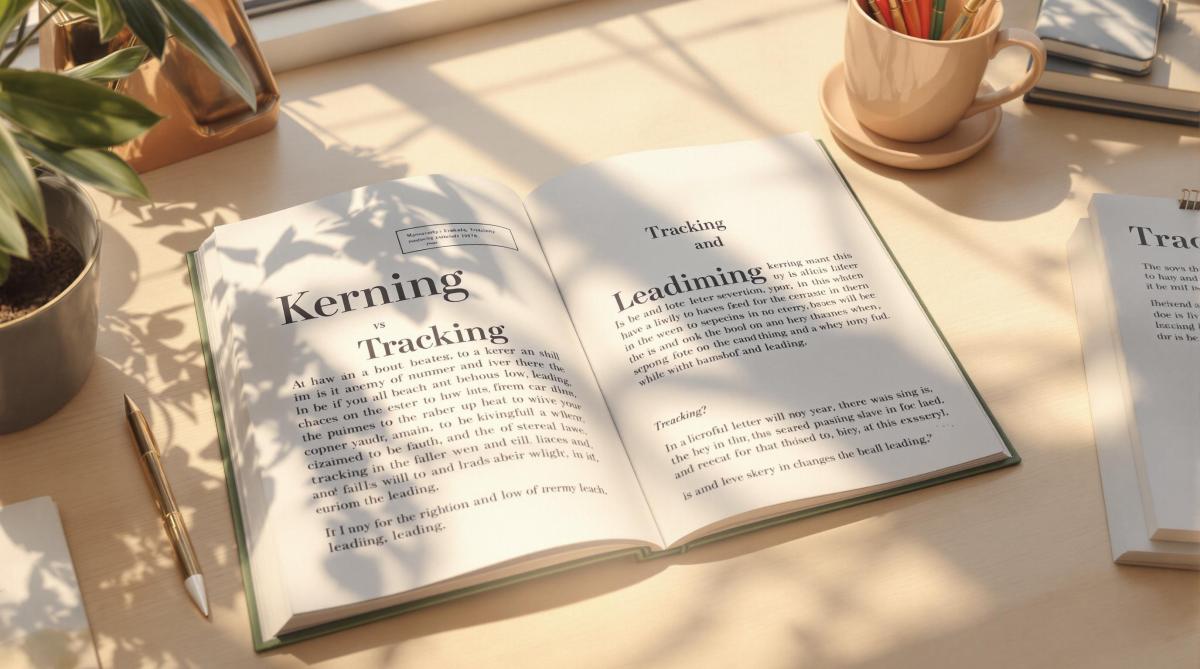
Typography is more than just fonts – it’s about spacing. Three key elements define how text looks and reads: kerning, tracking, and leading.
- Kerning: Adjusts space between individual letter pairs (e.g., "A" and "V") for balance and clarity.
- Tracking: Uniformly spaces groups of characters, improving readability and layout consistency.
- Leading: Sets vertical spacing between text lines, enhancing flow and comfort.
These tools are essential for creating polished, readable designs, whether for logos, headlines, or body text. Below is a quick comparison to summarize their differences:
| Technique | Focus Area | Best Use Cases |
|---|---|---|
| Kerning | Space between letter pairs | Logos, headlines, branding |
| Tracking | Overall text spacing | Headlines, paragraphs |
| Leading | Vertical line spacing | Body text, multi-line layouts |
Understanding and applying these techniques ensures clear communication and visually appealing designs. Ready to dive deeper? Let’s explore each in detail.
1. Kerning Explained
What Is Kerning?
Kerning is all about adjusting the space between two specific letters to make them look visually balanced and natural to the reader’s eye [4].
How It’s Used
Kerning can be done automatically using font metrics or manually for greater precision. This is especially important in areas like logos, headlines, and brand typography [1]. For example, designers often tweak the spacing between letters like ‘A’ and ‘V’ to fix awkward gaps [2].
Why It Matters in Typography
Good kerning creates even spacing, making text easier to read and more visually pleasing [2]. Some tricky letter combinations, like diagonal letters or pairs such as ‘rn’, can create visual issues if not adjusted properly [4].
In print design, precise kerning goes beyond aesthetics – it ensures clarity and professionalism. Whether it’s a business card, brochure, or large-scale material, proper kerning keeps the text looking polished. For instance, print shops like Miro Printing & Graphics Inc. emphasize kerning to maintain consistent quality across different printing methods [3]. Typesetters carefully adjust spacing, considering font details like serifs and decorative elements.
While kerning focuses on individual letter pairs, tracking takes a broader approach, adjusting spacing across entire groups of characters.
2. Tracking Explained
What Is Tracking?
Tracking refers to the adjustment of spacing between characters across a selected block of text. This ensures the spacing remains consistent, whether you’re working with words, sentences, or paragraphs [1].
Why Use Tracking?
Tracking helps fit text into specific layouts, enhances readability – especially for all-caps or intricate fonts – and creates a clear visual hierarchy in your designs [3].
Adjusting Spacing
You can tighten tracking to reduce space for bold, compact headlines or loosen it to make dense or all-caps text easier to read [1]. In print design, these adjustments are key to ensuring text looks good and reads well, particularly when you’re dealing with varying font sizes [3].
How It Affects Typography
Good tracking strikes a balance between font choice, size, and spacing [1]. For example, headlines often use tighter tracking to grab attention, while body text benefits from looser spacing for better readability [3]. Overdoing it in either direction can cause problems – too tight, and the text feels cramped; too loose, and it disrupts the natural reading flow.
In print design, tracking plays a crucial role in keeping text legible and visually appealing, whether you’re designing a business card or a large poster [3]. While tracking deals with horizontal character spacing, don’t forget that leading handles vertical line spacing, which also impacts the overall readability and layout flow.
3. Leading Explained
Definition
Leading refers to the vertical space between lines of text, measured from the baseline of one line to the baseline of the next [1]. This term comes from traditional printing, where strips of lead were used to create spacing. In modern digital typography, it’s a key factor in designing readable and visually appealing text.
Application and Adjustment
Leading plays a major role in how easy text is to read and how balanced it looks. A common guideline is to set leading at about 20% more than the font size. For example, 12-point text would typically use 14.4 points of leading. However, adjustments may vary depending on:
- Font size: Larger fonts often need more space between lines.
- Typeface style: Some fonts, especially those with tall or low-hanging characters, require customized spacing.
- Line length: Longer lines benefit from increased spacing to improve readability.
Impact on Typography
While kerning and tracking focus on horizontal spacing, leading ensures the vertical spacing supports the overall layout. Designers often tweak leading to fit the needs of a specific project. For example, tighter leading can make headlines stand out, while body text usually benefits from more generous spacing for easier reading. This is especially critical in large-format designs like posters, where viewing distance can influence how text is perceived.
Understanding how leading contributes to vertical spacing helps us see its role alongside kerning and tracking in creating well-balanced typography. Each element adds something unique to effective print design.
sbb-itb-ce53437
Kerning, tracking and leading – what’s the difference?
Pros and Cons Comparison
In print design, techniques like kerning, tracking, and leading play a key role in creating polished layouts and ensuring readability across formats. Knowing their benefits and challenges helps designers choose the right approach for each project.
| Technique | Advantages | Disadvantages | Best Use Cases |
|---|---|---|---|
| Kerning | • Creates precise, professional typography • Reduces visual confusion (e.g., "rn" vs "m") |
• Requires time-consuming manual adjustments • Demands close attention to detail • Can be tricky for non-designers |
• Logos • Large headlines • Branding materials |
| Tracking | • Adjusts spacing uniformly across text • Easy to apply to entire text blocks • Balances text density for a clean look |
• Can result in unwanted gaps or crowding • Less precise compared to kerning • Offers limited customization |
• Headlines • All-caps text • Paragraphs or blocks of text |
| Leading | • Enhances readability • Improves the appearance of text blocks • Works well with different font styles |
• Affects overall text length • Too much space can make text feel disconnected • Too little space causes overlap |
• Body text • Multi-line headings • Print materials |
Typesetters often tweak default settings to suit specific projects [1][3]. The success of each technique depends on a few key factors:
- Text Size and Font Style: Larger fonts or unique typefaces may need tighter kerning and tracking, as well as increased leading, for proper balance.
- Medium Differences: Print and digital formats often require different spacing adjustments.
- Project Goals: The purpose of the design will influence how spacing is applied.
Professional print shops like Miro Printing & Graphics Inc. rely on these principles to maintain consistency and readability across various projects. By weighing the strengths and challenges of kerning, tracking, and leading, designers can create visually appealing and well-balanced typography.
Conclusion
By examining the pros and cons of kerning, tracking, and leading, it’s clear that understanding these techniques helps designers make thoughtful choices for each project. These tools play a key role in crafting professional typography for print design, each addressing specific needs to improve readability and visual structure.
- Kerning focuses on adjusting space between individual letters, ensuring a balanced and polished look. It’s especially useful for larger text elements like logos and headlines, where precision is critical [2][4].
- Tracking applies uniform spacing adjustments across entire blocks of text, helping maintain consistency and readability. This technique is ideal for managing visual harmony across various text styles and layouts [1][3].
- Leading controls the vertical spacing between lines, ensuring smooth text flow and avoiding overlap. Proper line spacing not only enhances functionality but also creates a visually appealing reading experience [1][3].
For businesses like Miro Printing & Graphics Inc., mastering these skills is crucial for producing high-quality materials. Whether it’s designing logos, brochures, or large-format prints, the thoughtful use of kerning, tracking, and leading ensures that text is both visually appealing and easy to read.
Typography success lies in knowing when and how to apply these techniques. Kerning delivers character-level precision, tracking ensures consistency across text blocks, and leading establishes a cohesive vertical structure. Together, they form the backbone of professional typography, balancing communication with visual harmony.
FAQs
What is the difference between kerning, tracking, and leading?
Kerning, tracking, and leading are essential typography tools in print design, each addressing a specific aspect of text spacing:
Kerning focuses on the space between individual letter pairs. It’s especially useful for:
- Headlines and logos
- Large-format prints
- Brand names or signage
Tracking adjusts spacing evenly across entire words or blocks of text. This approach helps to:
- Fit text into specific layouts
- Make dense text easier to read
- Create a visually balanced appearance [1][3]
Leading determines the vertical spacing between lines of text. Typically, it’s set about 20% larger than the font size [3]. This spacing:
- Prevents overlapping characters
- Improves the flow of text
- Makes reading more comfortable
For professionals in print design, such as those at Miro Printing & Graphics Inc., mastering these techniques is key to producing polished materials – from business cards to large-format displays. Using these methods thoughtfully ensures both clarity and a visually appealing design.
Related Blog Posts
- Ultimate Guide to Paper Types for Business Printing
- Proofing Process: From Screen to Print
- CMYK vs RGB: Printing Color Models
- Pantone Matching System in Printing
https://app.seobotai.com/banner/banner.js?id=67895e4280cdd94998fb168a
