Can Agricultural Residue Paper Replace Wood Pulp?

Examines when crop residues (bagasse, straw, corn stover) can replace wood pulp—performance, costs, supply limits, and best uses.

Short answer: not fully, not yet. From what I see in the article, agricultural residue paper works best today as a partial replacement or blend in U.S. commercial printing and packaging.

If you want the fast takeaway, here it is:

  • Lower impact is possible when mills use local crop waste like bagasse, wheat straw, rice straw, and corn stover
  • Print quality is often fine for office paper, inserts, booklets, and light packaging
  • Wood pulp still wins for premium color work, long press runs, and steady sheet quality
  • Cost and supply are the main roadblocks because residue fiber is seasonal, bulky, and harder to store and move
  • In the U.S., most mills are still built around wood-based systems, so a full swap is not common today

A few details stand out right away. Bagasse has about 48.8% cellulose and about 20.2% lignin, which makes it one of the easier crop fibers to pulp. But wheat and rice straw can bring high silica, which can create mill processing issues. And because straw bales carry less usable fiber per truckload than wood chips, freight cost per ton can go up.
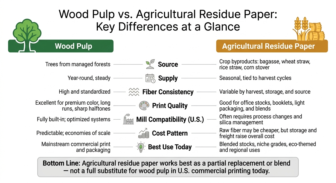
Wood Pulp vs. Agricultural Residue Paper: Key Differences at a Glance

Wood Pulp vs. Agricultural Residue Paper: Key Differences at a Glance

Quick Comparison

Criteria Wood Pulp Agricultural Residue Paper
Source Trees from managed forests Crop leftovers like straw and bagasse
Supply Year-round Seasonal
Fiber consistency More uniform More variable
Print quality Better for premium jobs Better for routine jobs and blends
Mill fit in the U.S. Already built in Often needs process changes
Cost pattern More predictable Raw fiber may be cheap, but storage and freight add cost
Best use today Mainstream commercial print and packaging Blended stocks, niche grades, regional uses

So if you’re choosing paper for brochures, direct mail, booklets, or packaging, I’d treat residue paper as a smart option for some jobs – but not a blanket replacement for wood pulp.

Wood Pulp vs. Agricultural Residue Paper: Definitions and Key Differences

Before weighing the tradeoffs, it helps to know what each fiber source actually is. At the core, this comes down to one issue: can residue fiber match wood pulp for consistency, scale, and print results?

Feature Wood Pulp Agricultural Residue Paper
Source Material Hardwood and softwood from managed forests Crop byproducts such as bagasse, wheat straw, rice straw, and corn stover
Fiber Consistency High and standardized Variable, depending on harvest, storage, and source
Pulping Process Kraft or sulfite methods that use heat and chemicals Modified methods such as soda-oxygen pulping

Wood pulp’s biggest strength is consistency. Residue paper’s biggest hurdle is variability. And for commercial printing, that gap matters.

How Wood Pulp Became the Standard

Wood pulp comes from managed forests and is processed mainly through the Kraft pulping process, which uses heat and chemicals to break down lignin and separate cellulose fibers. That steady process is a big reason wood pulp became the default choice for commercial print buyers.

In practice, it delivers dependable results across coated and uncoated printing papers, book papers, and heavy packaging boards. When buyers want paper that behaves the same way from run to run, wood pulp is usually the safe bet.

What Agricultural Residue Paper Is

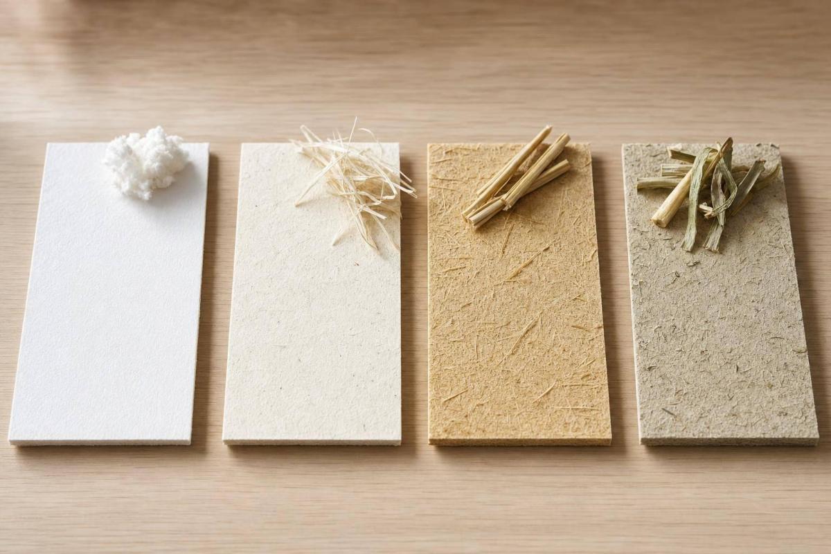
Agricultural residue paper uses fibers left behind after harvest, including bagasse, wheat straw, rice straw, and corn stover. But these materials aren’t all the same. Treating them like one category can hide some big differences.

Bagasse stands out because it has relatively low lignin content – around 20.2% – and high cellulose at roughly 48.8%. That makes it easier to pulp and a better fit for writing and printing grades.

Rice and wheat straw bring a different challenge: higher silica content, which makes chemical recovery harder in standard pulping systems. Mills can work around that with modified pulping methods, but there’s a catch. Fiber quality is less steady because residue composition shifts with harvest conditions, storage, and source.

That’s the main drawback: residue fiber is less consistent than wood pulp. And that difference shapes both environmental performance and the limits of print production.

Environmental Comparison: Agricultural Residues vs. Wood Pulp

Those material differences matter most once the focus moves from fiber quality to environmental impact. Residue paper can lower impact, but the upside depends a lot on supply chain conditions. So yes, residue paper can be a lower-impact input in many cases, but it isn’t a one-size-fits-all swap for wood pulp.

Where Residue Paper Can Cut Environmental Impact

Using crop residues keeps those fibers out of open burning and landfill streams. Research notes that non-wood fibers can help meet demand while reducing pulping pollution. Lower-temperature pulping can also cut energy use and waste.

Put simply, residue paper can reduce impact. But the size of that drop depends on practical details like how far the feedstock travels, how long it sits in storage, and which pulping method is used.

Where the Environmental Tradeoffs Still Apply

Storage is the first limit. Residues spoil fast, which shortens processing windows and adds logistics cost.

Transport is the second issue. These materials are bulky, and they’re heavy to move compared with the amount of usable fiber they deliver. That means hauling large volumes from field to mill can push up transportation energy use and carbon emissions. Rice and wheat straw also make chemical recovery and effluent management harder.

So while residue paper can reduce pressure on forests and avoid burning-related emissions, those gains can fade if the feedstock has to travel long distances, sits too long before processing, or goes through a less suitable pulping system. The case looks strong in the right supply chain, but it doesn’t automatically prove full replacement.

Environmental gains matter only if the stock can still run reliably on press.

Residue paper can do the job in a lot of print categories. But the big question is simple: can it stand up to wood pulp at every quality level?

Where Agricultural Residue Paper Holds Up Well

Agricultural residue paper works well for everyday print use. Think office printing, internal reports, notepads, and simple brochures.

Bleached bagasse pulp can reach brightness levels and fiber dimensions close to hardwood-based pulp, which makes it a fit for writing and printing grades. In practice, that means it can work well for:

  • office stocks
  • letterhead
  • envelopes
  • instructional booklets
  • light packaging

It often performs best in blends that help with strength and press runnability. So yes, residue paper is workable for routine jobs. That does not mean it’s automatically the right pick for premium color pieces.

Why Premium Print Jobs Still Often Need Wood Fiber or Blends

Higher-end print jobs tend to expose the weak spots.

Residue fibers are often shorter and less uniform. That can make the sheet rougher, increase ink absorption, lower opacity, and slow drying. For catalogs, presentation folders, and heavy solid-color work, wood-pulp stocks or engineered blends still tend to print in a more predictable way.

That matters on press. A stock may look fine on paper, then struggle when you need dense color, clean edges, and steady results across a long run. And even if the sheet performs well enough, sourcing and price still shape whether it can go head-to-head with wood pulp.

Property Typical Wood-Pulp Paper Typical Agricultural Residue Paper
Strength (tensile/tear) High; long fibers support demanding print and packaging uses Moderate; adequate for office and light printing when optimized or blended
Brightness and Opacity Generally high brightness and good opacity, especially in premium grades Slightly lower brightness; opacity can vary by residue type and process
Surface Quality/Smoothness Smooth, well-formed; supports fine halftones and sharp text More variable; rougher surface on uncoated grades; adequate for text
Ink Penetration/Holdout Controlled porosity; good holdout yields dense color and crisp dots Higher absorbency on some grades; ink penetrates more, reducing edge sharpness
Press Runnability/Machine Efficiency Highly optimized; stable, low dusting, reliable across long runs Acceptable when well-processed; better suited to short and medium runs
Offset Printing Suitability Excellent across economy to premium job types Suitable for simple text and graphics; more limited for image-heavy work
Digital Printing Suitability Very good with toner and inkjet in dedicated digital grades Reasonable for office and light commercial digital; needs calibration for high-end color

What This Means for U.S. Commercial Print Buyers

For U.S. print buyers, residue-based papers make sense for routine work like interior pages, office stocks, and eco-themed content. But when a piece needs sharp color, high opacity, or strong fold resistance, wood-pulp or blended stocks still tend to be the safer choice.

The next issue is whether those print advantages still make sense once you look at cost and supply chain conditions.

Economic Feasibility and the Direct Answer

Why Supply Chains Make Full Replacement Difficult

Performance isn’t the only thing that matters here. Supply and cost are what decide whether residue paper can grow beyond a niche.

Agricultural residues are seasonal. Wheat straw, rice straw, and bagasse show up in heavy volumes around harvest, not all year like wood chips from managed forestry. So if a mill wants a steady fiber stream, it has to collect, bale, and store a lot of material in a short period. That gets expensive fast. Baled straw also has lower bulk density than wood chips, which means more truckloads for each usable ton and higher freight costs per delivered ton. On top of that, stored bales can lose material over time.

The challenges don’t stop at the mill gate. Many agricultural residues, especially cereal straws, contain a lot of silica. That can lead to scaling and fouling in recovery boilers built around wood chemistry. Dealing with that may call for extra cleaning steps, changes to chemical recovery, and sometimes major capital spending. That’s a big reason mills often blend residue fiber with wood pulp instead of trying to swap wood out completely.

Factor Wood Pulp Agricultural Residue Fiber
Raw material supply Steady, year-round from managed forestry Seasonal; tied to crop harvest cycles
Storage & handling Dense chips; established mill practices Low-density bales; risk of material loss
Transport logistics Optimized per ton; lower freight cost More truckloads per ton; higher per-ton cost
Fit with existing mill systems Existing systems built for wood chemistry May need silica management and process changes
Production cost Predictable; benefits from economies of scale Potentially lower raw material cost, but logistics and retrofitting raise overall cost

Where Agricultural Residue Paper Makes Business Sense

The strongest business case shows up when buyers are willing to pay a modest premium because the paper choice itself adds meaning. Good examples include branded stationery, packaging inserts for natural food or wellness products, and short-run promotional pieces.

In those cases, residue-blend papers work best when the sustainability story helps explain the added cost. Put simply: use residue blends when that story can support a higher paper price.

That makes this as much an economic question as a technical one.

Conclusion: Can Agricultural Residue Paper Replace Wood Pulp?

The direct answer is: not fully, not yet – at least not for most U.S. commercial printing. Agricultural residue paper can replace some wood pulp in certain grades and markets, and it offers real environmental and economic gains where local crop supply is strong and mills are designed or adapted for non-wood fiber.

In the U.S., large integrated wood pulp supply chains are already mature, and most mills are tuned for wood. So residue fiber makes more sense as a supplemental source: useful in blended stocks, select specialty papers, and certain regional uses, but not set up to displace wood pulp across mainstream commercial printing today.

FAQs

How much wood pulp can residue fiber realistically replace today?

Agricultural residue fibers like corn maize, bamboo, hemp, and sugarcane can cut dependence on standard wood pulp.

The exact replacement rates aren’t specified. Even so, current industry progress shows that these plant-based fibers can serve as effective, low-impact substrates for many kinds of printing projects.

Which print jobs are best suited for agricultural residue paper?

Agricultural residue paper is a tree-free paper option made from leftover farm materials, and it works as a flexible substitute for wood pulp paper. It’s a strong fit for offset printing projects.

It works well for marketing collateral, packaging, and internal communications, while also supporting more responsible business practices.

What would need to change for wider U.S. adoption?

Broader U.S. use of paper made from agricultural residue will depend on better recycling and manufacturing methods that can bring down costs and improve performance. It also hinges on a steadier supply chain and print quality that stays consistent from job to job.

There’s a business mindset piece here too. Many companies still focus on upfront price, but long-term impact matters as well. Miro Printing & Graphics Inc. helps clients weigh substrate options based on each project’s needs and their sustainability goals.

Related Blog Posts

https://app.seobotai.com/banner/banner.js?id=6a7e5ccbdc1e9c396e6c44ae
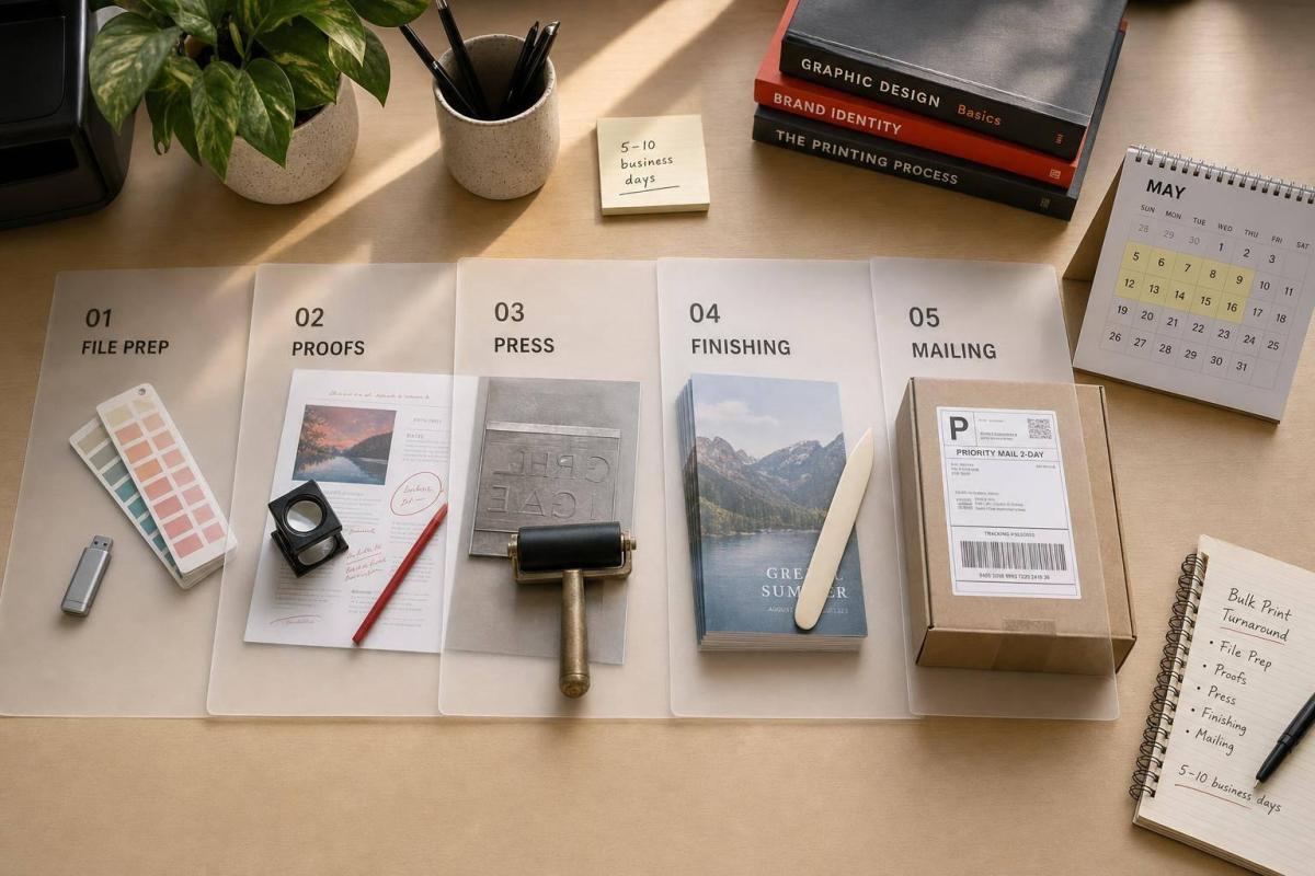
Ultimate Guide to Bulk Printing Turnaround

Practical timelines for bulk print jobs—file prep, proofs, press, finishing, and mailing; plan backward and add a 5–10 business day buffer.

If I need a simple answer, here it is: bulk print jobs often move on time only when I plan for more than press time. For many U.S. orders, production may take 2–15 business days after proof approval, but the full schedule can stretch much longer once I add file fixes, approvals, finishing, shipping, and USPS handling.

Here’s what matters most:

  • Turnaround time = production only
  • Lead time = quoting, proofs, revisions, printing, finishing, and delivery
  • File problems can add 1–2 business days
  • Each proof round can add 0.5–2 business days
  • Finishing can add 1–5 business days, and at times more for binding or die cutting
  • Special stocks can add 2–5+ days
  • Direct mail often needs 5–10 business days for print and mail prep, plus 3–5 more days in USPS transit

In other words: a “10-day turnaround” does not mean I’ll have the job in hand in 10 days.

If I’m planning a bulk order, I need to watch six things first:

  • file readiness
  • approval speed
  • print method
  • finishing steps
  • stock availability
  • shipping or mailing time

A simple flat piece may be done in 3–5 business days after approval. A folded brochure may need 3–7 days. A saddle-stitched booklet often takes 5–10 days. Perfect-bound work can land around 10–15 business days or more.

Job Type Common Time After Approval What Usually Adds Days
Flat prints 3–5 business days file issues, coatings, volume
Folded pieces 3–7 business days scoring, folding, finishing
Booklets/catalogs 5–15 business days page count, binding, paper
Direct mail 5–10 business days + USPS transit list work, addressing, postal entry

My main takeaway: the slowest step is often not the press run. It’s usually approvals, bindery, or delivery. So if I want to hit a firm in-hand date, I should build the schedule backward and leave 5–10 extra business days for surprises.

That’s the point of this guide: to help me set a print schedule that matches the job before the deadline starts to slip.

How to Backward Schedule Your Printed Products | Offset Printing Turnaround Times

What Affects Bulk Printing Turnaround the Most

The main factors are pretty simple: file readiness, approval speed, print method, finishing, materials, and shop capacity. Where do jobs usually get stuck? Most often in pre-production, setup, finishing, and delivery.

That matters because a bulk print schedule can look fine on paper, then slip fast once one early step slows down. If you know what tends to add time, you can set a schedule that matches the job before the deadline starts to drift.

File Readiness, Proofing, and Approval Delays

File problems are one of the biggest causes of delay. Common issues include missing bleeds, low-resolution images, unembedded fonts, RGB files sent into a CMYK workflow, and incorrect variable data setup. When that happens, the job often goes back to prepress, which can add 1 to 2 business days.

Proofing and approval can slow things down just as much. Each proof round can add 0.5 to 2 business days, based on how fast feedback comes in. If several people need to weigh in, that delay can grow fast.

A simple way to keep things moving is to:

  • assign one approver
  • set a 24- to 48-hour proof review deadline

Miro Printing & Graphics Inc. also offers in-house design and prepress support, which can help catch problems before they push the schedule off track.

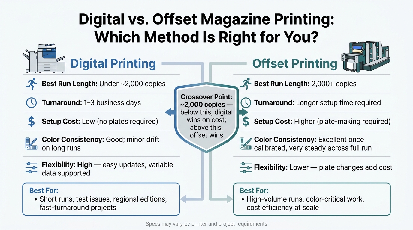
The print method has a direct effect on timing. Digital printing skips plate-making, so production can often begin soon after files are approved. It’s usually a good fit for runs in the hundreds to a few thousand pieces, with a normal turnaround of 1 to 3 business days after approval.

Offset printing takes more setup. Plates need to be made, the press has to be set up, and registration work adds time up front. For larger runs, offset is often the better choice, but production usually takes 3 to 7 business days, plus 12 to 24 hours of drying time on coated stocks before finishing can start.

Then there’s finishing, which is where a lot of hidden time shows up. Folding and trimming are often simple. But perfect binding, die cutting, UV coating, and lamination add extra steps and labor. Perfect binding needs glue curing. Custom die cuts may need dies made or pulled from inventory. Coatings and lamination often need separate equipment runs.

Across these steps, finishing can add 1 to 5 business days to a bulk order. And if the job uses specialty papers or substrates, sourcing those materials can add 2 to 5 days or more before the job is even scheduled.

Put all that together, and it becomes clear why one job can be easy to turn around while another with the same deadline feels tight from day one.

Comparison Table: Which Factors Add the Most Time

The table below shows which variables usually add the most time.

Factor How It Affects Time Typical Impact on Bulk Orders
File readiness Errors send files back to prepress before production Major if files have issues; minimal if press-ready
Approval speed Each revision cycle adds 0.5–2 business days Major with multiple stakeholders; moderate with one approver
Print method Offset adds setup and drying time compared with digital Moderate for standard runs; major for large offset jobs
Quantity Larger runs require more press and finishing time Moderate for typical volumes; major for very large runs
Finishing complexity Binding, die cutting, and coatings add production steps Major for multi-step bindery; minimal for simple trim and fold
Stock availability Special-order materials must be sourced before scheduling Minimal with house stocks; major with specialty substrates
Shop capacity Peak seasons or heavy job loads can push scheduling out Moderate in normal periods; major during high-demand seasons

Typical Turnaround Ranges for Common High-Volume Print Jobs

Use these ranges to spot schedule risk early. They reflect typical U.S. commercial print timelines and begin after final proof approval. In plain English, this is the window after the file is signed off, not the full project timeline. Setup, proofing, finishing, and mailing can still add time before a job is fully out the door.

The main pattern is simple: the more moving parts a job has, the more time it needs. Clean files move faster. Folding, bindery, coatings, list work, and mailing can stretch the schedule fast.

Marketing Collateral, Direct Mail, and Business Essentials

Flat items usually move the fastest. Once mailing enters the picture, the timeline takes its first big jump.

Flat single-sheet products often turn in 2–5 business days after proof approval. Business cards usually land in the 3–5 business day range, and specialty finishes can add 1–2 days. If the run goes above 2,500 pieces, timing can stretch to 4–8 business days.

Folded brochures – like trifolds, gatefolds, and similar formats – normally need at least one extra day for scoring and folding. That pushes them into the 3–7 business day range. Non-mailed postcards usually follow the same pattern as other flat products.

Direct mail works differently. The printing itself for postcards may take only 3–5 business days, but once you add addressing, variable data, sorting, and USPS induction, the full timeline from approval through mail prep often lands around 5–10 business days. After the mail is handed off, USPS transit can add another 3–5 business days, depending on destination.

Catalogs, Booklets, Labels, and Long-Run Projects

Once a job adds pages, bindery, or specialty materials, turnaround tends to stretch fast.

Short- to mid-run saddle-stitched booklets in the 8–32 page range usually take 5–10 business days on standard stocks. As page counts climb or stock needs get tighter, that range often shifts toward 10–15 business days for larger catalog work. Perfect-bound books and magazines sit near the top end of most commercial schedules: 10–15 business days for standard domestic runs, and 15–20+ business days when premium finishes or high page counts are involved.

Labels and stickers can look simple, but specs matter a lot. Standard shapes on common paper or vinyl stocks usually turn in 3–7 business days. Clear or metallic substrates, removable adhesives, or custom die cuts can push timing to 7–12+ business days, especially if dies must be ordered or substrate tests are needed before production starts.

Summary Table: Bulk Print Turnaround by Product Type

Use the table below to match product type to a planning window.

All ranges begin after final proof approval and do not include shipping or USPS transit.

Product Type Typical Quantity Range Standard Turnaround Extended Turnaround (Complex Specs)
Business cards 500–5,000 3–5 business days 5–10 business days (specialty finishes, higher volume)
Flyers / flat sell sheets 1,000–20,000 3–5 business days 7–10 business days (folding, scoring, specialty finishing)
Brochures (folded) 1,000–20,000 3–7 business days 7–12 business days (complex folds, coatings)
Postcards (non-mailed) 1,000–50,000 3–5 business days 7–10 business days (variable data, specialty stocks)
Direct mail campaigns 5,000–100,000+ pieces 5–10 business days (print + mail prep) 10–15+ business days (complex list work, multiple drops)
Booklets / catalogs (saddle-stitched) 1,000–20,000 copies 5–10 business days 10–15+ business days (high page counts, custom papers)
Magazines / perfect-bound books 1,000–50,000 copies 10–15 business days 15–20+ business days (premium finishes, complex schedules)
Labels / stickers (standard) 1,000–50,000 units 3–7 business days 7–12+ business days (specialty substrates, custom dies)

How to Plan a Bulk Print Order and Meet Your Deadline

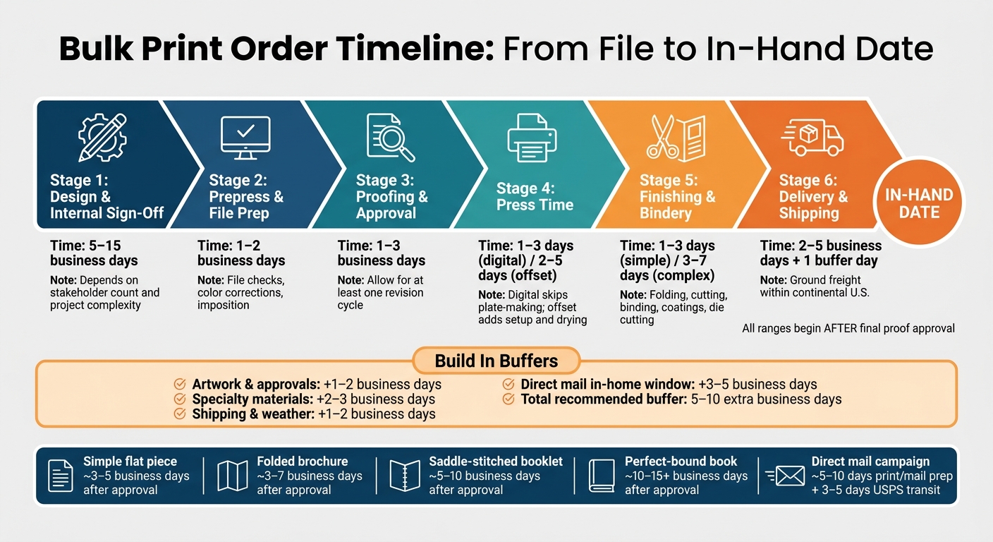
Bulk Print Order Timeline: From File to In-Hand Date

Bulk Print Order Timeline: From File to In-Hand Date

Use the turnaround windows above to build a backward schedule that lands on your in-hand date. Start with those ranges as your baseline, then subtract each production step in reverse.

Work Backward From the In-Hand Date

Start with the exact date and time the materials must be physically available. Not the ship date. Not the date printing wraps up. The in-hand date is when the pieces must be at your trade show booth, in your store, or delivered to the mail house.

Then work backward through each stage:

  • Delivery/shipping: 2–5 business days for ground freight within the continental U.S., plus 1 buffer day.
  • Finishing/bindery: 1–3 business days for standard work like cutting, folding, or saddle-stitching; 3–7 business days for more involved bindery such as perfect binding or custom die-cutting.
  • Press time: 1–3 business days for digital; 2–5 business days for offset bulk runs.
  • Proofing and approval: 1–3 business days, assuming at least one revision cycle.
  • Prepress and file prep: 1–2 business days for file checks, color corrections, and imposition.
  • Design and internal sign-off: 5–15 business days depending on stakeholder count and project complexity.

For example, if you need brochures in hand by October 7, a standard bulk job may mean design needs to wrap by mid-September, proof approval happens by late September, and press plus finishing are done by early October.

Trade show, product launch, and direct mail jobs need more room. Venue deadlines, compliance review, and in-home delivery windows can quietly add extra days.

Once the timeline is mapped out, lock materials and press capacity.

Confirm Materials, Capacity, and Specs Early

Finalize paper, finishes, and size before design is locked. Specialty stocks, coatings, and custom sizes each come with their own lead times, and those lead times keep moving while your design team is still working.

Check these points with your printer before design is locked:

  • Paper stock and availability: Non-standard weights, textured stocks, or recycled substrates may need to be ordered from a mill or distributor, which can add several business days.
  • Coatings and finishes: UV coating, soft-touch lamination, foil stamping, and embossing need specialized equipment and extra drying or curing time.
  • Quantity and press capacity: Lock quantities early so the job can get into the production queue.
  • Bindery and mailing: If the job needs saddle-stitching, perfect binding, or USPS entry, confirm whether those services are handled in-house. A full-service shop like Miro Printing & Graphics Inc. can coordinate printing, bindery, and mailing on one schedule, which helps cut handoff delays.

Specialty choices can add 3–10 business days to a bulk project. Make those calls early, or you may end up squeezing the production window at exactly the wrong time.

With the specs set, add some breathing room before production starts.

Build Buffers Into the Schedule

Print schedules almost never go exactly as planned. A copy change, a second proof cycle, a paper swap, a carrier delay – any one of those can eat up a day or two. Stack a few together, and you can lose a week fast.

Here are practical buffer guidelines for U.S. business-day planning:

  • Artwork and approvals: Add 1–2 extra business days for unplanned copy edits or brand review comments; add more if several departments need to sign off.
  • Supply chain: Add 2–3 business days if specialty paper or imported materials are involved, to cover late deliveries or substitutions.
  • Shipping and weather: Add at least 1–2 buffer days, especially during winter storm season or when shipping cross-country by ground freight.
  • Direct mail windows: Add 3–5 business days beyond the USPS delivery range to protect the in-home date.

Taken together, these buffers can add 5–10 business days to a high-stakes timeline. Add that cushion early. Rush fees can wipe out any savings.

Coordinating Printing, Finishing, Delivery, and Mailing

With buffers in place, the next thing that can still push your finish date is everything that happens after printing. This is why finishing and mailing need to be locked into the schedule now. The press run usually isn’t the part that drags. More often, the delay shows up once the sheets come off press.

How Bindery and Finishing Add Time

Every finishing step adds its own setup time, queue time, and quality check. And the more steps you add, the more handoffs you create. That’s where schedules start to slip.

Simple work like cutting and scoring usually adds 1–3 business days. More involved jobs – perfect binding, die cutting, coil binding, or multi-step booklet binding – can add 5–10 business days, especially when the finishing queue is packed. A perfect-bound catalog takes longer than folded brochures because it also needs curing and inspection time.

Once finishing is set, mailing becomes the next part that can hold up the schedule.

Mailing and Fulfillment Steps That Extend the Timeline

Mailing isn’t something you tack on at the end. It’s part of the production plan from the start. Address processing, variable data, inserting, tabbing, presorting, and USPS entry all take time, and each one affects the calendar.

After printing and finishing, mail prep usually adds 1–3 business days. Coordinated print-plus-mail campaigns often take 7–14 business days from approved artwork and a clean list. USPS Marketing Mail runs on a 4–7 day end-to-end service standard in the contiguous U.S., while First-Class Mail usually lands in 1–5 days.

Key Takeaways and Coordination Table

In bulk printing, the total turnaround usually follows the slowest step, and that’s often finishing or mailing, not printing itself. The table below shows where extra time comes from once you move beyond a simple press run.

Order Type Included Steps Added Time to Plan For Best Use Case
Print only Press run, trimming, shipping 2–5 business days after proof approval Flyers, posters, simple handouts
Print + finish Press run, folding/binding/die cutting, trimming, shipping 1–3 days (simple finishing); 5–10 days (complex bindery) Brochures, booklets, catalogs, coil-bound reports
Print, finish, mail Press run, finishing, address processing, presort, USPS induction, delivery 7–14 business days from approved artwork and clean list; full campaigns 3–6 weeks or more Direct mail campaigns, personalized mailers, EDDM drops

FAQs

What’s the difference between turnaround time and lead time?

Turnaround time is the period between placing your print order with Miro Printing & Graphics Inc. and the point when your finished piece is ready for pickup or delivery.

Lead time is a broader window. It covers the whole process, including planning, proofing, production, shipping, and any extra cushion needed to help hit your deadline.

How far in advance should I place a bulk print order?

Place your bulk print order well ahead of your deadline. That gives enough time for production and post-press work without turning the whole job into a last-minute scramble.

Digital printing often takes 1 to 4 business days. Larger offset jobs usually need 5 to 15 business days, including setup and binding.

If your project includes custom finishing, like embossing or die-cutting, expect 1 to 5 extra business days. It’s smart to talk through your specs and due date early with Miro Printing & Graphics Inc. so you can help avoid rush fees.

What delays bulk printing jobs the most?

Bulk printing delays usually come down to three things: long offset press setup, time-heavy finishing work, and special materials.

Finishing steps like embossing, die-cutting, or complex assembly can add 1 to 5 days to a job. That extra time stacks up fast, especially when several finishing steps are involved.

Delays also show up during peak demand, when files arrive late or aren’t print-ready, and when design changes happen in the middle of a run and new offset plates have to be made. Miro Printing & Graphics Inc. helps cut down on these slowdowns with end-to-end local production.

Related Blog Posts

https://app.seobotai.com/banner/banner.js?id=6a7d0b87dc1e9c396e6c3b35

Guide to Print File Standards: Bleed and Trim

Set trim size with 0.125in bleed, keep content in safe zones, export CMYK 300 DPI PDFs to avoid print issues.

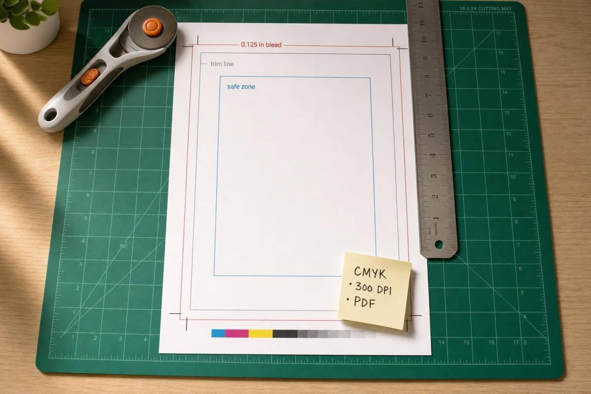
If your file is off by just 1/16 in, the finished piece can show white edges or cut-off text. That’s why I set up every print file with the right trim size, bleed, and safe zone from the start.

Here’s the short version:

  • Bleed = extra image or color that extends 0.125 in past the final cut on each side
  • Trim = the final finished size
  • Safe zone = where I keep text, logos, QR codes, and other must-keep items
  • Margins = layout spacing for design, not a print spec

A few fast examples:

  • A 3.5 in × 2 in business card should be built at 3.75 in × 2.25 in
  • An 8.5 in × 11 in flyer should be built at 8.75 in × 11.25 in
  • Large pieces like posters and banners often need 0.25 in to 1 in bleed, based on finishing

I also check for the file problems that lead to reprints and extra cost:

  • missing bleed
  • text too close to the edge
  • wrong page size
  • RGB color instead of CMYK
  • low-resolution images
  • no room for folds, gutters, hems, or grommets

Bottom line: I build the document at the final trim size, extend edge artwork past the cut, keep key content inside the safe area, and export a print-ready PDF with the right settings. That simple setup helps avoid print issues on business cards, postcards, flyers, brochures, booklets, catalogs, posters, and banners.

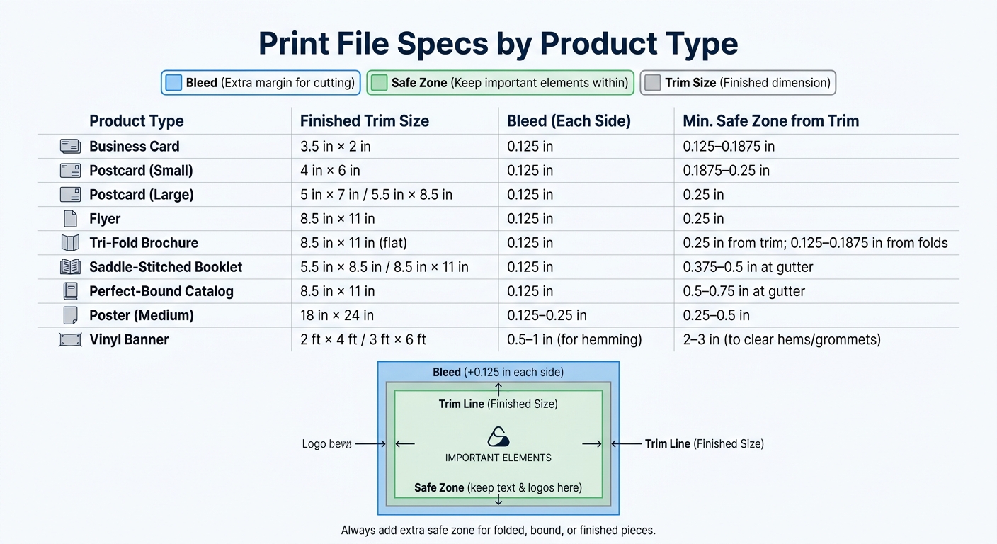
Print File Specs by Product: Bleed, Trim & Safe Zone Guide

Print File Specs by Product: Bleed, Trim & Safe Zone Guide

Bleed, Trim, Safe Zone, and Margins: The Standard Rules

How Each Print Zone Works

Here’s how those terms connect to the actual file size and the way a piece gets cut. Each zone plays a different part in print production.

Zone Where It Sits What Goes There Production Result
Bleed Outside the trim line Background color, images, fills meant to reach the edge Gets cut off – keep nonessential artwork only
Trim line Edge of the finished piece Defines the final cut size The cutter aims here; slight shifts are normal
Safe zone Inside the trim line Text, logos, contact info, barcodes, key visuals Keep text and logos inside the trim
Margins Inside the page Layout guides for visual balance and readability Not a production spec – a design decision

Use these rules when setting up bleed and safe zone for each piece.

Bleed is needed any time artwork, color, photos, or patterns are supposed to run all the way to the edge of the finished piece. If the design stays away from the edge or uses a built-in border, bleed is often not needed. That said, many printers still like files set up with bleed when the piece will be trimmed or finished by machine, because it gives the cutter a little more room for error.

Standard U.S. Measurements for Common Print Jobs

These zones affect two things: how big the file needs to be and how far key content should sit from the edge. The common standard is 0.125 in bleed on each side and at least 0.125 in safe zone inside the trim. Document size = trim size + bleed on all sides.

A simple example: a standard 8.5 × 11 in flyer becomes 8.75 × 11.25 in after bleed is added.

Bigger pieces usually need more space. For posters, banners, and other large-format prints, 0.25 in bleed or more is common, and some guidelines suggest 0.5 in per side for pieces larger than 18 × 24 in. Safe zones should also be wider on large-format jobs, since those pieces go through more handling during printing, mounting, and finishing.

Pay extra attention to areas near:

  • binding
  • grommets
  • hems
  • folds

These measurements are the starting point for file setup and PDF export.

How to Set Up Print Files Correctly

Document Setup in Adobe InDesign, Illustrator, and Photoshop

Adobe InDesign

Once you know your bleed and trim specs, set them up before you start designing. That saves time and helps you avoid ugly surprises at print time.

Start with the final trim size. Then add bleed outside the trim and safe-zone guides inside it. The trim size is your base. Everything else works off that.

Each app handles this a bit differently:

Software Where Trim Is Defined Where Bleed Is Set How Safe Zone Guides Are Created
InDesign File → New → Document (Width/Height fields) Bleed and Slug section in the same dialog Margins field in New Document dialog, or Layout → Create Guides
Illustrator Artboard size in File → New Bleed fields in File → New, or File → Document Setup Rulers + manually dragged guides placed inside the artboard edges
Photoshop Canvas size at trim + bleed in File → New (no native bleed field) Built into the canvas – create at trim size plus 0.125 in bleed on all sides View → New Guide to place trim and safe zone lines manually

For a 3.5 × 2 in business card, InDesign and Illustrator should be set to exactly 3.5 × 2 in, with 0.125 in bleed added in the bleed field. In Photoshop, build the canvas at 3.75 × 2.25 in at 300 dpi, then mark the trim with guides.

Across all three programs, keep text and logos inside the safe zone. That’s the part people often skip, and it’s where trouble starts.

Export Settings for a Print-Ready PDF

After the layout is ready, export the PDF with the bleed intact. In InDesign, go to File → Export → Adobe PDF (Print) and use a preset like Press Quality or PDF/X-1a. In the Marks and Bleeds panel, check Use Document Bleed Settings so the 0.125 in bleed you set up makes it into the final PDF.

Add crop marks only if the printer asks for them.

In Illustrator, it works much the same way: File → Save As → Adobe PDF, then check Use Document Bleed Settings and add Trim Marks only if requested.

In Photoshop, the bleed is already part of the canvas. Export through File → Save As → Photoshop PDF with high-quality print settings. You don’t need any extra bleed options there.

One last thing: never fake bleed by scaling artwork or making the page bigger. Let the bleed field handle it. That’s the clean way to do it.

Applying Bleed and Trim Standards to Common Products

Business Cards, Postcards, Flyers, and Brochures

The core rule stays the same across print pieces: extend bleed past the cut line, and keep anything important inside the safe zone. What changes is how much room each format needs.

For business cards with a finished size of 3.5 in × 2 in, any background color, pattern, or photo should run all the way to the bleed edge. That means your file should be 3.75 in × 2.25 in. Keep text 0.125–0.1875 in inside the trim so it doesn’t look cramped or get clipped.

For postcards, use the same 0.125 in bleed. A standard 4 in × 6 in postcard should be built at 4.25 in × 6.25 in. It’s smart to give addresses and call-to-action text a bit more breathing room, so use safe zone margins of 0.1875–0.25 in.

For flyers sized 8.5 in × 11 in, add 0.125 in bleed on every side and keep text 0.25 in from the trim. If the page has dense copy or legal disclaimers, move that margin closer to 0.5 in. It reads better, and it gives you more room for small trim shifts.

Tri-fold brochures need more care. The flat size is still 8.5 in × 11 in with 0.125 in bleed, but the panel widths may need slight changes so the fold closes the way it should. Keep text 0.25 in from all trim edges and 0.125–0.1875 in from fold lines on both sides. If one image runs across a fold, let it continue through. But don’t place a logo, a face, or small text right on that fold line. That’s asking for trouble.

Booklets, Catalogs, Posters, and Banners

Once a piece gets folded, stitched, glued, or hung, the safe zone usually needs more room.

Saddle-stitched booklets still use 0.125 in bleed at the trim edges, but the inside margin needs extra space. Because the pages nest inside each other, the inner sheets creep outward a bit. A safe zone of 0.375–0.5 in at the gutter helps protect page numbers and body copy after trimming.

Perfect-bound catalogs need even more room at the spine. Plan for gutter margins of 0.5–0.75 in or more. Full-bleed spreads should be built as two separate pages, and all key content should sit well away from the spine. If text or other key elements drift into the gutter, some of it can disappear into the glue area or get bent into the page curve.

Use the table below as a starting point. Then add more space if the piece includes folds, binding, hems, or grommets.

Product type Typical finished size Recommended bleed (each side) Minimum safe zone from trim
Business card 3.5 in × 2 in 0.125 in 0.125–0.1875 in
Postcard (small) 4 in × 6 in 0.125 in 0.1875–0.25 in
Postcard (large) 5 in × 7 in; 5.5 in × 8.5 in 0.125 in 0.25 in
Flyer 8.5 in × 11 in 0.125 in 0.25 in
Tri-fold brochure 8.5 in × 11 in (flat) 0.125 in 0.25 in from trim; 0.125–0.1875 in from folds
Saddle-stitched booklet 5.5 in × 8.5 in; 8.5 in × 11 in 0.125 in 0.375–0.5 in at gutter
Perfect-bound catalog 8.5 in × 11 in 0.125 in 0.5–0.75 in at gutter
Poster (medium) 18 in × 24 in 0.125–0.25 in 0.25–0.5 in
Banner (vinyl) 2 ft × 4 ft; 3 ft × 6 ft 0.5–1 in (for hemming) 2–3 in (to clear hems/grommets)

Banners are their own beast. Since they’re often finished with hems, grommets, or pole pockets, the safe zone gets much larger. Keep logos and text 2–3 in from the finished edge on large outdoor banners. That extra room doesn’t just clear the hardware. It also helps with viewing distance, since text pushed too close to the edge is harder to read from across a room or a parking lot.

How Finishing Services Change File Requirements

Finishing affects the file setup, not just what happens after printing. Postpress work adds a little movement to the final piece, and those small shifts matter.

Bindery work can introduce up to roughly 3/16 in of trimming variation, which is why a 0.25 in safe zone is often recommended. Cutting, folding, and binding can all shift things a bit.

Scoring matters most with heavier cardstocks. On heavy stock, keep text and fine details 0.1875–0.25 in from the fold. If you don’t, the fold can crack through thin lines or make small type harder to read.

Perforations need space too. A bindery guide recommends keeping at least 0.25 in between a perforation and any nearby fold or finishing detail to help prevent early tearing. If you’re setting up a tear-off coupon or reply card, that space needs to be there.

Match the file to the finishing method before export. A print file that ignores the bindery step can look fine on screen and still fail once it hits the shop floor.

Common File Errors to Avoid and a Final Submission Checklist

Missing Bleed, Unsafe Text Placement, and Incorrect File Size

Once trim, bleed, and finishing specs are set, do one last pass. This is where a lot of reprints start. In most cases, the problem isn’t the design itself. It’s a small setup mistake that could have been caught before export.

If full-bleed artwork stops right at the trim line, you can end up with thin white edges after cutting. Extend that artwork 0.125 in past the trim.

Text and logos need breathing room too. Keep them 0.125–0.25 in inside the trim so they don’t get clipped.

Use this quick preflight table before you export:

Issue Likely Print Impact How to Fix It Involves
Missing bleed on full-bleed artwork White slivers or unprinted edges after trimming Extend backgrounds and images beyond the trim by at least 0.125 in Bleed, trim
Text or logos too close to trim Content clipped during cutting Move critical elements at least 0.125–0.25 in inside the trim Safe zone, margins, trim
Wrong page size Piece prints at the wrong size or with borders Set document to final trim size plus bleed before designing Trim, bleed
Mixed or incorrect units Conversion errors from mixed units Use inches for U.S. print files and verify dimensions before export Trim, bleed, margins
Incorrect export settings File may be rejected or output incorrectly Export a print-ready PDF with bleed and requested marks Bleed, trim
RGB color, low-res images, or missing fonts Color shifts, blurry output, or font substitution Convert to CMYK, embed fonts, and ensure images are 300 DPI at final size Press-critical

Final Checklist Before Uploading or Sending a File

Before you send a file to print, check these five items:

  • Trim size confirmed – The document is set to the final finished size, not the bleed-adjusted size.
  • Bleed verified – All artwork that touches the edge extends at least 0.125 in past the trim on every side.
  • Critical content inside the safe zone – Text, logos, QR codes, and page numbers sit at least 0.125–0.25 in from the trim, with extra room for bound or folded pieces.
  • Finishing allowances reviewed – Folds, gutters, and binding allowances are built into the layout.
  • Print-ready PDF exported correctly – Export a print-ready PDF with bleed, embedded fonts, CMYK color, and 300 DPI images.

If the printer asks for crop marks, turn them on during export. If not, leave them off.

When all five checks are clear, the file is ready for press.

Conclusion: The Standards That Protect Print Quality

Build the document at the final trim size. Add the right bleed outside that size. Keep key content inside the safe zone. Then make sure the setup fits the product and its finishing method.

Whether you’re sending files to a local shop like Miro Printing & Graphics Inc. in Hackensack, NJ, or prepping artwork for any commercial press run, accurate file setup helps protect the final printed piece.

The Ultimate Bleeds and Crop Marks Video for Graphic Designers-Illustrator, InDesign, and Photoshop

FAQs

When is bleed required?

Bleed is needed any time colors, images, or graphics run all the way to the edge of the final trim size. A 0.125-inch (1/8-inch) bleed gives the printer a little extra room, which helps avoid unwanted white edges if the paper shifts slightly during trimming.

By extending the artwork into this extra area, you’re far more likely to get a clean finish at the edge of the page.

How much safe space should I leave for text?

Leave at least 0.25 inches of safe space inside the trim line. That buffer helps keep text away from the final cut.

For bound pieces like booklets or catalogs, bump the inner margin up to 0.375 to 0.5 inches to make room for binding. Keep all key text, logos, and graphics inside that space so nothing gets clipped by accident.

What changes for folded, bound, or large-format pieces?

For bound materials, give the inside edge a bit more room near the binding. Set the inner margins to 0.375 to 0.5 inches so page movement during production doesn’t crowd the content. Some binding styles, including perfect binding and Wire-O, may call for inner margins up to 0.6 inches.

For large-format pieces like banners and posters, use larger overall margins – usually 1.5 to 2 inches. That extra space helps protect text and other key elements during installation.

Related Blog Posts

https://app.seobotai.com/banner/banner.js?id=6a7bca6edc1e9c396e6c3648

Common CMYK Registration Issues and Prevention

Prevent CMYK halos, gaps, fuzzy type and duplex misalignment with 100% K text, proper trapping, and stable press conditions.

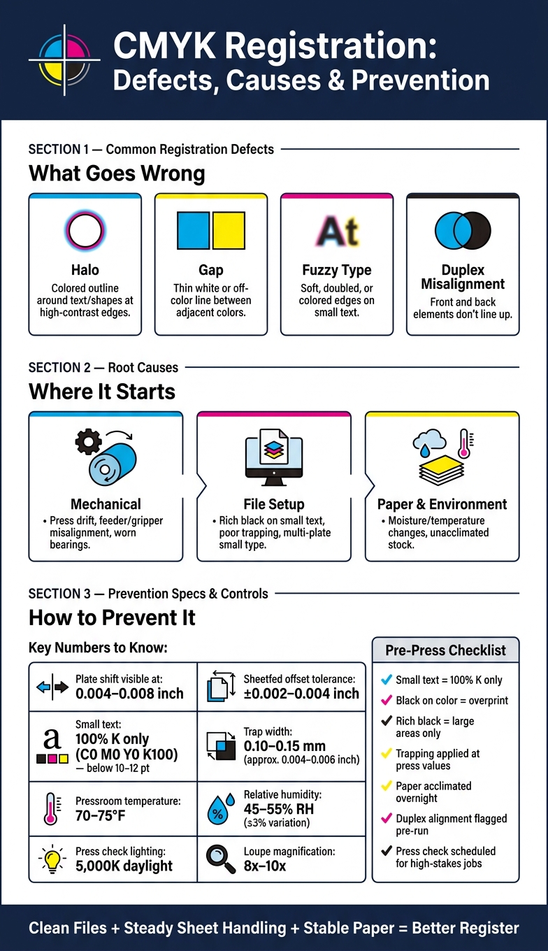
A plate shift as small as 0.004–0.008 inch can make print look off. If I want clean CMYK output, I need to control file setup, press alignment, and paper conditions from the start.

Here’s the short version:

  • What goes wrong: halos, white gaps, fuzzy small type, and front/back misalignment
  • What causes it: press drift, weak trapping, rich black on small text, and paper movement from heat or humidity
  • How shops check it: registration marks, color bars, loupes, and press checks under 5,000K lighting
  • Common targets: many sheetfed offset jobs aim for about ±0.002–0.004 inch
  • How I cut risk: keep small text at 100% K only, use trapping around 0.10–0.15 mm (about 0.004–0.006 inch), and keep the pressroom near 70–75°F with 45–55% RH

This article is about one simple point: most CMYK registration trouble starts small, then stacks up fast. If I catch the early signs and set the job up right, I can avoid blurry edges, weak brand color, and costly reprints.

What I’d check first:

  • Small text: black only, not built from CMYK
  • Black on color: overprint where needed
  • Rich black: save it for large areas
  • Paper: let it sit in pressroom conditions before printing
  • Duplex jobs: flag tight front/back alignment before the run starts
  • Proofs and press checks: ask for them on jobs where every detail matters

That’s the core of it: clean files + steady sheet handling + stable paper = better register.

CMYK Registration Defects: Causes, Checks & Prevention at a Glance

CMYK Registration Defects: Causes, Checks & Prevention at a Glance

Common CMYK Registration Problems and What Causes Them

Not every registration issue looks the same on press. And that matters, because the defect you see on the sheet usually gives you a solid clue about what’s going wrong.

Visual Defects: Halos, Gaps, Fuzzy Type, and Duplex Misalignment

When CMYK plates shift in different ways, they leave different signs on the page. So instead of treating all registration errors as one problem, it helps to read the pattern first.

Defect How it looks on the page Most likely causes
Halo Colored outline or shadow around text or shapes at high-contrast edges Lateral or feed-direction misregistration; poor trapping; small text built from multiple CMYK plates
Gap Thin white or off-color line between adjacent colors or at object edges Under-trapping in prepress; sheet movement; gripper or feed misalignment
Fuzzy type Soft, doubled, or colored edges on small text; loss of sharpness Process color builds on small text; registration drift; vibration or periodic movement
Duplex misalignment Front and back elements don’t line up when held to light; folds off-center Incorrect front/back registration setup; paper shrink or expansion between sides

Small type, thin rules, and high-contrast logos usually show trouble first. They don’t hide much. Even shifts as small as 0.004–0.008 inch can show up on those elements.

Once you can see the defect pattern clearly, the next move is simple: figure out whether the source is mechanical, file-related, or tied to the paper itself.

A lot of press-side movement starts with hardware setup. Feeder, guide, gripper, plate, cylinder, or roller alignment problems are common sources of registration shift.

Paper can also be the troublemaker. It reacts to moisture and temperature changes, so stock that hasn’t been acclimated can move during the run and drift out of register.

File setup plays a part too. Rich black on small type and poor trapping can make a minor alignment miss look much worse than it is.

After the likely cause is narrowed down, printers usually confirm alignment with marks, bars, and press checks.

How Printers Check Registration Accuracy

When a press operator needs to check CMYK alignment, the shop leans on a few standard tools.

Registration Marks, Color Bars, and Press Checks

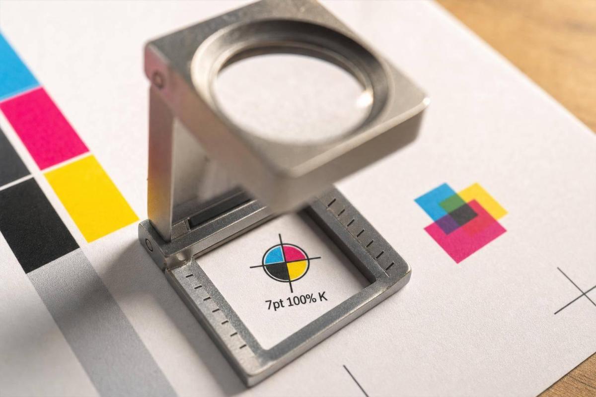
Registration marks are small targets printed just outside the trim area on each color separation. Since those marks are made from all four process colors, they should line up as one sharp mark when registration is on point. Under a loupe, a well-registered crosshair looks like a single clean mark. If cyan is off, you’ll see a thin colored shadow that shows which plate moved and which way it shifted.

Color bars run along the gripper or tail edge of the sheet. They include solid patches, overprints, tints, and fine-line patterns for each process color. Operators check them with a densitometer or spectrophotometer to measure ink density and color consistency. The fine-line parts can also show registration drift when viewed under a loupe.

During a press check, operators pull sample sheets and place them on a viewing table under standardized lighting, usually 5,000K daylight. Then they inspect registration marks and fine details with an 8x–10x loupe. Many modern commercial presses also use inline camera systems that watch registration targets the whole time and make real-time adjustments on their own. That same monitoring helps keep CMYK jobs on target throughout the run. The approved sheet is then set aside as the reference for the rest of the job.

Those results tell the pressroom whether the job is steady or whether it needs a fix before the run keeps going.

Typical Tolerances for Commercial CMYK Work

Tolerance depends on the job, stock, and press. Standard sheetfed offset work often aims for about ±0.002–0.004 inch. Packaging usually needs tighter control, while large-format work can get by with a bit more.

Fine type, hairline rules, and reversed-out copy can make even a small shift easy to spot.

Once the reading is off, the next step is to trace whether the cause is setup, stock movement, or press drift.

How to Prevent Registration Errors in Prepress, Press Setup, and Production

The best way to deal with registration errors is to stop them before plates are made, then keep the press locked in during production. Once you spot the defect, the fix usually comes down to three areas: file prep, press setup, and paper control.

Prepress Choices That Lower Misregistration Risk

Start with the small stuff, because that’s where registration problems show up fast.

Set small text below 10–12 pt in 100% K only: C0 M0 Y0 K100. That applies in particular to legal copy, contact details, barcodes, and QR codes. Check separations to make sure those elements are pure black only.

Black text on color should overprint. Rich black has its place, but it’s better reserved for large solid areas and display headlines. If you use rich black on tiny text, even a small shift can make the type look fuzzy or broken.

When two colors touch edge to edge, trapping helps cover the small gap that misregistration can create. For standard sheetfed offset on coated paper, a trap width of about 0.10–0.15 mm (around 0.3–0.4 pt) is a common target for normal press movement. On brand-heavy or packaging jobs, use the printer’s trap standard.

It also helps to avoid tiny multicolor type and thin colored keylines around small objects, especially near sheet edges. That’s often where mechanical movement shows up the most.

Pressroom Controls That Keep Sheets and Colors Aligned

Good file prep cuts risk. Press setup keeps the job inside tolerance.

The press has to feed each sheet the same way every time. That means feeder height, vacuum, side guides, and sheet separation all need close attention. If grippers are worn, or if gripper pressure is uneven, misregister can build over time and get worse as the run moves along.

Paper matters too. It takes in and gives off moisture from the air, and that changes sheet size. Because of that, paper should be stored in pressroom conditions and allowed to acclimate overnight before printing. Pressrooms handling precision CMYK work often aim for 70–75 °F and 45–55% relative humidity, with variation held to about ±3% RH during a run.

Routine maintenance also plays a big part. Drives, bearings, and transport parts can drift, and that mechanical drift shows up on the sheet. Operators watch registration marks and color bars through the run and stop the job if the shift goes past the job’s control limit.

A Pre-Order Checklist for Print Buyers

If you’re the buyer, these same press and prepress controls turn into a simple pre-order review.

Check What to Look For
Small text color build All small text should be 100% K only – no CMY values
Rich black usage Reserve rich black for large headlines and solid panels only
Overprint settings Small black text and hairlines over color should overprint; large rich-black areas should knock out
Trapping Confirm trapping is applied at press-appropriate values
Proof request Ask for a contract proof or pre-production sample on critical brand or packaging jobs
Front-to-back alignment Flag any duplex job where alignment matters – business cards, postcards, packaging inserts – so the printer can set appropriate controls
Press check timing Schedule a press check during make-ready for high-stakes runs

Conclusion: Key Ways to Avoid CMYK Registration Problems

CMYK registration problems usually come from three places: file prep, press setup, and paper movement. When something slips, you can see it right away: halos, gaps, fuzzy type, and duplex misalignment. In plain terms, the colors didn’t land where they were supposed to.

The fix isn’t one magic adjustment. It comes down to steady control from start to finish.

Most of these issues can be prevented with solid process control. Small body text should use 100% black. Proper trapping needs to be built in during prepress. Humidity and temperature should stay stable in the pressroom. And sheet handling needs to stay consistent through the entire run. That’s the big idea: registration problems usually don’t come from one dramatic failure. They come from small shifts that stack up.

The safest path is simple: build clean files, keep press settings steady, and maintain stable paper conditions.

FAQs

How can I tell if a file will cause registration problems before printing?

Use your design software’s Overprint Preview to see how colors interact and catch alignment issues where layers overlap. It’s also smart to keep the document in CMYK mode from the start, which helps avoid color shifts later.

Run preflight tools before sending anything out. They can flag problems like incorrect color modes, missing fonts, or low-resolution images. Miro Printing & Graphics Inc. can also review your files and provide custom PDF export presets before production.

When should I use rich black instead of 100% K black?

Use rich black for large, solid black areas or thick strokes when you want a deeper, more saturated look and better coverage. It gives those big dark areas more depth than plain black ink alone.

Use 100% K for small text and fine lines. That helps avoid registration issues and keeps type looking clean and sharp.

When choosing a rich black formula, keep total ink saturation in the 150% to 250% range. Push past that, and the black can start to look muddy instead of clean and deep.

Why does paper humidity affect CMYK registration so much?

Paper is hygroscopic. In plain English, that means it takes in moisture from the air and lets it go again. And when that happens, the sheet’s size can shift.

That’s where trouble starts. If humidity moves outside the 35%–55% sweet spot, paper can expand, shrink, warp, or turn brittle. Even small changes like that can make it harder for the press to keep CMYK colors lined up with precision.

Related Blog Posts

https://app.seobotai.com/banner/banner.js?id=6a7bba42dc1e9c396e6c3308

How PMS Builds Trust Through Color Consistency

Consistent PMS color makes printed materials read like the same brand — small color shifts quietly erode trust.

If your brand colors shift from one print job to the next, people notice – and that can weaken confidence in your business. The fix is simple: use PMS color codes, keep them documented, and check printed proofs before full production.

Here’s the short version:

  • Consistent color helps people recognize your brand faster.
  • Research often cites up to 80% higher brand recognition from steady color use.
  • PMS gives printers a fixed color target for reorders, signs, brochures, mailers, and cards.
  • CMYK, RGB, and HEX are not the same as PMS, so using the wrong format can shift color.
  • Paper stock, coatings, lighting, and print method can all change how ink looks.
  • The best way to keep color steady is to save exact PMS specs, use the same stock, and review a physical proof.

Put another way: if you want your printed pieces to look like they came from the same business every time, PMS turns color from a guess into a print rule.

This article connects the research on recognition and confidence with the print steps that keep brand color steady across jobs.

PMS and Brand Color Consistency Explained

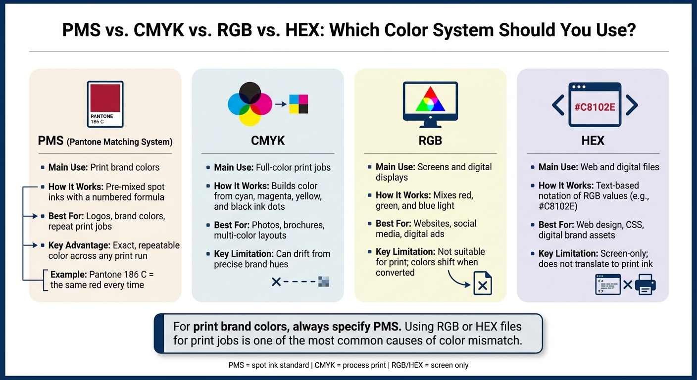
PMS vs. CMYK vs. RGB vs. HEX: Which Color System Should You Use?

PMS vs. CMYK vs. RGB vs. HEX: Which Color System Should You Use?

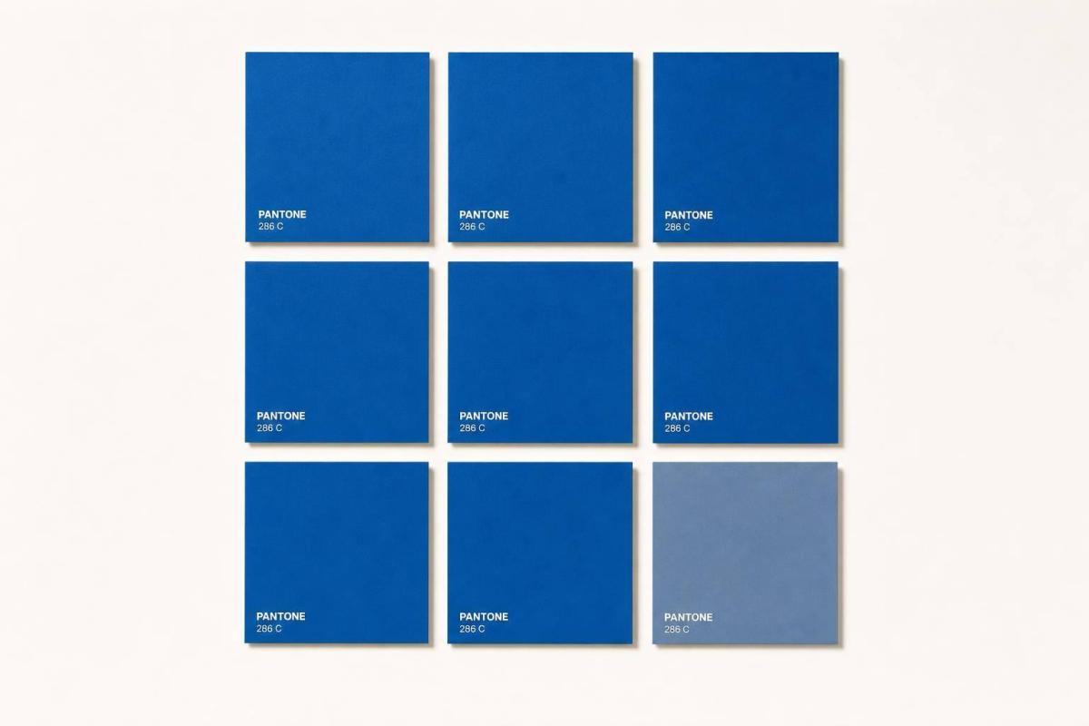
The Pantone Matching System (PMS) is a standard library of pre-mixed ink colors, and each one has its own number. That number matters. When a brand uses the same PMS code every time, its color stays repeatable from one print run to the next.

So if a brand calls for Pantone 186 C as its red, that exact code can be used again on later jobs. The goal is simple: keep that red looking like the same red on business cards, letterhead, folders, and other printed pieces.

How PMS Creates Repeatable Print Color

Each PMS color comes with a formula guide that tells printers how much base ink to mix. Once a brand picks a PMS color, that code becomes the fixed point of reference for future print jobs.

PMS colors also come in versions for different paper types. For example, Pantone 3005 C is meant for coated stock, while Pantone 3005 U is meant for uncoated stock. That small suffix does a lot of work, because the same color can shift depending on the paper. If you choose the right version, the brand look stays more even across materials.

What Brand Color Consistency Means in Practice

Brand color consistency means people keep seeing the same familiar colors across printed items like business cards, envelopes, signage, packaging, and mailers. A brand standard also spells out where each color should appear, so pieces stay lined up across jobs and substrates.

Without those rules, little shifts can start to pile up. One run looks slightly darker. Another leans greener. Before long, a logo that should look navy on every piece shows up navy on one item and teal on another. It’s a small miss, but people notice it. The whole brand can feel less polished.

PMS vs. RGB, CMYK, and HEX

These color systems do different jobs, and mixing them up is one of the main reasons branded materials come back with color that looks off.

System Main Use How It Works
PMS Print brand colors Pre-mixed spot inks with a numbered formula
CMYK Full-color print jobs Builds color from cyan, magenta, yellow, and black dots
RGB Screens and digital displays Mixes red, green, and blue light
HEX Web and digital files Text-based notation of RGB values

RGB and HEX describe screen color, not ink. A monitor gives off color, while paper reflects it. That’s why a brand blue can look one way on screen and another way in print, especially when a printer is working from an RGB file instead of a PMS spec.

CMYK is used for print, but it builds color from four inks. Because of that, it can drift from a precise brand hue. For print pieces where brand color needs to stay tight, PMS is often used as the main reference.

That repeatable print result makes color easier to recognize from one piece to the next. And that’s where consistency starts to show up in a very practical way.

What Research Says About Color Consistency, Recognition, and Trust

PMS locks in a brand color as a repeatable ink formula. So when research looks at recognition and trust tied to color consistency, it maps neatly to print.

How Color Consistency Improves Recognition and Recall

Consistent color use can increase brand recognition by up to 80%, a widely cited figure from Loyola University Maryland research. The idea is pretty straightforward: when people see the same colors again and again, they connect them to the same brand faster.

That matters in places where attention is split and time is short. Think retail shelves, trade show booths, or direct mail in a crowded mailbox. Familiar color patterns make it easier for people to spot a brand and remember it later.

How Consistent Visuals Support Credibility

Research on corporate visual identity ties consistent PMS-based design systems to higher professionalism and reliability ratings. When a logo, color palette, typography, and layout stay aligned across materials, people tend to rate the organization as more trustworthy than they do when those same elements shift from piece to piece.

A small color change can do more damage than most teams expect. If a blue looks one way on a brochure and another way on a sell sheet, it can chip away at trust without anyone saying a word.

Limits of the Research

Color can support trust, but it doesn’t create trust by itself. Most studies look at color as one part of a larger visual system, so it’s hard to pin down exactly how much color alone is doing.

Context matters too. What works in one market may land differently in another, and long-term loyalty still depends far more on product quality and service reliability than on visual polish. That’s why PMS works best as a control tool, not a promise of trust.

Study Summary Table

Study/Source Sample or Context Main Finding Trust Implication
University of Loyola, Maryland (widely cited) Brand recognition research Consistent color use increases brand recognition by up to 80% Stable PMS colors help customers identify a brand faster across print touchpoints
Corporate visual identity research Organizations evaluated across multiple materials Consistent logo and color application raised professionalism and reliability ratings PMS-matched print materials signal a more trustworthy operation
Eye-tracking and retail simulation studies Shoppers in complex visual environments Stable color schemes reduced visual search time and improved brand recall Consistent PMS color in signage and displays speeds recognition in crowded settings
Brand-color fit research Consumers evaluating brand materials by category fit Color consistency and fit with brand category improved credibility more than color choice alone Repeatable PMS colors reinforce brand positioning across every printed piece

These findings hit hardest when a brand needs the same color to print the same way across repeat jobs.

How PMS Delivers Dependable Color Results in Print

Research shows that color consistency can help build trust. But that kind of consistency doesn’t just happen on its own. It comes from using PMS specs the right way through each stage of printing.

Where PMS Helps Most in Printed Materials

PMS matters most on printed pieces customers see again and again. That includes business cards, signage, brochures, and direct mail. If those items don’t match from one order to the next, the brand can start to feel off, even if people can’t quite explain why.

That’s where PMS does its job. It keeps the color formula fixed across print jobs, which helps the same brand color show up the same way across touchpoints.

Why Proofing and Print Coordination Matter

A digital proof can check layout, spacing, and design. But it can’t show how ink will look on paper.

A printed proof on the actual stock, or something close to it, gives you that check before the full run starts. It shows how the PMS color will print in practice. From there, compare the proof against an approved Pantone guide or a past approved print.

It also helps to document the approved PMS code, paper stock, and finish for each reorder. If that record is missing, small shifts in production can lead to color drift over time without anyone noticing right away. In most cases, print mismatches come from a few common production changes, not random surprises.

Common Causes of Print Color Mismatch

The main causes of color shift are pretty straightforward:

  • Paper stock changes
  • File conversion errors
  • Lighting
  • Different print methods

Coated stock tends to print brighter. Uncoated stock absorbs more ink, so the color usually looks softer.

How Miro Printing & Graphics Inc. Supports Consistent Color

This kind of control matters even more when one brand appears across many formats. Miro Printing & Graphics Inc. in Hackensack, NJ helps keep approved PMS specs aligned across digital, offset, large-format, and mailed pieces by carrying color, stock, and proof details through production.

Practical Steps for Keeping PMS Colors Consistent Across Print Jobs

Once your PMS colors are approved, the job isn’t done. You need to tie every file, proof, and reorder to that same color code so the color stays the color.

Set Approved PMS Colors in Your Brand Standards

Document approved PMS colors before anything goes to press. That way, the same brand color keeps pointing to the same brand every time it appears. In a short brand standards sheet, list each PMS number, the coated or uncoated suffix, CMYK, HEX, RGB, and basic usage rules. Then share that sheet with anyone who creates or orders branded materials.

For each brand color, record:

  • The PMS number
  • Its CMYK breakdown
  • The matching HEX and RGB values
  • Simple usage rules, like which color is for logos, which is for backgrounds, and which tints or pairings are not allowed

Use the current physical Pantone chip as the official reference for each color. Screens drift. Physical swatches are the standard you can trust.

Use the Same Specifications on Every Reorder

Reorders are where brands often start to slip. Using the same specs each time is what keeps customer-facing pieces looking familiar. Every print order should include the exact PMS numbers and suffixes, the paper stock, the print method, and any coatings or laminates.

A simple setup is to create a master job packet for each repeat item, like business cards, rack cards, or brochures, and keep it in a shared location. The packet should include the final print-ready files, the PMS callouts, and an approved physical sample from the last run. When it’s time to reorder, send the packet to the printer – not a verbal description, not a screenshot. Use a fixed file naming system so the right version is easy to spot.

If the paper stock, coating, or print method changes, update the brand guide and note that change. And don’t swap PMS numbers casually for something “close enough” without writing it down. That’s usually where color drift begins.

Store each packet with your brand files so the next reorder starts from the same specs.

Review Proofs Before Full Production

Even when a PMS color is documented, it still needs a physical check before production. For customer-facing pieces, ask for a physical proof on the final stock.

When the proof arrives, compare it directly to the Pantone chip under neutral lighting. Check every place the brand color appears – logos, headlines, icons – to make sure it stays consistent. Also look for shifts caused by overprints, gradients, or transparency effects. For folded pieces like brochures or folders, check that the color holds across folds and on both sides. If something looks off, send the printer direct written feedback. For example: brand red reads too orange; please adjust closer to PMS 186 C. Approve it in writing only after it matches.

It also helps to keep a few clean copies from each approved run as reference samples. Those become your physical benchmark for later jobs. If a new piece needs to match an existing one, send that approved sample with the files and ask the printer to match the sample directly, not just the digital file.

Conclusion: The Business Case for PMS-Based Color Consistency

Put it all together, and the takeaway is pretty simple: color consistency is a business choice. Research links steady brand communication and repeated color use with stronger brand trust, loyalty, and recall.

When people keep seeing the same PMS color, they learn to spot your brand faster. Over time, that color starts to signal reliability.

That’s where PMS helps. It ties each print job to one ink formula, so your brand red stays the same red from one reorder to the next. This matters most when you’re reprinting the same materials over time. It can also cut down on reprints and make print costs easier to plan for.

Key Takeaways for U.S. Print and Branding Workflows

In day-to-day print work, that means:

  • Consistent color builds recognition and trust. Steady, repeatable color use helps people know your brand and see it as more trustworthy.
  • PMS makes consistency a process, not a guess. Documented PMS codes give every printer – and every reorder – a fixed reference point that stays fixed.
  • Proofing is a critical quality check. A physical proof can catch color shifts before full production.
  • Each accurate reprint reinforces the same brand cue. Every consistent reproduction adds to brand equity over time.

Miro Printing & Graphics Inc. in Hackensack, NJ helps keep approved colors aligned across offset, digital, and large-format jobs so the same brand color carries through every piece.

FAQs

When should I use PMS instead of CMYK?

Use PMS when you need exact, repeatable brand color matching for spot colors like logos and packaging. It also makes sense for specialty inks like metallics and fluorescents.

CMYK works better for full-color images and photos, where smooth blends and print cost matter more than exact spot-color matching.

Why does the same PMS color look different on different paper?

The same PMS color can look different from one paper stock to another. That happens because paper changes how ink behaves. Absorption, texture, finish, and drying time all play a part, and those details affect both how the ink sits on the page and how light bounces off the surface.

A simple example makes this clear: uncoated paper can make a color look duller, while glossy paper often makes it look brighter and more vibrant.

Do I still need a physical proof if my colors are documented?

Yes. Even if you already have documented PMS codes and color profiles, a physical proof still matters.

Why? Because it shows how ink, material, lighting, and the printing method work together in the finished piece. On a screen or in a file, everything can look fine. But once the job hits paper or another surface, small color shifts can show up fast.

A physical proof helps catch those differences early, before they turn into expensive mistakes during the full print run. That’s why Miro Printing & Graphics Inc. uses a careful proofing process before moving into full production.

Related Blog Posts

https://app.seobotai.com/banner/banner.js?id=6a7a6894d642d19a97929966

Materials for 3D Printed Signage Explained

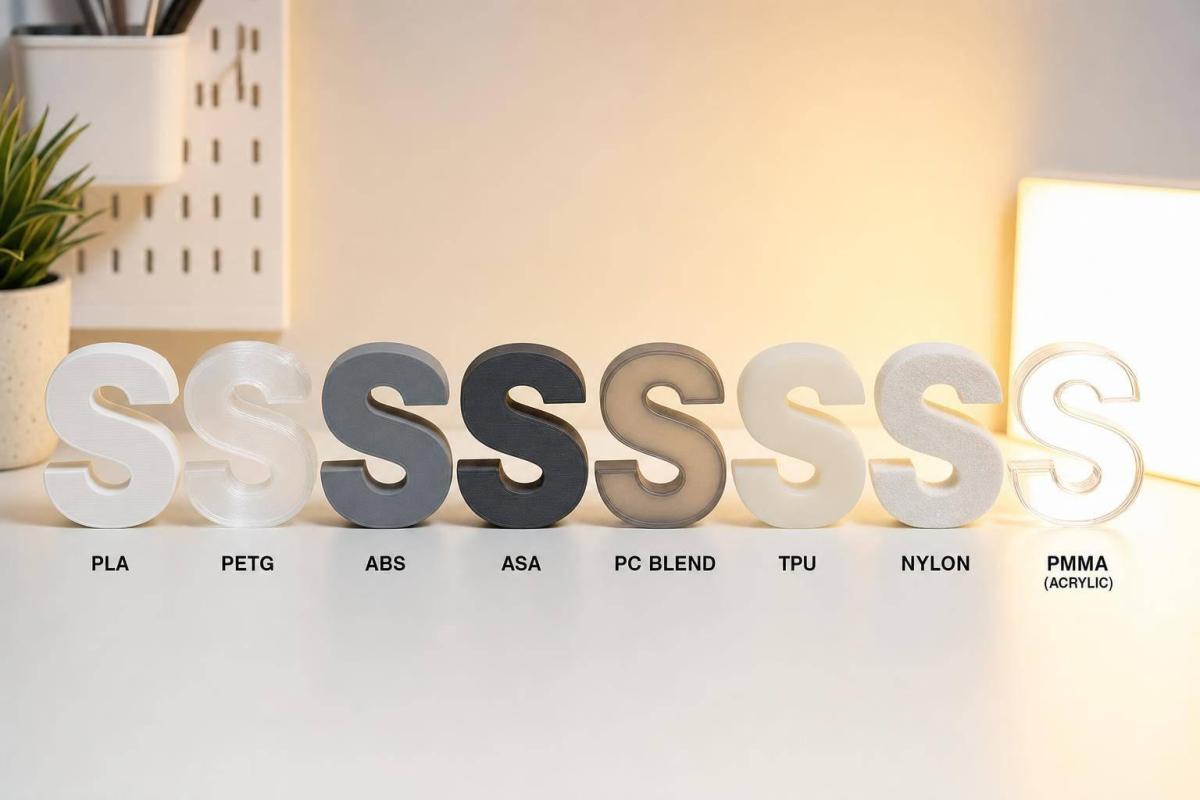
Compare PLA, PETG, ABS, ASA, PC blends, TPU, Nylon and PMMA to pick the right material for indoor, outdoor, and backlit signs.

If I had to boil this down to one line, it’s this: pick the material based on sun, heat, light, and stress – not just price or print ease. A sign that looks fine indoors can fail fast outside, especially when surface temperatures hit 120–140°F in summer and UV exposure stays high.

Here’s the short answer:

  • PLA works best for indoor, short-term signs
  • PETG is a good step up for tougher indoor use and light outdoor exposure
  • ABS fits indoor structural parts that may see heat
  • ASA is the top choice for permanent outdoor signs
  • PC/PETG blends suit lit signs that need more heat resistance and impact strength
  • TPU and Nylon are best for support parts, not display faces
  • Acrylic/PMMA hybrids are the go-to for premium backlit faces, with about 92% light transmission and outdoor life often around 7–12 years for cast grades

A few numbers tell the story fast:

  • PLA softens around 131–149°F
  • Clear PETG can transmit about 85–90% of light
  • ASA holds up far better in UV than ABS
  • TPU can stretch about 200–700% before breaking
  • PMMA gives the cleanest lit face in this group

If you’re choosing between materials, the main tradeoffs are simple:
PLA = easiest and lowest cost
PETG = middle ground
ASA = outdoor-first
PMMA = best-looking lit face

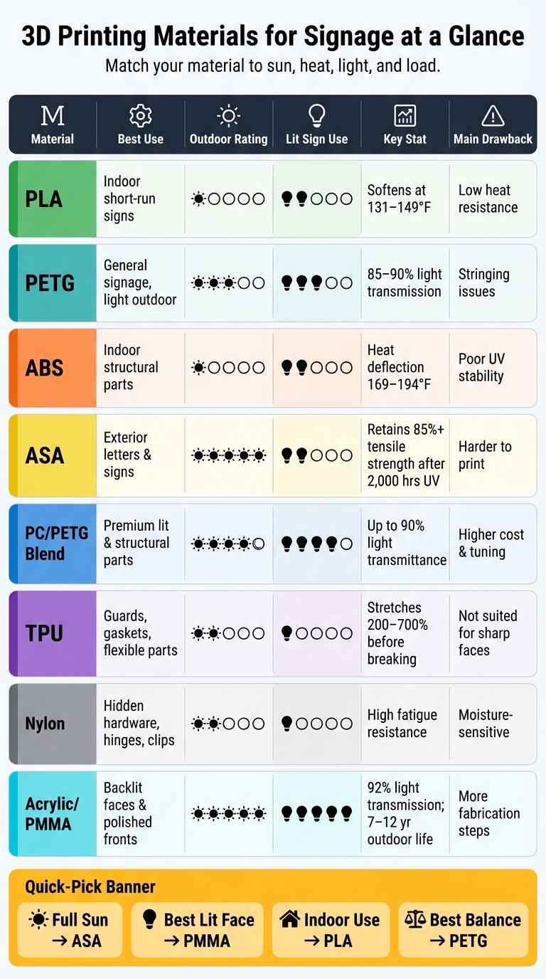
3D Printing Materials for Signage: Side-by-Side Comparison Guide

3D Printing Materials for Signage: Side-by-Side Comparison Guide

Quick Comparison

Material Best Use Outdoor Use Lit Sign Use Main Drawback
PLA Indoor short-run signs Poor Limited Softens in heat
PETG General signage, light outdoor use Fair to good Good Can string while printing
ABS Indoor structural parts Poor without coating Mostly structural only UV damage outdoors
ASA Exterior letters and signs Very good Limited for faces Harder to print
PC/PETG Blend Premium lit and structural parts Good with UV care Good Higher cost, more tuning
TPU Guards, gaskets, flexible parts Grade-dependent Limited Not suited for sharp faces
Nylon Hidden hardware, hinges, clips Limited Poor Moisture-sensitive
Acrylic/PMMA Hybrid Backlit faces and polished sign fronts Very good Best More fabrication steps

So if I were making a fast call: use ASA for sun, PETG for general use, PMMA for face quality, and PLA only when the sign stays indoors.

1. PLA

PLA (polylactic acid) is one of the most common filaments in FDM 3D printing. It prints at fairly low nozzle temperatures, usually around 190–210 °C (374–410 °F), with less warping than ABS. In many cases, you can print it with little or no heated bed at all. For short-run indoor signage, that makes PLA a quick, low-hassle choice.

Outdoor Durability

PLA is an indoor-first material. Its glass transition temperature sits around 55–65 °C (131–149 °F), which means it can start to soften if it sits on a sunlit surface during a hot day. Outside, UV exposure can fade the material, and direct sun plus rain can make it brittle within a few months. In plain terms, PLA works well in controlled indoor spaces, but it’s a poor match for signs that have to live in the weather.

Printability

If PLA has a main selling point, it’s how easy it is to print. It works on basic machines, holds small details well, and is easy to sand, prime, and paint. That matters when you want clean lettering, crisp edges, or a polished finish without a lot of fuss. For better durability, use thicker walls and filleted mounting holes to help cut down on cracking.

Optical Performance

PLA comes in a wide range of colors, so it’s a solid pick for opaque, solid-color signs. But it’s usually not the best option for backlit panels or light-diffusing parts. In those cases, optical clarity and heat tolerance matter more, and PLA tends to fall short.

Best-Fit Applications

PLA fits jobs like indoor nameplates, retail shelf labels, point-of-sale signs, trade-show graphics, classroom signage, prototype signage, and temporary promotional displays. It makes the most sense for short-life indoor graphics where fine detail matters more than weather resistance. If you need an indoor sign with more toughness, or something that may face a bit of outdoor exposure, PETG is the next step up.

2. PETG

PETG

PETG (polyethylene terephthalate glycol) sits in a nice middle spot for signage. It’s easy to print, takes hits well, and stays clear enough for many lit sign jobs.

Outdoor Durability

PETG handles outdoor use better than PLA, but standard grades still need some help in the sun. Standard PETG has moderate UV resistance, yet long exposure can still lead to yellowing, haze, and embrittlement.

UV-stabilized PETG does much better in accelerated weathering tests. If you’re using standard PETG, it’s smarter to place it in covered areas or add a UV clear coat. That’s why PETG makes sense when you need a material that prints easily but can also deal with some outdoor use.

Printability

PETG usually prints at 230–250 °C with a 70–85 °C bed, and it bonds well while keeping warp low. In plain English: it’s far less fussy than some other outdoor-capable plastics.

The main headache is stringing. You can cut that down with:

  • dry filament
  • tuned retraction
  • a slightly lower print temperature

Bed adhesion is strong, sometimes too strong, so parts can stick harder than you want. Controlled bed prep or a release agent helps avoid that problem.

Optical Performance

Clear PETG offers 85–90% light transmission, which is enough for backlit logos, LED diffusers, and illuminated inserts. That makes it a solid pick when you want light to pass through without jumping to a more brittle material.

Its big selling point is impact toughness. That matters for signs that get handled, shipped, installed, or bumped in high-traffic areas. You can also tweak wall thickness and infill to change how the light spreads and cut down LED hotspots. So PETG can work for both illuminated faces and sign parts that need to take some abuse.

Best-Fit Applications

PETG works well for:

  • outdoor dimensional letters
  • wayfinding signs
  • backlit logo elements
  • retail display parts
  • mounting brackets
  • standoffs

It’s also a good fit for short-run custom signage when toughness and easy printing matter most. For full sun or hotter conditions, ASA is the next material to look at.

3. ABS

ABS sits in the middle ground between PETG and ASA. It’s tougher than PETG, but it doesn’t do well in full sun. ABS (acrylonitrile butadiene styrene) is a step up from PLA when you need indoor sign parts that can take bumps, heat, and day-to-day handling. It’s a tough thermoplastic with a typical tensile strength of 40–50 MPa and strong impact resistance, which makes it a solid fit for indoor sign work that sees wear.

Outdoor Durability

This is where ABS starts to struggle. Standard ABS has poor UV resistance. After a few months in direct sunlight, it can yellow, chalk, and turn brittle. If you need to use it outside, add a UV-resistant paint or clear coat to slow that damage. Even then, ABS works better in shaded or partly protected spots.

Heat, though, is one of its strong points. Its heat deflection temperature usually falls between 76–90 °C (169–194 °F), and its glass transition temperature is around 100–108 °C. In plain English: ABS handles hot summer days and areas near lighting fixtures better than PLA.

Printability

ABS asks more from your printer than PLA or PETG. You’ll usually need:

  • A heated bed
  • An enclosure
  • Low cooling to help cut warping

It also gives off styrene fumes, so ventilation or filtration matters.

Optical Performance

Standard ABS is opaque, so it’s not the right pick for backlit faces or light-diffusing panels. It blocks light well, which is useful for the body or back wall of channel letters when you want to contain LED light and stop light bleed.

For illuminated signs, ABS usually handles the structural side, while a clear or translucent material like acrylic (PMMA) or PETG handles the face. You can also paint the inside of ABS housings white or line them with reflective film to get more from the light output.

That makes ABS a structural material, not a face material, for illuminated signs.

Best-Fit Applications

ABS works best in indoor signage like dimensional lobby logos, trade show displays, retail fixtures, and equipment nameplates. It’s also a strong choice for mounting brackets, back boxes, and internal frames in both indoor and outdoor signs, as long as the material stays out of direct sun.

One reason people keep coming back to ABS in finish-heavy projects is simple: it sands well, solvent welds well, and takes paint well. It also finishes more smoothly than PETG. If the sign face will sit in full sun, ASA is the better move.

4. ASA

When ABS is almost right but direct sun is the dealbreaker, ASA usually makes more sense. You can think of it as ABS’s outdoor cousin: similar in many ways, but built to handle UV exposure and weather much better.

Outdoor Durability

ASA is made to resist yellowing, chalking, embrittlement, and loss of impact strength during long stretches of sun and weather exposure. For exterior signs, that matters a lot. A sign can look good on day one, but if it fades, turns brittle, or starts looking worn after a season outside, that’s a problem.

That’s why ASA works well for exterior signs that need to stay readable and presentable through sun, rain, and seasonal temperature swings.

Printability

ASA prints a lot like ABS. You’ll want a heated bed, higher nozzle temperatures, and an enclosure. Good ventilation still matters, and cooling needs to stay under control.

For large sign panels or long sets of letters, a stable print setup becomes even more important. If the print area temperature bounces around too much, warping and layer issues can show up fast.

Optical Performance

ASA usually has a matte-to-satin finish, which helps cut glare and works well for bold outdoor lettering. That can make signs easier to read in bright light.

If you want a more polished look, sanding, priming, and painting can give ASA a cleaner, more professional finish. And because ASA handles UV exposure well, those finishes tend to last longer outdoors.

Best-Fit Applications

ASA is a strong fit for:

  • outdoor nameplates
  • storefront letters
  • building identification signs
  • wayfinding markers
  • house numbers
  • branded exterior plaques

It also works well for mounting brackets and other sign parts that sit in direct sun. If outdoor life matters more than easy printing, ASA is usually the better pick.

5. PC/PETG Signage Blends

PC/PETG blends sit in the middle ground between easy-print PETG and higher-heat polycarbonate. If standard PETG gets you close but not quite there, this blend gives you more heat resistance and better clarity. You’re getting polycarbonate’s strength and heat handling, mixed with PETG’s toughness, chemical resistance, weather resistance, and transparency. The result is a material that holds up well without being as fussy to print as straight PC.

Outdoor Durability

PC/PETG blends handle heat better than standard PETG. They also offer moisture resistance and chemical stability, which helps limit swelling and surface wear in humid or urban settings. Mechanical testing shows these alloys can reach tensile strength close to pure PC, while also posting better elongation at break and impact resistance. In plain English: they’re less likely to crack when stressed.

For very high-UV areas like the southwestern U.S., it makes sense to use a UV-stabilized grade or keep the sign out of direct sun when possible. Untreated PC-based materials can yellow over time.

That extra performance does come with a catch: print settings need a bit more care.

Printability

PC/PETG blends usually print at nozzle temperatures of about 230–260 °C (446–500 °F), which is hotter than standard PETG. A heated bed in the 70–90 °C (158–194 °F) range helps with adhesion. Drying the filament before printing also helps cut down on surface haze and stringing.

As the PC content goes up, the blend gets harder to extrude. So compared with standard PETG, dialing in settings takes more effort. If you want clean edges and a polished finish, it’s smart to tune retraction and cooling before you jump into a full sign batch.

Optical Performance

Clarity is where these blends stand out for signage. Research on PC/PETG alloys reports light transmittance up to 90%, which makes them a solid choice for illuminated parts. The PC portion helps the material keep its shape near heat sources like LED modules, while PETG helps the surface stay smooth and less prone to microcracking.

That mix works well for:

  • Backlit lettering
  • Translucent logo panels
  • Protective covers over LED arrays

Compared with standard PETG, you get higher clarity along with better heat handling.

Best-Fit Applications

These blends make sense for premium signs that need clear faces, impact resistance, and a longer service life. Good fits include illuminated channel letters, exterior corporate logos, and durable wayfinding signs exposed to both foot traffic and weather.

The main downside is cost. So it’s usually best to save PC/PETG blends for premium, long-life installations.

6. TPU

Unlike the rigid materials above, TPU comes into play when flexibility matters more than stiffness. It’s the outlier in this group: soft instead of rigid, and better suited to protective or functional sign parts than main sign faces. TPU is an elastomeric thermoplastic that can stretch 200–700% before breaking, depending on the grade.

Outdoor Durability

TPU handles abrasion, impact, and repeated flexing well, which makes it a good match for sign parts that get bumped, handled, or exposed to vibration. It also resists oils, greases, and many chemicals. Many grades work reliably in a temperature range of about -40°F to 176°F (-40°C to 80°C).

One catch: UV resistance depends on the formulation. If the part will sit in full sun, check with the filament maker to make sure the grade is UV-stabilized before using it in a long-term outdoor install.

Printability

TPU prints best with a direct-drive extruder, low print speeds, short retractions, and fully dried filament. Since the material is soft, it can buckle or jam in Bowden-style systems. That’s why extruder setup is the biggest print choice here.

Optical Performance

TPU is not the first pick for crisp, glossy sign faces. Its flexible surface usually looks less sharp and less glossy than acrylic or PETG. Still, translucent TPU grades can create a frosted look that works well for flexible LED diffusers, flexible light guides, or protective overlays in backlit signs.

Best-Fit Applications

TPU works well for parts like:

  • Vibration-damping mounts
  • Edge guards
  • Gaskets
  • Strain relief
  • Clips
  • Soft-touch branding accents

It also pairs nicely with rigid PETG or acrylic when the assembly needs extra impact protection. In most sign builds, TPU plays a support role, not the main display surface.

7. Nylon

Nylon plays a support role in sign builds, not a face-material role. It’s an engineering filament that makes the most sense for hidden parts that carry load, flex under stress, rub against other parts, or get handled again and again.

Outdoor Durability

Outdoors, nylon holds up well from a mechanical standpoint. But it has two big weak spots: it absorbs moisture, and UV exposure can warp parts, throw off accuracy, and make unmodified nylon brittle over time. That’s why UV-stabilized PA12 is the safer pick, and even then, it’s better suited to exterior hardware with limited exposure.

For most outdoor sign projects, nylon works best behind the sign face, not on the visible surface. Think brackets, mounts, and support parts that stay out of direct view. Because nylon reacts so much to moisture, drying and enclosure control aren’t optional extras here – they’re part of the deal.

Printability

Nylon can be a pain to print. In most setups, it needs high temperatures, an enclosure, and very dry filament. Leave a spool out in open air, and print quality can start dropping within hours.

Before printing, dry nylon at 158–176°F (70–80°C) for 8–12 hours. Then store it in an airtight container with desiccant between print sessions. If your shop already runs engineering filaments, this is probably just part of the routine. If not, nylon adds extra steps, extra gear, and extra room for error.

Optical Performance

Nylon isn’t the material you pick when looks come first. Most prints come out semi-opaque with a matte or satin finish, which makes nylon a poor fit for translucent sign faces, backlit panels, or anything that depends on bright color, surface clarity, or a glossy finish.

Put simply: nylon is about strength, not looks.

Best-Fit Applications

In hybrid sign builds, nylon belongs behind the display surface. It works well for:

  • Clips
  • Living hinges
  • Snap-fit panels
  • Cable guides
  • Other parts that need repeated flexing or impact resistance

Use nylon when the part needs to take abuse. Don’t use it for appearance.

8. Acrylic/PMMA Hybrid Constructions

For visible sign faces, the focus shifts. It’s less about how well a material prints and more about how good it looks once it’s on the wall. That’s where acrylic, or PMMA, comes in.

In many signage jobs, the setup is pretty simple: 3D printing handles the structure, and PMMA handles the finish. Acrylic is usually used as a pre-cut face panel or overlay, then bonded to a 3D-printed core. So while the printed part does the heavy lifting, the acrylic face is what people actually see.

Outdoor Durability

UV-stabilized PMMA generally holds up outdoors better than printed plastics. For exterior installs, use sign-grade UV-stabilized acrylic. That extra weather resistance matters when a sign has to sit in the sun day after day.

There’s one catch: acrylic moves with temperature changes. It expands and contracts, and if the panel is locked down too tightly, it can crack over time. That’s why outdoor assemblies should use slotted mounting holes or compliant tapes instead of rigid fasteners.

Printability

PMMA is usually cut, not FDM printed. In most shops, it’s shaped with a laser cutter or CNC router, then attached to the printed structure.

The printed parts – most often PETG or ABS – are built with recesses, standoffs, or slots so the acrylic inlays fit cleanly. From there, the face is bonded with a suitable acrylic adhesive or a high-bond tape, depending on the interface.

That makes the job split pretty clear:

  • Acrylic/PMMA is the face material
  • The 3D-printed core is the structural support

Optical Performance

Acrylic’s biggest strength is optical clarity. Clear PMMA transmits about 92% of visible light, which is noticeably better than most 3D-printed surfaces.

That difference shows up fast in lit signage. For backlit signs, opal or translucent acrylic helps spread LED hotspots into smooth, even illumination across a logo or letter face. Clear PMMA can also carry edge-lit light from embedded LEDs, which creates the glowing outline effect you see in many retail and architectural signs.

There’s also a finish benefit here. Put an acrylic face over a printed frame, and colors tend to look richer while the whole sign feels more polished.

Best-Fit Applications

Acrylic/PMMA hybrids are common in:

  • Illuminated channel letters with printed bodies and acrylic faces
  • Storefront identity signs
  • Interior wayfinding panels
  • ADA-compliant plaques

Use this hybrid approach when face quality, UV stability, and a premium finish matter more than impact resistance. That tradeoff is what the next section weighs material by material.

Performance Tradeoffs: Material by Material

Now that each material is on the table, the next step is simple: match the material to the job.

In practice, the choice usually comes down to four limits: sun, heat, light, and load. That’s where the tradeoffs show up. The big ones are outdoor life, ease of printing, and how the material handles light.

Outdoor Durability

For outdoor use, ASA and PMMA sit at the top. PETG lands in the middle. PLA, ABS, nylon, and TPU can work, but they need more shielding.

The gap between ASA and ABS is hard to ignore. ASA keeps more than 85% of its tensile strength after 2,000 hours of UV exposure, while ABS falls below 60% under the same test conditions. On a storefront sign or a building facade that gets full sun day after day, that difference matters.

Printability

If ease of printing is the main concern, PLA is the easiest starting point. PETG comes next.

After that, things get trickier. ABS, ASA, and PC blends need more control. Nylon can be finicky. TPU usually works best with a direct-drive setup. And PMMA is in a different lane altogether, since it’s usually fabricated outside standard FDM printing.

Optical Performance

For illuminated signage, PMMA is the top pick. It handles light well and is the go-to choice for clean, bright sign faces.

Translucent PETG is a solid second choice for lightly backlit parts where some diffusion is fine. Printed plastics sit lower here. ABS and ASA are mostly opaque, though they take paint well. PC/PETG blends can work as semi-transparent protective diffusers if the print settings are dialed in.

Quick-Selection Reference

Use the table below for fast material selection.

Material UV Resistance Warping Risk Enclosure Needed Best-Fit Application
PLA Poor Very low No Indoor logos, short-term event signs
PETG Moderate Low Optional Semi-outdoor panels, functional parts, lightly backlit pieces
ABS Poor High Yes Indoor structural parts, heat-exposed housings (coated)
ASA Excellent Medium Yes Outdoor building signs, permanent exterior lettering
PC/PETG Blend Variable (formulation-dependent) Medium–High Yes Structural brackets, protective covers, thermal-cycling parts
TPU Limited Low No Flexible bumpers, impact guards, gaskets
Nylon Limited High Yes Internal mechanical parts, fastener interfaces
Acrylic/PMMA Excellent N/A (not FDM) N/A Backlit channel letter faces, illuminated cabinet signs

Pros and Cons of Each Material

Here’s the fast version: each material has one clear upside, one tradeoff, and one job it fits best.

  • PLA – The cheapest option and the easiest to print. The downside is heat: it softens around 140°F (60°C) and tends to break down fast outdoors. Best for indoor logos and event signs.
  • PETG – A solid middle ground between toughness and print ease. Its main drawback is that it often needs more tuning to control stringing. Best for general indoor use and light outdoor panels.
  • ABS – Strong for indoor parts and handles heat well. The catch is weak UV resistance, which can lead to yellowing and cracking outside. Best for indoor structural parts.
  • ASA – This is where ABS comes up short. ASA has strong UV and weather resistance, but it asks more from your print setup. Best for permanent exterior lettering.
  • PC/PETG Blend – Built for strength, especially in load-bearing or heat-stressed parts. The tradeoff is tougher printing and more work during finishing. Best for brackets and protective housings.
  • TPU – Flexible, shock-absorbing, and good where you don’t want scuffs or hard contact. But it’s not a good pick for sharp, clean lettering. Best for edge guards, clips, and non-marring feet.
  • Nylon – Strong and fatigue-resistant, which makes it useful for hidden hardware that takes stress over time. The issue is moisture sensitivity and a more technical print process. Best for hinges, wall-mount brackets, and high-load hardware. Both TPU and Nylon are support materials, not display faces.
  • Acrylic/PMMA – Offers the highest light transmission at roughly 92–93% and a proven outdoor lifespan of 7–12 years for cast grades. The tradeoff is added fabrication steps and higher cost. Best for backlit channel letters and illuminated cabinet faces.

Use this recap when you need to make a quick material call.

Material Key Strengths Main Limitations Ideal Use Cases
PLA Easy to print; low cost; sharp detail Low heat resistance; weak outdoor durability Indoor logos, prototypes, event signs
PETG Tough; moderate heat and moisture resistance; good adhesion Stringing; slightly higher cost Indoor signage, covered entrances, light outdoor panels
ABS Heat-resistant; smoothable finish Warps easily; poor UV stability Indoor structural parts, illuminated cabinet internals
ASA Excellent UV and weather resistance; color-stable More demanding print setup Permanent outdoor letters, building signs
PC/PETG Blend High impact strength; strong structural performance Higher print temperatures; more difficult to finish Load-bearing brackets, protective housings
TPU Flexible; shock-absorbing; wear-resistant Not ideal for crisp lettering Edge guards, flexible clips, non-marring feet
Nylon Strong; fatigue-resistant; durable hardware Moisture-sensitive; technically demanding Hinges, wall-mount brackets, high-load hardware
Acrylic/PMMA High light transmission; premium appearance; long outdoor life More complex fabrication; brittle under heavy impact Backlit channel letters, illuminated cabinet faces

Conclusion

No single material works for every sign. The right pick depends on where the sign will live, how it will be lit, how long it needs to last, and what you want to spend.

In most cases, the choice comes down to four things: sun, heat, light, and load.

  • PLA – indoor, short-term
  • PETG – covered or light outdoor use
  • ASA – permanent outdoor use
  • PC/PETG – illuminated signs that need strength and clarity
  • TPU/Nylon – mounts, clips, and hinges
  • PMMA – premium illuminated faces

For mixed-use or illuminated builds, Miro Printing & Graphics Inc. can help with design, printing, and finishing.

Start by matching the material to the sign’s conditions. Then look at cost and how easy it is to print.

FAQs

Which material lasts longest outdoors?

For long-term outdoor signage, cast vinyl and metal are two of the toughest options.

Cast vinyl usually lasts 7 to 10 years outdoors. Some premium grades can last up to 12 years.

Metal substrates, including aluminum, also hold up very well. They offer strong fade resistance and rust-proof durability.

Pair either material with UV-cured or hard solvent inks, and both can perform very well in harsh weather.

What should I use for a backlit sign face?

For a backlit sign face, glossy vinyl is a smart pick because it shows well and works nicely with internal lighting.

Miro Printing & Graphics Inc. can help you choose the best substrate for your project by weighing durability, finish, and site conditions.

When is PETG better than PLA?

PETG is a better pick than PLA when outdoor signage needs to last. PLA works fine for basic printing, but recycled PETG is often the better choice for indoor and outdoor displays because it handles weather much better.

When a sign has to keep performing over time in sun, wind, and rain, PETG offers the kind of durability many standard plastics just don’t have.

Related Blog Posts

https://app.seobotai.com/banner/banner.js?id=6a7919e4d642d19a97928326

Ultimate Guide to Magazine Printing Services

Clear guide to magazine print specs, paper, binding, proofing, and choosing digital vs. offset to control cost and timing.

Printing a magazine comes down to a few core choices: size, page count, paper, binding, print method, and delivery. If you lock those down early, you can avoid file problems, control costs in U.S. dollars, and keep your schedule on track.

Here’s the short version:

  • Most magazines use trim sizes like 8.5" × 11" or 5.5" × 8.5"
  • Page counts must be in multiples of 4
  • Bleed is usually 0.125", and safe margins for text are 0.25" to 0.375"
  • Images should be 300 dpi at final size
  • Files should be CMYK, not RGB
  • Digital printing often fits short runs and fast turnarounds
  • Offset printing often fits runs above 2,000 copies
  • Saddle stitch often works for 8–64 pages
  • Perfect binding often works for 28–300+ pages
  • Proofing, finishing, mailing, and shipping all affect the final timeline and cost

In other words: if I’m planning a magazine, I need to think past the design. I need a print-ready file, the right production method, and a printer that can handle proofing, binding, and delivery without confusion.

A few details drive most of the outcome:

  • Page count affects paper use, binding, and price
  • Trim size affects layout and mailing
  • Paper stock changes how photos and text look
  • Binding affects durability and spine space
  • Prepress checks help catch low-res images, missing fonts, and wrong color modes before printing
  • Delivery planning matters if copies need to arrive before an event, launch, or mailing date

If I had to boil the article down to one point, it’s this: magazine printing works best when the specs, files, proofing, and delivery plan all match from the start. The rest of the guide walks through how to do that in a clear order.

How to Plan and Design a Print-Ready Magazine

Build the flatplan, page count, and layout grid

Once the issue structure is locked, the next step is page planning. Start with a flatplan. Map every page, lock in the cover and ad positions, and then place feature stories across clean spreads. That takes the editorial plan and turns it into a working page order before you touch the layout itself.

Page count has a direct effect on cost. Printers price jobs based on total pages and quantity, so even a small shift, like 64 pages vs. 72 pages, can change the budget in a noticeable way at higher print runs. A 64-page magazine built in 16-page signatures is more efficient than a 62-page magazine that needs filler pages.

For the layout grid, a 3- to 5-column system works well in most cases. Photo-led magazines often lean on 2 to 3 columns. Text-heavy trade publications usually work better with 3 to 4 columns, which helps keep line length comfortable and easier to read. Set margins around 0.5" to 0.75", and give the inside gutter a bit more room, about 0.75" to 1" for perfect-bound magazines, so text doesn’t disappear into the spine.

Set trim size, bleed, safe area, and image standards

Your file needs three clear zones: trim, bleed, and safe area. The trim line is the final cut edge. The bleed area extends past that edge. The safe area is where text, logos, and other must-keep items should stay.

In U.S. commercial printing, the standard bleed is 0.125" (1/8") on all sides for any item that runs to the page edge. Keep text and logos at least 0.25" to 0.375" inside the trim on every side. That extra room matters because even a slight shift at trimming can cause headaches.

Specification Standard Value
Bleed 0.125" beyond trim on all sides
Safe area (text/logos) 0.25"–0.375" inside trim
Image resolution 300 dpi at final print size
Color mode CMYK (not RGB)

A simple example helps here. If you have a full-page photo with a caption, let the photo run 0.125" past the trim. But keep the caption at least 0.25" inside the trim so it doesn’t get clipped if the cut shifts a little.

Images should be at least 300 dpi at final print size. Anything lower can look soft or pixelated on press. Convert images and artwork to CMYK before export. If you leave files in RGB, color can shift when the printer converts them at the RIP. It’s safer to use a standard profile such as U.S. Web Coated SWOP v2 and check for out-of-gamut colors before the file leaves your hands.

Choose software and export settings for print

Adobe InDesign is the main tool for magazine layout. It handles multi-page documents well, and its master pages, paragraph styles, and built-in preflight tools make the job a lot smoother. Most teams also use Adobe Photoshop for image retouching and Adobe Illustrator for vector graphics and infographics.

Before exporting, run a preflight check. InDesign’s preflight panel can catch missing fonts, low-resolution images, RGB objects, and overset text. Those are the kinds of problems that can slow production or cause trouble on press.

Export the file as PDF/X-1a or PDF/X-4, with bleed turned on and compression set to keep 300 dpi. If the printer gives you a PDF preset, use it. That’s usually the safest path for a clean handoff to prepress.

File Preparation and Production Specifications

Digital vs. Offset Magazine Printing: Which Method Is Right for You?

Digital vs. Offset Magazine Printing: Which Method Is Right for You?

Prepress checklist for clean, accurate files

Once the layout is exported, the job moves into prepress and print planning. This is the stage where a finished design becomes a press-ready file. In plain English: prepress checks whether the file will print the way you expect, without nasty surprises.

A good final review is easier when you group checks by type:

  • Fonts and links: Embed or outline fonts, and package or embed linked assets
  • Images and color: 300 dpi at final size, CMYK only, and use the printer’s ICC profile if one is provided
  • Page setup: 0.125" bleed, safe area respected, single pages unless spreads are requested, and page count and order checked
  • Output controls: Crop marks only if required, with overprint checked before export

If the file clears preflight, export it using the printer’s preferred PDF standard. Use PDF/X-1a for flattened output or PDF/X-4 for live transparency, based on the printer’s workflow. If you’re not sure which one to send, ask before exporting.

For black usage, the rule is simple. Use rich black for large solids and headlines. Use K:100 black for body text and small type.

Proofing also matters more than people think. Use a soft proof for layout review and general color checks. Use a contract proof when color needs to match closely, especially for brand work or photo-heavy pieces.

Proof Type Best For
Soft proof (calibrated monitor) Layout review and general color checking
Contract proof Brand colors, photography, and press reference

After proof approval, the print method shapes the schedule, cost, and run length.

Offset vs. digital printing for magazines

The printing method changes the math on cost, timing, and color consistency. The right fit usually comes down to run length, deadline, and how often the content changes.

Digital printing skips plate-making, so setup costs stay lower and turnaround is faster – often 1–3 business days. That makes it a good fit for short runs, test issues, regional editions, or projects where content changes often.

Offset printing takes more time up front, but once the press is calibrated, color stays very steady across the full run. It also tends to make more financial sense above about 2,000 copies, while digital is usually the lower-cost option below that mark.

Factor Digital Offset
Best run length Under ~2,000 copies 2,000+ copies
Turnaround 1–3 business days Longer setup
Setup cost Low (no plates) Higher (plate-making required)
Color consistency Good; minor drift on long runs Excellent once calibrated
Flexibility High (easy updates, variable data) Lower (plate changes add cost)

Once the print method is set, paper and binding shape the final piece in a more physical way – how it looks, how it feels in the hand, and how well it holds up over time.

Paper stocks and binding methods that match the project

Stock and binding should line up with how the magazine will be used, handled, and stored. The two main paper categories are coated and uncoated stock.

Coated paper holds ink closer to the surface, which leads to sharper dots and brighter color. That’s why it’s often used for photography-heavy editorial work. Within coated stocks, gloss gives you a bright, reflective finish, while matte and satin cut glare and feel a bit more polished. Uncoated paper absorbs ink more, which gives pages a warmer, more tactile look. It tends to work well for text-heavy or literary magazines. Cover stock is usually heavier than the interior pages, which helps with durability and gives the magazine a stronger first impression.

Paper Finish Image Quality Common Use
Gloss coated Sharpest, most vivid Photo-driven consumer magazines
Matte/satin coated Sharp, low glare Premium lifestyle, trade publications
Uncoated Softer detail Literary, text-heavy, niche publications

For binding, saddle stitching works for 8–64 pages. Perfect binding fits 28–300+ pages and adds a printable spine. It does cost more, but if the magazine is meant to sit on a shelf or be kept as a reference, that extra spend usually makes sense.

Miro Printing & Graphics Inc.‘s in-house bindery can keep this part of the job under one roof. Once files, stock, and binding are set, the printer can quote the project and schedule it with much less guesswork.

Working With a Printer From Proof to Delivery

Request estimates, proofs, and production schedules

Once your file is press-ready, the work moves into estimating, proofing, finishing, and delivery. Start with a written estimate that spells out the run size, setup fees, quantity breaks, and total cost in U.S. dollars. It also helps to ask for two or three quantity options so you can compare the numbers before you commit.

After you approve the estimate, the printer sends a proof. Digital PDF proofs usually show up within 24–48 hours, while physical proofs are used for color-critical work. As you review the proof, check the copy, page order, bleeds, safe areas, and brand color values. This is one of those moments where a small miss can turn into a headache later.

Use one point person to collect feedback and give final approval. That keeps the process clean. If changes come in after approval, costs can go up and the timeline can slide.

Build the schedule by working backward from your final delivery date. In most cases, the timeline runs through prepress, proofing, printing, finishing, shipping, and carrier transit. The page count, binding method, and print method all affect how long each part takes, so those early choices matter more than they may seem at first. If the magazine needs to land before an event or product launch, add 2–3 business days as a cushion for proof edits or prepress fixes.

Finishing, bindery, mailing, and fulfillment services

After printing, finishing turns stacks of printed sheets into an actual magazine. That work can include trimming, folding, collating, scoring, die cutting, and coating. You can also add cover treatments like UV coating, foil stamping, and laminating for extra durability and a stronger shelf look, especially if the magazine will be handled a lot or handed out at events.

For U.S. distribution, many printers also handle mailing and fulfillment. That often includes addressing, list processing, USPS sorting, and bulk mail entry. Smart postage setup and Marketing Mail batching can cut costs in a noticeable way. Running NCOA (National Change of Address) updates against your list also helps reduce undeliverable mail before anything goes out the door.

Stage Key Tasks Typical Timing
Design & Prepress Layout, file checks, color profiles Varies by project
Proofing & Approval PDF or hard-copy proof, stakeholder sign-off Usually a short turnaround
Printing Offset or digital press run Varies by project
Bindery & Finishing Trim, fold, bind, coat, score Included in the production window
Mailing & Fulfillment Address, sort, USPS entry, ship Depends on list size and transit time

When a full-service shop simplifies magazine production

When all of those steps happen in one place, scheduling tends to get easier and fewer errors slip in. Splitting design, printing, bindery, and mailing across different vendors creates more handoffs. And every handoff is another chance for something to go sideways.

Miro Printing & Graphics Inc. in Hackensack, NJ offers that kind of all-in-one workflow, taking a magazine project from design through distribution without sending it outside the facility. For teams working with tight deadlines and lean staff, that setup helps keep recurring issues in line and the schedule easier to manage.

Conclusion: Choosing the Right Magazine Printing Service

Every choice in a magazine project affects the next one. Trim size changes paper cost. Page count shapes binding. Binding can change postage. Magazine printing works like a connected system, not a set of separate tasks. That’s why the planning stage is the best time to control cost, print quality, and timing.

Before you ask for estimates, lock down the core specs:

  • trim size
  • page count
  • binding
  • cover and text stock
  • final file specs

Then send press-ready files that match the printer’s requirements. Once those details are set, the next call is the print method.

Match the print method to the run: digital for short, fast jobs; offset for higher-volume work. One isn’t always better than the other. A printer with experience in both can help you pick the most cost-effective fit for your job. After that, workflow matters just as much as the press.

Choose a printer that can manage prepress, printing, finishing, and delivery in one workflow. For magazine projects, Miro Printing & Graphics Inc. offers digital and offset printing, in-house bindery, design, and mailing & fulfillment – which helps keep the project moving with fewer handoffs from proof to delivery.

The best magazine printer is the one that keeps specs, production, and delivery aligned from start to finish.

FAQs

How do I choose the right magazine size?

Choose the right magazine size by balancing your content, budget, and how you plan to distribute the magazine. Start with your trim size – the final physical size of the printed magazine – and set up your document at those exact dimensions from the start.

Standard North American sizes like Letter (8.5 x 11 inches) or Tabloid (11 x 17 inches) are often more cost-effective. Custom sizes, on the other hand, can help your magazine stand out on the shelf. It also helps to think through binding, mailing costs, and readability before you lock in the format.

When should I use digital instead of offset printing?

Use digital printing for small print runs and rush projects. It needs very little setup and often turns around in 1 to 2 business days, which makes it a smart choice when there’s no minimum order quantity.

Use offset printing for large-volume jobs. It usually takes 5 to 7 business days and is often a better fit for premium paper stocks and high-end finishing.

What files do I need to send to the printer?

Miro Printing & Graphics Inc. recommends print-ready PDF/X-1a files.

Set your file up at 300 DPI, switch all colors to CMYK, and make sure the document matches the final trim size. Add a 0.125-inch (1/8") bleed and include crop marks.

You should also embed or outline all fonts and flatten transparencies. Before you send the file, check it in Adobe Acrobat Professional.

Related Blog Posts

https://app.seobotai.com/banner/banner.js?id=6a752c30d642d19a97926ade

Why Heavyweight Paper Lasts Longer for Certificates

Use heavier, acid-free or cotton paper plus proper finishing to prevent creases, yellowing, and damage to certificates.

If you want a certificate to last, paper weight and paper chemistry matter more than most people think. Standard office paper is usually 20–24 lb bond (about 75–90 gsm), while certificate stock often starts at 32 lb bond (about 120 gsm) and can go up to 65–110 lb cover (about 175–300 gsm). That jump helps cut down on creases, torn corners, curling, and yellowing.

Here’s the short version:

  • I’d use 28–32 lb text (105–120 gsm) for most everyday certificates
  • I’d use 65–100 lb cover (175–270 gsm) for framed awards, diplomas, and mailed certificates
  • I’d look for acid-free, buffered, or ANSI/ISO archival-grade paper for long-term storage
  • I’d pick cotton paper when the certificate is meant to last for decades
  • I’d also check finish, grain direction, scoring, and storage humidity (about 40%–50%)

Thin office paper may look fine at first. But over time, it can wrinkle, split at folds, ripple in frames, and turn yellow as acids break down the fibers. Heavier stock does a better job because it is stiffer, thicker, and harder to damage in handling and mailing.

In other words: heavier certificate paper lasts longer because it handles both physical wear and long-term aging better.

Paper type Typical weight Main use How it holds up
Standard office paper 20–24 lb bond Drafts, internal prints More likely to crease, curl, and yellow
Heavier text stock 28–32 lb text General certificates Better stiffness and cleaner display
Cover stock 65–110 lb cover Diplomas, awards, mailing Better against bends, tears, and corner damage
Acid-free / buffered / cotton Varies Long-term certificates Slows yellowing and brittleness

If I were choosing certificate paper, I wouldn’t look at weight alone. I’d match the stock to how the certificate will be handled, framed, mailed, and stored.

Certificate Paper Types: Weight, Composition & Lifespan Compared

Certificate Paper Types: Weight, Composition & Lifespan Compared

✅ CHOOSING THE RIGHT PAPER TYPE FOR PRINT

How heavyweight paper holds up better under physical stress

When standard paper gets passed around, stacked, mailed, or stored, it tends to show wear fast. Heavyweight paper lasts longer because it stands up better to that kind of stress. A thicker sheet is harder to bend, less likely to crease, and tougher to tear.

Weight, thickness, and tear resistance explained

Basis weight, GSM, and caliper each describe a different part of the sheet – weight, density, and thickness. For durability, caliper matters most because even a small bump in caliper can lead to a much bigger jump in stiffness. Standard copy paper is usually about 4 pt thick, while certificate cover stocks often fall between 8–14 pt, depending on the grade.

That difference shows up in everyday use. A stiffer sheet stays flat in a frame, makes it through the mail with less damage, and handles repeated use much better. That’s a big deal for certificates, which often get passed from hand to hand before they end up on display.

Heavier stocks also do a better job protecting corners. If a sheet catches on a binder clip or frame edge, you’re more likely to see a small scuff or dent instead of a full tear.

For certificate printing, the best weight depends on how the document will be used:

  • Use 28–32 lb text (≈105–120 gsm) for most certificates.
  • Use 65–110 lb cover (≈175–300 gsm) for framed diplomas, formal awards, and mailed certificates that need to arrive without bends or creases.

Comparison table: standard office paper vs. certificate stock

Paper Type Typical Weight Stiffness Crease Resistance Tear Resistance Best Use
Standard office paper 20 lb bond (≈75–80 gsm) Low Low Low–Medium Internal prints, drafts, temporary use
Heavier text stock 28–32 lb text (≈105–120 gsm) Medium Medium–High Medium–High General certificates, in-house printing, mailing
Certificate cover stock 65–110 lb cover (≈175–300 gsm) High High High Formal awards, diplomas, long-term framed display

Cover stock handles storage better, too. It resists crushed corners, stays flatter behind glass, and holds up in rigid mailers in a way lighter sheets just don’t.

Thickness matters, but it isn’t the whole story. The makeup of the paper also plays a big part in how well a certificate holds up over years of light exposure and storage.

Why paper composition matters for long-term durability

Thickness helps a certificate feel solid in your hands. But if you’re thinking years down the road, chemistry does a lot of the heavy lifting. In plain English: durability comes from both the sheet’s thickness and what it’s made of.

The big issue is acidity. Standard wood-pulp paper can contain lignin and acids left over from manufacturing. As time passes, those acids attack the cellulose fibers in the sheet. That’s what leads to yellowing, brittleness, and that dry, fragile feel old paper gets. Acid-free papers use a neutral to slightly alkaline pH, which slows that process down. Acidic paper may last about 20–50 years, while properly buffered, acid-free sheets can stay usable for 500+ years when stored in good conditions.

Acid-free, cotton, and archival-grade certificate papers

Acid-free paper is a solid starting point. But for certificates meant to last, the better options are also lignin-free and often include a calcium carbonate buffer. That buffer helps neutralize acids the paper may absorb from the air or from storage materials over time.

Cotton papers take things a step further. Cotton fibers are longer and stronger, so the sheet stands up better to tearing, repeat handling, and fold cracks. Cotton papers are also naturally lignin-free. A 25–100% cotton rag certificate stock in the 80–100 lb cover range can last more than 100 years for diplomas and lifetime awards.

True archival-grade papers meet known standards such as ANSI/NISO Z39.48 or ISO 9706. That’s an important line in the sand. Not every acid-free sheet meets those standards, so it’s worth checking for certification when you’re printing diplomas, licenses, and other permanent certificates.

Here’s how the main certificate paper types compare.

Comparison table: certificate paper types and lifespan factors

Paper Type Composition pH Level Estimated Lifespan Best Use
Standard wood-pulp paper Lignin-present, acidic Below 7.0 20–50 years Short-term, internal use
Acid-free paper Lignin-free, neutral pH 7.0–8.5 100–200+ years General certificates, awards
Buffered acid-free paper Lignin-free, calcium carbonate buffer 7.5–8.5 200–500+ years Professional licenses, formal awards
Cotton/rag paper 25–100% cotton, naturally lignin-free 7.5–8.5 100–500+ years Diplomas, lifetime awards, archival certificates
Archival-grade (ANSI/ISO certified) Acid-free, buffered, certified low lignin 7.5–8.5 500+ years Permanent records, diplomas, legal certificates

The next step is matching the stock to the certificate’s purpose.

How to choose the right heavyweight paper for your certificates

Now that thickness and paper makeup are on the table, the next step is simple: match the stock to how the certificate will actually be used. A framed certificate has one job. A certificate that gets passed around at events, mailed, or stored for years has a very different one.

Paper weights and finishes for common certificate uses

For basic framed certificates, 28–32 lb text (about 105–120 gsm) is a good place to start. The frame does some of the work, but the paper still needs enough stiffness to stay flat and look clean over time.

For frequently handled awards – employee recognition certificates, training completions, or student honors that get passed around and transported – it makes sense to move up to 65–80 lb cover (about 175–215 gsm). That extra heft helps the sheet resist curling, creasing, and those beat-up corners that can show up after a bit of travel.

For premium presentation pieces – executive awards, professional credentials, and diplomas meant to be kept for decades – go with 80–100 lb cover (about 215–270 gsm). This stock feels substantial in the hand, stands up better on an easel or tabletop stand without a frame, and works well with foil stamping and embossed seals.

Finish matters too. A simple match-up looks like this:

  • Use linen or laid for formal awards
  • Use parchment for academic-style certificates
  • Use smooth matte when signatures, stamps, or fine detail need to come through cleanly

The next thing to check is durability in practice: can the stock print, stamp, and finish without problems?

What to check before you print

Start with the spec sheet. Check both the basis weight in lb and the gsm. Bond and cover weights are not interchangeable, so a number that sounds heavy in one class can be thinner than expected in another. For example, 28 lb bond and 80 lb cover are nowhere close to the same thickness.

If the certificate needs to stay presentable for more than a few years, look for paper marked acid-free, buffered, or archival. It also helps to think about where the certificate will spend most of its life. A sunny hallway, a humid storage room, and a filing cabinet that gets opened all the time can each wear paper down in different ways.

Before you commit to a full run, test the stock first. That matters most if the certificates need signatures, seals, stamps, or foil.

Professional printing and finishing: getting the most from heavyweight certificate paper

Even great paper can wear out fast if printing and finishing are handled badly. The sheet matters, sure, but it’s only half the story. Rough print settings can still scuff, crack, or fade the surface. Commercial presses, matched inks or toners, and thick-stock settings help cut down on smudging, cracking, and color loss.

How finishing and handling affect a certificate’s lifespan

Heavyweight paper is stiffer, which means it can take more abuse in some ways. But it can also pick up edge damage more easily if it’s cut or folded the wrong way. A dull blade or the wrong clamp pressure can cause tiny tears along the edge. Those weak spots don’t stay small for long once the certificate gets handled.

After printing, the way the sheet is cut, scored, folded, and stored has a big effect on how long it holds up. Cover stock and text stock at 100 lb and up should be scored before folding. If you skip that step, the fibers crack instead of bending cleanly, and you end up with a visible split along the fold line.

Grain direction plays a part too. Scoring and folding with the grain helps limit cracking and lets the fold hold up better over time.

Some finishing options add both wear resistance and a more polished look, but the paper needs enough body to take that pressure. For certificates with foil stamping or embossing, heavyweight stock performs better than thin paper. It can take deeper impressions without tearing when die pressure is set the right way. Aqueous and UV coatings can also add abrasion resistance, which helps when certificates will be handled often or displayed without a frame.

Storage conditions matter just as much as finishing. Keep finishing and storage areas around 40% to 50% relative humidity to help limit curl and brittleness, especially with cotton or archival-grade stocks. Store certificates flat and keep them away from direct sunlight and strong airflow.

Handled with care, heavyweight paper keeps certificates looking crisp for longer.

FAQs

What paper weight is best for my certificate?

For a professional certificate, 14pt to 16pt cardstock is the minimum if you want to avoid a flimsy feel. 18pt to 24pt is the sweet spot for most high-quality awards.

If you’re printing a more prestigious certificate, or adding finishes like embossing, debossing, or metallic foil, go with 32pt cardstock or heavier. It gives the piece more durability and a premium feel.

Miro Printing & Graphics Inc. in Hackensack, NJ, can provide physical samples.

Is acid-free paper enough for long-term storage?

Acid-free paper is a good place to start, but it doesn’t always go far enough for long-term storage or high-end preservation. It can help slow yellowing and brittleness as time passes, yet a certificate’s weight and overall paper quality still play a big part.

For projects where longevity matters most, Miro Printing & Graphics Inc. recommends conservation-grade papers or museum board. It also helps to protect certificates from humidity, since moisture can wear down paper over time.

Can my printer handle heavyweight certificate paper?

Check your printer manual to see the maximum paper weight it can handle. A lot of home and office printers only work with certain paper thicknesses. More advanced models may support heavier stock, sometimes up to 275 gsm or 350 gsm.

For the best results, use the manual feed tray, select Cardstock or Heavy Paper in your printer settings, and load fewer sheets at a time to help avoid jams or alignment problems.

Related Blog Posts

https://app.seobotai.com/banner/banner.js?id=6a73d331a42311041ce63187

Are UV-Curable Inks Better for the Planet?

UV-curable inks cut VOCs, reduce make-ready waste, and save energy with UV-LED curing—yet may hinder recycling and require careful handling.

Yes – often. From what I see in the article, UV-curable inks are usually the better pick when you want lower VOC emissions, less print waste, and fast curing that cuts damaged runs.

Here’s the short version:

  • Air emissions: UV-curable inks can bring press VOCs down to below 0.1 g/m², versus 8–20 g/m² for solvent-based inks.
  • Power use: UV-LED curing can use 30% to 70% less energy than mercury UV, and hot-air/IR drying can use 5 to 9 times more energy than UV curing.
  • Waste: Some shops have reported 70% to 75% less make-ready spoilage, and one study found 22% less ink waste in UV/flexo work.
  • Limits: Uncured UV ink can irritate skin and eyes, and cured UV ink can make paper recycling harder, especially with heavy coverage or lamination.

So if you’re asking, “Are UV-curable inks better for the planet?” my answer is: often yes at the press, but not in every end-of-life case. The biggest gains show up in emissions and production waste. The main weak spots are worker handling and recycling.

UV-Curable vs. Solvent-Based vs. Water-Based Inks: Environmental Impact Comparison

UV-Curable vs. Solvent-Based vs. Water-Based Inks: Environmental Impact Comparison

Quick Comparison

Factor UV-Curable Solvent-Based Water-Based / Offset
VOCs at press Very low High Low to mid
Dry/cure time Near-instant Slower Slower
Spoilage risk Low Higher Mid
Power use Low with UV-LED Varies Often needs heated/air drying
Recycling Mixed Mixed Often easier on paper streams
Main concern Uncured ink handling, recycling limits Air emissions Slower drying, added drying load

If I had to sum it up in one line: UV-curable inks help most when clean air, less spoilage, and long print life matter more than easy recycling.

How UV-Curable Inks Can Cut Emissions and Printing Waste

Lower VOC Emissions and Less Solvent Loss

UV-curable inks can cut press emissions in a big way. The reason is simple: they cure through polymerization, so very little is released during printing.

With UV-LED systems, press-side VOC output can come in at below 0.1 g/m², compared with 8–20 g/m² for solvent-based inks and 0.5–1.8 g/m² for conventional water-based or offset inks. Put plainly, that’s about an 85% to 92% drop compared with solvent-based processes.

For U.S. print shops, that gap can matter beyond the pressroom. Lower emissions can help a facility stay under thresholds that trigger major-source air permits under EPA and state Clean Air Act rules. That can mean less record-keeping and reporting.

There’s also the day-to-day shop-floor side of it. Lower solvent loss usually means less odor and less vapor exposure for workers. In occupied spaces, that can make a noticeable difference. And because UV inks cure so fast, they also cut spoilage during production.

Less Spoilage, Fewer Reprints, and Cleaner Production

Fast cure changes the workflow. Solvent- and water-based prints may smudge or block while they dry, and that wait can last minutes or even hours. UV-cured prints, by contrast, are stable almost at once, so crews can handle and finish them right away.

That leads to fewer damaged runs and less material going in the trash. One LED-UV offset installation reported 70% to 75% less make-ready spoilage, and a 2023 Pira International study found 22% less ink waste in UV/flexo printing. Fewer reprints also mean less paper and vinyl waste.

The table below shows where UV-curable inks have the edge and where the trade-offs still sit.

Comparison Table: UV-Curable vs. Solvent-Based vs. Conventional Water-Based Inks

Attribute UV-Curable Solvent-Based Conventional Water-Based / Offset
VOC emissions at press Near-zero (<0.1 g/m²) High (8–20 g/m²) Moderate (0.5–1.8 g/m²)
Odor during printing Low Medium to high Low to moderate
Ink loss to evaporation Minimal – most ink stays on substrate Significant – solvents evaporate Moderate – some water and other volatiles evaporate
Spoilage risk during drying Low – instant cure, immediate handling Higher – drying time creates a damage window Moderate – slower drying increases handling risk
Key trade-offs Needs UV curing equipment; uncured ink requires careful handling; recycling compatibility varies. Higher emissions and odor. Slower drying; may need auxiliary chemicals.

Energy Use and the Role of UV-LED Curing

When Instant Curing Can Lower Electricity Use

After emissions and waste, energy use is the next big piece of the puzzle. And here, the curing system matters a lot.

Thermal drying systems – like hot-air ovens and infrared dryers – can use five to nine times more energy than UV curing in similar processes.

That gap gets easier to see on long, continuous jobs. UV-LED systems don’t need warm-up or cool-down time, so they avoid the extra power draw that comes with stopping and starting. On shorter runs, they still cut energy use, but some of that gain can get eaten up by press power and HVAC demand.

Why UV-LED Is Usually the Better Choice for Reducing Impact

Mercury vapor UV lamps can cure well, but they come with baggage. They need warm-up time, they run hot, and they’re often left on through the whole shift. UV-LED systems skip those problems.

Studies show UV-LED uses about 30% to 70% less energy than mercury UV. Part of the reason is simple efficiency. Mercury lamps turn less than 10% of input power into usable UV curing energy. UV-LED systems convert over 30% of input power into UV output.

That also means less wasted heat. And less heat doesn’t just help the curing unit itself. It can also cut HVAC load and reduce heat stress on sensitive substrates.

Lamp life is another big difference. Mercury arc lamps usually last 500–3,000 hours. UV-LED units often reach 20,000 hours or more. Fewer replacements can mean less downtime and less material headed for disposal.

Then there’s mercury itself. Conventional UV lamps contain mercury, so disposal and accidental breakage may call for special waste handling. UV-LED systems contain no mercury and do not generate ozone, which makes waste handling and ventilation simpler.

Comparison Table: UV-LED, Mercury UV, and Hot-Air / IR Drying

The side-by-side view makes the tradeoffs pretty clear.

Attribute UV-LED Mercury UV Hot-Air / IR Drying
Energy use Lowest – ~0.05 kWh/sq ft Moderate to high – ~0.18 kWh/sq ft Highest – 5–9× more than UV curing
Heat output Very low – most energy goes to UV emission High – significant infrared waste heat Very high – heat is the primary drying mechanism
Lamp / system life Often 20,000 hours or more 500–3,000 hours No lamps; heating elements vary
Mercury content None Yes – requires specialized disposal None
Ozone generation None Yes – requires extraction ventilation None
Instant on/off Yes – no warm-up needed No – requires warm-up; often left running No – ovens need time to reach temperature

Where the Benefits Have Limits

UV-curable inks can cut emissions and waste, but there’s no free lunch. The main trade-offs show up in handling, recycling, and disposal.

Handling Uncured Ink and Workplace Safety

The first limit comes before the ink is even cured. Uncured UV inks can irritate the skin and eyes, and they can lead to permanent acrylate sensitization.

That means safety steps matter. Use chemical-resistant gloves, eye protection, protective clothing, ventilation, and UV shielding. UV printing gets rid of the solvent fumes common in other systems, but it brings its own set of chemical and UV exposure risks.

Recycling and End-of-Life Performance Can Vary

The next issue starts after the piece is printed. Once cured, UV inks form a hard film that’s tougher to break apart during repulping and deinking.

INGEDE research found that most conventional UV-curing inks leave too many ink particles in recovered paper to meet good recyclability criteria. In plain terms, the more UV ink on the sheet, the harder the recycling job becomes. That’s a bigger problem on folding cartons and laminated materials.

Design-for-recycling guidance says UV coverage on folding cartons meant for recycling streams should stay at about 30% or less of the surface. And when a UV-printed piece is also film-laminated, recyclability is often only partial. In many cases, those items end up in landfill or go to disposal through energy recovery.

Pros and Cons Table: Gains and Trade-Offs

The table below separates the main gains from the limits that still remain.

Factor Benefit Potential Concern
Worker exposure Eliminates solvent fumes common in conventional systems. Acrylates and photoinitiators can cause sensitization, and UV radiation requires shielding.
Recyclability Thin UV layers on uncoated paper can sometimes perform adequately in repulping. Heavy coatings, laminates, and plastic substrates often complicate or prevent recycling.
Equipment UV-LED systems have long lamp life and no mercury. Mercury UV lamps bring disposal and maintenance concerns, and all UV systems need shielding and training.

What This Means for Print Buyers and Commercial Projects

Projects Where UV-Curable Inks Are a Good Fit

For print buyers, the big question is simple: where does UV durability cut waste over the life of the job?

UV-curable inks make the most sense for high-wear projects where longer life means fewer replacements. That includes outdoor signage, labels, point-of-purchase displays, trade show graphics, and vehicle decals. On rigid materials like corrugated plastic, foam board, and coated metals, UV inks create a tough, scratch-resistant film that stands up to moisture, temperature swings, and heavy handling. That can mean less replacement waste over time.

Another plus: instant curing lets jobs move straight to finishing. In plain English, that can help reduce delays and reprints.

What to Verify Before Ordering

If you want both print performance and a lower-impact job, check two things before you approve it.

  • Ask which curing system the print shop uses and whether UV-LED is available, since it often uses less energy and runs cooler.
  • Ask whether lamination or heavy coatings could make the chosen substrate harder to recycle.

Conclusion: Are UV-Curable Inks Better for the Planet?

Yes – UV-curable inks are often a better choice for the planet when low VOCs, less spoilage, and longer-lasting prints matter most. That said, the best setup depends on the job, the substrate, and the curing system.

For businesses and organizations in the Hackensack, NJ area, Miro Printing & Graphics Inc. offers large-format printing, digital printing, in-house bindery, and design services for projects with different durability and turnaround needs.

FAQs

Are UV-curable inks always the greenest option?

Not always. UV-curable inks are often a better option than many older ink types because they’re solvent-free, produce no VOCs, and can cut down on ink use.

That said, ink is only one piece of the puzzle. A greener print project also depends on the substrate you choose, such as FSC-certified or recycled paper. Miro Printing & Graphics Inc. looks at the full project this way to support sustainability goals.

Why can UV-printed materials be harder to recycle?

UV-curable inks are often seen as a cleaner option because they cure instantly and contain no volatile organic compounds.

Some printed materials are tougher to recycle, especially when they use multi-layer structures. That said, UV-cured prints are often easier to recycle than many other options. They usually need fewer additives and can move through standard recycling systems more easily.

Is UV-LED curing better than mercury UV?

Yes. UV-LED curing is generally a better option than old-school mercury UV. It uses less energy and avoids volatile organic compounds (VOCs).

It also helps speed up production. Printed materials can be handled right away, while still getting high-quality, durable finishes.

Related Blog Posts

https://app.seobotai.com/banner/banner.js?id=6a7281eca5e4d9396b8a07b4

Optimal DPI for Book Printing

Use effective DPI at final size: 300 DPI for most photos/covers, 240 for small images, 400–600 for line art.

If you want clean printed images, I’d use 300 DPI at the final print size for most book pages and covers. That’s the short answer.

Here’s the simple rule set I’d follow:

  • 300 DPI for most photos, covers, and full-page images
  • 240 DPI can work for smaller, non-critical images
  • 400–600 DPI for black-and-white line art, diagrams, comics, and coloring pages
  • Always check effective DPI at the size the image will print, not just the number stored in the file
  • If an image is too low, make it smaller on the page or swap in a higher-pixel file

A fast way to check an image is:

  • pixel width ÷ print width
  • pixel height ÷ print height
  • use the lower result

For example, a 1,800 × 2,700 px image prints at 300 DPI on a 6 in. × 9 in. page. Put that same image on a 9 in. × 12 in. page, and it drops to 200 DPI. That’s where print quality starts to slip.

Here’s the main takeaway in one view:

Use DPI to Aim For
Most book photos and covers 300 DPI
Small support images 240–300 DPI
Technical art, labels, thin lines 400–600 DPI
Pure black-and-white line art 600 DPI

I’d also keep export settings tight: CMYK for color print files, grayscale for black-and-white interiors, 0.125 in. bleed, and a print PDF like PDF/X-1a or PDF/X-4. Before sending anything out, run a preflight check for low-resolution images, RGB objects, missing bleeds, and font issues.

If you remember just one thing, make it this: <u>the image’s final printed size controls whether it will look sharp</u>.

Book Printing DPI Guide: Requirements by Image Type & Book Format

Book Printing DPI Guide: Requirements by Image Type & Book Format

How to Calculate DPI from Image Pixels and Book Size

The Basic Formula for Effective DPI

If you’re aiming for 300 DPI, the thing that matters is the image’s final size on the page.

Here’s the simple math:

  • Divide the pixel width by the print width
  • Divide the pixel height by the print height
  • Use the lower of the two results as the effective DPI

That lower number is the one that tells you how the image will print.

For example, a 1,800 × 2,700 pixel image placed at 6 in. × 9 in. prints at exactly 300 DPI in both directions:

  • 1,800 ÷ 6 = 300
  • 2,700 ÷ 9 = 300

Now make that same image larger, say 9 in. × 12 in., and the DPI drops:

  • 1,800 ÷ 9 = 200
  • 2,700 ÷ 12 = 225

That means the effective DPI is 200, not 225, because the lower number sets the limit for print quality.

One more thing: scaling an image up in layout software lowers its effective DPI, even if the file still shows 300 DPI in its metadata. That trips people up all the time.

Applying the Formula to Common U.S. Book Sizes

To figure out the pixel size you need, multiply each page dimension in inches by 300.

For common U.S. trim sizes, full-page image targets at 300 DPI look like this:

  • 5.5 in. × 8.5 in. (trade paperback) → 1,650 × 2,550 pixels
  • 6 in. × 9 in. (standard trade book) → 1,800 × 2,700 pixels
  • 8.5 in. × 11 in. (workbook/manual) → 2,550 × 3,300 pixels

The same rule works for smaller placements too.

A half-page horizontal image in a 6 in. × 9 in. book, placed at 6 in. × 4.5 in., needs about 1,800 × 1,350 pixels for 300 DPI. A quarter-page graphic on an 8.5 in. × 11 in. page, placed at 4.25 in. × 5.5 in., needs about 1,275 × 1,650 pixels.

Many print providers flag images that fall below about 200–225 DPI before press. So even if something looks okay on screen, it can still be a problem once it hits print.

Placement Guide: Full Page, Half Page, and Small Graphics

Match image quality to the size it will appear on the page.

300 DPI is the goal for full-page photos, chapter openers, and covers. Smaller support images can often look fine at 240 DPI. But for line art, screenshots, diagrams, charts, or anything with text, don’t go below 200 DPI.

Placement Size Target Pixels at 300 DPI Acceptable Min. DPI Typical Use Case
Full page – 8.5 in. × 11 in. ≈2,550 × 3,300 px 260–300 DPI Hero photo
Full page – 6 in. × 9 in. ≈1,800 × 2,700 px 260–300 DPI Full-page illustration
Half page – 6 in. × 4.5 in. ≈1,800 × 1,350 px 240–300 DPI Supporting photo
Quarter page – 4.25 in. × 5.5 in. ≈1,275 × 1,650 px 240–300 DPI Sidebar graphic
Small figure – 2 in. × 2 in. ≈600 × 600 px 240–300 DPI Small diagram

Here’s a practical example. A smartphone photo at 4,032 × 3,024 pixels, placed full-page in an 8.5 in. × 11 in. layout, gives about 355 DPI across and 275 DPI tall. The lower number still clears a 260 DPI floor, so it should print fine at that size.

If an image misses the minimum DPI for the size you want, shrink the placement. Don’t just enlarge the file and hope for the best.

DPI or PPI. Which is Best for Printing Images in Books, and does it Matter?

Once you’ve worked out the effective DPI at final size, the next step is simple: match that number to the kind of book you’re making.

Different books put different demands on print. A novel is mostly text. A photo book lives and dies by image quality. A textbook or coloring book often depends on thin lines, labels, and sharp edges. That’s why the right DPI target changes with the content.

Novels and Standard Trade Books

For novels and standard trade books, most body text is vector-based. So DPI only matters for placed raster images like photos, ornaments, and author portraits.

For those images, 300 DPI at final print size is the target. Going above that usually doesn’t lead to a visible change. It just makes the file heavier.

The main exception is dense black-and-white line art. Think pen work, cross-hatching, or decorative borders. In those cases, use 300–600 DPI. If the artwork has lots of fine detail, go with 600 DPI.

Photo Books and Image-Heavy Titles

With photo books, softness stands out fast. If images fill the page, readers will spot weak resolution right away.

For interior photos, full-page images, full-bleed spreads, and covers, aim for 300 DPI at final print size. If the source file can’t get there, 240 DPI is the lowest you should go.

Textbooks, Manuals, Comics, and Coloring Books

Books with diagrams, labels, and line art need more care. In these layouts, sharp edges and readable details matter more than they do in text-only books.

For textbooks and manuals, use:

  • 300 DPI for photos and raster diagrams
  • 400–600 DPI for thin lines, small labels, and technical illustrations

Vector diagrams stay crisp at any size, so they don’t have the same DPI limits.

For comics and coloring books, use 300 DPI for color pages and 400–600 DPI for black-and-white line art. If you’re printing pure black-and-white comics or intricate coloring-book outlines, use 600 DPI.

Book Type Interior Photos Interior Line Art Covers
Novels & Trade Books 300 DPI 300–600 DPI 300 DPI
Photo Books 300 DPI (240 DPI minimum) N/A 300 DPI
Textbooks & Manuals 300 DPI 400–600 DPI 300 DPI
Comics & Graphic Novels 300 DPI 400–600 DPI (600 DPI for pure B&W) 300 DPI
Coloring Books N/A 300–600 DPI (600 DPI preferred) 300 DPI

How to Prepare Print-Ready Files Without Resolution Problems

Once you know the target DPI, the next step is simple: keep that resolution intact through layout and export.

Set Image Resolution Before Building Your Layout

Your target DPI only matters if the source image can hold it from start to finish. A low-resolution image won’t get better just because you place it into a layout.

Open each image in your editor, set it to the planned print size, and check that it hits 300 PPI without changing the pixel count. That part matters. If the file doesn’t have enough pixels to reach 300 PPI at that size, you have two good options:

  • Use a higher-resolution source file
  • Make the image smaller in the layout

Don’t scale placed images past their native size. That’s where print quality starts to fall apart. In your layout software, check the effective PPI readout to make sure each image stays at or above your target.

Export a Print-Ready PDF with the Correct Settings

When it’s time to export, use a print-ready PDF in PDF/X-1a or PDF/X-4.

Set color files to CMYK and black-and-white interiors to grayscale. For resolution, downsample photos and general raster art to 300 DPI. Use 600 DPI only for fine line art or technical illustrations where tiny details need to stay sharp.

Also set:

  • Bleed: 0.125 in.
  • Crop marks: included

This is one of those small setup steps that can save you from a bad print run.

Run a Final Prepress Check Before Ordering

Before you send the file to print, run a preflight check. Even if everything looks fine on screen, missed problems can still sneak in.

Tools like InDesign include a built-in Preflight panel that can automatically flag:

  • Low-resolution images
  • RGB elements inside a CMYK file
  • Missing bleeds
  • Unembedded fonts

Use it. It takes a few minutes and can catch issues before they turn into delays or reprints.

The table below covers the main items to review:

Prepress Check Check Notes
Trim size Matches printer specs (e.g., 6 × 9 in.) Confirm in both layout and exported PDF
Interior image DPI 300 DPI at placed size Flag anything under 240 DPI for review
Line art DPI 400–600 DPI 600 DPI for pure B&W or intricate detail
Cover resolution 300 DPI at full bleed size Keep covers and background art at print resolution
Color mode CMYK (color) / Grayscale (B&W) Avoid RGB in print-bound files
Bleed 0.125 in. on all bleed edges Extend all edge-touching art to the bleed line

If you’re working with Miro Printing & Graphics Inc. in Hackensack, NJ, use their prepress review to catch file issues before approval.

Conclusion: The Key DPI Rules for Clean, Professional Book Printing

In day-to-day book production, three DPI checks do most of the heavy lifting: use 300 DPI for most book content, 240 DPI for small images that aren’t critical, and 400–600 DPI for fine line art, technical diagrams, and detailed illustrations.

Then look at the image at its final placed size. That’s the part people sometimes miss. What matters is the effective DPI, not the resolution label stored in the file. If you enlarge an image in your layout, its print quality drops.

Once those numbers check out, make sure your export settings don’t undo the work. Before export, confirm that images aren’t downsampled below your target resolution, keep line art at its higher setting, match the color mode to the press, and run preflight. For a final file review, Miro Printing & Graphics Inc. in Hackensack, NJ, can check your files before production.

FAQs

What is effective DPI?

Effective DPI (dots per inch) measures print resolution. It shows how many ink dots a printer places within one inch of paper.

In plain English: the higher the DPI, the sharper the image tends to look. It also helps color gradients appear smoother instead of patchy or rough.

For most standard print projects that people view up close, including books, 300 DPI is the professional standard.

Can I print below 300 DPI?

For professional book printing, 300 DPI is the standard if you want crisp text and sharp images at a normal reading distance.

Go below that, and pixelation or blur can start to show up. That’s why lower settings usually aren’t a good fit for hand-held books.

Resolutions like 150 DPI or 100 DPI are more common for large-format pieces that people view from several feet away.

Does resizing an image change DPI?

No. Changing the DPI metadata by itself does not change the image’s actual resolution or add detail.

To change resolution, you need to resample the image. That changes the amount of image data in the file. If you enlarge an image past its original size, its effective resolution drops, and the image can start to look blurry.

Related Blog Posts

https://app.seobotai.com/banner/banner.js?id=6a7220a8a5e4d9396b8a03db