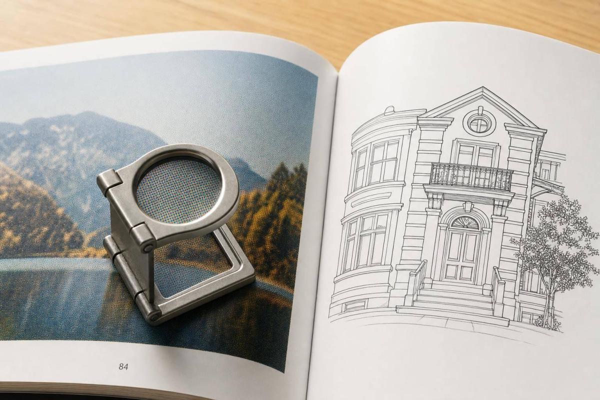
If you want clean printed images, I’d use 300 DPI at the final print size for most book pages and covers. That’s the short answer.
Here’s the simple rule set I’d follow:
- 300 DPI for most photos, covers, and full-page images
- 240 DPI can work for smaller, non-critical images
- 400–600 DPI for black-and-white line art, diagrams, comics, and coloring pages
- Always check effective DPI at the size the image will print, not just the number stored in the file
- If an image is too low, make it smaller on the page or swap in a higher-pixel file
A fast way to check an image is:
- pixel width ÷ print width
- pixel height ÷ print height
- use the lower result
For example, a 1,800 × 2,700 px image prints at 300 DPI on a 6 in. × 9 in. page. Put that same image on a 9 in. × 12 in. page, and it drops to 200 DPI. That’s where print quality starts to slip.
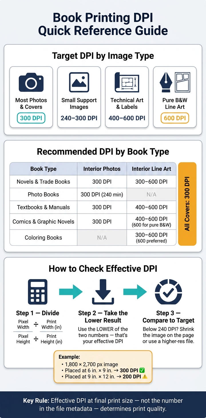
Here’s the main takeaway in one view:
| Use | DPI to Aim For |
|---|---|
| Most book photos and covers | 300 DPI |
| Small support images | 240–300 DPI |
| Technical art, labels, thin lines | 400–600 DPI |
| Pure black-and-white line art | 600 DPI |
I’d also keep export settings tight: CMYK for color print files, grayscale for black-and-white interiors, 0.125 in. bleed, and a print PDF like PDF/X-1a or PDF/X-4. Before sending anything out, run a preflight check for low-resolution images, RGB objects, missing bleeds, and font issues.
If you remember just one thing, make it this: <u>the image’s final printed size controls whether it will look sharp</u>.
Book Printing DPI Guide: Requirements by Image Type & Book Format
How to Calculate DPI from Image Pixels and Book Size
The Basic Formula for Effective DPI
If you’re aiming for 300 DPI, the thing that matters is the image’s final size on the page.
Here’s the simple math:
- Divide the pixel width by the print width
- Divide the pixel height by the print height
- Use the lower of the two results as the effective DPI
That lower number is the one that tells you how the image will print.
For example, a 1,800 × 2,700 pixel image placed at 6 in. × 9 in. prints at exactly 300 DPI in both directions:
- 1,800 ÷ 6 = 300
- 2,700 ÷ 9 = 300
Now make that same image larger, say 9 in. × 12 in., and the DPI drops:
- 1,800 ÷ 9 = 200
- 2,700 ÷ 12 = 225
That means the effective DPI is 200, not 225, because the lower number sets the limit for print quality.
One more thing: scaling an image up in layout software lowers its effective DPI, even if the file still shows 300 DPI in its metadata. That trips people up all the time.
Applying the Formula to Common U.S. Book Sizes
To figure out the pixel size you need, multiply each page dimension in inches by 300.
For common U.S. trim sizes, full-page image targets at 300 DPI look like this:
- 5.5 in. × 8.5 in. (trade paperback) → 1,650 × 2,550 pixels
- 6 in. × 9 in. (standard trade book) → 1,800 × 2,700 pixels
- 8.5 in. × 11 in. (workbook/manual) → 2,550 × 3,300 pixels
The same rule works for smaller placements too.
A half-page horizontal image in a 6 in. × 9 in. book, placed at 6 in. × 4.5 in., needs about 1,800 × 1,350 pixels for 300 DPI. A quarter-page graphic on an 8.5 in. × 11 in. page, placed at 4.25 in. × 5.5 in., needs about 1,275 × 1,650 pixels.
Many print providers flag images that fall below about 200–225 DPI before press. So even if something looks okay on screen, it can still be a problem once it hits print.
Placement Guide: Full Page, Half Page, and Small Graphics
Match image quality to the size it will appear on the page.
300 DPI is the goal for full-page photos, chapter openers, and covers. Smaller support images can often look fine at 240 DPI. But for line art, screenshots, diagrams, charts, or anything with text, don’t go below 200 DPI.
| Placement Size | Target Pixels at 300 DPI | Acceptable Min. DPI | Typical Use Case |
|---|---|---|---|
| Full page – 8.5 in. × 11 in. | ≈2,550 × 3,300 px | 260–300 DPI | Hero photo |
| Full page – 6 in. × 9 in. | ≈1,800 × 2,700 px | 260–300 DPI | Full-page illustration |
| Half page – 6 in. × 4.5 in. | ≈1,800 × 1,350 px | 240–300 DPI | Supporting photo |
| Quarter page – 4.25 in. × 5.5 in. | ≈1,275 × 1,650 px | 240–300 DPI | Sidebar graphic |
| Small figure – 2 in. × 2 in. | ≈600 × 600 px | 240–300 DPI | Small diagram |
Here’s a practical example. A smartphone photo at 4,032 × 3,024 pixels, placed full-page in an 8.5 in. × 11 in. layout, gives about 355 DPI across and 275 DPI tall. The lower number still clears a 260 DPI floor, so it should print fine at that size.
If an image misses the minimum DPI for the size you want, shrink the placement. Don’t just enlarge the file and hope for the best.
sbb-itb-ce53437
DPI or PPI. Which is Best for Printing Images in Books, and does it Matter?
Recommended DPI by Book Type
Once you’ve worked out the effective DPI at final size, the next step is simple: match that number to the kind of book you’re making.
Different books put different demands on print. A novel is mostly text. A photo book lives and dies by image quality. A textbook or coloring book often depends on thin lines, labels, and sharp edges. That’s why the right DPI target changes with the content.
Novels and Standard Trade Books
For novels and standard trade books, most body text is vector-based. So DPI only matters for placed raster images like photos, ornaments, and author portraits.
For those images, 300 DPI at final print size is the target. Going above that usually doesn’t lead to a visible change. It just makes the file heavier.
The main exception is dense black-and-white line art. Think pen work, cross-hatching, or decorative borders. In those cases, use 300–600 DPI. If the artwork has lots of fine detail, go with 600 DPI.
Photo Books and Image-Heavy Titles
With photo books, softness stands out fast. If images fill the page, readers will spot weak resolution right away.
For interior photos, full-page images, full-bleed spreads, and covers, aim for 300 DPI at final print size. If the source file can’t get there, 240 DPI is the lowest you should go.
Textbooks, Manuals, Comics, and Coloring Books
Books with diagrams, labels, and line art need more care. In these layouts, sharp edges and readable details matter more than they do in text-only books.
For textbooks and manuals, use:
- 300 DPI for photos and raster diagrams
- 400–600 DPI for thin lines, small labels, and technical illustrations
Vector diagrams stay crisp at any size, so they don’t have the same DPI limits.
For comics and coloring books, use 300 DPI for color pages and 400–600 DPI for black-and-white line art. If you’re printing pure black-and-white comics or intricate coloring-book outlines, use 600 DPI.
| Book Type | Interior Photos | Interior Line Art | Covers |
|---|---|---|---|
| Novels & Trade Books | 300 DPI | 300–600 DPI | 300 DPI |
| Photo Books | 300 DPI (240 DPI minimum) | N/A | 300 DPI |
| Textbooks & Manuals | 300 DPI | 400–600 DPI | 300 DPI |
| Comics & Graphic Novels | 300 DPI | 400–600 DPI (600 DPI for pure B&W) | 300 DPI |
| Coloring Books | N/A | 300–600 DPI (600 DPI preferred) | 300 DPI |
How to Prepare Print-Ready Files Without Resolution Problems
Once you know the target DPI, the next step is simple: keep that resolution intact through layout and export.
Set Image Resolution Before Building Your Layout
Your target DPI only matters if the source image can hold it from start to finish. A low-resolution image won’t get better just because you place it into a layout.
Open each image in your editor, set it to the planned print size, and check that it hits 300 PPI without changing the pixel count. That part matters. If the file doesn’t have enough pixels to reach 300 PPI at that size, you have two good options:
- Use a higher-resolution source file
- Make the image smaller in the layout
Don’t scale placed images past their native size. That’s where print quality starts to fall apart. In your layout software, check the effective PPI readout to make sure each image stays at or above your target.
Export a Print-Ready PDF with the Correct Settings
When it’s time to export, use a print-ready PDF in PDF/X-1a or PDF/X-4.
Set color files to CMYK and black-and-white interiors to grayscale. For resolution, downsample photos and general raster art to 300 DPI. Use 600 DPI only for fine line art or technical illustrations where tiny details need to stay sharp.
Also set:
- Bleed: 0.125 in.
- Crop marks: included
This is one of those small setup steps that can save you from a bad print run.
Run a Final Prepress Check Before Ordering
Before you send the file to print, run a preflight check. Even if everything looks fine on screen, missed problems can still sneak in.
Tools like InDesign include a built-in Preflight panel that can automatically flag:
- Low-resolution images
- RGB elements inside a CMYK file
- Missing bleeds
- Unembedded fonts
Use it. It takes a few minutes and can catch issues before they turn into delays or reprints.
The table below covers the main items to review:
| Prepress Check | Check | Notes |
|---|---|---|
| Trim size | Matches printer specs (e.g., 6 × 9 in.) | Confirm in both layout and exported PDF |
| Interior image DPI | 300 DPI at placed size | Flag anything under 240 DPI for review |
| Line art DPI | 400–600 DPI | 600 DPI for pure B&W or intricate detail |
| Cover resolution | 300 DPI at full bleed size | Keep covers and background art at print resolution |
| Color mode | CMYK (color) / Grayscale (B&W) | Avoid RGB in print-bound files |
| Bleed | 0.125 in. on all bleed edges | Extend all edge-touching art to the bleed line |
If you’re working with Miro Printing & Graphics Inc. in Hackensack, NJ, use their prepress review to catch file issues before approval.
Conclusion: The Key DPI Rules for Clean, Professional Book Printing
In day-to-day book production, three DPI checks do most of the heavy lifting: use 300 DPI for most book content, 240 DPI for small images that aren’t critical, and 400–600 DPI for fine line art, technical diagrams, and detailed illustrations.
Then look at the image at its final placed size. That’s the part people sometimes miss. What matters is the effective DPI, not the resolution label stored in the file. If you enlarge an image in your layout, its print quality drops.
Once those numbers check out, make sure your export settings don’t undo the work. Before export, confirm that images aren’t downsampled below your target resolution, keep line art at its higher setting, match the color mode to the press, and run preflight. For a final file review, Miro Printing & Graphics Inc. in Hackensack, NJ, can check your files before production.
FAQs
What is effective DPI?
Effective DPI (dots per inch) measures print resolution. It shows how many ink dots a printer places within one inch of paper.
In plain English: the higher the DPI, the sharper the image tends to look. It also helps color gradients appear smoother instead of patchy or rough.
For most standard print projects that people view up close, including books, 300 DPI is the professional standard.
Can I print below 300 DPI?
For professional book printing, 300 DPI is the standard if you want crisp text and sharp images at a normal reading distance.
Go below that, and pixelation or blur can start to show up. That’s why lower settings usually aren’t a good fit for hand-held books.
Resolutions like 150 DPI or 100 DPI are more common for large-format pieces that people view from several feet away.
Does resizing an image change DPI?
No. Changing the DPI metadata by itself does not change the image’s actual resolution or add detail.
To change resolution, you need to resample the image. That changes the amount of image data in the file. If you enlarge an image past its original size, its effective resolution drops, and the image can start to look blurry.
Related Blog Posts
- Image Resolution Standards for Offset Printing
- Best DPI Settings for Photo Printing
- Standard DPI for Commercial Printing
- How to Set Print File Resolution
https://app.seobotai.com/banner/banner.js?id=6a7220a8a5e4d9396b8a03db

