Misregistration in printing happens when color layers or design elements fail to align, creating blurry images, color fringes, or shadows. This issue not only reduces print quality but also increases waste and costs. The solution? Proper calibration. Calibration ensures precise alignment of printing components like plates, cylinders, and rollers, preventing defects and maintaining sharp, accurate prints.
Key points covered:
- Misregistration causes: mechanical wear, improper tension, and web handling issues.
- Calibration fixes: regular maintenance, tension adjustments, and sensor accuracy.
- Impact: Clearer prints, reduced waste, and fewer operational disruptions.
How to FIX Print Alignment Commercial Printer
sbb-itb-ce53437
Main Causes of Misregistration
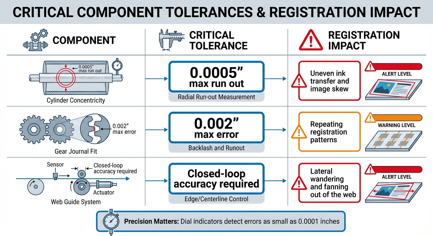
Critical Printing Component Tolerances and Registration Impact
To pinpoint calibration issues effectively, it’s crucial to understand the mechanical sources of misregistration. These problems often arise from equipment tolerances, wear on components, and inaccuracies in web handling.
Plate and Cylinder Misalignment
Misregistration can occur when plates, cylinders, or sleeves aren’t perfectly aligned during setup. If the centerline of these components is even slightly off, surface imperfections – like cuts, dried ink, or indentations – can shift the image. Additionally, a cylinder that’s not perfectly concentric creates a "run out", throwing off alignment during rotation. Maintaining precise tolerances is essential, with calibration tools like dial indicators capable of detecting errors as small as 0.0001 inches playing a key role. Mechanical wear in gears can also disrupt proper registration, further complicating the issue.
Gear and Bearing Wear
Worn gears or components that don’t fit properly (with tolerances exceeding 0.002 inches) can lead to consistent misregistration. This often manifests as repeating patterns throughout a print run. Idle rollers that drag or wobble exacerbate the problem, as they interfere with proper substrate contact. Routine inspections and cleaning to remove grease or debris help ensure components stay within the required tolerances.
Tension Control and Web Guiding Problems
Beyond component alignment, improper web handling can significantly impact registration. In web printing, the substrate must move smoothly between stations. A web guide system – comprising a sensor, controller, actuating cylinder, and the web – needs to function accurately. Faulty sensors or actuators can cause misalignment, leading to lateral shifts in the web and registration issues. To address this, tension adjustments at the splicer, combined with tools like prepress software or physical "bustle wheels", help manage natural web growth and maintain alignment.
| Component | Critical Tolerance | Registration Impact |
|---|---|---|
| Cylinder Concentricity | 0.0005" max run out | Uneven ink transfer and image skew |
| Gear Journal Fit | 0.002" max error | Repeating registration patterns |
| Web Guide System | Closed-loop accuracy | Lateral wandering and fanning out of the web |
How Poor Calibration Causes Misregistration
Poor calibration doesn’t just affect precision – it turns minor mechanical imperfections into major print flaws. When calibration is off, the safety margins designed into equipment tolerances vanish, meaning even well-maintained machinery can produce defective prints.
Effects of Uncalibrated Components
When components aren’t calibrated, the errors pile up as the press operates. For instance, plate cylinder gears are designed to hold a 0.002-inch tolerance. If they aren’t properly calibrated, even minor wear can result in visible registration shifts. Similarly, impression cylinders demand a 0.0005-inch concentricity tolerance. Without proper calibration, these cylinders cause uneven contact with the substrate, leading to inconsistent paper stretch.
Web guide systems are another critical area. These systems depend on sensors, controllers, and actuators working together seamlessly. If sensors are misaligned during calibration, they feed faulty velocity data to the controller. This creates a ripple effect where the system can’t correct mechanical issues like dragging idle rollers. The result? A "wandering web" – the substrate shifts laterally across the press. At high operating speeds, uncalibrated systems struggle to respond quickly enough, causing erratic misregistration at gripper or side-guide edges.
The visual consequences are hard to ignore. Even slight misregistration of dots can ruin image clarity. For example, when a rosette pattern shifts from being clear-centered to dot-centered, the print appears softer and less defined. Gordon Pritchard, a former Print Quality Marketing Manager, describes the effect vividly:
"As the rosette drifts from clear centered to dot centered it’s like intermittently turning a light on and off and back again – so the color goes intermittently darker and lighter through the run"
.
But it’s not just mechanical issues that create problems. Environmental factors can also wreak havoc on calibration.
Environmental Factors and Calibration
Mechanical wear isn’t the only culprit – external conditions can make calibration flaws even more apparent. Temperature and humidity don’t directly cause misregistration, but they expose weaknesses in systems that aren’t properly calibrated. For example, when plates are imaged at varying temperatures, thermal expansion causes them to grow unevenly. Without calibration to adjust for these changes, colors won’t align, leading to what printers refer to as "fit" problems.
Humidity poses its own challenges, especially given paper’s tendency to absorb and release moisture. In web presses, the edges of the paper lose moisture faster than the center as the web moves through the press. This uneven drying leads to registration drift. High humidity can also cause the paper edges to warp, creating wavy edges that result in misregistration at the side guides. On top of that, excessive fountain solution – another environmental factor – can destabilize the paper’s dimensions, making the problem worse. When impression or blanket squeeze isn’t calibrated correctly, it adds excessive pressure that physically stretches the substrate, leading to visible defects like "back stretch".
Calibration Solutions to Fix Misregistration
Fixing misregistration hinges on keeping your equipment in top condition through regular checks and precise tweaks. Let’s break down how to address this issue effectively.
Regular Equipment Maintenance
Preventing misregistration begins with routine inspections of your press components. Start by measuring impression cylinders with a dial indicator accurate to 0.0001 inches. Check the middle and both ends of each cylinder – total concentricity runout should not exceed 0.0005 inches.
Pay close attention to plate cylinder gears. The gear must fit the cylinder journal with an error margin no greater than 0.002 inches. Inspect for missing teeth, misalignment, or debris buildup, as even minor grime can disrupt proper registration. To avoid this, clean plates, cylinders, and sleeves frequently to remove ink and grime that could otherwise interfere with image reproduction.
Adjusting Tension and Web Guide Systems
Calibration of web guide systems is critical. These systems rely on sensors to provide error signals to the controller, which adjusts velocity across the web. As Luminite emphasizes:
"Correct sensor prepositioning is critical".
If sensors are not positioned correctly in a closed-loop system, they can send inaccurate data, causing the web to wander laterally.
Managing tension also requires a hands-on approach. Adjust the tension at the splicer to ensure the image carrier maintains uniform contact with the substrate. If you notice lateral web wandering during a run, recalibrate the splicer tension immediately to stabilize the substrate. For high-speed presses, even slight tension inconsistencies can lead to random misregistration at gripper or side-guide edges. Monitor press speed carefully – if it’s too high, the register system might struggle to keep up, resulting in erratic shifts. These adjustments play a key role in maintaining proper alignment during press operations.
Press Alignment and Cleaning
Press alignment isn’t a one-and-done task – it requires ongoing attention. If consecutive sheets misregister, inspect the press register system, side-guide settings, and gripper edges. Use a loupe to examine a row of halftone dots. The acceptable tolerance is up to half a row of dots, or roughly 0.0033 inches at 150 lpi.
Blankets and packing also need regular checks. During a press run, watch for compression issues – if the print length changes, adjustments or replacements may be necessary. Excessive impression or blanket squeeze can stretch the paper, causing sidewise misregistration along the trailing edge. For embossed papers prone to random misregistration, reduce the impression pressure. The goal is consistent contact without applying excessive force that distorts the substrate. Regular inspections and precise adjustments are key to maintaining accurate calibration throughout your print run.
How Miro Printing & Graphics Inc. Maintains Precision
At Miro Printing & Graphics Inc., maintaining precision isn’t just a goal – it’s a commitment. Every step of our process is designed to ensure flawless results, from calibration to detailed inspections.
Daily Pre-Run Checklists
Before every print run, we conduct a thorough pre-run inspection to catch potential issues early. Our team uses dial indicators that detect errors as small as 0.0001 inches to confirm cylinder concentricity, ensuring run-out stays within 0.0005 inches. Gear alignment is checked at both ends and the middle of the cylinders to verify a proper fit within strict tolerances.
Plates and sleeves are meticulously inspected for any defects that might cause misregistration. We also verify the positioning of web guide sensors and controller settings to keep the substrate from drifting laterally during the run. These detailed checks prevent delays and material waste, highlighting the team’s technical expertise and dedication to quality.
Leveraging In-House Expertise
Our team pairs technical know-how with hands-on experience across various printing techniques. With in-house bindery and design services, we maintain full control over production. Using loupes, we identify shifts as small as 0.0017 inches at 150 lpi, ensuring registration marks are sharp and precise, with no visible separation of CMYK colors . For custom finishes like foil stamping, embossing, or spot UV, our team ensures these elements align seamlessly with the underlying ink layers.
Precision That Reduces Waste
Our commitment to precision doesn’t just deliver high-quality results – it also reduces waste. Regular calibration keeps operations efficient by maintaining tight tolerances and adapting to environmental conditions. Clean plates, cylinders, and sleeves prevent ink buildup that could distort images, while proper tension management ensures substrates remain stable throughout the printing process.
This proactive approach minimizes press stops, downtime, and material waste, delivering a more cost-effective and environmentally conscious printing solution.
Conclusion
Key Takeaways
The quality of printed materials hinges on a delicate balance of calibration and component alignment. Calibration plays a critical role in ensuring precision. Even a tiny mechanical misalignment – as small as 0.0033 inches – can lead to blurred images, fuzzy edges, or noticeable color halos. These small errors can significantly impact image sharpness and cause neutral grays to skew toward bluish or reddish tones.
"In multicolor printing, when all the layers of inks are in perfect register, one is not aware of the individual ink layers, only the image created by their combination." – Gordon Pritchard, Former Print Quality Marketing Manager, Kodak
Regular calibration not only prevents alignment issues but also reduces material waste. Beyond ink alignment, it ensures precision in processes like foil stamping, embossing, and spot UV coating. These practices are at the core of the methods used by Miro Printing & Graphics Inc.
Miro Printing & Graphics Inc.’s Approach
At Miro Printing & Graphics Inc., we combine advanced calibration techniques with a dedication to precision. Our team follows daily pre-run checklists and leverages in-house expertise to maintain tight tolerances, ensuring every project meets high standards. By identifying potential issues early and closely monitoring alignment during production, we consistently deliver crisp, vibrant prints while minimizing waste and downtime. Whether you’re seeking digital or offset printing, or specialized finishing services, our Hackensack, NJ team is committed to turning your vision into reality with unmatched precision.
FAQs
How do I tell if misregistration is mechanical or tension-related?
To figure out if misregistration is due to mechanical or tension-related issues, start by looking for mechanical problems like misaligned or worn-out parts. Next, examine tension-related factors, such as uneven tension across rollers or incorrect tension adjustments. Either of these can have a big impact on registration accuracy.
What calibration checks should be done before every print run?
Before starting a print run, it’s essential to confirm printer registration, color consistency, and mechanical alignment. This involves checking registration marks to ensure all elements line up correctly, running test prints to evaluate quality, and fine-tuning press settings to align color layers and printed elements precisely. Also, make sure the printing cylinders are properly calibrated and that tension and positioning are set correctly. This helps avoid misregistration and ensures the print quality stays consistent throughout the run.
When should I recalibrate the web guide sensors and splicer tension?
If you’re dealing with misregistration issues or have made changes to the machine’s settings, it’s time to recalibrate the web guide sensors and adjust the splicer tension. Regular recalibration should also be part of your routine maintenance plan. This is especially important when switching materials or tweaking machine settings to maintain precise registration and achieve the best print quality.
Related Blog Posts
- Common Post-Press Quality Issues and Fixes
- 5 Causes of Registration Errors in Printing
- Offset Printing Process: Step-by-Step Guide
- CMYK Print Defects: Misregistration vs. Banding
https://app.seobotai.com/banner/banner.js?id=69c479c81b352ff267cc0fa8