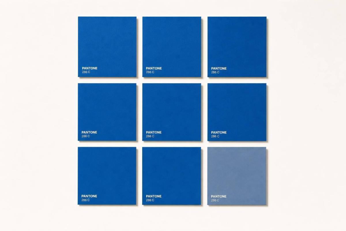
If your brand colors shift from one print job to the next, people notice – and that can weaken confidence in your business. The fix is simple: use PMS color codes, keep them documented, and check printed proofs before full production.
Here’s the short version:
- Consistent color helps people recognize your brand faster.
- Research often cites up to 80% higher brand recognition from steady color use.
- PMS gives printers a fixed color target for reorders, signs, brochures, mailers, and cards.
- CMYK, RGB, and HEX are not the same as PMS, so using the wrong format can shift color.
- Paper stock, coatings, lighting, and print method can all change how ink looks.
- The best way to keep color steady is to save exact PMS specs, use the same stock, and review a physical proof.
Put another way: if you want your printed pieces to look like they came from the same business every time, PMS turns color from a guess into a print rule.
This article connects the research on recognition and confidence with the print steps that keep brand color steady across jobs.
PMS and Brand Color Consistency Explained
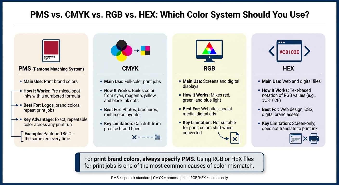
PMS vs. CMYK vs. RGB vs. HEX: Which Color System Should You Use?
The Pantone Matching System (PMS) is a standard library of pre-mixed ink colors, and each one has its own number. That number matters. When a brand uses the same PMS code every time, its color stays repeatable from one print run to the next.
So if a brand calls for Pantone 186 C as its red, that exact code can be used again on later jobs. The goal is simple: keep that red looking like the same red on business cards, letterhead, folders, and other printed pieces.
How PMS Creates Repeatable Print Color
Each PMS color comes with a formula guide that tells printers how much base ink to mix. Once a brand picks a PMS color, that code becomes the fixed point of reference for future print jobs.
PMS colors also come in versions for different paper types. For example, Pantone 3005 C is meant for coated stock, while Pantone 3005 U is meant for uncoated stock. That small suffix does a lot of work, because the same color can shift depending on the paper. If you choose the right version, the brand look stays more even across materials.
What Brand Color Consistency Means in Practice
Brand color consistency means people keep seeing the same familiar colors across printed items like business cards, envelopes, signage, packaging, and mailers. A brand standard also spells out where each color should appear, so pieces stay lined up across jobs and substrates.
Without those rules, little shifts can start to pile up. One run looks slightly darker. Another leans greener. Before long, a logo that should look navy on every piece shows up navy on one item and teal on another. It’s a small miss, but people notice it. The whole brand can feel less polished.
PMS vs. RGB, CMYK, and HEX
These color systems do different jobs, and mixing them up is one of the main reasons branded materials come back with color that looks off.
| System | Main Use | How It Works |
|---|---|---|
| PMS | Print brand colors | Pre-mixed spot inks with a numbered formula |
| CMYK | Full-color print jobs | Builds color from cyan, magenta, yellow, and black dots |
| RGB | Screens and digital displays | Mixes red, green, and blue light |
| HEX | Web and digital files | Text-based notation of RGB values |
RGB and HEX describe screen color, not ink. A monitor gives off color, while paper reflects it. That’s why a brand blue can look one way on screen and another way in print, especially when a printer is working from an RGB file instead of a PMS spec.
CMYK is used for print, but it builds color from four inks. Because of that, it can drift from a precise brand hue. For print pieces where brand color needs to stay tight, PMS is often used as the main reference.
That repeatable print result makes color easier to recognize from one piece to the next. And that’s where consistency starts to show up in a very practical way.
sbb-itb-ce53437
What Research Says About Color Consistency, Recognition, and Trust
PMS locks in a brand color as a repeatable ink formula. So when research looks at recognition and trust tied to color consistency, it maps neatly to print.
How Color Consistency Improves Recognition and Recall
Consistent color use can increase brand recognition by up to 80%, a widely cited figure from Loyola University Maryland research. The idea is pretty straightforward: when people see the same colors again and again, they connect them to the same brand faster.
That matters in places where attention is split and time is short. Think retail shelves, trade show booths, or direct mail in a crowded mailbox. Familiar color patterns make it easier for people to spot a brand and remember it later.
How Consistent Visuals Support Credibility
Research on corporate visual identity ties consistent PMS-based design systems to higher professionalism and reliability ratings. When a logo, color palette, typography, and layout stay aligned across materials, people tend to rate the organization as more trustworthy than they do when those same elements shift from piece to piece.
A small color change can do more damage than most teams expect. If a blue looks one way on a brochure and another way on a sell sheet, it can chip away at trust without anyone saying a word.
Limits of the Research
Color can support trust, but it doesn’t create trust by itself. Most studies look at color as one part of a larger visual system, so it’s hard to pin down exactly how much color alone is doing.
Context matters too. What works in one market may land differently in another, and long-term loyalty still depends far more on product quality and service reliability than on visual polish. That’s why PMS works best as a control tool, not a promise of trust.
Study Summary Table
| Study/Source | Sample or Context | Main Finding | Trust Implication |
|---|---|---|---|
| University of Loyola, Maryland (widely cited) | Brand recognition research | Consistent color use increases brand recognition by up to 80% | Stable PMS colors help customers identify a brand faster across print touchpoints |
| Corporate visual identity research | Organizations evaluated across multiple materials | Consistent logo and color application raised professionalism and reliability ratings | PMS-matched print materials signal a more trustworthy operation |
| Eye-tracking and retail simulation studies | Shoppers in complex visual environments | Stable color schemes reduced visual search time and improved brand recall | Consistent PMS color in signage and displays speeds recognition in crowded settings |
| Brand-color fit research | Consumers evaluating brand materials by category fit | Color consistency and fit with brand category improved credibility more than color choice alone | Repeatable PMS colors reinforce brand positioning across every printed piece |
These findings hit hardest when a brand needs the same color to print the same way across repeat jobs.
How PMS Delivers Dependable Color Results in Print
Research shows that color consistency can help build trust. But that kind of consistency doesn’t just happen on its own. It comes from using PMS specs the right way through each stage of printing.
Where PMS Helps Most in Printed Materials
PMS matters most on printed pieces customers see again and again. That includes business cards, signage, brochures, and direct mail. If those items don’t match from one order to the next, the brand can start to feel off, even if people can’t quite explain why.
That’s where PMS does its job. It keeps the color formula fixed across print jobs, which helps the same brand color show up the same way across touchpoints.
Why Proofing and Print Coordination Matter
A digital proof can check layout, spacing, and design. But it can’t show how ink will look on paper.
A printed proof on the actual stock, or something close to it, gives you that check before the full run starts. It shows how the PMS color will print in practice. From there, compare the proof against an approved Pantone guide or a past approved print.
It also helps to document the approved PMS code, paper stock, and finish for each reorder. If that record is missing, small shifts in production can lead to color drift over time without anyone noticing right away. In most cases, print mismatches come from a few common production changes, not random surprises.
Common Causes of Print Color Mismatch
The main causes of color shift are pretty straightforward:
- Paper stock changes
- File conversion errors
- Lighting
- Different print methods
Coated stock tends to print brighter. Uncoated stock absorbs more ink, so the color usually looks softer.
How Miro Printing & Graphics Inc. Supports Consistent Color
This kind of control matters even more when one brand appears across many formats. Miro Printing & Graphics Inc. in Hackensack, NJ helps keep approved PMS specs aligned across digital, offset, large-format, and mailed pieces by carrying color, stock, and proof details through production.
Practical Steps for Keeping PMS Colors Consistent Across Print Jobs
Once your PMS colors are approved, the job isn’t done. You need to tie every file, proof, and reorder to that same color code so the color stays the color.
Set Approved PMS Colors in Your Brand Standards
Document approved PMS colors before anything goes to press. That way, the same brand color keeps pointing to the same brand every time it appears. In a short brand standards sheet, list each PMS number, the coated or uncoated suffix, CMYK, HEX, RGB, and basic usage rules. Then share that sheet with anyone who creates or orders branded materials.
For each brand color, record:
- The PMS number
- Its CMYK breakdown
- The matching HEX and RGB values
- Simple usage rules, like which color is for logos, which is for backgrounds, and which tints or pairings are not allowed
Use the current physical Pantone chip as the official reference for each color. Screens drift. Physical swatches are the standard you can trust.
Use the Same Specifications on Every Reorder
Reorders are where brands often start to slip. Using the same specs each time is what keeps customer-facing pieces looking familiar. Every print order should include the exact PMS numbers and suffixes, the paper stock, the print method, and any coatings or laminates.
A simple setup is to create a master job packet for each repeat item, like business cards, rack cards, or brochures, and keep it in a shared location. The packet should include the final print-ready files, the PMS callouts, and an approved physical sample from the last run. When it’s time to reorder, send the packet to the printer – not a verbal description, not a screenshot. Use a fixed file naming system so the right version is easy to spot.
If the paper stock, coating, or print method changes, update the brand guide and note that change. And don’t swap PMS numbers casually for something “close enough” without writing it down. That’s usually where color drift begins.
Store each packet with your brand files so the next reorder starts from the same specs.
Review Proofs Before Full Production
Even when a PMS color is documented, it still needs a physical check before production. For customer-facing pieces, ask for a physical proof on the final stock.
When the proof arrives, compare it directly to the Pantone chip under neutral lighting. Check every place the brand color appears – logos, headlines, icons – to make sure it stays consistent. Also look for shifts caused by overprints, gradients, or transparency effects. For folded pieces like brochures or folders, check that the color holds across folds and on both sides. If something looks off, send the printer direct written feedback. For example: brand red reads too orange; please adjust closer to PMS 186 C. Approve it in writing only after it matches.
It also helps to keep a few clean copies from each approved run as reference samples. Those become your physical benchmark for later jobs. If a new piece needs to match an existing one, send that approved sample with the files and ask the printer to match the sample directly, not just the digital file.
Conclusion: The Business Case for PMS-Based Color Consistency
Put it all together, and the takeaway is pretty simple: color consistency is a business choice. Research links steady brand communication and repeated color use with stronger brand trust, loyalty, and recall.
When people keep seeing the same PMS color, they learn to spot your brand faster. Over time, that color starts to signal reliability.
That’s where PMS helps. It ties each print job to one ink formula, so your brand red stays the same red from one reorder to the next. This matters most when you’re reprinting the same materials over time. It can also cut down on reprints and make print costs easier to plan for.
Key Takeaways for U.S. Print and Branding Workflows
In day-to-day print work, that means:
- Consistent color builds recognition and trust. Steady, repeatable color use helps people know your brand and see it as more trustworthy.
- PMS makes consistency a process, not a guess. Documented PMS codes give every printer – and every reorder – a fixed reference point that stays fixed.
- Proofing is a critical quality check. A physical proof can catch color shifts before full production.
- Each accurate reprint reinforces the same brand cue. Every consistent reproduction adds to brand equity over time.
Miro Printing & Graphics Inc. in Hackensack, NJ helps keep approved colors aligned across offset, digital, and large-format jobs so the same brand color carries through every piece.
FAQs
When should I use PMS instead of CMYK?
Use PMS when you need exact, repeatable brand color matching for spot colors like logos and packaging. It also makes sense for specialty inks like metallics and fluorescents.
CMYK works better for full-color images and photos, where smooth blends and print cost matter more than exact spot-color matching.
Why does the same PMS color look different on different paper?
The same PMS color can look different from one paper stock to another. That happens because paper changes how ink behaves. Absorption, texture, finish, and drying time all play a part, and those details affect both how the ink sits on the page and how light bounces off the surface.
A simple example makes this clear: uncoated paper can make a color look duller, while glossy paper often makes it look brighter and more vibrant.
Do I still need a physical proof if my colors are documented?
Yes. Even if you already have documented PMS codes and color profiles, a physical proof still matters.
Why? Because it shows how ink, material, lighting, and the printing method work together in the finished piece. On a screen or in a file, everything can look fine. But once the job hits paper or another surface, small color shifts can show up fast.
A physical proof helps catch those differences early, before they turn into expensive mistakes during the full print run. That’s why Miro Printing & Graphics Inc. uses a careful proofing process before moving into full production.
Related Blog Posts
- Pantone Matching System in Printing
- How to Ensure Color Accuracy in Proofing
- Choosing Pantone Colors for Packaging Printing
- How Color Management Impacts Brand Identity
https://app.seobotai.com/banner/banner.js?id=6a7a6894d642d19a97929966

