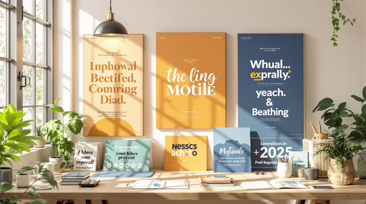
Typography in 2025 is evolving to meet modern design and sustainability needs. Here are the top 7 trends shaping commercial printing this year:
- Variable Fonts: Flexible fonts that adjust weight, width, and style for efficient, high-quality printing.
- Modern Serif Fonts: Classic yet updated serif fonts designed for readability and elegance.
- Vintage-Modern Blends: Combining retro styles with sleek, contemporary designs for unique branding.
- Custom Hand-Style Fonts: Hand-drawn fonts that add a personal and emotional touch to designs.
- High-Impact Typography: Bold, oversized fonts that dominate layouts and grab attention.
- 3D Typography Effects: Advanced printing techniques creating depth and texture in text.
- Green Fonts: Eco-friendly, ink-saving fonts designed for sustainability without losing clarity.
Quick Overview (Comparison Table)
| Trend | Key Features | Best Uses |
|---|---|---|
| Variable Fonts | Adjustable styles in one file | Packaging, corporate materials |
| Modern Serif Fonts | Elegant, readable, refined serifs | Magazines, luxury branding |
| Vintage-Modern Blends | Retro meets modern design | Posters, artisanal branding |
| Custom Hand-Style Fonts | Personal, human feel | Packaging, boutique branding |
| High-Impact Typography | Bold, oversized letters | Posters, tech ads |
| 3D Typography Effects | Depth, texture with printing effects | Luxury packaging, marketing |
| Green Fonts | Ink-efficient, eco-conscious designs | Sustainable projects, brochures |
These trends blend creativity, functionality, and eco-consciousness, helping brands stand out while meeting practical needs.
Top 20+ Font Trends for 2025
1. Variable Fonts in Print
Variable fonts are transforming commercial printing by offering new levels of flexibility and efficiency in 2025. These single-file fonts allow for adjustments in weight, width, and style while maintaining high-quality output across various print formats. This shift is helping printers cut down on material waste and energy use.
Take Nike‘s 2024 product catalogs as an example. By using variable fonts, they reduced file sizes by 65% and sped up production timelines by 30%. This allowed them to adapt typography seamlessly across different layouts while keeping their branding consistent [1].
Key uses and considerations for variable fonts in commercial printing include:
- Optimizing magazine headlines
- Scaling text for better packaging legibility
- Ensuring brand consistency in corporate materials
- Adjusting billboard text for different viewing distances
- Managing color density for weight variations
- Meeting 300+ DPI resolution standards
- Embedding fonts properly in PDFs
Raster Image Processor (RIP) systems are now equipped to handle these fonts, enabling designers to create responsive designs without needing multiple font files [10][7].
This dynamic approach to typography paves the way for the next trend: the return of modern serif fonts that blend traditional elegance with today’s design needs.
2. Modern Serif Fonts
Modern serif fonts combine classic elegance with a contemporary touch, featuring clean serifs and open counters. Their taller x-heights and refined proportions make them easy to read, especially in print formats[1][4].
To use modern serifs effectively in print, consider three key factors: print resolution, paper stock, and font characteristics. For example, high-contrast serifs often look sharper on coated paper, which helps preserve their fine details[2][4].
Popular Modern Serif Fonts for 2025
| Font Name | Key Features | Best Print Applications |
|---|---|---|
| Freight Text | Highly readable and flexible | Long-form documents, magazines |
| Noe Display | Bold contrast, expressive look | Headlines, packaging |
| Recoleta | Rounded serifs, retro style | Branding, posters |
| Canela | Delicate, high-contrast design | Luxury print materials |
| Roslindale | Scotch Roman-inspired style | Editorial, corporate materials |
Modern serifs are widely used in luxury branding, editorial layouts, and premium print projects[1][8]. To achieve the best results in commercial printing, tweak kerning and tracking, ensure strong font-background contrast, and set minimum font sizes based on the application[2][4].
This balance of classic and modern design leads us to the next trend: vintage-modern hybrids that reimagine historical styles.
3. Vintage-Modern Font Blends
Vintage-modern typography is making waves in 2025 print designs by combining nostalgic elements with sleek, contemporary styles.
Key Characteristics
The best vintage-modern designs strike a balance between old and new. Here’s how they do it:
| Element | Traditional Component | Modern Touch |
|---|---|---|
| Letterforms | Classic serif typefaces | Clean sans-serif accents |
| Layout | Heritage-inspired ornaments | Minimalist composition |
| Texture | Distressed or aged effects | Crisp digital rendering |
| Spacing | Traditional typesetting | Contemporary kerning |
| Color | Muted earth tones | Vibrant accent colors |
This thoughtful pairing helps designers create pieces that feel both timeless and fresh.
Popular Font Combinations
Clarendon paired with Helvetica Neue, and Bodoni with Futura, are standout choices for their striking contrasts [1][9].
Modern printing techniques have elevated these typography styles. Designers now use specialized finishes to add depth and polish, such as:
- Letterpress impressions for a tactile feel
- Foil stamping to introduce metallic details
- Spot UV coating for selective gloss effects
- Embossing to create raised textures
Real-World Implementation
One example? A craft brewery revamped its branding with hand-drawn scripts and sans-serifs, paired with embossing and UV effects. The result? A 30% increase in brand recognition [4][9].
This approach ensures vintage elements complement modern design without overshadowing it [1][6].
"The trend towards vintage-modern blends is not just about aesthetics, but also about creating authentic brand narratives and origin stories[1]"
To make these designs come to life, understanding print production is key. Miro Printing & Graphics Inc. provides the expertise and tools to ensure both vintage charm and modern precision shine in the final product.
4. Custom Hand-Style Fonts
Custom hand-style fonts bring a personal, human feel to printed materials, balancing out the clean, digital precision that dominates much of today’s design. These imperfect, hand-drawn letterforms add warmth and personality, making them a great choice for brands looking to stand out.
Impact on Brand Communication
Research shows that handwritten fonts can increase purchase intent by 17% in packaging tests [1][4][6]. This highlights their ability to forge an emotional connection with consumers.
Where to Use Them
These fonts work well in:
- Artisanal product packaging
- Farm-to-table restaurant menus
- Boutique branding materials
- Personalized correspondence campaigns
Popular Font Choices
Some standout hand-style fonts in 2025 include "Brusher" by Hustle Supply Co., known for its bold and energetic strokes, and "Selima" by Sudtipos, which offers an elegant, flowing script ideal for luxury brands [1][4].
Practical Tips
When using hand-style fonts, test them at different sizes to ensure they remain readable. Also, consider how paper types and color modes (CMYK vs. RGB) might influence the final look of your design.
Cost and Timeline
Creating a custom hand-style font for your brand can take 2-6 months and cost between $3,000 and $30,000, depending on the design’s complexity [1][4][6]. While it’s a significant investment, it can help establish a lasting and unique identity, especially for artisanal and boutique branding [4][6].
sbb-itb-ce53437
5. High-Impact Typography
High-impact typography is all about making bold visual statements that dominate layouts. Unlike the personal feel of hand-style fonts, this approach is designed to grab attention with strong typefaces and unconventional arrangements.
This trend is gaining traction in commercial printing for 2025, as brands aim to stand out in an increasingly crowded visual space. Eye-catching typography helps print materials leave a lasting impression.
Key Design Elements
The best high-impact typography often features oversized letters and dramatic weight contrasts. In fact, modern designs dedicate up to 70% of the layout to typography [1][4]. This creates a clear visual hierarchy, guiding the viewer’s attention while leaving a strong impact.
| Element | Best Use |
|---|---|
| Ultra-bold Sans-serifs | Headlines, posters |
| Bold Serifs | Luxury brand materials |
| Geometric Fonts | Tech industry designs |
| Distorted Typefaces | Creative industry projects |
Technical Considerations
Advances in digital printing make it easier to execute intricate designs. Printers can now incorporate features like:
- Metallic and holographic finishes
- Embossing and debossing
- Spot UV coating
These techniques add depth and texture, elevating the visual appeal of bold typography.
Balancing Impact and Readability
Striking visuals are important, but readability should never be sacrificed. To achieve this balance, designers use:
- High-contrast color pairings
- Proper letter spacing
- Thoughtful use of negative space
- Restricting extreme styles to headlines
Real-World Applications
Apple’s minimalist product ads are a great example of how clean, large-scale typography can make a lasting impression [8][9].
6. 3D Typography Effects
Dimensional typography takes bold text design to the next level. By using advanced printing methods, it creates text with depth and texture, making brand messages more engaging and visually striking.
Modern 3D Techniques
Today’s printing technologies offer several ways to achieve dimensional text effects:
| Technique | Effect | Best Use Cases |
|---|---|---|
| Embossing/Debossing | Raised or recessed text | Business cards, luxury packaging |
| Layered Cut-outs | Depth through paper layers | High-end brochures, annual reports |
| Holographic Printing | Dynamic, shifting 3D visuals | Magazine covers, security printing |
| Isometric Typography | 2D designs with a 3D illusion | Posters, marketing materials |
How It Impacts Consumer Engagement
Studies show that 3D typography boosts information retention by 67% [3]. These techniques not only elevate design but also add security features, such as microscopic 3D effects [5]. This reflects the growing trend of blending technical advancements with practical design.
"The American Printing House for the Blind recommends that 3D typography effects should not reduce text legibility by more than 10% compared to standard print" [12].
Where It Shines
Although 3D typography costs about 40% more than standard printing, it delivers results – customer satisfaction rates increase by 25% [9]. It works especially well for:
- Limited-edition packaging
- High-end marketing campaigns
- Luxury brand materials
Real-World Wins
For example, a premium magazine saw a 60% jump in sales, while luxury brands reported a 25% increase in orders after using 3D-enhanced designs [4].
Accessibility and Sustainability
To ensure inclusivity, alternative formats should be available when needed. Additionally, many modern 3D printing techniques now use recycled materials, maintaining quality while being eco-conscious [4].
These advancements open the door to combining eye-catching design with sustainable practices.
7. Easy-to-Read Green Fonts
Green fonts play a key role in eco-friendly design by offering ink-efficient letterforms that don’t compromise readability. These fonts are crafted with thin strokes and space-saving designs, addressing concerns about ink usage and environmental impact [1][2].
Ink-Saving Features
Modern green fonts take ink-saving to the next level with clever design techniques:
- Ecofont Vera Sans uses tiny perforations in its characters, which aren’t visible at normal sizes but significantly cut down on ink use [11].
| Font Name | Key Feature |
|---|---|
| Ryman Eco | Hollow letterforms |
| Ecofont Vera Sans | Micro-perforations |
Printing Compatibility
Green fonts work well across various printing methods, provided they’re used correctly:
- Offset printing is ideal for large-scale projects, maximizing ink savings.
- Digital printing ensures steady quality while reducing ink moderately.
- Large format printing benefits from noticeable savings due to the scale of the prints.
Tips for Using Green Fonts
To use green fonts effectively:
- Opt for slightly larger font sizes to enhance visibility of thinner strokes.
- Maintain strong contrast between text and background for readability.
- Pair the fonts with paper stocks that are optimized for ink efficiency [13].
Many print providers now include green fonts as part of their sustainability efforts, helping businesses reduce ink usage while keeping communication sharp and clear. These fonts represent a practical step toward combining eco-conscious design with effective typography.
Using These Trends in Print Projects
Green fonts may address eco-conscious goals, but making the most of 2025 typography trends involves careful planning and thoughtful material choices. For example, smooth papers work well with modern serif fonts, while textured stocks add depth to vintage and hand-drawn styles.
Material Selection Guide
| Trend | Paper | Weight | Finish |
|---|---|---|---|
| Variable Fonts | Bright White | 80lb Text | Smooth |
| Modern Serif | Premium Coated | 100lb Cover | Satin |
| 3D Typography | Ultra White | 120lb Cover | High Gloss |
| Green Fonts | Recycled | 70lb Text | Matte |
Budget Planning
Typography-focused print projects often use 10-20% of a marketing budget. This includes costs like font licensing, which can range from $2,000 to $50,000 for custom fonts.
Scaling Considerations
Maintaining consistent visuals across different print formats is key. Print specialists can adjust designs to ensure they scale properly. For example, Miro Printing & Graphics Inc. offers digital printing for consistent quality and large-format printing for bold, impactful typography.
Real-World Success
A luxury skincare brand increased shelf engagement by 40% by using a mix of vintage and modern typography on textured paper (Beauty Packaging Magazine 2024) [4].
Technical Considerations
For clarity and readability, body text should meet a minimum contrast ratio of 4.5:1. When combining typography trends, stick to 2-3 styles per project to avoid overwhelming the design. Always test prints at different sizes to ensure they look great across all applications.
Partnering with experienced print professionals can help bring these typography trends to life while ensuring the materials and techniques align with your project’s goals.
Conclusion
Typography in 2025 highlights how printing is evolving to meet both creative and practical needs. For instance, 72% of consumers now favor brands that use custom fonts [14], while the push for eco-friendly practices has led to an increased focus on ink-efficient designs.
Print businesses that tap into these typography shifts are seeing real benefits, including stronger client connections and better project results. Companies like Miro Printing & Graphics Inc. show how blending time-tested skills with modern typography trends can elevate services and provide greater value to customers.
Whether it’s bold 3D effects or eco-conscious green fonts, today’s commercial typography strikes a balance between artistic flair and functionality. These seven trends illustrate how modern typography meets the dual demands of visual appeal and practical use – like the efficiency of variable fonts or the emotional touch of hand-drawn styles. Printers who embrace this balance are set to excel by delivering designs that are both impactful and purposeful.
Related Blog Posts
- How Automation Improves Print Turnaround Times
- Kerning, Tracking, Leading: Key Differences
- Ultimate Guide to Personalized Print Design
- Printing Turnaround Times Explained
https://app.seobotai.com/banner/banner.js?id=67b3d1f7147c4c67492d0c8b
