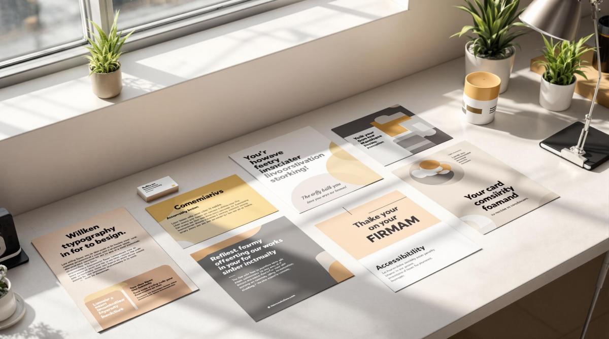
Typography is the backbone of effective print branding. It impacts readability, visual appeal, and how your brand is perceived. Here’s a quick summary of the 10 essential rules for creating impactful typography in print materials:
- Choose Brand-Appropriate Fonts: Select fonts that reflect your brand’s personality. Pair serif, sans-serif, or display fonts for contrast.
- Establish Clear Text Hierarchy: Use different font sizes, weights, and spacing to guide readers through your content.
- Set Proper Spacing: Adjust letter, line, and paragraph spacing for a polished look.
- Maintain Typography Uniformity: Stick to 2-3 fonts and create a typography style guide for consistency.
- Ensure Readability: Use optimal line lengths, contrast, and font sizes for clear communication.
- Use Bold and Italics Sparingly: Apply emphasis styles only where necessary to avoid clutter.
- Pick Print-Safe Colors: Use high-contrast CMYK colors and adjust for paper types.
- Follow Brand Style Rules: Align typography with your brand’s guidelines for cohesive materials.
- Prepare Files for Printing: Embed fonts, use proper resolution (300 DPI+), and check color settings.
- Check and Adjust Results: Review printed samples for clarity, consistency, and quality.
These principles ensure your typography looks professional, aligns with your brand, and communicates effectively in print materials.
Typography Tutorial – 10 rules to help you rule type
1. Select Brand-Appropriate Fonts
Choose fonts that reflect your brand’s personality while ensuring they are easy to read in print.
Primary and Secondary Fonts
Pick two main fonts:
- Primary font: Used for headlines and titles.
- Secondary font: Used for body text and detailed information.
The key is to pair fonts that complement each other but still provide enough contrast. For instance, you might combine a bold serif font for headlines with a clean sans-serif font for body text – or the other way around.
Types of Fonts for Print
Here are three font categories to consider:
- Serif Fonts: Great for brands that want to convey tradition and authority. Examples include:
- Sans-Serif Fonts: Ideal for a modern and clean look. Examples include:
- Display Fonts: Best used sparingly for logos or main headlines. Stick to one display font to maintain consistency.
Technical Details to Keep in Mind
- Ensure the font includes a full character set and offers various weights (like light, regular, and bold).
- Obtain the necessary commercial licenses for printing.
- Convert fonts to outlines before sending files to avoid any issues during production.
Font Size Recommendations
For readability, stick to these guidelines:
- Body text: 9–12 pt
- Headlines: 14–24 pt
- Minimum size: 6 pt (adjust based on how far away the text will be viewed).
Finally, always provide font files along with outlined artwork to avoid production delays.
2. Create Clear Text Hierarchy
A clear text hierarchy helps guide readers through printed materials, making it easier to follow and understand the content. Use these tips to build an organized visual structure based on your font choices.
Size and Weight Hierarchy
Varying size and weight can emphasize different levels of importance:
- Primary Level: Main headlines (24–36 pt)
- Secondary Level: Subheadings (18–24 pt)
- Tertiary Level: Section titles (14–16 pt)
- Body Text: Regular content (9–12 pt)
Visual Distinction Techniques
Enhance readability by applying these adjustments:
- Use bold weights for headlines to grab attention.
- Stick to regular weight for body text for easy reading.
- Apply light weights for supplementary details.
- Add more space above headings than below them.
- Keep paragraph spacing consistent (around 1.5× the text size).
- Provide wider margins for key text blocks to make them stand out.
Color and Contrast
Choose darker colors for main headlines and gradually lighter shades for supporting text to create a natural flow.
Practical Layout Tips
Whitespace Management
- Add generous whitespace around headlines to make them pop.
- Indent important paragraphs or quotes for emphasis.
- Use consistent spacing to create clear section breaks.
Alignment Structure
- Keep headings left-aligned to improve readability.
- Maintain uniform indentation levels throughout.
- Use hanging punctuation for bullet points to keep lists neat.
3. Set Proper Spacing
Once you’ve established a clear text hierarchy, the next step is to adjust spacing for a polished, readable layout. Good spacing not only improves readability but also enhances the overall visual appeal.
Letter Spacing (Tracking)
Here are some general recommendations for tracking:
- Headlines (above 24pt): Adjust between -20 to 0
- Body text (9–12pt): Adjust between 0 to +15
- Small text (below 9pt): Adjust between +15 to +25
Line Spacing (Leading)
For line spacing, follow these guidelines:
- Body Text: Set leading to 120–150% of the font size for comfortable reading.
- Headlines: Use tighter spacing, around 110–120% of the font size.
- Long-form Text: Increase leading to about 160% to improve readability over extended text blocks.
Paragraph Spacing
When setting up paragraph spacing, aim for consistency:
- Add space equal to 1.5× the line height between paragraphs.
- For new sections, use spacing equivalent to 2× the line height.
- Ensure spacing is uniform throughout the document.
Word Spacing
Word spacing depends on text alignment and its purpose. Use the table below as a guide:
| Alignment | Recommended Word Spacing | Best Use Case |
|---|---|---|
| Left | Default (100%) | Body text |
| Justified | 85–115% | Formal documents |
| Center | 90–100% | Headlines |
Special Considerations
Print-Specific Adjustments
- Leave at least 0.125 inches of margin to account for trimming during the printing process.
- Near fold lines, reduce spacing by 0.0625 inches and consider the thickness of the paper stock when adjusting.
Digital File Preparation
- Follow proper file conversion protocols for digital formats.
- For complex printing needs, consult with professional print shops like Miro Printing & Graphics Inc. in Hackensack, NJ, to ensure quality results.
4. Keep Typography Uniform
Maintaining consistent typography is key to building a strong brand identity and projecting a professional image. Here’s how to ensure your typography stays uniform:
Font Family Management
Stick to just 2–3 fonts to keep your designs clean and cohesive:
- Use a maximum of two or three primary fonts.
- Pair one serif font with one sans-serif font for balance.
- Add a display font only if it’s absolutely necessary for special occasions or unique designs.
Create a Typography Style Guide
Document key typography details to ensure consistency across all materials. Include these elements:
| Element | Specification | Usage Guidelines |
|---|---|---|
| Primary Font | Font name & weights | For main body text and headlines |
| Secondary Font | Font name & weights | For subheadings and callouts |
| Font Sizes | Specific point sizes | For various content types |
| Line Heights | Exact measurements | Adjust for different text blocks |
| Letter Spacing | Precise values | Differentiate headers and body text |
A well-documented style guide ensures your typography aligns with your brand identity for every project.
Cross-Platform Consistency
When working on files for different print materials, follow these steps:
- Convert logos and key elements to outlines.
- Package fonts with design files to avoid missing assets.
- Use OpenType fonts for better compatibility.
- Identify backup fonts to handle fallback scenarios.
These practices help maintain a seamless, polished look across all your print designs.
Version Control
Master templates are your best friend for keeping everything consistent:
- Develop templates for frequently used materials.
- Store approved font files in one central location.
- Document any allowed variations in typography.
- Keep a changelog to track updates or changes.
Size Relationships
Set clear point sizes for each text element to ensure consistency:
- Headlines: 24–36 pt
- Subheadings: 18–24 pt
- Body Text: 10–12 pt
- Captions: 8–9 pt
This structure ensures readability and balance throughout your designs.
Print-Specific Considerations
When preparing typography for print, keep these tips in mind:
- Use a minimum font size of 8 pt to ensure readability.
- Test fonts at actual sizes on the paper stock you’ll use to check for clarity.
5. Make Text Easy to Read
Clear and readable text is essential for effective print materials. Here’s how to ensure your text looks great and is easy to read:
Optimal Line Length
Keep line lengths within these ranges for better readability:
- General print: 45–75 characters
- Business cards: 35–45 characters
- Brochures: 60–65 characters
Once you’ve set the line length, adjust the line spacing to improve clarity.
Line Spacing (Leading)
Set line spacing to about 120–150% of the font size. This ensures the text feels open and easy on the eyes.
Contrast and Background
High contrast is key for legibility. Use dark text on light backgrounds and follow these tips:
- Aim for at least a 70% contrast difference between text and background colors.
- Avoid placing text over busy patterns or photographs, as it can make reading difficult.
Print-Specific Adjustments
Fine-tune your typography for print with these adjustments:
- Slightly increase tracking for smaller text sizes, and manually adjust kerning for headlines or logos.
- Use a heavier font weight for reverse type (light text on dark backgrounds).
- Keep body text at a minimum size of 8 pt for comfortable reading.
Paper Selection and Typography
The paper you choose impacts how your typography looks. Here’s what to consider:
| Paper Type | Typography Tips |
|---|---|
| Coated Gloss | Reduce contrast slightly for balance. |
| Uncoated | Increase font weight for better visibility. |
| Textured | Avoid delicate serif fonts. |
| Recycled | Test for ink spread before finalizing. |
After selecting your paper, adjust text effects to work with any specialty finishes.
Special Considerations for Print Effects
When using specialty printing techniques, make these adjustments:
- Embossed text: Use a font size of at least 12 pt.
- Foil stamping: Avoid using fonts with thin serifs.
- Spot UV: Ensure text is at least 10 pt.
- Reverse type: Increase font weight for better readability.
Physical Environment
Think about where the material will be viewed to ensure it remains readable:
- Indoor settings: Standard contrast and font sizes work well.
- Outdoor viewing: Increase contrast and text size by 10–15%.
- Reading distance: Use 6-inch distance for business cards and 18-inch distance for posters.
- Motion viewing: Opt for larger font sizes for moving visuals.
For professional results, consider working with experts like Miro Printing & Graphics Inc. in Hackensack, NJ. They offer a full range of services – from digital and offset printing to in-house bindery and design – ensuring your typography looks sharp and polished in every print project. You can learn more at Miro Printing & Graphics Inc..
sbb-itb-ce53437
6. Use Bold and Italics Carefully
Using text emphasis thoughtfully can make your print materials more effective and visually appealing. When paired with proper spacing and hierarchy, bold and italic styles can enhance clarity without overwhelming the design. Here’s how to use them effectively:
Bold Text Guidelines
Bold text is ideal for:
- Section headers and subheadings
- Key terms or product names (limit to 2 per paragraph)
- Contact details in business documents
- Warnings or critical notices
Avoid bolding:
- Entire sentences or paragraphs
- Several words close together
- Text used purely for decoration
Italic Text Applications
Italics are best suited for:
- Titles of publications
- Foreign language phrases
- Highlighting single words for emphasis
- Scientific terms
- Photo credits or captions
Adjusting Bold Weight for Different Paper Types
The type of paper you use can affect how bold text appears. Here’s a quick guide:
| Paper Type | Recommended Bold Weight |
|---|---|
| Coated Stock | Regular bold weight (600) |
| Uncoated Stock | Semi-bold weight (500) |
| Newsprint | Extra bold weight (800) |
| Specialty Papers | Test before production |
Combining Emphasis Styles
When mixing bold and italic styles:
- Avoid combining both styles on the same text
- Leave at least two lines of space between emphasized sections
- Limit emphasized text to no more than 10% of the total content
- Use only one emphasis style per paragraph
Size Relationships
For readability, follow these size tips:
- Keep bold text within 2 points of the body text size
- Raise italic text by 0.5 points for better visibility
- Minimum size for bold text: 7 pt
- Minimum size for italic text: 8 pt
Print Production Tips
- Ensure bold text remains sharp after printing
- Verify italic angles are clear, even at smaller sizes
- Test emphasis styles on the actual paper stock you’ll use
- Add 1-2 points of extra spacing (leading) around emphasized text
Preparing Digital Files
For digital design and production:
- Use true bold and italic fonts instead of simulated styles
- Include all font weights in packaged design files
- Convert emphasized text to outlines for logo files
- Preview how emphasis styles render in various file formats
7. Choose Print-Safe Colors
Picking the right colors for print is crucial for readability and meeting print standards. Here’s what you need to know.
Color Contrast Requirements
To ensure your text is easy to read:
- Maintain at least a 4.5:1 contrast ratio between text and background.
- Use dark shades for body text (80% or higher black).
- Avoid light text on light backgrounds.
- Test text colors at their final print size.
CMYK Color Guidelines
When setting up CMYK color values, follow these guidelines:
| Text Size | Recommended Color Settings |
|---|---|
| Body Text (8-12pt) | Single color, 100% value |
| Headlines (14pt+) | Up to 2 colors, minimum 80% value |
| Reversed Text | Single color, minimum 70% value |
| Decorative Text | Maximum 3 colors, test thoroughly |
Paper Stock Considerations
Paper type can affect how colors look in print. Adjust accordingly:
- Uncoated Paper: Colors may appear darker; reduce values by 10–15%.
- Coated Stock: Produces more vibrant colors.
- Recycled Paper: Slight color shifts are possible; test before production.
- Specialty Papers: Always test for color accuracy.
These adjustments help achieve sharp and consistent results.
Color Registration
Proper color registration is key for small text and detailed designs:
- Avoid multi-color fonts for text under 12pt.
- Use single color channels for small text.
- Add a 0.5pt trap for overlapping colors.
- Set black text to overprint.
Color Breakdowns
Use these breakdowns for clear and crisp printing:
- Black Text: 100% K for text under 14pt.
- Rich Black Text: 40C, 30M, 30Y, 100K (for 14pt+ text).
- Colored Text: Ensure at least 70% in a single color channel.
- White Text: Knock out from backgrounds with over 40% density.
Digital File Preparation
When preparing your files for printing:
- Convert all colors from RGB to CMYK.
- Embed color profiles and add spot colors as separate channels.
- Save your color swatches within the project files.
Special Printing Effects
To add flair to your typography, consider these effects:
- Metallic Inks: Use only for text 14pt or larger.
- Spot UV: Maintain a minimum stroke width of 2pt.
- Sans-Serif Fonts: Best for effects on text smaller than 16pt.
- Embossing: Recommended for sans-serif fonts, 18pt or larger.
These steps ensure that your printed materials look polished and professional.
8. Follow Brand Style Rules
Combine essential typography principles with your brand’s specific guidelines to ensure consistent and polished print results.
Brand Guidelines Integration
Keep your brand’s typography rules well-documented and easy to follow:
- Include font usage details in a brand style guide.
- Define clear roles for primary and secondary typefaces.
- Specify font sizes and weights for different contexts.
- Set consistent line spacing and kerning values.
Typography Specifications
| Element | Details |
|---|---|
| Primary Font | Font name, weights, and sizes for various uses |
| Secondary Font | Font name, weights, and allowed combinations |
| Minimum Size | Text: 8pt, Reversed: 10pt |
| Line Spacing | Body: 120-140% of font size |
| Letter Spacing | Headlines: -20 to 0, Body: 0 to +20 |
Document Templates
Standardize your business documents, marketing materials, corporate communications, and packaging with consistent templates.
Typography Variations
Define how typography can be adjusted within your brand’s framework:
- Headlines: Use up to two font weights.
- Body Text: Stick to one weight, with an italic option if needed.
- Pull Quotes: Apply special formatting aligned with brand rules.
- Captions: Follow specific size and weight guidelines.
These variations help maintain a professional and cohesive look while simplifying quality control and file management.
Quality Control Process
Check for consistency in fonts, spacing, alignment, hierarchy, and color usage according to your brand’s style guide.
File Management
Streamline your workflow by organizing fonts and templates:
- Store approved fonts in one central location.
- Lock templates to prevent unauthorized changes.
- Document font licenses.
- Keep backups of all brand fonts and templates.
Brand Evolution
Ensure your typography guidelines stay current as your brand evolves:
- Update the style guide with any changes.
- Notify team members about updates.
- Set deadlines for implementing changes.
- Archive older versions of guidelines.
- Adjust templates to reflect updates.
Print Production Standards
Stick to your brand rules during print production to achieve professional results:
- Include all necessary font files with print-ready documents.
- Maintain backup copies of original files.
- Test print samples before full production.
For expert assistance, local print shops like Miro Printing & Graphics Inc. in Hackensack, NJ, offer pre-press review services to ensure your typography is production-ready.
9. Prepare Files for Printing
Getting your files ready for printing requires careful attention to detail to ensure your typography looks perfect on paper.
Font Embedding and Packaging
When sending files for print, make sure all fonts are properly included:
- Convert fonts to outlines to avoid missing font issues.
- Embed fonts in PDFs to maintain consistency.
- Include all font files used in the design.
- Convert any special characters to outlines for accurate reproduction.
Resolution Requirements
Set the resolution based on the type of print material to ensure sharp and clear results:
| Print Material | Minimum DPI | Optimal DPI |
|---|---|---|
| Business Cards | 300 | 600 |
| Brochures | 300 | 450 |
| Large Format | 150 | 300 |
| Fine Text | 600 | 1200 |
Color Settings
Adjust color settings to ensure accurate typography in the final print:
- Use the CMYK color space for all text.
- Avoid using multiple colors for small text to prevent blurring.
- Keep reversed text sizes at 10pt or larger for readability.
- Use rich black (a mix of CMYK values) for deeper, more vibrant blacks.
Pre-flight Checklist
Before sending your files to print, review these key typography elements:
- Ensure font compatibility across systems.
- Check for missing characters or symbols.
- Fix any broken font links.
- Address text reflow issues that may occur during file conversion.
- Review transparency effects and ensure they won’t cause problems.
- Confirm overprint settings are applied correctly.
File Format Standards
Export your files in the correct formats for the type of printing:
- PDF/X-1a: Ideal for standard commercial printing.
- PDF/X-4: Suitable for digital printing with transparency.
- Native files: Include these for last-minute adjustments if needed.
Technical Specifications
Adjust typography based on the printing method to ensure readability and quality:
| Print Method | Minimum Type Size | Reverse Type Size |
|---|---|---|
| Digital | 6pt | 8pt |
| Offset | 4pt | 6pt |
| Screen | 12pt | 14pt |
Production Notes
Include detailed instructions to guide the production team:
- Specify font substitution preferences.
- Highlight critical alignment requirements.
- Note any special finishing effects like embossing or foil stamping.
- Provide quality control points for final checks.
Miro Printing & Graphics Inc. in Hackensack, NJ, offers pre-press services to ensure your typography meets professional standards. Their in-house team can review your files for potential issues before printing begins.
Version Control
Keep your files organized to avoid confusion:
- Save both progressive versions and the original files.
- Clearly label the final print files.
- Document any production adjustments made along the way.
Print Testing
Before full production, test your files to verify everything is correct:
- Request digital proofs for review.
- Check for color accuracy and consistency.
- Ensure all fonts render properly.
- Confirm the size and spacing align with your design.
- Inspect reversed type areas for clarity and readability.
10. Check and Adjust Results
Performing a thorough final check ensures your typography aligns with design standards and meets print specifications.
Visual Inspection
Carefully review printed samples for:
- Text clarity under different lighting conditions.
- Color consistency across various paper stocks.
- Sharpness of small text and any signs of ink bleeding.
- Line spacing to confirm readability.
Quality Control Steps
- Use a loupe to verify point sizes and spacing.
- Match colors against Pantone swatches.
- Check the registration of multi-color text.
- Test typography on different types of paper.
- Assess how coatings affect readability.
Common Adjustments
| Problem | Fix | How to Apply |
|---|---|---|
| Ink Spread | Increase letter spacing | Add 0.5–1pt tracking |
| Poor Contrast | Adjust type weight | Move up one weight class |
| Fill-in Issues | Modify reverse type | Increase point size by 0.5pt |
| Rough Edges | Adjust anti-aliasing | Add a slight stroke (0.25pt) |
| Gradient Text | Simplify color breaks | Reduce gradient steps |
Be mindful of how environmental factors can influence the final print.
Print Environment Considerations
- Temperature: Maintain between 68–72°F (20–22°C).
- Humidity: Keep at 45–55% relative humidity.
- Storage: Store flat to avoid warping.
- Handling: Use clean, dry hands to prevent smudges or damage.
Digital vs. Physical Review
Comparing digital proofs with physical samples helps ensure quality:
- View at the actual size and intended distance.
- Check typography from different angles.
- Inspect fold areas for distortion.
- Review binding edges to confirm proper text alignment.
Professional Quality Standards
- Text edges should remain sharp, even at 300% magnification.
- Line weights must stay consistent throughout.
- Character spacing should be uniform across text blocks.
Final Verification Process
To ensure everything is perfect, follow these steps:
- Conduct a viewing test from a distance.
- Inspect details under magnification.
- Compare multiple copies for consistency.
- Test under various lighting conditions.
- Check durability by handling and bending samples.
Miro Printing & Graphics Inc. offers expert quality control services, including detailed typography checks using professional-grade equipment. Their skilled team ensures your materials meet industry standards before mass production.
A detailed final review ensures your printed materials are polished and professional, ready to make an impact.
Conclusion
Creating outstanding print typography requires attention to detail and technical know-how. While digital tools simplify design, achieving professional print results still depends on expertise and high-quality equipment.
Typography in print plays a key role in shaping how a brand is perceived. Well-crafted typography can enhance brand recognition and make messages more memorable. On the other hand, poor typography can damage credibility and waste resources.
Why Professional Print Services Matter
Partnering with experienced print professionals ensures your typography looks as intended across all materials. Here’s what professional print services bring to the table:
| Feature | Typography Impact | Business Advantage |
|---|---|---|
| Pre-press Review | Identifies issues before printing | Prevents expensive reprints |
| Color Management | Keeps brand colors consistent | Builds stronger brand identity |
| Paper Selection | Matches typography to paper types | Improves overall print quality |
| Quality Control | Maintains typography standards | Safeguards brand reputation |
Miro Printing & Graphics Inc., with over 30 years in the industry, showcases the importance of professional services. Clients like Mike B. highlight their attention to detail:
"Great customer service that we didn’t get with our old online printer attention to detail is what makes the difference!"
This level of service ensures your typography achieves its full potential.
Elevating Typography in Print Branding
Success in print branding goes beyond the basics. It requires:
- Professional Equipment: Industrial-grade printers ensure consistent quality.
- Technical Knowledge: Understanding how different printing methods affect typography.
- Quality Control: Thorough checks to maintain uniform results.
- Material Expertise: Choosing the right paper and finishes for readability and impact.
With expert guidance, challenges in typography can be tackled effectively. As Julia I., another satisfied client, puts it:
"Best service I’ve ever received from a printer; couldn’t recommend Miro more highly."
What’s Next?
Strong print branding starts with mastering typography principles and working with skilled professionals. By combining technical expertise with professional services, you can avoid common mistakes and ensure your materials consistently reflect your brand’s quality. This approach helps solidify your presence in the market while maintaining your visual identity.
Related Blog Posts
- Top 7 Typography Trends in Commercial Printing 2025
- Serif vs. Sans Serif: Choosing Fonts for Print Branding
- How Typography Impacts Print Design Success
- Readability vs. Legibility: Typography Basics
https://app.seobotai.com/banner/banner.js?id=67d8c07fbeb3268b1c6ad0f4
