Want your business print materials to look professional and easy to read? Here’s how you can achieve that in 7 simple steps:
- Align Elements with Grids: Use grids to keep your design clean and organized.
- Pick Clear Fonts and Sizes: Stick to readable fonts and appropriate sizes for headlines and body text.
- Balance Text and White Space: Use negative space to make your design less cluttered and easier to follow.
- Use High-Quality Images: Ensure all visuals are sharp and print-ready (300 DPI or higher).
- Set Proper Margins and Bleeds: Avoid unwanted white edges by extending designs slightly beyond the trim line.
- Choose CMYK Colors for Print: Convert RGB colors to CMYK for accurate color reproduction.
- Double-Check Files Before Printing: Proofread, outline fonts, and export as a press-ready PDF.
Quick Tip: Follow these steps to create polished layouts that meet U.S. print standards and leave a lasting impression. Keep reading for detailed explanations and practical advice.
Print Design 101 | Office Hours
Basic Layout Rules for Business Printing
Creating effective print materials begins with using clear layout principles that make it easy for readers to follow and understand your message.
Visual Hierarchy and Flow
Start by establishing a clear visual hierarchy. Highlight your headline or logo first, then present supporting details in descending order of importance. This approach ensures readers can quickly grasp the most important information.
Below are seven practical tips to help you apply these principles to your print layouts effectively.
1. Keep Elements Aligned Using Grids
Stick to a consistent grid to align text, images, and other design elements. This approach helps create layouts that feel organized, clean, and easy to navigate. Pair your grid with clear fonts and appropriate sizes to enhance the overall structure.
2. Choose Clear Fonts and Sizes
Typography plays a key role in making your content easy to read and visually organized.
Stick to clean, readable fonts. Use sans serif fonts for body text and serif fonts for headlines. Limit yourself to just two font families to maintain a consistent look.
For body text, aim for a font size between 10–12 pt if it’s being viewed from a distance of 12–15 inches. Headlines should be larger to naturally draw attention. Always proof your design at 100% scale to ensure everything looks right. If you’re using light text on a dark background, consider increasing the font size slightly for better readability.
3. Balance Text and Empty Space
Once you’ve set up your grid and chosen your fonts, it’s time to think about white space (also called negative space). White space helps direct your readers’ attention, reduces visual strain, and gives your layout a polished look.
Here are some tips for using white space effectively:
- Keep consistent spacing around headings, paragraphs, and images.
- Use space to organize content and emphasize important details.
- Ensure clear separation between columns for better readability.
- Add generous margins around graphics to avoid a cluttered appearance.
- Break up long blocks of text with paragraph breaks and padding.
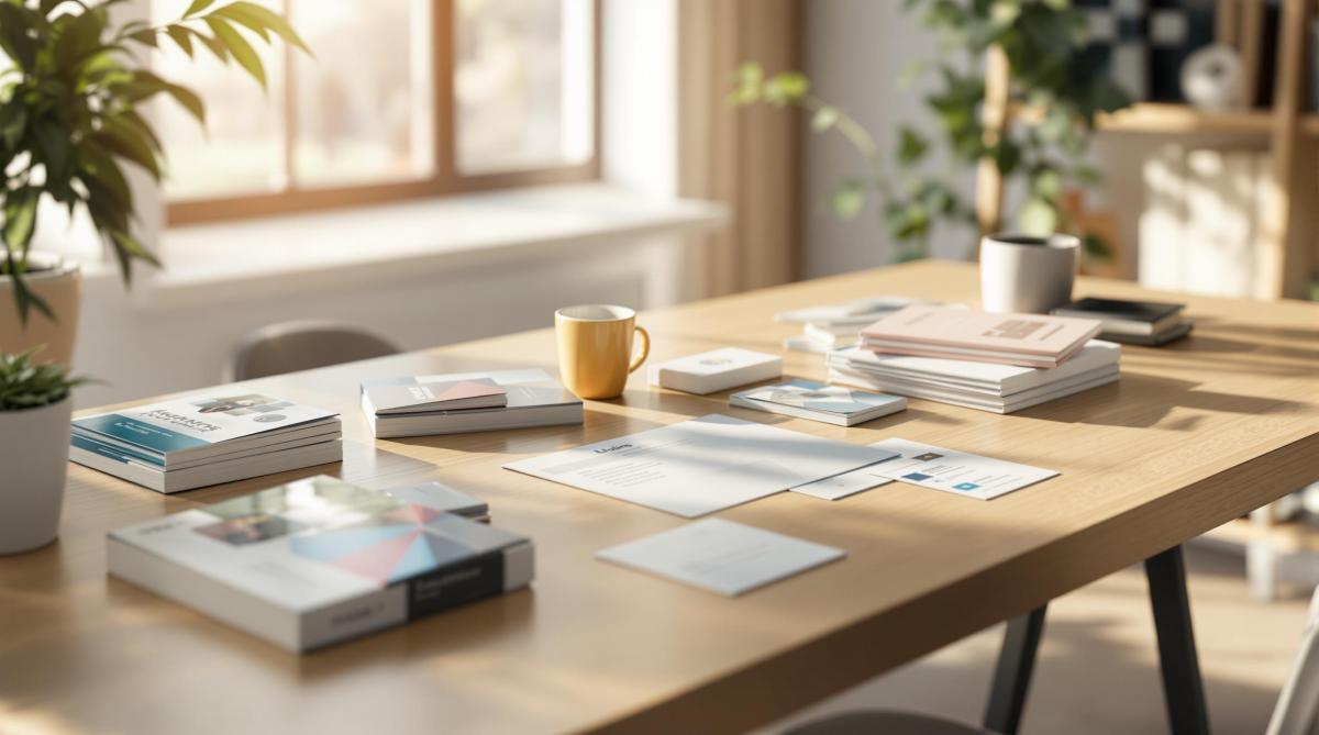
4. Use High-Quality Images
Once you’ve balanced text and white space, make sure your visuals are just as polished. Use sharp, high-resolution images to maintain a professional look. Always embed images at 300 DPI or higher, convert files from RGB to CMYK, and export artwork as TIFF or press-ready PDF. For logos, stick with vector EPS files to avoid pixelation and color inconsistencies. Clear and detailed images help create a strong visual flow and naturally guide the reader’s attention through your design.
sbb-itb-ce53437
5. Add Proper Print Margins
Set up your margins carefully to ensure edge-to-edge designs print without issues.
To avoid unwanted white edges, use bleed and margins correctly. Bleed means extending your background or images slightly beyond the trim line, so even if the cut is slightly off, there won’t be any gaps.
Here’s how to organize your layout:
- Bleed: Extend backgrounds and images beyond the trim line.
- Trim line: This is where the final cut will be made.
- Safe zone: Keep text, logos, and important elements inside this area to avoid them being cut off.
Most design software lets you enable guides for bleed and margins. Use these guides to keep key content in the safe zone and extend any edge-to-edge elements into the bleed. This is especially important for small-format prints, where even tiny misalignments can stand out.
6. Set Up Colors for Print
Once you’ve adjusted the margins, the next step is ensuring the colors in your design look the same in print as they do on your screen. To achieve this, ask Miro Printing & Graphics Inc. for a color proof. This will help confirm that the colors you see digitally will match the final printed product.
7. Check Files Before Printing
After finalizing your colors, reviewing your files one last time can help avoid expensive printing mistakes. A thorough preflight check ensures your project is production-ready.
Here’s a quick checklist to follow:
- Embed all fonts and convert text to outlines.
- Set color mode to CMYK and confirm spot color settings.
- Include bleed and trim marks in your design.
- Ensure images are at least 300 DPI for sharp results.
- Proofread all text at its actual size (100% scale).
- Export as a press-ready PDF (PDF/X‑1a or PDF/X‑4).
You can upload your preflighted file or send it directly to Miro Printing & Graphics Inc. for a professional review. Pair this step with the color proof from step 6 to ensure everything is perfect for printing.
Benefits and Challenges
Once your files are finalized, it’s time to consider the pros and cons of using professional layouts.
A well-thought-out layout can strengthen your brand while also highlighting potential areas for improvement.
Key Benefits
Using professional layouts can leave a lasting impression and directly influence your business outcomes. Here’s how well-crafted designs help:
- Make a strong first impression with cohesive and polished visuals.
- Enhance your brand image by showcasing professionalism in your materials.
- Stay cost-efficient by reducing the need for revisions and minimizing waste.
Challenges
Creating professional layouts demands attention to detail and careful budgeting. Ensure your final design aligns with your brand guidelines and stays within financial limits to avoid unexpected issues.
U.S. Print Standards
Once your layout is finalized, double-check these U.S. print standards to avoid any production hiccups.
Standard Paper Sizes
Here are the most commonly used paper sizes in the U.S.:
- Letter: 8.5×11 in (used for documents and letterheads)
- Legal: 8.5×14 in (ideal for contracts)
- Tabloid: 11×17 in (great for newsletters)
- Statement: 5.5×8.5 in (perfect for flyers)
Technical Specs
Make sure your files meet these key specifications:
- DPI: Use 300 for print-ready PDFs; 150-200 for larger-format graphics.
- Bleed: 0.125 in; Safe margin: 0.25 in; Gutter: 0.375 in.
Production Prep
Follow these steps to prepare your files for production:
- Convert colors from RGB to CMYK and specify spot colors using PMS.
- Use C60 M40 Y40 K100 for rich black.
- Embed or outline all fonts, define the trim size, and include crop marks.
- Export files as PDF/X-1a:2001 for the best results.
Stick to these guidelines and run a final preflight check to ensure everything is print-ready.
Design Services at Miro Printing & Graphics Inc.
At Miro Printing & Graphics Inc., we follow U.S. print standards to ensure layouts move seamlessly from digital designs to printed materials.
Our team has a deep understanding of layout principles and technical requirements, providing support at every stage of the process. We specialize in turning your ideas into polished, print-ready designs.
Experienced Design Team
- Over 30 years of expertise in creating print-ready layouts that meet strict specifications and uphold brand identity.
Collaborative Approach
We work closely with clients to create designs that align with their brand and fit their budget. Our services cover a wide range of needs, including:
- Brochures, flyers, and presentation folders
- Business cards, letterheads, and envelopes
- Banners, posters, and signage
- Custom formats and specialty finishes
Our design services are tailored to help you overcome any printing challenges, ensuring professional results every time.
Summary
Creating effective business print materials requires attention to several key elements: grid alignment, consistent typography, balanced white space, high-resolution visuals, proper margins with bleed, accurate CMYK color setup, and thorough preflight checks. These steps ensure polished, error-free materials that align with U.S. printing standards and reflect your brand’s professionalism.
Here’s a quick checklist:
- Use grid alignment and maintain consistent typography throughout.
- Ensure white space is well-balanced for a clean look.
- Include high-resolution images (300 DPI or higher).
- Set up correct margins, bleed, and CMYK color profiles.
- Perform final preflight checks (outline fonts, export as PDF/X).
Working with Miro Printing & Graphics Inc. simplifies this process, delivering professional, on-brand print materials efficiently.
Related posts
- Ultimate Guide to Personalized Print Design
- How Typography Impacts Print Design Success
- Readability vs. Legibility: Typography Basics
- French Fold Brochures: Design Tips
https://app.seobotai.com/banner/banner.js?id=6806df48e572faef86998937
