
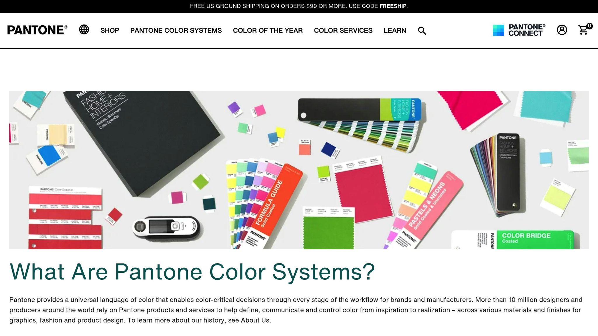
Pantone charts are essential for achieving accurate and consistent colors in large format printing. Whether you’re creating banners, posters, or signage, these charts help ensure that colors look the same across different materials and print runs. Here’s what you need to know:
- Precise Color Matching: Pantone’s unique spot colors ensure exact matches, especially for branding.
- Consistency Across Projects: Colors stay uniform, even in multiple print jobs.
- Material-Specific Accuracy: Swatches show how colors will appear on vinyl, fabric, or other materials.
Quick Comparison: Pantone vs. CMYK
| Feature | Pantone Colors | CMYK Process |
|---|---|---|
| Color Creation | Pre-mixed inks | Blend of four colors |
| Consistency | Extremely reliable | Can vary slightly |
| Cost | Higher | More affordable |
| Best For | Logos, branding | Photos, general printing |
| Color Range | 2,390+ spot colors | Limited gamut |
For the best results, professionals often combine both systems: Pantone for brand elements and CMYK for broader image areas. Testing colors on actual materials and using calibrated equipment ensures accuracy. Local print shops, like Miro Printing & Graphics Inc., specialize in this process, offering expert color matching and material testing for flawless results.
Pantone’s Impact on Large Format Printing
Pantone Matching System (PMS) Basics
The Pantone Matching System (PMS) changed the game for color accuracy in large format printing by introducing a standardized way to reproduce colors. With over 2,390 spot colors, each assigned a unique code, PMS acts like a universal language for color communication. This system ensures that everyone involved – designers, printers, and clients – can refer to the same exact shade, no matter the project. When a Pantone code is specified, it guarantees that the color will look consistent across all formats.
Large Format Projects and Pantone Charts
Pantone charts are essential tools for large format printing, offering a practical way to ensure colors remain true even on a grand scale. These guides allow professionals to see how colors will look when applied to larger surfaces. In real-world applications, Pantone charts help with:
- Color Verification: Testing colors on actual materials before full-scale production begins.
- Material Adaptation: Adjusting for how different materials, like vinyl or fabric, can alter a color’s appearance.
- Quality Control: Using physical swatches to compare and maintain consistency throughout production.
This level of precision is critical, especially when balancing the strengths of Pantone and CMYK processes.
Pantone and CMYK: Key Differences
When it comes to large format printing, deciding between Pantone and CMYK can make or break a project. Here’s how they stack up:
| Characteristic | Pantone Colors | CMYK Process |
|---|---|---|
| Color Creation | Pre-mixed inks | A blend of four colors |
| Consistency | Extremely consistent | Can vary between prints |
| Cost | Higher per color | More budget-friendly |
| Best Uses | Branding, exact matches | Photos, general printing |
| Color Range | 2,390+ spot colors | Limited gamut |
Pantone is the go-to choice for projects where exact color matching is crucial – like maintaining consistent brand colors across multiple print runs. On the other hand, CMYK is ideal for general imagery and photographic elements.
In large format printing, professionals often combine both systems. CMYK is used for broader image areas, while Pantone ensures that critical brand elements – like logos – remain consistent. To achieve this level of precision, print shops rely on advanced tools like spectrophotometers, which measure printed samples against reference colors, and RIP software, which translates Pantone values for various devices. This blend of technology and expertise ensures the final product meets exacting standards.
Best Practices for Pantone Charts in Large Format
Selecting Your Pantone Guide
Choosing the right Pantone guide is essential for accurate color reproduction, especially when working with large-format materials. The guide you pick should align with the type of material you’re printing on.
| Guide Type | Best Applications | Material Examples | Key Considerations |
|---|---|---|---|
| Coated | Glossy surfaces | Vinyl banners, photo paper, glossy signage | Produces vibrant, saturated colors |
| Uncoated | Porous materials | Fabrics, cardstock, matte paper | Colors appear softer and lighter |
| Metallic | Specialty finishes | Metallic substrates, foils | Requires specific inks and equipment |
Once you’ve selected the right guide, it’s important to confirm your color settings through thorough testing to ensure precision.
Color Testing and Equipment Setup
Proper calibration and testing are critical for consistent color output. Here’s how to get started:
-
Initial Calibration
Begin by setting up your printer’s color profiles, checking the print head functionality, and documenting the settings that deliver the best results. -
Test Print Protocol
Print sample swatches on your target material, then compare these to your Pantone guide under D50 (5000K) lighting conditions. This ensures you’re reviewing colors under standardized lighting. -
Color Management Settings
Fine-tune your printer’s settings, including:- RIP software configurations
- Color profile adjustments
- Ink density settings
- Material-specific parameters
By calibrating your equipment and verifying the printed colors, you can make adjustments tailored to the material you’re using for optimal results.
Material-Specific Pantone Applications
The texture, absorbency, and finish of your material can significantly influence how Pantone colors appear. Here’s what to keep in mind for different materials:
- Vinyl Banners: Increase ink saturation to achieve richer, deeper colors.
- Fabric Materials: Consider how the material’s absorbency and texture might alter the final color.
- Rigid Substrates: Account for the impact of surface coatings on color reproduction.
For particularly challenging materials or when exact color matching is essential, professional printing services can be invaluable. Companies like Miro Printing & Graphics Inc. specialize in material testing and Pantone color matching, ensuring accurate results across a variety of substrates.
Common Pantone Color Issues and Fixes
Material and Light Effects on Color
Pantone colors can look different depending on the printing material and lighting conditions.
| Material Type | Common Issues | Recommendations |
|---|---|---|
| Glossy Vinyl | Colors may appear overly vibrant | Adjust ink density and use a coated Pantone guide for reference |
| Matte Fabric | Colors can seem muted or washed out | Increase saturation and consult an uncoated Pantone guide |
| Rigid Boards | Uneven color absorption | Apply a primer coating and test colors on the actual material |
Lighting plays a huge role in how colors are perceived. To ensure accuracy, review proofs under D50 lighting as well as other conditions that mimic the final display environment. Testing samples in various lighting scenarios can help avoid surprises once the product is installed.
Printer Hardware Constraints
Modern printers often rely on CMYK to simulate Pantone colors, but this process has its limits. Here’s how to navigate these challenges:
-
Color Gamut Management
Use RIP software to identify colors that fall outside the printer’s gamut early in the process. If possible, opt for expanded gamut printing or spot colors to achieve closer matches for critical designs. -
Hardware Calibration
Regular calibration ensures your printer performs consistently. Follow this routine:- Check printhead alignment daily
- Perform color calibration weekly
- Verify printer profiles monthly
These steps help maintain color accuracy and avoid unexpected shifts during production.
Print Run Color Matching
Keeping colors consistent across multiple print runs requires close monitoring of several factors.
| Control Factor | Recommendation | Monitoring Frequency |
|---|---|---|
| Temperature | Maintain between 68–72°F (20–22°C) | Check every 4 hours |
| Humidity | Keep between 45–55% | Check every 4 hours |
| Material Storage | Store in a climate-controlled space | Inspect daily |
| Color Verification | Compare prints to a master sample | Review for every print run |
When inconsistencies arise, examine all variables – printer settings, ink batches, material lots, and environmental conditions. Meticulous tracking of these details can help pinpoint and resolve any discrepancies efficiently.
sbb-itb-ce53437
Professional Print Services for Pantone Projects
Benefits of Local Print Shops
When it comes to large format projects requiring precise Pantone color matching, local print shops offer distinct advantages. Their ability to provide direct communication and in-person collaboration allows for real-time problem-solving. Clients can review physical proofs under different lighting conditions and make adjustments as needed, ensuring the final product meets expectations.
Here are some of the key benefits local print providers bring to Pantone projects:
| Benefit | Impact on Project Success |
|---|---|
| Physical Proofing | Enables on-site color verification on actual substrates |
| Quick Turnaround | Facilitates faster adjustments and project completion |
| Direct Communication | Allows real-time solutions to any issues that arise |
| Material Testing | Ensures color accuracy across various media through testing |
| Quality Control | Provides in-person inspection throughout the printing process |
These advantages highlight the expertise and reliability of local print shops, making them an ideal choice for Pantone projects.
Miro Printing & Graphics Inc. Pantone Services
Miro Printing & Graphics Inc., based in Hackensack, NJ, is a standout example of a local print shop excelling in Pantone color management. Their facility is equipped with advanced large format printers calibrated to Pantone standards, ensuring consistent color reproduction across a variety of materials. They employ a sophisticated color management system to deliver precise results for every project.
The shop’s color matching process includes the following steps:
-
Color Assessment
Using Pantone color guides, their team evaluates the specific color needs of each project. -
Material-Specific Testing
Before full production begins, they perform detailed testing on the actual substrate to identify how the material affects color. This critical step helps avoid unexpected variations in the final output.
Their technical capabilities are supported by cutting-edge tools and processes, such as:
| Equipment/Service | Purpose |
|---|---|
| Pantone-Certified Inks | Delivers consistent and accurate color matching |
| Color Management Software | Maintains precise color standards throughout production |
| Calibration Tools | Ensures consistent equipment calibration for reliability |
| Proofing Systems | Produces physical samples for client approval |
Miro Printing & Graphics Inc.’s commitment to excellence is evident in their thorough approach to color management. By regularly calibrating their equipment and staying informed on the latest best practices, they ensure high standards of color accuracy. For projects where brand consistency is critical, they use both CMYK and Pantone spot colors to achieve the best results possible.
Mastering Color Profiles RGB, CMYK, and Pantone for Perfect Printing
Conclusion: Getting the Most from Pantone Charts
To achieve precise color reproduction in large format printing, it’s essential to combine standardized systems with skilled execution. The Pantone Matching System (PMS), with its library of over 1,800 spot colors, ensures consistent results across various materials and printing conditions.
| Key Factor | How It Impacts Color Accuracy |
|---|---|
| Guide Selection | Choose updated Pantone guides tailored to the specific substrate type (coated or uncoated). |
| Material Testing | Test colors on actual printing materials before full production. |
| Equipment Calibration | Regularly calibrate equipment to maintain consistent reproduction. |
| Professional Expertise | Leverage advanced color management systems and specialized knowledge. |
These steps provide a foundation for achieving professional results. Companies like Miro Printing & Graphics Inc. rely on meticulous color management and rigorous testing to minimize variations and deliver dependable outcomes.
The combination of digital color management tools with traditional Pantone techniques takes accuracy to the next level. Modern profiling technologies ensure reliable results even on tricky substrates, while using environmentally friendly inks helps maintain Pantone standards while reducing environmental impact. Together, these advancements strengthen the printing process.
For businesses that prioritize brand consistency, professional Pantone color reproduction services are a smart investment. This approach guarantees that large format prints not only meet but uphold strict brand standards.
FAQs
How do Pantone charts help maintain consistent colors on different materials in large format printing?
Pantone charts play a crucial role in maintaining color consistency for large format printing, no matter the material. These charts serve as a universal color reference, helping printers achieve precise color matching across different surfaces like vinyl, fabric, or paper.
With Pantone’s specific color codes, printers can clearly convey exact color expectations, cutting out guesswork and minimizing variations. This precision is especially important in branding, where consistent colors across all printed materials ensure a polished and unified appearance.
Why are Pantone colors often preferred over CMYK for branding in large format printing?
Pantone colors are a go-to choice for branding in large format printing because they deliver consistent and precise colors across various materials and printing methods. Unlike CMYK, which can produce slight variations depending on the printer or surface, Pantone relies on a standardized color matching system. This ensures you get the exact shade you’re aiming for – critical for maintaining a brand’s identity.
This level of consistency is particularly crucial for large format projects, where even minor color differences can stand out dramatically. By opting for Pantone, brands can achieve a polished, professional appearance that stays true to their visual standards.
How do I test and calibrate colors to ensure they match Pantone standards across different materials?
To get accurate Pantone color matching across different materials, start with a calibrated monitor and a color management system. These tools help maintain precise color representation during the design phase.
Next, print test samples on the exact material you’ll be using. Keep in mind that colors can look different depending on the texture and finish of the substrate. Compare these test prints with a Pantone color guide or swatch book under proper lighting conditions, such as daylight or in a color-matching booth. If needed, adjust your printer settings or color profiles to get closer to the desired match.
For reliable results, you might want to collaborate with a professional print shop like Miro Printing & Graphics Inc. Their expertise and advanced tools can ensure accurate Pantone color matching, especially for large format printing projects.
Related posts
- How to Adjust Colors for Offset Printing
- Pantone Matching System in Printing
- How to Ensure Color Accuracy in Proofing
- ISO 2846: Ink Color Standards Explained
https://app.seobotai.com/banner/banner.js?id=6823c999f8b9f5df39f5081e
