Typography is crucial for creating effective print designs. This guide covers everything you need to know to make your printed materials look sharp, clear, and professional. Here’s a quick summary:
- Key Principles: Focus on hierarchy, contrast, consistency, readability, and alignment.
- Print vs. Digital: Print requires higher resolution (300 DPI+), CMYK colors, and fixed sizes.
- Font Choices: Use serif fonts for long-form text and sans-serif for headlines or modern designs.
- Paper Matters: Paper type (coated, uncoated, textured) impacts ink absorption and text clarity.
- Special Effects: Enhance designs with embossing, foil stamping, or spot UV finishes.
- Preparation Tips: Use CMYK colors, embed fonts, and test print on actual paper stock.
For a strong print design, always test your typography on the intended paper and collaborate with a professional printer to ensure the final product looks exactly as planned.
Print Typography Basics
Print vs. Digital Type: Main Differences
When it comes to print typography, precision is key. Unlike digital typography, print must account for physical constraints like paper texture and ink behavior. The table below highlights some of the main differences between print and digital typography:
| Characteristic | Print Typography | Digital Typography |
|---|---|---|
| Resolution | 300+ DPI (fixed) | 72–96 PPI (variable) |
| Color Display | CMYK ink-based | RGB screen-based |
| Size Consistency | Fixed size | Scalable size |
| Surface Impact | Influenced by paper texture | Affected by screen quality |
Another critical aspect of print typography is the choice of paper stock, as it directly affects how the ink interacts with the surface:
- Uncoated papers absorb more ink, which can lead to slight bleeding or softer edges.
- Coated stocks provide sharper, crisper edges, making them ideal for high-detail designs.
- Textured surfaces may require larger type sizes to maintain clarity and readability.
These details play a huge role in shaping the overall design strategy for print.
How Typography Shapes Print Design
Beyond technical considerations, typography in print is a powerful tool for creating hierarchy and ensuring readability. Since print designs are permanent, every typographic decision must be intentional and carefully thought out.
To achieve effective print typography, focus on these key areas:
- Legibility: Always prioritize clarity, especially for smaller type sizes.
- Proofreading: Double-check every detail, as errors in print are costly to fix.
- Test Prints: Run tests on the actual production paper to ensure the design translates well to the final medium.
Several factors influence the success of print typography:
- Physical Environment: Think about where the printed material will be used. Viewing distance and lighting conditions can affect readability.
- Material Properties: The paper’s finish and how it interacts with the ink can dramatically alter the appearance of text.
- Production Method: Different printing techniques may require adjustments to typography for the best results.
Strong print typography relies on clear contrast, consistent spacing, proper alignment, a well-defined size hierarchy, and thoughtful use of white space.
Collaborating with professional print services, like Miro Printing & Graphics Inc., can make a big difference. Their expertise in paper stocks and printing techniques can help ensure your design looks exactly how you envisioned. Since print is permanent, always test on the actual production stock to guarantee the final product is both impactful and clear.
Font Selection and Combinations
Serif and Sans-Serif Fonts in Print
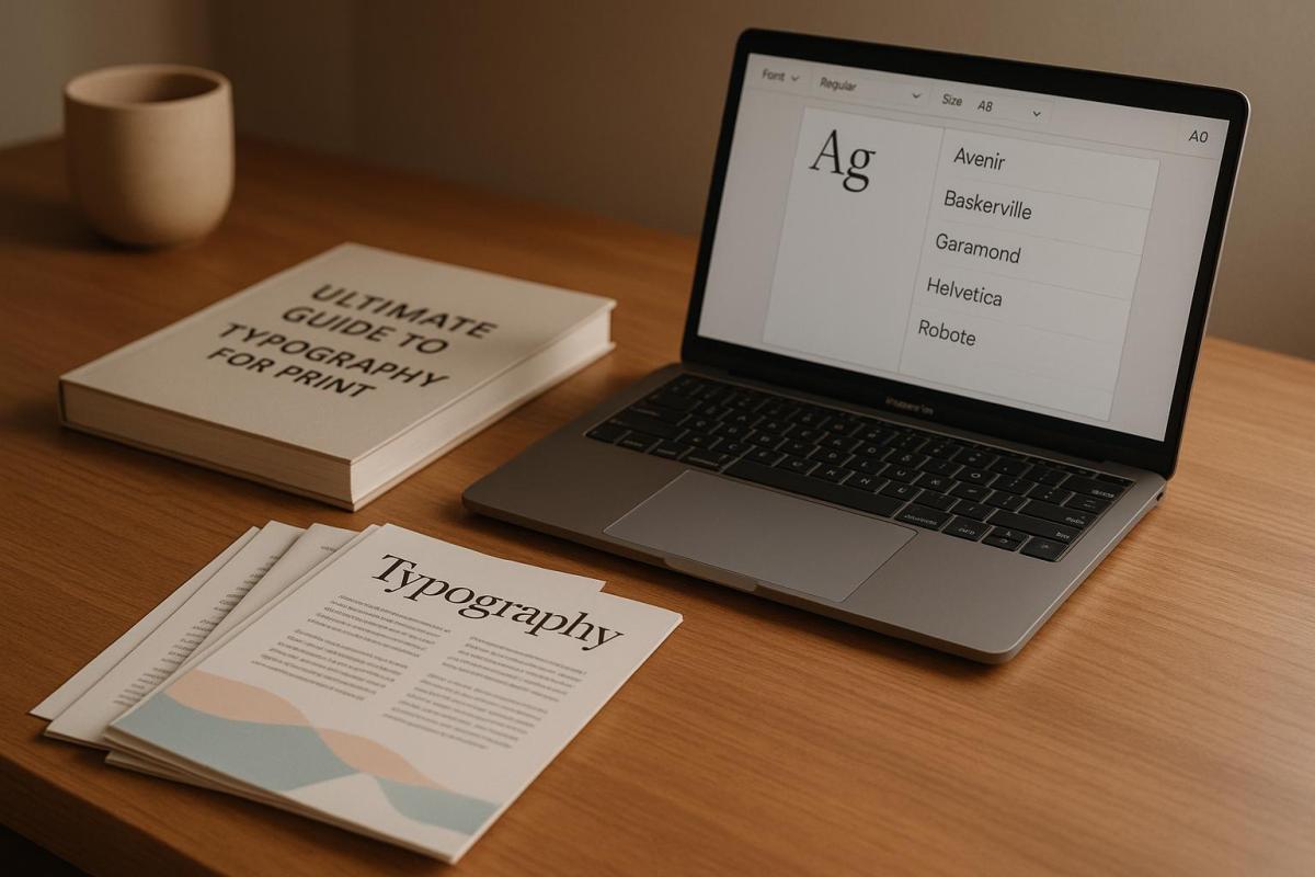
Serif fonts are a staple for long-form texts like books and magazines. Their small decorative strokes guide the reader’s eye smoothly across the page, making them perfect for immersive reading. On the other hand, sans-serif fonts are known for their clean, modern appearance, making them ideal for headlines, large-format prints, and contemporary business materials. Classic serif options like Times New Roman and Garamond remain go-to choices for professional documents, balancing readability with a sense of authority and formality.
Sans-serif fonts work best when you need a bold, clear impact, especially in:
- Headlines and titles
- Large-scale print formats
- Marketing materials and other modern communications
Font Pairing Guidelines
Choosing the right fonts – and combining them effectively – can make or break the look of your print materials. To ensure both clarity and visual appeal, keep these principles in mind:
-
Pair fonts with distinct yet harmonious attributes
A common strategy is combining a serif font for headers with a sans-serif font for body text. This contrast creates interest while maintaining readability. -
Look for subtle similarities to unify your design
For instance, pairing Georgia (serif) with Open Sans (sans-serif) strikes a balance between cohesion and individuality. -
Keep it simple
Stick to two or three typefaces at most. Overloading your design with too many fonts can lead to clutter and confusion.
Collaborating with a professional print shop can elevate your font choices. For example, the design team at Miro Printing & Graphics Inc. can assess how your selected fonts will appear on various paper types and through different printing methods. Their expertise ensures your fonts not only look great but also perform well in the final product.
When testing font combinations, follow these practical steps:
- Print samples at actual size on the paper stock you plan to use
- Check readability under typical viewing distances and lighting conditions
- Compare digital proofs with physical test prints to spot any discrepancies
Typography in print isn’t just about aesthetics – it’s about functionality too. Your fonts should work together visually while ensuring clarity across all materials. By following these strategies, you’ll set the stage for a strong, effective type hierarchy in your designs.
Type Hierarchy and Layout
Building Type Hierarchy
A well-thought-out type hierarchy helps readers navigate content by creating clear visual distinctions between text elements. When done right, it makes printed materials easier to read and visually appealing.
Here’s how different text levels stack up:
| Level | Size | Weight | Purpose |
|---|---|---|---|
| Main Heading | 30–48 pt | Bold | Grabs primary attention |
| Subheading | 18–24 pt | Regular/Bold | Organizes sections |
| Body Text | 10–12 pt | Regular | Displays main content |
| Caption | 8–10 pt | Light/Italic | Adds supporting details |
To create a strong hierarchy, use tools like bolding, color adjustments, and white space. For instance, bold text highlights key points, while extra spacing ensures each level stands apart.
Print Layout Fundamentals
A polished layout enhances your type hierarchy and ensures your design looks professional. Start by using a grid system to organize content placement consistently across the document.
Here are some key spacing tips for print materials:
- Margins: Stick to 0.5–1 inch for standard documents.
- Line Spacing: Aim for 120–150% of your font size for readability.
- Paragraph Spacing: Leave enough space between paragraphs to avoid clutter.
Alignment also plays a critical role. Left alignment is typically the easiest to read for Western languages. For formal documents or wide columns, justified text can work – just make sure it’s properly configured to avoid awkward spacing.
For the best results, collaborate with your print shop. For example, the team at Miro Printing & Graphics Inc. can review your layout to ensure it works seamlessly in print. They can also advise on how paper types and printing methods might influence your typography.
Technical Print Requirements
Type Resolution Standards
When it comes to print typography, precision is everything. The resolution you choose directly impacts the quality of the final product. Here’s a quick breakdown:
| Resolution | Ideal For | Viewing Distance |
|---|---|---|
| 300 DPI | Business cards, brochures, books | Close-up reading |
| 150–200 DPI | Posters, banners, large-format prints | 3–6 feet or more |
For the sharpest results, always use vector-based fonts. They maintain clarity no matter how much you scale them. If you’re working with raster designs, double-check that text layers hold their resolution during resizing. And don’t forget – your choice of paper can also influence how your typography looks.
Paper Selection and Typography
Paper isn’t just a surface – it’s a key player in how your typography comes to life. Different stocks interact with ink in unique ways, affecting everything from contrast to readability. Here’s how paper types stack up:
| Paper Type | Text Appearance | Best For |
|---|---|---|
| Gloss Coated | Sharp, high contrast | Marketing materials, photos |
| Matte Coated | Reduced glare, easier to read | Magazines, catalogs |
| Uncoated | Softer edges, natural feel | Books, stationery |
Paper weight matters too:
- Text-weight (20–24 lb): Perfect for letterhead.
- Cover stocks (80–100 lb): Ideal for business cards.
- Heavy cardstock (120+ lb): Great for premium materials.
If you’re using dark, textured, or low-opacity papers, opt for larger fonts and bolder weights to keep your text legible – especially for double-sided prints.
Want to get it just right? Collaborate with experienced print professionals. For instance, the team at Miro Printing & Graphics Inc. can provide paper samples and test prints to ensure your typography looks exactly as intended, no matter the stock or finish.
sbb-itb-ce53437
Special Print Effects for Type
Embossing and Foil Applications
Adding special effects to typography can transform the look and feel of your printed materials. Embossing, for instance, raises letterforms off the paper, giving them a three-dimensional quality, while debossing does the opposite, creating a recessed effect. Keep in mind that text smaller than 10-12pt might lose clarity with these techniques. Thicker, softer paper – around 100 lb or higher – works best for pronounced embossing, whereas moderately weighted paper is better suited for subtler debossing.
Foil stamping is another standout option, adding a metallic or glossy finish that works especially well for headlines and logos. Some popular foil finishes include:
- Metallic: Classic options like gold, silver, or copper
- Holographic: Creates a multi-dimensional effect that changes with the viewing angle
- Matte: Offers a more understated, refined look
- Pigment: Solid colors with a noticeable sheen
A 2023 industry report revealed that 68% of print buyers feel special finishes like embossing and foil stamping enhance the perceived value of printed materials. Whether you’re designing for luxury branding or event invitations, these techniques can make a lasting impression.
Color and Coating Options
Specialty colors and coatings can take typography to the next level. Spot colors, such as Pantone or PMS, ensure vibrant, consistent hues that go beyond standard CMYK printing. Coatings not only protect your print materials but also add visual and tactile appeal. Some popular options include:
- Spot UV Coating: A high-gloss finish that creates bold contrast
- Soft Touch Coating: A smooth, matte surface that feels luxurious to the touch
- Aqueous Coating: A durable satin or gloss finish for added protection
For maximum impact, try combining effects. For example, pairing a matte soft-touch coating with spot UV on key text elements can create a striking contrast that grabs attention. However, results can vary depending on the paper stock and finish combination, so it’s always a good idea to request print proofs before committing to a full run.
Miro Printing & Graphics Inc. advises testing coatings on your chosen paper stock beforehand. This ensures the final product achieves the desired look and feel while maintaining readability and quality.
Print File Preparation
Pre-Press Typography Checklist
When preparing your files for print, make sure your text colors are in CMYK, the resolution is set to 300 DPI, and all fonts are either embedded or converted to outlines. This step is crucial to avoid font substitution issues that can disrupt your design.
For a polished look, stick to a consistent typographic scale when using multiple typefaces:
| Text Element | Recommended Size (pt) | Usage |
|---|---|---|
| Headlines | 24–72 | Draws primary attention |
| Subheads | 14–18 | Marks sections and hierarchy |
| Body Copy | 10–12 | Main content text |
| Captions | 8–9 | Adds supporting details |
| Fine Print | 6–8 | Legal disclaimers and footnotes |
Keep in mind that all text elements should be positioned at least 0.125–0.25 inches away from the trim edges to prevent accidental cutoff. Once your typography is set, thorough quality checks ensure your text will look just as you envisioned when printed.
Print Quality Control
Proper print file preparation goes hand-in-hand with quality control to protect your design from unexpected issues. Always print a physical test copy on the paper stock you plan to use. While digital proofs are helpful, they can mask problems like faint font weights, color inconsistencies, poor ink absorption, or alignment issues.
Examine printed proofs under proper lighting to ensure fonts render consistently across all pages and that no unintended style changes occurred during processing. Pay close attention to how text interacts with background elements or images.
"Great customer service that we didn’t get with our old online printer. Attention to detail is what makes the difference!" – Mike B.
Miro Printing & Graphics Inc. emphasizes the importance of conducting multiple proofreading rounds with different reviewers to catch any lingering typographical errors. Their in-house design team also offers pre-flight checks to spot potential problems before they escalate into costly fixes.
For intricate projects involving special finishes, such as coatings or embossing, request a press proof. This will give you a precise preview of how your typography will appear with the final touches. Based on the press proof, you may need to tweak font weights or sizes to ensure optimal results.
Design Rules: Typography Tips For Readable Long-Form Content
Next Steps
It’s time to put your print typography skills into action. Start by documenting your design choices in a detailed typography specification document. Here’s what to include:
| Element | Details to Specify |
|---|---|
| Font Selection | Font names, weights, and styles |
| Size Hierarchy | Point sizes for headlines, body text, and captions |
| Color Values | CMYK breakdowns for all text elements |
| Special Effects | Requirements for embossing, foil, or spot UV finishes |
| Paper | Stock weight, finish, and color |
This document should clearly outline your vision and technical requirements. Keep in mind that changes to typography after plates are created can be costly, so thorough planning is critical. A well-prepared specification ensures clarity when collaborating with experts and avoids unnecessary rework.
Next, schedule a consultation with your printer’s prepress team. They can offer valuable advice on topics like:
- Minimum font sizes suitable for specific printing methods
- Paper stock options that enhance readability and design
- Special considerations for metallic inks or other finishes
- File preparation guidelines for a seamless printing process
To keep improving, maintain a record of successful projects. Document which font combinations, sizes, and paper stocks worked well to save time on future designs. Professional print shops are equipped to help you bring your typography from the screen to the page with precision. By following these steps, you’ll be ready to turn your design ideas into flawless printed results.
FAQs
How can I select the best paper type for my print design to ensure sharp text and vibrant colors?
Choosing the right paper type can make all the difference when aiming for professional-quality print results. Start by thinking about the purpose of your project. Glossy paper is a great choice for vibrant, image-heavy designs like brochures or photo prints, as it enhances colors and creates a polished look. On the other hand, matte or uncoated paper is better suited for text-heavy materials, such as books or reports, because it reduces glare and improves readability.
You’ll also want to consider the paper’s weight and finish. Heavier paper – measured in pounds or GSM – has a more premium feel, making it a solid pick for high-end items like invitations or business cards. Lighter paper, while more affordable, works well for everyday projects like flyers. And don’t forget to match the paper type to your printing method. Some papers perform better with digital printing, while others are designed to handle offset printing, ensuring the best ink absorption and sharpness.
If you’re not sure which paper to choose, a professional print shop like Miro Printing & Graphics Inc. can help. Their experts can recommend the best options tailored to your specific project needs.
What are the main differences between serif and sans-serif fonts in print, and how do they impact readability?
Serif fonts, such as Times New Roman or Georgia, feature small decorative strokes – known as serifs – at the ends of their letters. These details give printed text a more classic and formal feel. Serif fonts are often chosen for lengthy text, like books or newspapers, because the serifs help guide the reader’s eye, making dense layouts easier to navigate.
On the other hand, sans-serif fonts, like Arial or Helvetica, skip the decorative strokes entirely. This gives them a clean, modern appearance. They’re especially effective for headings, signage, or shorter text blocks, as their simplicity ensures high legibility, even at larger sizes or in lower-resolution formats.
When deciding between serif and sans-serif fonts, think about the tone you want to convey and the purpose of your design. Mixing the two can also work well – using serif fonts for body text and sans-serif for headings can create a clear visual hierarchy and improve readability.
What’s the best way to test typography on different paper types to ensure my printed design looks as expected?
To see how your typography performs on different paper types, start by requesting sample prints from your print provider. Use the exact fonts, sizes, and layouts from your design to ensure accuracy. Make sure to test on the specific paper stocks you’re considering – things like texture, weight, and finish can dramatically affect how your design looks and feels.
Pay attention to font clarity, contrast, and color accuracy under various lighting conditions. This step will help you determine how the typography interacts with the paper and whether it aligns with your vision. If you’re collaborating with a professional print shop like Miro Printing & Graphics Inc., they can assist in choosing the right materials and printing methods to bring out the best in your design.
Related posts
- How Typography Impacts Print Design Success
- Readability vs. Legibility: Typography Basics
- 10 Typography Rules for Print Branding
- Top 7 Layout Tips for Business Printing
https://app.seobotai.com/banner/banner.js?id=6823e6b4f8b9f5df39f52f7f
