85% of shoppers make decisions based on color. That’s why using Pantone colors for packaging is key to keeping your brand consistent and recognizable. Unlike CMYK, Pantone delivers exact, pre-mixed colors, ensuring your packaging looks the same across all materials and print runs. Big brands like Coca-Cola and Tiffany & Co. rely on Pantone for their iconic colors – and you can too.
Key Takeaways:
- Pantone vs. CMYK: Pantone offers precise spot colors, while CMYK is better for full-color images.
- Material Matters: Colors can look different on glossy, matte, or textured surfaces.
- Cost Considerations: Pantone is more expensive but provides unmatched accuracy for branding.
- Testing is Essential: Use tools like spectrophotometers and physical samples to ensure color accuracy.
For consistent, high-quality packaging, work with a print shop experienced in Pantone printing and always test colors on your actual materials.
Using Pantone for Package Design
What is the Pantone Matching System?
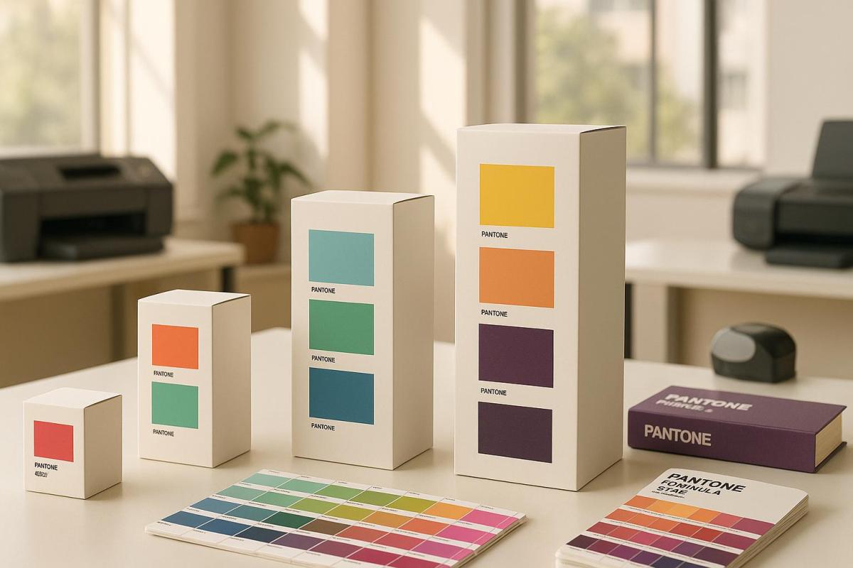
The Pantone Matching System (PMS) is a standardized system designed to ensure consistent color reproduction across various materials and printing processes. Introduced in the 1960s, it features 1,867 solid colors derived from 13 base pigments, allowing for precise matching in applications like packaging design.
PMS relies on pre-mixed inks made from exact formulas, eliminating the inconsistencies that can arise from mixing colors during the printing process. This ensures that brand colors remain consistent no matter where or how they are printed.
Pantone vs. CMYK: Main Differences
Pantone and CMYK differ significantly in how they produce colors and where they are best used in packaging printing. Here’s a side-by-side comparison:
| Feature | Pantone | CMYK |
|---|---|---|
| Color Production | Pre-mixed spot inks | Mixed during the printing process |
| Color Accuracy | Extremely precise and consistent | May vary between print runs |
| Best Applications | Logos, packaging, solid colors | Full-color images, photographs |
| Color Range | 1,867 solid colors, including metallics and fluorescents | Limited by four-color mixing |
| Cost | Higher per color | More affordable for multi-color prints |
For projects where precise color matching is critical – like branding and packaging – Pantone is often the preferred choice. Unlike CMYK, which combines cyan, magenta, yellow, and black inks during printing, Pantone inks are mixed beforehand to exact specifications. This results in more vibrant, saturated colors and ensures consistency across different printing runs. These unique characteristics make Pantone particularly valuable when working with a variety of packaging materials.
Coated and Uncoated Pantone Colors
Pantone colors are available in two main finishes to accommodate different packaging materials:
- Coated (C): Designed for glossy or semi-glossy surfaces, coated colors appear brighter and more vibrant. They’re commonly used for premium packaging with a polished finish.
- Uncoated (U): Applied to matte or natural paper, uncoated colors tend to look darker and more subdued compared to their coated versions.
It’s important to choose the correct finish when working with Pantone colors, as the same color can look dramatically different depending on the surface. For instance, PMS 185C on a glossy surface will appear much brighter than PMS 185U on matte paper. To avoid surprises, designers and printers often rely on Pantone swatch books to visualize how colors will appear on specific materials.
Choosing Pantone Colors for Package Materials
Selecting Pantone colors for packaging requires careful consideration of how different materials influence the final printed results. Since packaging substrates can significantly alter the appearance of colors, material-specific testing becomes a critical step.
How Materials Affect Color Results
While Pantone Matching System (PMS) colors are designed for consistency, the substrate’s properties can dramatically impact the way colors look. Here’s a breakdown of how various materials affect color outcomes:
| Material Type | Color Effect | Considerations |
|---|---|---|
| Glossy | Enhanced vibrancy, brighter look | Perfect for high-end packaging where bold, striking colors are desired. |
| Matte | Subdued, softer appearance | Colors may appear lighter due to increased light diffusion. |
| Textured | Dimensional quality, varied reflection | Often requires more ink to ensure even coverage across the surface. |
| Uncoated Paper | Duller look, higher absorption | May need special ink formulations to achieve the desired color. |
Material properties like surface treatments, light absorption, and reflection play a significant role in how Pantone colors appear. For instance, the same Pantone shade can look entirely different when printed on plastic compared to paper substrates. Understanding these variations is key to achieving the desired color consistency.
Color Testing Methods
To ensure color accuracy across different substrates, specific testing methods are essential:
-
Spectrophotometer Testing
Spectrophotometers measure colors with precision by converting them into numerical values. Bob Hollingsworth, Group Technical Director at YRG Group Ltd, highlights their importance:"Xrite produce industry leading spectrophotometers onto which you can install the latest pantone libraries. Measure the printed pantone with the spectro and get a true, accurate error difference reading!"
-
Physical Sample Testing
Testing colors on actual packaging materials helps evaluate real-world outcomes. Key factors to assess include:- Effects of surface treatments
- Color appearance under different lighting conditions
- Ink absorption and drying behavior
-
Color Bridge Guide Verification
Pantone’s Color Bridge Guides are invaluable for predicting how spot colors translate across different substrates and printing processes. They reinforce the reliability of PMS colors while accounting for material-specific variations.
Regularly calibrating color measurement tools is also crucial. Uncalibrated screens, for example, can distort colors by as much as 30%. Additionally, clear communication with ink suppliers and printers ensures that everyone is aligned on color expectations.
"Always request a hardcopy proof." – Graphic Designer, Branding Agency
This simple but essential step helps avoid costly errors and ensures that brand colors are reproduced accurately.
sbb-itb-ce53437
Pantone Color Printing Costs
When it comes to packaging projects, Pantone printing costs can take up a significant portion of your budget. Deciding between spot colors and process (CMYK) printing isn’t just about aesthetics – it’s a financial decision that requires careful consideration.
Spot vs. Process Color Expenses
Choosing between Pantone spot colors and CMYK process printing can have a noticeable impact on your costs. Here’s how they compare:
| Cost Factor | CMYK Process | Pantone Spot Colors |
|---|---|---|
| Cost per Impression | $0.02 | $0.15+ |
| Setup Requirements | Standard 4-color setup | Additional plates per color |
| Ink Expenses | Standard CMYK inks | Premium PMS inks |
| Color Accuracy | ±5-10% variation | Exact match |
| Best Use Case | High-volume, full-color prints | Brand-critical elements |
Pantone spot colors are more expensive due to the use of premium inks and the need for extra press setups to accommodate additional color plates. To keep costs under control, you might want to explore ways to minimize the number of colors used without sacrificing your brand’s visual identity.
Reducing Costs with Fewer Colors
Smart color choices can help cut costs while keeping your brand’s look intact. For example, a beverage company managed to save 23% on packaging expenses by simplifying its design to include just three PMS colors.
Here are a few strategies to help optimize your Pantone printing costs:
Material Selection
- Opting for uncoated paper can lower costs compared to coated stock, though it may result in more subdued colors.
- The type of substrate you choose affects how much ink is needed and how many layers are required.
Production Efficiency
- "Gang running" multiple jobs together is a great way to share costs when using CMYK printing.
- Converting raster images to vector formats with fewer spot colors can reduce the number of press setups needed.
Strategic Color Usage
- Stick to 1–3 primary colors to maintain control over costs.
- Reserve Pantone colors for the most critical branding elements, while using CMYK for less prominent details.
Collaborating with your printer early in the design process can help you find cost-effective solutions that still meet your color quality needs. While CMYK has a more limited color range compared to Pantone, smart planning can ensure your packaging stays on-brand and within budget. This balance allows you to deliver consistent, high-quality results without overspending.
Print Shop Partnership Tips
Choosing the right print shop partner is essential for achieving precise Pantone colors in your packaging projects.
Print Shop Equipment Requirements
To handle Pantone color printing effectively, a print shop must have specific tools and capabilities in place to ensure consistent color reproduction. Here’s what to look for:
Color Management Systems
- Monitors calibrated for accurate on-screen color representation
- ICC profiles customized for each printer and substrate combination
- Spectrophotometers for automated and precise color measurement
- Regular printer calibration and maintenance to maintain consistency
Advanced Printing Technology
- Digital printers with expanded ink sets (like orange and green) to better match Pantone colors
- Color analysis software to mix inks accurately and calculate precise CMYK ratios
- A prepress department equipped with verification tools to catch issues early
"For brands that want to maintain their high standards, partnering with a print provider that understands color management is critical." – 40 VISUALS
With the right equipment in place, the next step is ensuring your files are properly prepared for production.
File Setup for Pantone Printing
Proper file preparation is key to achieving accurate color reproduction and avoiding production hiccups. Follow these guidelines:
| File Component | Specification | Purpose |
|---|---|---|
| Color Mode | CMYK + Spot Colors | Ensures correct color separation |
| Resolution | Minimum 300 PPI | Maintains print quality |
| File Format | PDF-X/4 standard | Preserves color accuracy |
| Bleed Area | 1/8 inch | Prevents white edges |
| Font Treatment | Outlined or packaged | Avoids font-related issues |
Crucial Pre-Production Steps
- Use physical Pantone swatch books to select colors, instead of relying solely on digital screens.
- Verify color separations to ensure proper knockout for Pantone colors.
- Embed all linked images and graphics within your document.
- Test print on the actual production substrates to confirm color accuracy.
Clear Color Communication
- Provide your printer with detailed color specifications.
- Share physical Pantone samples for reference.
- Discuss any specific requirements based on the substrates being used.
- Schedule regular color audits, especially for large-scale production runs.
Maintaining open communication with your print shop can help prevent costly mistakes. With detailed preparation and collaboration, you can achieve consistent color results for your packaging needs.
If you’re looking for a reliable partner, Miro Printing & Graphics Inc., based in Hackensack, NJ, offers cutting-edge color management systems and advanced printing technology to deliver accurate and consistent Pantone color reproduction for your projects.
Summary
Using Pantone colors in packaging demands careful execution, as color significantly influences consumer choices. Studies show that color not only impacts buying behavior but also reinforces brand recognition when used consistently.
Here are the key aspects to consider:
Material Considerations
Pantone colors can behave differently depending on the material they’re applied to. Always test colors on the specific substrates you plan to use.
Color Management
Consistent color requires precise management. Regular calibration and advanced tools like spectrophotometers and ICC profiles are essential. Collaborating with a print shop that uses these tools ensures dependable results.
Cost-Effective Solutions
While Pantone spot colors deliver unmatched accuracy, they can increase costs. Reserve them for elements critical to your brand’s identity.
"Pantone is more than a color system; it’s an industry backbone that safeguards brand identity and fuels innovation." – BrillPack
Achieving accurate Pantone color reproduction hinges on teamwork between designers and printers, proper file setup, and ongoing quality checks during production. For businesses seeking expert support, Miro Printing & Graphics Inc. in Hackensack, NJ, provides advanced printing services tailored for precise brand color replication.
FAQs
Why should you test Pantone colors on packaging materials before finalizing your design?
Testing Pantone colors directly on your packaging materials is a crucial step to make sure the final product matches your vision. Colors can shift depending on the material, lighting conditions, or printing techniques used. What looks great on a screen or a proof might not translate the same way onto your actual packaging. Testing early helps you spot any discrepancies and make adjustments, saving you from expensive reprints down the line.
It’s also a great way to confirm that your packaging stays true to your brand’s identity while delivering the right impression to your customers. Plus, it gives you a chance to see how the colors work with other design elements, ensuring everything comes together seamlessly to create a polished, professional look that connects with your audience.
How can I save money on Pantone colors for packaging while keeping my brand consistent?
To keep costs down when incorporating Pantone colors into your packaging, start by reducing the number of colors in your design. Using fewer Pantone shades can significantly cut printing costs while preserving your brand’s visual identity. A simplified color palette can still make a bold and recognizable impact.
Another key step is to properly prepare your design files and rely on Pantone color guides. This ensures accurate color reproduction and avoids unexpected production issues or expensive revisions. A little extra attention to detail upfront can save a lot of headaches (and money) later.
Lastly, explore modern printing options like digital printing, which often handles Pantone colors more efficiently. Digital printing tends to generate less material waste and has lower setup costs compared to traditional methods, making it a budget-friendly way to achieve professional, high-quality results.
What should I consider when choosing a print shop to ensure accurate Pantone color reproduction for my packaging?
To get the colors on your packaging just right, it’s important to work with a print shop that knows Pantone color matching inside and out. Specifically, look for one that offers Pantone Matching System (PMS) capabilities – this ensures your colors stay consistent and true to your vision. Make sure they use top-notch printing equipment built for spot color printing and have experience with different materials, as colors can shift depending on the surface they’re printed on.
Also, check if the print shop uses strict color calibration techniques to keep accuracy consistent across all projects. A trustworthy shop will include a proofing process that lets you review and approve samples before full production. This extra step can save you from unexpected results and guarantees your packaging turns out as planned.
Related posts
- How to Adjust Colors for Offset Printing
- Pantone Matching System in Printing
- ISO 2846: Ink Color Standards Explained
- Pantone Charts for Large Format Printing
https://app.seobotai.com/banner/banner.js?id=682685640209458b3ff4f877
