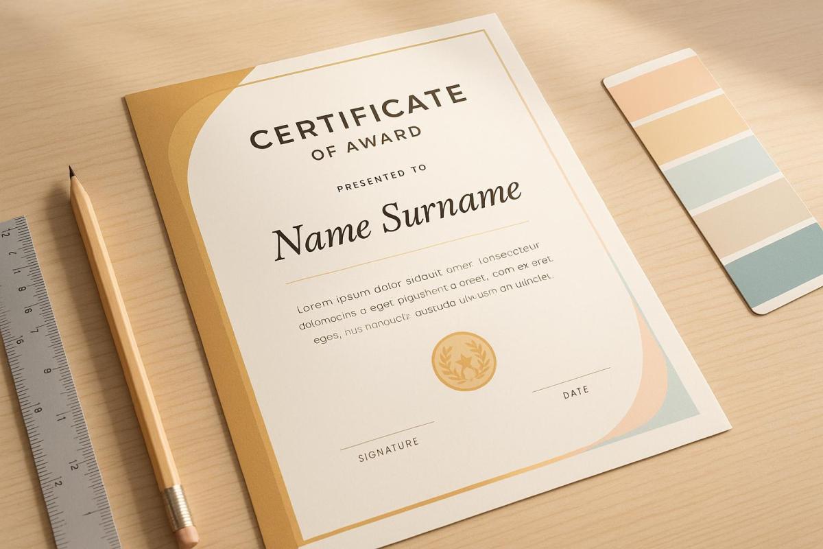
Crafting the perfect award certificate is simpler than you think. Here’s a quick guide to get started:
- Focus on Layout: Use a clean, grid-based design to highlight the recipient’s name and award title.
- Choose Colors Wisely: Pick colors that enhance readability and align with your brand. Ensure sufficient contrast for accessibility.
- Select Fonts Thoughtfully: Match fonts to the certificate’s tone – serif for formal, sans-serif for modern – and limit to 2–3 complementary fonts.
- Include Essential Elements: Add the title, recipient’s name, achievement details, date, and signatures.
- Use Quality Materials: Opt for premium paper (120–250 GSM) and professional printing methods like digital or offset for a polished finish.
How to design custom certificates and awards
Layout and Visual Structure
Crafting a certificate with a clean, organized layout sets the stage for professional recognition. A well-thought-out arrangement not only grabs attention but also ensures the achievement is communicated clearly and effectively.
Main Focus Points
To make the certificate impactful, the recipient’s name and the award title should stand out. Use a larger font size and place the name prominently above the title, ideally centered. At Miro Printing & Graphics Inc., they recommend leaving a generous top margin for the name to maintain a sense of balance and formality. A clear structural grid can help establish this focus and keep the layout cohesive.
Grid-Based Design
Using a grid is a smart way to divide the certificate into distinct sections. For example, the header can house the logo and title, the main area can feature the details, and the footer can include the date and signatures. As Josef Müller-Brockmann, a pioneer in design, once said:
"One must learn how to use the grid; it is an art that requires practice."
Troy Templeman, another design expert, adds:
"(Grids) speed up the design process by helping designers decide where content should be placed rather than where it could be placed."
This structured approach ensures that every element has a defined place, making the design both functional and visually appealing.
Space Management
Building on the grid layout, the use of white space is equally important. Generous, consistent margins and spacing can frame the content beautifully, prevent clutter, and create a clear visual hierarchy. Thoughtful use of white space helps guide the viewer’s eye naturally across the certificate, emphasizing key elements while maintaining a polished and professional look.
Color Selection
The colors you choose for a certificate can have a big impact on how it’s perceived. At Miro Printing & Graphics Inc., the design team knows that picking the right colors not only makes a certificate visually appealing but also ensures it’s accessible to everyone.
Color Meaning
Colors do more than just look nice – they communicate the importance of the achievement. When designing certificates, think about how different colors influence mood and perception. For example, classic combinations like black text on a white background convey formality and are easy to read. Always make sure the text stands out sharply against the background to maximize clarity.
Text Visibility
Accessibility is key. Choose colors that not only highlight the achievement but also meet a minimum contrast ratio of 4.5:1 between text and background. This ensures readability for everyone, including the 2.2 billion people worldwide who live with visual impairments.
| Text & Background Combination | Contrast Ratio | Readability Rating |
|---|---|---|
| Black on Yellow | 19.56:1 | Excellent |
| White on Purple | 9.42:1 | Very Good |
| Blue on Orange | 4.35:1 | Fair |
| Green on Red | 1.28:1 | Poor |
These guidelines are especially helpful for designing certificates that are accessible to individuals with color vision deficiencies, which affect about 1 in 12 men and 1 in 200 women.
Brand Colors
Once you’ve ensured the text is clear and readable, you can incorporate your organization’s brand colors to reinforce identity. For example, use your primary blue for borders or accents while keeping black for the main text. If your brand colors don’t provide enough contrast for readability, consider tweaking the shades slightly. This way, you can maintain your brand’s look without sacrificing legibility.
Font Choice and Combinations
Typography plays a pivotal role in creating professional certificates. At Miro Printing & Graphics Inc., the design team knows that choosing the right fonts can transform a certificate from looking ordinary to exuding prestige. The right typographic decisions build on the visual balance established in the earlier stages of the design.
Fonts That Match the Certificate’s Tone
Different types of certificates require fonts that align with their purpose and tone. Here’s a quick guide:
| Font Category | Best Uses | Recommended Fonts | Characteristics |
|---|---|---|---|
| Serif | Academic diplomas, formal awards | Times New Roman, Garamond, Baskerville | Classic, formal, and highly readable |
| Script | Recognition awards, achievements | Lucida Calligraphy, Great Vibes | Elegant with a personal touch |
| Sans-Serif | Corporate certificates, modern awards | Arial, Helvetica Neue, Raleway | Clean and contemporary |
| Blackletter | Prestigious institutional awards | Old English Text MT | Ornate and traditional |
"Typography contains fonts, sizes, and styles for the letters – the central elements of certificate design. Fonts used in certificates express design mood and meaning and improve the certificate’s readability." – Ola Kozielska, Content designer at Certifier
Text Size and Style
For standard letter-sized certificates (8.5 x 11 inches), choosing the right text size ensures readability and a polished appearance. Here’s a breakdown:
- Recipient’s name: 20–50 points (largest and most prominent element)
- Certificate title: 14–30 points
- Main body text: 10–14 points
- Signatures and dates: 8–30 points
Using bold for titles and names helps establish a clear hierarchy, while keeping supplementary text in regular weight ensures balance.
Font Matching
Pairing fonts thoughtfully can elevate the overall design of your certificate. Below are some tried-and-true combinations:
- Modern Combination: Dolce Vita for headlines paired with Montserrat for body text creates a sleek, contemporary style.
- Clean Aesthetic: Oswald combined with Lato Light delivers a crisp and professional look.
- Traditional Balance: Rozha for names paired with Montserrat for details strikes a perfect balance between elegance and readability.
To maintain a polished and cohesive appearance, limit your design to 2–3 complementary fonts. Mixing fonts thoughtfully can create striking contrasts that enhance visual appeal while reinforcing the structure of the certificate.
sbb-itb-ce53437
Required Design Elements
Crafting a well-designed certificate means including key elements that ensure it feels authentic and professional. By carefully considering layout, colors, and specific components, you can create a certificate that not only looks polished but also holds up under scrutiny.
Basic Components
Certain elements are essential to authenticate a certificate and establish its credibility. Here’s a breakdown of what to include and where to place them:
| Component | Purpose | Placement Guidelines |
|---|---|---|
| Title | Identifies the award or achievement | Top center, largest text |
| Presentation Line | Features a phrase such as "presented to" | Upper third, centered |
| Recipient’s Name | Highlights the honoree’s name | Center, prominent size |
| Achievement Description | Details the accomplishment | Middle section |
| Organization Name | Identifies the issuing body | Lower third |
| Date | States when the award is presented | Lower section |
| Signatures | Validates the certificate | Bottom portion |
While these components establish the foundation, adding security measures ensures the certificate remains tamper-proof.
Anti-Forgery Features
To protect against forgery, consider incorporating advanced security features. These measures not only safeguard authenticity but also add a layer of sophistication:
- Digital Verification: Use QR codes that link to an online verification system.
- Physical Elements: Include heat-sensitive ink that changes color if tampered with.
- Unique Identifiers: Add individual serial numbers or tracking codes for traceability.
- Advanced Printing Techniques: Use microprinted borders or signature lines to deter counterfeiting.
These features work together to secure the certificate while maintaining its professional appearance.
Visual Extras
Beyond functionality, adding visual enhancements can elevate the overall design and make the certificate stand out. Striking the right balance is key – dedicate 30–40% of the space to white space for a clean and balanced look. Here are a few ways to enhance the design:
- Borders and Frames: Opt for sleek, modern borders or subtle frames instead of overly ornate designs for a more contemporary feel.
- Seals and Emblems: Incorporate elements like embossed seals, metallic foil accents, digital watermarks, or custom holographic features to give the certificate a distinguished touch.
- Special Printing Effects: Premium options such as spot UV coating, metallic inks, raised printing, or custom embossing can add texture and visual interest. For example, companies like Miro Printing & Graphics Inc. specialize in these high-end finishes to make certificates truly stand out.
Paper and Print Options
Selecting the right paper and printing method can enhance both the look and longevity of a certificate.
Paper Types
The weight and texture of the paper play a big role in making a certificate feel special. Most professional certificates use paper that weighs between 120–250 GSM (grams per square meter). Here are some premium paper options to consider:
| Paper Type | Characteristics | Best Use Cases |
|---|---|---|
| Parchment | Features an antique, mottled appearance with excellent durability | Academic certificates, traditional awards |
| Linen | Embossed texture that feels luxurious and professional | Business certificates, corporate awards |
| Laid | A handcrafted look with a distinctive watermark | Prestigious awards, formal recognition |
| Security | Includes anti-forgery features like watermarks | Legal documents, professional certifications |
| Synthetic | Water-resistant and tear-proof for long-lasting durability | Certificates exposed to the elements or frequent handling |
When choosing paper, keep these factors in mind:
- Acid-free composition: Prevents yellowing over time.
- Printer compatibility: Ensure your printer can handle paper weights up to 80–100 lb.
- Surface finish: Matte finishes are often easier to read and less reflective.
- Archival quality: Essential for certificates that need to last for generations.
Once you’ve chosen the paper, it’s time to think about the printing method that works best for your design.
Print Methods
The printing process you choose can make a big difference in how your certificate looks and feels.
Benefits of Digital Printing:
- Perfect for small to medium runs (1–500 copies).
- Allows for easy adjustments and proofs without the need for plates.
- Enables personalization for each certificate.
- Offers faster turnaround times.
- Uses an environmentally friendly process.
Advantages of Offset Printing:
- Delivers precise color matching with the Pantone Matching System.
- Uses oil-based inks that absorb into the paper for a high-quality finish.
- More cost-effective for large print runs.
- Works with a broader range of paper types.
"A significant difference between digital printing and offset printing is how the ink adheres to the paper. In traditional offset printing, the ink is oil-based and soaks into the paper, while digital ink adheres to the paper surface, which may result in more vibrant colors but less resilience over time." – Kelley Create
For an extra touch of sophistication, companies like Miro Printing & Graphics Inc. offer both digital and offset printing, along with specialty finishes, to elevate the overall quality of your certificates.
Conclusion
A certificate isn’t just a piece of paper – it’s a symbol of accomplishment and professional trustworthiness. When designed thoughtfully and printed with care, it becomes a meaningful keepsake that recipients will treasure, while also reflecting positively on your organization.
Let’s revisit the essentials: Focus on a layout that highlights key details using a clear hierarchy. Select colors that not only match your brand but also ensure readability. Pair fonts strategically – mixing serif and sans-serif styles can add both clarity and sophistication. Don’t forget to incorporate essential design elements and anti-forgery features to safeguard authenticity.
"The design of a certificate is more than just aesthetic. A well-crafted certificate not only looks impressive but also conveys a sense of professionalism and value".
For an impeccable finish, collaborating with professionals like Miro Printing & Graphics Inc. can make all the difference. Their expertise in fine-tuning critical details – like color accuracy and layout precision – ensures that your certificates meet the highest standards. The result? A polished and enduring token of recognition that recipients will proudly display.
FAQs
How can I make sure the colors in my award certificate are accessible for everyone, including those with visual impairments?
To make your award certificate more inclusive for individuals with visual impairments, keep these tips in mind:
- Prioritize strong contrast: Use a contrast ratio of at least 4.5:1 for regular text and 3:1 for larger text. This ensures the content is easier to read.
- Select color-friendly combinations: Avoid depending solely on red and green, as these colors can be challenging for those with color vision deficiencies. Instead, opt for dark text on a light background for better clarity.
- Go beyond color: Don’t use color alone to convey important information. Incorporate text labels, patterns, or symbols to make your design more inclusive.
Using contrast-checking tools during the design process can help you verify accessibility while keeping your certificate visually appealing to everyone.
Why is using a grid-based design important for award certificates, and how does it enhance the layout?
Using a grid-based design for award certificates plays a key role in achieving a clean, polished appearance. Grids act as a structural guide, ensuring that all elements – like text, images, and logos – are evenly aligned and properly spaced. This creates a balanced layout that feels organized and professional.
By maintaining consistent spacing and alignment, a grid system improves readability and helps the viewer focus on the certificate’s content. Beyond just looking good, this approach adds to the certificate’s overall credibility, making it a more impactful and memorable symbol of recognition.
What are the best ways to make award certificates more secure and harder to forge?
To boost the security and credibility of your award certificates, consider adding these features:
- Security paper with embedded fibers or watermarks that are tough to duplicate.
- Holograms or embossed seals that provide a polished and tamper-resistant look.
- Unique serial numbers or barcodes for easy tracking and verification.
- Invisible ink that reveals itself under UV light for added protection.
These features not only help prevent counterfeiting but also give your certificates a professional edge. If you’re looking for expert printing and design services, Miro Printing & Graphics Inc. in Hackensack, NJ, can assist in creating secure and visually striking certificates.
Related posts
- Custom Certificate Holders: Design Options
- How Typography Impacts Print Design Success
- Ultimate Guide to Corporate Certificate Printing
- Top 7 Layout Tips for Business Printing
https://app.seobotai.com/banner/banner.js?id=6827d7e45642a17d106c5f26
