Understanding overprint settings is essential for creating professional print designs. Overprinting controls how colors interact when printed on top of each other, affecting the final look of your project. Here’s what you need to know:
- Overprint: Layers colors directly, blending them to create new shades. Commonly used for black text and rich black areas to avoid white gaps.
- Knockout: Removes underlying colors to ensure the top color remains pure, ideal for maintaining true color fidelity.
- When to Use Overprint: Use for small black text, specialty finishes (like spot UV or foil), and creating rich black by layering inks.
- Avoid Overprinting White: White objects set to overprint will disappear, as no ink is applied.
- Tools to Preview Overprint: Use features like Overprint Preview in Adobe Illustrator, InDesign, or Acrobat to simulate how colors will blend before printing.
- Common Issues: Mistakes with overprint settings can lead to unintended color blending, transparency conflicts, or registration problems.
Quick Comparison
| Aspect | Overprint | Knockout |
|---|---|---|
| Color Interaction | Blends colors together | Removes underlying colors |
| Final Result | Mixed, new colors | Pure, original colors |
| Edge Quality | May add thickness | Crisp, clean edges |
| Registration Risk | Prevents white halos | Risk of white gaps if misaligned |
To avoid costly errors, always preview your overprint settings, consult with your print provider, and request proofs before production. These steps ensure your designs print exactly as intended.
Overprint Basics
What is Overprinting?
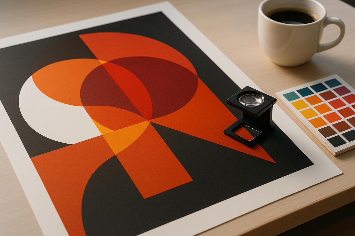
Overprinting is a technique in printing where one color is applied directly on top of another, rather than removing the underlying ink. The sequence in which the inks are applied is crucial – printing yellow first and then blue will yield a different result than reversing the order.
"With overprinting, however, you mix colors together by printing one on top of the other to form an interesting level of dimension and new color results." – Plum Grove
The top layer of ink is partially transparent, blending with the base color to create new shades. For instance, cyan combined with yellow produces green. When using spot colors like Pantone inks, overprinting can even generate a custom third color without requiring an additional ink station. This method is also tied to "trapping", a reprographic process designed to prevent white gaps between colors caused by slight misalignments during printing.
Overprint vs. Knockout
To get the desired print results, it’s essential to understand the difference between overprinting and knockout, as these approaches handle overlapping colors in distinct ways.
Knockout works by removing the underlying colors where objects overlap, leaving only the topmost color visible. For example, if red text is placed over a blue background using knockout, the blue beneath the text is removed, ensuring the red prints as pure.
On the other hand, overprinting layers colors directly on top of each other, blending them to create new hues. Using the same example of red text on a blue background, overprinting would layer the red ink over the blue, potentially resulting in colors like purple or brown, depending on the inks used.
| Aspect | Knockout | Overprint |
|---|---|---|
| Color Interaction | Removes underlying colors | Blends colors together |
| Final Result | Pure, original colors | Mixed, new colors |
| Edge Quality | Crisp, clean edges | May add thickness |
| Registration Risk | Risk of white gaps if misaligned | Prevents white halos |
Knockout ensures your colors remain true to the design, but even minor misalignments during printing can result in thin white lines where colors meet. Overprinting eliminates this risk but requires careful planning, as darker elements can overpower lighter ones, leading to unintended or muddy results.
Next, we’ll look at how and when to use overprinting effectively in professional printing projects.
When to Use Overprint
Overprinting is a targeted tool in professional printing, offering both efficiency and improved print quality when applied correctly.
For example, small black text – such as body copy – should almost always be set to overprint. This prevents the formation of tiny white halos if the black ink shifts slightly during printing. As a general rule in the industry: "NEVER overprint white, ALMOST ALWAYS overprint black" – Bob Levine.
Specialty finishes like embossing, spot UV, and foil stamping also depend on accurate overprint settings. Additionally, overprinting can be a cost-saving method for creating a third color by layering two spot colors, a technique that works especially well with Pantone inks.
Another common use of overprinting is for producing rich black. By layering black ink over other colors like cyan, magenta, or yellow, printers can achieve a deeper, more saturated black. A popular formula for rich black includes 50% cyan, 50% magenta, 50% yellow, and 100% black.
"Overprinting is an advanced printing technique that should only be used by creators who understand how to implement it properly." – PrintNinja
Overprinting is also widely used in custom projects like envelopes and packaging, where variable information such as dates, batch codes, or personalized details need to be added. This method allows for mass printing of base designs, with specific details added later as needed.
The success of overprinting depends on understanding how inks, paper, and printing methods interact. Factors like ink formulation and the type of paper used can significantly influence how overprinted areas appear.
What is Overprinting & Overprint Preview in InDesign?
How to Use Overprint in Design
Overprint is a valuable tool for enhancing print quality and avoiding registration issues. Below are practical ways to use overprint effectively in your design projects.
Using Overprint for Spot Colors
Spot colors are a great way to add vibrancy to your designs without increasing production costs. When working with systems like Pantone, overprinting can create deeper tonal variations and unique effects. To ensure accuracy, always enable Overprint Preview in your design software. This feature lets you see how the colors will interact before sending your files to print, helping you spot any potential issues and decide where overprinting is necessary.
Before finalizing your spot color designs, it’s crucial to consult your print provider – such as Miro Printing & Graphics Inc. – to understand how factors like inks, paper, and printing methods will influence the final result.
Overprint for Black Text and Lines
Black text and fine lines often benefit from overprint settings, especially when placed over colored backgrounds. Most design software, like InDesign, automatically sets black text to overprint, which helps prevent registration problems with small or delicate elements. However, if you’re using 100% black ink, the underlying colors might show through. To avoid this, consider using a rich black formula that blends small amounts of cyan, magenta, or yellow for better coverage.
If your design requires black elements to knock out the background instead of overprinting, you’ll need to manually disable the overprint settings. Collaborating with your print shop – such as Miro Printing & Graphics Inc. – can help you determine the best black ink formulation based on factors like the type of paper, press capabilities, and ink system being used.
Next, let’s look at how overprint settings can enhance specialty finishes.
Specialty Finishes and Overprint
Specialty finishes, like spot varnishes and metallic inks, require precise overprint settings for the best results. For example, spot varnishes should always be set to overprint so that only the intended areas receive the glossy effect without disrupting the underlying artwork.
Metallic inks, on the other hand, can create striking effects when overprinted on darker backgrounds. To maintain control over the final look, it’s helpful to place each color component on separate layers. Additionally, using high-resolution images and vector graphics is essential, as metallic finishes tend to highlight even the smallest imperfections.
Clear communication with your printer is key when working with specialty finishes. Share your design goals early in the process and request proofs to evaluate color interactions before production. Partnering with experienced professionals like Miro Printing & Graphics Inc. ensures your final output aligns with your creative vision.
Setting Up Overprint in Design Software
Getting your overprint settings right is key to achieving accurate print results. Since each design program handles these settings differently, understanding how to configure them properly can save you from costly errors and ensure your designs look just as you intended.
Adobe Illustrator: Overprint Attributes
In Adobe Illustrator, the default setting is to knock out underlying colors. To enable overprint, select the object(s) you want to adjust, then go to Window > Attributes and check Overprint Fill and/or Overprint Stroke.
If you’re working with large black elements, you can fine-tune their intensity by navigating to Edit > Edit Colors > Overprint Black. This allows you to adjust how black fills and strokes interact with other colors.
To avoid surprises during production, always activate Overprint Preview by selecting View > Overprint Preview. This mode lets you see how colors blend and helps identify potential issues before sending your files to print.
Next, let’s look at how Adobe InDesign handles overprint settings.
Adobe InDesign: Overprint Controls
Adobe InDesign offers precise control over overprint settings, making it easy to apply overprinting to strokes, fills, and other design elements. By default, InDesign automatically overprints black ink to minimize misregistration issues.
To manually set overprinting for a stroke or fill, select the desired object or text, then go to Window > Output > Attributes. In the Attributes panel, check Overprint Fill for fills or unstroked text, and Overprint Stroke for strokes. For patterned lines, you can also select Overprint Gap in the same panel.
For a preview of how your colors will overprint, use the Separations Preview panel. This tool shows you exactly how your design will appear when printed, giving you confidence in your settings. If you’re working with spot colors, you can simulate overprinting by selecting a composite option in the Print dialog’s Color menu and enabling Simulate Overprint.
If you want to change the default behavior of black objects automatically overprinting, adjust it in the preferences. On Windows, go to Edit > Preferences > Appearance Of Black, or on Mac, navigate to InDesign > Preferences > Appearance Of Black. From there, you can enable or disable the default Overprint Black Swatch at 100% setting.
Finally, use Adobe Acrobat to double-check your overprint settings before sending your files to print.
Checking Overprint in Adobe Acrobat

Adobe Acrobat is an essential tool for verifying your overprint settings before production. Its Output Preview feature simulates how your design will appear under different printing conditions, showing exactly where overprinting occurs in the color-separated output.
To access this feature, open your PDF in Acrobat Pro and go to All Tools > Use Print Production > Output Preview. In the Output Preview dialog, enable Simulate Overprinting to see how overprint effects will appear.
For consistent results, configure Acrobat to always use overprint preview. Go to Edit > Preferences > Page Display and, under "Page Content and Information", set Use Overprint Preview to Always. This ensures you’re viewing accurate color interactions, especially when working with transparencies or spot colors.
Additionally, the Color Warnings feature in Output Preview can flag areas with rich black or potential overprinting issues, helping you catch errors before production.
For added peace of mind, consider working with a professional print provider like Miro Printing & Graphics Inc. Their expertise can help you interpret preview results and ensure your overprint settings are correctly applied, giving you a final product that matches your vision. Properly setting up overprint in each software guarantees that your designs transition seamlessly from screen to print.
sbb-itb-ce53437
Common Overprint Problems and Solutions
Even seasoned designers can encounter overprint issues that lead to unexpected results during printing. Knowing what to watch for and how to address these problems can save you headaches, time, and money.
Unintended Color Blending
One common issue with overprinting is unexpected color blending. Overprinting layers the top color onto the background color, often resulting in altered or inaccurate hues. For example, if white text or graphics are mistakenly set to overprint, they disappear entirely, allowing the underlying colors to show through what should be white space.
Another frequent issue is show-through with 100% black elements. Black ink alone might not completely cover the colors beneath it, causing them to bleed through and affect the final look. This is particularly noticeable in large solid black areas or thick black strokes.
To avoid these pitfalls, use the Separations Preview feature in your design software. This tool lets you see how colors will interact when printed, helping you catch potential issues before production. For large black areas, consider using a rich black formula, such as C:75, M:68, Y:67, K:90, instead of relying solely on 100% black. This ensures better coverage and a more polished result.
Transparency and Overprint Conflicts
Transparency effects can complicate overprinting, often leading to unexpected results that don’t become apparent until the piece is printed. Black text with drop shadows over spot colors, for instance, can create color shifts or other unwanted effects, especially with digital printers.
These problems arise because transparency settings can override your overprint settings, creating conflicts that aren’t visible in standard preview modes. These issues can stem from file compatibility problems, user settings, or the way transparency interacts with spot colors.
To tackle these challenges, enable Overprint Preview in your design software to identify problem areas. If spot colors are causing issues, converting them to CMYK can help avoid compatibility problems. Additionally, ensure all transparency and blending modes are set to normal to minimize conflicts.
When working with transparency effects like drop shadows or gradients, use them sparingly and stick to normal effect modes. Simplifying your design in this way can reduce the risk of overprint-related issues.
Print Output Differences
One of the most frustrating aspects of overprinting is discovering that the printed piece looks nothing like what you saw on your screen. This often happens due to the blending and transparency issues mentioned earlier. As Certified G7 Expert John Myers explains:
"The color you see on the screen is not necessarily what you will see on the printed piece. There is no substitute for printed samples or color proofs when it comes to knowing exactly what you are going to get".
On-screen previews can be misleading, making it essential to use overprint preview features in your design software rather than relying on standard display modes. Registration problems during printing – when press alignment is slightly off – can also cause color bleeding or unwanted mixing.
To avoid surprises, always request a high-quality printed proof from your printer before approving the final run. Communicate clearly with your print provider, sharing detailed instructions about your overprint settings and asking for their PDF specifications. For critical projects, consider attending a press check to make real-time adjustments during printing.
Collaborating with experienced print providers, like Miro Printing & Graphics Inc., can help you navigate these challenges and ensure your final product aligns with your design vision.
Best Practices for Overprint Results
Building on the overprint strategies outlined earlier, these practices can help you achieve seamless and professional print results.
Proofing Your Designs
Proofing is a critical step in spotting overprint issues before they become costly mistakes. Tools like Separations Preview and built-in preflight checks are invaluable for identifying problems such as missing fonts, low-resolution images, incorrect color modes, or improper page dimensions. As print expert Brett Mullenaux advises:
"Using Preflight and Separations Preview/Output Preview before submitting files will help".
While soft proofs are useful for reviewing layouts and content, they fall short when it comes to accurately representing color interactions. Hard proofs, on the other hand, provide a physical sample, allowing you to evaluate color consistency and ensure alignment with folds, cuts, and other finishing details. For projects where color precision is non-negotiable – like packaging or branded materials – a press proof is worth considering. Though more time-consuming and costly, it uses the actual press and materials, delivering the most accurate preview of the final product.
Once you’ve reviewed your proofs, collaborate with your printer to fine-tune your setup for the best results.
Working With Your Print Vendor
Clear communication with your printer is key to avoiding overprint issues. Share your design files along with detailed instructions about your overprint settings, and don’t hesitate to ask about their specific processes and file requirements. Print Manager Steve Carolan from Inizio Engage XD highlights the importance of open dialogue:
"Talk to them. They want to produce the best possible job for you as well. Don’t second guess how files need to be supplied – ask the question".
Engage with your printer early in the design process to address potential challenges. Printers can offer guidance on materials, finishing options, and technical details that could impact your overprint strategy. If you’re working with experienced providers like Miro Printing & Graphics Inc., leverage their expertise. Their prepress team can review your files for overprint concerns and suggest adjustments before production begins. Additionally, request PDF export presets tailored to your printer’s specifications for smoother file preparation.
Packaging Files for Printing
After thorough proofing and discussions with your printer, it’s time to prepare your files for production. Always enable Overprint Preview mode to confirm how your overprints will appear in the final product. Save your files in professional formats like PDF/X-4 and ensure the document color mode is set to CMYK for consistent color reproduction. For added assurance, use Adobe Acrobat Pro’s Output Preview to double-check color interactions, complementing your earlier digital proofing efforts.
When packaging your files, include clear documentation specifying which elements should overprint and any special instructions for transparency effects or spot colors. Print expert Susmita Dutta emphasizes the value of pre-flighting:
"Before hitting print, use pre-flighting tools to catch issues such as missing fonts or low-resolution images. A test print or digital proof reveals layout or color issues. It’s a small step that saves big headaches (and reprints!) later".
Conclusion
Understanding and mastering overprint settings is a key step toward achieving high-quality print results. As Nurfa’ain Rosdin from Gogoprint explains: "Used correctly, it enhances design depth; misused, it leads to costly mistakes".
Incorrect overprint settings can result in unintended color blending or design flaws. To avoid these issues, always use the Overprint Preview feature to identify potential problems before production begins. This simple yet crucial step can save time, money, and frustration while ensuring your designs come out as intended.
Additionally, clear communication with your print provider is just as important. Collaborating with your vendor’s prepress team can provide valuable insights and help catch any overprint-related issues early on. For instance, experienced providers like Miro Printing & Graphics Inc. offer prepress expertise to review your files and address potential concerns before production starts.
FAQs
When should I use overprint instead of knockout in my design projects?
When it comes to choosing between overprint and knockout, the decision boils down to the visual style and functionality you’re aiming for in your print project.
Overprint works well when you want the top color to mix with the one underneath, creating a combined hue or effect. It’s commonly used for special finishes like spot colors, varnishes, or foil stamping, and it can also help prevent registration issues in detailed designs. This technique is perfect for adding layered color effects or ensuring alignment in complex prints.
Knockout, however, is the default in most design software. It ensures the top color fully blocks out the background, keeping elements sharp and high-contrast. This method is ideal for text, logos, or design elements that need to stand out clearly without blending into the background.
If you’re unsure, it’s always a good idea to test your design or check with your print provider to make sure you achieve the best possible outcome.
How can I make sure my overprint settings are correct before sending my design to print?
To make sure your overprint settings are correct before sending your design to print, here’s what you should do:
- Enable Overprint Preview: This feature allows you to see exactly how your design will look when printed. It’s a great way to spot any problems with overlapping colors or layers before it’s too late.
- Check Your Color Settings: Pay close attention to black elements, as they often default to overprint. Also, make sure white objects aren’t set to overprint – since printing doesn’t use white ink, these areas would end up blank.
- Inspect Each Element: Go through your design layer by layer to confirm that the overprint settings align with your vision. This step can save you from unexpected surprises in the final print.
By following these steps, you’ll avoid common overprinting errors and ensure your design turns out just the way you planned.
How do overprint settings impact the use of specialty finishes like spot UV or metallic inks in printing?
When working with specialty finishes like spot UV or metallic inks, getting your overprint settings right is key to achieving the desired effect. These settings make sure that inks and coatings layer properly, maintaining the reflective shine of metallic inks and enhancing the bold contrast of spot UV finishes.
Take spot UV varnish, for instance. It can be applied to specific design elements to create depth and a sleek, polished look. Overprinting also ensures metallic inks retain their brilliance, avoiding any dulling caused by overlapping colors or coatings. If the overprint settings aren’t configured correctly, you might end up with gaps or knockouts that disrupt the design. Paying close attention to these details is crucial for producing printed materials with a professional and eye-catching finish.
Related posts
- How to Adjust Colors for Offset Printing
- How to Prepare Vector Files for Print
- Ultimate Guide to Typography for Print
- How to Set Up Artboards for Printing
https://app.seobotai.com/banner/banner.js?id=683264c4d3b9661981804296
