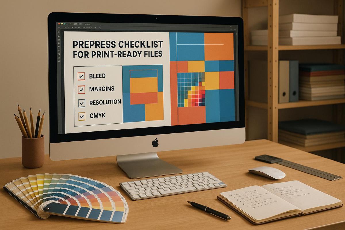
Printing errors like missing bleed or using RGB colors instead of CMYK can lead to expensive reprints. To save time and money, follow these essential prepress steps:
- Use the Right File Formats: Stick to PDFs (PDF/X-1a or PDF/X-4) for best compatibility. Use EPS for vector graphics and TIFF for high-quality images.
- Embed Fonts and Graphics: Ensure fonts are embedded and all images are linked or included in your file package.
- Set Correct Page Size and Layout: Match the document size to the final print size and adjust margins for safe trimming.
- Add Bleed and Crop Marks: Include a 1/8 inch (3 mm) bleed on all sides and use crop marks for precise cutting.
- Optimize Image Resolution: Use 300 DPI for sharp prints and convert files to CMYK for accurate colors.
- Proof and Finalize: Review text, layout, and branding, and always order a printed proof to catch errors before the final run.
InDesign: Packaging/Exporting to PDF (Prepress Essentials #6 of 6)
File Preparation Basics
Getting your files ready for print involves selecting the right format, embedding fonts and graphics, and ensuring your layouts are precise. A smooth printing process depends on these elements being handled correctly. Let’s break down the essentials for preparing your files.
File Formats and Compatibility
When it comes to file formats, PDF is the gold standard for retaining fonts, images, and layouts exactly as designed. For print jobs, stick to PDF/X-1a or PDF/X-4 standards. PDF/X-1a works well for traditional workflows, while PDF/X-4 is ideal if your project includes transparency or layered elements.
For vector graphics like logos or illustrations, use EPS files to maintain sharp edges, no matter the size. For high-resolution images, TIFF files are your best bet since they offer lossless compression and excellent quality. If you’re working with photographs, JPEGs can be an option, but only if saved at the highest quality setting. Always double-check with your print provider to confirm their specific file requirements. At Miro Printing & Graphics Inc., the team can guide you in selecting the right format for your project.
Embedding Fonts and Graphics
One of the most common issues in printing is missing fonts. To avoid this, embed your fonts to ensure your design looks exactly as intended. When exporting to PDF, use the "PDF for Print" preset, which automatically embeds fonts. After exporting, double-check your PDF in Adobe Acrobat by navigating to File > Properties > Fonts to confirm everything is embedded.
Graphics need attention too. Use the Links panel in design software like InDesign to manage your images. Linked files keep your project size smaller but require you to include the original files when sharing with your printer. Alternatively, embedding graphics creates a self-contained document. If you’re sending editable files, always package all linked fonts and images with your design to prevent anything from being left behind.
Page Size and Layout
Your document size must match the final print size – this is non-negotiable. As Mariah Althoff wisely advises:
"Make sure the document you’re sending to the printer is the correct size that you want it printed at."
Start your project by setting the correct paper size to avoid layout headaches later. For oversized projects that exceed your software’s maximum dimensions, design at a reduced scale (e.g., 25%, 50%, or 75% of the final size) and communicate this scale clearly to your printer. If scaling down, adjust image resolution to ensure quality when scaled back up.
For large-format prints, consider increasing your margins to 1.5–2 inches instead of the standard 0.5–1 inch used for smaller materials. This extra margin protects your content during production and installation, ensuring nothing important gets cut off or lost in the process.
Bleed, Margins, and Crop Marks
Getting the details right with bleed, margins, and crop marks can make a huge difference in the quality of your printed materials. These elements work together to ensure your design looks polished and professional after trimming, avoiding any unwanted white edges or cut-off content.
Setting Up Bleed
Bleed refers to the part of your design that extends beyond the final trim size, ensuring there are no white edges after cutting. In the U.S., the standard bleed size is 1/8 inch (3 mm) on all sides.
Here’s how to set it up in different design tools:
- Adobe InDesign: When creating a new document, set your page size and margins, then enter a 3 mm bleed in the "Bleed and Slug" settings. To adjust an existing document, go to File > Document Setup and input the bleed value.
- Adobe Illustrator: You can add bleed in the New Document dialog or later through File > Document Setup.
- Adobe Photoshop: Increase the canvas size by 6 mm in both width and height, keeping the anchor point centered.
- Canva: Canva also provides an easy way to add bleed directly within its interface.
Make sure all images, backgrounds, and color blocks extend into the bleed area to avoid white edges after trimming.
Safe Margins for Important Content
While bleed protects the edges, safe margins ensure none of your important content – like text, logos, or key design elements – gets trimmed off. A good rule of thumb is to keep these elements at least 0.25 inches inside the trim line, though specific projects may require more.
For book printing, margins vary depending on the binding method:
| Book Type | Binding Edge Margin | Outer Edge Margin |
|---|---|---|
| Hardcover Books | 0.25" (6 mm) | 0.25" (6 mm) |
| Perfect Bound Softcover | 0.6" (15 mm) | 0.25" (6 mm) |
| Saddle-Stitched | 0.25" (6 mm) | 0.25" (6 mm) |
| Wire‑O/Spiral Bound | 0.6" (15 mm) | 0.25" (6 mm) |
The binding edge often needs extra margin because pages can shift slightly during the binding process. Proper margin settings protect your critical content from being trimmed or lost in the binding.
It’s always a good idea to confirm margin requirements with your printer. For example, Miro Printing & Graphics Inc. provides detailed guidelines to ensure your content stays well within the printable area.
Adding Crop Marks
Crop marks are thin lines printed at the corners of your design, showing exactly where the paper needs to be trimmed. These are especially important when your design extends into the bleed area, as they ensure precise cutting.
Here’s how to add crop marks in popular design tools:
- Adobe InDesign: Go to File > Export, choose "Adobe PDF (Print)", and in the Marks and Bleed section, check the "Crop Marks" box. Make sure your bleed is set to 3 mm on all sides.
- Adobe Illustrator: Select File > Save As, choose Adobe PDF, and check "Trim Marks" under "Marks and Bleeds."
- Microsoft Publisher: Go to File > Print > Advanced Output Settings, select "Marks and Bleeds", and check the "Crop marks" box.
Crop marks align with your trim lines and guide the printer for accurate cutting. Combined with proper bleed and margins, they ensure your final product looks clean, professional, and exactly as intended. Once these elements are in place, your file is ready for proofing and printing.
Image Resolution and Color Settings
Once your bleed and layout are sorted, the next step is to refine image resolution and color settings for a polished print. These adjustments are crucial – low resolution can lead to blurry, pixelated images, while incorrect color settings might result in colors that don’t match what you see on your screen.
Setting High Image Resolution
For crisp, professional-quality prints, set your images to 300 DPI at their final size. If your image includes text, consider bumping it up to 400 DPI for sharper results.
Here’s a quick reference for common print sizes and their pixel dimensions at 300 DPI:
| Print Size | 300 DPI Pixels | 200 DPI Pixels |
|---|---|---|
| 4×6 inches | 1,200×1,800 | 800×1,200 |
| 8×10 inches | 2,400×3,000 | 1,600×2,000 |
| 11×14 inches | 3,300×4,200 | 2,200×2,800 |
Keep in mind that web images (typically 72–96 PPI) are not suitable for print. If you’re scanning images, scan at 300 DPI for originals that are already at their final size. For enlargements, scan at a proportionally higher resolution – for example, if you’re doubling the size of an image, scan at 600 DPI.
Once resolution is set, it’s time to focus on color settings.
Converting to CMYK Color Mode
Screens and printers interpret colors differently. While screens use RGB (Red, Green, Blue), printers rely on CMYK (Cyan, Magenta, Yellow, Black). To ensure your printed colors are accurate, convert your files to CMYK.
Since CMYK has a narrower color range than RGB, some vibrant screen colors may look less intense in print. Use your design software to make necessary adjustments during the conversion:
- Adobe Photoshop: Go to Image > Mode > CMYK Color. Use soft proofing (View > Proof Setup > Custom) to preview how colors will appear in print.
- Adobe InDesign: Start new projects with a "Print" intent or convert existing documents via Edit > Convert to Profile.
- Adobe Illustrator: Navigate to File > Document Color Mode > CMYK Color and tweak any colors that shift during the process.
- Canva Pro: When downloading, select "PDF Print" and enable the CMYK color profile option.
Before committing to a full print run, always order a printed proof. This step ensures that the final colors meet your expectations, as on-screen previews can be misleading.
Using Rich Black for Large Areas
For large black areas, like backgrounds or solid shapes, opt for rich black – a combination of 100% black (K) with small amounts of cyan, magenta, and yellow. This blend creates a deeper, more even tone. However, avoid using rich black for fine details like text, barcodes, or thin lines, as the extra ink can lead to smudging.
To prevent printing issues, keep your total ink coverage under 300%. Exceeding this limit can cause problems like bronzing, where ink doesn’t absorb properly, leading to longer drying times.
For the best results, check with your printer for their recommended rich black settings. For instance, Miro Printing & Graphics Inc. can provide specific values tailored to your project. Always ensure your design software is set to CMYK when creating rich black, and review proofs to confirm consistent saturation and tone before approving the final print run.
sbb-itb-ce53437
Proofing and Final Checks
After setting up your files and checking the layout, it’s time to wrap up your project with a detailed proofing process. A thorough review can help you catch any errors before submission, saving time and avoiding potential issues down the line. These final checks ensure your files are polished and maintain the quality established throughout the project.
Proofreading Text and Layout
Take a breather before diving into proofreading – it’s easier to spot mistakes with fresh eyes. Start by carefully reviewing grammar, punctuation, and spelling. Double-check proper nouns, numbers, and contact details to ensure accuracy. Reading the text aloud can help you notice awkward phrasing or inconsistencies. If possible, ask a colleague to give it a second look for an extra layer of review.
Be especially mindful of homophones like their, there, and they’re, as well as any auto-correct mishaps. Once you’ve made corrections, go over the text lightly again to make sure no new errors have crept in during the process.
Checking Image Placement and Branding
Use grid tools to ensure images are properly aligned and maintain consistency with brand guidelines. Confirm that all visuals are high-resolution (300 DPI) and have enough clear space around them. Also, check that no content is too close to edges or fold lines, which could affect the final print.
Verify that logos, colors, and imagery align with your brand’s standards. Many brands provide specific instructions for logo placement, color usage, and the overall style of imagery, so make sure to follow these guidelines closely.
Confirming Page Count and Design Elements
Compare your printed proof to the digital design to ensure the layout, order, and page numbering match perfectly. For multi-page projects, confirm the total page count is even, as each sheet typically includes two pages. If your project involves bound materials, remember to account for cover pages and adjust accordingly.
File Submission Guidelines
After ensuring your files are properly prepared, the next step is submitting them to your print provider. Correctly packaging and submitting your files can save time and avoid unnecessary delays. Following your printer’s specific submission guidelines is key to keeping your project on track.
Packaging Required Files
Start by organizing all the necessary design elements – fonts, images, and source files – into one package. Most design software includes a packaging feature that gathers these components for you.
For example, in Adobe Illustrator, you can create text outlines by selecting the text and navigating to Type > Create Outlines. To embed images, use the Links panel. These steps help eliminate common issues like missing fonts or broken image links when your files are sent to the printer.
Be sure to include your original design files in formats such as AI, EPS, or other native software formats, along with all linked images at their full resolution. This packaging process works hand-in-hand with the file setup techniques mentioned earlier.
Submitting Print-Ready PDFs
High-resolution PDFs are the gold standard for maintaining design accuracy. When exporting your PDF, make sure to:
- Set the color mode to CMYK (not RGB).
- Keep the resolution at 300 DPI for sharp, high-quality prints.
Your PDF should also include a 3mm bleed and ensure all critical content stays at least 5mm away from the page edges. For multi-page documents, arrange the pages as single pages in sequence, from the front cover to the back cover, and include any blank pages that are part of your design.
Additionally, verify that fonts are either embedded or converted to outlines. Avoid overprinting white elements, and double-check the placement of artwork if your project involves folds. Once your PDF is ready, follow your print provider’s specific submission rules to ensure final approval.
Following Submission Rules
Every print provider has unique requirements, so it’s essential to review their guidelines before submitting your files. Some printers may prefer specific file formats or have rules for naming files and size limits.
Use clear and descriptive file names to identify your project and version, such as BusinessCard_Smith_v3.pdf. For larger files, compress them into a ZIP folder or use a file-sharing service recommended by your printer.
Be sure to include detailed instructions with your submission, such as the desired quantity, paper type, finishing details, and deadlines. Sticking to these submission rules ensures your project maintains the quality established during the preparation phase.
At Miro Printing & Graphics Inc., we carefully review every file to confirm it meets our quality standards before starting production. If you have questions about file preparation or run into any issues, our team is always ready to assist!
Conclusion
Having a detailed prepress checklist is key to achieving print-ready, professional results. From preparing files and converting colors to setting up bleeds and proofing, every step helps avoid expensive mistakes and ensures your final prints meet the highest standards.
Proper file preparation not only saves money but also protects your brand’s reputation. Even small errors can distract readers and impact how your brand is perceived.
With the digital printing market expected to hit $47.1 billion by 2030, the importance of careful prepress work has never been greater. This growth underscores the need for precision and attention to detail, values we take seriously.
At Miro Printing & Graphics Inc., we bring over 30 years of expertise to ensure your files meet stringent quality requirements. Whether it’s digital, offset, or large format printing, we’re equipped to handle projects of all sizes with accuracy and care.
FAQs
What are the most common mistakes to avoid when preparing print-ready files, and how can you fix them?
When creating files for print, even small mistakes can affect the final product. One of the most common issues is missing bleed and safety margins. Without a proper bleed area – typically 0.125 inches – your design might end up with unwanted white edges. Similarly, if important elements aren’t kept within the safety zone, they risk being cut off during trimming. Including crop marks is also a must, as they guide the printer for precise cuts.
Another frequent mistake is using RGB instead of CMYK. While RGB works great for digital screens, it’s not ideal for print and can cause unexpected color shifts. Always convert your files to CMYK to ensure the colors print as intended. Also, low-resolution images (anything under 300 PPI) can lead to blurry or pixelated prints. To avoid this, verify that all images meet the resolution standard for sharp, clear results.
Lastly, don’t underestimate the importance of proofreading. Typos, missing elements, or layout errors can be expensive to fix once printing is done. Take time to double-check your files, embed or outline your fonts, and review a proof before sending your order to print. These steps go a long way in delivering a polished and professional final product.
Why is choosing the right file format important for high-quality printing?
Choosing the right file format is key to making your printed materials look polished and professional. High-resolution formats like TIFF and BMP are excellent for print because they retain all image details without any compression, ensuring sharp and clear results. In contrast, JPEG files use lossy compression, which can degrade image quality – especially if the file is edited multiple times.
For most print projects, PDF is the go-to format. It supports both vector and raster elements and works seamlessly with CMYK color settings, making it highly compatible with professional printing standards. Picking the correct format helps you sidestep issues like pixelation or color inconsistencies, ensuring your designs come out just as you envisioned.
Why do I need to convert colors from RGB to CMYK for printing, and what issues might occur during this conversion?
When it comes to printing, converting RGB to CMYK is a must. Why? Because RGB, designed for screens, covers a broader range of colors compared to CMYK, which is tailored for printing. Without this conversion, your design’s colors might look off or lose their vibrancy once printed, as CMYK simply can’t replicate every shade in the RGB spectrum.
This process isn’t always smooth sailing. Some colors can end up looking muted or less precise because of CMYK’s narrower range. To avoid surprises, it’s a good idea to manage colors carefully and preview your design in CMYK mode. This step can help you get as close as possible to the print results you’re aiming for.
Related posts
- Post-Press Quality Control Checklist
- How to Prepare Vector Files for Print
- Checklist for Print-Ready Files: Bleed, Trim, Safe Zone
- How to Create Print-Ready Artwork
https://app.seobotai.com/banner/banner.js?id=685208105559d477e75c9b09
