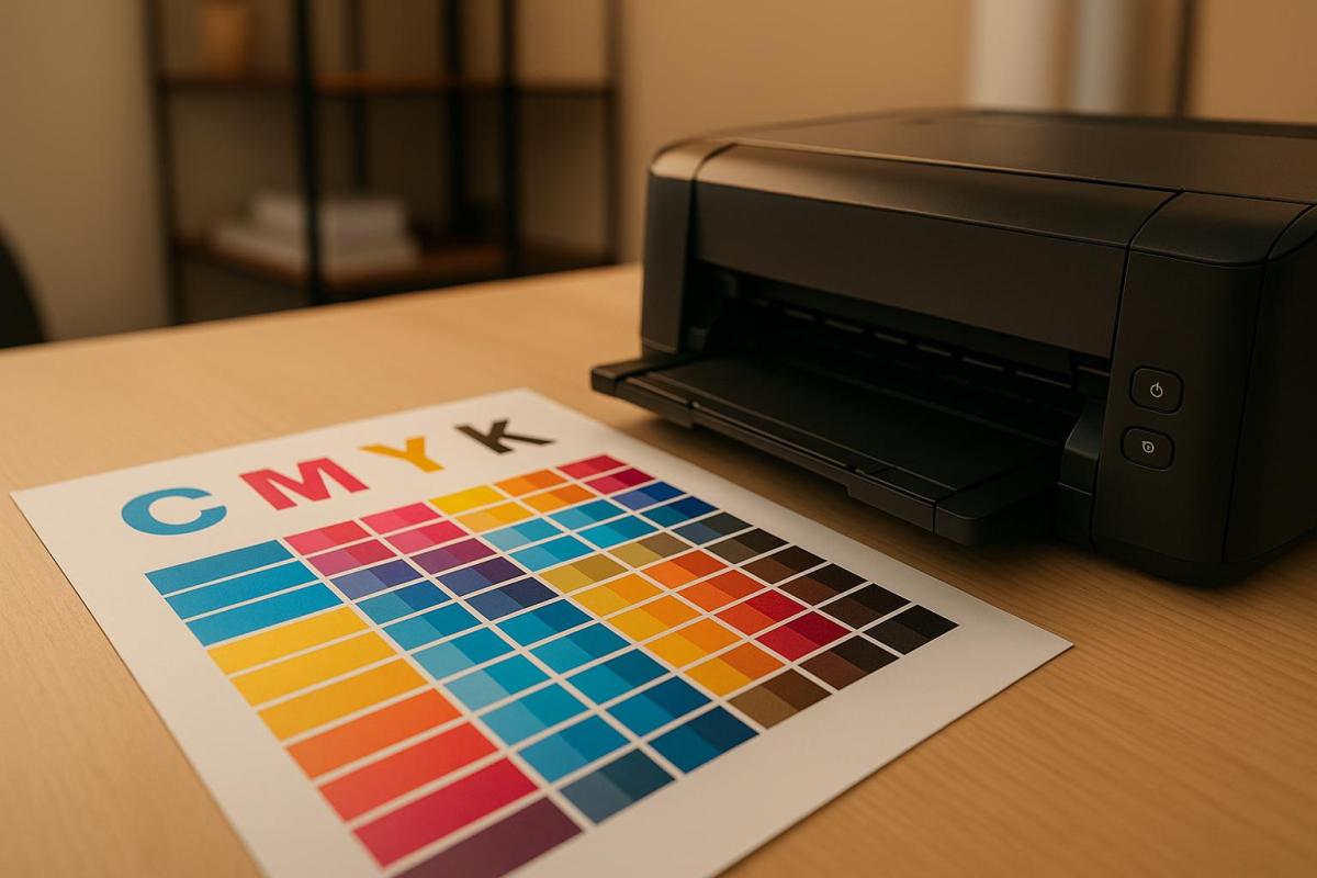
In printing, CMYK color issues often arise due to misunderstandings about how colors on screens (RGB) differ from printed materials (CMYK). Unlike RGB, which uses light to create vibrant colors, CMYK relies on ink to subtract light, leading to a smaller color range. Here’s what you need to know to avoid common problems:
- Screen-to-Print Mismatches: RGB colors may not translate accurately to CMYK. Calibrate your monitor regularly and use soft proofing tools to preview how designs will print.
- Banding and Streaks: Caused by clogged printheads or misaligned printers. Regular maintenance and using high-resolution images (300 DPI) can help.
- Brightness Problems: Prints may look too light or dark due to ink saturation, paper type, or incorrect settings. Aim for saturation levels between 150%-250% and choose the right paper.
- Wrong Color Profiles: Always design in CMYK mode and use the correct ICC profiles to prevent color shifts.
- Paper and Storage Issues: Paper type, humidity, and temperature affect print quality. Store paper in controlled conditions (68–76°F, 35–55% humidity).
Pro Tip: Collaborating with professional print shops ensures accurate colors, proper calibration, and fewer errors. They also provide printed proofs to catch problems early.
Focus on preparation, monitor calibration, and proper file setup to achieve consistent, high-quality prints.
Why wont my colours print correctly?! CMYK printing tutorial
1. Screen Colors Don’t Match Printed Colors
One of the most annoying challenges in printing is when the colors on your screen look completely different once printed. This happens because screens and printers rely on two different color systems: RGB for monitors and CMYK for printers.
RGB (red, green, blue) uses light emission to create over 16 million colors. It’s perfect for screens, which emit light directly. On the other hand, printers use CMYK (cyan, magenta, yellow, and black) inks in a subtractive color model. These inks absorb certain wavelengths of light from the white paper, and the colors we see are the result of reflected light.
The problem? RGB can display a much broader range of colors than CMYK can replicate. Vibrant hues like neon greens or electric blues that look stunning on your monitor are simply out of reach for traditional CMYK inks.
This fundamental difference makes accurate monitor calibration a must if you want your printed work to match your digital design. Most monitors aren’t calibrated correctly straight out of the box, which means the colors you see on-screen often don’t align with what comes out of the printer. Calibration adjusts your monitor’s brightness, contrast, gamma, and color temperature to meet industry standards. For instance, the recommended brightness level is 120 candela . Experts suggest recalibrating your monitor monthly to ensure consistent accuracy.
Soft proofing is another handy technique. With tools like Adobe Photoshop or Lightroom, you can simulate how your RGB design will look when converted to CMYK. As Visual Communications Expert Charles Kent explains:
"CMYK is more accurate for printing, it presents a higher probability that colours will be printed correctly"
Other factors also play a role in how colors turn out. The type of paper (glossy or matte), the printer’s quality, and even the ink’s saturation can all affect the final result. Glossy paper, for example, reflects light differently than matte, which can make colors appear more vibrant. Similarly, different printing methods – whether offset, digital, or screen printing – each come with their own quirks.
If your project is intended for print, it’s smart to design in CMYK from the beginning. This approach helps reduce surprises later. Using ICC color profiles can also standardize colors across devices, ensuring consistency. And don’t forget to consult with your print shop – they can provide insights into how their equipment and materials might influence your design.
2. Banding and Streaks in Printed Materials
Ever noticed those distracting horizontal or vertical lines ruining an otherwise flawless print? These imperfections, known as banding and streaking, can make even the most polished designs look unprofessional. Knowing what causes these issues is the first step to keeping your prints looking sharp.
Banding and streaking typically happen when printer heads are misaligned or clogged, preventing proper ink distribution. This results in gaps or lines on the print. Uneven paper movement can also lead to irregular coverage patterns . Additionally, variations in ink droplet size or placement can create visible streaks, especially in areas with gradients or solid colors.
The good news? Regular calibration and maintenance can help prevent these problems. Trisha Olivar, a printing expert from Compandsave.com, emphasizes the importance of calibration:
Regular printer calibration fine-tunes ink flow and printhead positioning.
She also warns against neglecting this step:
Skipping calibration can cause common printing errors like streaks, banding, or misalignment. A simple calibration corrects these issues for a clean output.
To keep your printer in top shape, make sure to clean the printheads regularly. Use the automatic cleaning function or a lint-free cloth with distilled water. Align the printheads through your printer’s settings, and replace ink cartridges before they run completely dry.
Another tip: always use high-resolution images. Files with at least 300 DPI prevent pixelation and banding, especially when enlarged. For large-format prints like banners, a resolution between 150 and 300 DPI is ideal, depending on how far the print will be viewed from .
If banding does occur, don’t panic. Troubleshooting steps include recalibrating media advance settings, checking paper loading, cleaning printheads, and adjusting heat or vacuum settings if your printer has those options.
Professional print shops, such as Miro Printing & Graphics Inc., rely on high-quality equipment and routine maintenance to avoid these issues. Their use of commercial-grade printers ensures fewer problems with banding and streaking compared to standard desktop printers.
3. Prints Look Too Light or Too Dark
Beyond color mismatches and banding, brightness inconsistencies can throw a wrench in your design plans. Prints that come out looking washed out or overly dark often result from issues like ink density, paper choice, or incorrect color adjustments.
Ink saturation is a key factor here. If saturation drops below 10%, the ink might not even show up on the final print. On the flip side, levels above 90% can make colors blend into solid, indistinguishable blocks. Striking the right balance is crucial.
For optimal results, aim for a saturation range of 150%-250%. As noted by PrintNinja.com:
We recommend your color choices, even your darkest sections, stay within the 150%-250% range. This area will show a lot of color flexibility, while preventing the muddied look when colors approach 300% and above.
Paper choice also plays a big role in how your prints turn out. Uncoated or recycled papers tend to absorb ink quickly, often making prints appear darker than expected. If you’re aiming for sharper, more vibrant results, silk or gloss papers are better options since they control ink absorption more effectively.
Environmental conditions can further complicate things. Low humidity, for instance, can prevent ink from setting properly, leading to faint or washed-out prints. On the other hand, high humidity can cause uneven ink absorption, resulting in prints with inconsistent brightness. Keeping your printing environment stable is key to avoiding these problems.
Another factor to consider is the contrast difference between screens and prints. Monitors can achieve contrast ratios as high as 2,000:1, while glossy prints max out at around 300:1. This explains why prints often look "flatter" compared to their on-screen counterparts. As expert D Fosse advises:
You want monitor white to be a close visual match to paper color. You want to ‘see’ paper white on screen…if it looks right, it is right.
Running test prints can help you catch potential issues before committing to a full print run, saving both time and money.
Professional print shops, such as Miro Printing & Graphics Inc., are well-equipped to handle these challenges. Using calibrated equipment and controlled environments, they ensure your prints meet the intended specifications. Their expertise with different paper stocks and ink formulations can make a noticeable difference in the final product.
To get the best results, store your paper in a cool, dry place and adjust ink density settings carefully. And remember, what looks perfect on your monitor may require fine-tuning during the actual printing process.
4. Wrong Color Profiles and Modes
One common printing mistake happens before the file even reaches the printer: using the wrong color mode. If you submit an RGB file, it will be automatically converted to CMYK, which often leads to unexpected color shifts. To avoid this, selecting the correct color mode from the start is essential.
Greg Simmons, Senior Creative Director at UPrinting, explains the difference clearly:
RGB is light-based and CMYK is ink on paper.
To keep your colors consistent and avoid surprises, start your design in CMYK mode. If you’re working with RGB images, convert them to CMYK early in the process to see any color changes on your screen. Greg Simmons advises:
To get a better idea of what will ultimately print, you should change your images to CMYK to see for yourself some of the subtle color shifts. Even though the change is on-screen, it will get you closer to envisioning the end result.
For print projects, always work in CMYK mode from the beginning. If you need to convert existing RGB images, use Adobe Photoshop by creating a copy of the image and selecting Image > Mode > CMYK Color. Also, make sure all images are in CMYK at 300ppi resolution.
By converting your files to CMYK before printing, you ensure more accurate results. Professional print shops, like Miro Printing & Graphics Inc., are familiar with these technical details and can assist with color profile setup. While prepress teams can handle conversions for you, preparing files correctly in advance leads to better outcomes.
Arcgel Hinggo, Prepress Manager at UPrinting, emphasizes how the industry relies on CMYK:
Printing industry machines are built to recognize CMYK. If you don’t switch, that’s okay. Our prepress team will do it for you as it is literally impossible to print in RGB.
When preparing your files, use a color profile that matches your printer’s specifications. If you’re unsure, the US Web Coated SWOP v2 profile is a reliable standard. Finally, run a preflight check to catch any issues and ensure high-quality print results.
sbb-itb-ce53437
5. Paper and Environmental Problems
The quality of CMYK printing isn’t just about perfect color profiles or meticulous file preparation – it also heavily depends on the type of paper used and how it’s stored. Even the most carefully prepared files can produce disappointing results if the wrong paper is chosen or if it’s kept in poor conditions.
The type of paper significantly influences how CMYK colors appear in the final print. For example, uncoated paper tends to absorb more ink, which can make colors look darker and less vibrant. On the other hand, coated paper minimizes ink absorption, resulting in brighter and more vivid colors. This means the same CMYK values can look entirely different when printed on newsprint versus glossy magazine paper. This is similar to how printer calibration affects output quality, as discussed earlier.
Paper brightness also plays a role. Measured on a scale from 0 to 100, brightness impacts how vivid colors appear. A design that looks sharp and vibrant on bright white paper might appear muted or dull on cream-colored or recycled stock.
Environmental conditions further complicate print quality. Fluctuations in temperature and humidity can cause paper to expand or contract, leading to alignment issues known as misregistration. High humidity can encourage mold growth and weaken the paper, while low humidity can make it brittle and prone to cracking. Since paper is hygroscopic – meaning it absorbs and releases moisture – it performs best when stored at 45–55% relative humidity and around 72°F, maintaining a moisture content of 4–6%.
Lori Slovik, a technology manager for Domtar printing papers, highlights a common issue faced in printing environments:
"We see a lot of Monday morning breakdowns, with people calling in because their copiers are jamming or the toner isn’t transferring uniformly, and that is often due to paper being stored in uncontrolled environments over the weekend."
Proper storage is key to avoiding these problems. Paper should be kept in a controlled environment between 68–76°F (20–24.4°C) with humidity levels between 35–55%. To protect it, leave paper wrapped in its original packaging until it’s ready to use, store reams flat rather than upright, and opt for solid shelving instead of wire racks. Allowing paper to acclimate for at least 24 hours before printing can also prevent issues like paper shock.
Professional print shops, such as Miro Printing & Graphics Inc., go the extra mile by maintaining climate-controlled storage areas. This ensures paper stays stable, preventing problems like wavy or tight edges that could disrupt feeding into a press. Their focus on proper handling and storage helps maintain high-quality output, efficiency, and productivity.
In addition to paper storage, keeping the surrounding environment clean is equally important. Dust and lint can clog print heads, so using air filtration systems, ensuring proper ventilation, and shielding printers from direct sunlight are essential steps.
To maintain print quality, always run test prints, adjust printer settings to match the paper type, and reseal any unused paper to protect it. By managing paper and environmental conditions effectively, you can prevent many common printing issues and ensure consistent, high-quality results.
6. How Professional Print Shops Help with Color Issues
Teaming up with a professional print shop can make all the difference when it comes to getting your project just right. These experts have the know-how, tools, and processes to tackle CMYK color challenges before they even become a problem.
The secret lies in their advanced equipment and precise calibration routines. Unlike home or office printers, professional setups are designed to align monitor displays with printed results, ensuring consistent color accuracy. Regular calibration and high-quality printers that precisely deposit ink help maintain this consistency throughout the process – bringing the CMYK principles we’ve discussed into action.
Another key advantage is soft proofing, which allows for pre-production adjustments. Using specialized color management software, print shops can simulate how your design will look in CMYK, giving you the chance to tweak and refine before anything gets printed.
Experienced technicians keep a close eye on every step of the printing process, quickly addressing any issues that might arise. They’re skilled in working with halftone dots, using AM for standard printing or FM for sharper, more detailed images. Additionally, they rely on controlled lighting environments to ensure accurate color perception, eliminating variables that could throw off the final result.
By blending state-of-the-art equipment with expert oversight, professional print shops maintain the high standards needed for flawless results. For instance, Miro Printing & Graphics Inc. offers a full range of services, from design consultations to final binding, all while ensuring color consistency at every stage.
What’s more, professional shops often provide printed proofs before full production, cutting down on waste and avoiding costly reprints. When DIY printing goes wrong, the expenses tied to reprints, wasted time, and potential damage to your brand can far outweigh the investment in professional services.
How to Prevent CMYK Color Problems
Addressing CMYK color issues starts with taking proactive steps to ensure consistent, accurate printing. By focusing on preparation and precision at every stage – from your workstation to the final print – you can save time, money, and avoid unnecessary frustration.
Monitor calibration is the first step toward achieving accurate colors. Your monitor needs to display colors as close as possible to what will appear on paper. Using a hardware calibration tool like the X-Rite i1Display or Datacolor Spyder can help you achieve precise results. If these tools are out of your budget, you can use built-in calibration software. For Windows, search "Calibrate Display Color" in your system settings. On macOS, the Display Calibrator Assistant provides a similar feature. While these software options aren’t as precise as hardware tools, they’re a great starting point. Make sure to calibrate in a room with consistent, dim lighting for the best results.
Environmental factors can also influence color perception. Ensure your workspace has uniform lighting, and keep your monitor clean and free of dust or screen films. It’s also a good idea to let your monitor warm up for 20–30 minutes before calibrating, as this can impact color accuracy.
To maintain consistency, use the correct ICC profiles for both your monitor and printer. This ensures colors translate accurately from screen to print. Recalibration is essential – aim to recalibrate every two to four weeks, or even weekly if you’re working on critical projects.
Proper file preparation is another key to avoiding CMYK issues. Always set up your files in CMYK mode from the beginning, and use soft proofing to preview how your designs will look when printed. Before committing to full production, request test prints. These samples allow you to see how your colors translate to paper and make any necessary adjustments.
Finally, working with a reliable print shop can make a big difference. Experienced professionals, like those at Miro Printing & Graphics Inc., can help identify potential problems early and offer guidance to optimize your designs. Their expertise in digital, offset, and large-format printing can complement your efforts in calibration, file preparation, and environmental control, ensuring your designs look their best in print.
Conclusion
Getting CMYK color right is essential for prints that truly represent your brand and vision. Issues like color shifts between screen and print, banding, incorrect brightness, and even environmental factors can all affect your final product. But the good news? With the proper techniques and attention to detail, these problems can be avoided entirely. This highlights the importance of effective color management.
Industry data backs this up: over half of design professionals recommend using CMYK instead of RGB for print projects to ensure consistent and accurate colors. Why? Because vibrant, reliable colors grab attention and convey a sense of quality and trustworthiness. On the flip side, inaccurate colors can distort a product’s appearance and negatively influence consumer perceptions and buying decisions.
"CMYK is the industry standard for printing because of the science behind the color space and the substrate. Ink on paper must use the CMYK color space to achieve the optimum results by creating an unlimited number and shades of color. CMYK will produce full, dark, rich and vibrant colors to bring your project on paper to life!"
- Olivia Gray, PrintingCenterUSA
The solution? Start with the right preparation and seek professional input. Design in CMYK from the beginning and regularly calibrate your monitor for accurate color representation. Always request printed proofs before committing to large production runs. These steps not only ensure color precision but also help avoid costly reprints and mismatched results.
At Miro Printing & Graphics Inc., we specialize in digital, offset, and large-format printing, catching potential color issues early in the process. From providing color profiles and file checks to offering expert advice, we ensure your designs look as good on paper as they do on screen. Our full-service approach – from initial design consultations to final bindery – supports you every step of the way.
"In the world of CMYK printing, precision is paramount. While many companies may claim to offer high-quality printing, not all processes deliver the same level of color accuracy."
FAQs
How can I make sure the colors on my screen look the same when printed?
To ensure your printed materials match the colors you see on your screen, start by calibrating your monitor with a hardware calibration tool. This step helps your screen display colors as accurately as possible. Then, make sure to use the appropriate ICC profiles for your specific printer and paper combination. These profiles are essential for translating on-screen colors into printed results.
For even greater precision, consider using the soft proofing feature in design tools like Photoshop. Soft proofing allows you to preview how your colors will look once printed, giving you the chance to spot and fix any issues before hitting "print." By following these practices, you can minimize color inconsistencies and achieve more dependable print results.
How can I avoid banding and streaks in my printed materials?
To reduce banding and streaks in your prints, make sure your design files are high resolution and set to CMYK color mode. Incorporate smooth gradients, and if banding persists, try adding a touch of noise to the gradients. Adjusting dither settings can also enhance the overall print quality.
Taking care of your printer is just as important. Replace ink cartridges before they run dry, and keep the printer clean to prevent problems like fuser oil contamination. These simple steps can go a long way in delivering sharp, professional-looking prints consistently.
Why is it important to use the right color profiles and modes when preparing files for printing?
When it comes to printed materials, choosing the right color profiles and modes is key to ensuring consistent and precise colors. While RGB works great for digital screens, CMYK is the go-to color mode for printing because it more accurately reflects how colors appear on physical surfaces.
Managing colors correctly helps your final print look as close to your original design as possible, preventing surprises like unexpected color changes or muted tones. This level of care is especially critical for professional projects where every detail matters.
Related posts
- How to Adjust Colors for Offset Printing
- CMYK vs RGB: Printing Color Models
- 5 Common ICC Profile Issues and Fixes
- Prepress Checklist for Print-Ready Files
https://app.seobotai.com/banner/banner.js?id=687434a96002c02a8238929e
