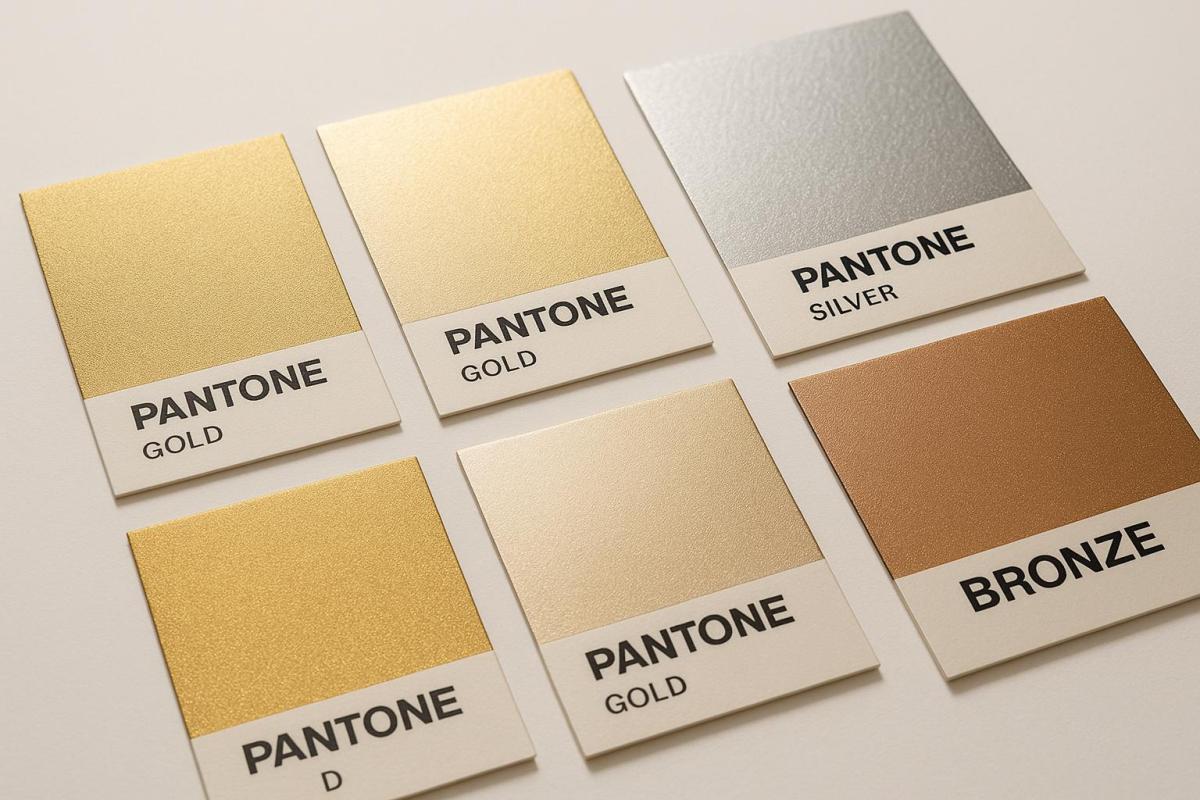
Pantone Metallic colors are designed to bring precision and a reflective shine to printed designs, making them ideal for creating high-end visuals. With 655 metallic shades split into two categories – standard metallics and Premium Metallics – these colors ensure consistent reproduction and a polished finish. They are often used in packaging, business cards, and luxury branding to grab attention and add a premium feel.
Key Highlights:
- 655 metallic shades: Includes 354 high-luster packaging metallics and 301 traditional spot colors.
- Why use metallics?: Adds a premium look, enhances visibility, and strengthens brand identity. Studies show 70% of consumers prefer eye-catching packaging.
- Best materials: Coated papers amplify shine, while heavier papers (100 lb or more) ensure stability.
- Printing methods: Offset printing for large runs, digital printing for small jobs, and metallic foil stamping for bold finishes.
- Pantone Metallics Guide: A tool for precise color selection, featuring eco-friendly ink formulas and examples with specialty coatings.
Pantone Metallics stand out for their ability to ensure consistent, reflective, and vibrant finishes, making them a go-to choice for luxury designs and branding. For the best results, early collaboration with skilled printers is recommended.
Pantone Metallics Guide GG1507C

Understanding the Pantone Metallics Guide
The Pantone Metallics Guide serves as a reliable resource for selecting metallic colors with precision. It removes uncertainty and ensures consistent results across various printing projects.
Features of the Pantone Metallics Guide
This guide includes 655 metallic colors, all neatly organized for easy reference. The colors are arranged chromatically, and there’s an index at the back to help you quickly find specific shades. Each color swatch comes with detailed ink formulations and is printed on 100 lb (148 gsm) coated paper. There’s even an indicator page to show the optimal lighting conditions for accurate color evaluation.
It also provides examples of how metallic colors look when paired with gloss aqueous and specialty coatings, giving designers a clear sense of their application.
The guide is divided into two categories: 354 high-luster packaging metallic colors and 301 traditional metallic spot colors. Packaging metallics, known for their high-gloss finish, are perfect for premium packaging designs, while traditional metallics work best for commercial graphics. To streamline its offerings, Pantone combined its regular and Premium Metallics into a single, unified guide.
These features make the guide a practical tool for keeping up with evolving design needs.
New Trends in Metallic Colors
The latest edition reflects modern design trends by introducing 54 new colors, including those featuring Rose Gold ink. Rose gold’s warm and elegant tone strikes a balance between classic gold and contemporary copper, giving designers a flexible option for trendy metallic effects.
Additionally, the updated guide incorporates eco-friendly ink formulas and ensures more consistent ink density, addressing both environmental concerns and practical challenges in printing.
These updates solidify the Pantone Metallics Guide as an indispensable resource for producing consistent, high-quality metallic finishes across all types of projects.
Key Factors for Metallic Printing Success
Creating impressive metallic prints hinges on the right combination of materials, techniques, and problem-solving strategies. Below, we’ll explore material selection, printing methods, and solutions to common challenges.
Choosing the Right Paper and Materials
The foundation of successful metallic printing lies in selecting the right paper. Coated papers are a top choice because their smooth surfaces evenly distribute metallic particles, amplifying the shine. The coating also prevents ink from soaking into the paper too quickly, which helps preserve the metallic effect.
Paper weight matters too. Heavier papers – typically 100 lb (148 gsm) or more – offer better stability during printing, reducing the chances of curling or warping. While uncoated papers can be used, they tend to absorb more ink, resulting in a more muted metallic finish. For maximum reflectivity, smooth and glossy surfaces are ideal, though textured papers can create unique, varied effects.
Once the materials are in place, the choice of printing method becomes the next critical step.
Best Printing Methods for Metallic Colors
The printing method you choose significantly influences the final result. For large-scale projects, offset printing is a reliable option. Its plate-based system ensures even ink application and precise color reproduction, making it perfect for runs of 1,000 or more. It’s also well-suited for handling the thicker consistency of metallic inks.
For smaller quantities or personalized projects, digital printing is a better fit. It’s especially useful for items like custom greeting cards or flyers where flexibility is key.
If you’re after bold, dramatic metallic effects, consider metallic foil stamping or metallic ink printing. Foil stamping uses heat and pressure to transfer metallic foil onto paper, producing a shiny, long-lasting finish. On the other hand, metallic ink printing involves inks infused with metal particles, offering a broader range of colors. However, this method may require multiple layers to achieve the desired effect.
Here’s a quick comparison of common methods:
| Method | Best For | Finish Quality | Cost | Detail Level |
|---|---|---|---|---|
| Foil Stamping | High-end projects, embossing | Shiny and durable | Higher | Great for bold designs |
| Metallic Ink | Subtle, detailed designs | Softer shine | Lower | Excellent for detail |
| Offset Printing | Large quantities | Consistent, polished | Moderate | High detail and precision |
| Digital Printing | Small runs, personalization | Good for small jobs | Lower setup costs | Very good detail |
Common Metallic Printing Problems and Solutions
Metallic printing can be tricky, with several potential pitfalls. One frequent issue is uneven ink coverage, often caused by metallic particles settling in the ink. To avoid this, stir the ink thoroughly before use and periodically agitate cartridges during longer print runs.
Printer nozzle clogging is another common challenge, particularly in digital printers. Metallic particles can accumulate and block the nozzles, so running cleaning cycles between jobs and adjusting print settings for thicker inks can help.
Residual metallic ink can also contaminate equipment, complicating future print jobs. Thorough cleaning after each run is essential to prevent leftover ink from interfering with subsequent projects.
For optimal results, apply multiple thin layers of ink rather than a single thick coat. Adjusting print speed and pressure – especially when working with silver inks – can enhance the metallic finish.
If you’re using metallic inks in offset presses, you may need to tweak the fountain solution. These inks often require a different balance of ink and water. Adding a water-resistant compound, available through most ink suppliers, can improve ink performance and prevent over-emulsification.
Temperature and curing times are equally important. Proper curing ensures that metallic particles set correctly, maintaining their reflective qualities. Test prints are invaluable here, allowing you to fine-tune settings, adjust formulations, and perfect techniques before committing to a full production run.
sbb-itb-ce53437
Pantone Metallics vs Other Color Systems
Choosing the right color system for metallic finishes can significantly influence the final look, cost, and overall impact of your project.
Pantone Metallics rely on pre-mixed spot colors, ensuring consistent results across different print runs. With 655 metallic shades available, this system offers designers a broad range to create striking finishes. These inks form solid, opaque layers, which are crucial for achieving smooth and reflective metallic effects.
On the other hand, CMYK – which uses cyan, magenta, yellow, and black inks – works well for reproducing photos and intricate images. However, it falls short when it comes to replicating the reflective properties of metallic finishes.
"Why should I use Pantone colors in my packaging? Pantone’s system ensures consistent colors, eliminating mismatches common with CMYK. This precision is vital for brands emphasizing detail." – Christal Wong
This quote underscores why Pantone is often the go-to choice for projects that demand precise color fidelity.
Interestingly, about 30% of the 1,114 spot colors in Pantone’s main library cannot be accurately reproduced using CMYK. While CMYK is typically more cost-effective for large-scale printing with multiple colors and gradients, Pantone printing becomes more economical for projects requiring exact color matching or metallic finishes. However, it’s worth noting that Pantone’s setup costs can be higher, particularly for short runs, as each spot color involves dedicated plates and precise ink mixing.
Beyond metallic effects, Pantone provides additional tools tailored to various design needs. For instance:
- The Pantone Formula Guide offers an extensive range of standard colors, organized chromatically, perfect for general design work.
- The Pantone Color Bridge helps designers see how spot colors translate into CMYK.
- The FHI range caters to textiles, featuring a variety of shades suited for apparel and home décor.
Comparison Table: Pantone Metallics vs Other Systems
| System | Best Applications | Color Accuracy | Cost | Metallic Capability | Setup Complexity |
|---|---|---|---|---|---|
| Pantone Metallics | Logos, branding, luxury packaging | Exceptional consistency | Higher, with multiple colors | True metallic effects (655 shades) | Moderate – requires special plates |
| CMYK | Photos, gradients, detailed images | Good but can vary | Budget-friendly for high volumes | Cannot replicate metallic finishes | Low – standard process |
| Pantone Formula Guide | Solid brand colors, general design | Outstanding consistency | Higher per color | No metallic options | Moderate – spot color setup |
| Foil Stamping | Premium logos, text elements | Excellent reflectivity | Highest setup costs | Superior shine and texture | High – needs custom dies |
When deciding between these options, Pantone Metallics stands out for projects requiring exact brand color matching and eye-catching metallic effects. For example, if you’re working on luxury packaging, Pantone Metallics ensures the kind of visual appeal that resonates with consumers. In fact, with the global luxury packaging market expected to hit $78.9 billion by 2025, studies show that 70% of consumers are more likely to choose a product with visually striking packaging.
For projects that prioritize precise metallic finishes, Pantone Metallics is the clear winner. However, if you’re working on designs with intricate, multi-tonal images or need to stick to a tighter budget, CMYK might be the better option for non-metallic elements.
Using Pantone Metallics in Design and Print Workflows
Working with Pantone Metallics requires careful planning from start to finish. The secret to success lies in understanding how these unique colors behave throughout the design and production process, while leveraging the right tools to maintain consistency.
Using Pantone Connect for Metallic Colors
Pantone Connect acts as a vital link between digital design and physical printing, making metallic color selection more accurate and efficient. Seamlessly integrating with Adobe Illustrator, Photoshop, and InDesign, this tool grants designers access to the full spectrum of metallic shades with ease.
One standout feature is its connection to PantoneLIVE, a digital library that previews how colors will appear on different materials and substrates. This is especially critical for metallics, as their appearance can vary drastically – popping vibrantly on coated paper but appearing more muted on uncoated stock.
Pantone Connect also helps designers navigate ink limitations and substrate compatibility. It offers practical insights into which metallic shades work best with specific materials, reducing the risk of costly reprints.
Another key component is the Pantone Matching System (PMS), which assigns numeric codes to each metallic color, creating a universal standard. For instance, specifying Pantone 8003 C for a rich metallic gold ensures that printers across the country can reproduce the exact shade, eliminating guesswork.
For physical reference, the Pantone Formula Guide remains indispensable. The Coated & Uncoated set is particularly valued for its precise color definitions and user-friendly organization, making it a go-to resource for designers and printers alike.
This seamless integration between digital tools and physical references sets the stage for real-world applications, as seen in the following examples.
Real Examples of Metallic Pantone Colors in Use
The practical application of metallic Pantone colors demonstrates their ability to elevate designs. Take Pantone 9580 U, for example, which was used in the packaging for a luxury retail brand. Printed on 250 gsm uncoated white kraft paper, this metallic shade reinforced the brand’s premium image through impeccable color matching on textured stock.
In another instance, Pantone 10360 C was chosen for a rigid box design with soft-touch lamination – a finish that can sometimes alter the look of metallic inks. Through meticulous testing and adjustments, the final product achieved the desired luxurious finish while maintaining the integrity of the metallic effect.
These successes highlight the importance of thorough workflow practices. Designers often conduct early material tests using actual paper samples instead of relying solely on digital previews. Additionally, they maintain close collaboration with ink suppliers, providing specific Pantone codes and physical samples to ensure the final outcome meets expectations.
How Miro Printing & Graphics Inc. Handles Metallic Printing
When it comes to translating design into print, Miro Printing & Graphics Inc. sets a high standard for metallic printing. Based in Hackensack, NJ, this full-service print shop combines offset printing expertise with tailored project management, making them well-equipped for challenging metallic jobs.
Their process starts with early consultations during the design phase. Rather than waiting for finalized files, Miro’s team collaborates with clients to address paper selection, ink compatibility, and potential challenges posed by metallic inks. This proactive approach helps avoid issues like color shifting or adhesion problems that can occur with certain substrates.
Miro’s in-house bindery services add another layer of precision. Post-press operations such as cutting, scoring, and folding can impact the appearance of metallic inks, especially along fold lines where the metallic particles may separate. By managing these processes internally, Miro ensures the final product maintains its intended metallic effect.
Color accuracy is a top priority for Miro. They rely on physical samples and regular press checks to achieve consistent results. Routine calibration of equipment – from monitors to presses – ensures accurate color reproduction. Additionally, they use ICC profiles embedded in client files to maintain uniformity across different devices and platforms.
For projects requiring both digital and offset versions, Miro advises creating two sets of color specifications: a CMYK approximation for proofs and digital use, and the precise Pantone Metallic for final offset production. This dual approach ensures consistency across all formats.
Miro’s portfolio includes custom projects like presentation folders and premium business cards, showcasing the striking impact of metallic accents. Their technical expertise and end-to-end services allow them to handle complex metallic printing projects seamlessly, ensuring the final product aligns with the designer’s vision.
Summary and Key Points
Pantone Metallic inks elevate designs, turning them into sophisticated materials that strengthen brand identity and capture consumer attention. These inks deliver a level of technical precision and visual appeal that standard printing methods simply can’t match.
Benefits of Metallic Printing
Metallic printing has a powerful effect on how consumers perceive products. Research shows that visually captivating packaging, especially with metallic elements, often becomes a standout feature that influences purchasing decisions.
Pantone offers an impressive range of 655 metallic colors, giving designers plenty of room to experiment. These inks can be layered with transparent coatings or paired with halftones to create subtle gradients and richer metallic finishes.
Another advantage is the cost efficiency of metallic ink printing compared to techniques like foil stamping, particularly for smaller coverage areas. This flexibility allows for creative visual effects that leave a lasting impression, whether on premium wine labels or festive holiday packaging. To put it in perspective, the global luxury packaging market is expected to hit $78.9 billion by 2025, growing at a 4.7% annual rate.
These technical and aesthetic benefits underline the importance of selecting the right print partner for metallic printing projects.
Choosing the Right Print Partner
Achieving the full potential of Pantone Metallic inks requires working with a skilled print provider. These inks demand expertise in areas like substrate selection, ink compatibility, and post-press handling. Miro Printing & Graphics Inc., based in Hackensack, NJ, is a prime example of a provider that excels in this space. Their services include offset printing, in-house bindery, and custom project management, all tailored to address challenges like color shifts and adhesion issues.
Engaging a print partner early in the design process is crucial. Factors such as paper choice and ink compatibility need to be addressed upfront to avoid costly reprints. Experienced providers also ensure consistent results by calibrating equipment, using ICC profiles for accurate color reproduction, and conducting regular press checks. This combination of technical expertise and advanced tools is what separates standard printing from exceptional metallic results.
FAQs
How can Pantone Metallic colors elevate packaging and luxury branding?
Pantone Metallic colors can elevate your packaging and luxury branding by adding a sleek, eye-catching finish that exudes elegance and sophistication. These shimmering tones create a sense of exclusivity, helping your products stand out on crowded shelves and leaving a memorable impression on customers.
Using Pantone Metallics in your designs allows you to emphasize key details like logos, accents, or text, ensuring your brand projects a polished and upscale image. This approach works particularly well in industries such as cosmetics, fashion, or gourmet foods, where visual appeal plays a crucial role in shaping brand identity.
What are the best tips for choosing paper and printing techniques to create stunning metallic finishes?
To create eye-catching metallic finishes, begin by choosing premium metallic or coated paper with a smooth texture and the right weight for your project. The paper’s reflective quality is crucial for amplifying the metallic effect, so pick one that works well with your design and color scheme.
When it comes to printing, UV and offset printing are your best options for achieving bold, long-lasting metallic effects. These methods provide accurate color application and help preserve the shine of metallic tones. It’s always a good idea to test your design on the selected paper to ensure the final outcome aligns with your vision.
How can the Pantone Metallics Guide help ensure consistent and vibrant metallic finishes in printing projects?
The Pantone Metallics Guide is a go-to resource for creating eye-catching metallic finishes with consistency. It offers a well-defined selection of metallic colors paired with detailed ink formulations, making it easier to achieve precise color matching across different printing projects.
This guide is particularly useful for designers and printers aiming to maintain consistent results, even when working with various materials or printing methods. The result? Metallic prints that always look sleek and professional.
Related posts
- Pantone Matching System in Printing
- Foil Stamping vs Metallic Ink: Key Differences
- Pantone Charts for Large Format Printing
- Choosing Pantone Colors for Packaging Printing
https://app.seobotai.com/banner/banner.js?id=6879979a75a0518b7c35026d
