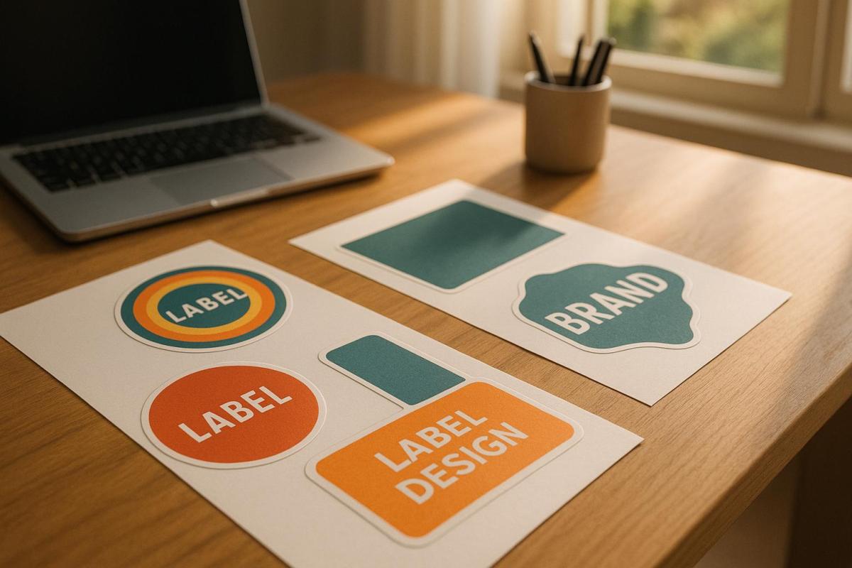
Choosing the right colors for die-cut labels can directly impact how customers perceive your product and whether they choose to buy it. Here’s what you need to know:
- Color Psychology Matters: Colors evoke emotions and influence purchasing decisions. For example, red grabs attention and encourages impulse buys, while blue builds trust. Studies show 85% of buying decisions are influenced by color alone.
- Align Colors with Your Brand: Your label’s colors should represent your brand’s personality and values. Consistency across platforms increases brand recognition by up to 80%.
- Consider Printing Methods: Digital printing is cost-effective for small runs but may not match Pantone colors perfectly. Offset printing offers better color accuracy, especially for custom shades.
- Material Impacts Color: Paper absorbs ink differently than vinyl or metallic materials. Test your colors on the actual label material to ensure they appear as intended.
- Ensure Readability: High-contrast combinations (e.g., black text on white) improve visibility. Avoid relying solely on color to convey meaning – use text or symbols for accessibility.
- Test Before Printing: Always request printed proofs to check colors under various lighting conditions and ensure accuracy.
Brand Identity and Customer Appeal
Your die-cut labels should immediately reflect your brand’s personality. The colors you select act as a visual shortcut, communicating everything your brand stands for. This choice goes beyond personal preference – it’s a strategic decision that shapes how customers perceive your brand.
Matching Colors to Your Brand
Your brand colors serve as an instant identifier for your audience. They should clearly express your values and the essence of your business. The goal isn’t to rely on clichés but to use colors that genuinely represent your brand.
"It’s far more important for colors to support the personality you want to portray instead of trying to align with stereotypical color associations", says Hillary Weiss, Creative Director.
Start by defining your brand personality. Are you bold and forward-thinking? Reliable and trustworthy? Fun and approachable? This foundation will guide your color choices. For example, one founder opted for a soft light blue to reflect his personal story and authenticity.
Consistency is key – using the same colors across platforms can increase brand recognition by up to 80%. Take Parachute, the bedding company, as an example. They use a consistent palette of dark charcoal grey, light blush pink, cream, and white across their website, social media, storefronts, and products. These muted tones create a sense of calm, perfectly aligning with their brand promise.
Don’t be afraid to break industry norms if it fits your brand. Monzo, a digital bank in the UK, chose a bold coral pink for its debit cards. This vibrant choice stands out in the typically conservative finance sector, signaling innovation and youthfulness. On their digital platforms, they balance this with blues and greys to convey trust and professionalism.
Also, think about how your colors compare to competitors. Over 33% of brands use blue as their main color, which might make it harder to stand out. Blueland, an eco-friendly cleaning brand, avoided the common green associated with eco-products. Instead, they chose blue to emphasize water conservation, paired with yellow as a secondary color to add vibrancy.
Once you’ve nailed down your brand colors, it’s time to explore how they influence customer behavior.
How Colors Affect Customer Behavior
Colors don’t just define your brand – they also shape how customers feel and act. They trigger emotional responses, which makes understanding color psychology essential for influencing buying decisions.
Warm colors like red, orange, and yellow evoke energy, excitement, and warmth. On the other hand, cool colors like blue, green, and purple inspire calmness and relaxation. For instance, red is known to encourage impulse purchases, while navy blue tends to promote more thoughtful, budget-conscious decisions.
Major companies use these principles to great effect. Coca-Cola’s red and McDonald’s yellow are iconic examples of colors that spark immediate emotional connections and drive purchases.
However, color preferences can vary based on demographics and cultural context. What appeals to millennials might not resonate with baby boomers. Similarly, colors that symbolize positivity in one culture might carry negative meanings in another. Kevin Kaminyar, CEO of Yellow Tree Marketing, shared how customer feedback shaped his brand’s color strategy:
"I asked [my clients] what popped into their head when they looked at different colors, and yellow was overwhelmingly positive. They brought up kindness, warmth, empathy – and that aligned with my brand".
Testing your color choices with real customers is a smart way to remove guesswork. Dan Antonelli, head of marketing agency Kickcharge, emphasizes this approach:
"We use a more research-driven approach about the use of color that’s already in the market".
This kind of research ensures your colors will have the desired effect on customer behavior.
Keep in mind that 85% of customers cite color as a major reason for choosing one brand over another. Even small details, like the colors on your die-cut labels, can have a big impact on customer decisions. Choose colors that not only look appealing but also actively strengthen your brand and encourage sales.
Printing Methods and Material Compatibility
The method you choose for printing your die-cut labels plays a big role in how your colors appear. Each technique has its own strengths and limitations, which can either enhance or compromise the vibrancy and accuracy of your design. Knowing these differences is key to maintaining your brand’s visual identity.
Printing Process Limitations
Different printing processes handle colors in unique ways, directly affecting the final output. For instance, digital printing transfers the design straight onto the surface, while offset printing involves metal plates and rubber rollers to apply the ink. Offset printing uses oil-based inks that soak into the paper, creating deep and lasting color saturation. On the other hand, digital printing applies ink to the surface, which can make colors appear brighter but may compromise durability over time.
When it comes to color precision, offset printing has the upper hand. It uses the Pantone Matching System to mix custom inks, ensuring highly accurate colors. Digital printing, however, relies on the standard CMYK color model, which may not perfectly replicate all Pantone shades. If your branding depends on exact Pantone colors, offset printing is the better choice. However, for projects with a broad color range or lower print volumes, digital printing offers a more budget-friendly solution.
There’s also UV printing, a specialized form of digital printing. It uses UV light to quickly dry specially formulated inks, resulting in sharper details and better color matching compared to traditional digital methods.
Color Selection for Different Label Materials
The material you print on also has a big impact on how your colors turn out. Different surfaces absorb and reflect ink in ways that can either enhance or alter your design.
Paper labels are the most predictable option. Standard paper stocks absorb ink well and provide reliable color saturation, making them a great choice for testing color combinations. Higher-quality paper can further improve color consistency and fidelity.
Vinyl and plastic materials, however, pose unique challenges. These non-absorbent surfaces don’t take in ink like paper does, which can lead to more vibrant but less durable colors. While these materials can deliver bold visual effects, they may also be more prone to scratching or wear over time.
Offset printing shines when working with a variety of materials. It can handle everything from paper and cardboard to plastic, including thicker stocks, while still delivering a polished, professional look. Digital printing, in contrast, works best with standard paper types that are compatible with inkjet technology.
Metallic and foil substrates add another layer of complexity. Metallic surfaces can amplify vibrancy with their reflective qualities, while clear substrates allow underlying colors to influence the final appearance.
To avoid surprises, it’s important to prepare your design in the CMYK color space from the start. This ensures your colors stay within the printable range and minimizes unexpected shifts when converting from RGB to CMYK. Additionally, collaborating with your printer early in the process can make a big difference. Professional printers, such as Miro Printing & Graphics Inc., can guide you in choosing the right materials and fine-tuning your colors to suit your project’s needs.
Visibility and Readability
Die-cut labels need to perform well in a variety of environments, under different lighting, and from various viewing angles. Ensuring that your labels are easy to read isn’t just a design choice – it’s essential for effectively communicating your message to your audience.
High-Contrast Color Combinations
The readability of your label heavily depends on the contrast between the text and its background. High contrast not only makes the text pop but also strengthens your branding.
Based on the Web Content Accessibility Guidelines (WCAG 2.1), body text should achieve a contrast ratio of at least 4.5:1 to ensure readability for most people.
"The visual presentation of text and images of text [to have] a contrast ratio of at least 4.5:1." – WCAG 2.1
Classic color pairings, like black text on a white background, provide excellent readability. On the flip side, combinations like yellow text on a white background lack the necessary contrast. Complementary colors – opposites on the color wheel, such as blue and orange or purple and yellow – offer a vibrant yet readable option when used thoughtfully. Similarly, saturated colors against neutral backgrounds improve visibility, especially for labels meant to be seen from a distance.
For fonts, stick to bold, clean styles that remain legible even when scaled down. Avoid thin or overly decorative fonts that can lose clarity at smaller sizes.
Before finalizing your design, use a color contrast checker to validate your choices. These tools calculate contrast ratios with precision, eliminating guesswork.
But readability isn’t just about contrast – it’s also about accessibility for users with color vision deficiencies.
Accessible Color Design
Accessibility goes beyond contrast, requiring designs that work for everyone. Millions of people live with color vision deficiencies, including approximately 8% of men and 0.5% of women of European descent who experience red-green color blindness. To address this, use additional visual cues like text, icons, or patterns to complement color.
Never rely solely on color to convey critical information. For example, if red indicates "stop" or "danger", pair it with clear text, symbols, or patterns. Becky Kinkead, Marketing Design and UX Manager at Litmus, underscores this point:
"If color is the only way you’re conveying meaning such as using red for errors and green for success, users experiencing color blindness might not be able to interpret your design at all. Accessibility is about making sure the experience works for everyone."
Incorporate secondary elements like bold text, underlining, patterns, icons, or descriptive labels to reinforce your message. For instance, if your label uses color to distinguish product categories, adding clear text labels or unique shapes can significantly enhance clarity.
Avoid color combinations that are difficult for color-blind users to differentiate, such as green/red, green/blue, green/black, green/brown, green/gray, light green/yellow, blue/purple, and blue/gray.
To test your design for accessibility, view it in grayscale. If the label remains understandable without color, it’s more likely to work for those with color vision deficiencies. Saturated colors also tend to create stronger contrast than pastels, making them easier to see in various lighting conditions.
For a more thorough evaluation, involve individuals with color vision deficiencies during the testing phase. Their feedback can reveal potential issues that digital tools might overlook.
Professional printing services, like Miro Printing & Graphics Inc., can provide expert advice on accessibility and help you test your designs under different lighting conditions to ensure maximum readability.
As Dana Randall, Head of Accessible UI Design at Level Access, puts it:
"We fail at our jobs when we create things that are difficult to use or unpleasant to engage with. With that lens, we may forget that not all people experience color the way we do, which is why we need to check our work through an experience beyond our own."
sbb-itb-ce53437
Testing and Final Color Selection
Once you’ve chosen colors based on branding, printing methods, and accessibility, the next step is to physically test them. This process ensures that all your earlier considerations – like material and printing limitations – translate effectively into the final product. Digital screens can’t fully capture how colors will appear on actual label materials, so physical testing is essential to confirm color accuracy.
Getting Printed Proofs
Printed proofs are a must before committing to a full production run. These proofs let you see how your colors and overall design will look on the chosen material under real-world conditions. Keep in mind that converting colors from RGB to CMYK can sometimes lead to unexpected shifts. Proofs also allow you to check other critical details like label fit, barcode readability, and the unwind direction. Skipping this step could result in costly errors, so reviewing a physical sample ensures your design is ready for production without surprises.
Testing Colors Under Different Lighting
Once you’ve reviewed your printed proofs, it’s time to test your label colors under various lighting conditions. Colors can appear drastically different depending on the light source – whether it’s fluorescent office lighting, incandescent bulbs, or natural daylight. Some industries, like automotive manufacturing, even use specialized light booths to simulate different lighting environments and spot subtle color variations. Testing under these conditions helps detect issues like metamerism, where colors match in one light but differ in another. Always evaluate your labels under key lighting scenarios and consistent viewing angles to ensure they look consistent wherever they’re displayed.
Working with Professional Printers
If you notice any inconsistencies, professional printers can help fine-tune your design. Collaborating with an experienced printing company, such as Miro Printing & Graphics Inc., can make a significant difference in achieving high-quality results. These experts bring valuable knowledge about color management, material compatibility, and quality control, which can be challenging to manage on your own.
Professional printers often adhere to industry standards like Pantone matching, ISO 12647, and G7 Master Printer certifications to guarantee reliable color reproduction. Epsen Hillmer Graphics Company highlights the importance of this process:
"Color management ensures that colors remain consistent across different devices and media by creating profiles that define how each device reproduces colors. This allows for accurate color conversion between devices. Maintaining consistent colors across all platforms, whether for logos, websites, or marketing materials, is crucial for brand recognition."
To ensure accuracy, provide your printer with physical color swatches and a detailed brand style guide that includes exact color codes. Professional printers can also recommend materials, suggest adjustments for better print results, and even simulate lighting conditions during the proofing stage. This collaboration is especially important when working with specialty materials, metallic inks, or intricate die-cut designs that demand precise alignment.
Conclusion: Creating Effective Die-Cut Labels
Crafting impactful die-cut labels involves striking the right balance between your brand’s color identity, printing techniques, and accessibility.
Start with your brand’s core identity by creating a detailed brand style guide. This should include defined color palettes in formats like RGB, CMYK, and Pantone to ensure consistent color reproduction across both digital and print mediums. Pair these guidelines with printing methods and materials that align with your chosen colors for seamless execution.
Choose materials that support accurate color reproduction. The material you select plays a critical role in how colors appear. Combine this with the use of spot colors for elements like logos or key branding features to achieve greater precision and consistency.
Testing is non-negotiable. Physical proofs let you see how your design looks on the actual material under various lighting conditions. This step is essential for catching potential issues and making adjustments before moving into full production. It’s a practical way to ensure your labels meet the intended design and color standards.
Collaborate with experienced printers for the best results. Partnering with skilled printers can elevate your project through advanced color management, finishing techniques, and accurate color matching. As Penmar Industries highlights:
"Professional printers have experienced staff who understand the intricacies of label printing. They can offer valuable insights on design considerations, materials, finishes, and printing techniques to achieve the best results for your specific product".
Companies like Miro Printing & Graphics Inc. provide end-to-end support, from design consultation to final production. Their expertise in digital and offset printing, along with specialty finishes, ensures that your vision translates perfectly onto the final label.
FAQs
How can I pick the best colors for my die-cut labels to reflect my brand’s personality?
When picking colors for your die-cut labels, start by reflecting on your brand’s personality and the message you want to send. Do you want to evoke trust, energy, or sophistication? This is where color psychology comes into play. For instance, blue is often associated with trust and dependability, while red exudes energy and passion.
It’s also smart to factor in industry trends and what appeals to your target audience. A good rule of thumb for creating a balanced color scheme is the 60-30-10 rule: dedicate 60% to a dominant color, 30% to a complementary secondary color, and 10% to an accent or neutral shade. Once you’ve narrowed down your palette, test your selections on the materials and finishes you’ll use for your labels to make sure they look as good in reality as they do in your design.
Need help perfecting your label design? Miro Printing & Graphics Inc. offers custom printing services to bring your vision to life.
What are the pros and cons of using digital printing versus offset printing for accurate colors on die-cut labels?
Digital printing works best for smaller print runs, thanks to its quick setup, faster production times, and lower overall costs. That said, it may fall short in terms of color range and can sometimes lack the precise color matching that offset printing provides.
Offset printing, by contrast, shines when it comes to color accuracy and sharp, detailed results. It’s the go-to option for large-volume projects or jobs that demand exact color consistency. However, this level of quality comes with higher setup costs and longer production timelines, making it less practical for smaller orders or projects with tight deadlines.
How can I make sure my die-cut labels are easy to read for people with color blindness?
To make your die-cut labels more accessible to people with color blindness, choose high-contrast color combinations that are easier to differentiate. Don’t depend solely on color to communicate key information – include clear text labels or symbols as extra indicators. Adding textures or patterns to separate areas can also enhance usability, ensuring your labels are inclusive. These thoughtful design elements not only improve accessibility but also help your labels remain effective and visually appealing to a wider audience.
Related posts
- How to Create Die-Cut Templates for Printing
- How Fonts Impact Brand Identity
- How Digital Die-Cutting Works for Packaging
- Choosing Pantone Colors for Packaging Printing
https://app.seobotai.com/banner/banner.js?id=687aeb478b14326f7937ad4c
