Choosing between spot and process colors impacts your budget and design quality. Here’s the quick takeaway:
- Spot colors use pre-mixed inks (like Pantone) for precise and consistent colors, ideal for branding, logos, and special effects (e.g., metallics). They cost more due to custom inks and separate printing plates for each color.
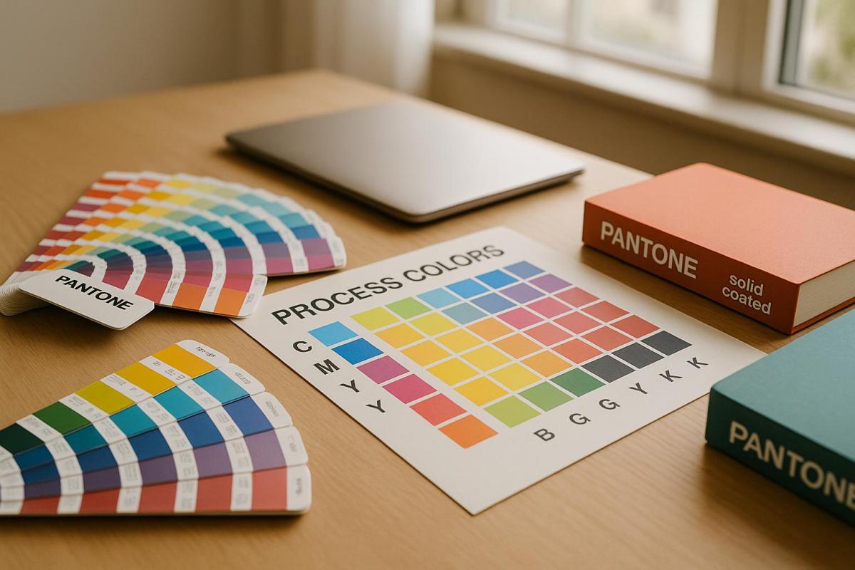
- Process colors (CMYK) combine four standard inks – cyan, magenta, yellow, and black – to create a wide range of colors. It’s affordable for detailed designs, photographs, and large print runs, but color accuracy can vary.
Key Points:
- Spot colors are best for exact color matching, special finishes, and small-color designs.
- Process colors suit multi-color designs, gradients, and high-volume printing.
- Spot colors have higher setup costs but may become cost-effective for large runs.
- Process colors are more budget-friendly for most projects, especially with intricate details.
Quick Comparison:
| Feature | Spot Colors | Process Colors (CMYK) |
|---|---|---|
| Color Matching | Precise and consistent | Less precise |
| Setup Costs | High (separate plates for each color) | Lower (only 4 plates) |
| Ink Costs | Higher (custom inks) | Lower (standard inks) |
| Best For | Branding, logos, special effects | Photos, gradients, high volumes |
| Cost Efficiency | Small runs = expensive; large runs = better per unit | Ideal for most print jobs |
Tip: For mixed needs, consider combining both methods – process colors for photos and spot colors for logos or brand elements.
Spot Colors: How They Work and What They Cost
What Spot Colors Are and When to Use Them
Spot colors are pre-mixed inks created using the Pantone Matching System. Unlike process colors, which combine different inks during printing, spot colors rely on individual ink formulas mixed beforehand to achieve precise color consistency.
The Pantone system includes over 2,000 colors, each identified by a unique number, like Pantone 186 or Pantone 294. This standardization ensures that a specific spot color will appear the same whether it’s printed in New York or Los Angeles.
Spot colors are applied directly to paper using premixed ink and separate printing plates. This method produces vibrant and consistent results. Spot colors are especially useful for matching exact brand colors or achieving special effects that CMYK printing can’t replicate. For example, metallic gold, fluorescent pink, or rich navy blue often require spot color printing to maintain their intended look.
Next, let’s explore what drives the cost of spot colors.
What Makes Spot Colors Expensive
The main reason spot colors are costly is the need for separate printing plates. Each spot color requires its own lithographic film and printing plate. This means printers must set up individual color stations for every spot color, significantly increasing setup time and material costs. The more spot colors you include, the higher the overall expense.
Setup costs add up quickly because printers have to prepare separate color stations, mix custom ink formulas, and calibrate each color individually. This process is far more time-intensive than setting up a standard four-color CMYK job. For smaller print runs, these setup costs make up a larger portion of the total expense.
Ink prices also play a role. Spot color inks are generally pricier than CMYK inks because they’re formulated with specific ingredients to meet exact standards. Specialty inks, like metallics or fluorescents, are even more expensive due to their unique manufacturing processes.
When you add spot colors to an existing CMYK job, it creates additional color separations, further increasing costs. For instance, if your design uses CMYK and you add a spot color for your logo, you’re essentially introducing a fifth color to the process.
Now that we’ve covered the costs, let’s look at the types of projects where spot colors shine.
Best Projects for Spot Colors
Corporate branding materials are a prime example of where spot colors excel. Items like business cards, letterhead, and marketing brochures benefit from the precise color matching that spot colors provide. Companies often prioritize brand consistency, making the added expense worthwhile to maintain a professional visual identity.
Logo-heavy designs are another great fit for spot colors. Logos often rely on specific brand colors that must stay consistent across all applications. Spot colors ensure accurate reproduction every time, reinforcing brand recognition and credibility.
Designs with fewer than four colors can sometimes be more affordable with spot colors than with CMYK printing. For example, a two-color brochure using black text and one spot color for accents may cost less than setting up a full four-color process.
Specialty applications requiring effects like metallic or fluorescent finishes must use spot colors. CMYK printing simply can’t replicate these effects. Wedding invitations with gold accents, safety signs with fluorescent orange, or luxury packaging with silver highlights all rely on spot color printing.
One notable example is Utopia, a tableware company, which collaborated with B&B Press in 2018 to produce their Eat & Drink Brochure. They combined spot color printing with CMYK, incorporating gold ink to create a sophisticated design that helped the brochure stand out. This showcases how spot colors can elevate the quality and appeal of printed materials.
Fine detail work also benefits from spot colors. Designs featuring small fonts, reverse type, or intricate lines (as thin as 0.5-point) print more sharply with spot colors than with process colors. The solid ink coverage ensures crisp, well-defined edges for even the most delicate design elements.
Process Colors: How They Work and What They Cost
What Process Colors Are and When to Use Them
Process colors rely on four standard inks – cyan, magenta, yellow, and black (CMYK) – to create a wide range of colors. This is done by printing millions of tiny, overlapping dots that combine visually to produce thousands of hues.
This technique, also known as 4-color process printing or full-color printing, works through a subtractive process. Each ink absorbs specific wavelengths of light while reflecting others, resulting in the desired colors on the printed material.
Process colors are particularly effective for reproducing photographs and designs with intricate shading and gradients. Illustrator and graphic designer James Weinberg highlights this distinction:
"Process colors are best for photographic reproduction, or something that has a lot of shading and nuance in it. Spot color lends itself to more of a graphic approach."
Because of this, process color printing is a favorite for projects like magazines, catalogs, and brochures that feature images and complex color transitions. However, it does have limitations. Certain vibrant tones – such as metallics and fluorescents – cannot be accurately achieved with CMYK alone, often requiring spot color inks for precise results.
Now, let’s take a closer look at why this method is so cost-effective.
What Makes Process Colors Affordable
One of the biggest cost advantages of process colors is their efficiency. No matter how many colors a design includes, only four printing plates – cyan, magenta, yellow, and black – are needed. This reduces setup expenses compared to spot color printing, which requires a separate plate for each additional color.
Printers use the same four-color setup for all CMYK jobs, eliminating the need for custom ink mixing or extra plates. This consistency keeps production costs low and streamlines the printing process.
When it comes to large print runs, process colors shine even brighter. Offset printing with CMYK becomes increasingly economical as the number of prints rises, with the cost per unit dropping significantly as volume increases.
Another factor that contributes to affordability is material efficiency. The standardized CMYK ink system allows printers to buy inks in bulk, lowering costs compared to the custom formulations required for spot colors. This means even highly detailed designs can be printed without additional expenses.
That said, color printing is still more expensive than black-and-white. For example, printing a black-and-white page on a laser printer typically costs around 5–8 cents, while a color page averages 12–15 cents.
Despite this, for high-volume and detailed projects, process colors remain a budget-friendly option.
Best Projects for Process Colors
Process color printing is ideal for projects that involve photography, large print volumes, or designs with multiple colors.
Materials featuring photographs – such as magazines, product catalogs, and annual reports – benefit from CMYK’s ability to handle subtle color shifts and smooth gradients. This makes it a go-to choice for visually rich marketing pieces.
For high-volume jobs, such as direct mail campaigns, newsletters, and promotional flyers, process colors are an economical solution. The cost per unit decreases significantly with larger quantities, making it a practical choice for bulk printing.
Multi-color designs that don’t require exact color matching – like posters, brochures, and advertisements – are also well-suited for process printing. This method delivers vibrant visuals without the higher costs associated with spot colors.
However, there’s an important trade-off to consider. With process colors, slight variations in color are more likely between different print runs. This makes them less suitable for projects where precise color consistency is crucial, such as corporate branding materials or packaging.
For projects with tight budgets or complex designs featuring gradients and shadows, process colors strike a great balance between quality and cost savings.
Understanding Spot and Process Colors for Printing
sbb-itb-ce53437
Direct Cost Comparison: Spot Colors vs Process Colors
When weighing the costs of spot colors against process colors, the key differences come down to setup expenses and ink costs. Each approach has its own pricing structure, which can have a big impact on your budget.
Setup Costs and Printing Plates
One of the most noticeable cost differences lies in setup requirements, particularly when it comes to printing plates. Spot color printing demands a separate plate for every color in your design. So, if your project uses five spot colors, you’ll need five individual plates, which can quickly drive up setup costs. On the other hand, process color printing relies on just four plates – Cyan, Magenta, Yellow, and Black (CMYK) – no matter how many colors appear in the final design. This makes it a more budget-friendly option for designs with lots of colors or intricate details.
Spot color printing also involves additional labor. Switching inks on a press requires cleaning the machinery, mixing new inks, and recalibrating the equipment, all of which are billable tasks that add to the overall cost. Pantone inks, in particular, need to be mixed manually, further increasing expenses. These setup factors are crucial when evaluating the ongoing costs of ink and materials.
Ink Costs and Material Expenses
Once setup is accounted for, ink and material costs take center stage. Specialty spot colors, like fluorescent shades, tend to be pricier than standard CMYK inks. In fact, some printers estimate that each color change can add roughly $200 to the total cost. Mixing Pantone colors also requires extra time, which contributes to higher expenses.
While process inks are generally more affordable, they may not perfectly replicate every hue. For simpler designs with just two or three colors, spot printing might actually be cheaper than using a full CMYK process. However, if three spot colors are used, the overall cost will likely surpass that of CMYK. That said, the enhanced print quality and precise color accuracy from spot colors may justify the extra investment.
Print Volume and Cost Per Unit
Print volume is another critical factor in determining cost efficiency. While spot colors come with higher upfront expenses, the cost per unit decreases as order quantities grow, making them a smart choice for large-scale projects. Traditional printing methods often require a bigger initial investment but can deliver lower per-unit costs for high-volume orders.
For substantial print runs, spot color printing may eventually become more economical due to the reduced cost per unit. However, for most commercial projects, using four spot colors is typically more expensive than the standard four-color process in offset printing.
How to Choose the Right Method for Your Project
Once you’ve weighed the costs and quality considerations, it’s time to decide which printing method best suits your project. This choice directly impacts both your budget and the overall quality of your printed materials, so it’s worth taking the time to align the method with your specific goals.
Key Factors to Consider
Color accuracy is often the most important factor. When exact color matching is non-negotiable – like for logos or corporate branding – spot colors are the go-to option. Experts note that while process colors (CMYK) excel at gradients and subtle variations, spot colors deliver unmatched precision for flat, solid hues.
Think about project complexity as well. If your design includes detailed imagery, such as photographs or gradients, process colors handle these elements better. On the other hand, designs with bold, distinct colors – like t-shirt graphics – are better suited to spot colors, as they ensure clear separation between hues.
Your budget also plays a big role. Spot colors are often cost-effective for designs with three or fewer colors. However, if your project involves more colors, the CMYK process typically becomes the more economical choice. Keep in mind that specialty colors, such as metallics or fluorescents, cannot be achieved with CMYK, making spot colors essential for those needs.
Finally, consider print volume. Spot colors involve higher setup costs, but for large print runs, the per-unit cost decreases significantly, potentially making it a more budget-friendly option over time.
By carefully evaluating these factors, many projects find success using a combination of both methods.
Using Both Methods Together
Combining spot and process colors can be a smart approach for some projects. For example, company brochures often use process colors for photos and product images, while spot colors ensure logos and branding remain consistent. This hybrid method allows you to achieve both vibrant image reproduction and precise brand representation.
However, coordinating the two methods requires careful planning. Discuss your technical requirements with your printer early in the process, as each method has unique setup needs. While this adds some complexity, the payoff is worth it for projects where brand consistency and visual quality are top priorities.
Tips for U.S. Printing Projects
When printing in the U.S., a few practical tips can help you achieve the best results while keeping costs in check.
-
Start conversations early with your printer. Roger P. Gimbel, EDP of Gimbel & Associates, advises:
"Jobs will run more smoothly when designers share concepts with their printers before submitting files."
- Paper choice matters. Uncoated paper is more affordable but produces softer, muted colors, while coated paper enhances vibrancy by reflecting more light. For budget-conscious projects, uncoated stock paired with CMYK printing can reduce costs without sacrificing professionalism. For consistent branding, specify two ink colors in your guidelines and communicate them clearly to your printer.
-
Always reference physical samples. Seattle Printworks recommends:
"The best results will always come from looking at a physical piece of paper with ink on it: a Pantone swatch is best."
- Be strategic with color use. Only use color printing where it adds real value to your project. Printing sample pages before committing to a full run can save you from costly errors.
For projects where brand consistency or premium quality is a must, spot colors often make the most sense. If your content relies heavily on photographic elements and vibrant colors aren’t critical, CMYK processing can help you cut costs without compromising on professionalism.
Conclusion: Key Takeaways
When it comes to choosing between spot colors and process colors, it all boils down to your project’s specific needs and financial constraints. Spot colors deliver unmatched precision but come with a higher price tag due to custom inks and additional plates. On the other hand, process colors (CMYK) are more budget-friendly, relying on a standard four-ink system.
If your design requires three colors or fewer, spot colors can be a cost-effective option. However, for projects involving a broader color palette, CMYK printing often proves to be the more efficient choice.
The economics of color printing also depend on the scale of your project. Spot colors may involve higher setup costs, but they become more affordable for large print runs. Conversely, process colors are ideal for smaller runs, offering better unit pricing. As Roger P. Gimbel, EDP, explains:
"If your project doesn’t require eye-popping treatments and loud colors, it’s highly likely you can execute your design vision using the standard four-color process and keep your costs down."
Planning is crucial when managing these cost differences. Engaging your printer early in the design process can help you make smarter decisions about color selection, avoiding unnecessary expenses. Use color printing strategically – apply it where it truly enhances your project. You might also consider a hybrid approach, combining spot and process colors to meet specific needs, such as maintaining precise brand colors while incorporating photographic elements.
Keep in mind that ink costs are relatively minor compared to setup expenses. The number of plates and setup requirements often play a much larger role in determining your overall budget. Whether you prioritize the precision of spot colors or the flexibility of process colors, aligning your choice with your project’s creative and financial priorities will ensure the best outcome. Thoughtful evaluation and planning are key to balancing quality and cost effectively.
FAQs
What factors should I consider when choosing between spot colors and process colors for my printing project?
When deciding between spot colors and process colors, it all comes down to the needs of your project. Spot colors are the go-to choice when you need precise color matching, making them ideal for things like logos or branding materials where consistency is key. These colors are mixed individually, ensuring they remain uniform across different prints.
On the flip side, process colors – better known as CMYK – work best for designs that include detailed, full-color images, gradients, or a wide range of shades. They combine cyan, magenta, yellow, and black to create a spectrum of colors, making them a practical option for intricate designs.
Think about what matters most for your project. If perfect color accuracy and consistency are non-negotiable, spot colors are worth considering. But if your design is more complex with multiple colors, process colors are often the more budget-friendly and flexible option. Your final decision will hinge on the specifics of your design, your budget, and the result you’re aiming for.
How can I save money by using both spot and process colors in a printing project?
When looking to cut costs while using both spot and process colors, try to keep the number of spot colors to one or two. Reserve these for crucial shades, such as brand-specific colors or distinctive tones that need to stand out. For everything else, rely on process colors (CMYK), which are better suited for covering a wider color spectrum where exact matching isn’t as critical.
Using too many spot colors can drive up expenses because of the additional plates and inks required. Striking the right balance between spot and process colors can help you manage costs effectively while still delivering high-quality visuals.
When should you use spot colors instead of process colors for printing?
Process colors, often referred to as CMYK, are a go-to option for creating a broad spectrum of colors by combining cyan, magenta, yellow, and black inks. While versatile, they fall short when it comes to achieving exact color matches or delivering special effects like metallic, fluorescent, or custom shades. For these specific needs, spot colors are the preferred solution.
Spot colors use pre-mixed inks, ensuring precision and consistency. They’re perfect for projects that require brand-specific colors, vivid neon tones, or metallic finishes – areas where CMYK struggles to deliver. When accuracy is a top priority, like in logos or premium designs, spot colors provide the reliability you need.
Related posts
- How to Adjust Colors for Offset Printing
- CMYK vs RGB: Printing Color Models
- Foil Stamping vs Metallic Ink: Key Differences
- Top 5 Factors for Choosing Printing Methods
https://app.seobotai.com/banner/banner.js?id=6879caf3b461ccae51a93890
