Preparing files for printing is all about ensuring accuracy, consistency, and quality. Whether you’re working with raster or vector files, the goal is to avoid common pitfalls like pixelation, color mismatches, or layout errors. Here’s what you need to know:
- Raster Files: Use a resolution of 300 DPI, convert to CMYK color mode, and save in formats like TIFF or PNG. Avoid enlarging images beyond their original resolution, and include bleed margins for precise trimming.
- Vector Files: Outline or embed fonts, set colors to CMYK, and save in formats like PDF, AI, or EPS. Flatten transparency and effects to prevent printing issues.
- Common Steps for Both: Run a preflight check, proofread content, and review a test proof to catch any errors before final printing.
Quick Tip: Always communicate with your printer to confirm file requirements and preferences. Proper preparation saves time and prevents costly reprints.
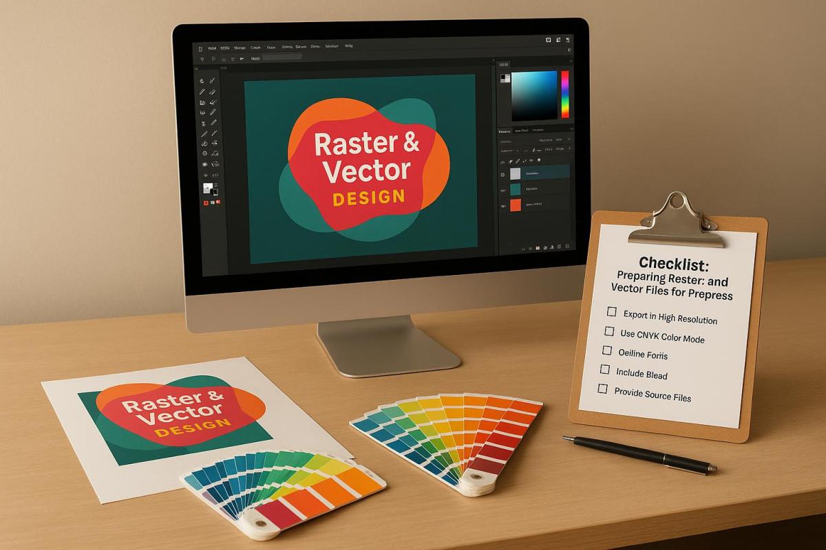
How to get Files Ready for Prepress
Checklist for Preparing Raster Files
Getting your raster files ready for high-quality print production takes a few key steps. Here’s how to ensure your images meet professional standards.
Set the Correct Resolution
The backbone of great print quality is resolution. For most projects, aim for 300 DPI – this ensures sharp text, clear details, and accurate colors. For smaller items like brochures, business cards, or flyers, 300 DPI is the standard. Larger prints, however, can work with lower resolutions: line images often look fine at 200 DPI, while photographic images on canvas may only need 100 DPI.
Keep in mind, enlarging an image reduces its PPI, and increasing resolution artificially can lead to quality loss. To calculate the pixel dimensions you need, multiply the print size (in inches) by 300. For example, a 4″ x 6″ print would require 1,200 x 1,800 pixels.
You can check an image’s DPI through file properties on Windows or macOS, or by using software like Adobe InDesign, Photoshop, or Illustrator. If the resolution is too low, try finding a higher-quality version, use AI tools to enhance it, or shrink the print size to increase the effective DPI.
Once resolution is set, it’s time to fine-tune the color mode.
Convert to CMYK Color Mode
For accurate color reproduction in print, your raster files need to be in CMYK. Most digital images are in RGB, which works great for screens but includes colors that CMYK inks can’t replicate. Automatic RGB-to-CMYK conversion might not always produce the best results, especially for color-critical projects. When precision matters, handle the conversion manually and check with your printer for their preferred file format.
"You can leave your images in RGB. You don’t need to convert them to CMYK. And in fact, you probably should not convert them to CMYK (at least not in Photoshop). Just because you place RGB images into InDesign doesn’t mean you’re sending RGB images to your printer! InDesign can convert those RGB images to CMYK when you export your PDF file." – David Blatner and Claudia McCue
To keep things simple, leave images in RGB until you’re ready to export the final PDF. If you need to convert in Photoshop, use Edit > Convert to Profile for precise control. It’s also a good idea to calibrate your monitor and print test samples to ensure what you see on-screen matches the final output.
Use the Right File Formats
The file format you choose can make or break print quality. Here’s a quick breakdown:
- TIFF: Best for high-quality printing, thanks to its lossless compression, though the file sizes can be large.
- JPEG: Suitable for photographs, with 24-bit color depth supporting over 16 million colors. However, its lossy compression means some image data is discarded each time you save.
- PNG: Great for graphics requiring transparency, like logos or infographics, with lossless compression for sharp and clean visuals.
For top-notch print quality, TIFF is the go-to format. Use JPEG when file size is a concern, and opt for PNG when transparency or sharp edges are needed.
Check Image Scaling and Cropping
Once your file format is set, double-check the image’s dimensions and layout. Scale and crop carefully to maintain quality. Avoid enlarging images beyond their original resolution to prevent pixelation. Instead, start with your final print size and work backward to ensure the resolution is sufficient.
When cropping, don’t forget to include bleed margins. This means extending the image slightly beyond the trim edge to avoid white borders if the cut isn’t perfectly aligned. Place key elements like text and logos within a safe zone, keeping them away from the trim edges.
Common Errors to Avoid
To save yourself headaches later, watch out for these common pitfalls:
- Over-compressing JPEGs, which can leave visible artifacts.
- Using incorrect color profiles, leading to unwanted color shifts. Always match your images to the CMYK profiles recommended by your printer.
- Skipping bleed margins and safe zones, which can cause delays or require reprints.
- Mixing images with different resolutions, resulting in uneven quality within the same project.
Checklist for Preparing Vector Files
Just like with raster files, getting vector files ready for printing requires careful attention to detail. Vector files are infinitely scalable, but they still need specific preparation to ensure your print job goes off without a hitch.
Outline or Embed All Fonts
Fonts are one of the most common troublemakers during prepress. If fonts aren’t embedded or outlined, they can shift or get substituted, causing unexpected results. To avoid this, you have two main options: outlining or embedding fonts.
Outlining turns your text into vector shapes, so you don’t need the original font files anymore. In Adobe Illustrator, you can do this by selecting the text and choosing Type > Create Outlines or using the shortcut Command/Ctrl + Shift + O. This method is ideal for designs like logos or business cards where you don’t need to edit the text later.
"Outlining fonts will convert them into vectorized shapes rather than editable text. This ensures your font will print as you designed it regardless of whether or not your printer has the same font installed." – Thomas Group Printing
Embedding, on the other hand, includes the actual font data in your file. In Microsoft Word or PowerPoint, you can embed fonts by going to File > Options, selecting the Save tab, and checking the Embed fonts in the file option. This approach is better for longer documents where formatting, like bullet points or underlines, needs to stay intact.
Choose embedding for text-heavy projects (though it might increase file size and require proper licensing) and outlining for simpler designs where text won’t need further edits.
Set Color Mode to CMYK
To get accurate print colors, convert your vector designs to CMYK. RGB colors, which look vibrant on screens, often lose their punch when printed because printers use the CMYK color model. If you let the printer handle the conversion, the results might not match your expectations.
In Adobe Illustrator, you can switch to CMYK by going to File > Document Color Mode > CMYK Color. For InDesign, you can adjust individual colors through the Swatches panel or convert the entire document via Edit > Convert to Profile, selecting a CMYK profile. Use the Proof Colors feature to preview how your design will look in print. For precise color matching, especially for brand colors, consider using Pantone colors.
Save in Accepted File Formats
Stick to widely supported vector file formats like AI, PDF, or EPS.
PDFs are a safe choice because they’re compatible with almost any system and can automatically embed fonts. AI files are great if your printer uses Adobe software, while EPS files work well across different platforms. If your printer accepts CDR (CorelDRAW) files, you can use those too, but always double-check compatibility. When in doubt, a PDF with embedded fonts is usually the most reliable option.
Flatten Transparency and Effects
To avoid printing issues, manually flatten transparency, shadows, and gradients in your design.
In Adobe Illustrator, you can do this by going to Object > Flatten Transparency. If you’re saving your file as a PDF, use print-quality settings to ensure transparency is handled correctly. For complex effects, consider simplifying or rasterizing certain elements at a high resolution to maintain consistency.
Common Errors to Avoid
Here are a few common mistakes to steer clear of when prepping vector files:
- Unflattened text effects: These can lead to printing errors.
- Font licensing violations: If you embed fonts, make sure you have the proper licenses. If not, outlining is a safer option.
- Missing bleed and trim marks: Extend your design at least 0.125 inches beyond the trim edge and keep critical elements 0.125 inches inside the trim area.
- Color profile mismatches: Ensure all elements in your design use the same CMYK profile, preferably the one your printer recommends.
- Version compatibility issues: If your printer’s software might not support newer file formats, save your files in legacy formats.
Comparison Table: Embedding vs. Outlining Fonts
| Criteria | Embedding Fonts | Outlining Fonts |
|---|---|---|
| Document Length | Ideal for long, text-heavy documents | Best for short designs like logos or business cards |
| File Size | Increases due to font data inclusion | Smaller since text is converted to vector shapes |
| Formatting | Preserves formatting like underlines and bullets | May lose formatting such as bullets or underlines |
| Font Licensing | Requires compliance with font licensing | Avoids licensing issues by converting text to shapes |
| Print Precision | Ensures accurate font appearance in print | Maintains accuracy but can affect text alignment |
sbb-itb-ce53437
Final Prepress Checklist for Both File Types
Taking the time to go through a thorough checklist before printing can save you from expensive reprints and delays. This applies to both raster and vector files, ensuring that every detail is in order before your project goes to press.
Run a Preflight Check
Preflighting is a critical step that reviews your digital files to ensure they’re ready for print. It’s essentially a detailed inspection to catch any issues that could disrupt the printing process.
Make sure your files are in print-ready formats like PDF or TIFF, with fonts embedded or outlined. Images should have a resolution of at least 300 dpi, colors need to be set to CMYK, and bleed areas should extend at least 1/8 inch beyond the trim. Double-check that your layout elements meet all specifications and that key content stays within the safety margins.
Most design tools, such as Adobe Illustrator, InDesign, and Photoshop, include preflight tools that can automatically flag common issues. While these are helpful, always back them up with a manual review for added assurance.
Proofread and Verify Content
Even if your file is technically flawless, any errors in the content can undermine the entire project. Carefully proofread all text for spelling, grammar, punctuation, and consistency. A fresh set of eyes – like a colleague or editor – can catch mistakes you might have overlooked. Once you’re confident the content is error-free, organize your files to keep everything running smoothly.
File Naming and Organization
A clear and consistent file naming system can eliminate confusion and make your workflow more efficient. Use descriptive names that clearly identify the file’s contents and distinguish it from similar ones.
For better organization, adopt a naming convention like the YYYY-MM-DD format paired with sequential numbering for version control. If you’re working with product images, consider sorting them by purpose – for instance, separating main listing photos from detailed close-ups. This makes files easier to locate and manage.
Review a Test Proof
Once your files are organized, reviewing a test proof is the next essential step. Whether it’s a soft proof viewed on a calibrated monitor or a physical print, this process helps confirm color accuracy, alignment, and image clarity. Seeing a test proof allows you to catch any issues before the final print run.
Conduct a Visual Inspection
A final visual inspection is your last chance to catch any lingering issues. Carefully check for artifacts, misalignments, and inconsistencies in spacing, fonts, and color use. Look for any unwanted spots, lines, or color shifts that might have occurred during file processing.
Ensure that bleed areas include the appropriate content and that no important elements are too close to the trim edges. Also, confirm that white spaces are intentional and not accidental.
At Miro Printing & Graphics Inc., we’re committed to helping your files meet all these checklist criteria. Our experienced prepress team is here to review your files, identify potential issues, and ensure your project prints exactly as you envisioned – saving you time, money, and stress.
Comparison Table: Raster vs. Vector File Preparation
Preparing raster and vector files correctly is crucial for seamless prepress work. While raster files are made of pixels, vector files rely on mathematical equations. The table below highlights the key differences between the two:
| Aspect | Raster Files | Vector Files |
|---|---|---|
| Resolution Requirements | 300 PPI for offset printing; 100 PPI for materials up to 120" wide; 80 PPI for materials over 120" wide | No fixed resolution – scalable indefinitely without quality loss |
| Accepted File Formats | .jpg, .tif, .bmp, .png, .psd, PDF | .ai, .eps, .cdr, .indd, PDF |
| Color Mode | Must convert to CMYK for printing | Must be set to CMYK for printing |
| Scaling Limitations | Quality degrades when resized | Scalable infinitely with no quality degradation |
| File Size | Generally larger | Typically smaller |
| Fonts | Text becomes part of the image | Fonts must be converted to outlines |
| Best Use Cases | Ideal for photographs and images with detailed gradients | Perfect for logos and graphics requiring flexible resizing |
| Quality Considerations | Quality depends on the original resolution – avoid upscaling low-res images | Maintains sharpness and clean edges at any size |
To achieve the best results, always start with high-quality raster files to avoid pixelation and never upscale low-resolution images. For vector files, ensure fonts are outlined and images are embedded to guarantee accurate printing.
When preparing files for printing, converting artwork to CMYK is a must. RGB files can cause color discrepancies, as some RGB hues don’t translate well to CMYK, resulting in muted or inaccurate colors.
Choosing between raster and vector files depends on the type of content and its intended use. Raster files shine when working with detailed images like photographs, while vector files are the go-to for logos, text-heavy designs, and graphics that need to be resized for different applications. This breakdown will help you prepare your files for flawless prepress results.
Conclusion: Key Points for Prepress Success
Getting your files ready for print is the backbone of professional printing. Whether you’re handling raster images or vector designs, paying close attention to the details can be the difference between a perfect print and an expensive do-over.
For raster files, make sure they have a resolution of 300 DPI, are converted to CMYK, saved in the right formats (like TIFF or EPS), and sized correctly. Vector files, on the other hand, need fonts to be outlined or embedded, set to CMYK color mode, and saved in compatible formats such as EPS.
"It’s the little things like color, resolution, and font embedding, that can turn a polished design into a disaster if overlooked." – Nicole Steffen, Creative Director
Before sending your files off for printing, always preflight them to catch any formatting issues. Proofread carefully for errors in spelling, typography, and spacing. And don’t underestimate the importance of clear communication with your print team to keep the production process smooth.
Stick to these best practices: use professional-grade design software, trust software color metrics rather than your screen, keep file names simple, verify that all graphics are properly linked, and tidy up your artboards before submission.
At Miro Printing & Graphics Inc., we pride ourselves on helping you achieve flawless results. Our experienced prepress team ensures your files are print-ready, whether you need digital printing, offset printing, or large-format projects. With proper file preparation and expert support, you can count on the quality your business deserves.
FAQs
Why is it important to convert images to CMYK before printing, and how can I ensure accurate colors?
Failing to convert images to CMYK before printing can result in noticeable color shifts between what you see on your screen and the final printed product. This happens because screens rely on the RGB color model, which offers a broader range of colors compared to CMYK, the standard used for printing.
To get accurate colors, make sure to convert your images to CMYK before sending them off to print. It’s best to do all your editing in RGB first, as this color space provides greater flexibility. Once your edits are complete, convert the file to CMYK as the final step. This method helps ensure consistent colors and reduces the chance of unexpected surprises in the printed result.
How do I figure out the right resolution for my raster images if my print size isn’t standard?
To figure out the right resolution for non-standard print sizes, start by multiplying the desired print dimensions (in inches) by 300 dpi (dots per inch). For instance, if you want a 5 x 7-inch print, the image resolution should be at least 1500 x 2100 pixels.
If your image doesn’t meet these pixel requirements, you have two options: shrink the print size or resample the image to boost its resolution. But be careful – resampling can sometimes compromise image quality. To achieve sharp, professional-quality prints, always aim for 300 dpi at the intended print size.
Why should you outline or embed fonts in vector files before sending them to print?
When preparing vector files for printing, outlining or embedding fonts is a key step to ensure your text looks just as you designed it. Skipping this process could result in font substitutions or layout problems if the required fonts are missing or incompatible, potentially impacting the final print quality.
Outlining fonts transforms your text into vector shapes, so it no longer relies on the original font file. Embedding fonts, on the other hand, incorporates the font data directly into the file. Both approaches safeguard the typography and layout of your design, guaranteeing the printed output aligns with your original concept.
Related posts
- How to Prepare Vector Files for Print
- How to Create Print-Ready Artwork
- Prepress Checklist for Print-Ready Files
- Vector vs Raster: Key Differences for Printing
https://app.seobotai.com/banner/banner.js?id=6882fd08b716ff8d6ab45309
