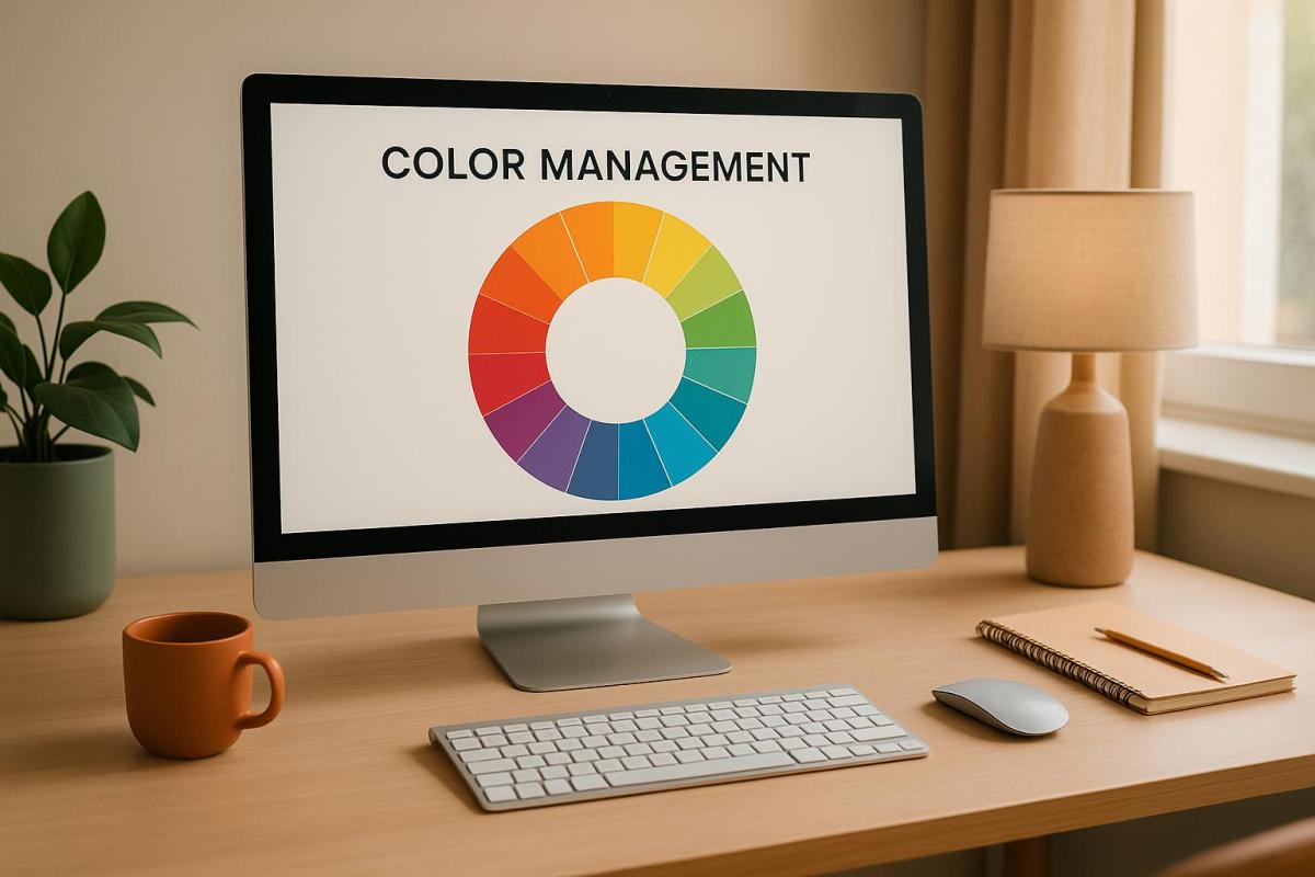
Color management ensures that your brand’s colors stay consistent across all platforms – digital and print. This consistency builds trust, strengthens recognition, and influences customer decisions. Up to 90% of first impressions are based on color, and brands with consistent colors see up to a 23% increase in revenue.
Key takeaways:
- Color consistency across devices (monitors, printers) is vital for maintaining brand identity.
- Tools like ICC profiles and calibration ensure accurate color reproduction.
- Poor color management can confuse customers and hurt sales, as seen with Tropicana’s 2009 redesign.
- Standards like ISO 12647 and G7 methodology simplify collaboration between designers and printers.
- Investing in color management systems saves time, reduces waste, and protects your brand image.
Effective color management isn’t just about looking good – it directly impacts how customers perceive your brand and their willingness to buy from you.
Master Colors a Guide to Setting Up a Color Management Workflow
The Science Behind Color Consistency
Creating consistent colors across various materials and devices is no small feat – it’s a highly technical process rooted in the science of color reproduction. This involves using advanced systems to ensure that every printed piece matches the original design as closely as possible. Achieving this level of precision means delivering high-quality, on-brand materials that meet professional standards.
Core Elements of Color Management
At the heart of color consistency lies a system often referred to as the "4 C’s" of color management: Consistency, Calibration, Characterization, and Conversion. These components work together to create a cohesive framework that ensures all devices speak the same "color language."
Color calibration is the process of tuning devices to a standardized state, ensuring that colors appear consistent across different platforms. This step minimizes variations between what you see on your screen and what ends up on the printed page.
ICC profiles act as standardized guides that describe how individual devices reproduce colors, enabling seamless color conversion between different pieces of equipment. The Profile Connection Space (PCS) plays a crucial role here by serving as a bridge between diverse color environments. For example, when transferring colors from a computer screen to a printing press, the PCS ensures the transition is smooth and accurate.
A Color Management Module (CMM) is the software responsible for handling color conversions within your operating system. It uses specific algorithms, known as rendering intents, to decide how colors should be adjusted during this process.
One of the biggest challenges in color management is that input, display, and output devices often interpret digital colors differently. Device-independent color spaces solve this problem by establishing a common reference point. This ensures that a specific shade of blue looks the same on a monitor in New York as it does on a printed banner in California.
"It’s been exciting to observe a company such as Tectonics making excellence in color management a priority… They are now reaping the benefits by saving money on ink and faster time to consistent and repeatable color. I’m sure their customers, and their competitors, are taking notice." – Ray Weiss, Director of Digital Print Programs at SGIA
Color Management in Different Printing Methods
While the principles of color management remain the same, different printing methods require unique strategies to maintain consistent results. Each method comes with its own set of challenges, demanding tailored tools and approaches.
Digital printing heavily depends on regular calibration and ICC profiling. Digital printers are prone to color drift over time due to factors like ink cartridge replacements, print head wear, and environmental changes. Frequent test prints and adjustments are necessary to uphold strict color standards.
Offset printing benefits from methodologies like G7, which establish a framework for achieving visual similarity across different print processes. These standards allow printing teams to align on shared color goals, ensuring consistency even when jobs are transferred between facilities or equipment types.
Large format printing presents additional challenges because of the variety of substrates and the need for an expanded color gamut. This segment, projected to reach USD 12.70 billion by 2030, often involves outdoor displays and specialty materials, making precise color management critical. Since large format printing typically requires converting colors from an RGB color space (used in digital designs) to CMYK, careful handling is essential to maintain accuracy.
Professional color management for large format projects includes selecting the right substrates to achieve the desired color outcomes and conducting regular color audits to maintain uniformity across multiple prints. On such a large scale, even minor color inconsistencies become glaringly obvious, making precision absolutely necessary.
Modern printing facilities are increasingly adopting closed-loop color control systems, which use inline spectrophotometers to measure color directly on the press. These systems automatically adjust ink densities in real time, ensuring consistent color throughout long print runs. This not only reduces waste but also boosts efficiency. Additionally, AI-powered tools are now being integrated into color management systems, enabling them to analyze print data, predict inconsistencies, and make automatic adjustments to maintain color fidelity. Cloud-based solutions further enhance these processes by centralizing color management across multiple locations, ensuring uniform standards whether production is handled in-house or outsourced. Such meticulous control protects a brand’s visual identity and ensures every project meets its intended quality.
Industry Standards and Best Practices
The printing industry depends on established standards to ensure color accuracy throughout its processes. These standards create a shared framework that allows designers, brand managers, and printers to collaborate effectively, ensuring consistent color reproduction. This shared language simplifies teamwork and enhances the reliability of results, as outlined below.
Key Color Management Standards
One of the most widely recognized standards is ISO 12647, which ensures consistent color reproduction globally. A great example of its application comes from Kellogg Company. Steve Wardle, European Marketing, Process Senior Manager at Kellogg, described their approach:
"For us as brand owners, everything made sense. We would need to set our standard, aligned closely to ISO 12647, and then our procured printers of cartons and flexibles would be trained and certified to ensure that they can print consistently to that level. This would naturally lead to a reduction in wasted time and materials, not just for Kellogg’s, but for any or all of their customers. The pay back would justify any investment very quickly".
Another key methodology is G7, which emphasizes achieving gray balance for consistent visual output. According to Idealliance:
"G7 is Idealliance’s industry-leading set of specifications for achieving gray balance and is the driving force for achieving visual similarity across all print processes".
The Pantone Matching System (PMS) remains a cornerstone for spot color reproduction. Its Formula Guide offers 2,161 colors, while the CMYK Color Guide includes 2,868 colors. Meanwhile, newer systems like the Spot Matching System (SMS) are expanding the possibilities, claiming to ensure visual color consistency across both print and digital channels, including web design, TV, and augmented reality. SMS provides 869 colors in three variations: standard, ECO for eco-friendly papers, and MAX for coated papers.
Regional standards also play a role in shaping practices. For instance, GRACoL is widely used in the United States, while FOGRA is preferred by many European companies.
How Standards Improve Team Collaboration
By building workflows around these standards, teams can enhance brand consistency and streamline their processes. When everyone – designers, printers, and brand managers – works from the same set of specifications, communication becomes more efficient. Designers can confidently specify colors, while production teams can ensure those colors remain consistent throughout the process. This alignment is essential for maintaining the precise color reproduction that is so critical to brand identity. It also reduces costs by minimizing press time, which is often one of the most expensive stages of production.
Certification programs bolster this reliability even further. For example, Pantone Certified Printers demonstrate their ability to match and reproduce colors precisely, while SWOP Certification ensures printed materials meet industry benchmarks for color and image quality.
Chris Schowalter, director of market segment management at EFI Fiery, highlights the importance of consistent results:
"The key is to have repeatability. Even if you have achieved customer satisfaction and a sign off, you need to ensure that you can reprint a job on any given day, and even if it is months or years after the original job".
Standards also simplify workflows. When a designer includes exact color codes in a brand style guide based on these established standards, every stakeholder in the production chain can reference the same specifications. This reduces guesswork and the time spent on revisions. Mark Geeves, director of sales and marketing at Color-Logic Inc., explains:
"Calibration and control of your process are critical. This way all of your production at least looks the same".
From the client’s perspective, Jonathan Rogers, international marketing manager at Onyx Graphics, Inc., emphasizes:
"Print buyers need to know their PSP can provide accurate, consistent color that conforms to these standards".
In sum, these standards and certifications not only enhance efficiency but also ensure that a brand’s visual identity remains consistent across all platforms and over time.
sbb-itb-ce53437
How Color Management Affects Brand Perception
Color management goes beyond ensuring technical accuracy – it plays a pivotal role in shaping how people feel about a brand. By leveraging the psychology of color, businesses can use this tool to create emotional connections, influence buying behavior, and build customer loyalty. A well-executed color strategy isn’t just about looking good; it’s about making a lasting impression.
The Psychology of Color in Branding
Did you know that color can drive split-second decisions? Research reveals that up to 80% of initial impressions about a brand are based on its color, with brand recognition improving by the same percentage, and recall rates climbing as high as 82% when colors are used effectively. Consistent color schemes across branding materials can also boost customer retention by as much as 23%, while websites with cohesive brand colors see a 39% increase in user engagement.
"Color harmony transforms a good photo into an unforgettable one, evoking emotions and telling a story that resonates in marketing and design." – Julien Kibler, Telluride wedding photographer
This insight carries over to branding. When a company uses consistent colors, it creates a sense of familiarity and trust. These color cues form mental associations that encourage repeat purchases and strengthen emotional ties with customers. On the flip side, inconsistent colors can weaken these bonds, leaving the brand vulnerable.
Problems Caused by Poor Color Consistency
When color management slips, the consequences go far beyond aesthetics. Inconsistent colors can confuse customers, erode trust, and even hurt the bottom line – potentially reducing revenue by up to 23%. Considering that 92.6% of consumers prioritize visual elements when making purchases, and 84.7% say color is a key factor in their decision-making, maintaining consistency is non-negotiable.
The risks are real. Take, for example, Tropicana’s infamous 2009 packaging redesign. The new look sparked such strong backlash that the company had to revert to its original design. This serves as a cautionary tale: when colors vary across business cards, websites, packaging, and ads, customers may start to question the brand’s reliability. On the other hand, a unified color scheme signals professionalism and inspires confidence. After all, up to 90% of snap purchase decisions are influenced by a brand’s visual presentation.
Color isn’t just decoration – it’s a powerful tool that can make or break how customers perceive your brand.
Setting Up Color Management in Printing
A solid color management system is key to ensuring your brand colors stay consistent from the design phase to the final printed product. This process takes theoretical color standards and brings them to life, creating a workflow where every device involved in the production process communicates in the same "color language." The ultimate goal? To ensure your brand’s colors look the same on every printed piece, reinforcing your visual identity time and time again.
Steps for Effective Color Management
To maintain your brand’s color consistency, follow the "Four C’s" of color management: Consistency, Calibration, Characterization, and Conversion:
- Consistency: Make sure all devices used in printing can reliably reproduce your brand colors across multiple print runs.
- Calibration: Regularly calibrate all equipment to ensure accurate color reproduction.
- Characterization: Use precise measurement tools to assess and document each device’s unique color output.
- Conversion: Leverage ICC profiles to accurately translate color data between devices.
Environmental factors like lighting, temperature, and humidity can also influence how colors appear, so keeping these elements under control is essential . Using premium-quality inks and substrates further enhances color accuracy. And don’t overlook the importance of staff training – well-informed team members are vital for maintaining color precision throughout the entire printing process.
By following these steps, professional print shops can implement tailored solutions to deliver brand-specific color accuracy.
Color Management Solutions at Miro Printing & Graphics Inc.
Miro Printing & Graphics Inc. serves as a great example of how to put these color management principles into action. They’ve integrated comprehensive color management techniques into their digital, offset, and large-format printing services. Their dedication to color accuracy is reflected in their rigorous quality control processes, which have earned praise from customers for their meticulous attention to detail.
Miro’s approach includes custom projects, in-house bindery, and design services, ensuring consistent color reproduction across every aspect of a project. Whether it’s business cards that perfectly match your website’s colors or large-format banners that align with your brand guidelines, they deliver results that uphold your visual identity.
Additionally, Miro employs the G7 methodology, a proven system for achieving consistent visual results across various printing processes, substrates, and devices. This approach allows printers to reach accurate colors more quickly, reduce waste, and align proofs across different platforms. By setting target color values based on actual production samples rather than just digital files, G7 ensures a higher level of reliability.
Investing in professional-grade tools like spectrophotometers is another critical step. These devices offer precise color measurement and are essential for maintaining the level of accuracy that protects your brand’s identity. While they may require a significant financial commitment, their value in avoiding costly reprints and building trust with clients is undeniable.
Conclusion: Why Color Management Matters for Branding
Color management plays a crucial role in shaping and maintaining your brand’s identity. Consistent use of brand colors can boost recognition by an impressive 80%, and businesses with cohesive branding are often valued up to 20% higher than those with inconsistent messaging.
Research shows that 81% of consumers are more likely to remember a brand’s color than its name. This kind of instant recognition fosters trust and loyalty, both of which are essential for driving sales. In fact, 71% of consumers are more likely to purchase from a brand they recognize, and 81% agree that trust is a fundamental factor in their buying decisions.
"Your brand colours aren’t just a design element; they’re a key tool in your brand’s identity, acting as a visual shortcut that helps people instantly recognise your business."
- Martin Sanders
The risks of inconsistent branding can’t be overstated. A staggering 71% of consumers report that inconsistent branding creates confusion in the market. On the other hand, companies that maintain consistent color schemes across platforms see 23% higher customer retention and a 23% average revenue increase.
To avoid these pitfalls, it’s essential to establish a strong color management process. This includes creating detailed brand guidelines with exact color codes, regularly calibrating equipment to ensure accuracy, and working with professional print services that understand the technical nuances of color reproduction.
Jessica Wong, Founder and CEO of Valux Digital, highlights this importance:
"Maintaining branding consistency creates trust, improves brand recognition and increases customer loyalty in every industry. Prioritizing consistency will help you build a strong brand that is instantly recognizable and beloved by its audiences."
As mentioned earlier, consistent color reproduction is the foundation of brand trust. With up to 90% of first impressions relying on color, investing in a reliable color management system ensures that every visual element reinforces your brand identity. This not only strengthens trust but also gives your business a competitive edge in the marketplace.
FAQs
How can businesses maintain consistent colors across digital and printed materials?
To keep colors consistent across both digital and printed materials, it’s important to rely on standardized color profiles like ICC and adhere to industry standards such as G7 calibration. Using color management tools can also help ensure colors remain accurate. Don’t forget the basics – regular calibration of monitors, printers, and other equipment is key to achieving dependable color reproduction.
For top-notch and consistent results in your branding materials, consider working with a professional print shop, such as Miro Printing & Graphics Inc. in Hackensack, NJ. Their expertise can make all the difference.
What are the risks to your brand identity if color management is overlooked?
Neglecting color management can result in visuals that don’t align across your brand materials. This lack of consistency might confuse your audience and dilute your brand’s identity, ultimately impacting how recognizable and reliable your business appears.
On top of that, inaccurate colors can disrupt the emotional connection your customers feel toward your brand. This could lead to missed sales opportunities and weaken customer loyalty over time. Keeping your colors consistent and accurate is key to building a strong, lasting impression.
Why are industry standards like ISO 12647 and G7 essential for color management?
Industry standards such as ISO 12647 and G7 play an essential role in ensuring precise, consistent, and high-quality color reproduction across different printing systems. By aligning with these standards, businesses can produce printed materials that maintain a unified appearance, strengthen their brand identity, and meet professional quality expectations.
Following these standards not only simplifies production workflows but also minimizes mistakes and enhances customer confidence by consistently delivering dependable results. For brands, this level of consistency is crucial in establishing a strong and easily recognizable visual identity.
Related posts
- How Fonts Impact Brand Identity
- 5 Common ICC Profile Issues and Fixes
- ISO 2846: Ink Color Standards Explained
- 5 Tips for Managing Color on Different Substrates
https://app.seobotai.com/banner/banner.js?id=6882d0f8b716ff8d6ab4111d
