When preparing files for professional printing, font management is key. You have two main options: font outlining and font embedding. Each has its pros and cons based on your project needs.
- Font Outlining: Converts text into vector shapes, ensuring perfect visual consistency across all systems. Best for final designs like logos or business cards. However, it makes text uneditable, increases file size, and impacts accessibility.
- Font Embedding: Includes font data within the file, keeping text editable and accessible. Ideal for editable documents like brochures or reports. But it can face licensing restrictions and compatibility issues with older printers.
Quick Comparison
| Factor | Font Outlining | Font Embedding |
|---|---|---|
| Editability | Not editable | Editable |
| Searchability | Not searchable | Searchable |
| Accessibility | Not compatible with screen readers | Fully compatible |
| File Size Impact | Larger file size | Slight size increase |
| Best Use Cases | Logos, business cards, finalized files | Brochures, reports, collaborative work |
Choose outlining for fixed designs and embedding for editable, collaborative projects. Always save an editable version of your file before outlining to allow future updates.
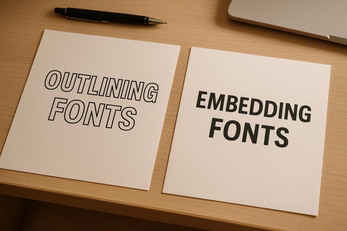
Embedding and Outlining your Fonts in your Artwork
What is Font Outlining?
Font outlining is the process of converting text into vector shapes rather than keeping it as editable text. When you outline fonts in design software like Adobe Illustrator, each letter is transformed into a mathematical path, turning the text into fixed vector shapes. This ensures your text displays exactly the same on any system, regardless of whether the original font is installed.
This approach guarantees consistency. Since the text is now a series of paths instead of characters, it will appear exactly as you designed it, even if the printer or recipient doesn’t have the font installed.
"Font outlining ensures absolute visual consistency at print time." – Ewan Printing
Font outlining is especially useful when working with specialty typefaces or custom fonts that might not be widely available. By outlining fonts, you eliminate the risk of font substitution, ensuring your design remains intact during the printing process.
Benefits of Font Outlining
The primary advantage of outlining fonts is consistency. Your text will print exactly as designed, without the risk of font substitution or rendering differences between systems. This is especially important for brand-critical designs like logos or marketing materials.
Outlining fonts also avoids licensing issues. Since you’re distributing vector shapes instead of font files, you sidestep potential copyright concerns. This is particularly relevant for premium or restricted fonts with strict licensing terms.
"Sometimes, you may need to outline fonts in PDF files, especially if you are using custom or licensed fonts that cannot be embedded due to copyright or technical reasons." – Heatherbank Print
Another advantage is universal compatibility. Outlined text works seamlessly across different platforms and software versions. Whether the printer uses a Mac or PC, or older or newer software, your outlined text will display exactly as intended. This reliability minimizes unexpected printing problems.
Outlining is also a common requirement for final print files, especially for PDF/X compliance. It acts as a safeguard, ensuring maximum fidelity for designs that no longer require text edits.
Drawbacks of Font Outlining
Despite its advantages, font outlining has some drawbacks. Once text is outlined, it becomes permanently uneditable. This means you can’t make quick spelling corrections or adjust the wording without reverting to the original file. For documents that may need frequent updates, outlining is not ideal.
Another downside is that outlined text increases file size. Each letter is converted into a detailed vector shape, which can make files significantly larger, especially with intricate fonts or large amounts of text.
Outlined text is also non-searchable and inaccessible to screen readers, which can be problematic for digital accessibility. Users won’t be able to copy text from the document, and search engines or document management systems won’t be able to index the content.
Additionally, outlined text loses its semantic meaning, which can affect discoverability and organization in digital environments.
When to Use Font Outlining
Font outlining is essential for vector file formats like Adobe Illustrator (.AI) or Encapsulated PostScript (.EPS). These formats require outlined text to prevent font substitution during printing.
"If you’re sending vector files (like AI or EPS), make sure to outline all fonts to avoid font substitution issues." – Replica Printing Services
Outlining is also a must when using custom or licensed fonts with embedding restrictions. Many premium fonts don’t allow embedding due to licensing agreements, making outlining the most reliable option for printing.
It’s best suited for short-form content like business cards, logos, or simple flyers, where text edits are unlikely once the design is finalized. However, always save a backup of the original editable file before outlining, so you can make future revisions if needed.
In the next section, we’ll explore font embedding as an alternative to outlining.
What is Font Embedding?
Font embedding involves including the exact font data directly within a document file. This ensures your text appears as intended, no matter if the viewer or printer has the specific font installed. Unlike outlining – which transforms text into vector shapes – embedding keeps the font data intact, allowing the text to remain editable.
When you embed fonts in formats like PDFs, the font files are packaged within the document. This ensures proper rendering, even if the recipient doesn’t have the font installed. It’s particularly useful for complex documents where maintaining formatting is crucial, as it preserves details like kerning, ligatures, bullet points, underlines, and numbering. This makes font embedding an excellent choice for projects like booklets, magazines, or multi-page brochures where design consistency and text functionality are key.
Font embedding not only ensures your design looks the same across devices but also allows for future edits and accessibility, unlike font outlining, which locks the text into a fixed shape.
Benefits of Font Embedding
Font embedding offers several advantages:
- It keeps text fully editable, searchable, and accessible while retaining advanced typography features like kerning and ligatures. This is especially helpful for collaborative editing or when maintaining precise design details.
- Embedded fonts ensure compatibility with screen readers, preserving the semantic meaning of the text. This makes the document accessible for users relying on assistive technologies.
- It allows team members to work on the document with the correct fonts, even if they don’t have the original font files or licenses, streamlining collaboration across projects.
Drawbacks of Font Embedding
Despite its benefits, font embedding does have some downsides:
- Older software or certain printers may struggle with rendering embedded fonts, leading to potential issues during printing.
- Font licensing restrictions can be a hurdle. Some fonts, especially premium or commercial ones, are marked as "non-embeddable" due to copyright rules set by the font creators.
- Embedding fonts can increase the file size of your document. Although the size increase is generally minor, it could become an issue for large files or when strict file size limits are in place.
When to Use Font Embedding
Font embedding is the go-to choice for projects that require both a polished visual presentation and the ability to make edits later. It’s particularly well-suited for long-form documents like catalogs, reports, brochures, and magazines, where maintaining consistent formatting across devices is crucial.
It’s also ideal for projects requiring accessibility compliance, such as those needing to meet ADA standards. Embedded fonts help maintain the text’s semantic structure, ensuring compatibility with screen readers and other assistive tools.
When working with standard fonts that allow embedding – such as most system fonts and many commercial ones – embedding is a reliable option for professional printing. However, always check the font’s license to confirm embedding permissions before finalizing your files.
For collaborative projects, embedding can prevent font substitution issues, maintain brand consistency, and offer the flexibility needed for future updates. It’s a practical solution that balances design integrity with functionality.
sbb-itb-ce53437
Font Outlining vs Font Embedding: Direct Comparison
When preparing files for printing or sharing, the choice between font outlining and font embedding comes down to their distinct approaches to ensuring fonts display correctly across different systems. While both methods address the same challenge, they do so in unique ways.
Font outlining transforms text into vector shapes, essentially converting each letter into a fixed graphic. This ensures the text appears exactly as designed, no matter where it’s viewed, but it also makes the text uneditable. Font embedding, on the other hand, incorporates the font data directly into the file. This keeps the text editable while ensuring it displays accurately, even if the recipient doesn’t have the font installed.
Each method has its strengths. Outlining is perfect for designs that won’t need further editing, such as logos or finalized marketing materials, and it sidesteps font licensing concerns. Embedding, however, is ideal for documents that need to remain editable or accessible, as it retains typographic features and supports assistive technologies. Below is a detailed comparison to help guide your decision.
Comparison Table
| Factor | Font Outlining | Font Embedding |
|---|---|---|
| Text Editability | Converts text to uneditable vector shapes | Keeps text fully editable |
| Searchability | Text cannot be searched or selected | Text remains searchable and selectable |
| Accessibility | Incompatible with screen readers | Fully compatible with assistive technologies |
| File Size Impact | Smaller or reduced file size | Slightly larger due to embedded font data |
| Typography Features | Preserves appearance but loses functionality | Retains advanced features like kerning and ligatures |
| Print Compatibility | Works seamlessly with all printers | May encounter issues with older printers |
| Font Licensing | No licensing concerns after outlining | Must adhere to font embedding permissions |
| Future Modifications | Requires original files for changes | Editable directly in the final document |
| Best Use Cases | Logos, headlines, final print files | Multi-page documents, collaborative projects, accessible content |
At Miro Printing & Graphics Inc., professionals often recommend tailoring your choice to the specific project. For static designs like business cards or flyers, outlining ensures flawless compatibility. For more dynamic projects like catalogs or reports, embedding offers flexibility and preserves the integrity of the typography.
Ultimately, the right method depends on your priorities – whether it’s locking in the design or keeping the file editable for future updates. Choose the approach that best aligns with your project’s goals to ensure a smooth and professional printing process.
Best Practices for Print-Ready Files
Producing high-quality print materials requires careful attention to detail, especially when it comes to managing fonts and preparing files. A smooth print process often hinges on following proven steps to avoid common errors that can lead to costly reprints.
Font Handling Guidelines
Start with fonts designed for print. Always choose fonts that are legally licensed for commercial use and check their terms of use before downloading. Some fonts that look great on a screen might not hold up in print, particularly at smaller sizes.
Keep an editable version of your file. Before you outline fonts or flatten elements, save an unaltered version of your file. This ensures you can make future revisions without starting from scratch.
Understand when to outline and when to embed fonts. For files heading straight to print production, outlining fonts removes the risk of font substitution. However, if files need to be shared for review or collaboration, embedding fonts keeps text editable while maintaining proper formatting. Think about who will handle the files and adjust your approach accordingly.
Check font readability at the final print size. A font that looks clear on your monitor might not be legible when scaled down for print, especially on small items like business cards. Always test your fonts at the actual size they’ll appear in print, particularly for fine details like contact information or disclaimers.
These steps lay the groundwork for successful file exports, which are vital for achieving professional results.
Exporting Files for Print
Export using PDF/X standards in CMYK mode with bleed and crop marks. To ensure precision, use PDF/X-1a or PDF/X-4 formats. These industry standards are tailored for print production, handling key aspects like color management, font embedding, and image resolution. Be sure to include a 0.125-inch bleed, crop marks, and high-resolution images (300 DPI) for the best results.
Once exported, it’s important to address potential font-related issues before submitting your files.
Common Font Issues to Avoid
Avoid font substitution. This is one of the most frequent problems in print production. If fonts aren’t handled correctly, the printer’s software may replace them with alternatives, potentially disrupting your layout or causing text to overflow.
Confirm font licensing. Double-check that all fonts are licensed for commercial use before finalizing your project. Overlooking this step can lead to legal complications or delays.
Run preflight checks on your files. Preflight tools, available in most professional design software, can identify missing fonts, low-resolution images, and other technical issues before printing. This step can save both time and money.
Limit the number of font families. Using too many fonts in a single project can complicate file preparation and increase the risk of errors. Stick to two or three font families, ensuring they’re all properly licensed and included in your files.
Test special characters and symbols. Not all fonts include the same range of special characters. If your design includes accented letters, symbols, or multilingual text, verify that your chosen fonts support them.
Choosing the Right Font Method for Your Print Project
When deciding on a font method for your print project, the choice often comes down to outlined fonts for fixed designs and embedded fonts for editable, collaborative work. The nature of your project will guide you toward the best option.
For finalized designs like business cards, brochures, banners, or anything using decorative or specialty fonts, outlining is the way to go. It ensures your typography prints exactly as intended, regardless of the printing system. This eliminates the risk of font substitution, saving you from potential delays or costly reprints.
On the other hand, if your project involves collaboration or client approvals, embedded fonts provide the flexibility you need. Marketing agencies often use this method for sending proofs to clients, as it allows for last-minute text changes without compromising the overall design. Embedded fonts make it easier to maintain editability while keeping the font appearance intact, simplifying the revision process.
For campaigns spanning multiple formats, such as projects that need both print and digital versions, embedded fonts are ideal during the development stage. You can work from a single master file with embedded fonts and then create outlined versions for final print production. This approach keeps file management straightforward while ensuring each version is optimized for its specific use.
Consider your timeline and the likelihood of revisions. If you expect several rounds of edits, embedded fonts are more practical. However, for tight deadlines where print compatibility is critical, outlined fonts eliminate potential technical issues that could slow things down. It’s also worth noting that while outlining fonts can increase file size, embedded fonts keep files lean and easy to render.
At Miro Printing & Graphics Inc., our prepress team is skilled in handling both outlined and embedded font files. From consultation to final print, we ensure your project aligns with your needs. Discussing your goals with us early on helps streamline production and ensure the best results.
FAQs
What should I consider when choosing between outlining and embedding fonts for printing?
When choosing between outlining and embedding fonts for a print project, it’s crucial to balance the need for future edits with ensuring visual consistency.
With embedding fonts, the text remains editable and searchable, which is ideal for drafts or files that might need revisions later. Plus, as long as the file is opened on a system with the right font support, the text will display as intended.
On the flip side, outlining fonts transforms text into vector shapes, locking in the design’s appearance. This eliminates any concerns about font licensing or software mismatches, making it the go-to option for final print files. While you lose the ability to edit the text, outlining ensures the design stays consistent across all systems. For professional-grade results, print shops often prefer outlined fonts to prevent font-related hiccups during production.
How do font licensing rules affect the decision to outline or embed fonts for print?
Font licensing rules are a crucial factor when deciding whether to outline or embed fonts in print files. Some licenses place restrictions on embedding fonts to prevent them from being shared or reproduced without permission. Ignoring these restrictions and embedding a font could potentially lead to legal trouble.
Outlining fonts offers a workaround. By converting text into vector shapes, outlining removes the need to embed the font entirely. This approach is typically permitted under most font licenses, making it a safer option when embedding isn’t allowed. That said, it’s always wise to carefully check the terms of the specific font license to ensure you’re following the rules.
Can fonts be outlined in digital documents while keeping them accessible and searchable?
When working with digital documents, outlining fonts can hinder accessibility and make text less searchable. To keep your content readable and functional, stick to using clear sans-serif fonts such as Arial, Verdana, or Open Sans. These are easier to read on screens. Also, ensure your font size is at least 12 points to improve readability, and always maintain strong contrast between the text and background.
To further improve accessibility, implement proper tagging, use logical heading structures, and steer clear of overly decorative or complex fonts. These steps will help keep your documents user-friendly, searchable, and aligned with accessibility standards.
Related Blog Posts
- Serif vs. Sans Serif: Choosing Fonts for Print Branding
- How Typography Impacts Print Design Success
- How to Pair Fonts for Professional Printing
- How to Embed Fonts in Print PDFs
https://app.seobotai.com/banner/banner.js?id=68c75e6b119e7220d79b9807
