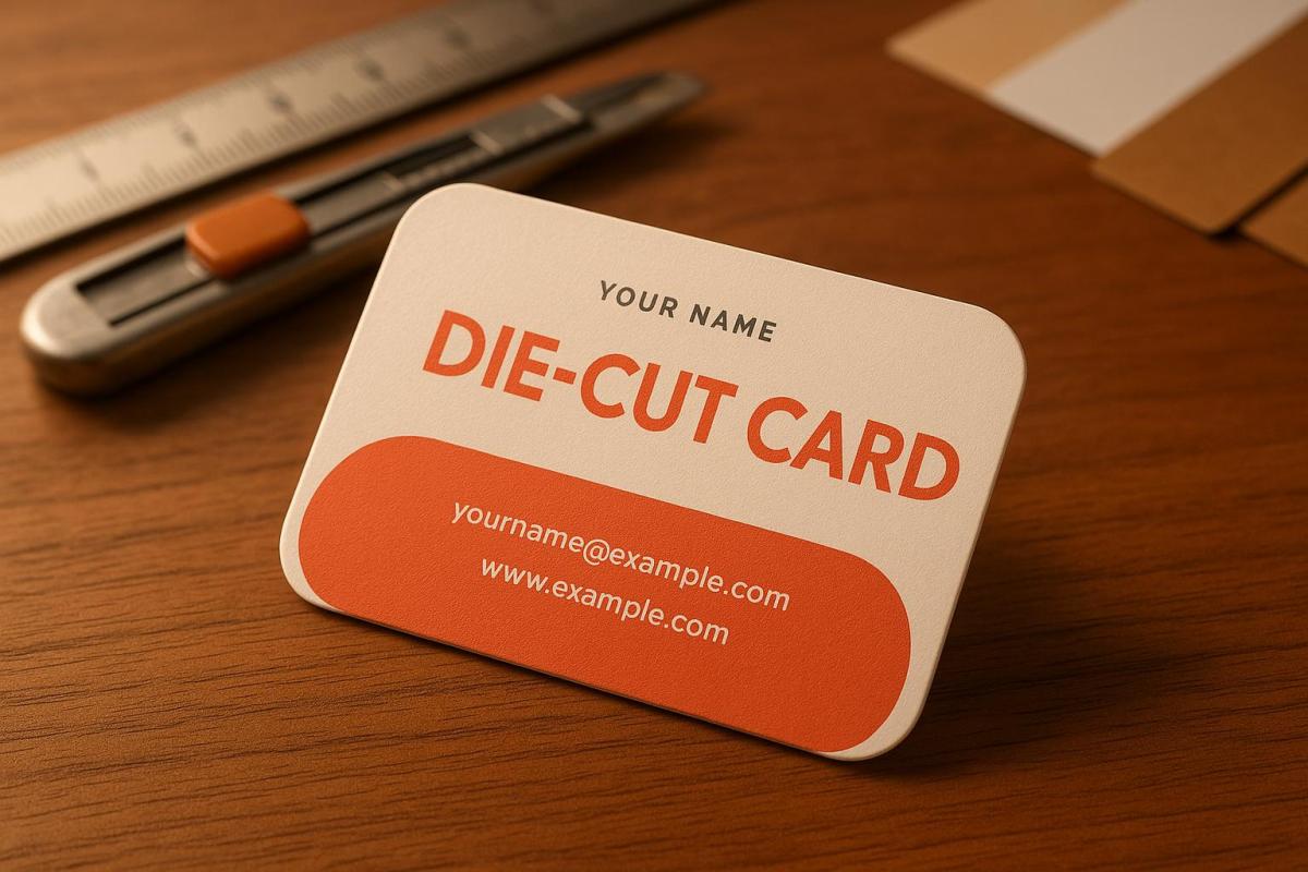
Die-cut business cards are a powerful way to make a lasting impression. By using custom shapes, materials, and finishes, they can visually and tactilely represent your brand. Here’s what you need to know:
- Dimensions & Shapes: Start with a standard size (3.5" x 2") and extend your design by 0.125 inches for bleed. Custom shapes like rounded corners or unique cut-outs can add appeal but must balance creativity with usability.
- Materials: Choose sturdy cardstock (14pt–16pt) or explore textured, coated, or plastic options for durability and aesthetic impact.
- Finishes: Add spot UV, foil stamping, embossing, or edge painting for extra flair. These details enhance the design while maintaining functionality.
- Layout & Readability: Ensure text and graphics are clear, with a safe margin of 1/8 inch from edges. Use high-contrast colors and legible fonts.
- File Preparation: Submit print-ready files in PDF format with 300 DPI resolution, CMYK colors, and separate die-cut layers.
Die-cut cards demand precision in design and production. Miro Printing & Graphics Inc. offers expert support, from design troubleshooting to proofing, ensuring your cards stand out and meet technical standards.
Dimensions and Shapes
Standard Dimensions and Guidelines
When designing a die-cut business card, the starting point is the standard U.S. dimensions: 3.5" × 2". To ensure a polished final product, extend your design by 0.125 inches beyond the cut line for bleed and keep all critical elements at least 0.125 inches inside the trim. This prevents key details from being accidentally trimmed. If you’re venturing into custom die-cut shapes – like a card shaped as a house – these technical guidelines become even more important. The more intricate the shape, the more precise you need to be with bleed and spacing to achieve a flawless result.
How Custom Shapes Affect Usability
Once the dimensions and layout are set, the card’s shape takes center stage in determining how recipients will interact with it. Custom shapes add a tactile and visual appeal, making the card more engaging and memorable for those who receive it. However, they come with practical considerations that standard rectangular cards don’t encounter.
For example, rounded corners and smooth curves not only enhance usability but also reduce the risk of tearing, which can happen with sharp or acute angles during handling or production. These small design tweaks can make a big difference in durability.
The shape of the card can also leave a lasting impression. A unique design increases the chances of the card being kept and even sparking conversations. For instance, a card with an interactive die-cut feature – like a small window revealing hidden details or a tab that doubles as a bookmark – can encourage recipients to engage with it beyond a simple glance.
That said, readability should always remain a top priority. While creative shapes can align beautifully with your brand identity, it’s crucial to ensure that your card is practical and easy to read. Opt for clear, legible fonts and avoid overly intricate typefaces, as complex shapes can sometimes make text harder to decipher.
Custom shapes also allow your cards to serve purposes beyond traditional networking. A fitness trainer might design dumbbell-shaped cards that double as appointment reminders, while a bakery could create cupcake-shaped loyalty cards with punch-out sections to track purchases. These multifunctional designs not only reinforce brand identity but also add value for the recipient.
Ultimately, the goal is to strike the right balance between creativity and functionality. Consider how easy it is to handle your chosen shape. Your card should stand out as a unique representation of your brand while remaining practical for everyday use as a networking tool.
Materials and Finishes
Paper Stock Options
Choosing the right paper stock is your starting point. The thickness of cardstock, measured in points (pt) or pounds (lb), plays a huge role in the durability and overall feel of your card. Heavier weights offer a sturdier, more premium touch.
For die-cut business cards, 14pt to 16pt cardstock strikes a great balance between sturdiness and flexibility. This weight is ideal for clean, precise cuts while being rigid enough to hold intricate shapes without bending or tearing. If your design includes very detailed die-cut patterns, 18pt cardstock provides added stability, though it can be trickier to cut through complex designs.
Uncoated cardstock gives a natural, tactile feel and is perfect for techniques like embossing or letterpress. Its rough texture adds an earthy, handcrafted vibe to your card.
Coated cardstock, on the other hand, comes in two popular finishes: matte and gloss. Matte-coated stock delivers vibrant colors without the glare, and it’s easy to write on. Gloss-coated stock, however, offers vivid colors and sharp image quality, making it a great choice for designs featuring bold graphics or photography.
If durability is a priority, plastic substrates like 20mil PVC are an excellent option. These are waterproof and long-lasting, making them ideal for membership or loyalty cards that see frequent handling.
For a unique touch, consider textured papers. A linen finish offers a polished, classic look, while a felt finish provides a softer, approachable texture. These specialty papers can elevate your die-cut design by adding a tactile element that makes your card unforgettable.
Once you’ve settled on the paper stock, you can explore specialized finishes to make your design even more striking.
Special Finishes and Add-Ons
Spot UV coating is a fantastic way to draw attention to specific elements of your design. By applying a glossy finish to select areas while keeping the rest matte, you can emphasize the unique contours of your die-cut shape or highlight key details.
For a touch of luxury, foil stamping adds metallic accents that catch the light. Classic options like gold, silver, and copper are timeless, while rose gold or holographic foils offer a modern twist. Beyond the visual appeal, foil stamping adds a tactile dimension that pairs beautifully with the depth of die-cut designs.
Embossing and debossing create raised or recessed details that add texture to your card. These techniques work particularly well along the edges of die-cut shapes, creating borders that accentuate the custom outline. Blind embossing (without ink) delivers a subtle, elegant look, while registered embossing combines texture with printed elements for added impact.
For a soft, luxurious feel, soft-touch coating is a standout choice. It adds a velvety texture that enhances the tactile experience of your card’s unique shape while also resisting fingerprints and wear.
If your cards need extra protection, aqueous coating is a practical option. This water-based finish guards against moisture and wear while maintaining excellent print quality. It’s a cost-effective alternative to UV coating and dries quickly for a professional look.
Edge painting is another way to make your card pop. By adding color to the edges, you can highlight the custom shape and give your card a polished, finished appearance. Metallics like gold and silver are popular choices, but bold colors that match your branding can be equally striking.
When combining multiple finishes, think about how they’ll work together with your die-cut shape. For example, rounded corners pair beautifully with edge painting to emphasize smooth curves, while sharp angles might benefit from spot UV to showcase precision. These thoughtful combinations can take your custom design to the next level, ensuring your card leaves a lasting impression.
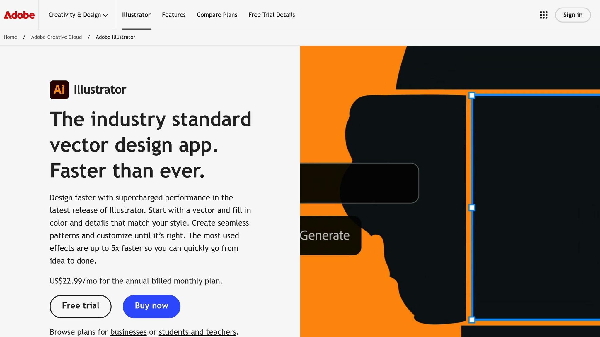
How To Set Up A Die Cut Business Card or Sticker in Adobe Illustrator | Clubcard TV
Design Layout Setup
Once you’ve nailed down your design’s dimensions and materials, it’s time to focus on the layout and where to place your content.
Required Information to Include
Make sure your card includes the essentials: your company name, logo, and primary contact details. Stick to one or two key contact methods like a phone number, email, or website, along with one or two active social media handles.
Adding a short job title or tagline can quickly communicate what you do. Phrases like "Creative Director" or "Your Marketing Partner" are concise and effective, especially if your business name doesn’t clearly explain your industry.
If space is tight – like on die-cut cards – consider adding a QR code. This can link directly to your digital business card, portfolio, or contact details. Just be sure to place it where it won’t interfere with the card’s unique shape but remains easy to scan.
Don’t forget a clear call-to-action. Phrases like "Schedule Your Free Consultation" or "View Our Latest Projects Online" can guide recipients toward their next step and make your card more engaging.
Once you’ve locked in the content, focus on refining your design for readability and visual appeal.
Design Best Practices
- Font size matters: Use fonts that are easy to read, with a minimum size of 8pt – though 10pt or larger is ideal.
- Lines and borders: Keep decorative lines or borders at least 0.5pt thick to ensure they print cleanly.
- Graphics and images: Use vector graphics for logos and icons to maintain sharp edges, and ensure photos or illustrations are at 300 DPI at their actual size to avoid pixelation.
- Color contrast: Ensure strong contrast between text and background, especially near the die-cut edges. For example, light text on a dark background (or vice versa) stands out better. Avoid placing critical text over busy patterns or images.
- Visual hierarchy: Guide the reader’s eye by prioritizing elements. Start with your company name as the most prominent, followed by your name and title, and then your contact details in descending order of importance.
- Die-cut considerations: Be mindful of how the card’s shape affects readability. Curved text can work well for short phrases like taglines, but keep contact details in straightforward horizontal or vertical arrangements for clarity.
Lastly, ensure your design elements are securely placed to avoid issues during trimming.
Safe Layout Guidelines
To avoid trimming mishaps, keep all critical elements at least 1/8 inch away from the die-cut edge.
Die-cut designs require a slightly different approach to bleed. While standard cards need a 1/8-inch bleed on all sides, die-cut cards require the bleed to follow the custom shape. Extend any background colors, patterns, or images beyond the cut line by at least 1/8 inch.
Pay extra attention to text placement near curved or angled edges. Horizontal text should maintain a safe distance from non-horizontal cut lines. If your design includes sharp angles or intricate details, avoid placing text in those areas altogether.
For logos, stick to stable, flat areas – usually the center or the largest unobstructed section. Avoid placing logos near complex cut patterns or narrow sections where distortion could occur.
If your die-cut shape includes functional elements like tabs or notches, keep these areas free of important details. These sections are more prone to wear and tear, so place critical information like phone numbers or email addresses in safer, more stable parts of the layout.
When working with Miro Printing & Graphics Inc., their design team can provide tailored safe area guidelines for your specific die-cut shape. This ensures your layout not only meets technical requirements but also makes a strong visual impact.
sbb-itb-ce53437
Print-Ready File Preparation
Getting your print files right is essential to avoid delays and costly reprints. A little extra attention upfront can save you a lot of headaches later.
File Format and Specifications
Always use PDF as your file format – it’s the industry standard for preserving designs across different software. When exporting, choose the "Press Quality" preset to ensure top-notch resolution and accurate colors.
Make sure to embed your fonts to prevent any unexpected text shifts during printing. Most design programs let you do this when exporting; just look for an option like "embed fonts" or "outline fonts" and check the box.
Convert your colors to CMYK before submitting your file. Remember, what you see on your screen (RGB) may not match the printed result, as print colors use CMYK inks. That vibrant blue on your monitor? It might print closer to purple if left unconverted.
For photos and raster images, set the resolution to 300 DPI. This ensures crisp, professional-quality prints without any pixelation. Vector elements, like logos and text, don’t require a DPI setting since they scale perfectly at any size.
If your design is vector-based, Adobe Illustrator (.AI) and Encapsulated PostScript (.EPS) files are excellent options. These formats are particularly effective for handling custom shapes and die-cut lines, as they maintain sharp edges no matter the size.
File Setup Tips
- Disable facing pages – die-cut cards are single-sided, so this setting isn’t needed.
- Add crop marks and bleed: Extend your background by 1/8 inch beyond the trim edge. Crop marks guide the printer on where to cut, while the bleed ensures no awkward white edges if the cut is slightly off.
- Use a separate layer for die-cut lines: Assign a unique, bright color (like magenta) with a 0.25pt stroke to make the cutting path easy to identify for the production team.
- Double-check your file at 100% zoom: Look for stray pixels, overlapping elements, or text placed too close to the cut line. A quick review can save you days of revisions.
- Name your file clearly: For example, "CompanyName_DieCut_BusinessCard_CMYK_300DPI.pdf" makes it easy for the production team to know exactly what they’re handling.
If this process feels overwhelming, don’t worry – there’s help available.
In-House Design Support
Feeling stuck? Miro Printing & Graphics Inc. offers expert design services to take the guesswork out of file preparation. Their team can handle every step, from concept creation to print-ready files, ensuring your die-cut cards look amazing and meet all technical requirements.
Here’s how they can help:
- Die-cutting expertise: Their team can spot and fix potential production issues before they become problems. They’ll adjust your design to ensure it works seamlessly with their cutting equipment, which can save you money on setup costs and reduce material waste.
- File troubleshooting: Got a file with minor issues, like incorrect color profiles or low resolution? They can often fix these problems in-house without sending it back to you for revisions.
- Proofing support: See exactly how your card will look before production starts. They can provide digital proofs for accurate colors and proportions or even physical samples if you want to feel the material and test the die-cut shape.
Pre-Press Review and Proofing
Once your file preparation is complete, it’s time for a final pre-press review. This step ensures your design is ready for production, helping you avoid costly reprints or delays.
Pre-Submission Checklist
Start by checking the legibility of your text. Print your design at actual size to make sure everything is readable, especially if you’re using a minimum text size of 8pt – this is particularly important for textured paper stocks. Double-check that all crucial details, like your contact information and company name, are clear and easy to find.
Pay close attention to color accuracy, especially for die-cut cards. Open your file in different software to catch any color shifts, and, if possible, view it on multiple devices. Be cautious with dark colors near die-cut edges; if your bleed isn’t set up correctly, white paper might peek through at the edges.
Keep all critical design elements – logos, text, and graphics – at least 1/8 inch away from the die-cut edge. Die-cutting equipment can slightly vary, and you don’t want important details, like your phone number, accidentally trimmed off.
Evaluate the die-cut shape to ensure it’s sturdy enough for production. Corners with angles sharper than 90 degrees are prone to tearing or bending. Thin or delicate sections should be at least 1/4 inch wide to maintain stability and durability.
Finally, confirm all file specifications are correct. Your resolution should be set at 300 DPI, colors in CMYK format, and fonts either embedded or outlined. Ensure the die-cut line is on a separate layer, marked with a distinct color that won’t interfere with your design.
Once you’ve verified these details, move on to proof review to ensure everything is production-ready.
Requesting Proofs
After ensuring your design meets technical standards, request proofs to finalize production quality. Digital proofs are a great way to check color accuracy, layout, and die-cut alignment. These proofs provide a clear view of how your design will look, including where the die-cut edges will fall.
For die-cut cards, physical proofs are especially helpful. They allow you to test the paper weight, assess durability, and confirm the practicality of the die-cut shape. While an intricate cut-out might look amazing, it could prove too fragile for everyday use in wallets or cardholders.
When reviewing proofs, compare the colors to your original design. Keep in mind that printed colors often differ from what you see on screen, particularly when specialty finishes or textured papers are involved. If your brand colors are essential to your identity, request a color-matched proof to ensure they’re accurate.
Proofs typically take 1-3 business days to prepare, depending on your design’s complexity and the production schedule. Be sure to account for this time in your project timeline, especially if you’re working toward a specific event or launch date.
Miro Printing & Graphics Inc. offers both digital and physical proofing options to help you perfect your die-cut cards before full production begins. Their team can also recommend adjustments during the proofing stage to address potential issues that could impact the final quality or durability of your cards.
Summary and Next Steps
Crafting professional die-cut cards requires careful attention to detail, from the initial concept to the final production stages. Following these essential steps ensures a polished, high-quality result.
Key Steps Review
Start by understanding the dimensions and shapes of your design. While the standard business card size of 3.5" x 2" serves as a reliable starting point, custom shapes demand extra precision. Avoid intricate or narrow design elements that could weaken the card’s durability.
Choose cardstock in the 14-16pt range for a balance between sturdiness and aesthetic appeal. Adding specialty finishes like spot UV or foil stamping can enhance the card’s visual impact. However, keep in mind that textured paper often requires larger text sizes to maintain legibility.
When laying out your design, maintain a safety margin of at least 1/8 inch from the edges to protect crucial elements such as logos and contact details. For file preparation, use 300 DPI resolution in CMYK, embed all fonts, and include a separate die-cut layer marked with a distinct color.
A thorough pre-press review is essential to avoid costly mistakes. By reviewing both digital and physical proofs, you can confirm color accuracy, test the paper’s durability, and ensure proper die-cut alignment. While this step may add 1-3 business days to your timeline, it’s a worthwhile safeguard against reprints.
Once these foundational steps are in place, having access to expert guidance can make a significant difference.
Why Partner with Miro Printing & Graphics Inc.
Miro Printing & Graphics Inc. specializes in die-cutting as part of their post-press services, making them an excellent choice for managing your custom card projects from start to finish. Their personalized approach ensures even the most intricate designs are handled with care and expertise.
Through their Custom Projects service, Miro Printing & Graphics Inc. offers tailored solutions that go beyond standard options. Whether you’re looking to experiment with unique shapes, specialty materials, or eye-catching finishing techniques, their experienced team collaborates with you to bring your vision to life while ensuring the final product is both durable and functional.
Their graphic design consultation services simplify the design process, providing expert advice to help you navigate complex specifications. This hands-on support ensures your die-cut cards are not only visually impressive but also ready for production.
Conveniently located at 831 Main St in Hackensack, New Jersey, Miro Printing & Graphics Inc. serves clients across New Jersey, New York, and Connecticut. To discuss your die-cut card project, you can reach them at (201) 439-9686 or email info@bergencountyprinters.com during business hours (Monday through Friday, 9:00 AM to 5:00 PM).
FAQs
What should I consider when choosing a custom shape for a die-cut business card?
When choosing a custom shape for your die-cut business card, it’s important to pick a design that mirrors your brand and industry. A shape that ties directly to your logo, product, or service can leave a memorable impression and highlight your originality.
However, don’t overlook practicality. The card’s shape should still be sturdy, easy to read, and convenient to handle. Overly elaborate designs might weaken the card or make production tricky. Striking the right mix of creativity and usability ensures your card grabs attention while staying polished and professional.
How do paper types and finishes affect the look and durability of die-cut cards?
The type of paper and finish you select for your die-cut cards plays a big role in both their look and durability. Coated finishes – like gloss or matte – add a layer of protection against moisture, dust, and wear. Plus, they make colors pop, giving your cards a sharp, vibrant appearance. If you prefer a more natural feel, uncoated paper offers a soft texture and muted tones, though it’s more prone to smudging and wear.
A glossy finish delivers a shiny, attention-grabbing effect, while matte offers a subtle and sophisticated vibe. Pairing the right paper with the perfect finish ensures your die-cut cards not only turn heads but also stand the test of time.
How do I make sure my design file is ready for printing die-cut cards?
To prepare your design file for die-cut business cards, start by adding a die line layer that clearly defines the card’s cut shape. Use a spot color, like "DIE-CUT FORME", and set it to CMYK. Don’t forget to include a bleed area of at least 0.125 inches to prevent any part of the design from being cut off.
Ensure all images and text are at a 300 dpi resolution and in CMYK color mode. To avoid font-related issues, either convert fonts to outlines or embed them. Add trim marks and maintain safe zones around the design to ensure accurate cutting. By following these guidelines, your file will be ready for professional die-cut printing.
Related Blog Posts
- How to Set Up Files for Die-Cutting
- How to Create Die-Cut Templates for Printing
- How to Prepare Files for Die-Cutting and Laser Cutting
- Ultimate Guide to Die-Cut Design Software
https://app.seobotai.com/banner/banner.js?id=68d0cc547b5c01ae368bb95f
