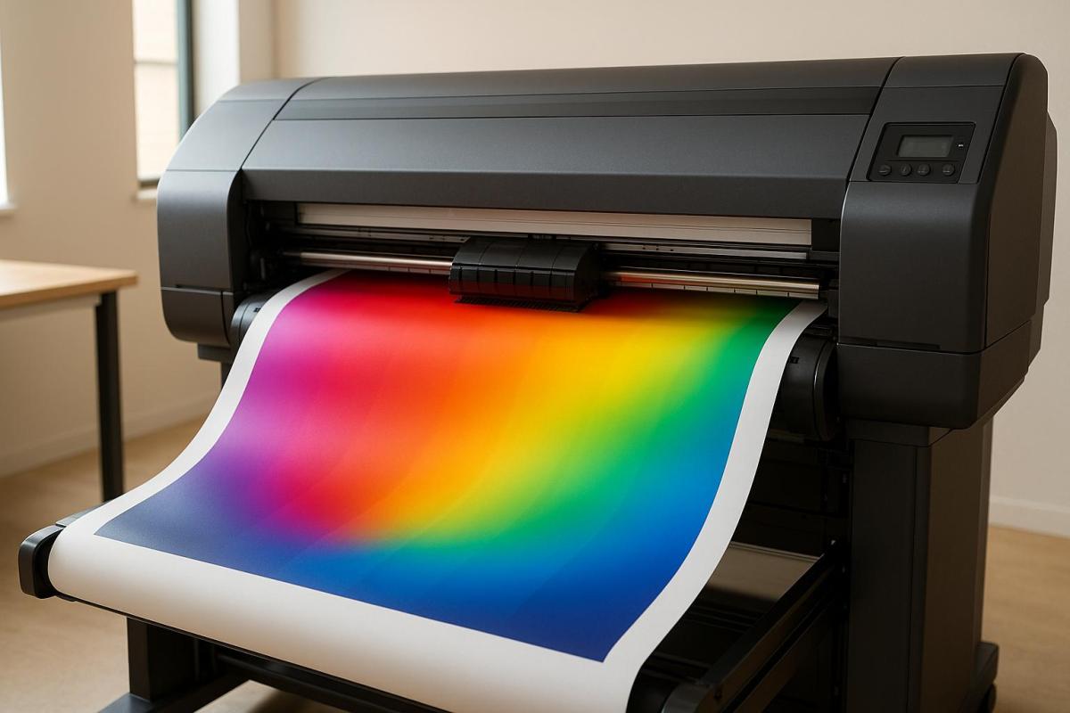
Color gamut refers to the range of colors a printer can reproduce. In large format printing, achieving accurate and vibrant colors is challenging due to limitations in ink, substrates, and device calibration. Expanded gamut printing, which adds inks like orange, green, and violet to the standard CMYK process, significantly improves color accuracy and coverage, reaching over 90% of Pantone colors. This ensures better brand consistency and reduces reprints.
Key points:
- Standard CMYK reproduces ~55% of visible colors, while expanded gamut systems can achieve up to 90% Pantone coverage.
- Substrate and ink type matter: Glossy materials and advanced inks produce brighter, more accurate colors.
- Calibration and profiling are critical: Regular adjustments ensure consistent results across devices.
- Expanded gamut printing benefits: Better spot color accuracy, faster production, and lower long-term costs.
Large format printing success depends on selecting the right materials, maintaining calibrated workflows, and leveraging advanced printing systems for precise results.
Printing Workflow | Color Gamut
Research Findings on Color Gamut Limitations
Understanding these findings is key to improving color reproduction strategies in large format printing.
CMYK Limitations in Large Format Printing
Research indicates that standard CMYK printing can reproduce only about 55% of visible colors. This poses challenges when replicating vibrant brand colors, neon shades, or highly saturated hues that fall outside the CMYK range. Advanced systems can extend this coverage to 65–70%. However, logos and designs that rely on colors outside this gamut may experience noticeable color shifts and reduced saturation, which can impact brand consistency and visual appeal.
How Ink and Device Types Affect Color Range
The range of reproducible colors in large format printing is heavily influenced by the type of printer and the ink formulations used. Inkjet printers stand out for their ability to achieve a wider color gamut, thanks to their advanced ink sets and precise droplet control, making them ideal for photographic and color-sensitive projects.
Different ink types also play a role:
- Aqueous inks: Provide good color range but lack durability.
- Solvent inks: Offer broader gamuts and excel in outdoor applications due to superior weather resistance.
- UV-curable inks: Deliver vibrant colors across a variety of substrates.
Additionally, many modern digital printers support expanded ink sets that go beyond the traditional CMYK palette. Hybrid systems, such as those incorporating CMYK+White or CMYKLcLm (light cyan and light magenta), further enhance the ability to reproduce subtle color variations. These advancements are paving the way for even greater improvements in color reproduction.
New Developments in Color Gamut Expansion
Recent innovations in expanded gamut printing are revolutionizing how colors are reproduced. Systems that incorporate additional inks – like CMYKOGV (adding orange, green, and violet) – can now achieve over 90% coverage of Pantone colors, far surpassing standard CMYK ranges. For example, HP’s DesignJet Z Pro series achieves up to 93% Pantone coverage through advanced ink formulations.
Research from Ryerson University highlights that digital printers with expanded gamut systems deliver closer matches to Pantone colors, with significant reductions in color deviation. The introduction of standardized Pantone EG Color Guides has further improved accuracy, enabling printers to achieve color precision within ΔE ≤ 2.8 for 76% of expanded gamut colors.
Case studies in packaging and display graphics demonstrate that expanded gamut printing not only produces consistent, vibrant colors across various substrates but also enhances customer satisfaction while reducing production costs. These advancements are particularly valuable for large format printing, where accurate color reproduction is essential for maintaining brand integrity and creating visually impactful results.
Expanded Gamut Printing: Methods and Benefits
What Is Expanded Gamut Printing?
Expanded gamut printing takes the standard CMYK process (cyan, magenta, yellow, and black) and adds extra ink colors – usually orange, green, and violet (CMYKOGV) – to significantly increase the range of colors that can be reproduced. This method fills in the gaps where traditional CMYK struggles, offering more vibrant and accurate results.
Each added ink has a specific role: orange boosts brightness in warm tones, green enhances natural hues, and violet deepens purples and enriches blues. Together, these inks expand the color range, allowing for up to 90% coverage of Pantone colors. This improvement is particularly beneficial for large format printing, where accurate and vibrant colors are crucial.
Benefits for Large Format Printing
Expanded gamut printing addresses the limitations of standard CMYK by delivering more precise color matching, which is critical for maintaining consistent branding. By improving spot color accuracy, it eliminates the trial-and-error process of custom ink mixing, helping printers meet strict brand guidelines. These systems can achieve Delta E values as low as 2.8 for about 76% of colors, significantly reducing the chances of costly reprints.
Another advantage is efficiency. Using a fixed set of seven inks minimizes the need for frequent ink changes and press cleanups, which speeds up production and allows for job batching. This approach also reduces inventory costs and waste, leading to lower overall expenses and faster turnaround times.
On top of that, expanded gamut printing enhances the overall quality of prints. The added vibrancy and smoother gradients ensure that images and graphics look as intended, with the depth and saturation needed for eye-catching displays.
Standard vs. Expanded Gamut Workflows
Choosing between standard CMYK and expanded gamut workflows depends on the specific needs of the project. Each has its strengths, and the decision often comes down to balancing simplicity with advanced capabilities.
| Workflow Type | Color Range | Spot Color Accuracy | Ink Changes | Cost Efficiency | Complexity |
|---|---|---|---|---|---|
| Standard CMYK | Limited (50% Pantone coverage) | Moderate | Frequent | Lower initial cost | Simpler setup |
| Expanded Gamut (CMYKOGV) | Wide (over 90% Pantone coverage) | High (ΔE ≤ 2.8) | Reduced by up to 30% | Cost-effective long-term | More complex color management |
For simpler projects where precise color matching isn’t critical, standard CMYK is appealing due to its straightforward setup and lower upfront investment. However, for applications that demand high color accuracy – like luxury retail displays, museum-quality reproductions, or corporate branding – expanded gamut printing is the better choice. While it requires more advanced software, detailed profiling, and operator training, the payoff is higher client satisfaction and fewer reprints.
For print shops managing a variety of color-sensitive projects, expanded gamut printing offers a valuable combination of improved accuracy and production efficiency, making it an excellent option for large format applications. Whether to choose standard CMYK or expanded gamut workflows depends on the specific demands of each project and the priorities of the business.
sbb-itb-ce53437
Color Management Best Practices
Getting color management right in large format printing requires a structured approach. It involves careful profile selection, regular calibration, and addressing standardization challenges. These practices help avoid costly errors and ensure precision in output.
Selecting the Right Color Profiles
ICC profiles are the backbone of accurate color reproduction in large format printing. These data sets define how colors should appear on specific devices, ensuring consistency across different printers and workflows. Without them, even the best printing equipment can produce uneven or incorrect colors.
Choosing the right profile starts with understanding industry standards in the U.S. For example, GRACoL (General Requirements for Applications in Commercial Offset Lithography) provides detailed guidelines for CMYK printing and is widely used in commercial printing across North America. For workflows that include additional colors like orange, green, and violet, Idealliance ECG (Expanded Gamut Printing) offers tailored support.
It’s also crucial to match ICC profiles to the specific printer, ink, and substrate being used. A profile designed for vinyl won’t necessarily work for canvas or paper, as different materials absorb ink differently. Substrate-specific profiling ensures the best results for each material.
Default settings like sRGB or SWOP can restrict the range of achievable colors. Updating these settings to align with modern printing technologies helps unlock the full potential of expanded gamut systems.
Once accurate profiles are selected, calibration becomes the next critical step to maintain consistency.
Device Calibration and Linearization
Linearization ensures that a printer’s output matches its input values, creating smooth transitions and avoiding issues like banding. This step is essential before profiling and plays a key role in maintaining print quality over time.
Regular calibration is needed to counteract shifts caused by environmental factors, ink aging, and heavy usage. Both printers and monitors can drift over time, which makes consistent calibration a must. The frequency of calibration depends on how often the equipment is used and the surrounding conditions.
Hand-held spectrophotometers have made on-site color measurement and adjustments much easier. Tools like the NIX Spectro L and Datacolor ColorReader Spectro allow operators to check color accuracy in real-time and make corrections before starting large print runs.
Environmental stability – such as consistent temperature, humidity, and lighting – also plays a big role in ensuring calibration holds steady.
After calibration, the next challenge is standardizing profiles across multiple devices.
Profile Standardization Challenges
Standardizing color profiles across different printers and environments is no small feat. Variations in printer models, ink types, substrates, and environmental conditions make perfect uniformity difficult to achieve, even with the best practices in place. Factors like device age, print head condition, and manufacturing differences often require individual profiling for each device.
Using LAB color management can help with device-agnostic color matching. LAB encompasses a broader range of colors than RGB or CMYK, enabling more vibrant and accurate reproduction across different devices. However, this approach demands advanced software and skilled operators to implement effectively.
Beyond the technical aspects, workflow management is equally important. Human factors, such as how operators handle equipment or the ambient lighting during quality checks, can impact color perception. Establishing clear protocols and providing proper training can minimize these variables.
G7+ calibration builds on traditional G7 standards by improving gray balance and tonal smoothness. This is especially beneficial for high-density inkjet printers that use six or more inks. By focusing on appearance matching across multiple devices and locations, G7+ helps maintain consistency on an enterprise level.
When perfect standardization isn’t possible, clear communication between designers, printers, and clients becomes essential. Setting realistic expectations and defining a clear color approval process can help avoid misunderstandings and reduce the chances of print rejections over minor color differences.
Practical Adjustments and Recommendations
When it comes to large format printing, consistency in color quality isn’t just about following good color management practices – it’s also about making smart, practical adjustments. Factors like material selection, workflow management, and quality control play a huge role in ensuring reliable results. These strategies not only help deliver the desired output but also reduce the risk of expensive reprints and unhappy clients.
Choosing Substrates and Ink Types
The foundation of accurate color reproduction lies in pairing the right substrate with the right ink. For instance, glossy or coated materials often produce more vibrant and sharp colors because they limit ink absorption. This makes them ideal for projects that demand bold, eye-catching visuals. Materials like photo paper or high-gloss vinyl are common choices for achieving this level of vibrancy and precision.
On the flip side, uncoated or textured materials absorb more ink, which can dull colors and reduce the available color range. Here’s an example: A client once chose an uncoated canvas for a retail display, expecting vibrant reds and blues. Unfortunately, the absorbent material muted the colors, and the dye-based inks they used faded quickly. Switching to a coated polyester fabric paired with pigment-based inks solved the issue, resulting in brighter colors and a longer-lasting print.
Ink selection is just as critical. Pigment-based inks are known for their stability and resistance to fading, making them a reliable choice for long-term projects. Dye-based inks, while offering a broader color range, tend to be less durable. Testing the interaction between the chosen substrate and ink before starting production is a simple but effective way to avoid costly errors and ensure the best results.
Workflow Calibration and Proofing
Maintaining consistent color quality also depends on regular workflow calibration and proofing. Calibration isn’t just about tweaking printer settings – it involves keeping detailed records, recalibrating whenever there’s a material change, and using tools like spectrophotometers for real-time color checks. While automated color management systems can simplify this process, human oversight remains essential for troubleshooting and ensuring top-notch quality.
Proofing acts as the final safeguard before full production. Hard proofs provide physical samples for review under different lighting conditions, giving both print providers and clients a chance to catch issues early. Digital proofs, on the other hand, offer a faster option for initial approvals. For complex projects, advanced proofing methods – like video samples of print outputs – can give clients a clear preview of the final product. This is particularly helpful for intricate items like booklets, where small details matter.
How Miro Printing & Graphics Inc. Applies These Methods
At Miro Printing & Graphics Inc., every project is carefully evaluated to recommend the best combination of substrate and ink for color accuracy and durability.
Customer Judy W. shared her experience:
"I was ordering new business cards and before printing them, Mike sent me the proof and I gave it my approval."
For more intricate projects, Miro Printing & Graphics Inc. employs advanced proofing techniques. Customer Julia I. noted:
"I even received a video of my print sample (a mini booklet) for approval before they proceeded with the rest."
The company also prioritizes regular device calibration and creates custom ICC profiles for each substrate and ink pairing. By keeping detailed records of successful combinations, they can replicate proven workflows while adapting quickly to new challenges. This meticulous approach ensures consistent, high-quality results for every project.
Conclusion
The concept of color gamut plays a crucial role in determining the vibrancy, accuracy, and overall quality of large-format prints. Studies indicate that the color gamut of a printer directly influences the final output, whether it’s for billboards, exhibition graphics, or branded displays. This knowledge becomes essential when comparing traditional printing methods with expanded gamut techniques.
While standard CMYK printing has its limitations, expanded gamut printing is reshaping the industry. By incorporating additional inks like orange, green, and violet into the process, modern printing systems can now achieve over 90% Pantone coverage. This advancement results in more precise brand color reproduction and smoother gradients, enhancing the overall quality of printed materials.
To ensure consistent and accurate color reproduction, advanced technologies and optimized workflows are key. Techniques like LAB color management, proper device calibration, and the use of customized ICC profiles help maintain consistency across various substrates. Additionally, the choice of substrate and ink formulation greatly impacts the achievable color gamut. For instance, glossy materials paired with the right ink systems can significantly enhance color vibrancy.
As printing technology continues to evolve with new inks, substrates, and color management tools, staying updated on these innovations empowers professionals to deliver superior results. Partnering with experienced print providers, such as Miro Printing & Graphics Inc., ensures that every aspect – from material selection to workflow optimization – is handled with precision, enabling exceptional outcomes that meet and exceed client expectations.
FAQs
What are the advantages of using expanded gamut printing instead of the traditional CMYK process for large format printing?
Expanded gamut printing brings a host of advantages over the traditional CMYK process, especially when it comes to large-format projects. By adding colors like orange, green, or violet to the mix, it expands the range of achievable colors. The result? More vibrant, true-to-life reproductions of images and designs – perfect for projects that demand precise brand colors or intricate detailing.
It also reduces the reliance on spot colors, which can simplify production and, in some cases, lower costs. For anyone aiming to create striking, high-quality prints, expanded gamut printing offers an effective way to enhance the visual appeal of their materials.
How does the choice of substrate affect color accuracy and vibrancy in large format printing?
The material you select for your large format printing project has a huge influence on how colors appear and how vivid they look. Substrates like vinyl, fabric, or paper interact with ink in unique ways – some absorb it more, while others reflect it differently – which directly impacts the final color outcome. For instance, glossy surfaces often make colors pop, while matte finishes can create a softer, more muted look.
The range of colors, or color gamut, that a substrate can produce also depends on factors like its texture, coating, and overall quality. To get the best results, it’s crucial to pick a material that aligns with your design goals and is compatible with the printing method you’re using. A professional print shop, such as Miro Printing & Graphics Inc., can guide you in choosing the right substrate for your project to ensure it turns out exactly as you envision.
How can I achieve consistent color reproduction across various printing devices and materials?
To maintain consistent color reproduction, it’s crucial to regularly calibrate your printing devices and use color profiles like ICC profiles that match your specific printer and material. These profiles play a key role in standardizing color output and minimizing variations.
The type of material you’re printing on also matters. Different substrates – like paper, vinyl, or fabric – interact with color in unique ways, either absorbing or reflecting it differently. Testing and fine-tuning your printer settings for each material can ensure more accurate results. For added precision, partnering with a professional printing service, such as Miro Printing & Graphics Inc., can provide expert-level guidance and handling to keep your large format printing projects on point.
Related Blog Posts
- How to Adjust Colors for Offset Printing
- CMYK vs RGB: Printing Color Models
- ISO 2846: Ink Color Standards Explained
- Pantone Charts for Large Format Printing
https://app.seobotai.com/banner/banner.js?id=691a748960ed14ccdc758c49
