Typography is the key to making print materials clear and readable.
Here’s why it matters:
- Visual hierarchy guides readers through content, showing what’s most important first.
- Typography tools like font size, weight, color, and spacing help structure content effectively.
- Strong typography improves engagement and comprehension by up to 70%.
- Poor typography – like inconsistent styles or low contrast – confuses readers and reduces impact.
How to create clear typography in print:
- Use larger, bold fonts for headings and smaller fonts for details.
- Apply consistent alignment and spacing to group related content.
- Add contrast with size, weight, or color to emphasize key points.
Done right, typography ensures your message stands out and makes printed materials easier to navigate. Whether it’s a brochure, flyer, or business card, clear typography improves both readability and the overall experience.
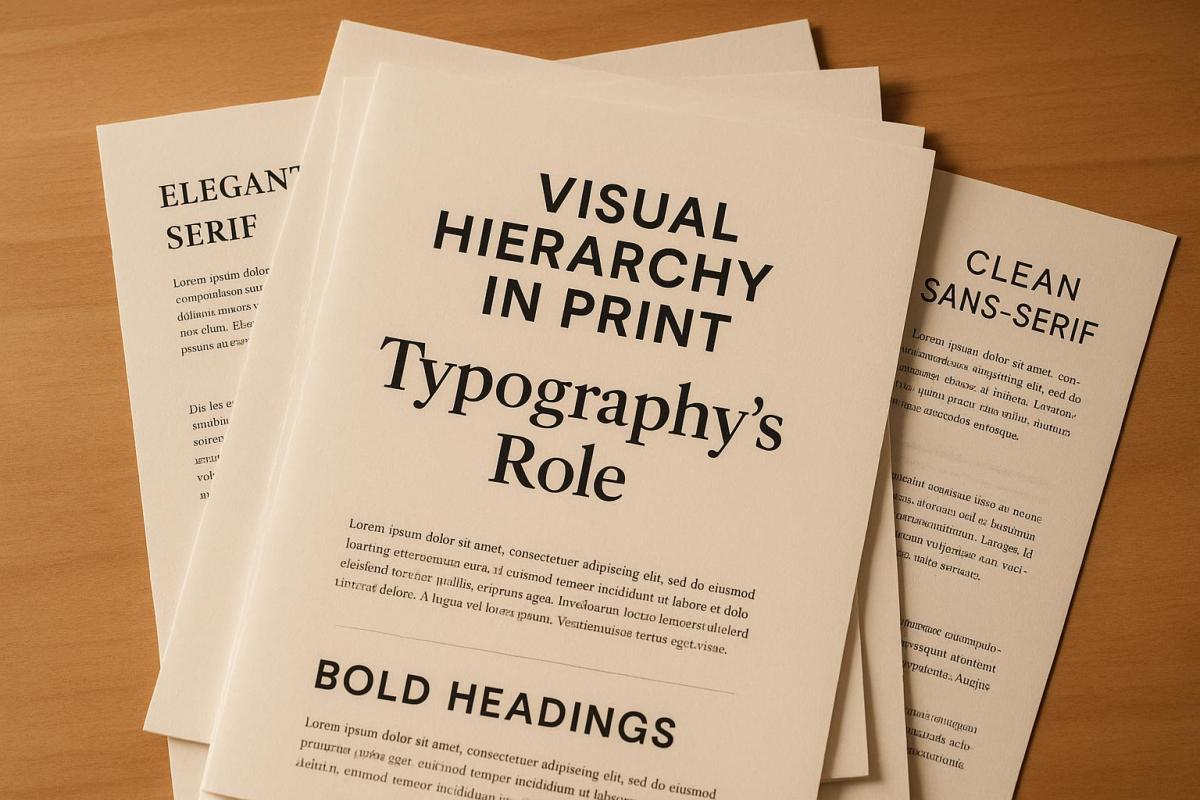
Typographic Hierarchy: Explained
Basic Principles of Typographic Hierarchy
Typography plays a crucial role in organizing content and enhancing the user experience. By mastering the principles of typographic hierarchy, you can transform cluttered layouts into clear, well-structured designs that guide readers effortlessly through printed material. These principles work together to establish order and highlight key elements.
Using Font Size, Weight, and Style
Font size is the most noticeable indicator of importance. Even a small difference – just 1 or 2 points – can make a big impact. For instance, Google’s Material Design guidelines suggest using a hierarchy where H1 is set at 96sp, H2 at 60sp, H3 at 48sp, and body text at 16sp.
Font weight offers another layer of emphasis. Bold text naturally draws the eye to important elements, while regular weight is better suited for supporting details. However, overusing bold can dilute its effect, so it’s best to apply it sparingly.
Italics and other style variations, like underlining or small caps, are ideal for highlighting quotes, captions, or secondary content. These subtle changes help readers quickly understand the purpose and priority of different text elements.
How Spacing and Alignment Work
Spacing serves as a visual cue, linking related elements or separating unrelated ones. Some key spacing techniques include:
- Kerning: Adjusting the space between individual letters for better readability.
- Leading: Controlling the space between lines of text to improve flow.
- Paragraph spacing: Adding or reducing space between text blocks to group or separate ideas.
For example, tight spacing between a heading and its paragraph signals they belong together, while extra spacing before a new section creates a clear division.
Alignment also plays a critical role in creating structure. Consistent left alignment for headings, subheadings, and body text ensures an orderly reading path. On the other hand, inconsistent alignment can make even well-designed typography feel disorganized. Together, spacing and alignment reinforce the hierarchy established by font size and style.
Using Color and Contrast
Color and contrast are powerful tools for reinforcing hierarchy. Contrast – whether achieved through differences in size, weight, or color – helps separate sections and highlight key elements.
A common approach is to use dark text on a light background for maximum readability. Specific colors can then be reserved for emphasis, like using a rich blue for main headings while keeping subheadings and body text in black. This creates a consistent pattern that readers can easily follow.
High contrast between text and background not only makes content easier to read but also improves accessibility for those with visual impairments. Thoughtful use of color, such as assigning unique shades to different sections, further clarifies the structure. In the end, maintaining strong contrast and purposeful color choices strengthens the overall visual hierarchy and ensures a more engaging reading experience.
Methods for Creating Clear Typographic Hierarchy
Crafting a clear typographic hierarchy isn’t just about following basic principles – it’s about applying thoughtful techniques to create a design that effortlessly guides readers through your content. By combining contrast, spacing, and alignment, you can refine the visual flow and make your design more intuitive.
Applying Contrast to Create Emphasis
Start by establishing a base style, such as 11pt regular body text, and build contrast from there to emphasize key elements. The key is to make size differences noticeable. Subtle variations – like increasing font size by just one or two points – won’t stand out. Instead, aim for significant size differences. For instance, if your body text is 12pt, set subheadings at 16pt and main headings at 24pt or larger.
You can also layer contrast techniques for a stronger hierarchy. For example, pair size differences with bold weights or color changes. On the flip side, reduce contrast for less critical elements, like labels or captions, by using smaller font sizes and mid-gray tones.
Grouping and Separating Content with Spacing
Spacing is another powerful tool for clarifying content relationships. Stick to this simple rule: elements that belong together should be closer, while unrelated elements should have more space between them. This approach helps readers quickly identify which pieces of content are connected.
For example, adjust line spacing to improve readability while keeping paragraphs visually cohesive. Use margins and padding to create clear section breaks. Generous spacing between unrelated sections – like adding extra space before chapter headings – helps readers navigate the content structure more easily.
To further enhance clarity, cluster related elements. Keep headings close to their corresponding text to show they’re connected. Meanwhile, a larger gap before the next section signals a natural stopping point, making it easier for readers to follow the flow.
Alignment and Proximity Strategies
Consistency in alignment is critical for maintaining order throughout your design. Whether you choose left, center, or right alignment, sticking to one approach creates a predictable structure that readers instinctively understand. Left alignment is often ideal for print materials in the U.S., as it aligns with natural reading patterns.
Proximity is another way to strengthen relationships between elements. Place related items close together to show their connection. For example, on a business card, cluster contact details, or in a brochure, keep captions near their respective images.
To create a smooth visual flow, align all headings and body text to the same margin. Then, use proximity to group related information. This strategy helps readers scan the layout quickly without getting distracted by inconsistent formatting.
For a systematic approach to building hierarchy, follow these five steps:
- Define your design goals.
- Simplify styles for clarity.
- Make elements distinct.
- Use contrast effectively.
- Group related items with space.
When these methods are combined seamlessly, they create an intuitive and polished typographic hierarchy. Highlighting key instructions or elements in bold can also help guide readers step by step.
sbb-itb-ce53437
How Typography Affects Print User Experience
Typography plays a key role in how readers interact with print materials. The arrangement of text, font selection, and visual hierarchy all influence whether readers can quickly grasp your message or struggle to engage with it. By following some essential principles, typography can do more than just inform – it can elevate the user experience.
Improving Readability and Accessibility
Typography that emphasizes contrast and spacing can significantly enhance readability and accessibility. For instance, using body text sized between 11–14 points and larger headers creates a clear visual hierarchy, making it easier for readers to navigate the content. Strong contrast helps readers quickly identify key information, while varying size, weight, and color further aid navigation, especially for individuals with cognitive or visual challenges.
Structured typography can make a big difference – studies show it can improve full document readership by up to 40%. Consistency also matters. Using a unified font system across materials builds trust and clarity, while limiting the number of fonts keeps the design focused and professional.
Common Typographic Mistakes to Avoid
Poor typography can undo all the benefits of a well-thought-out design. For example, insufficient contrast – such as using fonts that are too similar in size, weight, or color – makes it hard for readers to differentiate between headings, subheadings, and body text. Inconsistent typography disrupts the visual flow, reducing both credibility and readability. Overusing typeface variations can create visual chaos, while poor spacing can confuse readers by obscuring relationships between elements. Similarly, low-contrast color choices can severely impact readability, particularly for those with visual impairments.
To avoid these pitfalls, establish clear levels of hierarchy. Start with a base typeface and size, then use deliberate variations in size and weight to create contrast. Testing your designs with a diverse audience can also uncover potential readability issues before final production.
Guidelines for Commercial Print Projects
When it comes to commercial print projects, balancing aesthetics with readability is crucial. Business materials benefit from using 2–3 typeface sizes to establish content hierarchy without overwhelming the design. For example, U.S. commercial print standards often recommend 16-point body text for web-inspired designs and 48-point headers, although these can be adjusted based on the audience and medium.
Typeface selection is equally important. Serif fonts convey tradition and formality, while sans-serif fonts offer a more modern and clean appearance. Pairing fonts thoughtfully ensures visual distinction without sacrificing cohesion.
A real-world example highlights the impact of effective typography: a 2022 corporate brochure redesign saw a 35% boost in reader engagement after implementing a clear hierarchy with consistent font sizes, weights, and generous white space. Additionally, using color strategically – such as mid-gray for less important details like labels or dates – can subtly guide readers’ focus while maintaining brand identity.
Well-structured typography doesn’t just improve readability and accessibility – it builds trust and credibility. Every typographic decision should serve a practical purpose while keeping the design visually appealing, ensuring readers stay engaged.
Real-World Applications of Typographic Hierarchy in Print
Applying typographic hierarchy effectively is what turns design theory into polished, professional print materials. It’s not just about making content look good – it’s about ensuring the message is clear, engaging, and easy to follow. When done right, typography enhances both readability and the overall impact of a design.
Choosing and Combining Typefaces
Selecting the right fonts – and knowing how to pair them – is a cornerstone of typographic hierarchy. For instance, bold or decorative fonts can draw attention to headings, while simpler, highly legible fonts are better suited for body text. In print materials like brochures or business cards, it’s crucial to choose typefaces that fit the purpose and tone of the design. A good rule of thumb? Stick to two or three typefaces: one for headings, one for subheadings, and one for body text. This keeps things clean and organized.
Typographic hierarchy is often structured around three levels: headings, subheadings, and body text. Each level should have a distinct size to make the hierarchy visually clear. For example, in a business brochure, you might use a bold sans-serif font for headings, a lighter version of the same font for subheadings, and a classic serif for body text to ensure long-form readability.
When designing for print in the U.S., it’s also important to consider how fonts will look at different sizes and on various types of paper. A font that looks sharp on a screen might not translate well to a printed page. Opt for typefaces that maintain clarity across all sizes and printing methods.
Typography Standards for the U.S. Market
Typography in U.S. print design often reflects specific conventions, particularly in business contexts. For formal materials like letterheads, business cards, and corporate documents, professionalism is key. This typically means using conservative typefaces, standard font sizes, and clean alignment. For instance, body text in these materials is usually set at 11–12 points in a serif font, while company names or logos might use larger sizes, ranging from 18–24 points.
Marketing materials like brochures and flyers allow for more creativity while still maintaining a cohesive brand identity. Headlines in these designs might range from 24 to 36 points, often incorporating color or contrast to emphasize key messages. For larger formats like posters and banners, the hierarchy becomes even more dramatic – headlines can exceed 48 points, with bold or decorative fonts helping them stand out.
When designing for U.S. audiences, it’s also vital to consider reading patterns. Since most readers follow a left-to-right, top-to-bottom flow, placing the most important information in the upper-left corner can enhance visibility. Accessibility is another critical factor – ensure a contrast ratio of at least 4.5:1 for body text, and avoid relying solely on color to convey important details.
| Material Type | Heading Size | Subheading Size | Body Text Size |
|---|---|---|---|
| Business Cards | 14–18 points | 10–12 points | 8–10 points |
| Letterheads | 18–24 points | 14–16 points | 11–12 points |
| Brochures | 28–36 points | 16–20 points | 10–12 points |
| Posters | 48+ points | 24–36 points | 14–16 points |
These guidelines serve as a foundation for creating effective, professional print designs.
How Miro Printing & Graphics Inc. Supports Quality Typography
Turning typographic principles into flawless print materials often requires expert support. That’s where Miro Printing & Graphics Inc. comes in. They understand that print materials are more than just functional – they’re a reflection of your brand.
"With meticulous attention to detail, our print shop has a customized approach that is unmatched by big online printing companies or franchises."
- Miro Printing & Graphics Inc.
Their in-house Computer Layout & Design services help clients arrange visual and typographic elements to meet specific design goals. This personalized approach ensures that every project is executed with precision, from spacing and alignment to contrast and hierarchy.
Miro Printing & Graphics Inc. also prioritizes quality control. For example, one client, Julia I., shared how they provided a video preview of her print sample – a mini booklet – before proceeding with the full print run. This extra step ensured the final product met her expectations.
"I even received a video of my print sample (a mini booklet) for approval before they proceeded with the rest."
- Julia I., Customer
In cases where issues arise, they’re willing to reprint jobs at no extra cost, demonstrating their commitment to customer satisfaction. Their expertise spans various printing methods – digital, offset, and large format – ensuring that the planned typographic hierarchy translates perfectly to the final product. Post-press services, like binding and finishing, add the final touches that make a design truly shine.
"Great customer service that we didn’t get with our old online printer. Attention to detail is what makes the difference!"
- Mike B., Customer
Conclusion: Typography’s Role in Visual Hierarchy
Typography is a cornerstone of visual hierarchy, shaping how content is organized and directing the reader’s attention [13, 3, 9]. Without careful typographic decisions, even the most compelling messages can lose their clarity and impact. Choices around font size, weight, style, color, and spacing play a crucial role in determining whether your print materials effectively convey their message.
The effect on user experience is profound. A well-crafted typographic hierarchy makes content easier to read, reduces mental effort, and keeps readers engaged [13, 3, 5]. Clear headings, logical section relationships, and a natural flow of content help readers stay focused and take the desired action. This ease of readability forms the foundation of cohesive design.
Consistency is essential in professional print materials. When typography is consistent, readers can intuitively understand the structure of your content, making it easier to navigate and comprehend. On the other hand, too much variation in typographic styles can lead to confusion and diminish your design’s credibility.
Key elements like contrast, spacing, alignment, and typeface selection work together to create visually balanced and harmonious designs [13, 1, 6]. These tools ensure that critical information stands out, while supporting details remain accessible and easy to follow.
For businesses and designers, typographic choices are a reflection of professionalism and attention to detail [13, 3]. Whether you’re designing business cards, brochures, or large-scale displays, your typography sends a message about how much you value your audience and the confidence you have in your content.
Mastering typographic hierarchy takes time and practice. Start with a clear structure, emphasize contrasts between elements, and ensure consistency throughout your design. Above all, prioritize your reader’s experience – your typography should make their journey through the content smooth and engaging.
Typography in print design is about more than just aesthetics; it’s about creating materials that communicate effectively and leave a lasting impression. When done right, typography becomes almost invisible to the reader, allowing your message to shine through effortlessly. By applying these strategies, you not only enhance your design but also reinforce the core ideas outlined in this guide.
FAQs
What are the best ways to use typography to enhance the readability and appeal of print materials?
To ensure your print materials are both readable and engaging, pay close attention to typography choices. Select fonts that are easy on the eyes and match the tone of your message. Use font sizes that are large enough to be easily read, even from a distance. Establish a clear visual hierarchy by distinguishing headings, subheadings, and body text – this naturally guides the reader’s attention through your content.
Also, focus on spacing and alignment to maintain a clean and polished layout. Well-thought-out typography not only makes your text easier to read but also adds to the overall appeal, making your materials more inviting and user-friendly.
What are some common mistakes to avoid when creating a typographic hierarchy in print design?
When creating a typographic hierarchy for print, there are a few common missteps that can hinder both the flow and readability of your design. One major issue is using too many font styles or sizes. This can overwhelm the layout, making it visually chaotic and harder for the viewer to navigate. To avoid this, limit your font choices and establish a clear and consistent size progression for headings, subheadings, and body text.
Another frequent problem is lack of contrast. If there’s not enough distinction between text elements – whether through font weight, size, or color – it can be tough for readers to identify the hierarchy of information. Each level should stand out clearly but still feel cohesive within the design.
Finally, overlooking readability can undermine the effectiveness of your typography. Decorative fonts might look appealing, but they can be a poor choice for critical information. Prioritize clean, legible fonts and pay attention to line spacing and letter spacing to ensure your text is easy to read. Thoughtful typography doesn’t just enhance the aesthetics of your print materials – it also improves the overall user experience.
Why is typography crucial for creating effective print materials, and how does it influence the user experience?
Typography is a key element in shaping how users interact with print materials. It ensures that content is not only visually engaging but also easy to read. Well-chosen typography improves clarity, directs the reader’s focus, and strengthens the message, making it easier for businesses to communicate their brand effectively.
When businesses focus on typography, they can produce print materials that grab attention and leave a memorable impact. Miro Printing & Graphics Inc. provides expert guidance to help you design polished, professional materials that align with your goals.
Related Blog Posts
- How Typography Impacts Print Design Success
- Readability vs. Legibility: Typography Basics
- How Fonts Impact Brand Identity
- Ultimate Guide to Typography for Print
https://app.seobotai.com/banner/banner.js?id=6924f7a09c1061ed1622604a
