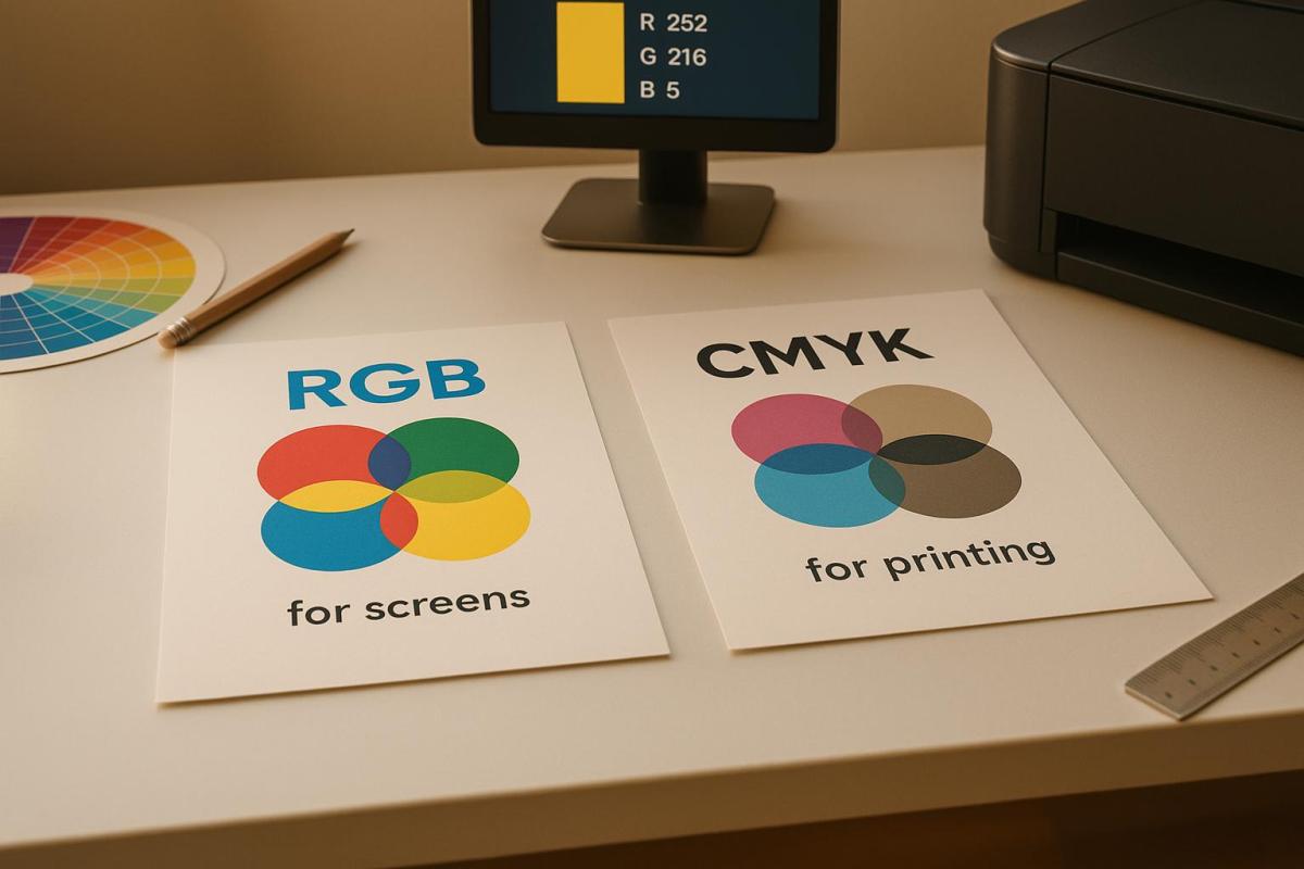
When designing for print, the choice between RGB and CMYK color modes matters. RGB (Red, Green, Blue) is optimized for digital screens, offering brighter and more vibrant colors. CMYK (Cyan, Magenta, Yellow, Key/Black) is specifically used for physical printing, relying on ink to create colors. The key difference? RGB uses light to produce colors, while CMYK subtracts light from white paper using ink.
Here’s what you need to know:
- RGB is best for digital formats like websites, social media, and presentations. It offers a broader color range (16.7 million colors) but isn’t ideal for print.
- CMYK is essential for printed materials like brochures, business cards, and posters. It ensures accurate color reproduction on paper but has a narrower color range than RGB.
- Printing RGB designs without converting them to CMYK can lead to muted or unexpected color shifts.
For the best results:
- Design in RGB for digital projects, then convert to CMYK for print.
- Use professional tools like Adobe Photoshop or Illustrator to manage the conversion.
- Always review a printed proof to ensure colors match your expectations.
If you’re unsure, professional printers like Miro Printing & Graphics Inc. can guide you through the process, ensuring your designs translate perfectly from screen to print.
RGB vs CMYK Color for Printing
What is RGB?
RGB (Red, Green, Blue) is a color model based on light, commonly used for digital displays. This model combines varying intensities of red, green, and blue light to create a wide range of colors. When all three colors are displayed at full intensity, the result is white light. Conversely, when all three are completely off, the display shows black – essentially the absence of light.
How RGB Works
The RGB system operates on a scale from 0 to 255 for each color channel. For instance:
- (255, 0, 0) represents pure red.
- (0, 255, 0) represents pure green.
- (0, 0, 255) represents pure blue.
When you max out all three channels – (255, 255, 255) – you get white, while setting them all to zero – (0, 0, 0) – results in black. This configuration allows for approximately 16.7 million possible color combinations, making it far more versatile than most print color systems. This broad range is why RGB is a go-to choice for digital applications.
Where RGB is Used
RGB is the standard for anything viewed on a screen. This includes websites, social media graphics, digital ads, television, video content, presentations, and mobile apps. While primarily digital, some printers – such as those at Miro Printing & Graphics Inc. – can accept RGB files and convert them to CMYK for printing. However, slight color variations may occur during this process. Up next, we’ll dive into CMYK, the preferred color model for print.
What is CMYK?
CMYK stands for Cyan, Magenta, Yellow, and Key (Black) – the four primary inks used in commercial printing. Unlike the RGB color model, which creates colors by adding light, CMYK works as a subtractive color model. It creates colors by absorbing light wavelengths on white paper. The "K" represents "Key", referring to black ink, which is crucial for enhancing detail and reducing the total amount of ink used. Without black ink, combining 100% cyan, magenta, and yellow would result in a muddy dark brown, not a true black. This is why black ink is essential for crisp text and strong contrast. Understanding how these inks interact on paper is key to producing high-quality printed images.
How CMYK Works
CMYK operates on a percentage scale for each ink color. For example, a combination like C=20, M=60, Y=0, K=10 specifies how much of each ink is applied. Here’s how it works: cyan absorbs red light, magenta absorbs green light, and yellow absorbs blue light. These inks are layered on white paper, with each layer subtracting more light, creating darker shades.
Unlike RGB, which adds light to create color, CMYK removes light, resulting in a more limited color range. This is why some bright and neon colors you see on screens in RGB can’t be perfectly replicated in print. Printed materials tend to appear less vibrant than their on-screen counterparts due to this subtractive process.
Where CMYK is Used
CMYK is the go-to color model for most printed materials, including brochures, business cards, posters, magazines, product packaging, and even direct-to-garment printing. Commercial printers rely on this model because their equipment is designed to use these four inks, ensuring consistent and accurate color reproduction. Whether you’re working with offset, digital, or large-format printing – like the services offered by companies such as Miro Printing & Graphics Inc. in Hackensack, NJ – CMYK is at the heart of the process. Even if you submit RGB files, printers will convert them to CMYK to ensure the final output matches the intended colors on paper or other materials.
RGB vs. CMYK: Main Differences
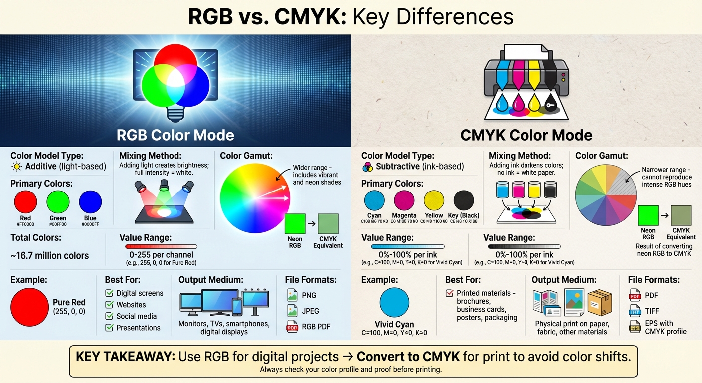
RGB vs CMYK Color Modes Comparison Chart for Print and Digital Design
When it comes to RGB and CMYK, the core distinction lies in how they create color. RGB generates colors by adding light, while CMYK does so by subtracting light. This fundamental difference means RGB can produce vibrant and luminous shades – think neon greens and saturated blues – that CMYK simply can’t replicate.
The color gamut, or the range of colors each system can produce, is significantly broader in RGB. Digital screens, using RGB, can display approximately 16.7 million colors by combining red, green, and blue values ranging from 0 to 255 per channel. CMYK, on the other hand, works with ink percentages (0% to 100%), which inherently limits its color range. This is why a striking electric blue on your monitor may appear muted when printed using CMYK.
RGB is tailored for digital displays – smartphones, monitors, TVs, and digital signage – where light creates the colors you see. CMYK is specifically designed for print materials like brochures, business cards, and posters, where ink absorbs light to create colors on paper or other surfaces. If you use the wrong color mode for your project, you might end up with unexpected color shifts.
Here’s a quick comparison to help clarify the differences:
Comparison Table: RGB vs. CMYK
| Aspect | RGB | CMYK |
|---|---|---|
| Color Model Type | Additive (light-based) | Subtractive (ink-based) |
| Primary Colors | Red, Green, Blue | Cyan, Magenta, Yellow, Key (Black) |
| Mixing Method | Adding light creates brightness; full intensity is white | Adding ink darkens colors; no ink shows as white paper |
| Color Gamut | Wider – includes vibrant and neon shades | Narrower – cannot reproduce some intense RGB hues |
| Typical Uses | Websites, social media, digital ads, presentations | Brochures, business cards, packaging, posters |
| File Preparation | Export as PNG, JPEG, or RGB PDF for digital use | Convert to CMYK; use PDF, TIFF, or EPS for print |
| Output Medium | Digital screens (monitors, TVs, smartphones) | Physical print (paper, fabric, other materials) |
For expert advice on selecting the right color mode, file preparation, or proofing for your project – whether it’s digital, offset, or large-format printing – Miro Printing & Graphics Inc. in Hackensack, NJ, is ready to assist.
sbb-itb-ce53437
When to Use RGB for Printing
RGB is ideal during the early stages of design, especially for projects like logos, social media graphics, or campaigns primarily intended for digital platforms. Why? Because RGB offers a wider range of vibrant colors, giving you the freedom to experiment and visualize how your designs will look on screens, including monitors and mobile devices, before preparing them for print.
Designers often keep their files in RGB when working on projects that span multiple channels – web, social media, email, and print. By staying in RGB, you retain flexibility across both digital and print media until it’s time for the final prepress conversion.
Interestingly, many modern U.S. commercial and digital printers can handle RGB files directly. Their advanced RIP (raster image processor) software is designed to convert RGB into the correct CMYK profile based on their specific presses and paper types. Trusted print shops, like Miro Printing & Graphics Inc. in Hackensack, NJ, often manage this conversion process for you, ensuring consistent results that align with their equipment and materials.
However, printing straight from RGB files without reviewing or converting colors can lead to problems. Colors outside the CMYK gamut – like electric blues or neon greens – might appear muted or dull in print. Automatic conversions can also cause unwanted shifts in skin tones, gradients, and brand colors, potentially leading to reprints, extra proofs, and higher production costs.
To prevent these issues, always convert a copy of your final file to CMYK using the appropriate color profiles. Collaborate with your print provider to discuss target profiles, paper types, and finishing details. This ensures the conversion is tailored to their equipment. Curious about how to make this conversion? The next section will guide you through the steps to achieve the best print results.
When to Use CMYK for Printing
When it comes to professional printing, the CMYK color model – cyan, magenta, yellow, and black – is the gold standard. Unlike RGB, which is based on light emission, CMYK works by subtracting light from white paper. This approach ensures that colors appear as they should when printed, providing consistent and reliable results.
CMYK is a must for professionally printed materials like brochures, business cards, posters, and packaging. It’s especially crucial for projects where color accuracy is non-negotiable, such as logos, corporate branding, and marketing materials. With standardized ink percentages – like 100C 0M 0Y 0K for a vivid cyan – professional printers can achieve consistent color reproduction across different presses and paper types. This level of consistency is key for maintaining a strong and recognizable brand identity.
For example, Miro Printing & Graphics Inc., based in Hackensack, NJ, uses calibrated workflows to ensure artwork is converted to CMYK correctly. They check separations, run proofs, and fine-tune the process to deliver precise color reproduction. This attention to detail not only minimizes costly reprints but also guarantees that printed materials like brochures, signs, and custom packaging meet high professional standards.
One of CMYK’s strengths is the control it offers over ink coverage, shadow details, and midtones. Techniques like halftone screening and custom ink builds allow for accurate reproduction of photographs and intricate artwork. This precision prevents the color shifts that can occur when RGB files are automatically converted to CMYK.
To ensure the best results, start your design in CMYK or convert it before exporting. Use print-ready formats like PDFs with embedded CMYK profiles, and avoid overly bright or neon RGB colors that won’t translate well to print. Always confirm the correct CMYK profile with your printer, provide specific brand colors (such as Pantone or custom builds), and request printed proofs to fine-tune ink densities before full production. These steps will help ensure your final product looks exactly as intended.
How to Convert RGB to CMYK for Printing
Conversion Steps
Converting RGB files to CMYK is essential for ensuring your designs print accurately. Start by saving your files as print-ready PDFs and use high-resolution images (300 ppi) in formats like TIFF or EPS to maintain quality.
If you’re using Adobe Photoshop, open your RGB file and go to Edit → Convert to Profile. Choose a suitable CMYK profile, such as US Web Coated (SWOP) v2, which is commonly used for commercial printing. Use the preview feature to check for any noticeable color changes before saving. In Adobe Illustrator, switch to File → Document Color Mode → CMYK Color. Afterward, carefully inspect elements like logos and gradients to ensure they translate well. Once satisfied, export the file as a print-ready PDF with the CMYK profile embedded.
Selecting the right CMYK profile is also crucial. For instance, coated paper tends to make colors more vibrant, while uncoated paper softens them. To avoid guesswork, consult your print provider – such as Miro Printing & Graphics Inc. – to confirm the recommended CMYK profiles, as well as bleed and trim settings.
It’s important to convert from RGB to CMYK only once. Multiple conversions can degrade color quality, particularly in highly saturated areas. After conversion, review and fine-tune your design in CMYK mode to ensure it’s ready for printing.
Reviewing Proofs and Making Adjustments
After converting your file, reviewing a printed proof is the next essential step. While calibrated monitors can give you a good idea of how colors will look, only a physical proof reveals how inks will behave on paper.
When examining the proof, pay close attention to key details like brand colors, product images, and skin tones to spot any unexpected shifts. Keep an eye out for issues like banding in gradients, loss of shadow details, or grays that appear tinted instead of neutral. Confirm that black areas are deep and rich without losing fine details, and ensure small text is sharp and easy to read.
If the printed proof reveals dull or muddy colors, make targeted adjustments. For example, you can boost saturation in specific areas but avoid oversaturating neutral tones. Experiment with different CMYK builds to correct off-brand colors, and reduce ink levels in shadows to retain detail. Once adjustments are made, request another proof to confirm the changes before proceeding with full production. This step is key to avoiding costly reprints and achieving a final product that stays true to your design.
Conclusion
Understanding the difference between RGB and CMYK is essential when working on print projects. RGB, which uses light to create colors, is perfect for screens, offering a broader range of bright and saturated hues that look amazing digitally. On the other hand, CMYK relies on ink to produce colors on paper, with a narrower color range tailored specifically for physical printing. This explains why the vibrancy you see on a screen doesn’t always translate to print.
For professional printing – whether it’s business cards, brochures, packaging, or large-format signage – CMYK is the go-to standard. It ensures consistent and predictable color results. Sending RGB files to a printer without converting them can lead to unexpected color shifts, so it’s best to switch to CMYK early in the design process to maintain control over how your colors appear in print.
Always design with your final medium in mind: use RGB for digital projects and convert to CMYK for anything that will be printed. To avoid surprises, review a printed proof before finalizing. If you’re unsure about the process, experienced print providers can help.
For professional results, Miro Printing & Graphics Inc. in Hackensack, NJ, offers comprehensive services to handle your CMYK printing needs. From digital and offset printing to large-format projects, their team provides in-house design assistance, binding, and expert guidance on color conversions. They’ll help you choose the right CMYK profiles for your paper and deliver accurate proofs, ensuring your final prints look exactly as you envisioned.
FAQs
Why do printed colors look different from what you see on a screen?
Screens and printers produce colors differently because they operate on distinct color modes. Screens rely on RGB (red, green, blue), which combines light to create vibrant and bright colors. Printers, however, use CMYK (cyan, magenta, yellow, black), a process that subtracts colors from white paper to achieve the desired shades.
The difference in color modes means that CMYK has a narrower color range compared to RGB. As a result, colors that appear vivid on your screen might look muted or altered when printed. To achieve better color accuracy, it’s a good idea to convert your designs to CMYK before sending them to print.
How can I make sure the colors I see on my screen look the same when printed?
To achieve printed colors that closely match what you see on your screen, the first step is to calibrate your monitor. This ensures that the colors displayed are as accurate as possible. When working on print projects, always use the CMYK color mode, as it aligns with how colors are created using ink. Before finalizing your design for printing, make sure to convert it to CMYK to minimize any unexpected color differences. However, remember that slight variations can still occur because screen colors (RGB) rely on light, while printed colors (CMYK) use pigments.
Why should I convert an RGB file to CMYK before printing?
When you print an RGB file without converting it to CMYK, the colors can end up looking different than what you see on your screen. Why? RGB is designed for digital screens and uses a broader range of colors, while CMYK is specifically meant for printing. This means certain bright or vibrant shades in RGB might lose their intensity or appear muted when printed.
To avoid surprises and get your printed materials to look as close as possible to your original design, make sure to convert your files to CMYK before sending them to print.
Related Blog Posts
- CMYK vs RGB: Printing Color Models
- Prepress Checklist for Print-Ready Files
- Common CMYK Color Issues in Printing
- RGB vs. CMYK: Color Conversion Tips
https://app.seobotai.com/banner/banner.js?id=693f9955df12e5e3fea8dfa8
