Die-cutting transforms flat designs into unique shapes like folders, boxes, or tags. To ensure precision and avoid errors, proper file preparation is essential. Here’s what you need to know:
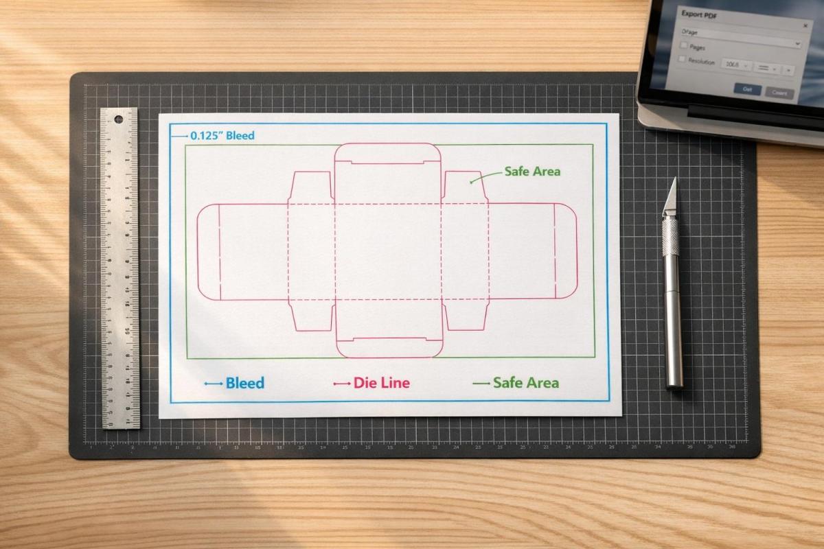
- Die Lines: These vector guides indicate where cuts, folds, and perforations occur. Use high-contrast spot colors (e.g., 100% Magenta) and set strokes to "Overprint" to prevent gaps.
- Document Setup: Add a 0.125-inch bleed and maintain safe margins of at least 0.125 inches for key content like text or logos.
- Vector Paths: Always create die lines as vector paths in software like Adobe Illustrator. Keep them on a separate, locked layer labeled clearly (e.g., "Die Lines").
- Exporting: Save your file as a print-ready PDF with CMYK color mode, 300 dpi resolution, and outlined text. Double-check settings in Adobe Acrobat to ensure accuracy.
Mistakes like missing bleeds or incorrect die lines can disrupt production. Following these steps ensures your design translates perfectly to the final product.
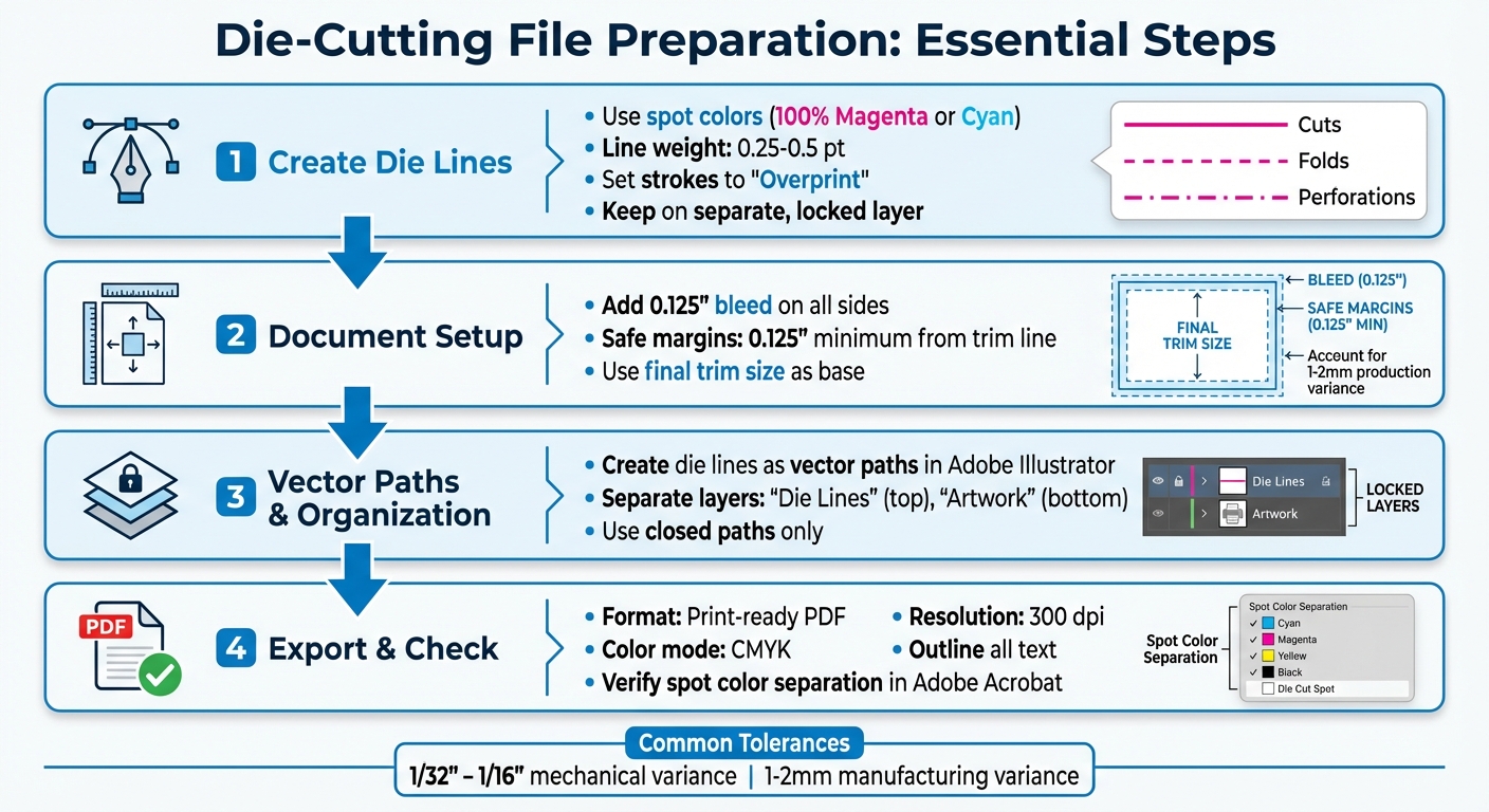
Die-Cutting File Preparation Checklist: 4-Step Process for Print-Ready Files
Die Lines and Why They Matter
What Are Die Lines?
Think of a die line as a blueprint for your design – a vector guide that shows exactly where cuts, folds, and perforations will happen. It’s what turns a flat, printed sheet into a finished product with your desired shape or structure. This is especially crucial for intricate designs involving curves or internal cutouts, as precision is key.
"A dieline is the art file that shows where cuts, perforations and folds need to be made. This dieline is a vector object that should be delivered to your printer in your art files." – Adam Fox, Solutions Analyst, Suttle-Straus
Die lines serve as the template for creating physical dies. These dies use sharp blades for clean cuts, dull blades for scoring, and blades with small nicks for perforations. By following the die line, every detail of your design can be executed with precision.
On top of the basics, ensuring proper color separation is another step that guarantees production accuracy.
Using Spot Colors for Die Lines
Spot colors are essential for keeping die lines separate from the rest of your design. Assign specific spot color swatches, such as "Die Cut", "Score", or "Perf", to clearly indicate finishing instructions. High-contrast colors like 100% Magenta or Cyan are great choices because they stay visible during proofing.
"Creating a spot color in the file that is titled with the name of the operation (die cut, score, or perf) is the ideal way to start. That way when the file is processed, the spot color will stand out from the rest of the design." – Adam Fox, Solutions Analyst, Suttle-Straus
You can also use different line styles to make instructions crystal clear: solid lines for cuts, dashed lines for folds, and dot-dash lines for perforations.
Line Weight and Overprint Settings
For die lines to be effective, their weight should fall between 0.25 pt and 0.5 pt – thick enough to be visible but not overwhelming. Set the die line strokes to "Overprint" to avoid knockout gaps, which ensures the print remains seamless despite the typical 1–2 mm production variance.
Always create die lines as vector paths using software like Adobe Illustrator. Cutting machines rely on the mathematical precision of vectors, something raster images simply can’t provide.
How to prepare a PDF file with a die-cut line for printing
Setting Up Your Document
Getting your document setup right is the backbone of successful die cutting. Every detail, from dimensions to margins, plays a role in ensuring your design aligns perfectly with production standards and delivers high-quality results.
Document Size and Bleed Requirements
Start by setting your document to the final trim size. For example, if you’re designing an 8.5" x 11" brochure, that’s your base canvas. Then, add a bleed of 0.125 inches on all sides. This extra space ensures there are no unwanted white edges if the cut shifts slightly during production.
In Photoshop, increase the canvas size by 0.25 inches overall to account for the bleed. Most printing processes have a mechanical tolerance of 1/32" to 1/16", with some manufacturers noting a variance of 1–2 mm. The bleed compensates for these natural shifts, keeping your design intact.
Once the bleed is set, establish safe margins to protect key design elements.
Safe Margins for Important Content
Always keep essential content – like text, logos, and key graphics – at least 0.125 inches inside the trim line. This "safe zone" ensures your important elements remain intact, even with slight cutting variances.
"Any text that extends beyond this margin will fall outside the mechanical tolerances of our paper-cutting equipment and may get cut off inadvertently." – ProPrint Digital
In Adobe Illustrator, you can add guides 1/8 inch inside the trim line to mark this safe zone visually. If your design includes borders, leave at least 0.25 inches of white space between the trim line and the border. For designs with folds, maintain a 1/8-inch margin on both sides of each fold line to prevent text from being obscured by the crease.
Using Vector Formats for Die Lines
Once your dimensions and margins are set, focus on creating die lines using vector formats. Vectors are resolution-independent, meaning they provide the precision needed for cutting equipment to follow exact paths, regardless of size.
Use Adobe Illustrator’s vector tools to draw die lines. Stick to line weights between 0.25 pt and 0.5 pt – thick enough to be recognized by prepress software but not so thick they cause confusion. Always place die lines on a separate, locked layer labeled clearly as "Die Lines" or "CUT" to differentiate them from your CMYK artwork. This ensures they don’t accidentally print while still serving as a precise guide for cutting equipment.
sbb-itb-ce53437
Creating Die Lines in Adobe Illustrator
Once your document is set up correctly, it’s time to create the die lines that will guide the cutting process. Adobe Illustrator’s vector tools are perfect for this task, offering precision and ease when you follow these steps.
Creating Spot Swatches for Die Cuts
Start by opening the Swatches panel (Window > Swatches). Click on "New Swatch" and give it a name, like Die Cut. Set the Color Type to Spot Color – this ensures it’s recognized as a finishing instruction. Choose a bright, high-contrast color, such as 100% Magenta or Cyan, to make it stand out. Ensure this color isn’t used anywhere else in your design. Set the Color Mode to CMYK and apply this spot color to the stroke of your die line.
Next, open the Attributes panel (Window > Attributes) and check the Overprint Stroke box. This step helps avoid unwanted white gaps caused by slight registration shifts during production.
Drawing Die Lines with the Pen Tool
With your spot swatch ready, switch to the dedicated die line layer. Use the Pen Tool to draw a fully closed vector path that outlines the final shape of your product. Set the stroke weight to 1 pt, which is the standard for digital die-cutting paths.
Different line styles communicate specific instructions:
- Solid lines: Indicate cuts.
- Dashed lines: Represent valley folds or creases.
- Dot-dash lines: Mark mountain folds.
For smoother results, use rounded corners and joins to avoid jagged edges. You can refine your paths using the Direct Selection Tool or the Simplify command (Object > Path > Simplify) to reduce unnecessary anchor points. Always ensure your paths are completely closed – open paths can cause errors in cutting software.
Organizing Layers for Die Lines and Artwork
Once your die lines are complete, organize your layers to keep everything clear. Place the die line layer above your CMYK artwork and label it Die Line. Use separate layers for your main artwork, labeled Artwork. If your project includes additional finishing processes, create individual layers for each, such as FOIL, EMBOSS, SCORE, or PERF.
Finally, lock your layers to prevent accidental changes. When everything is ready, export your design as a print-ready PDF to ensure smooth production.
Exporting and Checking Your File
Exporting as a Print-Ready PDF
To prepare your design for professional printing, export it as an Adobe PDF that maintains vector quality and supports printing workflows. In Adobe Illustrator, navigate to File > Save As and choose Adobe PDF as the format. Make sure your color mode is set to CMYK unless you’re working with specific Pantone colors. Set all raster effects and images to a resolution of 300 dpi. Add a 0.125-inch bleed on all sides to avoid unwanted white borders after trimming. Convert all text into outlines by selecting Type > Create Outlines, and remove any embedded color profiles.
"All designs need to be exported as PDF… This essential step makes sure that any color or image reaching the edge of your design extends past the trim area, eliminating the risk of unsightly white borders when the edges are cut and trimmed off." – Susan Han, CEO, QinPrinting
Once exported, open the file in Adobe Acrobat to double-check that all settings are accurate.
Checking the File for Errors
After exporting your PDF, it’s time to verify its accuracy. Open the file in Adobe Acrobat Pro and go to Print Production > Output Preview. Check the Separations list to confirm that your spot color (e.g., "Die Cut") is listed as a separate plate. To ensure overprint settings are correct, toggle the spot color plate off. If the underlying artwork remains visible without gaps or knockouts, your overprint setup is working as intended.
Run a preflight check to catch any technical issues, such as open paths, duplicates, or overlapping elements that might disrupt the cutting process. Finally, inspect the bleed area and confirm that all critical content is positioned at least 0.125 inches inside the die line to account for mechanical tolerances.
Creating a Die-Only File (If Needed)
Some print shops may request two separate PDFs: one with the full artwork and die lines, and a second "die-only" file containing just the cutting paths. Creating this die-only file is straightforward. Hide or delete the artwork layer, leaving only the die line layer visible against a white background. Export this as a separate PDF, ensuring you use clear file names like "Project_Print.pdf" and "Project_DieLine.pdf" to avoid confusion. This additional file acts as a precise guide for the die-maker, reducing the risk of production errors.
Final Tips for Die-Cut File Preparation
To ensure precision in your die-cut projects, always use vector paths for your die lines. Rasterized or pixelated edges can’t be read accurately by cutting equipment, which could lead to errors. Keep your die lines on a separate, clearly labeled layer – something like "Die Lines" or "DO NOT PRINT" works well. This prevents them from merging with your CMYK artwork. Assign a dedicated spot color to these lines and set them to overprint in your attributes panel to maintain the integrity of your design.
When creating die lines, don’t forget to account for production variances. Mechanical tolerances of 1/32" to 1/16" and manufacturing variances of 1 mm to 2 mm are common in the die-cutting process. Make sure your design includes safe margins, and verify that all background elements extend fully into the bleed area to avoid any unwanted gaps or white edges.
Before submitting your files, take an extra step to check your work in Adobe Acrobat Pro. Use the Print Production > Output Preview tool to confirm that your spot color shows up as a separate plate and that overprint is correctly applied.
Mistakes like missing bleeds, misplaced text, or active die lines in the final prepress PDF are frequent culprits behind failed die-cut projects. Avoid these by double-checking every detail.
For more complex designs, such as packaging or structural layouts, it’s a smart move to request a 1:1 mockup or CAD sample before moving into mass production. This helps confirm that everything fits and folds as intended. Finally, consider teaming up with a professional print shop like Miro Printing & Graphics Inc.. They can provide expert prepress reviews, structural templates, and advice on material tolerances, saving you from unexpected costs and delays.
FAQs
What mistakes should I avoid when preparing files for die-cutting?
When preparing files for die-cutting, there are a few key things to keep in mind to avoid common pitfalls. First, always work with vector file formats like AI, EPS, or SVG. Unlike raster files such as JPG or PNG, vector formats provide the precision needed for clean and accurate cutting. Be sure to designate your cut lines using a distinct spot color (like magenta), set to a 0.25 pt stroke, and place them on a separate, clearly labeled layer.
It’s also important to include a bleed area by extending your artwork 0.125 in to 0.25 in beyond the cut line. This ensures there are no unwanted white edges after cutting. At the same time, keep critical design elements well away from the edges to prevent accidental trimming. When you’re ready to finalize, export your file as a PDF with bleed and spot colors intact.
To avoid surprises, consider running a test cut on your material to confirm everything is aligned perfectly. If you’re feeling uncertain, Miro Printing & Graphics Inc. offers services to review your files, verify proper setup, and even perform test cuts to guarantee your project turns out just right.
How do I properly set up my files for die-cutting?
To get your files ready for die-cutting, here’s what you need to do:
- Set up a dedicated layer for cut lines: In a vector editing program like Adobe Illustrator, create a separate layer specifically for cut lines. Give it a clear name, such as "CUT LINES", to avoid confusion.
- Use closed paths and a spot color: Outline each cut shape using closed paths with a stroke weight of 0.25 pt and no fill. Choose a bright spot color like magenta or green for the stroke and label it "CUT."
- Include bleed and safe margins: Extend your artwork 0.125 in beyond the cut line to account for bleed. Keep key elements at least 0.125 in inside the cut line to prevent them from being trimmed.
- Export a print-ready PDF: Save your file as a PDF using settings like PDF/X-1a or PDF/X-4. Make sure to include bleed, crop marks, and preserve the spot color.
When submitting to your printer, provide two PDFs: one showing only the cut lines and another with the full artwork but without the cut lines. This ensures accurate production and avoids any issues during die-cutting at Miro Printing & Graphics Inc.
Why should I use vector paths instead of raster images for die-cut lines?
Using vector paths guarantees that your die-cut lines are sharp, scalable, and maintain their resolution no matter the size. This precision is crucial for die-cutting machines to accurately follow the design. On the other hand, raster images, made up of pixels, can lead to blurry or jagged edges when resized or processed by the machine.
By relying on vector paths, you ensure your design is executed with clean, exact lines, minimizing the risk of errors or misalignment during the cutting process. This approach delivers professional, polished results that stay true to your original vision.
Related Blog Posts
- How to Set Up Files for Die-Cutting
- How to Create Die-Cut Templates for Printing
- How to Prepare Files for Die-Cutting and Laser Cutting
- Ultimate Guide to Die-Cut Design Software
https://app.seobotai.com/banner/banner.js?id=696ecb730a871bef4add3c4e
