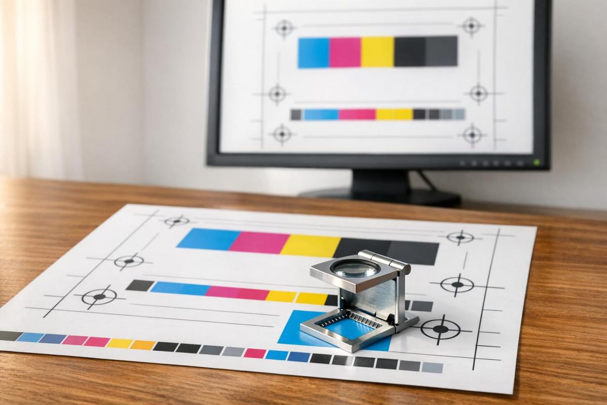
Printing mistakes can ruin your project and cost you time and money. Avoid this by understanding the most frequent CMYK proofing errors and how to fix them. Here’s what you need to know:
- RGB vs. CMYK: Designing in RGB leads to dull, inaccurate colors in print. Always start in CMYK mode.
- Monitor Calibration: An uncalibrated monitor distorts colors. Use a hardware colorimeter to match screen and print colors.
- Resolution Issues: Low-resolution images (<300 DPI) result in blurry prints. Use high-resolution assets from the start.
- Gamut Warnings: Ignoring out-of-gamut colors creates muted or inaccurate tones. Use soft-proofing tools to adjust colors.
- Skipping Proofs: Bypassing soft or physical proofs risks errors like misaligned bleeds, truncated text, or color shifts.
How to Make Artwork Proof Sheets in InDesign and Why It’s a Good Idea
Working in RGB Instead of CMYK Mode
A common mistake in print design happens before the creative process even begins: working in RGB instead of CMYK. Many designers stick with RGB (Red, Green, Blue) because it’s the default in most software. But while RGB is perfect for screens, it’s not suited for print. CMYK (Cyan, Magenta, Yellow, Key/Black) is the color mode designed for printed materials. Since these two systems handle colors differently, converting from RGB to CMYK often leads to noticeable color inconsistencies.
Here’s why this happens and how to avoid it.
How RGB to CMYK Conversion Alters Colors
RGB operates on an additive color model – it creates colors by combining light, with all three channels at full intensity producing white. CMYK, on the other hand, uses a subtractive model, layering pigments on white paper to block light. The problem? RGB has a broader color range, or gamut, than CMYK can physically replicate with ink.
"The ‘gamut,’ or range, of colors in the RGB (light-based, additive) spectrum far exceeds the gamut of the CMYK color space. In fact, some colors in the RGB model will never be achieved with CMYK printing colors alone." – Printingforless
When you convert an RGB file to CMYK, the software compresses the vibrant RGB colors into CMYK’s smaller gamut. This process, known as gamut clipping, often dulls or shifts colors. For example, navy blue might lean toward purple or gray, neon green could lose its vibrancy, and bright orange may appear muddy. Metallic shades like silver and gold also tend to lose their luster, printing as flat gray or brownish tones. Overall, the printed version will likely look darker and less vibrant than the on-screen design.
Starting in CMYK Mode
The best way to avoid these issues is to set your document to CMYK from the very beginning. In Adobe programs, go to File > Document Color Mode > CMYK and apply the appropriate ICC profile for your project. For example:
- GRACoL: Ideal for sheetfed printing (brochures, custom projects).
- SWOP: Commonly used for web press printing (magazines).
If you’re working in Adobe InDesign, selecting "Print" as your document intent automatically sets the workspace to CMYK, reducing the risk of unexpected color changes during export. Don’t forget to convert all high-resolution images to CMYK at 300 DPI with embedded color profiles before placing them into your layout.
Using Soft-Proofing Tools to Preview Colors
Even when designing in CMYK, soft-proofing tools can help you visualize how your colors will appear in print. In Adobe Photoshop or Illustrator, enable "Proof Colors" (View > Proof Colors, or press Ctrl+Y on Windows, Cmd+Y on Mac) to see a CMYK preview without permanently converting your file.
Soft-proofing can also highlight "out-of-gamut" colors – those vibrant RGB tones that CMYK inks can’t reproduce. To identify these, turn on gamut warnings (View > Gamut Warning), which will mark problematic colors. You can then use an HSL (Hue, Saturation, Lightness) adjustment layer to tweak hues and bring them within the printable range. Additionally, enabling "Black Point Compensation" in your proof setup ensures shadow details remain clear and don’t become overly dark or muddy.
Overlooking Gamut Warnings and Out-of-Gamut Colors
Even when working in CMYK mode, certain colors can exceed the printable range. Gamut warnings – available in design tools like Adobe Photoshop and Lightroom – serve as visual alerts for these unprintable colors. Ignoring them is a common yet avoidable error in CMYK proofing. Let’s break down what these warnings mean and how to address them effectively.
What Gamut Warnings Indicate
Gamut warnings highlight colors that a printer cannot reproduce accurately, often resulting in tones that look muted or dull in the final print.
"Programs like Lightroom and Photoshop… provide you gamut warnings that show you if certain tones in your soft proof preview may run into limitations. In other words, the printer might or might not be able to achieve those tones." – James Theopistos, FinerWorks
Designer Bogdan Sandu adds, "Many vibrant screen colors simply can’t be reproduced in print, particularly bright blues and saturated magentas." Tackling these issues early can save you from disappointing outcomes.
Adjusting Colors for CMYK Printing
Soft-proofing tools are your first line of defense for spotting out-of-gamut colors. Once identified, you can manually tweak these colors. A common approach is to use an HSL adjustment layer to lower saturation until the gamut warning disappears. If desaturation makes the color appear too muted, consider shifting the hue slightly toward a nearby shade that falls within the CMYK range.
For colors integral to your brand identity – like a specific neon green or metallic gold – using a Pantone spot color can be a better solution. This involves adding a fifth ink to the printing process, ensuring precise reproduction of those critical colors.
Using Printer ICC Profiles for Soft Proofing
Once your manual adjustments are complete, it’s essential to ensure your soft-proofing setup aligns with your printing conditions. Gamut warnings are most accurate when paired with the correct ICC profile for your printer and paper type. For instance, uncoated paper absorbs more ink than coated stock, limiting the range of printable colors.
In Adobe programs, you can access soft-proofing via View > Proof Setup > Custom and select the appropriate ICC profile, such as GRACoL for coated paper or U.S. Web Uncoated v2 for uncoated materials. Enabling options like "Simulate Paper Color" and "Black Point Compensation" helps account for the paper’s texture and contrast.
For further refinement, Adobe Acrobat Pro offers the Output Preview tool under Print Production, allowing you to check for gamut issues using your simulation profile. When setting the rendering intent, "Relative Colorimetric" is generally ideal for preserving in-gamut colors while clipping those outside the range. For photographs, the "Perceptual" rendering intent often works better, as it adjusts all colors proportionally to maintain their visual harmony.
Poor Monitor Calibration and Color Profiles
When your monitor isn’t properly calibrated, the colors you see on-screen may not match what appears in print. This happens because an uncalibrated display can distort white and black levels, leading to prints that look too dark, washed out, or have unexpected color shifts compared to your digital design. One of the biggest culprits? Brightness. Consumer monitors are often set to brightness levels above 200 cd/m², but print-matching standards recommend a much lower range – between 80 and 120 cd/m². This mismatch is why a design that looks vibrant on your monitor might appear dull and muddy when printed.
"If your prints are too dark, your monitor is too bright." – D Fosse, Community Expert, Adobe
Another issue is excessive contrast on monitors, which can mislead your perception of colors and make it harder to predict how your work will translate to print. Designer Bogdan Sandu sums it up perfectly:
"Without calibration, you’re essentially designing blindfolded, hoping colors will somehow translate correctly from the digital world to physical media"
Even environmental factors, like bright walls, direct sunlight, or colored ambient lighting, can affect how you perceive colors – yes, even on a calibrated display. To avoid these pitfalls, you’ll need to take specific steps to align your screen with print standards.
Calibrating Your Monitor for Accurate Previews
Relying on your computer’s built-in calibration tools won’t cut it. For precise results, invest in a hardware colorimeter like the Datacolor Spyder or Calibrite ColorChecker. These devices, which cost around $100 to $160, measure your monitor’s color output and create a custom ICC profile tailored to your display.
Before starting calibration, let your monitor warm up for at least 30 minutes to stabilize the backlight. Then, adjust your settings to these targets:
| Setting | Target Value | Purpose |
|---|---|---|
| Gamma | 2.2 | Ensures standard contrast for photography |
| White Point | D65 (6500K) or D50 (5000K) | Sets color temperature; D50 aligns better with paper white |
| Luminance | 80–120 cd/m² | Matches screen brightness to paper’s reflective properties |
One important note: don’t rely on physical test prints to adjust your monitor. Only a hardware device can provide the accurate measurements needed to create a reliable ICC profile. Once calibrated, make sure to integrate these settings into your design software to maintain consistency.
Applying Standard Color Profiles
A calibrated monitor is just the first step. To ensure your designs print as expected, you’ll also need to use the correct color profiles in your software. Adobe Bridge can help synchronize color settings across Photoshop, Illustrator, and InDesign – selecting "U.S. Prepress Defaults" ensures consistency. For soft-proofing, load the ICC profile specific to your printer and paper type via Adobe’s Proof Setup (View > Proof Setup > Custom).
For commercial printing in North America, GRACoL profiles are the standard for sheetfed offset printing, while SWOP 3 or SWOP 5 profiles are better suited for high-volume web press jobs like magazines. In Europe, FOGRA profiles are commonly used. These profiles bridge the gap between your monitor and the printing press, ensuring colors translate accurately.
Maintaining Calibration Settings Over Time
Monitor performance changes over time. LCD backlights, for instance, dim by about 10% to 15% each year, which can lead to gradual color drift. To keep your monitor accurate, recalibrate regularly – weekly for professional studios, monthly for design agencies, and every two to four weeks for freelancers.
"Calibration isn’t about perfection, it’s about consistency." – Marketing Admin, American Color Imaging
To preserve your calibration settings, disable features like auto-brightness, blue light filters, and dynamic contrast modes. Work in a dimly lit environment with neutral gray walls to minimize reflections and maintain color accuracy. And even with a perfectly calibrated monitor, always use soft-proofing tools to preview how your chosen ink and paper will affect the final CMYK output.
Bypassing Soft-Proofing and Physical Proofs
Skipping proofing steps during CMYK printing can lead to some of the most expensive mistakes in the process. The differences between digital colors and printed results are significant – prints tend to appear darker and less vibrant. Without proofing, you risk errors like misaligned bleeds, cut lines, low-resolution images (what looks sharp at 72 DPI on a screen can appear blurry in print), and shadow detail loss from excessive ink coverage [7, 15]. For large print runs, such mistakes can waste materials, time, and even harm your professional reputation if the final product falls short.
This highlights why both digital and physical proofing are essential.
Benefits of Soft-Proofing
Soft-proofing offers a digital preview of how your design will look when printed on a specific printer and paper type. By using ICC profiles, it accounts for factors like paper whiteness and CMYK’s limited color range [13, 24]. Programs like Adobe Photoshop or Acrobat allow you to enable options such as "Simulate Paper Color" and "Simulate Black Ink." These settings adjust your monitor’s display to mimic the contrast and saturation limitations of the final print [15, 24].
"Soft proofing is a way to help minimize these differences beforehand because it gives you an accurate representation on your screen before you even print." – James Theopistos, FinerWorks
Another handy feature of soft-proofing is the use of gamut warnings. These alerts highlight colors that can’t be reproduced in print, giving you the chance to make adjustments early in the process. This saves time and avoids the delays of waiting for physical samples.
Ordering Printed Proofs
While soft-proofing catches many potential issues, only a printed proof can confirm how ink interacts with the paper. Physical proofs allow you to evaluate the texture and appearance of the paper stock – something digital screens simply can’t replicate [7, 11]. For projects where color accuracy is critical or for large-scale print runs, a physical proof ensures details like ink registration, bleed lines, and transparency flattening are handled correctly.
"The only way to absolutely guarantee color replication is to get a hard copy proof so you can double check colors against any swatches you’re using." – PsPrint
Printed proofs also help identify technical problems that soft-proofing might miss, such as incorrect pagination in booklets or missing elements caused by unflattened transparencies. While soft-proofing flags issues like unprintable colors, only a physical proof can verify whether your file meets the required 300 DPI for sharp print quality – images downloaded at 72 DPI will look blurry in print. Spending a little on a proof print is a small price compared to the cost of reprinting an entire job.
Comparing Proofs to Final Output
Once you have a physical proof, let it dry for 24 hours before reviewing it. This drying time allows the ink to settle, stabilizing the colors. To ensure accuracy, compare the proof to your digital file under standardized lighting conditions. Use D50 (5000K) lighting with a Color Rendering Index (CRI) of at least 90 to avoid issues like metamerism, where colors can appear differently under various light sources [4, 23]. If precision is vital, you can measure color differences using Delta E values – anything above 5 indicates noticeable shifts between the proof and the final print.
Additionally, check that your proof adheres to the Total Area Coverage (TAC) limits: 300–340% for coated paper, 280–300% for uncoated paper, and 240–260% for newsprint. Exceeding these limits can result in muddy or washed-out shadow details. If you notice any problems, adjust your file and order another proof before committing to the full print run. Combining soft-proofing for initial adjustments with hard-proofing for final checks ensures consistency and avoids costly errors [4, 24].
sbb-itb-ce53437
Environmental Factors and Press Control Issues
Even if your digital files are flawless, the printing environment itself can throw unexpected challenges your way. Things like temperature changes, humidity levels, and poorly maintained equipment can all impact color accuracy and print quality. These factors highlight the need to focus not just on digital preparation but also on controlling the physical environment where printing happens.
Controlling Temperature and Humidity
The climate in your print shop plays a huge role in how ink behaves and how paper holds up. Ideally, you want to maintain a temperature of 70°F ± 10°F (21°C ± 5°C) and keep relative humidity between 40% and 60%, or even more precisely, 45% to 55% for digital printing. If humidity gets too high, paper can absorb moisture, leading to curling, wrinkling, ink smudging, and poor toner adhesion. On the other hand, air that’s too dry – below 40% humidity – can make paper brittle, cause static electricity (making sheets stick together), and result in ink drying too quickly for proper adhesion.
"Changes in temperature and humidity can negatively affect the viscosity or thickness of the ink as it’s laid down on the substrate. In turn, this can negatively affect your color reproduction." – Shelby Sapusek, Color Management Consultant, ColorCasters, LLC
To keep things stable, let your paper acclimate to the room by leaving it in the printing area for several hours before use. Use tools like a hygrometer or smart sensors (e.g., SensorPush) to monitor conditions in real time. Also, place printers away from heat sources or doors that are frequently opened, as sudden temperature changes can cause condensation on both equipment and paper, potentially damaging your prints.
Maintaining Press Equipment
Even with perfect files and a controlled environment, equipment precision is key. Proper press maintenance ensures that CMYK colors align correctly. If your press is out of registration, even the best-prepared files will produce blurry images or fuzzy text. Press shafts and cutting tools have their own error tolerances, and without regular maintenance, you might see uneven borders or design elements cut off entirely.
For sharp black text, always set it to 100% K (black only) instead of mixing CMYK inks. Regularly check press alignment to make sure everything stays in proper registration. Additionally, review preflight reports from your print provider to catch potential issues, especially with complex layers or transparency during the Raster Image Processing (RIP) stage.
Selecting Consistent Paper Stock
Switching paper types mid-project can lead to unexpected color shifts. For example, uncoated papers typically experience 30–40% dot gain, while coated papers show a lower dot gain of 15–25%. This variance affects how ink spreads on the paper, which can lead to muddy midtones or washed-out shadows if not properly managed.
Store your paper in a climate-controlled space to avoid warping or moisture absorption. Always ensure that your proofing paper matches the final production stock in terms of weight, finish, and opacity. If the proofing paper differs, the final output may not match your expectations. Coated papers keep ink on the surface for brighter, more vibrant colors, while uncoated papers absorb ink, giving a softer, more muted look. Adjust your RIP settings to account for the specific thickness and coating of your paper stock to maintain consistent results throughout the print run.
Quick Reference: Common CMYK Proofing Errors and Fixes
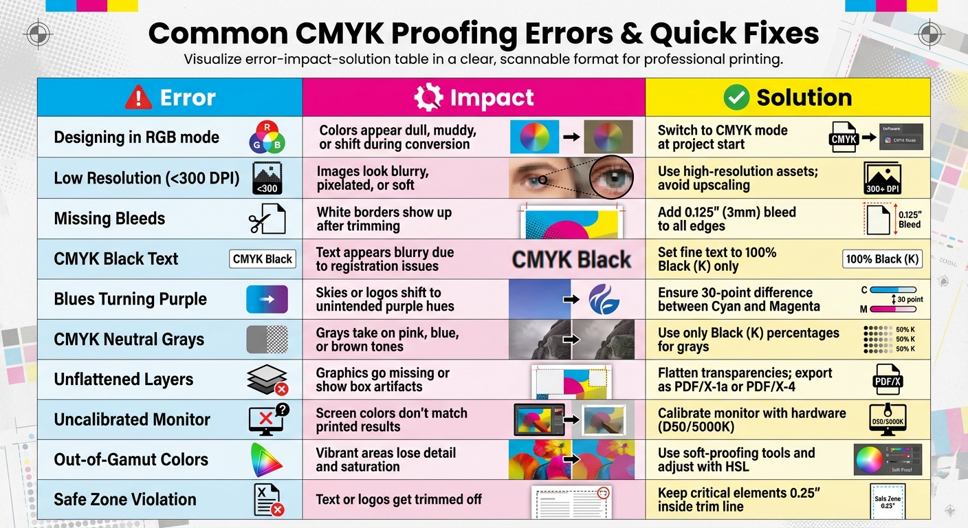
Common CMYK Proofing Errors and Quick Fixes Reference Guide
When working on a project, this quick reference can help you troubleshoot efficiently. The table below outlines common CMYK proofing errors, how they can affect your final print, and quick solutions to address them.
Error Impact Fix Table
| Common Error | Potential Impact on Final Print | Quick Fix |
|---|---|---|
| Designing in RGB mode | Colors appear dull, muddy, or shift during conversion | Switch to CMYK mode at the start of the project. |
| Low Resolution (<300 DPI) | Images look blurry, pixelated, or "soft" | Use high-resolution assets; avoid upscaling small images. |
| Missing Bleeds | White borders show up after trimming | Add a 0.125" (3mm) bleed to all edges. |
| CMYK Black Text | Text appears blurry due to registration issues | Set fine text to 100% Black (K) only. |
| Blues Turning Purple | Skies or logos shift to unintended purple hues | Ensure at least a 30-point difference between Cyan and Magenta values. |
| CMYK Neutral Grays | Grays take on pink, blue, or brown tones | Use only Black (K) percentages for gray tones. |
| Unflattened Layers | Graphics go missing or show "box" artifacts | Flatten transparencies and export as PDF/X-1a or PDF/X-4. |
| Uncalibrated Monitor | Screen colors don’t match printed results | Calibrate monitor with hardware (D50/5000K white point). |
| Out-of-Gamut Colors | Vibrant areas lose detail and saturation | Use soft-proofing tools and adjust colors with HSL. |
| Safe Zone Violation | Text or logos get trimmed off | Keep critical elements at least 0.25" inside the trim line. |
This table serves as a quick guide to avoid common pitfalls in the proofing process. By addressing these issues early, you can ensure your final print matches your design intentions and avoid unexpected surprises. For more detailed explanations and solutions, refer back to the earlier sections.
CMYK Proofing Services at Miro Printing & Graphics Inc.
At Miro Printing & Graphics Inc. in Hackensack, NJ, precision and consistency are at the heart of their CMYK proofing services. With a solid foundation in color management, they use ICC profiles to ensure digital designs transition seamlessly to print – no matter the substrate or printing method. Whether you’re working on brochures through digital printing or large-format banners, their approach guarantees accurate color reproduction across the board.
For projects where color precision is non-negotiable, Miro offers contract proofs. These hard-copy proofs act as both a formal agreement and a reliable color reference, ensuring the proofing system mirrors the final press results. This is especially critical for brand-specific marketing materials where maintaining exact color fidelity is a must.
Miro also integrates its in-house bindery capabilities into the proofing process. When producing booklets, catalogs, or presentation folders, they carefully manage imposition to ensure pages are in the correct order after folding and binding. This attention to detail prevents issues like text slipping outside safe zones or artwork misaligning during trimming. By combining proofing with finishing, Miro ensures every project meets the highest pre-press standards.
Their pre-press process is meticulous: all files are converted to CMYK, set at a minimum resolution of 300 DPI, and include a 0.125" bleed. These guidelines apply to everything from business cards and door hangers to oversized posters.
With expertise in both digital and offset printing, Miro customizes their proofing solutions to fit your project’s needs and budget. By handling everything in-house – from file review to final binding – they minimize communication gaps and reduce the risk of proofing errors. This full-service approach ensures your project is executed with precision from start to finish.
Conclusion
Mistakes in CMYK proofing can lead to expensive reprints and even jeopardize brand integrity. To avoid these pitfalls, start your designs in CMYK, address gamut warnings promptly, calibrate your monitors, use both digital and physical proofs, and manage environmental factors effectively. These steps help ensure that your on-screen design translates seamlessly to the final printed piece. This approach not only boosts quality but also keeps project budgets on track.
Printing expenses can take up a significant chunk of your budget, making it far more economical to catch errors during prepress. As Allen Glazer, a seasoned expert in high-volume print production, wisely notes:
"If you don’t catch a mistake in prepress, it will be much more costly to fix down the line".
For professional results, stick to 300 DPI resolution, include 0.125" bleeds, and use vector text whenever possible. Physical proofs remain invaluable for ensuring precise ink-to-paper accuracy, especially for projects where color fidelity is non-negotiable.
FAQs
How can I make sure my monitor shows colors accurately for printing?
To make sure your monitor shows colors accurately for printing, start by using a hardware calibration tool like the X-Rite i1Display Pro or Datacolor SpyderX. Calibration aligns your monitor’s color output with a standard profile, such as D50 lighting, which mimics the conditions under which prints are typically viewed. This adjustment ensures your screen displays colors closer to the CMYK color space used in printing.
Next, apply ICC profiles tailored to your monitor, printer, and paper type. These profiles help translate digital colors into printed results with greater precision. Combine this step with a color-managed workflow in software like Adobe Photoshop or InDesign to maintain consistency throughout the process. Also, work in a well-lit environment with neutral lighting – daylight-balanced or D50 light is ideal – to see colors more accurately while editing and proofing.
By calibrating your monitor, using ICC profiles, and working under controlled lighting, you can achieve prints that closely match what you see on your screen.
What are the advantages of using soft-proofing tools for CMYK printing?
Soft-proofing tools allow you to preview how colors will appear in the final printed piece. This process helps identify and address potential color problems before production starts, ensuring better color accuracy.
By spotting issues in advance, soft-proofing minimizes the risk of errors, saves time, and cuts down on expensive reprints. It’s a key practice for achieving consistent quality in CMYK printing.
Why should I design in CMYK instead of RGB for print projects?
Designing in CMYK mode right from the beginning is key to ensuring accurate color reproduction for printed materials. Unlike RGB (Red, Green, Blue), which is tailored for digital screens and offers a broader color range, CMYK (Cyan, Magenta, Yellow, and Black) is the standard for printing. If you start your design in RGB and later convert it to CMYK, you might encounter unexpected color shifts or changes.
By working in CMYK from the start, you can get a closer match between the colors on your screen and the final printed piece. This approach reduces the risk of surprises and saves time by cutting down on revisions. It’s a straightforward way to keep your colors consistent and meet professional printing standards.
Related Blog Posts
- Proofing Process: From Screen to Print
- Soft Proofing Techniques for Accurate Colors
- How to Ensure Color Accuracy in Proofing
- Prepress Checklist for Print-Ready Files
https://app.seobotai.com/banner/banner.js?id=69716d250a871bef4ae16ed8
