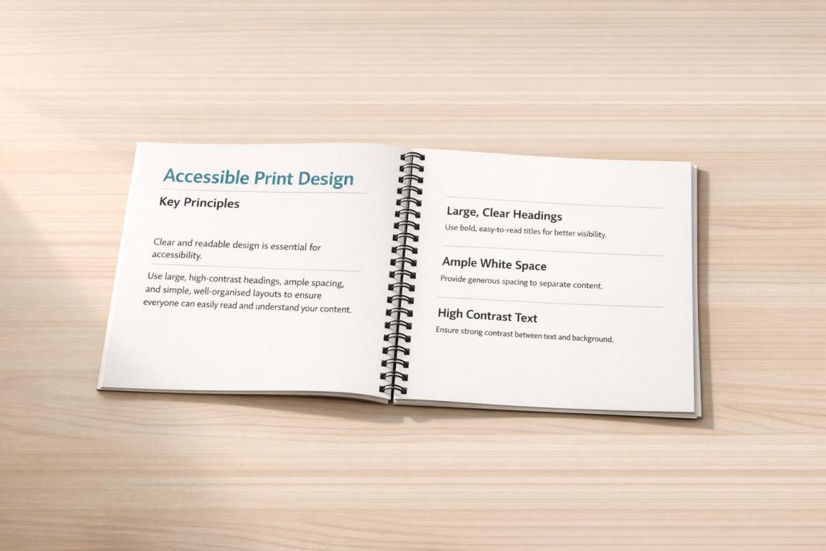
Accessible print design ensures that everyone can effectively read printed materials, regardless of physical or cognitive challenges. It prioritizes features like legibility, clarity, and usability over aesthetics. By following these principles, you can make your designs easier to read for all audiences, including those with visual impairments, dyslexia, or color vision deficiencies.
Key Takeaways:
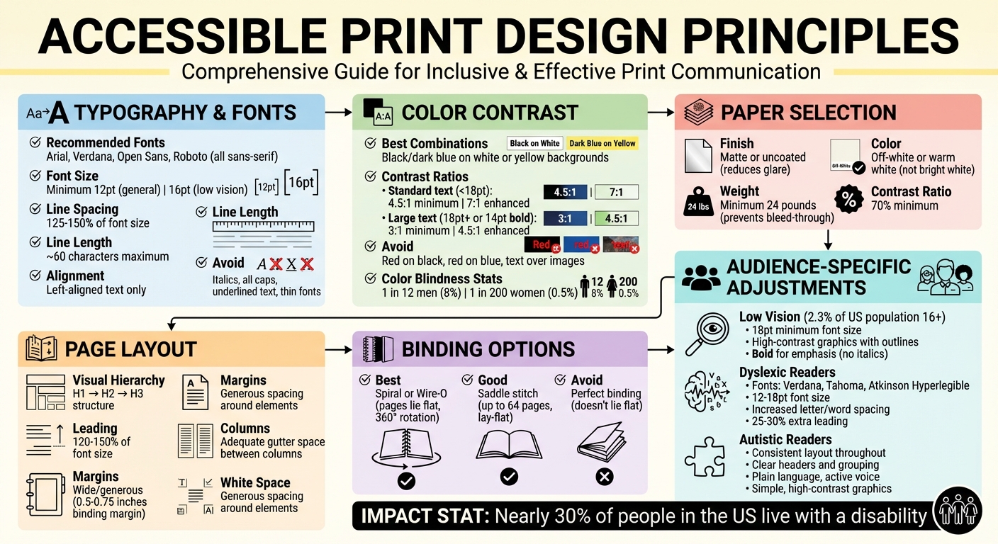
- Typography: Use sans-serif fonts like Arial or Verdana, with a minimum size of 12pt (16pt for low vision).
- Spacing: Ensure generous line spacing (125–150% of font size) and limit line lengths to ~60 characters.
- Contrast: Stick to high-contrast color pairs (e.g., black text on white or yellow backgrounds) and avoid placing text over images.
- Paper: Choose matte or uncoated paper to reduce glare and improve readability.
- Layout: Use left-aligned text, wide margins, and clear visual hierarchy for better navigation.
- Binding: Opt for spiral or Wire-O bindings to allow pages to lie flat, aiding usability.
Accessible design benefits everyone by improving readability and usability. Whether you’re designing for general audiences or specific groups, these adjustments can help ensure your message is clear and inclusive.
Accessible Print Design Guidelines: Typography, Color Contrast, and Layout Best Practices
Accessible Graphic Design Basics: Fonts and Readability
Typography and Font Selection
Typography forms the backbone of accessible print design. The fonts you pick, their sizes, and how they’re spaced all play a major role in how easily readers can absorb your message. Poor typography can make even the simplest content hard to read – even for those without visual impairments. Thoughtful typographic choices, on the other hand, make your content approachable for everyone. These decisions align with the broader principles of accessible design discussed earlier.
Choosing Readable Fonts
For body text, stick with sans-serif fonts like Arial, Verdana, Open Sans, or Roboto. These fonts are clean and easy to read, unlike decorative or script fonts, which can obscure word shapes and slow comprehension. Sans-serif fonts are particularly effective because their clear, distinct characters make word recognition faster.
Medium-weight fonts are ideal for readability. Avoid fonts that are too thin or text written entirely in uppercase, as both can make it harder for the eye to distinguish words. When you need to emphasize something, opt for bold or heavy weights rather than italics.
"The human eye recognizes the shape of words, and a word in all capitals is harder to recognize." – Ministry of Social Development
For headings or chapter titles, display fonts like Helvetica Neue Bold work well, but they shouldn’t be used for body text. If you’re using a less common font, compare its x-height (the height of lowercase letters like "x" or "a") to Arial at the same point size. If the new font appears smaller, increase its size to ensure it remains legible.
Once you’ve chosen the right font, focus on sizing and spacing to further enhance readability.
Font Size and Line Spacing
For general audiences, use a minimum font size of 12pt. If your material is intended for readers with low vision or learning disabilities, bump it up to 16pt. Line spacing is equally important – set it to at least 25–30% of the font size. This ensures that readers can easily move from one line to the next without losing their place.
Aim for line spacing that’s about 1.5 to 2 times the space between words. This creates a clean, structured layout. Keep your line lengths to approximately 60 characters for optimal readability, and always align text to the left. Left alignment prevents uneven spacing and avoids distracting "rivers" of white space running through the text.
"Leading is the space between lines of text and should be at least 25 to 30 percent of the point size. This lets readers move more easily to the next line of text." – Accessibility Hub, York University
Proper sizing and spacing set the stage for clear communication, but avoiding common typography pitfalls is just as important.
Common Typography Mistakes
When aesthetics overshadow function, readability often suffers. Overusing italics can distort the shape of words, making them harder to recognize. Similarly, underlined text and all-capital letters reduce word recognition by turning words into uniform blocks.
Tight character spacing is another common issue – it crowds letters together, making text harder to read. Use generous tracking to prevent this. Avoid placing text over images or patterned backgrounds, as this compromises the contrast needed for legibility.
Thin fonts are another challenge; they lack the contrast needed for clear reading. If you’re using a lighter font, increase its weight or size to improve visibility. Delicate fonts, especially under poor lighting, can fade into the background. Additionally, digital proofs with artificial font smoothing (antialiasing) can reduce contrast by up to 30%. For print-ready files, stick with auto or default smoothing settings.
When choosing typefaces, ensure that numerals are easy to distinguish from letters. Use wide margins and clear paragraph spacing to minimize visual clutter. For maximum readability, stick to black text on white backgrounds. If you decide to use color, limit it to titles or headlines where high contrast can be maintained.
Color Contrast and Readability
When it comes to making printed materials accessible, choosing the right colors plays a key role. Effective color contrast ensures that your text is easy to read, particularly for individuals with visual impairments or color vision deficiencies. The focus should be on luminance contrast – the difference between light and dark values – rather than relying on hue or saturation. Without sufficient contrast, text can blend into the background, creating barriers for readers. Below, we’ll explore high-contrast color combinations, ways to reduce glare, and essential contrast ratio standards to guide your print design.
High-Contrast Color Combinations
For maximum readability, stick to high-contrast color pairs like black or dark blue text on white or yellow backgrounds (or the reverse). These combinations work well for body text, while colored text should be reserved for titles or headlines.
Avoid combinations that lack sufficient contrast, such as red text on a black background. For individuals with protanopia (red-blindness), red can appear up to 55% darker, making it nearly invisible. Similarly, pairing red with blue can create a distracting shimmering effect, known as "chromatic aberration", because these colors focus differently on the retina.
"For people with color vision deficiency who are not able to distinguish certain shades of color, hue and saturation have minimal or no effect on legibility… the inability to distinguish certain shades of color does not negatively affect light-dark contrast perception."
– W3C
Never rely on color alone to convey important information. Use additional design elements like font weight, size, or shapes to make your content accessible to readers with color vision deficiencies. It’s worth noting that approximately 1 in 12 men (8%) and 1 in 200 women (0.5%) experience some form of color vision deficiency.
Reducing Glare and Eye Strain
While high contrast is important, too much contrast – like pure black text on a pure white background – can strain the eyes of some readers, particularly those with Irlen syndrome. To reduce this effect, consider using dark gray text instead of black and opt for off-white or warm white paper rather than bright white.
"Slightly temper the contrast between your text and background color. For example: don’t use pure black text on a pure white background. Stark contrast can result in blurred or moving text for people with Irlen syndrome."
– Digital.gov
The type of paper you use also impacts readability. Matte or uncoated paper reduces light reflection, making it easier to read, while glossy or coated finishes can create glare that’s challenging for readers with visual impairments.
"Using an uncoated paper stock will result in easier reading of both text and images as it reduces the glare of the page when compared to coated or glossy papers."
– Max Graham, Senior Designer at Scope
Additionally, avoid placing text over busy backgrounds, textures, or watermarks. These elements can create visual distractions that reduce perceived contrast and make reading more difficult.
Contrast Ratio Guidelines
To ensure accessibility, follow these contrast ratio standards for text:
| Text Type | WCAG Level AA (Minimum) | WCAG Level AAA (Enhanced) |
|---|---|---|
| Standard Text (under 18pt) | 4.5:1 | 7:1 |
| Large Text (18pt+ or 14pt bold) | 3:1 | 4.5:1 |
The 4.5:1 ratio is designed to accommodate individuals with moderate visual impairments, such as 20/40 vision, while the 7:1 ratio supports those with more severe contrast sensitivity loss, like 20/80 vision. Smaller text or lighter font weights require even higher contrast to remain legible.
"The 4.5:1 ratio is used… to account for the loss in contrast that results from moderately low visual acuity, congenital or acquired color deficiencies, or the loss of contrast sensitivity that typically accompanies aging."
– W3C
Before finalizing your design, test your color choices using tools like the WebAIM Color Contrast Checker or APCA. Always review a printed proof at full size to ensure the design translates well from screen to paper. Testing your design in grayscale is another effective way to confirm that your visual hierarchy is clear, even without color.
Page Layout and Structure
When it comes to presenting information, the way you arrange content on a page is just as important as the colors and typography you choose. A thoughtful layout not only helps readers navigate the page but also enhances their understanding of the material. A well-organized structure naturally guides the reader’s eye, while a cluttered or confusing layout can lead to frustration and disengagement. This organization works in harmony with the typography and color strategies we’ve already discussed.
Creating Clear Visual Hierarchy
A strong visual hierarchy is essential for directing attention to the most important information. Size, weight, and placement play a huge role in establishing this flow. For instance, the most critical elements should stand out by being larger or more prominent. Consistent use of heading structures – like using H1 for main titles, H2 for major sections, and H3 for subsections – makes it easier for readers to scan the page and quickly grasp its purpose before diving into the details.
Consistency is key. Placing headers, page numbers, and navigation markers in predictable locations helps readers orient themselves and find what they’re looking for without unnecessary effort.
Using Margins and Spacing
White space, or the empty space around text and images, is more than just a design choice – it’s a functional necessity. It prevents the page from feeling overcrowded and makes it easier to distinguish between different elements. Generous use of white space, along with wide binding margins, is particularly helpful for readers who use vision aids. Wide margins also ensure that pages can open fully without cutting off text, making the content more accessible.
Another critical factor is line spacing, or leading. For optimal readability, the space between lines should be set to 120% to 150% of the font size. This spacing creates breathing room for the text, reducing visual strain and making it easier to follow.
Text Alignment and Columns
For body text, always use left-aligned text with a ragged right edge. This alignment creates a consistent starting point for the reader’s eye, which is especially important for Western languages that are read left to right. Avoid justified text, as it can create distracting “rivers” of white space – gaps that disrupt the reading flow.
Keep line lengths to around 60 characters. Lines that are too long can make it hard for readers to find the start of the next line, while overly short lines can feel disjointed. If you’re working with wider pages, consider using columns to manage line length. Just make sure there’s enough gutter space (the margin between columns) to keep the text visually separate. Lastly, avoid breaking words with hyphens at the end of lines, as this can disrupt the flow for readers, particularly those with learning disabilities.
| Layout Element | Accessibility Recommendation | Reason |
|---|---|---|
| Text Alignment | Left-aligned, ragged right | Provides a consistent starting point for the eye |
| Line Length | ~60 characters | Makes it easier to track from one line to the next |
| Leading | 120% to 150% of font size | Improves readability by adding sufficient spacing between lines |
| Justification | Avoid | Prevents distracting rivers of white space |
| Margins | Wide/Generous | Reduces visual strain and makes the page easier to navigate |
sbb-itb-ce53437
Paper Selection and Physical Specifications
In creating accessible print designs, the physical qualities of your printed materials are just as crucial as the content itself. Paper type, weight, and binding methods can significantly impact the usability of your design, especially for readers with visual impairments or physical limitations.
Choosing the Right Paper Stock
Using uncoated paper can make a big difference in readability. Max Graham, Senior Designer at Scope, highlights this advantage:
"Using an uncoated paper stock will result in easier reading of both text and images as it reduces the glare of the page when compared to coated or glossy papers."
The color of the paper is equally important. Off-white or warm white paper is generally better than bright white, which can create a harsh contrast. For readers with conditions like Irlen syndrome, bright white paper can make text appear to "move", causing unnecessary strain.
Paper weight also plays a role in accessibility. Heavier paper stock offers better usability, as it allows readers to apply more pressure when turning pages. This is particularly helpful for those who may not use a standard finger-and-thumb grip.
Binding Options That Enhance Usability
Binding methods can greatly influence how easy it is to use a printed document. Spiral and Wire‑O bindings are standout choices because they allow pages to lay completely flat and even rotate 360°. This feature is especially beneficial for readers using magnifiers or those with limited hand mobility. As noted by York University’s Accessibility Hub:
"Flat pages work best for vision aids such as magnifiers."
For shorter documents (up to 64 pages), saddle stitching provides a budget-friendly option that also supports a lay-flat design. Just make sure to include wide binding margins – between 0.5 and 0.75 inches – to prevent text from being obscured.
Perfect binding, commonly used in paperbacks, offers a polished look but has a downside: it doesn’t lie flat. This makes it less practical for readers who may find it difficult to hold a book open for extended periods.
Avoiding Ink Bleed-Through
To maintain clarity in double-sided prints, thicker paper is essential. Thicker stock prevents ink from showing through to the other side, which can disrupt readability.
Opt for smooth, dull-finish paper with a weight of at least 24 pounds to avoid ink bleed-through. Additionally, aim for a 70% contrast ratio to ensure text remains easy to read.
By carefully selecting paper weight, finish, and binding, you can ensure that your typography and color choices remain effective across the entire document. These details work hand-in-hand with typography and color guidelines to produce print designs that prioritize accessibility.
At Miro Printing & Graphics Inc., we incorporate these principles into every project, offering a variety of paper stocks and binding options to meet diverse accessibility requirements.
Designing for Specific Audiences
Readers come with diverse needs, and tailoring your print materials can make a big difference in how accessible they are. Below are adjustments designed specifically for low vision, dyslexic, and autistic readers, building on the core design principles we’ve already covered.
Designing for Low Vision Users
In the U.S., 2.3% of individuals aged 16 and older experience visual disabilities, and as of 2009, more than 1.3 million people were legally blind. To make print materials easier to read for these users, consider the following adjustments:
- Font Choice and Size: Stick to sans serif fonts like Arial, Verdana, Helvetica, or APHont. These fonts have clean letter shapes and a larger x-height (the height of the lowercase "x"), which improves readability. Use a minimum size of 12pt for standard text and 18pt for large print.
- Line and Letter Spacing: Keep lines between 125–150% leading and limit each line to 60 characters or fewer.
- Emphasis: Use bold text for emphasis. Avoid italics or all-caps, as they can make letters harder to distinguish.
- Graphics and Contrast: Use high-contrast graphics with clear outlines, and separate text from images. A simple way to test contrast is to print your design in black and white or desaturate it digitally – if the content remains clear, the contrast level is sufficient.
Design Considerations for Dyslexic Readers
Dyslexic readers benefit from specific design tweaks that improve letter recognition and reduce visual strain. Here’s how to make your materials more accessible:
- Font Selection: Choose fonts that clearly differentiate similar-looking letters such as "b", "d", "p", and "q." Humanist sans serif fonts like Verdana, Tahoma, or Atkinson Hyperlegible work well.
-
Spacing Adjustments: Increase letter and word spacing to improve readability. The Neurodiversity Design System highlights how this can help reduce visual distractions like the "river" or "swirl" effects:
"By opening up the letter spacing, increasing the gap between each word and improving line height, these experiences [river and swirl effects] can be greatly reduced, and reading is improved for everyone."
- Font Size and Leading: Use a font size between 12–18pt and increase leading by 25–30%.
- Emphasis and Layout: Stick to bold or heavy fonts for emphasis. Avoid italics and all-caps. Keep layouts clean with plenty of white space to reduce visual clutter.
Supporting Autistic Readers
For autistic readers, a structured and predictable layout helps reduce cognitive load and sensory overwhelm. Here are some key strategies:
- Consistent Layout: Keep the placement of text, icons, and images consistent throughout the document.
- Headers and Grouping: Use clear headers and logical groupings to make information easier to process.
- Language Simplicity: Write in plain language with an active voice. Avoid technical jargon and overly complex terms.
- Spacing and Margins: Include generous margins and space between paragraphs to avoid a cluttered appearance.
- Graphics and Visuals: Use simple, high-contrast graphics or icons to support comprehension. Avoid relying solely on color to convey meaning – add patterns or text labels to ensure accessibility for readers with color blindness.
Conclusion and Practical Applications
Accessible print design ensures your message connects with everyone, breaking down barriers and fostering clear communication. The key principles we’ve discussed – such as readable typography, high contrast, clean layouts, thoughtful paper choices, and audience-specific adjustments – work together seamlessly to create materials that are easy to understand and inclusive. These elements combine typography, color contrast, layout, and material choices into a unified strategy for accessible design. As Alta Planning + Design aptly puts it:
"Accessible documents support goals of reaching the maximum number of people, and eliminating barriers to use. By creating printed materials that adhere to these accessibility guidelines, we are more effectively communicating to our target audiences; ensuring that our important messages are being heard."
To truly bring these principles to life, collaborating with a professional print service can make all the difference. While you might have the design skills, producing materials that meet accessibility standards often requires specialized tools and techniques. From choosing the best paper stock and finishes to achieving the precise binding methods that accessibility demands, these technical details go beyond the capabilities of standard office printers.
Miro Printing & Graphics Inc. provides the expertise and equipment needed to create fully accessible printed materials. Their in-house bindery services include options like plastic coil binding and perfect binding, which are particularly useful for individuals with motor disabilities. They’ll also guide you in selecting the right paper stock and finish, verify color contrast through physical proofs, and ensure your final product aligns with the accessibility standards you’ve designed for.
When tackling your next print project, apply these accessibility principles. Test contrast by printing in black and white, evaluate readability using printed proofs, and offer accessible alternatives where needed. With nearly 30% of people in the United States living with a disability, designing for accessibility isn’t just considerate – it’s an essential part of effective communication.
FAQs
What fonts work best for accessible print design?
Choosing the right font plays a key role in making print materials accessible to everyone, including those with visual impairments or reading disabilities. Fonts like Arial, Verdana, Tahoma, Helvetica, and APHont are excellent options because they are straightforward and lack decorative features that can make reading more difficult.
For large print materials, aim for a font size of at least 18 points for body text, with even larger sizes for headings to ensure better visibility. Avoid using ornate or heavily stylized fonts, as well as italics or thin strokes, since these can make text harder to read. Combining a clean font with strong contrast between the text and background further improves accessibility.
Focusing on simplicity and readability in your font choices ensures that your printed materials are inclusive and easy to read for a diverse audience.
Why is color contrast important for readability in print design?
Color contrast plays a key role in making printed text easy to read, especially for people with visual impairments or low vision. When there’s a strong contrast between the text and its background, the content becomes easier to distinguish, reducing eye strain and improving readability. A classic example is dark text on a light background – like black text on white or pale-colored paper – which remains a dependable option for clarity.
For accessibility, a contrast ratio of at least 4.5:1 is recommended for standard text. When contrast is too low, it can create challenges for readers, making information harder to access. Thoughtful use of color contrast not only enhances the visual appeal of print materials but also ensures they are inclusive and accessible to a wider audience.
Why does the type of paper matter for accessibility in printed materials?
The type of paper you choose can make a big difference in how accessible and comfortable printed materials are for everyone, including those with visual or motor challenges. For instance, non-glossy or matte paper helps reduce glare, making it easier to read – especially for people who are sensitive to light. Similarly, using off-white or warm white paper instead of bright white can ease eye strain and improve contrast, which is particularly beneficial for individuals with low vision or dyslexia.
Paper thickness matters, too. Thicker paper prevents ink from bleeding through and adds durability. It’s also easier to handle, which can be a huge help for people with motor disabilities or those who rely on tactile feedback. By paying attention to these details, you can ensure your printed materials are more user-friendly and accessible to a wider audience.
Related Blog Posts
- How Typography Impacts Print Design Success
- Readability vs. Legibility: Typography Basics
- Ultimate Guide to Typography for Print
- Visual Hierarchy in Print: Typography’s Role
https://app.seobotai.com/banner/banner.js?id=6973581312006df351792af3
