Choosing the right paper coating – Gloss, Matte, or Satin – depends on your project’s purpose and desired look. Here’s a quick breakdown to help you decide:
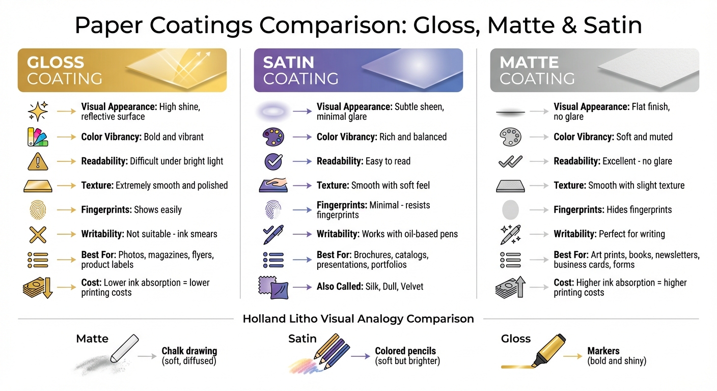
- Gloss: Shiny, reflective, and vibrant. Great for images, brochures, and magazines but prone to glare and fingerprints.
- Matte: Non-reflective, soft, and easy to read. Perfect for text-heavy materials, writing, and a refined appearance.
- Satin: A middle ground with a subtle sheen and rich colors. Ideal for combining images and text, like in catalogs or professional portfolios.
Each coating affects color, readability, and handling differently. Gloss enhances sharpness and bold visuals but may not suit text-heavy designs. Matte offers a glare-free surface and works well for writing. Satin balances vibrancy and readability with minimal glare.
Quick Comparison:
| Feature | Gloss | Satin | Matte |
|---|---|---|---|
| Reflection & Glare | High shine, reflective | Low sheen, minimal glare | No glare |
| Color Appearance | Bold and vibrant | Rich and balanced | Soft and muted |
| Readability | Can be difficult under bright light | Easy to read | Excellent |
| Best Uses | Photos, magazines | Brochures, presentations | Art prints, books |
| Handling | Shows fingerprints | Resists fingerprints | Smudge-resistant |
Your choice depends on balancing aesthetics, functionality, and the material’s purpose. Read on for detailed insights into each coating’s characteristics and applications.
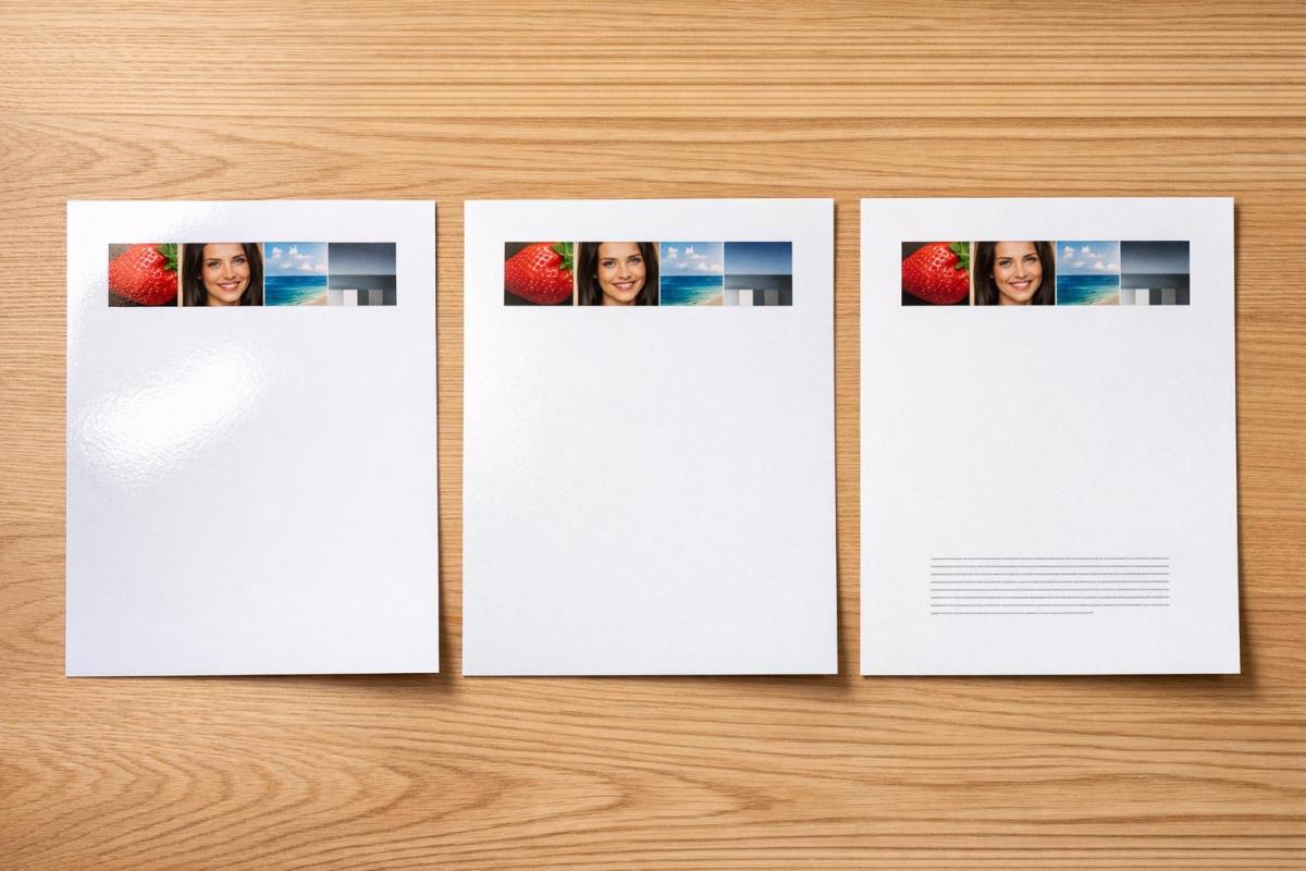
Gloss vs Matte vs Satin Paper Coating Comparison Chart
Gloss Coating: Characteristics and Uses
What Is Gloss Coating?
Gloss coating creates a shiny, reflective surface by smoothing out the tiny valleys between paper fibers through a process called heavy calendering. The result? A polished finish that stands out, especially under direct light .
This coating also limits ink absorption, which enhances image sharpness and makes colors pop. As Geoff Pick from Clear Print explains:
Because the inks stay on the surface of the coating instead of soaking in, the ink appears richer, sharper and glossier.
The result is vibrant colors with striking contrast, giving images a lifelike quality .
Gloss paper, while thinner than matte alternatives, offers a dense and sleek finish that affects both its look and feel. It also adds durability, reducing scuffing and scratches. However, it’s worth noting that gloss surfaces can show fingerprints and smudges more easily .
When to Use Gloss Coating
Gloss coating works best for materials that need to make a strong visual impression. Think brochures, catalogs, and magazine covers. It’s also a popular choice for postcards, flyers, product labels, and magazines .
This finish is perfect for marketing pieces that aim for a polished, high-end look. It’s particularly effective for designs with light-colored text on dark backgrounds – the reflective surface makes the text stand out. Another perk? Gloss paper absorbs less ink, which can help lower printing costs.
That said, gloss coating isn’t ideal for everything. Its reflective surface can cause glare, making it less suitable for text-heavy documents read under bright light . It’s also not the best option for materials meant to be written on, as ballpoint pen ink can smear on the slick surface . For calendars, workbooks, or forms requiring handwritten notes, a different finish would be a better choice.
sbb-itb-ce53437
Matte Coating: Characteristics and Uses
What Is Matte Coating?
Matte coatings are all about subtlety and elegance. Unlike the shiny, reflective nature of gloss, matte finishes diffuse light, creating a smooth, non-reflective surface that feels understated yet refined.
Interestingly, both matte and gloss coatings start with the same base material, but matte uses a lighter application of the coating. This process, known as light calendaring, retains a soft texture and gives the surface a slightly organic feel.
Matte paper tends to be thicker than gloss paper of the same weight. This is because its fibers are less densely packed, allowing it to absorb more ink. The thinner coating lets the ink sink deeper into the paper, creating softer, muted colors compared to the vivid tones of gloss. The result is a sophisticated finish, perfect for premium branding. Additionally, matte surfaces resist fingerprints and smudges, keeping printed materials looking clean even with regular handling.
Another practical advantage? Matte paper is writable. It easily accepts ink from pens and pencils without smudging, making it a practical choice for projects that require handwritten notes.
When to Use Matte Coating
Thanks to its soft finish and excellent readability, matte coating works well for text-heavy materials like newsletters, booklets, and training manuals. Its non-reflective surface reduces glare, making it easier on the eyes, especially in bright or direct lighting.
Matte is also a go-to for projects that need a polished, high-end feel. Think business cards, event invitations, annual reports, or luxury product packaging. Black-and-white photography and fine art prints look particularly striking on matte, as the finish enhances their timeless, artistic quality. It’s also a great match for minimalist designs or pastel color palettes, as the muted tones complement these styles beautifully.
For items that get handled frequently – like menus, postcards, calendars, and greeting cards – matte’s smudge-resistant surface is a big plus. Its ability to accept handwriting without smearing makes it ideal for forms and handwritten projects. However, keep in mind that thicker matte paper should be scored before folding to prevent cracking along the coating.
One thing to note: printing on matte paper might cost more than gloss. The paper’s higher ink absorption can increase printing expenses, so it’s worth factoring this into your budget.
Satin Coating: Characteristics and Uses
What Is Satin Coating?
Satin coating provides a finish that strikes a balance between the high shine of gloss and the muted elegance of matte. This low-to-medium gloss finish is achieved through moderate calendering, resulting in vibrant colors and sharp details while keeping glare to a minimum. It also has the practical advantage of resisting fingerprints and smudges. In the printing world, satin is often referred to as "silk", "dull", or "velvet."
"Satin/Silk/Dull/Velvet… describe a low-gloss coated sheet that sits between matte and gloss… keeps colors rich and crisp without glare." – Holland Litho
Satin’s ability to deliver vivid visuals without overwhelming glare makes it a versatile choice for designs that demand a mix of clarity and aesthetic appeal.
When to Use Satin Coating
Satin coating is a great choice for projects like brochures, catalogs, reports, and art prints. It enhances image quality while maintaining readability, even in brightly lit environments such as trade shows, exhibitions, or offices. For designs that blend high-resolution photography with extensive text – like corporate presentations or book covers – satin ensures vibrant visuals and easy-to-read text.
Its resistance to fingerprints makes it particularly useful for items that get frequent handling, such as menus, photo books, albums, and professional portfolios. Satin is also a popular choice for custom stationery like invitations, greeting cards, and letterheads, offering a sleek, non-reflective finish that feels refined. For thicker satin paper stocks (80# and above), scoring before folding is recommended to avoid cracking along the fold lines.
For handwritten elements, oil-based ballpoint pens work best on satin finishes. To make the most of this coating’s ability to showcase fine details, use high-resolution images (300 DPI or higher).
"Satin is ideal when you want a polished look without harsh glare… Its balanced sheen makes it the ‘best of both worlds’ between gloss and matte." – Printing Partners
At Miro Printing & Graphics Inc. (https://bergencountyprinters.com), we specialize in using satin coatings to create premium printed materials that combine eye-catching visuals with excellent readability. Each coating option has its own strengths, ensuring you can choose the perfect finish for your project’s unique requirements.
How to Choose the Right Paper Coating: Matte, Gloss, High-Gloss (with Host)
Comparing Gloss, Matte, and Satin Coatings
The finish of paper – whether gloss, matte, or satin – depends on a process called calendering. This involves smoothing the paper with rollers: heavy pressure creates a glossy finish, moderate pressure results in satin, and light pressure produces matte.
Each coating also uses a distinct chemical layer that affects its properties. Gloss coating applies a thick layer that fills the paper’s pores, preventing ink absorption. This maintains vibrant colors and sharp details but makes the surface prone to showing fingerprints. Matte coating, on the other hand, leaves the paper’s texture exposed, scattering light to reduce glare. However, it absorbs more ink, which can soften colors. Satin coating strikes a middle ground, offering rich colors with minimal glare and better resistance to fingerprints than gloss.
A helpful analogy from Holland Litho illustrates these differences:
"Matte is like a chalk drawing; satin/silk/dull/velvet is like colored pencils – still soft, but a little brighter; gloss is like markers – bold and shiny." – Holland Litho
This comparison highlights how each finish has unique strengths, making them better suited for specific projects.
If you’re working on materials that require writing – like calendars, forms, or study guides – matte is the best option. Gloss surfaces can cause pen or pencil ink to smear or fail to transfer properly. For projects where resistance to dirt and moisture is a priority, gloss performs best, though none of these coatings are completely waterproof.
Here’s a quick side-by-side breakdown of their key characteristics:
Comparison Table
| Feature | Gloss Coating | Satin / Silk / Dull | Matte Coating |
|---|---|---|---|
| Texture | Extremely smooth and polished | Smooth with a soft feel | Smooth with a slight texture |
| Reflection & Glare | High shine; very reflective | Subtle sheen; low glare | Flat finish; no glare |
| Color Appearance | Vibrant and bold | Rich and balanced | Soft and muted |
| Typical Uses | Photos, magazines, flyers | Brochures, covers | Art prints, books |
| Handling Properties | Shows fingerprints easily; resists dirt | Minimal fingerprints; easy to clean | Hides fingerprints; writable |
| Readability | Can be difficult due to glare | Minimal glare interference | Excellent; no glare in lit rooms |
How to Choose the Right Coating
What to Consider
Before diving into your printing project, it’s important to weigh a few key factors to ensure the best results.
If your project involves writing, always opt for matte over gloss. For items like calendars, forms, or workbooks that require handwriting, gloss is a poor choice because pen or pencil ink tends to smear. Matte finishes provide a smooth, non-reflective surface perfect for writing.
For image-heavy projects, gloss is ideal. It enhances color vibrancy and sharpness, making visuals pop. On the other hand, matte is better for text-heavy documents, as it reduces glare and minimizes eye strain, making reading more comfortable.
Think about how the material will be distributed and used. Glossy finishes can show fingerprints and reflect light, which might not work well for items being mailed, handed out, or used in bright environments. Matte and satin finishes are better in these cases, as they hide marks and reduce glare. However, gloss is more resistant to dirt and moisture, which is helpful for printed materials that may face rough handling or exposure to the elements.
For example, a glossy brochure might look stunning indoors but could become hard to read in bright sunlight. In such cases, matte is often a smarter choice because it diffuses light, ensuring the content remains legible.
Practical Examples
Your choice of coating impacts more than just the look of your project – it also affects how functional it is for its intended use.
- Business cards: Glossy finishes give a vibrant, eye-catching appearance, while matte exudes elegance and professionalism.
- Postcards and greeting cards: A popular choice is C1S (Coated One Side) stock, which uses gloss on the front for visual appeal and a matte or uncoated back for easy writing.
- Product catalogs and magazines: Gloss is a standard choice here, as it enhances color richness and image clarity.
- Luxury brochures: These often feature silk or satin finishes to maintain rich colors without the overly shiny look of full gloss.
- Event invitations and programs: Matte finishes are preferred for their refined look and ease of readability.
- Workbooks and study guides: Matte is a must for any material requiring handwritten notes, offering the best surface for writing.
For tailored advice on coatings and finishes, reach out to the experts at Miro Printing & Graphics Inc. (https://bergencountyprinters.com), a trusted print shop in Hackensack, NJ.
Conclusion
The type of paper coating you choose can significantly influence both the performance of your project and how your audience perceives it. Knowing the differences between gloss, matte, and satin coatings is key to creating materials that not only look polished but also serve their intended purpose effectively.
Matte finishes provide a glare-free surface, making them ideal for text-heavy designs or materials that require handwriting. Satin coatings strike a balance, offering rich colors with a softer, less reflective finish. Gloss coatings, on the other hand, deliver bold, vibrant visuals that grab attention but may introduce glare and show fingerprints more easily. Picking the wrong coating could lead to practical issues – like ink smudging on a glossy calendar or muted images on matte paper – potentially undermining your project’s success.
It’s also worth noting how coatings affect the technical aspects of printing. Matte paper tends to absorb more ink than glossy paper, which can influence both cost and color vibrancy. Gloss paper achieves its reflective finish through a thicker coating, while matte paper uses a lighter coating that scatters light, reducing reflections. These details highlight why selecting the right coating is so important for both the visual appeal and functionality of your project.
FAQs
How do I pick the best coating for my project?
When deciding on a coating, think about the purpose of your project and the look you’re aiming for:
- Gloss: Perfect for bold visuals, this finish boosts color vibrancy and adds a shiny, reflective surface. It’s great for making designs pop.
- Matte: Offers a softer, non-reflective surface, giving a professional feel and ensuring easy readability.
- Satin: Strikes a middle ground between gloss and matte, making it ideal for designs that blend text and images.
Choose the finish that aligns best with your project’s goals to achieve the desired effect.
Which coating is easiest to write on?
Uncoated paper stands out as the simplest option for writing because its porous surface absorbs ink effectively. This quality makes it a perfect choice for tasks that involve writing or marking.
Will my photos look better on gloss or satin?
Gloss paper brings your photos to life with bright, vivid colors and a sleek, shiny finish that grabs attention. Satin paper, however, offers a more understated look with a gentle sheen, making it easier to read and giving your images a softer, more polished appearance. Go for gloss if you want striking, bold visuals, or pick satin for a more elegant and professional touch.
Related Blog Posts
- Ultimate Guide to Paper Types for Business Printing
- Types of Paper Finishes for Printing
- Ultimate Guide to Paper Finishes and Textures
- Ultimate Guide to Glossy Coatings for Printing Projects
https://app.seobotai.com/banner/banner.js?id=698fb3c9efc60cc2af06dfc5
