Large-format printing requires precise file preparation to ensure high-quality results. Whether you’re designing banners, posters, or signage, here’s what you need to know:
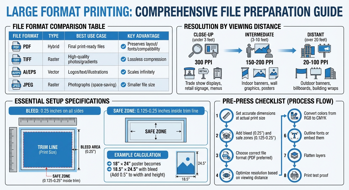
- Set Accurate Dimensions: Always design at the actual print size to avoid pixelation. For example, an 18" × 24" poster should be created at those exact dimensions.
- Add Bleed and Safe Zones: Extend your design 0.25 inches beyond the trim size (bleed) and keep important elements 0.125–0.25 inches inside the trim line (safe zone).
- Choose the Right File Format: Use PDF for overall reliability, TIFF for high-quality images, and AI/EPS for scalable vector graphics. Avoid low-resolution or lossy formats like JPEG unless necessary.
- Optimize Resolution: Match resolution to viewing distance. Close-up prints need 300 DPI, while distant billboards can work with 20 DPI.
- Convert Colors to CMYK: Ensure color accuracy by switching from RGB to CMYK early in the design process.
- Outline Fonts: Convert text to outlines to prevent font substitution errors during printing.
Final Steps: Flatten layers to preserve effects, review your file at full size, and print a proof to catch any errors before production. Proper preparation saves time, reduces costs, and ensures a polished final product.
Large Format Printing File Preparation Guide: Formats, Resolution, and Viewing Distance
How to Use the Large Format Printer: Part 2 – Preparing your File
sbb-itb-ce53437
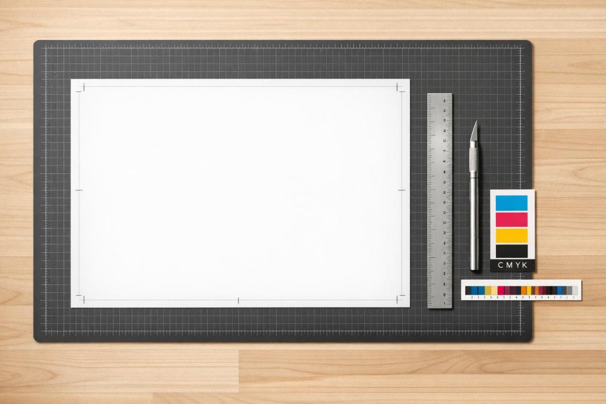
Setting Up Document Size and Bleed
Getting the document size right is essential for ensuring your design prints perfectly, especially for large-format projects.
Setting Your Print Dimensions
First, determine the exact size of your finished print. Whether it’s an 18″ × 24″ poster or a 24″ × 36″ banner, you need this information before jumping into your design software. Always design at the actual print size – no scaling down. Designing at a smaller scale can lead to pixelation issues when the file is enlarged for printing.
In tools like Adobe Photoshop or Illustrator, set your document size to match the final trim dimensions. For vector-based elements like logos or text, use file formats such as EPS or AI. These formats ensure your design stays sharp, no matter how much it’s scaled up. This step is particularly important for large-format prints where clarity matters.
Once the dimensions are set, you’ll need to add bleed and safe zones to finalize the setup.
Adding Bleed and Safe Zones
Bleed refers to the extra margin around your design that extends beyond the trim size. It ensures no unwanted white edges appear after the cutting process. For large-format designs, add a 0.25-inch bleed to all sides to account for slight cutting shifts.
"The decision to use a bleed is one of the fundamental signifiers of professional versus desktop publishing." – Robin Williams, Author, Peachpit Press
To calculate the total document size with bleed, add 0.5 inches to both the width and height (0.25″ for each side). For example, an 18″ × 24″ poster becomes 18.5″ × 24.5″. Extend your background, images, or patterns all the way to the outer edge of this bleed area to avoid visible trim lines.
At the same time, keep vital elements like text and logos within the safe zone – 0.125 to 0.25 inches inside the trim line. This ensures nothing important gets cut off. Use guides in your design software to clearly mark the trim line and safe zone, making it easier to see these boundaries as you work.
With dimensions, bleed, and safe zones in place, you’re ready to move on to file formats and compression for the final preparation.
Choosing the Right File Format
Once you’ve established the dimensions and bleed for your project, picking the right file format becomes critical. The format you choose directly impacts the quality of your design during printing. A poor choice can lead to issues like compression artifacts, font substitution, or color inaccuracies – problems that can ruin an otherwise flawless design.
Best File Types for Large Format
When it comes to large-format printing, certain file types stand out for their reliability and quality:
- PDF (Portable Document Format): This is the gold standard for print-ready files. PDFs maintain your entire design – fonts, images, and vector elements – across devices and printing systems seamlessly. Its universal compatibility makes it the safest option for finalizing your project.
- TIFF (Tagged Image File Format): Ideal for high-quality photographs or designs with intricate gradients and textures. Unlike JPEGs, TIFF files use lossless compression, ensuring no image data is lost.
- AI (Adobe Illustrator) and EPS (Encapsulated PostScript): These vector formats are perfect for logos, text, and illustrations. They can be scaled infinitely without losing quality or becoming pixelated.
- High-Resolution JPEG: While not the first choice, JPEGs can work for photographs if saved at maximum quality settings. This minimizes compression damage, but repeated saves should be avoided.
| File Format | Type | Best Use Case | Key Advantage |
|---|---|---|---|
| Hybrid | Final print-ready files | Preserves layout, fonts, and compatibility | |
| TIFF | Raster | High-quality photos/gradients | Lossless; retains maximum image detail |
| AI / EPS | Vector | Logos, text, and illustrations | Scales infinitely without pixelation |
| JPEG | Raster | Photographs (space-saving option) | Smaller file size; requires high-res settings |
Preventing Compression Problems
Compression artifacts – like graininess or halo effects – are especially noticeable in large-format prints. These occur when files are saved in lossy formats, which sacrifice image data to reduce file size.
JPEG files are often the source of such problems.
"JPEG files are small and compressed… quality is lost each time an image is saved, making it a poor choice for images with fine detail" – HP
To avoid this, use high-quality JPEGs sparingly and never re-save them multiple times, as each save further degrades the image.
Steer clear of screenshots, Word documents, or low-resolution web images for large-format projects. These are already compressed and will appear blurry or pixelated when enlarged. If file sizes become unwieldy, opt for lossless compression methods like LZW for TIFF files or ZIP for other formats to maintain visual integrity.
Another critical step is converting all text to outlines. This prevents font substitution errors during printing.
"Converting text to outlines is essential because if the print shop doesn’t have the exact font you used, your text might get automatically replaced with a different one" – Alpha BPO
This ensures your typography appears exactly as you designed it. After selecting the right file format and addressing potential issues, the next step is to fine-tune image resolution for optimal results.
Setting the Correct Image Resolution
Image resolution plays a key role in determining how sharp your prints will appear, and the right resolution depends heavily on how far away the image will be viewed. For standard commercial printing, 300 PPI (pixels per inch) is the go-to resolution. However, for large-format prints like banners or billboards, lower resolutions can work just fine because of one important factor: viewing distance.
Understanding DPI for Large Prints
The farther away an image is viewed, the less detail the human eye can discern, which means lower resolutions can still look sharp.
"The longer the viewing distance, the lower the resolution needs to be to display a sharp image." – Mousegraphics
For instance, images viewed up close (like trade show displays) usually need 100–300 PPI for clarity. Indoor banners, typically seen from 3–10 feet away, work well at 150–200 PPI. Outdoor billboards, designed to be seen from 50 feet or more, can look fine at resolutions as low as 20 DPI.
| Viewing Distance | Recommended Resolution | Common Applications |
|---|---|---|
| Close-up (under 3 feet) | 300 PPI | Trade show displays, retail signage, menus |
| Intermediate (3–10 feet) | 150–200 PPI | Indoor banners, wall graphics, posters |
| Distant (over 20 feet) | 20–100 PPI | Outdoor banners, billboards, building wraps |
The key is not just the DPI number but the total pixel count in your image. A higher pixel count ensures you can scale your image to larger sizes without sacrificing quality.
Resizing Images Without Quality Loss
When you’re preparing images for large-format printing, the file type you use matters. Vector graphics (like AI, EPS, and SVG files) are ideal for logos and text because they scale seamlessly without any loss of clarity. This is because vectors rely on mathematical equations rather than fixed pixels.
On the other hand, raster images (such as photographs) are made of pixels, which means they can become blurry or pixelated if stretched beyond their original resolution. To avoid this, some designers work at half the final size but double the resolution – using 300 DPI instead of 150 DPI, for example – so that the image stays sharp when scaled up to full size.
Always scale images proportionally and inspect them at 100% zoom to check for any pixelation or blur. And remember, web images saved at 72 PPI may look fine on a screen but won’t hold up for large-format printing.
Once your resolution is set, you’ll be ready to tackle colors and fonts for a flawless print.
Preparing Colors and Fonts
After optimizing resolution and file formats, the next step is fine-tuning colors and fonts to ensure your design translates accurately in print.
Converting to CMYK Color Mode
While screens rely on RGB (Red, Green, Blue), printers use CMYK (Cyan, Magenta, Yellow, Black). These two color systems operate differently, and RGB colors often appear more vibrant on-screen but can look muted or shift unpredictably when printed.
"Submitting an RGB file forces the printer’s software to make the conversion, leading to unexpected color shifts." – ArtsLens
To avoid surprises, convert your file to CMYK mode in your design software early on. This allows you to preview how the colors will look in print and make any necessary tweaks upfront.
For large, solid black areas (like backgrounds), opt for "Rich Black" instead of plain 100% K. A mix like 60C, 40M, 40Y, 100K produces a deeper, more saturated black. However, for small text, stick to 100% K. Using rich black for text can cause registration issues, where misaligned inks create blurry edges.
Once your colors are set, the next step is securing your fonts to maintain your design’s integrity.
Embedding or Converting Fonts to Outlines
Typography can face challenges if the printer doesn’t have your specific font. Their system might replace it with a default font, which can drastically alter your layout.
To prevent this, you have two choices: embed the fonts in your PDF so the printer can access them, or convert the text to outlines (also called vectorizing). Converting text to outlines turns it into vector shapes, ensuring it displays consistently regardless of the system.
If you choose to outline fonts, save a separate version of your file with editable text. Once text is converted to outlines, it can no longer be edited. When exporting your final file, use a "Press Quality" PDF preset. This setting typically embeds fonts and retains CMYK color modes automatically.
Final File Preparation and Review
Once you’ve set up your file, chosen the right format, and adjusted the resolution, it’s time to wrap things up with a detailed review of your design.
Flattening Design Layers
Flattening your design layers ensures that effects like drop shadows and transparency are preserved during printing.
"Flattening permanently destroys layer data. Always save unflattened copies before flattening." – Bogdan Sandu, Designer
Before flattening, save a backup of your layered file. This way, you can always return to the original if needed. Also, clear out unused or hidden layers to minimize file size. In Photoshop, go to Layer > Flatten Image. For Illustrator, use Object > Flatten Transparency and set the Raster/Vector Balance slider to 100% to prioritize vectors. When working in InDesign, select the "High Resolution" transparency flattener preset during export.
To confirm your PDF is flattened, open it in Adobe Acrobat and try highlighting text. If the text isn’t selectable, the file has been properly flattened.
Finally, inspect the file at full size to catch any lingering issues before moving forward.
Checking Your File at Full Scale
Zoom in to 100% to thoroughly examine your file. This helps you spot pixelation, blurry text, or transparency issues that might not be obvious at smaller scales. Pay extra attention to small text and logos – if they appear fuzzy at full size, they may not print clearly.
Double-check that all elements are aligned within the bleed and safe zones you’ve set up. In Adobe Acrobat, the "Output Preview" tool is a handy way to review color separations and transparency rendering before sending the file to print.
Printing a Test Proof
Print a test section of your design at full scale using a standard desktop printer. This gives you a chance to verify font sizes, image resolution, and color accuracy without committing to a full print run.
"A final sign-off on the proof means you accept the design as presented, and any errors found after printing will be your responsibility." – GoProof
Carefully review the proof for spelling mistakes, incorrect contact details, or color inconsistencies. Check that all design elements are properly aligned and nothing looks out of place. These last-minute checks can save you from costly errors and delays down the road.
Wrapping It Up
To achieve professional-quality prints, it’s essential to follow key steps like ensuring proper dimensions, adding bleed areas, adhering to resolution standards, converting colors to CMYK, and embedding fonts. Always select the right file format – such as PDF, TIFF, or EPS – and convert text to outlines to avoid font-related issues. These details help ensure your design moves seamlessly from screen to print without errors.
A meticulous final review is equally important. It can save you from costly reprints and ensure your design is perfectly reproduced. Partnering with experienced professionals is invaluable – seasoned pre-press teams can identify and fix common problems, such as blurry images, pixelated text, or incorrect color settings, before they become major issues.
As highlighted in this guide, Miro Printing & Graphics Inc., based in Hackensack, NJ, brings over 30 years of expertise to the table. Whether you’re working on banners, posters, or other large-format projects, their team offers the technical know-how and quality assurance necessary to deliver outstanding results.
"Mike and his team at Miro have delivered stars, comet, and galaxy size projects… No matter how little or large, no matter what the deadline, I sleep at night knowing Miro is on it." – LycoRed T.
FAQs
Should I design at full size or scale my file?
When creating a design for print, it’s always smart to work at the final size right from the start. By designing at the exact dimensions needed for printing, you can ensure the resolution, bleed, and layout are spot on. This method avoids pixelation or quality loss that often happens when scaling up smaller files and ensures your design will fit perfectly within the designated printable area.
How do I know what DPI I really need?
To figure out the right DPI for large-format printing, think about how the print will be viewed and its purpose.
- Close-up prints like posters usually need 150–300 DPI to ensure fine details stand out.
- For prints viewed from moderate distances, such as indoor banners, aim for 100–150 DPI.
- Distant viewing items like billboards can work well with just 20–100 DPI, as the details don’t need to be as sharp.
Choosing the right DPI ensures your prints look great while avoiding unnecessarily large file sizes.
Do I need to outline fonts or just embed them?
When preparing files for large-format printing, it’s best to embed fonts rather than outlining them. Embedding keeps the text intact, ensuring it displays as intended and avoids any font substitution problems. Plus, it keeps your file editable for future tweaks. Only convert fonts to outlines if your printer explicitly asks for it. This approach preserves your design’s quality and ensures the file is ready for high-quality printing.
Related Blog Posts
- How to Prepare Vector Files for Print
- How to Set Up Artboards for Printing
- How to Create Print-Ready Artwork
- Prepress Checklist for Print-Ready Files
https://app.seobotai.com/banner/banner.js?id=69c087981b352ff267cb83dd
