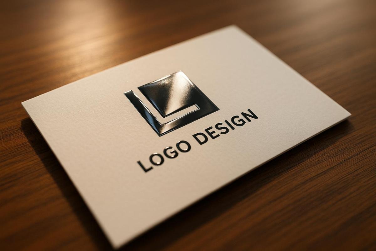
Spot UV coating is a specialized printing technique that adds a glossy, raised finish to specific areas of a design, making them stand out visually and physically. It works by applying a UV-cured varnish to targeted spots, such as logos, headlines, or patterns, creating a striking contrast between shiny and matte elements. This method not only enhances the design’s appearance but also adds durability, protecting against scratches and wear.
Key Takeaways:
- What it is: A glossy finish applied to specific design areas for emphasis.
- How it works: Uses a mask file to precisely apply UV varnish to selected spots.
- Why use it: Adds visual contrast, tactile appeal, and durability to printed materials.
- Best uses: Business cards, packaging, brochures, invitations, and presentation folders.
Spot UV coating is ideal for creating a polished, professional look that grabs attention without being overdone. It’s especially effective on thick cardstock or darker backgrounds, where the glossy accents pop. Pairing it with other finishes, like matte lamination or embossing, can further enhance its impact. For small businesses or premium brands, it’s a cost-effective way to elevate printed materials and leave a lasting impression.
How to Setup Your Spot UV Mask File for Print | Primoprint
Benefits of Spot UV Coating
Spot UV coating takes printed materials to the next level by enhancing their look, feel, and durability. Here’s how it adds value across these key areas.
Better Visual Appeal
Spot UV creates a glossy, reflective finish that turns ordinary design elements into eye-catching highlights. For example, CHANEL used spot UV on their logo for folding carton boxes, creating a stunning contrast between glossy and matte finishes. Similarly, The Body Shop applied spot UV to their paper bags, making their logo stand out while reinforcing their premium image.
Better Tactile Experience
Beyond its visual charm, spot UV offers a distinct tactile sensation. The raised, smooth texture invites touch, adding an interactive element that speaks to thoughtful design. As Blue Label Packaging explains:
"With spot UV, you get a raised, smooth texture on some elements. This doesn’t just make the label visually attractive, but gives the customer a tactile experience, too."
Studies suggest that products appealing to touch can foster deeper emotional connections and boost customer loyalty. Sunday Minx applied spot UV on their luxury rigid boxes, highlighting their brand name and intricate patterns. The result? A sophisticated play between matte and glossy finishes that underscores their high-end image.
Spot UV can also be customized with effects like wrinkle, leather, or frosted finishes, adding extra depth and character. Pairing it with matte or soft-touch lamination creates striking contrasts that draw people in.
Durability and Protection
Spot UV coating isn’t just about aesthetics – it also protects. The UV-cured layer resists smudges, scratches, and moisture, keeping items like business cards and brochures looking polished even with frequent handling. This durability makes it a smart choice for materials where elegance and resilience are equally important.
Best Use Cases for Spot UV Coating
Spot UV coating isn’t just about adding a glossy finish – it’s about creating a visual and tactile experience that leaves a lasting impression. Here’s how it shines in different applications:
Business Cards and Brochures
Business cards are often the first impression someone has of your brand, so why not make them unforgettable? Adding spot UV to key elements like logos, company names, or contact details creates a sleek, glossy effect that pops against the matte background. For brochures, spot UV can draw attention to headlines, images, or other vital information, guiding the reader’s focus. Plus, the textured finish adds a layer of sophistication and reinforces your brand’s identity.
Packaging and Product Labels
In retail, packaging speaks volumes about a product’s quality. Spot UV coating can give packaging a premium look by highlighting brand logos, product names, or other focal points. This technique not only enhances visual appeal but also adds a layer of durability, keeping labels crisp and pristine throughout the product’s lifecycle. It’s the perfect way to convey elegance and craftsmanship in a competitive market.
Invitations and Presentation Folders
When every detail matters, spot UV coating can elevate invitations and presentation folders to a whole new level. For wedding or event invitations, applying spot UV to names, dates, or decorative elements adds a luxurious touch. In corporate settings, using spot UV on logos or cover designs enhances professionalism and polish. The combination of visual appeal and tactile engagement ensures these materials stand out, even with frequent handling.
For professional spot UV coating services that bring your designs to life, Miro Printing & Graphics Inc. in Hackensack, NJ, offers custom solutions tailored to your specific needs.
sbb-itb-ce53437
Design and Application Tips for Spot UV Coating
To make the most of spot UV coating, thoughtful design and precise preparation are key. By carefully planning its placement and combining it with complementary finishes, you can create striking, high-quality print materials.
Smart Placement for Maximum Impact
Spot UV is most effective when used sparingly. Highlight key elements like your logo, company name, or a standout image. Overloading your design with spot UV can dilute its effect and make the piece feel cluttered.
Pay attention to the visual hierarchy of your design. Spot UV should emphasize the most important details first, guiding the viewer’s eye naturally to secondary elements. For example:
- On a business card, use it on your logo and name.
- In a brochure, apply it to headlines or calls-to-action that you want to stand out.
Contrast is another powerful tool. Spot UV shines – literally – when applied over darker colors or matte backgrounds. A glossy UV accent on a black or deep-colored surface creates a sleek, mirror-like effect that grabs attention.
After identifying the key areas to highlight, think about combining spot UV with other finishes to elevate your design further.
Combining Spot UV with Other Finishes
Pairing spot UV with other finishing techniques can add depth and sophistication to your materials. However, the sequence of application matters to ensure flawless results.
- Foil stamping: Apply foil stamping first, then spot UV. This prevents any adhesion issues between layers.
- Matte lamination: Combine a matte laminated surface with spot UV for a striking contrast. The soft, matte finish against glossy UV accents creates a polished and modern look.
- Embossing: Use embossing for texture, then add spot UV to the raised areas for a tactile and visually appealing effect. This works beautifully for logos or decorative elements where a combination of texture and shine enhances the design.
Consider the style of your brand when choosing combinations. Contemporary brands often favor spot UV paired with matte finishes, while more traditional brands opt for foil stamping and embossing for a timeless feel.
Before committing to a full print run, always test new combinations. Different materials and finishes can interact unpredictably, so testing ensures the final product meets your expectations.
Preparing Design Files for Spot UV
Accurate file preparation is critical for spot UV projects. Printing requires separate artwork files for precise application and to avoid misalignment.
If you’re combining spot UV with other finishes like foil stamping, prepare four distinct PDF files:
- Master Print File: Your main design.
- Hot Stamping File: For foil stamping areas.
- Spot UV File: For UV-coated elements.
- CMYK Printing File: For standard color printing.
For the Spot UV file, set the UV-coated areas to K=100 (solid black) on a transparent background. This ensures the coating is applied exactly where you want it. Avoid overlapping spot UV with other finishes like foil stamping, and leave a 1/16-inch gap between different finishing areas to prevent misalignment.
Lastly, remember that spot UV adds a slight thickness to your print. If you’re designing items like folders or packaging with tight tolerances, factor this into your measurements.
Collaborate with your printer early in the process to ensure your files are accurate and ready for production.
Spot UV Coating vs Other Finishing Techniques
The finishing technique you choose can make a big difference in how your printed materials look and feel. Spot UV coating, for instance, provides a distinctive visual and tactile experience, but other options might align better with your specific goals, budget, or timeline. Knowing the differences between these techniques is key to making the right call. Below is a comparison table highlighting the unique features of each.
Every finishing method brings something different to the table. Spot UV coating creates striking gloss contrasts against matte areas, while overall UV coating delivers a consistent high-gloss finish. Aqueous coating offers a softer, eco-conscious sheen, and foil stamping adds a metallic, high-end touch.
Your decision will often hinge on balancing creative impact, cost, and production time. For example, foil stamping might be worth the extra time and expense for a luxury product launch, but a corporate brochure could benefit from the quicker, more uniform finish of overall UV coating.
Comparison Table of Finishing Techniques
| Technique | Visual Effect | Tactile Quality | Durability | Best For |
|---|---|---|---|---|
| Spot UV Coating | Glossy accents with bold contrast | Raised, smooth texture | Excellent scratch resistance | Business cards, packaging, invitations |
| Overall UV Coating | Consistent, high-gloss finish | Smooth finish | Superior protection | Magazines, catalogs, postcards |
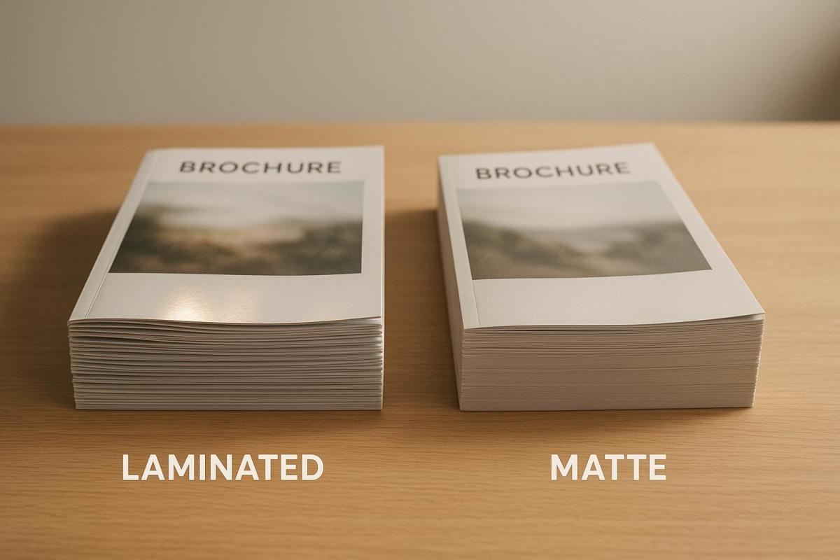
| Aqueous Coating | Soft satin sheen | Natural, soft feel | Good moisture resistance | Brochures, flyers, eco-friendly projects |
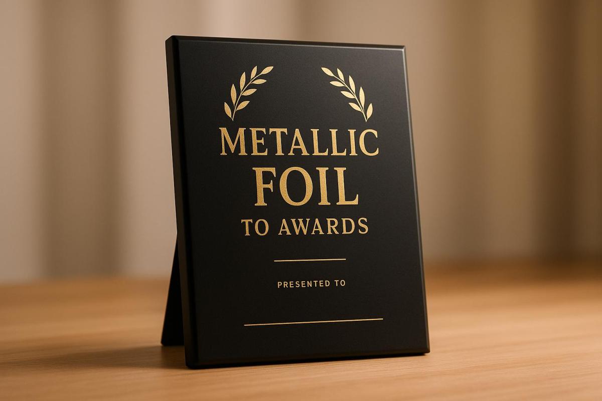
| Foil Stamping | Metallic shine with a mirror-like effect | Smooth, premium feel | Moderate (sensitive to bending) | Luxury packaging, certificates, awards |
Beyond aesthetics and texture, practical considerations like production time and material compatibility play a big role. Aqueous coating is quick to apply, making it ideal for projects with tight deadlines. Foil stamping, however, often requires more setup and specialized tools, which can extend turnaround times. Spot UV coating usually falls somewhere in the middle.
Environmental considerations are also worth keeping in mind. Aqueous coating, for instance, is more eco-friendly compared to other finishes. Balancing these factors – design impact, cost, and sustainability – will help you make a more informed choice.
Budget is another significant factor. While spot UV or foil stamping can create a bold, high-end look, they may not be cost-effective for larger projects where even a small price difference per piece adds up. In contrast, aqueous or overall UV finishes offer an elegant yet economical option for projects with tighter budgets.
Substrate material is equally important. Spot UV coating works best on thick cardstock but may not adhere well to certain synthetic surfaces. Similarly, foil stamping often requires specific paper weights and textures to achieve the desired effect. Testing your design and materials before full production is always a smart move to avoid surprises.
Next, we’ll dive deeper into when and why spot UV coating might be the best choice for your project.
When and Why to Choose Spot UV Coating
Spot UV coating is a smart choice when you want to add a touch of sophistication and create a lasting impression – all without stretching your budget. Its glossy, raised texture naturally catches the eye and invites touch, making it perfect for materials that need to stand out right away.
To get the most out of spot UV coating, focus on highlighting only the most important elements. This not only enhances the design but also helps keep costs manageable. It’s a great strategy for small businesses aiming to match the polished look of larger competitors without overspending.
For the best results, pair spot UV with thick cardstock (14pt or heavier). The contrast between the shiny coating and matte areas creates a striking effect, especially on items like business cards, product packaging, and presentation materials. Since these pieces are often handled directly, the tactile difference leaves a memorable impression. Plus, spot UV’s quick setup makes it a go-to option for projects with tight deadlines.
Use spot UV strategically to emphasize clear focal points like logos, product names, or call-to-action buttons. It’s especially effective on darker backgrounds, where the glossy finish pops against the matte surface, creating a dramatic and professional look.
For professional service providers – such as law firms, financial advisors, or consultants – spot UV coating adds a layer of refinement to business cards and presentation folders. It communicates attention to detail and quality without being overly flashy, striking the right balance between elegance and professionalism.
In addition to its visual appeal, spot UV coating offers practical benefits like scratch resistance and moisture protection, making it ideal for items that are frequently handled.
Working with Miro Printing & Graphics Inc. takes this process to the next level. Their in-house capabilities allow them to seamlessly combine spot UV coating with other services, such as design consultations and bindery work. This ensures your project maintains a consistent, high-quality finish from start to finish.
FAQs
How does spot UV coating compare to other finishing techniques in terms of cost and turnaround time?
Spot UV coating stands out as a cost-effective and time-efficient finishing option compared to techniques like embossing or foil stamping. Since it involves fewer materials and less labor, it helps cut costs while also speeding up the production process.
This makes Spot UV an excellent choice for projects with tight deadlines that still require a sleek and polished appearance. It’s particularly great for emphasizing specific design elements, offering an affordable way to create a professional and visually striking effect.
How can I prepare my design files for spot UV coating to achieve the best results?
To prepare your design files for spot UV coating, start by creating a separate, vector-based layer in your design software, such as Adobe Illustrator or InDesign. This layer should specifically highlight the areas where the UV coating will be applied. Use a solid black color or a designated spot color (like Pantone SpotUV) to mark these areas.
Make sure this layer is clearly labeled and kept separate from all other design elements. When you’re ready to save your file, export it as a PDF while preserving all layers. Be sure to follow the specific guidelines provided by your print shop. Keeping your file well-organized and clearly labeled ensures precise, sharp results and a professional-looking finish.
Can spot UV coating be used on all materials, or are certain surfaces better suited for it?
Spot UV coating performs exceptionally well on coated, non-porous surfaces like glossy or matte paper and smooth plastics such as BOPP or PET. These materials provide the perfect base for the coating to adhere properly, delivering the striking visual effect it’s known for.
On the other hand, uncoated or porous materials aren’t the best choice. They tend to absorb the coating unevenly, which can dull its effect. For the best results, stick to smooth, treated surfaces that highlight the high-gloss or matte contrast beautifully.
Related Blog Posts
- UV Printing vs. Lamination: Which Protects Better?
- Ultimate Guide to Textured Printing Effects
- Ultimate Guide to Glossy Coatings for Printing Projects
- Ultimate Guide to Varnish Coatings in Printing
https://app.seobotai.com/banner/banner.js?id=68d09afc7b5c01ae368b80ee