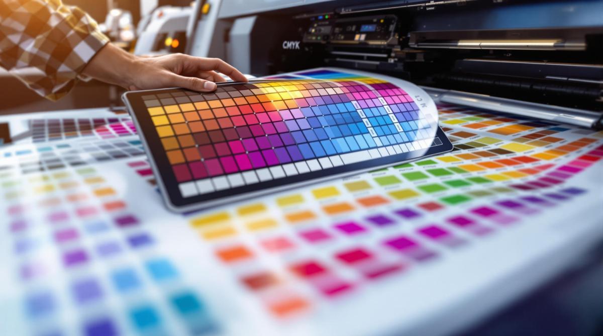
Want perfect prints? It all starts with proper color adjustment for offset printing. Offset printing uses CMYK inks for accurate, high-quality results, but getting colors right requires understanding key techniques. Here’s what you need to know:
- Start in CMYK Mode: Always design in CMYK to avoid unexpected color shifts.
- Convert Colors Carefully: RGB to CMYK conversion can alter vibrant hues – use proofing tools to preview results.
- Use Pantone Colors for Precision: For exact matches and brand consistency, Pantone spot colors are a reliable choice.
- Calibrate and Proof: Work with professional printers to fine-tune ink density, gray balance, and ensure consistent results.
- Adjust Colors in Software: Enhance blues, greens, and blacks by tweaking CMYK values for richer tones.
Quick Comparison:
| Feature | CMYK Process Colors | Pantone Spot Colors |
|---|---|---|
| Best Use Case | General prints | Brand colors, precise shades |
| Color Consistency | Good | Excellent |
| Cost | Affordable | Higher |
| Color Range | Limited to CMYK gamut | Broader, custom colors |
Start with CMYK for most projects, but use Pantone for critical color accuracy. Collaborate with professional printers to ensure your designs look as intended in print.
Understanding Color Systems in Printing
RGB vs. CMYK: Differences
RGB (Red, Green, Blue) is tailored for digital screens, relying on light to produce vibrant hues and a broader range of colors. On the other hand, CMYK (Cyan, Magenta, Yellow, Key/Black) is the go-to for offset printing, using ink to create consistent and accurate colors, though with a narrower range [1][2].
| Color System | Primary Use | Color Range |
|---|---|---|
| RGB | Digital displays (web, screens) | Broader, more vibrant |
| CMYK | Print materials (offset printing) | Narrower but consistent |
These differences influence every step of the printing process, from initial design to the final product. Knowing how RGB and CMYK work ensures your designs translate effectively into print [2].
Color Conversion Tips
Switching from RGB to CMYK can lead to noticeable color changes because CMYK can’t replicate the full range of RGB. This is especially true for bright or highly saturated colors [2][3]. Professional printers like Miro Printing & Graphics Inc. account for these challenges to deliver accurate results.
Helpful Conversion Tips:
- Begin your design in CMYK mode to minimize unexpected shifts.
- Use color management tools to handle conversions effectively.
- Print proofs on materials similar to the final product to account for ink absorption.
- Pay close attention to bright or saturated colors, as they may look different in CMYK.
- For precise color matching, consider using Pantone spot colors [2][4].
Printer calibration is another critical step. This process ensures that printers and presses are adjusted to match the desired color profile, maintaining consistency and accuracy throughout the print run [1][2]. Proper calibration plays a key role in achieving high-quality color reproduction in offset printing.
Preparing Colors for Offset Printing
Designing in CMYK
When working on designs for offset printing, always start in CMYK mode to ensure the colors translate properly to print. Begin by setting up new documents in CMYK mode and double-checking your software settings to match the printer’s specifications. If you’re working with RGB files, use the ‘Convert to Profile’ option instead of directly changing the color mode. This approach helps maintain color accuracy [1][2].
Once your design is in CMYK, you can fine-tune the colors in your software to achieve the best possible print results.
Adjusting Colors in Software
Fine-tuning colors in your design software plays a key role in bridging the gap between your digital design and the printed result. Tools like those in Adobe’s Creative Suite are particularly effective for making these adjustments [3].
| Color | Adjustment and Outcome |
|---|---|
| Vibrant Blues | Increase cyan and reduce magenta to create richer tones. |
| Rich Greens | Balance cyan and yellow to achieve more natural shades. |
| Deep Blacks | Use rich black (a mix of all 4 inks) for a more saturated look. |
Experts at print shops like Miro Printing & Graphics Inc. suggest using proofing tools specifically tailored to your chosen paper and press. This step helps ensure that the colors you see on screen closely match the final printed product [3].
For precise color matching, incorporate grayscale and color bars into your workflow, adjust ink density as needed, and collaborate closely with your printer to meet press requirements [2][3]. If you’re working with complex hues, applying Pantone color techniques (covered earlier) can also be helpful.
These adjustments will set you up for success when tackling advanced topics like ink density and proofing, which are discussed in the next section.
Using Pantone Colors for Precision
Advantages of Pantone Spot Colors
The Pantone Matching System (PMS) uses pre-mixed inks to ensure precise and consistent colors throughout print runs [2]. This makes Pantone colors a great choice for offset printing, where maintaining uniformity across large quantities is key.
| Feature | Pantone Spot Colors | CMYK Process Colors |
|---|---|---|
| Color Consistency | Highly consistent across prints | May vary between runs |
| Color Accuracy | Delivers exact matches | Limited by ink blending |
| Brand Compliance | Perfect for corporate colors | May not perfectly match brand colors |
Companies like Miro Printing & Graphics Inc. use advanced tools and expertise to meet strict color standards, ensuring accurate reproduction of Pantone colors [2].
Choosing Pantone vs. CMYK
Pantone colors are particularly useful for:
- Brand Identity Materials: Ensuring logos and corporate materials maintain exact color consistency.
- Packaging Design: Keeping colors uniform across multiple production runs.
- Special Effects: Achieving metallic or fluorescent finishes.
- Color-Critical Projects: Maintaining uniformity where even small shifts aren’t acceptable.
While Pantone colors provide superior accuracy, they often come with higher costs. This makes them ideal for projects where precise color matching and brand consistency are non-negotiable [2].
For projects that combine Pantone and CMYK, professional print services can create hybrid solutions to balance color accuracy and cost [2][4].
To get the best results, work with experienced printers who specialize in Pantone reproduction. Proper ink management and calibration are essential for achieving consistent, high-quality outcomes in offset printing.
Advanced Color Management Techniques
Managing Ink Coverage
Professional print shops rely on color reflection densitometers to fine-tune ink densities, ensuring proper coverage without causing over-saturation. Achieving this balance involves paying close attention to several critical factors:
- Ink Density Adjustment: Colors are slightly lightened to compensate for dot gain during printing [3].
- Gray Balance Control: Cyan, magenta, and yellow are carefully balanced to produce neutral grays, which is key for accurate color reproduction.
- Color Bar Monitoring: Standardized color bars are used to assess primary process colors and overprints [3].
By carefully adjusting ink density and maintaining gray balance, printers can create vibrant colors and neutral tones without overloading the paper. Tools like densitometers and color bars are essential for monitoring ink strength and ensuring consistency. Once these adjustments are made, calibration ensures they are accurately reflected in the final print.
Calibration and Proofing
The type of paper used can significantly impact color accuracy due to variations in absorption, drying time, and texture. This is why skilled printers focus on calibrating machines to align with specific paper profiles [2].
"Proper ink mixing and calibration are essential for achieving accurate Pantone color reproduction in offset printing." [2]
Companies like Miro Printing & Graphics Inc. use advanced proofing techniques to confirm that colors meet exact requirements before production begins [2]. Proofs should be evaluated under standardized lighting conditions, such as D50 light, to check:
- Color balance
- Density levels
- Overall print quality
These methods ensure that earlier steps, like CMYK design and Pantone color selection, lead to consistent and high-quality results. By maintaining tight control throughout the process, professional printers minimize errors and reduce the need for costly reprints while improving overall efficiency [2][3].
sbb-itb-ce53437
Color Correcting and Preparing Images for Offset Printing
Working with Professional Printing Services
Professional printers use advanced tools and techniques to ensure precise color matching and consistent results. For example, Miro Printing & Graphics Inc., based in Hackensack, NJ, offers a range of color management services, including Pantone color matching, in-house design support, calibration, and proofing. These services help achieve accurate color reproduction and minimize production errors [2].
Their design team plays a key role in preparing files with the correct color specifications right from the start. This reduces the chances of color issues during printing, which is especially important in offset printing. Even small mistakes in color management can lead to expensive reprints and uneven results [2][3].
Using a local print shop can be a smart choice for projects where color accuracy is critical. Some benefits include:
- On-site proofing to quickly address any color discrepancies
- Direct access to specialists in color management
- Real-time adjustments to fine-tune colors as needed
- Ongoing quality checks during the production process [2]
Miro Printing & Graphics Inc. uses advanced tools like densitometers and a detailed proofing process tailored to each project. They maintain color consistency through precise ink mixing, regular calibration, and thorough quality checks [2][3].
Working with an experienced print shop not only ensures accurate color results but also simplifies the entire offset printing process. Their combination of technical skills and modern equipment guarantees consistent, high-quality outcomes that meet exact color requirements [2][3].
Conclusion: Color Adjustment Best Practices in Offset Printing
Achieving accurate color adjustment in offset printing requires both technical skill and a strategic approach to using the CMYK color model. This model ensures dependable color reproduction across various print runs. For projects where precise color matching is critical, Pantone spot colors are a go-to choice. They deliver consistent results, maintaining brand integrity and avoiding inconsistencies between runs [2][4].
Pantone spot colors are particularly suited for projects where branding consistency is non-negotiable. While they may come with higher costs, their reliability in producing consistent colors makes them essential for specialized designs and brand-focused materials [2][4].
Beyond choosing between CMYK and Pantone, successful color adjustment also hinges on proper calibration and professional expertise. Calibration and proofing are key to achieving high-quality results. Adjusting ink density and maintaining color balance are vital steps, as outlined earlier in this guide [3].
Comparing CMYK and Pantone in Offset Printing
Here’s a quick breakdown to help you decide which method suits your project:
| Aspect | Standard CMYK | Pantone Spot Colors |
|---|---|---|
| Best Use Case | General photography and artwork | Brand colors and specific shades |
| Color Consistency | Good for standard prints | Excellent for precise matching |
| Cost | More affordable for full-color prints | Higher, but ensures brand accuracy |
| Color Range | Limited to CMYK gamut | Broader range of custom colors |
Professional print shops are crucial partners in this process. Their expertise in ink mixing, combined with advanced calibration tools, ensures consistent and accurate color results [2][3].
FAQs
What color profile for offset printing?
When preparing files for offset printing, the CMYK color profile is key for achieving accurate color reproduction. Here’s a quick overview of commonly used color profiles:
| Color Profile Type | Best Used For | Key Features |
|---|---|---|
| CMYK (US Web Coated SWOP v2) | Standard commercial printing | Widely compatible, industry standard |
| Fogra39 (ISO Coated v2) | European printing | Better color accuracy for coated papers |
| GRACoL 2006 | High-end commercial printing | Expanded color gamut |
Each profile serves a specific purpose, depending on the type of project and printing method. Professional printers can guide you in selecting and configuring the right profile to match your print specifications.
Tips for setting up your color profile:
- Pick the right profile: Match the profile to your printer’s requirements.
- Request a proof: Always review a proof to ensure colors look as expected before committing to the print run.
If you need consistent color across multiple print runs, Pantone spot colors are a more reliable option [2][4]. Collaborating with an experienced print shop ensures your project is set up for smooth and accurate offset printing [3].
Related Blog Posts
- Proofing Process: From Screen to Print
- Cost Analysis: Traditional vs. Alternative Materials
- Kerning, Tracking, Leading: Key Differences
- Cost-Saving Tips for Sustainable Paper Choices
https://app.seobotai.com/banner/banner.js?id=6785cb37fc0bf469b705f5a3
