Font pairing for professional printing is about achieving the right balance between visual appeal and readability. The goal is to create designs that are easy to read, visually organized, and aligned with your brand. Here’s a quick summary of the key takeaways:
- Limit to 2-3 Fonts: Use one font for headlines, another for body text, and an optional third for accents.
- Contrast and Harmony: Pair serif and sans-serif fonts for natural contrast, or use fonts from the same superfamily for consistency.
- Readability First: Test font sizes, weights, and colors on print materials to ensure clarity across different paper types and lighting conditions.
- Test Before Printing: Print samples on actual paper stock to confirm your choices look as intended.
Professional printers, like Miro Printing & Graphics Inc., can help fine-tune font choices, ensuring your materials look polished and professional. Whether it’s business cards, brochures, or large signage, the right font pairing can leave a lasting impression of your brand.
Font Pairing Basics
What Makes Fonts Work Together
Pairing fonts effectively is all about striking a balance between contrast and harmony. The goal is to have fonts that serve distinct purposes while sharing enough visual traits to feel cohesive.
One tried-and-true approach is using contrasting styles that complement each other. For example, pairing a classic serif font with a modern sans-serif creates a natural contrast. The serif font, known for its readability, works well for body text, while the sans-serif font shines in headlines and subheadings. This contrast helps readers quickly differentiate between sections of content.
Another key factor is proportional harmony. Fonts with similar x-heights (the height of lowercase letters like "a" and "e") and overall proportions tend to work well together, even if their styles are quite different. This similarity creates a consistent rhythm, making the design feel unified.
It’s also important to consider the weight ranges of the fonts you’re pairing. Fonts with comparable weight options allow for consistent emphasis and hierarchy throughout your design, ensuring a polished look.
Lastly, pay attention to character spacing and overall texture. Some fonts take up more space than others, and pairing a condensed font with a wide one can create an imbalance. The goal is to achieve a balanced visual texture, where neither font feels out of place.
These principles become even more critical when you’re designing for both digital and print formats, as each medium presents its own challenges.
How Print Materials Affect Font Choice
When designing for print, font compatibility must account for unique challenges posed by physical materials. The texture of the paper and how it absorbs ink can significantly impact legibility. For instance, thin strokes may fade or disappear on rough paper, while bold fonts tend to hold up better across various paper types, whether uncoated or coated.
The printing method itself also matters. Digital printing handles fine details differently than offset printing. For high-volume offset projects, fonts with sturdier designs often yield more reliable results. On the other hand, digital printing can handle more delicate typefaces with greater precision.
Font size is another critical consideration in print. A font that appears perfectly readable at 10 points on a screen might become hard to read when printed, especially on lower-quality paper. Always test how small sizes will look in print to avoid any surprises.
Finally, color plays a big role in print legibility. Light-colored text on dark backgrounds requires slightly heavier fonts to maintain clarity. Similarly, fonts with subtle contrasts between thick and thin strokes may lose their definition depending on the color combinations used. Testing these factors beforehand ensures your design translates smoothly from screen to paper.
Pairing Fonts – 3 effective ways to combine typefaces, from easy to advanced
Core Principles for Font Pairing
Good font pairing is all about balance. When done right, it ensures your design is visually appealing, easy to read, and professional. These three key principles will help you create typography that looks great and functions effectively.
Use 2-3 Fonts Maximum
Stick to just two or three fonts to keep your design clean and organized. A common strategy is to use one font for headlines, another for body text, and an optional third for accents like callouts or captions. For example, combining Cal Sans Semibold for headlines, Manrope Regular for body text, and PT Sans Regular for accents creates a layout that’s both polished and easy to navigate. By limiting your fonts, you create a sense of consistency and make it easier to establish a clear visual hierarchy.
Build Clear Visual Hierarchy
Once you’ve chosen your fonts, the next step is to arrange them in a way that naturally guides the reader’s eye. Use different sizes, weights, and styles to distinguish between headlines, subheadings, and body text. For instance, bold and large fonts work well for headlines, while smaller, regular-weight fonts are ideal for body content. You can also use style variations like italics, uppercase, or small caps to add emphasis without introducing new typefaces. Even subtle adjustments, such as fine-tuning kerning, can make headlines feel more authoritative and improve the overall readability of body text.
Focus on Readability First
No matter how stylish your font choices are, they need to be legible. Fonts should remain clear across various sizes, paper types, and printing methods. Look for fonts with well-defined letterforms, good contrast between thick and thin strokes, and balanced spacing. Avoid overly decorative or condensed fonts for body text – stick to options with open counters and even stroke widths to ensure clarity.
A classic example is pairing Times New Roman for body text with Source Sans Pro for headings. Times New Roman is easy to read at smaller sizes due to its balanced proportions, while Source Sans Pro adds a modern touch with its versatile weight options. Before finalizing your design, print test samples on the exact paper stock you’ll use. Fonts can look different on paper compared to a screen due to variations in color, contrast, and detail. Professional print shops, like Miro Printing & Graphics Inc., often recommend testing your combinations first. Their in-house design teams can help fine-tune your font pairings to ensure both readability and aesthetic appeal. These steps are crucial for creating a polished final product.
Font Pairing Methods for Print Design
Discover three practical approaches to combining fonts for polished and well-balanced print designs. Each method offers a way to create visual harmony while keeping readability front and center.
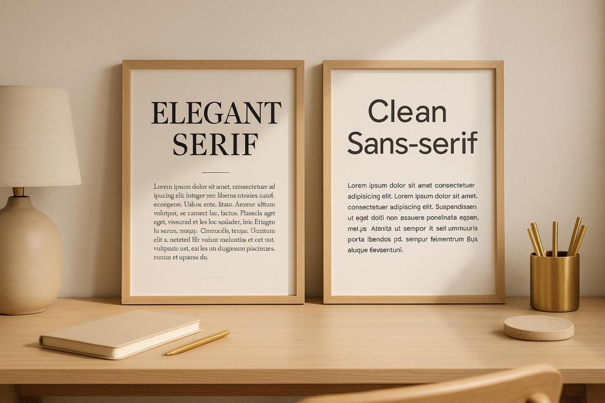
Pairing Serif and Sans-Serif Fonts
The timeless combination of serif and sans-serif fonts is a go-to for creating contrast in print. Serif fonts, with their decorative strokes at the ends of letters, are ideal for body text as they help guide the reader’s eye across the page. On the other hand, sans-serif fonts are sleek and modern, making them perfect for headlines and headings.
This pairing works because the two font styles complement each other beautifully. For instance, you can use a serif font like Georgia or Minion Pro for body text and pair it with a sans-serif font like Helvetica or Open Sans for headings. The contrast between the classic feel of serif fonts and the clean look of sans-serif fonts adds interest while maintaining a professional tone.
In brochures, you might use Caslon for body text and Futura for headlines. The key is to ensure that the serif font remains legible at smaller sizes, while the sans-serif font delivers bold, eye-catching headlines.
Next, let’s look at font families that are designed to make pairing even easier.
Working with Font Superfamilies
Font superfamilies are collections of typefaces that share the same core design but come in a variety of weights, widths, and styles. This ensures a cohesive look across your design while offering flexibility for hierarchy and emphasis.
Take Source Sans Pro or Univers, for example. These superfamilies provide a range of options to suit different needs. Use Source Sans Pro Light for body text, Source Sans Pro Semibold for subheadings, and Source Sans Pro Black for main headlines. This setup creates a clear hierarchy while maintaining consistency throughout your design.
Superfamilies shine in complex projects like catalogs or manuals, where multiple text styles are required. Instead of juggling unrelated fonts, you have a built-in toolkit that guarantees a harmonious design.
Finally, let’s explore how pairing display and body fonts can enhance both style and clarity.
Combining Display and Body Fonts
Display fonts are designed to grab attention at larger sizes, while body fonts are tailored for readability in smaller text. This pairing is especially effective for marketing materials, event invitations, and promotional designs where you need both impact and clarity.
When selecting display fonts, aim for ones that reflect your brand’s personality but avoid overly decorative options that might look unprofessional. A font like Bebas Neue, a condensed sans-serif, is great for bold headlines. Pair it with Lato for body text to balance impact with warmth and readability.
Another strong pairing is Playfair Display, a high-contrast serif with elegant letterforms, alongside Source Sans Pro for body text. Playfair Display works wonderfully for wedding invitations, upscale menus, or luxury branding, while Source Sans Pro keeps the supporting text clean and easy to read.
For display fonts, size relationships are key. The display font should be at least 2-3 times larger than the body text to establish a clear hierarchy. This ensures the decorative elements of the display font don’t overwhelm the design or compromise readability. Always test your font combinations at actual print sizes to confirm that the display font retains its impact and the body font remains legible.
Keep in mind that display fonts often have unique spacing or quirky letterforms that work well in headlines but can become problematic in longer text. Limit their use to headlines, pull quotes, or call-to-action elements for the best results.
sbb-itb-ce53437
Testing Your Font Combinations
After learning the basics of font pairing, it’s time to put your choices to the test. While digital previews can give you an idea of how fonts interact, nothing beats seeing your combinations in physical form. Testing ensures your final printed materials have the polished, professional look you’re aiming for.
Print Test Samples First
Always start by printing test samples. Use the actual paper stock you plan to use for your project, as factors like texture and ink absorption can affect how fonts appear.
When reviewing your test prints, focus on clarity, contrast, and readability. Pay close attention to body text, especially at smaller sizes. What looks sharp and legible on a screen at 12pt may become harder to read once printed.
Evaluate your samples under different lighting conditions. This step ensures your materials remain easy to read and visually appealing, whether they’re viewed indoors, outdoors, or under dim lighting. Once you’re satisfied with the technical aspects, check that the design aligns with your brand’s identity.
Verify Brand Alignment
Technical perfection isn’t enough – your font choices also need to reflect your brand’s personality. Serif fonts, for instance, often convey a sense of tradition, while sans-serif fonts feel more modern. Your font pairings should reinforce the message your brand wants to send.
Compare your printed samples to your brand guidelines and existing materials. Do the fonts work well with your logo and color palette? Does the overall design feel consistent with your brand’s values and appeal to your target audience? Sometimes, a pairing that looks great in theory might not feel right for your brand in practice.
Gather feedback from others. Share your test prints with colleagues, clients, or even members of your audience. Ask specific questions about readability, professionalism, and whether the fonts align with your brand’s image. Fresh perspectives can catch details you might have overlooked.
For the most accurate evaluation, use real content in your test prints. This helps you see how the fonts handle your actual messaging and layout.
Finally, think about how your font choices will work across different materials. A combination that looks great on business cards might not translate well to brochures or large banners. Test your fonts in various sizes and formats to ensure they work consistently across your entire campaign.
If something feels off during testing, don’t hesitate to tweak your choices. Refining your fonts through multiple rounds of testing often leads to a stronger final product. Make adjustments as needed, and when you’re confident in the results, move forward with your print project.
Working with Professional Print Services
Once you’ve nailed down the basics of font pairing, collaborating with a professional print service ensures your design vision translates seamlessly from screen to physical print. A skilled print shop doesn’t just print your project – it elevates it by applying years of expertise in handling materials, print methods, and design intricacies that go far beyond what you can achieve with DIY tools.
Print experts know how fonts interact with various paper types, how ink absorption impacts readability, and which combinations work best for offset or digital printing. Their knowledge helps you sidestep expensive errors and guarantees a polished, professional result.
In fact, a survey by Adobe found that over 70% of consumers associate high-quality printed materials with a company’s professionalism. The process of working with a print professional often begins early in your project. They’ll review your brand guidelines, get to know your target audience, and suggest font pairings that align with your goals. This mix of technical know-how and creative insight ensures a smooth journey from concept to final print.
Professional print shops also have access to extensive font libraries and specialized software, offering thousands of premium typography options. This opens up design possibilities far beyond the basic fonts available on most systems.
How Miro Printing & Graphics Inc. Can Help
Miro Printing & Graphics Inc. takes these principles to the next level, turning design challenges into standout print solutions. Their in-house design team specializes in typography for print, ensuring your materials are both visually striking and professionally crafted.
Their process includes reviewing your brand guidelines, testing print samples, and fine-tuning font pairings to balance readability and aesthetics – whether you’re printing business cards, brochures, or large-scale signage. With expertise across a variety of print projects, they tailor font choices to suit each specific application and printing method.
Miro Printing & Graphics Inc. handles every stage of the process, from initial design to final production. They don’t just choose fonts – they optimize them for clarity, style, and print quality. This hands-on approach bridges the gap between design and production, ensuring a cohesive and high-quality outcome.
Based in Hackensack, NJ, Miro Printing & Graphics Inc. is well-versed in U.S. preferences, spelling conventions, and formatting standards. This local expertise ensures your printed materials are perfectly suited for American audiences and business needs. By combining their understanding of the market with professional design skills, they create materials that truly connect with your target audience.
When you work with Miro Printing & Graphics Inc., you gain access to exclusive typography resources and expert advice. They stay ahead of font pairing trends, offering combinations that are both timeless and modern – helping your printed materials stand out while appealing to a broad audience.
Conclusion: Getting Font Pairing Right
Nailing font pairing can completely elevate your printed materials. Start by focusing on readability – it’s the cornerstone of effective design. Stick to a maximum of 2-3 fonts to keep things clean and professional, and establish a clear visual hierarchy to guide your audience effortlessly through the content.
Strive for a balance between contrast and harmony. Pair fonts with different weights or styles to add dimension, but ensure they still work well together. Classic combinations often strike the perfect balance between being easy to read and visually appealing, offering a modern edge without overcomplicating the design.
Always test your font choices on print. What looks great on a screen doesn’t always translate well to paper, so printing samples can save you from costly missteps.
Typography should reflect your brand’s personality. Keep in mind that fonts interact differently with various paper types and printing methods. Collaborating with professional printers can be a game-changer – they can help you sidestep common mistakes, like clashing fonts, overloading on typefaces, or using decorative fonts that compromise legibility.
Ultimately, font pairing isn’t just about following a set of rules. It’s about creating materials that are both visually compelling and easy to understand. By combining these principles with expert advice, your print projects will stand out and leave a lasting impression, giving your brand that polished, professional edge.
FAQs
How do I choose fonts that reflect my brand’s identity for professional print projects?
When selecting fonts for print design, it’s important to choose styles that reflect your brand’s personality and values. For instance, serif fonts often evoke tradition and trust, whereas sans-serif fonts offer a more modern and friendly vibe. Consider how these characteristics align with the message you want to convey.
Consistency plays a major role in building brand recognition. Stick to the same font family or use complementary styles throughout your printed materials. Thoughtful font pairing can also make a difference – try combining a bold, eye-catching headline font with a clean, easy-to-read body font. This approach not only creates a clear visual hierarchy but also ensures a cohesive and professional appearance.
If you’re feeling uncertain about your font choices or need expert input, reaching out to a reliable print shop like Miro Printing & Graphics Inc. could be a smart move. Their in-house design team can help you craft print materials that are polished and perfectly aligned with your brand.
What mistakes should I avoid when pairing fonts for professional printing?
When selecting fonts for professional printing, it’s important to keep things simple. Avoid using too many fonts in one design, as this can make your layout feel messy and unorganized. Sticking to just two or three fonts that work well together helps keep your project clean and visually appealing.
Another common pitfall is choosing fonts that are too similar. When there’s not enough contrast between fonts, your design can lose its structure and fail to guide the reader’s eye effectively. For instance, pairing two serif fonts with only subtle differences can result in a dull, monotonous appearance.
Finally, steer clear of relying entirely on fonts from the same family, unless those fonts come with distinct variations like bold or italic styles. Overusing a single font family can make your design appear flat and lifeless. Focus on creating a balanced and readable layout to achieve a polished, professional look.
How do printing methods impact the way fonts look on different types of paper?
The printing method you select has a big impact on how fonts look on different types of paper. Offset printing is known for producing sharp, detailed text, especially when used with coated or heavier paper. This method enhances the clarity and boldness of fonts, making them stand out. On the other hand, digital printing offers great resolution and accurate colors, though the outcome can depend on the paper’s brightness and texture. Smooth, high-quality paper typically delivers the best readability with this method.
Other elements, like the pressure used during printing and the texture of the paper’s surface, also play a role in shaping the depth and overall appearance of the fonts. To achieve professional-looking results, it’s crucial to align your printing method and paper choice with your design goals, balancing both readability and aesthetics.
Related posts
- How Typography Impacts Print Design Success
- Readability vs. Legibility: Typography Basics
- How Fonts Impact Brand Identity
- Ultimate Guide to Typography for Print
https://app.seobotai.com/banner/banner.js?id=68a2adb0e8dbcfc9a27ce853
