Want sharp, professional-looking prints every time? Here’s what you need to know about scaling images for print:
- Resolution matters: Always use at least 300 PPI for sharp results. Web images (72 PPI) won’t cut it for print.
- Color profiles: Convert from RGB to CMYK to ensure colors look accurate in print.
- Viewing distance impacts resolution: Close-up prints like business cards need higher DPI, while billboards can use lower DPI.
- Resizing tips: Keep the aspect ratio intact to avoid distortion. Avoid excessive upscaling to prevent pixelation.
- Use vector graphics: For logos and simple designs, vectors scale perfectly without losing quality.
Quick tip: Start with the highest resolution image available, lock proportions when resizing, and always test print before finalizing.
Follow these steps to avoid blurry, pixelated, or distorted prints and ensure your materials look polished and professional.
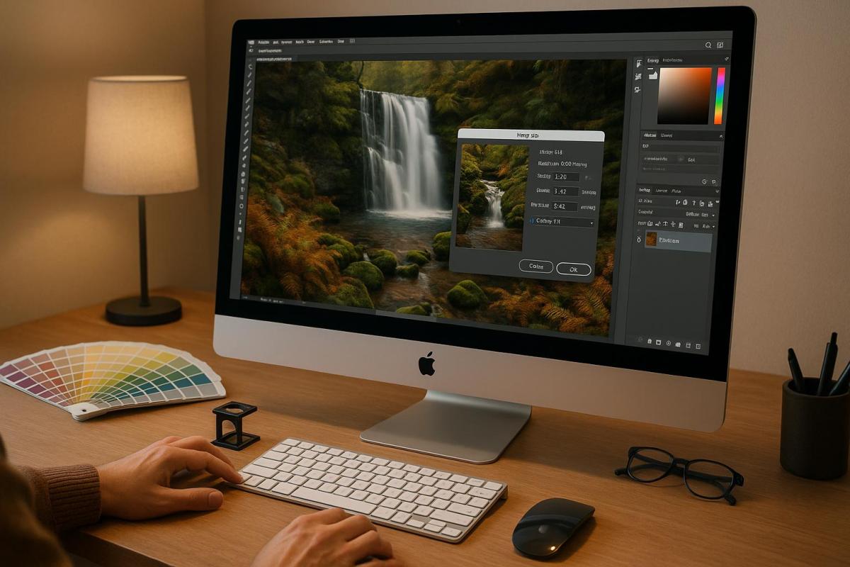
Prepare an Image for Print in Photoshop – Step-by-Step
Image Resolution Basics for Print
Understanding resolution is crucial for achieving sharp and clear print results. Two terms often come up in this context: PPI (Pixels Per Inch) and DPI (Dots Per Inch). While people sometimes use them interchangeably, they serve distinct roles in the print process.
What DPI and PPI Mean
PPI measures the number of pixels packed into a square inch on a digital screen, while DPI refers to the number of ink dots within a square inch on a printed image. Together, these factors influence how clear and detailed your image appears – higher PPI means finer detail on your screen.
PPI determines the overall size and quality of your digital image, which directly impacts how large it can be printed without losing clarity. On the other hand, DPI deals with how densely ink is applied during printing. DPI works within the CMYK color model, while PPI is based on RGB. This difference explains why printed colors can sometimes look different from what you see on your screen.
For high-quality prints, a standard 300 PPI is widely used. This ensures that images retain their sharpness when printed. In contrast, the 72 PPI standard for many screens dates back to early Apple Macintosh displays, which had a resolution of 72 pixels per inch.
Printer types also affect DPI. Inkjet printers typically operate in the 300–720 DPI range, while laser printers can reach 600–2,400 DPI. Printed materials like books usually use 150 DPI, while newspapers require only around 85 DPI.
Once you understand these basics, it’s important to consider how the viewing distance affects resolution requirements.
How Viewing Distance Affects Print Resolution
Resolution needs aren’t just about pixel density; how far the viewer is from the printed material also plays a big role. The farther away someone is, the less detail their eyes can perceive. This means that materials meant for distant viewing don’t need as high a resolution as those viewed up close.
For example, billboards viewed from 50 feet or more can be printed at just 20 DPI. In contrast, trade show displays, which are often viewed from a few feet away, typically require a resolution of 150–200 DPI.
Here’s a quick guide to how viewing distance impacts resolution needs:
| Viewing Distance | Required Resolution (PPI) |
|---|---|
| 1.5 ft | 300–400 |
| 2 ft | 300 |
| 3.3 ft | 180 |
| 5 ft | 120 |
| 6.5 ft | 90 |
| 10 ft | 60 |
| 16 ft | 35 |
| 33 ft | 18 |
| 50 ft | 12 |
For large displays viewed from a distance, a resolution of 100 DPI is generally sufficient. However, items meant for close viewing – like trade show displays – should stick to 300 DPI. For instance, a 3 x 2-meter billboard can be printed at just 43 DPI, while bus stop posters sized 175 x 118 cm are often produced at 75 DPI.
How to Prepare Images for Scaling
Getting your images ready for scaling is a crucial step to ensure they look great when printed. A little effort upfront can save you from blurry results or unnecessary reprints.
Check and Adjust Image Dimensions
For high-quality prints, your images need a resolution of at least 300 pixels per inch (PPI). You can check the image dimensions in its properties to confirm there’s enough pixel data for printing. If the resolution is too low, the print may look pixelated or blurry.
When resizing, use your editing software’s tools to adjust dimensions while keeping proportions locked. This prevents distortion. If you need to resample the image, keep in mind that upsampling (increasing resolution) can reduce detail, while downsampling (reducing resolution) permanently removes data from the file. Always proceed carefully to maintain image quality.
Once your dimensions are set, the next step is to convert the color profile.
Convert Color Profiles to CMYK
Printers use the CMYK color model (Cyan, Magenta, Yellow, and Black), while most screens display colors in RGB (Red, Green, Blue). To ensure your printed colors match your expectations, you’ll need to convert your images from RGB to CMYK. This conversion is crucial because RGB colors often appear more vibrant on screens than they will in print, and skipping this step can lead to unexpected results.
"To get a better idea of what will ultimately print, you should change your images to CMYK to see for yourself some of the subtle color shifts. Even though the change is on-screen – which is still digital/light – it will get you closer to envisioning the end result."
– Greg Simmons, Senior Creative Director, UPrinting
In Adobe Photoshop, go to "Image" > "Mode" > "CMYK Color" and save a new version of your file. For Adobe Illustrator, select "File" > "Document Color Mode" > "CMYK Color" and save a new file. When converting, choose a rendering intent – Perceptual or Relative Colorimetric are common options – and enable Black Point Compensation if you’re using the Relative Colorimetric setting. Always save a new version to keep your original RGB file intact.
Crop and Scale to Final Print Size
Before exporting, make sure your image is cropped and scaled to match the final print size. Scaling adjusts the image size while keeping the proportions intact, and cropping removes any unnecessary parts of the image. Both steps are essential for achieving the right dimensions without stretching or distorting the image.
Use your editing software’s crop tool to match the ratio of your intended print size. This ensures the image fits perfectly without any awkward adjustments. After cropping, scale the image incrementally to preserve quality, and export it at the final dimensions with a resolution of 300 DPI.
Choose the file format that suits your project: PNGs are great for graphics with sharp edges, while JPEGs work well for detailed photographs. Lock the aspect ratio during resizing to avoid distortion. Most editing programs offer a “maintain proportions” option to make this step easier.
Image Scaling and Resampling Methods
After preparing your images, applying the right scaling techniques is essential for achieving sharp and clear prints. The way you scale an image can make the difference between a crisp result and a blurry disappointment. Here, we’ll explore key methods and algorithms to refine your scaling process.
Upscaling vs. Downscaling: When and How
Upscaling and downscaling affect image quality in very different ways. Upscaling enlarges an image by adding pixels, which often leads to blurring, especially if the original resolution is low. On the other hand, downscaling reduces the number of pixels, which can result in the loss of fine details.
When you upscale, the software estimates and fills in new pixel values based on the existing ones. This process doesn’t create new details but instead stretches the image data, which can lead to a pixelated or blurry appearance. For the best results, always start with the highest-quality image available and avoid excessive upscaling.
Downscaling is less risky but still requires careful handling. It’s best to save scaled versions separately, keeping your original files intact. This way, you can always return to the original source if needed.
Pick the Right Resampling Algorithm
Once you’ve decided whether to upscale or downscale, the next step is choosing the right resampling algorithm. Resampling determines how new pixels are added or removed during scaling, and the algorithm you select can have a big impact on the final image quality. Here’s a breakdown of the most common options:
- Nearest Neighbor: This method is simple and fast, copying the color of the nearest pixel to fill new spaces. It preserves sharp edges but often results in blocky, jagged visuals. It’s ideal for pixel art or designs where crisp, hard edges are a priority.
- Bilinear Interpolation: By averaging the colors of a 2×2 pixel grid, this method produces smoother results than Nearest Neighbor. While it can introduce some blurring, it’s a reliable choice for enlarging photographs with smooth gradients.
- Bicubic Interpolation: This algorithm uses a 4×4 grid and cubic polynomials to generate smoother, more detailed results. Though it requires more processing power, it’s an excellent option for high-quality prints.
- Lanczos Interpolation: Designed for downscaling, this method uses a sinc function to maintain sharpness and minimize aliasing. However, it can sometimes create ringing artifacts around high-contrast edges.
- Area Interpolation: This approach averages pixel values in the corresponding area of the original image, making it perfect for downscaling. It reduces aliasing while preserving details.
Most professional software, like Adobe Photoshop, includes these algorithms in its resize options. Experimenting with different methods on your specific images can help you find the best fit for your project.
Use Vector Graphics for Scalability
For logos, text, and simple illustrations, vector graphics are a game-changer. Unlike raster images, which are made up of pixels, vector graphics rely on mathematical equations to define lines, shapes, and curves. This means they can be scaled to any size – whether it’s a tiny icon or a massive billboard – without losing clarity.
Because vectors aren’t tied to a pixel grid, they maintain sharp, clean edges at any size. While raster images are typically defined by resolution (e.g., 300 DPI for print), vector graphics remain resolution-independent. Common vector file formats include .AI (Adobe Illustrator), .EPS, .SVG, and .PDF (when created from vector sources). These files can be created and edited using tools like Adobe Illustrator, Inkscape, or Affinity Designer.
"SVG stands for Scalable Vector Graphics. This file format allows you to save vector designs. These images are made of vectors instead of pixels. They are scalable, so you can modify their size as much as you want without losing quality." – Aida González Vázquez, Digital Artist
Vector graphics shine when used for logos, illustrations, and designs with solid colors or simple shapes. However, they’re not suitable for photographs, which contain complex details and color variations better suited to raster formats. When preparing vector files for print, it’s a good idea to convert any text to outlines. This ensures the text renders correctly, even if the printer doesn’t have the required fonts, avoiding any unintended substitutions. For logos and straightforward designs, vector graphics provide a reliable and scalable solution.
sbb-itb-ce53437
Common Image Scaling Mistakes to Avoid
When preparing images for print, even small missteps can lead to disappointing results. Avoiding these frequent mistakes can save you time, money, and unnecessary frustration. Here’s a closer look at the most common errors that can ruin print quality – and how to steer clear of them.
Using Low-Resolution Images
Low-resolution images are a major culprit behind blurry, pixelated prints. This issue often stems from using images optimized for the web (typically 72 DPI) in projects that demand a higher resolution, like 300 DPI or more. Such images not only compromise visual quality but can also harm your brand’s reputation. To sidestep this problem, always start with the highest-quality source material. Use a professional camera with at least 12 megapixels for original photography, download the best resolution available from trusted stock photo sites, and always request vector files for logos and other graphics whenever possible.
Excessive Upscaling
Upscaling an image too much can lead to serious quality loss, resulting in pixelation and a lack of sharpness. When you enlarge an image, software has to create new pixel data, which often results in poor-quality output. The original image quality is far more important than merely increasing pixel count. If resizing is unavoidable, take a gradual approach – enlarging in smaller increments (e.g., 100% to 150%, then 225%, and finally 300%) can help retain more detail. For logos or simple graphics, converting them to vector format is a better option. Always source the highest-resolution image available and test small prints before committing to larger formats.
Incorrect Color Profiles
Another frequent mistake is using the wrong color mode. Images in RGB mode can appear muted or overly vibrant when printed, as RGB colors don’t translate perfectly to CMYK inks. This mismatch can result in unexpected color shifts. To avoid this, convert your images to CMYK early in the process and use soft proofing tools to see how colors will look on paper. Regularly calibrating your devices also ensures accurate color reproduction. Addressing these issues early can make professional printing smoother and ensure your final product looks as intended.
When to Use Professional Printing Services
Once you’ve explored the basics of scaling images, there are times when your in-house efforts might not be enough. When your project demands perfect resolution, precise color accuracy, or specialized materials, it’s worth considering professional printing services. These services are often the go-to solution for projects that require top-tier expertise and advanced equipment.
Why Professional Expertise Matters
Professional printers bring a wealth of experience and tools to the table, transforming ordinary prints into something exceptional. They offer expert advice on key factors like resolution, paper types, and color accuracy, ensuring your project meets the highest standards. Their ability to manage colors and prepare files properly is unmatched – catching scaling errors and other issues that might go unnoticed on your computer screen.
Industries that rely on detailed and precise visuals often turn to professional printers as a necessity. Whether it’s for high-quality marketing materials, large-scale banners, or intricate designs, their expertise can make all the difference.
How Miro Printing & Graphics Inc. Can Support Your Needs
Based in Hackensack, NJ, Miro Printing & Graphics Inc. offers a full range of services, including digital, offset, and large-format printing, alongside in-house design and bindery options. Their advanced equipment ensures precision for even the most demanding projects, making them a trusted partner for businesses needing reliable and high-quality printing.
Miro’s large-format printing is particularly useful for oversized projects like banners, posters, or other marketing materials that require flawless scaling and sharp visuals. They’re known for their attention to detail, timely delivery, and competitive pricing – all factors that have earned them glowing client reviews.
The commercial printing market, which was valued at over $400 billion in 2019 and is projected to surpass $460 billion by 2025, highlights the growing demand for professional printing services. For businesses that need impeccable visual presentation, consistent color accuracy for branding, or help with high-volume print runs under tight deadlines, Miro delivers comprehensive solutions. They also assist with logo design, branding strategies, and scaling projects involving unique materials, ensuring everything is completed on time and within budget.
When your project requires more than just basic printing, Miro Printing & Graphics Inc. is equipped to handle the challenge. Their commitment to quality and precision makes them a reliable choice for businesses aiming to stand out.
Conclusion: Key Points for Scaling Images for Print
Getting image scaling right for print comes down to a few essential rules. First and foremost, resolution matters. For sharp, high-quality prints, aim for at least 300 PPI. Images meant for the web, typically at 72 or 96 PPI, won’t cut it for professional printing.
Another must-do: convert images from RGB to CMYK to ensure colors appear as intended in print. Stick to lossless file formats like TIFF or PNG to maintain image quality.
Starting with high-resolution source images is crucial. Keep the original aspect ratio intact when resizing, and apply sharpening after scaling to enhance clarity . Always run test prints to check the image quality and color accuracy before committing to a full print run.
For projects where precision, consistent colors, or specialized materials are non-negotiable, professional printing services are your best bet. Companies like Miro Printing & Graphics Inc. bring advanced tools and expertise to the table, handling everything from large-scale banners to detailed marketing materials.
Whether you’re scaling images on your own or relying on experts like Miro Printing & Graphics Inc., following these basic principles ensures your printed materials look polished and professional. The effort you put into image preparation will always reflect in the final product.
FAQs
Why do I need to convert images from RGB to CMYK for printing?
When getting images ready for printing, switching from RGB to CMYK is a crucial step for achieving accurate color results. RGB (Red, Green, Blue) is designed for digital screens and offers a broader color range. However, many of those colors can’t be replicated in CMYK (Cyan, Magenta, Yellow, Black), the standard color model used in physical printing.
Converting to CMYK ahead of printing lets you see and tweak how the colors will actually appear on paper. This helps you avoid unexpected color changes or muted tones, ensuring your printed materials turn out vibrant and polished, just as you envisioned.
How does the viewing distance impact the resolution needed for printed materials?
The resolution you need for printed materials largely depends on how close the viewer will be to the print. Closer viewing distances call for higher resolution to keep the image sharp, while longer distances allow for lower resolution without compromising the visual quality.
Take a brochure, for instance – it’s meant to be viewed up close, so a resolution of around 300 DPI is ideal for crisp details. On the other hand, a large banner viewed from 10 feet away can still look great at just 60 DPI. A helpful rule of thumb is to consider the optimal viewing distance as roughly 1.5 to 2 times the diagonal length of the print. This approach ensures your project looks sharp and professional at the intended distance.
Why are vector graphics ideal for scaling images in print projects?
Vector graphics are ideal for print projects because they can be resized infinitely without sacrificing quality. Unlike raster images that blur or pixelate when stretched, vector files keep their sharp lines and clear details, no matter how large or small you make them. This precision is crucial for professional printing, where every detail matters.
Another advantage of vector graphics is their flexibility. You can easily tweak colors, shapes, and sizes to fit your design needs. Whether you’re working on business cards, banners, or brochures, vector files help ensure your printed materials always look clean and professional.
Related posts
- Large Format Printing: DPI vs. PPI Explained
- Image Resolution Standards for Offset Printing
- How to Prepare Vector Files for Print
- How to Adjust DPI for Large Format Prints
https://app.seobotai.com/banner/banner.js?id=6854e6305559d477e7600b62
