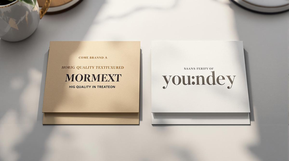
Serif and sans serif fonts are essential tools in print branding, each offering unique advantages. Serif fonts, with their decorative strokes, are ideal for creating a classic, formal tone and improving readability in long-form text like books. Sans serif fonts, with their clean lines, are better suited for modern, minimal designs and stand out in headlines and shorter content.
Key Differences:
- Serif Fonts: Traditional, elegant, and great for readability in dense text (e.g., books, newspapers).
- Sans Serif Fonts: Modern, approachable, and perfect for bold, clear visibility (e.g., posters, headlines).
Quick Comparison:
| Feature | Serif Fonts | Sans Serif Fonts |
|---|---|---|
| Visual Style | Decorative strokes at letter ends | Simple, clean lines |
| Best For | Body text in books, brochures | Headlines, posters, digital content |
| Perception | Formal, classic, authoritative | Modern, minimal, approachable |
| Challenges | Can lose clarity on dark backgrounds | May feel less formal in traditional contexts |
When choosing fonts for print, consider your brand’s personality, audience, and the type of material. Serif fonts work well for industries like finance or law, while sans serif fonts dominate tech and sports branding. Always test fonts in print to ensure clarity and readability.
Serif vs. Sans-serif: What do FONTS say about your brand?
Comparing Serif and Sans Serif Fonts
Design Features and Uses
Serif and sans serif fonts differ in their design and how they’re used in print branding. Serif fonts are known for their decorative strokes at the ends of letters, while sans serif fonts are characterized by their clean, uniform strokes .
| Print Material | Serif Font Advantages | Sans Serif Font Advantages |
|---|---|---|
| Business Cards | Creates a classic, formal tone | Delivers a sleek, modern appearance |
| Brochures | Improves readability for body text | Makes headlines stand out clearly |
| Books | Offers a smooth reading experience | Works well for chapter titles |
| Posters | Adds a touch of elegance | Ensures strong, bold visibility |
Serif fonts, such as Times New Roman, have long been favored for dense text. Times New Roman, designed in 1931 by Stanley Morison and Victor Lardent for The Times newspaper, is a prime example of how serif fonts are tailored for readability in extended text blocks . These design traits highlight the specific roles each font type can play in print materials.
Strengths and Limitations
When it comes to print branding, both serif and sans serif fonts have their own strengths and challenges. Studies show that comprehension levels remain similar between the two font styles for the average reader , but specific audiences may respond better to one over the other.
"In my opinion, serif typefaces less fatigue during long reading of regular, ‘paper’ editions than grotesque, for two reasons. Firstly, serifs emphasize the endings of strokes, becoming additional ‘sense-discerning’. Secondly, serif letters are somewhat more complex in shape, so they differ more from each other than grotesque ones. And our reader’s eye is more in need of a balance of individuality and unification than a designer’s eye, which enjoys mirror ideality." – Yuri Gordon, Book of letters from Aa to Ya
For audiences like children, older adults, or those with visual impairments or dyslexia, sans serif fonts tend to be easier to read . On the other hand, serif fonts continue to excel in traditional formats like books and newspapers, helping guide the reader’s eye across lines of text .
Technical factors also influence font choice. Serif fonts can lose clarity under certain conditions, such as when printed in CMYK or reversed out of dark backgrounds. Sans serif fonts, with their simpler shapes, often handle these challenges better .
Interestingly, about 90% of internet users read content in sans serif fonts , reflecting a preference for simplicity in digital contexts. However, for print branding, the decision between serif and sans serif should focus on the specific purpose and message rather than following digital trends. This approach ensures your font choice aligns with your brand’s goals.
Selecting Fonts for Your Brand
Matching Fonts to Brand Image
The fonts you choose play a big role in shaping how people see your brand. According to research by IT AgeLab and Monotype Imaging Holdings Inc., consumers form opinions about a brand’s personality based solely on its typography .
| Industry | Recommended Font Style | Notable Examples | Brand Values Conveyed |
|---|---|---|---|
| Luxury Fashion | Serif | Gucci, Chanel, Prada | Elegance, timeless appeal |
| Technology | Sans Serif | Apple, Google, Samsung | Modernity, simplicity |
| Sportswear | Sans Serif | Nike, Adidas, Under Armour | Energy, strength |
| Finance/Law | Serif | Traditional firms | Authority, reliability |
The weight of a font also communicates a message. Bold fonts suggest strength and confidence, while thinner fonts feel softer and more delicate. For instance, brands like Jimmy Choo and Hunkemoller use thin fonts to reflect femininity, whereas Diesel and Levi’s opt for bold typefaces to highlight a rugged, tough image .
Print Readability Factors
Once your fonts align with your brand image, it’s crucial to ensure they’re easy to read in print. A few technical tips can help:
- Font Size: Body text should be at least 12 points for clarity .
- Font Pairing: Stick to two or three font styles in a document to keep the design cohesive .
- Print Testing: Always test fonts on sample prints to check readability .
"Typography is one of the most powerful tools of design and marketing, creating deeper brand meaning and influencing consumer sentiment." – Ben Jura of Marks
For better results:
- Use serif fonts for body text to make longer content easier to read.
- Choose sans serif fonts for headlines and subheadings to create a clear visual hierarchy.
- Test fonts across different materials and sizes to ensure they work well in various formats.
In a survey of 500 people, serif fonts were seen as stable and mature, while modern fonts conveyed confidence and assertiveness .
sbb-itb-ce53437
Font Implementation Guidelines
Creating Font Standards
To establish consistent and accessible typography, define a clear font hierarchy that blends serif and sans serif fonts. The U.S. Web Design System (USWDS) provides helpful typography guidelines to maintain visual consistency and accessibility .
Here’s an example from Bastyr University‘s brand guidelines :
| Usage | Primary Font Choice | Alternative Font |
|---|---|---|
| Headlines | Libre Baskerville (Serif) | Palatino Linotype |
| Body Text | Myriad Pro (Sans Serif) | Arial |
| Digital Content | Lato (Sans Serif) | Tahoma |
- Serif fonts are ideal for lengthy content, as they improve reading flow and comprehension.
- Sans serif fonts are better suited for captions, credits, and charts.
- For younger audiences or early learners, simpler sans serif fonts often work best.
Once your font standards are in place, test them thoroughly to ensure they perform well across various mediums.
Print Quality Checks
To avoid common printing issues, follow these technical tips:
- Use solid spot colors with serif fonts to prevent blurred edges.
- Avoid thin serif fonts on dark backgrounds; opt for sturdier serif or sans serif options.
- Test fonts at actual print sizes, especially for smaller formats.
- Pair serif and sans serif fonts to create a clear distinction between headings and body text.
- Print test samples under different conditions to confirm font reliability.
Even well-known serif typefaces can face challenges in certain scenarios. For example, reversing text out of dark backgrounds or patterns can cause fine serif strokes to appear uneven or broken. In such cases, switch to sturdier serif fonts or sans serif alternatives that perform better under demanding printing conditions.
Miro Printing & Graphics Services
Print Design Services
Miro Printing & Graphics Inc. offers tailored print design services that prioritize brand consistency and readability. With expertise in digital, offset, and large format printing, they ensure fonts look sharp and professional across all mediums:
| Printing Method | Features |
|---|---|
| Digital Printing | Delivers crisp, high-resolution results for detailed fonts |
| Offset Printing | Offers precise color accuracy for a polished finish |
| Large Format | Ensures fonts stay sharp and clear, even at larger scales |
Their in-house design team works closely with clients to maintain font integrity in every project. As Miro Printing & Graphics Inc. explains:
"With meticulous attention to detail, our print shop has a customized approach that is unmatched by big online printing companies or franchises."
Small Business Print Solutions
Miro Printing & Graphics Inc. also specializes in helping small businesses achieve consistent branding across all printed materials. Their services include:
| Service Type | Features |
|---|---|
| Computer Layout & Design | Expert font pairing and clear visual hierarchy |
| Bindery Services | Ensures uniformity in multi-page documents |
| Print Quality Control | Provides video samples for font approval before production |
This thorough process has earned praise from clients. Julia I. shared how receiving video samples of a mini booklet allowed her to approve the fonts before the final print run. This ensures that serif and sans serif fonts remain consistent across both digital and print formats.
"Great customer service that we didn’t get with our old online printer. Attention to detail is what makes the difference!" – Mike B.
Their in-house bindery services further guarantee that font choices are effective and cohesive, whether you’re printing business cards or full catalogs. This dedication to detail helps businesses maintain a polished and professional image.
Conclusion
Summary of Font Differences
Serif and sans serif fonts each bring distinct advantages to print materials. Serif fonts, with their decorative strokes, are ideal for improving readability in printed text and play a key role in branding efforts . Their classic look makes them a go-to choice for industries like consulting, law, finance, and journalism, where establishing trust and authority is essential .
On the other hand, sans serif fonts, known for their clean and modern design, dominate contemporary branding. In fact, over 70% of Fortune 500 companies use sans serif fonts in their logos . These fonts excel in headings and shorter text, offering a crisp and versatile appearance.
Font Selection Tips
Here are some practical font selection tips for print branding:
| Context | Serif Fonts | Sans Serif Fonts |
|---|---|---|
| Body Text | Great for long-form content | Best for short paragraphs |
| Print Size | 12-14 points for body text | Use slightly larger for headings |
| Visual Hierarchy | Ideal for primary text content | Perfect for headers and subheadings |
| Special Conditions | Avoid on dark backgrounds | Works well for reversed text |
Ben Jura, Creative Director of Marks, highlights the importance of typography:
"Typography is one of the most powerful tools of design and marketing, creating deeper brand meaning and influencing consumer sentiment."
To achieve the best results in print, ensure consistent font sizing and spacing across your materials. For dark backgrounds or intricate patterns, sans serif fonts with strong, clear lines are the better choice for readability . By aligning font choices with your brand’s values and maintaining clarity, typography becomes a powerful tool for reinforcing your brand’s identity and message across all printed materials.
Related Blog Posts
- Ultimate Guide to Paper Types for Business Printing
- Kerning, Tracking, Leading: Key Differences
- How to Choose the Right Paper for Custom Prints
- Top 7 Typography Trends in Commercial Printing 2025
https://app.seobotai.com/banner/banner.js?id=67bbc494e5225d66b709372e
