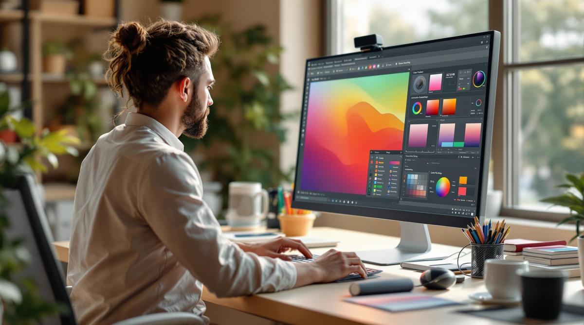
Soft proofing helps you preview how your digital designs will look when printed, saving time and reducing costly mistakes. It relies on calibrated monitors, ICC profiles, and color management software to simulate print colors accurately. Here’s what you need to know:
- Why It Matters: Ensures consistent colors for branding, photography, packaging, and fine art.
- Essential Tools:
- Monitor: IPS panel, 99% Adobe RGB coverage, calibrated with tools like X-Rite i1Display Pro.
- Software: Adobe Photoshop, Capture One Pro, or ColorNavigator.
- ICC Profiles: Custom profiles for monitors, printers, and paper types.
- Workspace Setup: Use D50 lighting, neutral gray walls, and avoid glare for accurate color evaluation.
- Steps:
- Calibrate your monitor monthly.
- Set up color management software with correct profiles.
- Use soft proofing modes to adjust colors for print accuracy.
Advanced Soft Proofing Monitor Calibration
Required Tools
To get started with soft proofing, you’ll need specific hardware and software. Here’s what you’ll need for accurate results.
Monitor Setup
Your monitor should meet these key specifications:
- Color Gamut: At least 99% Adobe RGB coverage
- Panel Type: IPS (In-Plane Switching) technology
- Bit Depth: True 10-bit color (not 8-bit + FRC)
- Resolution: Minimum 2560 x 1440 (QHD)
- Uniformity: Delta-E ≤ 2 across the screen
Calibration is crucial. Use tools like the X-Rite i1Display Pro ($279.99), Datacolor SpyderX Elite ($269.99), or Calibrite ColorChecker Display ($289.99) to calibrate your monitor. After calibration, professional software will help manage your settings effectively.
Software Options
Color management software plays a crucial role in soft proofing. Here are some top choices:
| Software | Key Features | Ideal For |
|---|---|---|
| Adobe Photoshop | Built-in soft proofing, ICC profile support, gamut warning | Photo editing and graphic design |
| Capture One Pro | Advanced color tools, tethered shooting, session-based workflow | Professional photography |
| ColorNavigator | Hardware calibration, custom profiles, automated scheduling | Eizo monitor users |
Using ICC profiles with these tools ensures consistent color translation across devices.
ICC Profile Guide
Here are the essential ICC profiles you’ll need:
- Monitor Profile: Created during calibration
- Printer Profile: Specific to each printer and paper combination
- Working Space Profile: Typically Adobe RGB or ProPhoto RGB
Update these profiles every 2–4 weeks for accuracy. Store them in the standard system directories:
- Windows:
C:\Windows\System32\spool\drivers\color - macOS:
/Library/ColorSync/Profiles
If you’re working with print shops like Miro Printing & Graphics Inc., ask for their custom ICC profiles. These ensure your soft proofs align perfectly with their printing equipment and materials.
Soft Proofing Steps
Workspace Setup
Setting up your workspace correctly is key for accurate soft proofing. Place your calibrated monitor away from direct light to avoid glare or reflections. Aim for ambient lighting at around 500 lux (roughly 50 foot-candles) with a color temperature of 5000K, which aligns with standard D50 viewing conditions.
Your workspace should include:
- Neutral gray walls (e.g., Munsell N8/)
- Overhead D50 lighting fixtures
- Window coverings to block outside light
- A desktop surface in 18% gray
Software Setup
Adjust these settings in your color management software for accurate results:
-
Color Settings
- RGB Working Space: Adobe RGB (1998)
- CMYK Working Space: U.S. Web Coated (SWOP) v2
- Color Management Policies: Preserve Embedded Profiles
-
Display Settings
- Brightness: 120 cd/m²
- White Point: D65 (6500K)
- Gamma: 2.2
-
Proofing Setup
- Device to Simulate: Your printer’s ICC profile
- Rendering Intent: Relative Colorimetric
- Black Point Compensation: Enabled
Once your software is configured, you’re ready to simulate your printed output.
Print Simulation
After preparing your workspace and software, simulate print conditions to preview how your design will look in print. Start by working with your image in Adobe RGB or ProPhoto RGB color space. Enable soft proofing mode (e.g., View > Proof Colors in Photoshop or Ctrl+Y/Cmd+Y). This will adjust your screen to mimic printed colors.
| Proofing View | Purpose | When to Use |
|---|---|---|
| Gamut Warning | Highlights out-of-gamut colors | Initial color check |
| Paper White | Simulates paper color | Final proof review |
| Black Ink | Shows rich black details | Dark tone evaluation |
Make any necessary color adjustments while soft proofing is active. Focus on saturated colors and shadow details, as these areas often differ the most between screen and print.
If you’re using a professional print service like Miro Printing & Graphics Inc., download and apply their specific ICC profiles. This ensures your soft proofing accurately reflects their printing conditions and paper types.
sbb-itb-ce53437
Common Problems and Solutions
Gamut Issues
Color gamut limitations can interfere with soft proofing accuracy. To tackle this, enable gamut warnings in your software. These warnings will highlight out-of-range colors, often as gray or other noticeable markers.
To address these issues, you can:
- Convert out-of-range colors to fit within the target gamut.
- Reduce saturation levels to bring colors within range.
- Switch to a wider gamut color space, such as ProPhoto RGB, for more flexibility.
For spot colors or specific brand hues, creating custom ICC profiles is key. These profiles should reflect your printer’s exact capabilities, especially when working with specialized inks or coated papers.
Lighting conditions also play a role in color accuracy, so it’s important to consider how they might affect your results.
Color Shifting
Inconsistent lighting is a major reason for color shifts. Your workspace lighting often differs from the final viewing environment, causing noticeable changes in how colors appear.
| Lighting Condition | Impact on Colors | Solution |
|---|---|---|
| Fluorescent Light | Adds a greenish cast | Install D50 bulbs |
| Window Light | Changes with time of day | Use light-blocking shades |
| Mixed Light Sources | Creates uneven color temp | Standardize to one source |
For best results, keep your workspace lighting at 5000K and maintain a consistent brightness of 120 cd/m².
Screen vs. Print Differences
Even with proper gamut management and consistent lighting, there are inherent differences between what you see on a screen and what appears in print. These differences arise due to limitations in monitor technology and the physical properties of print media. Common problems include:
- Shadow Detail Loss: Shadows may appear darker in print than on screen.
- Highlight Clipping: Bright areas might lose detail.
- Color Vibrancy: Colors often look more vibrant on screen compared to print.
Here’s how to minimize these issues:
1. Monitor Calibration
Regularly calibrate your monitor to ensure accurate color representation. This step is essential for reliable soft proofing.
2. Paper Selection
Use soft proofing settings that match your actual printing paper. Different paper types can significantly influence the final print:
- Matte papers tend to reduce contrast and color saturation.
- Glossy papers enhance blacks and make colors pop.
- Textured papers can alter how light reflects off the surface, affecting color perception.
3. Profile Management
Always use paper-specific ICC profiles to simulate accurate results. Many professional print shops provide custom ICC profiles tailored to their printer and paper combinations. These profiles are invaluable for ensuring your prints match your expectations.
Quality Control Methods
After preparing soft proofs, thorough quality control ensures that what you see on-screen matches the final printed output as closely as possible.
Monitor Maintenance
Keeping your monitor properly calibrated is key to consistent soft proofs. Tools like the X-Rite i1Display Pro can help you recalibrate monthly for accurate results.
Here are some essential steps to keep your monitor in top condition:
- Daily Warmup: Let your monitor run for at least 30 minutes before starting color-critical tasks.
- Weekly Cleaning: Use a microfiber cloth to clean your monitor weekly and avoid dust buildup.
- Monthly Calibration: Recalibrate your monitor with professional tools to maintain settings like a D65 white point and brightness around 120 cd/m².
Always double-check your monitor’s calibration settings before starting a session to ensure accuracy.
Lighting Standards
Proper lighting is crucial for professional color evaluation. Industry guidelines recommend using D50 (5000K) lighting with a Color Rendering Index (CRI) of 90 or higher.
| Lighting Component | Specification | Purpose |
|---|---|---|
| Overhead Lighting | D50 (5000K) | Ensures consistent color evaluation, separate from monitor calibration |
| Wall Color | Neutral Gray (N8) | Minimizes unwanted color reflections |
| Room Illumination | 500–750 lux | Provides the right brightness for viewing |
Set up your workspace to avoid direct sunlight or glare. Blackout curtains or light-filtering shades can help maintain consistent lighting throughout the day.
With a calibrated monitor and controlled lighting, you can confidently compare on-screen proofs with physical samples to fine-tune color accuracy.
Proof Comparison
Use a structured process to compare soft proofs with physical samples. Here’s how:
- Work in a controlled environment with calibrated equipment and D50 lighting.
- Focus on critical areas like shadows, highlights, saturation, and gray balance.
- Record any differences and note the adjustments needed.
Keep a detailed log of your findings, including:
- Date and time of the comparison
- Monitor calibration status
- Lighting conditions
- Observed color variations
- Adjustments made
Many professional print shops, such as Miro Printing & Graphics Inc., are equipped with calibrated viewing stations. These setups often include GTI viewing booths with controlled D50 lighting and neutral gray surrounds, ensuring reliable evaluations for both digital and physical proofs.
Summary
Key Advantages of Soft Proofing
Soft proofing comes with several perks:
- Save Time: Skip physical proofs and speed up production.
- Lower Costs: Reduce spending on proof prints and shipping.
- Eco-Friendly: Cut down on paper waste and transport-related emissions.
- Instant Adjustments: Make color corrections on the spot during design.
- Reliable Results: Ensure consistent, predictable color across print runs.
Practical Tips for Better Soft Proofing
- Use professional tools to calibrate monthly.
- Set up D50 (5000K) lighting at 500–750 lux.
- Keep walls painted in neutral gray (N8).
- Warm up your monitor for 30 minutes before use.
- Save monitor profiles tailored to different paper types.
- Log all color adjustments and calibration settings.
These tips can help you streamline your soft proofing workflow and improve results.
For projects where precise color reproduction is a must, working with an experienced print service provider can make a big difference.
About Miro Printing & Graphics Inc.
When accuracy matters, many professionals rely on trusted partners. Miro Printing & Graphics Inc., based in Hackensack, NJ, is a full-service print shop offering digital printing, offset printing, large-format printing, custom projects, and mailing and fulfillment services. Their in-house bindery and design team specialize in color management, helping ensure your printed materials look exactly as intended.
Related Blog Posts
- How to Adjust Colors for Offset Printing
- Print Proofing Steps for Flawless Results
- Proofing Process: From Screen to Print
- CMYK vs RGB: Printing Color Models
https://app.seobotai.com/banner/banner.js?id=67d770e4a5ba8bcd0fc6bea0
