Printing turnaround times refer to how long it takes from ordering to receiving your final printed product. Here’s what you need to know:
- Digital Printing: Fastest option, ideal for small runs or rush jobs (1-2 business days).
- Offset Printing: Best for large quantities, but takes longer (5-7 business days).
- Large Format Printing: Used for banners and signs, usually 3-5 business days.
Key Factors Affecting Turnaround:
- Materials: Standard papers are quicker; specialty materials add time.
- Finishing: Features like binding, lamination, or embossing can add 1-5 days.
- Seasonal Demand: Busy periods like holidays may slow production.
Quick Tip: Submit print-ready files, use standard materials, and plan ahead to meet deadlines. Rush orders are possible but cost more and may limit options.
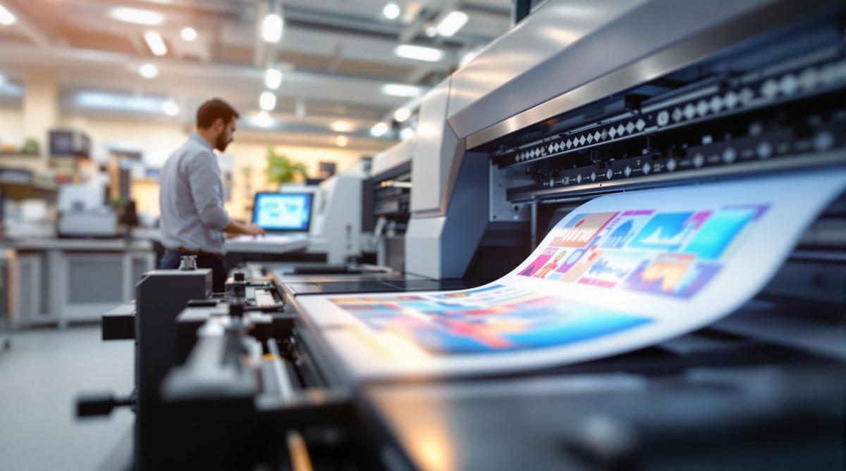
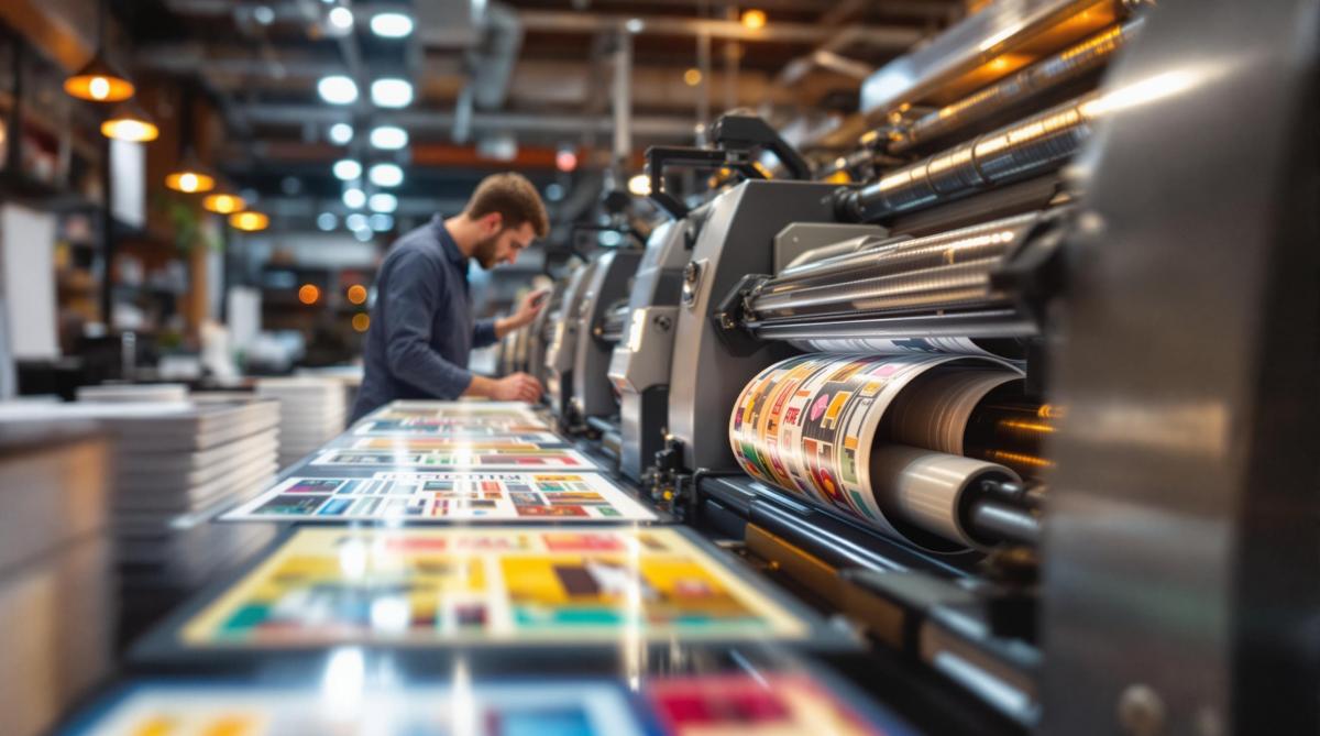
Digital Press: Fast Turnaround Times in Modern Printing
Factors That Determine Print Production Time
Several key elements influence how long it takes to complete print production:
Print Methods: Digital, Offset, and Large Format
The printing method you choose plays a major role in determining the timeline (see table below). Digital printing is the quickest option for runs under 500 units[1].
| Print Method | Standard Turnaround | Setup Time | Best Use Case |
|---|---|---|---|
| Digital | 1-2 business days | Minimal | Small runs, rush jobs |
| Offset | 5-7 business days | Longer setup | Large quantities |
| Large Format | 3-5 business days | Variable | Banners, signage |
Each printing method’s turnaround time also depends on the materials you select.
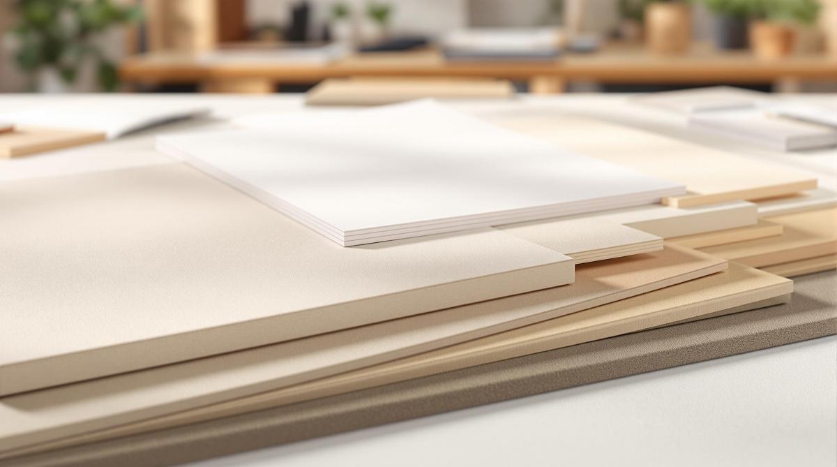
Paper and Materials
The type of paper or material you choose can either speed up or delay production. Standard paper stocks are processed faster, while specialty materials often require additional time. For example, during the holiday season, using unique materials can significantly impact schedules[4][6].
"Specialty materials require extra time for proper application and curing"[6]
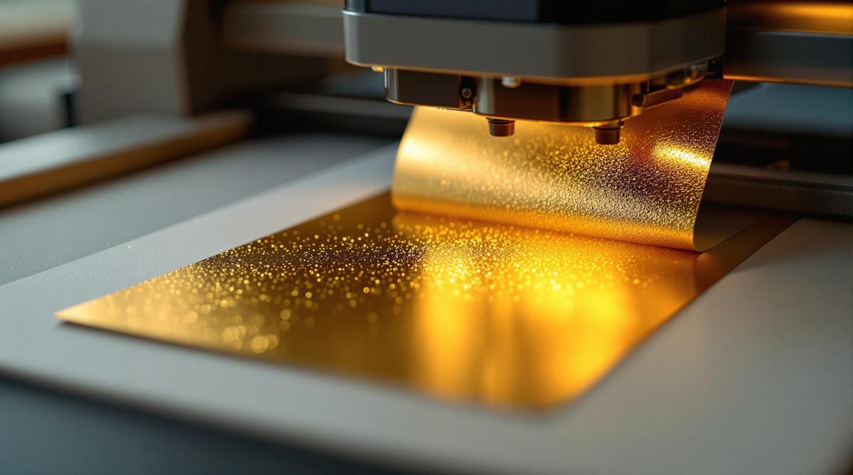
Finishing and Binding Time Requirements
Once printing is complete, post-production steps like finishing and binding further influence deadlines. Depending on the complexity, these steps can add anywhere from 1 to 5 extra days:
- Perfect binding or saddle-stitching: 2-3 days
- Lamination: 1 day
- Die-cutting or embossing: 2-4 days
- Complex assembly projects: 3-5 days
Planning for these additional steps early on can help ensure deadlines are met[1][3][5].
Tips for Meeting Print Deadlines
Meeting print deadlines takes careful planning and clear communication. By staying organized and proactive, you can handle the variables that often arise during production.
Setting Project Timelines
Create timelines that cover all stages of production. Here’s a general guide:
- Complex projects: Typically take 7-10 days
- Simple projects: Usually completed in 3-5 days [1]
Collaborating With Your Printer
Decide on materials and methods early to streamline communication with your printer. Assign a single point of contact and schedule regular updates, especially for more involved projects.
Keep these file specifications in mind:
- Use CMYK color mode
- Ensure images are at 300 dpi resolution
- Include a 1/8" bleed with crop marks
- Save files in PDF/X-1a format [2]
Handling Rush Orders
If you’re on a tight schedule, rush services can help but come with trade-offs. Expect to pay 25-50% more than standard rates [5].
Rush orders often involve:
- Fewer material choices
- Shortened proofing times
- Increased costs [5]
- Limited finishing options
These constraints can especially impact projects that require specialty materials.
sbb-itb-ce53437
Services at Miro Printing & Graphics Inc.
Miro Printing & Graphics Inc. is built for businesses that need fast, dependable service. By keeping all operations under one roof, they cut down on delays and keep projects moving efficiently.
Why On-Site Production Matters
With everything handled in-house, Miro Printing & Graphics Inc. avoids the common setbacks of outsourcing or transporting materials between locations. This setup means fewer delays and a smoother process overall [2].
| Key Benefits |
|---|
| Instant quality checks during production |
| Efficient file-to-print processes |
Handling Tight Deadlines
When time is of the essence, their streamlined workflow shines. Automated file checks ensure projects are ready to go without unnecessary back-and-forth [2][4].
For juggling multiple urgent tasks, their workflow management software steps in. It coordinates machine schedules and staff assignments, allowing different stages of several projects to run at the same time [3][5].
Conclusion: Keys to Print Project Success
Ensuring a smooth print project requires thoughtful planning, clear communication, and collaboration with your printer from start to finish. Starting with print-ready files and using standard materials can help you avoid unnecessary delays.
Preparation is key. Providing files that are ready for printing and clear specifications can significantly cut down on prepress bottlenecks. Thanks to modern printing advancements and automation, turnaround times are now quicker without sacrificing quality.
Technology has become a game-changer in the printing world. Tools like workflow automation reduce the need for manual tasks, while web-to-print platforms simplify order processing and proofing. These solutions help keep production efficient and on schedule.
Consistent communication and regular progress updates throughout the project are crucial. They allow potential issues to be spotted and resolved early. Adding buffer time to your schedule can also help you handle surprises without jeopardizing deadlines or output quality.
FAQs
What is turnaround time in printing?
Turnaround time refers to the period from when you place your printing order to when the final product is ready. For digital printing, this can take as little as 1 to 4 days for urgent jobs[3]. Offset printing, which is better suited for larger orders, typically takes 5 to 7 days[1].
Several factors can influence this timeline, including the printing method, availability of materials, and the complexity of finishing touches. To speed things up, consider these tips:
- Submit print-ready files to avoid delays.
- Stick to standard materials whenever possible.
- Schedule your project outside of peak seasons.
If your project involves detailed finishing work like embossing or die-cutting, expect an additional 1 to 2 days[2][6]. To avoid surprises, discuss any special requirements with your printer early on. For more detailed guidance, check out our ‘Setting Project Timelines’ section.
Related Blog Posts
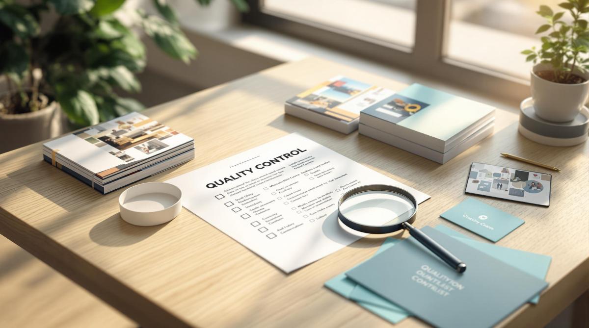
- Post-Press Quality Control Checklist
- Ultimate Guide to Post-Press Finishing
- Offset vs. Digital: Paper Size Considerations
- How Automation Improves Print Turnaround Times
https://app.seobotai.com/banner/banner.js?id=67ae740fa7b28c66c7df581a