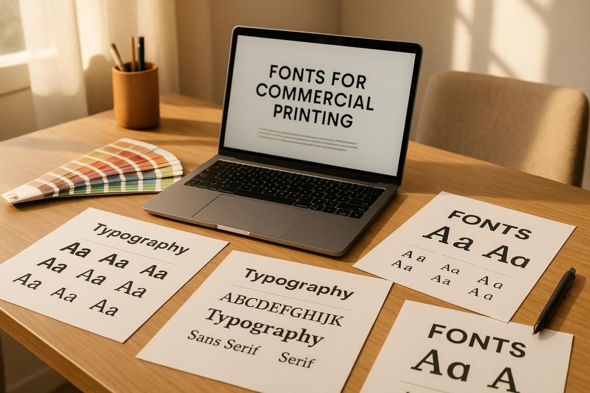
Typography is a cornerstone of effective print design. The fonts you choose can define your brand’s personality, improve readability, and directly impact how your audience perceives your materials. Here’s what you need to know:
- Readability and Legibility: Fonts should be easy to read across different sizes and formats. Serif fonts work well for long texts, while sans-serif fonts are better for headlines and modern designs.
- Brand Alignment: Match fonts to your brand’s tone. Serif fonts suggest tradition, while sans-serif fonts feel contemporary. Use two or three complementary fonts for consistency.
- Font Licensing: Always ensure proper licensing to avoid legal and financial risks. Different licenses cover desktop use, commercial applications, and embedding.
- Testing and Proofing: Print test samples to check how fonts appear on paper. Adjust for clarity, spacing, and contrast.
- Consistency: Develop a typography style guide to maintain uniformity in font usage, sizes, and colors.
Proper font selection ensures your printed materials look professional and communicate your message effectively. Let’s explore these steps in detail.
Digital Fonts & Typography for Letterpress Printing. FontLab lecture with Peter Fraterdeus
How Typography Affects Print Design
Typography is the backbone of any print design, combining visual appeal with the power to communicate your brand’s message. The way fonts are used can influence not just how your design looks but also how effectively it delivers your message. Typography guides readers through the content, shapes their emotional response, and becomes a tangible reflection of your brand when used in printed materials.
Let’s dive into how font choices can improve readability and enhance the overall visual experience.
How Fonts Impact Readability and Visual Appeal
The right font choices can make or break your print design. Elements like font size, weight, and style create a visual hierarchy, naturally drawing attention to key points like headlines while making the rest of the content easy to follow. Adjusting spacing – such as kerning, tracking, and leading – can transform crowded, hard-to-read text into something clean and accessible.
Contrast is another critical factor. A strong contrast between text and its background not only improves clarity but also adds visual interest. And don’t skip the step of reviewing print proofs; what looks great on a screen doesn’t always translate perfectly to paper. Testing ensures your typography maintains its clarity and impact once printed.
Matching Fonts with Brand Identity
Readability is crucial, but your font choices should also align with your brand’s personality. Fonts are more than just letters – they’re a visual representation of your brand’s character. They help set the tone, establish trust, and influence how your audience feels about your message.
For instance, serif fonts often convey a sense of tradition and reliability, while sans-serif fonts feel modern and straightforward. Script and display fonts, on the other hand, can add elegance, creativity, or boldness, depending on the context. By carefully selecting two or three complementary fonts, you can create a cohesive and polished look across all your materials.
At Miro Printing & Graphics Inc. in Hackensack, NJ, they emphasize maintaining typographic consistency across various formats – whether digital, offset, or large-scale printing. This consistency strengthens your brand identity and ensures a unified presentation across all platforms.
What to Consider When Selecting Print Fonts
Typography plays a big role in defining your brand, and choosing the right print fonts can make all the difference. The fonts you pick for commercial printing affect how clear, professional, and effective your materials appear.
Maintaining Legibility Across Different Sizes and Applications
Legibility is key, no matter the size or type of print. A font that works beautifully on a poster might not translate well to a business card. For most print materials, a font size of 10–12 points is typically best, but keep in mind that each typeface varies in how readable it is at different sizes. If you’re targeting a specific audience, such as older readers, you may need to use larger fonts to ensure accessibility.
"Good typography in your marketing materials keeps both ‘readability’ and ‘legibility’ in mind. While readability means exactly what you think it means: easy to read and understand, legibility means having sufficient contrast with a background (as in, not putting white on yellow on a billboard)." – A Better Image Printing
To ensure your design works well in real-life applications, always print a test version at 100% size. If the text looks blurry or hard to read from about 4 feet away, you might need to tweak the font size or increase the contrast.
White space also plays a big role in readability. Adjusting the spacing between lines (known as leading) can make text significantly clearer. For smaller font sizes under 22pt, stick to using no more than three CMYK colors to avoid blurring caused by mis-registration.
Once you’ve ensured legibility, compare different font styles to find the one that matches the tone and scale of your project.
Serif vs. Sans Serif Fonts: When to Use Each
Serif and sans serif fonts each have their strengths, depending on the context. Serif fonts, with their small decorative lines (serifs) at the ends of letters, are ideal for longer texts and formal documents. On the other hand, sans serif fonts, which lack these lines, offer a cleaner and more modern look, making them perfect for designs with limited space .
"Serifs often lend a bit more legibility at smaller scales. When you’re reading a 9.5 font in a printed book, serifs help you distinguish the letterforms and create flow as you’re reading." – Madeline DeCotes, Designer
Sans serif fonts shine in applications like signs, labels, and other designs where simplicity is key. They are also more accessible for individuals with low vision, with fonts like Arial, Helvetica, and Verdana being particularly effective.
| Font Type | Best Applications | Character | Advantage |
|---|---|---|---|
| Serif | Books, brochures, formal docs | Authoritative, traditional | Great for small print sizes |
| Sans Serif | Signs, labels, modern designs | Clean, modern | Ideal for tight spaces |
Serif fonts often feel more formal and stable, while sans serif fonts come across as neutral and contemporary.
With these distinctions in mind, the next step is ensuring your typography stays consistent to reinforce your brand identity.
Maintaining Typography Consistency for Branding
Consistency in your fonts is essential for building a strong brand identity. Start by creating a typography style guide that outlines the fonts to use for headlines, body text, sizes, spacing, and any specific styles . Stick to one primary font for headlines and branding, and a secondary font for body text. Limiting your font choices to just one or two can actually make your brand more recognizable.
Font management tools are a lifesaver when it comes to keeping your team on the same page. These tools ensure everyone has access to the correct fonts, reducing the risk of substitutions that could throw off your branding. Regularly auditing how fonts are being used can also help catch any inconsistencies before they become a bigger issue.
At Miro Printing & Graphics Inc., maintaining consistent typography across all printing methods – whether it’s digital, offset, or large format – helps ensure your brand always looks polished and professional.
Font Licensing and Legal Usage Requirements
While consistent typography strengthens brand identity, ensuring proper font licensing is essential to keep your projects legally sound. Fonts are treated as intellectual property, and using them without the correct licenses can lead to serious legal and financial repercussions.
Types of Font Licenses for Commercial Use
Font licenses are agreements that define how you can use, modify, or share font files. Knowing the different types of licenses helps you select the right one for your commercial printing needs.
- Desktop Licenses: These allow installation on specific devices for use in design software. However, they often limit the number of users and might restrict usage to prototypes or personal projects.
- Commercial Licenses: Required for business purposes like advertising, branding, or packaging. These licenses can vary in scope, covering print, web, or mobile use, and often specify limits on devices or users.
- Open Font Licenses: These permit modification, distribution, and broad usage, often at no cost. However, modifications may need to be shared under the same open-source terms.
- Embedding Font Licenses: These allow fonts to be embedded into documents or PDFs but might restrict certain file formats or usage contexts.
- App Licenses: Designed for mobile applications, these typically limit the number of installations.
The cost of font licenses depends on factors like font type, usage scope, licensing duration, and the foundry or designer. Since licensing terms differ between foundries, a "basic commercial license" from one may not cover the same usage as one from another.
How to Read and Understand Font EULAs
End User License Agreements (EULAs) detail the terms for font usage, but they can be confusing. A staggering 80% of designers don’t regularly read font licenses, and 78% of those who do still find the terms unclear. Additionally, 57% are unsure about their organization’s font licensing policies.
To navigate a EULA, start by identifying the license type and its coverage. Look for sections outlining permitted uses, restrictions, and the number of users or installations allowed. Pay close attention to clauses about commercial use, as some free fonts explicitly prohibit such applications.
If you plan to share font files with clients or vendors, review the agreement for transfer restrictions. Some licenses allow embedding fonts in deliverables, while others require the recipient to obtain their own license.
Be mindful of usage limitations. For instance, desktop licenses might only cover design creation, while commercial licenses may include broader applications like client work or mass distribution.
Keep thorough records of all font licenses, including EULAs, purchase receipts, and correspondence with foundries. With creative teams managing an average of 4,500 fonts, proper documentation is crucial. If any terms seem unclear, reach out to the foundry for clarification.
By understanding EULAs, you can avoid the costly mistakes outlined below.
Legal and Financial Risks of Improper Font Usage
Ignoring font licensing terms can lead to severe consequences. Willful copyright infringement may result in statutory damages of up to $150,000 per font per project. In one instance, a company paid approximately $3 million in damages for using a font that would have cost only $200 to license.
Several high-profile lawsuits underscore these risks. Font Bureau sued NBC for $2 million after the network installed a font on more devices than allowed by its license. Similarly, P22 filed a $1.5 million claim against NBC for using the "Harry Potter" font on merchandise beyond the scope of its digital-only license. Berthold pursued Target for using its "Akzidenz-Grotesk" font without proper licensing, seeking $150,000 in damages per font.
The issue is widespread. A global survey revealed that 59% of creative professionals admitted to sharing fonts with colleagues, while about one-third reported downloading fonts online without proper licensing. By 2016, it was estimated that 300 to 700 million fonts had been shared or downloaded without appropriate permissions.
The fallout from such violations includes legal fees, settlement costs, project delays, and loss of client trust. Beyond the financial impact, the reputational damage can be equally devastating. In commercial printing, even seemingly minor details like font licensing can have major legal implications.
To safeguard your business, always license fonts directly from type designers, foundries, or reputable retailers. Establish clear guidelines and conduct regular audits to ensure compliance with licensing terms.
sbb-itb-ce53437
Step-by-Step Guide to Choosing Print Fonts
Choosing the right fonts for print is more than just picking something that looks good – it’s about ensuring clarity, consistency, and alignment with your brand. A well-thought-out selection process can make all the difference in how your printed materials are perceived.
Font Selection Process: From Start to Finish
Start by identifying the needs of your project. Whether it’s a business card, a banner, or a brochure, each print format has different space and readability requirements.
Next, think about your audience and the message you want to convey. For instance, a fun, playful font might be perfect for an event flyer, while a clean, straightforward font is better for technical manuals. The tone – be it serious, elegant, or approachable – should guide your font choices.
Narrow it down to two or three fonts. Typically, you’ll need a primary font for body text and a secondary font for headings. These should complement each other to create visual harmony without overwhelming the design . Look for fonts that offer a variety of weights and styles (like bold or italic) to help establish a clear hierarchy and add visual interest without needing multiple font families.
Before finalizing, check the licensing terms and the End User License Agreement (EULA) to ensure your fonts are cleared for commercial use.
Finally, print test proofs. What looks sharp on a screen can appear very different on paper. Print samples at actual size to see how the fonts hold up in real-world conditions. Also, communicate with your printer about their preferred file formats and font handling requirements. If you’re working with a professional service like Miro Printing & Graphics Inc., discuss their specific needs upfront to avoid production delays.
Once you’ve locked in your choices, create a style guide to maintain consistency across all your printed materials.
Building a Typography Style Guide
A typography style guide is your go-to document for ensuring your font choices stay consistent across every project. It acts as a roadmap for designers, helping your brand maintain a unified look across different formats and campaigns.
Start with your brand’s existing guidelines. If you already have designated brand fonts, include them in your print style guide, but also consider how they perform in various print applications.
Define a primary font for body text that’s easy to read and aligns with your brand’s personality. Specify font sizes for different uses – 9–12 points generally work well for body text – and include line spacing guidelines to avoid a cramped appearance.
Choose secondary fonts for headings and subheadings that complement your primary font. Detail how these should be used, including size, weight, and style variations, to create a clear visual hierarchy. Include precise measurements and spacing requirements to ensure consistency in your designs.
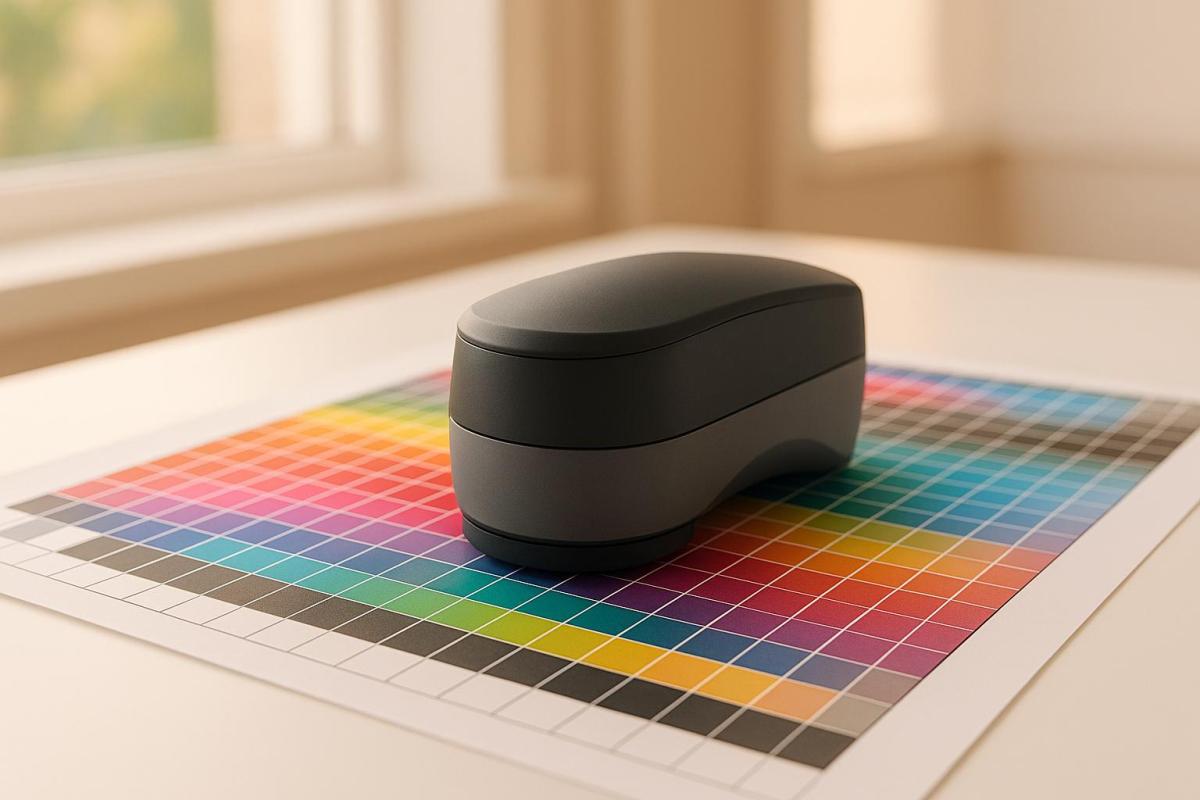
Your style guide should also cover color specifications, including RGB, CMYK, and HEX values, to ensure accurate printing. Provide guidelines for text color, background contrast, and accent colors for emphasis. Don’t forget to specify details like paper type, weight, finish, and trim size, as these factors can influence how your fonts appear.
After finalizing your style guide, validate your choices with thorough print testing.
Testing Fonts with Print Proofs
Print proofs are an essential step in confirming that your font choices work as intended. Fonts that look great on a screen can behave differently when printed, so testing under real conditions is key.
Print sample pages using your selected fonts in different sizes and applications. For example, create mockups of business cards, letterheads, or brochure sections to see how your chosen fonts perform together in print.
Pay attention to two key aspects: legibility (how easy it is to distinguish individual characters) and readability (how smoothly the reader can absorb the overall text). Experiment with font sizes to find the best balance between clarity and efficient use of space. Studies show that 86% of people prefer larger text for better legibility.
Test the contrast between your text and background colors by printing on the same paper stock you plan to use. Paper can significantly affect how colors and fonts appear. Also, review your materials under different lighting conditions – fluorescent office lights, natural daylight, and indoor ambient lighting – to ensure readability across environments.
Consider user testing as well. Feedback from readers can offer valuable insights into how your materials are perceived. Always save an editable version of your files before converting fonts to outlines, so you can make adjustments based on your test results. For example, you might find that serif fonts like Times New Roman or Georgia work better for long blocks of text, while sans-serif fonts like Helvetica are ideal for headings.
Summary: Font Selection Best Practices for Commercial Printing
Choosing the right fonts for commercial printing is a balancing act between aesthetics, brand identity, and functionality. Your font choices directly influence how your audience perceives and interacts with your printed materials, making this decision a crucial part of the design process.
To start, stick to your brand guidelines and limit your selection to just two or three fonts. This keeps your materials clear and visually cohesive. As PrintPlace.com puts it:
"Font selection can make the difference between interesting and boring printed materials".
Consistency in font use reinforces your overall brand strategy and makes your designs more effective.
For body text, prioritize readability. Serif fonts are a solid choice for lengthy passages, offering a classic, easy-to-read feel. Meanwhile, sans-serif fonts bring a clean, modern look that’s ideal for headlines and shorter sections . Also, ensure there’s enough contrast between your text and background colors so your materials remain legible in various lighting conditions.
Don’t overlook font licensing. Fonts are intellectual property, and using them without proper licensing can lead to legal troubles. Always secure the correct licenses before starting any print project to avoid unnecessary complications.
Testing your font choices with print proofs is essential. A font that looks crisp on a screen might not translate the same way on paper. Factors like paper texture, print resolution, and lighting can all affect the final appearance. Print samples at actual size on your chosen paper stock to confirm that your fonts achieve the desired effect.
Lastly, develop a detailed typography style guide. This document should outline your font choices, sizes, spacing, and color specifications. A well-crafted guide ensures consistency across all your printed materials and simplifies the production process. When working with commercial printers such as Miro Printing & Graphics Inc., share your font requirements early to avoid delays and ensure everything runs smoothly. Following these practices helps your printed materials consistently reflect your brand’s professionalism and attention to detail.
FAQs
What should I consider when selecting fonts for commercial printing to match my brand’s identity?
When selecting fonts for commercial printing, it’s important to pick ones that align with your brand’s personality and message. Choose typefaces that are clear and legible across different print formats and sizes, ensuring they work well whether they’re scaled up for posters or minimized for business cards.
Maintain a consistent font palette to give your materials – like brochures, flyers, and signage – a unified appearance. Also, double-check that the fonts you choose are licensed for commercial use to avoid any potential legal complications. These careful choices will ensure your printed materials effectively represent your brand.
How can I test and review fonts to ensure they look great in my printed materials?
To make sure your fonts look flawless in print, start by creating test documents with sample text in various sizes and styles. This allows you to assess character spacing, kerning, and how readable the text is overall. Export these files as PDFs to see how the fonts render in context. Be sure to use sample text that includes unique font elements, like punctuation, special characters, or numbers, so you can spot any potential issues right away.
For an extra layer of precision, print a physical proof to see how the fonts appear on paper. This step is essential for catching subtle details that might not be noticeable on a screen. Following these steps will help ensure your fonts give your project the polished, professional finish you’re aiming for.
Why is it important to understand font licensing for commercial printing, and what risks can improper use pose?
Why Font Licensing Matters in Commercial Printing
Using fonts in commercial printing isn’t just about picking something that looks good – it’s about making sure you have the legal right to use them. Fonts are considered intellectual property, and using them without the proper license can lead to serious consequences, like copyright infringement claims, lawsuits, or hefty fines. This becomes even more crucial when working on commercial projects, as the stakes are higher and proper usage rights must be secured.
Beyond the legal risks, using unlicensed fonts can damage your professional reputation. Imagine a client or partner discovering that your work includes fonts you don’t have the rights to use – it’s not a good look and could harm future opportunities. To protect your business and maintain trust, always double-check the licensing terms and ensure you have the necessary permissions for every font you include in your designs.
Related posts
- Serif vs. Sans Serif: Choosing Fonts for Print Branding
- How Typography Impacts Print Design Success
- Readability vs. Legibility: Typography Basics
- How Fonts Impact Brand Identity
https://app.seobotai.com/banner/banner.js?id=68817cb1b61d5c72653fabab