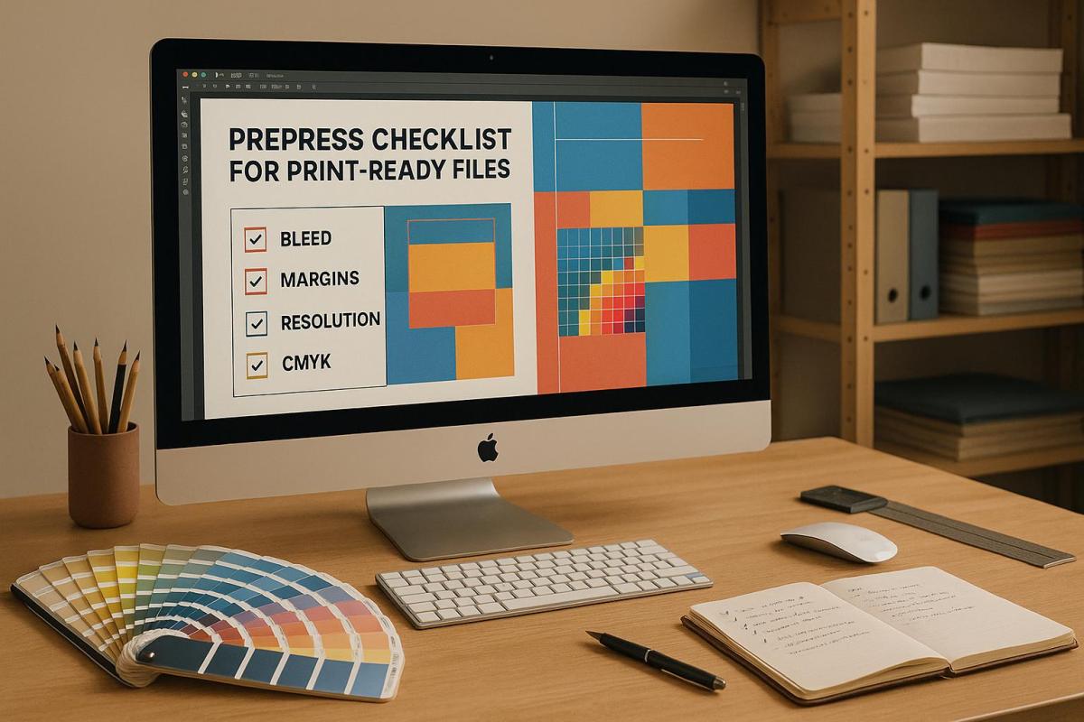
Die cutting combines precision and efficiency to create durable and visually appealing designs, but achieving the perfect balance requires careful planning. Here’s a quick summary of key tips for stronger die-cut structures:
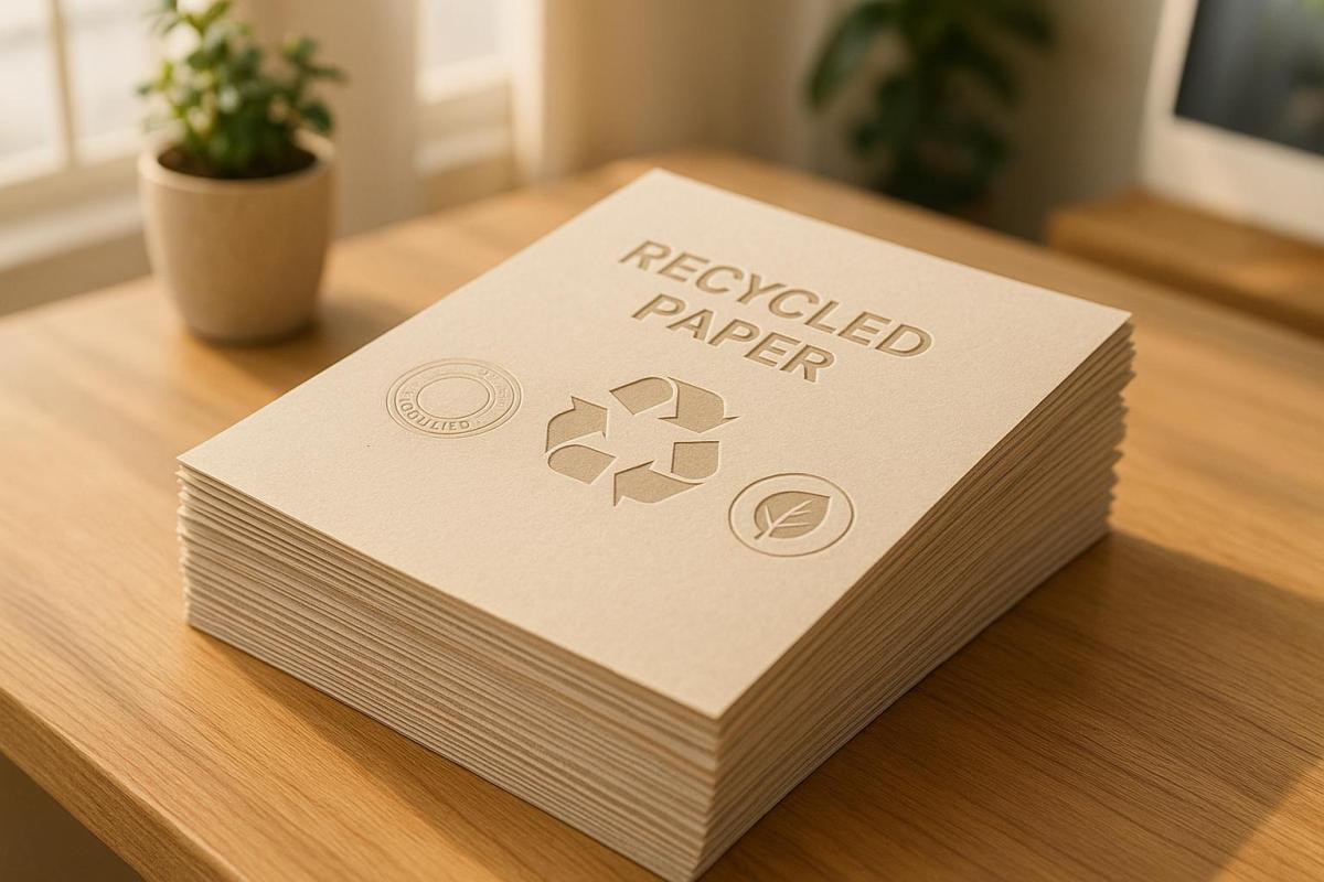
- Material Selection: Use durable materials like heavier cardstock or vinyl for better longevity. Add lamination for extra protection against wear and tear.
- Design Principles: Opt for simple shapes (circles, squares) and rounded corners to reduce stress points. Place holes and score lines strategically to avoid weak spots.
- Layout Optimization: Align designs with material grain for tear resistance and use nesting algorithms to minimize waste.
- Equipment Maintenance: Keep cutting dies sharp and clean to ensure precise cuts and avoid production delays.
- Testing and Quality Control: Create prototypes to identify weak points and use tools like vision systems or 3D scanning for defect detection.
5 Simple Ways to PERFECT Your Die Cut Images!
How Die-Cutting Design Affects Strength
When it comes to die cutting, every design choice plays a role in how durable the final product will be. For instance, sharp corners can focus stress, making thin materials prone to tearing. In contrast, rounded corners help distribute stress more evenly, improving overall durability.
Placement is also crucial. Holes should be positioned at least twice the material’s thickness away from edges, while score lines require a spacing of at least four times the material thickness. For end tabs, incorporating a hole can help dissipate stress effectively. These design principles lay the groundwork for choosing the right materials to ensure your design holds up over time.
Choosing Materials for Durability
Once you’ve accounted for stress distribution, selecting the right material becomes the next critical step. Heavier cardstock, for instance, provides better structural integrity for intricate designs, though it demands more precision in cutting. Finding the right balance between material thickness and the complexity of your design is essential.
For projects requiring extra durability, synthetic materials like vinyl are a smart choice. Unlike paper-based options, vinyl resists scratches, fading, and moisture, making it an excellent option for labels, decals, and promotional items. Adding a protective lamination layer can further improve durability while also enhancing the design’s visual appeal. Lamination resists UV damage and scratches and comes in various finishes like gloss or matte. Additionally, aligning your design with the paper’s grain direction can significantly boost tear resistance.
Balancing Appearance and Function
Striking the right balance between aesthetics and functionality is key to a successful die-cut design. Simple, bold shapes often offer better structural integrity than overly intricate patterns. Testing prototypes can help identify potential weak points before moving into full production.
Keep in mind that as designs become more complex, manufacturing costs tend to increase. Collaborating closely with your die-cutting provider can help you achieve a design that is both visually impactful and practical.
Also, consider the environment where the final product will be used. For outdoor applications, your design may need adjustments to withstand weather conditions, UV exposure, and moisture. Ultimately, opting for bold, straightforward shapes not only improves durability but also delivers a strong visual impression.
Design Methods for Stronger Die-Cut Projects
If you want die-cut projects that last, focus on design techniques that enhance structural strength. These approaches help your designs resist wear, hold their shape, and perform reliably over time.
Using Simple Shapes for Better Strength
When it comes to durability, simple geometric shapes are your best bet. Circles, squares, and rectangles handle stress more evenly than intricate patterns filled with multiple angles and curves. This is especially vital when working with thinner materials or items that will be handled frequently.
Why? Complex designs with sharp angles or directional changes tend to concentrate stress in specific areas, increasing the risk of failure. By sticking to simple shapes, you reduce these stress points and create a sturdier final product. If your project requires detailed elements, try breaking them into smaller, straightforward pieces that can be assembled later. This way, you keep the visual appeal without sacrificing strength.
Once you’ve simplified your design, it’s time to tackle potential weak spots.
Preventing Weak Spots in Your Design
Weak spots can emerge in predictable areas, but smart planning can help you avoid them. Sharp corners are a common culprit – they concentrate stress in small areas, making them prone to tearing. Instead, use rounded corners to spread forces more evenly across the material.
Hole placement is another critical factor. For optimal strength, follow these spacing guidelines:
- Place holes at least twice the material’s thickness away from edges.
- Maintain at least twice the material’s thickness between adjacent holes.
- Never position holes directly on score lines, as this increases the risk of tearing.
If your design includes tabs, be extra cautious. Holes near tabs should also follow the "twice the thickness" rule. Additionally, end the internal edges of tabs with a small hole to dissipate stress and prevent cracking during handling.
Arranging Layouts for Material Efficiency
Once you’ve addressed simplicity and weak spots, focus on how you arrange your designs on the material. The layout plays a huge role in both cutting efficiency and the durability of the final product.
"Strategic placement of cutouts, consideration of grain direction, and careful selection of materials can minimize material consumption and waste generation."
Using tools like nesting algorithms and CAD simulations can help you optimize your layout. These methods reduce waste, strengthen individual pieces, and ensure a more efficient cutting process.
The way you arrange your cuts also affects the quality of the finished product. For example, reducing horizontal cutting lines and evenly distributing cutting pressure can improve both the strength and appearance of your pieces. Staggered cutting patterns – where impressions are shifted vertically in the machine’s running direction – lower pressure requirements, enhance waste removal, and prevent die and anvil deflection.
Finally, consider the material’s grain direction. Aligning your designs with the grain improves tear resistance, while positioning them against the grain can be better for parts that need to fold or bend in specific ways. Thoughtful layout decisions like these can make all the difference in creating a durable and efficient die-cut project.
sbb-itb-ce53437
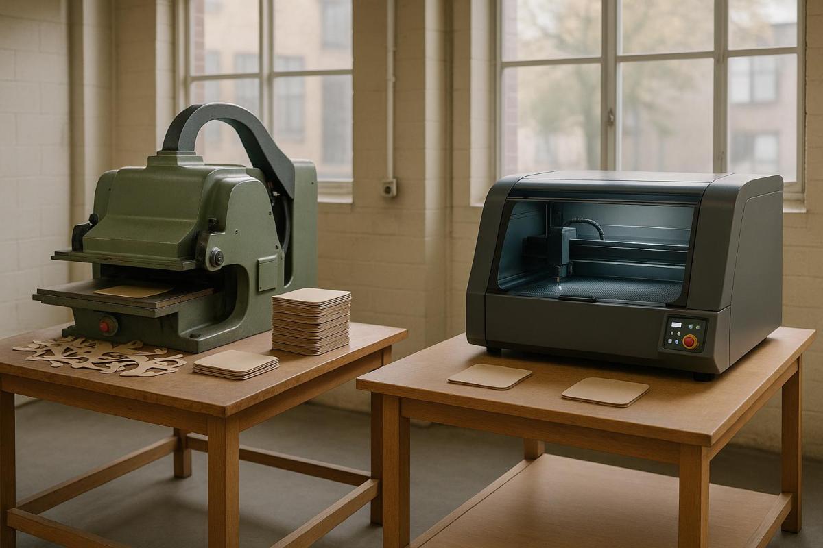
Equipment Selection and Maintenance Tips
When it comes to die-cutting, the equipment you choose and how you maintain it play a huge role in ensuring structural precision and long-lasting performance. The right tools and consistent upkeep are the backbone of any accurate and reliable die-cutting project. From selecting cutting dies to maintaining your equipment, every choice matters.
Choosing the Right Cutting Dies
Picking the right cutting dies means aligning your tools with the specific needs of your project. For instance:
- Material matters: Thin metal dies work best for lighter materials like paper, while steel rule dies are better suited for tougher materials like chipboard, fabric, leather, and wood veneer.
- Volume and complexity: Rotary dies are great for handling high-volume jobs, while flatbed dies excel at detailed, custom designs. Thin metal dies are ideal for intricate patterns on lighter materials, but steel rule dies may struggle with such precision.
If you’re working on label designs, maintain a 1/16-inch safe zone to protect essential design elements. Also, ensure your dies are compatible with your cutting machine. Rotary, flexible magnetic, and flatbed dies each offer unique benefits depending on your production goals. For cost-conscious projects, magnetic cylinders and flexible dies can save money, although their durability may be slightly lower.
Once you’ve chosen the right dies, maintaining their sharpness and precision becomes the next priority.
Keeping Blades and Cutting Plates Sharp
Maintenance is key to extending the life of your dies and ensuring consistent cutting quality. Regular upkeep can make a big difference:
- Cleanliness counts: Regularly clean your dies to reduce friction and maintain precision.
- Inspect often: Check blades frequently for dullness, chips, or damage. Address any issues promptly by sharpening or replacing parts as needed.
"Operating a die with blunt, worn, missing or loose parts can result in inconsistent cutting or folding, including frayed edges." – Best Cutting Die
Proper storage also helps preserve your equipment. Use oil paper-protected containers and handle dies by their outer edges to avoid bending the blades.
"Die maintenance ensures die-cutting equipment continues to function correctly, meets original equipment manufacturer (OEM) standards and prolongs its lifespan." – Best Cutting Die
Setting up a regular maintenance schedule is non-negotiable. Best Cutting Die recommends thorough cleaning to prevent friction, routine inspections to catch worn parts, and timely sharpening to keep your production line running smoothly. These steps not only ensure better performance but also help you get the most out of your equipment.
Testing and Quality Control
Once your die-cut design and equipment maintenance are in place, the next step is thorough testing. This process ensures your project’s structural integrity and visual appeal before full-scale production begins. By catching potential issues early, you can avoid costly errors and ensure a smooth production run.
Making and Testing Sample Projects
Prototyping is an essential step to identify potential flaws in your design or materials before committing to mass production. By creating sample projects, you can evaluate both the structural durability and the visual quality of your design. Running a small batch using the actual production materials and settings helps uncover issues that might not be apparent during the design phase.
To test prototypes effectively, use methods like the snap test to identify overly deep cuts or weak spots. Pair this with tensile strength measurements and black marker tests to detect problems with material penetration.
"A good physical feel of the liner and even using a peeler bar to make sure it doesn’t break works well." – Paul Young
For the black marker test, apply a black marker or diluted ink around the die-cut area on the liner material. Check for any ink bleed-through, which signals that the cuts are too deep and could compromise the substrate.
Document all testing results meticulously. Note any weak points, incomplete cuts, or areas that don’t meet performance standards. This feedback is invaluable for refining your process and ensuring the final product is up to par.
Once prototypes pass the strength tests, shift your attention to a detailed inspection for defects.
Checking for Defects and Accuracy
Defect detection plays a critical role in maintaining quality and avoiding customer complaints. Combining traditional inspection methods with modern technology ensures a thorough review of each piece.
For real-time defect detection, inline vision systems are a game-changer. For example, in June 2025, JBC Technologies implemented inline vision quality systems with high-resolution cameras on high-speed rotary die-cutting machines. This setup enables instant defect identification, process adjustments, and traceability for quality audits. Such systems are especially crucial for industries like aerospace, medical, and EV battery production, where precision is non-negotiable.
For smaller-scale projects, manual inspections remain effective. Use proper lighting and magnification to spot incomplete cuts, frayed edges, or dimensional inaccuracies. Pair these methods with advanced tools like 3D scanning technology, which offers faster and more detailed inspections compared to traditional coordinate measuring machines. This is particularly useful for verifying complex die-cut shapes with multiple dimensions and angles.
Adopt a tiered quality control system tailored to your project’s risk level. High-stakes applications, such as medical devices or aerospace components, demand more rigorous inspections to ensure every piece meets stringent standards.
For large production runs, statistical sampling is a practical approach. For instance, Metal Cutting Corporation, which often produces lots of 100,000 parts, relies on sampling protocols to maintain efficiency. In a typical scenario with a lot size of 5,000 pieces, an AQL of 1.0, and inspection level II, a random sample size of 200 pieces would be inspected.
Track defect trends over time using control charts and statistical analysis. This data helps identify recurring issues and guides process improvements. Addressing problems early minimizes the risk of costly recalls and reinforces customer confidence in your product.
If you need additional expertise, companies like Miro Printing & Graphics Inc. in Hackensack, NJ, can provide valuable insights into quality control practices. Their experience ensures that your die-cut projects meet the highest standards in both design and durability.
Conclusion: Getting Die-Cutting Design Right
Creating exceptional die-cut designs means finding the right balance between visual appeal and durability. Start with smart material choices – opt for vinyl if weather resistance is a priority or heavier cardstock for intricate, detailed designs. Remember, your material selection directly affects the product’s lifespan. Designs with simple shapes and rounded corners tend to hold up better over time, as sharp angles are more prone to tearing or breaking. Combining creativity with practicality ensures your projects are both eye-catching and long-lasting.
Keeping your equipment in top shape is equally crucial. Regular cleaning, inspections, and blade sharpening help maintain precision while avoiding costly production delays.
Effective quality control is the final piece of the puzzle. Early inspections and thorough root cause analysis can catch defects early, reduce waste, and build trust with your customers. Together, these practices create a production process that’s reliable and efficient.
By focusing on thoughtful material selection, straightforward design, meticulous equipment care, and strong quality control, you can deliver die-cut projects that make a lasting impression.
For businesses looking for expert die-cutting services that emphasize both style and structural integrity, Miro Printing & Graphics Inc. in Hackensack, NJ, offers a full range of printing and post-press services. Their experienced team specializes in custom die-cutting projects with a keen eye for quality and detail.
FAQs
What materials work best for durable and weather-resistant die-cutting projects?
For die-cutting projects that need to hold up under challenging conditions, materials like neoprene, silicone, urethane, EPDM rubber, and tough plastics such as polycarbonate are solid options. These materials are built to last and can resist weathering, making them suitable for both indoor and outdoor use.
When choosing the right material, think about factors like exposure to moisture, UV light, or extreme temperatures. This will help ensure your project stays durable and looks great over time.
What are the best ways to design a die-cut project that minimizes waste and improves production efficiency?
To create a die-cut project that minimizes waste and improves production efficiency, start with thoughtful planning and efficient material use. Arrange cutouts carefully to reduce scrap, and steer clear of overly complicated shapes. Keeping the design simple not only cuts down on material waste but also helps save on costs.
Selecting the right materials is just as important. Look for options that are both durable and budget-friendly, ensuring they meet the specific requirements of your project. Using modern die-cutting technologies can also make a big difference. These tools help streamline the production process, reduce mistakes, and make the most of your materials. By focusing on these strategies, you can produce high-quality die-cut designs while keeping waste and expenses under control.
What are the best ways to ensure die-cut designs are accurate and consistent before starting mass production?
To get die-cut designs right before diving into mass production, start with visual inspections to spot any issues like nicks, burrs, or misalignments. These quick checks can save you from costly mistakes down the line. Next, rely on precision measuring tools to verify that the dimensions and tolerances align perfectly with your design specs.
During the die-cutting process, it’s crucial to keep an eye on critical factors like cutting pressure, material feed rate, and die temperature. Monitoring these parameters helps catch potential errors early. Regular in-process inspections using calibrated tools add another layer of quality control, ensuring consistent and reliable results. Together, these steps safeguard the structural integrity and appearance of your die-cut projects.
Related posts
- How to Create Die-Cut Templates for Printing
- How to Prepare Files for Die-Cutting and Laser Cutting
- How Digital Die-Cutting Works for Packaging
- Ultimate Guide to Die-Cut Design Software
https://app.seobotai.com/banner/banner.js?id=6859ecfc5559d477e7653553