Thermal binding is a simple yet effective way to give your documents a polished, professional look while preserving your branding elements. It uses heat to secure pages in an adhesive-lined cover, creating a clean, book-like spine. This method is ideal for businesses looking to elevate proposals, reports, and marketing materials with custom covers featuring logos, colors, and finishes like foil stamping or embossing.
Key Highlights:
- Professional Finish: No punched holes; clean, glue-bound spine for a sleek appearance.
- Durability: Heat-activated adhesive ensures long-lasting bonds, even for frequent handling.
- Customization: Covers can include logos, brand colors, and premium textures like leatherette or linen.
- Applications: Perfect for proposals, annual reports, brochures, and marketing materials.
- Security: Tamper-evident binding ensures document integrity.
Thermal binding not only enhances the look of your materials but also reinforces your brand identity with high-quality, personalized designs. Whether you’re preparing client presentations or corporate handouts, this method ensures your documents leave a lasting impression.
How to use Thermal Binding
Key Benefits of Thermal Binding for Branding
Thermal binding offers a range of advantages for businesses aiming to enhance their brand image through printed materials. Its refined look, durability, and customization options make it a standout choice.
Professional and Polished Appearance
Thermal binding creates a sleek, book-like finish thanks to its smooth, glue-bound spine. Unlike other binding methods, it doesn’t require punching holes, which helps preserve the integrity of layouts and branding elements. This feature is especially useful when your materials include custom designs or high-quality visuals.
"The smooth, glue-bound spine gives documents a clean, book-like finish. It’s ideal for reports, proposals, manuals, and self-published books." – PrintFinish
Another key benefit is its tamper-resistant nature. The heat-activated adhesive fuses the pages firmly into the spine, making it difficult to alter the document without reheating the glue. Any attempt to add or remove pages becomes immediately noticeable. This added security is critical for legal documents, contracts, and high-stakes business proposals where maintaining document integrity is essential. Beyond aesthetics, the polished finish also contributes to the document’s durability and professional presentation.
Durability and Longevity
Thermal binding uses heat-activated adhesive to penetrate paper fibers, creating a secure and lasting bond. This method ensures that documents can withstand frequent handling without falling apart. It’s capable of holding hundreds of pages securely, making it suitable for large reports or manuals.
For added protection, library-quality hardcovers are available. These not only enhance durability but also provide a formal and professional look, ideal for materials that require long-term storage or frequent use. The combination of strength and style ensures your branded materials retain their quality over time, reinforcing a strong professional image.
Customization for Brand Identity
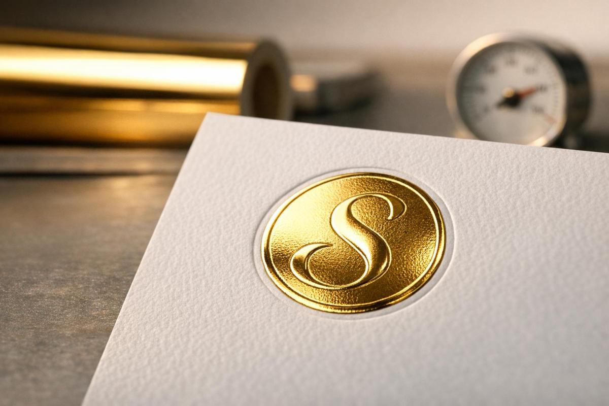
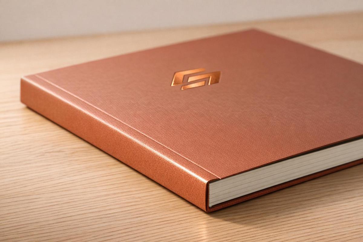
Thermal binding isn’t just about durability – it’s also highly customizable, allowing businesses to reflect their brand identity in every detail. Covers can feature logos, brand colors, and graphics, applied through techniques like one-color and multi-color offset printing or four-color process printing. To add a premium touch, options like foil stamping, embossing, and custom die-cut windows are available.
"The wide range of colors and textures of our cover materials, when coupled with our graphic capabilities, provides you with endless possibilities to reflect your company’s image." – ThermoBind
Material choices include linen, premium leatherette, and even recycled paper, so you can select a texture and feel that aligns with your brand’s values. By tailoring the cover materials and finishes, you create a lasting impression that sets your business apart. Considering that up to 93% of consumers base decisions on the visual appeal of logos and materials, investing in these customizations can have a powerful impact on how your brand is perceived.
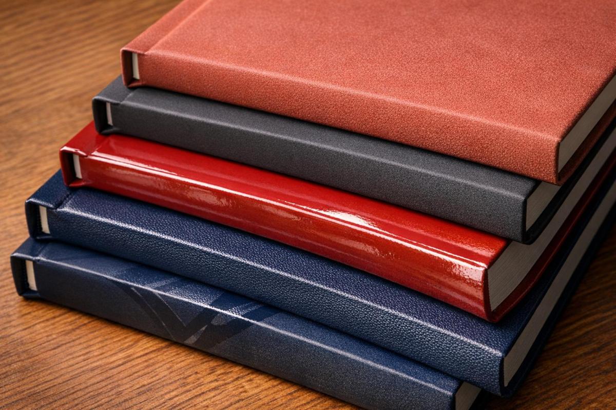
Customization Options for Thermal Bound Covers
Thermal binding covers come in two main styles: hardcovers and softcovers. Hardcovers are built with 100 pt. chipboard wrapped in premium materials like Kivar, Silktouch Nuba, and Skivertex Silver Linen, making them perfect for more upscale uses. Softcovers, on the other hand, are designed for frequent handling and include options such as Presidential, Executive, Prestige Linen, Whitegloss, and Leatherflex. For added flair, specialty finishes like frosted fronts (SteelMat) or crystal-clear covers (SteelCrystal) protect and highlight the first page of your document. These material and finish choices allow you to align your thermal bound covers with your brand identity seamlessly.
Material Options
Hardcovers are ideal for premium projects like proposals, annual reports, or self-published books, accommodating sizes from 1/8" (15–30 sheets) to 2" (430–500 sheets) thick. Softcovers are better suited for items like catalogs or brochures that require flexibility for mailing and handling. If you’re aiming for a timeless look, Prestige Linen or Elegant Linen finishes provide a classic texture. For a more polished, sophisticated feel, consider leather-like options such as Leatherflex or Premium Leatherette. Glossy Lithowrap and matte lamination are also available, enhancing the visual appeal while minimizing glare. Beyond the material itself, adding logos and brand colors ensures your documents reflect your company’s image.
Logo and Color Integration
Take your branding to the next level by incorporating your logo and colors through techniques like offset printing, silkscreening, foil stamping, or embossing. Both 1-4 color offset printing and silkscreening produce high-resolution graphics while matching your brand’s exact colors using the Pantone Matching System (PMS). For an elevated look, foil stamping adds a metallic touch in shades like shiny gold, silver, red, or blue, as well as pigment finishes in black or white. Pairing embossing with foil stamping creates a raised effect, giving your logo both visual and tactile prominence.
Custom die-cut windows are another way to enhance branding, allowing internal pages – such as title pages or letterheads – to peek through. These windows can be tailored to any shape or size, from standard rectangles (1 3/4" x 4") to unique designs that reflect your brand’s personality. Keep in mind that custom covers often require a minimum order of 100 pieces for laminated covers or 300 pieces for specific hardcover styles. Discounts are available for bulk orders at quantities like 200, 300, 500, 1,000, 2,500, 5,000, and beyond. These options not only protect your pages but also create a strong visual impact, ensuring your brand stands out with a professional, polished presentation.
sbb-itb-ce53437
Applications of Thermal Binding in Business Branding
Proposals and Presentations
Thermal binding transforms client documents into polished, professional presentations. For instance, real estate agencies often use thermal-bound listing books to present properties with a sleek, high-end finish during competitive pitches. Similarly, corporate presentations and client proposals benefit from the clean, glue-bound spine, which avoids the industrial look of mechanical binding methods and maintains the design’s visual appeal. Plus, the quick process allows for fast preparation of documents when time is tight. Beyond proposals, thermal binding adds a sophisticated touch to a variety of business documents.
Annual Reports and Brochures
Annual reports, catalogs, and pricelists gain a professional edge with thermal binding, offering durability for frequent handling. Companies often choose hardcover options with leather-like finishes for formal annual reports, while softcovers provide the flexibility needed for mail-friendly catalogs. Thermal binding accommodates a wide range of document sizes, with spine widths that can handle up to 500 sheets. This flexibility makes it suitable for everything from slim brochures to detailed company reports. Such refined presentation reinforces your brand’s premium image and professionalism.
Marketing Materials
Thermal binding also elevates marketing materials, giving them a polished, eye-catching finish. Whether it’s promotional booklets, photo books, or portfolios, these materials stand out at trade shows and client meetings. Customized covers featuring company logos and brand colors further strengthen brand identity. Additionally, the tamper-evident nature of thermal binding ensures document security, as any page removal is immediately noticeable. For portfolios requiring even greater security, VeloBind systems can secure up to 750 pages with pronged bars, making edits impossible without a full rebind. Window-cut covers provide an extra branding opportunity by showcasing specific artwork or title pages without opening the document. Across all applications, thermal binding consistently enhances the professional image of your brand in every business material.
Step-by-Step Thermal Binding Process at Miro Printing & Graphics Inc.
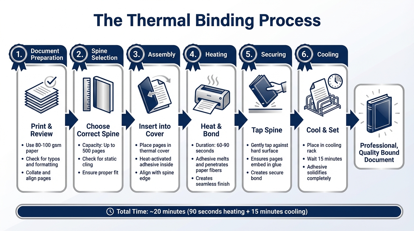
Thermal Binding Process: From Document Preparation to Professional Finish
Document Preparation
At Miro Printing & Graphics Inc., the thermal binding process starts with careful preparation. Before binding, every document undergoes a thorough check to ensure print readiness and proper formatting. High-quality paper, typically between 80 and 100 gsm, is used for printing, and documents are reviewed for typos to guarantee a polished final product. Once printed, the pages are collated and aligned perfectly with the spine using a paper jogger. This step ensures the adhesive can bond evenly to the paper.
Choosing the correct spine width is another crucial step. Thermal binding covers can accommodate up to 500 pages, so selecting a cover that’s too small may lead to jamming, while an oversized cover could result in a weak binding. Additionally, static cling is checked to prevent misalignment of the first and last pages. Once these details are addressed, the documents are ready for binding, ensuring a smooth and precise outcome.
Binding and Finishing
After preparation, the binding process begins. The document is inserted into a thermal binding cover, which contains heat-activated adhesive. The assembly is then placed into a thermal binding machine, where the adhesive melts and bonds to the paper fibers, creating a seamless, hole-free finish. This heating process typically takes 60 to 90 seconds.
Once the adhesive has melted, the spine is gently tapped against a hard surface to ensure the pages are securely embedded in the glue. The bound document is then placed in a cooling rack for about 15 minutes, allowing the adhesive to solidify completely. This step results in a durable, professional finish that resembles a book.
Miro Printing & Graphics Inc. also offers custom cover options to enhance the document’s appearance and reinforce brand identity. For clients needing precise color matching, the Pantone Matching System is used to ensure the cover colors align seamlessly with other corporate materials. This attention to detail ensures that every bound document is both functional and visually impressive.
Conclusion
Thermal binding does more than just polish your documents – it turns them into tools that strengthen your brand. With its sleek, book-like finish, thermal binding not only enhances the look of your materials but also ensures they’re durable enough for long-term use. This method is particularly cost-effective, cutting printing expenses by 30%–70%, while enabling the production of over 420 documents per hour. Plus, its heat-activated adhesive provides a secure, tamper-evident seal, making it a practical choice for both small and large-scale projects. As Sarah Cordeiro from Southwest Business Products puts it, "Thermal binding is recommended for documents that need to both look professional and remain intact".
Miro Printing & Graphics Inc. takes thermal binding to the next level with their expertise in custom design. From precise Pantone Matching to foil stamping and embossing, they handle every detail, ensuring your materials are not just functional but visually impressive. Their combination of technical skill and creative design makes it easier for businesses to stand out in competitive markets.
Whether it’s client presentations or corporate handouts, thermal binding offers an affordable way to deliver polished, professional materials that last. Choosing custom thermal binding doesn’t just improve the look of your documents – it boosts your brand’s credibility and leaves a lasting impression on your audience.
FAQs
What’s the best cover type for my document?
The right cover type depends on what you value most – durability, appearance, or style. Hard covers provide a polished, high-end look, making them perfect for formal presentations or professional reports. On the other hand, soft covers are lightweight and more suited for casual or versatile uses. Both options can be tailored with features like embossing or die-cut windows, helping your document reflect your branding and presentation objectives.
How do I choose the right spine size?
To choose the right spine size for thermal binding, start by measuring the thickness of your document’s pages when they’re loosely stacked together. A helpful guideline is to estimate 8–10 sheets of 20 lb paper per millimeter of spine width. If you’re uncertain, try fanning the pages near the spine to minimize any gaps. If you opt for a slightly larger spine, you can crease the cover with a ruler after binding to achieve a neater finish.
What files are needed for logo color matching?
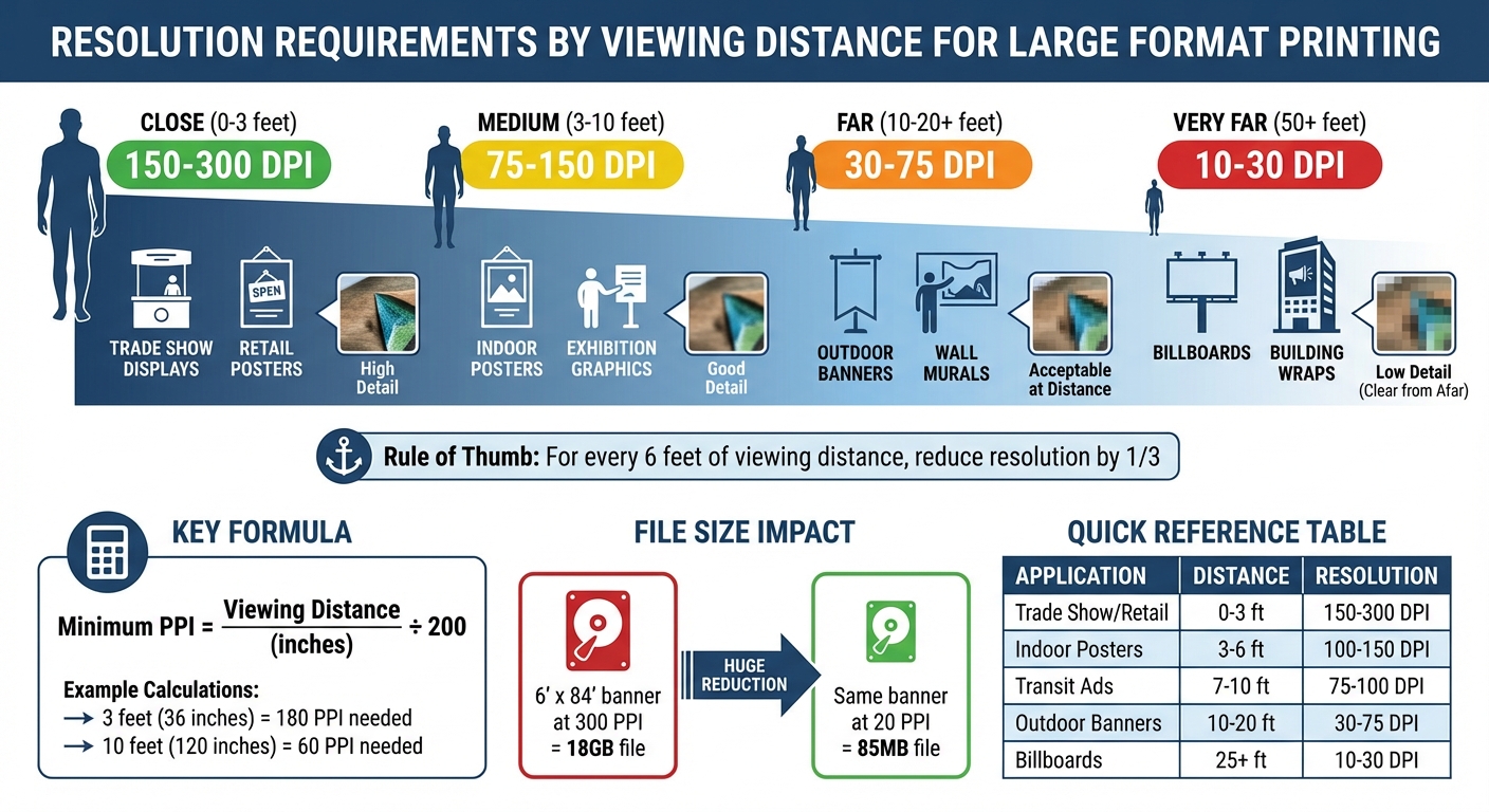
For precise logo color matching, it’s crucial to supply vector files like EPS, paired with Pantone or CMYK color codes. Additionally, high-resolution images (at least 300 DPI) are necessary to maintain color accuracy and ensure top-notch quality during printing.
Related Blog Posts
- Top 6 Binding Methods for Professional Documents
- Custom Certificate Holders: Design Options
- Ultimate Guide to Custom Binding Options
- Japanese Stab Binding for Business Projects
https://app.seobotai.com/banner/banner.js?id=699ceec7efc60cc2af096ec6