Cost-Saving Tips for Sustainable Paper Choices

Explore practical strategies for selecting eco-friendly paper that saves costs and reduces environmental impact through smart printing choices.

Switching to eco-friendly paper can save money, reduce waste, and lower environmental harm. Here’s how you can make smarter paper choices:

  • Double-Sided Printing: Cuts paper use by 50% instantly.
  • Use Recycled or FSC-Certified Paper: Saves energy by up to 70% and reduces waste.
  • Optimize Layouts: Adjust margins, use ink-efficient fonts, and avoid blank pages.
  • Print Management Tools: Track usage, enforce policies, and reduce costs by 20-30%.
  • Partner with Eco-Friendly Printers: Services like layout optimization and digital printing reduce waste and costs.

Quick Comparison:

Strategy Cost Savings Environmental Benefits
Double-Sided Printing 40-50% paper cost Cuts paper use by half
Recycled Paper Up to 70% energy Saves 17 trees per ton
Print Management Software 20-30% costs Reduces waste by 15-20%

Start small by adjusting printer settings, choosing sustainable paper, and collaborating with certified printers for larger projects. These steps can reduce costs while supporting sustainability goals.

5 Simple Ways to Increase Efficiency and Decrease Costs With Green Printing Solutions

Strategies for Cost-Effective Eco-Friendly Paper Choices

You can make smarter paper choices that are both budget-friendly and better for the environment. Here’s how to strike a balance between cost savings and sustainability.

Use Double-Sided Printing

Switching to double-sided (or duplex) printing is an easy way to save money and reduce waste. It can cut paper use by 50% [1][4].

Strategy Cost Savings Environmental Benefits
Set duplex as default Cuts paper costs by 40-50% Lowers energy use
Use print preview Avoids waste from mistakes Reduces unnecessary prints
Batch printing jobs Saves energy costs Limits printer emissions

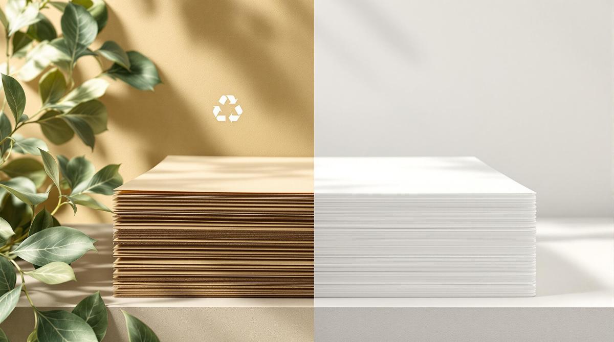
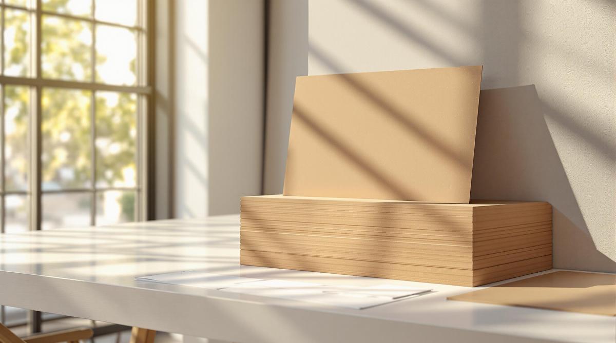
Choose Recycled or FSC-Certified Paper

FSC

While recycled paper can be up to 30% pricier than standard options [3], FSC-certified paper offers a more affordable way to make eco-conscious choices. In the UK, over 67% of commercial printing paper is FSC or PEFC certified [3], so it’s widely available.

Another option is lightweight, high-quality paper. It feels premium but is more efficient, potentially saving up to 10% on delivery costs compared to heavier paper stocks [3]. This approach balances cost, quality, and sustainability.

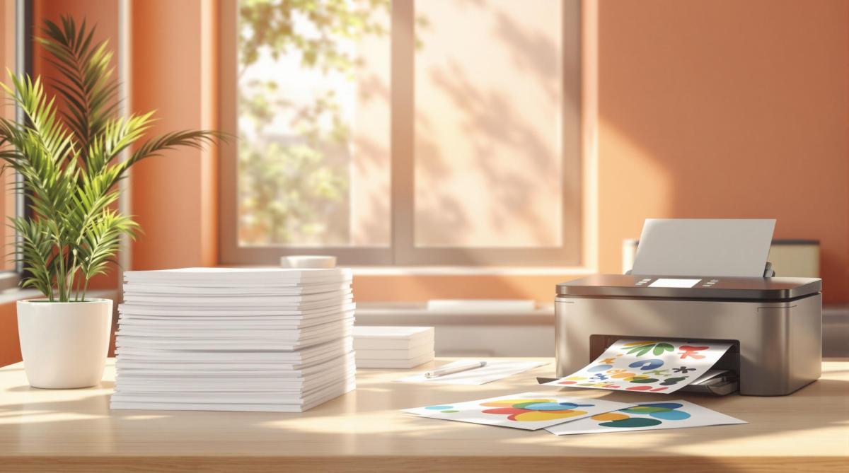
Optimize Document Layouts

Tweaking your document layouts can cut down on paper use and expenses. Here are a few practical tips:

  • Reduce margins and eliminate blank pages to maximize space.
  • Pick fonts that use less ink.
  • Use layout tools to compress content effectively.

Print management software can help you track these improvements and find more ways to save. Companies like Miro Printing & Graphics Inc. specialize in helping businesses adopt these practices, ensuring professional results while cutting costs.

For businesses looking to take it further, working with eco-friendly printing services can help maximize these strategies.

sbb-itb-ce53437

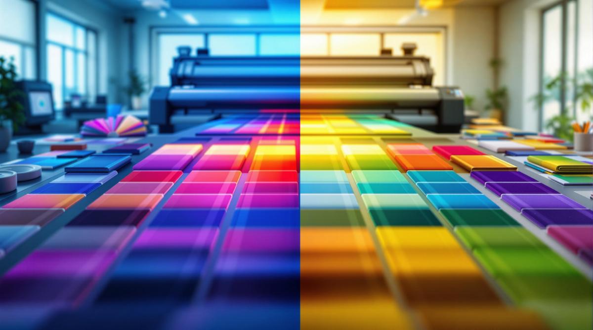
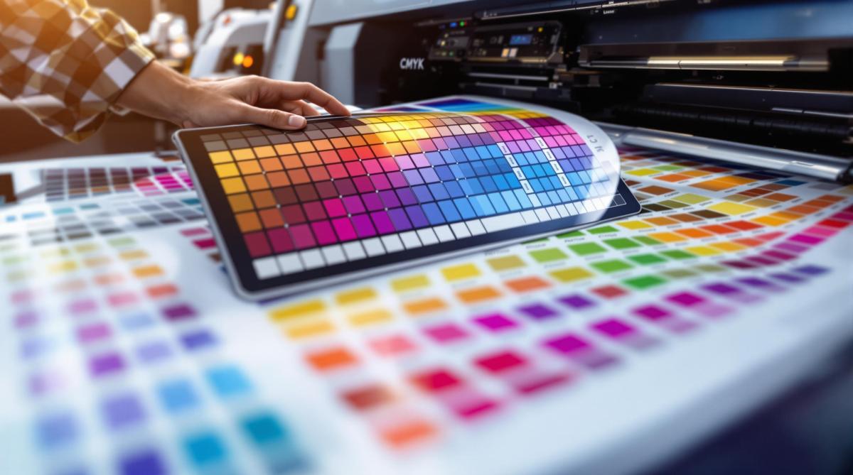
Tools and Technology for Eco-Friendly Printing

Choosing the right paper is just the start – using technology can make your printing process more efficient and cost-effective.

Use Print Management Software

Print management software helps businesses monitor usage and reduce waste. Tools like PaperCut allow organizations to track printing habits and enforce policies such as double-sided printing [1].

Feature Business Benefit Savings Potential
Usage Analytics Identifies heavy print users 15-20% less waste
Policy Enforcement Automates double-sided printing Up to 40% paper savings
Cost Allocation Tracks usage by department 25% budget improvement

Add User Authentication for Printing

Requiring user authentication makes employees more mindful of their printing habits. This step can cut unnecessary printing and reduce costs by as much as 30% [5]. It also eliminates unclaimed print jobs, lowering waste.

Preview Before Printing

Previewing documents before printing can help catch mistakes, cutting paper waste by up to 25% [2]. Take a moment to check page layout, margins, fonts, images, and colors to avoid costly errors.

Companies like Miro Printing & Graphics Inc. specialize in pre-press reviews to spot issues early. Their digital printing services include advanced preview tools that optimize documents for both cost and environmental benefits.

While in-house technology can make a big difference, working with eco-conscious printing services can take your efforts even further.

Working with Eco-Friendly Printing Services

Teaming up with eco-friendly printing services can help cut costs and reduce your environmental footprint. These providers are equipped with the tools and know-how to deliver sustainable solutions more effectively than handling it internally.

Miro Printing & Graphics Inc.

Miro Printing & Graphics Inc.

Located in Hackensack, NJ, Miro Printing & Graphics Inc. focuses on sustainable printing. Their services include digital printing, layout optimization, and in-house bindery, all aimed at cutting costs and reducing waste.

Service Feature Cost-Saving Benefit Environmental Impact
Digital Printing Lowers setup waste 30% less material waste
Layout Optimization Maximizes paper usage Reduces trim waste
In-house Bindery Cuts transport costs Lowers carbon footprint
Custom Projects Tailored solutions Avoids overproduction

Why Choose Eco-Friendly Printers?

Working with eco-friendly printers offers a range of benefits that align with sustainability goals:

Advanced Technology and Resources
These printers use cutting-edge eco-friendly equipment and buy materials in bulk, saving you from needing expensive machinery while ensuring efficient resource use.

Sustainable Materials
Many professional printers offer innovative options like Crush Corn Maize paper, made from vegetable residue. These materials are environmentally friendly without adding extra costs.

Certifications for Quality and Sustainability
Choose printers with certifications like ISO 14001. These ensure your projects meet high-quality standards while adhering to environmental guidelines, keeping your printing both eco-conscious and cost-effective.

Conclusion: Eco-Friendly Printing Practices

Key Takeaways

Choosing sustainable paper not only cuts costs but also helps reduce environmental harm. Using print management software and improving layout designs can lead to noticeable savings and a smaller ecological footprint. These tools allow businesses to track printing habits and find ways to reduce paper usage effectively.

Combining in-house efforts with partnerships with environmentally conscious printing services creates a well-rounded approach. Eco-friendly print shops can support sustainability goals while maintaining high-quality results.

Steps to Get Started

Ready to make a change? Here are some steps to kick off your sustainable printing practices:

  • Adjust Printer Settings and Track Usage: Set double-sided printing as the default and use print management software to monitor and optimize usage.
  • Choose Sustainable Paper: Opt for FSC-certified paper for everyday printing tasks.
  • Work with Certified Printers: For larger projects, select printing services that hold ISO 14001 certification [3][1].

Collaborating with environmentally aware printers, such as Miro Printing & Graphics Inc., can strengthen your efforts and help you achieve your sustainability goals.

Action Impact Timeline
Double-sided Printing Cuts paper use by 50% Immediate
FSC-certified Paper Lowers environmental harm Within 30 days
Print Management Tools Saves 20-30% on costs 60-90 days

Building a sustainable approach takes consistent effort and regular review. By continuously evaluating and improving your strategies, you can make a lasting positive impact on both your business and the planet. Stay committed, and the results will follow.

Related Blog Posts

https://app.seobotai.com/banner/banner.js?id=6789d2b480cdd94998fbdf17

Recycled vs. Virgin Paper: Cost Breakdown

Explore the cost, energy, and environmental impacts of recycled versus virgin paper to make informed choices for your printing projects.

Recycled paper costs more upfront due to extra processes like de-inking, but it uses 70% less energy, 35% less water, and saves 17 trees per ton compared to virgin paper. Virgin paper, made from fresh wood pulp, is cheaper to produce but has a higher environmental cost.

Quick Comparison

Factor Virgin Paper Recycled Paper
Raw Materials 2.5 tonnes of wood/ton 1.2 tonnes of waste paper/ton
Energy Usage Higher 40% less
Water Usage Higher 35% less
Processing Steps Basic (logging, milling) Complex (sorting, de-inking)
Cost Lower Higher
Environmental Impact Higher (more pollution, deforestation) Lower (saves trees, reduces landfill)

Key takeaway: Use recycled paper for eco-friendly projects and virgin paper for premium quality needs. Balance cost, quality, and environmental goals based on your project.

Cost Analysis of Recycled and Virgin Paper

Virgin Paper Production Costs

Making virgin paper involves a straightforward process that often keeps costs lower compared to recycled paper. Key expenses come from energy-heavy steps like turning raw wood into pulp. These include logging, processing wood pulp at mills, and distributing the final product. Despite needing more raw materials, the simplicity of the process often results in competitive pricing.

Recycled Paper Production Costs

Recycled paper production begins with collecting and sorting waste paper, followed by removing ink. While it requires less energy than virgin paper production [5], the need for specialized equipment and extra processing steps increases costs. These additional requirements usually make recycled paper more expensive.

Cost Comparison of Recycled and Virgin Paper

Here’s a breakdown of the cost factors for both types:

Cost Factor Virgin Paper Recycled Paper
Raw Materials Wood pulp (2.5 tonnes per tonne) Waste paper (1.2 tonnes per tonne)
Energy Usage Higher consumption 40% less energy required
Processing Steps Basic (logging, milling) Complex (collection, sorting, de-inking)
Water Usage Higher consumption Lower consumption
Equipment Standard machinery Specialized recycling equipment

Market trends and energy prices heavily impact the cost dynamics between these two options. Companies like Miro Printing & Graphics Inc. use their expertise to guide clients in balancing cost, quality, and sustainability. Their experience shows that while recycled paper often has a higher upfront cost, factors like project type and quality requirements frequently affect the final choice.

Cost is just one piece of the puzzle – environmental considerations also weigh heavily in paper decisions.

Environmental Impact of Paper Choices

Why Choose Recycled Paper?

Producing recycled paper offers major environmental advantages. It uses 35% less water, creates 74% less air pollution, and requires 70% less energy compared to making paper from new materials. Plus, every ton of recycled paper saves 17 trees and reduces methane emissions from landfills [6].

Environmental Factor Impact of Recycled Paper
Water Usage 35% less than virgin paper
Air Pollution 74% reduction
Energy Consumption 70% less
Trees Preserved 17 trees per ton
Landfill Space Conserved 3.3 cubic yards per ton

Making Sustainable Paper Choices

The environmental impact of recycled paper depends on how it’s made and the energy sources involved. Sustainability expert Paul Ekins from University College London highlights an important point:

"Increased recycling and recovery is not a straightforward recipe for reducing global greenhouse gas emissions" [1].

However, studies suggest that using renewable energy in recycling processes could cut emissions by as much as 96% [1]. Companies like Miro Printing & Graphics Inc. guide clients through these considerations, helping them balance environmental goals with practical needs.

New recycling technologies, such as better de-inking methods and greater use of post-consumer waste, are boosting the advantages of recycled paper [5]. When deciding between recycled and virgin paper, it’s important to weigh both the environmental impact and the specific demands of your project to make the best choice for sustainable printing.

sbb-itb-ce53437

Recycled Paper Vs. Virgin Paper

Choosing the Right Paper for Your Needs

Selecting the right paper involves more than just considering environmental factors – it’s about matching the paper to your project’s goals and budget.

When to Use Recycled Paper

Recycled paper works well for projects where eco-consciousness takes priority over a high-end finish. It’s a great fit for internal documents, educational materials, or environmentally focused marketing campaigns. Companies like Miro Printing & Graphics Inc. can help you evaluate whether recycled paper meets your project’s needs while aligning with your sustainability goals.

When to Use Virgin Paper

For projects that require top-tier print quality and aesthetics, virgin paper is the go-to choice. Its brightness, smooth texture, and durability make it perfect for:

Project Type Benefits of Virgin Paper
Luxury Packaging Excellent color reproduction and finish
High-end Marketing Sharp image clarity and contrast
Professional Photography Detailed and vibrant image preservation
Archival Documents Long-lasting durability

Choosing virgin paper ensures your project delivers a polished and professional look.

Balancing Cost and Quality in Paper Selection

The cost of paper often depends on energy prices and market trends, with recycled paper sometimes offering a more budget-friendly option during periods of high energy costs. When deciding, consider these factors:

  • Project Needs: Does your project require a premium, polished appearance?
  • Budget: Weigh immediate costs against potential savings in the long run.
  • Sustainability Goals: Think about how your paper choice reflects your brand’s environmental commitment.

Every project is unique, so it’s essential to weigh these factors carefully to strike the right balance between quality, cost, and environmental impact.

Conclusion on Paper Choices

Key Takeaways

Recycled paper, though often more expensive upfront due to its complex processing, uses 70% less energy and water, saves 17 trees per ton, and reduces landfill waste by 3.3 cubic yards [6]. On the other hand, virgin paper is cheaper to produce but doesn’t offer these environmental advantages [2]. Data consistently shows that recycling processes are far more efficient in conserving resources compared to virgin paper production [3].

These factors underline the importance of eco-conscious practices in the printing industry.

Looking Ahead: Printing and Sustainability

As sustainability becomes a bigger focus, companies like Miro Printing & Graphics Inc. are helping clients find eco-friendly paper options that meet both quality and environmental goals. Advances in recycling technology and changes in energy costs are expected to shrink the price difference between recycled and virgin paper [2]. Increasingly, businesses are considering the long-term environmental impact alongside upfront costs when making printing decisions [4].

Related Blog Posts

https://app.seobotai.com/banner/banner.js?id=6789ce7c80cdd94998fbd63d

Pantone Matching System in Printing

Explore the Pantone Matching System for precise color reproduction in printing, ensuring brand consistency across various materials.

The Pantone Matching System (PMS) ensures accurate and consistent color reproduction across different materials and locations. It assigns unique alphanumeric codes to colors, making it a universal standard for brands and printers worldwide. PMS is critical for maintaining brand identity, reducing color errors, and offering a broader color range than traditional CMYK printing.

Key points about PMS:

  • Exact Color Reproduction: Pre-mixed inks ensure precise matching.
  • Global Consistency: Works across materials like paper, fabric, and plastic.
  • Wider Color Options: Includes metallics, fluorescents, and specialty shades.
  • Use Cases: Ideal for logos, corporate branding, and custom printing projects.

Quick Comparison: PMS vs. CMYK

Aspect Pantone Matching System (PMS) CMYK Printing
Color Accuracy Very reliable Can vary between runs
Range Over 1,867 spot colors Limited to 4-color process
Best Use Logos, branding materials Photography, gradients
Cost Efficiency Better for large volumes Affordable for small runs

PMS is the go-to choice when exact color consistency is essential, while CMYK is better suited for detailed, full-color designs. Keep reading to learn how PMS works and why it’s a cornerstone of professional printing.

CMYK vs Pantone vs RGB – What’s the difference?

Pantone

How the Pantone Matching System Works

The Pantone Matching System (PMS) provides a structured way to identify and reproduce colors with accuracy and consistency.

Understanding PMS Codes

Every Pantone color is labeled with a unique alphanumeric code (e.g., PMS 300 C). The number indicates the color, while the letter specifies the type of paper – C for coated [3]. This universal system allows designers, manufacturers, and printers to communicate color choices without confusion.

With a library of over 1,000 colors, including metallic and fluorescent options [1], the system ensures precision. Tools like light boxes are often used to check colors under consistent lighting conditions.

How Pantone Colors Are Reproduced in Print

Printing Pantone colors relies on exact ink formulas provided by Pantone [3]. This precision is critical for professional print shops, such as Miro Printing & Graphics Inc., to meet specific client requirements.

The process involves two key steps:

  • Choosing the correct PMS code and mixing inks according to Pantone’s detailed formulas.
  • Checking the printed colors under controlled lighting to confirm accuracy.

Achieving Consistency Across Different Materials

PMS ensures uniform color reproduction across a variety of materials [3]. Specialized color palettes are designed for specific substrates, as shown below:

Material Type Pantone Palette
Paper Solid Color
Fabric Textile
Plastic Plastic

These palettes are tailored to their respective materials, ensuring that a brand’s colors remain consistent no matter where they’re applied [5]. This system is essential for maintaining brand identity across diverse projects and materials.

Advantages of Using the Pantone Matching System

The Pantone Matching System (PMS) offers a range of benefits that make it a go-to tool in the printing industry. Here’s why PMS stands out for color management.

Ensuring Brand Uniformity

PMS provides a universal color standard that keeps brand colors consistent across all materials [3][5]. For example, when companies like Miro Printing & Graphics Inc. handle multiple projects for a client, PMS ensures that the same brand colors appear on everything – whether it’s business cards, banners, or packaging.

Achieving Precise Color Reproduction

PMS reduces mismatches between design concepts and final prints by using a standardized system [4][7]. The system relies on specific ink formulas, controlled quality checks, and detailed material guidelines to deliver consistent results.

Feature Advantage
Color Matching Exact formulas for consistent reproduction
Quality Control Verified under controlled lighting
Material Specifics Tailored instructions for different surfaces

This level of precision helps avoid expensive reprints and ensures client satisfaction, especially when working with corporate materials where accuracy is crucial.

Offering a Broader Color Range

PMS goes beyond the limitations of traditional CMYK printing by providing a wider selection of colors [3][5]. This includes:

  • Specialty Shades: Colors that standard printing can’t achieve
  • Metallic Effects: Adds a premium look to materials
  • Custom Colors: Reproduces brand-specific shades with consistency

These features make PMS a vital tool for professional printing, offering capabilities that CMYK systems simply can’t match.

sbb-itb-ce53437

Comparing Pantone Matching System and CMYK Printing

Color Accuracy and Brightness

PMS and CMYK handle color reproduction in very different ways. CMYK relies on four inks – cyan, magenta, yellow, and black – to create a wide range of colors, while PMS uses pre-mixed inks for exact shades [1][9]. This makes PMS a go-to choice for businesses that need precise color consistency, especially for corporate branding.

One key difference is consistency. CMYK can show variations across print runs, with a typical color shift of 5-10% between screen and print [10]. On the other hand, PMS delivers uniform results thanks to its standardized mixing methods, offering over 1,867 spot colors [2].

"Pantone is all about precision. The universally used system mixes ink to create a consistent and exact color match every time." – NoIssue Blog [10]

Cost and Efficiency Comparison

Choosing between PMS and CMYK often comes down to the project’s requirements and budget. Print shops like Miro Printing & Graphics Inc. suggest PMS for materials where exact color matching is critical, such as logos and corporate branding. CMYK, however, is often the better option for designs with intricate gradients or photographic elements, as it tends to be more cost-effective [9].

Aspect Pantone Matching System CMYK Printing
Production Speed Faster for single-color jobs Better for full-color projects
Color Consistency Very reliable across materials Can vary between runs
Best Use Logos, branding materials Photography, detailed designs
Cost Efficiency Ideal for large-volume runs More affordable for small batches

PMS is ideal for projects where exact color accuracy is non-negotiable, while CMYK shines in designs with complex visuals. However, CMYK may require extra quality checks to ensure the final product meets expectations [2][11]. Knowing these differences allows businesses to pick the method that aligns best with their goals, whether it’s for branding or custom prints.

Applications of the Pantone Matching System

PMS in Custom Printing Services

Print shops use the Pantone Matching System (PMS) to achieve precise color consistency across a wide range of printing projects. For example, companies like Miro Printing & Graphics Inc. rely on PMS to ensure that brand colors remain uniform across items like business cards, brochures, banners, and packaging – no matter the material or scale.

PMS’s standardized ink formulas allow for the creation of over 1,867 colors, ensuring exact matches for custom printing needs [2]. This level of accuracy is essential for corporate materials where maintaining brand consistency is critical.

Additionally, PMS supports global branding efforts by enabling consistent color communication across different markets, making it a key tool for companies with an international presence.

PMS in Branding and Design

PMS acts as a universal color language for designers and printers, ensuring brand colors remain consistent worldwide. Its standardized codes eliminate confusion, allowing brands to maintain recognition across all forms of marketing materials.

PMS is also widely used in industries like fashion, textiles, plastics, and paint manufacturing [8]. Designers often turn to PMS for colors – such as metallics and fluorescents – that cannot be reproduced using CMYK.

Conclusion

The Pantone Matching System (PMS) plays a key role in professional printing and branding, offering unmatched precision and consistency.

With a library of 2,161 solid colors created from 14 base inks, PMS ensures accurate color reproduction. Its unique codes for coated, matte, and uncoated paper stocks guarantee consistent results across different surfaces [6].

One of PMS’s standout features is its ability to create specialty colors like metallics and fluorescents – options that go beyond what CMYK printing can achieve [5][12]. This expanded palette allows designers and print shops to meet complex printing demands while maintaining precise color matching.

Thanks to its global standardization, PMS has become a trusted tool for ensuring brand consistency across the world. Businesses and print shops, including Miro Printing & Graphics Inc., rely on PMS for dependable results on a variety of materials.

For the best results, experts suggest using a light box to compare printed materials with Pantone swatches under consistent lighting conditions [6]. This attention to detail solidifies PMS’s reputation as the leading choice in professional printing.

Related Blog Posts

https://app.seobotai.com/banner/banner.js?id=6789c68e80cdd94998fbbc46

CMYK vs RGB: Printing Color Models

Understand the differences between RGB and CMYK color models to ensure accurate color reproduction in digital and print designs.

CMYK and RGB are two essential color models used in design and printing, each serving specific purposes. Choosing the right one can save you time, money, and frustration. Here’s what you need to know:

  • RGB (Red, Green, Blue): Best for screens and digital content. It uses light to create vibrant colors and has a broader color range.
  • CMYK (Cyan, Magenta, Yellow, Black): Ideal for printing. It uses ink to absorb light and produces consistent, accurate colors for physical materials.

Quick Comparison:

Feature RGB (Digital) CMYK (Print)
Process Type Additive (light-based) Subtractive (ink-based)
Color Range Broader More limited
Use Case Screens (web, apps) Printed materials
Primary Colors Red, Green, Blue Cyan, Magenta, Yellow, Black
Color Accuracy Precise for screens Reliable for prints

Key Tip: Always design in the correct color mode (RGB for digital, CMYK for print) to avoid color mismatches. If you’re printing, partner with a professional print shop to ensure accurate results.

Why RGB Can Never Be Used for Print?

What Are Color Models?

Color models are systems that define how colors are created, displayed, and reproduced. They help ensure colors remain consistent across digital and physical formats, making them essential for design and communication.

Definition of Color Models

A color model provides a framework for generating and showing colors across various devices and mediums. This standardization ensures that colors look the same, whether on a screen or in print.

RGB and CMYK: The Two Main Models

RGB works by combining light to produce colors, making it perfect for screens. On the other hand, CMYK uses ink to absorb light, which is why it’s the go-to for printing.

Feature RGB Model CMYK Model
Process Type Additive (uses light) Subtractive (uses ink)
Color Range Broader More limited
Primary Use Digital screens Printing
Primary Colors Red, Green, Blue Cyan, Magenta, Yellow, Black
Color Creation Adds light to black Subtracts light from white

Choosing the right model is crucial, especially when moving from digital designs to printed materials. For example, professional printers like Miro Printing & Graphics Inc. often convert RGB files to CMYK to ensure accurate color reproduction [1][2]. This step is necessary because RGB’s broader spectrum includes colors that CMYK can’t replicate exactly [3].

With the basics of RGB and CMYK covered, let’s dive into how each model operates in its specific domain.

RGB: The Digital Color Model

This model generates vivid visuals by blending varying levels of red, green, and blue light.

How RGB Works

RGB operates using an additive color process. By adjusting the intensity of red, green, and blue light, it can produce millions of colors. When all three colors are at full intensity, the result is white; when they are absent, the result is black. Each color channel offers 256 intensity levels (ranging from 0 to 255), which allows for the creation of around 16.7 million colors.

LED and LCD screens rely on RGB subpixels to create the full-color images you see on your devices.

Advantages and Disadvantages of RGB

Knowing the pros and cons of RGB helps designers make better choices, especially when transitioning between digital and print designs.

Aspect Advantages Disadvantages
Color Range Offers vibrant, saturated colors Some colors can’t be replicated in print
Display Consistency Displays consistently on digital devices
Usage Flexibility Ideal for web and digital content Limited use in physical printing
Color Accuracy Precise control for screens Colors may shift when converted to CMYK

RGB is perfect for digital displays because of its ability to produce bright, dynamic colors [1]. However, its wide range includes shades that CMYK cannot replicate, which can cause noticeable shifts when designing for print [2][3].

To get the best results, designers should:

  • Regularly calibrate monitors to maintain accurate color representation.
  • Use color management tools to preview how RGB colors will appear when converted to CMYK.

While RGB dominates the digital space, CMYK remains essential for high-quality print work.

CMYK: The Printing Color Model

CMYK is the go-to color model for professional printing, using inks to absorb light and create colors. Unlike RGB, which is based on light, CMYK operates through a subtractive process, mimicking how physical inks blend on paper.

How CMYK Works

This model uses four core inks: Cyan, Magenta, Yellow, and Key (black). Starting with a white background, inks are layered to subtract light wavelengths, forming darker tones. Black ink is crucial for creating deep shadows, crisp text, and minimizing ink usage since the combination of CMY inks alone can’t produce a true black.

Pros and Cons of CMYK

CMYK is favored by print shops for its consistent results across different printing techniques, like digital and offset printing. Knowing its strengths and weaknesses can help you design better print materials.

Aspect Pros Cons
Color Accuracy Delivers consistent, reliable results Smaller color range compared to RGB
Cost Efficiency Saves ink with black separation Requires four separate ink cartridges
Print Quality Produces sharp, detailed prints May need additional color proofing
Industry Standard Universally used in printing RGB-to-CMYK conversions can cause color shifts

To get the best results with CMYK:

  • Design your projects in CMYK mode from the start if they’re meant for print.
  • Ask for physical proofs for projects where color accuracy is critical.
  • Partner with professional printers who specialize in color calibration.

While CMYK has a narrower color range than RGB, it remains essential for printing because it reflects how inks behave on paper. Working with experienced printers, like Miro Printing & Graphics Inc., ensures your designs are accurately translated to print.

sbb-itb-ce53437

Choosing Between RGB and CMYK

Picking the right color model can make or break your design. Here’s a straightforward guide to help you decide.

When to Use RGB

Go with RGB for anything viewed on a screen – websites, social media, or presentations. This model is perfect for creating bright, vibrant colors that look great on digital displays.

When to Use CMYK

Stick to CMYK for print projects like brochures, business cards, or packaging. This model ensures your printed colors match what you see on screen. Professional print shops, such as Miro Printing & Graphics Inc., rely on CMYK profiles to deliver consistent, high-quality results.

Tips for Managing Colors

To keep your colors accurate, follow these tips:

  • Work in the Right Color Mode: Start your design in the correct mode (RGB or CMYK) based on where it will appear – screen or print. This avoids unexpected color shifts later.
  • Calibrate Your Monitor: Regular calibration helps ensure what you see on your screen matches the final output.
  • Use Standard Color Profiles: Stick to standardized profiles to maintain consistent brand colors across different formats.

Conclusion

Knowing the differences between RGB and CMYK is key to achieving professional results in both digital and print media. These color models serve different purposes but work together to bridge the gap between digital screens and physical designs. RGB works best for digital content with its broad range of colors, while CMYK ensures accurate color reproduction for print.

Choosing the right color model can make or break the quality of your final output. For example, Miro Printing & Graphics Inc. uses advanced color management systems to deliver precise color matching in print, showcasing the importance of selecting and managing the correct model.

Here are some practical steps to ensure great results:

  • Use the appropriate color model from the start of your project.
  • Keep your devices properly calibrated for consistent colors.
  • Preview CMYK conversions before sending files to print.
  • Partner with professional printing services that specialize in color accuracy.

Miro Printing & Graphics Inc.

Miro Printing & Graphics Inc.

Located in Hackensack, NJ, Miro Printing & Graphics Inc. specializes in professional color management and printing services. They excel in delivering precise CMYK color reproduction, making sure your designs look just as good in print as they do on screen.

Service Category Capabilities Color Management Features
Digital Printing High-resolution output Expert CMYK calibration
Offset Printing Large volume runs Accurate spot color matching
Large Format Banners, Posters Consistent colors across sizes

Miro’s in-house team handles every step of the process, ensuring your files are prepared for accurate color printing. Their advanced systems take care of everything from RGB-to-CMYK conversion to calibration and quality checks. Plus, they offer additional services like cutting, folding, and assembling, managing your entire project under one roof with precision and care.

FAQs

Here are clear answers to common questions about RGB and CMYK to help you make better design choices.

What is the difference between RGB and CMYK color models?

RGB (Red-Green-Blue) and CMYK (Cyan-Magenta-Yellow-Black) create colors in different ways. RGB is an additive color model that blends light to form colors, making it ideal for digital screens like computers and smartphones. On the other hand, CMYK is a subtractive color model that uses ink to absorb light, making it the go-to choice for printed materials [1][2].

Is it better to print in CMYK or RGB?

For printing, CMYK is the way to go. While RGB produces vibrant colors on screens, it doesn’t translate well to print. Professional printers, like Miro Printing & Graphics Inc., rely on CMYK systems to ensure accurate color reproduction across various printing methods [3].

Color Model Best For Key Advantage
CMYK Print Materials Accurate color in prints
RGB Digital Displays Broader range of colors
Spot Colors Brand-specific prints Precise color consistency

Which color is best for print, CMYK or RGB?

If you’re working on a project meant for print, here are some useful tips:

  • Start in CMYK mode to avoid surprises during printing.
  • Use professional color profiles to keep colors consistent.
  • Work with experienced printers who know color management inside out.
  • Always ask for proofs when color accuracy is critical.

Related Blog Posts

https://app.seobotai.com/banner/banner.js?id=67899f8c80cdd94998fb5323

5 Tips for Perfect Kerning in Print Design

Master kerning in print design with these essential tips to achieve visually balanced typography and enhance readability.

  1. Choose the Right Font: Different fonts have unique spacing needs. Start with a font that fits your project and test tricky letter pairs early on.
  2. Flip Text Upside Down: This helps you focus on spacing as shapes rather than words, making uneven gaps easier to spot.
  3. Kern in Groups of Three: Adjust three letters at a time to ensure consistent spacing across your text.
  4. Handle Special Cases: Pay extra attention to diagonal letters (like A, V, Y) and all-caps text, which often need manual tweaks.
  5. Kern at the End: Finalize tracking and leading first, then make subtle kerning adjustments for balance and readability.

Quick Overview of Kerning Methods

Method Best For Tools to Use
Upside-Down Kerning Spotting uneven gaps Adobe Illustrator, InDesign
Grouping Letters (3s) Consistent spacing Adobe Illustrator, InDesign
Optical vs. Metric Kerning Display vs. body text Design software settings

Kerning is all about visual balance. Start with these tips, trust your eyes, and refine your skills with practice. For flawless results in print, consider consulting print professionals who can help fine-tune your designs.

How To Kern Professionally

Tip 1: Select the Right Font First

The font you choose plays a big role in how kerning works, as each typeface has its own spacing quirks. Picking the right one upfront saves you time and effort later.

How Fonts Influence Kerning

Different fonts have different kerning needs. For example, fonts like Arial and Helvetica often come with reliable built-in spacing, while decorative or custom fonts may require you to tweak things manually. Font size also matters – larger text usually needs tighter spacing, while smaller text benefits from slightly looser kerning for better readability.

Avoiding Redundant Adjustments

Switching fonts mid-project can be a headache because each typeface demands its own kerning adjustments.

"Each typeface requires its own kerning, adjustments and attention to detail. So it’s important that you make a decisive decision on the typeface you’re going to be working with early on within the design process." [5]

When picking a font, think about:

  • How well it handles kerning automatically
  • Whether it fits your project (headlines vs. body text)
  • How it deals with tricky letter pairs
  • Its appearance across different sizes

Pro tip: Test your font with challenging letter combinations early on to avoid surprises.

Once you’ve settled on the font, you can start fine-tuning your kerning with techniques like upside-down kerning.

Tip 2: Kern Text Upside Down

Flipping text upside down helps you focus on the spaces between letters instead of the words themselves. By viewing letters as shapes, it’s easier to spot uneven spacing and make adjustments.

Why Flip Text?

This approach makes it easier to notice uneven gaps and allows you to make more objective decisions about spacing. It’s especially useful for:

  • Logos
  • Headlines
  • Large display text
  • Brand names

Tools That Can Help

Programs like Adobe Illustrator and InDesign have features that let you rotate text upside down without interrupting your workflow [2].

Things to Keep in Mind

  • Check the kerning at different sizes, and occasionally flip the text back to its normal orientation to ensure it looks good and remains readable.
  • Pay extra attention to tricky letter pairings.
  • Use your eye to make adjustments rather than relying entirely on automatic kerning tools.

Once you’ve adjusted individual pairs, grouping letters can make the process smoother. We’ll dive into this in the next tip.

Tip 3: Kern in Sets of Three

Kerning letters in pairs can sometimes result in uneven spacing. Instead, work with three letters at a time to create consistent spacing and catch any issues that might be overlooked when focusing on pairs.

How to Kern in Groups of Three

To use this approach, adjust the spacing for three letters as a group. Start with the first three letters, balance their spacing, and then shift one position to the right (e.g., from "Typ" to "ypo"). Repeat this process throughout the text to ensure uniform spacing [1].

Here are a few key points for effective group kerning:

  • Focus on how the three letters interact as a whole.
  • Make small, precise adjustments to fine-tune the spacing.

This method is especially important for larger text, such as headlines or logos, where spacing inconsistencies are much more noticeable [1].

Pay special attention to tricky combinations like diagonal-sided letters (e.g., A, V, W, Y) and sequences of capital letters. These often require extra care to maintain even spacing across the group.

Tools and Benefits

Software like Adobe Illustrator and InDesign provides advanced controls for group kerning, making it easier to achieve a polished look [2]. Working with three-letter groups helps avoid common issues like:

  • Uneven letter spacing
  • Awkward gaps between characters
  • Overcrowded letters
  • Disrupted text flow

"Group kerning plays a critical role in ensuring that text is both visually appealing and easy to read. By maintaining consistent spacing throughout the text, group kerning helps to create a polished and professional finish that enhances the overall quality of the print design" [7][2].

Once you’ve mastered this technique, you’ll be better equipped to handle special cases like diagonal-sided letters and all-caps text, ensuring a clean and professional design.

sbb-itb-ce53437

Tip 4: Address Special Cases

Some letter combinations require extra care to ensure your text looks polished. Two common challenges are diagonal-sided letters and all-caps text, each needing specific kerning tweaks.

Kerning Diagonal-Sided Letters

Diagonal-sided letters like A, V, and Y often create awkward gaps that can disrupt the flow of your text. To fix this, focus on adjusting the space between these characters:

  • For pairs like "AV" or "VA", reduce the spacing to close the natural gaps caused by their diagonal shapes.
  • Pay close attention to sequences like "WAY" or "AWAY," where multiple diagonal letters appear together.
  • Test your adjustments at different sizes – spacing issues tend to stand out more in larger text.

While optical kerning tools can provide a good starting point, manual tweaks are usually needed for the best results [4][6].

Kerning All Caps Text

All-caps text often looks rigid, so tighter spacing is key to improving its appearance and readability. Start by increasing tracking to set a baseline, then fine-tune the kerning for specific letter pairs [4].

Letter Combination Type Suggested Adjustment
Straight-sided pairs (e.g., H-I, I-H) Maintain consistent spacing
Round-sided pairs (e.g., O-C, C-O) Slightly reduce spacing
Mixed pairs (e.g., H-O, O-H) Adjust visually for balance

Designers often test all-caps designs at multiple sizes to catch and fix any spacing issues [6][4].

Ultimately, what looks visually balanced matters more than achieving mathematically equal spacing [6][4]. Once you’ve addressed these tricky cases, your kerning will look clean and professional.

Tip 5: Kern at the End

Kerning should always be the last step in your typography process. Make sure to finish adjusting tracking and leading first. This approach avoids unnecessary rework and guarantees accurate results [1][3].

Trust Your Eyes

When it comes to final kerning adjustments, your eyes are your best tool. Focus on achieving a visually pleasing balance rather than relying on strict measurements [1][2].

Here’s how to refine your visual judgment:

  • View at actual size: Always check kerning at the size it will appear when printed or displayed.
  • Step back: Look at your work from a typical reading distance to get a better sense of overall balance.
  • Test on different screens: Make sure the kerning looks consistent across various devices and displays.

Don’t Overdo It

Going too far with kerning adjustments can hurt readability and disrupt the natural flow [1][3]. Keep these points in mind during the final tweaks:

Aspect Tips for Adjustment
Letter Spacing Keep changes subtle; avoid letters touching or being too far apart.
Visual Flow Maintain a smooth rhythm; eliminate any awkward gaps.
Readability Ensure text remains clear at all sizes and doesn’t become hard to read.

Small, thoughtful adjustments are the key to creating balanced and readable typography [1][3].

Additional Tips

Mastering manual kerning is important, but modern tools and expert advice can take your typography to the next level.

Optical vs. Metric Kerning

Most design software provides two kerning options: optical and metric.

  • Optical kerning adjusts spacing based on the shapes of the letters. It works well for display text like headlines or logos but may not always handle all fonts or sizes perfectly.
  • Metric kerning uses the font’s built-in spacing values, making it a better choice for body text and longer content. However, it depends heavily on the quality of the font’s design.

Both methods can benefit from manual adjustments to achieve the best results [7][2].

Kerning Type Ideal For Challenges
Optical Display text, headlines, logos Can be inconsistent with certain fonts or sizes
Metric Body text, long-form content Limited by the font’s built-in spacing values

Working with Experts

For print projects, consulting professionals can make a big difference. For instance, Miro Printing & Graphics Inc. in Hackensack, NJ, specializes in ensuring your kerning choices look flawless in print.

They can test kerning at actual print sizes, review proofs, and adjust for specific paper stocks or printing methods. This attention to detail can help you avoid costly errors and deliver polished results [8].

Conclusion: Achieving Perfect Kerning

Getting kerning just right takes a mix of technical skill and a sharp eye for design. It’s about blending the right font choice, precise kerning techniques, and special attention to tricky cases to create polished, professional results.

Relying on visual judgment is key, but pairing it with systematic methods makes a big difference. For example, optical kerning is often better for display text, while metric kerning suits body copy. Understanding when to use each approach helps create typography that’s both attractive and functional [1][2].

If you want flawless kerning in your print designs, consider working with professional print shops like Miro Printing & Graphics Inc. Their expertise ensures your designs look just as good in print as they do on screen [7][8]. Experienced print professionals can add that final touch of precision to your typography.

Perfect kerning isn’t something you achieve overnight – it’s a skill that grows with practice and attention to detail. Whether you’re designing a logo or a full print campaign, focusing on careful font selection, precise kerning, and professional input will help you create print materials that not only look great but also deliver your message effectively [1][3].

FAQs

How do you make a good kerning?

Kerning is an essential skill for print designers, focusing on adjusting the spacing between individual letters to create visually balanced text. Here’s how to refine your kerning:

Start by working on leading and tracking to establish the overall spacing. Then, fine-tune the kerning based on the text size. For large text, use tighter spacing; for smaller text, slightly loosen the spacing to maintain readability [1].

Certain letter pairs, like ‘V’ and ‘A’, often require manual adjustments due to their diagonal shapes. Each pair is unique, so it’s important to evaluate them individually [1][3].

Here are some tips to make the process easier:

  • Try upside-down kerning: This technique helps you focus on spacing without being distracted by the text’s meaning [1].
  • Work in groups of three letters: Adjusting three letters at a time ensures consistent spacing throughout your design [1].

Text size plays a big role in kerning. Larger text benefits from tighter spacing, while smaller text should have more space to improve readability [1]. Tools like Adobe InDesign and Illustrator offer advanced features to help you achieve precise results [2][3].

Related Blog Posts

https://app.seobotai.com/banner/banner.js?id=6789632e80cdd94998fb1914

Kerning, Tracking, Leading: Key Differences

Explore the essential typography techniques of kerning, tracking, and leading to enhance readability and design quality.

Typography is more than just fonts – it’s about spacing. Three key elements define how text looks and reads: kerning, tracking, and leading.

  • Kerning: Adjusts space between individual letter pairs (e.g., "A" and "V") for balance and clarity.
  • Tracking: Uniformly spaces groups of characters, improving readability and layout consistency.
  • Leading: Sets vertical spacing between text lines, enhancing flow and comfort.

These tools are essential for creating polished, readable designs, whether for logos, headlines, or body text. Below is a quick comparison to summarize their differences:

Technique Focus Area Best Use Cases
Kerning Space between letter pairs Logos, headlines, branding
Tracking Overall text spacing Headlines, paragraphs
Leading Vertical line spacing Body text, multi-line layouts

Understanding and applying these techniques ensures clear communication and visually appealing designs. Ready to dive deeper? Let’s explore each in detail.

1. Kerning Explained

What Is Kerning?

Kerning is all about adjusting the space between two specific letters to make them look visually balanced and natural to the reader’s eye [4].

How It’s Used

Kerning can be done automatically using font metrics or manually for greater precision. This is especially important in areas like logos, headlines, and brand typography [1]. For example, designers often tweak the spacing between letters like ‘A’ and ‘V’ to fix awkward gaps [2].

Why It Matters in Typography

Good kerning creates even spacing, making text easier to read and more visually pleasing [2]. Some tricky letter combinations, like diagonal letters or pairs such as ‘rn’, can create visual issues if not adjusted properly [4].

In print design, precise kerning goes beyond aesthetics – it ensures clarity and professionalism. Whether it’s a business card, brochure, or large-scale material, proper kerning keeps the text looking polished. For instance, print shops like Miro Printing & Graphics Inc. emphasize kerning to maintain consistent quality across different printing methods [3]. Typesetters carefully adjust spacing, considering font details like serifs and decorative elements.

While kerning focuses on individual letter pairs, tracking takes a broader approach, adjusting spacing across entire groups of characters.

2. Tracking Explained

What Is Tracking?

Tracking refers to the adjustment of spacing between characters across a selected block of text. This ensures the spacing remains consistent, whether you’re working with words, sentences, or paragraphs [1].

Why Use Tracking?

Tracking helps fit text into specific layouts, enhances readability – especially for all-caps or intricate fonts – and creates a clear visual hierarchy in your designs [3].

Adjusting Spacing

You can tighten tracking to reduce space for bold, compact headlines or loosen it to make dense or all-caps text easier to read [1]. In print design, these adjustments are key to ensuring text looks good and reads well, particularly when you’re dealing with varying font sizes [3].

How It Affects Typography

Good tracking strikes a balance between font choice, size, and spacing [1]. For example, headlines often use tighter tracking to grab attention, while body text benefits from looser spacing for better readability [3]. Overdoing it in either direction can cause problems – too tight, and the text feels cramped; too loose, and it disrupts the natural reading flow.

In print design, tracking plays a crucial role in keeping text legible and visually appealing, whether you’re designing a business card or a large poster [3]. While tracking deals with horizontal character spacing, don’t forget that leading handles vertical line spacing, which also impacts the overall readability and layout flow.

3. Leading Explained

Definition

Leading refers to the vertical space between lines of text, measured from the baseline of one line to the baseline of the next [1]. This term comes from traditional printing, where strips of lead were used to create spacing. In modern digital typography, it’s a key factor in designing readable and visually appealing text.

Application and Adjustment

Leading plays a major role in how easy text is to read and how balanced it looks. A common guideline is to set leading at about 20% more than the font size. For example, 12-point text would typically use 14.4 points of leading. However, adjustments may vary depending on:

  • Font size: Larger fonts often need more space between lines.
  • Typeface style: Some fonts, especially those with tall or low-hanging characters, require customized spacing.
  • Line length: Longer lines benefit from increased spacing to improve readability.

Impact on Typography

While kerning and tracking focus on horizontal spacing, leading ensures the vertical spacing supports the overall layout. Designers often tweak leading to fit the needs of a specific project. For example, tighter leading can make headlines stand out, while body text usually benefits from more generous spacing for easier reading. This is especially critical in large-format designs like posters, where viewing distance can influence how text is perceived.

Understanding how leading contributes to vertical spacing helps us see its role alongside kerning and tracking in creating well-balanced typography. Each element adds something unique to effective print design.

sbb-itb-ce53437

Kerning, tracking and leading – what’s the difference?

Pros and Cons Comparison

In print design, techniques like kerning, tracking, and leading play a key role in creating polished layouts and ensuring readability across formats. Knowing their benefits and challenges helps designers choose the right approach for each project.

Technique Advantages Disadvantages Best Use Cases
Kerning • Creates precise, professional typography
• Reduces visual confusion (e.g., "rn" vs "m")
• Requires time-consuming manual adjustments
• Demands close attention to detail
• Can be tricky for non-designers
• Logos
• Large headlines
• Branding materials
Tracking • Adjusts spacing uniformly across text
• Easy to apply to entire text blocks
• Balances text density for a clean look
• Can result in unwanted gaps or crowding
• Less precise compared to kerning
• Offers limited customization
• Headlines
• All-caps text
• Paragraphs or blocks of text
Leading • Enhances readability
• Improves the appearance of text blocks
• Works well with different font styles
• Affects overall text length
• Too much space can make text feel disconnected
• Too little space causes overlap
• Body text
• Multi-line headings
• Print materials

Typesetters often tweak default settings to suit specific projects [1][3]. The success of each technique depends on a few key factors:

  1. Text Size and Font Style: Larger fonts or unique typefaces may need tighter kerning and tracking, as well as increased leading, for proper balance.
  2. Medium Differences: Print and digital formats often require different spacing adjustments.
  3. Project Goals: The purpose of the design will influence how spacing is applied.

Professional print shops like Miro Printing & Graphics Inc. rely on these principles to maintain consistency and readability across various projects. By weighing the strengths and challenges of kerning, tracking, and leading, designers can create visually appealing and well-balanced typography.

Conclusion

By examining the pros and cons of kerning, tracking, and leading, it’s clear that understanding these techniques helps designers make thoughtful choices for each project. These tools play a key role in crafting professional typography for print design, each addressing specific needs to improve readability and visual structure.

  • Kerning focuses on adjusting space between individual letters, ensuring a balanced and polished look. It’s especially useful for larger text elements like logos and headlines, where precision is critical [2][4].
  • Tracking applies uniform spacing adjustments across entire blocks of text, helping maintain consistency and readability. This technique is ideal for managing visual harmony across various text styles and layouts [1][3].
  • Leading controls the vertical spacing between lines, ensuring smooth text flow and avoiding overlap. Proper line spacing not only enhances functionality but also creates a visually appealing reading experience [1][3].

For businesses like Miro Printing & Graphics Inc., mastering these skills is crucial for producing high-quality materials. Whether it’s designing logos, brochures, or large-format prints, the thoughtful use of kerning, tracking, and leading ensures that text is both visually appealing and easy to read.

Typography success lies in knowing when and how to apply these techniques. Kerning delivers character-level precision, tracking ensures consistency across text blocks, and leading establishes a cohesive vertical structure. Together, they form the backbone of professional typography, balancing communication with visual harmony.

FAQs

What is the difference between kerning, tracking, and leading?

Kerning, tracking, and leading are essential typography tools in print design, each addressing a specific aspect of text spacing:

Kerning focuses on the space between individual letter pairs. It’s especially useful for:

  • Headlines and logos
  • Large-format prints
  • Brand names or signage

Tracking adjusts spacing evenly across entire words or blocks of text. This approach helps to:

  • Fit text into specific layouts
  • Make dense text easier to read
  • Create a visually balanced appearance [1][3]

Leading determines the vertical spacing between lines of text. Typically, it’s set about 20% larger than the font size [3]. This spacing:

  • Prevents overlapping characters
  • Improves the flow of text
  • Makes reading more comfortable

For professionals in print design, such as those at Miro Printing & Graphics Inc., mastering these techniques is key to producing polished materials – from business cards to large-format displays. Using these methods thoughtfully ensures both clarity and a visually appealing design.

Related Blog Posts

https://app.seobotai.com/banner/banner.js?id=67895e4280cdd94998fb168a

Top 6 Binding Methods for Professional Documents

Explore the top 6 binding methods for professional documents, highlighting their durability, appearance, costs, and best uses.

When creating professional documents, choosing the right binding method is crucial for durability, usability, and presentation. Here are the top 6 binding methods to consider, each tailored for different needs:

  1. Thermal Binding: Uses heat-activated glue for a polished, book-like finish. Ideal for business reports and training manuals.
  2. Perfect Binding: Creates a sleek, squared spine. Best for catalogs, portfolios, and marketing materials (50-250 pages).
  3. Post Binding: Durable metal posts allow easy updates. Great for technical manuals and creative portfolios (up to 400 pages).
  4. Saddle Stitch Binding: Budget-friendly and lightweight. Perfect for brochures, newsletters, and smaller documents (8-64 pages).
  5. Wire Binding: Sturdy wire coils allow 360-degree rotation. Suitable for workbooks, technical guides, and presentations.
  6. Hardback Binding: Premium adhesive binding with a rigid cover. Ideal for high-profile materials like annual reports.

Quick Comparison

Binding Method Durability Appearance Cost Range Best Uses
Thermal Binding High Clean, professional $8-20 Business reports, training manuals
Perfect Binding Medium-High Sleek, squared spine $5-15 Catalogs, marketing materials
Post Binding High Industrial, robust $12-25 Technical manuals, portfolios
Saddle Stitch Low-Medium Simple, traditional $3-8 Brochures, newsletters
Wire Binding Medium Practical, functional $6-15 Workbooks, presentations
Hardback Binding Very High Premium, executive $15-75+ Annual reports, luxury documents

Choose based on your document’s purpose, size, and desired presentation. Each method offers unique strengths, so prioritize durability, cost, and appearance to match your needs.

Book Binding Types: Wire Coil, Saddle Stitching, Burst, Perfect Binding

1. Thermal Binding

Thermal binding is a straightforward and sleek method for binding documents. It uses heat-activated glue pre-applied to specially designed covers, delivering a clean, professional finish – no hole punching required.

Durability and Appearance

This method offers a combination of strength and style. The heat-activated glue ensures pages stay securely bound, while the seamless covers give documents a polished, book-like look. These covers are available in a variety of materials and colors, making them suitable for professional presentations.

Cost

The cost of thermal binding equipment can vary, but it’s a practical choice for businesses that frequently bind documents.

Best Uses

Thermal binding works well for businesses that need a professional and efficient solution, especially for materials intended for clients or frequent use.

Document Type Page Capacity Ideal Use Case
Business Reports & Portfolios Up to 120 pages Client-facing, professional materials
Training Manuals 100+ pages Long-lasting reference materials
Financial Documents Various High-quality professional documentation

Thermal binding systems are designed for speed and efficiency, often handling multiple documents at once. For example, the Coverbind series includes options for small offices as well as high-volume operations [1].

Although thermal binding provides a secure and polished result, methods like perfect binding may offer more flexibility in design and style.

2. Perfect Binding

Perfect binding gives documents a sleek, squared spine, creating the polished look you’d expect from a professional paperback. It uses a strong adhesive to secure the pages and attach them to a sturdy cover made from heavier stock paper.

Durability and Appearance

This method stands out with its solid, book-like appearance, making it ideal for larger documents. It’s designed to hold pages securely while still allowing smooth opening. Many print shops also offer gloss or matte laminated covers, which not only enhance the look but add extra durability.

Cost

The cost of perfect binding varies based on factors like the number of pages (works best for 50-250 pages), the quality of the cover material, and optional finishes such as lamination. While it’s pricier than basic options like saddle stitching, it delivers great value for professional-grade documents.

Best Uses

Perfect binding works well for business catalogs, portfolios, marketing materials, and premium proposals. It’s compatible with a range of paper sizes, from A5 to A3, making it suitable for different project types [2]. To ensure the binding is sturdy and user-friendly, aim for a page count between 50 and 250 [3].

If your project needs a clean, professional finish with lasting durability, perfect binding is a strong option. However, if flexibility is a priority, methods like post binding might be worth considering.

3. Post Binding

Post binding uses metal posts to hold pre-drilled pages together, creating a sturdy and practical option for professional documents. The exposed metal posts add a sleek, industrial look, making it a go-to choice for portfolios and technical manuals.

Durability and Appearance

The metal posts make this binding method highly durable, ideal for documents that are handled often. The industrial-style design, with its visible metal elements, gives a polished and professional feel – especially appealing for architectural portfolios or technical guides.

Cost

The upfront expense for metal posts, durable covers, and drilling tools can be higher. However, since the components are reusable, post binding becomes an economical choice for documents that need frequent updates.

Best Uses

Post binding works well for technical manuals, creative portfolios, corporate reports (up to 400 pages) [3], and training materials that require regular updates. One of its biggest strengths is the ease of adding or removing pages without affecting the overall binding [2].

While post binding offers durability and flexibility, lighter options like saddle stitch binding may be better for smaller, more portable documents.

4. Saddle Stitch Binding

Saddle stitch binding is a straightforward and budget-friendly way to bind lightweight materials. It involves folding sheets in half and securing them along the spine with staples, making it a practical option for many businesses.

Durability and Appearance

Although it’s not as sturdy as hardback or post binding, saddle stitch binding provides enough durability for documents that won’t see heavy use. It’s best suited for documents with 8 to 64 pages to ensure the binding remains intact.

Cost

This method is a cost-effective choice, especially for lightweight materials, and offers quick production times.

Best Uses

Saddle stitch binding works well for brochures, catalogs, newsletters, and lightweight training materials. Its lightweight design also makes it a perfect fit for mail distribution.

Technical Considerations

To get the best results with saddle stitch binding, pay attention to the type of paper used. Here are some key recommendations:

Paper Aspect Recommendation
Weight Range 70-100 gsm for internal pages
Cover Stock 150-250 gsm for added strength
Ideal Thickness 2-3 mm total document thickness

Using high-quality staples and ensuring precise alignment during binding is essential for a polished finish.

If you need a more durable and versatile binding option, wire binding might be worth considering.

sbb-itb-ce53437

5. Wire Binding

Wire binding, often called spiral binding, is a practical option for documents that see frequent use. This method involves threading a wire coil through holes punched along the document’s edge, creating a secure binding that allows full 360-degree rotation. This makes it easy to lay the document flat or fold it back completely.

Durability and Appearance

Wire coils are sturdy and resistant to bending, making them a dependable choice for everyday use. The sleek design of the binding, along with customizable coil options, adds a polished look to business documents. However, it’s worth noting that wire binding is better suited for thinner documents compared to hardback or thermal binding.

Cost

Wire binding is moderately priced. Machines can range from $50 to $1,000, while the cost per document typically falls between $0.50 and $2.00.

Best Uses

Wire binding works well for a variety of documents, including:

  • Training manuals
  • Workbooks
  • Technical guides
  • Professional portfolios
  • Educational materials
  • Presentation decks

Its ability to rotate fully makes it especially convenient for hands-free use or note-taking.

Technical Details

This method accommodates documents with 25 to 250 pages, using paper weights of 80-120 gsm and covers of 200-300 gsm. Coil diameters typically range from 6 mm to 32 mm, ensuring a snug fit when paired with properly aligned holes. These details contribute to a professional look and improve usability.

Ready to take it up a notch? Let’s look at hardback binding for a more premium finish.

6. Hardback Binding

Hardback binding is the go-to choice for those seeking professional and durable document finishing. This method secures pages with adhesive and encases them in a rigid cover, offering both strength and an elevated appearance.

Durability and Construction

With adhesive binding and a solid cover, hardback binding ensures documents can withstand years of use. Its sturdy construction keeps pages intact, even with frequent handling.

Appearance

Hardback covers can be tailored to your needs with options like lamination, textured finishes, or embossed designs. This makes it a popular choice for corporate materials that need to impress.

Cost Considerations

The cost typically ranges from $15 to $75 or more, depending on the size of the document and the level of customization. While it’s pricier than other binding methods, the durability and polished look make it worth the investment.

Best Uses

This method is ideal for high-profile materials like annual reports, luxury catalogs, and executive proposals where presentation is key. Professional printing services can ensure your documents leave a lasting impression.

Compared to wire or saddle stitch binding, hardback binding focuses on strength and a polished finish rather than flexibility or low cost. These documents are built to last and convey professionalism, making them perfect for critical business materials.

To help you weigh your options, check out the comparison table below to see how hardback binding stacks up against other binding methods.

Comparison Table of Binding Methods

Here’s a breakdown of different binding methods, comparing key factors to help you choose the right option for your needs.

Binding Method Durability Appearance Cost Range Best Uses Key Features
Thermal Binding High Professional, clean $8-20 per document Legal documents, sensitive files Tamper-resistant, no hole punching, supports A5-A3 sizes
Perfect Binding Medium to High Professional, squared spine $5-15 per document Magazines, catalogs, books (50-250 pages) Customizable covers, sleek finish, squared spine
Post Binding High Industrial, robust $12-25 per document Industrial manuals, art portfolios Handles up to 400 pages, allows updates, highly durable
Saddle Stitch Low to Medium Simple, traditional $3-8 per document Brochures, smaller documents Affordable, quick setup, lightweight
Wire Binding Medium Practical, functional $6-15 per document Reports, presentations Lays flat, folds 360 degrees, sturdy
Hardback Very High Premium, executive $15-75+ per document Annual reports, high-end materials Long-lasting, premium look, professional impact

Additional Considerations

When deciding on a binding method, think about your document’s purpose, size, and security needs. For example, wire binding works well for reference materials due to its ability to lay flat, while hardback binding is a top choice for creating an executive-level impression.

Your choice of binding plays a key role in both usability and presentation. By weighing factors like durability, cost, and appearance, you can select a method that enhances your document’s overall quality and impact.

Choosing the Right Binding Method

The way you bind your documents affects how functional they are and how polished they look. Different binding methods cater to different purposes, so it’s important to pick the right one.

Think about how the document will be used. If you need something secure for sensitive materials, thermal binding is a solid option. For projects that might need updates later, post binding works well. Need a high-end look? Go with hardback binding. And if your document will be handled a lot, wire binding is great because it lays flat for easy use.

Cost is another important consideration. For example, hardback binding can cost between $15 and $75 or more per document, making it better for premium projects. On the other hand, saddle stitching is much more affordable, typically $3 to $8 per document, and works well for shorter or high-volume projects.

When deciding, focus on what matters most: durability, presentation, and how the document will be used. The right binding choice not only makes your document more practical but also boosts its overall value, giving it a professional touch.

Need more help? Check out the FAQs below for additional tips.

FAQs

If you’re unsure which binding method suits your project, these FAQs cover common questions to help you make an informed choice.

What are the different types of book binding techniques?

The most popular professional binding methods include saddle stitch, PUR, hardcover, and spiral binding. Each serves specific purposes based on factors like document size, frequency of use, and required durability. For unique projects, artistic or niche techniques may also be considered, though they’re less typical in professional settings [4][3].

Which type of book binding is best?

For projects that demand a polished look and long-lasting quality, hardcover (or case binding) is the top choice. Its sturdy design and premium finish make it ideal for important documents. However, for other needs, options like thermal binding or wire binding might be more practical, balancing cost and functionality effectively.

What is the most durable binding?

When it comes to durability, hardcover binding leads the pack. This method secures pages individually and pairs them with strong cover materials, ensuring a robust and long-lasting result [3].

"Advances in digital printing and binding technologies have made it possible to produce high-quality documents in small quantities without incurring high setup charges." [2]

Binding Method Durability Rating Best Use Case Typical Lifespan
Hardcover Excellent Premium publications 10+ years
Thermal Very Good Business presentations 5-7 years
Perfect Good Catalogs & magazines 3-5 years
Wire Good Frequently used manuals 2-4 years
Saddle Stitch Fair Short documents 1-2 years

Related Blog Posts

https://app.seobotai.com/banner/banner.js?id=6760abe695278076f2a238e3

Ultimate Guide to Paper Types for Business Printing

Learn how to choose the right paper type, weight, and finish for business printing to enhance your materials’ professionalism and effectiveness.

Choosing the right paper for business printing is essential for creating professional, durable, and visually appealing materials. Whether you’re printing brochures, business cards, or reports, your paper choice impacts print quality, readability, and overall presentation. Here’s a quick breakdown:

  • Key Paper Types:

    • Coated: Smooth, vibrant, ideal for images (e.g., brochures, magazines).
    • Uncoated: Natural texture, easy to write on (e.g., letterheads, notepads).
    • Specialty: Unique finishes for premium projects (e.g., invitations, certificates).
  • Paper Finishes:

    • Glossy: Shiny and vibrant, great for photos.
    • Matte: Non-reflective, perfect for text-heavy content.
    • Satin: A balance between glossy and matte.
  • Weight & Thickness:

    • Everyday documents: ~90gsm.
    • Marketing materials: 130-170gsm.
    • Business cards: 350gsm+ for durability.

Quick Tip: Match your paper’s finish and weight to the purpose of your project for the best results. For example, glossy finishes are perfect for image-heavy designs, while matte or uncoated works better for text readability.

This guide dives deeper into selecting the best paper for your business needs, from brochures to business cards.

Paper Weights and Types Guide

Paper Finishes: How to Pick the Right Surface

The type of finish on your paper can completely change how your printed materials look and feel. Picking the right one ensures your materials match your brand’s style and purpose.

Glossy and Matte Finishes Compared

Glossy and matte finishes serve different purposes. Here’s a quick comparison:

Finish Type Best For Characteristics Common Applications
Glossy Images & Photos Shiny, vibrant colors, sharp details Marketing brochures, product catalogs
Matte Text-heavy content Non-reflective, smooth, easy to read Reports, newsletters, business documents

Glossy finishes are perfect for showcasing vibrant images with sharp details, but their reflective surface can cause glare, making text harder to read. On the other hand, matte finishes are ideal for documents with lots of text, offering easy readability and reduced eye strain.

Uncoated Paper: Features and Uses

Uncoated paper has a natural feel and absorbs ink quickly, making it great for writable materials and stationery. Its versatility makes it a go-to option for:

  • Business stationery: Letterheads and envelopes
  • Internal documents: Reports and memos
  • Note-taking materials: Notepads and journals

Typically around 90gsm, uncoated paper provides a practical balance between durability and usability.

Specialty Finishes for Custom Projects

For projects that need a premium touch, specialty finishes can elevate your materials. Some popular options include:

Satin Finish: Combines the shine of glossy with the subtlety of matte, making it perfect for luxury business cards and high-end marketing pieces.

Textured Paper: Adds a tactile element with unique patterns. Commonly used for:

  • Premium business cards (350gsm)
  • Corporate invitations
  • Covers for annual reports

When choosing specialty finishes, think about both aesthetics and practicality. Papers with a weight of 130gsm or more are durable enough for frequent handling while still looking polished.

"The choice of paper finish should be based on the project’s specific needs" [2][4].

For image-heavy designs, glossy paper delivers vibrant visuals, while matte or uncoated options are better for readability and writing [3][6]. Once you’ve decided on the finish, consider paper weight and thickness to ensure your materials meet both functional and visual expectations.

Understanding Paper Weight and Thickness

Paper weight and thickness play a big role in how your printed materials look, feel, and hold up over time. These factors affect everything from durability to ease of handling and overall presentation.

Weight and Thickness: The Basics

Paper weight is calculated by weighing 1,000 sheets of a standard size. It’s typically divided into two main categories: Text Weight (70-100lb) for lighter materials like brochures and Cover Weight (65-130lb) for sturdier items like business cards. Thickness, on the other hand, is measured in points (pt) and determines how rigid the paper is. For instance, a 16pt cardstock is thick and sturdy, making it ideal for business cards [2].

Here’s an important detail: thickness can differ even within the same weight category. Coated papers, for example, might feel thinner than uncoated ones of the same weight. If durability is a priority, pay close attention to thickness, not just weight [2][4].

Tips for Choosing the Right Paper Weight

Choosing the right paper weight depends on the purpose of your project. Here’s a quick guide:

Project Type Recommended Weight Why It Works
Everyday Documents 90gsm (24lb Text) Light and easy to handle
Marketing Materials 130gsm (80lb Text) Sturdy enough for regular use, cost-effective
Premium Catalogs 170gsm (100lb Cover) Thick for a polished, professional feel
Business Cards 350gsm (130lb Cover) Durable for frequent handling

When deciding, keep these factors in mind:

  • How often it’ll be used: Heavier paper lasts longer for items handled daily.
  • Printing method: Digital printing may work better with certain weights.
  • Cost considerations: Thicker paper usually comes with a higher price tag.
  • Mailing rules: Heavier paper might not meet postal weight limits.

For example, a glossy finish on 130lb Cover weight paper is a great choice for business cards. It delivers a polished, professional look while maintaining durability [1][4].

With weight and thickness covered, let’s dive into the best paper types for specific business printing needs.

sbb-itb-ce53437

Best Paper Choices for Business Printing Projects

Paper for Brochures and Flyers

When creating brochures and flyers, paper weight plays a key role. Opt for 130gsm to 170gsm – this range offers a solid mix of durability and a polished appearance [1]. It’s sturdy enough to hold up while still being easy to fold and handle. The finish you pick also impacts the overall look and feel:

Paper Type Ideal Use Benefits
Glossy 130gsm Photo-heavy designs Boosts color vibrancy, sharp visuals
Matte 170gsm Text-focused flyers Reduces glare, improves text clarity
Silk 150gsm Mixed content Balanced for text and images, sleek

For materials where presentation is everything – like business cards – paper quality becomes even more crucial.

Paper for Business Cards

Business cards need to be sturdy and professional. A weight of 350gsm to 380gsm is the standard, ensuring durability and a premium feel [1][2]. Pair this with a finish like matte or gloss to elevate the look and extend its lifespan.

Here are some tried-and-true options:

  • Matte 350gsm: Great for clean, minimalist designs and easy to write on.
  • Gloss 380gsm: Perfect for bold colors and photo-heavy designs.
  • Uncoated 350gsm: Ideal for textured effects like letterpress or embossing.

Paper for Reports and Documents

For everyday business documents, practicality and readability are key. The go-to choice is 90gsm uncoated paper – lightweight yet opaque enough for clear text [1]. It’s also easy to store and file, making it a favorite for internal use.

Here’s how to match the paper to your document type:

Document Type Suggested Paper Benefits
Daily Reports 90gsm Uncoated Smooth for writing, natural texture
Annual Reports 130gsm Silk Adds a premium touch, durable

Uncoated paper is especially suited for writing and reduces eye strain during long reading sessions [2][4]. Picking the right paper ensures your business materials not only look polished but also serve their purpose effectively.

Conclusion: Final Thoughts on Paper Selection

Summary of Paper Types, Finishes, and Weights

Paper Aspect Key Considerations Business Impact & Application
Finish Type Coated vs Uncoated Coated works well for visuals in marketing; uncoated is better for readability in documents.
Weight Class Text vs Cover Text weight (70-100lb) suits documents; Cover weight (65-130lb) is ideal for sturdy materials.
Surface Type Glossy, Matte, Silk Glossy highlights vibrant images; matte is great for readable text; silk offers a balance of uses.

The right paper choices – weight, finish, and type – can make your materials stand out and meet practical needs at the same time [3]. Let’s break down how you can use these factors for your business printing.

Advice for Picking the Right Paper

When choosing paper, keep these key tips in mind:

  • Match Paper to Purpose: Use uncoated paper for text-heavy documents, coated paper for vivid imagery, and specialty finishes for high-end materials [6].
  • Think About Your Audience: Luxury brands benefit from premium finishes, while budget-friendly options are better for high-volume internal use [3].
  • Balance Cost with Quality: Opt for recycled paper for internal needs, digital printing for small runs, and save premium paper for client-facing projects [1].

Selecting the right paper ensures your materials meet your project goals and reflect your brand effectively [3][6].

FAQs

Here are answers to some frequently asked questions to guide your paper selection process:

Is coated or uncoated paper better?

Coated paper provides a glossy finish that improves image quality, making it great for visuals. Uncoated paper, on the other hand, works well for techniques like embossing or foil stamping. The right choice depends on your project needs [3].

What are the disadvantages of coated paper?

Coated paper can smudge easily and doesn’t absorb ink as well, which can complicate printing. It’s also more expensive than uncoated paper, making it less ideal for large-scale printing [5].

What type of paper is best for brochures?

For brochures, 80# Gloss Text paper is widely used. It offers a good balance of durability, quality, and cost, especially for multi-fold designs [4].

Which type of paper is best for printing?

The ideal paper depends on what you’re printing. Here’s a quick breakdown:

Paper Type Weight Best For
Uncoated 90gsm Documents, letterheads
Coated Matte 130gsm Posters, brochures
Semi-rigid 350gsm Business cards, covers

Consider factors like durability, finish, and the intended use of your project when making your choice [1][2].

These answers can help ensure you pick the right paper for your business needs.

Related Blog Posts

https://app.seobotai.com/banner/banner.js?id=6760abe795278076f2a238e4

How to Adjust Colors for Offset Printing

Learn essential techniques for adjusting colors in offset printing to achieve accurate, high-quality results using CMYK and Pantone colors.

Want perfect prints? It all starts with proper color adjustment for offset printing. Offset printing uses CMYK inks for accurate, high-quality results, but getting colors right requires understanding key techniques. Here’s what you need to know:

  • Start in CMYK Mode: Always design in CMYK to avoid unexpected color shifts.
  • Convert Colors Carefully: RGB to CMYK conversion can alter vibrant hues – use proofing tools to preview results.
  • Use Pantone Colors for Precision: For exact matches and brand consistency, Pantone spot colors are a reliable choice.
  • Calibrate and Proof: Work with professional printers to fine-tune ink density, gray balance, and ensure consistent results.
  • Adjust Colors in Software: Enhance blues, greens, and blacks by tweaking CMYK values for richer tones.

Quick Comparison:

Feature CMYK Process Colors Pantone Spot Colors
Best Use Case General prints Brand colors, precise shades
Color Consistency Good Excellent
Cost Affordable Higher
Color Range Limited to CMYK gamut Broader, custom colors

Start with CMYK for most projects, but use Pantone for critical color accuracy. Collaborate with professional printers to ensure your designs look as intended in print.

Understanding Color Systems in Printing

RGB vs. CMYK: Differences

RGB (Red, Green, Blue) is tailored for digital screens, relying on light to produce vibrant hues and a broader range of colors. On the other hand, CMYK (Cyan, Magenta, Yellow, Key/Black) is the go-to for offset printing, using ink to create consistent and accurate colors, though with a narrower range [1][2].

Color System Primary Use Color Range
RGB Digital displays (web, screens) Broader, more vibrant
CMYK Print materials (offset printing) Narrower but consistent

These differences influence every step of the printing process, from initial design to the final product. Knowing how RGB and CMYK work ensures your designs translate effectively into print [2].

Color Conversion Tips

Switching from RGB to CMYK can lead to noticeable color changes because CMYK can’t replicate the full range of RGB. This is especially true for bright or highly saturated colors [2][3]. Professional printers like Miro Printing & Graphics Inc. account for these challenges to deliver accurate results.

Helpful Conversion Tips:

  • Begin your design in CMYK mode to minimize unexpected shifts.
  • Use color management tools to handle conversions effectively.
  • Print proofs on materials similar to the final product to account for ink absorption.
  • Pay close attention to bright or saturated colors, as they may look different in CMYK.
  • For precise color matching, consider using Pantone spot colors [2][4].

Printer calibration is another critical step. This process ensures that printers and presses are adjusted to match the desired color profile, maintaining consistency and accuracy throughout the print run [1][2]. Proper calibration plays a key role in achieving high-quality color reproduction in offset printing.

Preparing Colors for Offset Printing

Designing in CMYK

When working on designs for offset printing, always start in CMYK mode to ensure the colors translate properly to print. Begin by setting up new documents in CMYK mode and double-checking your software settings to match the printer’s specifications. If you’re working with RGB files, use the ‘Convert to Profile’ option instead of directly changing the color mode. This approach helps maintain color accuracy [1][2].

Once your design is in CMYK, you can fine-tune the colors in your software to achieve the best possible print results.

Adjusting Colors in Software

Fine-tuning colors in your design software plays a key role in bridging the gap between your digital design and the printed result. Tools like those in Adobe’s Creative Suite are particularly effective for making these adjustments [3].

Color Adjustment and Outcome
Vibrant Blues Increase cyan and reduce magenta to create richer tones.
Rich Greens Balance cyan and yellow to achieve more natural shades.
Deep Blacks Use rich black (a mix of all 4 inks) for a more saturated look.

Experts at print shops like Miro Printing & Graphics Inc. suggest using proofing tools specifically tailored to your chosen paper and press. This step helps ensure that the colors you see on screen closely match the final printed product [3].

For precise color matching, incorporate grayscale and color bars into your workflow, adjust ink density as needed, and collaborate closely with your printer to meet press requirements [2][3]. If you’re working with complex hues, applying Pantone color techniques (covered earlier) can also be helpful.

These adjustments will set you up for success when tackling advanced topics like ink density and proofing, which are discussed in the next section.

Using Pantone Colors for Precision

Pantone

Advantages of Pantone Spot Colors

The Pantone Matching System (PMS) uses pre-mixed inks to ensure precise and consistent colors throughout print runs [2]. This makes Pantone colors a great choice for offset printing, where maintaining uniformity across large quantities is key.

Feature Pantone Spot Colors CMYK Process Colors
Color Consistency Highly consistent across prints May vary between runs
Color Accuracy Delivers exact matches Limited by ink blending
Brand Compliance Perfect for corporate colors May not perfectly match brand colors

Companies like Miro Printing & Graphics Inc. use advanced tools and expertise to meet strict color standards, ensuring accurate reproduction of Pantone colors [2].

Choosing Pantone vs. CMYK

Pantone colors are particularly useful for:

  • Brand Identity Materials: Ensuring logos and corporate materials maintain exact color consistency.
  • Packaging Design: Keeping colors uniform across multiple production runs.
  • Special Effects: Achieving metallic or fluorescent finishes.
  • Color-Critical Projects: Maintaining uniformity where even small shifts aren’t acceptable.

While Pantone colors provide superior accuracy, they often come with higher costs. This makes them ideal for projects where precise color matching and brand consistency are non-negotiable [2].

For projects that combine Pantone and CMYK, professional print services can create hybrid solutions to balance color accuracy and cost [2][4].

To get the best results, work with experienced printers who specialize in Pantone reproduction. Proper ink management and calibration are essential for achieving consistent, high-quality outcomes in offset printing.

Advanced Color Management Techniques

Managing Ink Coverage

Professional print shops rely on color reflection densitometers to fine-tune ink densities, ensuring proper coverage without causing over-saturation. Achieving this balance involves paying close attention to several critical factors:

  • Ink Density Adjustment: Colors are slightly lightened to compensate for dot gain during printing [3].
  • Gray Balance Control: Cyan, magenta, and yellow are carefully balanced to produce neutral grays, which is key for accurate color reproduction.
  • Color Bar Monitoring: Standardized color bars are used to assess primary process colors and overprints [3].

By carefully adjusting ink density and maintaining gray balance, printers can create vibrant colors and neutral tones without overloading the paper. Tools like densitometers and color bars are essential for monitoring ink strength and ensuring consistency. Once these adjustments are made, calibration ensures they are accurately reflected in the final print.

Calibration and Proofing

The type of paper used can significantly impact color accuracy due to variations in absorption, drying time, and texture. This is why skilled printers focus on calibrating machines to align with specific paper profiles [2].

"Proper ink mixing and calibration are essential for achieving accurate Pantone color reproduction in offset printing." [2]

Companies like Miro Printing & Graphics Inc. use advanced proofing techniques to confirm that colors meet exact requirements before production begins [2]. Proofs should be evaluated under standardized lighting conditions, such as D50 light, to check:

  • Color balance
  • Density levels
  • Overall print quality

These methods ensure that earlier steps, like CMYK design and Pantone color selection, lead to consistent and high-quality results. By maintaining tight control throughout the process, professional printers minimize errors and reduce the need for costly reprints while improving overall efficiency [2][3].

sbb-itb-ce53437

Color Correcting and Preparing Images for Offset Printing

Working with Professional Printing Services

Professional printers use advanced tools and techniques to ensure precise color matching and consistent results. For example, Miro Printing & Graphics Inc., based in Hackensack, NJ, offers a range of color management services, including Pantone color matching, in-house design support, calibration, and proofing. These services help achieve accurate color reproduction and minimize production errors [2].

Their design team plays a key role in preparing files with the correct color specifications right from the start. This reduces the chances of color issues during printing, which is especially important in offset printing. Even small mistakes in color management can lead to expensive reprints and uneven results [2][3].

Using a local print shop can be a smart choice for projects where color accuracy is critical. Some benefits include:

  • On-site proofing to quickly address any color discrepancies
  • Direct access to specialists in color management
  • Real-time adjustments to fine-tune colors as needed
  • Ongoing quality checks during the production process [2]

Miro Printing & Graphics Inc. uses advanced tools like densitometers and a detailed proofing process tailored to each project. They maintain color consistency through precise ink mixing, regular calibration, and thorough quality checks [2][3].

Working with an experienced print shop not only ensures accurate color results but also simplifies the entire offset printing process. Their combination of technical skills and modern equipment guarantees consistent, high-quality outcomes that meet exact color requirements [2][3].

Conclusion: Color Adjustment Best Practices in Offset Printing

Achieving accurate color adjustment in offset printing requires both technical skill and a strategic approach to using the CMYK color model. This model ensures dependable color reproduction across various print runs. For projects where precise color matching is critical, Pantone spot colors are a go-to choice. They deliver consistent results, maintaining brand integrity and avoiding inconsistencies between runs [2][4].

Pantone spot colors are particularly suited for projects where branding consistency is non-negotiable. While they may come with higher costs, their reliability in producing consistent colors makes them essential for specialized designs and brand-focused materials [2][4].

Beyond choosing between CMYK and Pantone, successful color adjustment also hinges on proper calibration and professional expertise. Calibration and proofing are key to achieving high-quality results. Adjusting ink density and maintaining color balance are vital steps, as outlined earlier in this guide [3].

Comparing CMYK and Pantone in Offset Printing

Here’s a quick breakdown to help you decide which method suits your project:

Aspect Standard CMYK Pantone Spot Colors
Best Use Case General photography and artwork Brand colors and specific shades
Color Consistency Good for standard prints Excellent for precise matching
Cost More affordable for full-color prints Higher, but ensures brand accuracy
Color Range Limited to CMYK gamut Broader range of custom colors

Professional print shops are crucial partners in this process. Their expertise in ink mixing, combined with advanced calibration tools, ensures consistent and accurate color results [2][3].

FAQs

What color profile for offset printing?

When preparing files for offset printing, the CMYK color profile is key for achieving accurate color reproduction. Here’s a quick overview of commonly used color profiles:

Color Profile Type Best Used For Key Features
CMYK (US Web Coated SWOP v2) Standard commercial printing Widely compatible, industry standard
Fogra39 (ISO Coated v2) European printing Better color accuracy for coated papers
GRACoL 2006 High-end commercial printing Expanded color gamut

Each profile serves a specific purpose, depending on the type of project and printing method. Professional printers can guide you in selecting and configuring the right profile to match your print specifications.

Tips for setting up your color profile:

  • Pick the right profile: Match the profile to your printer’s requirements.
  • Request a proof: Always review a proof to ensure colors look as expected before committing to the print run.

If you need consistent color across multiple print runs, Pantone spot colors are a more reliable option [2][4]. Collaborating with an experienced print shop ensures your project is set up for smooth and accurate offset printing [3].

Related Blog Posts

https://app.seobotai.com/banner/banner.js?id=6785cb37fc0bf469b705f5a3

Cost Analysis: Traditional vs. Alternative Materials

Explore the cost differences between traditional and alternative printing materials, focusing on savings, recyclability, and environmental impact.

Switching to alternative printing materials can save businesses up to 33% in costs while reducing waste and environmental impact. Here’s what you need to know:

Key Takeaways:

  • Traditional Materials: Higher upfront costs, best for large runs, consistent quality, but limited recyclability.
  • Alternative Materials: Lower startup costs, ideal for small to medium runs, higher recyclability, and faster production speeds.

Quick Comparison:

Aspect Traditional Materials Alternative Materials
Initial Costs $500-$2,000 setup Lower setup costs
Material Costs Up to $3/unit $1.50-$2/unit
Volume Efficiency Best for large runs Best for small-medium runs
Recyclability Limited 50-80%
Production Speed Slower setup Faster turnaround

Whether you’re managing high-volume projects or looking for eco-friendly options, understanding these cost differences can help you make smarter material choices. Read on for a deeper dive into costs, benefits, and use cases for both options.

1. Traditional Materials

Traditional printing materials are still a major part of the industry, but they come with costs that need careful planning. For example, high-quality paper costs between $0.50 and $5 per sheet, while professional-grade offset printing ink ranges from $50 to $100 per liter. These materials are the backbone of conventional printing methods like offset, screen, and letterpress printing.

Costs for these materials are heavily influenced by production volume. Buying in bulk can lower per-unit costs by 20-30%, though it requires a significant upfront investment and storage space. This strategy is especially relevant for large-scale operations that need to manage inventory efficiently.

Here’s a quick overview of traditional material costs:

Material Type Initial Cost Bulk Discount Potential
Premium Paper (A4) $5-10/ream 25-30% at 100+ reams
Offset Ink $50-100/liter 15-20% at 10+ liters
Screen Print Supplies $500-2,000 setup 10-15% bulk discount

Spending more on premium materials upfront can actually save money over time due to their durability and reduced need for reprints.

"High-quality traditional printing materials can provide better durability and longevity, reducing the need for reprints and thus saving costs in the long run", says experts at Miro Printing & Graphics Inc., emphasizing the value of quality in managing overall expenses.

On top of material costs, environmental factors like waste disposal and compliance fees add to the total expense. Setup costs for traditional methods typically range from $500 to $2,000 [2], making these methods most cost-effective for large-scale projects where economies of scale come into play.

Understanding these costs is crucial when comparing traditional materials to newer alternatives. While traditional materials are often the go-to choice for large projects, alternative options are gaining attention for their cost efficiency and reduced environmental impact.

2. Alternative Materials

Printing materials have come a long way, with newer options offering different cost structures and reduced environmental impact. Materials like toner-based systems and eco-friendly papers present an alternative to traditional options, which often come with higher setup costs and limited recyclability.

The cost-effectiveness of these materials depends heavily on production volume. For smaller to medium-sized print runs, digital printing materials tend to be more economical due to lower setup costs. Here’s a closer look:

Material Type Cost Range Best Use Case Cost Efficiency Point
Digital Toner $0.05-0.15/page Small-medium runs Under 500 prints
Eco-friendly Paper $7-15/ream All print volumes 50+ reams
Recycled Materials $4-8/ream Medium runs (100-1,000 prints) Cost-efficient at 100+ reams
Bioplastics $80-150/kg Specialty projects Custom orders

Recycled paper, for instance, cuts down waste disposal costs and can lower greenhouse gas emissions by as much as 70%. Advanced materials, with recyclability rates between 50-80%, also help reduce waste and long-term expenses, with prices ranging from $60-200/kg [1].

"Digital printing materials combine high quality with cost advantages for smaller print runs, reshaping material decisions for modern businesses", say experts at Miro Printing & Graphics Inc., emphasizing how these materials are changing the game.

Digital printing now rivals traditional methods in quality, offering precise color control and flexibility. Choosing the right material depends on the project:

  • Small Batch Production: While unit costs may be higher, savings come from skipping plate-making and minimizing waste.
  • Eco-Friendly Projects: Recycled or sustainable materials cost 15-20% more upfront but can save on environmental fees and improve brand image.
  • High-Volume Production: Alternative materials become more competitive at scale, thanks to lower storage needs, reduced waste, and fewer compliance costs.

These shifting cost dynamics and benefits are making alternative materials more attractive. But how do they measure up against traditional options? Let’s weigh the pros and cons.

sbb-itb-ce53437

Pros and Cons

When choosing between traditional and alternative printing materials, several factors come into play, including cost and performance. Here’s a quick comparison:

Aspect Traditional Materials Alternative Materials
Initial Costs Higher setup costs ($500-$2,000) Lower startup costs
Material Costs Up to $3 per unit $1.50-$2 per unit
Volume Efficiency Best for large runs Ideal for small to medium runs
Material Efficiency Limited recyclability High recyclability
Quality Control Consistent quality Can vary with technology
Production Speed Slower setup time Faster turnaround

In apparel printing, traditional methods – often requiring setup costs of $500-$2,000 – are increasingly being replaced by digital alternatives [2]. Materials like SLS powders, with recyclability rates of 50-80%, not only cut waste but also lower disposal costs, offering savings over time for high-volume production [1]. Plus, these materials help reduce environmental impact.

"Alternative materials prioritize long-term sustainability and efficiency over immediate savings", says a technical specialist at Miro Printing & Graphics Inc., emphasizing the shift toward smarter material use.

When it comes to quality, it often depends on the project. Traditional materials are known for consistent results, but alternative materials shine in areas like customization and rapid prototyping. Digital printing is especially cost-friendly for small to medium runs, with material costs between $1.50 and $2 per unit, compared to up to $3 for traditional options [2].

For specialized projects, 3D printing filaments ($20-$60/kg) and SLS powders ($60-$200/kg) are popular choices [1]. By weighing these advantages and limitations, businesses can better choose materials that align with their goals.

Conclusion

The analysis of traditional and alternative printing materials highlights clear reasons for businesses to rethink their material choices. While traditional options may seem cheaper upfront, alternative materials often prove more cost-effective in the long run due to reduced waste and greater durability.

Companies that switch to eco-friendly materials often see noticeable cost savings. In fact, Nielsen‘s 2021 research found that 85% of consumers prefer companies that prioritize environmentally responsible practices, benefiting both the planet and business growth [1]. As shown earlier, alternative materials consistently lead in recyclability and long-term financial benefits.

Material durability plays a key role in reducing costs. A 2022 study by the Environmental Paper Network found that sustainable materials significantly cut operational expenses by lowering waste and extending product lifespan [1].

Here are some important factors to consider when evaluating printing costs:

Cost Factor Business Impact
Initial Investment Higher upfront costs but fewer purchases needed over time
Operational Costs Lower waste management and disposal expenses
Long-term Savings Potential 30-50% reduction in overall material costs
Market Value Improved brand image and stronger customer loyalty

The printing industry is steadily moving toward sustainable materials as the preferred choice. With advancing technology and increasing demand, the price difference between traditional and alternative materials continues to shrink. This makes the shift more appealing for businesses of all sizes, offering a chance to balance cost savings with environmentally conscious practices.

FAQs

Is eco-friendly paper expensive?

Eco-friendly paper can cost more upfront – typically 10-50% higher than standard paper – but the benefits often outweigh the initial expense. Here’s a breakdown of what drives the cost:

Cost Factor Impact on Price
Sustainable Sourcing Higher costs for responsibly sourced materials
Production Process Extra steps for recycling and processing
Certifications Compliance with FSC and similar standards
Energy Efficiency Investments in greener manufacturing methods

Despite the higher price, eco-friendly paper can cut greenhouse gas emissions by up to 70% [1]. It also offers additional advantages like:

  • Lower Waste Costs: Easier disposal and better waste management.
  • Tax Incentives: Rebates and credits for sustainable practices.

"The cost difference between eco-friendly and traditional paper is expected to narrow as demand increases and production technology advances", according to the Environmental Paper Network.

For some industries, like packaging, eco-friendly paper is already a smart choice. Its durability reduces replacement needs, making it cost-effective in high-volume applications. Businesses can also take steps to manage costs effectively:

  • Reduce paper use by optimizing printing processes.
  • Place bulk orders to access discounts.
  • Prioritize sustainable materials for high-impact uses.
  • Highlight certifications to boost marketing efforts.

Related Blog Posts

https://app.seobotai.com/banner/banner.js?id=67887a1180cdd94998fa5c63