Outdoor printing projects demand fabrics that can handle tough weather. From UV rays to wind and rain, choosing the right material is key to ensuring your banners, flags, or wraps last.
Here’s what you need to know:
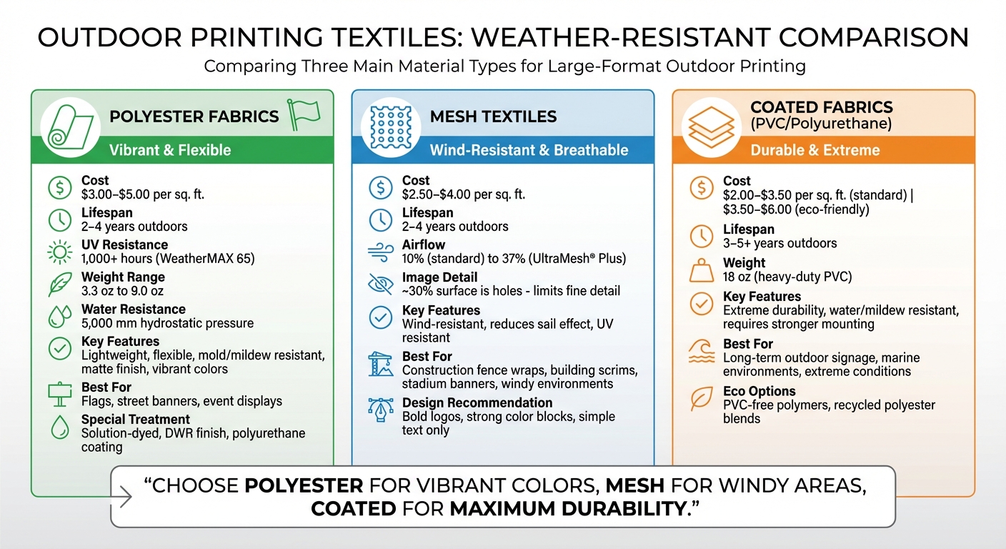
- Polyester fabrics: Lightweight, durable, and resistant to mold and fading. Costs range from $3.00–$5.00 per square foot, lasting 2–4 years outdoors.
- Mesh textiles: Ideal for windy areas, with perforations to reduce wind stress. Best for bold designs, priced at $2.50–$4.00 per square foot, lasting 2–4 years.
- Coated fabrics: Heavy-duty options like PVC-coated vinyl last 3–5 years, priced at $2.00–$3.50 per square foot.
Printing methods like UV-curable inks and dye-sublimation ensure vibrant, weather-resistant designs. Proper maintenance – like regular cleaning and careful storage – extends the lifespan of your textiles. With the right materials and care, your outdoor prints can stand up to the elements and deliver lasting impact.
Materials for Weather-Resistant Textiles
Weather-Resistant Textile Materials Comparison: Cost, Durability and Applications
The choice of textile plays a huge role in determining how long your prints will last outdoors. Polyester fabrics, mesh textiles, and coated specialty materials are the three primary options, each tailored to specific environmental needs. While they all offer durability, cost, and visual appeal, they come with trade-offs that are worth exploring.
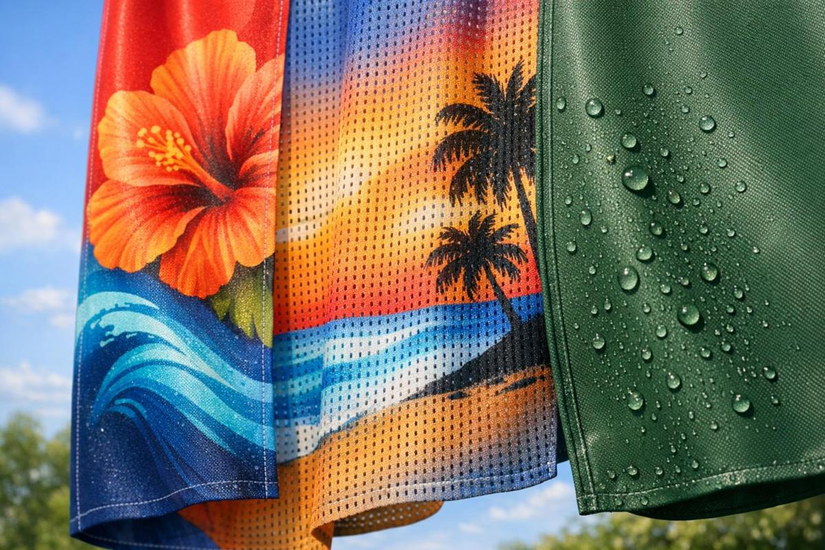
Polyester Fabrics for Outdoor Use
Polyester is a go-to material for outdoor applications because it’s lightweight, flexible, and stands up well to weather. This synthetic fiber resists stretching, wear and tear, mold, mildew, and rot, making it ideal for items like flags, street banners, and event displays. Polyester fabrics come in various weights, from the lightweight 3.3 oz Primary Flag material to the sturdier 9.0 oz Hercules fabric, which is perfect for heavy-duty banners.
Solution-dyed polyester is a standout option. Instead of applying color to the surface, the dye is embedded during the manufacturing process, which significantly boosts its resistance to fading. For example, WeatherMAX 65 weighs just 6.5 oz per square yard but offers at least 1,000 hours of UV resistance. Additional treatments like DWR (Durable Water Repellent) finishes or polyurethane coatings enhance water resistance. Mid-range water-resistant polyester typically achieves hydrostatic pressure ratings of 5,000 mm and breathability levels of 5,000 g/m²/d.
Polyester banners are priced at the higher end of the market, ranging from $3.00 to $5.00 per square foot. This cost reflects their superior quality, particularly their matte finish, which minimizes glare and produces vibrant, sharp images unmatched by vinyl. With proper care, polyester fabrics can last 2 to 4 years outdoors, and thoughtful maintenance can extend their lifespan even further.
Mesh Textiles for Windy Environments
Mesh textiles are designed to tackle the challenges of windy conditions. Their open-weave or perforated structure allows air to pass through, reducing the "sail effect" that can damage solid banners. Standard perforated PVC mesh has an open space of about 10%, while advanced options like UltraMesh® Plus allow for around 37% airflow.
"The unique perforated design allows winds to spill through the banner instead of around the banner, giving it a longer life span than regular scrim vinyl banners." – BlueWave Printing
However, the perforations can compromise image detail. Fine text, intricate patterns, and subtle color gradients don’t translate well on mesh because roughly 30% of the surface is made up of holes. Bold, simple designs – like large logos, strong color blocks, and straightforward text – work best. Mesh textiles are commonly used for construction fence wraps, building scrims, and stadium banners, where wind resistance is more important than detailed visuals.
Mesh vinyl typically costs between $2.50 and $4.00 per square foot and lasts 2 to 4 years outdoors. It’s built to handle UV exposure and harsh weather while reducing stress on mounting hardware like grommets and poles.
Coated and Specialty Fabrics
For the toughest conditions, coated fabrics combine a polyester base with protective PVC or polyurethane layers. Heavy-duty options, like 18 oz PVC-coated vinyl with internal scrim, can last 3 to 5 years or more outdoors. These materials are durable but heavy, requiring stronger mounting systems. They’re priced between $2.00 and $3.50 per square foot, making them a cost-effective choice for long-term use.
Polyurethane-coated polyester is an excellent option for environments with constant moisture, such as marine settings. Specialty treatments like HydroMAX add water repellency and mildew resistance, all while avoiding environmentally harmful chemicals. These coated fabrics are designed for extreme durability and specific use cases.
Sustainability is becoming a bigger focus in the textile industry. Manufacturers are now offering PVC-free polymers and recycled polyester blends to meet the growing demand for eco-friendly materials. These greener options cost between $3.50 and $6.00 per square foot, catering to brands that prioritize environmental responsibility without compromising on outdoor performance.
Printing Methods for Outdoor Textiles
Printing Methods Overview
The durability of outdoor textiles largely depends on the printing method used. For instance, UV-curable inkjet systems offer instant curing, resulting in vibrant and long-lasting prints. Similarly, latex printing employs water-based inks, making it an eco-friendly and odorless option, particularly suitable for soft signage and flags. Direct disperse dye printing is another effective approach for flags, as it achieves 90–100% ink strike-through, ensuring designs are clearly visible on both sides of the fabric.
When it comes to dye-sublimation, both transfer and direct methods infuse color into the fibers. Transfer dye-sublimation involves printing on paper and then using heat to transfer the design, while direct sublimation prints directly onto the fabric. Both methods maintain the fabric’s softness, though low-energy inks used in these processes may fade more quickly in outdoor conditions.
"When polyester gets heated, the molecules expand, allowing the dye to penetrate the surface. When the substrate is cooled, the dyes are locked into the material. The colorant becomes part of the substrate itself." – Mike Syverson, National Textile Manager, Durst Image Technology
The digital textile printing industry was growing at a rate of approximately 34% CAGR as of 2019, with projections suggesting further growth exceeding 13% CAGR between 2023 and 2030. Now, let’s explore the inks, coatings, and design strategies that enhance these printing techniques.
Inks and Coatings for Weather Resistance
The choice of inks and coatings plays a crucial role in ensuring outdoor textiles can withstand harsh weather conditions. Pigment-based inks are a popular choice for outdoor use due to their excellent resistance to UV fading and moisture. Unlike dye-based inks, which bond with the fabric fibers, pigment inks sit on the surface. While this can slightly stiffen the material, it significantly improves its durability. For example, solution-dyed acrylic fabrics can handle up to 2,200 hours of UV exposure before noticeable fading, compared to just 300 hours for standard printed polyester or acrylic fabrics.
To maintain color vibrancy, UV-protective top coatings are essential. Additionally, Durable Water Repellent (DWR) treatments, often made with fluoropolymer-based formulas, help fabrics resist moisture by keeping them hydrophobic. Proper ink load management is also critical to ensure adequate penetration and to prevent issues like blooming or dot gain. For those using transfer paper in dye-sublimation, maintaining consistent humidity levels during the heat press process is equally important.
Design Considerations for Outdoor Textiles
Effective design is just as important as the printing and coating techniques when it comes to creating outdoor textiles that last. Using bold typography and high-contrast colors ensures readability even in bright sunlight. Designers should also account for a 1–2% shrinkage in fabric dimensions during production. For applications involving Silicon Edge Graphic (SEG) frames, choosing fabrics with slight stretch allows for a smooth, taut finish.
Color selection plays a significant role too. While pigment inks are highly resistant to fading, they offer a narrower color range compared to dye-based inks, which produce vibrant, saturated colors but are less durable outdoors. To evaluate how well prints will hold up over time, lightfastness tests like the American Standard AATCC 169.3 provide ratings from 1 (Very Poor) to 8 (Outstanding), offering valuable insights into a print’s performance under extended outdoor exposure.
Finishing and Installation for Weather-Resistant Textiles
Finishing Techniques
To protect textiles from weather damage, proper finishing is essential. Reinforced sewn hems are a common method for preventing fraying and adding stability against wind and moisture. These sturdy edges help maintain the banner’s shape and reduce the risk of tearing at vulnerable spots.
Grommets are another key finishing element. They provide secure mounting points without damaging the fabric, allowing banners to be attached with zip ties or hardware without risk of ripping. For street-pole banners or suspended displays, pole pockets are often the better choice. They distribute wind stress more evenly across the banner, unlike grommets, which can concentrate pressure at specific points.
Specialty coatings applied post-printing, such as UV-protective, moisture-resistant, and flame-retardant finishes, further enhance durability. These coatings improve tear resistance and help the material maintain its shape. In public spaces where flame-proofing is required, timing is critical. As Tom Andrews, President of Turning Star Flame Proofing Inc., advises:
"It’s better to flame-proof the fabric after it’s been printed so that the flame retardant has an opportunity to soak into the ink as well".
These finishing methods ensure textiles are prepared for outdoor conditions and set the foundation for successful installation.
Installation Hardware and Planning
The right hardware and careful planning are crucial for ensuring outdoor textiles hold up under various environmental conditions. Street-pole mounts, zip ties, and other compatible hardware are designed to secure materials effectively. High-quality vinyl, for instance, can endure temperatures as low as -22°F, retaining its integrity even during harsh winters. Adhesive-backed textiles require thorough surface preparation to avoid bubbles and ensure long-term adhesion. Additionally, always verify local building codes before installation, as regulations may dictate specific mounting methods or flame-retardant requirements.
| Hardware Type | Best Application | Key Advantage |
|---|---|---|
| Pole Pockets | Street-pole banners, backdrops | Even weight distribution |
| Grommets (#2 Brass) | Fence wraps, temporary installations | Quick mounting and removal |
| Rope and Stake Kits | Ground-level outdoor events | Portable and adjustable |
Miro Printing & Graphics Inc.’s Finishing Services
For advanced finishing needs, Miro Printing & Graphics Inc. in Hackensack, NJ, offers comprehensive in-house services to prepare outdoor textiles for installation. Their bindery capabilities include cutting, folding, and binding, specifically tailored for large-format outdoor signage projects. They also install grommets and create pole pockets to reinforce edges and mounting points, ensuring promotional materials remain secure during installation and throughout their use.
Miro’s facility specializes in techniques like hemming, where edges are folded and sewn to maintain the textile’s shape and prevent tearing. By handling every step of the process – from printing to finishing – under one roof, they ensure quality control and maximize the lifespan of outdoor textiles. Their large-format printing capabilities accommodate widths ranging from 5.2 feet to over 16 feet, making them equipped to produce everything from street banners to massive building wraps.
sbb-itb-ce53437
Maintenance and Lifecycle of Outdoor Textiles
Routine Maintenance Practices
Keeping outdoor textiles in top condition starts with regular upkeep. Sunbrella recommends rinsing fabrics with clean water monthly to prevent dirt accumulation, which can significantly extend their lifespan. This simple step can help reduce the need for deep cleaning to once every two to three years for premium acrylics, or about four times per year for standard outdoor fabrics.
When deeper cleaning is necessary, mix 1/4 cup of mild soap with a gallon of lukewarm water. Avoid power washers or high-pressure sprays, as they can damage the fibers and protective coatings. For oil-based stains, sprinkle an absorbent like cornstarch or baking soda on the spill, let it sit for 10 minutes, then gently scrape it off before cleaning. Dry dirt or pencil marks can be lifted with masking tape or a dry Magic Eraser to avoid embedding the stain further into the fabric. Always let textiles air dry completely – never use high heat, as it can cause shrinkage (up to 3/4 inch for every 50 inches of stretch fabric). Once cleaned and dried, proper storage is key to preserving their condition.
Storage and Reuse Guidelines
Proper storage is essential for maintaining outdoor textiles. Ensure fabrics are completely dry before storing to prevent mildew and rot. Vinyl banners and UV graphics should be rolled with the printed side inward and stored in tubes to avoid crushing or creasing. For backlit textiles, loosely fold them with bubble wrap or roll them around a tube to reduce the risk of ink cracking. Tight folds should be avoided to prevent permanent creases or chipped ink.
When handling textiles, use clean hands or white fabric gloves to avoid transferring oils and dirt. To further protect fabrics, store them in their original sleeves or specialized bags to shield them from dust and pollutants. After cleaning – especially if bleach was used – apply a fabric protector like 3M Scotchgard or Sunbrella Restore to renew water repellency and UV resistance.
Lifespan and Replacement Planning
The lifespan of outdoor textiles depends largely on their fiber type and dyeing process. Solution-dyed acrylics, where the color runs through the entire fiber, can provide up to 2,200 hours of UV protection. In contrast, printed polyester or acrylic fabrics, where color is applied to the surface, typically offer around 300 hours of UV resistance, making them better suited for seasonal use.
Environmental factors – like sun exposure, geographic location, temperature, humidity, and airflow – also play a big role in how quickly textiles degrade. The AATCC 169.3 lightfastness scale (rated 1 to 8) is often used to measure longevity. Fabrics rated 7 or 8, which show minimal or no fading, can last over a century under controlled conditions. On the other hand, fabrics rated 1 or 2 may fade significantly and require replacement within two years.
| Fabric Type | UV Protection Hours | Typical Application | Expected Longevity |
|---|---|---|---|
| Solution-Dyed Acrylic | 2,200+ hours | Permanent outdoor signage | Multi-year (Excellent) |
| Printed Polyester/Acrylic | ~300 hours | Seasonal promotions | 1–2 years (Seasonal) |
| Backlit Textiles | High sensitivity | Indoor/protected outdoor | 2–3 years with care |
Conclusion
Choosing the right weather-resistant textiles means carefully aligning your substrate, ink, and finishing techniques with the environmental conditions your displays will face. UV rays can cause colors to fade, while moisture and temperature swings may lead to warping or cracking of materials. Running UV tests before finalizing your materials and opting for pigment-based inks instead of dye-based ones can make all the difference – turning a display that lasts a single season into one that holds up for years. Balancing performance with budget is key to cost-effective material selection.
Regular maintenance is another critical factor in extending the life of your displays and ensuring you get the most out of your investment. When you combine thorough material testing with consistent upkeep, you set your project up for long-lasting success.
Miro Printing & Graphics Inc., based in Hackensack, NJ, brings over 30 years of experience to the table, helping businesses make informed decisions about substrates, offering professional pre-press services like color correction, and paying close attention to every detail to ensure outdoor displays can stand up to the elements.
"With meticulous attention to detail, our print shop has a customized approach that is unmatched by big online printing companies or franchises." – Miro Printing & Graphics Inc.
Whether you’re creating permanent signage or temporary seasonal promotions, the right combination of materials, inks, protective finishes, and expert craftsmanship determines how well your outdoor textiles perform over time. Careful planning and working with seasoned professionals not only enhance durability and visual appeal but also provide significant cost savings throughout the lifespan of your project.
FAQs
What materials are best for outdoor weather-resistant large-format printing?
When it comes to outdoor large-format printing, picking the right material is crucial to ensure your signage can withstand rain, UV rays, and temperature shifts. Some of the best materials for the job are vinyl, polyester fabrics, and rigid polymer boards.
Vinyl materials – like PVC-coated banners and mesh-woven vinyl – are both waterproof and affordable, making them a go-to for temporary signage. Mesh vinyl, in particular, is great for windy areas since it allows air to flow through. For illuminated or long-term displays, backlit vinyl or acrylic panels work exceptionally well.
Polyester fabrics, such as Taslan nylon or Silkara, are treated to repel water, making them ideal for banners, flags, and other outdoor displays. For projects requiring extra durability, materials like DuPont Tyvek® offer UV resistance, flexibility, and lightweight strength, making them suitable for extended use.
For the most permanent solutions, rigid polymer boards – like Alumacorr, PolyMetal, and Coroplast – provide a sturdy, weatherproof surface that stands up to fading, moisture, and temperature changes. These materials are perfect for wall-mounted signs, directional panels, or even vehicle graphics.
Miro Printing & Graphics Inc., based in Hackensack, NJ, specializes in large-format printing using these durable materials. They can help you choose the best option to fit your project’s requirements and budget.
How do printing techniques affect the durability of outdoor textiles?
The longevity of outdoor textiles is closely tied to the printing method used. Dye-sublimation and pigment-based inks integrate colors directly into the fibers, making them highly resistant to fading and washing – provided the fabric undergoes proper treatment. Meanwhile, solvent-based inks, commonly applied to polyester or vinyl, chemically bond with the material, resulting in a surface that’s waterproof and abrasion-resistant. To further protect prints from sunlight and wear, adding a UV-blocking coating or laminate is an effective solution.
Finishing touches play an equally important role in ensuring durability. Protective laminates or UV coatings act as shields against scratches, moisture, and extended sun exposure. Additionally, mounting textiles on sturdy backings like aluminum or PVC helps prevent sagging or tearing, especially in windy environments. At Miro Printing & Graphics Inc., we combine cutting-edge printing techniques with expert finishing solutions to deliver outdoor graphics that stay vibrant and weather-resistant for years to come.
How can I maintain weather-resistant textiles to ensure long-lasting use?
To keep weather-resistant textiles used in large-format printing in great condition, consistent care is key. Start with monthly light cleaning: brush off loose dirt and rinse the fabric with clean water. For a more thorough cleaning every 2–3 years, mix a mild soap or fabric cleaner with lukewarm water, gently wash the material, rinse it well, and let it air-dry completely. Avoid using heat, abrasive tools, or harsh chemicals, as these can harm both the fabric and the printed graphics. For spot stains, use a soft cloth and distilled water, gently blotting to prevent the stain from spreading.
Handling and storing these textiles properly is just as important. Always work in a clean, dry area, and if possible, wear white gloves to avoid transferring oils or dirt. Make sure the fabric is fully dry before rolling or folding it, and store it in a cool, dry space away from direct sunlight or UV exposure. These simple care practices will help maintain the fabric’s color and durability over time.
Related Blog Posts
- Fire-Resistant Fabrics for Printing: Types and Uses
- Applications of Coated Synthetic Fabrics in Outdoor Advertising
- How to Choose Durable Banner Materials for Outdoors
- Top 5 Substrates for Multi-Climate Printing
https://app.seobotai.com/banner/banner.js?id=694dee1112e0ddc12500b428