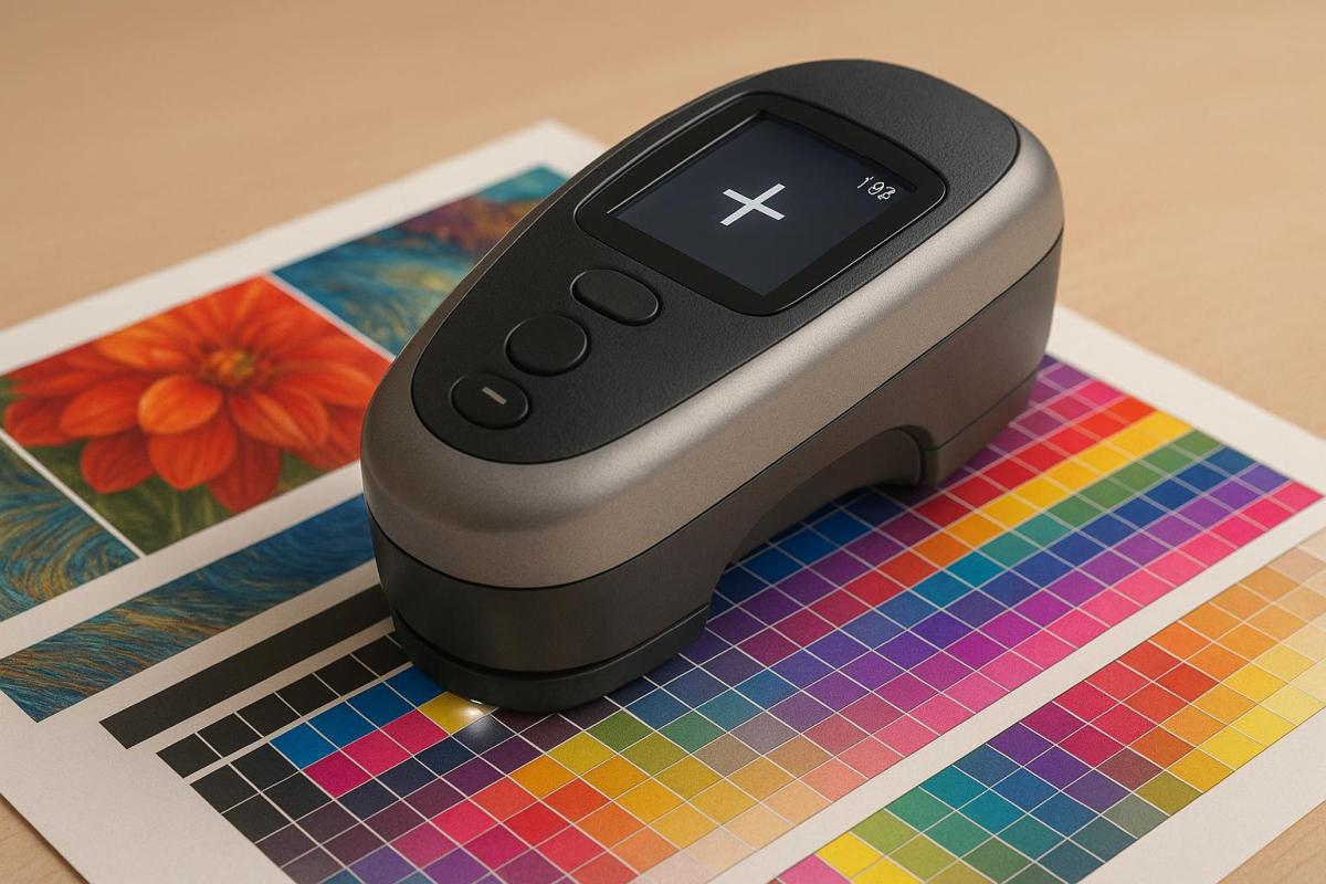
ISO 13655 is a global standard for measuring color in printing, ensuring consistency across devices and locations. It focuses on how to measure color accurately, addressing challenges like optical brightening agents (OBAs) in paper. Unlike ISO 12647-2 and ISO 12647-6, which set production targets for offset and flexographic printing, ISO 13655 standardizes the tools and methods for color measurement.
Key Highlights:
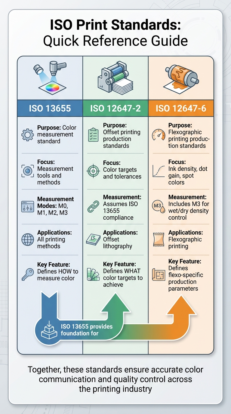
- ISO 13655: Defines measurement conditions (M0, M1, M2, M3), geometries, and backing materials for precise color data.
- ISO 12647-2: Sets color targets and tolerances for offset printing.
- ISO 12647-6: Focuses on flexographic printing standards like ink density and dot gain.
- ISO 3664: Establishes D50 lighting for viewing conditions.
Quick Comparison:
| Aspect | ISO 13655 | ISO 12647-2 | ISO 12647-6 |
|---|---|---|---|
| Purpose | Color measurement standard | Offset printing production standards | Flexographic printing production standards |
| Focus | Measurement tools and methods | Color targets and tolerances | Ink density, dot gain, and spot colors |
| Measurement Modes | M0, M1, M2, M3 | Assumes ISO 13655 compliance | Includes M3 for wet/dry density control |
| Applications | All printing methods | Offset lithography | Flexographic printing |
Together, these standards ensure accurate color communication, reliable production, and quality control across the printing industry.
ISO 13655 vs ISO 12647-2 vs ISO 12647-6 Print Standards Comparison
ISO 13655 vs. ISO 12647-2
Key Differences in Measurement and Applications
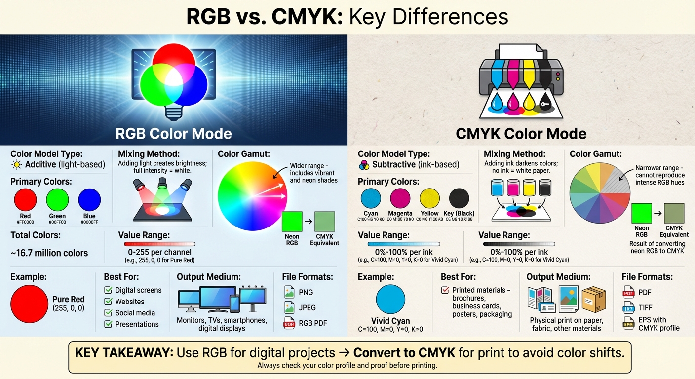
Although both ISO 13655 and ISO 12647-2 are crucial to the offset printing industry, they serve very different purposes within the production process. ISO 13655 focuses on how to measure color, acting as a guide for spectrophotometers by outlining measurement modes (M0, M1, M2, M3), geometries like 0°/45° or 45°/0°, and backing materials. Meanwhile, ISO 12647-2 defines the color standards and tolerances that should be achieved during offset lithography.
To put it simply: ISO 13655 ensures that your measuring tools are aligned globally, while ISO 12647-2 sets the benchmarks for production quality. ISO 12647-2 builds on the precise measurement framework established by ISO 13655 by specifying production targets, such as cyan ink values (L* 55±2, a* -37±2, b* -50±2), density tolerances of ±0.03 for solid areas, and tonal value increase (TVI) targets like a 25% tint printing at 26±4%.
ISO 13655 provides the foundation for consistent measurements, offering modes like M1 for D50 illumination (to account for optical brightening agents, or OBAs) and M3 for simulating wet sheets. While ISO 12647-2 doesn’t mandate specific measurement modes, it assumes the use of ISO 13655-compliant instruments. ISO 12647-2 focuses on ensuring consistent production results across various paper types (classified as Types 1 through 5 based on characteristics like OBA content) and relies on ISO 13655’s precision to meet its strict tolerances.
Together, these standards create a complementary system: ISO 13655 standardizes how colors are measured, and ISO 12647-2 ensures those measurements translate into consistent, high-quality production results.
Comparison Table: Measurement Modes and Applications
The table below highlights the key differences between ISO 13655 and ISO 12647-2:
| Aspect | ISO 13655 | ISO 12647-2 |
|---|---|---|
| Primary Purpose | Specifies how to measure color and instrument behavior | Sets process control parameters and color targets for offset printing |
| Measurement Modes | M0 (legacy tungsten), M1 (D50 with UV for OBAs), M2 (UV-cut), M3 (polarization + UV-cut for wet sheets) | References M3 for density control but assumes ISO 13655-compliant instruments |
| Backing Requirements | Black backing (visual density 1.5±0.2) for opacity; white backing (L* 92-96, C* <3, no OBAs) for translucency | Considers substrate properties but does not mandate specific backings |
| Key Parameters | Measurement geometry (0°/45° or 45°/0°), illuminant specs, substrate compensation formulas | Color targets (IT8 charts), density tolerances (±0.03), Lab tolerances (ΔE <2.5), TVI targets |
| Scope | Covers all graphic arts processes (offset, flexo, gravure, screen, digital) | Focuses specifically on offset lithography on paper and board |
| Application Examples | Press characterization, proof-to-press matching, spectral data collection | Production color control, achieving standardized printing conditions, quality control color bars |
ISO 13655 vs. ISO 12647-6
Spectral Data vs. Flexographic Printing Standards
ISO 13655 and ISO 12647-6 are two key standards in the printing world, but they address distinct aspects of the process. ISO 13655 focuses on creating a consistent framework for measuring color spectrally, while ISO 12647-6 sets specific production standards for flexographic printing. ISO 13655 outlines how to measure color using defined modes and backing materials, which apply across multiple printing methods like offset, flexography, gravure, screen, and digital. On the other hand, ISO 12647-6 zeroes in on flexographic printing, providing tolerances for factors like ink density, dot gain, and spot color tone value (SCTV).
The measurement modes established by ISO 13655 are crucial for handling optical brightening agents (OBAs) and gloss variations, which are often encountered in flexographic printing. ISO 12647-6 builds on this by defining flexo-specific parameters, such as ink densities of 1.2–1.5 for CMYK, dot gain ranges of 15–25% in highlights and 20–35% in midtones, and SCTV for spot colors. Together, these standards create a bridge between accurate color measurement and practical production controls in flexographic printing.
ISO 13655 also provides clear guidelines for backing materials, which are directly relevant to flexographic substrates. For example, it specifies white backing for substrate compensation and black backing for measuring opacity. While ISO 12647-6 doesn’t explicitly mandate these backings, it relies on the principles of ISO 13655 to ensure consistency, particularly for translucent films and other packaging materials.
Flexographic printers often face challenges when applying these standards. For instance, ISO 13655 requires modern spectrodensitometers with 45°a:0° geometry capable of M-mode measurements. This can pose difficulties for operations still using older M0 instruments, especially when working with OBA-heavy substrates common in packaging. Additionally, ISO 12647-6 allows for the optional use of M3 polarization to predict wet-to-dry density shifts, helping manage gloss variations during large production runs.
Comparison Table: Backing Materials and Printing Parameters
| Aspect | ISO 13655 | ISO 12647-6 |
|---|---|---|
| Primary Focus | Spectral measurement conditions and backing evaluation | Flexographic printing process control with tolerances for ink density, dot gain, and SCTV |
| Backing Materials | White backing (matte, no OBA, L* 92–96, C* <3) for substrate compensation; black backing for opacity measurements | Relies on ISO 13655 backing guidelines for translucent films and packaging materials, without strict requirements |
| Measurement Modes | M1 (D50 for OBA fluorescence), M2 (UV-cut), M3 (polarization for gloss reduction) | M3 may be used for wet/dry density control, emphasizing production tolerances |
| Key Parameters | Spectral reflectance curves, colorimetric computation, and substrate compensation formulas | Ink density tolerances (1.2–1.5 for CMYK), dot gain (15–25% in highlights, 20–35% in midtones), and SCTV for spot colors |
| Scope | Universal measurement framework for press characterization, proof verification, and color communication | Flexography-specific applications in packaging, labels, and high-volume production on films |
| Application Examples | Ensuring spectral accuracy for proof-to-press matching and managing fluorescent substrates with M1 mode | Maintaining production consistency through defined density parameters and achieving standardized flexo printing conditions |
ISO 13655 and ISO 3664: Viewing Conditions
Illuminants and Optical Brightening Agents (OBAs)
ISO 3664:2009 establishes viewing conditions for graphic arts, using the CIE D50 illuminant at specific light levels: P1 (2,000 ± 500 lux) for critical comparisons and P2 (500 ± 125 lux) for less demanding evaluations. These settings, paired with neutral surroundings, are essential for maintaining consistent color fidelity.
A key factor in printing is managing optical brightening agents (OBAs), which are chemicals added to paper to make it appear brighter and whiter by fluorescing under UV light. To ensure that this fluorescence is consistent and accurate, ISO 3664 requires retaining the D50 UV energy in viewing conditions. This is where ISO 13655’s M1 mode steps in – it mimics D50 UV excitation, solving longstanding discrepancies between proofs and final prints. With M1, measurements align closely with what is visually observed under proper D50 lighting.
In contrast, using modes like M2, which employs a UV-cut filter, can result in noticeable color deviations – often in the range of 5–10 ΔE – on fluorescent substrates. This highlights the importance of D50 lighting and M1 mode for achieving accurate proof-to-print matching. To ensure consistency, instruments must operate in M1 mode, and results should be verified under D50 lightbooth conditions with light levels around 2,000 lux.
Comparison Table: Illuminants and Viewing Conditions
| Aspect | ISO 3664 Viewing | ISO 13655 M0 | ISO 13655 M1 | ISO 13655 M2 | ISO 13655 M3 |
|---|---|---|---|---|---|
| Illuminant | D50 (including UV) | A (legacy tungsten) | D50 match with UV for OBAs | UV-cut filter | UV-cut + polarization |
| UV Handling | Full D50 UV energy | Variable | Emulates OBA fluorescence | Minimal (<10% at 400nm; >85% above 420nm) | Same as M2 |
| Application | Proof/print evaluation | Legacy workflows | Accurate color matching with OBAs | Non-OBA assessments | Wet/dry offset density |
| Alignment with ISO 3664 | Reference standard | Low alignment | Direct match | Partial alignment | Special cases only |
| OBA Suitability | Designed for OBA viewing | Poor | Excellent | None | None |
sbb-itb-ce53437
Key Advantages of ISO 13655
Precision in Spectral Reflectance
ISO 13655 offers an impressive level of precision in measuring spectral reflectance, making it especially effective for challenging materials. The standard mandates spectral data intervals between 5–10 nm, ensuring accurate colorimetric calculations across various devices and locations. This precision is particularly important when working with substrates like papers containing optical brightening agents (OBAs) or translucent packaging films, where even small discrepancies can lead to noticeable color shifts.
The introduction of the M1 measurement condition marks a significant step forward for modern printing. By aligning with CIE illuminant D50 (including UV content), M1 effectively captures the fluorescence of OBAs in paper substrates. This ensures that instrument measurements align with the visual appearance observed under ISO 3664 viewing conditions – something that older M0 measurements with tungsten light sources could not achieve. For print shops handling OBA-rich papers, this translates to more dependable proof-to-press workflows.
Compliance Testing with Standard Backings
Beyond accurate spectral measurements, ISO 13655 also defines specific backing materials to ensure consistent results. These standardized backings are essential for testing non-opaque substrates and achieving overall compliance. For example, when working with translucent packaging films or clear materials, the standard specifies the use of white backings (matte finish, no OBAs, chroma below 3) and black backings (density between 1.30–1.60), with each meeting detailed spectral reflectance criteria. These guidelines are crucial for press characterization, proof verification, and high-volume production across offset, flexographic, and digital printing.
To implement these standards effectively, compliance involves using specified geometries (either 45°:0° or 0°:45°) and placing samples on flat surfaces with the designated backing. Additionally, print providers can confirm their instruments meet UV-cut specifications (transmittance below 0.10 at 400 nm for M2) by performing Annex G tests. This step is essential before applying substrate compensation formulas for non-opaque prints in production settings. This structured approach transforms ISO 13655 from a technical guideline into a practical tool for ensuring quality control, minimizing color mismatches, and improving coordination across prepress, pressroom, and proofing workflows.
Conclusion
Summary of Key Points
Accurate spectral measurement plays a crucial role in ensuring proofs match final prints. Standards like ISO 13655 provide guidelines for capturing spectral data, including instrument geometries, wavelength intervals, and measurement modes (M0–M3). Meanwhile, ISO 12647-2/6 defines production tolerances, and ISO 3664 establishes D50 viewing conditions. Together, these standards help bridge the gap between instrument readings and visual evaluations, creating a more reliable production workflow.
The 2017 update to ISO 13655 introduced stricter requirements, such as 10 nm spectral intervals and standardized backing, which improve consistency and repeatability across devices and locations. By enforcing these precise parameters, ISO 13655 enhances ICC profiling and overall quality control, making it a significant step forward compared to older densitometric methods.
Why ISO 13655 Matters for Modern Printing
The importance of ISO 13655 in today’s printing industry cannot be overstated. It supports contract-grade workflows for press characterization, proof verification, and on-press quality control, ensuring consistency across various printing processes in the U.S.. This standard reduces color disputes, ensures predictable reprints, and facilitates seamless data exchange between designers, prepress teams, and production facilities – even when different instrument brands are involved. For packaging that uses OBA-rich boards and combines offset and flexo printing, ISO 13655’s M1 mode ensures accurate readings that align with the visual appearance, helping avoid costly reprints.
Take, for example, Miro Printing & Graphics Inc., based in Hackensack, NJ. This full-service print shop, which handles digital, offset, and large-format printing, benefits greatly from ISO 13655. By implementing a unified spectral framework, they ensure consistent color across all devices and substrates, whether handling proofs, short-run digital jobs, or long-run offset projects. This approach not only aligns with clients’ expectations but also highlights their commitment to ISO-based quality standards. As substrates become more complex with increasing OBAs, metallic finishes, and intricate coatings, ISO 13655 remains a key tool for achieving accurate color profiles, automating control processes, and maintaining efficient workflows.
Spectral reading M0 M1 M2 M3
FAQs
What is the difference between ISO 13655 and ISO 12647-2 in printing?
ISO 13655 is all about measuring spectral data to deliver precise color information, ensuring accurate and consistent print quality. This standard is especially helpful for assessing how colors look under various lighting conditions.
On the other hand, ISO 12647-2 focuses on process control for offset printing. It provides clear guidelines for managing color, defining printing conditions, and maintaining consistency throughout production. While both standards aim to uphold high-quality printing, they address different aspects of the process.
How does ISO 13655 account for optical brightening agents (OBAs) in color measurements?
ISO 13655 plays a key role in ensuring precise color measurements by reducing the effects of optical brightening agents (OBAs). It delivers spectral data that eliminates OBA interference, enabling consistent and dependable color assessment across various printing materials. This level of accuracy is essential for upholding top-notch print quality and achieving consistent outcomes in color reproduction.
What makes ISO 13655 essential for modern printing?
ISO 13655 is essential in today’s printing industry as it establishes a clear framework for measuring spectral data. This helps ensure accurate and consistent color reproduction across different devices, materials, and printing environments.
Following ISO 13655 allows printers to maintain dependable color quality control, reducing mistakes and delivering uniform results. This standard is particularly crucial in professional printing, where precision and consistency are vital for meeting client demands.
Related Blog Posts
- ISO 2846: Ink Color Standards Explained
- Proofing Standards in Printing: Key ISO Guidelines
- How ISO 12647 Ensures Print Quality
- Top Tools for Color Calibration in Printing
https://app.seobotai.com/banner/banner.js?id=694220cd89a9fb16dc708788