10 Benefits of Waterless Printing for Textiles

Explore the transformative benefits of waterless printing in textiles, including reduced water usage, energy savings, and enhanced fabric quality.

Waterless printing is reshaping how textiles are made, cutting water use by up to 95% and energy consumption by 75%. Traditional methods waste massive resources and pollute water systems, but this new approach removes water and harmful chemicals entirely. Here’s what makes waterless printing stand out:

  • Saves Water: Uses as little as 0.02 liters per kilogram of fabric compared to 150 liters in older methods.
  • Eliminates Wastewater: No contaminated water discharge, reducing pollution and treatment costs.
  • Cuts Energy Use: Avoids energy-heavy steps like drying and steaming, lowering power needs by 75%.
  • Reduces Chemicals: Skips pre- and post-treatment processes, cutting chemical costs by 80%.
  • Improves Efficiency: Produces only what’s needed, reducing waste and speeding up production.
  • Preserves Fabric Quality: No water-related distortion or shrinkage, ensuring better texture and vibrant colors.
  • Shortens Production Time: Simplifies steps, enabling faster turnaround and on-demand production.
  • Minimizes Environmental Impact: Prevents pollutants, uses VOC-free inks, and reduces carbon footprints.
  • Lowers Costs: Saves on water, energy, and chemicals while reducing waste and equipment expenses.
  • Supports Compliance: Meets stricter regulations and aligns with eco-conscious consumer demands.

This process is transforming textile manufacturing, offering a cleaner, more efficient, and cost-effective way to produce fabrics without compromising quality.

Mimaki TRAPIS: The Future of Sustainable Textile Printing

Mimaki TRAPIS

1. Major Water Conservation

Waterless printing is a game-changer when it comes to saving water in textile production. Traditional printing methods require anywhere from 95 to 400 liters of water per kilogram of fabric. In contrast, digital waterless printing uses just 5–9 cc per meter, slashing water consumption by up to 95%. These numbers highlight the dramatic difference waterless methods can make.

Take Kyocera’s FOREARTH printer as an example. Using pigment ink, it consumes only 0.02 liters of water per kilogram of fabric compared to the staggering 150 liters used in conventional processes. That’s a reduction of over 99.9%, which translates into massive savings, especially for large-scale production.

Different digital systems also contribute to water conservation in unique ways:

  • Dye-sublimation and pigment systems save 70–80 liters per meter.
  • Disperse, reactive, and acid ink digital systems save 30–40 liters per meter.

These savings are especially crucial when you consider the textile industry’s enormous water footprint. Each year, traditional analog textile production consumes around 93 billion cubic meters of water. Alarmingly, over 94% of the world’s printed fabric is still produced using water-intensive screen printing methods.

Waterless printing doesn’t just conserve water – it also helps protect the environment. Traditional printing methods often release harmful chemicals into water sources, leading to contamination. By removing water from the process entirely, waterless printing avoids this issue, offering both environmental and conservation benefits. It’s a step toward a more sustainable future for textile production.

2. Zero Wastewater Production

One standout benefit of waterless printing is its complete elimination of wastewater production. Unlike traditional methods that produce contaminated water requiring expensive treatment, waterless printing sidesteps this issue entirely. This approach paves the way for operations that are cleaner and more efficient.

Textile printing, in particular, is a major contributor to water pollution. Globally, traditional printing and dyeing processes are estimated to account for around 20% of clean water pollution. To put this into perspective, the textile industry uses up to 9 trillion gallons of water annually to produce 60 billion kilograms of fabric. These conventional methods rely heavily on water to stabilize ink, creating wastewater that harms ecosystems and increases treatment costs.

Waterless printing flips this script. By removing water from the equation, it eliminates the need for wastewater treatment altogether. As Seacourt highlights:

"Waterless printing brings numerous benefits that make it a valuable choice for modern businesses. Its innovative technology offers high-quality, precise prints without the need for water, cutting down on both waste and pollution." – Seacourt

This zero-discharge system prevents harmful chemicals and pollutants from entering water systems, safeguarding ecosystems from contamination. Businesses that switch to waterless printing also save on the costs of wastewater treatment facilities, chemicals, and the regulatory challenges tied to managing industrial wastewater.

3. Reduced Energy Use

For textile manufacturers, energy consumption is one of the biggest operational costs. This is where waterless printing offers a clear edge. Digital textile printing technologies use much less energy compared to traditional methods, bringing both cost savings and environmental advantages.

The key to this energy efficiency lies in eliminating water-intensive steps like heating and drying, which are notorious for their high power demands. Traditional textile printing heavily depends on these energy-draining processes and requires complex machinery that consumes significant electricity. Digital textile printing, on the other hand, skips these steps entirely, slashing power usage in the process.

How much energy can be saved? Digital printing reduces energy use by up to 75% compared to conventional methods. For instance, a digital printing machine typically consumes about 0.14 kW per meter printed, while a rotary screen printer uses around 0.46 kW per meter printed. That’s a power saving of over 63%.

The energy savings don’t stop there. Alchemie Technology, a company specializing in inkjet solutions for textiles, demonstrates the impact of waterless dyeing. Their technology cuts energy use by 70% for cotton processing and a staggering 85% for polyester compared to traditional methods.

These efficiencies are also due to a streamlined production process. Unlike rotary screen printing, which forces ink through water-heavy emulsions, digital printing uses minimal physical force, making it far less energy-intensive.

"Waterless printing is more energy-efficient because it requires fewer steps and less equipment." – SureRank Access

Another example is dry dyeing, which reduces energy consumption by up to 50%. This method not only cuts energy use but also simplifies production, lowering costs and shortening setup times. Up next, we’ll explore how waterless printing’s reduced reliance on chemicals further enhances its sustainability and cost-effectiveness.

4. Less Chemical Usage

Traditional printing methods often rely on water-heavy pre-treatments, steaming, and fixation agents, which can harm both workers and the environment. Waterless printing offers a cleaner alternative, eliminating the need for these chemical-intensive pre- and post-treatment processes.

By skipping these steps, waterless printing avoids the use of solvents, developers, stabilizers, cleaning agents, and fountain solutions. Taner Güven, CEO of Optimum Digital, highlights that this approach completely removes water usage and eliminates the need for contaminated chemicals. This simplified process not only reduces chemical dependency but also lowers costs and enhances workplace safety.

A prime example is Optimum Digital’s Nirvana Belt textile printer, which cuts chemical costs by 80% and slashes overall production expenses by half. Additionally, with fewer chemicals involved, worker safety improves significantly, reducing both health risks and environmental pollution.

Beyond cost savings and worker safety, waterless printing brings broader environmental benefits. It reduces VOC emissions, minimizes reliance on petroleum-based inks, and eliminates toxic wastewater, creating a zero-discharge production cycle. The result? Safer workplaces, cleaner surroundings, and a substantial drop in chemical expenses.

5. Better Resource Efficiency

Waterless printing stands out for its ability to use raw materials more efficiently through precise, on-demand production. Unlike traditional methods, which often involve extensive material preparation and generate significant fabric waste, waterless printing ensures that only the required quantity is produced. This level of accuracy not only reduces overproduction but also cuts down on waste, resulting in notable resource savings.

Digital waterless printing systems further enhance efficiency by enabling faster setups and minimizing waste throughout the production process. These streamlined operations save resources across multiple fronts.

Practically speaking, this means manufacturers can significantly reduce water, energy, and material consumption. Traditional printing methods demand far more water, but waterless systems can cut water usage by up to 95%. They also lower energy consumption by 75% compared to conventional techniques, while dye-sublimation and pigment-based systems save between 70 and 80 liters per meter printed.

A prime example of this efficiency is Kyocera’s FOREARTH digital textile printer. It uses just 0.02 liters of water per kilogram of fabric, a staggering reduction from the 150 liters typically required in conventional printing. That’s about 99.9% less water, all while delivering high-quality prints on fabrics like cotton, silk, and polyester.

"Initially, many customers were hesitant to work with pigment ink. But once they witness the actual print quality, they are more and more willing to use it", says Sho Taniguchi, Deputy General Manager of Kyocera’s IDP Business Development Division.

For manufacturers, this improved efficiency offers more than just environmental benefits – it also provides a competitive edge. By producing exactly what’s needed, companies can respond faster to market demands, cut down on inventory costs, and reduce waste disposal expenses. This approach not only supports a more sustainable business model but also boosts profitability.

sbb-itb-ce53437

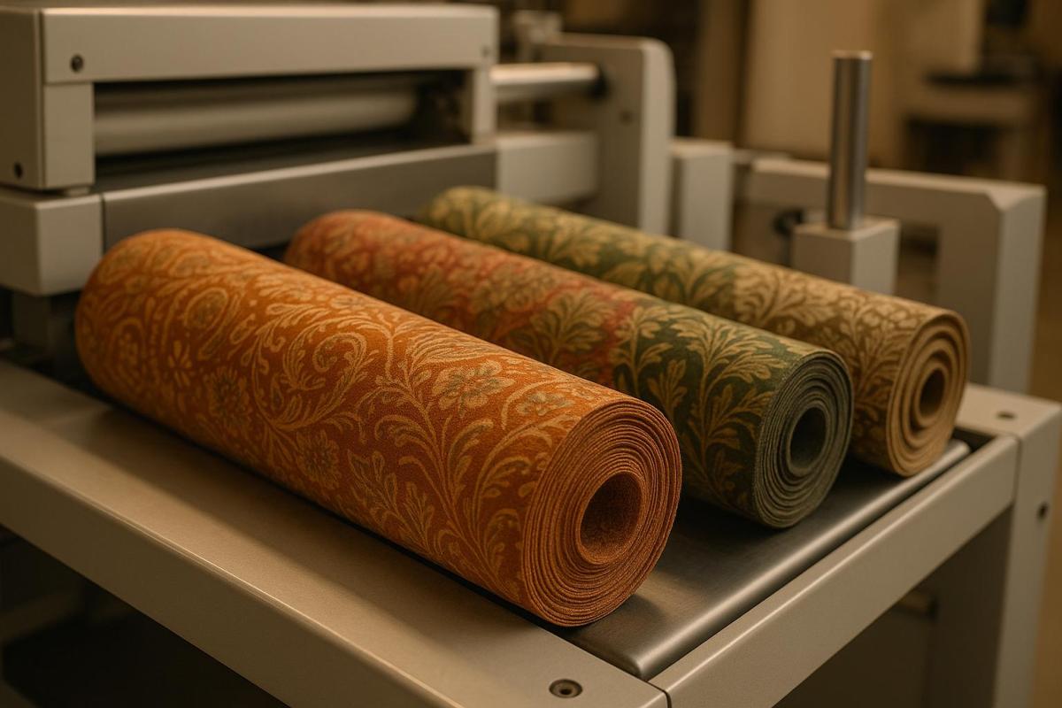
6. Higher Fabric Quality

Waterless printing offers a major advantage: it preserves the integrity of fabrics throughout the printing process. By removing water from the equation, manufacturers can sidestep common issues like fabric distortion and shrinkage, which are often unavoidable with traditional methods. Conventional textile printing relies on water during pre-treatment, printing, steaming, and washing stages, all of which can compromise the fabric’s structure.

This innovative method uses silicone-coated plates and inks to repel ink from non-printing areas, eliminating the need for dampening systems. It also avoids the paper stretch that occurs in water-based printing methods, ensuring greater precision and stability.

Waterless printing also shines when it comes to color quality. Without water-induced damage, colors appear more vibrant and are less prone to fading over time. The process is gentler on fabrics, maintaining their original texture and structural integrity. This combination of vibrant colors and preserved texture elevates the overall print quality, paving the way for advancements like Kyocera’s cutting-edge system.

Kyocera’s FOREARTH digital textile printer exemplifies these benefits. It uses proprietary pigment ink coupled with specialized pre- and post-processing techniques to overcome traditional challenges. Older pigment dyes often left printed areas stiff, but Kyocera’s approach achieves a soft, natural finish comparable to dye-based inks. The printer’s versatility allows it to handle a variety of fabrics – cotton, silk, polyester – while delivering consistent quality and excellent lightfastness.

Overall, waterless printing ensures uniform, precise results that enhance fabric quality, making it ideal for durable and comfortable textiles.

7. Shorter Production Times

Waterless printing slashes production time by cutting out several traditional steps. Gone are the days of pre-treatment processes, post-printing washing, steaming, and lengthy drying phases that often stretch manufacturing cycles by hours or even days.

One of the most dramatic time-saving benefits comes from simplifying production lines. For instance, Kyocera’s FOREARTH digital textile printer reduces the production line length from 100 meters to just 10 meters. This streamlined setup not only boosts throughput but also allows for much faster turnaround times. Shorter production lines are further enhanced by other efficiencies built into the process.

Another game-changer is the elimination of printing plates. Digital waterless printing makes it easy to switch between designs instantly, enabling quick small-batch production without the time-consuming setup that traditional screen printing requires. Plus, skipping washing stages means fabrics can move straight from printing to finishing, saving even more time.

Energy efficiency also plays a role in speeding up production. By optimizing energy use, waterless printing reduces machinery downtime, further accelerating workflows.

For an example of speed in action, consider Optimum Digital’s Nirvana Belt textile printer, which can print up to 8,611 square feet (800 m²) per hour – all without using a single drop of water. CEO Taner Güven highlights the broader impact:

"The waterless printing technology eliminates the need for litres of water required to produce printed textiles with zero water consumption, and also prevents the use of contaminated chemicals."

This streamlined process allows manufacturers to respond to market demands with agility, making it an excellent choice for on-demand production and rapid customization.

8. Smaller Environmental Impact

Waterless printing offers a way to significantly cut down on pollution and conserve resources in textile production. Traditional dyeing and treatment processes in the textile industry are responsible for about 20% of global industrial water pollution. By reducing the use of raw materials, waterless printing not only addresses this issue but also brings additional ecological and operational advantages.

This method tackles both water and energy consumption at once. Digital systems used in waterless printing can lower energy use by 75% and slash water usage to less than 1% of what traditional methods require. By eliminating energy-intensive steps like drying, steaming, and washing, manufacturers can dramatically shrink their carbon footprints. These energy savings are further complemented by the use of safer, cleaner chemicals in modern waterless systems.

Waterless printing employs VOC-free inks and environmentally friendly materials like urea, reducing dependency on synthetic dyes that harm ecosystems. By eliminating wastewater discharge, it also prevents hazardous pollutants from contaminating water sources.

To put this into perspective, traditional textile production consumes approximately 93 billion cubic meters of water every year. Furthermore, traditional screen printing still accounts for over 94% of the printed fabric worldwide. This underscores the massive potential for industry-wide change through the adoption of waterless printing technology.

One standout example of this shift is Optimum Digital’s Nirvana Belt waterless textile printing solution, introduced in January 2022. This innovative system eliminates the need for pre- and post-treatment processes, reduces energy and chemical costs by 80%, and entirely removes water from the equation [doc].

On top of these environmental benefits, digital printing machinery requires far less factory space compared to traditional rotary screen machines. This means manufacturers can optimize their facilities for greater efficiency.

9. Lower Operating Costs

Switching to waterless printing can reduce operating costs while aligning financial benefits with its eco-friendly perks. By cutting overhead expenses and minimizing environmental impact, it offers a win-win solution. For example, using less water not only slashes water bills but also eliminates the need for expensive wastewater treatment systems.

Digital textile printing systems are another game-changer, cutting energy consumption by an impressive 75%. Without energy-intensive steps like drying, steaming, or washing, manufacturers can significantly lower electricity costs.

The benefits don’t stop there. Reduced chemical usage and the extended lifespan of printing plates mean fewer expenses for purchasing, storage, and upkeep. Waterless printing equipment, designed for durability, further trims recurring costs. A standout example is Optimum Digital’s Nirvana Belt waterless textile printing solution, introduced in January 2022. This system reduces overall costs by 50% while slashing energy and chemical expenses by 80%, thanks to the elimination of pre-treatment and post-printing processes.

Cost Component Traditional Printing Waterless Printing
Water Costs Higher Lower
Energy Costs Higher 75% Reduction
Chemical Costs Higher 80% Reduction
Wastewater Treatment Required Eliminated

Additionally, reduced waste means fewer raw materials are needed, cutting down on material and disposal costs even further. Manufacturers adopting waterless printing not only save money but also tap into the growing market of eco-conscious consumers, adding another layer of financial benefit.

10. Meets Regulations and Green Goals

Waterless printing not only brings operational benefits but also simplifies compliance with regulatory standards and environmental objectives. For textile companies navigating strict eco-regulations and an increasing demand for sustainable practices, this technology offers a practical solution for meeting both compliance mandates and corporate responsibility goals.

The Environmental Protection Agency (EPA) has set energy efficiency benchmarks for office equipment, and waterless printing aligns with these standards by reducing energy consumption by 35% compared to traditional methods. This energy efficiency complements its other advantages, like lower resource usage and reduced operating costs.

Environmental, Social, and Governance (ESG) compliance now requires businesses to focus on cutting energy use, minimizing waste, reducing emissions, and maintaining ethical sourcing and responsible production. Waterless printing addresses these areas head-on. By significantly reducing water pollution, companies can achieve measurable environmental improvements that align with regulatory demands and stakeholder expectations.

Additionally, adopting waterless printing helps manufacturers earn respected sustainability certifications, such as Greenguard, GOTS, Oeko-Tex, and Green to Wear, which can boost brand credibility and trust.

This technology also tackles air quality concerns by reducing nearly 98% of volatile organic compound (VOC) emissions compared to conventional lithographic printing. This substantial reduction in VOCs not only helps businesses stay ahead of evolving air quality regulations but also strengthens their position as leaders in environmentally conscious practices.

The push for sustainable operations has shifted from being a marketing trend to a business imperative. As Max Murray from Pointmedia Creative aptly puts it:

"Sustainability in printing is no longer a marketing buzzword but a commercial necessity".

This shift underscores the growing reality: regulatory compliance and green initiatives are no longer optional – they’re essential for staying competitive in today’s business landscape.

Conclusion

Waterless printing is transforming the textile industry by tackling some of its biggest environmental and production challenges. This technology conserves up to 95% of water, reduces energy consumption by 75%, and slashes production costs by 50%, all while cutting energy and chemical expenses by 80%.

The environmental advantages are striking. By eliminating the release of harmful chemicals into water systems, waterless printing directly addresses a major issue: textile dyeing and treatment account for over 20% of global industrial water pollution. This makes it easier for manufacturers to comply with stricter environmental regulations and align with the values of eco-conscious consumers.

Operationally, waterless printing is a game changer. Its streamlined, single-step process removes the need for pre- and post-treatment machinery, reducing equipment costs and production times. This efficiency not only saves resources but also improves fabric quality by minimizing waste.

Industry leaders are emphasizing the urgency of adopting sustainable practices. Taner Güven, CEO of Optimum Digital, highlights the need for change:

"We must rapidly create a circular value chain for a sustainable world. Today’s traditional textile printing methods do not allow environmentally friendly production due to the excessive use of water and wastewater containing contaminated chemicals".

The textile sector is at a pivotal moment. With traditional methods consuming enormous amounts of water, adopting waterless printing is becoming a necessity for companies aiming to stay competitive while meeting their environmental obligations. This technology not only satisfies regulatory requirements but also lays the groundwork for a more sustainable future.

For manufacturers ready to take the leap, waterless printing offers a path toward creating textiles with Zero Impact. It’s a solution that blends environmental responsibility with operational efficiency, setting the stage for a greener and more profitable industry.

FAQs

How does waterless printing support environmental sustainability in textiles?

Waterless printing makes a big difference in conserving resources, cutting water usage by up to 95% compared to traditional printing methods. It also eliminates wastewater, reduces reliance on harsh chemicals, and requires less energy. This combination helps shrink the carbon footprint tied to textile production.

By reducing water pollution and preserving essential resources, waterless printing offers an environmentally conscious approach that matches the textile industry’s increasing focus on sustainability.

What cost-saving advantages does waterless printing offer to textile manufacturers?

Waterless printing brings notable cost advantages for textile manufacturers by slashing resource usage. This method can reduce water consumption by up to 95% and energy use by as much as 75%, which translates to significantly lower utility costs and overall operational expenses.

On top of that, it lessens the reliance on costly chemicals and cuts down on wastewater treatment needs. These reductions not only trim expenses but also align with environmentally conscious practices. Over time, these savings can make a meaningful difference to your bottom line while shrinking your environmental impact.

How does waterless printing enhance the quality of textiles compared to traditional methods?

Waterless printing improves textile quality by offering consistent, vibrant colors and rich ink density, which lead to sharper and more detailed designs. It reduces problems like dot gain, ensuring cleaner and more precise patterns. Unlike traditional methods that rely on water and harsh chemicals, this approach avoids substances that could weaken the fabric, preserving its strength and feel. As a result, waterless printing is not only gentler on textiles but also a more environmentally friendly option for production.

Related posts

https://app.seobotai.com/banner/banner.js?id=68802c180c233be3c85313f4

Applications of Coated Synthetic Fabrics in Outdoor Advertising

Coated synthetic fabrics enhance outdoor advertising with durability, weather resistance, and vibrant print quality, outpacing traditional materials.

Coated synthetic fabrics are transforming outdoor advertising by offering durability, weather resistance, and superior print quality. These materials outperform traditional options, like paper and natural fabrics, which degrade quickly under harsh conditions. Key features include:

  • Weather Resistance: Withstand UV rays, rain, wind, and temperature shifts.
  • Durability: Long-lasting materials reduce replacement costs.
  • Print Quality: Sharp, vibrant designs that resist fading.
  • Cost Efficiency: Higher upfront costs but lower long-term expenses.
  • Versatility: Ideal for banners, billboards, flags, and building wraps.

These fabrics feature coatings like PVC, polyurethane, and silicone, each suited to specific applications. For example, PVC-coated fabrics are perfect for billboards, while silicone coatings excel in extreme conditions. By choosing the right material and printing techniques, businesses can ensure their advertising remains impactful and cost-effective in any environment.

Outdoor PVC Banner Printed with Waterproof ECO-Solvent Ink and Hung by Eyelet Holes

Properties of Coated Synthetic Fabrics

Coated synthetic fabrics are a blend of textile substrates and polymer coatings, designed to turn regular fabrics into materials that can withstand tough outdoor conditions. These coatings enhance resistance to corrosion, heat, and abrasion, while also offering waterproofing and controlled air permeability. These qualities make them a go-to choice for outdoor advertising applications.

Here’s a closer look at the features that make these fabrics ideal for demanding environments.

Weather Resistance and Durability

One of the standout qualities of coated synthetic fabrics is their ability to endure harsh weather. This resilience comes from specialized coatings that guard against UV damage, water infiltration, and chemical exposure, all of which can degrade materials over time. These fabrics also perform well across a wide temperature range, maintaining their structure and functionality. The coatings not only shield fibers from wear and tear but also significantly extend the material’s lifespan.

Enhanced Color Retention and Print Quality

Durability aside, coated synthetic fabrics also excel in visual performance. Materials like polyester are particularly good at holding dyes, ensuring colors remain vivid over time. The coating itself creates a smooth surface that enhances ink adhesion, resulting in sharper and more vibrant prints compared to uncoated fabrics.

Sublimation printing is especially effective on synthetic fabrics like polyester, producing long-lasting, fade-resistant designs. Additionally, modern pigment printing methods deposit color particles onto the fabric’s surface, delivering images with improved texture and durability. These techniques also offer better resistance to light exposure compared to traditional dyes.

Types of Coatings and Their Advantages

Different coatings bring unique benefits, depending on the intended use. For example:

  • Polyurethane (PU): Known for its cost-effectiveness and excellent water resistance, PU coatings are flexible and perform well under various weather conditions.
  • Silicone: This coating provides exceptional UV protection and increases tear strength, making it ideal for large-scale applications like billboards. However, it typically costs 10–30% more than PU.
  • Polyether Urethane (PE): With strong resistance to mold and hydrolytic degradation, PE coatings are well-suited for humid climates or areas with frequent rain.

Each coating type has its strengths and is suited for specific needs, as outlined below:

Coating Type Key Benefits Best Applications Cost Considerations
Polyurethane (PU) High water resistance, cost-effective General outdoor signage, banners Lower upfront cost
Silicone Superior UV resistance, increases tear strength Large outdoor displays, extreme weather 10–30% premium over PU
Polyether Urethane (PE) Mold resistance, hydrolytic stability Humid climates, long-term installations Higher cost, longer longevity

While PU and PE coatings may degrade under prolonged UV exposure, silicone coatings maintain their protective properties, making them a better choice for extreme conditions. Understanding these coating options allows advertisers to choose the right material based on environmental challenges and budget constraints.

As of 2021, synthetic fabrics dominate the global fiber market, making up 64% of it, with polyester alone accounting for 54%. This widespread use ensures a growing range of coated synthetic options for various applications.

Outdoor Advertising Uses for Coated Synthetic Fabrics

Coated synthetic fabrics are a go-to solution for outdoor advertising, offering durability and consistent print quality across various formats. Whether it’s banners, flags, or billboards, these materials shine in both temporary and long-term applications, standing up to weather challenges while maintaining vibrant visuals.

Banners and Building Wraps

When it comes to banners and building wraps, coated synthetic fabrics handle demanding outdoor applications with ease. For example, vinyl banners made from synthetic polyester can last up to five years when properly maintained.

In areas prone to strong winds, mesh banners are a smart choice. Their perforated design allows air to pass through, reducing strain on mounting hardware and preventing the banner from acting like a sail during storms. These lightweight yet tough materials are both waterproof and weather-resistant, making them a reliable option.

Building wraps, on the other hand, call for materials that can adapt to various architectural shapes while delivering sharp, clear prints. PVC-coated tarpaulin fabric fits the bill perfectly. It combines flexibility with strength, resists corrosion, and offers UV protection. This makes it easy to wrap around corners and irregular surfaces, ensuring vibrant graphics throughout the campaign’s duration.

Flags and Event Signage

The same durable qualities that make coated synthetic fabrics great for banners also make them ideal for event signage and mobile advertising. Event setups often require materials that are portable yet eye-catching, and fabric banners meet these needs exceptionally well. They’re lighter than vinyl options and can be displayed almost anywhere, making them a favorite for trade shows and temporary installations.

In 2023, SpeedPro highlighted the effectiveness of fabric displays at community events, trade shows, and outdoor fairs. Their case studies showed that flags, tents, and banners made from coated synthetic fabrics worked wonders for promoting brands and messages. Custom table covers and canopies also helped create cohesive, branded spaces [doc].

Polyester fabric is particularly well-suited for event signage. It has a substantial feel despite being lightweight, giving it a polished, premium look that’s perfect for high-end brand presentations. Additionally, dye sublimation printing pairs beautifully with polyester. This method embeds graphics deep into the fabric, making them a permanent part of the material rather than a surface-level coating.

For flags, the flexibility of coated synthetic fabrics not only helps them maintain their shape but also enhances visibility. The natural motion of the fabric catches the eye, drawing attention to the display.

Billboards and Roadside Advertising

Coated synthetic fabrics also excel in large-scale, fixed installations like billboards and roadside advertisements. These applications demand materials that can withstand years of exposure to harsh weather while maintaining their visual appeal. PVC-coated fabrics are a standout choice here, offering wind resistance and stability even in extreme conditions. Their excellent print clarity minimizes the need for frequent replacements, a key advantage for billboards in remote or hard-to-reach locations.

Unlike materials that require lamination – which can peel or bubble over time – coated synthetic fabrics integrate their protective features directly into the material. Testing by Kellogg Community College Print and Document Services confirmed the durability of synthetic media, even in demanding scenarios like ID badges and emergency guides.

Cost is another factor that makes PVC fabrics appealing for billboards. They’re more affordable than traditional options like canvas or natural fabrics, and their durability reduces maintenance and replacement expenses. For roadside advertising, maintaining vibrant colors and sharp images is crucial for catching attention. Coated synthetic fabrics deliver on this front, offering a smooth surface for high-quality printing and built-in UV protection to prevent fading over time.

sbb-itb-ce53437

Coated Synthetic Fabrics vs Traditional Materials

Coated synthetic fabrics are proving to be a game-changer in the outdoor fabric market, which is projected to hit $4.8 billion by 2033.

Traditional paper-based materials struggle to perform outdoors. They tear easily, lack durability in extreme conditions, and falter when exposed to temperature shifts. Similarly, natural fabrics face their own set of challenges. Their fiber structure makes it hard for printing inks to stick properly, leading to poor print durability.

Performance Comparison

Let’s dive deeper into how these materials stack up against each other.

Weather Resistance
Traditional paper and uncoated fabrics are no match for harsh weather – they degrade quickly. On the other hand, coated synthetic fabrics, like PVC vinyl, excel in strength, flexibility, and water resistance. This makes them ideal for outdoor use, reducing the need for frequent replacements and cutting costs in the long run.

Color Retention and Print Quality
Polyester-based synthetic fabrics hold onto dyes exceptionally well, delivering vibrant, long-lasting prints that resist fading. Their smooth surface ensures sharper, more detailed images. In contrast, natural fabrics like cotton and linen fade more quickly, especially when exposed to sunlight or varying weather conditions. This durability not only lowers maintenance needs but also keeps branding visible for longer periods.

The way inks bond with these materials further highlights the gap. Synthetic fabrics allow inks to penetrate deeply and adhere more effectively, resulting in brighter colors and sharper images compared to natural fabrics.

Feature Coated Synthetic Fabrics Traditional Materials
Weather Resistance Excellent Limited
Color Retention High Moderate
Durability Long-lasting Lower durability
Print Quality Vibrant and clear Fades quickly
Cost Moderate upfront Low upfront
Environmental Impact Recyclable options Often non-recyclable

This table highlights not only the performance edge of coated synthetic fabrics but also their long-term cost and environmental benefits.

Cost Considerations
Although traditional materials may seem cheaper at first glance, coated synthetic fabrics save money over time. Their durability means fewer replacements and less maintenance, making the initial investment well worth it.

Environmental Impact
Traditional materials contribute more waste due to frequent replacements. In contrast, many coated synthetic fabrics are recyclable, offering a more sustainable option despite not being biodegradable.

Thanks to their durability, coated synthetic fabrics outlast traditional materials by a wide margin. For outdoor advertising, where materials endure constant environmental stress, this durability is crucial. These advantages in performance, cost, and sustainability make coated synthetic fabrics the smart choice for long-lasting, effective campaigns.

How to Choose the Right Coated Synthetic Fabric

Picking the right coated synthetic fabric is essential to avoid issues like fading, material breakdown, or the need for expensive replacements.

What to Consider

When exploring coated synthetic fabrics for outdoor advertising, keep these critical factors in mind to ensure your material performs well in its intended environment.

Weather and UV Resistance
Outdoor materials face constant exposure to rain, wind, sun, and snow. Look for fabrics made with tough fibers designed to endure harsh weather conditions. UV resistance is especially important and should match your specific use case. For example:

  • 500–1,000 hours: Ideal for short-term signage.
  • 1,000–2,000 hours: Suitable for shade structures.
  • 2,000–3,000 hours: Works well for vehicle covers.
  • 3,000–5,000+ hours: Necessary for marine or extreme outdoor applications.

Water Protection Levels
Understanding the difference between water-resistant, water-repellent, and waterproof fabrics is key. Waterproof materials like vinyl completely block water, while water-repellent fabrics balance water protection with breathability. For most outdoor advertising, a waterproof or highly water-resistant fabric is a must.

Color and Heat Considerations
The color of your fabric can impact its performance. Lighter colors reflect sunlight, helping with heat resistance, while darker colors absorb more heat but may provide better UV protection. Additionally, colorfastness – rated on a scale from 1 to 5 – measures resistance to fading, with 5 being the best.

Installation and Budget Planning
Think about factors like installation requirements, fabric weight, flexibility, and overall budget when choosing your material. For example:

  • Tension fabric systems simplify the setup of flexible PVC banners.
  • Building wraps: Full wraps offer complete coverage for branding, mesh wraps work well in windy areas, and perforated wraps are ideal for windows and glass surfaces.
    While fabrics like solution-dyed acrylics may cost more upfront, they often outlast polyester and olefin in terms of color retention and water resistance.

Once you’ve narrowed down your options, professional printing services can help ensure your chosen material meets the demands of your campaign.

Why Use Professional Printing Services

Choosing the right fabric is only part of the equation – professional printing services can elevate your project by combining expert material selection with cutting-edge techniques and quality assurance.

Material Selection Expertise

"When buying PVC fabric for outdoor use, it’s important to consider factors like durability, UV resistance, water resistance, flexibility, and maintenance needs."

Professionals can guide you in selecting a fabric that aligns with your specific application, weather conditions, and budget.

Advanced Printing Techniques

"Our advanced printing techniques ensure precise, sharp, and vibrant prints that deliver superior durability."

With specialized tools and methods, professional printers deliver vibrant colors and prints that stand the test of time.

Quality Control and Testing
From digital mock-ups to strike-offs and testing under various lighting conditions, professional printers ensure your final product meets the highest standards.

Design and Technical Support
Experienced teams provide design assistance, handle multiple file formats, and offer advice to align your designs with branding and aesthetic goals.

Sustainable Practices
Many printing services now use eco-friendly inks and materials, ensuring sustainability without sacrificing performance.

Miro Printing & Graphics Inc. stands out with its comprehensive large-format printing services. From banners to custom projects, their in-house design capabilities ensure your coated synthetic fabric materials meet top-tier standards, from concept to installation.

Conclusion: Benefits of Coated Synthetic Fabrics for Outdoor Advertising

Coated synthetic fabrics have reshaped the landscape of outdoor advertising by addressing many of the challenges associated with traditional materials. Paper-based products, for example, often falter under harsh weather conditions and require frequent replacements. In contrast, coated synthetic fabrics stand out for their impressive durability, resistance to weather, and exceptional print quality – qualities that traditional materials simply can’t rival.

The benefits aren’t just theoretical; the data backs them up. Jeremy Underhill, Vice President of Sales at MGX, puts it succinctly:

"In general, synthetic papers provide superior durability versus traditional paper in the form of tear, water, and chemical resistance. This can extend the life of the end application, requiring less reprints and reducing costs over the life cycle of the piece."

Although these fabrics may come with a higher initial price tag, their waterproofing, UV resistance, and tear resistance ensure that outdoor advertisements retain their professional appearance for much longer, driving down overall costs over time.

Operationally, the advantages are just as compelling. Laura Slovensky, Senior Manager of Product Marketing at Nekoosa, underscores another critical point:

"Synthetic paper won’t wrinkle, delaminate, or fray along the edges, ensuring a clean, professional look over the lifetime of the printed application. It also improves operational efficiency by eliminating the time-consuming lamination step, allowing printers to streamline production. Additionally, printing on synthetic paper requires few consumables while delivering superior results."

These operational perks emphasize the importance of working with experts in the field. Choosing the right fabric, coating, and printing method can be a complex process that benefits from professional guidance.

Miro Printing & Graphics Inc. brings both expertise and advanced technology to the table. With their in-house design services and cutting-edge printing techniques, they ensure your coated synthetic fabric projects deliver vibrant colors, crisp images, and lasting performance. From banners and building wraps to custom signage, their professional printing services turn the unique properties of coated synthetic fabrics into advertising materials built to thrive in tough outdoor settings.

Coated synthetic fabrics are a game-changer for outdoor advertising, and with the right printing partner, you can unlock their full potential to create impactful, long-lasting campaigns.

FAQs

What makes coated synthetic fabrics a better choice for outdoor advertising compared to traditional materials?

Coated synthetic fabrics are built to last, offering impressive durability that makes them perfect for tough outdoor environments. These fabrics are crafted to handle rain, strong winds, and even extreme temperatures, ensuring they hold up over time. Plus, they include UV protection to keep colors bright and prevent fading, so your outdoor displays stay eye-catching.

On top of that, their tear-resistant nature helps banners, billboards, and other outdoor materials maintain their shape and quality, even in demanding conditions. This combination of features makes coated synthetic fabrics a dependable and budget-friendly choice for outdoor advertising.

How do coatings like PVC, polyurethane, and silicone impact the performance and cost of synthetic fabrics for outdoor advertising?

Coatings significantly impact both the performance and cost of synthetic fabrics used in outdoor advertising. PVC coatings are a cost-effective choice, offering durability, waterproofing, and resistance to tough weather conditions, making them perfect for large outdoor banners. On the other hand, polyurethane coatings are known for their flexibility and resistance to abrasion, making them ideal for uses that involve frequent handling, though they tend to come with a higher price tag. For those needing top-tier performance, silicone coatings excel with outstanding weather resistance, UV stability, and the ability to endure extreme temperatures, albeit at a premium cost.

Each type of coating brings its own advantages, allowing businesses to tailor their choice based on specific advertising demands and budgets. Picking the right coating ensures displays stay vibrant and reliable, no matter the environment.

What should businesses look for when selecting coated synthetic fabrics for outdoor advertising?

When selecting coated synthetic fabrics for outdoor advertising, businesses should focus on a few key qualities to ensure their displays remain effective and visually striking over time. Durability, weather resistance (including protection from rain, snow, and UV rays), and color retention are essential for maintaining vibrant and long-lasting advertisements.

Other important factors include printability, flexibility, and tensile strength, which contribute to creating visually appealing and sturdy ads. Since outdoor advertisements face constant exposure to harsh environmental conditions, ease of maintenance and the fabric’s overall lifespan are equally important. Prioritizing these features helps businesses choose materials that not only look great but also stand up to the challenges of the outdoors.

Related posts

https://app.seobotai.com/banner/banner.js?id=687eda980c233be3c8514345

Steps to Create Custom ICC Profiles for Printing

Learn how to create custom ICC profiles for printing to achieve better color accuracy and consistent results tailored to your specific setup.

Creating custom ICC profiles ensures your printer produces colors that match what you see on your screen. These profiles are tailored to your printer, ink, and paper combination, offering up to 90% better color accuracy than generic profiles. Whether you’re a photographer or run a print shop, custom ICC profiles help achieve consistent, precise color reproduction.

Key Steps:

  1. Understand ICC Profiles: They translate colors between devices like monitors and printers.
  2. Gather Tools: You’ll need a spectrophotometer, colorimeter, and profiling software (e.g., Adobe Photoshop, ColorLogic’s CoPrA).
  3. Prepare Printer: Disable printer color management and use consistent ink, paper, and settings.
  4. Print Color Charts: Use tools like Canon Professional Print and Layout or Adobe Color Print Utility to print targets without color adjustments.
  5. Measure Colors: Use a spectrophotometer to scan printed charts for accurate data.
  6. Build the Profile: Import measurements into profiling software to generate your custom ICC profile.
  7. Install and Use: Add the profile to your system and design software for color-managed workflows.
  8. Maintain Profiles: Update profiles regularly, especially after changes in ink, paper, or printer settings.

By following these steps, you can produce prints with accurate and consistent colors, meeting professional standards while reducing errors and waste.

What ICC Profiles Are and Why You Need Them

ICC Profile Basics

An ICC profile is like a digital guide that ensures devices display colors accurately. Essentially, it’s a file that tells your device how to interpret and reproduce colors correctly.

Here’s how it works: ICC profiles map the colors in a digital image (the source) to the color space of the destination, whether that’s a screen or a printed page. Keith Cooper, Owner of Northlight Images, sums it up well:

"An ICC profile works as a translation between different sets of colour capabilities."

This process involves converting colors from your device’s unique color space into a standardized profile connection space, such as CIE L_a_b* or CIE XYZ. This guarantees consistent and accurate color reproduction. ICC profiles are globally recognized, including by the International Organization for Standardization (ISO 15076).

There are three main types of ICC profiles:

  • Input profiles: Used for devices like cameras and scanners.
  • Output profiles: Tailored for monitors and printers.
  • Working space profiles: Used within editing software.

Even the type of paper you use – whether it’s glossy photo paper, matte cardstock, or canvas – requires a specific ICC profile. That’s because ink interacts differently with each material. This level of detail is what makes custom ICC profiles so effective for achieving precise color adjustments.

Benefits of Custom ICC Profiles

While standard ICC profiles can handle basic color translation, custom profiles go a step further by addressing the unique characteristics of your setup. Generic profiles are designed to fit a wide range of devices, but they don’t account for the specific nuances of your printer, ink, and paper combination. Custom profiles, on the other hand, are tailored to your exact configuration, resulting in better color accuracy and tonal depth.

This level of precision is especially important in commercial printing, where even small color mismatches can diminish the quality of marketing materials or fine art reproductions. Custom ICC profiles excel at handling gamut mapping, ensuring that out-of-range colors are translated while maintaining the overall color balance. This means the colors on your screen will closely match the final print – an essential advantage for professionals.

For print shops like Miro Printing & Graphics Inc., custom profiles are a game-changer. They help meet the high expectations of clients who demand flawless color reproduction. Plus, for businesses managing multiple print jobs daily, these profiles reduce errors and cut down on wasted materials from reprints caused by color mismatches. Custom ICC profiles provide the consistency and reliability needed for an efficient color workflow.

Required Tools and Materials

Hardware and Software Requirements

Creating custom ICC profiles calls for precise tools to ensure accurate color measurement. A spectrophotometer is essential for measuring colors across various materials, ensuring consistency and reliability in color reproduction. These devices come in several forms – benchtop, portable handheld, and inline models. For most print shops, handheld spectrophotometers are the most practical option.

A colorimeter is another key tool, used to calibrate monitors by measuring on-screen color patches. This device works across different display types, using an optical prescription and a finely tuned sensor to capture and measure screen colors. While not as precise as spectrophotometers, colorimeters are critical for making sure your monitor displays colors accurately.

Equally important is a calibrated monitor to ensure accurate color representation throughout the profiling process. Experts recommend recalibrating your monitor monthly to maintain consistency.

On the software side, options range from the open-source ArgyllCMS (which integrates well with the user-friendly DisplayCAL interface) to commercial tools like Adobe Photoshop and ColorLogic’s CoPrA .

Vendor Product Create Profiles Edit Profiles v4 Support
Adobe Systems Adobe Photoshop Y Y Y
Agfa Graphics Apogee Workflow Y Y Y
basICColor DeviL Y Y Y
CGS ORIS Press Matcher Y Y Y
Heidelberg Prinect Color Toolbox Y Y Y
X-Rite i1Studio Y . Y

ColorLogic describes CoPrA as:

"The most intelligent and advanced profiling tool in the industry today".

CoPrA 9 has earned the G7 System Certification, making it a trusted choice for professional applications.

Setting Up Your Printer and Materials

With the right tools and software ready, the next step is configuring your production environment. Use the exact printer, ink, and paper you plan to profile. This step is critical because the profiling process encompasses the entire output system – including the printer, media, inks, environmental conditions, and even the drying process.

"Note that for output devices, you’re really profiling the WHOLE output process – printer, media, inks, environmental conditions, drying process, etc."

  • JerryTheC

Before starting, disable your printer driver’s color management. This prevents the driver from applying its own color corrections, which could interfere with the profile creation process. Also, ensure that the same inks and media used during calibration are consistent with those used in actual print jobs.

"If you choose to download and use an ICC profile, you need to adjust the ink limit to your printer. That’s what tunes it in and makes the rest of the profile correct."

  • Andy D

For businesses like Miro Printing & Graphics Inc., which handle diverse printing projects, it’s a good idea to create multiple profiles tailored to different settings. Field testing these profiles can help identify the best configurations for specific applications, whether you’re working on business cards, large-format prints, or specialty materials.

Keep in mind that environmental factors like temperature and humidity can influence how inks dry and colors appear. Maintaining consistent conditions during both profile creation and production printing is essential for achieving reliable results.

Printing Color Target Charts

How to Print Target Charts

Printing accurate color target charts is a key step in creating a custom ICC profile that reflects your printer’s actual output. To do this, you’ll need to disable your printer driver’s color management settings. This ensures the printed charts capture the true output of your printer without any automatic adjustments. Similarly, turn off any automatic color corrections to maintain accuracy during profiling.

Use the recommended utility for your printer to disable color management – options include tools like Canon Professional Print and Layout, Adobe Color Print Utility, or macOS ColorSync. Set the mode to No Color Correction.

Next, fine-tune your print settings:

  • Match the Media Type to your paper.
  • Turn off Borderless Printing.
  • Select the highest Print Quality.
  • Set the Scale to 100%.
  • For glossy or semi-gloss papers, choose a Clear Coating option like Printed Area or Overall. For matte papers, the Auto setting is typically ideal.

Make sure the printed charts fill a letter-size page without shrinking, so all color patches remain visible and properly oriented. Once printed, let the charts dry for 24 hours before measuring them. This drying time ensures accurate results.

After your charts are ready, you can move on to the next step: measuring and building your ICC profile to achieve the best color reproduction.

Selecting Color Patch Count

After printing your target charts, selecting the right patch count is critical for balancing accuracy with practicality. Higher patch counts provide more precise ICC profiles but require more time and resources to produce. Pre-made charts from providers like Red River Paper come in various formats, such as 1-page, 2-page, or 3-page versions. For professional-level color accuracy, the 2-page and 3-page options are the better choice.

Single-page charts work well for basic profiling and are budget-friendly for smaller projects. However, for more demanding tasks – like fine art reproduction or projects requiring strict adherence to brand colors – a higher patch count is invaluable. Multi-page charts are particularly useful for capturing subtle color transitions, which is essential for achieving precise color matches in challenging color spaces. Whether you’re handling everyday printing or high-precision jobs for clients like Miro Printing & Graphics Inc., choose your patch count based on the complexity and requirements of your project.

Measuring Colors and Creating the Profile

Taking Spectrophotometer Measurements

Once your printed charts have dried completely, it’s time to measure the color patches using a spectrophotometer. This device works by shining light on each sample and analyzing the reflected light across different wavelengths to capture detailed color data.

Start by calibrating your spectrophotometer according to the manufacturer’s instructions. For handheld and scanning models, this often involves placing the device on its charger, which typically includes a small white tile for calibration. Inline spectrophotometers, on the other hand, handle calibration automatically as needed.

Before measuring, make sure your printed charts are clean. Dust, fingerprints, or any debris can interfere with the readings and negatively affect the accuracy of your final ICC profile. Carefully position each color patch under the spectrophotometer’s measurement aperture, ensuring the patch lies flat and fully covers the measurement area. Then, press the measurement button to record the reflected light data.

Follow a systematic approach, measuring each patch in order to maintain precision. Adhere to the manufacturer’s recommendations for cleaning and updating the device’s software to ensure consistent performance.

Once all the patches have been measured, you can move on to creating your custom ICC profile.

Building Your Custom Profile

The next step is to import the measurement data into ICC profile creation software. This software evaluates your printed values against established reference standards to build a translation table that helps your printer reproduce colors accurately.

Some commonly used profiling tools include i1Profiler, ColorMunki Photo, and ProfileMaker. These programs generally follow the same steps: upload your measurement data, analyze the color properties, and generate an ICC profile tailored to your printer, ink, and paper combination.

Using the spectrophotometer data, the software maps the color space of your setup to standardized color values, producing an ICC output profile that characterizes your device. This process involves advanced calculations to ensure precise color reproduction.

After creating the profile, verification is key. Print a test chart using your new ICC profile and measure it again. Compare these results to the target values to confirm the profile’s accuracy. If there are noticeable color differences, revisit your original measurements or tweak your printer settings.

Professional printing services, such as Miro Printing & Graphics Inc., rely on custom ICC profiles to maintain consistent and reliable color reproduction across various projects and materials, meeting client expectations with precision.

Finally, save your completed profile with a clear and descriptive name. Include details like your printer model, paper type, and the creation date. This makes it easier to organize multiple profiles and identify when updates might be necessary.

sbb-itb-ce53437

Installing and Using Your ICC Profile

Installing Profiles on Windows and macOS

Once you’ve created your custom ICC profile, the next step is to integrate it into your operating system and design software to manage colors effectively. Keep in mind that administrator privileges are required for system-level installations on both Windows and macOS.

Windows Installation

To install on Windows, simply right-click your ICC profile file and select "Install Profile" from the context menu. This action automatically places the profile in the correct directory. If you prefer a manual approach, copy the .icc or .icm file directly to the folder located at C:\Windows\system32\spool\drivers\color.

macOS Installation

For macOS, copy your ICC profile to /Library/ColorSync/Profiles for system-wide access. If you only need it for a specific user, place it in /Users/[username]/Library/ColorSync/Profiles . To locate the hidden Library folder, hold down the Alt key and choose Library from the Finder’s Go menu.

Post-Installation Steps

After installing the profile, restart your design software. This ensures the application recognizes and applies the new profile .

Setting Up Profiles in Design Software

Once your ICC profile is installed, configure your design software to maintain consistent color management throughout your workflow. Here’s how to set it up in popular programs:

Adobe Photoshop Configuration

  • Navigate to Edit > Assign Profile to apply the custom profile to individual images.
  • Use Edit > Color Settings to define default working spaces and set up color management policies.
  • When opening images without embedded profiles, Photoshop will prompt you to select a profile. Choose your custom ICC profile for the best results.

Adobe Illustrator Setup

  • Custom profiles can be found at the end of the profile list in the Color dialog box.
  • If you don’t see your profile immediately, click "More Options" to display all available profiles.
  • Save your color settings in Photoshop and load them into Illustrator to maintain consistency across applications.

Best Practices for Accurate Color Reproduction

To achieve precise color reproduction, follow these tips:

  • Calibrate Your Monitor: Use a colorimeter to ensure your screen displays colors accurately.
  • Enable Soft Proofing: Preview how your colors will appear when printed by enabling soft proofing in your design software.
  • Embed Color Profiles: Always embed color profiles when saving images to preserve color information for future use.
  • Turn Off Printer Color Management: Disable your printer’s color management settings when using custom ICC profiles. Let your design software handle the color management instead.

"ICC profiles allow printers to accurately reproduce what the designer saw on the screen." – Fujifilm

Professional printing services, like Miro Printing & Graphics Inc., rely on these workflows to deliver high-quality prints with consistent and accurate colors across various projects and materials. By integrating these steps, you can ensure your printed results match the color precision established during profiling.

Fixing Problems and Keeping Profiles Current

Solving Common Problems

Even with the best preparation, issues can crop up when working with custom ICC profiles. Knowing how to tackle these common problems can save you from hours of frustration.

Profile Creation Errors

One of the most frequent challenges happens during profile creation. For instance, clogged printer nozzles or driver issues can mess up your color target charts, stopping the profiling software from processing them properly. Before you start printing, double-check that the nozzles are clear, the correct driver is installed, and your print settings align with the profiling software’s requirements.

Invalid Profile Errors

If you encounter an "invalid profile" error, take a look at the profile’s filename. Make sure it only includes alphanumeric characters – special characters, spaces, or symbols can cause recognition issues in certain applications.

Missing Profiles in Software

If your profiles seem to vanish from Photoshop on Windows 11, close the program and install the profiles in the directory C:\Windows\System32\spool\drivers\color. Then, reopen Photoshop. If the problem persists, re-installing the profiles through the same method can help refresh the system’s profile database.

Color Management Conflicts

To avoid conflicts, disable the printer driver’s color management when using custom profiles. When printing from Photoshop, pressing the spacebar while printing can clear old metadata that might interfere with your custom profile.

Software Synchronization Issues

Ensure consistent color settings across different applications by saving your color settings in one program and loading them into another. This keeps everything aligned and reduces the risk of mismatched outputs.

By addressing these issues quickly, you can maintain consistent results and focus on keeping your profiles up to date.

When to Update Your Profiles

Once you’ve resolved common profiling issues, it’s important to keep your profiles current. ICC profiles aren’t static – changes in your printing setup or environment can impact color accuracy. Knowing when to update ensures your output stays consistent.

Equipment and Material Changes

Anytime you change ink, paper, or printheads, it’s time to update your profiles. These changes can shift color reproduction, making old profiles less reliable.

Update Trigger Notes
Change in Ink Batch Ensure consistent colors with new ink
Environmental Changes Adjust for temperature or humidity shifts
New DTF Film Type Create profiles for new films

Regular Maintenance Schedule

For professional results, follow a regular maintenance schedule. Here’s a quick guide:

Test Print Frequency Notes
Weekly Check for color shifts and fine-tune as needed
Major Configuration Change Recalibrate thoroughly after big changes

Printing a small test target and comparing it to your reference standard is a simple way to check your profile’s accuracy.

Environmental Factors

Temperature and humidity can affect both your printer and the paper you use. If your environment changes with the seasons, consider creating separate profiles for different conditions. Update these profiles as the environment shifts to maintain consistent results.

Long-term Profile Management

Regular calibration is key to keeping your ICC profiles accurate. Incorporate profile updates into your maintenance routine. Depending on how often you print and the variability of your equipment, you might need to recalibrate monthly for high-volume operations or quarterly if you print less frequently.

Major System Changes

After significant updates – like printer maintenance, driver upgrades, or hardware replacements – run thorough tests and create a new profile if needed. Don’t assume your old profile will work seamlessly with updated components; a fresh profile ensures consistent color reproduction.

Professional printing companies, such as Miro Printing & Graphics Inc., rely on strict profile update schedules to deliver top-notch color accuracy. By adopting similar habits, you can achieve professional-quality results with your custom ICC profiles.

Making printer ICC profiles – Creating pro level paper profiles for my reviews. X-Rite i1iSis review

X-Rite i1iSis

Conclusion

Custom ICC profiles take the uncertainty out of printing and replace it with precision. By following the process – selecting the right tools, printing color targets, measuring with a spectrophotometer, and building profiles – you can achieve highly accurate color reproduction. Each step plays a critical role in delivering results that meet professional standards.

These profiles can improve color accuracy by up to 90% while also reducing ink waste, making them indispensable for applications like branding, packaging, and fine art reproduction.

"ICC profiles are essential for your printing workflow because they help ensure that your prints’ colors are accurate. Without ICC profiles, it would be challenging to produce consistent results."

But precision isn’t a one-and-done effort – it requires ongoing maintenance. Over time, equipment performance can shift due to wear, environmental factors, or changes in consumables. As Fujifilm highlights, "Color management requires ongoing calibration to ensure the profile is properly tailored to the equipment’s performance". Regular calibration helps prevent color shifts and keeps your profiles aligned with your equipment’s current state.

Additionally, as your printing needs evolve, updating profiles becomes essential. Different paper types, ink formulations, or environmental conditions may call for tailored profiles. By creating and maintaining multiple profiles for various scenarios, you’re equipped to handle any project with confidence. Whether you’re managing a high-volume operation or printing occasionally, keeping your profiles up to date ensures the consistent color quality that separates professional work from the rest.

FAQs

Why do I need to turn off printer color management when creating custom ICC profiles?

To create custom ICC profiles, it’s important to turn off the printer’s color management. Why? Because this stops the printer from making its own internal color adjustments, giving your custom ICC profile complete control over the color output. This way, your prints are tailored to your specific materials and deliver the color accuracy and consistency you’re aiming for.

Disabling the printer’s color management also avoids any potential mismatches or errors. This allows your custom profile to work as intended, ensuring you get professional-grade prints with reliable, predictable colors every time.

How often should I update my custom ICC profiles to keep colors accurate?

When you make changes to your printing setup – like switching to different inks, paper, or even a new printer – it’s important to update your custom ICC profiles. Doing so ensures your colors stay consistent and accurate.

In addition, it’s a good idea to review and update your profiles every 6 to 12 months. Over time, equipment and materials can shift slightly in performance, and staying on top of these changes helps you maintain top-notch quality in your printing work.

What’s the difference between a spectrophotometer and a colorimeter when creating ICC profiles?

A spectrophotometer captures the entire spectrum of light that a material reflects or transmits, delivering detailed and precise color data. This level of accuracy makes it perfect for developing ICC profiles, particularly when dealing with complex printing processes or unique materials.

In contrast, a colorimeter is designed for quick and straightforward color comparisons. It’s most commonly used to maintain color consistency during production. While it doesn’t provide the same level of detail as a spectrophotometer, it’s more compact, easier to use, and well-suited for routine color monitoring.

Related posts

https://app.seobotai.com/banner/banner.js?id=687e269a766673742bdc6e8c

Soy-Based Inks vs. Petroleum-Based Inks

Explore the differences between soy-based and petroleum-based inks, focusing on environmental impact, print quality, and cost considerations.

Soy-based inks and petroleum-based inks differ in key areas like environmental impact, print quality, and cost. Soy inks, derived from renewable soybean oil, emit fewer volatile organic compounds (VOCs), decompose faster, and make recycling easier. They also produce brighter colors and offer better coverage efficiency but dry slower and cost more upfront. Petroleum inks, made from fossil fuels, dry faster and are more durable for outdoor use but have higher VOC emissions and are harder to recycle. While soy inks align better with eco-conscious goals, petroleum inks remain practical for specific applications like outdoor advertising.

Quick Comparison:

Criteria Soy-Based Inks Petroleum-Based Inks
Resource Origin Renewable soybean oil Non-renewable fossil fuels
VOC Emissions <1% ~4.6%
Biodegradability Faster decomposition Slower decomposition
Color Quality Brighter and sharper Less vibrant
Drying Time Slower Faster
Durability Moderate, less suitable for outdoor use Higher, better for outdoor applications
Cost 5–10% higher upfront Lower initial cost
Recyclability Easier to de-ink Harder to de-ink

Soy inks are ideal for industries like newspapers, packaging, and marketing materials, while petroleum inks work better for projects requiring fast drying and durability. Balancing these factors helps businesses choose the right ink for their needs.

5 – Soy Ink.mov

Environmental Effects

Soy-based and petroleum-based inks have distinct impacts when it comes to resource use, air quality, and waste management.

Biodegradability and Renewability

The key difference between these two ink types lies in their origins. Soy-based inks are made from soybean oil, a resource that can be replenished, while petroleum-based inks rely entirely on fossil fuels, which are finite. This difference plays a major role in their environmental impact.

"Soy-based inks provide a green alternative to conventional petroleum-based inks. Because it is made from renewable soybeans, this soy-based ink has a smaller environmental footprint."

Soy-based inks break down much faster than their petroleum-based counterparts, which helps reduce the long-term environmental impact of printed materials. This characteristic makes them a more eco-friendly choice when it comes to disposal.

Interestingly, over 90% of daily newspapers in the United States now use soy-based color inks. This shift shows how industries can balance environmental awareness with large-scale printing demands. Beyond biodegradability, another crucial factor to consider is the emission of volatile organic compounds (VOCs).

VOC Emissions and Regulations

Soy-based inks also stand out for their lower VOC emissions. These compounds, which can evaporate from printed materials, contribute to air pollution and can be harmful to both the environment and human health. Soy-based inks contain just 0.8% VOCs, a stark contrast to the 4.6% found in petroleum-based inks.

"VOCs are the chemical compounds that evaporate off the paper surface and often create a noticeable chemical smell that can contribute to air quality impacts and can be harmful to human health." – Shelie Miller, Jonathan W. Bulkley Collegiate Professor in Sustainable Systems at the University of Michigan

According to a 1994 EPA study, soy inks have over 80% fewer volatile components than petroleum-based inks. Petroleum-based inks often contain harmful VOCs like toluene, benzene, and xylene, which pose risks to ecosystems, wildlife, and people. By reducing VOC emissions, soy-based inks help improve air quality in printing facilities, making them safer for workers and ensuring compliance with strict environmental standards.

Paper Recycling and De-Inking

Soy-based inks also make a difference in the recycling process. Publications printed with soy inks are easier to de-ink, which streamlines the recycling chain and minimizes environmental harm.

During the de-inking process, soy inks cause less damage to paper fibers, and the resulting waste is less toxic and easier to manage than waste from petroleum-based inks. This results in higher-quality recycled paper and reduces the environmental burden of waste treatment.

"Soy-based inks are definitely more sustainable than petroleum-based inks and are a better choice." – Marina Hanes, RecycleNation

The faster breakdown of soy inks allows recycling facilities to handle these materials more efficiently, generating less hazardous waste in the process.

For companies committed to environmental responsibility, soy-based inks offer a clear advantage. Their renewable source, lower VOC emissions, and improved recyclability make them a smart choice for reducing the ecological footprint of printing operations.

Performance and Print Quality

When it comes to printing, performance and print quality are just as crucial as environmental considerations. Understanding how different inks perform can help printing professionals make informed decisions about which ink to use for specific projects.

Color Brightness and Intensity

Soy-based inks are known for delivering exceptional color quality. Thanks to the clarity of soy oil, these inks require less pigment while still producing sharper and brighter colors compared to petroleum-based inks. On the other hand, petroleum-based inks often retain natural contaminants from the refining process, which can dull the vibrancy of their color pigments. Soy-based inks, in contrast, result in more vivid and intense colors. While other vegetable-based inks are a better alternative to petroleum-based inks, they often fall short of the vibrant results that soy-based inks can achieve.

Drying Time and Substrate Compatibility

Drying time and how inks interact with different materials are also important factors. Soy-based inks tend to dry more slowly than petroleum-based inks, as they lack the evaporative solvents commonly found in traditional inks. However, they make up for this slower drying time with their versatility. Soy inks perform well on a variety of materials, including paper, cardboard, and even some plastics. They are effective on both coated and uncoated papers, as well as other absorbent surfaces, making them ideal for offset and flexographic printing processes.

That said, soy inks may require additional surface treatments or primers to ensure proper adhesion on certain materials. They are also sensitive to extreme conditions like cold or high humidity, which can affect print quality. For applications that demand maximum durability – such as outdoor advertising or packaging – petroleum-based inks are often the better choice. Additionally, soy inks are more prone to color shifts when exposed to prolonged light or outdoor environments.

Durability and Clean-Up

Durability and ease of maintenance are other areas where these inks differ. Soy-based inks provide excellent rub resistance, making them ideal for publications that are frequently handled. However, they may not hold up as well in terms of lightfastness and overall wear resistance.

Feature Soy-Based Ink Petroleum-Based Ink
Durability Moderate, varies by application Generally more long-lasting
Toxicity Lower, safer for workers and users Higher, more hazardous

Soy inks also simplify equipment cleaning, thanks to their milder solvents. This not only reduces maintenance costs but can also lower overall ink usage by up to 85% in label printing applications. For most commercial printing needs, soy-based inks strike a good balance between durability and environmental benefits, while also being safer to handle.

At Miro Printing & Graphics Inc., these performance factors are carefully evaluated to ensure the right ink is chosen for each project, delivering reliable results without compromising on quality.

Cost Comparison

When deciding between soy-based and petroleum-based inks, it’s essential to weigh both the upfront expenses and the long-term financial impact. While traditional inks may appear cheaper initially, the broader financial picture paints a more complex reality.

Initial Costs vs. Long-Term Savings

Soy-based inks typically cost 5–10% more upfront, largely due to higher pigment expenses. Additionally, switching to soy ink often requires investing in new cleaners and solvents, which can add to the initial setup costs.

However, soy inks provide 10–15% better coverage efficiency compared to petroleum-based inks. In label printing, for example, soy inks can reduce overall ink usage by as much as 85% compared to water-based alternatives. This efficiency translates to significant savings over time.

Another advantage lies in environmental compliance. Soy inks contain less than 1% VOCs (volatile organic compounds), compared to 4.6% in petroleum-based inks. This lower VOC content not only reduces compliance costs but also helps businesses avoid potential environmental penalties. Additionally, soy inks simplify paper recycling due to their lower oil content, making waste management more cost-effective.

Cost Factor Soy-Based Ink Petroleum-Based Ink
Initial Price 5–10% higher Lower upfront cost
Coverage Efficiency 10–15% better coverage Standard coverage
VOC Content <1% ~4.6%
Cleaning Costs Lower maintenance costs Higher cleaning expenses

These long-term savings align with growing market trends that prioritize sustainable printing solutions.

The market for soy-based inks is expanding rapidly, fueled by the increasing demand for environmentally friendly printing options. Valued at $1.1 billion in 2025, the soy-based ink market is projected to grow to $2.1 billion by 2032, reflecting a compound annual growth rate (CAGR) of 8.5%. In the United States, the eco-friendly ink market is expected to grow at a 7.1% CAGR from 2025 to 2035.

Government initiatives and shifting consumer preferences toward green products are driving this growth across North America. Notably, over 90% of daily newspapers in the U.S. now use color soy ink . This widespread adoption has significantly improved the availability of soy-based inks, with approximately 25% of all commercial printing in the U.S. now utilizing soy ink.

Despite these advancements, challenges remain. As John Kwasneski, director of sales for coatings, construction, and adhesives at Munzing, points out:

"Companies are interested in sustainability; however, the message is clear, no additional cost."
– John Kwasneski

Alex Radu, technical service manager for Shamrock Technologies, highlights the broader shift in priorities:

"Sustainability has evolved from a buzzword and a checked box to being a vital feature of all business segments."
– Alex Radu

The industry is also benefiting from increased collaboration between startups, established companies, and research institutions. These partnerships are driving innovation, improving product performance, and helping to reduce costs. As a result, soy-based inks are becoming more competitive with traditional petroleum-based options.

At Miro Printing & Graphics Inc., cost evaluations are designed to balance sustainability with performance, ensuring the best possible printing solutions for their clients.

sbb-itb-ce53437

Commercial Printing Applications

When it comes to commercial printing, understanding the best applications for different ink types can make all the difference. Soy-based and petroleum-based inks each bring unique strengths to the table, depending on factors like printing method, substrate, and quality requirements.

Best Uses for Soy-Based Inks

Soy-based inks have become a go-to choice in newspaper publishing. Major publishers favor these inks for their ability to deliver vibrant colors and efficient coverage. Beyond newspapers, soy inks shine in food packaging due to their non-toxic nature and compliance with food safety standards. They’re also a trusted option in the pharmaceutical industry, where safety is critical for medication packaging and informational materials.

In the cosmetics sector, soy inks are often used for labels, cartons, and tubes, aligning with the eco-friendly image many brands promote. High-end packaging for luxury goods and premium food products also benefits from the precise color accuracy soy inks provide.

Offset printing is another area where soy-based inks excel, producing standout results on brochures, catalogs, and other marketing materials. Even in textiles, companies like Alternative Apparel and Pact incorporate soy inks into their designs. Brands such as Nike and Patagonia have also used soy inks in advertising campaigns to highlight their commitment to sustainability. These examples underscore the versatility and appeal of soy-based inks in various industries.

Limitations of Each Ink Type

While both ink types have their advantages, they also come with trade-offs. Soy-based inks, for instance, have slower drying times and are more sensitive to moisture. They can also experience color shifts when exposed to light, making them less ideal for outdoor applications where durability is key .

In some cases, soy inks may not be suitable for food packaging that requires zero odor transfer, as even slight scent issues could be problematic. Additionally, certain substrates might need extra preparation, like surface treatments or primers, to ensure proper adhesion. For glossy finishes or specialty substrates, petroleum-based inks often provide more consistent color and performance.

Integration into Full-Service Printing

Full-service printing operations often integrate both soy-based and petroleum-based inks to cater to a range of client needs. The choice of ink depends on several factors, including environmental priorities, substrate requirements, durability, and budget. Switching between ink types usually requires process adjustments, such as equipment calibration, to account for the unique properties of soy inks.

Maintenance routines also differ. Soy inks, for example, use gentler solvents, which can simplify cleaning and reduce downtime.

At Miro Printing & Graphics Inc., both ink technologies are used to offer a wide range of services, from digital and offset printing to large-format applications. This flexibility ensures that clients can find solutions tailored to their priorities – whether they value sustainability, specific performance characteristics, or cost-effectiveness.

Additionally, offering soy-based inks allows businesses to enhance their sustainability messaging. By choosing eco-friendly printing materials, companies can weave environmental responsibility into their brand narrative, making it a meaningful part of their story.

Summary Table of Key Differences

The table below highlights the main contrasts between soy-based and petroleum-based inks:

Factor Soy-Based Inks Petroleum-Based Inks
Resource Origin Made from renewable soybean oil Derived from non-renewable fossil fuels
VOC Emissions Less than 1% VOCs Approximately 4.6% VOCs
Biodegradability Up to four times more biodegradable Lower biodegradability
Energy Production Uses only 0.5% of the energy needed for petroleum inks Requires significantly more energy
Print Coverage Offers 10–15% better coverage Provides standard coverage
Color Vibrancy Produces brighter, more vibrant colors Color quality varies by formulation
Drying Time Slower drying times Dries faster
Durability Moderate resistance to light and wear More durable, especially for outdoor use
Initial Cost 5–10% higher upfront cost Lower initial price
Recycling Impact Easier to remove during paper recycling Harder to de-ink during recycling
Worker Safety Safer with lower toxicity Higher toxicity levels
Market Adoption Used by over 90% of U.S. daily newspapers for color printing Long-standing industry standard

This comparison underscores the strengths and trade-offs of both ink types. Soy-based inks shine in eco-friendliness, with their renewable origins, minimal VOC emissions, and easier recyclability. They also deliver vibrant colors and better print coverage, making them a strong choice for environmentally conscious printing.

However, soy inks come with slower drying times and higher upfront costs, which can be hurdles in high-speed production settings. On the other hand, petroleum-based inks are more durable and dry quickly, making them better suited for outdoor applications and projects requiring fast turnaround, though they come with environmental and safety drawbacks.

Many printers strike a balance by using both types of inks, selecting the one that aligns best with the specific needs of each project, whether it’s speed, durability, or environmental responsibility.

Conclusion

Choosing soy-based inks aligns with both business goals and a commitment to sustainability, offering long-term savings and practical advantages for modern printing operations.

Soy inks stand out for their ability to protect air quality and improve recyclability. They contribute to safer working environments and lower environmental impact due to their renewable origins and biodegradability, supporting a more sustainable approach to printing. As Shelie Miller, Jonathan W. Bulkley Collegiate Professor in Sustainable Systems at the University of Michigan, highlights:

"For inks, reduced VOCs will likely have the greatest benefit by reducing workplace exposures rather than benefits to customers."

In addition to their environmental perks, soy inks deliver exceptional performance. They provide better coverage than petroleum-based inks, which means less ink is needed – saving money and simplifying cleanup. Wendy Brannen from the American Soybean Association explains:

"Because of the more intense colors, less ink may be needed to print materials, thereby lowering costs. Also, [color] soy ink is better at resisting rub off on the reader’s hands."

While soy inks may have a higher initial cost, their efficiency results in long-term savings. With over 90% of America’s daily newspapers using color soy ink, the economic advantages are clear. Additionally, approximately 25% of all commercial printing in the United States now uses soy-based inks, showcasing their practicality and growing popularity.

FAQs

What are the environmental advantages of choosing soy-based inks over petroleum-based inks?

Soy-based inks present several clear advantages over petroleum-based inks, especially when it comes to reducing environmental impact. For starters, they emit much lower levels of volatile organic compounds (VOCs). This means less air pollution and better indoor air quality during the printing process – a win for both the planet and the people working with these materials.

These inks are also derived from soybeans, a renewable resource, which ties directly to supporting sustainable farming. Plus, their biodegradability makes recycling easier and minimizes environmental harm when disposed of. Opting for soy-based inks is a straightforward way to make a positive environmental choice without sacrificing print quality.

Are soy-based inks more cost-effective than petroleum-based inks over time?

Soy-based inks might come with a slightly higher upfront cost – about 2–5% more than petroleum-based inks – but they often pay off over time. Their formulation typically requires less material, which can reduce overall consumption. Plus, they can lower expenses tied to compliance with environmental regulations and waste disposal. On top of that, businesses adopting these inks may find added value in aligning with eco-conscious goals, cutting down on regulatory fees, and even boosting their brand reputation. In the long run, these advantages can easily offset the initial price difference.

Why are petroleum-based inks still used in certain printing applications despite their environmental impact?

Petroleum-based inks continue to be the go-to option for certain applications where their distinct characteristics are indispensable. These inks work particularly well on non-porous surfaces such as glossy paper, plastic, and metal, offering excellent adhesion and producing vibrant, high-quality prints.

You’ll often find them used in packaging, labels, and textiles, especially when durability and longevity are a priority. While soy-based inks are a greener alternative, petroleum-based inks shine in scenarios where performance and resilience take center stage.

Related posts

https://app.seobotai.com/banner/banner.js?id=687d8c0c84572425aeda4947

Standard Booklet Sizes for Printing

Choosing the right booklet size is crucial for readability, cost, and usability. Explore popular sizes and their best uses for effective printing.

When printing booklets, choosing the right size impacts readability, cost, and usability. Common booklet sizes include:

  • 5.5″ x 8.5″ (Half-Letter): Compact and portable, ideal for event programs, product catalogs, and promotional materials.
  • 8.5″ x 11″ (Letter): Offers more space, suitable for reports, manuals, and detailed presentations.
  • 6″ x 9″: A balanced option, often used for novels, training materials, and portfolios.
  • A5 (5.83″ x 8.27″): Similar to half-letter, popular for international projects.
  • A4 (8.27″ x 11.69″): Larger format, great for content-heavy designs and global audiences.

Smaller booklets are easier to carry and economical, while larger ones accommodate detailed visuals and text. Production and mailing costs vary by size, with standard formats like 5.5″ x 8.5″ and 8.5″ x 11″ being cost-effective in the U.S.

For custom sizes, consider your budget, audience, and content needs. Custom formats stand out but may increase production costs. Partnering with an experienced printer ensures high-quality results tailored to your project.

Designing Booklets: Choosing a Booklet Size

Standard Booklet Sizes

When it comes to printing booklets, certain dimensions have become widely used because they balance practicality, cost, and visual appeal. Here’s a breakdown of the most popular sizes and what they’re best suited for.

5.5″ x 8.5″ (Half-Letter)

This size, often referred to as half-letter or digest, is a favorite in the US. Its compact design makes it easy to carry while still offering enough space for visuals and text. That’s why it’s a go-to for product catalogs and promotional materials. It’s also a practical choice for event programs, as it fits conveniently into a purse or pocket. Many novels, memoirs, and non-fiction books also fall into this size category.

8.5″ x 11″ (Letter)

The letter size, 8.5″ x 11″, provides more room, making it ideal for content that requires clarity and detail. It’s commonly used for reports, manuals, handbooks, and technical documents, where clear text and diagrams are essential. This size is also perfect for professional business presentations and annual reports, offering a polished and organized look.

6″ x 9″ and Square Formats

The 6″ x 9″ size is a middle ground between the compact half-letter and the larger letter dimensions. It’s often chosen for portfolios, lookbooks, or marketing materials that need a sleek, sophisticated feel. Square formats, such as 6″ x 6″ or 8″ x 8″, stand out visually and are popular for art books, photography portfolios, and brand-focused designs.

A5 (5.83″ x 8.27″) and A4 (8.27″ x 11.69″)

International sizes like A5 and A4 are gaining traction in the US, especially among businesses with global audiences. A5, at 5.83″ x 8.27″, is similar to half-letter in its portable and personal feel. Meanwhile, A4 offers even more space than the standard letter size, making it ideal for detailed catalogs, comprehensive reports, and educational materials. A5 works well for projects needing a smaller, approachable format, while A4 is better for content-heavy designs.

The choice between US standard and international sizes depends on your audience and project goals. For US-focused projects, 5.5″ x 8.5″ and 8.5″ x 11″ are familiar and practical. On the other hand, international formats like A5 and A4 can add a global touch and ensure consistency for worldwide use. These dimensions provide a solid foundation for customizing your booklet to fit your needs and budget.

How to Choose the Right Size

Selecting the right booklet size is about finding the sweet spot between your content needs, how your audience will use it, and what your budget allows. The size you choose influences not only the design but also how practical and cost-effective the booklet will be.

Content and Layout Requirements

The type and amount of content you have should guide your size decision. If you’re working on detailed reports, technical manuals, or catalogs packed with charts and diagrams, a larger format like 8.5″ x 11″ is ideal. It ensures everything – from text to visuals – remains clear and easy to read. Larger sizes are also better for content with intricate visuals, as they preserve detail and impact.

For simpler materials such as event programs, product brochures, or promotional handouts, smaller formats like 5.5″ x 8.5″ are a better fit. This size encourages concise, focused messaging that’s quick for readers to digest.

If your project is heavy on visuals – like photography portfolios, art books, or architectural showcases – larger formats allow images to stand out. On the other hand, text-heavy booklets can work well in smaller sizes, as long as the content is well-organized and the font remains legible.

Purpose and Target Audience

Think about who will use your booklet and in what setting. For materials like trade show handouts, networking guides, or quick-reference booklets, portability is key. Smaller formats are easy to carry and more practical for these scenarios.

Larger formats, like 8.5″ x 11″, work best for professional settings such as boardroom presentations or client meetings. They make a strong impression and are ideal for discussing complex information like real estate brochures, corporate reports, or detailed product catalogs.

Educational materials and training manuals need a balance between portability and readability. A 6″ x 9″ size often works well, offering enough space for clear explanations and diagrams while still being easy to handle for students or employees.

Also, consider where your audience will encounter your booklet. Compact, visually appealing formats are perfect for busy trade shows, while larger, more detailed catalogs can be sent directly to prospects who are likely to spend more time reviewing them.

Budget and Mailing Costs

The size of your booklet has a direct impact on printing and shipping costs, so your budget plays a big role. Standard sizes like 5.5″ x 8.5″ and 8.5″ x 11″ are often more economical because they reduce production waste. Even small changes to these dimensions can lead to higher costs.

Mailing costs also increase with size and weight. For example, as of August 2024, USPS flat mail (large envelopes) starts at $1.50 for up to 1 ounce, with an additional $0.27 for every extra ounce. Standard letter-sized booklets are cheaper to mail than larger formats because of the way they’re processed. If your booklet can fold down to fit letter-size dimensions, you’ll save significantly on postage.

The size of your print run also affects costs. Ordering 25 booklets might cost $3–$5 per piece, but ordering 1,000 could drop the price to $0.40–$0.60 per booklet. Larger print runs make bigger formats more affordable, though rush orders will add extra charges.

"The size you select should resonate with your book’s purpose, content type, and target audience, so we’re often asked for guidance as a commercial printer on this small but crucial decision." – Thomas Group Printing

Booklet Size Comparison Chart

Choosing the right booklet size can make a big difference in your project’s impact and cost. Below is a side-by-side comparison of standard booklet sizes, highlighting their uses, advantages, and limitations to help you make an informed decision.

Size Best Uses Advantages Disadvantages Cost Considerations
5.5″ x 8.5″ Event programs, promotional booklets, product catalogs, zines Portable; fits standard envelopes; economical for printing and mailing Limited space for content; requires concise design Most affordable for printing and shipping
8.5″ x 11″ Reports, manuals, presentations, detailed catalogs Offers maximum content space; professional look; great for visuals Less portable; higher mailing and production costs Expensive to print and ship
6″ x 9″ Novels, biographies, non-fiction books, training materials Standard book size; good balance of readability and cost Moderate space; average portability Balanced printing and mailing costs
A5 (5.83″ x 8.27″) International publications, technical manuals, academic materials Compact and internationally recognized Less common in the U.S.; may need custom setup Slightly higher costs due to non-standard sizing in the U.S.
A4 (8.27″ x 11.69″) International reports, technical documentation, academic papers Larger international standard; great for detailed content Rare in U.S.; higher costs and mailing challenges Most expensive due to non-standard U.S. sizing

Key Insights on Booklet Sizes

The 5.5″ x 8.5″ size stands out for its portability and cost efficiency. It’s perfect for projects like product catalogs or zines where compactness and affordability are priorities.

If your project requires more room for visuals and detailed text, the 8.5″ x 11″ format provides the space you need. This size is ideal for professional reports, technical manuals, and catalogs loaded with charts, diagrams, or extensive information.

For a balance between compactness and content space, the 6″ x 9″ format is a reliable choice. Widely recognized as the standard for novels and non-fiction books, it offers a good mix of readability and cost-effectiveness. It’s also a popular size for training materials and educational booklets.

Cost and Mailing Considerations

Printing costs can vary significantly between formats. For instance, a 6″ x 9″ booklet with 60 full-color pages and saddle-stitch binding costs about $5.50 per unit, while increasing the page count to 92 raises the cost to $11.88. On the other hand, 1,000 perfect-bound 5.5″ x 8.5″ booklets with 80 pages cost roughly $3.97 each, while printing just 250 units increases the cost to around $5.89 per booklet.

"The thicker the paper and the more color images (and ink) you use, the more it can cost." – Zoe Fisher, Marketing Assistant, PrintingCenterUSA

Mailing costs also depend on size. Smaller formats like 5.5″ x 8.5″ are generally cheaper to mail due to their lighter weight, which often qualifies them for lower postage rates. Larger sizes, such as 8.5″ x 11″, may incur higher shipping fees and could fall into more expensive postal rate categories.

A5 and A4 Formats for Global Use

If your project targets an international audience, A5 and A4 formats are worth considering. While these sizes align with global standards, they can increase costs in the U.S. due to custom setups and mailing challenges.

Final Thoughts on Choosing a Format

Smaller booklets are great for delivering focused, concise content, while larger formats are better suited for detailed information. The 6″ x 9″ size often strikes the best balance, offering enough space for content while keeping production and mailing costs reasonable. Use this guide to weigh the trade-offs and select the format that best fits your project’s needs and budget.

sbb-itb-ce53437

Custom Booklet Sizes

When you’re looking to make a statement with your printed materials, custom booklet sizes can provide the flexibility and creativity needed to leave a lasting impression. Moving beyond standard dimensions, custom sizes allow you to tailor your booklets to meet specific needs and stand out from the crowd.

Benefits of Custom Sizes

Choosing custom dimensions for your booklets comes with several perks:

  • They offer unique shapes and sizes that align perfectly with specific design goals.
  • Square booklets, being less common than rectangular ones, naturally draw attention and set your materials apart.
  • Custom dimensions help reinforce your brand identity, making your booklet distinct and memorable.
  • These sizes are ideal for matching your brand’s visual style or accommodating particular design elements.

Custom booklet sizes can be grouped into categories based on their purpose:

  • Small Custom Booklets: Sizes like 9.5″ x 4.75″ or 8.0″ x 9.0″ are perfect for portable materials such as event programs, product brochures, or promotional handouts.
  • Medium Custom Formats: Dimensions like 12.0″ x 9.0″ provide a flexible option for educational materials, retail catalogs, or company profiles.
  • Large Custom Booklets: Larger sizes, such as 17.0″ x 11.0″ or 11.0″ x 17.0″, are excellent for impactful presentations, where large visuals and detailed information take center stage.
  • Extra-Wide Formats: Unique dimensions like 22.0″ x 8.5″ or 18.0″ x 6.0″ are ideal for panoramic layouts or timelines, making them a standout choice for artistic displays or detailed marketing campaigns.

These options not only enhance the visual appeal of your materials but also ensure they serve their intended purpose effectively.

Custom Printing Considerations

Printing custom-sized booklets involves more than just picking dimensions. Here are some key factors to keep in mind:

  • Cost implications: Custom sizes generally cost more than standard ones, so budget accordingly.
  • Paper stock selection: Use thinner paper for internal pages and thicker, more durable stock for the cover.
  • Binding methods: Leave enough space for binding to avoid cutting off important content. Saddle stitching is a budget-friendly option for booklets with fewer pages.
  • File preparation: Ensure your files are formatted correctly, use high-resolution images, and work in CMYK color mode for accurate printing.
  • Consult your printer early: Getting input from your printer during the design phase can help avoid costly mistakes.
  • Order quantity: Printing larger quantities can significantly lower the cost per unit.
  • Quality control: Always request a proof to check for errors. Images should have a resolution of at least 300 dpi for sharp, professional results.

Booklet Printing at Miro Printing & Graphics Inc.

Choosing the right booklet size is just one piece of the puzzle – what truly brings your vision to life is expert printing and finishing.

Since its founding in 1994 in Hackensack, NJ, Miro Printing & Graphics Inc. has been delivering professional-grade booklet printing for over 30 years. Their expertise spans both standard and custom projects, ensuring each booklet is produced to the highest standards.

"With meticulous attention to detail, our print shop has a customized approach that is unmatched by larger print providers."

Printing and Finishing Options

Miro Printing & Graphics Inc. offers a range of printing solutions, including digital and offset printing, to accommodate diverse project needs. Digital printing is perfect for short runs and tight deadlines, while offset printing provides consistent, cost-effective results for larger orders. What sets them apart is their fully in-house bindery, which keeps every step of production under one roof. This approach not only reduces delays but also ensures strict quality control.

Their post-press services cover a wide array of finishing options, including:

  • Binding methods like perfect binding, plastic coil, and comb binding
  • Collating, cutting, creasing, and die cutting
  • Drilling, folding, micro-perforation, and numbering
  • Padding and direct mailing services

These capabilities allow them to handle everything from economical production of standard formats to the intricate demands of custom designs. Whether it’s a simple saddle-stitched booklet or a catalog with unique finishes, they deliver professional results every time.

Custom Projects and Design Support

Miro Printing & Graphics Inc. goes beyond printing by offering layout and design support to create polished interiors and eye-catching covers. Their design team collaborates with clients throughout the process, from initial concept to final production, ensuring tailored solutions for even the most unique booklet projects.

"Let us know what type of project you are working on, and allow us to leverage our expertise."

For more complex projects, they provide proofs for review before moving to final production, giving clients the chance to ensure every detail is just right.

Customer testimonials highlight their dedication to quality and service. One client praised their exceptional customer service and attention to detail, while another shared how Miro completed a challenging job quickly and at a fair price – even going the extra mile to provide a video of a print sample for approval.

Conclusion

Selecting the right booklet size plays a key role in how well your content connects with readers, impacts your budget, and achieves the desired outcome. Standard formats each serve specific purposes, so your choice should reflect the type of content you’re presenting, the needs of your audience, and the resources you have available.

Smaller formats are ideal for portable, quick reads. Medium sizes shine in educational materials and profiles, while larger formats are perfect for bold, impactful presentations. Extra-wide layouts, on the other hand, are designed to showcase intricate visuals or artistic content.

For those looking to balance cost and efficiency, the 5.5″ x 8.5″ size is often the most economical for larger print runs, offering a good mix of affordability and printing ease. Careful planning and proper file preparation can also help you avoid unnecessary expenses, such as rush orders or reprints.

Beyond size, the quality of execution is equally important. Miro Printing & Graphics Inc., with over 30 years of experience, offers both digital and offset printing options, along with comprehensive finishing services. Their in-house bindery ensures consistent quality, while their design team provides layout assistance to help you make the most of your chosen format.

Once you’ve decided on the size, expert printing and attention to detail are essential for bringing your project to life. Whether it’s a small promotional booklet or a detailed product catalog, combining thoughtful size selection with professional printing ensures your booklet meets its purpose and delivers the impact you’re aiming for. This seamless approach – from choosing the right format to final production – ensures your vision becomes a reality.

FAQs

What should I consider when deciding between US standard and international booklet sizes?

When choosing between US standard and international booklet sizes, it’s important to consider your audience, the booklet’s purpose, and how it will be printed. In the United States, 8.5" x 11" is a popular size, commonly used for catalogs, instruction manuals, and business documents. Meanwhile, international sizes like A4 (8.27" x 11.7") are favored worldwide, especially for formal publications or materials targeting global audiences.

You’ll also want to think about the availability of printing services and materials for the size you select. Additionally, some design or layout requirements may naturally fit better with one format over the other. If you’re unsure, reaching out to a professional print shop, such as Miro Printing & Graphics Inc., can provide guidance tailored to your project’s needs.

How do custom booklet sizes affect production and mailing costs compared to standard sizes?

When opting for custom booklet sizes, be prepared for potentially higher production and mailing expenses compared to standard options. Why? Custom sizes often demand specialized printing setups, unique cutting processes, and adjustments to meet mailing requirements. All these extra steps can drive up both material and labor costs.

If you’re thinking about going the custom route, it’s worth balancing the appeal of a distinctive design against the likelihood of increased expenses. For those working within tighter budgets, sticking with standard booklet sizes is usually a more economical and efficient choice.

Why is the 6" x 9" booklet size a great choice for educational materials and training manuals?

The 6" x 9" booklet size is a favorite choice for educational materials and training manuals because it offers the ideal mix of ease of reading and portability. Its compact dimensions make it simple to carry around, while still providing enough room for detailed text, diagrams, and visuals.

This format is also widely recognized and convenient for readers, fitting easily into bags or sitting neatly on desks. Whether you’re creating step-by-step guides or reference materials, the 6" x 9" size delivers a polished, professional appearance without being cumbersome.

Related posts

https://app.seobotai.com/banner/banner.js?id=687c359f84572425aed90198

How to Choose Colors for Die-Cut Labels

Learn how to select colors for die-cut labels that enhance brand identity, ensure readability, and influence customer behavior effectively.

Choosing the right colors for die-cut labels can directly impact how customers perceive your product and whether they choose to buy it. Here’s what you need to know:

  • Color Psychology Matters: Colors evoke emotions and influence purchasing decisions. For example, red grabs attention and encourages impulse buys, while blue builds trust. Studies show 85% of buying decisions are influenced by color alone.
  • Align Colors with Your Brand: Your label’s colors should represent your brand’s personality and values. Consistency across platforms increases brand recognition by up to 80%.
  • Consider Printing Methods: Digital printing is cost-effective for small runs but may not match Pantone colors perfectly. Offset printing offers better color accuracy, especially for custom shades.
  • Material Impacts Color: Paper absorbs ink differently than vinyl or metallic materials. Test your colors on the actual label material to ensure they appear as intended.
  • Ensure Readability: High-contrast combinations (e.g., black text on white) improve visibility. Avoid relying solely on color to convey meaning – use text or symbols for accessibility.
  • Test Before Printing: Always request printed proofs to check colors under various lighting conditions and ensure accuracy.

Brand Identity and Customer Appeal

Your die-cut labels should immediately reflect your brand’s personality. The colors you select act as a visual shortcut, communicating everything your brand stands for. This choice goes beyond personal preference – it’s a strategic decision that shapes how customers perceive your brand.

Matching Colors to Your Brand

Your brand colors serve as an instant identifier for your audience. They should clearly express your values and the essence of your business. The goal isn’t to rely on clichés but to use colors that genuinely represent your brand.

"It’s far more important for colors to support the personality you want to portray instead of trying to align with stereotypical color associations", says Hillary Weiss, Creative Director.

Start by defining your brand personality. Are you bold and forward-thinking? Reliable and trustworthy? Fun and approachable? This foundation will guide your color choices. For example, one founder opted for a soft light blue to reflect his personal story and authenticity.

Consistency is key – using the same colors across platforms can increase brand recognition by up to 80%. Take Parachute, the bedding company, as an example. They use a consistent palette of dark charcoal grey, light blush pink, cream, and white across their website, social media, storefronts, and products. These muted tones create a sense of calm, perfectly aligning with their brand promise.

Don’t be afraid to break industry norms if it fits your brand. Monzo, a digital bank in the UK, chose a bold coral pink for its debit cards. This vibrant choice stands out in the typically conservative finance sector, signaling innovation and youthfulness. On their digital platforms, they balance this with blues and greys to convey trust and professionalism.

Also, think about how your colors compare to competitors. Over 33% of brands use blue as their main color, which might make it harder to stand out. Blueland, an eco-friendly cleaning brand, avoided the common green associated with eco-products. Instead, they chose blue to emphasize water conservation, paired with yellow as a secondary color to add vibrancy.

Once you’ve nailed down your brand colors, it’s time to explore how they influence customer behavior.

How Colors Affect Customer Behavior

Colors don’t just define your brand – they also shape how customers feel and act. They trigger emotional responses, which makes understanding color psychology essential for influencing buying decisions.

Warm colors like red, orange, and yellow evoke energy, excitement, and warmth. On the other hand, cool colors like blue, green, and purple inspire calmness and relaxation. For instance, red is known to encourage impulse purchases, while navy blue tends to promote more thoughtful, budget-conscious decisions.

Major companies use these principles to great effect. Coca-Cola’s red and McDonald’s yellow are iconic examples of colors that spark immediate emotional connections and drive purchases.

However, color preferences can vary based on demographics and cultural context. What appeals to millennials might not resonate with baby boomers. Similarly, colors that symbolize positivity in one culture might carry negative meanings in another. Kevin Kaminyar, CEO of Yellow Tree Marketing, shared how customer feedback shaped his brand’s color strategy:

"I asked [my clients] what popped into their head when they looked at different colors, and yellow was overwhelmingly positive. They brought up kindness, warmth, empathy – and that aligned with my brand".

Testing your color choices with real customers is a smart way to remove guesswork. Dan Antonelli, head of marketing agency Kickcharge, emphasizes this approach:

"We use a more research-driven approach about the use of color that’s already in the market".

This kind of research ensures your colors will have the desired effect on customer behavior.

Keep in mind that 85% of customers cite color as a major reason for choosing one brand over another. Even small details, like the colors on your die-cut labels, can have a big impact on customer decisions. Choose colors that not only look appealing but also actively strengthen your brand and encourage sales.

Printing Methods and Material Compatibility

The method you choose for printing your die-cut labels plays a big role in how your colors appear. Each technique has its own strengths and limitations, which can either enhance or compromise the vibrancy and accuracy of your design. Knowing these differences is key to maintaining your brand’s visual identity.

Printing Process Limitations

Different printing processes handle colors in unique ways, directly affecting the final output. For instance, digital printing transfers the design straight onto the surface, while offset printing involves metal plates and rubber rollers to apply the ink. Offset printing uses oil-based inks that soak into the paper, creating deep and lasting color saturation. On the other hand, digital printing applies ink to the surface, which can make colors appear brighter but may compromise durability over time.

When it comes to color precision, offset printing has the upper hand. It uses the Pantone Matching System to mix custom inks, ensuring highly accurate colors. Digital printing, however, relies on the standard CMYK color model, which may not perfectly replicate all Pantone shades. If your branding depends on exact Pantone colors, offset printing is the better choice. However, for projects with a broad color range or lower print volumes, digital printing offers a more budget-friendly solution.

There’s also UV printing, a specialized form of digital printing. It uses UV light to quickly dry specially formulated inks, resulting in sharper details and better color matching compared to traditional digital methods.

Color Selection for Different Label Materials

The material you print on also has a big impact on how your colors turn out. Different surfaces absorb and reflect ink in ways that can either enhance or alter your design.

Paper labels are the most predictable option. Standard paper stocks absorb ink well and provide reliable color saturation, making them a great choice for testing color combinations. Higher-quality paper can further improve color consistency and fidelity.

Vinyl and plastic materials, however, pose unique challenges. These non-absorbent surfaces don’t take in ink like paper does, which can lead to more vibrant but less durable colors. While these materials can deliver bold visual effects, they may also be more prone to scratching or wear over time.

Offset printing shines when working with a variety of materials. It can handle everything from paper and cardboard to plastic, including thicker stocks, while still delivering a polished, professional look. Digital printing, in contrast, works best with standard paper types that are compatible with inkjet technology.

Metallic and foil substrates add another layer of complexity. Metallic surfaces can amplify vibrancy with their reflective qualities, while clear substrates allow underlying colors to influence the final appearance.

To avoid surprises, it’s important to prepare your design in the CMYK color space from the start. This ensures your colors stay within the printable range and minimizes unexpected shifts when converting from RGB to CMYK. Additionally, collaborating with your printer early in the process can make a big difference. Professional printers, such as Miro Printing & Graphics Inc., can guide you in choosing the right materials and fine-tuning your colors to suit your project’s needs.

Visibility and Readability

Die-cut labels need to perform well in a variety of environments, under different lighting, and from various viewing angles. Ensuring that your labels are easy to read isn’t just a design choice – it’s essential for effectively communicating your message to your audience.

High-Contrast Color Combinations

The readability of your label heavily depends on the contrast between the text and its background. High contrast not only makes the text pop but also strengthens your branding.

Based on the Web Content Accessibility Guidelines (WCAG 2.1), body text should achieve a contrast ratio of at least 4.5:1 to ensure readability for most people.

"The visual presentation of text and images of text [to have] a contrast ratio of at least 4.5:1." – WCAG 2.1

Classic color pairings, like black text on a white background, provide excellent readability. On the flip side, combinations like yellow text on a white background lack the necessary contrast. Complementary colors – opposites on the color wheel, such as blue and orange or purple and yellow – offer a vibrant yet readable option when used thoughtfully. Similarly, saturated colors against neutral backgrounds improve visibility, especially for labels meant to be seen from a distance.

For fonts, stick to bold, clean styles that remain legible even when scaled down. Avoid thin or overly decorative fonts that can lose clarity at smaller sizes.

Before finalizing your design, use a color contrast checker to validate your choices. These tools calculate contrast ratios with precision, eliminating guesswork.

But readability isn’t just about contrast – it’s also about accessibility for users with color vision deficiencies.

Accessible Color Design

Accessibility goes beyond contrast, requiring designs that work for everyone. Millions of people live with color vision deficiencies, including approximately 8% of men and 0.5% of women of European descent who experience red-green color blindness. To address this, use additional visual cues like text, icons, or patterns to complement color.

Never rely solely on color to convey critical information. For example, if red indicates "stop" or "danger", pair it with clear text, symbols, or patterns. Becky Kinkead, Marketing Design and UX Manager at Litmus, underscores this point:

"If color is the only way you’re conveying meaning such as using red for errors and green for success, users experiencing color blindness might not be able to interpret your design at all. Accessibility is about making sure the experience works for everyone."

Incorporate secondary elements like bold text, underlining, patterns, icons, or descriptive labels to reinforce your message. For instance, if your label uses color to distinguish product categories, adding clear text labels or unique shapes can significantly enhance clarity.

Avoid color combinations that are difficult for color-blind users to differentiate, such as green/red, green/blue, green/black, green/brown, green/gray, light green/yellow, blue/purple, and blue/gray.

To test your design for accessibility, view it in grayscale. If the label remains understandable without color, it’s more likely to work for those with color vision deficiencies. Saturated colors also tend to create stronger contrast than pastels, making them easier to see in various lighting conditions.

For a more thorough evaluation, involve individuals with color vision deficiencies during the testing phase. Their feedback can reveal potential issues that digital tools might overlook.

Professional printing services, like Miro Printing & Graphics Inc., can provide expert advice on accessibility and help you test your designs under different lighting conditions to ensure maximum readability.

As Dana Randall, Head of Accessible UI Design at Level Access, puts it:

"We fail at our jobs when we create things that are difficult to use or unpleasant to engage with. With that lens, we may forget that not all people experience color the way we do, which is why we need to check our work through an experience beyond our own."

sbb-itb-ce53437

Testing and Final Color Selection

Once you’ve chosen colors based on branding, printing methods, and accessibility, the next step is to physically test them. This process ensures that all your earlier considerations – like material and printing limitations – translate effectively into the final product. Digital screens can’t fully capture how colors will appear on actual label materials, so physical testing is essential to confirm color accuracy.

Getting Printed Proofs

Printed proofs are a must before committing to a full production run. These proofs let you see how your colors and overall design will look on the chosen material under real-world conditions. Keep in mind that converting colors from RGB to CMYK can sometimes lead to unexpected shifts. Proofs also allow you to check other critical details like label fit, barcode readability, and the unwind direction. Skipping this step could result in costly errors, so reviewing a physical sample ensures your design is ready for production without surprises.

Testing Colors Under Different Lighting

Once you’ve reviewed your printed proofs, it’s time to test your label colors under various lighting conditions. Colors can appear drastically different depending on the light source – whether it’s fluorescent office lighting, incandescent bulbs, or natural daylight. Some industries, like automotive manufacturing, even use specialized light booths to simulate different lighting environments and spot subtle color variations. Testing under these conditions helps detect issues like metamerism, where colors match in one light but differ in another. Always evaluate your labels under key lighting scenarios and consistent viewing angles to ensure they look consistent wherever they’re displayed.

Working with Professional Printers

If you notice any inconsistencies, professional printers can help fine-tune your design. Collaborating with an experienced printing company, such as Miro Printing & Graphics Inc., can make a significant difference in achieving high-quality results. These experts bring valuable knowledge about color management, material compatibility, and quality control, which can be challenging to manage on your own.

Professional printers often adhere to industry standards like Pantone matching, ISO 12647, and G7 Master Printer certifications to guarantee reliable color reproduction. Epsen Hillmer Graphics Company highlights the importance of this process:

"Color management ensures that colors remain consistent across different devices and media by creating profiles that define how each device reproduces colors. This allows for accurate color conversion between devices. Maintaining consistent colors across all platforms, whether for logos, websites, or marketing materials, is crucial for brand recognition."

To ensure accuracy, provide your printer with physical color swatches and a detailed brand style guide that includes exact color codes. Professional printers can also recommend materials, suggest adjustments for better print results, and even simulate lighting conditions during the proofing stage. This collaboration is especially important when working with specialty materials, metallic inks, or intricate die-cut designs that demand precise alignment.

Conclusion: Creating Effective Die-Cut Labels

Crafting impactful die-cut labels involves striking the right balance between your brand’s color identity, printing techniques, and accessibility.

Start with your brand’s core identity by creating a detailed brand style guide. This should include defined color palettes in formats like RGB, CMYK, and Pantone to ensure consistent color reproduction across both digital and print mediums. Pair these guidelines with printing methods and materials that align with your chosen colors for seamless execution.

Choose materials that support accurate color reproduction. The material you select plays a critical role in how colors appear. Combine this with the use of spot colors for elements like logos or key branding features to achieve greater precision and consistency.

Testing is non-negotiable. Physical proofs let you see how your design looks on the actual material under various lighting conditions. This step is essential for catching potential issues and making adjustments before moving into full production. It’s a practical way to ensure your labels meet the intended design and color standards.

Collaborate with experienced printers for the best results. Partnering with skilled printers can elevate your project through advanced color management, finishing techniques, and accurate color matching. As Penmar Industries highlights:

"Professional printers have experienced staff who understand the intricacies of label printing. They can offer valuable insights on design considerations, materials, finishes, and printing techniques to achieve the best results for your specific product".

Companies like Miro Printing & Graphics Inc. provide end-to-end support, from design consultation to final production. Their expertise in digital and offset printing, along with specialty finishes, ensures that your vision translates perfectly onto the final label.

FAQs

How can I pick the best colors for my die-cut labels to reflect my brand’s personality?

When picking colors for your die-cut labels, start by reflecting on your brand’s personality and the message you want to send. Do you want to evoke trust, energy, or sophistication? This is where color psychology comes into play. For instance, blue is often associated with trust and dependability, while red exudes energy and passion.

It’s also smart to factor in industry trends and what appeals to your target audience. A good rule of thumb for creating a balanced color scheme is the 60-30-10 rule: dedicate 60% to a dominant color, 30% to a complementary secondary color, and 10% to an accent or neutral shade. Once you’ve narrowed down your palette, test your selections on the materials and finishes you’ll use for your labels to make sure they look as good in reality as they do in your design.

Need help perfecting your label design? Miro Printing & Graphics Inc. offers custom printing services to bring your vision to life.

What are the pros and cons of using digital printing versus offset printing for accurate colors on die-cut labels?

Digital printing works best for smaller print runs, thanks to its quick setup, faster production times, and lower overall costs. That said, it may fall short in terms of color range and can sometimes lack the precise color matching that offset printing provides.

Offset printing, by contrast, shines when it comes to color accuracy and sharp, detailed results. It’s the go-to option for large-volume projects or jobs that demand exact color consistency. However, this level of quality comes with higher setup costs and longer production timelines, making it less practical for smaller orders or projects with tight deadlines.

How can I make sure my die-cut labels are easy to read for people with color blindness?

To make your die-cut labels more accessible to people with color blindness, choose high-contrast color combinations that are easier to differentiate. Don’t depend solely on color to communicate key information – include clear text labels or symbols as extra indicators. Adding textures or patterns to separate areas can also enhance usability, ensuring your labels are inclusive. These thoughtful design elements not only improve accessibility but also help your labels remain effective and visually appealing to a wider audience.

Related posts

https://app.seobotai.com/banner/banner.js?id=687aeb478b14326f7937ad4c

Spot Colors vs Process Colors: Cost Comparison

Explore the cost differences between spot and process colors, and learn how to choose the right printing method for your project.

Choosing between spot and process colors impacts your budget and design quality. Here’s the quick takeaway:

  • Spot colors use pre-mixed inks (like Pantone) for precise and consistent colors, ideal for branding, logos, and special effects (e.g., metallics). They cost more due to custom inks and separate printing plates for each color.
  • Process colors (CMYK) combine four standard inks – cyan, magenta, yellow, and black – to create a wide range of colors. It’s affordable for detailed designs, photographs, and large print runs, but color accuracy can vary.

Key Points:

  • Spot colors are best for exact color matching, special finishes, and small-color designs.
  • Process colors suit multi-color designs, gradients, and high-volume printing.
  • Spot colors have higher setup costs but may become cost-effective for large runs.
  • Process colors are more budget-friendly for most projects, especially with intricate details.

Quick Comparison:

Feature Spot Colors Process Colors (CMYK)
Color Matching Precise and consistent Less precise
Setup Costs High (separate plates for each color) Lower (only 4 plates)
Ink Costs Higher (custom inks) Lower (standard inks)
Best For Branding, logos, special effects Photos, gradients, high volumes
Cost Efficiency Small runs = expensive; large runs = better per unit Ideal for most print jobs

Tip: For mixed needs, consider combining both methods – process colors for photos and spot colors for logos or brand elements.

Spot Colors: How They Work and What They Cost

What Spot Colors Are and When to Use Them

Spot colors are pre-mixed inks created using the Pantone Matching System. Unlike process colors, which combine different inks during printing, spot colors rely on individual ink formulas mixed beforehand to achieve precise color consistency.

The Pantone system includes over 2,000 colors, each identified by a unique number, like Pantone 186 or Pantone 294. This standardization ensures that a specific spot color will appear the same whether it’s printed in New York or Los Angeles.

Spot colors are applied directly to paper using premixed ink and separate printing plates. This method produces vibrant and consistent results. Spot colors are especially useful for matching exact brand colors or achieving special effects that CMYK printing can’t replicate. For example, metallic gold, fluorescent pink, or rich navy blue often require spot color printing to maintain their intended look.

Next, let’s explore what drives the cost of spot colors.

What Makes Spot Colors Expensive

The main reason spot colors are costly is the need for separate printing plates. Each spot color requires its own lithographic film and printing plate. This means printers must set up individual color stations for every spot color, significantly increasing setup time and material costs. The more spot colors you include, the higher the overall expense.

Setup costs add up quickly because printers have to prepare separate color stations, mix custom ink formulas, and calibrate each color individually. This process is far more time-intensive than setting up a standard four-color CMYK job. For smaller print runs, these setup costs make up a larger portion of the total expense.

Ink prices also play a role. Spot color inks are generally pricier than CMYK inks because they’re formulated with specific ingredients to meet exact standards. Specialty inks, like metallics or fluorescents, are even more expensive due to their unique manufacturing processes.

When you add spot colors to an existing CMYK job, it creates additional color separations, further increasing costs. For instance, if your design uses CMYK and you add a spot color for your logo, you’re essentially introducing a fifth color to the process.

Now that we’ve covered the costs, let’s look at the types of projects where spot colors shine.

Best Projects for Spot Colors

Corporate branding materials are a prime example of where spot colors excel. Items like business cards, letterhead, and marketing brochures benefit from the precise color matching that spot colors provide. Companies often prioritize brand consistency, making the added expense worthwhile to maintain a professional visual identity.

Logo-heavy designs are another great fit for spot colors. Logos often rely on specific brand colors that must stay consistent across all applications. Spot colors ensure accurate reproduction every time, reinforcing brand recognition and credibility.

Designs with fewer than four colors can sometimes be more affordable with spot colors than with CMYK printing. For example, a two-color brochure using black text and one spot color for accents may cost less than setting up a full four-color process.

Specialty applications requiring effects like metallic or fluorescent finishes must use spot colors. CMYK printing simply can’t replicate these effects. Wedding invitations with gold accents, safety signs with fluorescent orange, or luxury packaging with silver highlights all rely on spot color printing.

One notable example is Utopia, a tableware company, which collaborated with B&B Press in 2018 to produce their Eat & Drink Brochure. They combined spot color printing with CMYK, incorporating gold ink to create a sophisticated design that helped the brochure stand out. This showcases how spot colors can elevate the quality and appeal of printed materials.

Fine detail work also benefits from spot colors. Designs featuring small fonts, reverse type, or intricate lines (as thin as 0.5-point) print more sharply with spot colors than with process colors. The solid ink coverage ensures crisp, well-defined edges for even the most delicate design elements.

Process Colors: How They Work and What They Cost

What Process Colors Are and When to Use Them

Process colors rely on four standard inks – cyan, magenta, yellow, and black (CMYK) – to create a wide range of colors. This is done by printing millions of tiny, overlapping dots that combine visually to produce thousands of hues.

This technique, also known as 4-color process printing or full-color printing, works through a subtractive process. Each ink absorbs specific wavelengths of light while reflecting others, resulting in the desired colors on the printed material.

Process colors are particularly effective for reproducing photographs and designs with intricate shading and gradients. Illustrator and graphic designer James Weinberg highlights this distinction:

"Process colors are best for photographic reproduction, or something that has a lot of shading and nuance in it. Spot color lends itself to more of a graphic approach."

Because of this, process color printing is a favorite for projects like magazines, catalogs, and brochures that feature images and complex color transitions. However, it does have limitations. Certain vibrant tones – such as metallics and fluorescents – cannot be accurately achieved with CMYK alone, often requiring spot color inks for precise results.

Now, let’s take a closer look at why this method is so cost-effective.

What Makes Process Colors Affordable

One of the biggest cost advantages of process colors is their efficiency. No matter how many colors a design includes, only four printing plates – cyan, magenta, yellow, and black – are needed. This reduces setup expenses compared to spot color printing, which requires a separate plate for each additional color.

Printers use the same four-color setup for all CMYK jobs, eliminating the need for custom ink mixing or extra plates. This consistency keeps production costs low and streamlines the printing process.

When it comes to large print runs, process colors shine even brighter. Offset printing with CMYK becomes increasingly economical as the number of prints rises, with the cost per unit dropping significantly as volume increases.

Another factor that contributes to affordability is material efficiency. The standardized CMYK ink system allows printers to buy inks in bulk, lowering costs compared to the custom formulations required for spot colors. This means even highly detailed designs can be printed without additional expenses.

That said, color printing is still more expensive than black-and-white. For example, printing a black-and-white page on a laser printer typically costs around 5–8 cents, while a color page averages 12–15 cents.

Despite this, for high-volume and detailed projects, process colors remain a budget-friendly option.

Best Projects for Process Colors

Process color printing is ideal for projects that involve photography, large print volumes, or designs with multiple colors.

Materials featuring photographs – such as magazines, product catalogs, and annual reports – benefit from CMYK’s ability to handle subtle color shifts and smooth gradients. This makes it a go-to choice for visually rich marketing pieces.

For high-volume jobs, such as direct mail campaigns, newsletters, and promotional flyers, process colors are an economical solution. The cost per unit decreases significantly with larger quantities, making it a practical choice for bulk printing.

Multi-color designs that don’t require exact color matching – like posters, brochures, and advertisements – are also well-suited for process printing. This method delivers vibrant visuals without the higher costs associated with spot colors.

However, there’s an important trade-off to consider. With process colors, slight variations in color are more likely between different print runs. This makes them less suitable for projects where precise color consistency is crucial, such as corporate branding materials or packaging.

For projects with tight budgets or complex designs featuring gradients and shadows, process colors strike a great balance between quality and cost savings.

Understanding Spot and Process Colors for Printing

sbb-itb-ce53437

Direct Cost Comparison: Spot Colors vs Process Colors

When weighing the costs of spot colors against process colors, the key differences come down to setup expenses and ink costs. Each approach has its own pricing structure, which can have a big impact on your budget.

Setup Costs and Printing Plates

One of the most noticeable cost differences lies in setup requirements, particularly when it comes to printing plates. Spot color printing demands a separate plate for every color in your design. So, if your project uses five spot colors, you’ll need five individual plates, which can quickly drive up setup costs. On the other hand, process color printing relies on just four plates – Cyan, Magenta, Yellow, and Black (CMYK) – no matter how many colors appear in the final design. This makes it a more budget-friendly option for designs with lots of colors or intricate details.

Spot color printing also involves additional labor. Switching inks on a press requires cleaning the machinery, mixing new inks, and recalibrating the equipment, all of which are billable tasks that add to the overall cost. Pantone inks, in particular, need to be mixed manually, further increasing expenses. These setup factors are crucial when evaluating the ongoing costs of ink and materials.

Ink Costs and Material Expenses

Once setup is accounted for, ink and material costs take center stage. Specialty spot colors, like fluorescent shades, tend to be pricier than standard CMYK inks. In fact, some printers estimate that each color change can add roughly $200 to the total cost. Mixing Pantone colors also requires extra time, which contributes to higher expenses.

While process inks are generally more affordable, they may not perfectly replicate every hue. For simpler designs with just two or three colors, spot printing might actually be cheaper than using a full CMYK process. However, if three spot colors are used, the overall cost will likely surpass that of CMYK. That said, the enhanced print quality and precise color accuracy from spot colors may justify the extra investment.

Print volume is another critical factor in determining cost efficiency. While spot colors come with higher upfront expenses, the cost per unit decreases as order quantities grow, making them a smart choice for large-scale projects. Traditional printing methods often require a bigger initial investment but can deliver lower per-unit costs for high-volume orders.

For substantial print runs, spot color printing may eventually become more economical due to the reduced cost per unit. However, for most commercial projects, using four spot colors is typically more expensive than the standard four-color process in offset printing.

How to Choose the Right Method for Your Project

Once you’ve weighed the costs and quality considerations, it’s time to decide which printing method best suits your project. This choice directly impacts both your budget and the overall quality of your printed materials, so it’s worth taking the time to align the method with your specific goals.

Key Factors to Consider

Color accuracy is often the most important factor. When exact color matching is non-negotiable – like for logos or corporate branding – spot colors are the go-to option. Experts note that while process colors (CMYK) excel at gradients and subtle variations, spot colors deliver unmatched precision for flat, solid hues.

Think about project complexity as well. If your design includes detailed imagery, such as photographs or gradients, process colors handle these elements better. On the other hand, designs with bold, distinct colors – like t-shirt graphics – are better suited to spot colors, as they ensure clear separation between hues.

Your budget also plays a big role. Spot colors are often cost-effective for designs with three or fewer colors. However, if your project involves more colors, the CMYK process typically becomes the more economical choice. Keep in mind that specialty colors, such as metallics or fluorescents, cannot be achieved with CMYK, making spot colors essential for those needs.

Finally, consider print volume. Spot colors involve higher setup costs, but for large print runs, the per-unit cost decreases significantly, potentially making it a more budget-friendly option over time.

By carefully evaluating these factors, many projects find success using a combination of both methods.

Using Both Methods Together

Combining spot and process colors can be a smart approach for some projects. For example, company brochures often use process colors for photos and product images, while spot colors ensure logos and branding remain consistent. This hybrid method allows you to achieve both vibrant image reproduction and precise brand representation.

However, coordinating the two methods requires careful planning. Discuss your technical requirements with your printer early in the process, as each method has unique setup needs. While this adds some complexity, the payoff is worth it for projects where brand consistency and visual quality are top priorities.

Tips for U.S. Printing Projects

When printing in the U.S., a few practical tips can help you achieve the best results while keeping costs in check.

  • Start conversations early with your printer. Roger P. Gimbel, EDP of Gimbel & Associates, advises:

    "Jobs will run more smoothly when designers share concepts with their printers before submitting files."

  • Paper choice matters. Uncoated paper is more affordable but produces softer, muted colors, while coated paper enhances vibrancy by reflecting more light. For budget-conscious projects, uncoated stock paired with CMYK printing can reduce costs without sacrificing professionalism. For consistent branding, specify two ink colors in your guidelines and communicate them clearly to your printer.
  • Always reference physical samples. Seattle Printworks recommends:

    "The best results will always come from looking at a physical piece of paper with ink on it: a Pantone swatch is best."

  • Be strategic with color use. Only use color printing where it adds real value to your project. Printing sample pages before committing to a full run can save you from costly errors.

For projects where brand consistency or premium quality is a must, spot colors often make the most sense. If your content relies heavily on photographic elements and vibrant colors aren’t critical, CMYK processing can help you cut costs without compromising on professionalism.

Conclusion: Key Takeaways

When it comes to choosing between spot colors and process colors, it all boils down to your project’s specific needs and financial constraints. Spot colors deliver unmatched precision but come with a higher price tag due to custom inks and additional plates. On the other hand, process colors (CMYK) are more budget-friendly, relying on a standard four-ink system.

If your design requires three colors or fewer, spot colors can be a cost-effective option. However, for projects involving a broader color palette, CMYK printing often proves to be the more efficient choice.

The economics of color printing also depend on the scale of your project. Spot colors may involve higher setup costs, but they become more affordable for large print runs. Conversely, process colors are ideal for smaller runs, offering better unit pricing. As Roger P. Gimbel, EDP, explains:

"If your project doesn’t require eye-popping treatments and loud colors, it’s highly likely you can execute your design vision using the standard four-color process and keep your costs down."

Planning is crucial when managing these cost differences. Engaging your printer early in the design process can help you make smarter decisions about color selection, avoiding unnecessary expenses. Use color printing strategically – apply it where it truly enhances your project. You might also consider a hybrid approach, combining spot and process colors to meet specific needs, such as maintaining precise brand colors while incorporating photographic elements.

Keep in mind that ink costs are relatively minor compared to setup expenses. The number of plates and setup requirements often play a much larger role in determining your overall budget. Whether you prioritize the precision of spot colors or the flexibility of process colors, aligning your choice with your project’s creative and financial priorities will ensure the best outcome. Thoughtful evaluation and planning are key to balancing quality and cost effectively.

FAQs

What factors should I consider when choosing between spot colors and process colors for my printing project?

When deciding between spot colors and process colors, it all comes down to the needs of your project. Spot colors are the go-to choice when you need precise color matching, making them ideal for things like logos or branding materials where consistency is key. These colors are mixed individually, ensuring they remain uniform across different prints.

On the flip side, process colors – better known as CMYK – work best for designs that include detailed, full-color images, gradients, or a wide range of shades. They combine cyan, magenta, yellow, and black to create a spectrum of colors, making them a practical option for intricate designs.

Think about what matters most for your project. If perfect color accuracy and consistency are non-negotiable, spot colors are worth considering. But if your design is more complex with multiple colors, process colors are often the more budget-friendly and flexible option. Your final decision will hinge on the specifics of your design, your budget, and the result you’re aiming for.

How can I save money by using both spot and process colors in a printing project?

When looking to cut costs while using both spot and process colors, try to keep the number of spot colors to one or two. Reserve these for crucial shades, such as brand-specific colors or distinctive tones that need to stand out. For everything else, rely on process colors (CMYK), which are better suited for covering a wider color spectrum where exact matching isn’t as critical.

Using too many spot colors can drive up expenses because of the additional plates and inks required. Striking the right balance between spot and process colors can help you manage costs effectively while still delivering high-quality visuals.

When should you use spot colors instead of process colors for printing?

Process colors, often referred to as CMYK, are a go-to option for creating a broad spectrum of colors by combining cyan, magenta, yellow, and black inks. While versatile, they fall short when it comes to achieving exact color matches or delivering special effects like metallic, fluorescent, or custom shades. For these specific needs, spot colors are the preferred solution.

Spot colors use pre-mixed inks, ensuring precision and consistency. They’re perfect for projects that require brand-specific colors, vivid neon tones, or metallic finishes – areas where CMYK struggles to deliver. When accuracy is a top priority, like in logos or premium designs, spot colors provide the reliability you need.

Related posts

https://app.seobotai.com/banner/banner.js?id=6879caf3b461ccae51a93890

Pantone Colors for Metallic Printing

Explore the world of Pantone Metallic colors, their applications in luxury design, and how to achieve stunning metallic prints.

Pantone Metallic colors are designed to bring precision and a reflective shine to printed designs, making them ideal for creating high-end visuals. With 655 metallic shades split into two categories – standard metallics and Premium Metallics – these colors ensure consistent reproduction and a polished finish. They are often used in packaging, business cards, and luxury branding to grab attention and add a premium feel.

Key Highlights:

  • 655 metallic shades: Includes 354 high-luster packaging metallics and 301 traditional spot colors.
  • Why use metallics?: Adds a premium look, enhances visibility, and strengthens brand identity. Studies show 70% of consumers prefer eye-catching packaging.
  • Best materials: Coated papers amplify shine, while heavier papers (100 lb or more) ensure stability.
  • Printing methods: Offset printing for large runs, digital printing for small jobs, and metallic foil stamping for bold finishes.
  • Pantone Metallics Guide: A tool for precise color selection, featuring eco-friendly ink formulas and examples with specialty coatings.

Pantone Metallics stand out for their ability to ensure consistent, reflective, and vibrant finishes, making them a go-to choice for luxury designs and branding. For the best results, early collaboration with skilled printers is recommended.

Pantone Metallics Guide GG1507C

Pantone

Understanding the Pantone Metallics Guide

The Pantone Metallics Guide serves as a reliable resource for selecting metallic colors with precision. It removes uncertainty and ensures consistent results across various printing projects.

Features of the Pantone Metallics Guide

This guide includes 655 metallic colors, all neatly organized for easy reference. The colors are arranged chromatically, and there’s an index at the back to help you quickly find specific shades. Each color swatch comes with detailed ink formulations and is printed on 100 lb (148 gsm) coated paper. There’s even an indicator page to show the optimal lighting conditions for accurate color evaluation.

It also provides examples of how metallic colors look when paired with gloss aqueous and specialty coatings, giving designers a clear sense of their application.

The guide is divided into two categories: 354 high-luster packaging metallic colors and 301 traditional metallic spot colors. Packaging metallics, known for their high-gloss finish, are perfect for premium packaging designs, while traditional metallics work best for commercial graphics. To streamline its offerings, Pantone combined its regular and Premium Metallics into a single, unified guide.

These features make the guide a practical tool for keeping up with evolving design needs.

The latest edition reflects modern design trends by introducing 54 new colors, including those featuring Rose Gold ink. Rose gold’s warm and elegant tone strikes a balance between classic gold and contemporary copper, giving designers a flexible option for trendy metallic effects.

Additionally, the updated guide incorporates eco-friendly ink formulas and ensures more consistent ink density, addressing both environmental concerns and practical challenges in printing.

These updates solidify the Pantone Metallics Guide as an indispensable resource for producing consistent, high-quality metallic finishes across all types of projects.

Key Factors for Metallic Printing Success

Creating impressive metallic prints hinges on the right combination of materials, techniques, and problem-solving strategies. Below, we’ll explore material selection, printing methods, and solutions to common challenges.

Choosing the Right Paper and Materials

The foundation of successful metallic printing lies in selecting the right paper. Coated papers are a top choice because their smooth surfaces evenly distribute metallic particles, amplifying the shine. The coating also prevents ink from soaking into the paper too quickly, which helps preserve the metallic effect.

Paper weight matters too. Heavier papers – typically 100 lb (148 gsm) or more – offer better stability during printing, reducing the chances of curling or warping. While uncoated papers can be used, they tend to absorb more ink, resulting in a more muted metallic finish. For maximum reflectivity, smooth and glossy surfaces are ideal, though textured papers can create unique, varied effects.

Once the materials are in place, the choice of printing method becomes the next critical step.

Best Printing Methods for Metallic Colors

The printing method you choose significantly influences the final result. For large-scale projects, offset printing is a reliable option. Its plate-based system ensures even ink application and precise color reproduction, making it perfect for runs of 1,000 or more. It’s also well-suited for handling the thicker consistency of metallic inks.

For smaller quantities or personalized projects, digital printing is a better fit. It’s especially useful for items like custom greeting cards or flyers where flexibility is key.

If you’re after bold, dramatic metallic effects, consider metallic foil stamping or metallic ink printing. Foil stamping uses heat and pressure to transfer metallic foil onto paper, producing a shiny, long-lasting finish. On the other hand, metallic ink printing involves inks infused with metal particles, offering a broader range of colors. However, this method may require multiple layers to achieve the desired effect.

Here’s a quick comparison of common methods:

Method Best For Finish Quality Cost Detail Level
Foil Stamping High-end projects, embossing Shiny and durable Higher Great for bold designs
Metallic Ink Subtle, detailed designs Softer shine Lower Excellent for detail
Offset Printing Large quantities Consistent, polished Moderate High detail and precision
Digital Printing Small runs, personalization Good for small jobs Lower setup costs Very good detail

Common Metallic Printing Problems and Solutions

Metallic printing can be tricky, with several potential pitfalls. One frequent issue is uneven ink coverage, often caused by metallic particles settling in the ink. To avoid this, stir the ink thoroughly before use and periodically agitate cartridges during longer print runs.

Printer nozzle clogging is another common challenge, particularly in digital printers. Metallic particles can accumulate and block the nozzles, so running cleaning cycles between jobs and adjusting print settings for thicker inks can help.

Residual metallic ink can also contaminate equipment, complicating future print jobs. Thorough cleaning after each run is essential to prevent leftover ink from interfering with subsequent projects.

For optimal results, apply multiple thin layers of ink rather than a single thick coat. Adjusting print speed and pressure – especially when working with silver inks – can enhance the metallic finish.

If you’re using metallic inks in offset presses, you may need to tweak the fountain solution. These inks often require a different balance of ink and water. Adding a water-resistant compound, available through most ink suppliers, can improve ink performance and prevent over-emulsification.

Temperature and curing times are equally important. Proper curing ensures that metallic particles set correctly, maintaining their reflective qualities. Test prints are invaluable here, allowing you to fine-tune settings, adjust formulations, and perfect techniques before committing to a full production run.

sbb-itb-ce53437

Pantone Metallics vs Other Color Systems

Choosing the right color system for metallic finishes can significantly influence the final look, cost, and overall impact of your project.

Pantone Metallics rely on pre-mixed spot colors, ensuring consistent results across different print runs. With 655 metallic shades available, this system offers designers a broad range to create striking finishes. These inks form solid, opaque layers, which are crucial for achieving smooth and reflective metallic effects.

On the other hand, CMYK – which uses cyan, magenta, yellow, and black inks – works well for reproducing photos and intricate images. However, it falls short when it comes to replicating the reflective properties of metallic finishes.

"Why should I use Pantone colors in my packaging? Pantone’s system ensures consistent colors, eliminating mismatches common with CMYK. This precision is vital for brands emphasizing detail." – Christal Wong

This quote underscores why Pantone is often the go-to choice for projects that demand precise color fidelity.

Interestingly, about 30% of the 1,114 spot colors in Pantone’s main library cannot be accurately reproduced using CMYK. While CMYK is typically more cost-effective for large-scale printing with multiple colors and gradients, Pantone printing becomes more economical for projects requiring exact color matching or metallic finishes. However, it’s worth noting that Pantone’s setup costs can be higher, particularly for short runs, as each spot color involves dedicated plates and precise ink mixing.

Beyond metallic effects, Pantone provides additional tools tailored to various design needs. For instance:

  • The Pantone Formula Guide offers an extensive range of standard colors, organized chromatically, perfect for general design work.
  • The Pantone Color Bridge helps designers see how spot colors translate into CMYK.
  • The FHI range caters to textiles, featuring a variety of shades suited for apparel and home décor.

Comparison Table: Pantone Metallics vs Other Systems

System Best Applications Color Accuracy Cost Metallic Capability Setup Complexity
Pantone Metallics Logos, branding, luxury packaging Exceptional consistency Higher, with multiple colors True metallic effects (655 shades) Moderate – requires special plates
CMYK Photos, gradients, detailed images Good but can vary Budget-friendly for high volumes Cannot replicate metallic finishes Low – standard process
Pantone Formula Guide Solid brand colors, general design Outstanding consistency Higher per color No metallic options Moderate – spot color setup
Foil Stamping Premium logos, text elements Excellent reflectivity Highest setup costs Superior shine and texture High – needs custom dies

When deciding between these options, Pantone Metallics stands out for projects requiring exact brand color matching and eye-catching metallic effects. For example, if you’re working on luxury packaging, Pantone Metallics ensures the kind of visual appeal that resonates with consumers. In fact, with the global luxury packaging market expected to hit $78.9 billion by 2025, studies show that 70% of consumers are more likely to choose a product with visually striking packaging.

For projects that prioritize precise metallic finishes, Pantone Metallics is the clear winner. However, if you’re working on designs with intricate, multi-tonal images or need to stick to a tighter budget, CMYK might be the better option for non-metallic elements.

Using Pantone Metallics in Design and Print Workflows

Working with Pantone Metallics requires careful planning from start to finish. The secret to success lies in understanding how these unique colors behave throughout the design and production process, while leveraging the right tools to maintain consistency.

Using Pantone Connect for Metallic Colors

Pantone Connect

Pantone Connect acts as a vital link between digital design and physical printing, making metallic color selection more accurate and efficient. Seamlessly integrating with Adobe Illustrator, Photoshop, and InDesign, this tool grants designers access to the full spectrum of metallic shades with ease.

One standout feature is its connection to PantoneLIVE, a digital library that previews how colors will appear on different materials and substrates. This is especially critical for metallics, as their appearance can vary drastically – popping vibrantly on coated paper but appearing more muted on uncoated stock.

Pantone Connect also helps designers navigate ink limitations and substrate compatibility. It offers practical insights into which metallic shades work best with specific materials, reducing the risk of costly reprints.

Another key component is the Pantone Matching System (PMS), which assigns numeric codes to each metallic color, creating a universal standard. For instance, specifying Pantone 8003 C for a rich metallic gold ensures that printers across the country can reproduce the exact shade, eliminating guesswork.

For physical reference, the Pantone Formula Guide remains indispensable. The Coated & Uncoated set is particularly valued for its precise color definitions and user-friendly organization, making it a go-to resource for designers and printers alike.

This seamless integration between digital tools and physical references sets the stage for real-world applications, as seen in the following examples.

Real Examples of Metallic Pantone Colors in Use

The practical application of metallic Pantone colors demonstrates their ability to elevate designs. Take Pantone 9580 U, for example, which was used in the packaging for a luxury retail brand. Printed on 250 gsm uncoated white kraft paper, this metallic shade reinforced the brand’s premium image through impeccable color matching on textured stock.

In another instance, Pantone 10360 C was chosen for a rigid box design with soft-touch lamination – a finish that can sometimes alter the look of metallic inks. Through meticulous testing and adjustments, the final product achieved the desired luxurious finish while maintaining the integrity of the metallic effect.

These successes highlight the importance of thorough workflow practices. Designers often conduct early material tests using actual paper samples instead of relying solely on digital previews. Additionally, they maintain close collaboration with ink suppliers, providing specific Pantone codes and physical samples to ensure the final outcome meets expectations.

How Miro Printing & Graphics Inc. Handles Metallic Printing

When it comes to translating design into print, Miro Printing & Graphics Inc. sets a high standard for metallic printing. Based in Hackensack, NJ, this full-service print shop combines offset printing expertise with tailored project management, making them well-equipped for challenging metallic jobs.

Their process starts with early consultations during the design phase. Rather than waiting for finalized files, Miro’s team collaborates with clients to address paper selection, ink compatibility, and potential challenges posed by metallic inks. This proactive approach helps avoid issues like color shifting or adhesion problems that can occur with certain substrates.

Miro’s in-house bindery services add another layer of precision. Post-press operations such as cutting, scoring, and folding can impact the appearance of metallic inks, especially along fold lines where the metallic particles may separate. By managing these processes internally, Miro ensures the final product maintains its intended metallic effect.

Color accuracy is a top priority for Miro. They rely on physical samples and regular press checks to achieve consistent results. Routine calibration of equipment – from monitors to presses – ensures accurate color reproduction. Additionally, they use ICC profiles embedded in client files to maintain uniformity across different devices and platforms.

For projects requiring both digital and offset versions, Miro advises creating two sets of color specifications: a CMYK approximation for proofs and digital use, and the precise Pantone Metallic for final offset production. This dual approach ensures consistency across all formats.

Miro’s portfolio includes custom projects like presentation folders and premium business cards, showcasing the striking impact of metallic accents. Their technical expertise and end-to-end services allow them to handle complex metallic printing projects seamlessly, ensuring the final product aligns with the designer’s vision.

Summary and Key Points

Pantone Metallic inks elevate designs, turning them into sophisticated materials that strengthen brand identity and capture consumer attention. These inks deliver a level of technical precision and visual appeal that standard printing methods simply can’t match.

Benefits of Metallic Printing

Metallic printing has a powerful effect on how consumers perceive products. Research shows that visually captivating packaging, especially with metallic elements, often becomes a standout feature that influences purchasing decisions.

Pantone offers an impressive range of 655 metallic colors, giving designers plenty of room to experiment. These inks can be layered with transparent coatings or paired with halftones to create subtle gradients and richer metallic finishes.

Another advantage is the cost efficiency of metallic ink printing compared to techniques like foil stamping, particularly for smaller coverage areas. This flexibility allows for creative visual effects that leave a lasting impression, whether on premium wine labels or festive holiday packaging. To put it in perspective, the global luxury packaging market is expected to hit $78.9 billion by 2025, growing at a 4.7% annual rate.

These technical and aesthetic benefits underline the importance of selecting the right print partner for metallic printing projects.

Choosing the Right Print Partner

Achieving the full potential of Pantone Metallic inks requires working with a skilled print provider. These inks demand expertise in areas like substrate selection, ink compatibility, and post-press handling. Miro Printing & Graphics Inc., based in Hackensack, NJ, is a prime example of a provider that excels in this space. Their services include offset printing, in-house bindery, and custom project management, all tailored to address challenges like color shifts and adhesion issues.

Engaging a print partner early in the design process is crucial. Factors such as paper choice and ink compatibility need to be addressed upfront to avoid costly reprints. Experienced providers also ensure consistent results by calibrating equipment, using ICC profiles for accurate color reproduction, and conducting regular press checks. This combination of technical expertise and advanced tools is what separates standard printing from exceptional metallic results.

FAQs

How can Pantone Metallic colors elevate packaging and luxury branding?

Pantone Metallic colors can elevate your packaging and luxury branding by adding a sleek, eye-catching finish that exudes elegance and sophistication. These shimmering tones create a sense of exclusivity, helping your products stand out on crowded shelves and leaving a memorable impression on customers.

Using Pantone Metallics in your designs allows you to emphasize key details like logos, accents, or text, ensuring your brand projects a polished and upscale image. This approach works particularly well in industries such as cosmetics, fashion, or gourmet foods, where visual appeal plays a crucial role in shaping brand identity.

What are the best tips for choosing paper and printing techniques to create stunning metallic finishes?

To create eye-catching metallic finishes, begin by choosing premium metallic or coated paper with a smooth texture and the right weight for your project. The paper’s reflective quality is crucial for amplifying the metallic effect, so pick one that works well with your design and color scheme.

When it comes to printing, UV and offset printing are your best options for achieving bold, long-lasting metallic effects. These methods provide accurate color application and help preserve the shine of metallic tones. It’s always a good idea to test your design on the selected paper to ensure the final outcome aligns with your vision.

How can the Pantone Metallics Guide help ensure consistent and vibrant metallic finishes in printing projects?

The Pantone Metallics Guide is a go-to resource for creating eye-catching metallic finishes with consistency. It offers a well-defined selection of metallic colors paired with detailed ink formulations, making it easier to achieve precise color matching across different printing projects.

This guide is particularly useful for designers and printers aiming to maintain consistent results, even when working with various materials or printing methods. The result? Metallic prints that always look sleek and professional.

Related posts

https://app.seobotai.com/banner/banner.js?id=6879979a75a0518b7c35026d

G7 Method: Ensuring Color Consistency in Printing

Learn how the G7 Method standardizes color calibration in printing, ensuring consistent quality across various devices and materials.

The G7 Method is a standardized calibration process for printing that ensures consistent color reproduction across various devices and materials. Developed in 2006, it focuses on grayscale accuracy using a Neutral Print Density Curve (NPDC), making it applicable to any CMYK printing system. This approach eliminates subjective adjustments, reduces color variation, and simplifies achieving uniform results for branding and print quality.

Key Takeaways:

  • What It Does: Ensures consistent color output by standardizing gray balance.
  • How It Works: Uses NPDC to maintain neutral tonality across devices.
  • Why It Matters: Prevents color inconsistencies that can harm brand perception.
  • Certification: Print shops can achieve G7 Master Qualification to validate quality.

G7 is widely used in modern printing, including large-format systems, and helps reduce waste, improve efficiency, and maintain brand integrity. Regular calibration and monitoring are essential to sustain consistent results over time. For businesses, G7 certification signals a commitment to reliable, high-quality printing.

G7 Basics – A Simpl(er) Explanation for Neutral Print Density Curves (NPDC)

How the G7 Method Works

The G7 Method operates on the idea that neutral tonality is the foundation of accurate color reproduction. Unlike older calibration methods that depended on mechanical tweaks and subjective judgment, G7 uses precise color data to establish a standardized process that works across all CMYK printing devices.

Neutral Print Density Curve (NPDC)

At the heart of the G7 Method lies the Neutral Print Density Curve (NPDC). This curve ensures consistent neutral tonality between any two G7-calibrated printing systems, regardless of their technology. The NPDC separates data for CMY (composite) and K (black), offering precise control over how neutral grays are rendered across different devices.

One of the key challenges NPDC addresses is tonal value increases (TVIs), often referred to as dot gain. Traditional calibration methods struggled with varying TVIs across computer-to-plate (CtP) systems and other devices. G7 bypasses this by mapping neutral density directly to halftone dot percentages, avoiding reliance on inconsistent TVI curves.

To implement NPDC, technicians compare the device-generated curve to the ‘ideal’ standard, make adjustments to the RIP (Raster Image Processor), and then revalidate the NPDC to ensure accuracy. This process ensures that the G7 target (P2P target) produces uniform measurement data across various printing systems. The result? Consistent gray balance across all devices.

Gray Balance and Tonality

Gray balance is a critical element of the G7 Method. The process defines gray balance and tonality in relation to the color of the paper or substrate, ensuring that neutral grays appear the same across different printing systems. This eliminates the color casts that often occur with traditional calibration techniques, leading to sharper, more accurate images.

To achieve proper gray balance, adjustments are made to screen values to counteract variations in primary ink absorption. Without these adjustments, gray balance errors can cause noticeable color shifts. As industry experts Steve Upton and Pat Herold explain:

"Gray balance and consistent tone curving is so important to image perception that a print job separated for one printing condition (say SWOP) will look VERY SIMILAR when printed using a different printing system (such as sheet fed GRACoL) when both presses have been gray balanced and toned using G7."

The G7 Grayscale Compliance process zeroes in on achieving neutral gray balance for all printed materials. This involves defining specific percentages of cyan, magenta, and yellow ink needed for gray balance, along with precise a* and b* values in the Lab color space. These detailed specifications set G7 apart from older calibration practices.

G7 vs. Older Calibration Methods

The G7 Method represents a significant shift from traditional calibration approaches. Older methods depended heavily on mechanical adjustments tied to press variability – a flawed strategy, as presses rarely operate identically unless they are identical machines in perfect condition.

Traditional techniques focused on mechanical print attributes like density and dot gain, which can vary widely across presses due to differences in substrate, mechanical setup, ink properties, and other factors. While these attributes are helpful for monitoring individual presses, they fall short when it comes to ensuring consistent color reproduction across multiple systems.

G7 revolutionized this process by using color measurements instead of mechanical attributes to achieve color consistency. It provides a unified target and set of aims for all devices in a printing facility, focusing on color rather than machine-specific characteristics. This makes G7 applicable to any CMYK printing device.

Another major difference is G7’s reliance on grayscale calibration. Unlike traditional methods that primarily targeted individual color channels, G7 recognizes that accurate gray balance is the key to achieving consistent and accurate color reproduction across all hues and tones. By focusing on neutral tonality, G7 eliminates the guesswork and subjectivity that plagued older density-based calibration techniques.

Using G7 for Large Format Printing

Large format printing comes with its own set of challenges, especially when it comes to maintaining consistent color output. Variations in substrates, inks, and environmental conditions can make it tricky to achieve uniform results. That’s where the G7 method steps in. By building on the principles of Neutral Print Density Curve (NPDC) and gray balance, G7 provides a structured way to ensure consistent color across wide-format printing systems.

Tools and Setup Requirements

To implement G7 for large format printing, you’ll need the following tools and equipment:

  • Calibration Software: This software handles G7 targets and communicates with measurement devices. For instance, Curve+ supports a range of instruments and target types.
  • Spectrophotometer: Essential for precise color measurement. Make sure your software is compatible with various spectrophotometers to future-proof your setup.
  • G7 Targets: Standardized test patterns with specific color patches. Depending on your system, you might use the standard P2P target or smaller options like miniP2P or microP2P.
  • Raster Image Processor (RIP): Your RIP must be capable of applying tone curves and making color corrections based on G7 measurements.

These tools are crucial for accurate measurements and NPDC corrections. Once everything is set up, proper procedures and routine maintenance will help you achieve and sustain consistent results.

G7 Calibration Steps

The G7 calibration process is designed to establish a neutral gray balance across your printing system. Here’s how it works:

  1. Choose the Right Target: Start by selecting a P2P target that fits your setup, such as P2P51, P2P25Xa, or P2P51 Randomized.
  2. Print and Measure the Initial Target: Use your current settings to print the target and establish baseline measurements.
  3. Analyze Results: Examine the gray balance measurements to identify any deviations from G7 standards. Pay close attention to the gray balance patches, as they are central to the process.
  4. Apply Correction Curves: Calibration software will generate NPDC curves based on your measurements. Apply these curves to your RIP to account for factors like ink absorption and substrate differences.
  5. Reprint and Verify: Print the P2P target again with the correction curves applied. Measure the patches to confirm that your system meets G7 specifications.
  6. Repeat if Necessary: Continue making adjustments until your system falls within G7 tolerances.

In December 2023, TKO Graphix highlighted the importance of their G7 Master Qualification, emphasizing how it ensures consistent and vibrant color profiles for their large format prints.

"By adhering to this standardized color process, we ensure that our client’s vision aligns seamlessly with the end product we produce."
– TKO Graphix

Once your system is calibrated, regular checks will help maintain these results.

Keeping Colors Consistent Over Time

Calibration isn’t a one-and-done process. Over time, factors like ink aging, environmental shifts, and equipment wear can cause your system to drift from its calibrated state. Regular recalibration is essential to keep things consistent.

Conditions such as temperature, humidity, and media variations can impact ink flow and color output. Additionally, both printers and monitors naturally drift over time, making periodic adjustments necessary.

To address these challenges, establish a calibration schedule based on your production needs. High-production environments might require weekly recalibration, while lower-volume operations could get by with monthly checks. Consistency in your routine is key to maintaining quality.

Monitoring your system through process control adds another layer of reliability. G7 Expert Trainer Ron Ellis from Ron Ellis Consulting puts it this way:

"Calibration is important, but I often tell my customers – that’s the easy part. Maintaining the calibration is the real challenge."

For example, one company uses a Techkon SpectroDrive to streamline their process. By placing a sheet on the console, they can gather all the necessary data in just 8 seconds to confirm if their prints meet G7 standards. This live data not only helps with immediate adjustments but can also be used for trend analysis.

Finally, regular color audits are a great way to ensure consistency. Compare new prints to established reference standards or previous batches to catch any drift before it becomes noticeable to clients. These ongoing checks and adjustments make it easier to maintain high-quality results over time.

G7 Method Pros and Cons

The G7 method comes with a mix of benefits and challenges that print shops need to weigh carefully. By understanding these factors, you can make smarter decisions about adopting the method and prepare your team for what’s ahead.

Benefits of G7 Calibration

The G7 method has become the go-to approach for ensuring consistent color quality in the printing industry. Its ability to work seamlessly across offset, digital, and large-format systems makes it widely applicable.

One of the standout benefits is its potential to cut costs and boost efficiency. By reducing waste from trial-and-error color matching and limiting reprints, G7 helps streamline operations and save time.

Javier Robles, Director of Technical Service – Digital at INX International, highlights its role in maintaining quality:

"G7 calibrated printing is important because it helps guarantee quality assurance across multiple printing devices."

For agencies and brand managers, G7 offers peace of mind. Its standardization ensures that the final printed product matches the original design, preserving the integrity of campaigns.

Additionally, these improvements naturally lead to happier clients. G7-certified printers are trusted to deliver consistent, high-quality results. As Kiran Deshpande, G7 Expert at Idealliance, explains:

"Regardless of how, when, or where a product is printed, the basis of G7® allows for visual consistency every time."

However, while the G7 method offers clear benefits, it also presents challenges that must be addressed.

G7 Challenges and Limits

One of the biggest hurdles is getting everyone on board. Implementing G7 can feel disruptive to some team members, making organizational buy-in a critical step. Success requires alignment across management, production, and prepress teams.

Before diving into G7, your printing process needs to be fine-tuned and validated for consistent performance. This often involves tackling issues with tooling, materials, and prepress workflows – efforts that can demand significant time and resources.

Ongoing maintenance is another challenge. Keeping the process within specifications requires regular monitoring and attention. Many print shops find value in hiring a G7 Expert or training an internal G7 Professional to oversee the implementation. While this adds upfront costs, it can lead to smoother operations and better long-term outcomes.

Advantages Challenges
Works across various printing technologies Requires buy-in from all team members
Reduces waste and cuts costs Printing process must be optimized first
Simplifies workflows and reduces manual adjustments Demands ongoing monitoring and maintenance
Improves customer satisfaction Requires time and resource investment
Ensures consistent brand colors May involve hiring or training G7 specialists

G7 and ISO Standards

The G7 method doesn’t replace ISO standards – it complements them. It provides practical steps for meeting ISO requirements, making compliance more manageable. Unlike methods focused solely on mechanical attributes like dot gain or density, G7 emphasizes gray balance and how it affects visual appearance. This makes the process more intuitive and visually driven.

"G7® methodology specifies requirements for print color that can be applied to any printing technology, substrate, or ink set."

This flexibility allows print shops to meet ISO standards across different equipment and materials while maintaining the visual consistency G7 is known for. According to ISO estimates, over 50,000 printers worldwide use G7 workflows. The method has proven its value in supporting standardization and delivering the high-quality results clients expect. Weighing these benefits and challenges is key for print shops aiming to build a reliable, ISO-compliant, G7-calibrated workflow.

sbb-itb-ce53437

G7 Certification for Print Shops

Earning G7 certification is a way for print shops to showcase their dedication to quality and precision. This globally acknowledged standard sets businesses apart in an industry where dependable color reproduction is crucial for upholding brand consistency.

What is G7 Certification?

G7 certification is a globally accepted benchmark for consistent color quality in printing. It acts as a universal calibration method across various systems, including digital, offset, and large-format printing. The program offers three levels of compliance:

  • G7 Grayscale Compliance: Focuses on achieving a neutral gray balance in printed materials.
  • G7 Targeted Compliance: Includes solid ink measurements for primary and secondary colors.
  • G7 Colorspace Compliance: The highest level, ensuring alignment with an entire Reference Print Condition.

For print shops, this certification brings tangible benefits: happier customers, increased repeat business, and stronger brand loyalty. It also helps cut down on waste and boosts press efficiency.

Getting G7 Certified

The G7 certification process provides a structured path for print shops, though it requires careful planning and investment. The certification, known as G7 Master Facility Qualification, is granted by Idealliance and confirms that a facility’s equipment and systems meet G7 standards for gray balance and consistent print quality.

There are two main ways to achieve certification:

  1. Send an employee to a G7 Expert Training program.
  2. Hire a G7 Expert consultant to oversee the qualification process.

To become G7 Master Qualified, a print shop must have a G7 Expert on-site to review and submit calibration data to Idealliance. The costs associated with certification depend on the facility’s requirements and the number of devices involved. Here’s a breakdown of typical fees:

Certification Component Cost
New G7 Master Submission Application Fee $800/facility
Renewal G7 Master Submission Application Fee $550/facility
Grayscale or Targeted Compliance $100/device
Colorspace Compliance $150/device

G7 certifications are valid for one year and must be renewed annually by a G7 Expert or G7 Professional.

According to Idealliance:

"For business owners, the benefits of being a G7 Master Facility are simple. Your print products are consistent, which helps maintain the integrity of your customers’ brand – and turns these customers into repeat customers. Your customer base will increase due to print buyers actively seeking out suppliers who are G7 certified. And lastly, your costs will go down because of reduced paper waste and ink consumption."

G7 at Miro Printing & Graphics Inc.

For companies like Miro Printing & Graphics Inc., G7 certification is a cornerstone of their operations. This full-service print shop in Hackensack, NJ, uses G7 standards to ensure consistent color quality across various printing methods. Whether it’s business cards, brochures, banners, or posters, G7 certification guarantees that colors remain uniform across different technologies and materials.

The certification supports their commitment to precise color management and simplifies the supply chain for clients who demand consistent branding across multiple projects. It also reduces production time, making it particularly useful for custom projects and complex campaigns.

In competitive markets like northern New Jersey, G7 certification is a clear marker of expertise and process control. It not only enhances a company’s reputation but also aligns with broader industry trends. For example, the printing industry was valued at $494.53 billion in 2023. As the sector evolves, standards like G7 continue to play a key role in delivering reliable, high-quality results.

Conclusion

The G7 Method transforms how color consistency is managed by relying on gray balance and neutral print density curves to maintain uniformity across different technologies, materials, and devices. This approach not only meets production standards but also safeguards brand identity, ensuring that colors remain true to their intended appearance. It’s a level of precision that builds trust and reinforces brand integrity.

Julie Thysse, Preflight and Color Management Manager, describes it best:

"Color management is what a printer does to accurately reproduce your brand colors across all print media. Clings, brochures, letters, displays, packaging, and signage are all made from different substrates on different print devices that use different inks. Color management is all about achieving consistent visual similarity across all those variables".

G7 simplifies workflows while ensuring consistent brand colors across all materials, regardless of printing method or location. This consistency is crucial, especially when studies show that up to 80% of instant judgments about products are based entirely on color.

G7 certification acts as a hallmark of quality for both print providers and their clients. The certification offers three levels of compliance – Grayscale, Targeted, and Colorspace – each demonstrating varying degrees of precision. At the highest level, G7 Master Colorspace Qualification ensures that color variations are imperceptible to the human eye, making it ideal for projects that demand absolute accuracy.

Whether using digital presses, offset printers, or large-format systems, G7 provides a universal framework for achieving predictable and consistent results. This standardization not only simplifies supply chain management but also makes it easier for businesses to collaborate with multiple vendors while maintaining high-quality output.

For businesses that depend on flawless color reproduction, working with G7-certified facilities like Miro Printing & Graphics Inc. ensures that brand colors are treated with the utmost care and precision. In a $494.53 billion printing industry, G7 certification sets apart providers who prioritize accuracy and consistency, making it a critical factor in delivering reliable results.

FAQs

What is the G7 Method, and how does it ensure consistent color quality in printing?

What Is the G7 Method?

The G7 Method is a color calibration technique that helps achieve consistent and accurate color reproduction, no matter the printing technology or material. By focusing on midtones and balancing grayscale, it ensures a uniform look across different printers, substrates, and inks.

This approach relies on neutral print density curves to standardize the way colors and tones appear, making it independent of specific devices. The result? Fewer color discrepancies between proofs and final prints, leading to predictable and reliable outcomes for every print job. It’s especially useful in large format printing, where maintaining consistent color is absolutely essential.

What is the process for a print shop to achieve G7 certification, and why is it important?

What Is G7 Certification?

G7 certification is a process led by a certified G7 Expert to fine-tune a print system, ensuring it meets the G7 grayscale standard. This standard emphasizes precise control of midtones, which helps achieve consistent and accurate color reproduction across various devices and materials. The certification process involves calibrating the system, submitting calibration data for review, and maintaining regular quality checks to ensure ongoing compliance.

Why does this matter? G7 certification offers several key advantages. It guarantees consistent color across all print jobs, enhances a print shop’s reputation for reliability, cuts down on material waste, and strengthens customer confidence by consistently delivering high-quality results. For companies like Miro Printing & Graphics Inc., earning G7 certification highlights their dedication to providing top-notch large-format and other printing services.

What makes maintaining a neutral gray balance essential in the G7 Method, and how is it different from traditional calibration techniques?

Maintaining a neutral gray balance is at the heart of the G7 Method, as it ensures consistent color reproduction no matter the printing process or material. By honing in on the visual appearance of grayscale tones, the G7 Method delivers stable and predictable color results that work smoothly across a range of devices and substrates.

What sets the G7 Method apart from traditional calibration techniques is its focus on how colors appear to the human eye rather than relying solely on mechanical measurements like ink density or dot gain. This makes it particularly effective for large-format printing, where achieving consistent, professional-quality results is absolutely essential.

Related posts

https://app.seobotai.com/banner/banner.js?id=6878476e2685a2f677e71faf

Glow-in-the-Dark Printing: How It Works

Learn how glow-in-the-dark printing utilizes phosphorescent inks for vibrant designs, enhancing visibility and creativity in various applications.

Glow-in-the-dark printing uses phosphorescent inks to create luminous designs that absorb light and release it in the dark. This technique is ideal for safety signage, marketing materials, and event decorations, combining functionality with striking visual effects.

Key Highlights:

  • Phosphorescent inks store light and glow in the dark, with strontium aluminate pigments offering brighter and longer-lasting effects.
  • Screen printing is the primary method, often requiring a white underbase for maximum glow.
  • Works well on textiles, paper, and plastics, with green being the brightest glow color.
  • Applications range from safety signs and promotional items to fashion and event materials.

Glow-in-the-dark printing is a practical way to make designs stand out and improve visibility in low-light conditions.

Materials and Inks Required

Phosphorescent Inks: How They Work

Phosphorescent inks are the backbone of glow-in-the-dark printing. These inks contain pigments that absorb light and then gradually release it as a glow over time. Here’s how it works: when light hits the pigment, its electrons get excited to higher energy levels. As these electrons return to their normal state, they release the stored energy in the form of a glow.

The pigment type plays a big role in determining how bright and long-lasting the glow will be. Today’s advanced inks use strontium aluminate, which is up to 10 times more effective than the older zinc sulfide. For the most intense glow, strontium aluminate mixed with europium and dysprosium is the top choice. The glow can last anywhere from a few minutes to several hours, though brightness typically decreases to about 10% within two hours.

To get the best results, expose the pigments to direct sunlight for 20–30 minutes. However, be cautious not to overexpose them, as this can lead to color fading over time. These specifics highlight the importance of choosing the right materials for achieving the desired glow effect.

Suitable Materials for Glow-in-the-Dark Printing

Choosing the right material – or substrate – is just as important as selecting the ink. The substrate affects both the brightness and the duration of the glow. Common materials include paper, textiles, and plastics. Because phosphorescent ink is transparent, the base color of the material has a big impact on how well the glow appears.

For textiles, white fabrics or materials with a white base deliver the best results. Printing directly on dark fabrics without a white underbase can result in a faint or barely noticeable glow. To maximize brightness, apply a white base layer before using the phosphorescent ink. The thickness of the ink application also matters – a thicker layer typically produces a brighter and longer-lasting glow, as long as the material can handle it without cracking or peeling.

Paper works well for items like posters, promotional materials, and signage. Its absorbent surface helps the ink adhere and perform effectively. Plastics, on the other hand, are ideal for outdoor uses and safety signs because they offer durability and allow for smooth, even ink distribution, which ensures consistent glow effects.

Environmental factors such as UV exposure, moisture, and chemicals can affect how long the glow lasts. For outdoor applications, it’s important to use durable materials and proper curing methods. Color also makes a difference – green glows are perceived as the brightest, followed by blue, while red tends to appear dimmer.

If you need help selecting the best materials and inks for your project, Miro Printing & Graphics Inc. provides expert advice tailored to specialized needs.

Printing Methods and Techniques

Screen Printing Process

When it comes to achieving the best glow effect, the screen printing process plays a crucial role, especially when using plastisol or water-based inks. The key is in the preparation and layering.

Start with a white underbase – this reflects light and enhances the glow. Once the underbase is cured, evenly apply the glow-in-the-dark ink. For a stronger glow, apply multiple layers to increase the pigment density. Avoid mixing glow ink with regular white ink, as this can weaken the glow effect.

It’s essential to maintain the correct curing temperatures. Many modern inks, like Rapid Cure Glow in the Dark Ink, are designed to cure at lower temperatures and are non-phthalate. After curing, expose the print to light to charge the pigments effectively.

For water-based glow inks, take extra care during printing. Spritzing a fine mist over the ink after the flood stroke can prevent it from thickening during the process.

Once you’ve optimized the printing process, refine your design to maximize the glow effect.

Design Guidelines for Glow Effects

A good design is just as important as the printing technique when it comes to glow-in-the-dark prints. Phosphorescent inks behave differently in various lighting conditions, so understanding their properties is key. While the standard glow color is yellow-green, other options like pink, red, blue, and violet are also available. Printing glow designs on a white base ensures the brightest results.

Focus on bold shapes that look great in both daylight and darkness. Glow inks work best when applied in thicker layers, so avoid intricate line work or small text, as these may not glow effectively.

Color choices can significantly influence the final look. Pairing a white underbase with different phosphorescent ink colors can create striking effects. For instance, using a fluorescent underbase can enhance visibility during the day while still delivering a strong glow at night.

When planning your design, keep in mind that glow-in-the-dark prints typically have a shelf life of 6–12 months. This makes them ideal for short-term campaigns, seasonal events, or temporary signage rather than long-term use.

Lastly, consider the environment where the glow effect will be viewed. These prints shine brightest in complete darkness or low-light settings. If your design will be seen in areas with ambient lighting, ensure it works well in both lit and dark conditions.

Always consult your ink manufacturer’s instructions, as application thickness, curing temperatures, and charging methods can vary between brands. Following these guidelines will help you create prints that truly stand out.

Printing Glow (Phosphorescent) Inks

sbb-itb-ce53437

Commercial Applications and Uses

Glow-in-the-dark printing is making waves across various industries, offering businesses a standout way to grab attention and create memorable experiences. By leveraging its unique properties, companies can deliver impactful results across different sectors.

Retail and Marketing Materials

Retailers are increasingly turning to glow-in-the-dark printing to stand out in competitive markets. This technique is used for posters, banners, brochures, and packaging, ensuring visibility in low-light settings and outdoor ads that remain prominent after dark.

It’s also a favorite for point-of-purchase (POP) displays, gift boxes, tags, clings, maps, and even business cards. As one expert puts it:

"Simply put, glow-in-the-dark offers a unique way to engage with consumers and other target markets in a way that is Anything but Ordinary".

Fashion brands have embraced this technology for creating eye-catching designs on T-shirts, hoodies, and hats, especially for concerts and nighttime events. It’s also effective for short-term promotions like postcards, direct mail campaigns, and greeting cards, though its 6–12 month shelf life makes it better suited for temporary campaigns rather than long-term branding efforts.

Event and Entertainment Applications

Glow-in-the-dark printing doesn’t just shine in retail – it also transforms event and entertainment spaces. From decorations and costumes to giveaways, this technology adds a visually striking element that lingers in guests’ memories. Music festivals and concert venues often use glow-in-the-dark merchandise, wristbands, and promo materials to enhance the atmosphere and assist with crowd management in dimly lit venues.

Screen-printed glow-in-the-dark transfers are a hit for Halloween parties, birthday celebrations, and band merchandise, allowing groups to stand out in dark settings. Corporate events also benefit from its versatility, using it on name badges, directional signs, and promotional items to capture attention in low-light environments.

Safety and Emergency Products

Glow-in-the-dark printing isn’t just about aesthetics – it plays a critical role in safety. Phosphorescent inks are commonly used for safety messages like exit signs in offices, public buildings, and venues such as stadiums, cinemas, and theaters.

In the U.S., building codes emphasize its importance. The International Building Code requires photoluminescent egress path markings in high-rise buildings, while the NFPA 101 Life Safety Code mandates their use in assembly spaces, educational facilities, and other large structures. These markings, which include signs and floor indicators, are low-maintenance and cost-effective, requiring no electrical connections or ongoing upkeep.

Strontium aluminate, a material known for its brightness and long-lasting glow, is the go-to choice for safety applications. Glow-in-the-dark tape, for instance, releases 80–85% of its stored energy within 30 minutes of being removed from a light source, making it invaluable during emergencies.

Applications extend beyond exit signs to include staircase nosing, door frames, stair edges, and emergency equipment locations, providing a comprehensive wayfinding system. Even the home décor market has jumped on board, with glow-in-the-dark elements like wall art, furniture, and stickers becoming popular in children’s bedrooms for both aesthetic charm and practical nighttime navigation.

For businesses exploring glow-in-the-dark printing, professional services like Miro Printing & Graphics Inc. in Hackensack, NJ, can guide you through the process, whether you’re working on promotional materials, safety signage, or custom projects requiring specialized techniques and materials.

Best Practices for Quality Results

Building on our technical guide, here are some proven strategies to ensure your glow effects stand out. Whether you’re designing safety signs or eye-catching promotional materials, these tips can help you achieve the best results from your investment.

Maximizing Glow Brightness and Duration

To create long-lasting and vibrant glow effects, focus on proper charging and maintenance techniques. The brightness and duration of glow-in-the-dark prints rely on several controllable factors.

Direct sunlight can fully charge prints in just 30 minutes. If sunlight isn’t an option, strong LED or incandescent bulbs positioned close to the print work as effective alternatives.

"Charging your glow in the dark creations is the key to unlocking their mesmerizing potential." – The Night Sky

The ink application technique plays a crucial role in the glow’s intensity. A base layer of bright, vibrant inks enhances the effect, while darker or muted inks can dull the glow. Additionally, applying a thicker layer of ink increases phosphorescent density, resulting in a stronger glow.

Regular maintenance is essential for preserving the glow. Recharging prints under suitable light sources ensures they remain effective over time. However, be cautious – overexposure to sunlight can lead to color fading and diminish the glow’s longevity.

Protective measures help maintain the luminescent properties. Framing the prints shields them from dust, moisture, and physical damage, all of which can reduce the glow effect. When cleaning is necessary, use a dry cloth and avoid harsh chemicals that could strip away the luminescent material. Handle the prints gently to prevent damage to the phosphorescent surface.

For safety applications, where brightness is critical, materials like strontium aluminate doped with europium and dysprosium offer the longest and brightest glow available. This makes them ideal for emergency signage, where visibility is paramount.

These technical refinements highlight the importance of precision and expertise in achieving standout results.

Working with Professional Print Services

While following these best practices is key, professional print services can elevate your glow-in-the-dark projects to the next level. Their expertise ensures a seamless blend of UV inks and phosphorescent compounds, applied using specialized screen printing techniques.

Technical expertise is invaluable for achieving high-quality results. Professionals use advanced machinery and premium materials to produce sharp, vibrant images that retain their glow over time. Since phosphorescent compounds can create a slightly grainy texture, experienced printers know how to minimize this effect while maximizing glow performance.

Specialized equipment and materials also make a big difference. Professional printers have access to specialty inks and a variety of glow formulations tailored to different uses. Their high-grade phosphorescent materials and precision equipment ensure consistent and even application.

Customization and scalability are additional advantages. Professional services offer a range of customization options, allowing businesses to create unique, tailored designs. Whether you’re producing a small batch of promotional items or large-scale safety signage, professional printers can handle projects of any size while maintaining consistent quality.

For those in the New Jersey area, Miro Printing & Graphics Inc. in Hackensack provides comprehensive printing solutions, including custom glow-in-the-dark projects. With expertise in digital, offset, and large-format printing, along with in-house bindery services, they offer the technical skills needed for successful results.

Conclusion

Glow-in-the-dark printing turns ordinary materials into striking, light-emitting designs by using phosphorescent inks and screen printing techniques. These inks absorb light and release it gradually, creating a glowing effect that’s perfect for both marketing and safety applications.

Key Points Summary

The effectiveness of glow-in-the-dark printing hinges on a few important factors. Phosphorescent inks store light energy and emit it over time, with the classic yellow-green glow being the brightest and most reliable. Other colors like pink, red, blue, and violet are available, but they tend to have a less intense glow. For the best results, it’s recommended to print on white backgrounds, as darker surfaces can reduce the luminescent effect.

This printing method is versatile and can be applied across various industries. It’s commonly used for direct mail campaigns, postcards, Halloween promotions, gift cards, credit cards, packaging, retail displays, book covers, and greeting cards. It’s especially beneficial for safety products, where visibility in low-light environments is critical.

Planning is essential for success. Glow-in-the-dark inks have a shelf life of 6–12 months, so timing your orders is crucial. These inks can also be combined with others to create layered, mixed-media designs for added visual impact. For artwork preparation, vector-based tools like Adobe Illustrator or InDesign are highly recommended.

This technique elevates standard prints into glowing, attention-grabbing designs. With these basics covered, you’re ready to turn your creative ideas into reality.

Getting Started with Your Project

Glow-in-the-dark printing offers a unique way to make your designs unforgettable. To get started, proper planning and collaboration with experienced professionals are key. These experts can help navigate the technical aspects of phosphorescent inks and screen printing to ensure your project’s success.

Think about how adding glow-in-the-dark elements could boost your brand’s visibility and leave a lasting impression on your audience. Whether you’re creating safety signage, promotional materials, or distinctive packaging, this technique provides a way to stand out in any lighting condition.

For those ready to dive in, Miro Printing & Graphics Inc. in Hackensack, NJ, offers a full range of printing services, including custom glow-in-the-dark projects. With expertise in digital, offset, and large-format printing, as well as in-house bindery services, they have the tools and knowledge to bring your glowing designs to life.

Start your glow-in-the-dark printing project today and discover how this technique can take your brand’s visibility to the next level. Traditional printing just can’t compare!

FAQs

What makes glow-in-the-dark inks unique, and how do they work?

Glow-in-the-dark inks, often called phosphorescent inks, have a fascinating ability to absorb and store light energy, which they later release as a soft, glowing light in darkness. This glowing effect is powered by materials known as phosphors. When exposed to light, these phosphors trap the energy and then slowly release it over time, creating the signature glow.

What sets phosphorescent inks apart from fluorescent ones is their ability to keep glowing even after the light source is gone. Fluorescent inks, on the other hand, only glow when exposed to UV light and stop immediately once the light is removed. Modern glow-in-the-dark inks typically rely on zinc sulfide or strontium aluminate as their phosphors. Among the two, strontium aluminate is especially favored for its brighter glow and longer-lasting effect.

These inks have become a favorite in both creative and commercial applications, offering a striking and memorable touch to any design.

How can I keep glow-in-the-dark prints bright and long-lasting?

To keep your glow-in-the-dark prints shining bright and lasting longer, ensure they’re well-charged. Expose them to direct sunlight or a strong artificial light source for at least 30 minutes. This simple step boosts both their glow intensity and how long they stay illuminated.

For extra protection, apply a clear topcoat. This creates a barrier that guards the glow layer against moisture, scratches, and general wear. Be mindful when handling these prints – avoid exposing them to harsh conditions, and clean them gently if needed. Regularly recharging them will also help maintain their glowing effect over time.

What factors should you consider when selecting materials for glow-in-the-dark printing?

When choosing materials for glow-in-the-dark printing, it’s crucial to pick substrates that support strong ink adhesion and ensure lasting durability. The texture and surface energy of the material play a big role in how well the glow-in-the-dark ink sticks and holds up over time.

You’ll also want to make sure the substrate works well with phosphorescent compounds and UV inks used in the process. This compatibility helps maintain a bright, long-lasting glow without sacrificing the overall appearance. Think about factors like the material’s toughness, surface feel, and how the printed item will be used – especially if it’s meant for outdoor settings or heavy use.

Related posts

https://app.seobotai.com/banner/banner.js?id=68773914896c57272c5b6670