How Folding Impacts Print Design and Usability

Explore how folding shapes print design, enhancing usability and engagement. Learn the best techniques for effective communication through folds.

Folding isn’t just about saving space – it’s a key part of print design that affects how people interact with your materials. The right fold can guide readers through your content, create excitement, and make complex ideas easier to understand. The wrong fold? It can confuse or frustrate your audience.

Key Benefits of Folding:

  • Organizes Content: Folds divide information into manageable sections, making it easier to follow.
  • Enhances User Experience: Adds an interactive element and controls how content is revealed.
  • Saves Space: Compact designs are easier to store and distribute.
  • Boosts Visual Appeal: Clean, precise folds show professionalism and attention to detail.
  • Half Fold: Simple, 4 panels – great for menus or invitations.
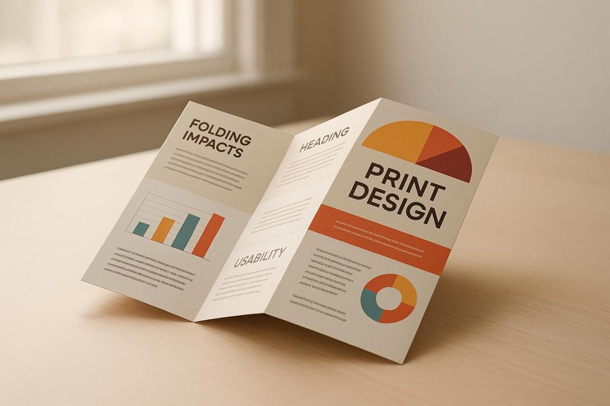
  • Tri-Fold: 6 panels, ideal for brochures or step-by-step guides.
  • Z-Fold: 6 panels, perfect for comparisons or quick references.
  • Gate Fold: Dramatic reveal – great for product launches or luxury designs.
  • Accordion Fold: Continuous flow, best for timelines or educational materials.

Quick Comparison Table:

Folding Style Panels Best For
Half Fold 4 Menus, invitations
Tri-Fold 6 Brochures, guides
Z-Fold 6 Comparisons, references
Gate Fold 4 Product launches, announcements
Accordion Fold 4-6 Timelines, educational content

Folding isn’t just functional – it’s a design tool that can make your print materials more engaging and effective. Choose the fold that best matches your content and audience for the best results.

Understanding Imposition and Printer Spreads for Designers

Common Folding Methods and Their Uses

Understanding how different folding techniques align with your project goals can help you create engaging and effective materials. Each fold not only shapes the user experience but also determines how content is communicated.

Here’s a breakdown of the most common folding styles and how they can be used effectively.

Half Fold (Bi-fold) is the simplest folding method, dividing the paper into two equal sections with a single fold. This creates four printable panels, making it perfect for greeting cards, invitations, announcements, and straightforward menus. Its clean and intuitive design ensures ease of use and familiarity.

Tri-Fold (Letter Fold) divides the paper into three sections with two parallel folds, where the outer panels fold inward. This layout provides six panels and fits neatly into standard envelopes, making it ideal for step-by-step presentations, product brochures, and detailed menus. Its structure naturally guides readers through sequential content.

Z-Fold uses two alternating folds to create three sections of similar size, forming a zigzag pattern. Like the tri-fold, it offers six printable panels, but its unique folding style allows all sections to be viewed simultaneously when partially opened. This makes it great for quick reference materials and side-by-side comparisons.

Gate Fold features two panels that open outward like doors, revealing the inner content. This creates a sense of anticipation and visual impact, making it an excellent choice for product launches, special announcements, and high-end marketing materials.

French Fold (Quarter Fold) combines horizontal and vertical folds to create four equal panels. This compact format works well for maps, illustrated guides, and event invitations, offering a visually engaging way to present information.

Roll Fold (Barrel Fold) involves multiple panels folded inward in the same direction, creating a rolled appearance when unfolded. It works best for presenting step-by-step instructions, multi-course menus, or detailed guides where content flows sequentially.

Accordion Fold alternates folds to create a series of parallel panels, resembling an accordion when extended. This style is ideal for timelines, chronological content, or materials that benefit from a continuous, flowing layout.

"Folding paper can be a powerful way to engage readers, just a couple of well-placed folds can add a great deal of dimensionality and surprise!"

  • Bambra

Where to Use Each Folding Technique

Different industries and projects lend themselves to specific folding styles. For instance, restaurants often use tri-folds for detailed menus and half-folds for simpler items like wine lists or daily specials. Roll folds are particularly effective for multi-course tasting menus, as the sequential layout mirrors the dining experience.

In corporate settings, tri-folds are commonly used for product brochures and service overviews because they present a professional and organized format. Gate folds, with their dramatic reveal, are perfect for high-impact materials like product launches or annual reports.

Event planners frequently use French folds for wedding invitations and event programs, offering a compact yet elegant design. Accordion folds are often chosen for conference schedules and event timelines, providing attendees with a user-friendly way to access information at a glance.

Other industries also benefit from tailored folding techniques. Educational institutions might use Z-folds for course catalogs and program details, allowing for easy side-by-side comparisons. Real estate professionals often opt for gate folds to showcase luxury properties with a striking visual presentation. Similarly, healthcare providers can use accordion folds to create clear, step-by-step patient education materials.

Folding Methods Comparison Table

Folding Technique Key Features Primary Benefits Best Applications
Half Fold Single fold, 2 panels, 4 print areas Simple and easy to navigate Greeting cards, invitations, basic menus
Tri-Fold Two parallel folds, 3 panels, 6 print areas Fits standard envelopes, guides sequential content Product brochures, service guides, detailed menus
Z-Fold Alternating folds, 3 equal panels, 6 print areas Allows simultaneous viewing of panels Course catalogs, quick references, comparison materials
Gate Fold Two panels open inward, dramatic reveal High visual impact, builds anticipation Product launches, luxury brochures, announcements
French Fold Horizontal and vertical folds, 4 equal panels Compact and visually engaging Maps, illustrated guides, wedding invitations
Roll Fold Multiple inward folds, sequential presentation Perfect for step-by-step content Instructions, multi-course menus, care guides
Accordion Fold Alternating parallel panels, continuous flow Best for chronological or flowing layouts Timelines, event schedules, educational materials

Choosing the right folding method depends on your content, audience, and how the material will be distributed. Think about how your readers will interact with the piece and the impression you want to leave when deciding on a folding style.

How Folding Changes Print Design and Layout

Folding has the power to turn a flat print into something much more engaging. It shapes how people interact with your design, guiding them through the content in a structured way. To create effective folded materials, it’s essential to understand this interaction and how folding impacts both design and layout.

The fold acts as a storytelling tool. Unlike flat designs where everything is visible at once, folded pieces reveal information step by step. Your layout needs to work on two levels: each panel should stand alone, yet all panels must come together seamlessly when fully opened.

Design Rules for Folded Materials

To make folded designs effective, you need to balance technical precision with creative vision. Here are some key principles to keep in mind:

  • Panel alignment: Panels need to line up perfectly for a polished look. Misaligned panels can make your design feel disorganized, affecting both readability and the placement of visuals.
  • Bleed and margin management: Extend images slightly beyond the trim line and keep text away from edges and folds. This prevents misalignments, especially where panels meet, which can be distracting and unprofessional.
  • Content flow: Each panel should tell its own mini-story while contributing to an overarching narrative. Think of it as a conversation – each panel should naturally lead to the next, keeping the reader curious and engaged.
  • Gutter space management: When content crosses over a fold, like in booklets, increase the inner margins to avoid losing important details in the crease. This ensures readability and prevents crucial text from disappearing.
  • White space strategy: Use white space thoughtfully to make your design easy on the eyes. Plan how it works on individual panels and when multiple panels are viewed together. White space gives your design breathing room and directs attention to key elements.

Mock-ups are essential for spotting alignment issues and other design flaws early in the process.

Using Folding to Improve Message Delivery

Once the technical aspects are set, folding can be used creatively to enhance how your message is delivered. It’s not just about the fold itself – it’s about how the fold works as part of your storytelling.

  • Sequential revelation: Folding allows you to control when and how information is revealed. Start with a captivating hook on the front panel, then guide readers through supporting details as they unfold the piece. This creates a natural flow that keeps them engaged.
  • Interactive design elements: Folding can add an interactive layer to your design. For instance, a gate fold can mimic doors opening, inviting readers to physically engage with the piece. This makes the fold an integral part of the experience, not just a practical feature.
  • Content prioritization: Use the front panel to grab attention, inner panels for detailed information, and the back panel for a strong call to action. This structure helps break down complex ideas into manageable sections.
  • Visual continuity: Maintain consistent colors, fonts, and design elements across all panels. Whether folded or fully opened, the design should feel cohesive and intentional.
  • Balance considerations: Spread text, images, and white space evenly across the panels to avoid overwhelming any single section. A cluttered panel can throw off the entire design, even if the rest is well-organized.

The secret to successful folded design lies in treating the fold as a feature, not a limitation. By integrating folding into your design process, you can create materials that are both functional and engaging. This approach ensures your message is delivered more effectively than with traditional flat designs.

sbb-itb-ce53437

Usability and Function of Folded Materials

Folded materials do more than just look good – they create an interactive experience that guides the reader through your content. Each fold adds an element of discovery, turning a flat print into something dynamic and engaging. The process of unfolding draws readers in, revealing information gradually and making the experience more memorable.

How Users Interact with Folded Designs

The way a piece is folded directly affects how readers engage with it. Different folding styles offer unique experiences:

  • Half-folds are simple and intuitive. Most people instinctively know how to open them, making them perfect for straightforward messages that require minimal effort to understand.
  • Tri-folds encourage a bit more exploration. Readers choose which panel to start with, allowing for information to be presented in smaller, more digestible sections. This makes them great for highlighting multiple points of interest.
  • Z-folds guide readers through a set sequence, making them ideal for step-by-step instructions or a story that unfolds logically from one panel to the next.
  • Gate folds add a dramatic element. Readers must open the panels to reveal the central message, which can create a more immersive and engaging experience, though it requires more effort.

The material itself also plays a role. Heavier paper feels more professional and encourages readers to spend more time with it, while lighter paper is better suited for quick-reference materials. These details may seem small, but they significantly impact how people interact with and perceive the piece.

Accessibility and Engagement Factors

When designed thoughtfully, folded materials can improve accessibility and engagement. For instance, using large fonts and high-contrast colors makes text easier to read. Breaking content into sections across panels, with plenty of white space, helps keep things clean and easy to follow.

Folded designs can also be particularly helpful for people with cognitive disabilities. Presenting information step by step, with clear language and visual aids, allows readers to absorb the message at their own pace. Similarly, lightweight materials with easy-to-grip edges make it easier for those with limited dexterity to handle the piece.

For those with low vision, high-contrast color pairings like black text on a white background improve readability. Adding texture or patterns alongside color helps readers who struggle to differentiate between colors.

Engagement also gets a boost with well-designed folds. Studies show that 57% of viewing time is spent on content above the fold in digital media, a principle that applies to physical prints as well. A strong front panel captures attention, while the inner panels keep readers invested as they unfold the design. Additionally, the tactile element of unfolding creates a memorable, emotional connection. In fact, 52% of consumers report feeling more emotionally connected to a brand through well-designed packaging, including inserts. This emotional impact can translate into more effective brochures, direct mail campaigns, and other printed materials.

Usability Factors Comparison Table

Folding Style Ease of Use Interaction Level Accessibility
Half-Fold High Low High
Tri-Fold Medium Medium Medium
Z-Fold Medium High Medium
Gate Fold Low High Low
Roll Fold Medium High Medium

This table highlights how different folding styles align with usability goals. Half-folds are easy to use and accessible, making them a great choice for general audiences. Gate folds, on the other hand, create a striking interactive experience but may be harder for some users to handle. Z-folds and roll folds strike a middle ground, offering both engagement and usability, making them ideal for educational materials or product catalogs.

When selecting a fold, think about your audience’s needs and the message you want to convey. The best designs balance interaction, accessibility, and clarity to ensure your materials leave a lasting impression.

How to Choose the Right Fold for Your Project

Choosing the right fold for your printed material is more than just a design decision – it’s about making sure your message is clear, engaging, and easy to navigate. The wrong fold can confuse readers, obscure key information, or make your piece hard to handle. On the other hand, the right fold can enhance your message and create a better experience for your audience.

Matching Project Goals with Audience Needs

The type of fold you choose should align with your content and the purpose of your project. For example, tri-folds are great for presenting information in a step-by-step sequence, while gate folds build suspense by hiding the main message until the panels are opened. If your content involves comparisons, a Z-fold works well because it allows multiple panels to be viewed at the same time.

Keep the amount of content in mind, too. Folds like the Z-fold or accordion fold are better suited for detailed or text-heavy projects, while a half fold is ideal for simpler layouts. Think about your audience as well – straightforward folds are often better for general audiences, while intricate folds can signal a premium or upscale presentation.

Also, consider who will be handling your piece. Older readers, for instance, may prefer larger text and simpler folds for easier readability, while complex folds that require precise handling might not be ideal for people with limited dexterity.

Here’s a quick guide to common brochure types and their best uses:

Brochure Type Panel Count Ideal Page Size Best Use Case
Half Fold 2 8.5″ x 11″ Menus, programs, product sheets
Tri Fold 3 8.5″ x 11″ Travel guides, service brochures
Z Fold 3 8.5″ x 11″ Event schedules, floor plans
Gate Fold 4 8.5″ x 14″ Portfolios, event invitations
Double Gate Fold 8 11″ x 17″ Premium product showcases
Accordion Fold 4–6 8.5″ x 14″+ Step-by-step guides, timelines

Once you’ve matched your fold to your content and audience, it’s time to think about production and materials.

Production and Material Factors

The type of paper you use can have a big impact on how your piece folds and holds its shape. Lightweight paper works well for simple folds, but if you’re using thicker stock, you’ll need to take extra care. Heavier papers often require scoring to prevent cracking, which can add to both production time and cost.

Another important factor is grain direction. When folding heavier paper, always fold along the grain instead of against it. Folding against the grain can cause cracking or tearing, especially if you’re using coated paper. The thicker the paper, the more critical it is to pay attention to grain direction.

If you’re producing a large quantity, automated folding machines are your best bet for consistent results. However, specialty folds might require manual folding, which can increase costs but ensures precision. Coated papers also need extra care during folding – proper scoring or creasing is essential to avoid cracking and maintain a professional finish.

When these technical details start to feel overwhelming, it’s time to bring in the experts.

Working with Print Professionals

Partnering with experienced print professionals can make a huge difference in the success of your project. Companies like Miro Printing & Graphics Inc. offer a full range of folding services as part of their in-house bindery capabilities. They can guide you in choosing the best fold for your project and ensure flawless execution from start to finish.

Professional printers bring a deep understanding of paper stocks, folding techniques, and finishing touches. They’ll know how to prepare your files to avoid issues at the fold lines and how to handle specialty finishes that could impact the folding process. Their expertise helps you sidestep costly mistakes and ensures your final product meets high-quality standards.

Working with a full-service provider like Miro Printing & Graphics Inc. also simplifies your workflow. By keeping printing, folding, and finishing under one roof, you reduce the chances of miscommunication and have a single point of contact throughout the project.

The key is finding a printer who takes the time to understand your goals, audience, and budget. They can suggest alternatives if your chosen fold doesn’t quite fit your needs, helping you achieve the best results without breaking the bank.

Starting this collaboration early in the design process is crucial. Discuss your folding requirements upfront to allow for adjustments that optimize both design and production. This proactive approach not only streamlines the process but also ensures a polished, professional final product at a reasonable cost.

Conclusion: Getting the Most from Folded Print Designs

Folding transforms ordinary print materials into engaging, interactive experiences. When done right, the perfect fold draws your audience in, guiding them through your message in a way that feels natural and compelling.

Key Takeaways

The foundation of successful folded print design lies in knowing your audience and matching the fold style to your content. Simple folds work well for clear, straightforward messages, while more intricate folds can build curiosity and excitement.

Design plays a critical role, too. The front panel is your first impression, so it needs to grab attention with bold headlines, eye-catching visuals, or irresistible offers. Each panel should flow seamlessly into the next, creating a unified narrative instead of disjointed sections.

Technical details are just as important as the creative ones. Use white space wisely to highlight key points and avoid clutter. Plan for proper bleeds and margins, and always create a physical mock-up to catch any potential issues before production.

Paper choice can make or break your design. Heavier paper stocks may require scoring to avoid cracking, and the paper grain direction can impact the final look. Select a paper weight and finish that aligns with your brand and purpose while ensuring practicality.

Real-world success stories illustrate the power of thoughtful folding. For instance, a boutique travel agency saw a surge in engagement after introducing accordion fold brochures, and a local café experienced a noticeable boost in foot traffic thanks to creatively folded leaflets. These examples show how folding can add an element of surprise and make printed materials more memorable.

By combining smart design principles with meticulous production techniques, you can create a polished, engaging print piece that leaves a lasting impression.

Work with Print Experts

To bring your folded designs to life without a hitch, partnering with experienced print professionals is essential. They can help refine your design, recommend the best materials, and ensure flawless execution.

Take Miro Printing & Graphics Inc., for example. With their in-house bindery services, they offer expertise in folding techniques, paper selection, and technical production. They can help you avoid common mistakes and suggest practical alternatives tailored to your goals and budget.

Professional printing services also save you time and money by reducing errors that could lead to costly reprints. Their advanced technology ensures consistent, vibrant colors throughout your print run. And remember, nearly 60% of customers prefer familiar brands. High-quality, professionally folded materials can reinforce your brand’s reliability and help you stand out in a crowded market.

Starting conversations with your printer early in the design process can make all the difference. By discussing your folding needs upfront, you can fine-tune your design for both visual appeal and production efficiency. This collaborative approach not only streamlines the process but also ensures the final product meets your standards while staying on budget.

Investing in professional folding services isn’t just about aesthetics – it’s about building trust, boosting credibility, and ensuring your brand leaves a lasting impression. In a competitive marketplace, these details can set you apart.

FAQs

How can I choose the right folding style for my print project?

When it comes to picking the perfect folding style for your print project, you’ll want to weigh a few key factors: the type of content, the purpose of the material, and the overall design. For example, half-folds are a timeless option for straightforward brochures, while Z-folds are ideal for layouts that need to spread detailed information across multiple panels.

Think about your audience and how the fold can improve usability. A well-chosen fold not only complements your design but also enhances readability, making your project feel more engaging and polished. Don’t forget to consider practicality – how the folded piece will be handled matters too. By matching your folding style to your content and goals, you’ll end up with a professional and effective final product.

What should I avoid when designing folded print materials?

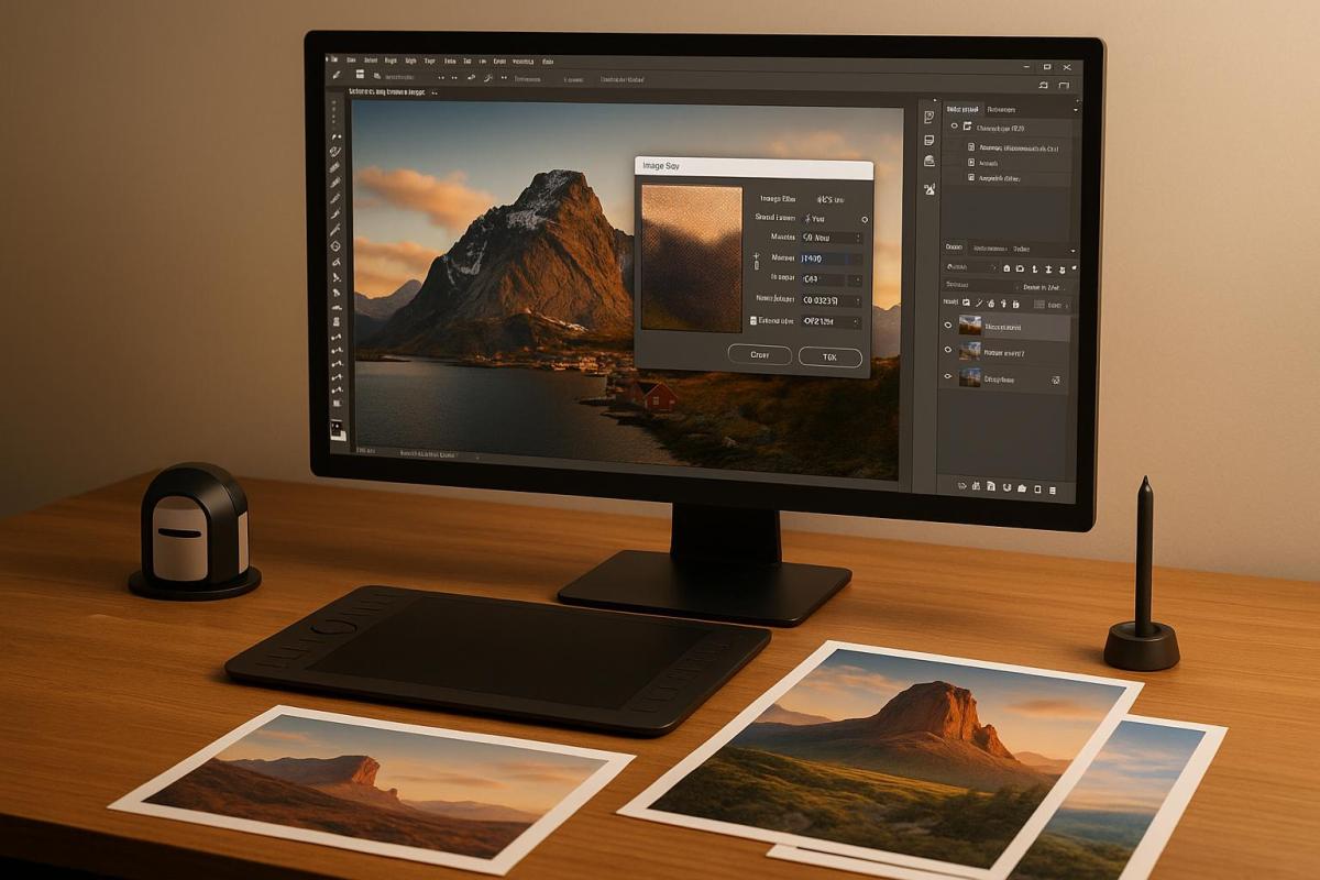
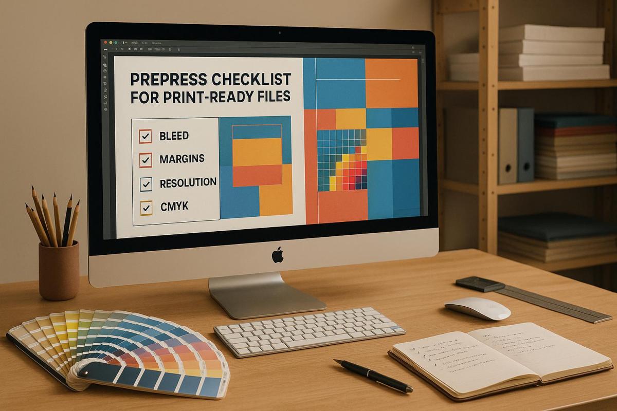
When creating folded print materials, there are a few key mistakes you’ll want to steer clear of to maintain a professional finish. Issues like misaligned folds, uneven creases, or improper folding techniques can leave your materials looking sloppy. On top of that, skipping essential steps in file preparation – such as not including bleed, relying on low-resolution images, or designing in RGB instead of CMYK – can cause headaches during printing.

To achieve a polished and professional result, focus on the details. Ensure fold lines are precise, use high-resolution images, and double-check that your color profiles are set to CMYK. These small but crucial steps will help your folded print materials stand out and work as intended.

How do folding techniques improve the design and usability of printed materials?

Folding techniques are a game-changer when it comes to designing printed materials. They bring a hands-on, interactive element that grabs attention and invites readers to engage with your content. Whether it’s an accordion fold, a gate fold, or a classic tri-fold, these designs can make your materials pop and deliver information in a dynamic, eye-catching way.

Beyond aesthetics, thoughtful folding can also improve how your content is organized. It guides readers through the material in a logical sequence, making it easier to follow and ensuring that your key points stand out. When creativity meets practicality, folding techniques can turn ordinary print pieces into memorable, visually striking experiences.

Related posts

https://app.seobotai.com/banner/banner.js?id=68589e3f5559d477e7639fea

Vector vs Raster: Key Differences for Printing

Learn the essential differences between vector and raster graphics for printing to ensure crisp, high-quality results in your projects.

Vector and raster graphics are the two main types of images used in printing, and knowing their differences ensures better print results.

  • Vector graphics are resolution-independent, meaning they can be scaled to any size without losing clarity. They are ideal for logos, text, and illustrations.
  • Raster graphics are made of pixels and depend on resolution (measured in DPI). They’re best for photographs and detailed images but lose quality when enlarged.

Quick Comparison

Feature Vector Graphics Raster Graphics
Scalability Infinite scaling without quality loss Loses quality when enlarged
File Size Smaller Larger at high resolutions
Resolution Resolution-independent Requires 300 DPI or higher for printing
Best For Logos, illustrations, text Photos, detailed images, gradients
Editing Path-based, easy to adjust shapes Pixel-based, suited for photo editing

Choose vector graphics for sharp, scalable designs like logos and banners. Opt for raster graphics for detailed visuals like photos. Proper file preparation, including resolution and color mode adjustments, ensures high-quality prints every time.

Raster vs Vector Files for Printing

How Vector and Raster Graphics Function

Understanding the differences between vector and raster graphics is crucial for achieving the best print results. Knowing how each format works allows you to choose the right one for your specific needs.

Size and Resolution Differences

Vector graphics are built on mathematical formulas, which means they stay sharp no matter how much you resize them. This makes them ideal for logos and illustrations, where clarity is key. The computer recalculates these formulas to match the required size, ensuring the design remains crisp.

"Vector images stay smooth when resized because they’re made of mathematical equations defining shapes, lines, and colors – so they can scale infinitely without losing clarity." – Prince Singh

Raster graphics, on the other hand, are resolution-dependent and measured in DPI (dots per inch) or PPI (pixels per inch). For example, web images are often saved at 72 DPI, which looks fine on screens but falls short for professional printing. To achieve sharp prints, 300 DPI is typically required. Enlarging a raster image stretches its pixels, leading to pixelation and a loss of clarity.

"Raster images, on the other hand, are made of pixels. When you enlarge them, the pixels stretch, causing a blurry or blocky look since no new detail is added." – Prince Singh

Raster files also tend to be larger because they store color data for each individual pixel, while vector files remain compact due to their math-based structure. These differences in resolution and file size play a significant role in how each format performs in print.

Editing Options

The way you can edit vector and raster graphics reflects their underlying structures. Vector graphics allow for path-based editing, meaning you can adjust individual shapes, lines, and curves without affecting the overall quality. This flexibility makes them perfect for tweaking logos, typography, or illustrations.

Raster graphics are edited pixel by pixel, which is ideal for detailed photo adjustments. Whether you’re correcting colors, fine-tuning lighting, or adding intricate effects, raster editing provides the precision needed for photographs and artwork with subtle variations in color, shadows, and highlights.

"Raster images function like paint-by-numbers; each pixel holds a color code that collectively forms the complete image."

Raster graphics also support a broader color range and excel in rendering smooth gradients and subtle shading, making them the go-to choice for photos and complex artwork. Vector graphics, in contrast, maintain sharp edges and clean lines, which are better suited for designs requiring scalability, like logos and text-based illustrations.

Converting between these formats also differs. Turning a vector into a raster is relatively simple – it’s just a matter of rendering the formulas into pixels at the desired resolution. But converting a raster image to vector format is much trickier, often requiring specialized software or manual tracing.

These differences in editing and conversion significantly impact the quality of your printed designs, making it essential to choose the right format for your project.

Main Differences for Printing

When it comes to printing, the choice between vector and raster graphics can have a big impact on the final result. Each format comes with its own strengths and limitations that influence print quality, scalability, and overall usability.

Vector vs Raster Comparison Chart

To make the right decision for your printing needs, it’s helpful to compare the key differences between vector and raster graphics. Here’s a quick overview:

Feature Vector Graphics Raster Graphics
Scalability Can be scaled infinitely without losing quality Loses quality when enlarged
File Size Typically smaller Larger, especially at high resolutions
Resolution Resolution-independent Requires 300 DPI or higher for clear printing
Ideal For Logos, illustrations, signage, and text Photos, detailed images, and complex textures
Editing Shape-based, easy to manipulate paths Pixel-based, suited for detailed photo adjustments
Print Quality Always sharp regardless of size Quality depends on the original resolution

The key takeaway? Vector graphics stay crisp no matter how much you scale them, while raster images rely on their original resolution, which can lead to quality issues if enlarged too much.

The format you choose plays a crucial role in how your designs translate to paper. Vector graphics excel in this area because they are resolution-independent. This means they are recalculated to fit the exact size of your print project, ensuring sharp and consistent results every time.

Raster images, however, are resolution-dependent. To avoid blurry or pixelated prints, they need to be created at a high resolution – at least 300 DPI. While a photo might look perfect on your screen, it could appear fuzzy in print if the resolution isn’t high enough.

For large-scale projects like banners, posters, or vehicle wraps, these differences are even more noticeable. A vector logo can be enlarged to virtually any size without sacrificing quality. On the other hand, a raster image must have enough pixels to maintain clarity at the final print size.

Additionally, raster images designed for print should use the CMYK color model to ensure accurate color reproduction. Vector graphics, on the other hand, handle colors more predictably, making them a dependable choice for brand materials where consistent hues are key.

sbb-itb-ce53437

Selecting the Right Graphic Type for Your Project

Choosing the right graphic type depends on your print content, required dimensions, and budget. Let’s break down when each type works best to ensure your print projects achieve optimal results.

When to Use Vector Graphics

Vector graphics shine when scalability and clarity are non-negotiable. These graphics maintain their sharpness no matter the size, making them ideal for designs that need to look flawless on everything from tiny business cards to massive billboards. This is why they’re often the go-to for company logos and branding materials.

Large-format projects – like banners, posters, vehicle wraps, and trade show displays – rely on vectors to deliver sharp, clean prints. Text in vector format stays crisp at any size, ensuring readability and professionalism. Simple illustrations and icons, typically made up of geometric shapes and clean lines, are also perfect for vectors. Plus, their smaller file sizes make production more efficient.

Another perk? Vector files can streamline the printing process, potentially reducing costs for plates and overall production.

When to Use Raster Graphics

Raster graphics, on the other hand, are all about capturing intricate details. They’re the best choice for projects that require high-quality photographic reproduction, thanks to their ability to handle subtle color variations and complex textures.

Think of photography-based projects like family portraits, product catalogs, brochures, and flyers. These types of materials benefit from the pixel-based structure of raster files, which allows for smooth color transitions and realistic shading. Art reproductions and detailed illustrations, especially those with painterly effects or textured details, also rely on the precision of raster graphics.

If color accuracy is critical, raster files offer pixel-level control, making precise color matching possible. Just be sure to plan your final print size carefully to avoid pixelation, as raster graphics are resolution-dependent. Align your choice with the level of detail your project demands and the scale of the final print.

File Preparation Tips for Print

Preparing your files for print involves more than just hitting "save" and sending them off. It’s about picking the right file formats and ensuring they meet specific technical requirements. This step is crucial to achieving high-quality results and avoiding costly errors. Let’s break down the essentials for getting your files print-ready.

Best File Formats to Use

When it comes to print, PDF is the gold standard. It ensures your layout, fonts, and images remain intact across different platforms. For professional printing, opt for PDF/X-1a or PDF/X-4 formats, as they’re designed for high-quality output and work seamlessly with most commercial printers.

For vector graphics like logos or illustrations, stick to EPS or AI files. These formats maintain sharpness at any size. Once finalized, export your designs as PDF or EPS for printing.

For raster images (like photographs), TIFF is your go-to. It uses lossless compression, making it ideal for detailed images. If file size is a concern, JPG can work, but always save at the highest quality setting to avoid visible compression artifacts. PNG is another option, particularly for images with transparency or limited colors, though it’s not universally supported by all printers.

For complex, multi-page documents, Adobe InDesign (INDD) files are excellent. They handle intricate layouts effectively. Just remember to package all fonts and linked images or export the file as a PDF. Similarly, Photoshop (PSD) files are great for image-heavy designs, but you should convert them to TIFF or PDF before sending them to print.

Resolution and Size Guidelines

Once you’ve picked the right file format, it’s time to fine-tune your resolution and sizing. For raster images, aim for a resolution of 300 pixels per inch (PPI) – this is the standard for crisp, high-quality prints. Web images, which are typically 72 or 96 PPI, won’t cut it for print and will look blurry or pixelated. Always start with high-resolution images that match your final print dimensions. For instance, a 6×4 inch image at 300 PPI will drop to 150 PPI if you enlarge it to 12×8 inches, significantly reducing its quality.

Vector files, on the other hand, require a different approach. Create them at their final print size and set the color mode to CMYK, which is standard for printing. Add a 0.125-inch bleed to ensure no white edges show up after trimming. To avoid font issues, convert text to outlines. For cleaner files, simplify paths by reducing anchor points and removing hidden layers.

Lastly, always double-check with your printing company for any specific file requirements. If you’re working on large-format projects that demand extreme detail, consider using professional photo enlarging services instead of attempting to upscale images yourself. A little extra effort here can make a big difference in the final product.

Conclusion: Choosing the Right Graphics for Print Success

Knowing the key differences between vector and raster graphics is a game-changer when it comes to achieving professional print results. Vector graphics retain their sharpness no matter how much you scale them, while raster images need to meet a minimum of 300 DPI to print clearly. This makes vector files the go-to option for branding elements that need to appear consistently across a range of printed materials.

File preparation is just as important as the type of graphic you use. Always request vector files when designing logos, double-check that raster images meet the 300 DPI requirement, and don’t forget to convert RGB designs to CMYK to ensure accurate color reproduction. These steps help ensure your designs look their best in print and are ready for expert handling.

For those looking to take the guesswork out of the process, companies like Miro Printing & Graphics Inc. offer professional guidance. Their team can evaluate your artwork, recommend the best graphic format, and optimize your files for digital, offset, or large-format printing. Whether you’re working on business cards, brochures, or oversized banners, having expert support ensures your vision is perfectly translated from screen to print.

With the right preparation and professional input, your printed materials will deliver the impact you’re aiming for.

FAQs

How can I choose between vector and raster graphics for my print project?

Choosing between vector and raster graphics largely depends on the nature of your artwork and its intended use in your print project.

Vector graphics are ideal for designs like logos, icons, or illustrations that need to be resized without any loss of quality. Since they’re created using mathematical paths, they stay sharp and precise at any size, making them perfect for large-format prints or projects requiring clean, crisp lines.

Raster images, on the other hand, are composed of pixels, making them better suited for detailed photographs or intricate color gradients. However, keep in mind that enlarging a raster image beyond its original resolution can result in a blurry or pixelated appearance.

For the best printing results, use vectors for scalable, sharp designs and rasters for detailed photographic elements. If you’re unsure which format is right for your project, reaching out to a professional print service like Miro Printing & Graphics Inc. can help ensure everything turns out perfectly.

How can I properly prepare vector and raster files for high-quality printing?

To get your vector files ready for printing, stick to formats like .AI, .EPS, or .PDF. Make sure the file dimensions align with the final print size, and convert all text into outlines to sidestep any font compatibility issues.

For raster files, aim for a resolution of at least 300 DPI and save them in high-quality formats such as TIFF or PNG. Steer clear of enlarging low-resolution images, as this can lead to unwanted pixelation.

Don’t forget to include bleed, crop marks, and safe areas in your design. These elements ensure precise trimming and give your project a polished, professional finish. Taking these steps will help ensure your files are fully prepared for high-quality printing.

Can a raster image be converted to a vector format, and how does it impact print quality?

Yes, you can convert a raster image to a vector format using software like Adobe Illustrator or Inkscape. This conversion can greatly enhance print quality because vector graphics are resolution-independent. In simple terms, they can be scaled up or down without losing sharpness, making them perfect for high-quality printing, especially for large-scale projects like banners or signs.

That said, the quality of the conversion depends heavily on the original raster image. If the image is low-resolution or has a lot of intricate details, the process might not be flawless. In such cases, manual tweaks may be necessary to maintain clarity and ensure the best possible outcome for printing. If you’re unsure, it might be worth consulting a professional print shop to help fine-tune your files for your project.

Related posts

https://app.seobotai.com/banner/banner.js?id=685749da5559d477e76280d0

Die Cutting vs Laser Cutting: Eco Impact

Explore the eco impact of die cutting and laser cutting, comparing energy use, waste production, and material efficiency for sustainable manufacturing.

Laser cutting is more energy-efficient and produces less waste than die cutting, making it a better choice for sustainability-focused projects. Here’s a quick breakdown of the two methods:

  • Energy Use: Laser cutting uses less energy, especially with modern fiber lasers, while die cutting relies on large, energy-intensive machines.
  • Waste Production: Laser cutting generates minimal waste due to its precision, whereas die cutting produces more scrap and requires physical dies that eventually need disposal.
  • Material Efficiency: Laser cutting excels at intricate designs and prototypes, while die cutting is better for high-volume, simple shapes.

Quick Comparison

Factor Die Cutting Laser Cutting
Energy Use High, due to large machines and maintenance Lower, especially with fiber lasers
Waste Production More waste from scraps and die disposal Minimal waste due to precision cutting
Material Efficiency Good for simple, high-volume projects Excellent for detailed designs and prototypes

Laser cutting is ideal for precision and sustainability, while die cutting works well for large-scale, straightforward jobs. Choose based on your project’s needs!

Xymox – Die Cut vs Laser

Xymox

Die Cutting Process and Eco Impact

Die cutting involves shaping materials using custom steel dies and presses. To understand its environmental impact, it’s essential to examine energy consumption, waste generation, and material efficiency.

Energy Consumption in Die Cutting

Die cutting relies heavily on mechanical presses and steel dies, which require significant energy during both the cutting process and the production and maintenance of the dies themselves.

In fact, machine tool electricity accounts for 75% of manufacturing energy use and 90% of industrial energy consumption. This highlights the importance of optimizing machine settings and material choices to enhance efficiency. For instance, a packaging company improved its sustainability efforts by switching from traditional cardboard to recycled composite materials. By adjusting their die cutting machine settings to accommodate the new material, they achieved cleaner cuts and reduced energy use.

Energy consumption directly ties into waste production, which is the next critical area to consider.

Waste Production in Die Cutting

The die cutting process generates waste primarily in the form of leftover material surrounding cutouts, scraps, and damaged pieces caused by poorly maintained dies. Additionally, the disposal of steel dies after their lifecycle contributes to waste.

However, innovative recycling solutions are emerging to tackle these issues. In 2021, Batavia Container Inc., in collaboration with Mid America Paper Recycling, recycled outdated dieboards into products like lawn mulch and other wood-based items. A specialized chipper separated the metal components from the wood, making repurposing possible.

"Preventing old cutting dies from ending up in a landfill will help all of us." – Paul Mansour, Director of Account Development at Batavia Container

"The boards were sent through a high-tech wood chipper that can separate the metal tool from the wood. The resulting wood chips can be reused as mulch and other wood-based products." – Paul Pirkle, President of Mid America Paper Recycling

Precision engineering and advanced nesting techniques also help reduce waste. CAD software can simulate the die cutting process, highlighting areas for improvement, while nesting algorithms optimize the placement of cutouts to use materials more efficiently. Automated waste removal systems further enhance production quality by preventing tool damage and minimizing material defects. These measures underscore the need for thoughtful material usage to boost sustainability.

Material Usage in Die Cutting

One of die cutting’s strengths lies in its ability to maximize material efficiency. By utilizing the full width and length of materials, this process reduces waste and increases the number of parts produced per roll. This precision is especially beneficial when working with costly materials, as minimizing waste directly lowers expenses.

Digital die cutting offers another advantage, particularly for prototypes and small-scale projects. It allows businesses to test and refine designs before committing to large production runs, reducing material waste in the process. However, traditional steel dies, once manufactured, cannot be easily modified. This limitation can result in less efficient material use if design changes become necessary.

The rapid growth of e-commerce has further emphasized the importance of efficient material use. The global e-commerce packaging market was valued at $63.6 billion in 2022, with annual growth rates of 20% between 2017 and 2021. As this market expands, the environmental impact of packaging production grows, making material efficiency a key concern.

Automation plays a significant role in addressing these challenges. By streamlining production and reducing waste, automated systems lower both costs and environmental footprints.

Laser Cutting Process and Eco Impact

Laser cutting relies on concentrated light beams to cut materials with precision. Unlike the mechanical method of die cutting, this digital approach has unique environmental implications, particularly in energy use, waste production, and material efficiency.

Energy Consumption in Laser Cutting

The energy used by laser cutting machines varies widely, ranging from 0.1 kW to 15 kW, depending on machine type and workload. The laser technology in use plays a major role in energy efficiency. For example, fiber lasers are far more efficient than CO₂ lasers. A 1 kW fiber laser typically requires 1.5–2 kW of total power, whereas a comparable CO₂ laser needs 3–4 kW. The gap widens with high-power systems, where CO₂ lasers can consume around 70 kW compared to just 18 kW for fiber lasers.

Factors like material thickness, reflectivity, and environmental conditions – such as temperature and humidity – also influence energy demands. To combat energy waste, some machines integrate advanced fiber laser resonators, lightweight gantries, and automated power controls. Features like nesting power output control help adjust laser intensity based on the material, further improving efficiency.

These advancements not only cut energy costs but also reduce waste during the cutting process.

Waste Production in Laser Cutting

Thanks to its precision, laser cutting generates less waste compared to traditional cutting methods. Most waste comes in the form of off-cuts, scrap, and dross, but digital control significantly limits these byproducts. Fiber laser cutting, for instance, can reduce material waste by 15–30%, with stainless steel seeing improvements up to 35%, aluminum around 25%, and carbon steel between 20–30%.

Real-world examples highlight this efficiency. Ashley Furniture Industries slashed sheet-cutting waste by 75% after adopting CNC cutting and implementing practices to sell or donate scrap materials. Similarly, Signarama reduced sheet-cutting waste by 90% by switching to waterjet cutting and refining scrap management.

Nesting software also plays a key role in waste reduction. By optimizing material placement and cutting paths, it can decrease waste by as much as 25%. Unlike die cutting, laser cutting eliminates the need for physical dies, avoiding the waste associated with their creation, maintenance, and disposal.

Material Usage in Laser Cutting

Laser cutting is highly efficient in material usage, offering a level of precision that sets it apart from die cutting. With accuracy up to ±0.1 mm and kerf widths as narrow as 0.1 mm, laser cutting maximizes material utilization. In fact, sheet utilization rates can reach up to 94%. For example, DOMUSA Teknik replaced mechanical steel cutters with fiber laser systems for boiler production, achieving a 94.1% sheet utilization rate and lowering both waste and costs.

This technology also reduces material loss caused by wide cutting tools, minimizing rework. With digital file-based designs and advanced nesting software, manufacturers can optimize material use in real time, ensuring every sheet is used as efficiently as possible.

Neway Precision Works Ltd. highlights: "Laser-cutting technology is pivotal in sustainable manufacturing because it reduces waste and improves production efficiency… laser cutting helps manufacturers optimize material usage while maintaining high-quality production standards."

TAB Industries adds: "Efficiency and sustainability are inherent in laser cutting, thanks to advanced nesting software. This technology optimizes material utilization by strategically arranging parts on a single sheet, minimizing scrap and maximizing cost-effectiveness."

Additionally, the process involves minimal use of chemicals and solvents, further reducing its overall environmental footprint.

sbb-itb-ce53437

Side-by-Side Comparison: Die Cutting vs Laser Cutting

When evaluating die cutting and laser cutting from an environmental perspective, three main factors stand out: energy consumption, waste generation, and material efficiency. Both methods have their strengths, and the right choice often depends on the specifics of the project, including production volume and design complexity.

Energy Consumption

Die cutting relies on large machines and dies that consume a lot of energy. These machines also require frequent maintenance, which contributes to higher carbon emissions. On the other hand, laser cutting uses a focused light beam, which operates with fewer consumables and requires less maintenance. Its speed and efficiency help reduce the overall energy footprint.

Waste Generation

Die cutting tends to produce more waste due to the material trimming involved in the process. Laser cutting, however, is highly precise, targeting only the necessary material. This precision not only reduces waste but also makes recycling easier.

Material Efficiency

Die cutting performs well for high-volume projects with simple shapes. Laser cutting, by contrast, is ideal for intricate designs and prototypes. However, minor material losses can occur with laser ablation, particularly for complex designs.

These differences are evident in real-world applications. For instance, in the aerospace industry, laser cutting is used to create lightweight, durable parts with minimal waste, helping to lower costs and environmental impact. Similarly, in the automotive sector, laser technology enables the production of high-precision components that improve fuel efficiency and reduce emissions.

Comparison Table

Environmental Factor Die Cutting Laser Cutting
Energy Consumption High energy use from large machines; frequent maintenance adds to emissions Lower energy usage with faster operation and minimal maintenance
Waste Generation Significant waste due to material trimming Minimal waste thanks to precise cutting; scrap is often recyclable
Material Efficiency Best for high-volume, simple shapes Excellent for intricate designs and prototypes; minor losses from laser ablation
Best Applications High-volume runs of basic shapes Low-volume custom work, prototypes, and detailed designs
Maintenance Impact Frequent tool and die replacement increases environmental footprint Few consumables required; equipment longevity reduces maintenance needs

Ultimately, choosing between die cutting and laser cutting depends on your production requirements. Die cutting may be the better option for large-scale projects with straightforward designs, while laser cutting stands out for its precision, waste reduction, and energy efficiency in smaller, more complex jobs.

To further reduce environmental impact, manufacturers can take steps such as using energy-efficient equipment, fine-tuning cutting parameters, or integrating renewable energy sources into their processes. The laser cutting market, projected to grow to $14.52 billion by 2026, reflects the rising demand for these sustainable technologies.

Eco-Friendly Practices at Miro Printing & Graphics Inc.

At Miro Printing & Graphics Inc., based in Hackensack, NJ, environmental responsibility is at the core of their die cutting and laser cutting operations. By focusing on energy efficiency, waste reduction, and material optimization, the company integrates sustainable practices into every aspect of its facility while maintaining top-tier printing and post-press services.

Digital Technology for Reducing Waste

Miro employs digital die cutting technology to help cut down on waste, making it particularly effective for prototypes and short-run projects. This approach minimizes material use and ensures precision in every cut.

Their laser cutting services also play a big role in minimizing waste. Unlike traditional methods, laser cutting eliminates the need for physical dies and allows for intricate shapes and designs without overcuts or excess scrap. This level of accuracy not only saves material but also reduces costs, offering both environmental and financial benefits.

Efficient Use of Materials

Material efficiency is a key focus of Miro’s die cutting services. By using engineered dies, they achieve precise cuts and creases tailored to a product’s dimensions. This customization enhances product protection while cutting down on unnecessary material use.

Laser cutting further enhances efficiency. Its precision means less raw material is needed to produce the same volume of products. Additionally, Miro incorporates energy-saving technologies into their processes, ensuring that every step supports their sustainability goals.

Energy-Conscious Operations

Miro prioritizes eco-friendly printing methods that use less energy without compromising quality. Their digital cutting services are a prime example, offering a more energy-efficient alternative to traditional printing techniques. This approach aligns with their broader commitment to reducing their environmental footprint while delivering excellent results.

Sourcing Sustainable Materials

The company also promotes the use of sustainable materials. By collaborating with clients, Miro helps select eco-friendly options such as recycled acrylics and other recycled materials. This effort meets the growing demand for greener printing solutions in the Bergen County area.

Innovative Processes

Miro’s laser cutting technology employs an advanced ablation process, where a focused laser beam removes material through sublimation. This technique allows for clean, precise cuts with minimal waste, outperforming traditional mechanical cutting methods in terms of both efficiency and sustainability.

Conclusion

Laser cutting stands out for its clear environmental benefits compared to die cutting. By offering precision that reduces material waste by 30–60%, laser cutting minimizes the scrap often associated with methods like sawing or punching. Its narrow kerf widths and focused beam technology are key contributors to this efficiency.

While die cutting remains suitable for certain applications, it typically results in higher waste and carbon emissions. Both methods, however, can benefit from using recycled materials, renewable energy sources, and energy-efficient machinery.

As Stephens Gaskets highlights:

"Laser cutting has proven to be a powerful tool in supporting sustainable manufacturing. By reducing material waste, conserving energy, and lowering carbon emissions, laser technology enables businesses to achieve their environmental goals without compromising on quality or precision."

  • Stephens Gaskets

The importance of sustainability is also reflected in consumer behavior. According to recent data, 78% of consumers prioritize sustainable lifestyle choices, with many willing to pay up to 28% more for eco-friendly products. This trend underscores the need for businesses to adopt greener manufacturing processes to meet both environmental standards and consumer expectations.

A great example of this balance is Miro Printing & Graphics Inc., which successfully integrates both laser and die cutting technologies while maintaining a strong focus on sustainability. Their operations emphasize energy efficiency and sustainable material sourcing, proving that environmental responsibility can coexist with quality and performance.

Ultimately, the choice between die cutting and laser cutting should depend on the specific needs of your project, with careful consideration of energy use, waste reduction, and material efficiency. Opting for an eco-conscious provider ensures your manufacturing aligns with sustainable practices and resonates with consumer values.

FAQs

What is the environmental impact of laser cutting compared to die cutting?

Laser cutting tends to use less energy per unit and works more efficiently compared to die cutting, which can help reduce its overall impact on the environment. Plus, it produces less material waste since it doesn’t rely on physical cutting tools, making it a more eco-friendly choice for many applications.

In contrast, die cutting can lead to more waste due to the need for custom dies and leftover materials. Even so, it remains a practical option depending on the project’s specific needs and the materials involved. Both methods have their strengths, but laser cutting often shines for its precision and smaller environmental footprint.

How do die cutting and laser cutting differ in terms of waste production?

When it comes to waste production, die cutting and laser cutting take very different approaches due to how they work. Laser cutting stands out for its precision, allowing for detailed designs with minimal material removal. This precision helps keep waste to a minimum. In contrast, die cutting often generates more waste because it relies on physical tools and larger, less optimized die shapes. This can lead to more material being discarded, especially during smaller production runs.

Another key difference lies in tooling. Laser cutting operates digitally, so there’s no need for physical tools, making it a more efficient choice for small-to-medium volume projects. However, it’s worth noting that the heat generated during laser cutting can create heat-affected zones, which might limit the reusability of leftover materials. On the other hand, die cutting requires specific tools and setup, which can introduce inefficiencies, particularly for low-volume jobs.

In short, laser cutting tends to be more efficient with materials, while die cutting often results in more waste, depending on the scale and complexity of the project.

When is die cutting a better choice than laser cutting, even though it has a higher environmental impact?

Die cutting is often the go-to method for producing simple shapes in high volumes. Known for its precision and efficiency, it’s a solid choice for large-scale projects where consistency is key. While it might produce more waste and consume more energy compared to laser cutting, its ability to perform repetitive tasks quickly and accurately can make it a more practical option in many cases.

This method also shines when creating shapes with tight tolerances, especially in projects where speed and uniformity are non-negotiable. For smaller quantities or designs that require intricate details, laser cutting might be a better fit. But for straightforward, large-scale production, die cutting remains a dependable and effective solution.

Related posts

https://app.seobotai.com/banner/banner.js?id=6855f98d5559d477e76135b5

Scaling Images for Print: Best Practices

Learn essential practices for scaling images for print, including resolution, color profiles, and preparation techniques for sharp results.

Want sharp, professional-looking prints every time? Here’s what you need to know about scaling images for print:

  • Resolution matters: Always use at least 300 PPI for sharp results. Web images (72 PPI) won’t cut it for print.
  • Color profiles: Convert from RGB to CMYK to ensure colors look accurate in print.
  • Viewing distance impacts resolution: Close-up prints like business cards need higher DPI, while billboards can use lower DPI.
  • Resizing tips: Keep the aspect ratio intact to avoid distortion. Avoid excessive upscaling to prevent pixelation.
  • Use vector graphics: For logos and simple designs, vectors scale perfectly without losing quality.

Quick tip: Start with the highest resolution image available, lock proportions when resizing, and always test print before finalizing.

Follow these steps to avoid blurry, pixelated, or distorted prints and ensure your materials look polished and professional.

Prepare an Image for Print in Photoshop – Step-by-Step

Image Resolution Basics for Print

Understanding resolution is crucial for achieving sharp and clear print results. Two terms often come up in this context: PPI (Pixels Per Inch) and DPI (Dots Per Inch). While people sometimes use them interchangeably, they serve distinct roles in the print process.

What DPI and PPI Mean

PPI measures the number of pixels packed into a square inch on a digital screen, while DPI refers to the number of ink dots within a square inch on a printed image. Together, these factors influence how clear and detailed your image appears – higher PPI means finer detail on your screen.

PPI determines the overall size and quality of your digital image, which directly impacts how large it can be printed without losing clarity. On the other hand, DPI deals with how densely ink is applied during printing. DPI works within the CMYK color model, while PPI is based on RGB. This difference explains why printed colors can sometimes look different from what you see on your screen.

For high-quality prints, a standard 300 PPI is widely used. This ensures that images retain their sharpness when printed. In contrast, the 72 PPI standard for many screens dates back to early Apple Macintosh displays, which had a resolution of 72 pixels per inch.

Printer types also affect DPI. Inkjet printers typically operate in the 300–720 DPI range, while laser printers can reach 600–2,400 DPI. Printed materials like books usually use 150 DPI, while newspapers require only around 85 DPI.

Once you understand these basics, it’s important to consider how the viewing distance affects resolution requirements.

How Viewing Distance Affects Print Resolution

Resolution needs aren’t just about pixel density; how far the viewer is from the printed material also plays a big role. The farther away someone is, the less detail their eyes can perceive. This means that materials meant for distant viewing don’t need as high a resolution as those viewed up close.

For example, billboards viewed from 50 feet or more can be printed at just 20 DPI. In contrast, trade show displays, which are often viewed from a few feet away, typically require a resolution of 150–200 DPI.

Here’s a quick guide to how viewing distance impacts resolution needs:

Viewing Distance Required Resolution (PPI)
1.5 ft 300–400
2 ft 300
3.3 ft 180
5 ft 120
6.5 ft 90
10 ft 60
16 ft 35
33 ft 18
50 ft 12

For large displays viewed from a distance, a resolution of 100 DPI is generally sufficient. However, items meant for close viewing – like trade show displays – should stick to 300 DPI. For instance, a 3 x 2-meter billboard can be printed at just 43 DPI, while bus stop posters sized 175 x 118 cm are often produced at 75 DPI.

How to Prepare Images for Scaling

Getting your images ready for scaling is a crucial step to ensure they look great when printed. A little effort upfront can save you from blurry results or unnecessary reprints.

Check and Adjust Image Dimensions

For high-quality prints, your images need a resolution of at least 300 pixels per inch (PPI). You can check the image dimensions in its properties to confirm there’s enough pixel data for printing. If the resolution is too low, the print may look pixelated or blurry.

When resizing, use your editing software’s tools to adjust dimensions while keeping proportions locked. This prevents distortion. If you need to resample the image, keep in mind that upsampling (increasing resolution) can reduce detail, while downsampling (reducing resolution) permanently removes data from the file. Always proceed carefully to maintain image quality.

Once your dimensions are set, the next step is to convert the color profile.

Convert Color Profiles to CMYK

Printers use the CMYK color model (Cyan, Magenta, Yellow, and Black), while most screens display colors in RGB (Red, Green, Blue). To ensure your printed colors match your expectations, you’ll need to convert your images from RGB to CMYK. This conversion is crucial because RGB colors often appear more vibrant on screens than they will in print, and skipping this step can lead to unexpected results.

"To get a better idea of what will ultimately print, you should change your images to CMYK to see for yourself some of the subtle color shifts. Even though the change is on-screen – which is still digital/light – it will get you closer to envisioning the end result."
– Greg Simmons, Senior Creative Director, UPrinting

In Adobe Photoshop, go to "Image" > "Mode" > "CMYK Color" and save a new version of your file. For Adobe Illustrator, select "File" > "Document Color Mode" > "CMYK Color" and save a new file. When converting, choose a rendering intent – Perceptual or Relative Colorimetric are common options – and enable Black Point Compensation if you’re using the Relative Colorimetric setting. Always save a new version to keep your original RGB file intact.

Crop and Scale to Final Print Size

Before exporting, make sure your image is cropped and scaled to match the final print size. Scaling adjusts the image size while keeping the proportions intact, and cropping removes any unnecessary parts of the image. Both steps are essential for achieving the right dimensions without stretching or distorting the image.

Use your editing software’s crop tool to match the ratio of your intended print size. This ensures the image fits perfectly without any awkward adjustments. After cropping, scale the image incrementally to preserve quality, and export it at the final dimensions with a resolution of 300 DPI.

Choose the file format that suits your project: PNGs are great for graphics with sharp edges, while JPEGs work well for detailed photographs. Lock the aspect ratio during resizing to avoid distortion. Most editing programs offer a “maintain proportions” option to make this step easier.

Image Scaling and Resampling Methods

After preparing your images, applying the right scaling techniques is essential for achieving sharp and clear prints. The way you scale an image can make the difference between a crisp result and a blurry disappointment. Here, we’ll explore key methods and algorithms to refine your scaling process.

Upscaling vs. Downscaling: When and How

Upscaling and downscaling affect image quality in very different ways. Upscaling enlarges an image by adding pixels, which often leads to blurring, especially if the original resolution is low. On the other hand, downscaling reduces the number of pixels, which can result in the loss of fine details.

When you upscale, the software estimates and fills in new pixel values based on the existing ones. This process doesn’t create new details but instead stretches the image data, which can lead to a pixelated or blurry appearance. For the best results, always start with the highest-quality image available and avoid excessive upscaling.

Downscaling is less risky but still requires careful handling. It’s best to save scaled versions separately, keeping your original files intact. This way, you can always return to the original source if needed.

Pick the Right Resampling Algorithm

Once you’ve decided whether to upscale or downscale, the next step is choosing the right resampling algorithm. Resampling determines how new pixels are added or removed during scaling, and the algorithm you select can have a big impact on the final image quality. Here’s a breakdown of the most common options:

  • Nearest Neighbor: This method is simple and fast, copying the color of the nearest pixel to fill new spaces. It preserves sharp edges but often results in blocky, jagged visuals. It’s ideal for pixel art or designs where crisp, hard edges are a priority.
  • Bilinear Interpolation: By averaging the colors of a 2×2 pixel grid, this method produces smoother results than Nearest Neighbor. While it can introduce some blurring, it’s a reliable choice for enlarging photographs with smooth gradients.
  • Bicubic Interpolation: This algorithm uses a 4×4 grid and cubic polynomials to generate smoother, more detailed results. Though it requires more processing power, it’s an excellent option for high-quality prints.
  • Lanczos Interpolation: Designed for downscaling, this method uses a sinc function to maintain sharpness and minimize aliasing. However, it can sometimes create ringing artifacts around high-contrast edges.
  • Area Interpolation: This approach averages pixel values in the corresponding area of the original image, making it perfect for downscaling. It reduces aliasing while preserving details.

Most professional software, like Adobe Photoshop, includes these algorithms in its resize options. Experimenting with different methods on your specific images can help you find the best fit for your project.

Use Vector Graphics for Scalability

For logos, text, and simple illustrations, vector graphics are a game-changer. Unlike raster images, which are made up of pixels, vector graphics rely on mathematical equations to define lines, shapes, and curves. This means they can be scaled to any size – whether it’s a tiny icon or a massive billboard – without losing clarity.

Because vectors aren’t tied to a pixel grid, they maintain sharp, clean edges at any size. While raster images are typically defined by resolution (e.g., 300 DPI for print), vector graphics remain resolution-independent. Common vector file formats include .AI (Adobe Illustrator), .EPS, .SVG, and .PDF (when created from vector sources). These files can be created and edited using tools like Adobe Illustrator, Inkscape, or Affinity Designer.

"SVG stands for Scalable Vector Graphics. This file format allows you to save vector designs. These images are made of vectors instead of pixels. They are scalable, so you can modify their size as much as you want without losing quality." – Aida González Vázquez, Digital Artist

Vector graphics shine when used for logos, illustrations, and designs with solid colors or simple shapes. However, they’re not suitable for photographs, which contain complex details and color variations better suited to raster formats. When preparing vector files for print, it’s a good idea to convert any text to outlines. This ensures the text renders correctly, even if the printer doesn’t have the required fonts, avoiding any unintended substitutions. For logos and straightforward designs, vector graphics provide a reliable and scalable solution.

sbb-itb-ce53437

Common Image Scaling Mistakes to Avoid

When preparing images for print, even small missteps can lead to disappointing results. Avoiding these frequent mistakes can save you time, money, and unnecessary frustration. Here’s a closer look at the most common errors that can ruin print quality – and how to steer clear of them.

Using Low-Resolution Images

Low-resolution images are a major culprit behind blurry, pixelated prints. This issue often stems from using images optimized for the web (typically 72 DPI) in projects that demand a higher resolution, like 300 DPI or more. Such images not only compromise visual quality but can also harm your brand’s reputation. To sidestep this problem, always start with the highest-quality source material. Use a professional camera with at least 12 megapixels for original photography, download the best resolution available from trusted stock photo sites, and always request vector files for logos and other graphics whenever possible.

Excessive Upscaling

Upscaling an image too much can lead to serious quality loss, resulting in pixelation and a lack of sharpness. When you enlarge an image, software has to create new pixel data, which often results in poor-quality output. The original image quality is far more important than merely increasing pixel count. If resizing is unavoidable, take a gradual approach – enlarging in smaller increments (e.g., 100% to 150%, then 225%, and finally 300%) can help retain more detail. For logos or simple graphics, converting them to vector format is a better option. Always source the highest-resolution image available and test small prints before committing to larger formats.

Incorrect Color Profiles

Another frequent mistake is using the wrong color mode. Images in RGB mode can appear muted or overly vibrant when printed, as RGB colors don’t translate perfectly to CMYK inks. This mismatch can result in unexpected color shifts. To avoid this, convert your images to CMYK early in the process and use soft proofing tools to see how colors will look on paper. Regularly calibrating your devices also ensures accurate color reproduction. Addressing these issues early can make professional printing smoother and ensure your final product looks as intended.

When to Use Professional Printing Services

Once you’ve explored the basics of scaling images, there are times when your in-house efforts might not be enough. When your project demands perfect resolution, precise color accuracy, or specialized materials, it’s worth considering professional printing services. These services are often the go-to solution for projects that require top-tier expertise and advanced equipment.

Why Professional Expertise Matters

Professional printers bring a wealth of experience and tools to the table, transforming ordinary prints into something exceptional. They offer expert advice on key factors like resolution, paper types, and color accuracy, ensuring your project meets the highest standards. Their ability to manage colors and prepare files properly is unmatched – catching scaling errors and other issues that might go unnoticed on your computer screen.

Industries that rely on detailed and precise visuals often turn to professional printers as a necessity. Whether it’s for high-quality marketing materials, large-scale banners, or intricate designs, their expertise can make all the difference.

How Miro Printing & Graphics Inc. Can Support Your Needs

Based in Hackensack, NJ, Miro Printing & Graphics Inc. offers a full range of services, including digital, offset, and large-format printing, alongside in-house design and bindery options. Their advanced equipment ensures precision for even the most demanding projects, making them a trusted partner for businesses needing reliable and high-quality printing.

Miro’s large-format printing is particularly useful for oversized projects like banners, posters, or other marketing materials that require flawless scaling and sharp visuals. They’re known for their attention to detail, timely delivery, and competitive pricing – all factors that have earned them glowing client reviews.

The commercial printing market, which was valued at over $400 billion in 2019 and is projected to surpass $460 billion by 2025, highlights the growing demand for professional printing services. For businesses that need impeccable visual presentation, consistent color accuracy for branding, or help with high-volume print runs under tight deadlines, Miro delivers comprehensive solutions. They also assist with logo design, branding strategies, and scaling projects involving unique materials, ensuring everything is completed on time and within budget.

When your project requires more than just basic printing, Miro Printing & Graphics Inc. is equipped to handle the challenge. Their commitment to quality and precision makes them a reliable choice for businesses aiming to stand out.

Conclusion: Key Points for Scaling Images for Print

Getting image scaling right for print comes down to a few essential rules. First and foremost, resolution matters. For sharp, high-quality prints, aim for at least 300 PPI. Images meant for the web, typically at 72 or 96 PPI, won’t cut it for professional printing.

Another must-do: convert images from RGB to CMYK to ensure colors appear as intended in print. Stick to lossless file formats like TIFF or PNG to maintain image quality.

Starting with high-resolution source images is crucial. Keep the original aspect ratio intact when resizing, and apply sharpening after scaling to enhance clarity . Always run test prints to check the image quality and color accuracy before committing to a full print run.

For projects where precision, consistent colors, or specialized materials are non-negotiable, professional printing services are your best bet. Companies like Miro Printing & Graphics Inc. bring advanced tools and expertise to the table, handling everything from large-scale banners to detailed marketing materials.

Whether you’re scaling images on your own or relying on experts like Miro Printing & Graphics Inc., following these basic principles ensures your printed materials look polished and professional. The effort you put into image preparation will always reflect in the final product.

FAQs

Why do I need to convert images from RGB to CMYK for printing?

When getting images ready for printing, switching from RGB to CMYK is a crucial step for achieving accurate color results. RGB (Red, Green, Blue) is designed for digital screens and offers a broader color range. However, many of those colors can’t be replicated in CMYK (Cyan, Magenta, Yellow, Black), the standard color model used in physical printing.

Converting to CMYK ahead of printing lets you see and tweak how the colors will actually appear on paper. This helps you avoid unexpected color changes or muted tones, ensuring your printed materials turn out vibrant and polished, just as you envisioned.

How does the viewing distance impact the resolution needed for printed materials?

The resolution you need for printed materials largely depends on how close the viewer will be to the print. Closer viewing distances call for higher resolution to keep the image sharp, while longer distances allow for lower resolution without compromising the visual quality.

Take a brochure, for instance – it’s meant to be viewed up close, so a resolution of around 300 DPI is ideal for crisp details. On the other hand, a large banner viewed from 10 feet away can still look great at just 60 DPI. A helpful rule of thumb is to consider the optimal viewing distance as roughly 1.5 to 2 times the diagonal length of the print. This approach ensures your project looks sharp and professional at the intended distance.

Why are vector graphics ideal for scaling images in print projects?

Vector graphics are ideal for print projects because they can be resized infinitely without sacrificing quality. Unlike raster images that blur or pixelate when stretched, vector files keep their sharp lines and clear details, no matter how large or small you make them. This precision is crucial for professional printing, where every detail matters.

Another advantage of vector graphics is their flexibility. You can easily tweak colors, shapes, and sizes to fit your design needs. Whether you’re working on business cards, banners, or brochures, vector files help ensure your printed materials always look clean and professional.

Related posts

https://app.seobotai.com/banner/banner.js?id=6854e6305559d477e7600b62

How Lightweight Materials Reduce Printing Costs

Learn how lightweight materials can significantly reduce printing costs while maintaining quality and promoting sustainability in your operations.

Switching to lightweight materials can cut printing costs significantly. Here’s how:

  • Cost Savings: Reducing material weight by 10% can lower manufacturing costs by 4%.
  • Shipping Efficiency: Lighter materials reduce shipping costs and import tariffs.
  • Production Benefits: Lightweight materials require less raw material, reduce ink usage, and minimize machine jams.
  • Durability: Materials like PLA, PETG, and ABS offer high strength without added weight.
  • Environmental Perks: Lighter shipments reduce fuel use and carbon emissions.

Quick Comparison: Lightweight vs. Heavy Materials

Feature Lightweight Materials Heavy Materials
Cost Lower Higher
Shipping Cheaper Expensive
Durability Moderate High
Print Quality Good but softer ink retention Sharper and vibrant
Environmental Impact Lower carbon footprint Higher resource usage

Lightweight materials are ideal for reducing costs while maintaining quality and sustainability. For tailored solutions, consult experts like Miro Printing & Graphics Inc..

Why Material Weight Affects Printing Costs

Understanding how material weight influences costs is key to making smart decisions about lightweight materials. The weight of your materials impacts everything – from production and shipping to storage and handling. Heavier materials not only cost more upfront but also lead to higher transportation and operational expenses. This makes selecting lighter materials an effective way to manage overall costs.

Production Costs

The weight of the paper you choose directly affects production expenses. Heavier paper requires more raw materials, which increases the base cost. Additionally, heavier paper often needs specific ink profiles. If these aren’t calibrated correctly, you could end up using more ink than necessary, cutting into your profits. On the other hand, lighter paper tends to be less prone to jams and works better for high-volume printing jobs.

For reference, standard bond paper comes in weights like 16, 20, 24, 28, 32, and 36 pounds, while text paper is typically available in 50, 60, 70, 80, and 100-pound options. Each weight has specific handling requirements and can affect the performance of your printing equipment. By optimizing your production processes, you can also unlock savings in shipping and handling down the line.

Shipping and Logistics Savings

Shipping costs are heavily influenced by material weight, especially for bulk orders or large-format prints. Shipping companies calculate charges based on either actual weight or dimensional weight – whichever is greater. For instance, in March 2025, DCL Logistics client Willow managed to cut shipping and labor costs by 50% by rethinking their packaging strategy and focusing on weight reduction.

Lighter materials also lead to lower import tariffs and create savings across the supply chain by reducing both product and shipping costs. James Scott from Printingblue highlights the importance of this approach:

"Custom product packaging, when designed correctly, can significantly lower storage, freight, and import costs. By optimizing the size and weight of each shipment, businesses can protect their margins, stay competitive, and operate more efficiently."

Packaging costs alone often make up at least 10% of a product’s retail price. Small reductions in weight can lead to big savings. For example, flexible packaging costs between $0.25–$0.75 per unit, while rigid boxes range from $8.50–$10.00 per unit when ordering 5,000–25,000 units. These savings in logistics contribute directly to smoother operations and better cost control.

Handling and Storage Efficiency

Lighter materials also improve efficiency when it comes to handling and storage. Employees can move lighter materials more quickly and with less effort, boosting productivity and reducing the risk of workplace injuries. Storage becomes simpler and more cost-effective, as lighter materials require less heavy-duty shelving and infrastructure. This allows businesses to store more units in the same space without exceeding weight limits.

Additionally, lightweight materials make internal transportation easier, enabling workers to carry larger quantities per trip. They also integrate seamlessly with automated systems, reducing the need for manual labor and further cutting labor costs. These advantages make lighter materials a practical choice for improving overall operational efficiency.

Benefits of Lightweight Materials for Printing

Using lightweight materials in printing offers a trio of advantages: reduced waste, lower costs, and preserved print quality. By selecting the right materials, you can achieve operational efficiencies while maintaining high standards in production.

Cost Reduction and Waste Minimization

Lightweight materials aren’t just about saving on raw materials – they can significantly cut manufacturing costs. For instance, reducing material weight by 10% can lower manufacturing expenses by 4%. Considering that nearly 44.3% of manufacturing costs stem from materials, even modest weight reductions can lead to noticeable financial savings.

This concept, often called "lightweighting", involves using fewer materials without compromising functionality. For example, swapping a heavier, lower-grade board for a stronger, lightweight option can lead to up to a 20% reduction in weight. One company achieved an 8% weight reduction by switching to a lighter cartonboard, saving 2.2 tons (about 4,850 lbs) of material, reducing transport needs by eight pallets, and cutting waste by 120 kg (approximately 265 lbs).

"Switching to a packaging material with lower grammage, but higher strength and stiffness, will save you money from every shipment down to every last package and single sheet." – Billerud

Advanced manufacturing methods like 3D printing amplify these savings. Unlike traditional methods that often waste material, 3D printing uses only what’s needed, reducing waste and material costs by nearly 90%. These efficiencies not only save money but also pave the way for more sustainable practices.

Environmental Benefits

Lightweight materials also contribute to greener operations. Lighter shipments consume less fuel, cutting carbon emissions and reducing energy use during production. Beyond transportation, lightweight materials often support better recycling practices. For example, Henkel redesigned a spray pump to use less plastic, saving more than 450 metric tons (roughly 992,000 lbs) of plastic annually.

JawsTec offers another compelling example. By optimizing their selective laser sintering process, the company eliminated 30% waste in thermoplastic powder usage, achieving full powder utilization. As Oscar Klassen, Co-Founder & CEO of JawsTec, explains:

"The QLS 230 printers give us the ability to use end-of-life powder from other SLS and MJF machines to produce high-quality parts while eliminating powder waste. On top of the operational sustainability, the smaller build volume of the QLS 230 allows for a much shorter build cycle and cooling cycle with zero negative effect on part accuracy or surface quality." – Oscar Klassen, Co-Founder & CEO, JawsTec

These sustainable practices don’t just help the planet – they also align with operational goals, all while maintaining the integrity of the final product.

Maintaining Print Quality

While cost and environmental benefits are essential, print quality remains a top priority. Lightweight materials, when chosen carefully, can deliver excellent results without compromising performance.

Modern lightweight materials are designed for precision and reliability. In printing, these materials allow for significant weight reductions while maintaining output quality. For example, advanced 3D printing techniques can optimize material structures for better performance. A real-world example is the Boeing 787, where a 20% weight reduction led to improved fuel efficiency, showcasing the broader advantages of lightweighting.

In printing applications, lighter materials also improve equipment handling. They move more smoothly through machinery, reducing jams and wear and tear, which ensures consistent print quality and fewer production disruptions. This smooth processing, combined with the ability to meet specific weight requirements, allows engineers to design products that not only perform well but also integrate additional functionality.

Selecting the Right Lightweight Materials

Picking the right lightweight materials is all about finding the sweet spot between cost and performance. This decision plays a big role in supporting the cost-saving strategies we’ve discussed earlier. The materials you choose directly affect print quality, durability, and the overall success of your project. Understanding your options is key to making informed choices that balance both budget and performance.

Common Lightweight Materials in Printing

The printing world offers a variety of lightweight materials, each suited to specific needs. Here are some common categories:

  • Paper and cardstock: Ideal for everyday documents and premium items like business cards or postcards.
  • Plastic substrates: Materials like PVC, polystyrene, and polyester are durable and can handle moisture and UV exposure, making them perfect for outdoor use.
  • Metal substrates: Options like aluminum, steel, and brass deliver durability and a polished look, great for signage projects.
  • Fabric materials: Choices like cotton, polyester, silk, and canvas provide a range of textures while keeping things lightweight.
  • Eco-friendly alternatives: These materials combine lightweight properties with environmentally conscious production methods.

Once you’ve identified possible materials, it’s time to evaluate them against the specific needs of your project.

Factors to Consider

Choosing the right material means weighing several factors to ensure it meets both quality and budget requirements.

  • Strength and durability: Think about how long the material needs to last and the conditions it will face, such as exposure to moisture or sunlight.
  • Compatibility with printing technology: Not all materials work with every printing method. Make sure your choice aligns with your printing process, whether it’s offset, digital, or screen printing.
  • Paper weight and thickness: Heavier materials feel more premium, but thinner options are lighter and can cut down on shipping costs.
  • Paper finish: Gloss, matte, satin, or uncoated finishes can dramatically change the final look of your project. Match the finish to your design goals.
  • Color and whiteness: The substrate’s color can influence how your design appears, so consider how it interacts with your chosen colors.

Here’s a quick comparison of some common materials to help with decision-making:

Material Type Strength Flexibility Durability Heat Resistance Cost
Lightweight Paper Moderate Low Good Low Low
Cardstock High Moderate Good Moderate Moderate
Plastic (PVC/Polyester) High Moderate Excellent Moderate Moderate
Metal (Aluminum) High Low High High High
Fabric (Polyester) Low High Moderate Low Moderate

Material and Process Compatibility

The next step is ensuring your chosen material works seamlessly with your printing process. Mismatched materials and processes can lead to issues like poor ink adhesion or deformation.

  • Check that the ink and substrate are compatible in terms of surface tension and chemical properties.
  • Make sure the ink’s drying method aligns with the heat or chemical resistance of the material to avoid damage.
  • Adjust printing parameters as needed, such as temperature, print speed, or pressure, to suit the substrate’s characteristics.
  • Some materials may require pre-treatment or special ink formulas to improve compatibility.

Don’t forget to consider the quantity of materials needed, as bulk orders can impact per-unit costs and availability. For outdoor projects, it’s worth checking if weather-resistant coatings or laminates are necessary to maintain durability and appearance.

Finally, testing prototypes with your selected materials can help you fine-tune the process and identify potential savings before jumping into full production.

sbb-itb-ce53437

Cost Optimization Strategies with Lightweight Materials

Once you’ve selected lightweight materials, the next step is to maximize cost efficiency without compromising quality. By implementing targeted strategies, you can ensure that every aspect of your project aligns to reduce expenses while maintaining performance. These approaches build on the interplay between material weight and cost, creating a harmonious process that prioritizes savings.

Optimize Material Thickness

One of the simplest ways to save money is by determining the ideal material thickness for your project. The goal is to use the least amount of material necessary while still meeting functional requirements. Techniques like hollowed sections, structural ribs, and efficient infill patterns (e.g., honeycomb or triangular designs) help reduce material usage while preserving strength. For 3D printing, adding escape holes in hollowed sections prevents trapped powder or resin during post-processing, further improving efficiency. Generative design software also offers a powerful solution, automatically distributing material only where it’s structurally needed.

Use Efficient Printing Processes

Your choice of printing process can significantly impact production costs. For smaller runs, digital printing offers a cost-effective and fast solution. For larger volumes, methods like LED UV printing – which uses UV lights to instantly dry ink – or flexography, ideal for lightweight substrates like thin films or light cardboard, provide efficient and scalable options.

When it comes to specific needs, inkjet printing delivers high-quality results but comes with a higher per-print cost. On the other hand, laser printing is faster but requires a more expensive setup. In the realm of 3D printing, affordable methods like Fused Deposition Modeling (FDM) are popular for general use, whereas Selective Laser Sintering (SLS) is preferred for creating precise and durable components for demanding applications. Matching the right printing process with your lightweight material strategy can lead to significant savings.

Minimize Material Waste

Reducing waste is another key to controlling costs. Start by optimizing print layouts to minimize offcuts, adopting minimalist designs to lower ink use, and implementing quality control measures early in production to catch defects before they turn into waste. Lean manufacturing principles can also drive continuous improvements in waste reduction.

For example, studies show that 45% of office-printed paper is discarded by the end of the day. Planning realistic print runs can prevent unnecessary waste, and recycling programs play a dual role in cost control and environmental responsibility. Yet, only 20–30% of toner waste is recycled globally. Conducting regular waste audits can help identify problem areas and set actionable goals for improvement.

"Sustainable print design is all about creating print materials in a way that minimizes environmental impact." – Greg Barber

Simple adjustments, like using minimalist designs and eco-friendly fonts, can also reduce ink usage while maintaining a professional look.

If you’re looking for expert assistance in applying these strategies to your projects, consider reaching out to Miro Printing & Graphics Inc. (https://bergencountyprinters.com). Based in Hackensack, NJ, they offer full-service printing solutions tailored to your needs.

Lightweight vs. Heavy Materials: A Comparison

When it comes to managing costs effectively, understanding the pros and cons of lightweight versus heavy materials is essential. Your choice should align with cost considerations, quality standards, and environmental goals. Each material type offers unique benefits and drawbacks that can influence overall expenses, print outcomes, and ecological impact. Here’s a breakdown to help you decide which is best for your needs.

Material costs make up more than 40% of manufacturing expenses. Opting for lightweight materials can reduce manufacturing costs by 4% for every 10% reduction in weight, as these materials often weigh up to 50% less than their metal counterparts. They also consume less energy during production, which helps minimize the carbon footprint.

However, the decision isn’t always straightforward. For instance, lightweight paper (20–24 lb) is cost-effective and works well for high-volume printing, but it may lead to ink spreading or smudging. On the other hand, heavier paper (32–80 lb) offers sharper prints and greater durability, making it ideal for premium projects. Lightweight paper tends to absorb more ink, resulting in a softer look, while heavier paper retains ink better, producing sharper and more vibrant results.

Comparison Table

Here’s a quick look at how lightweight and heavy materials stack up:

Feature Lightweight Materials Heavy Materials
Cost Lower costs due to reduced raw material usage Higher costs because of greater material volume
Manufacturing Costs 4% savings for every 10% weight reduction Higher production costs tied to material volume
Shipping Expenses Cheaper shipping due to lighter weight and compact packaging Higher shipping costs, sometimes with oversized surcharges
Print Quality Prone to ink spreading or smudging on very light papers Produces sharper, more vibrant prints with better ink retention
Durability Less durable, suited for short-term or disposable uses More durable, better for long-term or frequent handling
Environmental Impact Lower carbon footprint and waste Higher impact due to increased material use
Storage Requirements Easier to store and handle Requires more storage space and sturdier handling
Professional Appearance Best for everyday printing and mass distribution Offers a high-end feel, great for business cards or marketing materials

Ultimately, the choice boils down to your project goals, budget, and quality expectations. Lightweight materials are a smart pick for high-volume, cost-driven tasks, while heavy materials are worth the investment for projects that need to stand out or withstand frequent use.

Conclusion: Maximizing Savings with Lightweight Materials

Lightweight materials offer a smart way to cut costs while aligning with sustainability goals. A 10% reduction in material weight can lower manufacturing costs by 4%, making these materials a practical choice for managing expenses.

Success hinges on selecting the right materials and fine-tuning your processes. Focus on reducing material thickness where feasible without sacrificing strength, adopt efficient printing techniques that minimize waste, and ensure the materials you choose work seamlessly with your printing methods.

Maintaining quality control is crucial when using lightweight materials. Structured inspections – before, during, and after printing – can help you avoid expensive reprints and delays. These measures not only improve operational efficiency but also complement the environmental benefits of lightweight materials.

The environmental perks bring even more value. With consumers willing to pay 9.7% more for products made sustainably, lightweight materials can help your business stay competitive by meeting market expectations while keeping costs in check.

To fully capitalize on these advantages, working with experienced printing professionals can make a big difference. Miro Printing & Graphics Inc. provides expert guidance on material selection, process optimization, and quality control, helping you transition to lightweight materials while achieving exceptional results.

FAQs

How can using lightweight materials help lower shipping and logistics costs in printing?

Using lightweight materials in printing can make a big difference when it comes to shipping and logistics expenses. By reducing the overall weight and size of packages, you can cut down on transportation fees, as shipping providers often base their rates on these factors. Plus, lighter materials allow you to fit more products on each pallet or truckload, boosting efficiency and trimming freight costs.

Another advantage of lightweight materials is better space optimization during transit. This not only reduces handling expenses but also simplifies logistics. On top of the financial perks, using lighter materials supports more environmentally friendly shipping practices by cutting fuel usage and lowering emissions during transport.

What should I consider when choosing lightweight materials for printing projects?

When choosing lightweight materials for printing, prioritize durability, visual appeal, and cost-effectiveness. Opting for lighter materials can help cut down on shipping and handling costs while still delivering polished, professional results.

Think about the material’s flexibility, its ability to resist wear and tear, and its impact on the environment. It’s also important to match the material to your project’s unique demands – whether that means withstanding harsh weather or enduring frequent use. Selecting the right material ensures you can manage costs without sacrificing quality or functionality.

How can businesses use lightweight materials to reduce printing costs without sacrificing quality?

Using lightweight materials is a smart way to cut printing costs, but keeping the quality intact takes some careful planning. The first step is choosing the right lightweight materials – ones that are both durable and flexible. For example, lightweight PLA (LW-PLA) is a solid choice, offering reduced weight without sacrificing strength.

Next, it’s crucial to fine-tune your print settings to suit the material. Adjust settings like layer height, print speed, and temperature to get the best possible outcome. Regular printer calibration and prepping the print surface properly are also key to achieving consistent, high-quality results.

Finally, make sure to work with high-resolution design files and handle the materials carefully to avoid any flaws. By focusing on these details, businesses can trim costs with lightweight materials while still producing top-notch prints.

Related posts

https://app.seobotai.com/banner/banner.js?id=6854a8045559d477e75fa9c9

How to Adjust DPI for Large Format Prints

Learn how to adjust DPI settings for large format prints to achieve sharp, professional results tailored to viewing distance.

Want sharp, professional large format prints? Start by getting the DPI right. DPI (dots per inch) determines print clarity, and the right setting depends on viewing distance and print type. Here’s what you need to know:

  • Close Viewing (e.g., trade show displays): Use 150–300 DPI for crisp detail.
  • Moderate Viewing (e.g., indoor graphics): 100–150 DPI works well.
  • Distant Viewing (e.g., billboards): 20–100 DPI is sufficient for clear visuals.

Quick Tips:

  • File Prep: Use TIFF or PDF for high-quality results. Convert images to CMYK to match print colors.
  • Software Settings: Adjust DPI in Photoshop (Image > Image Size) or Illustrator (Effects > Document Raster Effects Settings).
  • Printer Settings: Check your printer’s resolution options for optimal output.

Balancing DPI ensures sharp prints without bloated file sizes. Need professional results? Test your settings on smaller prints before scaling up.

Viewing Distance and Resolution for Large Format Graphics

DPI Requirements for Large Format Printing

When it comes to large format printing, the ideal DPI (dots per inch) setting depends on the type of print and how far away it will be viewed. Unlike standard desktop printing – where 300 DPI is the norm – large format prints can maintain great visual quality even at lower resolutions, especially when viewed from a distance.

DPI Guidelines by Print Type

Different types of large format prints require specific DPI settings based on their purpose and viewing conditions:

  • Trade Show Displays and Retail Signage: For prints viewed up close, a resolution of 150–200 DPI typically ensures sharpness and clarity.
  • Outdoor Banners and Street-Level Signage: These are usually seen from several feet away, so a resolution of 100–120 DPI is enough to provide clear visuals while keeping file sizes manageable.
  • Architectural Drawings and Technical Displays: High detail is crucial for these, so a resolution of about 300 DPI is often necessary to capture fine lines and measurements.
  • Indoor Graphics (like Lobby Displays and Wall Graphics): For moderate viewing distances, 150–200 DPI works well.
  • Billboards: Because these are viewed from 50 feet or more away, resolutions as low as 20 DPI are sufficient without any noticeable loss in quality.

Here’s a quick reference table:

Print Type Recommended DPI Viewing Distance
Trade Show Displays 150–200 Close
Outdoor Banners 100–120 Distant
Architectural Drawings 300 Close
Indoor Graphics 150–200 Close

Understanding these DPI ranges helps ensure your print looks great while balancing file size and production efficiency.

How Viewing Distance Affects DPI Needs

The further away a print is viewed, the lower the resolution it needs to appear sharp. As ArtisanHD explains:

"The further away your print is, the lower its resolution can and should be."

For example, at 300 DPI, the recommended minimum viewing distance is about 11.46 inches. Lowering the resolution to 180 DPI increases the ideal viewing distance to roughly 19.1 inches.

Here are some general guidelines based on viewing distance:

  • Close Viewing (under 6 feet): Use 200–300 DPI for crisp detail.
  • Moderate Viewing (6 to 12 feet): A resolution of 100–150 DPI works well.
  • Distant Viewing (over 12 feet): Even 100 DPI or less can deliver good results.

For instance, a 20×30 inch print viewed from 54 to 72 inches only needs a resolution of about 64 DPI, which equates to a 2.5-megapixel image.

How to Adjust DPI for Large Format Prints

When preparing large format prints, understanding and adjusting DPI settings is key to achieving clear and sharp results. While the steps may differ depending on the tools you use, the basic principles remain consistent.

Setting DPI in Design Software

In Adobe Photoshop, you can modify the DPI of raster images by navigating to Image > Image Size. A dialog box will appear, showing fields for Resolution, Width, and Height. Before making changes, ensure you understand the relationship between pixel dimensions and print size. For most high-quality prints, a resolution of 300 DPI is recommended. However, for large format prints viewed from a distance, a lower DPI – like 150 or even 100 – can often suffice. To maintain the original pixel count, uncheck the "Resample" box. For example, if you’re printing a 10-inch by 10-inch image at 300 DPI, your file size should be 3,000px × 3,000px.

For Adobe Illustrator, which primarily handles vector graphics, DPI adjustments apply to raster effects within your design. Go to Effects > Document Raster Effects Settings to control the resolution. You can choose presets like "High Quality 300 DPI" or enter a custom value. This ensures that embedded images and filters render correctly during printing.

Once your design software is configured, move on to your printer’s DPI settings to ensure everything aligns.

Configuring Printer DPI Settings

Adjust your printer’s DPI settings through its control panel or driver software. Most large format printers include options under menus such as "Print Quality", "Resolution", or "DPI Settings." These settings directly affect how your design translates onto the print material.

It’s a good idea to print a test document to confirm your settings. Different materials – like vinyl, canvas, or specialty papers – may behave differently depending on the DPI. For instance, if you’re designing a banner at 10% of its final size, setting the file at 1,200 DPI will result in an effective resolution of 120 DPI when scaled to full size. Always check your printer’s manual for recommendations tailored to your material.

Once you’ve finalized your printer settings, focus on balancing file quality with manageable file sizes.

Managing Quality and File Size

Higher DPI settings provide more detail but can also result in significantly larger file sizes, which might slow down processing and transfer times. To manage this, consider using minimal-loss JPEG compression for raster images. This helps reduce file size while maintaining acceptable quality, especially for prints viewed from a distance. Cropping unnecessary portions of your design and optimizing color profiles can also help without sacrificing clarity.

For detailed or intricate graphics, TIFF files are often the best choice since they support high color depths and efficient compression. On the other hand, vector formats like EPS or SVG are ideal for designs with text and simple shapes, as they can be scaled indefinitely without quality loss. Remember, the ideal DPI depends on both the viewing distance and the material you’re printing on.

If you need professional advice or services for large format printing, consider reaching out to Miro Printing & Graphics Inc. in Hackensack, NJ. Their expertise in digital and large format printing can help ensure your project meets your expectations for quality and clarity.

sbb-itb-ce53437

File Format and Image Quality Tips

Picking the right file format can make or break your print quality. The wrong choice might lead to pixelation, color mismatches, or compression artifacts – issues that become glaringly obvious on large format prints.

Using Lossless File Formats

Beyond resolution, the file format plays a big role in preserving image details during printing.

  • TIFF files are ideal for large format printing. These lossless files ensure every detail is retained, making them a top choice for high-quality prints.
  • PDF files are incredibly versatile, handling both vector and raster elements with ease. To ensure top-notch results, export PDFs at 300 DPI and in CMYK mode to align with print standards.
  • For vector-based designs like logos or illustrations, EPS and AI formats are your go-to. These formats allow for scaling to any size without losing clarity. If you’re using Adobe Illustrator, export your work in AI or EPS to maintain the sharpness of vector graphics.
  • PSD files are great for designs that might need last-minute tweaks. They keep layers editable, which is especially useful for photo-heavy projects. However, PSD files tend to be quite large.

One crucial tip: always convert RGB images to CMYK before printing. While RGB colors pop on screens, they often look different in print, so this conversion helps avoid unpleasant surprises.

Pairing the right file format with the correct DPI settings ensures your images stay sharp and vibrant, even when scaled up.

Preventing Compression Problems

Once you’ve chosen the right file format, it’s essential to avoid common pitfalls that could degrade your image quality.

  • Steer clear of JPEG files for large format printing. JPEG’s lossy compression reduces quality every time you edit or save the file.
  • If you must work with JPEGs, start with the highest resolution available. Never try to upscale a low-resolution JPEG – it only amplifies compression artifacts and results in a blurry, unusable image.
  • Keep your resizing proportional to maintain the correct aspect ratio and avoid distortion.
  • Raster images should always be at least 300 DPI at the final print size for optimal results. If you’re designing at a smaller scale (like 25% of the final size), create your images at four times the target resolution to ensure clarity when enlarged.
  • Resist the temptation to compress files for easier handling. While smaller files might transfer faster, the loss in quality isn’t worth it when you’re aiming for professional-grade large format prints.

Here’s a quick summary of the key file formats, their best uses, and what makes them stand out:

File Format Best For Key Benefits Important Notes
TIFF Photos, detailed graphics Lossless compression, high-quality detail Large file sizes
PDF Mixed media, complex layouts Handles both vector and raster elements, preserves fonts Export at 300 DPI in CMYK mode
EPS Logos, line art Fully scalable, maintains sharpness Perfect for vector designs
PSD Layered designs, photo-heavy projects Editable layers for flexibility Large file sizes; not suited for vectors

Choosing the right file format and handling it correctly ensures your final prints look as polished and professional as you envision.

High DPI vs Low DPI Settings

Choosing the right DPI setting is all about balancing print quality with practical constraints. Each option comes with its own set of strengths and challenges that can significantly impact your large format printing project. Here’s a closer look at how these settings influence file size, processing time, and production costs.

High DPI: Benefits and Drawbacks

High DPI (200–300) is ideal for prints that need to look sharp and vibrant up close. This setting ensures detailed and colorful results, making it perfect for items like trade show displays or architectural drawings. High DPI preserves fine text clarity and keeps intricate graphics crisp, even when viewed from just a few feet away.

However, there’s a trade-off. High DPI generates larger file sizes, which can strain your storage and slow down processing. It also requires more power and resources, leading to longer production times and increased costs for labor and ink.

Low DPI: Benefits and Drawbacks

Low DPI, on the other hand, is best suited for prints meant to be viewed from a distance, such as billboards or outdoor banners. With smaller file sizes, this setting makes storage, sharing, and processing much more efficient, often speeding up turnaround times.

The downside? Low DPI can result in pixelation when viewed up close. Fine text may become unreadable, and detailed graphics may lose their sharpness if closely inspected. Additionally, outdoor conditions like sunlight or moisture can impact print quality, which might require adjustments in DPI or the use of specialized materials.

DPI Comparison Table

Here’s a quick breakdown of how high and low DPI settings stack up:

Feature High DPI (200–300) Low DPI (20–150)
Best Use Cases Trade show displays, architectural drawings, detailed indoor graphics Billboards, outdoor banners, distant viewing signage
Image Quality Sharp details, vibrant colors, professional appearance Adequate for distance viewing; may show pixelation up close
File Size Large files, storage intensive Smaller files, easier to manage and transfer
Processing Time Longer processing times Faster processing
Production Cost Higher ink consumption and labor costs Lower material costs and reduced printing time
Viewing Distance Optimized for close inspection (e.g., 3–10 feet) Designed for distant viewing (e.g., 50+ feet)
Material Compatibility Works well with rigid materials and premium substrates Suitable for vinyl, fabric banners, and cost-effective materials

When deciding on a DPI setting, think about your project’s specific needs. For large displays viewed from a distance, a minimum of 100 DPI is usually sufficient. For items that will be inspected closely, 300 DPI is often necessary. Balancing your budget, timeline, viewing conditions, and quality expectations will help you make the right choice for your large format print project.

Key Takeaways

When it comes to large prints, getting the DPI (dots per inch) right depends on a few key factors: how far the audience will be from the graphic, how you manage your files, and the material you’re printing on. The general rule? The farther away your audience is, the lower the required DPI can be without losing visual clarity.

For example, billboards meant for highway viewing typically need just 20 DPI, while trade show displays viewed up close require 150–300 DPI to achieve a sharp, professional appearance.

While higher DPI ensures more detail, it also leads to larger file sizes and increased costs. A smart approach is to design at a smaller scale with the maximum resolution and then scale up. This method helps maintain quality while keeping file sizes manageable.

File formats also play a crucial role in achieving the desired quality. Use EPS or SVG formats for vector graphics and TIFF for complex images. Running test prints on your selected material can help you spot any necessary DPI adjustments early, saving you from costly reprints.

Large-format printing generally starts at 100 DPI, but your specific project needs will determine the best choice. For professional insights and assistance, you can reach out to Miro Printing & Graphics Inc. at https://bergencountyprinters.com.

FAQs

What is the best DPI setting for large format prints?

When deciding on the right DPI (dots per inch) for large format printing, you need to think about how the print will be viewed and the level of detail it needs. For most projects, 100 to 150 DPI works well, especially for prints meant to be seen from a distance, like banners or billboards. However, for prints that will be viewed up close – such as posters or fine art – going with 150 to 300 DPI ensures sharper detail.

It’s worth noting that higher DPI settings lead to larger file sizes, which can slow down processing and printing. The trick is to find the sweet spot between resolution and practicality, ensuring your prints look clear and professional without creating oversized files. If you’re unsure about the best settings, reaching out to a professional print shop like Miro Printing & Graphics Inc. can provide the guidance you need for your specific project.

What file formats should I use for the best quality in large format printing?

When it comes to large format printing, choosing the right file format is key to preserving image sharpness and detail. The best options include TIFF, PDF, EPS, and PSD. These formats are designed to handle high-resolution images while keeping your design intact throughout the printing process.

To prepare your files properly, make sure they’re saved at a resolution of at least 300 DPI. Also, embed any fonts and images directly into the file to avoid any surprises during printing. Following these steps will help your large format prints stand out with crisp, professional quality.

How can I handle large file sizes when working with high DPI for large format printing?

To handle large file sizes for high DPI large-format prints, it’s best to create files at their actual size whenever possible. If the final dimensions exceed your software’s limits, work at a common scale like 1/2 or 1/10, and make sure to label the scale clearly in the file name to avoid any mix-ups. A resolution of 100–150 DPI works well for most large prints, but you can push it up to 300 DPI for projects that need extra detail or are meant to be viewed up close.

Stick to lossless file formats like TIFF to maintain image quality without adding unnecessary bulk to your files. You can also resize images directly in your RIP software to simplify the workflow. Staying organized is key – maintain a clear file structure, and double-check both dimensions and resolution before sending files to print.

Related posts

https://app.seobotai.com/banner/banner.js?id=685355d05559d477e75e276f

Ultimate Guide to Glossy Coatings for Printing Projects

Explore the types, benefits, and drawbacks of glossy coatings for printing to elevate your projects with vibrant, durable finishes.

Glossy coatings can make your printed materials look sharp, vibrant, and durable. They enhance colors, protect against smudges and scratches, and give a professional polish to everything from business cards to brochures. Here’s a quick breakdown:

  • Types of Glossy Coatings:

    • UV Coating: Maximum shine and durability but can crack when folded.
    • Aqueous Coating: Eco-friendly, fast-drying, and flexible.
    • Gloss Lamination: Superior protection and color depth, but more expensive.
  • Key Benefits:

    • Makes colors pop for high-impact visuals.
    • Protects against wear and tear.
    • Adds a sleek, professional finish.
  • Drawbacks:

    • Can show fingerprints and glare.
    • Not ideal for text-heavy designs.
  • Best Uses: Marketing materials, business cards, photos, catalogs, and product labels.
Coating Type Shine Durability Eco-Friendliness Flexibility
UV Coating High High Low Low
Aqueous Coating Moderate Moderate High High
Gloss Lamination High Very High Moderate High

Pro Tip: Work with a professional print shop to ensure the best results for your project. Whether you want bold, eye-catching visuals or durable, long-lasting prints, glossy coatings can help you achieve your goals.

How to Choose the Right Paper Coating: Matte, Gloss, High-Gloss

Types of Glossy Coatings

Choosing the right type of glossy coating can make a big difference in the outcome of your project. Each option has its own strengths and weaknesses, so understanding these can help you make an informed decision. Below, we’ll break down the main types of glossy coatings, their features, and the best ways to use them.

Gloss UV Coating

If you’re looking for a coating that delivers maximum shine, UV coating is the way to go. This finish creates a deep, high-gloss effect that can make your prints stand out. It’s applied and cured under UV light, which speeds up the process and fits seamlessly into many printing workflows.

UV coating is highly resistant to scratches and abrasions, making it a durable option. However, its rigidity can be a drawback – folding or bending may cause it to crack, so it’s not ideal for projects requiring flexibility. While it offers some resistance to minor spills, it’s not waterproof. For those aiming for ultra-glossy results, UV coating can achieve over 80 Gloss Units (GU), making it perfect for bold logos or accents. Additionally, UV coatings can be formulated with up to 100% solids, meaning they release no volatile compounds into the environment.

Aqueous Gloss Coating

Aqueous coating is a water-based solution that dries quickly and is a more eco-conscious choice. As Beaver Creek Printing explains:

"Aqueous coatings are fast drying, water-based, protective sealants particularly resistant to smudges and fingerprints."

This coating offers solid protection against fingerprints, rubs, and light scuffs, though it isn’t as tough as UV coating. One advantage is its flexibility – it resists cracking when folded, making it a go-to for brochures and other folded materials. Aqueous coating is typically applied as a flood coat, covering the entire surface.

The market for water-based coatings is growing, with projections estimating it will surpass $3.8 billion by 2032. While specialized drying equipment is needed for application, the benefits – like its environmental friendliness and adaptability to paper and cardboard – make it a worthwhile investment.

Gloss Lamination

Lamination involves adhering a glossy film over your prints, creating a polished finish that enhances color depth and vibrancy. Beyond aesthetics, it also provides excellent durability and protection.

"Lamination provides structure and the highest protection from moisture compared to other coating types." – NEWPRINT

Although lamination is slower to apply compared to coatings, its superior tear resistance and moisture protection make it a strong choice for high-value projects. While it is the most expensive option, its longevity and durability can offset the cost, especially for items that need to withstand wear and tear over time.

Spot Gloss vs. Full Gloss Applications

When deciding between spot gloss and full gloss, it comes down to the type of impact you want to create. Spot gloss is used to highlight specific elements, like logos or text, by applying shine selectively. This creates contrast and adds a tactile quality that works especially well on darker, matte backgrounds. It’s a favorite for business cards, luxury invitations, and packaging where subtle emphasis is key.

On the other hand, full gloss covers the entire surface, delivering a consistent shine and vibrant colors. This approach works well for materials like brochures, flyers, and promotional items that benefit from a polished, professional appearance. While spot gloss tends to be more expensive and requires precision during application, the added texture and focus it provides often justify the cost for premium projects.

Feature Aqueous Coating UV Coating
Material Water-based coating UV-reactive liquid coating
Application Method Flood coating only Flood or spot coating
Finish Soft, minimal glare Extremely shiny and reflective
Drying Process Dries via evaporation Cured under UV light
Durability Moderate High
Environmental Impact Eco-friendly Less eco-friendly
Flexibility Fold-friendly May crack when folded

Benefits and Drawbacks of Glossy Coatings

Glossy coatings can elevate the look and durability of printed materials, but they come with their own set of trade-offs. Understanding both the perks and the challenges can help you make the right choice for your project. Let’s break it down.

Advantages of Glossy Coatings

  • Enhanced Visual Impact
    Glossy coatings amplify colors, increase contrast, and bring out the finer details in high-resolution images, making visuals pop .
  • Polished, Professional Look
    The sleek, shiny surface gives printed materials a high-end, polished appearance, making them perfect for brochures, catalogs, and other marketing tools.
  • Improved Durability
    The glossy finish adds a layer of protection against scratches and moisture. This makes it a smart choice for items like product labels or stickers that might be exposed to humid or wet conditions.
  • Cost-Effective Options
    Depending on the quality and intended use, glossy finishes can be a budget-friendly way to add a premium touch to your project.

While these advantages make glossy coatings appealing, they’re not without their limitations.

Drawbacks of Glossy Coatings

  • Glare and Reflection
    Glossy surfaces reflect light, which can create glare, especially in well-lit environments. This can sometimes obscure details, depending on the viewing angle.
  • Fingerprint and Smudge Magnet
    The shiny surface tends to highlight fingerprints and smudges, which can be distracting.
  • Ink Adhesion Issues
    Writing on glossy surfaces can be tricky since the slick finish slows ink drying, increasing the risk of smudging.
  • Higher Costs for Premium Options
    While basic glossy finishes can be affordable, premium glossy papers and processes often come with a higher price tag. Additionally, some premium options may not align with eco-conscious goals .
  • Limited Suitability for Certain Projects
    Glossy finishes are not ideal for text-heavy documents or materials where readability is key, as glare and reflections can reduce legibility.
Aspect Advantages Drawbacks
Visual Appeal Vibrant colors and a sleek, eye-catching finish Glare can obscure details in bright settings
Durability Resists scratches and moisture Shows fingerprints and smudges easily
Usability Great for high-resolution images Not ideal for writing or interactive uses
Cost Affordable options available Premium choices can be pricier and less eco-friendly
Applications Perfect for photos, brochures, and catalogs Unsuitable for text-heavy or readability-focused work

Glossy coatings can be a game-changer for certain projects, but they’re not a one-size-fits-all solution. By weighing their strengths and weaknesses, you can decide if they’re the right fit for your needs.

sbb-itb-ce53437

Applications and Best Uses for Glossy Coatings

Glossy coatings are perfect when you want to create a bold visual impact. Here’s a closer look at where they shine the most.

Marketing Materials

Whether it’s flyers, brochures, or postcards, glossy coatings bring out the best in marketing materials. They amplify color vibrancy and lend a polished, professional look that grabs attention.

"The shiny surface created by a gloss coating enhances the depth and intensity of the underlying ink colors, making them appear even more vibrant and visually striking." – Color Vision Printing

Brochures stand out when paired with glossy coatings, especially those featuring high-quality photos or bold graphics. This finish enhances image depth and color intensity, making it a favorite in industries like retail and design where visual appeal is key. For example, restaurant menus with glossy finishes make food photography pop, enticing customers with vibrant, appetizing visuals.

Postcards and flyers benefit greatly, too. Their reflective surfaces catch the light, drawing attention whether they’re pinned to a bulletin board or pulled from a mailbox. Plus, the protective layer ensures your message stays sharp, even after multiple handlings.

But glossy coatings aren’t just for promotional materials; they also elevate business essentials and creative content.

Business Cards and Presentation Folders

Glossy coatings bring a premium touch to business materials, ensuring they leave a lasting impression. They enhance the visual appeal and durability of items like business cards and presentation folders, making them look sleek and professional.

Business cards with a glossy finish exude professionalism and attention to detail. The smooth, polished surface not only feels high-end but also sets your card apart from the standard matte options. Plus, the added durability ensures your contact information stays intact over time.

Presentation folders also benefit significantly. A glossy finish gives them a polished, high-quality appearance while protecting the documents inside. When presenting proposals or marketing materials, a sleek folder reinforces the quality and care you’ve put into your work.

Photographic Prints and Catalogs

Photography and glossy coatings are a natural match. The reflective surface enhances color saturation, brightness, and sharpness, making images leap off the page.

Photographic prints achieve stunning clarity and vibrant colors with a glossy finish. Whether it’s for portfolios, event photography, or art prints, this coating ensures sharp details and deep color saturation, making it the top choice for visually striking images.

Catalogs also thrive with glossy coatings. Since they often rely on product photography to drive sales, the finish helps showcase vibrant colors and maintain a crisp appearance, even after frequent handling. This is especially important in retail, where high-quality visuals can directly influence purchasing decisions.

Glossy finishes are also practical for product labels and stickers, especially in humid or wet conditions, where durability matters.

Application Primary Benefits Best For
Marketing Materials Vibrant colors, durability, professional look Brochures, flyers, postcards, restaurant menus
Business Materials Premium feel, strong first impression, durability Business cards, presentation folders
Visual Content Enhanced color saturation, sharp details, vibrancy Photographic prints, catalogs, product labels

When choosing glossy coatings, think about your target audience, budget, and competition. The coating is often the first thing people notice, so it should reflect your brand and the impression you want to leave.

Tips for Achieving the Best Results with Glossy Coatings

Creating a flawless glossy finish begins with careful preparation. From selecting the right materials to working with experienced professionals, every step plays a role in transforming your project from ordinary to extraordinary.

Preparing Artwork for Glossy Coatings

High-quality artwork is the foundation of a polished glossy finish. Use images and graphics with a resolution of at least 300 DPI to avoid pixelation, as the reflective nature of glossy coatings can make even small flaws more noticeable. Always work in CMYK color mode instead of RGB, and convert your files accordingly to minimize color discrepancies during printing. For clean edges, include a bleed of 0.125–0.25 inches and keep critical design elements at least 0.125 inches away from the trim line. Since glossy coatings can slightly tone down colors, adjust your artwork by increasing brightness, contrast, and saturation to ensure vibrant results. Before committing to production, conduct prepress checks and request a proof copy to confirm everything looks as intended.

Selecting Compatible Substrates

The choice of substrate significantly impacts the final look and durability of your print. Coated papers are often the best option for glossy finishes, as their smooth surface enhances clarity and shine. Paper weight, measured in GSM or pounds, also plays a role in how premium and sturdy the final product feels. Match the paper’s finish – such as glossy or satin – to the purpose of your project; for example, brochures and magazines often benefit from glossy or satin-coated papers. Don’t forget to consider environmental factors and ensure the substrate is compatible with your chosen printing method, whether it’s offset, digital, or screen printing. Keeping the substrate clean is equally important to avoid any defects during production.

Working with Expert Print Shops

Once your artwork and materials are ready, partnering with a skilled print shop can make all the difference. An experienced print shop will fine-tune your design and materials to achieve a professional glossy finish. Their expertise extends to formatting, paper selection, and printing techniques, ensuring high-resolution results with precise color reproduction.

"Your printer will discuss all of your project options with you, including whether or not your project will benefit from the creative elements and protection of coating or finishing."

Professional print shops also provide tailored solutions for unique projects, helping you decide between gloss, matte, or satin finishes depending on your design goals. Collaborating with experts early in the process can save time and money while ensuring your final product aligns with your vision.

At Miro Printing & Graphics Inc. in Hackensack, NJ, their seasoned team guides clients through every stage of glossy coating projects. Offering services like digital printing, offset printing, and comprehensive post-press finishing, they help bring your ideas to life with precision and care.

"Print shops help businesses share their products and messages in a noteworthy way, making them valuable partners for many industries."

It’s also essential to understand the distinction between coating and finishing. Coatings are applied during the printing process, while finishing is done afterward to protect the print and add creative elements. Knowing this difference allows you to make informed choices that best suit your project’s needs.

Conclusion

Glossy coatings can transform print projects into sleek, professional-looking materials. In this guide, we’ve covered the three main types – gloss UV coating, aqueous gloss coating, and gloss lamination – each suited to different needs and budgets.

These finishes bring several perks to the table: they boost color intensity, sharpen image quality, and create a polished, high-end feel. That said, they’re not without drawbacks. Glossy surfaces can produce glare and show fingerprints, making them less ideal for text-heavy or frequently handled items.

When used thoughtfully, glossy coatings can make a big difference in marketing materials, business cards, presentation folders, and photo prints. A common strategy is to mix finishes – for instance, pairing a glossy cover with matte interior pages – to achieve both eye-catching visuals and easy readability.

Achieving a flawless finish requires technical precision. Attention to details like paper choice and scoring techniques plays a key role in getting the best results. That’s why working with an experienced print shop is so important. A partner like Miro Printing & Graphics Inc., based in Hackensack, NJ, offers a full range of services, from digital and offset printing to in-house bindery and finishing, ensuring every detail is handled expertly.

Whether you’re designing a product catalog that showcases the vibrant depth of UV-coated colors or creating business cards with a smooth, refined texture, the right glossy finish can elevate your project. By understanding your options and collaborating with skilled professionals, you can achieve stunning, impactful results.

FAQs

What should I consider when choosing between UV coating, aqueous coating, and gloss lamination for my print project?

When choosing between UV coating, aqueous coating, and gloss lamination, it’s all about balancing durability, flexibility, and the finish you’re aiming for.

  • UV coating creates a striking, high-gloss finish that makes colors pop with a glass-like shine. While it’s tough and visually stunning, it’s not the best for projects that need to bend or fold, as it can crack under pressure.
  • Aqueous coating offers a more environmentally friendly option. This water-based finish resists cracking and provides a softer look with a moderate gloss level. It’s ideal for projects that need flexibility or a greener touch.
  • Gloss lamination adds a thin plastic layer, making it incredibly durable and resistant to wear and tear. Though it’s not as glossy as UV coating, it’s perfect for items that need to stand up to heavy handling over time.

Go for UV coating if you want bold, eye-catching shine, aqueous coating for flexible and eco-conscious designs, and gloss lamination when durability and protection are top priorities.

How can I reduce glare and fingerprints on glossy coatings for my printing projects?

To tackle glare and fingerprints on glossy surfaces, try using anti-fingerprint coatings. These specialized coatings are designed to resist oils and smudges, helping surfaces stay cleaner and maintain a polished, professional appearance. They’re a smart way to keep those visible marks to a minimum while also boosting the durability of your prints.

Another approach is to opt for low-reflective finishes. These finishes reduce glare without sacrificing the sleek, glossy look. By combining the right coating with the appropriate finish, you can create a high-quality result that not only looks great but also stays cleaner for longer.

How can I combine glossy and matte finishes to make my printed materials more visually appealing and easy to read?

Combining glossy and matte finishes can transform the appearance and functionality of your printed materials. A glossy finish is perfect for drawing attention to vibrant elements like images, logos, or titles, giving them a sharp, eye-catching brilliance. On the other hand, a matte finish works best for text-heavy areas or intricate designs, as it reduces glare and makes reading easier.

For a dynamic and polished look, try blending these finishes thoughtfully. For instance, using a matte background with glossy accents can create a bold contrast that naturally directs attention to specific elements. This approach not only enhances the design’s aesthetic appeal but also ensures that important details remain clear and engaging.

Related posts

https://app.seobotai.com/banner/banner.js?id=6852442b5559d477e75d04db

Prepress Checklist for Print-Ready Files

Follow this comprehensive prepress checklist to ensure your print files are error-free and ready for professional quality printing.

Printing errors like missing bleed or using RGB colors instead of CMYK can lead to expensive reprints. To save time and money, follow these essential prepress steps:

  • Use the Right File Formats: Stick to PDFs (PDF/X-1a or PDF/X-4) for best compatibility. Use EPS for vector graphics and TIFF for high-quality images.
  • Embed Fonts and Graphics: Ensure fonts are embedded and all images are linked or included in your file package.
  • Set Correct Page Size and Layout: Match the document size to the final print size and adjust margins for safe trimming.
  • Add Bleed and Crop Marks: Include a 1/8 inch (3 mm) bleed on all sides and use crop marks for precise cutting.
  • Optimize Image Resolution: Use 300 DPI for sharp prints and convert files to CMYK for accurate colors.
  • Proof and Finalize: Review text, layout, and branding, and always order a printed proof to catch errors before the final run.

InDesign: Packaging/Exporting to PDF (Prepress Essentials #6 of 6)

File Preparation Basics

Getting your files ready for print involves selecting the right format, embedding fonts and graphics, and ensuring your layouts are precise. A smooth printing process depends on these elements being handled correctly. Let’s break down the essentials for preparing your files.

File Formats and Compatibility

When it comes to file formats, PDF is the gold standard for retaining fonts, images, and layouts exactly as designed. For print jobs, stick to PDF/X-1a or PDF/X-4 standards. PDF/X-1a works well for traditional workflows, while PDF/X-4 is ideal if your project includes transparency or layered elements.

For vector graphics like logos or illustrations, use EPS files to maintain sharp edges, no matter the size. For high-resolution images, TIFF files are your best bet since they offer lossless compression and excellent quality. If you’re working with photographs, JPEGs can be an option, but only if saved at the highest quality setting. Always double-check with your print provider to confirm their specific file requirements. At Miro Printing & Graphics Inc., the team can guide you in selecting the right format for your project.

Embedding Fonts and Graphics

One of the most common issues in printing is missing fonts. To avoid this, embed your fonts to ensure your design looks exactly as intended. When exporting to PDF, use the "PDF for Print" preset, which automatically embeds fonts. After exporting, double-check your PDF in Adobe Acrobat by navigating to File > Properties > Fonts to confirm everything is embedded.

Graphics need attention too. Use the Links panel in design software like InDesign to manage your images. Linked files keep your project size smaller but require you to include the original files when sharing with your printer. Alternatively, embedding graphics creates a self-contained document. If you’re sending editable files, always package all linked fonts and images with your design to prevent anything from being left behind.

Page Size and Layout

Your document size must match the final print size – this is non-negotiable. As Mariah Althoff wisely advises:

"Make sure the document you’re sending to the printer is the correct size that you want it printed at."

Start your project by setting the correct paper size to avoid layout headaches later. For oversized projects that exceed your software’s maximum dimensions, design at a reduced scale (e.g., 25%, 50%, or 75% of the final size) and communicate this scale clearly to your printer. If scaling down, adjust image resolution to ensure quality when scaled back up.

For large-format prints, consider increasing your margins to 1.5–2 inches instead of the standard 0.5–1 inch used for smaller materials. This extra margin protects your content during production and installation, ensuring nothing important gets cut off or lost in the process.

Bleed, Margins, and Crop Marks

Getting the details right with bleed, margins, and crop marks can make a huge difference in the quality of your printed materials. These elements work together to ensure your design looks polished and professional after trimming, avoiding any unwanted white edges or cut-off content.

Setting Up Bleed

Bleed refers to the part of your design that extends beyond the final trim size, ensuring there are no white edges after cutting. In the U.S., the standard bleed size is 1/8 inch (3 mm) on all sides.

Here’s how to set it up in different design tools:

  • Adobe InDesign: When creating a new document, set your page size and margins, then enter a 3 mm bleed in the "Bleed and Slug" settings. To adjust an existing document, go to File > Document Setup and input the bleed value.
  • Adobe Illustrator: You can add bleed in the New Document dialog or later through File > Document Setup.
  • Adobe Photoshop: Increase the canvas size by 6 mm in both width and height, keeping the anchor point centered.
  • Canva: Canva also provides an easy way to add bleed directly within its interface.

Make sure all images, backgrounds, and color blocks extend into the bleed area to avoid white edges after trimming.

Safe Margins for Important Content

While bleed protects the edges, safe margins ensure none of your important content – like text, logos, or key design elements – gets trimmed off. A good rule of thumb is to keep these elements at least 0.25 inches inside the trim line, though specific projects may require more.

For book printing, margins vary depending on the binding method:

Book Type Binding Edge Margin Outer Edge Margin
Hardcover Books 0.25" (6 mm) 0.25" (6 mm)
Perfect Bound Softcover 0.6" (15 mm) 0.25" (6 mm)
Saddle-Stitched 0.25" (6 mm) 0.25" (6 mm)
Wire‑O/Spiral Bound 0.6" (15 mm) 0.25" (6 mm)

The binding edge often needs extra margin because pages can shift slightly during the binding process. Proper margin settings protect your critical content from being trimmed or lost in the binding.

It’s always a good idea to confirm margin requirements with your printer. For example, Miro Printing & Graphics Inc. provides detailed guidelines to ensure your content stays well within the printable area.

Adding Crop Marks

Crop marks are thin lines printed at the corners of your design, showing exactly where the paper needs to be trimmed. These are especially important when your design extends into the bleed area, as they ensure precise cutting.

Here’s how to add crop marks in popular design tools:

  • Adobe InDesign: Go to File > Export, choose "Adobe PDF (Print)", and in the Marks and Bleed section, check the "Crop Marks" box. Make sure your bleed is set to 3 mm on all sides.
  • Adobe Illustrator: Select File > Save As, choose Adobe PDF, and check "Trim Marks" under "Marks and Bleeds."
  • Microsoft Publisher: Go to File > Print > Advanced Output Settings, select "Marks and Bleeds", and check the "Crop marks" box.

Crop marks align with your trim lines and guide the printer for accurate cutting. Combined with proper bleed and margins, they ensure your final product looks clean, professional, and exactly as intended. Once these elements are in place, your file is ready for proofing and printing.

Image Resolution and Color Settings

Once your bleed and layout are sorted, the next step is to refine image resolution and color settings for a polished print. These adjustments are crucial – low resolution can lead to blurry, pixelated images, while incorrect color settings might result in colors that don’t match what you see on your screen.

Setting High Image Resolution

For crisp, professional-quality prints, set your images to 300 DPI at their final size. If your image includes text, consider bumping it up to 400 DPI for sharper results.

Here’s a quick reference for common print sizes and their pixel dimensions at 300 DPI:

Print Size 300 DPI Pixels 200 DPI Pixels
4×6 inches 1,200×1,800 800×1,200
8×10 inches 2,400×3,000 1,600×2,000
11×14 inches 3,300×4,200 2,200×2,800

Keep in mind that web images (typically 72–96 PPI) are not suitable for print. If you’re scanning images, scan at 300 DPI for originals that are already at their final size. For enlargements, scan at a proportionally higher resolution – for example, if you’re doubling the size of an image, scan at 600 DPI.

Once resolution is set, it’s time to focus on color settings.

Converting to CMYK Color Mode

Screens and printers interpret colors differently. While screens use RGB (Red, Green, Blue), printers rely on CMYK (Cyan, Magenta, Yellow, Black). To ensure your printed colors are accurate, convert your files to CMYK.

Since CMYK has a narrower color range than RGB, some vibrant screen colors may look less intense in print. Use your design software to make necessary adjustments during the conversion:

  • Adobe Photoshop: Go to Image > Mode > CMYK Color. Use soft proofing (View > Proof Setup > Custom) to preview how colors will appear in print.
  • Adobe InDesign: Start new projects with a "Print" intent or convert existing documents via Edit > Convert to Profile.
  • Adobe Illustrator: Navigate to File > Document Color Mode > CMYK Color and tweak any colors that shift during the process.
  • Canva Pro: When downloading, select "PDF Print" and enable the CMYK color profile option.

Before committing to a full print run, always order a printed proof. This step ensures that the final colors meet your expectations, as on-screen previews can be misleading.

Using Rich Black for Large Areas

For large black areas, like backgrounds or solid shapes, opt for rich black – a combination of 100% black (K) with small amounts of cyan, magenta, and yellow. This blend creates a deeper, more even tone. However, avoid using rich black for fine details like text, barcodes, or thin lines, as the extra ink can lead to smudging.

To prevent printing issues, keep your total ink coverage under 300%. Exceeding this limit can cause problems like bronzing, where ink doesn’t absorb properly, leading to longer drying times.

For the best results, check with your printer for their recommended rich black settings. For instance, Miro Printing & Graphics Inc. can provide specific values tailored to your project. Always ensure your design software is set to CMYK when creating rich black, and review proofs to confirm consistent saturation and tone before approving the final print run.

sbb-itb-ce53437

Proofing and Final Checks

After setting up your files and checking the layout, it’s time to wrap up your project with a detailed proofing process. A thorough review can help you catch any errors before submission, saving time and avoiding potential issues down the line. These final checks ensure your files are polished and maintain the quality established throughout the project.

Proofreading Text and Layout

Take a breather before diving into proofreading – it’s easier to spot mistakes with fresh eyes. Start by carefully reviewing grammar, punctuation, and spelling. Double-check proper nouns, numbers, and contact details to ensure accuracy. Reading the text aloud can help you notice awkward phrasing or inconsistencies. If possible, ask a colleague to give it a second look for an extra layer of review.

Be especially mindful of homophones like their, there, and they’re, as well as any auto-correct mishaps. Once you’ve made corrections, go over the text lightly again to make sure no new errors have crept in during the process.

Checking Image Placement and Branding

Use grid tools to ensure images are properly aligned and maintain consistency with brand guidelines. Confirm that all visuals are high-resolution (300 DPI) and have enough clear space around them. Also, check that no content is too close to edges or fold lines, which could affect the final print.

Verify that logos, colors, and imagery align with your brand’s standards. Many brands provide specific instructions for logo placement, color usage, and the overall style of imagery, so make sure to follow these guidelines closely.

Confirming Page Count and Design Elements

Compare your printed proof to the digital design to ensure the layout, order, and page numbering match perfectly. For multi-page projects, confirm the total page count is even, as each sheet typically includes two pages. If your project involves bound materials, remember to account for cover pages and adjust accordingly.

File Submission Guidelines

After ensuring your files are properly prepared, the next step is submitting them to your print provider. Correctly packaging and submitting your files can save time and avoid unnecessary delays. Following your printer’s specific submission guidelines is key to keeping your project on track.

Packaging Required Files

Start by organizing all the necessary design elements – fonts, images, and source files – into one package. Most design software includes a packaging feature that gathers these components for you.

For example, in Adobe Illustrator, you can create text outlines by selecting the text and navigating to Type > Create Outlines. To embed images, use the Links panel. These steps help eliminate common issues like missing fonts or broken image links when your files are sent to the printer.

Be sure to include your original design files in formats such as AI, EPS, or other native software formats, along with all linked images at their full resolution. This packaging process works hand-in-hand with the file setup techniques mentioned earlier.

Submitting Print-Ready PDFs

High-resolution PDFs are the gold standard for maintaining design accuracy. When exporting your PDF, make sure to:

  • Set the color mode to CMYK (not RGB).
  • Keep the resolution at 300 DPI for sharp, high-quality prints.

Your PDF should also include a 3mm bleed and ensure all critical content stays at least 5mm away from the page edges. For multi-page documents, arrange the pages as single pages in sequence, from the front cover to the back cover, and include any blank pages that are part of your design.

Additionally, verify that fonts are either embedded or converted to outlines. Avoid overprinting white elements, and double-check the placement of artwork if your project involves folds. Once your PDF is ready, follow your print provider’s specific submission rules to ensure final approval.

Following Submission Rules

Every print provider has unique requirements, so it’s essential to review their guidelines before submitting your files. Some printers may prefer specific file formats or have rules for naming files and size limits.

Use clear and descriptive file names to identify your project and version, such as BusinessCard_Smith_v3.pdf. For larger files, compress them into a ZIP folder or use a file-sharing service recommended by your printer.

Be sure to include detailed instructions with your submission, such as the desired quantity, paper type, finishing details, and deadlines. Sticking to these submission rules ensures your project maintains the quality established during the preparation phase.

At Miro Printing & Graphics Inc., we carefully review every file to confirm it meets our quality standards before starting production. If you have questions about file preparation or run into any issues, our team is always ready to assist!

Conclusion

Having a detailed prepress checklist is key to achieving print-ready, professional results. From preparing files and converting colors to setting up bleeds and proofing, every step helps avoid expensive mistakes and ensures your final prints meet the highest standards.

Proper file preparation not only saves money but also protects your brand’s reputation. Even small errors can distract readers and impact how your brand is perceived.

With the digital printing market expected to hit $47.1 billion by 2030, the importance of careful prepress work has never been greater. This growth underscores the need for precision and attention to detail, values we take seriously.

At Miro Printing & Graphics Inc., we bring over 30 years of expertise to ensure your files meet stringent quality requirements. Whether it’s digital, offset, or large format printing, we’re equipped to handle projects of all sizes with accuracy and care.

FAQs

What are the most common mistakes to avoid when preparing print-ready files, and how can you fix them?

When creating files for print, even small mistakes can affect the final product. One of the most common issues is missing bleed and safety margins. Without a proper bleed area – typically 0.125 inches – your design might end up with unwanted white edges. Similarly, if important elements aren’t kept within the safety zone, they risk being cut off during trimming. Including crop marks is also a must, as they guide the printer for precise cuts.

Another frequent mistake is using RGB instead of CMYK. While RGB works great for digital screens, it’s not ideal for print and can cause unexpected color shifts. Always convert your files to CMYK to ensure the colors print as intended. Also, low-resolution images (anything under 300 PPI) can lead to blurry or pixelated prints. To avoid this, verify that all images meet the resolution standard for sharp, clear results.

Lastly, don’t underestimate the importance of proofreading. Typos, missing elements, or layout errors can be expensive to fix once printing is done. Take time to double-check your files, embed or outline your fonts, and review a proof before sending your order to print. These steps go a long way in delivering a polished and professional final product.

Why is choosing the right file format important for high-quality printing?

Choosing the right file format is key to making your printed materials look polished and professional. High-resolution formats like TIFF and BMP are excellent for print because they retain all image details without any compression, ensuring sharp and clear results. In contrast, JPEG files use lossy compression, which can degrade image quality – especially if the file is edited multiple times.

For most print projects, PDF is the go-to format. It supports both vector and raster elements and works seamlessly with CMYK color settings, making it highly compatible with professional printing standards. Picking the correct format helps you sidestep issues like pixelation or color inconsistencies, ensuring your designs come out just as you envisioned.

Why do I need to convert colors from RGB to CMYK for printing, and what issues might occur during this conversion?

When it comes to printing, converting RGB to CMYK is a must. Why? Because RGB, designed for screens, covers a broader range of colors compared to CMYK, which is tailored for printing. Without this conversion, your design’s colors might look off or lose their vibrancy once printed, as CMYK simply can’t replicate every shade in the RGB spectrum.

This process isn’t always smooth sailing. Some colors can end up looking muted or less precise because of CMYK’s narrower range. To avoid surprises, it’s a good idea to manage colors carefully and preview your design in CMYK mode. This step can help you get as close as possible to the print results you’re aiming for.

Related posts

https://app.seobotai.com/banner/banner.js?id=685208105559d477e75c9b09

How Binding Choices Impact Print Durability

Explore how different binding methods affect the durability of printed materials and find the best option for your projects.

Want your printed materials to last? Start with the right binding method. Here’s what you need to know:

  • Sewn Binding: The most durable option. Ideal for textbooks, archival materials, and premium publications. Lasts decades but costs more.
  • Perfect Binding (PUR vs. EVA): PUR adhesives are stronger and more flexible, perfect for long-term use. EVA is cheaper but less durable.
  • Spiral and Wire-O Binding: Great for manuals and workbooks. Spiral allows flat-laying, while Wire-O adds a polished look.
  • Environmental Factors: Humidity and temperature affect durability – PUR and sewn bindings handle these best.
  • Paper Type Matters: Heavier paper adds durability but increases weight and cost.

Quick Comparison Table

Binding Method Durability Best For Limitations
Sewn Binding Highest Premium/archival books High cost, slower production
Perfect (PUR) High Long-lasting publications More expensive than EVA
Perfect (EVA) Moderate Magazines, short-term use Weakens over time, heat-sensitive
Spiral Binding Moderate Workbooks, manuals Coils can deform with heavy use
Wire-O Binding Very High Professional presentations Limited flexibility, higher cost

Key Takeaway: Match your binding method to your project’s durability needs, usage, and environment. For expert advice, consult professionals early in your design process.

Perfect Binding Strength

Common Binding Methods and Their Durability

When it comes to binding, the durability of each method plays a big role in determining the right choice for your project. Let’s break down how different binding techniques hold up over time and under various conditions.

Perfect Binding: EVA vs. PUR Adhesives

Perfect binding uses adhesive to hold pages together, but the type of adhesive makes a huge difference in durability. Two commonly used adhesives are EVA (Ethylene Vinyl Acetate) and PUR (Polyurethane Reactive), each with its own strengths.

EVA adhesive is a popular choice for short-term, high-volume projects. It cures quickly and is more affordable, making it ideal for items like magazines where longevity isn’t the top priority. However, EVA has its limits – it doesn’t handle extreme temperatures well and can be reactivated with heat, which might cause the adhesive to weaken.

"In short, EVA is still very effective and produces strong results. It is a slightly cheaper option when compared with PUR and is commonly used in the magazine industry, for example, where volume is a consideration and may not need to be as strong or withstand long term demanding use." – Print4UK

On the other hand, PUR adhesive offers exceptional durability, making it the go-to option for projects that need to last. PUR bonds are up to 50% stronger than EVA, and books bound with PUR glue resist page pulling by 60% more compared to EVA.

"As the strongest, most durable binding product available, PUR delivers a 50% stronger bind than traditional EVA glue." – Printivity

The main difference lies in how the adhesives cure. While EVA sets through cooling, PUR cures by absorbing moisture from the air, forming a flexible, heat-resistant bond that won’t weaken over time.

Spiral and Coil Binding

Spiral and coil binding are standout options for documents that will be handled frequently. Thanks to their continuous coil design, these bindings allow pages to open completely flat and fold back 360 degrees, making them perfect for manuals, workbooks, and reference materials.

The coils are designed to withstand stretching or compressing, so they remain intact even after rough handling. This makes them a reliable choice for items like training materials or classroom workbooks that are used daily. Compared to plastic comb binding, which can snap under pressure, coil binding is much more durable and forgiving.

Wire-O Binding

For a polished, professional look paired with durability, Wire-O binding is a solid option. Its double-loop wire structure holds pages securely, making it a great choice for presentations, reports, and other high-quality documents.

While Wire-O binding offers a sleek appearance and smooth page-turning, it’s not as flexible as coil binding. The wires can bend if handled roughly, unlike coils, which spring back into shape. Still, Wire-O is ideal for office settings or professional presentations where both durability and aesthetics are important.

This binding method is especially effective for documents with moderate page counts that need to lay flat, such as notebooks or reference materials. It strikes a balance between functionality and a polished finish.

Sewn Binding

If you’re looking for unmatched longevity, sewn binding is the gold standard. This method involves stitching the pages together before attaching the cover, creating a structure that can last for decades with proper care.

Section-sewn binding is particularly durable, making it the top choice for collector’s editions, textbooks, and archival materials. Unlike adhesive-only methods, sewn binding distributes stress evenly across the binding, ensuring it holds up even after years of use.

For materials that face frequent handling or need long-term preservation, sewn binding is hard to beat. Libraries often choose this method for books that will be opened thousands of times, as the stitching keeps pages intact while the cover adds extra protection. Though it comes with a higher upfront cost, the extended lifespan makes it a smart investment for projects that need to endure over time, such as hardcovers, archival books, and records.

What Affects How Long Bound Materials Last

Several factors influence the lifespan of bound materials, and understanding these can help you select the most suitable binding method for your needs.

Adhesive Strength and Flexibility

The type of adhesive used plays a key role in determining a book’s durability by balancing bond strength and flexibility. PUR glue chemically bonds with paper fibers, creating a stronger and more durable connection compared to EVA glue. In fact, PUR adhesives consistently exceed the industry standard for page-pull strength, which is 2.5 lbs per linear inch.

One major downside of EVA glue is that it tends to become brittle over time. In contrast, PUR retains its flexibility for years, allowing books to open wide or lie flat without placing undue stress on the spine. This flexibility is crucial because it enables the adhesive to absorb energy rather than transferring it directly to the paper, reducing wear and tear.

Of course, adhesive performance can also be influenced by external factors, such as environmental conditions.

Usage and Environmental Conditions

Environmental factors like temperature and humidity can have a significant impact on the longevity of bound materials. Fluctuations in humidity and temperature can cause paper to expand and contract, which may weaken bindings over time. For example, high heat can cause paper to yellow and become brittle, while warm, damp environments encourage mold growth that can stain and damage both paper and binding materials.

Temperature-sensitive adhesives like EVA are particularly vulnerable, as they can soften in high temperatures, weakening the bond. On the other hand, PUR adhesives maintain their strength and flexibility even under extreme conditions. To protect your bound materials, aim to store them in environments with stable temperatures below 65°F and humidity levels between 35–45%.

As Gregg Howard, Technical Manager II at H.B. Fuller, emphasizes:

"Humidity control is critical to product quality and process efficiency. Improved print quality, elimination of paper distortion, static prevention, and consistent adhesive application are all byproducts of effectively controlling humidity levels in your bindery."

It’s worth noting that PUR adhesives rely on moisture to cure properly, so excessively low humidity can slow the curing process and compromise bond strength. Binding materials also respond differently to environmental stress. For example, acrylic-coated cloth resists moisture, mold, and insects, while starch-filled cloth, though chemically stable, is more prone to insect damage and water spotting.

But adhesives and environment aren’t the only factors to consider – paper characteristics also play a vital role.

Page Count and Paper Type

The type and weight of paper you choose directly affect the durability and practicality of your binding. Heavier paper offers better tear resistance, which is particularly important for items that face frequent handling, like textbooks or reference materials. Thicker paper is also less likely to rip during everyday use.

For books with a high page count, lighter paper (70–90 GSM) can reduce bulk and make the book easier to handle. Conversely, heavier paper (150–170 GSM) is ideal for children’s books and art books, as it enhances image quality and ensures durability. The relationship between paper type and binding method is critical: perfect binding works best with sturdier stocks, while saddle stitching is more suitable for lighter papers.

Coated papers add another layer of complexity. EVA glue works well with standard and uncoated papers, but PUR adhesives are the better choice for heavily coated or hard-to-bind stocks.

Lauren Harpum, a writer, highlights the importance of paper selection:

"Choosing the right paper weight for your book is a crucial decision that impacts not only the feel and appearance of your book but also its durability and cost."

Shipping costs also come into play. Heavier books are more expensive to ship, so balancing durability with practicality is key. While perfect binding accommodates higher page counts, spiral and coil binding are versatile options that work well with medium-weight papers across a range of page counts.

sbb-itb-ce53437

How to Pick the Right Binding for Your Project

When selecting a binding method for your project, it’s essential to balance durability, functionality, appearance, and cost. Here’s a breakdown of how to make the best choice based on your specific needs.

Assessing Your Usage Requirements

Start by considering how the document will be used and the conditions it might face. Will it be handled frequently? Exposed to moisture or temperature changes? These factors determine the level of binding strength required.

For short-term projects like event programs, saddle stitching is a cost-effective option. On the other hand, long-lasting materials such as annual reports or employee handbooks benefit from perfect binding or PUR binding for added durability and a polished look.

If you’re creating manuals or cookbooks that need to lay flat, spiral, comb, or Wire-O binding are practical choices. For training materials that require frequent updates, ring binders make it easy to add or remove pages.

David Spillers, an expert in digital printing and corporate branding at Digiprint Corporation, puts it perfectly:

"Choosing the right type of binding is about matching the appeal, durability, and soul of your project."

Once you’ve identified the usage needs, it’s time to dive into the specifics of your project.

Matching Binding to Project Details

The details of your project – such as page count, trim size, paper type, and budget – play a significant role in determining the most suitable binding method.

For example, saddle stitching is ideal for documents up to 64–68 pages when using 150gsm paper, while perfect binding can handle much larger page counts. Heavier paper stocks are better suited for perfect binding, whereas lighter papers work well with saddle stitching.

Budget is another key factor. Saddle stitching is a budget-friendly choice for smaller projects, while perfect binding and premium methods like case binding cost more but provide added durability and a refined appearance.

The binding style should also align with your brand and the document’s purpose. For instance, perfect binding gives a magazine-like, polished feel that conveys quality and permanence, while spiral binding emphasizes practicality and ease of use.

Working with Print Professionals

Collaborating with print professionals early in the process can save time and ensure your binding choice fits your project’s requirements. Request samples that match your paper stock and specifications to get a clear idea of how the final product will look and function.

Print shops like Miro Printing & Graphics Inc. offer a wide range of in-house binding services, including comb binding, perfect binding, and plastic coil binding. These services ensure your printing and binding are seamlessly integrated.

Expert guidance is particularly valuable for projects with unique specifications, such as high page counts, nonstandard sizes, or specialized paper types. Professionals can help you avoid potential issues and ensure your final product not only looks polished but also stands up to regular use – echoing the durability principles discussed earlier.

Binding Method Comparison: Durability and Best Uses

Choosing the right binding method for your project can make a big difference in how long it lasts and how well it performs. Each binding technique comes with its own set of strengths and weaknesses, affecting durability, resistance to environmental conditions, and overall functionality. Here’s a closer look at how these methods compare.

Binding Methods Comparison Chart

The table below breaks down the durability, environmental resistance, and ideal uses for several popular binding methods, along with their key drawbacks.

Binding Method Durability Rating Resistance Best Uses Key Limitations
Sewn Binding (Case/Hardcover) Highest Excellent – handles temperature and humidity changes well Reference books, textbooks, archival materials, premium publications Higher cost, longer production time
Wire-O Binding Very High Good – metal elements resist bending and deformation Calendars, planners, presentations, cookbooks Limited page capacity, appearance may vary
Perfect Binding (PUR) High Good – significantly more durable than EVA adhesives Magazines, catalogs, annual reports, manuals Glue may become brittle over time; pages can separate
Perfect Binding (EVA) Moderate Fair – less resistant to extreme temperatures than PUR Short-term publications, promotional materials, event programs Lower durability; faster deterioration
Spiral Binding (Metal) Moderate-High Good – metal coils last longer than plastic versions Training manuals, workbooks, reference guides Coils may deform with heavy use; bulkier for storage
Spiral Binding (Plastic) Moderate Fair – plastic coils can become brittle in extreme conditions Notebooks, reports, student materials Less durable than metal coils; limited professional look

Key Takeaways on Binding Durability

From the chart, it’s clear that sewn binding is the gold standard for durability. The method involves stitching pages together in sections, gluing them to endpapers, and attaching them to the spine, creating a sturdy and long-lasting product. This makes it ideal for books or materials that need to endure heavy use over time.

Wire-O binding also stands out for its strength and ability to keep pages intact. Its design prevents bending and ensures pages don’t slip out, making it a more durable option than spiral binding.

Meanwhile, spiral binding offers the advantage of allowing pages to lay flat, which is especially useful for reference materials. However, the coils – whether metal or plastic – can wear down with frequent use. Metal coils tend to last longer than plastic ones, but both are more prone to deformation compared to sewn or Wire-O binding.

Environmental Considerations

Environmental factors, like humidity and temperature, can significantly impact the performance of certain binding methods. For example, polyurethane reactive adhesives (PUR) are highly effective in humid conditions. As noted by H.B. Fuller:

"Maintaining consistent humidity is especially important when using polyurethane reactive adhesives (PUR). These adhesives react with moisture to form a very strong bond after application."

In areas with high humidity (above 65%), mold growth and paper warping can become issues. To minimize these risks, the moisture content of the paper should ideally stay between 5–6%. For such conditions, sewn binding and Wire-O binding are excellent choices due to their resilience.

Balancing Cost and Durability

While premium options like sewn binding may come with a higher price tag, they often provide better value in the long run. For materials that will face frequent handling or challenging storage conditions, investing in a more durable binding method can save money and hassle over time.

Need help deciding the best binding method for your project? Reach out to the experts at Miro Printing & Graphics Inc. in Hackensack, NJ, for personalized advice.

Conclusion: Selecting Durable Binding for Long-Lasting Materials

The binding method you choose plays a crucial role in determining how well your printed materials hold up over time. Some binding techniques are more resilient than others, making them better suited for heavy use or specific purposes.

For unmatched durability, sewn and case binding are excellent options. These methods involve sewing pages into sections and securely attaching them to the cover, providing flexibility and resistance to damage that adhesive-only methods often struggle to match. While perfect binding offers greater strength compared to saddle stitching under frequent use, hardcover binding remains the gold standard when longevity is a top priority.

When deciding on a binding method, think about factors like how the material will be used, the number of pages, how often it will be handled, and the conditions it will face. For example, a corporate annual report may need a different binding approach than a university thesis. Heavier papers often pair well with robust options like perfect or comb binding, while lighter pages might be better suited for saddle stitching or spiral binding. Consulting with experts can help align these considerations with the best binding choice.

Miro Printing & Graphics Inc. specializes in providing tailored in-house bindery services to meet these needs. With professional bindery services, you gain access to skilled expertise, advanced tools, and a variety of options for paper stocks, cover materials, and finishes – all ensuring a polished and durable result.

Located in Hackensack, NJ, Miro Printing & Graphics Inc. offers a range of in-house binding solutions, including perfect binding, plastic coil binding, comb binding, and custom finishes. Our team is ready to assess your project’s unique requirements and recommend the most reliable binding method that fits your budget and timeline. Reach out to us early in your design process to ensure your materials are bound to last for years to come.

FAQs

How do humidity and temperature affect the durability of binding methods?

Environmental conditions, such as humidity and temperature, play a crucial role in how well bound printed materials hold up over time. When humidity levels are high, paper tends to absorb moisture, which can lead to warping or curling. This extra moisture can also weaken the adhesives, putting the binding at risk of failure. On the flip side, when humidity is too low, paper can become brittle and prone to static, increasing the chances of tearing or misalignment during the binding process.

Temperature shifts are another factor to watch out for. Variations in temperature can cause materials to expand and contract, which places stress on the binding and can lead to early wear and tear. To keep your printed materials in good shape, aim to store and handle them in environments with stable conditions, steering clear of extreme humidity or significant temperature swings.

What’s the difference between PUR and EVA adhesives in perfect binding, and how do they affect the durability of printed materials?

When it comes to perfect binding, PUR (Polyurethane Reactive) adhesive stands out for its durability and flexibility, making it a top choice for long-lasting materials. It forms a bond that’s up to 50% more resistant to common issues like page separation and environmental challenges, including heat, humidity, and cold. This makes PUR ideal for projects such as books, manuals, and catalogs that need to endure over time.

In contrast, EVA (Ethylene Vinyl Acetate) adhesive is better suited for short-term or less demanding applications. It’s easier to handle and cures more quickly, but it doesn’t hold up as well against wear and tear over time. If your project prioritizes durability and longevity, PUR is the clear winner.

When is sewn binding the best choice for my printed materials?

Sewn binding is a solid choice when strength and long-term use are essential. This method works particularly well for materials like textbooks, manuals, or any documents that will see frequent handling. It ensures the pages stay firmly attached and can endure heavy, regular use without falling apart.

One standout feature of sewn binding is its ability to let books lay completely flat when open. This makes reading and referencing much more convenient, especially for materials meant for study or quick lookups. If you want a polished and dependable finish that can handle the test of time, sewn binding is definitely worth considering for your project.

Related posts

https://app.seobotai.com/banner/banner.js?id=6850b2f45559d477e75aee6b

Print Project Timeline: Steps to Stay on Track

Learn essential steps to create a print project timeline that ensures timely completion and minimizes costly mistakes.

Want to finish your print projects on time and avoid costly mistakes? Here’s how:

  1. Plan Ahead: Define your goals, gather requirements, and document everything – like size, materials, and deadlines.
  2. Design Smart: Stick to brand guidelines, use online proofing tools, and request printed samples to avoid surprises.
  3. Prepare Files Properly: Use CMYK color mode, add bleed marks, and ensure images are 300 DPI.
  4. Choose the Right Printing Method: Digital for small runs, offset for large quantities, and large-format for oversized prints.
  5. Stay Organized: Set milestones, assign clear roles, and track progress with tools like Gantt charts or spreadsheets.
  6. Expect Delays: Build buffer time into your timeline to handle unexpected issues.
  7. Work with a Full-Service Print Shop: Streamline the process by handling design, printing, and delivery under one roof.

Pro Tip: Regular communication with your team and printing partner can prevent delays and ensure quality. A clear timeline isn’t just about deadlines – it saves money, avoids reprints, and delivers better results.

Critical Path, Dependencies & Printing – Planning With the Gantt Chart

How to Create a Print Project Timeline

Creating a successful print project timeline means breaking the process into clear phases, each with specific tasks and deadlines. This approach helps keep things on track, avoiding costly delays or miscommunication.

Planning and Gathering Requirements

Every print project starts with a solid plan. This phase is all about understanding exactly what your project needs from beginning to end.

Start by defining your goals and gathering detailed specifications. Consider the size, quantity, materials, budget, and delivery date. Document everything, from paper type to binding options, so nothing is overlooked.

"Requirements gathering is the process of identifying your project’s exact requirements from start to finish." – Team Asana

Meet with stakeholders to understand their expectations. Ask what success looks like to them and what adjustments might be necessary.

"Understanding what stakeholders want matters because they’re ultimately the ones you’re creating your deliverables for." – Team Asana

Keep track of all discussions and requests using a project management tool. Make sure your requirements are specific, measurable, and actionable by outlining clear timelines, resources, and responsibilities. Once finalized, compile these details into a formal document and get stakeholder approval to keep everyone on the same page and avoid scope creep.

Design and Proofing

This phase is where your ideas come to life, transforming requirements into visual designs ready for review.

Work with your design team to ensure concepts align with the project’s goals and specifications. Stick to brand guidelines and technical requirements to minimize revisions. Use digital proofs for quick feedback and printed samples to check color accuracy and material quality. Online proofing tools can simplify collaboration by allowing reviewers to annotate directly on digital files.

"A brief is everything. But I’ve found it’s very effective to maintain what I refer to as a ‘living brief.’" – Josh Adams, Pulitzer Prize-winning artist and art director

Set up a clear approval process to encourage actionable feedback. Regular check-ins can help resolve concerns early, and always request a physical printed sample for final approval to ensure the finished product meets expectations.

Prepress and File Preparation

Once designs are approved, it’s time to focus on the technical details to avoid production errors.

"Avoid prepress mistakes by ensuring proper setup translates perfectly from screen to print." – Julie Thysse, Preflight & Color Science Manager

First, confirm that all images are at least 300 DPI at their final print size and that the document is set to CMYK color mode. Add bleed and crop marks (at least 0.125 inches) to ensure clean edges.

Embed or outline fonts in your final files, and save a duplicate version with an "_OUTLINE" suffix for future edits. Use pre-flight tools to catch errors before production. If you’re working with gradients in Photoshop, add noise to reduce banding, and stick to CMYK values instead of Pantone colors for effects or transparencies to ensure consistent results.

Printing and Production

This is where your designs turn into finished products.

For smaller runs or tight deadlines, digital printing is often the best choice due to its quick turnaround. Offset printing, on the other hand, offers better color consistency for larger quantities. For oversized materials like banners or posters, large-format printing is the way to go.

Partner with a reliable print shop, such as Miro Printing & Graphics Inc., to choose the right production method for your timeline and project needs. Stay in regular contact with your printing partner to quickly address any technical issues that arise.

Finishing and Delivery

The finishing phase is all about adding those final touches and getting your materials ready for distribution.

Coordinate post-press services like binding, cutting, folding, and packaging to meet your deadlines. Binding options depend on the project and budget – saddle stitching works well for smaller booklets, while perfect binding suits thicker publications. Accurate cutting and folding ensure your materials meet the desired dimensions and presentation standards.

Plan delivery logistics early. Confirm addresses and delivery dates in advance to avoid last-minute delays. Using a full-service print shop can streamline this phase by handling everything under one roof, reducing handoff delays and maintaining quality control from start to finish.

Key Elements of an Effective Timeline

A solid timeline relies on clearly defined milestones, assigned responsibilities, and effective tracking. It’s the backbone of any successful print project. Without these elements, even the best-laid plans can fall apart, leading to missed deadlines or costly delays.

Setting Milestones and Deadlines

Milestones are the key checkpoints that help track progress and ensure each stage of your project meets expectations before moving forward. They act as guideposts, keeping the project on course and clarifying what needs to happen next. For print projects, typical milestones might include design approval, file finalization, proof approval, production start, and delivery completion.

When setting deadlines, it’s helpful to work backward from the final delivery date. For instance, if 500 brochures need to be delivered by March 15th, you might plan to start production on March 12th, approve proofs by March 8th, and finalize the design by March 5th.

Once milestones are set, assigning specific tasks to team members ensures everyone knows what they’re responsible for and when their work is due.

Assigning Responsibilities

Clear responsibilities are essential for keeping projects on track. When team members understand their roles, there’s less confusion, and deadlines are more likely to be met.

To streamline this process, create a responsibility assignment matrix at the start of the project. This document outlines who is responsible for each task, who makes final decisions, and who needs to stay informed. A popular tool for this is a RACI chart, which identifies who is Responsible for doing the work, Accountable for the outcome, Consulted for input, and Informed about progress.

For example, in a print project, a graphic designer might handle layout creation, while the project manager oversees the timeline. The client would be consulted on design decisions and kept informed about production milestones.

It’s a good idea to involve your team in defining these roles rather than assigning them unilaterally. When people have input into their responsibilities, they’re more likely to take ownership and deliver on time. Be sure to document everyone’s roles, deadlines, and communication protocols to avoid misunderstandings and ensure accountability.

Using Tools to Track Progress

Once responsibilities and milestones are in place, tracking tools help ensure everything stays on schedule. The right tools can turn your timeline into a dynamic, real-time project dashboard.

For simpler projects, a detailed spreadsheet can suffice. It should include task names, assigned team members, start dates, due dates, and current status. For more complex projects, project management software may be a better fit. These tools often include features like Gantt charts for visual timelines, Kanban boards for workflow management, and automated progress updates.

Establishing a baseline schedule allows you to compare planned progress with actual progress. This makes it easier to spot potential delays early and adjust resources or timelines as needed. Regular check-ins, such as weekly progress meetings, provide opportunities to address issues, update statuses, and make any necessary adjustments.

Keeping your tracking tools updated ensures real-time visibility into your project’s status, which is crucial for staying on track and avoiding surprises.

sbb-itb-ce53437

How to Stay on Track and Handle Delays

Even with clear milestones and well-defined responsibilities, print projects can encounter unexpected hurdles. The key to staying on track lies in proactive monitoring, thoughtful planning, and open communication. Together, these strategies can help you navigate challenges and keep your timeline intact.

Regular Progress Reviews

Frequent progress reviews are essential for catching potential issues early. Instead of waiting for problems to escalate, regular check-ins allow you to identify and address concerns before they disrupt your timeline.

Tailor the frequency of these reviews to match your project’s complexity. Use each check-in to measure progress against your baseline plan, and take time to record and analyze the data. This can help you spot patterns, such as recurring delays, and make informed adjustments.

Involve your entire team in these reviews – not just project managers. Team-wide participation can uncover valuable insights, like tasks that consistently take longer than expected or bottlenecks caused by task dependencies.

"Effective communication is the backbone of any successful print project." – RoyerComm

Building in Buffer Time

Experienced project managers know that unexpected delays are inevitable, so they build buffer time into their schedules. This extra time acts as a safety net, helping you address challenges without throwing the entire project off course.

For most projects, aim to add buffer time equal to at least 20% of the total duration. For example, you might allocate an extra 15 minutes for every hour of work. Apply this approach to both individual tasks and the overall schedule to give yourself room to maneuver.

In print projects, delays often occur at key stages like design revisions, where approvals from multiple stakeholders can take longer than anticipated. File preparation might also uncover technical issues requiring additional work, while production delays can arise from equipment maintenance or material shortages. Adding buffer time to these stages can help you stay prepared.

Track how buffer time is used across multiple projects to refine your scheduling in the future. Keeping all partners informed about schedule adjustments ensures everyone remains aligned and ready to adapt.

Communicating Effectively with Partners

Strong communication with your printing partner can be the difference between a smooth process and a last-minute scramble. Establishing clear communication protocols from the beginning helps prevent misunderstandings and keeps everyone working toward the same goals.

Engage with your printing partner early on to identify potential challenges. They may suggest practical solutions, such as splitting shipments or tweaking specifications, to help you meet critical deadlines. If delays arise, notify stakeholders immediately and work together to find alternatives.

Maintain open communication throughout the project. Regular updates keep everyone informed and provide opportunities to tackle small issues before they escalate. This collaborative approach often leads to creative solutions that might not emerge when team members work in isolation.

Flexibility in your communication plan is equally important. Set clear protocols for handling unexpected changes, such as urgent design modifications or delivery adjustments. When everyone understands how to manage these situations, your team can respond quickly without sacrificing quality or missing deadlines.

Benefits of Working with a Full-Service Print Shop

When you’re juggling multiple deadlines and trying to keep all the moving parts of a print project in sync, a full-service print shop can make life a lot easier. Instead of dealing with separate vendors for design, printing, and finishing, you get everything handled by one team. This streamlined approach ensures every stage of your project works together smoothly, saving you time and stress.

Complete Services Under One Roof

Coordinating between multiple vendors can be a headache, especially when delays or compatibility issues pop up. A full-service print shop like Miro Printing & Graphics Inc. eliminates this hassle by managing everything in-house. From computer layout and design to digital and offset printing, large format printing, and complete bindery services, your project moves seamlessly from start to finish. Services like perfect binding, comb binding, and custom die cutting are handled without the usual handoff delays.

For time-sensitive campaigns, mailing and fulfillment services are a game-changer. Instead of printing your materials and scrambling to find a mailing house, everything is coordinated internally. Your brochures, for example, can go straight from the bindery to the mailing department, shaving days off your timeline.

This efficiency can lead to real savings. Businesses can reduce their annual marketing budgets by as much as 20% by choosing quality printing services that minimize reprints and delays. It’s not just about better pricing – it’s about avoiding the costly errors that happen when multiple vendors don’t communicate effectively.

Expert Guidance for Complex Projects

Tight deadlines demand experience, and a full-service print shop brings plenty of it. They know how different printing methods, paper types, and finishing options affect both quality and turnaround time. This expertise is essential for delivering great results on time.

An experienced printer can recommend the best printing method based on your schedule and quantity needs. They’ll also catch potential issues early during the prepress phase, when fixes are quick and inexpensive. Services like proofing, color correction, and layout design ensure everything is accurate before printing begins, preventing costly mistakes.

For personalized marketing campaigns, variable data printing (VDP) allows for quick and efficient customization. Whether you’re creating personalized postcards or targeted direct mailers, this capability helps you meet tight deadlines without sacrificing quality. The result? Faster production and delivery of materials tailored to your audience.

Fast Fulfillment and Delivery

The final steps of a project – fulfillment and delivery – can make or break your timeline. Full-service print shops offer kitting and fulfillment services to manage inventory and shipping, so you don’t have to worry about coordinating pickup, storage, or distribution separately.

Planning your shipping needs early ensures your printer can arrange the best delivery method for your timeline. Many shops also offer online platforms for uploading designs and placing orders, which speeds up the entire process. For time-sensitive campaigns, direct mail services integrate printing and distribution, moving materials directly from production to the mail stream without delays.

Working with a single point of contact simplifies everything. Instead of managing multiple schedules and vendors, you have one partner who understands your entire project and can make adjustments as needed. This centralized approach ensures smoother coordination across all services.

"They understand our needs more thoroughly and that leads to them being able to suggest certain solutions that may work hand in hand or enhance your current equipment and work flow." – Rob Spindler, Print Director for UW-Stevens Point

Conclusion: Key Points for Print Project Timeline Success

Creating a smooth and successful print project timeline boils down to three essentials: thorough planning, consistent communication, and choosing the right printing partner. Every stage in the process – from brainstorming the concept to delivering the final product – demands careful attention to detail and proactive management to sidestep costly delays.

The cornerstone of success lies in realistic planning paired with clear milestones. Research reveals that 85% of customers value proactive communication from businesses. Setting clear deadlines, assigning responsibilities, and building in buffer time form a roadmap that keeps everyone aligned. This structure becomes even stronger when paired with regular updates to keep the project on track.

Frequent communication ensures potential issues are caught early. Weekly check-ins, for example, can make all the difference. In fact, 83% of customers expect companies to identify and address potential problems before they escalate.

"Communication is the linchpin that holds all components together… it’s a catalyst for success."

  • Nadege Minois, Project Management Communication Consultant

Another critical factor is finding the right print partner. Working with a skilled, full-service print shop – like Miro Printing & Graphics Inc. – can transform a chaotic process into a seamless one. A partner who offers everything from design and prepress to printing, binding, and mailing under one roof eliminates the stress of juggling multiple vendors. This not only enhances communication but also speeds up turnaround times. Plus, working with experts who excel at meeting tight deadlines and handling complex projects provides an unmatched sense of confidence.

"Professional printing services provide the quality, efficiency, and expertise needed to make a lasting impact in the competitive business landscape."

Consistency is key to building trust. Did you know it takes just seven seconds for customers to form an impression of your brand? And it often takes over five impressions for your branding to stick. When your print projects consistently arrive on time and meet high-quality standards, you’re not just delivering materials – you’re solidifying your brand’s reliability and paving the way for long-term success.

With the right approach – focused planning, open communication, and a dependable print partner – your next print project can be stress-free and deliver exceptional results.

FAQs

What are common mistakes to avoid when creating a print project timeline?

When organizing a timeline for a print project, there are a few pitfalls to watch out for that can derail your progress:

  • Unrealistic deadlines: Tight schedules often lead to rushed work, mistakes, and overlooked details. It’s better to allow adequate time for each phase.
  • Skipping a detailed review of requirements: Overlooking essential steps, materials, or dependencies can lead to unexpected hiccups along the way.
  • No contingency planning: Without a backup plan for potential delays – like design changes or supply chain disruptions – your timeline can easily fall apart.
  • Weak communication: Miscommunication between team members or vendors can create confusion and cause you to miss key milestones.

To keep things on track, build a timeline that’s clear, achievable, and includes extra time for any surprises. Strong communication and teamwork with everyone involved will also help ensure your project stays on schedule.

What’s the best way to communicate with my print partner to avoid delays?

To keep things moving smoothly, start by giving your print partner clear and detailed instructions. Be upfront about everything they need to know – paper type, ink choices, finishes, and any specific design requirements. This cuts down on unnecessary back-and-forth during production.

It’s also smart to set realistic deadlines and let your print partner know about any changes as soon as they happen. Regular check-ins can help everyone stay on the same page, and being open about your timeline and goals ensures expectations are aligned for a hassle-free process.

In short, strong communication and a sharp eye for details are key to finishing your print project on time and to your satisfaction.

Why should I choose a full-service print shop for complex printing projects?

Choosing a full-service print shop for complicated projects comes with some clear perks. These shops take care of everything under one roof – design, printing, finishing, and delivery – making the entire process smooth and ensuring consistent quality from start to finish. Their ability to handle all the little details helps minimize mistakes and keeps your project on schedule.

On top of that, full-service print shops save you both time and energy by simplifying the production process and delivering quicker results. They also provide expert advice to fine-tune your design and material choices, so you can get the best results without blowing your budget.

Related posts

https://app.seobotai.com/banner/banner.js?id=684feb985559d477e759c75d