How to Balance Image Detail and File Size

Match resolution to viewing distance, pick the right format, and compress smartly to keep large-format prints sharp while minimizing file size.

Balancing image detail and file size is all about optimizing resolution based on viewing distance and print purpose. Large format printing doesn’t always require high DPI like smaller prints, thanks to how the human eye perceives detail from a distance. Here’s how you can strike the right balance:

  • Match resolution to viewing distance: Closer prints need higher DPI (150–300), while distant ones like billboards work with as low as 10–30 DPI.
  • Choose the right file format: Use TIFF for detail, PDF for flexibility, and vector formats (AI, EPS, SVG) for logos and text.
  • Compress smartly: Apply lossless compression (LZW/ZIP) for TIFFs or lossy compression (JPEG) when necessary.
  • Simplify files: Flatten layers, crop to canvas size, and optimize elements to reduce file size.

These steps ensure your prints look sharp while keeping file sizes manageable for efficient production.

What really matters when you make bigger prints. Resolution, viewing distances and sharpness

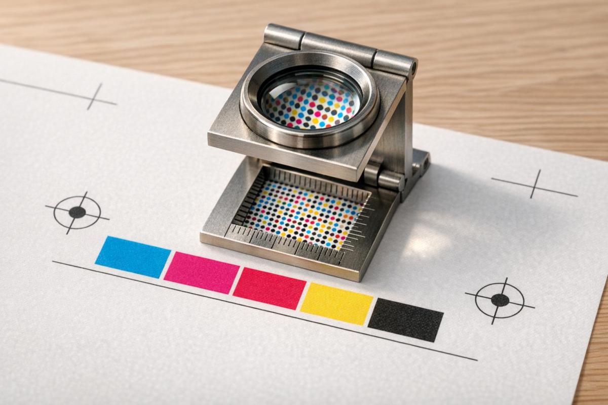
Understanding Resolution in Large Format Printing

Large Format Print Resolution Guide by Viewing Distance

Large Format Print Resolution Guide by Viewing Distance

When it comes to large format printing, resolution plays a critical role. The resolution you need depends on the type of project – what works for a business card won’t work for a billboard. Knowing these differences is essential for producing large prints that are both efficient and high-quality.

DPI vs. PPI: What Sets Them Apart?

PPI (Pixels Per Inch) refers to the digital resolution of your image file – essentially, how many pixels are packed into each square inch of the image. This is something you control in design software.

On the other hand, DPI (Dots Per Inch) describes the physical resolution of a printed image. It measures how many ink dots the printer applies to the paper. HP explains the distinction like this:

"DPI is the specific number of dots printed on a page, ppi refers to the number of pixels within an inch on a computer screen. In short, while ppi applies specifically to digital images, dpi relates to printed images".

While many design tools treat DPI and PPI as if they’re interchangeable, they’re not. For smaller prints like brochures, 300 DPI is the gold standard. But for large format printing, you can often achieve great results with much lower resolutions – sometimes as low as 100 DPI. For instance, a 24-megapixel image (6,000 x 4,000 pixels) printed at a width of 6.5 feet results in a resolution of about 76 DPI, which is perfectly fine for large-scale prints.

The key takeaway? DPI and PPI influence how you prepare your files and how the final print looks, especially when factoring in viewing distance.

How Viewing Distance Impacts Resolution

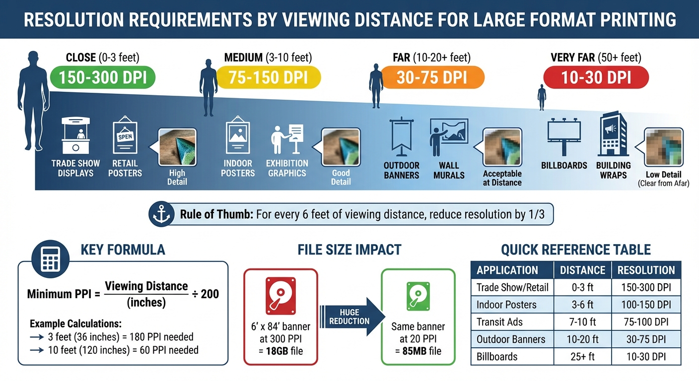
The distance from which people view your print directly affects the resolution you need. As the viewing distance increases, the human eye perceives less detail. This means you can lower the resolution without sacrificing quality. Essentially, pixels and dots blend together when viewed from farther away.

Here’s a rule of thumb: for every 6 feet of additional viewing distance, you can reduce the required resolution by about one-third. For example, a 10-foot banner viewed from 20 feet away only needs about 72 PPI to appear sharp. For larger applications like billboards, resolutions between 10 and 50 DPI are often sufficient.

"The further away your print is, the lower its resolution can and should be." – ArtisanHD

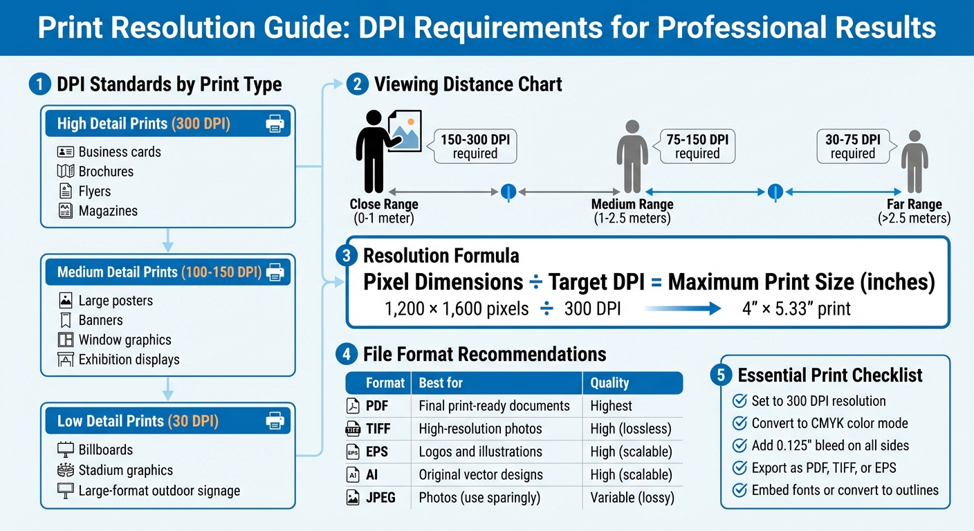
Here’s a quick guide to recommended resolutions based on viewing distance:

Viewing Distance Recommended Resolution Examples
Close (0–3 feet) 150–300 DPI Trade show displays, retail posters
Medium (3–10 feet) 75–150 DPI Indoor posters, exhibition graphics
Far (10–20+ feet) 30–75 DPI Outdoor banners, wall murals
Very Far (50+ feet) 10–30 DPI Billboards, building wraps

To determine the minimum PPI needed for your project, divide the viewing distance (in inches) by 200. For instance, a trade show graphic viewed from 3 feet (36 inches) would need about 180 PPI, while an outdoor banner viewed from 10 feet (120 inches) would only require around 60 PPI. Adjusting resolution to match viewing distance not only ensures the image looks great but also keeps file sizes manageable.

Assessing Your Project Requirements

Start by identifying the purpose of your print. The goal of your project, along with its physical size, will determine the level of detail required – and how large your files need to be.

Defining Your Print’s Purpose

Think about where the print will be displayed. The environment and viewing distance dictate the resolution you’ll need. For example, trade show displays viewed from 3 to 6 feet benefit from 150–200 PPI, while outdoor banners seen from 20 to 50 feet can work with 75–100 PPI.

Lighting conditions matter, too. A well-lit indoor wall mural requires higher quality than a vehicle wrap that’s typically seen in motion. If your design includes high-contrast details, like fine hair or fabric textures, you’ll need a higher resolution to avoid jagged edges. On the other hand, soft-focus or low-contrast images are more forgiving and can be produced at lower resolutions.

The material you’re printing on also affects the outcome. Canvas absorbs ink differently than high-gloss vinyl, which can impact how details appear. For fine art reproductions on canvas, higher resolution helps preserve tonal details. Meanwhile, mesh banners for outdoor use can be printed at lower resolutions.

Once you’ve accounted for the environment, lighting, and material, you can calculate the exact pixel dimensions needed to ensure your print looks its best.

Matching Resolution to Print Size

To determine the right pixel dimensions for your project, multiply the print size (in inches) by the desired PPI. For example, a 24 x 36-inch poster at 150 PPI requires 3,600 x 5,400 pixels. This ensures the file meets the print’s resolution needs.

For very large prints exceeding 150 inches, working at full size can create massive, unwieldy files. Instead, design at 10% of the actual size and adjust the DPI proportionally. For instance, if the full-size resolution is 75 DPI, work at 750 DPI at the reduced scale. This approach keeps your software running smoothly while maintaining the necessary detail for printing.

Always use vector graphics for logos and text, saving them in formats like .AI, .EPS, or .SVG. Vectors can scale infinitely without losing quality or increasing file size, ensuring sharp results no matter the print dimensions. Reserve raster formats, such as TIFF or high-quality JPEG, for images like photographs.

Reducing File Size While Maintaining Quality

Once you’ve nailed down your project’s resolution needs, it’s time to tackle file optimization. Large format prints often result in hefty files that can slow down your workflow and make file transfers a headache. But with the right approach, you can trim file sizes without losing the detail necessary for high-quality prints.

Choosing the Right File Format

Your choice of file format plays a big role in balancing image quality and file size. For instance, TIFF files are a go-to for professional printing because they support lossless compression methods like LZW or ZIP, which preserve every detail. However, this precision comes at the cost of larger file sizes.

For most large format projects, PDFs are a highly practical option. They can handle both vector and raster graphics, retain fonts and formatting, and offer flexible compression options that keep file sizes manageable. When working with vector-based graphics like logos, EPS files are ideal. They scale perfectly without any quality loss and typically result in smaller files compared to high-resolution raster images.

If you’re dealing with massive banners and file size is becoming unmanageable, a high-quality JPEG (95–100%) can work as a last resort.

Format Quality Compression Best For File Size
TIFF Excellent Lossless (LZW/ZIP) Professional photography, fine art Large
PDF Excellent Various (Lossy/Lossless) Complex layouts combining text and images Medium
EPS Excellent Vector-based Logos, illustrations, large-scale text Small–Medium
JPEG Good–High Lossy Massive banners as a last resort Small

Once you’ve chosen the right format, the next step is to fine-tune file size using efficient compression techniques.

Applying Compression Techniques

Compression methods fall into two categories: lossless, which preserves all data, and lossy, which sacrifices some details. For TIFF files, enabling LZW or ZIP compression is a must. LZW is especially effective for images with large areas of solid color, cutting file size by up to 50%. ZIP compression can go even further, reducing file size by as much as 60%.

"The golden rule of file compression is: don’t compress photos or images any more than you need to."
Adobe

When using JPEG compression, aim for a quality setting of 8–10 on a 1–12 scale (or "Medium" in most software). This strikes a good balance between quality and file size. For PDFs, using the "Smallest File Size" preset in design software can significantly reduce file size without compromising print quality.

Even vector files can benefit from optimization. For example, in August 2018, web.dev demonstrated how running an SVG file through the SVGO minification tool reduced its size from 470 bytes to 199 bytes – an impressive 58% reduction – by removing unnecessary metadata and XML namespaces while keeping the visual output intact.

Now, let’s look at how simplifying image layers and elements can further slim down your files.

Simplifying Image Layers and Elements

After compression, you can shrink file sizes even more by simplifying layers and elements. Flattening all layers into a single background layer before exporting can reduce file size by up to 98%. Tools like Photoshop’s "Flatten Image" command not only merge layers but also simplify the file structure, making it easier for the printer’s RIP software to process.

Another trick is to rasterize smart objects, which retain original data and non-destructive filters. While useful during editing, these features can unnecessarily inflate file size. Similarly, deleting hidden or unused layers is crucial since these invisible elements can add up to 76 MB to your file.

Cropping your image to the canvas size is another quick win. Elements or textures extending beyond the document edges still consume storage space, so cropping can save roughly 74 MB. At the same time, keeping text and logos as vectors ensures they remain sharp and clear in the final print.

In April 2024, designer Ivan Gromov shared a workflow where he reduced a 181 MB Photoshop template to just 28 MB. His process included compressing textures, cropping elements to the canvas, merging non-essential layers, and deleting invisible layers – all while keeping smart objects editable.

"For printing, a flat tiff file is recommended (no layers), as the interpretation of layers can differ between different software implementations."
Prinfab

Resolution Guidelines for Common Large Format Projects

Once you’ve optimized your files, setting the right resolution becomes crucial for creating detailed, efficient large-format prints. The correct resolution strikes a balance between avoiding unnecessary file size and maintaining quality. Here’s how resolution needs vary by project type.

Banners, Posters, and Trade Show Displays

The resolution requirements for these projects depend heavily on viewing distance. For example, trade show displays and retail signage viewed up close (0 to 3 feet) need 150 to 300 DPI for sharp clarity. Indoor posters, typically viewed from 3 to 6 feet, can work well with 100 to 150 DPI, while outdoor banners designed to be seen from 10 to 20 feet away only require 30 to 75 DPI.

"Large-format printing, however, typically uses image files that are 100 dpi resolution."
– Jacques Jourdain, Gordon Flesch Company

Here’s a practical breakdown: an A0 poster (33.1" x 46.8") optimized at 150 DPI for close viewing creates a file size of about 100 MB. Reducing the resolution to 100 DPI for medium viewing drops the file size to roughly 45 MB, without compromising visual quality for its intended viewing distance.

For much larger outdoor banners, the resolution requirements become even more lenient. A 15-foot banner, for example, might only need an effective resolution of 14 PPI when viewed from a distance. Similarly, billboards designed to be seen from 50 feet or more can be printed at just 11 to 30 DPI and still appear crisp to the human eye.

Application Type Typical Viewing Distance Recommended Resolution (DPI/PPI)
Trade Show Displays / Retail 0–3 feet 150–300 DPI
Indoor Posters (A0/A1) 3–6 feet 100–150 DPI
Transit / Bus Shelter Ads 7–10 feet 75–100 DPI
Outdoor Banners 10–20 feet 30–75 DPI
Billboards / Fleet Graphics 25+ feet 10–30 DPI

These looser resolution standards for large-scale projects differ significantly from those required for fine art, where close inspection demands much higher detail.

Fine Art and High-Detail Reproductions

Fine art prints are in a league of their own. Typically viewed from less than one meter, these reproductions require 150 to 300 DPI to capture every nuance – whether it’s subtle color shifts, tonal gradations, or intricate textures like fabric or hair.

"For fine art reproduction (giclee), TIFF files are particularly advantageous. They preserve precise color accuracy and extensive tonal detail, critical for accurately reproducing an artist’s original intent."
Intermedia Print Solutions

Museum graphics and gallery reproductions generally need 150–180 PPI, ensuring that every detail – down to the smallest brushstroke – stands out. While this results in larger file sizes, the clarity and precision make it worth the extra storage for projects where detail is paramount.

Before moving forward with a full print run, it’s a good idea to request a 100% scale physical crop. This allows you to check for pixelation and sharpness in a small section of the final design.

Conclusion

This guide highlights the importance of balancing image detail with file size by aligning resolution to the intended viewing distance. Since our ability to perceive fine details decreases as the distance increases, adjusting resolution accordingly avoids unnecessarily large files. For instance, a 6′ x 84′ banner at 300 PPI could result in an 18GB file, but lowering the resolution to 20 PPI (ideal for distant viewing) reduces it to just 85MB. These strategies ensure efficient file sizes while maintaining visual quality.

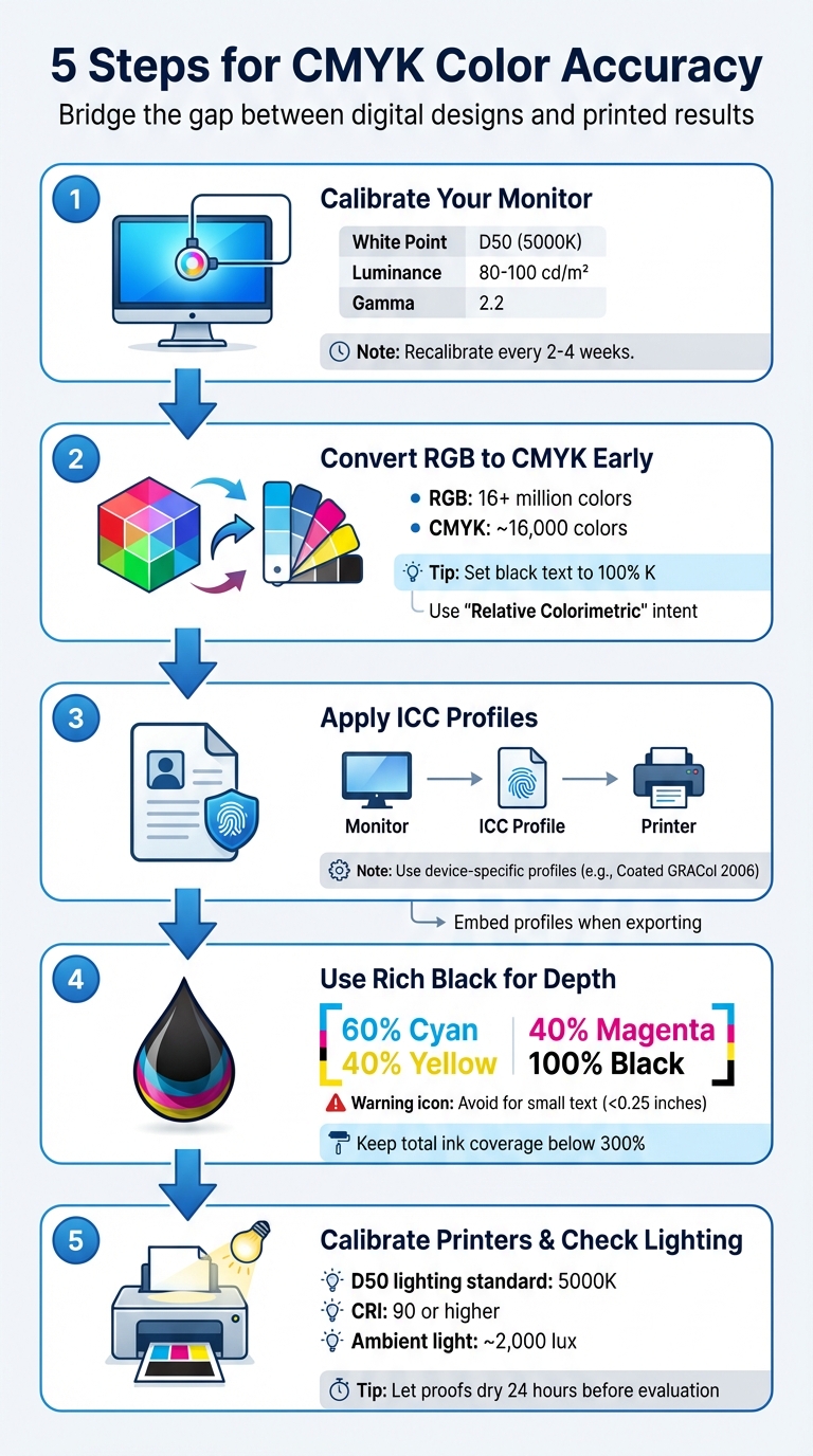
Choosing the right file format and compression method is equally crucial. Using TIFF with LZW compression can shrink file sizes by about 50% without losing detail. For elements like logos and text, vector graphics are ideal since they maintain sharpness at any scale without bloating the file size. Additionally, designing in CMYK rather than RGB ensures accurate color reproduction during printing.

"Resolution above what the output device can render provides no benefit. A 600 DPI image printed on a 300 DPI printer looks identical to a 300 DPI image – but the file is 4x larger."
– Professional Prepress Standards

When upscaling images, consider using AI-based tools such as Photoshop’s "Preserve Details 2.0" and upscale in small increments (10–20%) to maintain edge sharpness. Before proceeding with a full production run, always request a physical proof at 100% scale. This step is vital to confirm clarity and color accuracy, as digital screens can’t fully replicate how ink will interact with the chosen material. By applying these practices, you can achieve efficient, high-quality large-format prints while ensuring the final product meets your expectations.

FAQs

What resolution do I need for my print size?

The resolution you need varies depending on how the print will be viewed and its type. For prints that will be seen up close, 150–300 DPI is recommended, with 300 DPI being the go-to standard for smaller prints. On the other hand, large-format prints meant to be viewed from a distance can work well with resolutions between 20–100 DPI.

For instance, if you’re creating a 24-inch-wide print at 100 DPI, your image should be at least 2400 pixels wide. Always adjust the resolution based on the size and expected viewing conditions.

Should I export as TIFF, PDF, or JPEG?

When preparing files for large format printing, TIFF and PDF are your best options because they preserve high resolution and image quality. Steer clear of JPEG for professional printing, as its compression can result in quality loss. Make sure your file has a resolution of at least 150-300 DPI, is set to the CMYK color mode, and is adjusted for precise color accuracy and sharp details. The exact settings may vary based on how far the print will be viewed from.

How can I shrink my file without losing print quality?

To shrink file size without sacrificing print quality, tweak the resolution and compression settings. Dropping the resolution from 300 dpi to about 240 dpi can noticeably reduce the file size while still delivering good quality for large-format prints. Opt for lossless compression or a thoughtfully adjusted lossy compression to maintain image sharpness. Make sure the resolution aligns with the print size and expected viewing distance for the best outcome.

Related Blog Posts

https://app.seobotai.com/banner/banner.js?id=69953eb4efc60cc2af080db6

Common Foil Stamping Issues Solved

Practical foil stamping troubleshooting: fixes for peeling, misalignment, wrinkling, cracking, and uneven finish, plus temperature, pressure, and material tips.

Foil stamping can transform materials into luxurious, metallic-finished products, but achieving perfection often comes with challenges. Issues like peeling foil, misalignment, smudges, or cracking are common. These problems typically arise from imbalances in heat, pressure, or dwell time, as well as substrate incompatibility or environmental factors. Here’s a quick summary of solutions:

  • Peeling or Poor Adhesion: Adjust heat, pressure, or dwell time; ensure clean dies and substrates; match foil type to material.
  • Misalignment: Secure dies properly, maintain press calibration, and use optical registration for precise placement.
  • Wrinkling or Cracking: Fine-tune foil tension, lower heat for delicate materials, and select flexible foils for intricate designs.
  • Uneven Finish: Ensure even heat distribution, clean plates regularly, and test foil compatibility with substrates.

Regular maintenance, testing, and precise adjustments can significantly improve foil stamping results. Keep reading for detailed solutions to each problem.

Foil Stamping Troubleshooting Guide: Common Issues and Solutions

Foil Stamping Troubleshooting Guide: Common Issues and Solutions

Poor Adhesion and Bonding Failures

What Causes Poor Adhesion

Issues like foil peeling or uneven transfer often signal specific problems in the process. A temperature imbalance is one of the most common causes. If the heat is too low, the adhesive layer on the foil doesn’t activate properly. On the flip side, too much heat can melt the foil, leading to "foil fill-in", where fine details are lost. Pressure issues can also cause trouble. If the die doesn’t make full contact with textured materials, gaps form, and the foil fails to bond.

Another factor is insufficient dwell time, which refers to the duration the die remains in contact with the substrate. Most commercial applications require about 1–2 seconds, but tougher materials may need 3 seconds or more. Substrate incompatibility adds further challenges. Rough or heavily textured papers make it hard for the foil to reach the material’s "valleys", while coatings like UV varnishes can repel the foil entirely.

Surface contaminants – like dust, oils, or moisture – are another major problem. These interfere with the chemical bond between the foil and substrate, particularly on materials like leather. Using the wrong foil type, such as one designed for paper on leather, or applying foil over non-toner-based inks, can also lead to bonding failures. For thermal toner foiling, a minimum temperature of 300°F (149°C) is necessary to ensure proper adhesion. Additionally, dirty or worn dies with adhesive residue can result in patchy or uneven transfers.

Interestingly, over 65% of leathercrafters report issues like peeling or patchy impressions during their first year of foil stamping. This highlights how common adhesion challenges are, even for those committed to mastering the craft.

Understanding these causes lays the groundwork for making precise adjustments, as detailed below.

How to Fix Adhesion Problems

Fixing adhesion problems means addressing the root causes through careful adjustments in temperature, pressure, and preparation techniques. Start by tweaking the temperature in 5°C increments to find the sweet spot without scorching the material. Different materials require different temperature ranges – vegetable-tanned leather works best at 285–320°F (140–160°C), while coated paper performs better at 250–300°F (121–149°C). For moisture-prone materials like leather, pre-heating the substrate at 140°F (60°C) for 10 minutes can improve foil bonding.

Keep your die clean by wiping it with isopropyl alcohol to remove adhesive residue or dust that could interfere with heat transfer. Use pressure test paper to ensure the die applies even pressure across the surface – uneven pressure is a leading cause of incomplete foil transfer. For textured or porous materials like recycled paper, increasing the dwell time or pressure helps the foil settle into the material’s crevices.

"Pressure does not replace heat. Operators often try to fix transfer problems by increasing impression. That usually introduces new defects instead of solving the root cause." – Puget Bindery

To check bond strength, use medium-tack masking tape; a clean removal indicates a secure bond. For added assurance, wipe the foiled area five times with a cloth moistened with rubbing alcohol – the pigment should stay intact. Always let the foil cool to room temperature before peeling the carrier film to ensure the bond has fully set.

For intricate designs like fine-line stamping on paper, use hard make-ready boards, such as epoxy glass or phenolic board. These materials help achieve a sharp, precise transfer and complement other strategies for addressing foil-related issues.

Misalignment and Design Distortion

What Causes Misalignment

Misalignment often arises from setup mistakes or poor material handling. If the stamping die isn’t properly secured to its reference point during installation, the entire design can shift out of place. On top of that, faulty sensors or inaccurate auto-alignment systems can fail to detect these errors, leading to repeated feed and placement issues.

Mechanical feed problems are another common culprit. Dirty feed rollers, low-precision encoders, or even the thermal expansion of foil can throw off feed distances. Loose cores and shafts can also cause the foil to drift during operation, creating alignment issues.

Material conditions add another layer of complexity. Substrate deformation, often caused by unstable storage temperatures or high humidity, can lead to warping that disrupts feeding alignment. To avoid this, paper or plastic substrates should have moisture levels below 8%. For digitally printed sheets, traditional mechanical grippers often struggle because they depend on the sheet’s edge rather than optical registration marks, making precise alignment harder to achieve.

"Something with drop-dead, tight registration can be a challenge because of the way digital printing equipment uses optical registration." – Sean Hurley, MCD

Press equipment can also contribute to misalignment. A press that isn’t level or has a platen that isn’t parallel can create uneven pressure, leading to distorted designs or "haloing" effects around images. Additionally, the thermal expansion of metal dies can alter dimensions, further affecting alignment.

How to Maintain Proper Alignment

Preventing misalignment starts with meticulous setup and ongoing maintenance. Secure die mounting is critical. High-quality die bonding tape or specialized tools like "Lock-A-Block" attachments can keep the die firmly in place during stamping. Ensuring that the press is level and the platen is parallel to the stamping plate is another essential step – it not only prevents pressure-induced distortion but also reduces makeready time.

For digital printing, rely on registration marks printed or stamped onto the material rather than aligning by the sheet’s edge. Regularly cleaning feed rollers and calibrating alignment sensors can help minimize cumulative errors during production.

"Having a second honeycomb is great, so that you can start setting up your next job. Having the press maintained and the platen parallel will reduce your makeready times." – Andy Dvorsky, Dvorsky Press Services

Environmental control is just as important. Maintaining stable temperature and humidity levels prevents substrate warping before the material even reaches the press. For highly detailed designs, using hard make-ready boards like epoxy glass or phenolic board ensures crisp, distortion-free stamps. Testing alignment with makeready sheets from previous runs can also save time and reduce waste before using costly final substrates.

Documenting successful settings – such as temperature, pressure, and feed increments – makes it easier to replicate results for future jobs. For intricate designs with varying surface areas, spacer paper can help balance pressure across the platen. These steps are key to achieving consistent, high-quality results in foil stamping.

At Miro Printing & Graphics Inc., we follow these practices to deliver precise, flawless foil stamping every time.

Foil Wrinkling, Curling, and Cracking

What Causes Wrinkling and Cracking

Just like with adhesion and alignment issues, maintaining proper foil tension and controlled conditions is key to achieving flawless results. Wrinkling and curling often happen when the foil doesn’t lay flat during stamping. If the foil tension is too loose, it can sag and form creases. On the flip side, too much tension can lead to breakage. Excessive heat is another common culprit. When temperatures go beyond the recommended range, the foil can melt outside the design edges and scorch, leading to curling and distorted edges. Cracking, which shows up as splits or a brittle texture, is usually caused by too much stamping pressure or using a foil that isn’t flexible enough for intricate designs. High stamping speeds can also play a role by not allowing enough bonding time.

"Foil cracking, where the foil appears broken or brittle on the substrate, can significantly affect the aesthetics of the stamped product. This issue often stems from using a foil that’s not flexible enough for the substrate or the design’s intricacies." – Metallic Elephant

Improper handling of materials, like failing to lay the foil flat or misaligning the stamping plate, can make these problems worse. For designs with large solid areas, trapped gas between the foil and substrate can create bubble-like wrinkles. Using a fine-screened die can help release these trapped gases. Addressing these challenges requires specific adjustments, which are outlined in the prevention tips below.

How to Prevent Wrinkling and Cracking

Start by fine-tuning the tension settings to keep the foil tight but not overly stretched. If wrinkles appear, increase the rewind or brake tension to ensure the web path stays straight. Temperature control is just as important – if you notice wrinkling or bleeding, gradually lower the heat until the edges stay sharp and the foil lies flat. For delicate materials like thin leather or synthetics, reduce the temperature to around 212–248°F (100–120°C) and use thermal barrier paper to avoid scorching.

To address cracking, reduce the stamping pressure slightly until the foil transfers cleanly. Avoid the temptation to fix transfer issues by increasing pressure, as this often introduces new defects. Slowing down the stamping speed can also help with intricate designs, giving the foil more time to bond properly. Choosing the right foil is critical too – opt for softer, more flexible options for complex designs or tricky substrates. For UV-coated materials, use "stampable" UV coatings instead of silicone-based ones, and check the surface compatibility with a dyne test (aim for a level between 36 and 42).

For substrates that are prone to crushing under pressure, placing a silicone cushion or leather padding beneath the die can act as a buffer. Pre-drying materials to keep their moisture levels below 8% can also prevent steam-related bubbling during the heated stamping process. These steps ensure a smooth, defect-free finish.

At Miro Printing & Graphics Inc., we apply these techniques to deliver the premium quality our clients expect every time.

Uneven Foil Finish and Gloss

What Affects Foil Finish Quality

Patchy foil finishes and inconsistent gloss often stem from a few key factors. One major issue is uneven heat distribution. If the stamping head’s temperature isn’t consistent, some areas of the foil will bond properly, while others remain dull or incomplete. Even a slight temperature difference can create noticeable imperfections.

Another common cause is contamination on the stamping plates. Dust, oils, or residues from inks can interfere with the foil’s ability to adhere evenly. Bertrand Hayoz from Bobst highlights this challenge:

"A tiny piece of dust or something on the foil stamp or on the sheet, and the picky customer rejects the sheet"

The type of paper or coating used also plays a role. Textured or porous papers can prevent the foil from making solid contact, while coatings, particularly UV coatings with silicone, can repel the foil.

Additionally, low-quality foil or choosing the wrong material for the job can lead to inconsistent results. Worn-out equipment, such as deformed stamping plates or old silicone pads, can also contribute. Silicone pads, in particular, may need replacing after about 500 uses in certain applications to maintain even pressure across the design.

Addressing these issues is essential for achieving a flawless finish. The following steps can help ensure consistent results.

How to Get Consistent Finish

Start by cleaning your stamping plates regularly. Use isopropyl alcohol to remove dust, oils, or other contaminants that can interfere with the foil application. This simple maintenance step can prevent many common problems.

Next, focus on temperature control. Ensure even heat distribution across the stamping mold by using tools like an Omron temperature controller for precise calibration. Most hot stamping foils work best at temperatures between 250°F and 350°F (121°C to 177°C). For laminator-based foiling, a minimum of 300°F is often required.

Using high-quality foil that’s compatible with the substrate is another crucial factor. For coated stocks, testing surface energy with dyne pens can help determine if specialty foils or "stampable" UV coatings are needed. Additionally, pre-drying substrates to maintain moisture levels below 8% can prevent bubbling caused by steam.

Finally, make sure your stamping plate is level. For uneven surfaces, consider adding silicone cushioning to evenly distribute pressure and improve the finish.

At Miro Printing & Graphics Inc., we adhere to strict quality control standards and regularly calibrate our equipment to ensure every project delivers a flawless, eye-catching foil finish.

Selecting Equipment and Materials

Matching Foils to Substrates

Choosing the right foil for your substrate is a key step in achieving the best results. Each substrate has unique surface properties, so using a foil with the correct adhesive chemistry and release characteristics is essential. This choice directly affects how well the foil adheres and the overall finish of the stamped product.

  • Smooth surfaces like coated papers and SBS (Solid Bleached Sulfate) boards are highly efficient at transferring heat, making them the easiest to stamp.
  • Textured or porous materials like uncoated or recycled stocks demand foils with stronger adhesive properties to ensure proper contact and transfer.
  • Synthetic materials and laminates act as thermal barriers, requiring specialty foils designed for low-surface-energy substrates.

To check surface energy, dyne pens can be a useful tool, especially for UV-coated or plastic substrates. For metallized films, a surface energy above 40 mN/m (dynes) is ideal for proper adhesion. If stamping on UV coatings, low dyne levels may indicate the need for specialty foils or UV coatings specifically made for stamping.

Before full-scale production, always test new foils on 10–20 pieces of the actual material to confirm adhesion consistency. Store foils in a controlled environment to avoid issues caused by extreme humidity or temperature, such as color inconsistencies or performance degradation. Proper environmental controls also help manage substrate moisture, preventing problems during the stamping process. These steps ensure smoother production and better results.

Machine Maintenance and Calibration

Precise machine settings, along with regular maintenance, are essential for consistent foil stamping quality. Neglecting upkeep can lead to poor results and increased waste. Andy Dvorsky from Dvorsky Press Services emphasizes:

"Reducing waste requires the right state of mind, the right operators, regular maintenance of the machines, cleanliness and making sure that counters are working – all of that has an effect".

Key maintenance tasks include calibrating temperature zones and leveling the platen to ensure even heat distribution and uniform pressure. For reference, standard temperatures for stamping range between 90°C–110°C (194°F–230°F) for paper and 120°C–140°C (248°F–284°F) for leather. Proper calibration minimizes setup times and avoids damaging paper fibers from excessive pressure. Additionally, regular lubrication and allowing cooling periods after extended use can prevent overheating.

Cleanliness is equally important. Keeping stamping plates and work surfaces free of debris helps eliminate defects. These practices align with earlier discussions on addressing alignment and adhesion challenges, ensuring consistent, high-quality outcomes.

With proper maintenance, hot foil stamping machines can typically last 5 to 10 years. At Miro Printing & Graphics Inc., strict maintenance protocols and regular calibrations are followed to deliver top-notch results on every project.

Overcoming Hot Foiling Troubles

Conclusion: Getting Better Foil Stamping Results

Achieving consistent, high-quality foil stamping results boils down to mastering the balance of heat, pressure, and dwell time. As Puget Bindery puts it:

"Hot foil stamping is not just a decorative process. It is a controlled transfer of material using heat, pressure, and time. When one variable drifts, quality drops."

Typically, most setups run optimally at 300–350°F with 40–60 psi of pressure. However, success also depends on tailoring your approach to the materials you’re working with. For instance, coated substrates tend to allow for smoother transfers, while textured stocks may call for specialized foils. Testing new foils on actual production samples before committing to a full run can help avoid expensive errors.

Regular equipment maintenance and calibration are essential for smooth operations. Cleaning dies, leveling platens, and ensuring temperature zones are properly calibrated can prevent many common issues like misalignment or poor adhesion. Even simple steps, like performing a tape test, can confirm that the foil adheres properly.

FAQs

How do I know if my foil is compatible with my substrate?

To determine if a material is suitable for foil, check that it can withstand heat between 212–392°F, allows proper adhesion (smooth, non-porous surfaces are ideal), and holds its shape under pressure. Materials like heavily coated or textured papers often struggle with foil application. It’s always a good idea to test beforehand to ensure compatibility.

What’s the fastest way to dial in heat, pressure, and dwell time?

The fastest way to dial in the heat, pressure, and dwell time for foil stamping is to begin with the suggested temperature range for your foil – usually between 250°F and 350°F. Run a few test stamps and tweak the settings as needed. If the foil appears faint, try increasing the temperature or pressure slightly. On the other hand, if you notice peeling or blurring, reduce these settings. Adjust the dwell time in small increments to ensure a clean transfer without burning or uneven finishes.

When should I switch foil types instead of changing machine settings?

When your current foil isn’t delivering the color or finish you need, or if its adhesive or release properties don’t work well with your material, it’s time to switch. Using the right foil ensures proper adhesion and maintains quality without requiring extra tweaks to your machine settings.

Related Blog Posts

https://app.seobotai.com/banner/banner.js?id=699503c0efc60cc2af07ed58

Prepress vs. Post-Press: Error Prevention

Prevent costly print mistakes with prepress file checks (bleeds, CMYK, fonts, 300 DPI) and post-press controls (trim, folding, barcodes).

Errors in printing can cost businesses millions, but most mistakes are avoidable. Prepress focuses on preparing digital files for print, while post-press handles physical finishing like trimming and binding. Catching errors early in prepress is cheaper and prevents costly reprints. Post-press ensures the final product is polished and functional.

  • Prepress errors: Missing bleeds, low-resolution images, RGB color mode, font issues, and transparency problems.
  • Prevention: Use preflight software, embed fonts, convert colors to CMYK, and check resolution.
  • Post-press errors: Misalignments, trimming mistakes, folding cracks, and barcode issues.
  • Prevention: Allow ink to dry properly, test barcodes, and use folded dummies for accuracy.

Key takeaway: Early checks in prepress save time and money, while post-press ensures the final product meets quality expectations. Together, they form a robust quality control system that minimizes errors and builds trust with clients.

Prepress Errors and Prevention Methods

Common Prepress Errors

When it comes to desktop publishing, many designers lack the technical know-how required for print production. This often leads to overlooked mechanical details that can cause major issues during printing. For example, RGB images may look perfect on screen but fail to translate well into CMYK for print output.

One frequent mistake is missing bleeds. To avoid white edges around the artwork, designers need to extend the artwork by 0.125" beyond the trim line. Another common issue is low-resolution images. While standard printing demands images at 300 DPI (dots per inch) at full size, large-format printing requires at least 150 DPI. In contrast, web images are typically just 72 DPI, which is far below what’s needed for quality print production.

Color mode mismatches are another headache. Designers who work in RGB instead of CMYK often see dramatic color shifts when their files are converted for printing. Similarly, font issues arise when fonts aren’t embedded or converted to outlines, leading to unwanted substitutions or layout problems. Safe zone violations occur when critical elements like text or logos are placed too close to the trim edge – ideally, they should be within 0.125" to 0.25" from the edge to avoid being cut off. Lastly, transparency and overprint errors can result in unexpected color interactions if these settings aren’t properly managed.

These kinds of errors emphasize the importance of thorough prepress checks to ensure a smooth printing process.

Prepress Error Prevention Methods

Once these common errors are understood, implementing effective prevention strategies becomes crucial.

Automated preflight checks are a game-changer. Tools like Adobe InDesign‘s Preflight panel and Acrobat Pro‘s Print Production features can scan files for resolution issues, missing fonts, and incorrect color spaces before production begins. As the GlobalVision Editorial Board puts it:

Preflight catches errors when fixing them costs pennies instead of thousands, turning potential chaos into smooth production runs.

Another key step is proper file preparation. Using the "Package" function in design software ensures all linked images and fonts are gathered in one folder. Exporting files in formats like PDF/X-1a or PDF/X-4 helps maintain layers, fonts, and other essential elements while ensuring the file meets print-ready standards. For rich blacks, it’s better to use a mix like 40C, 40M, 40Y, 100K instead of relying solely on 100% K, as this creates a deeper, more vibrant black.

Color management is another critical area. Calibrating monitors and using ICC profiles allows designers to simulate press output through soft proofing. Converting all images and colors to CMYK – or to specific Pantone colors – before exporting reduces the risk of unexpected shifts. For projects where color accuracy is vital, ordering physical proofs ensures the final output matches expectations before the full production run. Lastly, to avoid font-related issues, always embed fonts in the PDF or convert text to outlines when working in software like Adobe Illustrator.

Post-Press Errors and Prevention Methods

Common Post-Press Errors

Finishing processes bring their own set of challenges, with trimming and cutting errors being among the most frequent. For example, guillotine cutting inaccuracies can eliminate crucial details like phone numbers or logos if safety margins are ignored. Similarly, improper trimming that exposes bleed gaps can leave unsightly white slivers along the edges, making the final product look sloppy and unprofessional. As Quebec-printing.com aptly warns:

Placing critical information in [the risk zone] is like playing Russian roulette with your content.

Folding and binding issues are also prevalent. Incorrect imposition calculations can cause pages to appear out of order, while coated stocks often crack along fold lines if creasing pressure isn’t adjusted correctly. Timing is critical, too – structural issues like poor adhesion or scuffing can occur when finishing starts before the ink has had enough time to dry. In offset printing, it’s generally recommended to allow 1–2 days for proper drying.

Functional problems, such as unscannable barcodes or QR codes, can also arise. These issues often stem from dot gain on porous paper or a lack of contrast between printed elements, rendering the codes ineffective.

The financial consequences of these errors can be severe, leading to costly reprints, wasted materials, delayed project timelines, and even reputational harm. For example, producing a typical book through offset printing may take around three weeks, partly to account for drying time and complex finishing steps. These risks highlight the importance of stringent post-press quality controls.

Post-Press Error Prevention Methods

Just as prepress checks are essential for avoiding errors, post-press controls ensure the final product meets quality standards. Timing plays a critical role here. In offset printing, ink requires at least 24–48 hours to stabilize before finishing begins, whereas digital printing offers the advantage of immediate ink drying, allowing for quicker transitions to the next steps.

Physical verification is another key preventative measure. For instance, creating a folded dummy from imposition proofs can help confirm pagination, cutting, and binding accuracy before moving into full production. Additionally, a rule-up sheet from the press – clearly showing trim lines, final dimensions, spine placement, and perforations – should be cross-checked against the prepress imposition proof.

Automation has also become a powerful ally in minimizing post-press errors. High-resolution cameras and vision systems allow for real-time inspection of registration and defects, significantly improving quality control. One mid-size converter reported impressive results: a 30% drop in rework and a 20% reduction in ink waste within just 90 days of implementing standardized inspection intervals and stricter color tolerances. However, human expertise remains indispensable for aesthetic evaluations and adjustments that machines cannot handle.

Don’t skip functional testing, either. Always test QR codes and barcodes with optical scanners after printing and finishing, as dot gain can easily render them unreadable. For projects involving binding methods like spiral or perfect binding, maintaining a safety margin of 10 mm (approximately 0.4 inches) near the spine is critical to ensure that no important information is lost in the gutter.

Common Prepress Problems

Prepress vs. Post-Press: Error Prevention Comparison

Prepress vs Post-Press Error Prevention Comparison Chart

Prepress vs Post-Press Error Prevention Comparison Chart

Prepress and post-press error prevention tackle different stages in the production process: prepress focuses on ensuring digital file accuracy, while post-press emphasizes the precision of physical finishing tasks. In prepress, the goal is to catch issues like missing fonts or incorrect image resolution before printing begins. On the other hand, post-press ensures that tasks like trimming, folding, binding, and specialty finishes – such as embossing – are executed flawlessly .

The timing of error detection plays a crucial role in managing costs. Errors caught during prepress are far less expensive to fix. For instance, resolving a missing bleed or a low-resolution image during preflight might cost next to nothing. However, discovering a post-press issue – like pages bound in the wrong order – can result in scrapping an entire print run, wasting paper, ink, and press time.

Despite their differences, prepress and post-press are deeply interconnected. Decisions made during prepress, such as setting a 0.125-inch bleed or maintaining a 0.25-inch safe zone, are designed to accommodate the mechanical tolerances required during post-press. For example, while imposition is arranged digitally in prepress, its accuracy is ultimately confirmed during the folding process in post-press, highlighting how both stages rely on one another .

Comparison Table: Prepress vs. Post-Press

Feature Prepress Error Prevention Post-Press Error Prevention
Primary Focus Digital file setup (fonts, CMYK, resolution) Physical finishing (trimming, folding, binding)
Common Errors Missing bleeds, low-res images, RGB color mode Misalignment, page order errors, scuffing
Prevention Tools Preflight software, ICC profiles, digital proofs Folded dummies, press rule-up sheets, checks
Cost of Failure Low (if caught before printing) High (wasted materials and labor)
Quality Impact Affects visual clarity and brand color accuracy Affects functionality and professional finish

Error Prevention at Miro Printing & Graphics Inc.

Custom Solutions for Error-Free Printing

At Miro Printing & Graphics Inc., prepress isn’t just a step in the process – it’s a safeguard against potential printing pitfalls. Their prepress team meticulously reviews files to catch issues like incorrect color profiles (e.g., RGB instead of CMYK), missing bleeds, low-resolution images (under 300 DPI), and non-vectorized fonts. These proactive checks ensure files are press-ready before production begins.

To maintain color accuracy, they validate ICC profiles and use precise imposition techniques to ensure pages align correctly after folding. Barcodes, including QR and UPC, are tested under different lighting and paper conditions to account for dot gain. For high-stakes projects – such as corporate branding or luxury packaging – Miro provides physical "Sherpa" proofs. These proofs act as binding agreements, as noted:

A physical proof is a contract. It is the reference the printer commits to matching on the presses.

Additionally, their workflow emphasizes strict adherence to safety margins, using 0.125-inch bleeds and 0.2-inch safe zones to protect crucial design elements from being trimmed. They also account for ink drying times (1–2 days for offset printing), plate production, and manual adjustments during prepress, ensuring every detail is addressed without rushing.

Benefits of Full-Service Local Printing

Miro’s full-service, local approach further strengthens its error prevention measures. By housing design, prepress, digital and offset printing, and bindery services under one roof, they eliminate the risks associated with transferring files between multiple vendors. This integrated workflow allows seamless communication across departments, enabling teams to identify and resolve potential issues early in the process. For example, production staff contribute to prepress decisions, while bindery teams provide input on finishing requirements upfront – saving time and avoiding costly mistakes later.

Being a local operation also allows for hands-on quality checks, quicker turnaround times, and personalized support. Clients can review physical proofs, discuss complex projects in person, and get expert advice on preparing files for specific finishing needs. This collaborative, in-house system ensures errors are minimized at every stage, from prepress to post-press, delivering a smooth and reliable production experience.

Conclusion

From the earlier breakdown of prepress and post-press processes, it’s evident that having a well-structured quality system is critical. Preventing errors in printing depends on the smooth collaboration between these two stages. Prepress acts as the first line of defense, ensuring files meet all technical requirements before production begins. Addressing issues early in this stage is far less costly than dealing with mistakes after production.

Post-press, on the other hand, focuses on the physical finishing touches – cutting, folding, binding, and more. This stage demands careful handling and rigorous quality checks to ensure the work done in prepress remains intact. For example, when prepress teams set proper imposition and maintain safety margins, post-press operations can proceed without compromising critical elements.

By treating prepress and post-press as interconnected parts of a single quality control system, production standards can reach new heights. As the GlobalVision Editorial Board aptly notes:

If your earlier stages work properly, proofing confirms quality rather than discovering disasters.

Automated preflight software plays a key role in this process, checking technical parameters with precision. This automation allows human teams to focus on creative decisions and brand alignment – areas where machines fall short. Together, these efforts reduce errors while maintaining consistent quality throughout the workflow.

Beyond cost savings, effective error prevention builds trust with customers and strengthens your brand’s reputation. A misprinted brochure or an unreadable barcode isn’t just a financial loss – it can harm client relationships or even lead to legal trouble in regulated industries. By combining thorough prepress reviews with flawless post-press execution, you create a dependable process that keeps clients coming back.

FAQs

What’s the cheapest stage to fix a printing mistake?

The prepress stage is the best opportunity to catch and fix printing errors without breaking the bank. Identifying mistakes during preflight usually means they can be corrected with minimal expense, saving you from costly reprints or last-minute adjustments during post-press or final production.

Which file settings should I verify before sending artwork to print?

Before you send your artwork to print, double-check these essential settings to prevent mistakes:

  • File format: Stick to PDF/X-1a or PDF/X-4 for reliable results.
  • Color mode: Convert your design to CMYK to match printing standards.
  • Resolution: Ensure images are at least 300 DPI for sharp output.
  • Bleed and margins: Add a 1/8 inch bleed and keep elements within safe margins.
  • Fonts: Embed or outline all fonts to avoid font substitution issues.
  • Linked assets: Package all linked files to keep everything intact.

Following these steps will help you avoid hiccups and achieve a smooth printing process.

How can I prevent trimming, folding, or barcode problems after printing?

To prevent problems such as trimming mistakes, uneven folds, or barcodes that can’t be scanned, it’s crucial to enforce rigorous post-press quality control measures. Use accurate measuring tools to check trim and fold lines, and test barcodes with scanners to confirm they work properly. Conduct frequent inspections both during and after production to catch errors early, ensuring the final product meets dimensional and finishing standards before it reaches the customer.

Related Blog Posts

https://app.seobotai.com/banner/banner.js?id=6993b214efc60cc2af07b412

Preflight for PDFs: Key Steps Explained

Step-by-step guide to preflighting PDFs for print: check trim/bleed, CMYK conversion, 300 DPI images, embedded fonts, and PDF/X export.

Preflighting a PDF ensures your file is error-free and ready for professional printing. This process involves verifying fonts, image resolution, color modes, and layout dimensions to prevent costly mistakes like color shifts or misaligned designs. Here’s a quick breakdown:

  • Why Preflight? Avoid errors like missing fonts, low-resolution images, or incorrect color spaces that can ruin print jobs and lead to expensive reprints.
  • Who Needs It? Designers, printers, marketers, and anyone creating print materials.
  • Key Tools: Adobe Acrobat Pro and GWG Preflight Profiles help identify and fix issues.
  • Steps to Follow:
    1. Check trim size, bleed, and margins.
    2. Convert colors to CMYK and verify ink coverage.
    3. Ensure images are at least 300 DPI.
    4. Embed fonts and flatten transparencies.
    5. Export using PDF/X standards.

Skipping preflighting can lead to delays, wasted materials, and unexpected costs. By following these steps, you can ensure your design transitions seamlessly from screen to print, saving time and money.

5-Step PDF Preflight Process for Print-Ready Files

5-Step PDF Preflight Process for Print-Ready Files

Tools for PDF Preflighting

Adobe Acrobat Pro

Adobe Acrobat Pro

Adobe Acrobat Pro includes a powerful preflight engine, derived from the callas pdfToolbox, that uses profiles to identify and correct errors in PDFs. To access this feature, go to All Tools > Use Print Production > Preflight. With over 400 predefined checks, it can identify issues like missing fonts or incorrect color spaces. The tool also provides detailed reports in PDF, XML, or text formats, highlighting problems such as transparent masks or comments. For more intricate layouts, the Snap View feature allows you to zoom in on specific objects to pinpoint issues. Once corrections are made, you can digitally sign the document using the "Embed Audit Trail" option.

"The success of a preflight inspection depends on how well you define the criteria for the inspection." – Adobe Acrobat User Guide

Additionally, Adobe Acrobat Pro offers specialized profiles to enhance error detection, particularly for professional printing needs.

GWG Preflight Profiles

Ghent Workgroup (GWG) Preflight Profiles are another essential tool for ensuring print-ready PDFs. These profiles act as detailed checklists tailored to specific printing methods, including sheetfed offset, web offset, digital printing, and newspaper ads. They go beyond the standard PDF/X requirements, enforcing stricter rules such as rejecting color images below 150 ppi, limiting ink coverage to 320% for sheetfed printing, and requiring a minimum line thickness of 0.125 points.

The Ghent Workgroup recommends using their GWG 2022 or GWG 2015 profiles, based on ISO PDF/X-4 standards, which support modern features like native transparency and color-managed RGB workflows. They advise against the outdated GWG 1v4 standard (PDF/X-1a). These profiles are available for tools like Adobe Acrobat Pro, Enfocus PitStop, and callas pdfToolbox, ensuring consistent results. All compliant applications undergo rigorous testing by the GWG to catch relevant errors and warnings.

"Preflighting your files can save you a lot of money as many errors can only be detected by preflight software. And those errors do create trouble afterwards!" – Ghent Workgroup

Steps to Preflight Your PDF

Check Trim Size and Bleed

Make sure your document’s dimensions align with your printer’s specifications. The trim size refers to the final dimensions of your printed piece after cutting, while the bleed is an extra 0.125 inches (1/8") of artwork extending beyond the trim line on all sides. This allows for slight shifts during the cutting process.

In Adobe Acrobat Pro, activate the art, trim, and bleed boxes to confirm your dimensions. For detailed measurements, use the Measuring Tool or open the Crop Pages tool to view exact sizes.

"For exact trim page size measurement use the ‘Crop Pages’ option… to bring up the Crop Pages dialog box to display its TrimBox information." – DK Handbook

Ensure background images and colors extend into the bleed area. Even a tiny 1/64" shift during cutting can expose unwanted white borders if the bleed is missing. When exporting from software like InDesign, check the "Use Document Bleed Settings" option in the Marks and Bleeds tab. Also, enable "Use Overprint Preview" in Acrobat Preferences, set to Always, to preview how colors and bleeds will appear in print.

Verify Color Mode and Accuracy

Once dimensions are confirmed, check that your colors are print-ready. Convert all colors in your PDF to the CMYK color space to prevent unexpected shifts during printing. Use the Output Preview tool in Adobe Acrobat Pro (found under Print Production > Output Preview) and select "CMYK" from the dropdown to verify color accuracy.

Check the Total Ink Coverage (TIC) to ensure it stays below recommended thresholds. For sheetfed offset printing, TIC should be 320% or less, while commercial web offset printing requires TIC under 305%. If you’re using spot colors, ensure they are consistently named throughout the document to avoid creating extra printing plates.

Set black text to overprint and avoid overprinting white to sidestep registration issues. Use Acrobat’s Preflight tool to convert RGB elements to CMYK using profiles like Convert to PDF/X-1a (Coated GRACoL 2006) with the "Analyze and Fix" option.

Check Image Resolution and Quality

After confirming dimensions and colors, ensure your images meet print-quality standards. Images should have a resolution of 300 DPI (dots per inch) for clear printing, though large-format prints can use 150 DPI since they’re typically viewed from a distance. Images that look fine on a screen may appear blurry or pixelated in print if their resolution is too low.

Use Acrobat Pro’s Preflight tool to scan for images below the required resolution. Replace any flagged images with higher-quality versions.

Embed Fonts and Flatten Transparencies

To avoid text and transparency issues, embed fonts and flatten transparencies. Embedding fonts ensures your text appears as intended, preventing substitution errors that could lead to illegible or altered characters. Without embedding, printers may replace your fonts with different ones, disrupting your design.

Flattening transparencies is equally important. If not flattened, overlapping colors can shift, or some design elements might disappear during printing. To handle this, convert your file to the PDF/X-1a standard using Acrobat’s Preflight tool. Alternatively, use Print Production > Flattener Preview, select "Transparent Objects" to highlight areas with transparency, and click "Apply".

Set Margins and Safety Zones

Keep all essential content – like text, logos, and key design elements – at least 0.125 inches (1/8") inside the trim line. This creates a safety zone, ensuring critical elements aren’t accidentally trimmed during production. While decorative elements and background colors can extend into the bleed, make sure important content stays within the trim boundaries to avoid costly reprints.

Acrobat Tutorial: Using the Preflight Dialog Box – Adobe Acrobat Training Course

How to Export a Print-Ready PDF

Getting your PDF ready for print is the final step in ensuring your design transitions seamlessly to the physical world. Here’s how to do it right.

Use PDF/X Standards

When exporting your file, opt for PDF/X-1a or PDF/X-4. These formats are designed to eliminate common printing mishaps by embedding fonts, defining colors, and removing interactive elements or optional features that might cause issues at the print shop.

"PDF/X basically says: No guessing. No surprises. Everything defined." – IMG.LY Blog

  • PDF/X-1a works best for traditional offset printing. It requires CMYK color mode and flattens transparencies, ensuring compatibility with older printing workflows.
  • PDF/X-4 is ideal for modern digital printing. It supports live transparency and layers, which can improve quality while keeping file sizes smaller.

If you’re unsure which standard your printer prefers, reach out to them. PDF/X-1a tends to be the safer, more universally accepted choice. Once you’ve exported your file, open it in Adobe Acrobat Pro and use the "Verify Conformance" feature in the Standards pane to confirm it meets the required specifications.

Add Crop and Bleed Marks

Crop and bleed marks are essential for accurate trimming. In software like InDesign or Illustrator, go to the "Marks and Bleeds" section during export. Check the "Crop Marks" option and enable "Use Document Bleed Settings" to include the necessary 0.125-inch bleed area.

Keep in mind that some automated print services may not require printer marks. Always confirm your printer’s specific requirements to avoid unnecessary adjustments.

Name and Organize Your Files

Clear and descriptive file names are a must. Instead of vague names like "Final_FINAL_v2.pdf", use something like "BusinessCard_Front_v3_02-16-2026.pdf". Stick to letters, numbers, underscores, and hyphens – special characters and spaces can cause compatibility problems with certain systems.

Before submission, organize your files in a dedicated folder. If you’re sending multiple files (e.g., front and back designs), label them clearly and include a simple text file listing the contents. This extra step helps avoid confusion and ensures your printer processes everything correctly. For detailed submission tips, check out the guidelines from Miro Printing & Graphics Inc. (https://bergencountyprinters.com).

Final Review and Submission

With your PDF fully preflighted and export settings confirmed, it’s time to complete these final steps to ensure everything is ready for print.

Proofread and Print a Test Copy

Printing a physical proof is a critical step to catch issues that might not show up on screen. Check for text clarity, proper image placement, and any unexpected color shifts. Screen previews often miss print-specific problems, such as overprinted white text or transparency issues that only become apparent in a hard copy.

"It’s much cheaper to spend a little extra time proofing your document than it is to re-print it."
– Brian Coale, Creative Director, Casey Printing

A physical proof can uncover details you might otherwise overlook. For instance, small text might become unreadable at its final size, colors can shift during the RGB-to-CMYK conversion, or trim alignment could be slightly off. Skipping this step has cost companies tens of thousands of dollars in reprints – errors a simple test copy would have flagged.

Review Printer Requirements

Before sending your files, double-check that your PDF aligns with your printer’s specific guidelines. This includes ensuring the correct PDF/X format, CMYK color mode, 300 DPI resolution for images, embedded fonts, and proper bleed settings. Additionally, confirm whether printer marks like crop marks should be included, as some automated systems can misinterpret them during the sizing process.

Submit Your Files

When submitting your files, include clear and concise instructions that align with your printer’s procedures. Verify that all final settings, including margins and safety zones, are intact. Run one last preflight scan in Adobe Acrobat Pro to catch any lingering issues. Following these steps will help ensure your final product meets expectations, as advised by Miro Printing & Graphics Inc. (https://bergencountyprinters.com).

Conclusion

Preflighting your PDFs acts as your final safeguard, catching errors early and helping you avoid costly mistakes. Imagine losing tens of thousands of dollars on a single job due to a simple labeling error – something a preflight check could have caught in seconds. This process not only protects your budget but also ensures your project stays on schedule for timely delivery.

By identifying technical issues – like missing fonts or incorrect bleeds – before your files reach the printer, preflighting keeps your production timeline intact. This is especially crucial for hitting key deadlines, such as product launches or trade shows. A thorough review of your file’s essential components ensures it’s truly print-ready, so the final product matches your vision perfectly.

"Preflighting your document regularly is a crucial step towards a trouble-free and predictable printing result."
– Brian Coale, Creative Director, Casey Printing

Preflighting can address half of the top 10 PDF issues. Unlike digital content that can be updated instantly, printed materials are permanent. Once a job is printed, fixing errors requires a complete reprint – an expensive and time-consuming process. Catching problems early not only simplifies corrections but also saves money. By following these steps, you ensure a smooth transition from your screen to the press.

For professional help in creating flawless, print-ready PDFs, check out the services offered by Miro Printing & Graphics Inc..

FAQs

Which PDF/X standard should I choose for my print job?

The PDF/X-1a standard is a go-to choice for print jobs. Why? It guarantees that all fonts are embedded, colors are set in CMYK or spot colors, and transparency is completely eliminated. These characteristics help ensure consistent and dependable printing outcomes every time.

How can I tell if my PDF has enough bleed and safe margins?

To ensure your PDF meets bleed and safe margin standards, make sure any design elements meant to extend to the edge of the page go at least 0.125 inches beyond the trim size. Additionally, keep all important content – like text or logos – at least 0.125 to 0.25 inches away from the trim edge. This helps avoid accidental cutting during printing. Use the guides and tools in your design software to double-check these settings for accuracy.

What’s the fastest way to find RGB colors, missing fonts, or low-res images in my PDF?

The Preflight tool in Adobe Acrobat Pro is a handy way to spot problems like RGB colors, missing fonts, or low-resolution images. To access it, go to Tools > Print Production > Preflight, and use predefined profiles to examine your file. It will flag any issues, helping you fix them quickly and get your PDF ready for printing.

Related Blog Posts

https://app.seobotai.com/banner/banner.js?id=69926269efc60cc2af073cdb

5 Tips for CMYK Color Accuracy

Ensure accurate print colors with 5 steps: calibrate monitor and printer, convert early to CMYK, use ICC profiles, rich black, and D50 lighting.

Achieving accurate colors in print is challenging because screens use RGB light, while printers rely on CMYK ink. This difference often leads to inconsistencies between what you see on screen and the final printed product. To avoid these issues, follow these five key steps:

  1. Calibrate Your Monitor: Use a hardware colorimeter to ensure accurate colors. Adjust settings like white point (D50), luminance (80–100 cd/m²), and gamma (2.2). Recalibrate every 2–4 weeks for consistent results.
  2. Convert RGB to CMYK Early: Start your design in CMYK or convert it early to manage tonal shifts. Set black text to 100% K for sharpness and use "Relative Colorimetric" intent for better color matching.
  3. Apply ICC Profiles: Use device-specific ICC profiles to maintain consistent colors across monitors, printers, and paper. Synchronize settings in Adobe apps and embed profiles when exporting files.
  4. Use Rich Black for Depth: For deep blacks, combine 60% Cyan, 40% Magenta, 40% Yellow, and 100% Black. Avoid this for small text to prevent misregistration.
  5. Calibrate Printers and Check Lighting: Ensure your printer is calibrated and evaluate proofs under D50 (5000K) lighting to match the final output.

These steps help bridge the gap between digital designs and printed results, ensuring your colors are accurate and consistent.

5-Step Process for Achieving CMYK Color Accuracy in Print

5-Step Process for Achieving CMYK Color Accuracy in Print

1. Calibrate Your Monitor

Monitor and Equipment Calibration

Getting your monitor properly calibrated is a crucial step if you want your prints to match what you see on screen. Relying on your eyes alone to judge color temperature or brightness isn’t reliable – our perception can be subjective. Even built-in operating system tools fall short, as they depend heavily on personal judgment. To avoid guesswork, a hardware colorimeter is your best bet. These devices measure and adjust your monitor’s settings with precision.

For those just starting, options like the Datacolor SpyderX Start or ColorMunki Smile are available for around $100–$150. If you’re aiming for greater accuracy, the X-Rite i1Display Pro is a solid choice. Before calibrating, let your monitor warm up for about 30 minutes to ensure stable color temperature and brightness.

Here are the key settings to aim for when calibrating for print accuracy:

Setting Target Value Why It Matters
White Point D50 (5000K) Mimics the warmer tone of paper white
Luminance 80–100 cd/m² Reflects the properties of printed paper
Gamma 2.2 Standard for professional workflows

Turn off any display features like eco-modes, blue light filters, dynamic contrast, or auto-brightness – these can disrupt color consistency. Since monitor backlights naturally dim by about 10–15% each year, it’s a good idea to recalibrate every 2–4 weeks if you’re working on projects where color accuracy is critical. Setting a recurring reminder can help you stay on schedule.

To further improve color accuracy, create a workspace with controlled lighting. Work in a dim room with neutral gray walls and surroundings, and even consider wearing neutral-toned clothing to avoid unwanted color reflections. Once your monitor is calibrated, take advantage of soft proofing in Adobe Photoshop (View > Proof Setup) to preview how your design will look with specific CMYK profiles before sending it off to print. This extra step can save you from unpleasant surprises when your project comes back from the printer.

2. Convert Designs from RGB to CMYK Early

File Preparation and Color Mode Conversion

Once your monitor is calibrated for accurate screen colors, shift your workflow early by converting files from RGB to CMYK. Why? Because delaying this step can hurt your print quality. RGB supports over 16 million colors, while CMYK is limited to around 16,000. Waiting until the last minute to convert often results in colors looking dull or muted on paper.

John Myers, a Prepress Technician and Certified G7 Expert at Walsworth, puts it this way:

Art created in RGB colorspace will need to be converted to CMYK ink channels. This can cause unexpected changes in tonality.

By converting early, you can manage these tonal shifts instead of leaving them to chance. This step ensures better control over your colors and sets the stage for fine-tuning. For best results, start your Photoshop files in CMYK mode right from the beginning or manually convert them using Image > Mode > CMYK Color. In Illustrator, the equivalent option is Edit > Edit Colors > Convert to CMYK.

Once converted, don’t stop there. Use Photoshop’s Curves Adjustment Layer to tweak any colors that may have shifted during the process. Pay extra attention to black text – it should be set to 100% K (black ink only) rather than a mix of cyan, magenta, and yellow. Mixed blacks can lead to blurry or misaligned text due to registration issues. Additionally, when converting, apply the "Relative Colorimetric" rendering intent. This setting preserves RGB colors that are reproducible in CMYK while mapping out-of-gamut colors to their closest match.

Taking this step early avoids costly errors and ensures your print proofs match expectations. As PrintPlace emphasizes:

Accurate colors are especially important for color branding and art reproductions, and neglecting to convert files from RGB can result in prints you may find unusable.

3. Apply ICC Profiles for Devices

Why ICC Profiles Matter for Consistency

Once you’ve converted from RGB to CMYK, applying ICC profiles is crucial to maintaining consistent color across all devices. An ICC profile acts as a blueprint for a device’s color behavior, ensuring that colors are translated accurately between different devices. It uses device-independent color models like CIE L_a_b* or CIE XYZ to achieve this precision.

Here’s the thing: every device interprets color differently. Monitors display colors using RGB light, while printers rely on CMYK ink. Without ICC profiles, the same color values can look completely different depending on the device. As Harold Johnson, the author of Mastering Digital Printing, puts it:

ICC profiles are the device’s fingerprint.

To get the best results, you need to use the correct profile for each device in your workflow. During editing, rely on device-independent working space profiles like Adobe RGB or sRGB. For the final output, choose specific output profiles – such as Coated GRACol 2006, which is a common standard for U.S. commercial printing. If you’re working with a printing company, always ask them which profile they recommend before finalizing your design.

ICC profiles are also essential for soft proofing. This process lets you preview how your design will look when printed by simulating the final output on a calibrated monitor. To streamline your workflow, synchronize color settings across Photoshop, Illustrator, and InDesign using Adobe Bridge. When exporting your final files, use the PDF/X-4:2008 preset to embed the profiles properly. And don’t forget – when using color-managed applications, disable color management in your printer driver to avoid double-profiling.

4. Use Rich Black for Deep Blacks

Techniques for Achieving Sharp, Deep Blacks

Relying solely on standard black ink (100% K) can leave large areas looking dull or grayish because the ink is translucent – allowing paper fibers to show through and dilute its intensity. To achieve a deeper, more vibrant black, rich black is the solution. This method layers CMY (Cyan, Magenta, Yellow) beneath 100% Black to block light and create a more saturated finish.

To get the best results, use the common formula: 60% Cyan, 40% Magenta, 40% Yellow, and 100% Black (60/40/40/100). You can tweak these CMY percentages slightly to produce cooler or warmer tones, depending on your desired effect.

However, rich black isn’t suitable for everything. Avoid using it for small text, fine lines, or barcodes. Why? Because applying multiple colors introduces the risk of misregistration. Even a tiny paper shift – just 0.004 inches (around 0.1 mm) – can cause blurred edges or unwanted color halos. PrintNinja explains:

The microscopic variations in plate registration between the 4 colors can cause slight color shadows to appear around the text, called ghosting.

For small elements (under 0.25 inches), stick to flat black (0/0/0/100) for clean, sharp edges.

Another key tip: keep your total ink coverage below 300% to avoid bronzing or smudging. Some printers even recommend staying at or below 240% for better results. Never use the "Registration" swatch (100/100/100/100) for artwork. Its excessive 400% ink coverage can cause smearing and drying issues.

When working in Adobe Illustrator or InDesign, adjust your "Appearance of Black" preference to "Display All Blacks Accurately" for both screen and print. This ensures your monitor doesn’t mislead you, as screen blacks often appear richer due to backlighting. Always request a physical proof on your chosen paper stock before committing to the full print run. This is the only way to confirm that your rich black achieves the desired depth and aligns with your overall color expectations.

Paying close attention to these ink details ensures your CMYK prints look polished and professional.

5. Calibrate Printers and Check Under Consistent Lighting

Printer Calibration for Predictable Results

After fine-tuning your monitor, the next step is to calibrate your printer to maintain consistent CMYK output. The goal of printer calibration is to achieve results that are both predictable and repeatable across multiple print runs. Don Hutcheson, President of HutchColor, LLC, puts it perfectly:

Color management is not about achieving ‘perfect’ color… It’s about achieving predictable and repeatable color.

To do this, use a spectrophotometer to measure printed color targets. These devices provide far more accurate results compared to software-only adjustments. Before starting the calibration process, make sure your printer is in good working order – clean the nozzles and ensure tone values print linearly. For example, if your design shows 50% cyan, it should print as 50% cyan on paper. Calibration also accounts for how different paper types absorb and reflect light, which can significantly impact color output.

Lighting Conditions for Proof Evaluation

Once your printer is calibrated, evaluating proofs under proper lighting ensures that what you see matches the final print. Inconsistent lighting can distort your perception of colors. The industry standard for proof evaluation is D50 lighting, which mimics daylight at 5,000 Kelvin. This lighting standard helps prevent metamerism – a phenomenon where colors appear to match under one light source but differ under another.

For accurate evaluation, your workspace should meet specific conditions: lighting fixtures with a Color Rendering Index (CRI) of 90 or higher, ambient light levels around 2,000 lux, and a setup away from windows to avoid fluctuating natural light. Walls should be painted neutral gray (N8, 60% reflectance) to avoid introducing color casts. Additionally, remove any brightly colored objects from your surroundings and wear neutral-colored clothing to avoid influencing your perception. For critical projects, request a physical hard proof on the exact paper stock you’ll use. Let the proof dry for at least 24 hours before making your final evaluation.

Mastering Colour Accuracy: Why CMYK Matters for Print Success

Conclusion

Achieving accurate CMYK color reproduction requires following a series of well-coordinated steps. Calibrating your monitor lays the groundwork, ensuring your design decisions are based on accurate color representation. Converting to CMYK early tailors your file for the specific press and paper type, reducing the risk of unexpected color shifts. Applying ICC profiles such as GRACoL or SWOP helps maintain color consistency throughout the workflow. Using Rich Black adds the depth needed for a polished look, while printer calibration and consistent lighting ensure your printed output aligns with your expectations. Together, these practices not only simplify production but also reinforce your brand’s reputation.

Consistency is key. As John Myers, a Prepress Technician and Certified G7 Expert at Walsworth, highlights, the way artwork is prepared and handed off to the printer directly impacts whether printed pieces match each other or align with physical products. Reliable color output fosters trust in your brand, while inconsistency can subtly erode its perceived value. Factors like monitor angles, ambient lighting, and paper characteristics must be carefully managed. For instance, the whiteness, texture, and coating of paper can significantly alter how colors appear compared to a backlit screen.

When all these steps come together, the final printed piece will faithfully represent your creative vision. Miro Printing & Graphics Inc., located in Hackensack, NJ, offers professional printing services with calibrated equipment and a skilled team that understands these technical details. Whether you need digital, offset, or large-format printing, their expertise ensures the color accuracy your brand demands. They also provide in-house design services to help you prepare files correctly from the outset.

For projects where color precision is critical, physical proofs offer a reliable way to bridge the gap between digital previews and the final production, giving you peace of mind before committing to a full print run.

FAQs

Which CMYK ICC profile should I use for my print job?

To get accurate color reproduction, select an ICC profile tailored to your specific printing conditions. This includes factors like the type of paper you’re using and the printing process itself. Doing so ensures consistent colors across your entire print project.

Why do my printed colors look different on different paper stocks?

Printed colors can look different depending on the paper stock because each type of paper interacts with ink in its own way. Things like how much ink the paper absorbs, whether it has a glossy or matte finish, and its level of brightness all play a role in how the colors turn out. These differences are completely normal and are influenced by the specific material being printed on.

Should I order a hard proof or is soft proofing enough?

If getting the colors just right is a top priority, it’s a good idea to order a hard proof. A hard proof gives you a physical sample of how the colors will look when printed, something that soft proofing can’t fully guarantee. Why? Because factors like monitor calibration and lighting conditions can affect how colors appear on screen. While soft proofing is useful for a quick preview, it’s not the most dependable option for exact color matching.

Related Blog Posts

https://app.seobotai.com/banner/banner.js?id=69910eaeefc60cc2af070ca1

Industry Standards for Heat Testing

Overview of ISO and ASTM heat-testing standards for inks, substrates, and printing processes, ensuring color consistency, drying performance, and thermal durability.

Heat testing in printing ensures materials like inks, substrates, and coatings can withstand high temperatures and stress during production and use. It’s crucial for maintaining quality, preventing defects, and meeting performance expectations. Standards from ISO and ASTM guide these processes, offering benchmarks for consistent results across various printing methods, including offset and digital. Key points include:

  • ISO Standards: Cover ink color, transparency, and drying methods (e.g., ISO 2846-1, ISO 12647-2).
  • ASTM Standards: Focus on testing methods like ink setting speed (e.g., ASTM D6073-08a) and substrate heat resistance (e.g., ASTM D648).
  • Applications: Used in packaging, signage, and specialty prints (e.g., labels for refillable bottles).

International Standards for Heat Testing

ISO vs ASTM Heat Testing Standards for Printing Industry

ISO vs ASTM Heat Testing Standards for Printing Industry

Two major organizations – ISO and ASTM International – set the standards that allow for direct comparisons of materials and accurate performance predictions in heat testing. These benchmarks create a shared framework for ink suppliers, substrate manufacturers, and printing companies, ensuring everyone is on the same page about performance expectations before production starts. Without these guidelines, it would be nearly impossible to reliably compare materials or predict how printed products will behave under thermal stress.

ISO focuses on a broad range of printing processes, from traditional offset lithography to advanced digital methods. These standards are managed by ISO/TC 130 (Graphic Technology) and are reviewed every five years to stay aligned with technological progress. Meanwhile, ASTM standards are particularly relevant in North America, offering detailed testing methodologies that ensure consistent procedures across the board. Below are some of the key ISO and ASTM standards shaping the industry.

ISO Standards for Heat Resistance

  • ISO 2846-1:2017: This standard specifies ink color and transparency under controlled conditions, ensuring ink sets used in heat-set web offset lithography meet strict requirements. Laboratory printability testers are used to verify performance, supporting consistent quality control in printed materials.
  • ISO 12647-2:2013: Currently under revision (Stage 90.92), this standard defines process control parameters for various drying methods, including heat-set, infrared, and ultraviolet. It focuses on offset lithography, setting clear guidelines for maintaining consistent quality during production.
  • ISO 2836:2021: This standard addresses the resistance of prints to various agents, including thermal stress. It applies to both traditional methods like offset and flexography and digital techniques such as inkjet and electrophotography. By ensuring printed materials can endure environmental challenges, it supports reliable quality control throughout the product lifecycle.

ASTM Standards in Heat Testing

While ISO sets overarching performance criteria, ASTM focuses on precise testing methods to measure these properties.

  • ASTM D6073-08a: This method tests the heat-set ink setting speed using a controlled hot-air oven and print delivery system. It helps verify that printed materials can perform under thermal stress. The test is often conducted in direct letterpress mode, as the thicker ink films in this setup make it easier to detect subtle differences in setting speeds. However, it’s important to note that lab results may not directly predict performance on large-scale production presses.
  • ASTM D648: This standard measures the heat deflection temperature of plastic substrates, ensuring they maintain structural integrity under high temperatures. It’s particularly important for specialty applications involving synthetic substrates that need to stay dimensionally stable during thermal processing.

ISO 2846-1: Ink Quality in Heat-Set Offset Printing

ISO 2846-1:2017 sets precise color and transparency standards for process color inks – cyan, magenta, yellow, and black – used in sheet-fed, heat-set, and radiation-curing lithography. This standard ensures that inks from different manufacturers produce consistent colors when applied to a common reference substrate at the correct film thickness, which is crucial for maintaining uniformity across production sites. Below, you’ll find details on the testing methods and conformance criteria that make this standard a cornerstone of quality control.

The standard accounts for both physical drying (like evaporation in a forced-air oven) and chemical drying (via oxidation or absorption), ensuring inks meet stringent quality expectations.

Using the CIELAB system, ISO 2846-1 defines specific color targets. For example:

  • Yellow ink must reach L* = 91.00, a* = –5.08, and b* = 94.97, with a tolerance of ΔE_ab ≤ 4.0.
  • Black ink must have an L* value no higher than 18.0.

These detailed measurements help ensure printed materials can withstand heat without compromising quality, meeting the demands of modern printing standards.

Test Methods for Ink Performance

To verify ink performance, specific testing procedures are carried out under controlled conditions.

Color measurements follow ISO 13655 guidelines, using either 0°:45° or 45°:0° geometry. Test prints are created on a laboratory tester (per ISO 2834-1), then dried according to the manufacturer’s instructions before analysis. Transparency testing involves printing chromatic inks on a black substrate at different film thicknesses. The transparency value (T) is determined as the reciprocal of the slope of the regression line between ink film thickness and the resulting color difference (ΔE*ab). Minimum transparency thresholds are:

  • Yellow ink: T ≥ 0.08
  • Magenta ink: T ≥ 0.12
  • Cyan ink: T ≥ 0.20

Conformance Requirements for Offset Printing

Meeting ISO 2846-1 conformance criteria ensures inks perform reliably across various production settings.

To comply, inks must meet the defined colorimetric and transparency standards at film thicknesses between 0.7 and 1.1 µm. This range reflects typical production variability. Tests are conducted using the C2846 reference substrate, which replaced the older APCO II/II substrate in the 2017 update. The standard underwent its latest review in December 2022 and remains valid through 2026.

For manufacturers seeking certification, Fogra offers testing services for UV and heat-set inks. Costs are $2,186.67 for members and $2,934.75 for non-members. Additionally, the ISO 2846-1 document can be purchased for $100.

At Miro Printing & Graphics Inc., we adhere to these internationally recognized standards in our heat-set offset printing operations. This commitment ensures every project meets rigorous color and transparency benchmarks, delivering consistent, high-quality results.

ISO 12647 Series: Printing Process Standards with Thermal Factors

The ISO 12647 series fine-tunes printing process control by incorporating thermal factors into its standards, building on established heat testing criteria.

This series sets detailed guidelines for printing, with Part 2 focusing on offset lithography and heat-based drying methods. It applies to heat-set, infrared (IR), and ultraviolet (UV) drying processes, ensuring consistent quality across these thermal methods. The standard addresses parameters like color separations, printing forms, and production prints, emphasizing how heat impacts the final output.

"ISO 12647-2:2013… is applicable for all kinds of drying methods such as heat-set, infrared, and ultraviolet."

Key thermal parameters defined in the standard include ink transparency, TVI (tone value increase) per paper type, and CIELAB solid-tone values. These measurements ensure color accuracy and consistency for heat-set web offset printing. The current 2013 version is undergoing updates, with Edition 4 registered as a committee draft on November 10, 2025. These updates aim to align the standards with advancements in thermal printing technology.

Updates to ISO 12647-2 for Heat-Set Web Offset

Recent revisions to ISO 12647-2 focus on improving the alignment between proof and production prints by updating ink solids and TVI curves. A significant change is the mandatory use of measurement mode M1, which simulates D50 lighting with UV content. This adjustment accounts for optical brightening agents (OBAs) often found in modern papers used in heat-set processes.

The updated standard also introduces new data sets – FOGRA51 for premium coated papers and FOGRA52 for wood-free, high-OBA, uncoated papers. These data sets provide precise CIELAB values tailored for heat-set operations, ensuring compliance with earlier colorimetric benchmarks. Visual evaluations should be conducted under D50 norm light as specified in ISO 3664:2009, and processes should be calibrated using the specific TVI curves for the chosen paper type and drying method.

Applications for Digital Printing Quality

The principles from earlier standards extend to digital printing, ensuring it meets rigorous thermal quality control requirements. ISO 12647-7 applies these thermal process standards to digital proofing, enabling digital proofs to accurately simulate production conditions for heat-set offset and other thermal-based methods. This 23-page standard (priced at CHF 135) offers a framework for digital systems to replicate the appearance of materials produced using heat-set drying. It complements ISO 12647-8, which focuses on validation prints for digital systems.

Practical Applications and Benefits of Heat Testing Standards

Heat testing standards play a crucial role in improving performance and reducing waste by establishing clear benchmarks. These benchmarks allow businesses to predict how materials will perform before moving into full production.

Maintaining Consistency Across Printing Projects

Achieving uniformity across print runs depends on managing key factors like ink drying and color reproduction. For instance, ASTM D6073 evaluates the setting speed of heatset inks, offering a dependable standard for agreements between ink suppliers and printers. Similarly, ISO 12647-8 ensures that digital proofs closely match production results, cutting down on the need for multiple physical proofs. These standards not only streamline the printing process but also improve the durability and quality of the final products.

Improving Durability of Printed Materials

Beyond consistency, heat testing strengthens the long-term durability of printed materials. Standards such as ISO/TS 21139-1, ISO 18930:2011, and ISO/IEC 22592-3:2025 help safeguard material integrity throughout a product’s lifecycle. For example:

  • ISO/TS 21139-1:2019 simulates environmental stressors for commercial prints like flyers, signage, and packaging, ensuring they hold up under real-world conditions.
  • ISO 18930:2011 addresses physical degradation issues, highlighting that factors like embrittlement, cracking, or delamination often determine a material’s lifespan rather than image stability. As noted:

    physical degradation such as support embrittlement, image layer cracking, or delamination of an image layer from its support, rather than image stability, will determine the useful life of a print material.

  • ISO/IEC 22592-3:2025 evaluates thermal blocking to ensure that office color prints remain intact when exposed to heat during transport or use.

Additionally, accelerated aging tests, such as ASTM D6819, use dry oven exposure to measure the mechanical strength of paper over time. This helps manufacturers identify stable materials early on, reducing waste and avoiding product failures that could disappoint customers.

At Miro Printing & Graphics Inc., we strictly follow these rigorous heat testing standards to ensure our printing processes deliver consistent, durable, and high-quality results every time.

Conclusion

Heat and thermal resistance testing plays a crucial role in maintaining quality assurance within the printing industry. These standards ensure that inks dry properly under specific thermal conditions while preventing defects like blistering on coated papers during heatset printing. Without such guidelines, achieving consistent results and reliable performance predictions would be nearly impossible.

These standards also foster clear communication between suppliers and customers. As highlighted in ASTM D6073-08a:

The setting speed of heatset printing inks is important because it influences the efficiency of the drying process.

By providing a standardized framework, both parties can agree on measurable performance benchmarks, reducing uncertainty and minimizing waste.

Beyond consistency, these standards open doors to global markets. The Association for PRINT Technologies explains:

These standards allow manufacturers to design and build equipment to a single set of safety standards, regardless of the country of import/export.

This uniformity simplifies international trade, ensuring that quality expectations remain consistent across different regions.

For businesses and clients alike, adhering to heat testing standards delivers practical benefits: prints that withstand environmental stress, materials that remain intact during transport and storage, and final products that meet durability requirements. By controlling factors like forced air temperature, airflow rates, and heat exposure time, these standards help prevent physical damage that could jeopardize a project’s success.

At Miro Printing & Graphics Inc., we are dedicated to following stringent heat testing protocols to ensure every project meets the highest quality expectations, delivering results you can count on.

FAQs

Which ISO and ASTM standards should I use for my print job?

For heat testing in printing, here are some key standards to follow:

  • ASTM D6073-20: Focuses on evaluating heatset inks to ensure their performance under heat conditions.
  • ASTM D6819-02e3: Covers accelerated temperature aging of paper, helping to assess how paper withstands prolonged exposure to heat.
  • ISO 2834-1:2020: Provides methods for preparing test prints using paste inks, crucial for consistent testing.

These standards help maintain accuracy and reliability when assessing thermal resistance and durability in printing materials.

How do I choose the right heat test conditions for my materials?

To determine the best heat test conditions, aim to mimic your actual printing environment as closely as you can. Pay attention to key factors such as the type of substrate, the thickness of the ink film, air temperature, airflow, and the duration of heat exposure. For consistent and reliable comparisons of heatset ink performance, use established methods like ASTM D6073-20. These standards help maintain uniformity in testing under controlled conditions.

Why can lab heat-test results differ from production press results?

Lab heat-test results often vary from production press outcomes because of differences in testing conditions, substrates, load variations, and external factors. These elements can influence how well the test results reflect actual production performance. It’s crucial to keep these variables in mind when analyzing and applying the findings.

Related Blog Posts

https://app.seobotai.com/banner/banner.js?id=698fc036efc60cc2af06e5bf

Paper Coatings Explained: Gloss, Matte, Satin

Compare gloss, matte and satin paper coatings — effects on color, glare, readability, and best uses to help you pick the right finish.

Choosing the right paper coating – Gloss, Matte, or Satin – depends on your project’s purpose and desired look. Here’s a quick breakdown to help you decide:

  • Gloss: Shiny, reflective, and vibrant. Great for images, brochures, and magazines but prone to glare and fingerprints.
  • Matte: Non-reflective, soft, and easy to read. Perfect for text-heavy materials, writing, and a refined appearance.
  • Satin: A middle ground with a subtle sheen and rich colors. Ideal for combining images and text, like in catalogs or professional portfolios.

Each coating affects color, readability, and handling differently. Gloss enhances sharpness and bold visuals but may not suit text-heavy designs. Matte offers a glare-free surface and works well for writing. Satin balances vibrancy and readability with minimal glare.

Quick Comparison:

Feature Gloss Satin Matte
Reflection & Glare High shine, reflective Low sheen, minimal glare No glare
Color Appearance Bold and vibrant Rich and balanced Soft and muted
Readability Can be difficult under bright light Easy to read Excellent
Best Uses Photos, magazines Brochures, presentations Art prints, books
Handling Shows fingerprints Resists fingerprints Smudge-resistant

Your choice depends on balancing aesthetics, functionality, and the material’s purpose. Read on for detailed insights into each coating’s characteristics and applications.

Gloss vs Matte vs Satin Paper Coating Comparison Chart

Gloss vs Matte vs Satin Paper Coating Comparison Chart

Gloss Coating: Characteristics and Uses

What Is Gloss Coating?

Gloss coating creates a shiny, reflective surface by smoothing out the tiny valleys between paper fibers through a process called heavy calendering. The result? A polished finish that stands out, especially under direct light .

This coating also limits ink absorption, which enhances image sharpness and makes colors pop. As Geoff Pick from Clear Print explains:

Because the inks stay on the surface of the coating instead of soaking in, the ink appears richer, sharper and glossier.

The result is vibrant colors with striking contrast, giving images a lifelike quality .

Gloss paper, while thinner than matte alternatives, offers a dense and sleek finish that affects both its look and feel. It also adds durability, reducing scuffing and scratches. However, it’s worth noting that gloss surfaces can show fingerprints and smudges more easily .

When to Use Gloss Coating

Gloss coating works best for materials that need to make a strong visual impression. Think brochures, catalogs, and magazine covers. It’s also a popular choice for postcards, flyers, product labels, and magazines .

This finish is perfect for marketing pieces that aim for a polished, high-end look. It’s particularly effective for designs with light-colored text on dark backgrounds – the reflective surface makes the text stand out. Another perk? Gloss paper absorbs less ink, which can help lower printing costs.

That said, gloss coating isn’t ideal for everything. Its reflective surface can cause glare, making it less suitable for text-heavy documents read under bright light . It’s also not the best option for materials meant to be written on, as ballpoint pen ink can smear on the slick surface . For calendars, workbooks, or forms requiring handwritten notes, a different finish would be a better choice.

Matte Coating: Characteristics and Uses

What Is Matte Coating?

Matte coatings are all about subtlety and elegance. Unlike the shiny, reflective nature of gloss, matte finishes diffuse light, creating a smooth, non-reflective surface that feels understated yet refined.

Interestingly, both matte and gloss coatings start with the same base material, but matte uses a lighter application of the coating. This process, known as light calendaring, retains a soft texture and gives the surface a slightly organic feel.

Matte paper tends to be thicker than gloss paper of the same weight. This is because its fibers are less densely packed, allowing it to absorb more ink. The thinner coating lets the ink sink deeper into the paper, creating softer, muted colors compared to the vivid tones of gloss. The result is a sophisticated finish, perfect for premium branding. Additionally, matte surfaces resist fingerprints and smudges, keeping printed materials looking clean even with regular handling.

Another practical advantage? Matte paper is writable. It easily accepts ink from pens and pencils without smudging, making it a practical choice for projects that require handwritten notes.

When to Use Matte Coating

Thanks to its soft finish and excellent readability, matte coating works well for text-heavy materials like newsletters, booklets, and training manuals. Its non-reflective surface reduces glare, making it easier on the eyes, especially in bright or direct lighting.

Matte is also a go-to for projects that need a polished, high-end feel. Think business cards, event invitations, annual reports, or luxury product packaging. Black-and-white photography and fine art prints look particularly striking on matte, as the finish enhances their timeless, artistic quality. It’s also a great match for minimalist designs or pastel color palettes, as the muted tones complement these styles beautifully.

For items that get handled frequently – like menus, postcards, calendars, and greeting cards – matte’s smudge-resistant surface is a big plus. Its ability to accept handwriting without smearing makes it ideal for forms and handwritten projects. However, keep in mind that thicker matte paper should be scored before folding to prevent cracking along the coating.

One thing to note: printing on matte paper might cost more than gloss. The paper’s higher ink absorption can increase printing expenses, so it’s worth factoring this into your budget.

Satin Coating: Characteristics and Uses

What Is Satin Coating?

Satin coating provides a finish that strikes a balance between the high shine of gloss and the muted elegance of matte. This low-to-medium gloss finish is achieved through moderate calendering, resulting in vibrant colors and sharp details while keeping glare to a minimum. It also has the practical advantage of resisting fingerprints and smudges. In the printing world, satin is often referred to as "silk", "dull", or "velvet."

"Satin/Silk/Dull/Velvet… describe a low-gloss coated sheet that sits between matte and gloss… keeps colors rich and crisp without glare." – Holland Litho

Satin’s ability to deliver vivid visuals without overwhelming glare makes it a versatile choice for designs that demand a mix of clarity and aesthetic appeal.

When to Use Satin Coating

Satin coating is a great choice for projects like brochures, catalogs, reports, and art prints. It enhances image quality while maintaining readability, even in brightly lit environments such as trade shows, exhibitions, or offices. For designs that blend high-resolution photography with extensive text – like corporate presentations or book covers – satin ensures vibrant visuals and easy-to-read text.

Its resistance to fingerprints makes it particularly useful for items that get frequent handling, such as menus, photo books, albums, and professional portfolios. Satin is also a popular choice for custom stationery like invitations, greeting cards, and letterheads, offering a sleek, non-reflective finish that feels refined. For thicker satin paper stocks (80# and above), scoring before folding is recommended to avoid cracking along the fold lines.

For handwritten elements, oil-based ballpoint pens work best on satin finishes. To make the most of this coating’s ability to showcase fine details, use high-resolution images (300 DPI or higher).

"Satin is ideal when you want a polished look without harsh glare… Its balanced sheen makes it the ‘best of both worlds’ between gloss and matte." – Printing Partners

At Miro Printing & Graphics Inc. (https://bergencountyprinters.com), we specialize in using satin coatings to create premium printed materials that combine eye-catching visuals with excellent readability. Each coating option has its own strengths, ensuring you can choose the perfect finish for your project’s unique requirements.

How to Choose the Right Paper Coating: Matte, Gloss, High-Gloss (with Host)

Comparing Gloss, Matte, and Satin Coatings

The finish of paper – whether gloss, matte, or satin – depends on a process called calendering. This involves smoothing the paper with rollers: heavy pressure creates a glossy finish, moderate pressure results in satin, and light pressure produces matte.

Each coating also uses a distinct chemical layer that affects its properties. Gloss coating applies a thick layer that fills the paper’s pores, preventing ink absorption. This maintains vibrant colors and sharp details but makes the surface prone to showing fingerprints. Matte coating, on the other hand, leaves the paper’s texture exposed, scattering light to reduce glare. However, it absorbs more ink, which can soften colors. Satin coating strikes a middle ground, offering rich colors with minimal glare and better resistance to fingerprints than gloss.

A helpful analogy from Holland Litho illustrates these differences:

"Matte is like a chalk drawing; satin/silk/dull/velvet is like colored pencils – still soft, but a little brighter; gloss is like markers – bold and shiny." – Holland Litho

This comparison highlights how each finish has unique strengths, making them better suited for specific projects.

If you’re working on materials that require writing – like calendars, forms, or study guides – matte is the best option. Gloss surfaces can cause pen or pencil ink to smear or fail to transfer properly. For projects where resistance to dirt and moisture is a priority, gloss performs best, though none of these coatings are completely waterproof.

Here’s a quick side-by-side breakdown of their key characteristics:

Comparison Table

Feature Gloss Coating Satin / Silk / Dull Matte Coating
Texture Extremely smooth and polished Smooth with a soft feel Smooth with a slight texture
Reflection & Glare High shine; very reflective Subtle sheen; low glare Flat finish; no glare
Color Appearance Vibrant and bold Rich and balanced Soft and muted
Typical Uses Photos, magazines, flyers Brochures, covers Art prints, books
Handling Properties Shows fingerprints easily; resists dirt Minimal fingerprints; easy to clean Hides fingerprints; writable
Readability Can be difficult due to glare Minimal glare interference Excellent; no glare in lit rooms

How to Choose the Right Coating

What to Consider

Before diving into your printing project, it’s important to weigh a few key factors to ensure the best results.

If your project involves writing, always opt for matte over gloss. For items like calendars, forms, or workbooks that require handwriting, gloss is a poor choice because pen or pencil ink tends to smear. Matte finishes provide a smooth, non-reflective surface perfect for writing.

For image-heavy projects, gloss is ideal. It enhances color vibrancy and sharpness, making visuals pop. On the other hand, matte is better for text-heavy documents, as it reduces glare and minimizes eye strain, making reading more comfortable.

Think about how the material will be distributed and used. Glossy finishes can show fingerprints and reflect light, which might not work well for items being mailed, handed out, or used in bright environments. Matte and satin finishes are better in these cases, as they hide marks and reduce glare. However, gloss is more resistant to dirt and moisture, which is helpful for printed materials that may face rough handling or exposure to the elements.

For example, a glossy brochure might look stunning indoors but could become hard to read in bright sunlight. In such cases, matte is often a smarter choice because it diffuses light, ensuring the content remains legible.

Practical Examples

Your choice of coating impacts more than just the look of your project – it also affects how functional it is for its intended use.

  • Business cards: Glossy finishes give a vibrant, eye-catching appearance, while matte exudes elegance and professionalism.
  • Postcards and greeting cards: A popular choice is C1S (Coated One Side) stock, which uses gloss on the front for visual appeal and a matte or uncoated back for easy writing.
  • Product catalogs and magazines: Gloss is a standard choice here, as it enhances color richness and image clarity.
  • Luxury brochures: These often feature silk or satin finishes to maintain rich colors without the overly shiny look of full gloss.
  • Event invitations and programs: Matte finishes are preferred for their refined look and ease of readability.
  • Workbooks and study guides: Matte is a must for any material requiring handwritten notes, offering the best surface for writing.

For tailored advice on coatings and finishes, reach out to the experts at Miro Printing & Graphics Inc. (https://bergencountyprinters.com), a trusted print shop in Hackensack, NJ.

Conclusion

The type of paper coating you choose can significantly influence both the performance of your project and how your audience perceives it. Knowing the differences between gloss, matte, and satin coatings is key to creating materials that not only look polished but also serve their intended purpose effectively.

Matte finishes provide a glare-free surface, making them ideal for text-heavy designs or materials that require handwriting. Satin coatings strike a balance, offering rich colors with a softer, less reflective finish. Gloss coatings, on the other hand, deliver bold, vibrant visuals that grab attention but may introduce glare and show fingerprints more easily. Picking the wrong coating could lead to practical issues – like ink smudging on a glossy calendar or muted images on matte paper – potentially undermining your project’s success.

It’s also worth noting how coatings affect the technical aspects of printing. Matte paper tends to absorb more ink than glossy paper, which can influence both cost and color vibrancy. Gloss paper achieves its reflective finish through a thicker coating, while matte paper uses a lighter coating that scatters light, reducing reflections. These details highlight why selecting the right coating is so important for both the visual appeal and functionality of your project.

FAQs

How do I pick the best coating for my project?

When deciding on a coating, think about the purpose of your project and the look you’re aiming for:

  • Gloss: Perfect for bold visuals, this finish boosts color vibrancy and adds a shiny, reflective surface. It’s great for making designs pop.
  • Matte: Offers a softer, non-reflective surface, giving a professional feel and ensuring easy readability.
  • Satin: Strikes a middle ground between gloss and matte, making it ideal for designs that blend text and images.

Choose the finish that aligns best with your project’s goals to achieve the desired effect.

Which coating is easiest to write on?

Uncoated paper stands out as the simplest option for writing because its porous surface absorbs ink effectively. This quality makes it a perfect choice for tasks that involve writing or marking.

Will my photos look better on gloss or satin?

Gloss paper brings your photos to life with bright, vivid colors and a sleek, shiny finish that grabs attention. Satin paper, however, offers a more understated look with a gentle sheen, making it easier to read and giving your images a softer, more polished appearance. Go for gloss if you want striking, bold visuals, or pick satin for a more elegant and professional touch.

Related Blog Posts

https://app.seobotai.com/banner/banner.js?id=698fb3c9efc60cc2af06dfc5

How to Set Print File Resolution

Proper DPI and pixel planning are essential—start designs at 300 PPI and export CMYK PDFs for sharp, print-ready results.

The quality of your printed materials depends heavily on the file resolution. To ensure sharp, clear prints, you need to understand DPI (dots per inch) and how it impacts print quality. For most projects, 300 DPI is the standard for professional results. Here’s what you need to know:

  • DPI vs. PPI: DPI is for printing, while PPI is for digital screens.
  • Standard Resolutions:
    • 300 DPI: Ideal for brochures, business cards, and flyers.
    • 100–150 DPI: Works for large posters or banners viewed from a distance.
    • 30 DPI: Sufficient for billboards seen from far away.
  • Resolution Formula: Pixel Dimensions ÷ Target DPI = Maximum Print Size (in inches).
  • How to Check Resolution: Use tools like Photoshop, InDesign, or GIMP to verify file settings.

Proper resolution ensures clear, professional prints. Start with high-resolution files, convert to CMYK for accurate colors, and include a bleed (0.125 inches) to avoid trimming issues. Always export as PDF, TIFF, or EPS for the best results.

Read on to learn how to set and adjust resolution in your design software.

Print Resolution Guide: DPI Requirements by Viewing Distance and Application Type

Print Resolution Guide: DPI Requirements by Viewing Distance and Application Type

HOW TO RESIZE AN IMAGE AND EXPORT FOR PRINTING IN PHOTOSHOP

How to Determine the Required Resolution

Figuring out the right resolution for your project starts with understanding pixel dimensions, print size, and the target DPI (dots per inch). Once you have these, applying the calculations within your design software becomes straightforward.

Understanding the Resolution Formula

The connection between pixel dimensions, print size, and resolution can be summed up with this formula:

Pixel Dimensions ÷ Target DPI = Maximum Print Size (in inches)

This tells you how large you can print an image without losing quality. For example, if you have an image that’s 1,200 × 1,600 pixels and print it at 300 DPI, the maximum size is 4″ × 5.33″. Stretching it to 8″ × 10.66″ drops the resolution to 150 DPI, which results in a less sharp appearance.

To calculate the pixel dimensions you need for a specific print size, use this formula:

Print Width (in inches) × Target DPI = Required Pixel Width

For instance, an A0 poster (33.1″ × 46.8″) printed at 150 DPI needs 4,965 × 7,020 pixels. If viewed from a medium distance and printed at 100 DPI, the requirement drops to 3,310 × 4,680 pixels.

"Resolution and image size are inversely proportional to each other. Enlarge an image, the resolution decreases; reduce an image, the resolution increases." – Printing for Less

Here’s a quick guide for typical print scenarios:

Viewing Distance Recommended DPI Typical Applications
Close (0–1 meter) 150–300 Brochures, business cards, magazines
Medium (1–2.5 meters) 75–150 Posters, window graphics, exhibition displays
Far (>2.5 meters) 30–75 Banners, billboards, stadium graphics

Once you know the required pixel dimensions, check and adjust your file’s resolution in your design software to ensure it meets these specifications.

Checking Current Resolution in Design Software

Before printing, verify your file’s resolution. Here’s how to check in common tools:

  • Photoshop: Go to Image > Image Size.
  • InDesign: Use the Info panel to check Effective PPI, which accounts for any scaling applied to the image.
  • Windows: Right-click the file, select Properties > Details.
  • macOS: Open the file in Preview and use the Inspector tool.

For PDFs, online DPI checkers can confirm that embedded images haven’t been downsampled below 300 DPI. Ensuring your file matches the required resolution is critical for professional-quality prints.

Scaling Images Without Losing Quality

To increase the effective DPI, reduce the print size. For example, a 1,200 × 900 pixel image printed at 12″ × 9″ has an effective resolution of 100 DPI. Shrinking it to 4″ × 3″ boosts the resolution to 300 DPI without changing the pixel data.

"Reducing print size is a simple and effective way to organically boost DPI for print." – Thomas Group Printing

If reducing the print size isn’t an option, consider AI-powered upscaling tools like Photoshop’s Preserve Details 2.0. Using Smart Objects ensures non-destructive resizing .

When scanning images, aim to capture extra detail. For example, scanning a 2″ × 3″ photo at 750 DPI allows you to enlarge it to 5″ × 7.5″ at 300 DPI. Avoid using images from websites or emails, as they’re often saved at 72–96 DPI and can look blurry or pixelated when printed.

Setting Print File Resolution in Design Software

Now that you’ve figured out the resolution your project needs, here’s how to configure it properly in your design software.

Adobe Photoshop

Adobe Photoshop

In Photoshop, resolution is managed through the Image Size dialog box. Go to Image > Image Size to access these settings. Resolution here refers to the number of pixels printed per inch (PPI).

You’ll need to decide whether to resample (changing the pixel count) or resize (adjusting physical dimensions without altering pixel data). To adjust resolution while keeping the original pixel count intact, uncheck the Resample box. This way, the total number of pixels stays the same, and the print dimensions adjust automatically. For instance, halving the physical size of an image doubles its resolution because the same pixels are packed into a smaller space.

Keep the link icon active to ensure proportional scaling. For most high-quality prints, especially on inkjet printers, aim for 300 PPI. If you’re increasing resolution (upsampling), consider applying the Unsharp Mask filter to improve clarity. You can also set resolution with the Crop tool by entering specific width, height, and resolution values in the options bar before cropping. The Info panel can help you monitor the pixel dimensions of your selection.

Method Resample Setting Effect on Pixel Dimensions Effect on Print Quality
Resizing Deselected No change; total pixels stay the same Changes physical size; higher PPI increases detail density
Upsampling Selected Adds new pixels Can cause blurriness, jagged edges, or blockiness
Downsampling Selected Removes pixels Reduces file size; safer than upsampling

For projects involving vector graphics, consider switching to Adobe Illustrator to ensure sharpness at any scale.

Adobe Illustrator

Adobe Illustrator

Illustrator handles resolution differently because it’s designed for vector graphics, which are resolution-independent. Unlike raster images (which rely on fixed pixel dimensions), vector artwork can be scaled infinitely without losing quality.

"Vectors are resolution independent, so they can be scaled to any size with absolutely no loss of quality." – PsPrint

To manage resolution for raster effects in Illustrator, expand the Advanced Options when creating a new file (File > New) and set Raster Effects to High (300 PPI). For existing documents, go to Effect > Document Raster Effects Settings and select 300 PPI. This ensures your file meets the professional print standards mentioned earlier.

To check the quality of imported images, open the Document Info panel (Window > Document Info) and select Embedded Images. This lets you verify the actual PPI of placed raster images. Avoid upscaling images beyond their limits; their effective resolution should stay at or above 300 PPI. Before finalizing, convert text to outlines (Type > Create Outlines) to avoid font issues during printing.

When exporting, select File > Export > Export As and ensure the resolution is set to High (300 PPI) for formats like TIFF or JPEG. For vector artwork, save as PDF or EPS to preserve scalability and prevent pixelation.

If you’re using other software, the next section covers how to adjust resolution in tools like GIMP and Canva.

Other Tools (Canva, GIMP)

Setting resolution in GIMP or Canva is just as important for ensuring high-quality prints.

In GIMP, use the Print Size command to adjust physical dimensions and resolution without affecting pixel data. Go to Image > Print Size, choose your preferred unit (like inches), and set the X and Y resolution to 300 PPI. Keep the chain icon active to maintain the aspect ratio. Changing the resolution here automatically updates the print dimensions based on the existing pixel count. If your image defaults to 72 PPI, make sure to reset it to 300 PPI to avoid pixelation.

For Canva, download your design using the highest quality settings available. Double-check that the file dimensions align with a 300 DPI output for proper print resolution.

File Formats and Settings for High-Quality Printing

Once you’ve nailed down the resolution, the next step is selecting the right file format and print settings to achieve crisp, professional results.

Picking the right file format can make or break the quality of your prints. PDF (Portable Document Format) is widely regarded as the best choice for print-ready files because it preserves fonts, graphics, and formatting across different devices and systems.

For high-resolution images or multi-colored artwork, TIFF (Tagged Image File Format) is a top contender.

"TIFF (Tagged Image File Format) is a lossless format, preserving all image data. This makes it the preferred choice for professional printing where quality is paramount" – 4OVER4

Unlike JPEG files, which use lossy compression and lose data every time they’re saved, TIFF files retain consistent color and image quality no matter how often they’re used.

For logos and illustrations, EPS (Encapsulated PostScript) is a solid choice because it supports vector graphics, allowing images to scale to any size without losing clarity. Similarly, AI (Adobe Illustrator) files are perfect for complex vector artwork, as they keep all paths and scalability intact. On the other hand, PNG is not recommended for professional printing since it doesn’t support the CMYK color mode required by printers.

File Format Type Best For Quality
PDF Container Final print-ready documents Highest (preserves all data)
TIFF Raster High-resolution photos and scans High (lossless)
EPS Vector/Raster Logos, icons, and illustrations High (scalable)
AI Vector Original design files High (scalable)
JPEG Raster Photographs (use sparingly) Variable (lossy compression)

Color Mode and Bleed Settings

Monitors display colors in RGB (Red, Green, Blue), but printing presses use CMYK (Cyan, Magenta, Yellow, and Black) inks. Converting your file to CMYK before printing ensures your colors appear accurate and vibrant. For designs that include small text, bumping up the resolution to 400 DPI can help maintain sharpness .

To avoid unwanted white borders after trimming, always include bleed settings. Add a 0.125-inch bleed on all sides by extending background colors and images beyond the trim line. For example, if you’re designing an 8.5" x 11" flyer, set up your document as 8.75" x 11.25". Also, keep critical elements like text and logos at least 0.125 to 0.25 inches inside the trim line to prevent them from being cut off.

Once you’ve double-checked these settings, you’re ready to prepare your file for submission.

Submitting Files to Miro Printing & Graphics Inc.

When your file is ready, follow these steps to ensure a smooth submission process with Miro Printing & Graphics Inc.

First, package all related components together. If you’re submitting multiple files, compress them into a single ZIP archive. For larger files (over 10–20 MB), use cloud storage services like Dropbox or Google Drive .

Before uploading, flatten all layers in formats like PSD or TIFF to reduce file size and prevent any shifts during printing. If your design includes custom fonts, make sure they’re embedded in the PDF or converted to outlines in Illustrator using the Type > Create Outlines feature. This avoids font substitution issues.

Double-check that your file meets these key requirements:

  • CMYK color mode
  • 300 DPI resolution
  • 0.125-inch bleed on all sides
  • PDF, TIFF, or EPS format

Troubleshooting Common Resolution Issues

Getting the resolution right is key to achieving high-quality print results. Even with careful preparation, resolution issues can sometimes sneak in. Spotting and fixing these problems early can save you a lot of time, money, and headaches.

Identifying Signs of Low Resolution

The most obvious signs of low resolution are pixelation and jagged edges. When an image is enlarged beyond its original size, the software tries to fill in the gaps by creating new pixels, which often leads to blocky edges and a noticeable loss of detail. Similarly, blurriness and lack of sharpness are telltale signs that an image doesn’t have enough pixel data to produce a crisp print. Simply scaling up a low-resolution image won’t add the fine details or smooth gradients that weren’t there to begin with.

Another issue to watch for is compression artifacts, which are common in JPEG files. These artifacts look like random noise or distortion and can be especially noticeable in printed materials. Misleading on-screen displays can also trip you up. For example, a 600 DPI scan might appear huge on your monitor if your software defaults to showing it at 72 DPI, but this doesn’t reflect how it will print.

To avoid these pitfalls, double-check your resolution using this formula: width in inches × DPI = required pixels. If you’re working with PDFs, use a PDF DPI Checker to verify the resolution of embedded images before submitting your file.

Fixing Resolution Problems

If you’ve identified resolution issues, here’s how to address them effectively. The best solution is to start with a higher-quality source. This might mean rescanning the original image at a higher DPI or capturing a new image with better settings. If rescanning isn’t possible, reducing the print size can increase the effective DPI.

Avoid the temptation to simply increase the DPI in your software without resizing the image dimensions. This doesn’t actually improve the quality and will lead to blurry, pixelated results. In layout programs like InDesign, always use the Place command instead of Paste. Pasting can embed a low-resolution preview instead of the full-quality image.

If you need to enlarge an image, calculate the required scanning DPI first. For example, enlarging a 2" × 3" image to 5" × 7.5" (2.5× its original size) requires scanning the original at 750 DPI. When saving your edits, stick to lossless formats like TIF or EPS to maintain quality. Avoid repeatedly saving in JPEG format, as this can degrade the image over time.

Pre-Flight Checks for Final Files

Before sending your file to the printer, perform a detailed pre-flight check to catch any lingering issues. In Adobe Acrobat Pro, the Pre-flight tool can flag images that fall below 300 DPI. If you find a problematic image, right-click it, choose Save image as, and open it in Photoshop. There, you can verify its exact DPI under Image > Image Size.

For documents with transparency, use the PDF Optimizer tool to detect and merge image fragments, which can help reduce file size and avoid printing errors. The Flattener Preview tool can also be useful for adjusting the Raster/Vector balance slider to its highest setting, ensuring professional-quality output. When everything is ready, save your file as a Press-ready PDF (PDF/X) using the PDF/X-4 profile to meet industry printing standards.

Pre-flight Task Tool/Menu Path (Adobe Acrobat Pro) Purpose
Resolution Check Print Production > Pre-flight Flags images below 300 DPI
Image Verification Right-click > Save Image > Photoshop Confirms pixel dimensions and DPI
File Optimization Advanced > PDF Optimizer Merges image fragments, reduces file size
Transparency Flattening Print Production > Flattener Preview Converts transparent objects for printing
Final Export Save as Other > Press-ready PDF (PDF/X) Ensures PDF/X-4 print standards

Conclusion

Getting the print file resolution right isn’t complicated, but it’s critical for producing professional-quality results. The industry standard of 300 PPI is your go-to for projects like business cards, flyers, brochures, and other commercial printing. As Natalie Wiley, Content Marketing Supervisor at Printivity, puts it: "300 PPI is the standard benchmark for optimal print quality. It’s considered the minimum resolution required for high-quality printing, especially for images and graphics."

The golden rule? Start with a high resolution. Always set your canvas to 300 PPI at the final print size before you begin designing. Trying to increase the resolution after finishing your design just leads to blurry, pixelated results – it’s impossible to add detail that wasn’t there to begin with. Use high-resolution photos straight from a camera instead of web images or screenshots, which are typically only 72 DPI and unsuitable for print.

For logos, text, and illustrations, vector graphics (like AI or EPS files) are your best friend. These formats scale perfectly without losing clarity. For raster images, check the effective PPI in your design software to ensure the resolution holds up after scaling. If an image’s resolution is too low, reducing its physical size can help boost its effective DPI.

Before sending your files to Miro Printing & Graphics Inc., take a moment to run a pre-flight check. Tools like Adobe Acrobat Pro or your design software’s built-in features can flag images below 300 PPI. Export your final files as high-resolution PDFs, ensuring fonts are embedded and images are preserved. These steps can help you avoid production delays, costly errors, and disappointing results.

Spending a little extra time upfront to verify your resolution settings can save you hours of headaches later. When you start with the right resolution, your printed materials will reflect the quality and precision your brand stands for.

FAQs

What size can I print my image without it looking blurry?

To get sharp, clear prints, make sure your image resolution is set to 300 pixels per inch (PPI) or dots per inch (DPI) at the size you plan to print. This is the standard for producing high-quality prints.

Does changing DPI alone actually improve print quality?

Changing DPI by itself doesn’t automatically improve print quality. For sharp and vibrant prints, you need both the right DPI setting – usually 300 dpi – and a suitable resolution. If you adjust DPI without ensuring the resolution matches, the final print might not look any better.

When should I use PDF vs. TIFF vs. EPS for printing?

For most printing tasks, PDF is the go-to option. It maintains formatting and works seamlessly across different systems. When dealing with high-resolution raster images, such as photographs, TIFF is the preferred choice because it offers lossless quality. For scalable vector graphics, like logos or detailed illustrations, EPS is the best fit due to its ability to preserve sharpness at any size.

So, think of it this way: PDF for layouts, TIFF for photos, and EPS for vector-based designs.

Related Blog Posts

https://app.seobotai.com/banner/banner.js?id=698fa9b5efc60cc2af06df44