Learn the difference between DPI and PPI to optimize print quality and ensure stunning large-format prints tailored for viewing distances.
DPI (dots per inch) and PPI (pixels per inch) are often confused but refer to different things that affect print quality. DPI measures the ink dots a printer applies, while PPI defines the resolution of a digital image. Here’s what you need to know:
DPI impacts print clarity and is based on viewing distance. For example:
300 DPI for close-up prints (e.g., decals)
75 DPI for banners viewed from 10–35 feet
12 DPI for billboards viewed from over 35 feet
PPI affects the sharpness of digital images. Enlarging an image reduces its PPI, which can cause pixelation. Aim for at least 100 PPI for large-format prints.
Quick Comparison:
Aspect
DPI (Dots per Inch)
PPI (Pixels per Inch)
Definition
Ink dots in a printer
Pixels in a digital image
Application
Print resolution
Digital image resolution
Typical Range
150–300 DPI for large formats
72–300 PPI, depending on use
Scaling Impact
Fixed by printer
Changes with image resizing
For professional results:
Match resolution to viewing distance.
Use vector files (.EPS, .SVG) for scalable graphics.
Export in PDF or TIFF for quality retention.
Understanding DPI and PPI ensures sharp, high-quality prints without oversized files or unnecessary detail.
What Are DPI, PPI & LPI | Printing Resolution Guide
1. DPI: Print Resolution Basics
DPI, or dots per inch, refers to the number of ink dots a printer applies per inch. It plays a key role in determining the clarity and detail of printed materials. The ideal DPI depends on how the print will be viewed – up close or from a distance. For example, product decals require higher resolution for close-up viewing, while billboards can look sharp with much lower DPI .
Here’s a quick guide to recommended DPI settings based on viewing distance:
Viewing Distance
Application Types
Recommended DPI
Under 3 feet
Product Decals
300 DPI
3–10 feet
Posters, Window Decals, Wall Wraps (close-range)
150 DPI
10–35 feet
Banners, Feather Flags, Yard Signs
75 DPI
Over 35 feet
Billboards, Building Murals
12 DPI
"The higher the DPI, the more dots are used, resulting in finer detail and smoother gradations in the printed image." – Seattle Design & Print
Aside from resolution, file format also plays a big part in print quality. For instance, vector graphics are ideal for logos and text since they scale without losing clarity. While higher DPI improves fine details and smooth color transitions, it also increases file size and can slow down printing .
When working on large format prints, always factor in the viewing distance. This approach ensures high-quality results without creating unnecessarily large files or extending production time.
sbb-itb-ce53437
2. PPI: Digital Image Resolution
After covering DPI for print resolution, it’s time to dive into PPI, which plays a crucial role in determining the quality of digital images.
PPI, or pixels per inch, measures the pixel density in a digital image. It directly impacts how sharp or clear an image appears. While DPI deals with physical prints, PPI focuses on the number of pixels in every inch of your digital file before printing .
For large-format projects, you need to factor in both the final print size and the viewing distance. Standard digital displays typically use 72 or 96 PPI for web graphics, but professional printing often requires much higher resolutions .
Here’s a quick reference for PPI recommendations based on project type:
Project Type
Viewing Context
Recommended PPI
Canvas Prints
Photographic Images
100 PPI
Digital Files for Print
Industry Standard
300 PPI
Web Graphics
Digital Display Only
72–96 PPI
"PPI (pixels per inch) is the number of pixels contained in a digital image. The density of pixels within a digital image refers to the amount of detail in an image, based on the concentration of pixels. This affects the print size of your design and the quality of the output." – Smartpress.com
Keep in mind that enlarging an image decreases its PPI. For example, doubling the dimensions of an image will cut its PPI in half , which can lead to pixelation and a loss of clarity when the image is enlarged.
To achieve the best results in large-format printing, follow these tips:
Use high-resolution source images, aiming for at least 100 PPI at the final print size .
For very large projects, consider designing at half or quarter scale to work within software limits. Just make sure to scale the design back to full size before printing .
Check the original resolution of any photographs to ensure they meet the requirements for your desired print size .
It’s important to note that you can’t add detail that doesn’t exist in the original image . Understanding PPI prepares you for a deeper comparison between DPI and PPI in the next section.
DPI and PPI Comparison
Let’s break down how DPI (Dots per Inch) and PPI (Pixels per Inch) differ and where they’re used. While these terms are often mixed up, they play distinct roles in achieving the best print quality.
Aspect
DPI (Dots per Inch)
PPI (Pixels per Inch)
Definition
Resolution of a printer’s ink dots
Resolution of a digital image’s pixels
Application
Determines ink placement on paper
Defines pixel density in digital files
Typical Range
150–300 for large formats
72–300, depending on the project
Scaling Impact
Fixed attribute of the printer
Changes when resizing images
File Type Impact
Affects all printed outputs
Relevant only for raster-based images
Practical Example
Imagine designing a trade show banner that’s 6 feet by 3 feet and will be viewed from 10 feet away. For this, you’d need around 100 PPI for the digital file and 150 DPI for the printer settings. Vector elements, like logos, will stay sharp no matter the size because they aren’t pixel-based.
Common Misconception
It’s a myth that large-format prints always require extremely high resolutions. Close-up materials like posters or brochures may need 300–600 PPI/DPI, but large-format prints – designed to be viewed from a distance – often look great with much lower resolutions.
Tips for Large-Format Printing
Use vector files (like PDF, TIFF, or EPS) for better scalability and quality. Formats like JPG and PNG are less ideal for large projects.
Balance PPI for digital image clarity and DPI for printing precision, while keeping file size manageable.
Conclusion
Understanding the roles of DPI and PPI is crucial for achieving high-quality results in large format printing. These concepts guide the resolution settings and practices needed for successful projects.
When preparing files for large format printing, always design at the final print size with the correct resolution settings. Export vector graphics in formats like PDF or TIFF to preserve their quality. As HP Large Format Printers & Plotters puts it:
"The right image resolution for large format printing makes all the difference"
Here are some key tips for better results:
Match the resolution to the intended viewing distance.
Use vector graphics whenever you can.
Export files in PDF or TIFF formats.
Factor in the final print dimensions when deciding on initial resolution settings .
Following these practices ensures your prints meet professional standards while keeping production workflows smooth and efficient.
Choosing the right substrate for digital printing is essential for achieving optimal print quality, durability, and cost-effectiveness.
The right substrate is crucial for digital printing success. It impacts print quality, durability, and cost. Here’s what you need to know:
Key Factors: Surface properties, material weight, finish, environmental conditions, and printer compatibility.
Popular Materials: Paper (coated, uncoated, specialty), plastics (polypropylene, PVC), fabrics, and metals.
Sustainability: Eco-friendly substrates and UV inks reduce energy use and CO2 emissions.
Testing: Check moisture content (4.7–5.3%), heat resistance (up to 200°C), and ink adhesion before full production.
Quick Tip: Always match your substrate to your printing technology and end-use requirements for optimal results.
Digital Technologies and Material Selection
Main Substrate Selection Factors
The outcome of digital printing projects often hinges on understanding the key features of the substrate, such as surface properties, material weight, finish, and environmental considerations. Let’s dive into these factors.
Surface Properties
The surface of a substrate – its chemistry and texture – plays a big role in how ink adheres and how colors appear. Surface chemistry influences how well ink bonds to the material . Generally, smoother surfaces produce crisper images, while textured surfaces may need extra attention during printing. Interestingly, studies show that hydrophobic papers tend to have less mottling compared to hydrophilic ones.
Material Weight and Finish
The weight and finish of a material impact both its durability and visual effect. Here’s a quick breakdown of common finishes:
Finish Type
Features
Best Fit
Coated
Bright, sharp colors
Marketing materials, photos
Uncoated
Subtle, natural look
Business documents, letterheads
Textured
Adds depth and character
Artistic prints, specialty projects
Coated papers stand out for their ability to produce vivid, sharp colors, as the coating prevents ink from soaking into the fibers . This makes them ideal for projects where precise color reproduction and striking visuals are priorities.
Cost and Recycling Options
Economic and environmental considerations are just as important as physical characteristics. For instance, in offset printing, substrates can make up roughly 30% of the total job cost . Digital printing, however, allows for more cost-effective and flexible substrate choices. Today, there are options like tear-resistant polypropylene films that combine durability with recyclability . Additionally, digital printing’s on-demand capabilities reduce storage needs and material waste, making it a more resource-conscious choice.
sbb-itb-ce53437
Popular Substrate Materials
Digital printing works with a wide range of materials, each suited for specific needs and uses.
Paper Products
Paper remains the most widely used material for digital printing . Its versatility makes it suitable for many applications:
Paper Type
Best Applications
Key Features
Coated Stock
Marketing materials, catalogs
Better ink adhesion, vibrant colors
Uncoated Text
Business documents, letterheads
Natural texture, easy to write on
Specialty Papers
Certificates, premium packaging
Unique textures, custom finishes
While paper is the go-to, other materials can meet specialized requirements.
Fabric and Plastic Options
Modern printers are equipped to handle various fabrics with specific inks and preparation processes. Synthetic materials like polypropylene and PVC are great for applications needing moisture and chemical resistance.
"The ink choice depends on the substrate. Aside from textiles, substrates are either ‘porous’ – absorbing the ink or ‘non-porous’ – ink spreading because the ink sits on the substrate’s surface." – Kao Collins Inkjet Inks
Plastic substrates, such as polypropylene and PVC, are especially useful for outdoor signs and durable product labels. For projects requiring extra durability, other materials may be a better fit.
Metal and Other Materials
Metal substrates stand out for high-end and industrial uses. Testing shows that metal prints perform better across multiple factors:
Criteria
Metal Score
Acrylic Score
Moisture Resistance
5/5
3/5
Image Sharpness
5/5
5/5
Environmental Impact
5/5
1/5
Value
4/5
1/5
Metal is particularly strong in outdoor settings, offering excellent fade resistance and long-term durability . For more niche applications, materials like glass, leather, and stone can also be printed on using laser technology, though they require careful preparation and specialized inks.
Companies like Miro Printing & Graphics Inc. (https://bergencountyprinters.com) provide expert advice to ensure the right material and technology are chosen for each project, delivering high-quality, long-lasting results.
Substrate Selection Guide
Printer Compatibility
Choosing the right substrate depends heavily on your printing technology. For liquid toner systems, which cover around 72% of substrates, material selection is crucial to ensure proper ink adhesion. On the other hand, dry toner systems (used for about 19% of substrates) have their own specific needs. For instance, metallized paper is not suitable for these systems.
Here’s a quick compatibility breakdown:
Printing Technology
Key Compatibility Factors
Surface Requirements
Liquid Toner
Needs strong adhesion
Optimized films
Dry Toner
Moderate sensitivity
Avoid metallized paper
UV Inkjet
High surface energy (44+)
–
Always confirm these characteristics through controlled testing to avoid issues later.
Sample Print Process
Analyzing print quality involves breaking down images into measurable factors.
"When you want to optimize your entire printing process, you need a way to evaluate your entire printing process. Print Quality tools analyze the end result, the printed image, so you can measure the output of hundreds of parameters at work in one easy test."
– ImageXpert
Some critical testing parameters include:
Moisture content: Between 4.7–5.3%
Heat resistance: Up to 200°C
Color consistency and dot quality
Use test patterns to check printhead alignment and nozzle performance. This ensures any potential problems are identified before committing to a full production run.
Print Shop Consultation
Once you’ve confirmed compatibility and print performance, consulting with experts can help fine-tune your substrate selection.
"The substrate you choose is an integral part of the storytelling process, influencing how your audience perceives and interacts with your printed materials."
– PonderosaPrinting
Companies like Miro Printing & Graphics Inc. provide tailored advice by assessing your project’s goals, installation needs, environmental factors, application methods, and budget. Their deep understanding of various printing technologies – be it liquid toner, dry toner, or inkjet – ensures you pick a substrate that delivers top-notch print quality while avoiding costly errors.
Conclusion
The success of digital printing relies heavily on selecting substrates that meet specific technical requirements. Jennifer Pennington, Director of Product Management and OEM Partnerships at Kodak, emphasizes this point:
"Before getting into inkjet, it’s important to seek out education on what can and can’t be done. We [Kodak Prosper] can do almost everything with the right set of parameters. You have to have the right paper, you have to have the right ink settings, and you have to have the right drying to achieve true production speed."
This highlights how critical it is to manage parameters like paper type, ink settings, and drying processes. As digital printing techniques advance, careful attention to these technical details becomes even more important. For instance, the best substrates are those that handle moisture and heat effectively, while different printing systems often require specific substrate properties . Sustainability also plays a growing role, with 78% of consumers considering it in their purchasing decisions. UV inks, for example, use significantly less energy and emit far less CO2 compared to latex inks .
Dave Bell from Ricoh USA adds another layer of insight:
"I give them what the red flags are, what they should be looking for, and where they might have performance issues. It could be nothing more than using a less optimal substrate. They have the right press, they have the right inks, and they printed it well. But they missed one key point, the substrate, that was important to the customer."
This underscores the importance of substrate selection in achieving both technical and customer satisfaction goals.
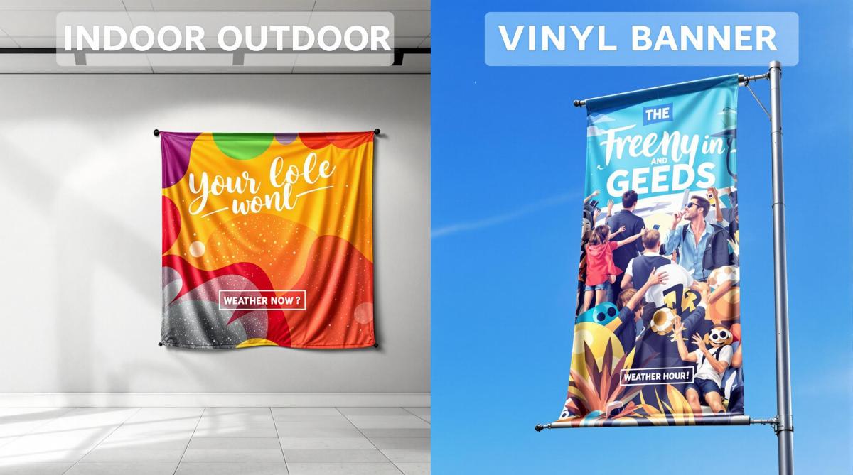
Learn the key differences between indoor and outdoor banners, including materials, design requirements, and best use cases for effective advertising.
Choosing the right banner depends on where it will be displayed and its purpose. Here’s a quick breakdown:
Indoor Banners: Best for controlled environments like trade shows or retail stores. Made from lightweight materials like fabric or standard vinyl, they allow for detailed designs, smaller text, and interactive elements (e.g., QR codes). They’re not weatherproof and are ideal for close-range viewing.
Outdoor Banners: Designed for durability in harsh weather conditions. Made from reinforced vinyl or mesh, they feature bold designs, large fonts, and UV-resistant inks for visibility from a distance. These banners are built to last and withstand wind, rain, and sunlight.
Quick Comparison
Feature
Indoor Banners
Outdoor Banners
Material
Lightweight vinyl, fabric
Reinforced vinyl, mesh
Durability
Short-term, indoor use
Long-term, weatherproof
Design
Detailed, small text
Bold, large fonts
Viewing Distance
Close range
Long distance
Best Uses
Trade shows, retail spaces
Storefronts, events, highways
Use indoor banners for detailed, up-close messaging in controlled settings. Opt for outdoor banners when visibility and durability in tough conditions are key.
Indoor and Outdoor Vinyl Banners
Materials and Durability
The type of material used for banners plays a big role in how well they perform and how long they last.
Indoor Banner Materials
Indoor banners are usually made from fabric or vinyl designed for sharp, high-resolution printing in controlled environments. Polyester blends are a common choice for fabric banners because they resist wrinkles and work well for detailed printing. These are popular for trade shows and retail displays.
Outdoor Banner Materials
Outdoor banners need tougher materials to handle harsh weather conditions like sun, wind, and rain. Heavy-duty vinyl and mesh banners are the go-to options. Heavy vinyl is great for street-facing displays due to its resistance to UV rays and water. Mesh banners, with their perforated design, are ideal for windy areas as they allow air to pass through.
Material Type
Best Used For
Key Features
Heavy Vinyl
Street-facing displays
UV-resistant, waterproof
Mesh Banner
Windy locations
Allows air to pass through
Lifespan and Wear
Indoor and outdoor banners differ significantly in how long they last. Indoor banners usually hold up for a few months to a year, while outdoor banners can last several years if cared for properly. Factors like UV exposure (which causes fading), extreme temperatures (leading to warping), moisture (causing material breakdown), and poor mounting can all shorten a banner’s lifespan.
For outdoor use, experts recommend adding features like reinforced edges and wind slits to reduce weather damage. Professionals from companies like Miro Printing & Graphics Inc. (https://bergencountyprinters.com) stress that choosing the right materials and structural reinforcements is essential for long-lasting results.
With the right materials in place, the next step is designing a banner that fits its environment. Material selection sets the stage for creating a functional and visually effective design, as we’ll explore in the following section.
Design Requirements
When creating banners, it’s important to consider both material durability and how the design fits the environment where the banner will be displayed.
Indoor Design Specs
Indoor banners are seen up close, often under controlled lighting. This allows for detailed designs, including intricate graphics, small text, and subtle color gradients. Features like QR codes and social media handles work well here since viewers can interact with them easily.
Outdoor Design Specs
Outdoor banners need to stand out from a distance. This means using bold, large fonts and high-contrast colors. Professionals like Miro Printing & Graphics Inc. recommend UV-resistant inks to keep colors vibrant despite exposure to sunlight and weather.
Design Selection Guide
To choose the right design, think about:
Viewing Context: How far away and at what angle will people see the banner?
Environmental Conditions: Will it face bright sunlight, rain, or other weather challenges?
Message Priority: Focus on one clear message for outdoor banners, while indoor banners can include more details.
These design principles help lay the groundwork for determining the best banner placement, which will be covered next.
Setup and Location
The success of a banner often depends on where it’s placed.
Indoor Locations
Indoor banners work best in spaces where the environment is controlled, like trade shows, retail stores, or corporate lobbies. For maximum impact, position them at eye level in well-lit areas. This ensures they grab attention and are easy to read.
Lightweight polyester banners are a great choice for temporary setups. They’re easy to install and give a polished look.
Outdoor Locations
Outdoor banners need a bit more planning to handle weather changes and longer viewing distances. High-traffic spots like storefronts or event venues are ideal, but you’ll need materials that can stand up to the elements. Here are some key factors to consider:
Factor
Challenge
Best Solution
Sun Exposure
UV damage risk
UV-resistant vinyl
Wind Impact
Risk of tearing
Mesh banners for airflow
Viewing Distance
Need for visibility
Larger size, bold design
Traffic Flow
Audience movement
Place at strategic angles
Location Tips
For indoor banners, choose spots where people naturally stop, like near registration desks or information booths. This gives them time to take in the details or interact with features like QR codes.
For outdoor banners, think about the sun’s position throughout the day to avoid glare, ensuring your message remains clear and visible.
sbb-itb-ce53437
Quick Reference Chart
Here’s a handy comparison to help you decide between indoor and outdoor banners based on your specific needs.
Feature Comparison
Feature
Indoor Banners
Outdoor Banners
Material
Lightweight vinyl, fabric
Reinforced vinyl, mesh
Durability
Best for controlled indoor settings
Built to handle outdoor weather
Weather Resistance
Minimal protection for indoor use
Resistant to sun, rain, and other elements
Design Elements
Detailed graphics, smaller text (e.g., QR codes)
Bold fonts, simple graphics for visibility
Viewing Distance
Great for close-up viewing
Easy to read from far away
Installation
Simple hanging options
Requires sturdy mounting hardware
Best Uses
Trade shows, retail displays, corporate events
Storefronts, outdoor events, highway signs
When choosing a banner, match it to its environment. For indoor use, go with lightweight vinyl or fabric for detailed designs under controlled lighting. For outdoor settings, opt for reinforced materials or mesh to handle weather and ensure clear visibility from a distance. This guide sets you up to make the right choice in the next steps.
Banner Selection Guide
Location Analysis
Think about where your banner will be displayed. Consider the height of ceilings, wall sizes, and lighting conditions. For trade shows, banners should be visible from moderate distances, while retail displays work best at eye level. Outdoor banners need to handle wind, sunlight, and varied viewing angles, especially in high-traffic areas.
Goal Setting
Your banner choice should align with your advertising goals and the duration of your campaign. Temporary indoor promotions benefit from lightweight vinyl, which offers sharp and detailed visuals. Long-term outdoor banners, on the other hand, need sturdier materials like reinforced vinyl or mesh to endure weather conditions while staying visually appealing.
Goal
Recommended Banner Type
Key Considerations
Trade Show Display (short-term)
Indoor Fabric
Easy to set up, wrinkle-free, professional look
Seasonal Retail Promotion
Indoor Vinyl
Great for detailed graphics and budget-friendly
Storefront Advertising
Outdoor Mesh
Resists wind, UV-protected, and highly visible
Construction Site Signage
Heavy-duty Outdoor Vinyl
Extremely durable and weatherproof
Once your goals are clear, the next step is finding the right print shop to bring your vision to life.
Print Shop Selection
Choose a reliable print shop to ensure your banner is both high-quality and durable. Experienced printers can guide you on materials and technical details. For instance, Miro Printing & Graphics Inc. in Hackensack, NJ, specializes in large format printing and offers in-house design support to fine-tune banners for both indoor and outdoor use.
When evaluating a printer, check if they provide material samples, mounting hardware options, installation tips, color matching, and guarantees on durability. Local printers with knowledge of regional weather conditions are particularly helpful. For example, in windy areas, mesh banners with wind slits often outperform solid vinyl while still standing out visually.
Conclusion
Choose your banner based on the materials, design needs, and where it will be displayed. Indoor banners are typically made from lightweight vinyl or fabric, making them ideal for controlled spaces. On the other hand, outdoor banners require tougher materials to withstand external conditions, which can impact their lifespan and design clarity.
The design approach also varies. Indoor banners can feature detailed graphics since they’re viewed up close. Outdoor banners, however, work best with bold, simple designs and larger fonts to ensure they’re readable from a distance.
Think about the environment where the banner will be displayed. Indoor banners thrive in stable settings with consistent lighting and predictable viewing distances. Outdoor banners, however, need to handle weather changes and other unpredictable factors.
Durability is another key factor. While indoor banners may seem like the cheaper option upfront, outdoor banners often save money in the long run because they’re built to resist harsh weather conditions.
FAQs
Here are quick answers to common questions about the differences and key considerations for indoor and outdoor banners.
What sets indoor and outdoor banners apart?
Indoor banners are typically made from scrim vinyl, a lighter material suited for controlled environments. Outdoor banners, on the other hand, use blackout vinyl, which is sturdier and designed to withstand weather conditions.
How do design needs differ for indoor vs. outdoor banners?
Indoor banners can feature intricate graphics and smaller text since they are viewed up close. Outdoor banners require bold, straightforward designs with larger fonts to ensure visibility from a distance and in varying lighting conditions.
What affects the lifespan of a banner?
Indoor banners can last for several years with proper care. Outdoor banners are crafted for tougher environments, often featuring UV-resistant coatings and added reinforcements to extend their durability.
How do I decide between indoor and outdoor banners?
Think about these aspects:
Location: Will the banner be in a controlled indoor space or exposed to outdoor elements?
Viewing Distance: Is it meant for close-up viewing or to catch attention from afar?
Duration: Is it for a short-term event or a long-term display?
Budget: Weigh the initial investment against how long you need the banner to last.
Where are indoor and outdoor banners most effective?
Indoor banners work great for:
Trade shows
Retail spaces
Conference rooms
Shopping malls
Outdoor banners shine in places like:
Building exteriors
Event venues
Street advertising spots
Sports arenas
"A professional print shop can provide expert advice on material selection, design considerations, and installation methods tailored to the specific needs of the business, ensuring that the chosen banner effectively meets the advertising goals", says Miro Printing & Graphics Inc., a full-service print shop specializing in both indoor and outdoor banners.
Learn how grid systems enhance print design with organization, readability, and visual appeal across various formats.
Grid systems are essential for creating clear and organized print designs. They use columns, rows, margins, and gutters to structure layouts, improving readability and visual appeal. Here’s a quick overview of what you’ll learn about grid systems:
What They Are: Frameworks of intersecting lines to guide content placement.
Benefits: Consistency, readability, professional looks, and efficiency.
Setup Tips: Use tools like Adobe InDesign, test across formats, and avoid common mistakes like misaligned elements or poor spacing.
Advanced Techniques: Modular grids for magazines, print-to-digital grids, and case studies like Miro Printing & Graphics Inc.
Grid systems streamline the design process and ensure your print materials look polished and professional.
The Missing Guide to Grid Systems
Grid System Categories
Grid systems in print design are divided into specific types, each suited to different kinds of projects. These systems serve as the foundation for creating organized and visually appealing layouts.
Single-Column Grids
Single-column grids provide a straightforward layout, making them ideal for text-heavy documents. They keep the reader’s attention on the content by reducing visual distractions. This design works well for materials like books, reports, and academic papers, where a clear reading flow is essential. For instance, Miro Printing & Graphics Inc. uses single-column grids in book printing to ensure easy readability.
Multi-Column Grids
Multi-column grids are perfect for more intricate layouts, commonly used in newspapers, magazines, and promotional materials. By dividing the page into multiple columns, designers can organize content effectively. For example, a 6-column grid is frequently used in newspaper layouts to structure stories clearly. A great example of this approach is The Guardian‘s 2018 redesign, which used a modular grid to give each section its own style while maintaining the overall brand’s visual identity.
Combined Row-Column Grids
Combined row-column grids add both horizontal and vertical divisions, allowing for precise placement of design elements. These grids are especially useful for layouts where content flows in multiple directions, such as annual reports, catalogs, or magazine spreads. In modern magazine design, this type of grid helps balance text and images, establish visual hierarchy, and maintain consistent spacing. Designers typically start with a base grid and adjust it to meet the specific needs of the project.
Grid System Setup and Use
Building Your Grid
Start by setting the dimensions, margins, and gutters to create a layout that’s easy to read. Tools like Adobe InDesign allow you to customize columns, gutter widths, and margins to fit your needs. For instance, magazine layouts often use moderate gutter widths to balance readability and space efficiency. Adjust your grid setup based on the specific demands of each project.
Grid Use by Project Type
Different print materials require different grid systems. Here’s how they align:
Project Type
Grid Type
Key Considerations
Magazines
Multi-column grid
Enables flexible layouts with varied column combinations
Books
Single-column grid
Prioritizes readability with uniform margins
Brochures
Modular or combined grid
Balances text and visuals for an engaging layout
Posters
Hierarchical grid
Offers creative flexibility while keeping structure intact
Grid Design Software
Creating effective grids often involves specialized tools. Adobe InDesign is a top choice for professional designers, offering advanced features like column spanning for complex layouts. If you’re looking for a budget-friendly option, Affinity Publisher provides similar functionality with an easier learning curve, making it great for simpler projects.
Consistent spacing is key to a polished design. Professional printers like Miro Printing & Graphics Inc. (https://bergencountyprinters.com) highlight how a well-structured grid can simplify production and reduce printing errors.
Before finalizing your design, test your grid system on different print formats. This step helps catch potential issues early and ensures your layout works well across various sizes and formats.
sbb-itb-ce53437
Grid System Standards
Keeping Grids Uniform
Establish a master grid template with consistent margins, gutters, and column widths. This approach ensures a visually balanced design across your project and simplifies the layout process. For multi-page documents, using baseline grids to align text across pages improves readability and gives your design a polished, professional feel.
Adjusting Grids by Format
Adapt grid settings to fit the specific needs of each format. For instance, magazine layouts often work well with flexible, multi-column grids and wider gutters, while business cards and brochures need simpler grids with tighter margins. Large-format posters, on the other hand, may require larger margins to keep content easy to read from a distance. Adjusting column widths and spacing based on the format’s size helps maintain a well-organized and visually pleasing design. Proper adjustments also help avoid layout issues.
Common Grid Mistakes
Knowing common grid mistakes can save you from design headaches later. Misaligned elements, for example, can make your layout look messy and unprofessional. Similarly, poorly planned gutter spacing – whether too narrow or too wide – can either clutter your design or waste space. Another frequent issue is breaking the grid without purpose. While intentional grid breaks can enhance a design, random deviations often lead to visual chaos. Failing to adjust grids for various formats can also result in mismatched and awkward layouts.
Expert Grid Techniques
Taking grid design to the next level, advanced techniques help create layouts that handle the challenges of complex publications.
Magazine Grid Systems
Magazine layouts demand grids that combine visual appeal with easy readability. A modular grid approach works well here – using primary grids for main content, secondary grids for elements like captions and sidebars, and a baseline grid to keep text aligned. This setup creates dynamic spreads that naturally guide the reader’s eye.
Some key points to keep in mind: wider gutters improve readability, flexible columns allow for varied content arrangements, and strategic image placement adds balance without disrupting harmony.
Print-to-Digital Grids
Creating grids that work across both print and digital platforms requires careful planning. For example, The New York Times uses a grid system that ensures a consistent look while adapting to different screen sizes and print formats.
For print, fixed measurements are used, while digital grids rely on percentage-based widths, responsive padding, scalable typography, and fluid image containers. These methods make grids flexible enough to handle real-world design challenges, as we’ll see in the case study below.
Case Study: Miro Printing & Graphics Inc.
Miro Printing & Graphics Inc. showcases how advanced grid systems can be tailored to a wide range of print projects. From simple single-column layouts for business cards to intricate multi-column grids for catalogs and booklets, their approach is customized for each project.
Their success lies in using consistent baseline grids for alignment across multi-page documents and modular frameworks that adapt to different content needs.
"Studies have shown that designs with a structured layout can improve comprehensibility for the user by up to 50%."
For complex projects like catalogs or brochures, Miro often employs hierarchical grid systems. These create clear visual pathways while keeping the design structured. Their large-format printing services further highlight how well-designed grids can maintain readability and visual impact, even at different viewing distances.
Summary
Grid systems are the backbone of print design, providing structure and clarity. Here’s a closer look at their benefits and practical tips for effective implementation. These insights expand on the grid concepts introduced earlier.
Grid System Benefits
Grid systems have been shaping print design since the 15th century. Visionaries like Jan Tschichold and Josef Müller-Brockmann introduced methods that still guide modern designs. A great example is The Guardian’s 2018 redesign, which used a modular grid to achieve balance and improve readability.
Benefit
How It Helps
Visual Hierarchy
Organizes content clearly, making information easier to follow
Consistency
Keeps layouts uniform across multiple pages
Efficiency
Speeds up the design process by providing a reliable framework
Flexibility
Supports varied content arrangements without losing structure
Tips for Using Grid Systems
To get the most out of your grid system, try these practical tips:
Match the grid to your content: Use manuscript grids for text-heavy projects or modular grids for more intricate layouts, like those seen in Miro Printing & Graphics Inc.’s catalogs.
Leverage design tools: Programs like Adobe InDesign can simplify layout creation, ensuring technology enhances your design rather than restricts it.
Keep baseline grids consistent: While maintaining alignment, allow for some flexibility to balance structure with creativity.
Use white space wisely: Strategic margins and gutters can make your design more readable and visually pleasing.
"Studies have shown that designs with a structured layout can improve comprehensibility for the user by up to 50%."
FAQs
Here are answers to common questions about grid types and standard layouts in print design.
What are the different types of image grids?
Print design typically utilizes five main grid types, each tailored for specific layout needs. These grids help structure content effectively in various print materials.
Grid Type
Best Used For
Key Characteristic
Manuscript
Books, reports
Single-column layout
Column
Magazines, newspapers
Vertical divisions
Modular
Complex layouts
Combines horizontal and vertical divisions
Hierarchical
Custom designs
Structure based on content needs
Baseline
Text alignment
Ensures consistent typography
What is the standard grid layout?
A standard grid includes three main components: columns to create vertical structure, gutters to separate the content, and margins to frame the page. Professional print shops, like Miro Printing & Graphics Inc., often adjust these elements to fit specific project needs. For more technical details, check out the guide Grid System Setup and Use.
Learn effective strategies to cut print marketing costs while maintaining quality, using materials wisely and leveraging local services.
Print marketing can be cost-effective if you use the right strategies. Here’s how to save money without sacrificing quality:
Choose Affordable Materials: Opt for uncoated or matte paper and simpler finishes like folding instead of expensive options like foil stamping.
Print in Bulk: Larger orders reduce per-unit costs, but plan carefully to avoid waste.
Simplify Designs: Use standard sizes, lighter paper weights, and fewer graphics to lower expenses.
Work with Local Printers: Save on shipping, reduce turnaround times, and get personalized service.
Use Print-on-Demand: Avoid waste and storage costs by printing only what you need, when you need it.
Combine Print Jobs: Group similar projects to cut setup costs and reduce waste.
These methods can cut costs by up to 50% and minimize waste by 30%. Partnering with local print shops, like Miro Printing & Graphics Inc., can further streamline your efforts and improve efficiency.
5 Simple Tips to Reduce Printing Costs
Choosing Cost-Effective Print Materials
Making smart choices about materials can significantly lower print marketing costs. By understanding paper options, bulk pricing, and design strategies, businesses can save money while maintaining a professional look. Let’s break down these key factors.
Paper Types and Finish Options
Your choice of paper and finish has a direct impact on both cost and presentation. For example, matte or uncoated paper is often more affordable than glossy or coated paper, yet still looks polished. Similarly, simpler finishes like folding and stapling cost less than options like die-cutting or foil stamping.
Here’s a quick comparison of paper and finish options based on cost and use:
Paper/Finish Type
Cost Level
Best Used For
Uncoated House Stock
Low
Flyers, internal documents, newsletters
Matte Standard
Medium
Brochures, presentations, catalogs
Coated Premium
High
High-end marketing materials, annual reports
Volume Discounts and Bulk Orders
Printing in bulk can drastically cut costs by spreading setup expenses across a larger quantity. For example, printing 5,000 brochures might cost nearly the same as printing 2,500, cutting the per-unit cost in half.
When planning bulk orders, keep these factors in mind:
Storage space for your materials
Seasonal updates that might require changes to your content
Distribution timeline to ensure materials stay relevant
These considerations help you avoid waste while taking full advantage of bulk pricing.
Cost-Saving Design Tips
Thoughtful design choices can also help trim printing costs. Here are some effective strategies:
Opt for standard sizes to reduce paper waste
Keep graphics simple to save on ink
Choose house stock paper from your printer’s inventory
Use lighter basis weight when suitable for the project
Plan for gang-run printing to combine multiple items in one print job
Don’t hesitate to consult your print shop for advice – they can often suggest additional ways to save without compromising quality.
Working with Local Print Shops
Local print shops can help you save on print marketing expenses while providing personalized service and quicker turnarounds.
Why Choose Local Printing?
Local printing can cut costs in a few important ways:
Lower shipping expenses by avoiding long-distance delivery.
Faster turnaround times that help you skip rush fees.
In-person reviews to catch errors early, reducing the risk of costly reprints.
On top of these savings, visiting a local shop for hands-on consultations ensures your final product matches your expectations.
Partnering with Miro Printing & Graphics Inc.
If you’re in Hackensack, NJ, Miro Printing & Graphics Inc. is a great example of what a local print shop can offer. They cover a wide range of needs – digital printing, offset printing, and large-format printing – so you can handle all your projects with one provider.
Their in-house bindery and design services simplify the process even further. Instead of juggling multiple vendors for design, printing, and finishing, you can rely on Miro for everything. This approach not only saves time but also reduces costs. Some of their standout services include:
Digital printing for small, budget-friendly runs.
Offset printing for cost-efficient bulk orders.
In-house bindery to avoid extra finishing charges.
Integrated mailing and fulfillment to streamline distribution.
When choosing a local print shop, look for one that offers a full suite of services tailored to your needs. This can help you avoid coordination headaches and build a strong, long-term partnership – often leading to better pricing and faster service for urgent projects.
Working with local print shops is a smart way to cut print marketing costs while maintaining quality and convenience.
sbb-itb-ce53437
Money-Saving Print Methods
Smart printing techniques can help reduce marketing expenses when paired with thoughtful material choices and local service strategies.
Print on Demand Benefits
Print-on-demand eliminates storage costs and waste by producing materials only when needed. This approach is perfect for targeted efforts, like sending personalized direct mail to shoppers who abandoned their carts. Plus, automation can cut manual tasks by up to 80%, streamlining processes such as list management and variable data printing (VDP).
By focusing on high-value prospects, such as those who left items in their shopping carts, businesses can create more impactful campaigns while saving time and resources.
Combining Print Jobs
Batch printing is another way to save time and reduce material waste by grouping similar projects together.
Here are some ways to combine print jobs effectively:
Print Job Type
Combination Strategy
Cost-Saving Benefit
Marketing Materials
Group seasonal campaigns
Cuts setup time and reduces material waste
Business Essentials
Combine letterhead, envelopes, etc.
Shares paper stock and press setup
Direct Mail
Batch similar-sized mailers
Lowers postal rates and boosts efficiency
Using pre-printed templates (also known as "shells") allows for quick, on-demand customization, saving even more time and money.
Web2Print platforms simplify the process of managing combined print jobs. These tools help businesses track inventory, coordinate batch printing, and maintain consistent quality across materials. By using these systems, companies can better manage their printing budgets while improving the effectiveness of their marketing efforts.
Work closely with your print provider to group projects and schedule print runs strategically. These cost-saving methods will also complement the distribution strategies covered in the next section.
Smart Distribution Methods
By combining cost-effective materials with local printing, well-thought-out distribution can cut waste and make campaigns more impactful.
Focused Marketing Campaigns
Instead of blanketing everyone with your message, zero in on high-value customer segments using data. This not only lowers costs but also boosts response rates. Think about seasonal trends and customer habits – like timing print runs to match busy shopping seasons for retail or syncing distribution with key industry events for B2B. Placement matters too – where you put your materials can make or break engagement.
Effective Material Placement
Put your printed materials where your audience is already spending time. For example, local businesses can team up with complementary establishments – like leaving gym brochures at health food stores or placing restaurant menus in nearby hotels.
Some smart placement ideas include:
High-Traffic Areas: Focus on spots where your audience naturally gathers.
Complementary Locations: Partner with businesses that serve a similar crowd.
Seasonal or Event-Based Timing: Distribute materials during peak times or related events.
Keep an eye on how people respond and adjust your locations as needed. Using local insights and staying flexible can help you get the most out of your efforts.
Conclusion: Print Cost Reduction Tips
Effective print marketing doesn’t have to break the bank. Partnering with local print shops, like Miro Printing & Graphics Inc. in Hackensack, NJ, can save you money while delivering professional results. Local providers eliminate shipping fees and offer services like in-house bindery and design consultations, making the entire process smoother and more affordable.
Studies suggest that combining bulk printing with print-on-demand services can cut costs by up to 50%, reduce waste by 30%, and boost efficiency. To maximize savings, focus on using budget-friendly materials, consolidating print jobs, and working with local experts. By making smart material choices and tapping into nearby resources, you can ensure every printed piece adds value to your business.
FAQs
How can I save the cost of printing?
Here’s a quick summary of effective ways to cut your printing expenses:
Opt for lighter, more affordable paper options.
Combine multiple projects into a single bulk print run to save on setup fees.
Work with local printers like Miro Printing & Graphics Inc. to lower shipping costs and get personalized service.
Use print-on-demand to produce materials only when needed.
Automate processes to reduce manual effort and improve efficiency.
Take advantage of Web2Print platforms to better manage inventory and avoid waste.
These strategies help you stretch your budget while still delivering high-quality print materials.
Learn to create precise die-cut templates for printing, ensuring accuracy and professionalism in your custom designs.
Die-cut templates are essential for creating custom shapes in printed products like business cards, packaging, and promotional materials. Here’s how to create them effectively:
Set Up Your Document: Use CMYK color mode, 300 DPI resolution, and include a 0.125-inch bleed area.
Organize Layers: Separate artwork, cut lines, fold lines, and guidelines with clear names and color codes (e.g., magenta for cut lines, cyan for folds).
Add Key Details: Include registration marks, safe zones, and perforation lines for accuracy.
Final Checklist: Ensure 300 DPI resolution, CMYK color mode, outlined fonts, proper bleed, and overprint settings before exporting as PDF/X-4.
Quick Tip: Mistakes like incorrect spot colors, missing bleed, or complex cutting patterns can lead to costly errors. Test your design with a physical prototype and consult a print shop for professional guidance.
Want precise results? Follow these steps and communicate early with your print provider to ensure your design meets production standards.
Pick software that aligns with your project’s complexity and technical requirements.
Popular Software and Their Features
Adobe Illustrator is a go-to for intricate commercial die-cut templates. Its vector-based tools allow for precise control over shapes and paths, which is critical for accurate die lines. Adobe InDesign is ideal for multi-page layouts or text-heavy designs, while Silhouette Studio is a user-friendly option for simpler, smaller-scale projects.
Software
Best For
Key Features
Learning Curve
Adobe Illustrator
Complex commercial designs
Precise vector tools and advanced path control
High
Adobe InDesign
Multi-page layouts
Excellent text handling and master pages
Medium
Silhouette Studio
Craft and small projects
Pre-set cutting tools and simple interface
Low
Adobe Creative Cloud tools like Illustrator and InDesign dominate the market, used by 90% of creative professionals[4]. Once you’ve selected your software, the next step is preparing your document for print.
Setting Up Your Document
Start a new document with these key settings:
Color Mode: CMYK
Resolution: Minimum 300 DPI
Bleed: Add 0.125 inches (3mm) beyond cut lines
Document Size: Include the bleed area in your dimensions
To keep your project organized and professional, use a clear layer system:
Layer Type
Purpose
Color Coding
Artwork
Main design elements
CMYK values
Cut Lines
Paths for die-cutting
100% magenta
Fold Lines
Crease locations
100% cyan
Guidelines
Safe zones and measurements
Non-printing
Miro Printing & Graphics Inc. advises saving your templates as AI, EPS, or PDF files with all layers intact. This ensures compatibility with die-cutting equipment and allows for easy adjustments if needed.
Step 2: Build Your Template
Set Up Design Layers
Start by organizing your template with a clear layer hierarchy. A well-structured system makes your design process smoother and helps avoid mistakes during revisions.
Layer Name
Purpose
Color Coding
Line Style
Artwork
Design elements and graphics
CMYK values
N/A
Cut Lines
Material cutting paths
100% magenta
Solid, 0.25pt
Fold Lines
Crease and fold locations
100% cyan
Dashed, 0.25pt
Glue Tabs
Adhesive areas
20% black
Dotted, 0.25pt
Perforations
Tear lines
100% yellow
Long-short dash
Lock layers you’re not actively working on and use clear, descriptive names for each. For glue tabs, aim for a width of 0.5–1 inch and consider slightly rounded corners for better usability. If your design involves intricate folds, adjust the panel widths to account for the material’s thickness where folds occur.
Add Print Marks and Bleed
Once your layers are set up, focus on adding print marks and bleed areas. These details are essential for precision. Extend background elements 0.125 inches (3 mm) beyond the cut line, or up to 0.25 inches (6 mm) for more intricate shapes.
Create a "safe zone" by keeping key design elements at least 0.125 inches (3 mm) inside the cut lines. This ensures that important details, like text, remain intact and legible after folding and assembly.
In January 2022, BoxMaker, a packaging design firm, streamlined their process by introducing standardized layer structures for die-cut designs. Led by Senior Designer Mark Johnson, the team created templates with pre-defined layers for cut lines, artwork, and bleed areas. This approach cut their template creation time by 40%, reduced pre-press errors by 25%, and sped up client approvals. (Source: PackagingWorld.com, 2022 Case Studies)
For registration marks:
Place at least three marks near the corners of your artwork.
Use 100% black for maximum visibility.
Position marks 0.25 inches (6 mm) from the trim lines.
Keep placement consistent across all layers.
When working with perforations, align them with the paper grain for smoother tears. End perforation lines just before the edges to maintain the structure of your design. Test the perforation patterns to ensure they balance ease of tearing with durability.
sbb-itb-ce53437
Step 3: Print Preparation
Now that your design is structured, it’s time to focus on the final steps to ensure your file is ready for production.
Final Template Checklist
Before submitting your die-cut template, double-check these key elements:
Element
Requirement
Common Issues
Resolution
300 DPI minimum
Pixelation in the final print
Die Lines
Spot color, overprint enabled
Knockout issues, misalignment
Fonts
Outlined or embedded
Missing characters, substitution
Bleed Area
1/8 inch (3mm) extension
White edges after cutting
Color Mode
CMYK for artwork
Incorrect color reproduction
Make sure all raster images have a resolution of 300 DPI to avoid blurry prints [1]. Convert your file’s color mode to CMYK, and define spot colors – especially for die lines – as 100% magenta or the specific PMS color required by your print shop [2]. Double-check your overprint settings for die lines to prevent unwanted knockouts in the final print [5].
File Export Guidelines
Once your template passes the checklist, export it properly to maintain quality and accuracy.
Export your file as PDF/X-4, which preserves transparency, layer details, and color consistency [1]. Use these settings for the best results:
PDF compatibility: Acrobat 7 (PDF 1.6) or higher
Image compression: 300 ppi for color and grayscale, 1200 ppi for monochrome [1]
Overprint settings: Enable overprint and Illustrator editing capabilities [5]
Fonts: Embed fonts or convert text to outlines [1]
Marks and bleed: Include trim marks and document bleed settings
Color conversion: Select "No Color Conversion"
Transparency: Use the "High Resolution" transparency flattener preset
Layers: Preserve layers if your printer requires them
For intricate projects that involve special finishes, consider consulting a professional print shop like Miro Printing & Graphics Inc.. They can provide customized templates and ensure your die-cut design meets production standards.
Prevent Template Errors
Before finalizing your project, double-check both the design details and material choices to avoid costly production mistakes.
Design Problems to Check
Mistakes in die-cut templates can lead to expensive errors. Here’s a quick guide to common issues and how to address them:
Design Element
Common Error
Prevention Method
Dielines
Incorrect spot colors or weights
Use standard magenta for cut lines and cyan for folds [2]
For example, in June 2022, a beverage company had to discard 50,000 misaligned boxes, resulting in a $75,000 loss (PrintWeek Magazine, August 2022).
To avoid similar issues, use your design software’s outline view to spot hidden elements [1]. For intricate designs, request a physical prototype to ensure everything aligns properly [3].
Once you’ve addressed design concerns, turn your attention to the materials you plan to use.
Material Selection Issues
When selecting materials, keep these key factors in mind:
Paper Stock
Coated paper requires different cutting pressures compared to uncoated stock [3].
Material thickness can impact the size of cut-outs [3].
Some materials may stretch or warp during cutting, so adjust your design accordingly [3].
Testing
Create mock-ups using a desktop cutter for early validation [3].
Test complex designs with printed proofs on the actual production material [1][3].
Working with a professional print provider, like Miro Printing & Graphics Inc., can help you navigate these challenges. Their expertise is especially useful when dealing with specialty materials that need specific die types or cutting pressures.
Clear communication with your print shop about material specs and finishing requirements is crucial. This ensures your design aligns with the material’s limitations and the production process.
Print Shop Services
Professional print services play a crucial role in managing complex die-cut projects, helping you avoid common production challenges.
When it comes to working with die-cut templates, professional print shops offer several key advantages:
Service Aspect
Benefit
Technical Consideration
Design Review
Expert assessment of template feasibility
Ensures compatibility with die-cutting equipment
Material Consultation
Advice on the best substrate to use
Matches paper type to cutting needs
Quality Control
Careful proofing
Reduces risk of production errors
Production Efficiency
Use of industrial-grade equipment
Delivers precise, consistent results for large runs
Miro Printing & Graphics Inc. stands out by integrating specialized die-cutting into its in-house bindery, ensuring smooth quality control from the design phase to the final cut.
To make the most of professional print services, you should:
Provide print-ready files that meet the shop’s specifications.
Confirm the best paper stock and finishing options for your project.
Allow enough time for proofing and production to ensure a flawless outcome.
For more intricate projects, involving a print service early in the design process can save both time and money. Their expertise in materials and cutting techniques helps refine your template design, avoiding potential production hiccups.
Conclusion: Die-Cut Template Success Tips
Creating successful die-cut templates requires careful design and precise execution. Using professional design software helps ensure accurate template preparation.
Keep all die lines on a separate layer and set the transparency to "Multiply." This avoids white lines interfering with the final print. Use solid lines for cutting paths and dotted lines for folds, making sure every element is functional and clear [1]. Here’s a quick checklist to guide you through the process:
Phase
Key Action
Important Consideration
Setup
Match print specs
Align with exact project dimensions
Design
Separate artwork layers
Keep die-cut lines distinct from other design elements
Proofing
Create full-scale mock-up
Test the design’s practicality before production
Materials
Choose proper stock
Ensure the substrate works well with cutting requirements
To achieve sharp and accurate results, use brass or copper dies combined with appropriate paper stocks [1]. For intricate designs, it’s a smart move to involve print experts early on to confirm feasibility and avoid production issues.
Explore the differences between biodegradable and compostable printing materials, their environmental impacts, and suitable applications for businesses.
Biodegradable and compostable printing materials are often confused, but they serve different purposes. Here’s a quick breakdown:
Biodegradable materials: Break down naturally with microorganisms over months or years. May leave residues like microplastics and don’t always require specific conditions.
Compostable materials: Fully decompose into non-toxic components (like water and biomass) within 90-180 days in industrial composting facilities. Require controlled conditions like heat, humidity, and aeration.
Quick Comparison
Characteristic
Biodegradable Materials
Compostable Materials
Raw Materials
May include petroleum-based additives
Typically plant-based (e.g., corn, sugarcane)
Breakdown Time
Months to years
90-180 days under proper conditions
End Result
May leave microplastics or residues
Fully decomposes into soil-enriching elements
Certification
Few or no standards
Requires certifications (ASTM D6400, EN 13432)
Disposal Method
Regular waste streams
Needs industrial composting facilities
Environmental Impact
May release methane in landfills
Enriches soil when composted correctly
Businesses should choose based on their needs, disposal infrastructure, and environmental goals. Compostable options are ideal for food-related or zero-waste projects, while biodegradable options work for broader use cases but may have higher environmental risks.
Basic Differences: Biodegradable vs. Compostable
Biodegradable Materials Explained
Biodegradable materials break down with the help of microorganisms, moisture, and oxygen. They can decompose in different environments, but the process may take anywhere from a few months to several years. For example, biodegradable inks often include petroleum-based resins with additives to speed up the process[2], while biodegradable papers rely on natural fibers for quicker breakdown.
A biodegradable plastic film used in printing might degrade within 3-6 months under ideal conditions. However, in a landfill, it could last much longer[1]. Even when these materials break down, they may leave behind microplastics or other residues. In comparison, compostable materials require specific conditions to fully decompose.
Compostable Materials Explained
Compostable materials need controlled settings to break down completely. These settings are typically found in industrial composting facilities, where specific conditions are maintained:
Requirement
Specification
Temperature
50-60°C (122-140°F)
Environment
Controlled humidity
Process
Proper aeration
Breakdown Period
90-180 days
Certification
ASTM D6400 or EN 13432
One example is Burton’s Biscuit Company, which uses compostable packaging made from wood pulp and corn starch. This material, certified to EN 13432, decomposes within 26 weeks in industrial composting facilities. By adopting this approach, the company has reduced its plastic use by 61 tonnes per year[4]. Such certifications ensure compostable materials meet strict standards, making them an attractive option for businesses aiming to minimize waste.
Side-by-Side Comparison
Here’s a quick look at how biodegradable and compostable materials differ:
Characteristic
Biodegradable Materials
Compostable Materials
Raw Materials
May include petroleum-based components with additives
The main difference lies in the decomposition process. Biodegradable materials can break down in a variety of environments but might leave harmful residues. Compostable materials, on the other hand, are designed to decompose completely under specific conditions, leaving nothing toxic behind[6]. This makes compostable options especially appealing for zero-waste goals and businesses with access to industrial composting systems.
Biodegradable vs Compostable Food Packaging: What’s The Difference?
Effects on the Environment
The environmental impact of biodegradable and compostable materials sets them apart even further, especially when considering their breakdown processes, production, and chemical effects.
Breakdown Process and Results
Biodegradable materials decompose naturally but often under anaerobic conditions in landfills. This can lead to the release of methane – a greenhouse gas far more potent than CO2 – and leave behind microplastics or toxic residues[1]. In contrast, compostable materials, when processed in dedicated composting facilities, fully break down and contribute to soil health by enriching it with nutrients[1][3].
Production Requirements
Compostable materials are usually made from renewable sources like corn, cassava, and sugar cane[2]. A prime example is PLA (Polylactic Acid), which is created by fermenting plant starch into lactic acid. This process results in a lower environmental impact:
Production Aspect
Environmental Impact
Raw Materials
Sourced from renewable plants
Energy Usage
Reduced carbon emissions compared to plastics
Resource Consumption
Limited reliance on non-renewable resources
Waste Generation
Produces less manufacturing waste
Biodegradable materials, however, can be derived from a wider range of sources, including petroleum-based plastics with added chemicals[1]. While they may use fewer resources than traditional plastics, their overall environmental impact is higher compared to compostable options[2].
Chemical Impact
The chemical differences during decomposition are also notable. Biodegradable materials can emit methane, release microplastics, and leach harmful additives. Certified compostable materials, on the other hand, break down into water, CO2, and biomass without leaving harmful residues[1][3].
Research into industrial composting standards shows that certified compostable materials must convert at least 90% of their mass into CO2, water, and biomass within 180 days to meet certification requirements[8].
sbb-itb-ce53437
Business Uses and Applications
Choosing the right material can help reduce waste and meet specific project requirements. These decisions tie into the earlier discussions on material properties and production methods.
When to Use Biodegradable Materials
Biodegradable materials are ideal for projects where durability is needed but eventual breakdown is planned. For instance, Dunkin’ Donuts successfully transitioned to biodegradable options in 2022, replacing nearly 1 billion foam cups with eco-friendly alternatives[1].
Here are some common uses for biodegradable materials:
Application
Benefits
Examples
Marketing Materials
Long-lasting quality
Brochures, catalogs
Shipping Materials
Strong and reliable
Mailers, protective wraps
Event Signage
Resistant to weather
Banners, posters
Product Packaging
Maintains structure
Non-food containers
When to Use Compostable Materials
Compostable materials are better suited for food-related uses or items that may come into contact with organic waste. These materials fully break down in industrial composting facilities within 90-180 days[1].
Typical applications include:
Restaurant Takeout: Containers and utensils that can be composted along with food scraps.
Grocery Packaging: Produce bags and wraps that are safe for composting.
Event Catering: Disposable plates, cups, and utensils that meet eco-friendly standards.
Agricultural Products: Items like mulch films and plant containers designed to decompose naturally.
Material Selection Guide
A study found that 64% of consumers are willing to pay more for sustainable packaging, making material choice a key business decision[9].
To select the best option, keep these factors in mind:
Usage Environment
Think about where and how the material will be used. For example, compostable materials may not hold up well in humid conditions.
Disposal Infrastructure
Check local waste management systems. If there aren’t commercial composting facilities nearby, biodegradable materials might be a better fit.
Cost Considerations
Compare the upfront cost of materials with potential long-term gains. Market trends show these options are becoming more competitive over time[7].
For tailored advice, businesses can reach out to companies like Miro Printing & Graphics Inc., who specialize in eco-friendly solutions and can guide you based on your needs and local disposal systems[4].
Disposal and Certification Issues
As eco-friendly printing gains popularity, businesses face challenges with limited infrastructure and navigating complex certifications. One of the main hurdles is the lack of facilities: only 185 full-scale composting sites in the U.S. accept compostable packaging, and less than 5% of such materials are processed correctly[7].
Disposal Systems and Access
Many areas lack the industrial composting facilities necessary for proper decomposition[1].
Challenge
Impact
Solution
Limited Facility Access
Materials end up in landfills
Partner with specialized waste services
Contamination Risk
Reduces recycling effectiveness
Establish strict sorting protocols
Inconsistent Local Rules
Disposal methods vary widely
Research area-specific requirements
Collection Gaps
Improper material handling
Set up private collection programs
Programs like Pela 360 offer innovative solutions. Since 2022, Pela 360’s mail-back program has kept over 100,000 units of compostable phone cases out of landfills by providing a closed-loop system[7]. However, disposal isn’t the only concern – ensuring materials meet proper standards is just as critical for avoiding legal risks and maintaining customer confidence.
Material Standards and Claims
Certifications play a key role in validating environmental claims and guiding material choices for sustainable printing. Here are some of the most recognized standards:
ASTM D6400 Certification
This North American standard outlines the requirements for labeling materials as compostable in municipal and industrial facilities[1].
EN 13432 Certification
Widely used across Europe, this standard ensures that materials meet strict compostability requirements[2].
BPI Certification
The Biodegradable Products Institute provides third-party verification for compostable products in North America, helping businesses avoid misleading claims[1].
"Compostable materials must break down within 180 days in industrial composting facilities to meet certification requirements[9]."
To maintain compliance and trust, businesses should verify certifications through official databases, supplier documentation, independent testing, and regular audits.
For expert assistance, consider working with providers like Miro Printing & Graphics Inc. (https://bergencountyprinters.com) to address certification and disposal challenges effectively.
Miro Printing & Graphics Inc.: Green Printing Options
Miro Printing & Graphics Inc. provides eco-conscious printing solutions designed to align with biodegradable and compostable standards. By using certified materials and offering clear disposal instructions, they help businesses make responsible environmental choices.
Eco-Friendly Printing Services
Here’s a breakdown of their eco-friendly printing services:
Service Type
Materials Used
Environmental Benefits
Digital Printing
Soy-based inks, FSC-certified papers
Less chemical use, sustainably sourced materials
Large Format
Recycled materials, corn-based PLA
Reduced waste, biodegradable options
Offset Printing
Vegetable-based inks, agricultural waste papers
Renewable inputs, lower toxicity
Miro Printing & Graphics Inc. holds FSC certification, ensuring that their paper products come from responsibly managed forests [1]. They also adhere to Sustainable Green Printing Partnership (SGP) standards, reflecting their dedication to high environmental practices [2][5]. These services are further supported by their focus on effective waste management.
Waste Management Solutions
Eco-friendly printing isn’t just about materials – it’s also about handling waste responsibly. Miro Printing & Graphics Inc. provides:
Material Recovery Programs
They offer take-back programs for printed materials, helping to close the loop on waste management.
Disposal Guidance
Clients receive detailed guidance on local composting and recycling programs [1][6], making it easier to manage eco-friendly materials properly.
To further support these efforts, the company uses an environmental tracking system to monitor energy use, water consumption, and waste reduction [1][5]. This data not only highlights the benefits of their green printing options but also empowers clients to make informed choices for future projects.
Choosing the Right Printing Material
Key Takeaways
When selecting printing materials, consider both their environmental impact and their practicality. Compostable materials break down in industrial composting facilities within 90–180 days, leaving behind non-toxic components. This makes them a good fit for short-term printing needs [1][6]. On the other hand, biodegradable materials can decompose under more varied conditions, but the process may take longer and could leave some residual substances [1][4].
Understanding these differences can help you make an informed decision tailored to your needs.
Practical Steps to Get Started
Here are some actions to help you adopt sustainable printing practices effectively:
Assess Local Facilities: Determine if industrial composting facilities are available in your area. If not, biodegradable materials may be a more suitable choice [1][6].
Check for Certifications: Look for certifications like ASTM D6400 to ensure the materials meet industry standards. This helps avoid misleading claims and confirms the material’s quality [1][11].
Work with Experts: Collaborate with trusted providers, such as Miro Printing & Graphics Inc., to select the best materials and manage waste efficiently.
Track Results: Keep an eye on waste reduction and gather customer feedback. These insights can help you measure the environmental impact and improve your sustainability efforts [10].
Explore the 2025 typography trends transforming commercial printing with innovative designs and eco-friendly practices.
Typography in 2025 is evolving to meet modern design and sustainability needs. Here are the top 7 trends shaping commercial printing this year:
Variable Fonts: Flexible fonts that adjust weight, width, and style for efficient, high-quality printing.
Modern Serif Fonts: Classic yet updated serif fonts designed for readability and elegance.
Vintage-Modern Blends: Combining retro styles with sleek, contemporary designs for unique branding.
Custom Hand-Style Fonts: Hand-drawn fonts that add a personal and emotional touch to designs.
High-Impact Typography: Bold, oversized fonts that dominate layouts and grab attention.
3D Typography Effects: Advanced printing techniques creating depth and texture in text.
Green Fonts: Eco-friendly, ink-saving fonts designed for sustainability without losing clarity.
Quick Overview (Comparison Table)
Trend
Key Features
Best Uses
Variable Fonts
Adjustable styles in one file
Packaging, corporate materials
Modern Serif Fonts
Elegant, readable, refined serifs
Magazines, luxury branding
Vintage-Modern Blends
Retro meets modern design
Posters, artisanal branding
Custom Hand-Style Fonts
Personal, human feel
Packaging, boutique branding
High-Impact Typography
Bold, oversized letters
Posters, tech ads
3D Typography Effects
Depth, texture with printing effects
Luxury packaging, marketing
Green Fonts
Ink-efficient, eco-conscious designs
Sustainable projects, brochures
These trends blend creativity, functionality, and eco-consciousness, helping brands stand out while meeting practical needs.
Top 20+ Font Trends for 2025
1. Variable Fonts in Print
Variable fonts are transforming commercial printing by offering new levels of flexibility and efficiency in 2025. These single-file fonts allow for adjustments in weight, width, and style while maintaining high-quality output across various print formats. This shift is helping printers cut down on material waste and energy use.
Take Nike‘s 2024 product catalogs as an example. By using variable fonts, they reduced file sizes by 65% and sped up production timelines by 30%. This allowed them to adapt typography seamlessly across different layouts while keeping their branding consistent [1].
Key uses and considerations for variable fonts in commercial printing include:
Optimizing magazine headlines
Scaling text for better packaging legibility
Ensuring brand consistency in corporate materials
Adjusting billboard text for different viewing distances
Managing color density for weight variations
Meeting 300+ DPI resolution standards
Embedding fonts properly in PDFs
Raster Image Processor (RIP) systems are now equipped to handle these fonts, enabling designers to create responsive designs without needing multiple font files [10][7].
This dynamic approach to typography paves the way for the next trend: the return of modern serif fonts that blend traditional elegance with today’s design needs.
2. Modern Serif Fonts
Modern serif fonts combine classic elegance with a contemporary touch, featuring clean serifs and open counters. Their taller x-heights and refined proportions make them easy to read, especially in print formats[1][4].
To use modern serifs effectively in print, consider three key factors: print resolution, paper stock, and font characteristics. For example, high-contrast serifs often look sharper on coated paper, which helps preserve their fine details[2][4].
Modern serifs are widely used in luxury branding, editorial layouts, and premium print projects[1][8]. To achieve the best results in commercial printing, tweak kerning and tracking, ensure strong font-background contrast, and set minimum font sizes based on the application[2][4].
This balance of classic and modern design leads us to the next trend: vintage-modern hybrids that reimagine historical styles.
3. Vintage-Modern Font Blends
Vintage-modern typography is making waves in 2025 print designs by combining nostalgic elements with sleek, contemporary styles.
Key Characteristics
The best vintage-modern designs strike a balance between old and new. Here’s how they do it:
Element
Traditional Component
Modern Touch
Letterforms
Classic serif typefaces
Clean sans-serif accents
Layout
Heritage-inspired ornaments
Minimalist composition
Texture
Distressed or aged effects
Crisp digital rendering
Spacing
Traditional typesetting
Contemporary kerning
Color
Muted earth tones
Vibrant accent colors
This thoughtful pairing helps designers create pieces that feel both timeless and fresh.
Modern printing techniques have elevated these typography styles. Designers now use specialized finishes to add depth and polish, such as:
Letterpress impressions for a tactile feel
Foil stamping to introduce metallic details
Spot UV coating for selective gloss effects
Embossing to create raised textures
Real-World Implementation
One example? A craft brewery revamped its branding with hand-drawn scripts and sans-serifs, paired with embossing and UV effects. The result? A 30% increase in brand recognition [4][9].
This approach ensures vintage elements complement modern design without overshadowing it [1][6].
"The trend towards vintage-modern blends is not just about aesthetics, but also about creating authentic brand narratives and origin stories[1]"
To make these designs come to life, understanding print production is key. Miro Printing & Graphics Inc. provides the expertise and tools to ensure both vintage charm and modern precision shine in the final product.
4. Custom Hand-Style Fonts
Custom hand-style fonts bring a personal, human feel to printed materials, balancing out the clean, digital precision that dominates much of today’s design. These imperfect, hand-drawn letterforms add warmth and personality, making them a great choice for brands looking to stand out.
Impact on Brand Communication
Research shows that handwritten fonts can increase purchase intent by 17% in packaging tests [1][4][6]. This highlights their ability to forge an emotional connection with consumers.
Where to Use Them
These fonts work well in:
Artisanal product packaging
Farm-to-table restaurant menus
Boutique branding materials
Personalized correspondence campaigns
Popular Font Choices
Some standout hand-style fonts in 2025 include "Brusher" by Hustle Supply Co., known for its bold and energetic strokes, and "Selima" by Sudtipos, which offers an elegant, flowing script ideal for luxury brands [1][4].
Practical Tips
When using hand-style fonts, test them at different sizes to ensure they remain readable. Also, consider how paper types and color modes (CMYK vs. RGB) might influence the final look of your design.
Cost and Timeline
Creating a custom hand-style font for your brand can take 2-6 months and cost between $3,000 and $30,000, depending on the design’s complexity [1][4][6]. While it’s a significant investment, it can help establish a lasting and unique identity, especially for artisanal and boutique branding [4][6].
sbb-itb-ce53437
5. High-Impact Typography
High-impact typography is all about making bold visual statements that dominate layouts. Unlike the personal feel of hand-style fonts, this approach is designed to grab attention with strong typefaces and unconventional arrangements.
This trend is gaining traction in commercial printing for 2025, as brands aim to stand out in an increasingly crowded visual space. Eye-catching typography helps print materials leave a lasting impression.
Key Design Elements
The best high-impact typography often features oversized letters and dramatic weight contrasts. In fact, modern designs dedicate up to 70% of the layout to typography [1][4]. This creates a clear visual hierarchy, guiding the viewer’s attention while leaving a strong impact.
Element
Best Use
Ultra-bold Sans-serifs
Headlines, posters
Bold Serifs
Luxury brand materials
Geometric Fonts
Tech industry designs
Distorted Typefaces
Creative industry projects
Technical Considerations
Advances in digital printing make it easier to execute intricate designs. Printers can now incorporate features like:
Metallic and holographic finishes
Embossing and debossing
Spot UV coating
These techniques add depth and texture, elevating the visual appeal of bold typography.
Balancing Impact and Readability
Striking visuals are important, but readability should never be sacrificed. To achieve this balance, designers use:
High-contrast color pairings
Proper letter spacing
Thoughtful use of negative space
Restricting extreme styles to headlines
Real-World Applications
Apple’s minimalist product ads are a great example of how clean, large-scale typography can make a lasting impression [8][9].
6. 3D Typography Effects
Dimensional typography takes bold text design to the next level. By using advanced printing methods, it creates text with depth and texture, making brand messages more engaging and visually striking.
Modern 3D Techniques
Today’s printing technologies offer several ways to achieve dimensional text effects:
Technique
Effect
Best Use Cases
Embossing/Debossing
Raised or recessed text
Business cards, luxury packaging
Layered Cut-outs
Depth through paper layers
High-end brochures, annual reports
Holographic Printing
Dynamic, shifting 3D visuals
Magazine covers, security printing
Isometric Typography
2D designs with a 3D illusion
Posters, marketing materials
How It Impacts Consumer Engagement
Studies show that 3D typography boosts information retention by 67% [3]. These techniques not only elevate design but also add security features, such as microscopic 3D effects [5]. This reflects the growing trend of blending technical advancements with practical design.
"The American Printing House for the Blind recommends that 3D typography effects should not reduce text legibility by more than 10% compared to standard print" [12].
Where It Shines
Although 3D typography costs about 40% more than standard printing, it delivers results – customer satisfaction rates increase by 25% [9]. It works especially well for:
Limited-edition packaging
High-end marketing campaigns
Luxury brand materials
Real-World Wins
For example, a premium magazine saw a 60% jump in sales, while luxury brands reported a 25% increase in orders after using 3D-enhanced designs [4].
Accessibility and Sustainability
To ensure inclusivity, alternative formats should be available when needed. Additionally, many modern 3D printing techniques now use recycled materials, maintaining quality while being eco-conscious [4].
These advancements open the door to combining eye-catching design with sustainable practices.
7. Easy-to-Read Green Fonts
Green fonts play a key role in eco-friendly design by offering ink-efficient letterforms that don’t compromise readability. These fonts are crafted with thin strokes and space-saving designs, addressing concerns about ink usage and environmental impact [1][2].
Ink-Saving Features
Modern green fonts take ink-saving to the next level with clever design techniques:
Ecofont Vera Sans uses tiny perforations in its characters, which aren’t visible at normal sizes but significantly cut down on ink use [11].
Green fonts work well across various printing methods, provided they’re used correctly:
Offset printing is ideal for large-scale projects, maximizing ink savings.
Digital printing ensures steady quality while reducing ink moderately.
Large format printing benefits from noticeable savings due to the scale of the prints.
Tips for Using Green Fonts
To use green fonts effectively:
Opt for slightly larger font sizes to enhance visibility of thinner strokes.
Maintain strong contrast between text and background for readability.
Pair the fonts with paper stocks that are optimized for ink efficiency [13].
Many print providers now include green fonts as part of their sustainability efforts, helping businesses reduce ink usage while keeping communication sharp and clear. These fonts represent a practical step toward combining eco-conscious design with effective typography.
Using These Trends in Print Projects
Green fonts may address eco-conscious goals, but making the most of 2025 typography trends involves careful planning and thoughtful material choices. For example, smooth papers work well with modern serif fonts, while textured stocks add depth to vintage and hand-drawn styles.
Material Selection Guide
Trend
Paper
Weight
Finish
Variable Fonts
Bright White
80lb Text
Smooth
Modern Serif
Premium Coated
100lb Cover
Satin
3D Typography
Ultra White
120lb Cover
High Gloss
Green Fonts
Recycled
70lb Text
Matte
Budget Planning
Typography-focused print projects often use 10-20% of a marketing budget. This includes costs like font licensing, which can range from $2,000 to $50,000 for custom fonts.
Scaling Considerations
Maintaining consistent visuals across different print formats is key. Print specialists can adjust designs to ensure they scale properly. For example, Miro Printing & Graphics Inc. offers digital printing for consistent quality and large-format printing for bold, impactful typography.
Real-World Success
A luxury skincare brand increased shelf engagement by 40% by using a mix of vintage and modern typography on textured paper (Beauty Packaging Magazine 2024) [4].
Technical Considerations
For clarity and readability, body text should meet a minimum contrast ratio of 4.5:1. When combining typography trends, stick to 2-3 styles per project to avoid overwhelming the design. Always test prints at different sizes to ensure they look great across all applications.
Partnering with experienced print professionals can help bring these typography trends to life while ensuring the materials and techniques align with your project’s goals.
Conclusion
Typography in 2025 highlights how printing is evolving to meet both creative and practical needs. For instance, 72% of consumers now favor brands that use custom fonts[14], while the push for eco-friendly practices has led to an increased focus on ink-efficient designs.
Print businesses that tap into these typography shifts are seeing real benefits, including stronger client connections and better project results. Companies like Miro Printing & Graphics Inc. show how blending time-tested skills with modern typography trends can elevate services and provide greater value to customers.
Whether it’s bold 3D effects or eco-conscious green fonts, today’s commercial typography strikes a balance between artistic flair and functionality. These seven trends illustrate how modern typography meets the dual demands of visual appeal and practical use – like the efficiency of variable fonts or the emotional touch of hand-drawn styles. Printers who embrace this balance are set to excel by delivering designs that are both impactful and purposeful.
Explore the essential features and applications of fire-resistant fabrics for printing, including types, safety standards, and innovative developments.
Fire-resistant fabrics are crucial for printed materials in safety-conscious environments. They resist ignition and self-extinguish, making them ideal for banners, safety gear, and decor in high-risk areas. Here’s what you need to know:
Types:
Inherently Fire-Resistant (IFR): Built-in fire resistance that lasts a lifetime.
Chemically Treated: Requires regular retreatment to maintain protection.
Key Features:
Durability: IFR fabrics are long-lasting, while treated ones lose effectiveness over time.
Print Compatibility: Polyester works well with dye sublimation for vibrant, durable results.
Safety Standards: Must meet NFPA 701 compliance for fire resistance.
Applications:
Events: Stage curtains, backdrops, and partitions.
Safety Equipment: Labels and vests for hazardous environments.
Decor: Upholstery, acoustic panels, and custom designs.
New Developments:
Recycled polyester and plant-based flame retardants offer eco-friendly options.
Nano-engineered coatings enhance fire resistance while maintaining print quality.
Quick Comparison
Feature
IFR Fabrics
Chemically Treated Fabrics
Durability
Lifetime fire resistance
Requires regular retreatment
Print Compatibility
Excellent
May impact ink reception
Cost
Higher upfront
Cheaper initially, higher upkeep
Washing Impact
No loss of properties
Loses up to 75% effectiveness after 50 washes
For safety, durability, and print quality, IFR fabrics are the go-to choice, especially for long-term applications.
What is Flame Resistant (FR) Fabric?
Key Features of Fire-Resistant Fabrics
Knowing the key traits of fire-resistant fabrics can guide you in picking the right material for your printing needs. These fabrics are engineered to resist ignition, slow down fire spread, and maintain high print quality.
Built-in vs. Chemical Fire Resistance
Feature
Inherently Fire-Resistant (IFR)
Chemically Treated
Durability
Fire resistance lasts a lifetime
Needs regular re-treatment
Print Compatibility
Excellent ink adhesion
Ink reception may be impacted
Washing Impact
Properties remain intact
Loses up to 75% effectiveness after 50 washes
Cost Structure
Higher initial cost
Cheaper upfront, but higher upkeep costs
Aramid fibers, such as Kevlar, are a great choice for printed safety gear that requires frequent washing. They retain their protective qualities even after multiple washes[1][3][4].
Safety Standards and Testing
Fire-resistant fabrics undergo strict testing to meet safety benchmarks for printed materials. The NFPA 701 standard is widely used, requiring materials to self-extinguish within 2 seconds after the flame is removed and limiting char length to under 6.5 inches[6][4].
Tests focus on factors like flame spread rate, ignition temperature (fire-resistant fabrics can withstand over 600°C[1][2]), toxic emissions, and the ability to self-extinguish.
Recent advancements include nano-engineered coatings that enhance fire protection while keeping the fabric’s texture intact. Some of these coatings are eco-friendly, using materials like chitosan derived from crustacean shells, and they work well with printing processes[2][4].
Common Fire-Resistant Printing Fabrics
These fabric types align with the resistance mechanisms discussed earlier, each designed for specific printing needs.
Polyester Materials
Polyester-based fabrics, especially modified versions, are widely used in fire-resistant printing. They stand out for their durability and compatibility with dye sublimation printing, which produces bold, long-lasting colors while retaining protective qualities. This makes them a top choice for dye sublimation projects.
Property
Performance
Temperature Resistance
Up to 260°C
Print Method Compatibility
Excellent with dye sublimation
Color Retention
High vibrancy and fastness
Best Applications
Exhibition displays, event backdrops, banners
Aramid Fabrics
Aramid fabrics, such as Kevlar and Nomex, represent the high-performance end of fire-resistant materials. Known for their outstanding heat resistance and strength – five times stronger than steel [5] – these fabrics are ideal for demanding applications. Although they require specialized printing techniques, their durability makes them perfect for safety equipment and other critical uses.
Coated Fire-Resistant Fabrics
Coated fabrics use a blend of polyester and cotton treated with fire-retardant chemicals. While they offer reliable initial protection, their fire-resistant properties may diminish over time and often require retreatment after multiple washes [4].
Eco-friendly coatings are now available, using halogen-free retardants that maintain print compatibility while addressing environmental concerns [2].
Tips for working with coated fabrics:
Use water-based inks for better results.
Test fabric samples before starting production.
Perform regular checks to ensure the coating’s effectiveness.
sbb-itb-ce53437
Printing Methods for Fire-Resistant Materials
These printing techniques ensure both high-quality results and adherence to safety standards. The choice of method depends on the type of fabric and its intended use.
Dye Sublimation Process
Dye sublimation operates at temperatures between 380-420°F (193-216°C) for 35-55 seconds [3]. During this process, dyes are transformed into gas and bond directly with fabric fibers. This approach works well with polyester, as it aligns with the material’s heat resistance and maintains NFPA 701 compliance.
Screen Printing Methods
For fabrics treated with specialized coatings, such as eco-friendly finishes, screen printing involves:
Using inks compatible with fire-resistant materials
Curing at controlled temperatures
Conducting flammability tests after production
Direct Fabric Printing
Digital printing methods, enhanced by nano-engineered coatings, allow direct application on fire-resistant fabrics. Key steps include:
Pre-treating fabrics to improve ink adhesion
Using pigment-based inks designed for fire-resistant materials
Verifying safety compliance through mandatory testing
Manufacturers emphasize testing printed samples before large-scale production to ensure both print quality and fire-resistant properties [7]. Digital printing is particularly useful for custom designs and small-batch orders.
Uses and Markets
Fire-resistant fabrics, enhanced with advanced printing methods, play an essential role in three main industries:
Events and Displays
Fire-resistant printed fabrics are a staple in trade shows, exhibitions, and entertainment venues. They help create visually appealing yet safe environments. Key applications include:
Application
Use Case
Stage Curtains
Theaters, concert venues
Exhibition Booths
Trade shows, conventions
Backdrop Displays
Corporate events, museums
Temporary Partitions
Compliance with safety rules
Museums often use these fabrics in large-scale displays, showing how fire resistance can be maintained without compromising design or print quality[3].
Safety Equipment and Labels
Industries requiring high safety standards depend on materials that combine fire resistance with durability. For instance, high-visibility safety vests now incorporate fire-resistant fibers that withstand repeated industrial washes while keeping printed details clear[5].
In hazardous environments, Kevlar-based fabrics are used for equipment labels. These materials ensure safety information remains readable even under extreme conditions[1].
Building and Decor
In commercial spaces, fire-resistant fabrics are used in decorative elements while adhering to strict building codes. Hotels, hospitals, and public buildings benefit from these fabrics’ ability to provide safety without sacrificing customization[9].
Examples of modern uses include:
Acoustic Panels: Printed panels that combine sound absorption with artistic visuals
Smart Textiles: Fabrics with integrated LED safety features, customized through printing
Interior Elements: Fire-resistant upholstery with custom designs
New Developments
Recent advancements in materials are addressing fire resistance while considering environmental priorities.
Recycled Materials
ECOPET®FR fabric, made from recycled PET bottles, achieves the UL94 V-0 fire safety rating with 32% fewer emissions. It also features coatings that improve ink adhesion for digital printing[8]. These coatings not only enhance ink absorption but also maintain the fabric’s flame-retardant properties, meeting strict fire safety standards[6].
Natural Fire Retardants
"Compounds extracted from seaweed and spinach have demonstrated flame-retardant properties comparable to some synthetic alternatives"[3].
Graphene-based coatings that improve fire resistance while keeping fabrics breathable[10]
Phosphorus-based solutions with a smaller environmental footprint[3]
Water-based inks now pair effectively with these bio-based fire retardants, making digital printing safer for custom designs[1]. These advancements are influencing printing processes, requiring updated compliance checks when selecting materials.
Selection Guide
Picking the right fire-resistant fabric for printing involves balancing safety standards with the desired print quality. To make the best choice, focus on the specific application and ensure compliance with safety regulations.
For indoor displays like trade show booths or event backdrops, inherently fire-resistant polyester fabrics work well. These fabrics pair effectively with dye sublimation printing, offering excellent quality and long-term cost savings[3].
Application
Recommended Fabric
Printing Method
Safety Labels
Aramid (Nomex/Kevlar)
Direct fabric printing
Banners
FR-treated polyester
Dye sublimation
These suggestions align with the material properties and printing techniques discussed in earlier sections.
When dealing with safety equipment labels (explored in section 4), opt for inherently fire-resistant fabrics that self-extinguish within 2 seconds of ignition[3]. While these materials may have higher upfront costs, they save money over time by removing the need for chemical retreatments.
Specialized print services, such as Miro Printing & Graphics Inc., can guide you in choosing materials that deliver the right visual results while ensuring fire resistance, as highlighted in the section on modern printing techniques.
Key Considerations for Material Selection:
Environment: Determine if the material will be used indoors or outdoors.
Certifications: Confirm that the fabric meets required safety standards.
Compatibility: Ensure the fabric suits your chosen printing method.
For outdoor applications, silicone-coated fabrics are ideal. They maintain print vibrancy while offering reliable fire resistance[1].
Explore the cost differences of tri-fold, z-fold, and gatefold brochures to choose the best format for your marketing needs.
Choosing the right folded print format depends on your budget and marketing needs. Here’s a quick cost comparison for the three most common formats:
Tri-Fold: Budget-friendly, costs start at $115 per 1,000 units. Ideal for general marketing.
Z-Fold: Slightly pricier, starting at $125 per 1,000 units. Great for step-by-step guides.
Gatefold: Premium option, starting at $140 per 1,000 units. Perfect for bold visuals.
Quick Comparison Table
Format
Base Cost (per 1,000)
Complexity
Best Use
Tri-Fold
$115
Low
General marketing
Z-Fold
$125
Medium
Sequential storytelling
Gatefold
$140
High
High-impact visuals
Bulk orders and premium finishes like UV coating or foil stamping can increase costs. Tri-folds are the most cost-effective, while gatefolds offer the best visual impact. Choose based on your goals and budget.
Brochure Printing Examples: Trifold, Bifold, and Z-Fold Formats
1. Tri-Fold Costs
Tri-fold brochures are one of the more budget-friendly options for folded print materials. Pricing depends on factors like order quantity, paper type, and production methods. The standard format uses an 8.5" x 11" sheet folded into three equal sections, making it a popular choice for general marketing.
As highlighted earlier, tri-fold brochures are the most economical starting point for folded marketing materials.
Ordering in bulk helps lower the cost per unit:
Quantity
Cost Range
500
$50–$200
1,000
$80–$300
5,000
$300–$1,000
Your choice of paper stock also plays a big role in pricing. A 70 lb. uncoated paper keeps costs low, while specialty stocks can add 10-30% to the price.
If you’re looking for premium touches, additional finishing options can increase costs:
Z-fold brochures generally cost 8-15% more than tri-folds. This is because the folding process is more intricate and requires specialized equipment, with labor contributing an additional 20-30% to the overall expense [7]. Despite the higher price, Z-folds are ideal for presenting content in a clear, sequential layout.
Here’s how pricing typically breaks down based on volume:
Quantity
Total Cost
Cost/Piece
100
$150 – $250
$1.50 – $2.50
500
$400 – $600
$0.80 – $1.20
1,000
$500 – $800
$0.50 – $0.80
5,000
$1,500 – $2,500
$0.30 – $0.50
10,000
$2,000 – $3,500
$0.20 – $0.35
The cost per piece drops significantly as quantities increase, a trend similar to other folded brochure formats.
Material costs can also vary, typically accounting for 10-30% of the total, depending on the type of paper used [1][2]. Additionally, the printing method impacts the final price:
Digital printing is better suited for smaller orders under 500 units, costing around $1.00-$2.00 per piece.
Offset printing becomes more affordable for larger quantities (over 1,000 units), with costs ranging between $0.30-$0.60 per piece [2].
If you’re looking to add premium finishes, here are some options and their approximate costs:
These finishing touches can elevate the look and feel of your Z-fold brochures, making them stand out even more.
3. Gatefold Costs
Gatefold brochures, known for their dual-panel folding that demands precise alignment, are among the most expensive folded print options. These typically cost 20-30% more than standard tri-fold brochures [2]. While the price is higher, gatefolds are a go-to choice for creating a striking visual impression, making them ideal for high-impact marketing campaigns.
Here’s a pricing breakdown for standard 11" x 17" gatefold brochures [5]:
Quantity
Price Range
Cost/Piece
500
$414 – $513
$0.83 – $1.03
1,000
$553 – $685
$0.55 – $0.69
2,500
$829 – $1,027
$0.33 – $0.41
5,000
$1,200 – $1,600
$0.24 – $0.32
10,000
$2,000 – $2,500
$0.20 – $0.25
The higher costs reflect the additional material requirements and the precise handling needed for this style of fold.
Choices like paper weight and coating also play a role in determining the price, similar to other formats (refer to the Tri-Fold section for more details). Adding premium finishes can further increase costs by 10-50%[1][4], with options including:
Gloss or matte coating
Spot UV treatment
Foil stamping
Embossing or debossing
For projects with tight deadlines, opting for 24-hour turnaround services can double the base cost, with surcharges ranging from 50-100%[1][3].
To keep costs manageable, using standard sizes like 8.5" x 11" or 11" x 17" is a practical approach.
sbb-itb-ce53437
Format Comparison
Let’s break down how these three folded formats compare in terms of cost and practical use.
Feature
Tri-Fold
Z-Fold
Gatefold
Base Cost (500 pieces)
$50–$200
$400–$600
$414
Panel Layout
6 panels total
6 panels total
8 panels total
Beyond the initial cost, structural differences play a role in long-term expenses. For instance, at 1,000 units (printed on 100lb gloss paper, full-color): Tri-folds range from $300–$500, Z-folds from $350–$550, and Gatefolds from $400–$650 [6][8].
Production Complexity
Tri-folds are straightforward to produce, thanks to their standardized design. Gatefolds, on the other hand, demand extra setup time and skilled labor to ensure proper alignment. This added complexity increases labor costs and can lead to longer production times [7][3].
Space Utilization
Gatefolds stand out by providing the largest single-panel space, making them perfect for bold visuals. Z-folds, however, excel at sequential storytelling, offering a flow that tri-folds can’t match. These space advantages can lead to more efficient messaging in campaigns that aim to make a strong impact [9].
For projects that need a polished look without overspending, Z-folds often strike a balance between cost and creative flexibility. Meanwhile, Tri-folds remain the go-to option for economical and straightforward informational materials [1][3].
Additional Cost Factors
When calculating the total cost of folded print materials, it’s important to consider more than just the base printing expenses. Several elements can significantly influence the final price.
Paper Stock Selection
The type of paper you choose has a big impact. For instance, using heavier paper like 100 lb. gloss can cost 10-20% more per piece compared to the standard 80 lb. option [7][10].
Setup Costs
Different fold types come with varying setup costs due to their complexity:
Tri-fold: $50-$200 for a standard setup
Z-fold: $75-$250, as it requires precise alignment
Gatefold: $100-$300 due to the intricate setup and design adjustments [1][2]
Finishing Options and Costs
Adding finishing touches can enhance the look and feel of your materials, but they come with additional costs:
These savings apply across all folded formats, making bulk orders a cost-effective choice regardless of the design complexity.
Shipping and Handling Costs
Shipping costs can add 5-15% to your total project expenses. For example:
Shipping 1,000 tri-folds locally costs $30-$50
Shipping the same quantity nationally costs $75-$150[5]
Larger orders often benefit from better shipping rates per unit, making them more economical in the long run.
Rush Production Fees
Need your materials quickly? Expedited production comes with extra charges:
3-5 day rush service: Adds 20-30%
1-2 day rush service: Increases costs by 50-100%
Design Complexity
Intricate designs, such as those requiring precise fold alignment or exact brand color matching, can raise prepress costs by 20-40%.
Conclusion
After analyzing the costs of tri-fold, z-fold, and gatefold formats, it’s clear that selecting the right brochure style depends on balancing budget and communication goals. The data highlights that tri-fold brochures are the most budget-friendly, costing about 20-30% less than other formats for print runs under 5,000 units [1].
While tri-folds hold their cost advantage for smaller print runs, gatefolds become a more practical option for large campaigns, as the price difference narrows to just 10-15% for orders over 10,000 units [1][6]. Here’s a quick comparison:
Format Type
Ideal Use
Cost Efficiency
Typical Cost per 1,000 (100lb gloss)
Tri-fold
Marketing materials, Direct mail
Most economical
$250-$350
Z-fold
Step-by-step guides, Timelines
Moderate
$300-$400
Gatefold
High-end visuals, Premium projects
Higher cost
$350-$450
For larger print volumes, the cost gap between these formats becomes less significant. Digital printing also makes intricate folds more affordable for smaller batches, giving businesses more flexibility to choose based on their messaging needs rather than just cost.
Keep in mind that production timelines can also influence costs. Expedited printing often leads to higher expenses, so plan accordingly. Ultimately, your choice of format should align with both your budget and campaign goals. Tri-folds are perfect for cost-conscious projects, gatefolds deliver a more polished look, and z-folds work well for structured, sequential messaging.
FAQs
What is the difference between Z fold and tri fold?
The main difference between Z-fold and tri-fold brochures lies in their folding style and panel sizes. A Z-fold uses equal-sized panels that fold in an accordion style, while a tri-fold features uneven panels, with the right panel typically narrower to allow for proper overlapping during the fold[1]. This design difference influences both production costs and layout options.
Feature
Z-Fold
Tri-Fold
Panels
Equal
Uneven
Fold Pattern
Zigzag
Standard
Cost Premium
+8-15%
Base
The Z-fold design often requires a different press setup, which can slightly increase production costs. However, it’s a great choice when you need larger panels to showcase detailed content or visuals[6]. For a detailed breakdown of costs by quantity, check the Format Comparison section above.