Explore the key differences between legibility and readability in typography, essential for effective print design and clear communication.
Typography for print boils down to two key principles: readability and legibility. While they sound similar, they focus on different aspects of text design:
Legibility ensures individual characters are clear and easy to distinguish. Perfect for small text, signage, or headlines.
Readability focuses on how smoothly text flows in blocks, making it easier to read long-form content like brochures or books.
Quick Overview: Key Differences
Aspect
Legibility
Readability
Focus
Clarity of individual characters
Smooth flow of entire text blocks
Key Elements
Font design, spacing, stroke contrast
Line length, spacing, text alignment
Applications
Headlines, signage
Body text, long-form content
To create effective print designs, balance both elements. Use clear fonts like Helvetica for legibility and ensure proper spacing for readability. Keep font sizes between 10–12pt for body text, and test layouts before finalizing.
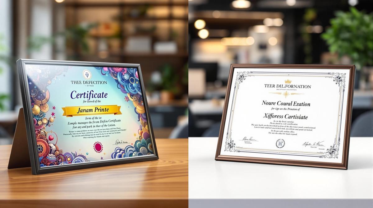
Legibility Versus Readability in Typography and Design
Legibility: Making Letters Clear
Legibility in typography is all about how easily someone can recognize individual characters and differentiate them from others. While readability focuses on how smoothly text flows as a whole, legibility hones in on the clarity of each letter, number, and symbol in a typeface.
Elements of Clear Legibility
Several factors influence how clear and easy-to-read a typeface will be when used in print:
Character Distinction: Letters and numbers must stand apart. For instance, lowercase ‘l’, uppercase ‘I’, and the numeral ‘1’ should be clearly different – especially in small sizes.
Stroke Weight: The thickness of a letter’s strokes impacts clarity. Thin strokes can fade out, while overly thick strokes may lose detail. Medium weights are ideal for body text, while heavier strokes suit headlines.
Counter Spaces: The open areas inside letters like ‘e’, ‘o’, and ‘p’ need to be large enough to maintain clarity, particularly when printed small or on textured materials.
Letter Spacing: Proper kerning avoids crowding. Slightly looser spacing often improves clarity in print.
Fonts Known for Legibility
Some fonts consistently perform well in print due to their clarity and design:
Sans-Serif Fonts
Helvetica: A classic choice for clean, professional materials.
Frutiger: Originally designed for airport signage, making it easy to read at various sizes.
Serif Fonts
Garamond: A timeless option for body text in books and long documents.
Times New Roman: A standard for professional and academic work.
Baskerville: Renowned for its sharp clarity in print.
For specific print projects, font choices should align with the material’s purpose and size requirements:
Print Material
Recommended Font Size
Suggested Fonts
Business Cards
8-12pt
Helvetica, Futura
Brochures
10-12pt
Garamond, Frutiger
Billboards
12-24 inches
Impact, Futura
Legal Documents
10-12pt
Times New Roman
Getting the best legibility in print involves more than just picking the right font. Font size, stroke weight, and the printing surface all play a role. Testing different sizes and weights before finalizing a design ensures the text remains clear under all conditions.
These principles of legibility set the stage for creating text that flows effortlessly, a topic we’ll dive into next.
Readability: Making Text Flow
Legibility is about how easy it is to distinguish individual characters, but readability goes a step further – it’s about how smoothly readers can process entire blocks of text.
Text Layout Basics
Here are some essential tips for creating readable text:
Line Length and Spacing
Aim for line lengths of 45–75 characters. Use line spacing (leading) that’s 120–150% of the font size, and set paragraph spacing to about 1.5 times the line spacing.
Alignment and Structure
Stick to left alignment for easier reading. Break content into short paragraphs of 3–4 lines and leave margins of at least 0.75 inches.
Visual Hierarchy
Make headlines stand out clearly from body text by varying font sizes (e.g., 14pt for headlines, 11pt for body text). Keep spacing consistent across all elements to maintain a clean, organized look.
These guidelines also work well for multi-column layouts, ensuring the text remains easy to follow.
Examples of Effective Text Layouts
Different types of print materials call for specific formatting:
Print Material
Line Length
Leading
Margin Size
Business Letter
60–70 chars
120%
1 inch
Magazine Column
35–45 chars
130%
0.5 inches
Book Page
65–75 chars
140%
0.75 inches
Additional tips:
Set column gutters to 1.5 times the font size.
Match paragraph spacing to the line height.
Use double the paragraph spacing for section breaks.
A consistent layout helps readers move through the content naturally. Proper spacing and clear hierarchies make it easier to find key information, especially when paired with easy-to-read fonts.
For professional results, consider working with experts like Miro Printing & Graphics Inc. in Hackensack, NJ. They can help bring your print projects to life with precision and care.
sbb-itb-ce53437
How Legibility and Readability Differ
Legibility and readability play distinct roles in print design, each focusing on different aspects of how text is perceived and understood.
Side-by-Side Comparison
Here’s a breakdown of how these two concepts differ in print design:
Aspect
Legibility
Readability
Primary Focus
Clarity of individual letters
Smooth flow of text
Key Elements
Font design, character spacing, stroke contrast
Line length, paragraph spacing, text alignment
Measurement
Speed of recognizing characters
Reading comprehension and speed
Optimal Distance
Close-up viewing (e.g., business cards, labels)
Standard reading distance (e.g., books, magazines)
Font Size Impact
Critical for sizes below 12pt
Important across all sizes, especially body text
Applications
Headlines, signage, small text
Body copy, long-form content
These differences guide how designers approach various print projects.
Using Both Together
The balance between legibility and readability depends on the type of print material.
For business cards and labels, prioritize clear fonts with distinct characters, especially at smaller sizes.
When working on magazines and brochures, aim for a balance with readability taking a slight edge. The text should flow naturally while maintaining clear individual characters.
Headlines: Use highly legible fonts sized between 18-24pt.
Body text: Opt for readable fonts at 10-12pt for smooth reading.
Captions: Stick with legible fonts at 8-9pt.
In technical documentation, legibility often takes the lead in areas like data tables and specifications, where readers need to locate specific details quickly. At the same time, readability ensures instructional content is easy to follow.
Consistency is key for multi-page documents. Use uniform typography to maintain rhythm and clarity throughout. Also, consider factors like paper quality, printing methods, and typical reading distance, as these elements influence how legibility and readability function together.
Making Typography Work in Print
Print Typography Guidelines
When designing for print, precision is everything. For body text, stick to 10–12pt, use 14–16pt for subheadings, and reserve 18–24pt for headlines. These sizes ensure readability across different print materials.
The printing method matters too. Offset printing handles both serif and sans-serif fonts well, while digital printing works best with fonts that have moderate stroke contrast. According to Miro Printing & Graphics Inc., black text should be no smaller than 6pt, and colored or reversed text should be at least 8pt.
Every print project has unique needs, so adjust your typography settings accordingly. While these guidelines help set a strong foundation, sidestepping common errors is just as important.
Common Typography Mistakes
Even the best settings can’t save a design from these common typography missteps:
Poor Contrast Choices
Harsh black-on-white contrast can strain the eyes. Instead, try dark gray (around 80% black) for a softer look. Avoid using small white text on dark backgrounds – it’s hard to read and often prints poorly.
Inconsistent Spacing
Uneven spacing between letters, words, or paragraphs disrupts the reading flow and makes your design look sloppy. Keep spacing consistent to maintain a polished appearance.
Overusing Fonts
Too many fonts can overwhelm the design and cause printing issues. Stick to 2–3 font families to keep things clean and visually balanced.
Conclusion
Typography for print hinges on two key factors: readability and legibility. While legibility is about recognizing individual characters, readability focuses on how smoothly the text flows. Together, these elements ensure effective communication in print.
Your choice of font plays a big role in achieving both. However, even the best typeface won’t work if the layout and spacing are poorly executed. Similarly, a great arrangement can’t fix an unreadable font.
To get the best results in print, keep these tips in mind:
Maintain consistent spacing throughout your design.
Stick to font sizes between 10–12 pt for body text.
Use 2–3 complementary font families to avoid clutter.
Create contrast that’s easy on the eyes.
Adjust typography settings to match the specific print method you’re using.
These practices help lay the groundwork for polished and professional designs.
Good typography isn’t about rigidly following rules – it’s about balancing readability and legibility to meet your design goals. Whether you’re working on business cards or large-scale prints, these principles are essential for clear and effective communication.
For high-quality results, consider working with a trusted print shop like Miro Printing & Graphics Inc. in Hackensack, NJ. They’ll help ensure your typography choices look sharp and professional across various printing methods and materials. Check them out at Miro Printing & Graphics Inc..
Explore how typography influences print design, enhancing readability and communication through smart font choices and effective spacing.
Typography can make or break your print design. The right fonts improve readability, guide attention, and enhance your message. Poor typography? It confuses readers and weakens communication.
Key Takeaways:
Font Choices Matter: Serif fonts work for books and magazines; sans-serif suits headlines and signage.
Spacing and Clarity: Proper kerning, tracking, and leading ensure clean, readable designs.
Font Pairing: Combine serif for body text and sans-serif for headings to create balance.
Licensing: Always check font licenses for legal use in print projects.
Trends: Simple, readable fonts like Helvetica Now are popular, with variable fonts offering flexibility.
Typography isn’t just about aesthetics – it’s about delivering clear, effective messages. Choose wisely, test proofs, and focus on readability to ensure your designs succeed.
Typography Basics in Print Design
Font Types, Sizes, and Spacing
Typography plays a crucial role in creating clean, readable print materials. Key elements to focus on include font size, kerning (spacing between letters), tracking (overall letter spacing), and leading (line spacing). These details not only improve readability but also help guide the reader’s attention effectively.
How Fonts Affect Design Success
Typography choices can make or break your design. Fonts that are too small or have poor spacing – whether between letters or lines – can result in cluttered layouts that are hard to read. By carefully managing these factors, you can create prints that are both visually appealing and easy to navigate.
The Ultimate Guide to Typography
Selecting Fonts for Print Projects
Choosing the right fonts plays a key role in shaping the look and functionality of print projects. Let’s break down the essentials.
Serif vs. Sans-Serif: Print Design Comparison
Understanding the basics of serif and sans-serif fonts can help you make better choices for your print materials. Serif fonts have small strokes at the ends of their letters, which guide the eye and make them ideal for long-form text like books, newspapers, and magazines. They’re perfect for creating a traditional and easy-to-read experience.
On the other hand, sans-serif fonts skip the decorative strokes, giving them a clean, modern look. They work best for headlines, signage, and shorter text blocks. Plus, they’re great for digital-to-print projects where clarity is key, especially at larger sizes.
Font Type
Best Print Applications
Characteristics
Serif
Books, magazines, newspapers
Easy on the eyes for long text, classic feel
Sans-serif
Headlines, signage, brochures
Modern style, clear and sharp at large sizes
Display
Posters, logos, headers
Bold and eye-catching, best for minimal text
How to Pair Fonts Effectively
Pairing fonts is all about creating balance and contrast. A common approach is to combine a serif font for body text with a sans-serif font for headlines. For instance, using Georgia for the main text and Helvetica for headings creates a polished and readable design.
Here are some tips for pairing fonts:
Contrast with purpose: Select fonts that are different enough to stand out but still work well together.
Keep it simple: Stick to 2-3 fonts per project to avoid visual clutter.
Stay consistent: Use the same fonts across all elements to maintain a cohesive design.
Font Licensing for Print Projects
If you’re working on commercial print projects, understanding font licensing is a must. Most professional fonts require specific licenses, especially for print use. A desktop license usually covers basic print needs, while larger projects or digital distribution may require an extended license.
To avoid issues, check your font licenses carefully, particularly when using professional services like Miro Printing & Graphics Inc. Many providers suggest using trusted font sources like Adobe’s library or Google Fonts to sidestep licensing headaches.
Here’s what to keep in mind about font licensing:
Check usage rights: Confirm your license covers your project’s print needs.
Keep records: Save proof of any purchased licenses.
Embedding permissions: Make sure your license allows embedding fonts in PDFs.
These steps help ensure your designs are both high-quality and legally compliant.
sbb-itb-ce53437
Print Typography Guidelines
Building Text Hierarchy
Create a clear text hierarchy by using larger, bold fonts for main headlines, slightly smaller and subtler styles for subheadings, and highly legible fonts for body text. This structure ensures captions and footnotes stay supportive without drawing attention away from the main content.
Balancing Text and White Space
Once the hierarchy is in place, balance it with plenty of white space. Proper line spacing and consistent margins help separate ideas and prevent a cluttered look. A good balance between text and white space not only improves readability but also makes the design easier on the eyes.
Ensuring Font Clarity for Printing
Font clarity is essential, no matter the printing method. For digital printing, fonts should stay legible at smaller sizes and have enough weight for sharp reproduction, especially for colored or reversed text. In offset printing, finer details might need heavier font weights or slight letter-spacing adjustments. To avoid surprises, test print proofs with professional print services like Miro Printing & Graphics Inc. to confirm the typography works well in the final product.
Common Typography Errors to Avoid
Poor Letter Spacing
Letter spacing plays a big role in how readable and visually appealing your text is. Pay special attention to kerning, especially in larger headlines. Certain letter pairs, like "VA" or "LT", often need manual adjustments to look right. In body text, aim for consistent spacing – too tight or too loose can make the text hard to read. Also, don’t overlook the spacing of special characters like numbers, hyphens, em dashes, and quotation marks. While you’re at it, make sure there’s enough contrast between the text and its background for better readability.
Text and Background Contrast
The contrast between text and background can make or break readability. Factors like color, paper type, and printing methods all come into play. For instance, glossy paper tends to make colors pop more than matte finishes. Always test print your designs and check how the text stands out under different lighting conditions. This ensures your text remains clear and easy to read.
Current Print Typography Trends
Simple Font Styles
Modern print design leans heavily toward clean, minimalist typography that prioritizes readability. This shift reflects both aesthetic tastes and practical needs. Sans-serif fonts such as Helvetica Now and Inter are becoming go-to choices due to their flexibility across various print sizes and materials. Local businesses like Miro Printing & Graphics Inc. have noted an increasing preference for these modern, straightforward typefaces.
Key features include:
Font weight variations to establish visual hierarchy
Consistent spacing to improve readability
Clean, simple lines that hold up well across various printing methods
Variable Fonts in Print
Variable fonts are transforming typography by offering design flexibility without sacrificing quality. These fonts allow designers to tweak attributes like weight and width, ensuring the final product looks polished regardless of the print format – whether it’s a business card or a large banner.
Some advantages of variable fonts include:
Precise control over font adjustments
Smaller file sizes compared to using multiple font weights
Consistent appearance across different print sizes
Readable Typography for All Users
Designers are increasingly focusing on accessibility, ensuring typography works for everyone, including individuals with visual impairments. Readability is now a top priority in print design.
Recommended Font Sizes
Headlines: 18–24 pt
Body text: 11–12 pt
Fine print: No smaller than 8 pt
Features for Better Readability
Higher contrast between text and background
Line spacing (leading) around 1.5 times the font size
Clear character spacing to improve letter recognition
To enhance accessibility, designers are favoring fonts with larger x-heights and open counters, which improve legibility while maintaining a polished, professional look. These approaches help ensure your print designs are both functional and visually appealing for a wide range of audiences.
Conclusion: Typography’s Role in Print Success
Typography plays a key role in print design. The right font choices can make your prints not just visually appealing but also memorable and engaging.
"Presentation is the first step to a successful, lasting relationship,"
says Miro Printing & Graphics Inc., emphasizing how well-thought-out typography helps deliver your message clearly. This dedication to detail shines through every phase of their print design process.
Experienced providers like Miro Printing & Graphics Inc. ensure fonts align with both technical requirements and design goals. Their tailored approach is especially valuable for complex projects that demand precision and care.
Good typography improves readability, enhances brand perception, and drives ROI across various print formats. From business cards to brochures to large-format displays, font choices should strike a balance between aesthetics and functionality. This is even more critical as print design continues to adapt to new technologies and accessibility needs.
Working with skilled print professionals ensures your projects are clear, high-quality, and leave a lasting impression. Every typography decision plays a part in achieving print success.
Explore various methods for testing paper surface texture, their advantages, limitations, and applications in ensuring quality print results.
Surface texture directly affects print quality. Choosing the right testing method ensures better print results. Here’s a quick overview of the main methods used to measure paper surface texture:
Contact Profilometry: Uses a stylus to measure surface roughness.
Pros: High accuracy (±0.01 µm), reliable for quality control.
Cons: Risk of surface damage, slower testing.
Optical Surface Measurement: Non-contact method using light-based technology.
Pros: Fast, non-destructive, creates 3D surface maps.
Cons: Expensive equipment, sensitive to environmental conditions.
Air Leak Testing: Measures air permeability to assess surface smoothness.
Pros: Affordable, quick, easy to use.
Cons: Limited to surface-level analysis, less detailed.
Digital Imaging Analysis: High-resolution cameras and software for detailed surface mapping.
Pros: Extremely precise, automated data handling.
Cons: High cost, slower processing.
Quick Comparison
Method
Accuracy
Speed
Cost Range
Contact Type
Best For
Contact Profilometry
±0.01 µm
8–12 min/sq in
$25,000–$45,000
Contact
Routine quality checks
Optical Measurement
±0.05 µm
2–4 min/sq in
$45,000–$85,000
Non-contact
Detailed surface analysis
Air Leak Testing
±0.5 µm
30–60 sec/test
$5,000–$15,000
Non-contact
Fast production QC
Digital Imaging
±0.1 µm
3–7 min/sq in
$75,000–$150,000
Non-contact
Specialty paper development
Each method suits different needs. For quick production checks, Air Leak Testing works best. For precise analysis, Digital Imaging or Optical Measurement is ideal. Choose based on your application and budget.
Surface Finish Measurement – Skidded VS. Skidless Surface Roughness Measurement
1. Contact Profilometry Tests
Contact profilometry is a widely used technique for measuring the surface texture of paper. It relies on a diamond-tipped stylus (with a tip radius of 2–5 µm) that moves across the surface at a speed of 0.1–0.5 mm/s. The vertical movements of the stylus are converted into electrical signals, offering a precision of ±0.01 µm.
Advantages of Contact Profilometry
High resolution: Detects surface variations as small as 0.005 micrometers.
Direct measurement: Provides accurate surface topology through physical contact.
Industry standard: Well-established protocols make it a trusted method in the paper industry.
Limitations of Contact Profilometry
Risk of surface damage: The stylus may leave marks on delicate paper.
Time-consuming: Each scan typically takes 3–5 minutes.
Limited coverage: Measures only a narrow path instead of the entire surface.
These factors influence how print shops decide to use this method for specific quality checks.
Common Applications in Print Shops
Professional print shops rely on contact profilometry for tasks such as:
Quality control of premium paper stocks
Checking coating uniformity
Diagnosing print quality issues
Comparing new paper suppliers
This method is a key part of quality control in reputable print operations.
Testing Conditions and Process
For accurate results, testing is conducted under controlled conditions: 73°F (23°C) and 50% relative humidity. Technicians take measurements at five locations on each sheet, with three readings per location.
Common Roughness Parameters
The following parameters are typically measured:
Parameter
Description
Typical Range
Ra
Average roughness
0.2–5.0 µm
Rz
Mean peak-to-valley height
1.0–15.0 µm
Rq
Root mean square roughness
0.3–6.0 µm
Lower roughness values indicate smoother surfaces, ideal for high-resolution printing. Higher values suggest a more textured surface, which may require adjustments in printing techniques or specialized inks.
Importance of Profilometry Records
Print shops maintain detailed records of profilometry data to:
Monitor paper quality over time
Compare grades and suppliers
Fine-tune printing parameters for specific paper types
Document quality control processes for ISO certification
These records ensure that paper characteristics align with printing needs, helping to achieve the best possible print quality for customers.
2. Optical Surface Measurement
Optical surface measurement is a non-contact method used to evaluate the texture of paper. By relying on light-based technology, this approach analyzes surface characteristics without physically touching the material, making it ideal for delicate surfaces.
Operating Principles
These systems use focused light beams to scan the paper’s surface. Techniques like laser triangulation or confocal microscopy help generate detailed 3D surface maps. Depending on the equipment, the resolution can range from 0.1 to 1.0 micrometers.
Optical sensor: CCD or CMOS detector with 1024 x 1024 pixel resolution
Scanning area: 0.39 x 0.39 in to 3.94 x 3.94 in (10 x 10 mm to 100 x 100 mm)
Measurement speed: 100,000 points per second
These components work together to deliver precise surface measurements, as outlined in the parameters below.
Measurement Parameters
Parameter
Description
Range
Sa
Average surface roughness
0.1–4.0 µm
Sq
Root mean square height
0.15–5.0 µm
Ssk
Skewness of height distribution
-2.0 to +2.0
Sku
Surface kurtosis
2.0–4.0
This setup allows for accurate and efficient analysis of surface features.
Advantages of Optical Measurement
Optical measurement offers several benefits:
Non-destructive testing: Keeps the paper surface intact.
Fast scanning: Completes surface analysis in under 60 seconds.
Comprehensive coverage: Captures entire surface areas, not just single lines.
Real-time visualization: Provides immediate 3D surface maps.
Digital storage: Simplifies archiving and comparison of results.
Technical Limitations
Despite its strengths, this method has some limitations:
Surface reflectivity: Glossy papers can lead to measurement errors.
Depth restrictions: Can measure depths up to 500 micrometers only.
Environmental sensitivity: Requires stable lighting and vibration-free conditions.
High cost: Equipment typically costs between $50,000 and $150,000.
Testing Environment Requirements
To ensure accurate results, testing should be performed in a controlled environment with minimal vibrations and consistent lighting.
Data Analysis Capabilities
Optical systems come with software that can:
Generate detailed topographic maps and calculate surface statistics.
Perform automated quality control checks.
Export data in formats like CSV or XML.
Compare results against set reference standards.
Industry Applications
This method is particularly useful in:
Quality control during paper manufacturing.
Developing specialty paper grades.
Assessing coating uniformity.
Improving print performance.
Researching and creating new paper products.
sbb-itb-ce53437
3. Air Leak Testing
Air leak testing, often called air permeability testing, evaluates the smoothness of a paper’s surface by measuring how quickly air escapes between the paper and a precision metal ring.
Operating Principle
This test determines airflow between a flat metal ring and the paper sample under a set pressure. The time it takes for a specific air volume to pass through or around the paper indicates surface smoothness. A longer escape time suggests a smoother surface, while a shorter time points to a rougher texture.
Testing Equipment Components
An air leak tester typically includes:
Measuring head: A metal ring with a 1-inch inner diameter
Air chamber: Holds a calibrated 3.39 fl oz (100 mL) volume
Digital timer: Provides 0.01-second resolution
Temperature sensor: Tracks ambient conditions
Measurement Parameters
Parameter
Range
Resolution
Flow Time
0.1–100 seconds
0.01 seconds
Test Pressure
0–50 kPa
0.1 kPa
Surface Area
0.79–3.14 sq in
0.01 sq in
Temperature
68–77°F
0.5°F
These parameters ensure precise and reliable measurements.
Key Advantages
Affordable: Equipment costs range from $5,000 to $15,000
Easy to use: Requires minimal training
Fast results: Tests complete in under 30 seconds
Portable: Usable in labs and production settings
Standardized: Adheres to established industry norms
Technical Limitations
Moisture sensitivity: Paper moisture can affect results
Sample flatness: Wrinkled samples may lead to inaccuracies
Temperature dependence: Controlled environments are necessary
Surface-only analysis: Limited to surface characteristics
Edge exclusion: Results don’t account for areas within 0.79 inches (20 mm) of edges
These factors highlight the importance of maintaining strict testing conditions.
Environmental Requirements
For accurate results, testing should occur in:
Temperature: 73 ± 2°F
Relative humidity: 50 ± 2%
A stable, vibration-free surface
A clean, dust-free environment
Common Applications
Air leak testing plays a critical role in paper manufacturing and quality control. It helps assess coating uniformity, evaluate print surfaces, classify paper grades, and monitor production processes. Print shops like Miro Printing & Graphics Inc. (https://bergencountyprinters.com) use this method to ensure their paper substrates meet stringent print quality standards.
Data Recording
Modern air leak testers simplify data management by offering features such as:
Automatic test result storage
Statistical average calculations
Quality control report generation
Data export in standard formats
Historical measurement tracking
Measurement Accuracy
This method delivers consistent results with:
Standard deviation: ±2%
Measurement uncertainty: ±3%
Calibration interval: 12 months
Reference standard deviation: <1%
4. Digital Imaging Analysis
Digital imaging analysis uses high-resolution cameras and advanced algorithms to create detailed surface maps, offering a sophisticated way to evaluate paper surface texture.
System Components
Key components of digital imaging systems include:
High-resolution camera: 20+ megapixel resolution
LED lighting array: Structured illumination at angles between 15°–45°
Precision stage: Positioning accuracy of ±0.5 µm
Analysis software: Equipped with 3D reconstruction capabilities
Calibration standards: Based on NIST-traceable reference materials
Measurement Capabilities
Parameter
Range
Resolution
Surface Area
0.4–16 sq in
0.0004 sq in
Height Range
0–500 µm
0.1 µm
Lateral Resolution
0.5–10 µm
0.1 µm
Scan Speed
1–5 min/sq in
–
Data Points
Up to 16M/sq in
–
Advanced Analysis Features
Digital imaging systems offer a detailed view of surface characteristics, including:
3D topography maps for complete surface visualization
Calculations of roughness parameters like Ra, Rz, and RSm
Waviness analysis to examine surface patterns
Automated defect detection
Statistical data processing for in-depth analysis
This method complements other non-contact techniques by delivering greater detail and dependability, making it ideal for high-end print applications.
Environmental Requirements
To operate effectively, these systems require:
Temperature: 72 ± 1°F
Humidity: 45–55%
Vibration: Less than 0.1 g
Ambient Light: Below 50 lux
Clean Room: Class 100,000 or better
Technical Limitations
While highly effective, digital imaging systems come with a few limitations:
Sample Size: Restricted to a maximum area of 8 x 8 inches
Processing Time: Takes approximately 3–7 minutes per measurement
Cost: Systems are priced between $75,000 and $150,000
Maintenance: Requires annual calibration
Training: Operators need specialized expertise
Even with these constraints, integrated data management tools improve its usability for quality control tasks.
Data Management
The integrated software adds functionality by enabling:
Real-time analysis
Automated reporting
Secure database storage
Seamless integration with quality control processes
Export options compatible with CAD/CAM systems
Measurement Precision
Digital imaging systems excel in precision, offering:
Vertical Resolution: ±0.1 µm
Lateral Resolution: ±0.5 µm
Repeatability: 99.8%
Reproducibility: 99.5%
Measurement Uncertainty: ±1%
Industry Applications
Digital imaging analysis elevates traditional testing methods by offering a detailed, high-resolution view crucial for meeting modern print quality standards. This technology is widely used in paper manufacturing and quality control for tasks such as:
Verifying coating uniformity
Qualifying print surfaces
Monitoring production processes
Supporting research and development
Documenting quality assurance
Its non-contact nature ensures sample integrity while delivering precise surface data, making it indispensable for specialty paper development and premium printing. For example, companies like Miro Printing & Graphics Inc. (https://bergencountyprinters.com) can use this method to improve print surface quality and meet the demands of high-end printing applications.
Method Comparison
Here’s a breakdown of key performance metrics for various testing methods:
Testing Method
Accuracy
Resolution
Sample Size
Test Speed
Equipment Cost
Environmental Requirements
Sample Impact
Contact Profilometry
±0.01 µm
0.005 µm
Up to 12 x 12 in
8–12 min/sq in
$25,000–$45,000
Controlled conditions
Contact may damage surface
Optical Surface
±0.05 µm
0.1 µm
Up to 24 x 24 in
2–4 min/sq in
$45,000–$85,000
Controlled conditions
Non-contact
Air Leak
±0.5 µm
0.2 µm
1.5 x 1.5 in
30–60 sec/sample
$5,000–$15,000
Controlled conditions
Non-contact
Digital Imaging
±0.1 µm
0.1 µm
Up to 8 x 8 in
3–7 min/sq in
$75,000–$150,000
Controlled conditions
Non-contact
Performance Factors
Digital imaging and optical surface methods strike a balance between speed and precision, making them ideal for detailed analysis. Air leak testing, while the fastest option, provides less detailed surface measurements.
From a cost perspective, air leak testing is the most affordable, starting at $5,000. On the other hand, digital imaging systems, though more expensive, provide comprehensive data analysis and non-contact testing, offering greater long-term benefits.
Environmental controls vary by method. Digital imaging requires stricter conditions, while air leak testing is more flexible, handling broader temperature and humidity ranges, making it suitable for shop floor environments.
Application Suitability:
High-Volume Production: Air leak testing is well-suited for fast-paced production lines.
Research & Development: Digital imaging and optical measurements are ideal for detailed surface analysis.
Quality Control: Contact profilometry is reliable for routine inspections.
Specialty Papers: Digital imaging ensures precise surface characterization.
Companies like Miro Printing & Graphics Inc. (https://bergencountyprinters.com) use these methods to uphold high-quality standards in their services.
Maintenance Requirements
Consistent maintenance is essential to ensure accurate results. Here’s a comparison of maintenance needs for each method:
Method
Calibration Frequency
Annual Maintenance Cost
Operator Training Time
Contact Profilometry
Monthly
$2,500–$4,000
16–24 hours
Optical Surface
Quarterly
$3,500–$6,000
24–32 hours
Air Leak
Weekly
$800–$1,500
4–8 hours
Digital Imaging
Annual
$5,000–$8,000
32–40 hours
Data Management Capabilities
The ability to handle and analyze data varies across methods:
Digital Imaging: Offers automated data management, making it highly efficient.
Optical Surface: Integrates seamlessly with quality control systems.
Contact Profilometry: Provides basic data export and storage capabilities.
Air Leak Testing: Captures essential measurement data but lacks advanced integration.
Industry Standards Compliance
Each method aligns with specific industry standards:
TAPPI T555: Relevant for contact profilometry and optical measurements.
ISO 8791-2: Applied to air leak testing.
ASTM D7127: Designed for digital imaging analysis.
Choosing the right testing method ensures that print quality and production requirements are met effectively.
Summary and Recommendations
Choose a testing method that aligns with your specific application requirements. Below are tailored suggestions for different scenarios:
For high-volume commercial printing, air leak testing is a practical choice due to its speed and affordability:
Ensures fast quality control checks
Equipment is relatively inexpensive
When it comes to specialty and fine paper manufacturing, digital imaging analysis stands out for its precision:
Ideal for controlling textures, especially in security papers
Higher upfront costs are justified by advanced data handling
In research and development, optical surface measurement offers a good balance of precision and sample handling:
Non-contact method protects the sample
Provides detailed surface insights
For quality assurance, contact profilometry is a dependable option for routine checks:
Delivers high accuracy without excessive costs
Meets industry-standard measurement needs
Here’s a quick summary of the best methods for each application:
Application Type
Recommended Primary Method
Backup Method
Key Consideration
Production QC
Air Leak
Digital Imaging
Testing speed
R&D
Optical Surface
Contact Profilometry
Resolution detail
Fine Papers
Digital Imaging
Optical Surface
Surface preservation
General QA
Contact Profilometry
Air Leak
Cost-effectiveness
Professional print shops, such as Miro Printing & Graphics Inc., rely on these methods based on the specific needs of their projects. Striking the right balance between speed, precision, and cost is critical. To ensure the best results, always maintain regular calibration and controlled testing environments.
Use this checklist to choose the right recycled paper for printing, balancing quality, cost, and environmental impact effectively.
Looking for eco-friendly printing options? Recycled paper is your answer. It saves energy, water, and reduces emissions, all while meeting professional standards. Here’s a quick checklist to guide your choice:
Content: Choose between pre-consumer (higher quality) and post-consumer (better for waste reduction) materials.
Quality: Check brightness (80+ for standard, 90+ for high-end), opacity (90%+), and surface finish.
Certifications: Look for FSC-certified or chlorine-free options.
Print Compatibility: Ensure the paper works with digital, offset, or large-format printing.
Cost: Expect a 10-30% price increase compared to standard paper, but bulk purchasing and local suppliers can help manage costs.
For best results, test the paper for print quality, durability, and equipment compatibility before large print jobs. Recycled paper isn’t just a greener choice – it’s a step toward reducing your ecological footprint.
Related video from YouTube
Types of Recycled Paper Content
Understanding the types of recycled paper helps you align your printing needs with eco-friendly practices.
Pre-Consumer vs. Post-Consumer Materials
Pre-consumer materials come from manufacturing leftovers like printer trimmings, unsold publications, and mill scraps. Since these materials require minimal reprocessing, they often result in higher-quality paper.
Post-consumer materials, on the other hand, are sourced from used paper products such as office documents, newspapers, and packaging. While paper made from post-consumer content may differ slightly in brightness or smoothness, it plays a critical role in reducing landfill waste.
Content Percentage Recommendations
The right recycled content depends on your specific project. Here’s a quick guide:
Project Type
Recommended Recycled Content
Common Material Focus
Business Cards
80–100%
Post-consumer
Brochures
50–70%
Mixed content
Marketing Materials
30–50%
Pre-consumer
High-End Publications
10–30%
Pre-consumer
Packaging
90–100%
Post-consumer
If you’re aiming for premium print quality, paper with a higher percentage of pre-consumer material might be a better choice. Keep in mind that higher post-consumer content can impact qualities like brightness and surface texture. Balance these factors based on your project needs.
Reducing Waste Through Recycled Paper
Using recycled paper helps preserve natural resources and minimizes landfill waste. Combining pre- and post-consumer materials can strike the right balance between environmental impact and print quality.
Paper Quality Factors
Once you’ve selected recycled paper, it’s essential to check its quality to ensure professional results.
Paper Brightness and Opacity
For standard projects, go for recycled paper with a brightness level of at least 80. For high-end work, aim for a brightness of 90 or higher. Opacity should be 90% or more to avoid text or images showing through on double-sided prints.
"Brightness and opacity are critical factors in ensuring that printed materials are visually appealing and easy to read." – Mike Johnson, Printing Specialist, Miro Printing & Graphics Inc.
After checking brightness and opacity, focus on the paper’s strength and how it performs during printing.
Strength and Print Testing
Before committing to a large print job, put the paper through a series of tests. Look at:
Color accuracy, ink absorption, and drying time to ensure the final print matches expectations.
Tear resistance, bending, and folding strength to confirm durability.
Compatibility with your printing equipment to avoid issues during production.
Always request sample sheets from different batches to make sure the quality stays consistent.
sbb-itb-ce53437
Required Certifications
Checking certifications helps ensure the recycled paper you choose meets environmental standards and aligns with responsible practices.
FSC Certification Standards
The FSC certification guarantees that the paper comes from responsibly managed forests, promoting ethical forestry practices.
"FSC certification is a mark of responsible forestry, ensuring that the paper you use is sourced from forests that are managed sustainably." – Forest Stewardship Council
Chlorine-Free Standards
Chlorine-free certifications show that recycled paper is made without using harmful chlorine compounds. This reduces chemical pollution and supports cleaner production methods. Choosing such paper contributes to eco-friendly bleaching processes.
Price and Supply Factors
Recycled paper offers environmental advantages, but let’s dive into how it impacts costs and supply.
Cost vs Standard Paper
Planning your printing budget is essential when considering recycled paper. Prices typically range from $0.025 to $0.065 per sheet, compared to $0.02 to $0.05 for standard paper – a 10-30% increase.
Why pay more? Here are some key benefits:
Lower energy usage during production
Positive brand perception, as more consumers prioritize eco-conscious businesses
Possible tax breaks for sustainable practices
"Switching to recycled paper not only helps the environment but can also enhance your brand’s reputation among consumers who value sustainability." – Mike Johnson, Sustainability Consultant, EcoPrint Solutions
To manage costs effectively, consider these strategies:
Strategy
Advantages
Bulk purchasing agreements
Discounts and predictable pricing
Partnering with local suppliers
Reduced shipping costs and quick delivery
Long-term contracts
Stable pricing and secure supply
Once you’ve assessed costs, focus on building a reliable supply chain.
Supply Chain Options
Local suppliers, like Miro Printing & Graphics Inc. in Hackensack, NJ, bring benefits such as personalized service and quick turnaround times, backed by decades of experience.
When choosing suppliers, look for:
Reliable delivery schedules
Consistent quality control
Capacity to handle urgent orders
For businesses with ongoing paper needs, working with multiple suppliers ensures steady availability and competitive pricing. A mix of local and regional providers can help you manage varying order sizes and delivery requirements efficiently.
Print Method Compatibility
Choosing the right recycled paper for your printing process is key to achieving high-quality results. Each printing method has specific requirements, and recycled paper must meet these to perform well.
Digital and Offset Requirements
Digital printing needs recycled paper with a smooth surface and low moisture content to avoid printing problems. Offset printing, on the other hand, is more flexible, often working well with papers that have a standard finish and moisture levels. Here’s a quick comparison:
Requirement
Digital Printing
Offset Printing
Surface Texture
Smooth finish made for digital processes
Consistent finish; texture can vary
Moisture Content
Lower moisture to prevent issues
Standard levels work well
Paper Weight
Follow printer-specific recommendations
Slightly heavier paper is common
Coating
Coating designed for digital printing
Standard coating is sufficient
"Using the right type of recycled paper can significantly enhance the quality of your digital prints." – Mike, Owner of Miro Printing & Graphics Inc.
For successful digital printing with recycled paper, follow these steps:
Check your printer’s specifications for recycled paper compatibility.
Run test prints to ensure quality meets your standards.
Store paper in a climate-controlled space to maintain its condition.
Large Format Specifications
Large format printing has its own set of challenges. It requires recycled paper that can handle heavy ink coverage, remain durable, and maintain its shape. Look for paper specifically designed for these demands. Always consult your supplier to ensure the paper is suitable for large format projects.
Working with experienced print providers is essential when using recycled paper. Companies like Miro Printing & Graphics Inc. can guide you toward the best options for your printing needs.
Final Selection Tips
When choosing recycled paper, focus on quality, expert input, proper documentation, and storage needs. These steps will help ensure your paper meets both performance and environmental standards. Here’s what to keep in mind:
Test for Quality
Run test prints to check the paper’s print quality. Professional printers can assist with this process.
Consult Local Experts
Reach out to local professionals, such as Miro Printing & Graphics Inc., who have years of experience in selecting recycled paper.
Check Documentation
Make sure the paper includes the following:
FSC certification
Percentage of post-consumer content
Brightness and opacity details
Compatibility with your print method
Ensure Proper Storage
Verify that storage conditions will maintain the paper’s quality over time.
Consideration
Action Required
Sample Testing
Request test prints on selected paper
Expert Consultation
Seek advice from print professionals
Documentation
Confirm certifications and specs
Storage
Verify suitable storage conditions
For custom printing needs, consider scheduling a consultation with experts. They can offer tailored advice to help you achieve the best results while staying eco-conscious.
Explore the key differences between pre-consumer and post-consumer recycled paper, including their sources, processing, costs, and environmental impacts.
What’s the difference between pre-consumer and post-consumer recycled paper? Here’s the quick answer:
Pre-consumer recycled paper is made from unused manufacturing leftovers like trimmings or unsold publications. It’s cleaner, requires less processing, and is often cheaper with higher-quality fibers.
Post-consumer recycled paper comes from used materials like office paper or newspapers. It reduces landfill waste but needs more processing, making it costlier with slightly degraded fibers.
Key Comparison:
Feature
Pre-Consumer Paper
Post-Consumer Paper
Source Material
Manufacturing waste
Used paper from homes, offices, etc.
Processing
Less processing needed
More processing (deinking, cleaning)
Fiber Quality
Higher-quality, less degraded fibers
Slightly degraded fibers
Environmental Impact
Diverts industrial waste
Reduces landfill waste significantly
Cost
Lower
Higher
Best Uses
Marketing materials, packaging
Office paper, eco-focused projects
For sharp visuals and premium quality, go with pre-consumer paper. For eco-conscious goals, post-consumer paper is the better choice. Both options help reduce waste and conserve resources.
The Difference Between Pre-Consumer and Post-Consumer Waste
Pre-Consumer Recycled Paper Basics
Pre-consumer recycled paper is made by repurposing unused manufacturing leftovers to create high-quality paper products. This process relies on specialized methods to ensure the final product meets industry standards.
Material Sources
The materials used for pre-consumer recycled paper come from three main sources:
Manufacturing trim waste: Scraps and edges left over from cutting large paper rolls into standard sizes.
Printer setup sheets: Test prints and calibration pages generated by commercial printers.
Unused or damaged printed materials: Items like magazines or books that never made it to market.
These materials, which would otherwise be discarded, are collected and processed efficiently due to their clean and sorted condition.
Production Steps
Turning pre-consumer waste into new paper products involves a few key steps:
1. Collection and Sorting
Manufacturing facilities collect trimmings and other unused materials, sorting them by paper type and grade. Since these materials are already clean, this step is quicker and easier compared to post-consumer recycling.
2. Pulping Process
The sorted materials are broken down into pulp using mechanical and chemical methods. Because pre-consumer waste is free from contaminants like inks and adhesives, this step uses less energy and fewer chemicals.
3. Quality Control
The recycled paper is tested for strength, brightness, and consistency. Thanks to the clean source materials, pre-consumer recycled paper maintains a high standard of quality.
This streamlined process ensures the paper is suitable for a wide range of applications.
Common Uses
Pre-consumer recycled paper is used in many industries, including:
Application
Common Uses
Benefits
Packaging
Boxes, protective wrapping, bags
Durable and cost-effective
Office Supplies
Copy paper, notebooks, file folders
Professional look, reliable quality
Marketing Materials
Brochures, business cards, flyers
Eco-conscious without sacrificing quality
Businesses looking for professional printing services can explore options like Miro Printing & Graphics Inc., which offers pre-consumer recycled paper products that combine high standards with environmental responsibility.
Post-Consumer Recycled Paper Explained
Post-consumer recycled paper is made from materials that have already been used and discarded. These materials are collected through recycling programs after their initial use, unlike pre-consumer materials, which are byproducts of manufacturing processes.
Collection Methods
The collection of post-consumer materials depends on community recycling efforts, including municipal programs, commercial pickups, and drop-off centers.
Here are some common sources, examples, and challenges in collecting recyclable paper:
Source
Examples
Collection Challenges
Households
Newspapers, magazines, mail
Food contamination, mixed items
Offices
Printer paper, envelopes
Staples, paper clips, adhesives
Schools
Notebooks, worksheets
Colored paper, binding materials
Once collected, the paper goes through a detailed recycling process to prepare it for reuse.
Recycling Process
Turning used paper into new products involves several key steps:
Initial Sorting: Workers use both manual and mechanical methods to separate paper from contaminants like plastics and other non-paper materials.
Pulping and Cleaning: The sorted paper is cleaned to remove inks, adhesives, and coatings that might interfere with the recycling process.
Fiber Processing: The cleaned material is broken down into individual fibers. Any remaining impurities are removed before the fibers are reformed into new paper products.
Impact on Waste Reduction
Recycling post-consumer paper helps reduce waste sent to landfills while conserving natural resources like trees, water, and energy. This recycling process highlights the environmental advantages of post-consumer recycled paper compared to pre-consumer alternatives.
Companies like Miro Printing & Graphics Inc. contribute to these efforts by offering post-consumer recycled paper for printing projects, combining quality with environmentally-friendly practices.
sbb-itb-ce53437
Pre-Consumer vs Post-Consumer Paper: Main Differences
Understanding the differences between pre- and post-consumer recycled paper can help you make better choices by focusing on where the materials come from, how they’re processed, and their overall environmental effects.
Side-by-Side Comparison
Characteristic
Pre-Consumer Recycled Paper
Post-Consumer Recycled Paper
Source Material
Comes from manufacturing waste, printer trimmings, and unsold publications.
Made from used paper products collected from homes, offices, and schools.
Processing Requirements
Requires less processing due to cleaner, consistent materials.
Needs more processing to remove inks, adhesives, and contaminants.
Fiber Quality
Contains higher-quality fibers with minimal degradation.
Fibers may be slightly degraded due to prior use and processing.
Environmental Impact
Diverts industrial waste from landfills.
Reduces landfill waste and conserves natural resources.
Energy Usage
Uses less energy because of simpler processing.
Requires more energy for steps like deinking and contaminant removal.
Cost
Often cheaper due to straightforward processing.
Higher costs because of additional collection and processing steps.
Availability
Consistently available.
Supply can vary depending on collection rates.
Common Applications
Used in packaging materials, paper towels, and tissues.
Found in office paper, newspapers, magazines, and some packaging.
Key Takeaways
The source of the material plays a big role in processing and quality. Pre-consumer recycled paper, which hasn’t been exposed to contaminants, requires less processing, making it more cost-effective. On the other hand, post-consumer paper undergoes more extensive processing, such as deinking and contaminant removal, which increases costs but has a stronger impact on reducing landfill waste.
If you’re looking for high-quality paper for detailed printing jobs, pre-consumer paper is a better fit because of its superior fiber quality. For everyday office needs, post-consumer paper strikes a good balance between quality and sustainability.
Businesses can find both options at print shops like Miro Printing & Graphics Inc. in Hackensack, NJ (https://bergencountyprinters.com), making it easy to choose based on cost, environmental considerations, and print quality needs.
How to Select Recycled Paper
Choosing the right recycled paper means balancing print quality, environmental impact, and cost. Here’s what you need to know to make the best choice.
Key Factors to Consider
When deciding on recycled paper, keep these points in mind:
Pre-consumer paper: Offers better print quality, making it ideal for projects where sharp visuals are a priority.
Post-consumer paper: Reduces environmental impact significantly, saving about 2,500 gallons of water per ton compared to virgin paper.
Cost: Prices vary depending on the processing required, with post-consumer paper often being more expensive due to its recycling process.
Certifications to Look For
Certifications help verify the source and sustainability of recycled paper. Here are some key labels to check:
Miro Printing & Graphics Inc. offers guidance on selecting the right recycled paper while providing top-notch printing services. Their expertise ensures you meet both quality and sustainability goals.
"Choosing the right type of recycled paper can significantly impact both your brand’s sustainability efforts and the quality of your printed materials", says Mike, Owner of Miro Printing & Graphics Inc.
Their services include:
One-on-one consultations to understand your needs
Paper samples to help you visualize the final product
Custom digital and offset printing solutions
Expert advice tailored to your budget and project goals
Get in touch with Miro Printing & Graphics Inc. for personalized recommendations and solutions for your printing projects.
Summary and Recommendations
Choosing the right recycled paper depends on understanding the differences between pre-consumer and post-consumer options.
Project Considerations
Pre-consumer recycled paper is ideal for:
Marketing materials
Presentations
Projects requiring precise color quality
Post-consumer recycled paper shines in:
Everyday business documents
Eco-focused initiatives
Internal communications with a sustainability message
This breakdown helps you align your paper choice with your project’s goals. For tailored advice, Miro Printing & Graphics Inc. can help you find the best recycled paper for your needs.
Making the Right Choice
Factor
Pre-Consumer
Post-Consumer
Print Quality
High-quality surface
Suitable for standard tasks
Environmental Impact
Reduces waste moderately
Reduces waste significantly
Cost Efficiency
More affordable
Higher due to processing
Best Uses
Brochures, marketing
Office paper, packaging
These comparisons can help you decide which type of paper fits your project. Working with experienced printers ensures you can balance quality and sustainability effectively.
Many projects combine both pre- and post-consumer papers to strike the right balance between performance, environmental benefits, and budget.
Explore diverse design options for custom certificate holders, including materials, finishes, and features to elevate presentation and branding.
Custom certificate holders protect and showcase important documents like diplomas and awards. They enhance presentation, safeguard certificates, and align with professional branding. Here’s a quick breakdown of design options:
Materials: Choose from paper, vinyl, padded, or leatherette.
Surface Finishes: Options include matte, linen texture, semi-gloss, or metallic accents.
Customization: Add logos, text, or branding.
Functional Features: Notched corners, protective layers, or built-in easels.
Price Ranges:
Paper folders: $1.35–$2.25
Vinyl holders: $4.15–$6.59
Padded holders: $7.99–$13.39
Leatherette: $21.95–$35.25
Quick Comparison Table
Type
Price Range
Best Use Case
Rating
Paper Certificate Folder
$1.35 – $2.25
Semi-formal events
4.9/5
Vinyl Holder
$4.15 – $6.59
High-use environments
5/5
Padded Holder
$7.99 – $13.39
Premium presentations
4.8/5
Leatherette Holder
$21.95 – $35.25
Formal or executive use
N/A
For professional events or awards, selecting the right material, finish, and customization ensures a polished and durable presentation.
Custom Certificate Holders & Diploma Covers
Materials and Structure
Modern manufacturing provides a variety of options to balance durability, appearance, and practicality.
Material Types
Certificate holders are crafted from different materials, each suited to specific needs. For a polished, professional feel, SBS paperboard (0.010–0.028 inches) is a popular choice. For added strength, corrugated materials are available in single-wall (4.8 mm), double-wall (6.4 mm), and triple-wall (12.7 mm) options.
Here’s a quick comparison of common materials and their uses:
Material Type
Thickness Range
Key Features
Best Use Case
Kraft Paper
2.5–5 mils
Strong and durable
Informal presentations
SBS Paperboard
0.010–0.028 inches
Smooth, premium finish
Professional events
Corrugated Board
4.8–12.7 mm
High protection
Shipping and storage
Vinyl
Standard gauge
Flexible, water-resistant
High-use environments
Material Comparison
Each material has its strengths, depending on the intended use. For instance, multi-ply paperboard is better for folding and creasing than single-ply options. A well-made crease acts like a hinge, ensuring smooth and clean folds.
Here are some factors to consider when choosing materials:
Protection: Stiffer materials guard against bending and physical wear.
Visual Appeal: Leather or faux leather adds a sleek, professional touch for formal settings.
Practicality: Clear plastic or acetate pockets keep certificates visible while protecting them.
Eco-Friendliness: Flexible materials often have a smaller environmental impact than rigid ones.
To maximize protection, many holders combine materials. For example, a hard outer shell can be paired with a soft inner lining to prevent scratches, while clear plastic sleeves protect against dust and fingerprints.
Next, we’ll explore how color and finishes can elevate your design.
Colors and Surface Treatments
Custom certificate holders combine various colors and finishes to strengthen brand identity and add a formal touch. These design choices not only improve the holder’s appearance but also enhance its protective role.
Color Selection
Common color choices for certificate holders are designed to convey different tones. Classic shades like navy blue, black, and forest green project professionalism, while maroon and red bring a bold, dynamic feel to formal occasions.
Here are some professional color and finish pairings:
Base Color
Best Surface Treatment
Recommended Use
Navy Blue
Linen Texture
Corporate ceremonies
Black
Matte Finish
Academic graduations
Forest Green
Premium Linen
Environmental awards
Maroon
Semi-gloss
Professional certifications
Red
Metallic Accents
Executive recognition
To maintain brand alignment, custom color matching and full-color printing ensure logos and design elements are reproduced accurately. Pairing these colors with the right surface finishes can further enhance the overall presentation.
Surface Finishes
Surface finishes not only improve durability but also add visual appeal:
Linen Texture: Offers a sophisticated, tactile feel, ideal for formal settings.
Matte Finish: Reduces glare and provides a smooth surface for signatures.
Metallic Effects: Adds foil accents to highlight important design elements.
"In January 2024, Diploma Cover Source offered navy blue paper certificate holders with a premium linen paper finish. These holders feature a modest shiny foil stamping logo on the front and four cut slits corners to hold an 8 1/2" x 11" diploma. The company stocks these in navy blue, black, maroon, forest green, and red. (Source: diplomacoversource.com, accessed January 2024)"
Semi-gloss Coating: Deepens color vibrancy while protecting against wear.
Spot UV Treatment: Adds glossy highlights to specific areas, contrasting with matte backgrounds.
Combining finishes, like matte surfaces with foil stamping, creates a polished look with a clear visual hierarchy, making the holder both professional and eye-catching. Up next, explore how print and decoration techniques can seamlessly align with these design features.
sbb-itb-ce53437
Design Methods and Features
Modern certificate holders combine advanced printing techniques with practical design elements to enhance both appearance and durability. These methods, paired with thoughtful material choices, create a well-rounded design approach.
Print and Decoration Methods
Certificate holders rely on various decoration techniques to improve both aesthetics and functionality. Digital printing ensures accurate color matching across 59 paper stock options, while manufacturers can choose from 24 foil colors for metallic effects.
Decoration Method
Benefits
Ideal Use
Four-color Process
Bright, full-color designs
Logos and detailed visuals
Offset PMS Printing
Precise color matching
Maintaining brand identity
Foil Stamping
Metallic highlights
Formal or premium designs
Embossing
Adds texture and depth
Corporate logos and branding
UV Coating
Protection and gloss
High-traffic or frequently handled holders
For example, in March 2022, Printingblue designed custom certificate holders for Verizon Wireless. This project featured embossed logos paired with glossy UV coating, showcasing how multiple decoration techniques can be combined for a polished, professional look.
While these methods improve the visual appeal, the functionality of the holders is just as important for secure storage and practical use.
Functional Elements
Modern certificate holders are designed with features that ensure secure storage and ease of use:
Secure Document Storage:
Notched corners for precise placement
Folder jackets with protective layers
Wrap-around flaps with notch closures
Enhanced Functionality:
Built-in easels for easy display
Options for portrait or landscape orientation
Extra pockets for supplementary materials
For added protection, aqueous coatings can provide texture and basic defense, while laminate coatings offer stronger resistance to wear and damage. When additional storage is needed, spine attachments and stitched brochures can be included.
Selection Guide
When choosing a certificate holder, it’s important to align the design with the event’s purpose and level of formality.
Selection Criteria
The right holder should reflect the tone of the event. For example, children’s events benefit from playful designs and colorful options, while formal gatherings call for more refined materials and finishes. For events like graduations or corporate ceremonies, durability and a polished appearance are key considerations.
Event Type
Recommended Features
Material Priority
Children’s Events
Bright colors, fun designs
Standard paper
Sports Awards
Foil embellishments
Good quality paper
Graduations
Premium finish, durability
Highest quality
Corporate Events
Professional look, branding
Premium linen/laid
Government
Security features, longevity
Watermarked, acid-free
Cost Options
The price of certificate holders varies based on material and quantity. Below are some common options:
Style
Price Range
Best Use Case
Paper Certificate Folder
$1.35 – $2.25
Semi-formal events
Tuck Flap Certificate Holder
$1.25 – $2.45
Versatile use
Portfolio Cover – Linen
$0.85 – $4.49
Professional settings
Padded Diploma Holder
$7.35+
Premium presentations
For an affordable yet refined look, linen paper offers a textured finish that works well for professional events. Ordering in bulk can also help lower the cost per unit.
Professional Print Services
Working with professional print services can elevate the final product. Companies like Miro Printing & Graphics Inc. (https://bergencountyprinters.com), based in Hackensack, NJ, provide a wide range of printing options and in-house bindery services to ensure consistent quality.
Here are a few tips to consider when partnering with a print service:
Paper selection: Test different paper stocks to find the best match for your design and printing needs.
Surface treatments: Opt for matte finishes for better readability or glossy finishes for a bold, eye-catching look.
Customization: Add embossed logos or engraved branding for a personalized touch.
For formal events, parchment paper is a popular choice due to its timeless look and durability. Granite paper, with its smooth and premium feel, is another excellent option for corporate settings that demand sophistication.
Conclusion
Design Checklist
When wrapping up your certificate holder design, make sure to focus on these key elements to create a polished and professional product:
Design Element
Key Considerations
Impact on Final Product
Material Selection
Durability, texture, weight
Improves protection and boosts perceived quality
Size Specifications
Standard or custom dimensions
Ensures proper fit and a neat presentation
Surface Treatment
Aqueous, laminate, UV coating
Adds protection and enhances visual appeal
Security Features
Notch closure, wrap-around flaps
Keeps documents secure and private
Customization
Branding, colors, finishes
Strengthens your professional identity
Once these elements are finalized, you’ll be ready to move forward with production.
Getting Started
With your design finalized, achieve a polished result by working with a professional print service. Miro Printing & Graphics Inc. in Hackensack, NJ, offers:
Digital and offset printing for precise color matching
In-house bindery services for a professional finish
Design consultations to refine and perfect your concept
Custom finishing options that improve durability and appearance
When partnering with a print service, provide detailed specifications about your project’s purpose to ensure the final product meets both functional and aesthetic needs.
Explore practical tips for reducing print design costs while maintaining quality and professionalism in your marketing materials.
Looking to cut costs on print materials like flyers, brochures, or business cards? Here’s how you can save money while maintaining a professional look:
Choose Standard Sizes: Stick to common dimensions (e.g., 8.5" x 11") to reduce waste and trimming costs.
Limit Color Usage: Use fewer colors or opt for black-and-white printing to save up to 50% on ink costs.
Pick Affordable Paper: Lightweight or matte paper is budget-friendly and still looks great.
Use Digital Printing for Small Runs: Ideal for orders under 2,000 pieces – no setup fees and faster turnaround.
Submit Files Early: Avoid rush fees by planning ahead and submitting print-ready files.
Order in Bulk: Save with tiered discounts on large print runs, but plan storage space carefully.
Format Files Correctly: Ensure files are in CMYK, 300 DPI, with proper bleed to avoid costly reprints.
Opt for Basic Finishes: Aqueous or matte coatings are affordable alternatives to premium finishes.
Use Templates and Stock Resources: Save time and money by starting with pre-designed templates or free stock images.
Work with Local Print Shops: Lower shipping costs, get expert advice, and ensure quality control.
Quick Savings Tip:
Example: Reducing a notepad size from 5" x 7" to 4" x 6" can cut costs by nearly 40%.
These tips help you maximize your print budget while achieving professional results. Keep reading for detailed strategies and practical examples.
Print Marketing Materials For A Startup Business 101
1. Choose the Right Size and Layout
Making smart decisions about size and layout can have a big impact on your printing expenses. Sticking to standard paper sizes like 8.5" x 11", 5.5" x 8.5", or 11" x 17" is usually far more cost-effective than opting for custom dimensions. This simple change can set the stage for cutting costs down the line.
For example, a custom 6.5" x 8.5" book requires 8.5" x 13" sheets, which are less common and more expensive. Switching to a standard 5.5" x 8.5" size allows for the use of widely available 8.5" x 11" sheets, reducing both waste and trimming costs .
Mailing costs are another area where size matters. A 5.5" x 8.5" brochure fits perfectly into a standard 6" x 9" envelope, cutting mailing expenses by as much as 40% . As Formax Printing explains:
"The bottom line is that printing on common paper sizes is generally more economical than printing on less common paper sizes."
Efficient layouts can also save money. For instance, printing two 5.5" x 8.5" pieces on a single 8.5" x 11" sheet makes the most of the material and reduces waste. This method is especially useful for bulk printing, where even small efficiencies add up to noticeable savings.
Here are some tips to keep your design budget-friendly:
Work with your printer to identify the most cost-effective sizes.
Choose dimensions that fit standard envelopes to lower mailing costs.
Plan layouts carefully to maximize sheet usage and minimize waste.
Even minor adjustments, like reducing dimensions from 280x220mm to 280x210mm, can lead to meaningful savings .
2. Use Fewer Colors
Reducing the number of colors in your design can significantly lower printing costs without sacrificing quality. Color printing is often 3–5 times more expensive than black-and-white, and in some cases, it can cost up to ten times more . This approach isn’t just about aesthetics – it’s a practical way to save money.
Consider using CMYK process colors instead of pricier spot colors. You can even tweak specific brand colors to match their closest CMYK equivalents . A streamlined color palette can still make an impact by applying a few tried-and-true techniques:
Use halftone printing to mimic multiple shades with primary dots .
Overprint to blend colors directly on the paper.
Create different tints and shades from one or two base colors .
"Simply follow the principle of mixing colours on canvas to the world of printer technology. The result is simple: once a colour prints over another, a third colour is created" .
These methods not only cut costs but also align with efficient print design practices. Set printers to default to black-and-white to avoid accidental color printing . For added interest without the expense of full-color printing, try duotones or tritones . You can also take advantage of the natural color of your printing material and use white space to minimize ink usage.
For internal documents, black-and-white printing is usually enough and can reduce color printing expenses by up to 50% . Even your font choice can make a difference – Century Gothic, for instance, uses 30% less ink than Arial . Incorporating these techniques into your workflow can help you save while maintaining effective designs.
3. Pick Cost-Effective Paper
The type of paper you choose can greatly influence both your printing budget and the final look of your project. Standard copy paper (20 lb. bond) is an affordable choice for everyday printing, offering a much lower cost than thicker options like 24+ lb. bond paper . For most basic printing, regular matte paper is a practical choice, providing quick drying and good ink absorption without breaking the bank .
Here’s a quick guide to help you pick the right paper for your needs:
Paper Type
Best Use Case
Cost Impact
Print Quality
Copy Paper (20 lb)
Internal documents, drafts
Lowest cost
Good for text
Matte Paper
Marketing materials
Moderate
Balanced
Silk-coated
Professional documents
Medium-high
Premium feel
Uncoated
Writable surfaces
Low-medium
Soft appearance
Choosing the right paper stock from these options can help you manage costs effectively.
If you’re printing in bulk, lightweight paper can save money while still maintaining readability and durability. Buying in bulk is another smart way to reduce expenses .
"Knowing the particular traits of coated and uncoated paper is a crucial starting point for your project."
– Scott Kravitz, Ironmark
For those aiming to balance cost and sustainability, consider options like Elementree Sustainable Printer Paper. This eco-friendly paper uses 47% less water during production and is thicker than standard copy paper, making it both economical and environmentally responsible .
When dealing with images or marketing materials, uncoated paper can be a budget-friendly alternative to pricier coated stocks. While coated papers deliver sharper images, uncoated paper offers a softer, more affordable finish .
To ensure you make the best choice, consult with print representatives early in the process . Also, aim for paper with a brightness level between 80 and 100 for clear, sharp results .
4. Use Digital Printing for Small Orders
Digital printing is a great way to save money on smaller print runs because it avoids setup costs like plate creation and make-ready work .
Here’s a quick breakdown to help you decide which printing method works best for your needs:
Print Run Size
Best Method
Cost Factors
Turnaround Time
Under 2,000 pieces
Digital
No setup costs, consistent per-unit price
Fast
Over 2,000 pieces
Offset
Higher setup costs, lower per-unit price
Longer
Variable data projects
Digital
Affordable personalization
Quick
Multi-page documents
Digital
Automated collation reduces costs
Efficient
As shown, digital printing shines when you’re dealing with small runs, offering a "break-even" point with offset printing at around 2,000 pieces .
To maximize savings with digital printing, keep these points in mind:
Quantity: Best for runs under 2,000 pieces.
Timeline: Faster turnaround due to minimal setup.
Customization: Ideal for personalized or variable data projects.
Document Type: Great for multi-page materials, thanks to automated collation.
"One of the key advantages of digital printing is its cost-effectiveness, particularly for small print runs or personalized printing. Unlike offset printing, digital printing eliminates the need for costly setup processes such as creating printing plates. This absence of setup fees makes digital printing a more affordable option for businesses looking to produce a limited number of copies or personalized materials." – Modern Office Methods
Companies like Miro Printing & Graphics Inc. showcase how digital printing simplifies small-run projects. Their expertise ensures quick turnarounds and easy customization for businesses.
Digital printing also stands out when you need frequent updates or multiple versions of your materials. Unlike offset printing, where changes mean extra setup costs, digital printing allows for adjustments without additional expenses .
For multi-page projects like books or magazines, digital printing can even be a smart choice at higher volumes. Automated collation keeps costs low, making it a perfect option for testing designs or producing smaller batches without overstocking .
5. Submit Files Early
Submitting your print files early can save you from unnecessary costs like rush fees, overtime charges, and expedited shipping, which can easily exceed the actual printing expenses. Pairing early submission with smart design decisions ensures a smoother and more budget-friendly production process.
Here’s how timing impacts your printing costs:
Submission Timeline
Cost Impact
Benefits
2+ weeks ahead
Standard rates
Full quality control and flexible scheduling
1 week ahead
Standard rates + possible rush fees
Limited room for revisions
2-3 days ahead
Rush fees apply
Little time for corrections
Same day
Premium rush rates + expedited shipping
Maximum costs, high error risk
This table highlights how early submissions help streamline production and reduce costs.
Starting conversations with your printer early is key. It allows them to plan resources, adjust schedules, and offer advice to avoid costly mistakes. For projects involving special features like die-cutting or perforations, early planning becomes even more crucial due to the additional time and coordination required.
Local print shops, such as Miro Printing & Graphics Inc., can help you plan effectively, offering better rates for non-rush jobs and optimized production schedules.
Tips to Cut Costs:
Request file prep guidelines before beginning your design.
Build in time for internal reviews to catch errors early.
Plan for shipping time to avoid expensive expedited delivery.
"From the moment you know you’ll need something to be printed, make planning your top priority." – Craig Sheer, Owner of Sheer Print Solutions
Besides timing, ensuring your files meet technical requirements is crucial. Submitting early provides a buffer for addressing common issues like layout errors or text adjustments, which can cause delays and extra charges .
Make sure your files are:
In CMYK color mode at 300 dpi resolution.
Saved in standard formats like PDF.
Properly set up with trim and bleed specifications .
This combination of technical preparation and early submission ensures a smooth and cost-effective printing process.
sbb-itb-ce53437
6. Order in Bulk When Possible
Ordering in bulk can significantly lower costs by spreading setup expenses across a larger number of items. This method works well for materials you use frequently or distribute regularly.
Many print companies offer tiered discounts for bulk orders. For instance, FOREVER.com provides up to 30% savings when you order 30 or more packs of cards .
Tips for Smart Bulk Ordering:
Group similar projects into one order to maximize cost efficiency.
Plan ahead for items you’ll need repeatedly, like business cards or brochures.
Make sure you have enough storage space for large orders.
Factor in storage and handling costs when calculating overall savings.
While bulk ordering can save money, it requires careful planning. Overstocking ties up both storage and funds, especially if demand is overestimated. Accurate forecasting and targeted marketing can help you avoid these issues.
Local print shops, like Miro Printing & Graphics Inc., can assist with bulk orders while maintaining quality. They often offer custom pricing for large projects and provide advice on balancing order size with practical considerations.
When Bulk Orders Make Sense:
Marketing materials like brochures and flyers
Business essentials such as business cards and letterheads
Event handouts and materials
Annual reports or catalogs
Seasonal promotional items
To get the most out of bulk printing, evaluate your needs and available storage space. Experienced printers can help ensure consistent quality across large orders and guide you through the process. Bulk ordering can cut costs per unit, but proper planning is key to avoiding waste and maximizing savings.
7. Format Files for Printing
Getting your file format right can save you from costly reprints. Submitting files early is helpful, but ensuring proper formatting is what truly avoids expensive fixes. Here’s what you need to know:
Key File Format Guidelines
Use images at 300 DPI or higher for clear, sharp prints.
Set your color mode to CMYK for accurate color reproduction.
Add a .125" bleed on all sides to prevent white edges.
Make sure fonts are either embedded or outlined.
"The key to avoiding common prepress mistakes is all in the details. Proper setup ensures that your design translates perfectly from screen to print."
Why Your Software Choice Matters
Professional design tools, like Adobe InDesign, provide better control and reduce the risk of errors. On the other hand, using programs like PowerPoint or Excel often requires expensive corrections .
To keep things smooth and cost-effective:
Use preflight profiles to catch errors early.
Export your design as a print-ready PDF.
Remove unnecessary elements to reduce file size.
Local print shops, such as Miro Printing & Graphics Inc., can offer a quick preflight review to spot potential issues before printing.
Common Mistakes to Avoid
Watch out for these frequent errors:
Low-resolution images (below 300 DPI).
Files left in RGB instead of converting to CMYK.
Incorrect page counts.
Missing bleeds.
Fonts that aren’t embedded or outlined.
Design elements positioned too close to trim edges.
Double-check these details during your prepress review to avoid setbacks and keep your printing process efficient and budget-friendly.
8. Select Basic Finishing Options
Finishing options play a key role in both the cost and appearance of your printed materials. While high-end finishes like embossing or foil stamping can make a bold statement, basic finishes can still deliver a polished, professional look without breaking the bank.
Affordable Standard Finishes
Aqueous coating: Protects against fingerprints and offers a budget-friendly solution.
Matte varnish: Provides a non-reflective surface, perfect for text-heavy designs.
Gloss varnish: Enhances color vibrancy without the higher cost of lamination.
Using Spot Finishes Strategically
If you’re looking for a middle ground between basic and premium, UV spot varnishing is a smart choice. By applying this finish to specific elements, like logos or headlines, you can achieve a high-end appearance without the expense of treating the entire surface. This targeted approach helps you save while still making key design elements stand out.
Finish Type
Best Used For
Cost Impact
Aqueous Coating
Business cards, brochures
Low
Matte Varnish
Reports, catalogs
Low–Medium
Gloss Varnish
Marketing materials, photos
Low–Medium
UV Spot Varnish
Logos, headlines
Medium
Alternatives to Premium Finishes
Premium options like lamination and foil stamping can quickly increase costs. Instead, consider these alternatives:
Swap full lamination with aqueous coating for basic protection.
Use spot UV treatment rather than applying premium finishes across the entire surface.
Choose a satin finish for a balanced look that complements both photos and text.
Local printers, such as Miro Printing & Graphics Inc. (https://bergencountyprinters.com), often provide samples to help you decide on the best finishing options. This ensures your choice aligns with both your design goals and budget.
9. Use Ready-Made Design Resources
Using pre-designed resources can save both time and money on your print projects. These tools provide a solid starting point that you can tailor to suit your brand.
Template Options That Save Time
Platforms like Microsoft Create offer free, customizable templates for flyers, brochures, and business cards. Canva provides a mix of free and paid templates designed for print. PrintPlace.com includes layout templates with proper bleed, trim, and safety lines, ensuring your designs meet professional printing standards.
Affordable Stock Image Sources
Here’s a quick comparison of stock image platforms to help you find the right visuals:
You can customize these images to align with your branding and messaging.
Making the Most of Templates
Once you’ve chosen a template, personalize it to suit your brand by:
Adjusting colors, fonts, and layouts to match your identity.
Ensuring the design includes necessary bleeds and margins for printing.
Double-checking licensing terms to avoid any usage issues.
Choosing the Right Stock Photos
Stock photos are a cost-effective alternative to custom shoots, but they need to feel genuine and relevant to your message. Start with free options like Pixabay or Unsplash for general needs. For more specific or professional visuals, platforms like DepositPhotos or 123RF offer high-quality images for $1 to $10 per photo.
Building a Resource Library
To get the most value out of your design investments, create a library of purchased assets. This ensures consistency across projects and helps reduce costs in the long run. If needed, local print shops like Miro Printing & Graphics Inc. can assist in adapting these resources to fit your printing needs.
Incorporating these ready-made resources into your workflow can simplify the design process and keep your print projects on track.
10. Work with a Local Print Shop
Choosing a local print shop can help you manage printing costs while ensuring top-notch results. These shops often provide a level of personalized service and attention to detail that online services just can’t match.
Why Local Print Shops Save Money
Local print shops can cut costs in several ways:
Lower shipping fees
Quicker turnaround times
Fewer production errors
By working directly with experts, you can avoid costly mistakes and get your project done more efficiently.
Better Quality Control
One big advantage of local print shops is hands-on quality control. You can review physical proofs and make changes on the spot. Plus, many shops keep customer profiles to ensure consistent results across projects.
Clearer Communication
Local shops make communication easier and more effective. They often provide:
Pre-press reviews to catch file setup issues early
Material recommendations to find the best options for your budget
Design troubleshooting to minimize revisions
Having direct contact with the team working on your project means problems get solved faster.
Professional Advice
Experienced print shop staff can guide you through the process. They’ll suggest cost-effective paper options, help optimize layouts, and recommend finishing touches that look great without overspending.
Eco-Friendly Options
Many local print shops focus on sustainable practices. They often have connections with suppliers offering environmentally friendly materials that won’t break the bank. Choosing these options helps the planet and can also lower long-term costs.
While online printers might seem cheaper at first glance, the personalized service and expert input from a local print shop often provide better overall value. From cost savings to quality assurance, partnering with a local shop can make a big difference in your printing projects.
Conclusion
Creating budget-friendly print materials requires careful planning, technical know-how, and efficient resource management. By focusing on key elements like paper selection, color usage, and finishing options, businesses can cut costs while maintaining high standards. For tailored solutions, seeking professional guidance can make all the difference.
Local print shops, such as Miro Printing & Graphics Inc., can assist with:
Choosing the right paper stock
Making economical color decisions
Determining the best print quantities
Preparing files correctly
Planning production timelines
"Developing a long-term relationship with a printing company can be your ace in the hole when it comes to developing cost-saving print strategies" .
Partnering with a trusted printer can also unlock additional perks over time. Combining thoughtful design decisions with expert printing advice ensures a streamlined approach to managing costs in print projects.
Learn essential questions to ask during print consultations to ensure project success, avoid errors, and align materials with goals.
Print consultations are your chance to ensure your project is on track from the start. By asking the right questions, you can avoid errors, manage costs, and align your materials with your goals. Here’s a quick summary of what to focus on:
What to Print: Define the type, purpose, and format (e.g., brochures, banners, business cards).
Audience: Understand who will use the materials to guide design and distribution.
Design Needs: Decide if you need help or have print-ready files.
Brand Guidelines: Share colors, fonts, and layout rules for consistency.
Specifications: Plan quantity, size, and format, including folding styles.
Paper and Finish: Choose stock (coated/uncoated) and finishing touches (lamination, embossing).
Budget: Set a clear range and explore cost-saving options like digital printing.
Deadlines: Account for production and shipping timelines to avoid delays.
Shipping: Determine if you need bulk shipping, direct mailing, or mixed distribution.
Proofing Process: Establish a review system to ensure quality and accuracy.
These steps will help you streamline your print process and achieve professional results every time.
How Do You Know if a Print Shop is Good? 9 Industry Veterans Tell Us
1. What do you want to print?
Start by defining the scope and purpose of your project. Knowing the type of print you need early on helps you choose the right materials and production methods.
Different types of print materials are suited for specific uses:
Print Type
Common Applications
Key Considerations
Brochures
Sales materials, spec sheets, menus
Fold styles like tri-fold, z-fold, etc.
Marketing Collateral
Product catalogs, flyers
Brand consistency, paper quality
Large Format
Banners, billboards, building wraps
Visibility, weather durability
Business Essentials
Cards, letterheads, envelopes
Professional look, paper stock
Decide if the project is a one-time effort or something recurring. This impacts planning and budgeting. For example, print-on-demand (POD) solutions are a great choice for smaller batches, as they help cut costs and minimize waste .
Here are a couple of things to keep in mind:
Project Purpose: Is the goal to market a product, educate, or boost brand awareness?
Material Format: Will you need specialized folding, like accordion or French folds?
For more complex projects, check if your printer offers additional services. Some providers handle everything from printing to distribution, storage, and inventory management. This kind of all-in-one service can make the process much smoother .
Take Miro Printing & Graphics Inc. as an example (https://bergencountyprinters.com). They provide a wide range of options, helping you align your project’s needs with the right production methods.
2. Who will read or use these materials?
Knowing your audience is key to creating print materials that meet your communication goals. Understanding who will use your materials helps shape design, paper choices, and distribution strategies.
Here are some important audience factors to consider:
Audience Factor
Impact on Print Design
Considerations
Demographics
Visual style and tone of language
Age, education level, profession
Usage Context
Material durability and format
Indoor/outdoor use, frequency of handling
Reading Environment
Print size and contrast
Lighting conditions, viewing distance
Cultural Background
Design and messaging elements
Language preferences, cultural sensitivities
Focus your materials on the audience’s needs. For example, technical documents should prioritize accuracy and clarity, while marketing materials should grab attention with engaging visuals.
"Understanding your writing purpose is crucial as it shapes the content, structure, and delivery of your message, ensuring clarity and effectiveness." – Noble Desktop
When working with a print provider, discuss these points:
Primary Usage: Will the material be used repeatedly or just once?
Accessibility Needs: What font sizes, contrast, and readability factors are required?
Distribution Context: How will the material be delivered and used?
Language Requirements: Will translations or multilingual versions be necessary?
These decisions guide design and production. For instance, a trade show brochure must be visually striking and durable, while a corporate annual report might need a polished, high-quality look to convey professionalism.
Set specific goals to measure your project’s success and refine future efforts. For example, if you’re creating a product catalog, track metrics like increased orders or customer inquiries generated by the catalog .
Experienced print providers, like Miro Printing & Graphics Inc. (https://bergencountyprinters.com), can incorporate these audience considerations early in the process to ensure the final product connects with its readers.
3. Do you need design help or have print-ready files?
After defining your project scope and understanding your audience, the next step is preparing your files correctly. Getting this right avoids delays and extra costs.
Here’s a quick checklist for creating print-ready files:
Document Setup: Ensure the correct size, including bleeds and crop marks.
Image Quality: Use a minimum of 300 dpi to avoid blurry prints.
Color Mode: Convert to CMYK for accurate color reproduction.
Linked Elements: Package all related files together.
If you’re unsure about file preparation, many print shops offer design assistance. For instance, Miro Printing & Graphics Inc. provides design services that ensure your materials meet creative and technical standards while staying true to your brand. Use this checklist to confirm your files are ready for print.
To make the process smoother:
Assign a primary contact to handle file specifications with the printer.
Double-check the printer’s preferred file formats before submission.
Convert all colors to CMYK before sending your files.
Package fonts and linked elements in one folder.
Run a final quality check to catch any errors.
Following these steps minimizes mistakes and ensures your final prints look polished and professional.
4. What are your brand colors and design rules?
Once your print files are ready, it’s time to define your brand’s visual identity. Clear guidelines for colors and design elements help maintain consistency across all materials, reinforcing how your brand is perceived. Just like technical precision is crucial for print files, having well-defined brand rules ensures everything looks cohesive.
A breakdown of primary colors (core brand colors), secondary colors (supporting tones), and tertiary colors (for added flexibility)
Rules for color proportions and combinations
Instructions for background usage
Brand Guidelines to Include
Your brand identity goes beyond colors. Make sure to outline:
Logo placement rules, including minimum clear space
Typography choices, specifying primary and secondary fonts
Preferences for image styles
Standards for layout grids, margins, and general spacing
At Miro Printing & Graphics Inc., we rely on these detailed brand specs to deliver consistent results every time. This approach avoids issues like color mismatches or uneven designs, ensuring your materials always align with your brand identity.
With these rules in place, your printed materials will stay true to your brand as we move into production details.
5. How many copies, what size, and which format?
Sorting out technical details like quantity, size, and format is crucial – they influence both your budget and the final result.
Quantity Planning
When planning print quantities, include a buffer to handle damage or unexpected demand. A good rule of thumb: add 10% for indoor events and 20% for outdoor ones. For example, if you’re organizing a 500-person indoor conference, aim for 550 copies.
Size and Format Selection
The size you choose impacts both the cost and the impression your materials leave. Here are some common dimensions and their uses:
Size (inches)
Best Used For
Key Considerations
8.5 x 11
Business documents, flyers
Standard letter size, affordable
4 x 6
Postcards, promotional cards
Great for direct mail campaigns
12 x 18
Posters, presentation materials
Offers better visibility, more eye-catching
24 x 36
Trade show displays, signage
Perfect for large spaces, maximum impact
Format Specifications
For best results, use high-resolution JPEG or TIFF files for photos, vector files like EPS or AI for logos, and print-ready PDFs with embedded fonts for documents. Getting these details right from the start prevents issues like pixelation or color distortion.
At Miro Printing & Graphics Inc., we encourage discussing format needs early in the process. This ensures everything is prepared correctly and avoids last-minute surprises. If folding is part of your project, be clear about the style right away.
Folding Considerations
If your materials need to be folded, specify the style upfront. Here are some popular options:
Tri-fold: Great for brochures and mailers.
Z-fold: Works well for maps and presentations.
Gate fold: Adds a dramatic touch, ideal for impactful designs.
sbb-itb-ce53437
6. Which paper stock and finish options do you want?
Your choice of paper and finish plays a big role in how your printed materials look and perform. Here’s what you need to know:
Basics of Paper Selection
The right paper depends on the features you need. Here’s a quick guide:
Feature
What It Does
Best For
Coated
Produces sharper details, bold colors
Photos, marketing materials
Uncoated
Provides a natural feel, easy to write on
Letterhead, forms
Matte
Reduces glare, professional appearance
Text-heavy documents
Glossy
Boosts color saturation
Magazines, product catalogs
Weight and Thickness
Paper weight impacts durability and usability. For example, a 100# cover stock (about 14 pt) is great for business cards. If you’re planning embossing or die-cuts, go for paper at least 12 pt thick to ensure it holds up well.
Finishing Touches
Finishes can elevate your print materials. Here are some popular options:
Protective Finishes
Lamination adds water resistance and durability, UV coating gives a glossy finish, and soft-touch coating creates a velvety texture.
Decorative Elements
Foil stamping adds metallic details, embossing creates raised textures, and spot UV varnish makes specific areas pop.
Cost and Sustainability
Recycled paper uses 70% less energy to produce than new paper, and producing one kilogram of paper emits 3.3 kg of CO2 into the air . To save on costs and reduce your environmental impact, consider:
Lighter paper stocks for mass mailings
Uncoated paper for items that need to be handwritten
FSC-certified or recycled paper, bamboo fibers, or soy-based inks
Miro Printing & Graphics Inc. offers a wide range of paper options and samples to help you find the perfect match for your project.
7. What’s your budget range?
Your budget plays a key role in shaping your print project, just like design and specifications do. Having a clear budget strategy helps you make smart production choices without overspending.
Budget Planning Components
Cost Category
Key Factors
Cost-Saving Tips
Design
In-house vs. outsourced creative work
Start early to avoid rush fees
Printing
Paper, ink, finishing options
Opt for digital printing for smaller quantities
Post-Press
Binding, lamination, special effects
Focus premium finishes on important sections
Distribution
Shipping, handling, fulfillment
Use local pickup when feasible
Smart Budget Management
Combine orders across departments to take advantage of volume discounts. Keep all expenses organized in a single spreadsheet to stay on top of your spending and avoid unexpected costs .
Cost vs. Quality Balance
Digital vs. Offset Printing
Digital printing is a great choice for smaller print runs since it doesn’t require a minimum order. On the other hand, offset printing becomes more economical if you’re producing large quantities.
Selective Customization
Premium finishes can make your materials stand out, but they can also be pricey. To stay within budget:
Apply premium finishes only to the most impactful areas.
Align your project timeline with standard production schedules to avoid extra fees.
Timeline Impact on Budget
Planning ahead is key. Rushed timelines often lead to higher costs, so allow enough time to avoid unnecessary charges.
Distribution Cost Management
If shipping is involved, look for printers that offer in-house fulfillment services to save on handling costs. For local projects, consider working with printers like Miro Printing & Graphics Inc. in Hackensack, NJ, which provides in-house fulfillment options.
8. When do you need the final product?
Project deadlines play a big role in deciding production methods and costs. Here’s an overview of key timeline factors to consider.
Timeline Planning Factors
Factor
Consideration
Impact
Production Time
From proof approval to press
1–2 days for initial setup
Event Deadlines
Trade shows, launches, campaigns
Requires buffer time
Shipping Method
Ground, air, or ocean freight
Timing varies by distance and urgency
Rush Options
Expedited production
25–50% increase in cost
These elements are crucial for planning, especially for events with strict deadlines.
Critical Event Considerations
Events like trade shows, product launches, or marketing campaigns demand precise planning to ensure materials arrive on time.
"80% of trade show leads aren’t followed up"
If you’re facing tight deadlines, expedited services can help bridge the gap.
Rush Service Options
Standard: Normal timeline and pricing
Fast Track: 1.5× rate for quicker turnaround
ASAP: 2× rate for urgent jobs
Buffer Time Recommendations
Add extra days for proof reviews and possible shipping delays.
Consider seasonal printing demands that might slow production.
Factor in customs clearance time for international shipments.
Managing Production Timelines
Production time depends on the project’s complexity, binding methods, and size. Expedited options are available but shouldn’t compromise quality. For firm deadlines, services like PrintNinja’s "Requested Deliver-By Date" can align production and shipping schedules effectively.
Local vs. International Production
Using local printers, such as Miro Printing & Graphics Inc. in Hackensack, NJ, can cut down delivery times for regional projects. This approach avoids international shipping delays and offers more flexibility with deadlines. Local production often simplifies scheduling and integrates smoothly into your overall print planning process.
"We made the decision to charge a premium for [rush jobs] because it gives the client a chance to think, ‘Is this really that important?’"
9. Will you need shipping or distribution help?
Sorting out your shipping and distribution needs early can save both time and money.
Distribution Options
Choose the right method based on your specific needs:
Service Type
Best For
Key Points
Bulk Shipping
Trade shows, warehouses
Ideal for single-location delivery with potential volume discounts
Direct Mailing
Marketing campaigns, customer outreach
Great for personalized addressing but requires attention to postal rules
Mixed Distribution
Product launches, multi-location needs
Combines approaches for deliveries to various destinations
Make sure to identify any special packaging or compliance requirements upfront.
Special Requirements
Packaging Needs: Fragile items need extra care. Specify protective packaging to avoid damage during transit .
Destination Restrictions: Be aware of regional limitations that may affect shipping options.
Cost Optimization
Bulk Savings: Shipping large orders to one location can often lower costs.
Local Providers: Partnering with regional print providers can cut down on shipping expenses and speed up delivery.
Compliance Details
When preparing shipping labels, include:
Destination and return addresses
Any special handling instructions
Compliance markings as required
Distribution Timeline Planning
Carefully plan your timelines. Large orders may come with extra shipping fees, so account for these in your budget.
10. How should we handle proof reviews?
Having a clear proofing process is key to ensuring printed materials meet expectations. Once deadlines and distribution plans are in place, the next step is reviewing proofs.
Proof Format Options
Format Type
Advantages
Best Used For
Soft Proofs (Digital)
Quick and easy to share
Text-heavy projects and basic layouts
Hard Proofs (Physical)
Ensures accurate color and texture
Color-sensitive projects and special finishes
Keep in mind that soft proofs might not fully align with CMYK printing. For projects where color accuracy is crucial, hard proofs are the better choice.
Review Responsibilities
Define the roles of everyone involved in the review process:
Mandatory Reviewers: Team members who must approve the proof.
Gatekeepers: Creative directors responsible for deciding if changes are necessary.
Final Approvers: Individuals with the authority to give the final go-ahead for production .
Feedback Communication
Choose one method for submitting corrections, such as:
Online proofing platforms
Annotated PDFs
Direct XML file edits
"Review of the proof is typically the final touch point for authors, allowing them to ensure their research is being conveyed as intended." – Mary O’Hara, Assistant Director, Global Production Operations for ACS Publications
Revision Guidelines
Set clear expectations for revisions, including:
Number of allowed revision rounds
Potential extra costs for additional changes
Deadlines for feedback
Procedures for urgent updates
Quality Control Steps
Follow these steps to maintain high standards:
Check text for accuracy and proper formatting.
Ensure colors are consistent throughout.
Verify paper stock and finishing details.
Confirm measurements and specifications.
Inspect binding or folding elements.
Document all feedback and approvals thoroughly. Many experienced print providers, like Miro Printing & Graphics Inc., use these practices to deliver top-quality results.
Conclusion
Asking the right questions is essential for successful print projects. It helps clarify specifications, anticipate potential challenges, and ensure client expectations are met.
Building Trust Through Understanding
Effective consultations build trust by showcasing expertise and attention to detail. Daniel Ortolaza, Director of Estimating at Shawmut, puts it best: "Good communication is the key to successful creative projects, especially if they include a print or direct mail component" .
Why Detailed Consultations Matter
Aspect
How It Impacts Success
Error Reduction
Precise specifications minimize misunderstandings and costly errors.
Clear requirements support consistent quality checks.
Take Miro Printing & Graphics Inc., for example. Their personalized consultations consistently deliver results that not only meet but often surpass client expectations – all while staying within budget .
These consultations bring more than just immediate benefits. They also contribute to long-term gains, such as:
Smoother production workflows
Better problem-solving skills
Knowledge sharing across the industry
Building strategic partnerships
"Excellent customer service helps establish strong relationships with clients, fostering loyalty and repeat business. When customers know they can rely on their print partner to deliver not just quality products but also exceptional service, they’re more likely to return for future projects."
Explore the differences between offset and digital printing for certificates to determine the best option for your needs.
Struggling to decide between offset and digital printing for certificates? Here’s a quick breakdown:
Offset Printing: Best for large quantities (2,000+), precise color matching, and premium finishes like foil stamping or embossing. Offers sharper details and works well with specialty papers but requires more setup time and is less flexible for changes.
Digital Printing: Ideal for smaller runs (under 2,000), fast turnarounds, and personalized designs (e.g., unique names or IDs). It’s cost-effective for small batches but may lack the precision and finish options of offset.
Key takeaway: Choose offset for high-quality, large-scale projects and digital for quick, personalized, or small-batch needs.
Offset Printing Vs Digital Printing: Difference & Best
Offset Printing Basics
Offset printing uses a transfer process to deliver consistent and high-quality results, making it a go-to choice for certificate production. This method has been a cornerstone of commercial printing since the 1950s . Here’s a closer look at how it works and its key features.
Offset Printing Method
The process is based on a simple principle: oil and water don’t mix . It starts with metal plates created using computer-to-plate (CTP) systems. These plates are then mounted on cylinders and treated with two substances:
A water solution covering non-image areas
Oil-based ink applied only to image areas
The inked image is transferred from the plate to a rubber blanket cylinder and then to the certificate paper . This indirect transfer, known as "offset", ensures exceptional image quality.
Process Stage
Function
Benefit
Plate Creation
Transfers design to metal plate
Produces precise images
Ink Application
Applies oil-based ink to images
Ensures sharp, clear output
Rubber Transfer
Moves image to rubber blanket
Provides even pressure
Paper Impression
Transfers image to paper stock
Delivers consistent results
Benefits of Offset Printing
Offset printing offers several advantages that make it ideal for producing certificates:
Consistent High Quality
This method ensures uniform color, sharp details, and excellent image clarity .
"Offset printing is the industry standard for print quality and fast turnaround for large commercial orders"
Digital Printing Basics
Digital printing has been a game-changer for certificate production since the 1980s. By transferring digital images directly onto various media without the need for plates, it’s become the go-to method for small production runs .
How Digital Printing Works
Digital printing operates much like a high-end office printer but delivers professional results. Here’s how the process unfolds:
Stage
Description
Why It Matters
File Processing
Transfers files directly from a computer to the printer
Skips the need for plate creation
Ink Application
Applies CMYK or specialty dry inks directly to the surface
Supports immediate printing
Surface Adhesion
Ink stays on the surface rather than soaking into it
Produces sharper, more detailed visuals
Final Output
Prints dry instantly and is ready for finishing
Speeds up production time
This straightforward approach makes digital printing efficient and reliable for certificate production.
Why Choose Digital Printing?
Digital printing brings several advantages to certificate production:
Perfect for Small Runs
It’s ideal for producing small batches, typically ranging from just a few copies to a few hundred . For example, Miro Printing & Graphics Inc. in Hackensack regularly handles these types of orders for local businesses and organizations, offering affordable solutions for limited runs.
Fast Production
Because it skips the plate creation and lengthy setup required in offset printing, digital printing allows for quick turnarounds . As Xerox explains:
"Digital printing is the process of printing digital-based images directly onto a variety of media substrates. There is no need for a printing plate, unlike with offset printing."
Personalization Options
With Variable Data Printing (VDP), each certificate can be tailored with unique details, such as:
Names and titles
Dates or serial numbers
Custom graphics or logos
Supports a Range of Materials
Modern digital printers can handle various certificate stocks, including 300 GSM card stock, textured paper, and metallic finishes .
Drawbacks of Digital Printing
While digital printing offers many benefits, there are a few limitations to consider:
Higher Per-Unit Costs for Large Runs
Although setup costs are lower, the per-unit cost stays the same regardless of the quantity . For larger runs, offset printing may be more cost-efficient.
Surface Compatibility Issues
Since the ink sits on the surface rather than absorbing into the material , certain specialty finishes and papers may not be suitable for digital printing.
sbb-itb-ce53437
Direct Comparison: Offset vs. Digital
Print and Color Quality
When it comes to printing certificates, color accuracy and image quality are essential. Here’s how offset and digital printing stack up:
Quality Aspect
Offset Printing
Digital Printing
Color Accuracy
Uses Pantone (PMS) colors for precise matching
Relies on CMYK approximation
Image Crispness
Delivers sharper details
Provides good detail, but less precise
Gradient Handling
Smooth gradients with no banding
May show slight banding
Solid Color Areas
Consistent and even coverage
Possible minor variations
These distinctions in quality play a big role in determining the best option for your needs.
Price Breakdown
Cost is another key factor. For smaller print runs – anything under 2,000 certificates – digital printing is often the cheaper choice because it has lower setup costs and a consistent price per unit. However, for larger quantities, offset printing becomes more economical, as its higher setup costs are spread across a bigger order size .
Production Speed and Changes
If you need quick turnaround or anticipate last-minute edits, digital printing is the better option. It allows for immediate printing directly from digital files, skipping the lengthy setup process required by offset printing. Offset, on the other hand, shines in large-volume projects where consistency and efficiency are critical.
Custom Options
Both methods offer unique customization benefits:
Digital Printing: Ideal for variable data printing, such as adding unique names or codes to each certificate.
Offset Printing: Better for maintaining consistent branding across large orders and offers specialized features like metallic inks and spot color effects.
Materials and Finishes
The finishing options differ between the two methods:
Offset Printing: Excels with premium finishes like metallic inks and spot colors.
Digital Printing: Works well with standard finishes on compatible materials.
Selecting Your Printing Method
Choosing between offset and digital printing depends on several factors. Use the table below to help decide which method suits your needs best.
Factor
Go with Offset
Go with Digital
Quantity
More than 2,000 pieces
Fewer than 2,000 pieces
Timeline
Longer setup is fine
Need it done fast
Color Accuracy
Precise Pantone matching
CMYK approximation works
Personalization
Same design for all
Variable data like names or IDs
Paper Type
Specialty or textured options
Standard paper weights
Finishes
Foil stamping, embossing, special coatings
Basic finishes only
This table provides a quick way to determine the right fit for your project.
When to Choose Offset Printing
Offset printing works best in situations like these:
You’re producing large quantities (over 2,000 pieces).
Exact Pantone color matching is a must.
Your design includes advanced finishes like foil stamping or embossing.
You’re using specialty or textured paper stock.
Maintaining consistent branding across a large volume is critical.
When Digital Printing Makes Sense
Digital printing shines in cases such as:
Small runs (under 2,000 pieces).
Tight deadlines where fast turnaround is essential.
Projects requiring personalized elements, like unique names or identifiers.
"The print buyer’s choice between digital vs offset printing is driven by price, turnaround time, and the quality of the final piece." – The Print Authority
Summary
Main Points Review
Offset printing is ideal for large-scale projects requiring precise PMS color matching, while digital printing shines for smaller runs and projects needing variable data personalization . Offset offers sharper images and richer colors , but today’s digital printing technology meets professional standards for most certificate needs. The cost balance shifts around 2,000 pieces: digital is more affordable for smaller quantities, while offset becomes more economical for larger orders .
Digital printing allows for fast setups, making it perfect for urgent jobs. Offset printing, though slower to start, is better suited for high-volume production. Additionally, modern digital printing systems reduce waste and produce fewer harmful byproducts, making them a cleaner option .
Printing Method Guide
Here’s a quick reference to help you choose the right printing method based on your project’s needs:
Requirement
Offset Printing
Digital Printing
Volume
Best for over 2,000 pieces
Best for under 2,000 pieces
Color Accuracy
Exact PMS color matching
Close PMS color approximation
Production Speed
Great for bulk runs
Ideal for rush jobs
Environmental Impact
More waste, more byproducts
Less waste, fewer toxins
Paper Options
Extensive, including textured stocks
Standard weight papers
This table simplifies the decision-making process, helping you align your printing method with your project’s volume, quality, speed, and environmental goals.
Located in Hackensack, NJ, Miro Printing & Graphics Inc. has been a trusted name in certificate printing for over 30 years. They combine the precision of offset printing with the efficiency of digital printing to handle projects of all sizes.
Miro customizes its approach based on your project needs. Whether you need quick, professional results with digital printing or cost-effective solutions for bulk orders through offset printing, they’ve got you covered.
"Mike and his team completed a complex job in record time for a very reasonable price…Best service I’ve ever received from a printer; couldn’t recommend Miro more highly." – Julia I.
Their services include:
Pre-press: Color correction and layout design to make your certificates stand out.
Materials: A range of standard and specialty certificate papers.
Quality Control: Proofing with detailed video samples for accuracy.
Post-press: In-house bindery to ensure a polished, professional finish.
From selecting the perfect paper to adding the final touches, Miro works closely with clients to meet their exact certificate printing needs.
Explore the unique advantages of serif and sans serif fonts in print branding, and learn how to choose the right type for your materials.
Serif and sans serif fonts are essential tools in print branding, each offering unique advantages. Serif fonts, with their decorative strokes, are ideal for creating a classic, formal tone and improving readability in long-form text like books. Sans serif fonts, with their clean lines, are better suited for modern, minimal designs and stand out in headlines and shorter content.
Key Differences:
Serif Fonts: Traditional, elegant, and great for readability in dense text (e.g., books, newspapers).
Sans Serif Fonts: Modern, approachable, and perfect for bold, clear visibility (e.g., posters, headlines).
Quick Comparison:
Feature
Serif Fonts
Sans Serif Fonts
Visual Style
Decorative strokes at letter ends
Simple, clean lines
Best For
Body text in books, brochures
Headlines, posters, digital content
Perception
Formal, classic, authoritative
Modern, minimal, approachable
Challenges
Can lose clarity on dark backgrounds
May feel less formal in traditional contexts
When choosing fonts for print, consider your brand’s personality, audience, and the type of material. Serif fonts work well for industries like finance or law, while sans serif fonts dominate tech and sports branding. Always test fonts in print to ensure clarity and readability.
Serif vs. Sans-serif: What do FONTS say about your brand?
Comparing Serif and Sans Serif Fonts
Design Features and Uses
Serif and sans serif fonts differ in their design and how they’re used in print branding. Serif fonts are known for their decorative strokes at the ends of letters, while sans serif fonts are characterized by their clean, uniform strokes .
Print Material
Serif Font Advantages
Sans Serif Font Advantages
Business Cards
Creates a classic, formal tone
Delivers a sleek, modern appearance
Brochures
Improves readability for body text
Makes headlines stand out clearly
Books
Offers a smooth reading experience
Works well for chapter titles
Posters
Adds a touch of elegance
Ensures strong, bold visibility
Serif fonts, such as Times New Roman, have long been favored for dense text. Times New Roman, designed in 1931 by Stanley Morison and Victor Lardent for The Times newspaper, is a prime example of how serif fonts are tailored for readability in extended text blocks . These design traits highlight the specific roles each font type can play in print materials.
Strengths and Limitations
When it comes to print branding, both serif and sans serif fonts have their own strengths and challenges. Studies show that comprehension levels remain similar between the two font styles for the average reader , but specific audiences may respond better to one over the other.
"In my opinion, serif typefaces less fatigue during long reading of regular, ‘paper’ editions than grotesque, for two reasons. Firstly, serifs emphasize the endings of strokes, becoming additional ‘sense-discerning’. Secondly, serif letters are somewhat more complex in shape, so they differ more from each other than grotesque ones. And our reader’s eye is more in need of a balance of individuality and unification than a designer’s eye, which enjoys mirror ideality." – Yuri Gordon, Book of letters from Aa to Ya
For audiences like children, older adults, or those with visual impairments or dyslexia, sans serif fonts tend to be easier to read . On the other hand, serif fonts continue to excel in traditional formats like books and newspapers, helping guide the reader’s eye across lines of text .
Technical factors also influence font choice. Serif fonts can lose clarity under certain conditions, such as when printed in CMYK or reversed out of dark backgrounds. Sans serif fonts, with their simpler shapes, often handle these challenges better .
Interestingly, about 90% of internet users read content in sans serif fonts , reflecting a preference for simplicity in digital contexts. However, for print branding, the decision between serif and sans serif should focus on the specific purpose and message rather than following digital trends. This approach ensures your font choice aligns with your brand’s goals.
Selecting Fonts for Your Brand
Matching Fonts to Brand Image
The fonts you choose play a big role in shaping how people see your brand. According to research by IT AgeLab and Monotype Imaging Holdings Inc., consumers form opinions about a brand’s personality based solely on its typography .
The weight of a font also communicates a message. Bold fonts suggest strength and confidence, while thinner fonts feel softer and more delicate. For instance, brands like Jimmy Choo and Hunkemoller use thin fonts to reflect femininity, whereas Diesel and Levi’s opt for bold typefaces to highlight a rugged, tough image .
Print Readability Factors
Once your fonts align with your brand image, it’s crucial to ensure they’re easy to read in print. A few technical tips can help:
Font Size: Body text should be at least 12 points for clarity .
Font Pairing: Stick to two or three font styles in a document to keep the design cohesive .
Print Testing: Always test fonts on sample prints to check readability .
"Typography is one of the most powerful tools of design and marketing, creating deeper brand meaning and influencing consumer sentiment." – Ben Jura of Marks
For better results:
Use serif fonts for body text to make longer content easier to read.
Choose sans serif fonts for headlines and subheadings to create a clear visual hierarchy.
Test fonts across different materials and sizes to ensure they work well in various formats.
In a survey of 500 people, serif fonts were seen as stable and mature, while modern fonts conveyed confidence and assertiveness .
sbb-itb-ce53437
Font Implementation Guidelines
Creating Font Standards
To establish consistent and accessible typography, define a clear font hierarchy that blends serif and sans serif fonts. The U.S. Web Design System (USWDS) provides helpful typography guidelines to maintain visual consistency and accessibility .
Serif fonts are ideal for lengthy content, as they improve reading flow and comprehension.
Sans serif fonts are better suited for captions, credits, and charts.
For younger audiences or early learners, simpler sans serif fonts often work best.
Once your font standards are in place, test them thoroughly to ensure they perform well across various mediums.
Print Quality Checks
To avoid common printing issues, follow these technical tips:
Use solid spot colors with serif fonts to prevent blurred edges.
Avoid thin serif fonts on dark backgrounds; opt for sturdier serif or sans serif options.
Test fonts at actual print sizes, especially for smaller formats.
Pair serif and sans serif fonts to create a clear distinction between headings and body text.
Print test samples under different conditions to confirm font reliability.
Even well-known serif typefaces can face challenges in certain scenarios. For example, reversing text out of dark backgrounds or patterns can cause fine serif strokes to appear uneven or broken. In such cases, switch to sturdier serif fonts or sans serif alternatives that perform better under demanding printing conditions.
Miro Printing & Graphics Services
Print Design Services
Miro Printing & Graphics Inc. offers tailored print design services that prioritize brand consistency and readability. With expertise in digital, offset, and large format printing, they ensure fonts look sharp and professional across all mediums:
Printing Method
Features
Digital Printing
Delivers crisp, high-resolution results for detailed fonts
Offset Printing
Offers precise color accuracy for a polished finish
Large Format
Ensures fonts stay sharp and clear, even at larger scales
Their in-house design team works closely with clients to maintain font integrity in every project. As Miro Printing & Graphics Inc. explains:
"With meticulous attention to detail, our print shop has a customized approach that is unmatched by big online printing companies or franchises."
Small Business Print Solutions
Miro Printing & Graphics Inc. also specializes in helping small businesses achieve consistent branding across all printed materials. Their services include:
Service Type
Features
Computer Layout & Design
Expert font pairing and clear visual hierarchy
Bindery Services
Ensures uniformity in multi-page documents
Print Quality Control
Provides video samples for font approval before production
This thorough process has earned praise from clients. Julia I. shared how receiving video samples of a mini booklet allowed her to approve the fonts before the final print run. This ensures that serif and sans serif fonts remain consistent across both digital and print formats.
"Great customer service that we didn’t get with our old online printer. Attention to detail is what makes the difference!" – Mike B.
Their in-house bindery services further guarantee that font choices are effective and cohesive, whether you’re printing business cards or full catalogs. This dedication to detail helps businesses maintain a polished and professional image.
Conclusion
Summary of Font Differences
Serif and sans serif fonts each bring distinct advantages to print materials. Serif fonts, with their decorative strokes, are ideal for improving readability in printed text and play a key role in branding efforts . Their classic look makes them a go-to choice for industries like consulting, law, finance, and journalism, where establishing trust and authority is essential .
On the other hand, sans serif fonts, known for their clean and modern design, dominate contemporary branding. In fact, over 70% of Fortune 500 companies use sans serif fonts in their logos . These fonts excel in headings and shorter text, offering a crisp and versatile appearance.
Font Selection Tips
Here are some practical font selection tips for print branding:
Context
Serif Fonts
Sans Serif Fonts
Body Text
Great for long-form content
Best for short paragraphs
Print Size
12-14 points for body text
Use slightly larger for headings
Visual Hierarchy
Ideal for primary text content
Perfect for headers and subheadings
Special Conditions
Avoid on dark backgrounds
Works well for reversed text
Ben Jura, Creative Director of Marks, highlights the importance of typography:
"Typography is one of the most powerful tools of design and marketing, creating deeper brand meaning and influencing consumer sentiment."
To achieve the best results in print, ensure consistent font sizing and spacing across your materials. For dark backgrounds or intricate patterns, sans serif fonts with strong, clear lines are the better choice for readability . By aligning font choices with your brand’s values and maintaining clarity, typography becomes a powerful tool for reinforcing your brand’s identity and message across all printed materials.