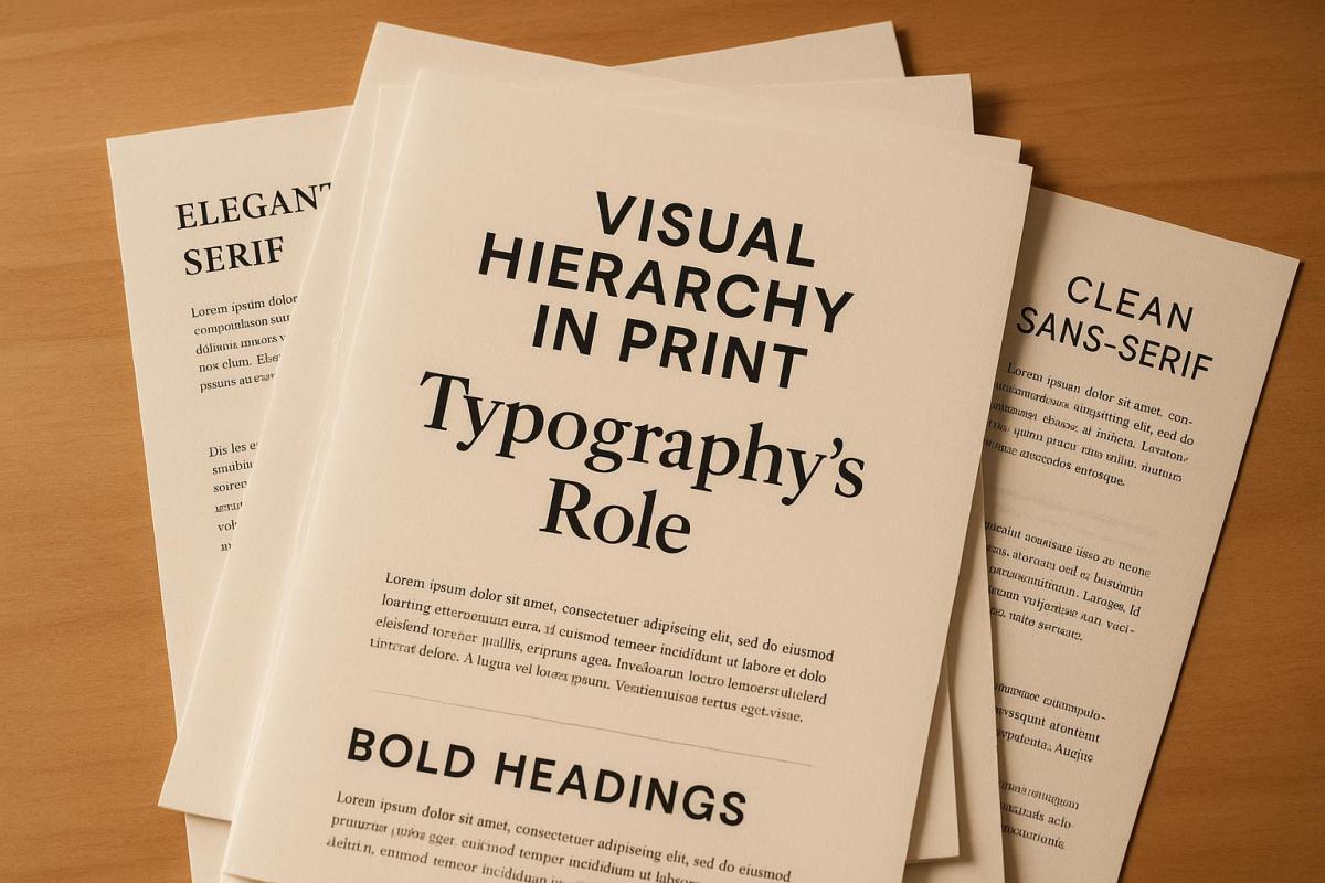
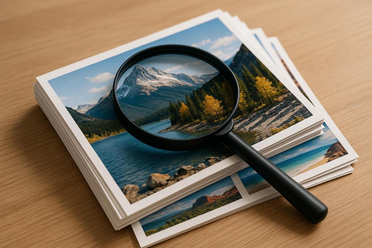
Color calibration ensures that printed colors match digital designs, keeping brand consistency intact. Without it, colors can appear inaccurate, wasting resources and damaging trust. Tools like spectrophotometers and ICC profiles correct these issues, aligning colors across devices and materials while reducing reprints and costs. Here’s a quick look at the best tools:
- Apogee Color Quality Manager: Centralized control for offset and digital presses, automating adjustments and reducing waste.
- X-Rite ColorCert and MeasureColor: Real-time Delta E monitoring for precise adjustments and compliance with standards.
- Fiery Color Profiler Suite: Simplifies ICC profile creation for digital presses, ensuring repeatable accuracy.
- Datacolor Spyder Print: Affordable option for custom ICC profiles, perfect for smaller setups.
- Calibrite Tools: Budget-friendly calibration for monitors and printers, ideal for smaller businesses.
Each tool supports ICC profiles and industry standards like G7 and ISO, helping print shops reduce waste by 20-30% and maintain consistent results. For example, Miro Printing & Graphics Inc. uses these tools to achieve near-perfect color accuracy, saving time and resources while delighting clients. Investing in color calibration tools is a smart move for any printing operation.
Calibrite Profiler 3 adds printer profiling. Updated colour management software
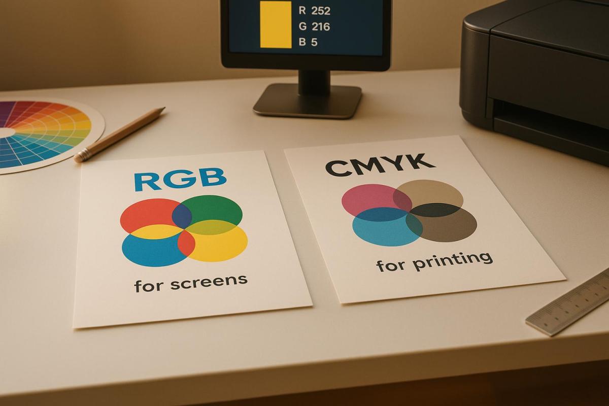
Best Color Calibration Tools for Printing
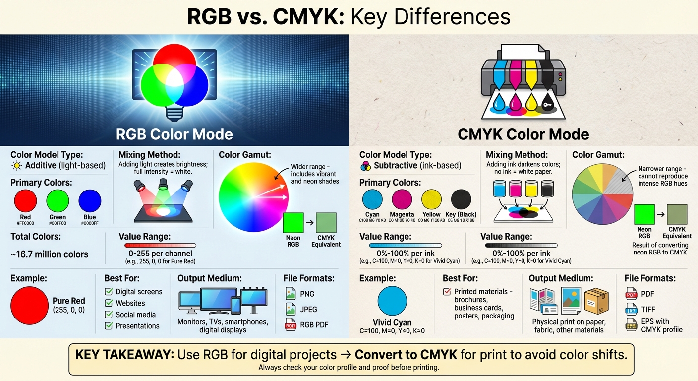
Precision in color control is essential for any printing operation. Whether you’re working with offset presses, digital printers, or small-format devices, having the right calibration tools can make all the difference in achieving consistent, high-quality results. Commercial printers often prioritize tools that integrate seamlessly with their prepress systems, align with standards like ISO 12647 and G7, and provide real-time Delta E monitoring. Below are five standout options that cater to a wide range of printing needs, ensuring consistent color accuracy across various workflows.
Apogee Color Quality Manager
The Apogee Color Quality Manager is a go-to solution for print shops using Agfa‘s Apogee prepress workflow. It offers centralized control over color management for both offset and digital presses. This tool gathers measurement data, ICC profiles, and press settings in one place, using ISO/G7 targets to automatically adjust plate curves for offset presses. For digital devices, it handles calibration cycles and applies ICC profiles to specific media presets, ensuring color accuracy.
One key benefit for U.S. printers is its ability to automate color corrections, reducing setup times and minimizing waste. Additionally, it generates detailed color reports for jobs, which can be shared with clients as proof of compliance with color specifications. By managing both offset and digital devices from a single platform, printers can maintain consistent results for repeat jobs over time.
X-Rite ColorCert and MeasureColor
X-Rite‘s ColorCert and MeasureColor systems excel at real-time Delta E monitoring, allowing operators to make immediate adjustments. These tools compare press sheet measurements to predefined standards – whether a brand’s custom library, ISO references, or specific targets. They calculate Delta E values for solids and overprints, providing pass/fail feedback or trend data. Operators can then tweak ink density, tone values, or curves as needed.
ColorCert operates as a cloud-based platform, making it easy for brand owners and printers in different locations to share performance data. MeasureColor, on the other hand, focuses on pressroom operations, offering live evaluations and instant feedback. Both tools help U.S. printers standardize color targets across devices, reduce disputes over color accuracy, and comply with brand requirements. Case studies have shown that using these systems can cut color-related complaints by over 50% and reduce press setup times by 20–30%[1].
Fiery Color Profiler Suite
Designed for digital presses with EFI Fiery digital front ends (DFEs), the Fiery Color Profiler Suite integrates directly into the Fiery system. It simplifies the process of creating, applying, and verifying ICC profiles, guiding users through test chart printing and measurement to build device-specific profiles. These profiles can be tied to presets, queues, or virtual printers, ensuring repeatable color accuracy for jobs like catalogs, postcards, or short-run packaging.
U.S. digital printers appreciate the automated recalibration features, which maintain consistency without requiring manual adjustments. Additional modules for spot color optimization and verification tools help ensure that presses are within tolerance before running high-value jobs, reducing errors and reprints.
Datacolor Spyder Print
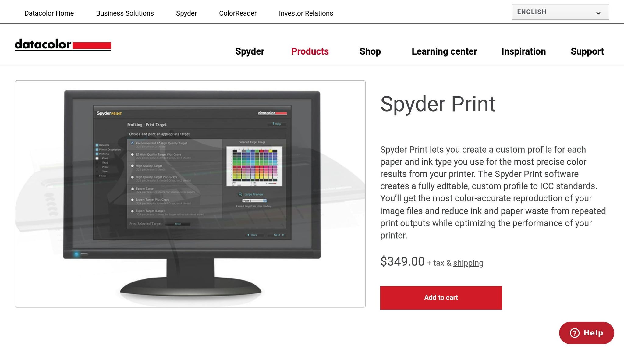
Datacolor Spyder Print is a versatile tool for creating custom ICC profiles tailored to specific printer, ink, and paper combinations. The software walks users through the process of printing test targets, measuring them, and generating profiles. This makes it a great choice for standardizing photo or proofing printers, fine-tuning large-format devices, or aligning smaller in-house printers with production presses.
Positioned as a mid-range solution, Spyder Print offers a balance between affordability and functionality. It’s especially popular for its user-friendly interface and the noticeable improvement in screen-to-print matching it delivers after calibration.
Calibrite Color Calibration Tools
Calibrite offers a range of tools for monitor and printer calibration, based on proven X-Rite technology. These tools are ideal for creative professionals and smaller businesses looking to improve color accuracy without investing in complex enterprise systems. For monitors, they provide calibrated displays for accurate print previews. For printers, they use spectrophotometers to create ICC profiles and generate basic verification reports.
Small and mid-sized U.S. print shops often rely on Calibrite tools to align in-house design and proofing with production output. This not only enhances client confidence but also keeps costs manageable. The product lineup includes everything from entry-level monitor calibrators to comprehensive bundles for both monitor and printer profiling, offering scalable options as color management needs grow.
Using Color Tools in Print Workflows at Miro Printing & Graphics Inc.
Miro Printing & Graphics Inc., based in Hackensack, NJ, has embedded advanced color calibration tools into every step of its production process. To ensure precise color matching across various devices, the shop relies on tools like the Fiery Color Profiler Suite for printer profiling, X-Rite ColorCert for automated chart reading and quality checks, and Datacolor Spyder Print for creating custom ICC profiles. These tools help fine-tune both offset and digital presses to accommodate a variety of substrates.
Miro’s workflow kicks off with profiling using spectrophotometers to scan test prints and measure deviations. The team then optimizes settings and compares results against G7 standards, maintaining a deviation of less than 2 Delta E. This level of accuracy is essential for clients who demand consistent branding across different print runs or technologies. Daily calibration routines ensure equipment stays aligned, while Fiery’s automated setup simplifies the process for both seasoned professionals and newer staff.
For example, when producing mailed brochures for a business client, the team used Calibrite for display soft-proofing and Datacolor Spyder for printer profiling. This combination achieved an impressive 95% color match on the first run, cutting material waste by 30%. These measures not only support the company’s mailing and fulfillment services but also deliver measurable results, including a 50% reduction in reprint waste and color accuracy consistently within 1–2 Delta E.
The commitment to calibration extends beyond pre-press into post-press operations. By integrating tools like Fiery’s Verify and Inspect, Miro ensures that bound and finished materials meet industry standards such as FOGRA. This thorough approach guarantees color consistency throughout the entire production process, delivering uniform results across all completed projects.
Clients regularly highlight Miro’s dedication to quality.
"Mike and his team at Miro have delivered stars, comet, and galaxy size projects for Lycored. No matter how little or large, no matter what the deadline, I sleep at night knowing Miro is on it."
- LycoRed T.
sbb-itb-ce53437
Feature Comparison Table

Color Calibration Tools Comparison: Features, Pricing, and Compatibility for Print Shops
Comparison Table
When it comes to selecting a color calibration tool, the decision largely hinges on your printing environment, budget, and technical needs. To simplify the process, the table below outlines how various tools measure up across key features that are critical for commercial printers. This breakdown makes it easier for print professionals to choose the tool that fits seamlessly into their workflow.
| Tool | Compatibility | Automation Level | ICC Profile Support | Delta E Tolerancing | Pricing Tiers |
|---|---|---|---|---|---|
| Apogee Color Quality Manager | Offset/Digital Press | High | Yes | Delta E 2000 | Custom Pricing |
| X-Rite ColorCert | Offset/Digital Press | Medium | Yes | Delta E 2000 | Subscription Pricing |
| Fiery Color Profiler Suite | Digital Press | High | Yes | Delta E 2000 | Custom Pricing |
| Datacolor Spyder Print | Small Scale/Custom | Low | Yes | Delta E 76 | Affordable One-Time |
| Calibrite Tools | Versatile | Medium | Yes | Delta E 2000 | Affordable One-Time |
Delta E 2000 is widely used as it aligns closely with how humans perceive color differences. Most tools adhere to tolerances under 2.0 Delta E, meeting commercial standards like G7, ISO, and FOGRA. However, the Datacolor Spyder Print still relies on the older Delta E 76 method, which is sufficient for basic profiling but falls short in precision for demanding, brand-specific color matching.
In terms of cost, enterprise tools like Apogee and Fiery typically exceed $5,000 and require custom quotes, while X-Rite ColorCert operates on a subscription model, costing between $1,000 and $3,000 per year per site. For smaller operations or proofing setups, Datacolor Spyder Print and Calibrite offer one-time purchases ranging from $200 to $500, making high-quality color management accessible without recurring expenses.
All tools support ICC profile creation and management. Apogee and Fiery stand out with automated features like tone curve adjustments, while X-Rite integrates i1Profiler for smooth calibration. Meanwhile, Datacolor and Calibrite focus on quick and straightforward custom profile generation. This ICC profile support isn’t just technical jargon – it has real-world advantages. Print shops that implement proper profiling and soft-proofing often experience 20–30% less waste due to more accurate first-run color matching.
Conclusion
When it comes to achieving consistent brand colors in print, color calibration tools are a must-have. Whether you’re running high-volume offset presses or using specialized digital equipment, tools like Apogee Color Quality Manager, X-Rite ColorCert, Fiery Color Profiler Suite, Datacolor Spyder Print, and Calibrite solutions play a key role in maintaining color consistency across different materials. These tools help create precise ICC profiles that correct color imperfections, ensuring smooth transitions from design to final print while meeting industry standards like G7 and ISO.
Proper calibration not only ensures accurate reproduction of CMYK and spot colors but also cuts down on waste and reduces the need for manual adjustments, making the production process more efficient. For example, businesses using the Fiery Color Profiler Suite have reported streamlined workflows and improved color consistency, as highlighted in case studies.
A great example of these tools in action is Miro Printing & Graphics Inc., based in Hackensack, NJ. With over 30 years of experience, they incorporate advanced calibration techniques across all their printing processes, guaranteeing uniformity and high-quality results. From business cards to banners and intricate custom projects, their in-house bindery, design, and fulfillment services ensure your vision is faithfully brought to life.
Looking ahead, advancements like AI-driven optimization and cloud-based platforms promise even greater precision and automation in color management. For businesses and individuals aiming for flawless color accuracy, working with a full-service print shop that uses these cutting-edge tools can make all the difference.
Need prints that perfectly match your brand? Reach out to Miro Printing & Graphics Inc. at bergencountyprinters.com to bring your next project to life with expert color management and personalized service.
FAQs
How do color calibration tools help improve efficiency and reduce waste in printing?
Color calibration tools play a critical role in ensuring your prints display colors accurately and consistently. This precision helps avoid mistakes and cuts down on the need for reprints. Getting the colors right the first time means saving valuable resources like time, paper, ink, and other materials.
Beyond accuracy, these tools simplify the printing process by keeping colors consistent across various printers and print jobs. This not only ensures your projects meet professional-quality standards but also helps reduce unnecessary waste.
Why is Delta E important in color calibration for printing?
Delta E is a number that measures how different two colors are from each other. In the world of color calibration, the goal is simple: the lower the Delta E, the closer the colors match. This level of precision is key for consistent and accurate printing results.
Keeping Delta E low ensures that printed materials appear as intended – whether it’s replicating brand colors or bringing intricate designs to life. In professional printing, where color accuracy directly impacts quality and customer satisfaction, this precision is absolutely critical.
What makes ICC profiles important for achieving accurate colors in printing?
ICC profiles are essential for maintaining accurate and consistent colors in printing. They serve as a universal standard, ensuring that colors are interpreted consistently across various devices like monitors, printers, and scanners. Without an ICC profile, the colors displayed on your screen might look completely different once printed.
Embedding an ICC profile in your digital files ensures your design’s colors are reproduced as intended, eliminating much of the guesswork and helping to avoid expensive reprints. This is particularly important for commercial printing projects, where precision and consistency are non-negotiable.
Related Blog Posts
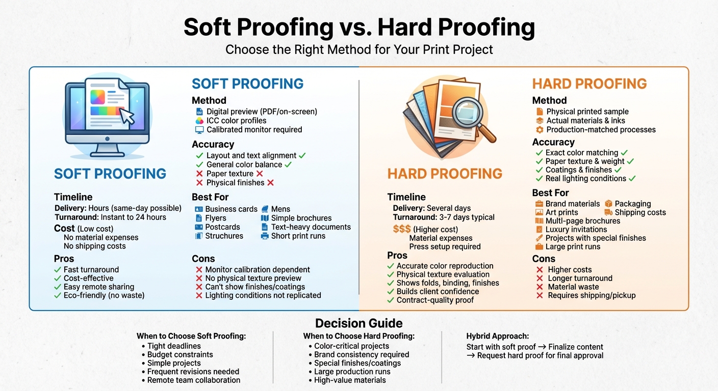
- Soft Proofing Techniques for Accurate Colors
- How to Ensure Color Accuracy in Proofing
- 5 Common ICC Profile Issues and Fixes
- 5 Steps to Use ICC Profiles for Accurate Colors
https://app.seobotai.com/banner/banner.js?id=6940a67ddf12e5e3feb2104d