Checklist for Print-Ready Files: Bleed, Trim, Safe Zone

Learn how to prepare print-ready files with essential guidelines on bleed, trim, and safe zones to ensure professional-quality prints.

Getting your files ready for printing? Here’s the quick breakdown:

  • Bleed: Extend your design 0.125" beyond the trim line to avoid white edges.
  • Trim: The final size of your printed piece after cutting. Example: A letter size (8.5" x 11") with bleed becomes 8.75" x 11.25".
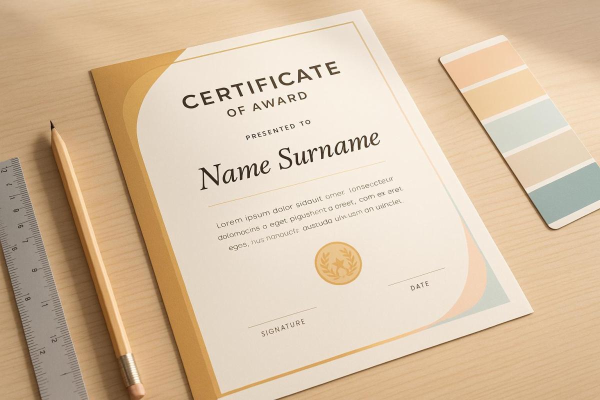
  • Safe Zone: Keep important elements like text or logos 0.25" away from the trim line to avoid accidental cropping.

Why It Matters

Mistakes like cut-off text or misaligned graphics can ruin your design. Following these setup steps ensures your prints look professional and polished.

Quick Setup Tips

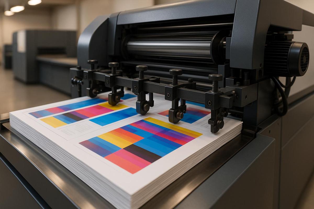
  • Use 300 DPI resolution for sharp images.
  • Convert colors to CMYK for accurate printing.
  • Add crop marks and export as a print-ready PDF.

This guide covers everything you need to know about bleed, trim, and safe zones to ensure flawless printing. Let’s dive in!

What is Bleed? Understanding Printer Bleed

Bleed Setup Guide

Setting up bleed properly ensures your design prints seamlessly from edge to edge, eliminating any unwanted white borders.

What is Bleed?

Bleed refers to the portion of your design that extends past the final trim line. Since printers can’t print all the way to the edge of the paper, this extra area allows the design to cover the entire surface after trimming.

Required Bleed Measurements

In the United States, the standard bleed size is 0.125 inches on each side of your document. For larger prints (those bigger than 18 x 24 inches), the bleed should be increased to 0.5 inches per side.

Here’s a quick guide for common document sizes with bleed:

Document Type Final Size Size with Bleed
Business Card 2.3″ x 2″ 2.425″ x 2.125″
Postcard 4″ x 6″ 4.125″ x 6.125″
Letter Paper 8.5″ x 11″ 8.625″ x 11.125″

Use these measurements as a reference when setting up your document in design software.

Setting Up Bleed in Design Programs

To ensure your design prints correctly, enable crop marks and apply bleed settings when exporting. Here’s how to do it in popular design tools:

  • Adobe InDesign

    • When creating a new document, set the bleed to 0.125 inches in the Bleed and Slug section.
    • On export, make sure to enable crop marks and select "Use Document Bleed Settings".
  • Adobe Illustrator

    • Define bleed values in the New Document dialog box.
    • Extend your background or design elements into the bleed area.
    • When saving as a PDF, check the "Use Document Bleed Settings" option.
  • Adobe Photoshop

    • Increase the canvas size by 0.25 inches (to account for 0.125 inches on each side).
    • Use rulers to mark the trim lines and ensure your design elements extend to the edges.
    • Add crop marks before exporting.

Trim Size Requirements

Trim size refers to the final dimensions of your printed piece after it’s been cut to its finished size. It’s important to distinguish this from the full document size, which includes extra bleed margins to ensure the design extends seamlessly to the edges.

Trim Size vs. Full Document Size

Here’s a quick example: if your trim size is 8.5" x 11" and you add a 0.125" bleed on all sides, the full document size becomes 8.75" x 11.25". This extra margin ensures that no unprinted edges appear after trimming.

Below is a handy table showing common print formats, their trim sizes, and how adding a 0.125" bleed impacts the full document size:

Print Format Trim Size (W x H) Full Document Size (with bleed)
Business Card 3.5" x 2" 3.75" x 2.25"
Postcard 4" x 6" 4.25" x 6.25"
Letter 8.5" x 11" 8.75" x 11.25"
Legal 8.5" x 14" 8.75" x 14.25"
Tabloid 11" x 17" 11.25" x 17.25"

Once you’ve set your trim size, adding accurate crop marks ensures the document is cut to the correct dimensions.

Adding Trim Marks

Trim marks, also known as crop marks, are small lines placed at the corners of your document to guide the printer in cutting it precisely. These marks align with the edge of the bleed area.

Here’s how to add trim marks in two popular design tools:

Adobe InDesign

  • Go to File > Export.
  • Choose "Adobe PDF (Print)" and select the "High Quality Print" preset.
  • In the Marks and Bleed section, check the box for Crop Marks and set an offset equal to or greater than the bleed value.

Adobe Illustrator

  • Navigate to File > Print.
  • In the left panel, select Marks & Bleed.
  • Enable Trim Marks, then adjust the line width and offset to match or exceed the bleed value.

When everything is set, export your file as a print-ready PDF (such as PDF/X-1a) to ensure it meets professional printing standards.

sbb-itb-ce53437

Safe Zone Setup

The safe zone is essential for protecting critical design elements from being trimmed during the printing process. It ensures your content remains intact and visually appealing.

Safe Zone Basics

The safe zone is a margin within your design that keeps important elements – like text, logos, and graphics – away from the edges where trimming occurs. Anything outside this area risks being cut off. To safeguard your design, follow these industry-standard safe zone guidelines:

Print Product Minimum Safe Zone Recommended Safe Zone
General Print Jobs 0.25" from trim 0.25" from trim
Booklets/Catalogs 0.25" from trim 0.375" from trim
Bound Materials 0.375" from trim 0.5" from trim

By adhering to these measurements, you can avoid trimming mishaps and maintain a polished final product. Use these standards to set accurate margins in your design software.

Safe Zone Margins

When creating your design files, keep the following safe zone margin tips in mind:

For standard materials:

  • Keep all essential text and graphics at least 0.25 inches inside the trim line.
  • For bound documents, increase the inner margins to 0.375–0.5 inches.
  • Maintain a 0.125-inch gap between your content and the safe zone boundary to ensure clarity.

For complex projects:

  • Use wider margins, between 0.375–0.5 inches, for premium materials.
  • Avoid placing frames or straight lines too close to the trim edge to prevent uneven cuts.
  • Add extra padding for intricate graphics or detailed designs to maintain their integrity.

Adjustments for specific formats:

  • Hang Tags (3.5" × 2"): Keep text and logos at least 0.25 inches away from the edges.
  • Standard Letters (8.5" × 11"): Ensure a 0.25-inch safe zone on all sides.
  • Bound Publications: Add an additional 0.125–0.25 inches to the inner margins to accommodate binding.

Trimming shifts are common in printing, which is why setting up proper safe zones is critical. If you’re unsure about configuring safe zones in your design files, the team at Miro Printing & Graphics Inc. is ready to assist.

Once you’ve set up your bleed, trim, and safe zones, use this checklist to make sure your file is fully prepared for printing.

Check All Print Margins

Double-check that your margins align with professional standards:

Element Measurement Notes
Standard Bleed 0.125" Commonly used for most print materials
Extended Bleed 0.25"–0.3" Ideal for booklets, catalogs, and folders
Safe Zone 0.25"–0.375" Keep important content away from edges
Round Corner Items 0.325" Best for business cards and postcards

Adjust these measurements as needed for specialized projects.

Technical Requirements

Make sure your file meets these technical specifications:

Resolution Standards:

  • Set the document resolution to 300 DPI.
  • Use original image dimensions for clarity.
  • Confirm all linked images are at 300 DPI.

Color Settings:

  • Convert all colors to CMYK.
  • Ensure solid black elements are set to 100% K (pure black).
  • Avoid setting white text to overprint.
  • Remove any remaining RGB elements from the file.

Essential Elements:

  • Include crop marks outside the design area.
  • Add fold and score marks if required.
  • Embed all fonts or convert text to outlines.
  • Confirm all images are properly linked and embedded.

Once these steps are complete, you’re ready to export your file as a final PDF.

PDF Export Settings

Follow these guidelines to create a print-ready PDF:

  • Use the ‘Press Quality’ preset during export, ensuring crop marks, bleeds, and CMYK conversion are included.
  • Set document bleed to 0.125".
  • Embed all fonts to avoid missing typefaces.
  • Preview separations to check ink coverage.
  • Ensure the page size matches the trim size exactly.
  • Confirm the page order is correct.
  • Flatten any transparency to prevent printing issues.

At Miro Printing & Graphics Inc., we recommend exporting your file using PDF/X standards to minimize potential issues with color, fonts, or trapping. Before submitting your file, use Adobe Acrobat Professional to preflight and verify all specifications are met for a smooth printing process.

Conclusion

Getting the bleed, trim, and safe zones right is key to achieving polished, professional prints. For example, using a 0.125-inch bleed guarantees clean edges, while a safe zone of at least 0.25 inch ensures that important content stays intact. These measurements account for the slight variations that naturally occur with modern printing equipment.

At Miro Printing & Graphics Inc., we’ve seen firsthand how attention to these details can make all the difference. From business cards to large-format banners, our quality assurance process ensures every project meets the highest standards.

Here are a few essential file preparation tips to keep in mind:

  • Convert colors to CMYK for accurate printing.
  • Use a resolution of 300 DPI to maintain sharpness.
  • Extend backgrounds into the bleed area.
  • Keep key design elements within the safe zone.
  • Export files using PDF/X standards for best results.

Even small trimming inconsistencies can impact your final product, so working with a printer who understands these details is critical. Choosing an experienced partner ensures your prints come out looking sharp and professional every time.

"The end result is a finished piece that exceeds your highest expectations but never your budget!"

  • Miro Printing & Graphics Inc.

FAQs

How can I make sure my design’s colors print accurately?

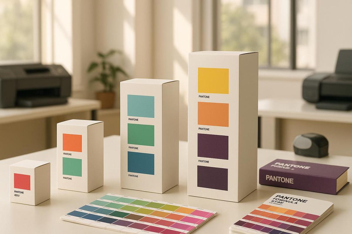
When aiming for accurate color printing, always work in the CMYK color mode – this is the standard for print production and ensures your designs translate correctly to the printed page. It’s also important to calibrate your monitor so the colors you see on screen are as close as possible to the final printed result.

For more precise results, consider using color management tools to create custom profiles tailored to your specific printer and paper type. Running test prints can help you catch any discrepancies and fine-tune your colors before completing your project. If maintaining exact color consistency is a priority, the Pantone Matching System (PMS) is a reliable option for achieving consistent and precise color matching.

How can I set up bleed, trim, and safe zones if my design software isn’t mentioned?

If your design software isn’t listed specifically, don’t worry – you can still prepare your file to meet bleed, trim, and safe zone requirements by sticking to these general steps:

  • Set the document size to match the final trim size of your project. For instance, if your finished piece will be 8.5" x 11", use those exact dimensions when setting up your file.
  • Add a bleed area by increasing the document size slightly. A standard bleed is 0.125" (1/8 inch) on all sides, so your total document size would grow to 8.75" x 11.25". Make sure any background colors, images, or designs extend into this bleed area to avoid any unprinted edges after trimming.
  • Define a safe zone within the trim line, usually 0.125" to 0.25" inside the edge. Keep all critical text and graphics within this area to ensure they aren’t accidentally trimmed off.

When you’re ready to export, be sure to include crop marks and enable the bleed settings. Following these steps will help ensure your file is print-ready, no matter which design software you prefer.

Why do I need to convert my file to a print-ready PDF, and what problems could occur if I don’t?

Converting your file into a print-ready PDF is a crucial step to ensure it aligns with professional printing standards. This includes properly setting up bleed, trim, and safe zone alignment. By doing so, you maintain the integrity of your design – fonts, colors, and layouts will appear just as you envisioned, without any unexpected glitches or distortions.

Skipping this step or improperly preparing your file can lead to frustrating issues like missing fonts, inaccurate colors, or misaligned elements. These mistakes can result in poor print quality, unintended cropping, or even unusable prints, which may cause delays and extra expenses. Creating a print-ready PDF eliminates these risks, ensuring your printing process goes smoothly and your final product looks polished.

Related posts

https://app.seobotai.com/banner/banner.js?id=682a7b9d5642a17d106efca0

5 Causes of Registration Errors in Printing

Explore the top 5 causes of registration errors in printing and effective prevention strategies to enhance print quality and reduce costs.

Registration errors in printing can ruin the final product, causing blurred images, misaligned colors, and wasted materials. They lead to higher costs, customer dissatisfaction, and delays. Here are the top 5 causes of these errors and how to prevent them:

  1. Worn Mechanical Parts: Misaligned gears, cylinders, or loose belts from wear and tear disrupt alignment. Regular maintenance and inspections can prevent this.
  2. Incorrect Plate Installation: Poorly mounted plates cause misregistration. Use precision tools and standardized mounting procedures.
  3. Paper Tension Problems: Uneven tension leads to material stretching or contracting, throwing off alignment. Automated tension control systems help maintain consistency.
  4. Temperature and Humidity Issues: Fluctuations in environmental conditions affect paper and ink, causing misalignment. Keep the workspace between 68°F–76°F and 35%–55% humidity.
  5. Machine Calibration Problems: Over time, calibration drifts, leading to misaligned prints. Routine calibration checks and software updates are essential.

Quick Overview of Prevention Steps:

  • Maintenance: Regularly check and replace worn parts.
  • Environment: Control temperature and humidity.
  • Calibration: Perform monthly checks and alignments.
  • Training: Ensure operators follow best practices.
  • Automation: Invest in tools like tension control systems.

By addressing these causes, you can reduce errors, improve print quality, and avoid costly reprints.

1. Worn Mechanical Parts

Impact on Registration Alignment

When mechanical parts start to wear out, they can seriously mess with registration alignment in printing. Even slight wear can lead to noticeable issues like color inconsistencies and misregistration, which directly affect print quality. The most frequent culprits include:

  • Misaligned or damaged gears
  • Misaligned cylinders
  • Faulty grippers
  • Loose belts and rails, which can destabilize the machine

How Often It Happens

Mechanical wear doesn’t happen overnight. It’s a gradual process, but certain factors can speed it up. Registration problems tend to crop up more often in situations like:

  • High daily print volumes
  • Aging or outdated printing equipment
  • Lack of regular maintenance
  • Poor environmental conditions, such as extreme humidity or dust

If you’re noticing recurring issues, it’s worth investigating whether wear and tear is the underlying cause.

Steps to Diagnose

To pinpoint worn components as the issue, follow these steps:

  • Inspect gears, cylinders, and bearings for visible signs of wear or damage.
  • Watch for consistent patterns of misalignment in print quality.
  • Listen for unusual noises or observe irregular movement of the substrate during operation.

Ways to Prevent

"Keeping your printing press clean and well lubricated is the very basic maintenance activity that should be done in-house on a regular basis." – David Lee, Focus Label

A proactive maintenance plan can go a long way in preventing wear-related problems. Here’s an example of a routine schedule:

Maintenance Task Frequency Purpose
Lubrication Weekly Reduces friction and minimizes wear
Gear Inspection Monthly Detects early signs of damage or misalignment
Belt Tension Check Bi-weekly Ensures smooth and accurate movement
Cylinder Alignment Quarterly Keeps registration alignment in check

For best results:

  • Stick to manufacturer-recommended lubricants for all moving parts.
  • Keep detailed maintenance logs to monitor wear trends over time.
  • Replace worn-out parts as soon as they’re identified.
  • Train operators thoroughly on proper machine handling and upkeep.
  • Maintain stable environmental conditions to avoid unnecessary strain on components.

At Miro Printing & Graphics Inc., regular maintenance isn’t just about avoiding errors – it’s about extending the life of your equipment and minimizing downtime. A little effort up front can save a lot of headaches later.

10 Common Causes of Print Misregistration in Flexographic Printing

2. Incorrect Plate Installation

Incorrectly installing plates can be a major source of printing errors, especially after addressing mechanical wear.

Impact on Registration Alignment

When plates are not installed properly, the entire registration process suffers. This can lead to blurred images, color inconsistencies, misaligned text, and overlapping design elements. Essentially, the quality of the final print takes a big hit.

How Often It Happens

Errors in plate installation are surprisingly common and typically occur during:

  • The initial setup of plates
  • Plate replacements
  • Rushed operations under tight deadlines
  • High-pressure, high-volume production runs

"Misregistration by the tiniest fraction will result in waste, machine downtimes, re-prints of jobs, and delays in delivering the end customer."

The key to avoiding these issues lies in identifying and addressing the root causes through thorough checks.

Steps to Diagnose

To pinpoint installation errors, use this systematic checklist:

Inspection Point What to Check Common Issues
Plate Position Verify the centerline; ensure plates are evenly spaced Off-center mounting, uneven spacing
Mounting Surface Check tape condition and adhesion Air bubbles, debris, poor bonding
Tension Assess plate tightness Loose sections, over-tensioning
Registration Marks Confirm microdot alignment Misaligned registration points

Ways to Prevent

Avoid installation errors by following these best practices:

  • Use precision tools to align plates perfectly with the cylinder centerline.
  • Double-check alignment using microdots or other registration marks before starting production.
  • Standardize mounting procedures across all shifts to ensure consistency.

"Improper mounting results in a slow makeready and machine downtime as the plate is re-mounted. Also, re-mounting the plate increases the risk of accidental stretching." – Mark Gibis, vice president of sales for Doyle Systems

At Miro Printing & Graphics Inc., we recognize the importance of proper plate installation. Our skilled technicians rely on advanced mounting systems and adhere to strict protocols to ensure every plate is aligned with precision, delivering top-tier print quality every time.

3. Paper Tension Problems

Paper tension problems can wreak havoc on registration, leading to poor print quality and operational inefficiencies. After mechanical issues and plate installation errors, tension-related challenges are another major obstacle to achieving precise registration.

Impact on Registration Alignment

When paper tension fluctuates, it often results in misregistration. This happens because the material stretches or contracts unevenly, throwing off the alignment between color layers. For jobs that require high precision, even minor distortions can make the final product unusable.

Substrate characteristics like thickness, stiffness, and elasticity can also contribute to issues. These variations may cause wrinkles, skewed images, color misalignment, or uneven ink transfer – problems that directly affect the quality of the final print.

How Often It Happens

Paper tension issues are a frequent concern in printing operations. For example, with papers and high modulus films, a diameter change as small as 0.1% (about 1 mil per inch of radius) can cause significant tension disruptions. These problems typically arise during:

Operation Phase Common Tension Issues
Roll Changes Variations in diameter disrupt tension control
Speed Transitions Rapid acceleration or deceleration creates fluctuations
Environmental Shifts Changes in temperature and humidity affect material properties
Extended Runs Gradual roll diameter changes alter tension dynamics

Steps to Diagnose

To identify and address paper tension problems effectively, consider these steps:

  • Monitor web guide systems for excessive lateral movement.
  • Check tension readings across various zones of the press.
  • Inspect for visible signs of material stress, such as wrinkles or distortions.
  • Evaluate environmental conditions in the press room, including temperature and humidity levels.

Quick action is crucial to stabilize tension and maintain smooth operations.

"It is impossible to control a web without proper tension being applied to it." – Jeff Damour, Converter Accessory Corp.

Ways to Prevent

Here are some practical strategies to help avoid paper tension issues:

  • Automated Tension Control Systems: Advanced systems with real-time sensors can continuously monitor and adjust tension levels. Keeping tension within 10% to 25% of the web’s tensile strength ensures consistent performance.
  • Environmental Management and Maintenance:
    • Use specialized HVAC systems to regulate temperature and humidity.
    • Regularly inspect and maintain tension sensors, controllers, web guide systems, and drive mechanisms.

"Proper tension control is essential to controlling print-to-print or die-cut registration." – Jeff Damour, Converter Accessory Corp.

sbb-itb-ce53437

4. Temperature and Humidity Issues

Just like mechanical and paper tension problems, shifts in temperature and humidity can throw off registration. These environmental factors affect material size and ink behavior, leading to misaligned prints.

Impact on Registration Alignment

Temperature changes between 65°F and 75°F can cause materials to expand or contract, disrupting alignment. Similarly, humidity levels outside the 40%–60% range can make paper absorb or lose moisture, altering its dimensions and causing registration problems.

Here’s a quick breakdown of how these conditions affect printing:

Condition Impact on Materials Effect on Registration
High Humidity (>60%) Paper absorbs moisture, leading to warping Misaligned colors and wrinkled prints
Low Humidity (<40%) Paper dries out, becoming brittle and prone to static Feeding issues and uneven registration
High Temperature (>75°F) Accelerated ink evaporation Poor ink adhesion and color inconsistencies

How Often It Happens

These issues are especially common during seasonal changes or in facilities without proper climate control. Without consistent environmental management, they can escalate quickly, making precise registration a challenge.

Steps to Diagnose

To identify these problems, use a hygrometer to monitor temperature and humidity levels. Look for signs like curled paper, static buildup, or printing defects such as ink bleeding or unexpected color shifts.

Ways to Prevent

The best way to avoid these issues is by keeping the temperature between 68°F and 76°F and maintaining humidity levels between 35% and 55%.

"When printing on paper, when the humidity of the working environment becomes too high, this will lead the paper to absorb the humidity, increasing the water percentage in the paper. As a result, the paper can become wrinkled, and easily disfigured. Wrinkled and disfigured paper will cause issues when it comes to holding the print registration." – Zack Chen, KYMC

Here are some practical steps to maintain optimal conditions:

  • Use automated HVAC systems, dehumidifiers, or humidifiers to stabilize the environment.
  • Store materials in climate-controlled areas to prevent exposure to extreme conditions.
  • Pre-condition paper before printing to ensure it’s acclimated to the environment.
  • Regularly monitor and adjust environmental controls.

For digital printing, keeping relative humidity between 30% and 50% can also help reduce static buildup and improve inkjet precision. Proper climate management is essential to ensure consistent and accurate registration.

5. Machine Calibration Issues

Calibration plays a crucial role in ensuring accurate registration, just like managing mechanical wear and adapting to external factors. When calibration drifts from its intended settings, it can significantly affect print quality and precision.

Impact on Registration Alignment

Modern digital printers are built to keep alignment within a tight tolerance of +/- 0.5 mm. However, when calibration is off, you might notice misaligned barcodes, color shifts, inconsistent positioning, or even data errors.

How Often It Happens

Calibration problems tend to creep in over time, especially with frequent use, skipped maintenance routines, or changes in environmental conditions.

Steps to Diagnose

If you suspect calibration issues, here’s how to identify them:

Issue Diagnostic Method Warning Signs
Color Misalignment Print test patterns Noticeable color bleeding or shadows
Registration Drift Check registration marks Irregular positioning across prints
Print Head Problems Inspect print heads Streaks or missing print elements

Ways to Prevent

Experts stress the importance of regular calibration to maintain high-quality results:

"Needless to say, precise registration is a prerequisite for high-quality printing. Achieving the proper registration requires careful set-up and calibration of the printing equipment, as well as frequent monitoring during the production process."

To reduce the risk of calibration-related issues:

  • Perform routine calibration checks based on how often the equipment is used.
  • Clean printheads and nozzles regularly to ensure smooth ink flow.
  • Replace UV lamps as per the maintenance schedule and keep firmware and drivers updated.
  • Use camera-based verification systems for real-time monitoring of alignment.

Many modern printers come equipped with automated tools like Production Accurate Registration (PAR) and Full Width Array (FWA). These advanced systems can detect and adjust minor misalignments before they escalate into visible defects.

Experts also emphasize the importance of proper color calibration:

"Proper color calibration ensures that the colors are accurate and consistent across a range of different materials, such as paper, vinyl, and fabric. It also ensures that the colors will be as close as possible to the original design, ensuring that the end result is of high quality."

How to Fix Registration Problems

Once you’ve pinpointed registration issues, it’s time to address them with specific solutions to get your print quality back on track. These steps build on the earlier diagnostics and are designed to tackle registration errors head-on.

Immediate Troubleshooting Steps

Component Action Required Expected Outcome
Paper Size Ensure dimensions match specifications Fixes misalignment problems
Printer Settings Check alignment and resolution Ensures precise color placement
Design Software Confirm compatibility and updates Avoids software-related issues
Ink Levels Inspect cartridge installation Keeps print quality consistent

Environmental Controls

Maintain a temperature range of 65°F to 75°F and relative humidity between 45% and 55% for optimal registration accuracy. Additionally, make sure the workspace has proper air filtration to reduce dust, which can interfere with printer performance.

Professional Maintenance Protocol

  1. Daily Checks
    Inspect printheads and alignment marks regularly to catch potential issues early.
  2. Weekly Maintenance
    Pay attention to mechanical components and calibration.

    "Printer registration check and calibration must be first thing to look at. And must be made on regular basis, if you need consistent results"

  3. Monthly Procedures

    • Verify plate mounting
    • Clean gripper pads
    • Adjust web tension
    • Perform full calibration checks

    "One way color to color registration if affected is from dirty or worn gripper pads. Powder can build up on the pads causing mis register. One of many things to keep an eye on"

Material Handling Best Practices

Always store paper in its original packaging until it’s ready for use. Let it acclimate to the printing environment before loading it into the printer. High-quality paper is typically manufactured to maintain humidity levels between 25% and 50%.

Advanced Troubleshooting

If basic adjustments don’t solve the problem, it’s time to dig deeper. Reassess the plate mounting process and double-check calibration settings for any discrepancies.

"Standardized maintenance directly minimizes waste and downtime when carefully and reliably practiced. There are also the added benefits of achieving and maintaining print quality, increasing profitability and customer satisfaction"

Conclusion

Addressing registration challenges requires a well-thought-out strategy that builds on the causes and solutions discussed earlier. Registration errors can disrupt print quality and workflow, but they are preventable with the right approach. Routine maintenance, stable conditions, and proactive quality control are key to achieving consistent, high-quality prints.

Essential Prevention Steps

Area Maintenance Action Frequency
Equipment Clean paper feed system Daily
Software Update preflight checks Weekly
Environment Monitor temperature Continuous
Quality Control Calibrate devices Monthly

Maintaining stable printing conditions is a cornerstone of registration accuracy. For detailed guidance on managing environmental factors, refer back to earlier sections.

"Maintaining stable and controlled conditions is essential for consistent quality. Especially when printing high-volume jobs or high-precision items like product packaging or textiles."

In cases where basic troubleshooting doesn’t resolve hardware issues, professional assistance may be necessary.

"The problem you are experiencing is beyond user fixability at this point, as it is a hardware problem between the print head and the rollers." – Tom K, Technician

To ensure smooth operations and avoid registration problems, consider these practices:

  • Install smart sensors to monitor environmental conditions in real time.
  • Conduct regular prepress proofing before starting full production runs.
  • Schedule routine maintenance protocols to keep equipment in top shape.
  • Invest in staff training to stay updated on software and printing techniques.

Well-prepared files are another critical factor in minimizing errors. Proper file preparation not only prevents delays but also ensures a seamless printing process, safeguarding the quality of your final product.

For expert advice on tackling registration issues, reach out to Miro Printing & Graphics Inc. today.

FAQs

Why is regular maintenance important for preventing registration errors in printing?

Keeping up with regular maintenance is key to avoiding registration errors in your printing equipment. It helps ensure that your machines remain properly aligned and calibrated, which is crucial for achieving sharp and accurate print registration. Without this, you might encounter problems like colors or images that don’t line up as they should.

Routine checks also allow you to spot mechanical issues, like worn-out parts, before they start affecting the quality of your prints. Tackling these problems early means you can keep your equipment running smoothly, minimize downtime, and consistently deliver top-notch results with every print job.

How can I manage temperature and humidity in a printing workspace to improve print quality?

Maintaining the right temperature and humidity in your printing workspace is key to producing consistent, high-quality results. Ideally, you should keep the relative humidity between 45% and 60%. This range helps minimize problems like paper shrinkage, static buildup, and misfeeds. As for temperature, aim for about 73°F – this ensures your ink performs as it should and prevents mechanical issues with your equipment.

To stay on top of these conditions, consider using tools like hygrometers for regular monitoring. Keeping these factors in check not only enhances print quality but also helps your equipment last longer.

Why is proper plate installation important for accurate printing registration?

Proper installation of printing plates plays a key role in achieving accurate registration during the printing process. When plates are securely and precisely aligned on the press, it ensures that each element of the design is printed exactly where it should be. On the other hand, misaligned plates can lead to noticeable problems like blurry images, incorrect color overlaps, and an overall drop in print quality.

Registration accuracy relies on the exact alignment of each color layer. Even minor misalignments can create visible flaws in the final product, affecting both its appearance and the professional impression it leaves. By taking the time to install plates correctly, you can prevent these issues and consistently produce top-notch prints.

Related posts

https://app.seobotai.com/banner/banner.js?id=68299b4d5642a17d106dc183

5 Design Tips for Award Certificates

Learn essential design tips for creating professional award certificates that are visually appealing, accessible, and secure.

Crafting the perfect award certificate is simpler than you think. Here’s a quick guide to get started:

  • Focus on Layout: Use a clean, grid-based design to highlight the recipient’s name and award title.
  • Choose Colors Wisely: Pick colors that enhance readability and align with your brand. Ensure sufficient contrast for accessibility.
  • Select Fonts Thoughtfully: Match fonts to the certificate’s tone – serif for formal, sans-serif for modern – and limit to 2–3 complementary fonts.
  • Include Essential Elements: Add the title, recipient’s name, achievement details, date, and signatures.
  • Use Quality Materials: Opt for premium paper (120–250 GSM) and professional printing methods like digital or offset for a polished finish.

How to design custom certificates and awards

Layout and Visual Structure

Crafting a certificate with a clean, organized layout sets the stage for professional recognition. A well-thought-out arrangement not only grabs attention but also ensures the achievement is communicated clearly and effectively.

Main Focus Points

To make the certificate impactful, the recipient’s name and the award title should stand out. Use a larger font size and place the name prominently above the title, ideally centered. At Miro Printing & Graphics Inc., they recommend leaving a generous top margin for the name to maintain a sense of balance and formality. A clear structural grid can help establish this focus and keep the layout cohesive.

Grid-Based Design

Using a grid is a smart way to divide the certificate into distinct sections. For example, the header can house the logo and title, the main area can feature the details, and the footer can include the date and signatures. As Josef Müller-Brockmann, a pioneer in design, once said:

"One must learn how to use the grid; it is an art that requires practice."

Troy Templeman, another design expert, adds:

"(Grids) speed up the design process by helping designers decide where content should be placed rather than where it could be placed."

This structured approach ensures that every element has a defined place, making the design both functional and visually appealing.

Space Management

Building on the grid layout, the use of white space is equally important. Generous, consistent margins and spacing can frame the content beautifully, prevent clutter, and create a clear visual hierarchy. Thoughtful use of white space helps guide the viewer’s eye naturally across the certificate, emphasizing key elements while maintaining a polished and professional look.

Color Selection

The colors you choose for a certificate can have a big impact on how it’s perceived. At Miro Printing & Graphics Inc., the design team knows that picking the right colors not only makes a certificate visually appealing but also ensures it’s accessible to everyone.

Color Meaning

Colors do more than just look nice – they communicate the importance of the achievement. When designing certificates, think about how different colors influence mood and perception. For example, classic combinations like black text on a white background convey formality and are easy to read. Always make sure the text stands out sharply against the background to maximize clarity.

Text Visibility

Accessibility is key. Choose colors that not only highlight the achievement but also meet a minimum contrast ratio of 4.5:1 between text and background. This ensures readability for everyone, including the 2.2 billion people worldwide who live with visual impairments.

Text & Background Combination Contrast Ratio Readability Rating
Black on Yellow 19.56:1 Excellent
White on Purple 9.42:1 Very Good
Blue on Orange 4.35:1 Fair
Green on Red 1.28:1 Poor

These guidelines are especially helpful for designing certificates that are accessible to individuals with color vision deficiencies, which affect about 1 in 12 men and 1 in 200 women.

Brand Colors

Once you’ve ensured the text is clear and readable, you can incorporate your organization’s brand colors to reinforce identity. For example, use your primary blue for borders or accents while keeping black for the main text. If your brand colors don’t provide enough contrast for readability, consider tweaking the shades slightly. This way, you can maintain your brand’s look without sacrificing legibility.

Font Choice and Combinations

Typography plays a pivotal role in creating professional certificates. At Miro Printing & Graphics Inc., the design team knows that choosing the right fonts can transform a certificate from looking ordinary to exuding prestige. The right typographic decisions build on the visual balance established in the earlier stages of the design.

Fonts That Match the Certificate’s Tone

Different types of certificates require fonts that align with their purpose and tone. Here’s a quick guide:

Font Category Best Uses Recommended Fonts Characteristics
Serif Academic diplomas, formal awards Times New Roman, Garamond, Baskerville Classic, formal, and highly readable
Script Recognition awards, achievements Lucida Calligraphy, Great Vibes Elegant with a personal touch
Sans-Serif Corporate certificates, modern awards Arial, Helvetica Neue, Raleway Clean and contemporary
Blackletter Prestigious institutional awards Old English Text MT Ornate and traditional

"Typography contains fonts, sizes, and styles for the letters – the central elements of certificate design. Fonts used in certificates express design mood and meaning and improve the certificate’s readability." – Ola Kozielska, Content designer at Certifier

Text Size and Style

For standard letter-sized certificates (8.5 x 11 inches), choosing the right text size ensures readability and a polished appearance. Here’s a breakdown:

  • Recipient’s name: 20–50 points (largest and most prominent element)
  • Certificate title: 14–30 points
  • Main body text: 10–14 points
  • Signatures and dates: 8–30 points

Using bold for titles and names helps establish a clear hierarchy, while keeping supplementary text in regular weight ensures balance.

Font Matching

Pairing fonts thoughtfully can elevate the overall design of your certificate. Below are some tried-and-true combinations:

  • Modern Combination: Dolce Vita for headlines paired with Montserrat for body text creates a sleek, contemporary style.
  • Clean Aesthetic: Oswald combined with Lato Light delivers a crisp and professional look.
  • Traditional Balance: Rozha for names paired with Montserrat for details strikes a perfect balance between elegance and readability.

To maintain a polished and cohesive appearance, limit your design to 2–3 complementary fonts. Mixing fonts thoughtfully can create striking contrasts that enhance visual appeal while reinforcing the structure of the certificate.

sbb-itb-ce53437

Required Design Elements

Crafting a well-designed certificate means including key elements that ensure it feels authentic and professional. By carefully considering layout, colors, and specific components, you can create a certificate that not only looks polished but also holds up under scrutiny.

Basic Components

Certain elements are essential to authenticate a certificate and establish its credibility. Here’s a breakdown of what to include and where to place them:

Component Purpose Placement Guidelines
Title Identifies the award or achievement Top center, largest text
Presentation Line Features a phrase such as "presented to" Upper third, centered
Recipient’s Name Highlights the honoree’s name Center, prominent size
Achievement Description Details the accomplishment Middle section
Organization Name Identifies the issuing body Lower third
Date States when the award is presented Lower section
Signatures Validates the certificate Bottom portion

While these components establish the foundation, adding security measures ensures the certificate remains tamper-proof.

Anti-Forgery Features

To protect against forgery, consider incorporating advanced security features. These measures not only safeguard authenticity but also add a layer of sophistication:

  • Digital Verification: Use QR codes that link to an online verification system.
  • Physical Elements: Include heat-sensitive ink that changes color if tampered with.
  • Unique Identifiers: Add individual serial numbers or tracking codes for traceability.
  • Advanced Printing Techniques: Use microprinted borders or signature lines to deter counterfeiting.

These features work together to secure the certificate while maintaining its professional appearance.

Visual Extras

Beyond functionality, adding visual enhancements can elevate the overall design and make the certificate stand out. Striking the right balance is key – dedicate 30–40% of the space to white space for a clean and balanced look. Here are a few ways to enhance the design:

  • Borders and Frames: Opt for sleek, modern borders or subtle frames instead of overly ornate designs for a more contemporary feel.
  • Seals and Emblems: Incorporate elements like embossed seals, metallic foil accents, digital watermarks, or custom holographic features to give the certificate a distinguished touch.
  • Special Printing Effects: Premium options such as spot UV coating, metallic inks, raised printing, or custom embossing can add texture and visual interest. For example, companies like Miro Printing & Graphics Inc. specialize in these high-end finishes to make certificates truly stand out.

Paper and Print Options

Selecting the right paper and printing method can enhance both the look and longevity of a certificate.

Paper Types

The weight and texture of the paper play a big role in making a certificate feel special. Most professional certificates use paper that weighs between 120–250 GSM (grams per square meter). Here are some premium paper options to consider:

Paper Type Characteristics Best Use Cases
Parchment Features an antique, mottled appearance with excellent durability Academic certificates, traditional awards
Linen Embossed texture that feels luxurious and professional Business certificates, corporate awards
Laid A handcrafted look with a distinctive watermark Prestigious awards, formal recognition
Security Includes anti-forgery features like watermarks Legal documents, professional certifications
Synthetic Water-resistant and tear-proof for long-lasting durability Certificates exposed to the elements or frequent handling

When choosing paper, keep these factors in mind:

  • Acid-free composition: Prevents yellowing over time.
  • Printer compatibility: Ensure your printer can handle paper weights up to 80–100 lb.
  • Surface finish: Matte finishes are often easier to read and less reflective.
  • Archival quality: Essential for certificates that need to last for generations.

Once you’ve chosen the paper, it’s time to think about the printing method that works best for your design.

The printing process you choose can make a big difference in how your certificate looks and feels.

Benefits of Digital Printing:

  • Perfect for small to medium runs (1–500 copies).
  • Allows for easy adjustments and proofs without the need for plates.
  • Enables personalization for each certificate.
  • Offers faster turnaround times.
  • Uses an environmentally friendly process.

Advantages of Offset Printing:

  • Delivers precise color matching with the Pantone Matching System.
  • Uses oil-based inks that absorb into the paper for a high-quality finish.
  • More cost-effective for large print runs.
  • Works with a broader range of paper types.

"A significant difference between digital printing and offset printing is how the ink adheres to the paper. In traditional offset printing, the ink is oil-based and soaks into the paper, while digital ink adheres to the paper surface, which may result in more vibrant colors but less resilience over time." – Kelley Create

For an extra touch of sophistication, companies like Miro Printing & Graphics Inc. offer both digital and offset printing, along with specialty finishes, to elevate the overall quality of your certificates.

Conclusion

A certificate isn’t just a piece of paper – it’s a symbol of accomplishment and professional trustworthiness. When designed thoughtfully and printed with care, it becomes a meaningful keepsake that recipients will treasure, while also reflecting positively on your organization.

Let’s revisit the essentials: Focus on a layout that highlights key details using a clear hierarchy. Select colors that not only match your brand but also ensure readability. Pair fonts strategically – mixing serif and sans-serif styles can add both clarity and sophistication. Don’t forget to incorporate essential design elements and anti-forgery features to safeguard authenticity.

"The design of a certificate is more than just aesthetic. A well-crafted certificate not only looks impressive but also conveys a sense of professionalism and value".

For an impeccable finish, collaborating with professionals like Miro Printing & Graphics Inc. can make all the difference. Their expertise in fine-tuning critical details – like color accuracy and layout precision – ensures that your certificates meet the highest standards. The result? A polished and enduring token of recognition that recipients will proudly display.

FAQs

How can I make sure the colors in my award certificate are accessible for everyone, including those with visual impairments?

To make your award certificate more inclusive for individuals with visual impairments, keep these tips in mind:

  • Prioritize strong contrast: Use a contrast ratio of at least 4.5:1 for regular text and 3:1 for larger text. This ensures the content is easier to read.
  • Select color-friendly combinations: Avoid depending solely on red and green, as these colors can be challenging for those with color vision deficiencies. Instead, opt for dark text on a light background for better clarity.
  • Go beyond color: Don’t use color alone to convey important information. Incorporate text labels, patterns, or symbols to make your design more inclusive.

Using contrast-checking tools during the design process can help you verify accessibility while keeping your certificate visually appealing to everyone.

Why is using a grid-based design important for award certificates, and how does it enhance the layout?

Using a grid-based design for award certificates plays a key role in achieving a clean, polished appearance. Grids act as a structural guide, ensuring that all elements – like text, images, and logos – are evenly aligned and properly spaced. This creates a balanced layout that feels organized and professional.

By maintaining consistent spacing and alignment, a grid system improves readability and helps the viewer focus on the certificate’s content. Beyond just looking good, this approach adds to the certificate’s overall credibility, making it a more impactful and memorable symbol of recognition.

What are the best ways to make award certificates more secure and harder to forge?

To boost the security and credibility of your award certificates, consider adding these features:

  • Security paper with embedded fibers or watermarks that are tough to duplicate.
  • Holograms or embossed seals that provide a polished and tamper-resistant look.
  • Unique serial numbers or barcodes for easy tracking and verification.
  • Invisible ink that reveals itself under UV light for added protection.

These features not only help prevent counterfeiting but also give your certificates a professional edge. If you’re looking for expert printing and design services, Miro Printing & Graphics Inc. in Hackensack, NJ, can assist in creating secure and visually striking certificates.

Related posts

https://app.seobotai.com/banner/banner.js?id=6827d7e45642a17d106c5f26

Ultimate Guide to Textured Printing Effects

Explore the world of textured printing effects, from embossing to UV coating, and discover how they enhance designs and materials.

Textured printing transforms flat designs into tactile, eye-catching prints by adding raised, embossed, or patterned surfaces. It’s perfect for creating premium business materials, personal projects, or specialty items. Here’s what you’ll learn:

  • What It Is: Printing with physical depth using embossing, UV coating, or foil.
  • Benefits: Adds durability, luxury, and engagement to prints.
  • Methods: Embossing, debossing, UV finishes, and foil stamping.
  • Materials: Works on paper, plastic, metal, and more.
  • Applications: Business cards, packaging, wedding invites, and signage.
Technique Effect Best Use
Embossing Raised texture Luxury packaging, cards
Debossing Sunken texture Minimalist designs
UV Coating Gloss, matte, or soft-touch finishes Durable, standout prints
Foil Stamping Metallic accents Elegant, shiny designs

Textured printing combines creativity with practicality, making designs pop visually and physically. Ready to explore? Let’s dive into the details.

Printing Methods – Embossing and Debossing Technique – Smart Hospitality Supplies

Textured Printing Methods

Textured printing takes designs to the next level by incorporating tactile elements that add depth and character. Here’s a closer look at some popular techniques to help you bring your creative ideas to life.

Emboss and Deboss Techniques

Embossing and debossing are all about creating three-dimensional effects using pressure and specially designed dies. Here’s a quick comparison of the two:

Feature Embossing Debossing
Effect Raised surface Sunken surface
Dies Required Two (male and female) One
Cost Higher Lower
Back Impact May show on reverse Minimal back effect
Common Uses Luxury packaging, business cards Minimalist designs, corporate materials

Both methods can be applied without ink or foil, creating a subtle texture known as blind embossing or debossing, perfect for understated elegance.

UV Coating Options

UV coating has introduced exciting possibilities in textured printing, offering a variety of finishes that enhance both appearance and durability. This technique uses ultraviolet light to instantly cure special coatings, making it ideal for heavier paper stocks (80 lbs. or more). Some of the most popular finishes include:

  • High-gloss for a bold, shiny effect
  • Matte for a smooth, understated look
  • Soft-touch for a velvety feel
  • Textured patterns for a tactile, distinctive design

With 72% of American consumers stating that packaging design influences their purchase decisions, UV coating is a powerful tool for creating memorable, high-quality prints.

Foil and Flock Printing

Foil and flock printing add a layer of sophistication and texture to your designs. Foil printing uses metallic or pigmented foils applied with heat and pressure, while flock printing involves synthetic fibers (typically 0.5 to 2.0 millimeters) to create a plush, three-dimensional texture.

The success of foil stamping depends on precise temperature control. Here’s a breakdown of common foil types and their ideal applications:

Foil Type Temperature Range Best Applications
Universal Series 105–130°C Standard papers, films
Semi-Matte Series 95–120°C Special papers, varnished surfaces
Pearlescent Series 105–130°C Laminated materials, films

Minimalist designs featuring finishes like rose gold, bronze, and holographic effects are currently in high demand. These techniques not only enhance the visual appeal but also make your designs stand out with a tactile edge.

Materials for Textured Printing

When it comes to textured printing, the materials you choose play a huge role in the final look and feel of your project. Both the surface and any additional coatings or finishes will shape the visual appeal and tactile experience of your printed piece.

The surface material is the backbone of any textured print. The weight and type of paper – or even alternative materials – can significantly impact the durability and overall effect. Here’s a quick guide to selecting the right paper weight and textures for different uses:

Paper Weight (gsm) Best Applications Recommended Textures
120–180 Brochures, paper bags, flexible items Linen, Laid, Felt
180–240 Gift cards, luxury paper bags Hyacinth, Pearl series
240–300 Business cards, invitations, tags Linen, Felt, Embossed
300–400 Luxury packaging, watch boxes Metallic Fancy, Pearl series

Beyond paper, modern UV flatbed printers allow textured effects on materials like wood, acrylic, glass, plastic, and even metal. This versatility opens up endless possibilities for creating unique designs.

Interestingly, studies suggest that adding tactile elements to printed materials can enhance information retention. Once you’ve chosen the right surface, the next step is to refine the texture and durability with specialized additives.

Additives are the finishing touch that can elevate your textured prints, enhancing both their appearance and longevity. Depending on your project, different types of varnish can create specific effects:

Varnish Type Visual Effect Tactile Quality Best Uses
Gloss High shine, vivid colors Smooth Electronics packaging
Matte Non-reflective Velvety Luxury goods
Soft-Touch Subtle sheen Ultra-smooth Premium cosmetics
Satin Gentle luster Balanced feel Food packaging

For an eco-friendly approach, consider water-based or bio-based varnishes. These options not only meet environmental standards but also provide excellent protection against moisture and UV damage. Plus, they’re increasingly cost-effective, making them a smart choice for sustainable printing without compromising quality.

sbb-itb-ce53437

Common Uses for Textured Printing

Business Materials

Textured printing turns ordinary business materials into unforgettable brand statements. For instance, textured paper has been shown to increase response rates by 17% and make business cards 15% more memorable, thanks to how strongly our brains respond to touch. Abercrombie & Fitch tapped into this power with their fragrance collection, using rigid boxes with subtle cloth-like patterns to emphasize their brand’s elegance. This tactile appeal isn’t just for businesses – it can also bring a unique touch to personal projects.

Personal Projects

When it comes to personal projects, textured printing adds a whole new dimension. Around 80% of wedding invitations use textured paper, creating a combination of visual appeal and tactile engagement that leaves a lasting impression. But textured printing doesn’t stop at weddings; its versatility shines in specialty applications as well.

Specialty Products

Textured printing is essential in crafting functional and accessible specialty products. For example, ADA-compliant signage often incorporates raised textures produced by UV flatbed printers, ensuring accessibility requirements are met. Renathing uses textured embossing on luxury paper bags to highlight a minimalist, high-quality aesthetic. And for those looking for eco-conscious options, recycled or biodegradable materials used in texturing align with the growing demand for environmentally responsible products. Whether for business, personal, or specialty uses, textured printing consistently elevates the quality and impact of the final product.

Planning Your Print Project

File Setup

Setting up your files correctly is key to getting the tactile effects you’re aiming for. Always prepare your files in the CMYK color space to ensure accurate color reproduction for textured printing.

For embossing or foil stamping projects, you’ll need two separate mask files. Use vector shapes for the elements you want to emboss or stamp – this ensures crisp edges and precise details. Keep the design area solid white, while embossed details should be solid black, with color values set to 100%K (C:0% M:0% Y:0% K:100%). This setup clearly defines the texture elements. Double-check that all mask graphics align perfectly with your original design.

If your project involves specialty finishes like spot UV varnishes, fluorescent inks, or metallic effects, create distinct spot colors for them. Apply overprint settings to these elements to avoid knockout issues with other print plates.

Effect Type File Requirements Key Considerations
Embossing/Debossing Two mask files, vector shapes Maintain exact positioning
Foil Stamping Separate foil layer, spot color Consider metallic effects
Spot UV Designated spot color, overprint settings Avoid knockout issues
Digital Embellishments CMYK color space, consistent spot colors Use a single swatch per effect

Once your files are print-ready, the next step is executing the print process.

Textured printing projects are highly customized, and each one requires a unique approach depending on the design goals, expectations, and overall scope. On average, the print timeline stretches to at least 3–4 weeks, depending on the project’s complexity.

Keep in mind that specialty papers can increase costs. For instance, recycled materials are about 30% more expensive than standard FSC-certified papers. On the other hand, using high-bulking paper can lower delivery costs by up to 10%.

The printing method you choose will also impact the final result. Digital printing is faster and better suited for short runs, but it may struggle with heavily textured papers. Litho printing, which uses wet inks and rubber rollers, is generally more effective for textured materials.

To get the best outcome:

  • Request samples and proofs before committing to full production.
  • Run print tests to see how the finished product will look.
  • Choose the paper weight carefully based on the project’s purpose.
  • Plan for extra production time when layering multiple textures.

Next Steps

Summary

Textured printing demands thoughtful preparation and a focus on details to achieve the best results. Before diving into your project, pay close attention to these key areas:

  • File Preparation: Ensure your design files are set to 300 DPI and use the CMYK color mode for sharp, vibrant prints.
  • Material Selection: Pick the right paper weight, texture, and finish to complement your design.
  • Quality Control: Request samples and conduct test prints to verify that the final outcome aligns with your expectations.

These steps lay the groundwork for a successful textured printing project. Collaborating with experienced professionals can further enhance the process and bring your ideas to life.

Project Phase Key Considerations Impact on Quality
Design Setup CMYK color space, 300 DPI Sharp, accurate colors
File Preparation Embedded fonts, proper spacing Professional appearance
Material Selection Paper weight and texture compatibility Durability and polished finish
Quality Testing Sample prints, proofing Consistency and accuracy

Miro Printing & Graphics Inc. Services

Once you’ve covered the basics, working with a professional partner can elevate your project to the next level. Miro Printing & Graphics Inc., based in Hackensack, NJ, specializes in textured printing solutions tailored to your needs. Their offerings include:

  • Digital and Offset Printing: Capable of handling projects of all sizes.
  • In-House Bindery: Comprehensive finishing services for a polished final product.
  • Design Consultation: Expert advice to fine-tune your design files for the best results.
  • Material Guidance: Support in selecting the perfect paper and finishes.
  • Thorough Quality Control: Proofing and testing at every stage to ensure consistency.

To kick off your project, consider preparing:

  • Clear objectives and a timeline.
  • High-resolution (300 DPI) design files.
  • Preferences for materials or sample options.
  • A budget that accounts for specialty papers and finishes.

For personalized assistance, reach out to Miro Printing & Graphics Inc. to discuss your textured printing goals. Their expertise can help turn your vision into a reality.

FAQs

What should I consider when selecting materials for textured printing projects?

When selecting materials for textured printing, start by considering the kind of texture you’re aiming for. Materials such as linen paper or embossed finishes can bring a sense of depth and a touchable quality that enhances your design.

You’ll also want to ensure the material is suited to your printing method. Some textures might need tweaks in ink application or longer drying times to achieve the desired outcome. Finally, think about the durability needed for the project. If the printed piece is meant to last, opt for materials that can withstand wear and tear while maintaining their textured appeal.

What’s the difference between embossing and debossing in terms of cost and appearance?

Embossing and debossing are two textured printing techniques that add a unique touch to designs, but they stand apart in both appearance and cost. Embossing creates a raised effect, lifting the design above the material’s surface. This results in a bold, tactile, and attention-grabbing look. In contrast, debossing pushes the design into the material, producing a recessed, engraved effect that exudes simplicity and elegance.

When it comes to cost, embossing tends to be pricier. This is because it requires a two-part die to achieve the raised effect, with molds often starting at around $300. Debossing, however, uses a single-plate setup, making it a more budget-friendly option. The choice between the two techniques boils down to your aesthetic goals and budget: embossing delivers a striking, three-dimensional finish, while debossing offers a subtle, sophisticated appeal.

What are the advantages of using UV coating in textured printing, and how does it improve print durability?

UV coating brings a range of advantages to textured printing, improving both the look and lifespan of printed materials. This glossy protective layer not only makes colors pop but also shields prints from scratches, moisture, and fading. As a result, your prints stay vibrant and intact for much longer.

The process involves curing the coating with ultraviolet light, which hardens it almost instantly. This creates a sleek, premium finish. Plus, UV coatings are a safer choice for the environment – they’re solvent-free and don’t emit harmful volatile organic compounds (VOCs), offering a more responsible solution for printing projects.

Related posts

https://app.seobotai.com/banner/banner.js?id=6826b5340209458b3ff520c7

Choosing Pantone Colors for Packaging Printing

Learn the importance of Pantone colors in packaging, their cost implications, and how to ensure color accuracy for brand consistency.

85% of shoppers make decisions based on color. That’s why using Pantone colors for packaging is key to keeping your brand consistent and recognizable. Unlike CMYK, Pantone delivers exact, pre-mixed colors, ensuring your packaging looks the same across all materials and print runs. Big brands like Coca-Cola and Tiffany & Co. rely on Pantone for their iconic colors – and you can too.

Key Takeaways:

  • Pantone vs. CMYK: Pantone offers precise spot colors, while CMYK is better for full-color images.
  • Material Matters: Colors can look different on glossy, matte, or textured surfaces.
  • Cost Considerations: Pantone is more expensive but provides unmatched accuracy for branding.
  • Testing is Essential: Use tools like spectrophotometers and physical samples to ensure color accuracy.

For consistent, high-quality packaging, work with a print shop experienced in Pantone printing and always test colors on your actual materials.

Using Pantone for Package Design

Pantone

What is the Pantone Matching System?

The Pantone Matching System (PMS) is a standardized system designed to ensure consistent color reproduction across various materials and printing processes. Introduced in the 1960s, it features 1,867 solid colors derived from 13 base pigments, allowing for precise matching in applications like packaging design.

PMS relies on pre-mixed inks made from exact formulas, eliminating the inconsistencies that can arise from mixing colors during the printing process. This ensures that brand colors remain consistent no matter where or how they are printed.

Pantone vs. CMYK: Main Differences

Pantone and CMYK differ significantly in how they produce colors and where they are best used in packaging printing. Here’s a side-by-side comparison:

Feature Pantone CMYK
Color Production Pre-mixed spot inks Mixed during the printing process
Color Accuracy Extremely precise and consistent May vary between print runs
Best Applications Logos, packaging, solid colors Full-color images, photographs
Color Range 1,867 solid colors, including metallics and fluorescents Limited by four-color mixing
Cost Higher per color More affordable for multi-color prints

For projects where precise color matching is critical – like branding and packaging – Pantone is often the preferred choice. Unlike CMYK, which combines cyan, magenta, yellow, and black inks during printing, Pantone inks are mixed beforehand to exact specifications. This results in more vibrant, saturated colors and ensures consistency across different printing runs. These unique characteristics make Pantone particularly valuable when working with a variety of packaging materials.

Coated and Uncoated Pantone Colors

Pantone colors are available in two main finishes to accommodate different packaging materials:

  • Coated (C): Designed for glossy or semi-glossy surfaces, coated colors appear brighter and more vibrant. They’re commonly used for premium packaging with a polished finish.
  • Uncoated (U): Applied to matte or natural paper, uncoated colors tend to look darker and more subdued compared to their coated versions.

It’s important to choose the correct finish when working with Pantone colors, as the same color can look dramatically different depending on the surface. For instance, PMS 185C on a glossy surface will appear much brighter than PMS 185U on matte paper. To avoid surprises, designers and printers often rely on Pantone swatch books to visualize how colors will appear on specific materials.

Choosing Pantone Colors for Package Materials

Selecting Pantone colors for packaging requires careful consideration of how different materials influence the final printed results. Since packaging substrates can significantly alter the appearance of colors, material-specific testing becomes a critical step.

How Materials Affect Color Results

While Pantone Matching System (PMS) colors are designed for consistency, the substrate’s properties can dramatically impact the way colors look. Here’s a breakdown of how various materials affect color outcomes:

Material Type Color Effect Considerations
Glossy Enhanced vibrancy, brighter look Perfect for high-end packaging where bold, striking colors are desired.
Matte Subdued, softer appearance Colors may appear lighter due to increased light diffusion.
Textured Dimensional quality, varied reflection Often requires more ink to ensure even coverage across the surface.
Uncoated Paper Duller look, higher absorption May need special ink formulations to achieve the desired color.

Material properties like surface treatments, light absorption, and reflection play a significant role in how Pantone colors appear. For instance, the same Pantone shade can look entirely different when printed on plastic compared to paper substrates. Understanding these variations is key to achieving the desired color consistency.

Color Testing Methods

To ensure color accuracy across different substrates, specific testing methods are essential:

  • Spectrophotometer Testing
    Spectrophotometers measure colors with precision by converting them into numerical values. Bob Hollingsworth, Group Technical Director at YRG Group Ltd, highlights their importance:

    "Xrite produce industry leading spectrophotometers onto which you can install the latest pantone libraries. Measure the printed pantone with the spectro and get a true, accurate error difference reading!"

  • Physical Sample Testing
    Testing colors on actual packaging materials helps evaluate real-world outcomes. Key factors to assess include:

    • Effects of surface treatments
    • Color appearance under different lighting conditions
    • Ink absorption and drying behavior
  • Color Bridge Guide Verification
    Pantone’s Color Bridge Guides are invaluable for predicting how spot colors translate across different substrates and printing processes. They reinforce the reliability of PMS colors while accounting for material-specific variations.

Regularly calibrating color measurement tools is also crucial. Uncalibrated screens, for example, can distort colors by as much as 30%. Additionally, clear communication with ink suppliers and printers ensures that everyone is aligned on color expectations.

"Always request a hardcopy proof." – Graphic Designer, Branding Agency

This simple but essential step helps avoid costly errors and ensures that brand colors are reproduced accurately.

sbb-itb-ce53437

Pantone Color Printing Costs

When it comes to packaging projects, Pantone printing costs can take up a significant portion of your budget. Deciding between spot colors and process (CMYK) printing isn’t just about aesthetics – it’s a financial decision that requires careful consideration.

Spot vs. Process Color Expenses

Choosing between Pantone spot colors and CMYK process printing can have a noticeable impact on your costs. Here’s how they compare:

Cost Factor CMYK Process Pantone Spot Colors
Cost per Impression $0.02 $0.15+
Setup Requirements Standard 4-color setup Additional plates per color
Ink Expenses Standard CMYK inks Premium PMS inks
Color Accuracy ±5-10% variation Exact match
Best Use Case High-volume, full-color prints Brand-critical elements

Pantone spot colors are more expensive due to the use of premium inks and the need for extra press setups to accommodate additional color plates. To keep costs under control, you might want to explore ways to minimize the number of colors used without sacrificing your brand’s visual identity.

Reducing Costs with Fewer Colors

Smart color choices can help cut costs while keeping your brand’s look intact. For example, a beverage company managed to save 23% on packaging expenses by simplifying its design to include just three PMS colors.

Here are a few strategies to help optimize your Pantone printing costs:

Material Selection

  • Opting for uncoated paper can lower costs compared to coated stock, though it may result in more subdued colors.
  • The type of substrate you choose affects how much ink is needed and how many layers are required.

Production Efficiency

  • "Gang running" multiple jobs together is a great way to share costs when using CMYK printing.
  • Converting raster images to vector formats with fewer spot colors can reduce the number of press setups needed.

Strategic Color Usage

  • Stick to 1–3 primary colors to maintain control over costs.
  • Reserve Pantone colors for the most critical branding elements, while using CMYK for less prominent details.

Collaborating with your printer early in the design process can help you find cost-effective solutions that still meet your color quality needs. While CMYK has a more limited color range compared to Pantone, smart planning can ensure your packaging stays on-brand and within budget. This balance allows you to deliver consistent, high-quality results without overspending.

Choosing the right print shop partner is essential for achieving precise Pantone colors in your packaging projects.

To handle Pantone color printing effectively, a print shop must have specific tools and capabilities in place to ensure consistent color reproduction. Here’s what to look for:

Color Management Systems

  • Monitors calibrated for accurate on-screen color representation
  • ICC profiles customized for each printer and substrate combination
  • Spectrophotometers for automated and precise color measurement
  • Regular printer calibration and maintenance to maintain consistency

Advanced Printing Technology

  • Digital printers with expanded ink sets (like orange and green) to better match Pantone colors
  • Color analysis software to mix inks accurately and calculate precise CMYK ratios
  • A prepress department equipped with verification tools to catch issues early

"For brands that want to maintain their high standards, partnering with a print provider that understands color management is critical." – 40 VISUALS

With the right equipment in place, the next step is ensuring your files are properly prepared for production.

File Setup for Pantone Printing

Proper file preparation is key to achieving accurate color reproduction and avoiding production hiccups. Follow these guidelines:

File Component Specification Purpose
Color Mode CMYK + Spot Colors Ensures correct color separation
Resolution Minimum 300 PPI Maintains print quality
File Format PDF-X/4 standard Preserves color accuracy
Bleed Area 1/8 inch Prevents white edges
Font Treatment Outlined or packaged Avoids font-related issues

Crucial Pre-Production Steps

  • Use physical Pantone swatch books to select colors, instead of relying solely on digital screens.
  • Verify color separations to ensure proper knockout for Pantone colors.
  • Embed all linked images and graphics within your document.
  • Test print on the actual production substrates to confirm color accuracy.

Clear Color Communication

  • Provide your printer with detailed color specifications.
  • Share physical Pantone samples for reference.
  • Discuss any specific requirements based on the substrates being used.
  • Schedule regular color audits, especially for large-scale production runs.

Maintaining open communication with your print shop can help prevent costly mistakes. With detailed preparation and collaboration, you can achieve consistent color results for your packaging needs.

If you’re looking for a reliable partner, Miro Printing & Graphics Inc., based in Hackensack, NJ, offers cutting-edge color management systems and advanced printing technology to deliver accurate and consistent Pantone color reproduction for your projects.

Summary

Using Pantone colors in packaging demands careful execution, as color significantly influences consumer choices. Studies show that color not only impacts buying behavior but also reinforces brand recognition when used consistently.

Here are the key aspects to consider:

Material Considerations
Pantone colors can behave differently depending on the material they’re applied to. Always test colors on the specific substrates you plan to use.

Color Management
Consistent color requires precise management. Regular calibration and advanced tools like spectrophotometers and ICC profiles are essential. Collaborating with a print shop that uses these tools ensures dependable results.

Cost-Effective Solutions
While Pantone spot colors deliver unmatched accuracy, they can increase costs. Reserve them for elements critical to your brand’s identity.

"Pantone is more than a color system; it’s an industry backbone that safeguards brand identity and fuels innovation." – BrillPack

Achieving accurate Pantone color reproduction hinges on teamwork between designers and printers, proper file setup, and ongoing quality checks during production. For businesses seeking expert support, Miro Printing & Graphics Inc. in Hackensack, NJ, provides advanced printing services tailored for precise brand color replication.

FAQs

Why should you test Pantone colors on packaging materials before finalizing your design?

Testing Pantone colors directly on your packaging materials is a crucial step to make sure the final product matches your vision. Colors can shift depending on the material, lighting conditions, or printing techniques used. What looks great on a screen or a proof might not translate the same way onto your actual packaging. Testing early helps you spot any discrepancies and make adjustments, saving you from expensive reprints down the line.

It’s also a great way to confirm that your packaging stays true to your brand’s identity while delivering the right impression to your customers. Plus, it gives you a chance to see how the colors work with other design elements, ensuring everything comes together seamlessly to create a polished, professional look that connects with your audience.

How can I save money on Pantone colors for packaging while keeping my brand consistent?

To keep costs down when incorporating Pantone colors into your packaging, start by reducing the number of colors in your design. Using fewer Pantone shades can significantly cut printing costs while preserving your brand’s visual identity. A simplified color palette can still make a bold and recognizable impact.

Another key step is to properly prepare your design files and rely on Pantone color guides. This ensures accurate color reproduction and avoids unexpected production issues or expensive revisions. A little extra attention to detail upfront can save a lot of headaches (and money) later.

Lastly, explore modern printing options like digital printing, which often handles Pantone colors more efficiently. Digital printing tends to generate less material waste and has lower setup costs compared to traditional methods, making it a budget-friendly way to achieve professional, high-quality results.

What should I consider when choosing a print shop to ensure accurate Pantone color reproduction for my packaging?

To get the colors on your packaging just right, it’s important to work with a print shop that knows Pantone color matching inside and out. Specifically, look for one that offers Pantone Matching System (PMS) capabilities – this ensures your colors stay consistent and true to your vision. Make sure they use top-notch printing equipment built for spot color printing and have experience with different materials, as colors can shift depending on the surface they’re printed on.

Also, check if the print shop uses strict color calibration techniques to keep accuracy consistent across all projects. A trustworthy shop will include a proofing process that lets you review and approve samples before full production. This extra step can save you from unexpected results and guarantees your packaging turns out as planned.

Related posts

https://app.seobotai.com/banner/banner.js?id=682685640209458b3ff4f877

Corner Radius in Die Cutting: Design Tips

Learn how corner radius affects die cutting efficiency and product quality with expert design tips and material-specific guidelines.

The corner radius in die-cutting design directly impacts production efficiency and product quality. Here’s what you need to know:

  • What is it? The corner radius is the curve at the corner of a die-cut shape, measured as the radius of an imaginary circle.
  • Why does it matter? Proper corner radii reduce wear on tools, prevent material tearing, and improve adhesion and durability.
  • Key Recommendations:
    • Minimum corner radius: 1 mm (0.0394 inches); 3 mm (0.118 inches) is often better.
    • For thin materials, use at least 0.031 inches to avoid cracking.
    • Match or exceed the material’s thickness for internal corners.
  • Design Tips:
    • Use vector software for precision.
    • Account for tool tolerances (±0.010 inches) and material elongation during cutting.
    • Keep at least twice the material thickness between slots to prevent tearing.

Quick takeaway: A well-planned corner radius improves efficiency, reduces costs, and ensures a durable final product. Let’s dive into the details!

Design Guidelines for Corner Radius

Material-Specific Radius Sizes

Choosing the right corner radius depends heavily on the material’s properties and thickness. Here’s a quick reference:

Material Type Recommended Minimum Radius Special Considerations
Thin Paper 0.031" Helps prevent tearing and cracking
Cardstock 0.031" Thicker cardstock may require a larger radius
Rigid Plastic ≥ 1 mm (≈0.04") Larger radii reduce stress points
Flexible Materials 0.031" or greater Accommodate elongation (over 15%) during cutting

By following these material-specific guidelines, you can avoid common issues like tearing, cracking, or stress points.

Preventing Corner Issues

To minimize corner-related problems, stick to these essential practices:

  • Internal Corners: Always use a minimum radius of 0.031 inches. This reduces material stress and extends the lifespan of die-cutting tools. For thicker materials, the radius should match or exceed the material’s thickness.
  • Spacing Between Slots: Maintain a distance of at least twice the material’s thickness to avoid tearing.

These adjustments not only improve the design but also enhance the durability of the final product.

Corner Radius in Design Software

When designing corner radii in software like Adobe Illustrator, precision is key. Here’s how to get it right:

  • CNC-Manufactured Dies: These dies typically have a tolerance of ±0.010 inches. Set corner radius values accurately to stay within this tolerance.
  • Internal Corners: Increase the radius by 0.02"–0.05" to account for cutter movement during manufacturing.
  • Properties Panel: Use this tool for exact measurements rather than relying on visual adjustments with the Corner Widget. This ensures your design meets manufacturing standards.

For more intricate designs with multiple radius adjustments:

  • Select all corners that need the same radius.
  • Enter the exact measurement in the Properties panel.
  • Double-check all measurements for accuracy.
  • Export the design in a vector format for production.

While straight exterior edges and square corners can simplify the die-making process and reduce costs, they should only be used if they don’t compromise the product’s structural integrity.

Following these practices ensures your design meets technical requirements while maintaining quality and durability.

Technical Requirements

Material Thickness Guidelines

The thickness of your material plays a key role in determining the minimum corner radius for your design. As a general rule, the corner radius should be at least equal to the material’s thickness. For very thin materials – those with a thickness under 0.031 inches – a minimum radius of 0.031 inches is recommended to avoid cracking. Ideally, aim for a corner radius approximately twice the material’s thickness for optimal results.

For example, if you’re working with 0.030-inch material, use a minimum radius of 0.031 inches, but an optimal radius would be closer to 0.060 inches.

Here’s a quick reference table to guide your corner radius selection based on material thickness:

Material Thickness Minimum Corner Radius Optimal Corner Radius
Up to 0.031" 0.031" ~2× material thickness
0.031" – 0.060" Equal to material thickness ~2× material thickness
Greater than 0.060" Equal to material thickness 2× material thickness

Note: Specific material properties and die-cutting methods may require adjustments to these guidelines.

Once you’ve established the appropriate radii, ensure your dielines are precisely defined to meet these standards.

Dieline Setup Steps

Start by defining the finished cut line, then add the necessary specifications. Include a standard bleed area of 0.125 inches beyond the cut line to ensure that colors and images extend fully to the edge.

For designs with multiple corner radii or intricate details, follow these steps:

  • Use vector-based design software to create precise paths.
  • Extend your artwork 0.125 inches beyond the cut lines, and maintain a 0.125-inch safety margin inside the cut line to protect key elements.
  • Clearly label the corner radius measurements on your design.

"Most die tools are manufactured using CNC routers with tolerances of ±0.010 inches. When working with elastomeric materials, expect potential elongation of more than 15% during the cutting process".

After setting up your dielines, consider the precision limits of the tools to fine-tune your design.

Tool Precision Limits

The precision of your tools directly impacts the execution of corner radii. CNC-manufactured dies typically operate within a tolerance of ±0.010 inches, which should guide your design adjustments.

For internal corners, keep these factors in mind:

  • Add 0.02 to 0.05 inches to account for tool movement and material elasticity. Standard square punches, for instance, increase incrementally by 0.015 inches.
  • Be aware of potential elongation during the cutting process.
  • Maintain a spacing of at least twice the material thickness between slots to ensure structural integrity.

Working with Print Providers

File Preparation Steps

When submitting files to print providers, ensure they are production-ready. Use vector-based software like Adobe Illustrator or CorelDRAW to create dielines, and save them in formats such as PDF, AI, or EPS. To avoid confusion, place dielines on a separate layer and assign a distinct spot color for easy identification.

Here are the key file requirements:

Element Specification Notes
Corner Radius As specified in design guidelines Adjust to account for material thickness
File Format Vector-based Acceptable formats: AI, EPS, PDF
Dieline Layer Separate layer Use a spot color for visibility
Font Treatment Convert all text to outlines N/A

If your files need further refinement, expert support is available to assist with adjustments.

Professional Support Options

Miro Printing & Graphics Inc. offers specialized support to ensure your designs are ready for production. Their services include:

  • Pre-press file review to optimize your designs for printing.
  • Recommendations on materials tailored to your project needs.
  • Assistance with intricate die-cutting patterns.
  • Sample cuts to validate designs before full production.

Production Process Tips

To achieve the best results, align your designs with the production process by keeping these tips in mind:

  • Material and Tooling: Consider material properties, such as elongation (over 15% for elastomeric materials), and the CNC router’s tolerances, which are ±0.010 inches. These factors are crucial when specifying corner radii.
  • Standard Specifications: Opt for standard punch sizes and corner radii to minimize costs and simplify production.
  • Quality Assurance: Collaborate with Miro Printing & Graphics Inc. to fine-tune your design. Their team ensures your project meets aesthetic and functional standards while staying compatible with their equipment.
sbb-itb-ce53437

Summary

Main Guidelines Review

When working on die-cut designs, keep these essential specifications in mind:

Design Element Specification Key Consideration
Internal Corners Minimum 0.031" (0.8 mm) radius Helps prevent cracking or splitting of material
External Edges Straight where possible Allows for cost-efficient common ruling
Feature Spacing 2x material thickness Ensures structural integrity
Tool Tolerance ±0.010" Compensates for material properties

For elastomeric materials (those with over 15% elongation), additional tolerances are necessary to avoid hour-glassing effects.

Getting Started

Start by assessing the material requirements and design constraints for your project. The design team at Miro Printing & Graphics Inc. is available to help fine-tune your dielines, ensuring your die-cut projects meet both aesthetic and structural needs while adhering to manufacturing standards.

To save on tooling costs, adjust internal radii by 0.02"–0.05" and stick to standard punch sizes (in increments of 0.015"). Be sure to account for the unique properties of your chosen material when finalizing measurements.

For expert assistance, contact Miro Printing & Graphics Inc.. Their pre-press review service is designed to spot potential issues early, helping you achieve the best possible results for your specific application.

LightBurn Quick Tips: Corner Radius

LightBurn

FAQs

How can I choose the right corner radius for different materials in die cutting?

When it comes to die cutting, the perfect corner radius largely depends on the material you’re working with and the result you’re aiming for. Sharp corners are usually a no-go – they can cause tearing or uneven cuts. Instead, opting for a rounded corner radius can lead to smoother edges and improve the overall durability of your piece.

Here’s a quick rule of thumb: softer materials like paper or thin cardstock can handle smaller radii, while tougher or thicker materials – think plastic or heavy cardstock – typically need larger radii to avoid cracking or other damage. Testing with sample cuts or consulting a professional can help you nail down the right radius for your specific project.

Need help? Miro Printing & Graphics Inc. offers tailored guidance and expertise in die cutting and design, ensuring your project is crafted with precision and care.

What problems can occur with incorrect corner radii in die cutting, and how can they be avoided?

Incorrect corner radii in die cutting can cause problems like tearing, uneven edges, or unnecessary wear on the cutting dies. For example, sharp corners can act as stress points, leading to material tearing during the cutting process. Similarly, using radii that are too tight or poorly chosen can make it harder to achieve clean and precise cuts.

To avoid these issues, it’s crucial to select corner radii that align with the material and design requirements. Rounded corners with an appropriate radius can result in smoother cuts and extend the life of your dies. Partnering with a skilled print and die-cutting service, such as Miro Printing & Graphics Inc., can help ensure your designs meet the right specifications for the best possible outcome.

Why should tool tolerances and material flexibility be considered when designing corner radii for die cutting?

When working on corner radii for die cutting, it’s crucial to consider tool tolerances and material flexibility to achieve clean and accurate cuts. Die-cutting tools have their limits when it comes to handling sharp or highly detailed corners. Adding appropriate radii not only reduces wear and tear on the tools but also ensures smoother production. On top of that, materials can stretch or deform slightly during the cutting process, which might alter the final shape if these factors aren’t taken into account. By addressing these details in your design, you can improve precision and help your die-cutting tools last longer.

Related posts

https://app.seobotai.com/banner/banner.js?id=6825535f0209458b3ff35ace

How to Compress Images for Large Format Printing

Learn how to compress images for large format printing, ensuring high quality while managing file sizes effectively.

Want sharp, professional large-format prints without bloated file sizes? Here’s how to compress images effectively while maintaining quality:

  • Choose the Right Compression Type: Use lossless formats (e.g., TIFF, PNG) for high-quality prints. Avoid lossy formats like JPEG, which can cause blurry details and artifacts.
  • Optimize Resolution: Match resolution to viewing distance:
    • Close-up prints: 300 DPI
    • Mid-range (banners): 100–150 DPI
    • Billboards: 20 DPI or higher
  • Switch to CMYK: Convert images from RGB to CMYK for accurate color reproduction.
  • Use Proper File Formats: TIFF for photos, EPS/SVG for scalable graphics, and PDF for print-ready projects.
  • Prepare Files Correctly: Add bleeds, manage layers, and clean up unused elements to reduce file size.

Quick Comparison

Aspect Best Practice
Compression Type Lossless (TIFF/PNG)
Resolution 300 DPI (close-up); 100 DPI (banners); 20 DPI (billboards)
Color Mode CMYK
File Formats TIFF, PDF, EPS, SVG
File Preparation Add bleeds, clean layers, manage resolution

Start with these basics to ensure stunning results for banners, posters, or trade show displays. Let’s dive deeper into the process!

How to Compress Large Size TIFF Files in Adobe Photoshop Without Losing Quality

Adobe Photoshop

Image Compression Basics

Grasping the essentials of image compression is key to getting the best results in large format printing. Below, we’ll break down the core concepts that influence both print quality and file management.

Lossy and Lossless Compression Methods

When it comes to compression, you have two main options: lossy and lossless. Each serves a different purpose, so choosing wisely can make a big difference in your project.

Lossless compression keeps all the original data intact, making it perfect for professional printing where every detail counts. Though the files are larger, this method ensures no quality is lost – an essential feature for large format prints.

On the other hand, lossy compression reduces file size by removing some image data. While this works fine for web images, it can cause noticeable problems in large format printing, such as:

  • Blurry or pixelated details
  • Colors that look distorted or washed out
  • Visible compression artifacts

Here’s a quick comparison to help you decide:

Compression Type Best For File Size Impact Quality Impact
Lossless (TIFF, PNG) High-quality prints, retail signage Larger files No quality loss
Lossy (JPEG) Web previews, quick digital proofs Smaller files Quality declines with compression

Now that we’ve covered compression, let’s dive into how resolution and DPI affect print quality.

The right resolution largely depends on how far away the print will be viewed and its size. Unlike the standard 300 DPI often used in commercial printing, large format projects can vary. Here’s a practical guide:

  • Vinyl and fabric banners: 100–150 DPI works well for mid-range viewing distances.
  • Trade show displays: Use 300 DPI for close-up viewing.
  • Outdoor banners: As low as 20 DPI is acceptable when viewed from 50 feet or more.

Matching the resolution to the viewing distance ensures you’re not overloading your file with unnecessary detail while still delivering crisp results.

Color Space Selection for Print

Color space plays a huge role in achieving accurate and vibrant prints. In the rapidly growing large format printing industry – expected to hit $12.70 billion by 2030 – precise color reproduction is critical for maintaining brand integrity and professional quality.

Switching from RGB to CMYK is a must for printing. However, it’s worth noting that 1,114 Pantone colors can’t be perfectly replicated in CMYK.

To get the best results:

  • Start with high-quality images in the correct color space.
  • Use color management tools to handle conversions accurately.
  • Run test prints to check color accuracy before full production.
  • Factor in the substrate – coated papers produce brighter colors, while uncoated ones tend to look duller.

"The CMYK printing process will never accurately print the entire RGB color space. This can create a big difference between what we see on the monitor, your desktop proofer, and the actual printed piece produced from any of the current CMYK printing processes we use today." – Elizabeth Gooding and Mary Schilling

With these basics in mind, you’re ready to move on to the critical steps of preparing your files for print.

Image Preparation Steps

Building on the basics of compression and resolution, these steps will help you prepare your files for top-notch print quality.

Software and File Format Selection

Selecting the right software and file format is crucial for maintaining image quality and achieving efficient compression. Adobe Photoshop is widely regarded as the go-to tool, but alternatives like GIMP also handle large-format printing effectively.

Here’s a quick guide to choosing the best file format for your project:

Format Type Best For Advantages File Size
Vector (EPS/SVG) Logos, graphics Infinite scaling, sharp edges Small to medium
TIFF Photos, detailed images Lossless quality, CMYK support Large
RAW Professional photography Maximum editing flexibility Very large

Pro tip: Always remember to convert RGB images to CMYK, as discussed earlier. This ensures your colors print accurately and sets the foundation for precise sizing and efficient layer management.

Image Sizing and Cropping

Getting the size and crop right is essential for sharp, high-quality prints. Start with the highest resolution version of your image and adjust it to match your desired print dimensions, keeping the aspect ratio intact.

If you’re using Photoshop to resize:

  • Keep the original aspect ratio locked to avoid distortion.
  • Follow the "200% rule" – never enlarge an image more than twice its original size at full quality.
  • Use the "resample" option and select "Preserve Details" for better scaling results.

Once your images are sized correctly, cleaning up files ensures they’re optimized for compression and ready for printing.

File Cleanup and Layer Management

Organizing and cleaning up your files not only reduces file size but also helps maintain compression quality. Here’s how to streamline your workflow:

  • Delete unused swatches, paths, and empty layers.
  • Remove hidden objects that won’t appear in the final design.
  • Convert smart objects to raster layers once edits are finalized.
  • Flatten visible layers, but always keep an editable backup.
  • Simplify vector artwork by cutting down on unnecessary anchor points.

For instance, in Adobe InDesign, if a full-page image is only partially visible in a small thumbnail frame, the hidden portions still inflate the file size. Using tools like "Crop" or "Fit Content to Frame" eliminates these hidden areas, significantly reducing the file size.

sbb-itb-ce53437

Advanced Compression Methods

Once you’ve mastered the basics of file preparation, advanced compression techniques can take your image optimization for large format printing to the next level.

Vector Graphics Benefits

Vector graphics come with a range of perks that make them ideal for large-scale printing. Unlike raster images, which are made up of pixels, vectors use mathematical formulas to define shapes. This means they can be scaled infinitely without losing quality.

Feature Vector Benefit Impact on Print Quality
File Size Smaller than raster files Faster processing and easier handling
Scalability Infinite scaling without quality loss Sharp output at any size
Color Consistency Mathematical color definitions Precise and consistent color reproduction
Editability Easy shape modifications Quick and seamless design adjustments

"Vector graphics are your best bet for large format printing. They offer flexibility, quality, and efficiency, ensuring your designs look stunning whether they’re on a massive billboard or a trade show banner." – Racecals.com

For text elements, it’s crucial to convert fonts to outlines. Tools like Adobe Illustrator’s "Create Outlines" feature ensure that text prints perfectly, even if the font isn’t available on the printer’s system. Once your vector files are prepared, validate your settings by running print sample tests.

Before committing to a full-scale print, it’s essential to test your settings. Start by calibrating your monitor with a hardware calibration tool to ensure the colors you see on screen match the printed output.

Here’s what to focus on during testing:

  • Resolution Check: Print small test patches at resolutions between 150–300 PPI to find the sweet spot for clarity and file size.
  • Color Profile Verification: Embed the proper color profiles to maintain consistency between screen and print.
  • Format Comparison: Test file formats, such as TIFF and PDF, to determine the best balance between quality and file size.

Once your test prints meet your expectations, you can move on to fine-tuning your files to prevent unwanted artifacts.

Preventing Image Artifacts

Artifacts can ruin the quality of large format prints, so taking steps to avoid them is crucial. Here’s how to keep your images clean and sharp:

  • Use Lossless Formats
    Save critical image sections in formats like TIFF or PNG to completely avoid compression-related artifacts.
  • Optimize JPEG Usage
    When using JPEGs, set the quality to the highest level and avoid saving the file repeatedly, as this can degrade image quality over time.
  • Manage Resolution Carefully
    When resizing images, maintain the resolution to prevent pixelation or blurring.

It’s also a good idea to keep a master file in a lossless format. This way, you’ll always have a high-quality version to fall back on while creating optimized files tailored to specific printing needs. By doing so, you’ll strike the perfect balance between quality and file size, ensuring stunning print results every time.

Working with Print Shops

File Preparation and Delivery

When preparing files for large format printing, it’s essential to get the details right. Here’s what you need to focus on:

  • Add a 0.125-inch bleed on all sides of your design.
  • Use a resolution of 300 DPI or higher.
  • Ensure the color mode is set to CMYK.
  • Save your files in print-ready formats like PDF, TIFF, or EPS.

To better understand these specifications, here’s a quick breakdown:

File Component Specification Purpose
Bleed Area 0.125" on all sides Prevents unexpected white edges after trimming.
Safety Zone 0.125" from trim edge Protects important design elements from being cut off.
Resolution 300 DPI minimum Ensures images and text appear sharp and professional.
Color Mode CMYK or Pantone Delivers accurate color reproduction during printing.

Adhering to these standards ensures your files are ready for seamless processing.

At Miro Printing & Graphics Inc., their team of experts is ready to help you meet these technical requirements. They’ll assist with:

  • Choosing the correct file format for your project.
  • Verifying color profiles and image resolution.
  • Avoiding issues like compression artifacts.
  • Adjusting sizing to fit your project’s specific needs.

"A print-ready file means exactly what the name suggests: a file that is ready for printing. This is a digital file that needs no alterations for your printer to get started with your project." – PrintingCenterUSA

Proof Review Process

Once your files are prepared and reviewed with the print shop, the next step is to carefully examine proofs. This step is crucial for catching any last-minute errors:

  • Digital proofs: Check for color accuracy, resolution, and proper text placement.
  • Physical proofs: Inspect colors, sharpness, and scaling to ensure everything aligns with your expectations.

Final Approval Process: Make note of any adjustments needed and communicate them clearly to your print provider. Keep a record of all proof versions and approved changes to avoid confusion and ensure the final product matches your specifications.

For the best color accuracy, download and apply the printer’s ICC color profiles. This step helps bridge the gap between what you see on your screen and the final printed colors. Also, save an uncompressed master copy of your file for any future edits or reprints.

Conclusion: Image Compression Guidelines Summary

When it comes to large format printing, getting image compression right is all about aligning resolution with viewing distance. The goal is to strike a balance between file size and quality, ensuring the final print looks sharp without unnecessary file bloat.

Viewing Distance Recommended DPI File Format Color Mode
Close-up (e.g., < 3 ft) 300 DPI TIFF/PDF CMYK
Moderate distance (e.g., ≥ 3 ft) 100 DPI TIFF/PDF CMYK
Billboards (e.g., viewed from 50 ft) 20 DPI TIFF/PDF CMYK

The table above provides a quick reference for the ideal settings based on how far viewers will stand. Using effective lossy compression methods, you can reduce file sizes by up to 80% while maintaining visual quality. As Jerome Seidita points out, it’s crucial to choose lossy compression tools that allow you to revert to the original file. This way, you avoid permanent quality loss.

If you’re looking to ensure your files are print-ready, working with professionals like Miro Printing & Graphics Inc. can make all the difference. Their team ensures your files meet industry standards, handling technical details like bleed settings (e.g., a 1/4″ bleed for files under 48″ and 2″ for murals), safe margins, and precise color settings like rich black (C‑50, M‑40, Y‑30, K‑100).

FAQs

Why do I need to convert images from RGB to CMYK for large format printing, and how does it impact color accuracy?

Converting images from RGB (Red, Green, Blue) to CMYK (Cyan, Magenta, Yellow, Black) is a crucial step when preparing designs for large format printing. These two color models serve different functions: RGB is optimized for digital screens, offering a broader range of bright and vivid colors, while CMYK is tailored specifically for printing. Since printers cannot reproduce all RGB colors, skipping this conversion can lead to unexpected results, like colors looking less vibrant or noticeably different in print.

Making the switch to CMYK before printing helps ensure your colors are as precise and consistent as possible. This is especially critical for maintaining brand consistency and achieving the desired outcome in your printed materials. By preparing your files in CMYK, you can bridge the gap between your digital design and the final printed product, ensuring the results align with your expectations.

What’s the difference between lossy and lossless compression, and why is lossless better for large format printing?

Lossy and lossless compression are two approaches to shrinking file sizes, but they operate in very different ways. Lossy compression works by permanently discarding some data to create smaller files. While this can lead to a noticeable drop in quality, it’s perfectly fine for situations like web images, where flawless quality isn’t essential. Lossless compression, however, retains all the original data, allowing the file to be restored to its full quality without any degradation.

When it comes to large format printing, lossless compression is the way to go. It preserves every detail and subtlety of an image, which is crucial for producing sharp, high-quality prints that hold up even under close inspection. File formats like TIFF are commonly chosen for this purpose because they support lossless compression, ensuring the final print is vibrant, detailed, and professional in appearance.

What is the best DPI for large format printing based on how far away it will be viewed?

When it comes to large format printing, the ideal DPI (dots per inch) largely depends on how close the viewer will be to the print. Here’s a quick breakdown:

  • 300 DPI: Best for prints viewed up close (around 2 feet).
  • 180 DPI: Suitable for medium distances (about 3 feet).
  • 120 DPI: Works well for viewing from 5 feet away.
  • 90 DPI: Ideal for a distance of 6.5 feet.
  • 60 DPI: Good for prints viewed from 10 feet.
  • 35 DPI: For prints viewed from 16 feet or more.

To fine-tune your DPI, you can estimate the viewing distance by calculating the diagonal size of your print. Multiply the diagonal by 1.5 to find the minimum viewing distance or by 2 for the maximum distance. This simple calculation can help you make sure your prints look just right for their intended purpose.

If you’re feeling uncertain about the process, reaching out to a professional printing service like Miro Printing & Graphics Inc. can make all the difference. They can provide expert advice to ensure your large format prints are sharp and visually appealing.

Related posts

https://app.seobotai.com/banner/banner.js?id=6825346b0209458b3ff336ad

How Folding Machines Handle Complex Print Layouts

Explore how modern folding machines utilize advanced technology to achieve precision in complex print layouts and streamline operations.

Folding machines are essential for turning printed sheets into folded products with precision. They handle even the most complex layouts by using advanced features like self-adjusting settings, programmable memory for up to 35 custom folds, and real-time alignment correction. These machines can process up to 15,500 sheets per hour and handle paper sizes up to 12" x 18". Here’s what makes modern folding machines effective:

  • Key Features:

    • Advanced feeding mechanisms and fold plates for different fold styles (e.g., gate, accordion).
    • Optical sensors and registration tables for precise alignment (±0.2mm accuracy).
    • Automated settings like dynamic speed control and paper thickness detection.
  • Setup Tips:

    • Plan fold sequences carefully (e.g., gate folds start with outer panels).
    • Adjust settings for paper type (e.g., higher roller pressure for heavyweight paper).
    • Test with sample runs to ensure accuracy.
  • Common Issues & Fixes:

    • Misalignment: Use side guides and lower roller pressure for coated papers.
    • Paper damage: Reduce speed and adjust roller pressure for heavier stocks.

Kato ShikoMBO K70 high-speed paper folding machine succeeds in downsizing and increasing revenue

Kato Shiko

Main Parts of Folding Machines

Modern folding machines rely on several key components to deliver precise and consistent results, even with complex folding tasks. Each part plays a specific role in ensuring accuracy throughout the production process.

How Fold Plates Work

Fold plates are at the heart of folding machines, enabling precise folds by guiding the paper through adjustable channels. These plates, made from metal or plastic, have backstops that determine where the paper buckles to form the fold. Here’s how it works: as the paper enters the fold plate, it moves until it hits the backstop, forcing it to buckle downward. This buckle is then compressed by nip rollers, creating the fold.

High-performance machines often feature advanced fold plate technology, including:

  • Precision backstop adjustments for exact fold placement
  • Skew adjustment controls to handle paper misalignment
  • Deflector systems that optimize paper paths
  • Variable pressure settings to accommodate different paper weights

Take the Martin Yale 1217A, for example. This machine offers adjustable fold ranges, allowing for various presentation needs without requiring pre-scored paper. But fold plates are only one piece of the puzzle – let’s look at how paper alignment plays a critical role in the process.

Paper Registration Controls

Accurate paper alignment is essential for consistent folding, and modern machines employ multiple systems to ensure precision.

Registration Component Function Precision Level
Side Guide Systems Aligns paper laterally ±0.2mm alignment
Optical Sensors Tracks paper in real time Continuous monitoring
Registration Tables Aligns paper pre-fold Initial positioning
Sheet Separators Prevents double feeding Single-sheet accuracy

For instance, optical sensors can detect alignment errors as small as 0.2mm and immediately correct them. These registration systems work together to ensure flawless alignment, which is critical for producing high-quality folds. But alignment isn’t the only area where modern machines shine – automation is another game-changer.

Self-Adjusting Settings

Today’s folding machines come equipped with automated features that streamline operations and maintain consistent results, even during long production runs. A great example is the FD 38X Document Folder, which can process up to 20,100 pieces per hour and store 35 different fold patterns.

Some standout automated features include:

  • Dynamic Speed Control: Adjusts speed based on the type of paper being used
  • Paper Thickness Detection: Alters roller pressure to handle varying stock weights
  • Counter-Skew Technology: Corrects alignment issues in real time
  • Batch Processing Automation: Keeps settings consistent across large runs

These advancements have boosted daily production efficiency by over 15% compared to older models with flat pile feeders. By reducing the need for constant operator input, these self-adjusting systems make it easier to handle even the most intricate folding jobs.

Machine Setup for Complex Folds

Getting a folding machine ready for intricate print layouts demands careful planning and precise adjustments. At Miro Printing & Graphics Inc., operators use a structured approach to ensure accuracy, as outlined in earlier sections.

Fold Order Planning

The sequence in which folds are made is key to achieving the desired results. For complex designs like gate folds or accordion folds, using a folding dummy can cut setup time by 15–20% while also optimizing paper usage.

Here are some important fold types and their considerations:

Fold Type Planning Considerations Typical Sequence
Gate Fold Variations in panel sizes Begin with outside panels
Accordion Equal spacing between panels Work from right to left
Roll Fold Gradual reduction in panel size Start with the outermost panel
Double Parallel Paper thickness concerns Begin with the largest fold

For brochures with multiple panels, it’s a good idea to decrease the inner panel dimensions by about 1/32" to 1/16" for each fold. This adjustment helps account for the thickness of the paper, preventing buckling and ensuring smooth operation. After finalizing the fold sequence, adjust the machine settings to suit the paper type for the project.

Paper Type Settings

Adjusting the machine for the paper type is critical. Here’s how to handle different paper weights:

Lightweight papers (20–60 lb text):

  • Apply minimal roller pressure.
  • Set fold plate gaps between 0.5–1 mm.
  • Lower the vacuum feeder strength.

Heavyweight papers (80–100 lb cover):

  • Use significantly higher roller pressure.
  • Pre-score the paper to avoid cracking.
  • Slightly widen the fold plate gaps.

For coated stocks, increase roller pressure by 10–15% compared to uncoated papers. Using anti-static bars can also help prevent sheets from sticking together. Once these settings are in place, it’s important to test them with sample runs to ensure everything is dialed in.

Sample Run Procedures

Sample runs are a must to catch errors early. Research shows that thorough testing can lower customer rejection rates by up to 70%. Here’s a step-by-step guide for sample testing:

  1. Run 5–10 test sheets with standard settings.
  2. Measure panel dimensions, ensuring accuracy within 1/64", and check fold squareness using diagonal measurements.
  3. Confirm that printed elements are properly aligned.
  4. Inspect the creases for quality and sharpness.

For more difficult materials, like die-cut stock, reduce machine speed by 25–30% during testing. Specialized guide systems, such as custom polycarbonate inserts, can also help minimize spoilage, reducing waste by up to 40% on complex projects.

Pro Tip: Keep detailed logs of machine settings for repeat jobs. This practice can cut setup time for repeat orders by 40% and ensures consistent quality.

Special Folding Methods

Multiple Direction Folds

Modern folding machines use advanced digital controls and specialized mechanisms to create complex fold patterns. For example, accordion folds rely on sequential fold plates that alternate directions, ensuring uniform panel widths. Each plate must align precisely – within a tight tolerance of 0.2–0.3 mm – to maintain consistency. This meticulous setup also allows for the smooth incorporation of additional finishing steps.

Mixed Finishing Operations

Combining processes like scoring, perforation, and folding in a single pass requires careful planning. The scoring depth should match the paper’s thickness, and roller pressure needs to be reduced after scoring to avoid damaging the paper. Slowing the paper feed slightly improves registration accuracy and helps prevent jams. Many modern machines simplify this process by allowing operators to save these configurations as reusable templates.

Heavy and Specialty Paper Folding

Folding heavy papers, such as those exceeding 100 lb (270 gsm), demands significant machine adjustments. At Miro Printing & Graphics Inc., heavy-duty equipment is specifically designed to handle these materials with precision. For these stocks, operators typically increase roller pressure by 30–50%, lower operating speeds by 40–60%, and widen fold plate gaps by 0.5–1 mm. Pre-scoring is essential for papers over 120 lb (325 gsm) to achieve clean folds.

When working with coated papers, air-feed systems are used to prevent slippage. Roller pressure is reduced by 15–20%, and additional rollers are added to improve grip and eliminate static. For textured papers, a slight adjustment to the roller gap – usually by 0.2–0.3 mm – helps maintain the paper’s texture while delivering sharp folds. To further enhance control over specialty papers, Extra Grip rollers, which provide 30% more drag force, are often employed.

sbb-itb-ce53437

Fixing Common Fold Problems

Fixing Alignment Issues

Alignment issues can throw off the quality of a print layout, especially in more intricate designs. Problems like skewed folds, uneven margins, or panels that don’t line up can undermine the final product. To address these, start by ensuring the paper stack is properly aligned and jogged before feeding. Adjust the side guides to keep the sheets in the correct position, and double-check that the fold plate stops are set accurately – small misalignments can make a big difference. For coated or glossy papers, lower the roller pressure and consider using an air-feed system to help separate the sheets and counter static buildup. Making these adjustments not only improves alignment but also helps prevent potential damage to the paper.

Reducing Paper Damage

Wrinkling or tearing during folding often comes down to improper settings or rough handling. To avoid this, particularly when working with heavier or specialty papers, adjust the roller pressure and slow down the machine speed to match the paper’s weight and properties. Regular cleaning and careful setup are key to ensuring smooth folds without putting unnecessary strain on the material. Keeping the equipment in good shape also plays a big role in minimizing errors and maintaining consistent results.

Machine Maintenance Tips

Daily maintenance is essential for keeping folding machines running smoothly. Clean and inspect the rollers regularly, check sensors and mechanical components, and manage humidity levels to reduce static buildup. Performing thorough inspections on a routine basis helps ensure consistent performance. If problems persist despite these efforts, refer to the machine’s manual for calibration instructions or reach out to a certified technician for support. A little preventative care goes a long way in avoiding downtime and costly repairs.

Conclusion: Getting the Best Results

Precision in complex print layouts demands advanced machinery and skilled operation. When paired with careful setup and consistent maintenance, these tools ensure flawless folding and high-quality outcomes.

At Miro Printing & Graphics Inc., cutting-edge folding equipment and experienced operators work together to deliver exceptional results. Their in-house bindery services emphasize proper paper selection, test runs, and thorough quality checks to guarantee accuracy.

Here are some standout technical features:

  • Polyurethane-ringed rollers: Improve fold precision, especially for specialty papers.
  • Quick-release fold stops and fine-tuning adjustments: Allow precise handling across various materials.
  • Ri round continuous feeder technology: Increases daily production efficiency by over 15%.

For the best folding results, consider these practices:

  • Choose paper stock that matches the machine’s capabilities.
  • Utilize automated settings for consistent performance.
  • Regularly calibrate equipment to maintain accuracy.

Professional print shops like Miro Printing & Graphics Inc. achieve outstanding results by focusing on every detail and maintaining robust quality control measures. One satisfied client shared their experience:

"Great customer service that we didn’t get with our old online printer. Attention to detail is what makes the difference!"

FAQs

How do folding machines achieve precise alignment and prevent misalignment in complex fold layouts?

Folding machines are designed to deliver precise alignment in even the most intricate layouts by combining smart engineering with proper setup. They rely on adjustable guides, precision rollers, and automated sensors to ensure accuracy throughout the entire folding process. These elements work in unison to position the paper correctly and reduce the chances of errors.

Getting the setup right is key to avoiding misalignment problems. This involves calibrating the paper feed, choosing the correct fold type, and making sure the paper stack is loaded evenly. Routine maintenance, like cleaning the rollers and inspecting for wear and tear, is equally important for maintaining consistent performance. For businesses managing detailed print designs, teaming up with a full-service print shop like Miro Printing & Graphics Inc. can offer valuable expertise and support for handling intricate folding tasks.

How do you adjust a folding machine to handle different paper types and weights effectively?

To properly set up a folding machine for different paper types and weights, you’ll need to make careful adjustments to ensure everything runs smoothly and folds come out just right. Start by setting the folding plates to match the specific fold type and dimensions you need. Then, tweak the roller pressure according to the paper’s thickness – use lighter pressure for thin paper and increase it for heavier stock. Lastly, check that the feed system is aligned properly to avoid misfeeds or jams.

Before committing to the full batch, it’s a good idea to run a few test sheets to make sure the settings are dialed in for the paper you’re working with. Regular cleaning and maintenance of the machine are also key to keeping it precise and preventing any hiccups during operation.

How do sample runs help ensure precision in complex folding projects?

The Importance of Sample Runs in Folding Projects

Running sample batches is a crucial step when working on intricate folding projects. It helps spot issues like misalignment, incorrect folds, or paper handling errors before committing to a full production run.

By testing a small batch, you can adjust machine settings – such as fold type, paper thickness, and alignment – to ensure the final product matches your specifications. This extra step not only saves time and materials but also guarantees a polished, professional outcome.

Related posts

https://app.seobotai.com/banner/banner.js?id=68241a7459ff6128992246cb

Ultimate Guide to Typography for Print

Master print typography with essential tips on font selection, layout, and effects to create stunning and professional printed materials.

Typography is crucial for creating effective print designs. This guide covers everything you need to know to make your printed materials look sharp, clear, and professional. Here’s a quick summary:

  • Key Principles: Focus on hierarchy, contrast, consistency, readability, and alignment.
  • Print vs. Digital: Print requires higher resolution (300 DPI+), CMYK colors, and fixed sizes.
  • Font Choices: Use serif fonts for long-form text and sans-serif for headlines or modern designs.
  • Paper Matters: Paper type (coated, uncoated, textured) impacts ink absorption and text clarity.
  • Special Effects: Enhance designs with embossing, foil stamping, or spot UV finishes.
  • Preparation Tips: Use CMYK colors, embed fonts, and test print on actual paper stock.

For a strong print design, always test your typography on the intended paper and collaborate with a professional printer to ensure the final product looks exactly as planned.

When it comes to print typography, precision is key. Unlike digital typography, print must account for physical constraints like paper texture and ink behavior. The table below highlights some of the main differences between print and digital typography:

Characteristic Print Typography Digital Typography
Resolution 300+ DPI (fixed) 72–96 PPI (variable)
Color Display CMYK ink-based RGB screen-based
Size Consistency Fixed size Scalable size
Surface Impact Influenced by paper texture Affected by screen quality

Another critical aspect of print typography is the choice of paper stock, as it directly affects how the ink interacts with the surface:

  • Uncoated papers absorb more ink, which can lead to slight bleeding or softer edges.
  • Coated stocks provide sharper, crisper edges, making them ideal for high-detail designs.
  • Textured surfaces may require larger type sizes to maintain clarity and readability.

These details play a huge role in shaping the overall design strategy for print.

How Typography Shapes Print Design

Beyond technical considerations, typography in print is a powerful tool for creating hierarchy and ensuring readability. Since print designs are permanent, every typographic decision must be intentional and carefully thought out.

To achieve effective print typography, focus on these key areas:

  • Legibility: Always prioritize clarity, especially for smaller type sizes.
  • Proofreading: Double-check every detail, as errors in print are costly to fix.
  • Test Prints: Run tests on the actual production paper to ensure the design translates well to the final medium.

Several factors influence the success of print typography:

  1. Physical Environment: Think about where the printed material will be used. Viewing distance and lighting conditions can affect readability.
  2. Material Properties: The paper’s finish and how it interacts with the ink can dramatically alter the appearance of text.
  3. Production Method: Different printing techniques may require adjustments to typography for the best results.

Strong print typography relies on clear contrast, consistent spacing, proper alignment, a well-defined size hierarchy, and thoughtful use of white space.

Collaborating with professional print services, like Miro Printing & Graphics Inc., can make a big difference. Their expertise in paper stocks and printing techniques can help ensure your design looks exactly how you envisioned. Since print is permanent, always test on the actual production stock to guarantee the final product is both impactful and clear.

Font Selection and Combinations

Serif and Sans-Serif Fonts in Print

Serif fonts are a staple for long-form texts like books and magazines. Their small decorative strokes guide the reader’s eye smoothly across the page, making them perfect for immersive reading. On the other hand, sans-serif fonts are known for their clean, modern appearance, making them ideal for headlines, large-format prints, and contemporary business materials. Classic serif options like Times New Roman and Garamond remain go-to choices for professional documents, balancing readability with a sense of authority and formality.

Sans-serif fonts work best when you need a bold, clear impact, especially in:

  • Headlines and titles
  • Large-scale print formats
  • Marketing materials and other modern communications

Font Pairing Guidelines

Choosing the right fonts – and combining them effectively – can make or break the look of your print materials. To ensure both clarity and visual appeal, keep these principles in mind:

  • Pair fonts with distinct yet harmonious attributes
    A common strategy is combining a serif font for headers with a sans-serif font for body text. This contrast creates interest while maintaining readability.
  • Look for subtle similarities to unify your design
    For instance, pairing Georgia (serif) with Open Sans (sans-serif) strikes a balance between cohesion and individuality.
  • Keep it simple
    Stick to two or three typefaces at most. Overloading your design with too many fonts can lead to clutter and confusion.

Collaborating with a professional print shop can elevate your font choices. For example, the design team at Miro Printing & Graphics Inc. can assess how your selected fonts will appear on various paper types and through different printing methods. Their expertise ensures your fonts not only look great but also perform well in the final product.

When testing font combinations, follow these practical steps:

  • Print samples at actual size on the paper stock you plan to use
  • Check readability under typical viewing distances and lighting conditions
  • Compare digital proofs with physical test prints to spot any discrepancies

Typography in print isn’t just about aesthetics – it’s about functionality too. Your fonts should work together visually while ensuring clarity across all materials. By following these strategies, you’ll set the stage for a strong, effective type hierarchy in your designs.

Type Hierarchy and Layout

Building Type Hierarchy

A well-thought-out type hierarchy helps readers navigate content by creating clear visual distinctions between text elements. When done right, it makes printed materials easier to read and visually appealing.

Here’s how different text levels stack up:

Level Size Weight Purpose
Main Heading 30–48 pt Bold Grabs primary attention
Subheading 18–24 pt Regular/Bold Organizes sections
Body Text 10–12 pt Regular Displays main content
Caption 8–10 pt Light/Italic Adds supporting details

To create a strong hierarchy, use tools like bolding, color adjustments, and white space. For instance, bold text highlights key points, while extra spacing ensures each level stands apart.

A polished layout enhances your type hierarchy and ensures your design looks professional. Start by using a grid system to organize content placement consistently across the document.

Here are some key spacing tips for print materials:

  • Margins: Stick to 0.5–1 inch for standard documents.
  • Line Spacing: Aim for 120–150% of your font size for readability.
  • Paragraph Spacing: Leave enough space between paragraphs to avoid clutter.

Alignment also plays a critical role. Left alignment is typically the easiest to read for Western languages. For formal documents or wide columns, justified text can work – just make sure it’s properly configured to avoid awkward spacing.

For the best results, collaborate with your print shop. For example, the team at Miro Printing & Graphics Inc. can review your layout to ensure it works seamlessly in print. They can also advise on how paper types and printing methods might influence your typography.

Technical Print Requirements

Type Resolution Standards

When it comes to print typography, precision is everything. The resolution you choose directly impacts the quality of the final product. Here’s a quick breakdown:

Resolution Ideal For Viewing Distance
300 DPI Business cards, brochures, books Close-up reading
150–200 DPI Posters, banners, large-format prints 3–6 feet or more

For the sharpest results, always use vector-based fonts. They maintain clarity no matter how much you scale them. If you’re working with raster designs, double-check that text layers hold their resolution during resizing. And don’t forget – your choice of paper can also influence how your typography looks.

Paper Selection and Typography

Paper isn’t just a surface – it’s a key player in how your typography comes to life. Different stocks interact with ink in unique ways, affecting everything from contrast to readability. Here’s how paper types stack up:

Paper Type Text Appearance Best For
Gloss Coated Sharp, high contrast Marketing materials, photos
Matte Coated Reduced glare, easier to read Magazines, catalogs
Uncoated Softer edges, natural feel Books, stationery

Paper weight matters too:

  • Text-weight (20–24 lb): Perfect for letterhead.
  • Cover stocks (80–100 lb): Ideal for business cards.
  • Heavy cardstock (120+ lb): Great for premium materials.

If you’re using dark, textured, or low-opacity papers, opt for larger fonts and bolder weights to keep your text legible – especially for double-sided prints.

Want to get it just right? Collaborate with experienced print professionals. For instance, the team at Miro Printing & Graphics Inc. can provide paper samples and test prints to ensure your typography looks exactly as intended, no matter the stock or finish.

sbb-itb-ce53437

Special Print Effects for Type

Embossing and Foil Applications

Adding special effects to typography can transform the look and feel of your printed materials. Embossing, for instance, raises letterforms off the paper, giving them a three-dimensional quality, while debossing does the opposite, creating a recessed effect. Keep in mind that text smaller than 10-12pt might lose clarity with these techniques. Thicker, softer paper – around 100 lb or higher – works best for pronounced embossing, whereas moderately weighted paper is better suited for subtler debossing.

Foil stamping is another standout option, adding a metallic or glossy finish that works especially well for headlines and logos. Some popular foil finishes include:

  • Metallic: Classic options like gold, silver, or copper
  • Holographic: Creates a multi-dimensional effect that changes with the viewing angle
  • Matte: Offers a more understated, refined look
  • Pigment: Solid colors with a noticeable sheen

A 2023 industry report revealed that 68% of print buyers feel special finishes like embossing and foil stamping enhance the perceived value of printed materials. Whether you’re designing for luxury branding or event invitations, these techniques can make a lasting impression.

Color and Coating Options

Specialty colors and coatings can take typography to the next level. Spot colors, such as Pantone or PMS, ensure vibrant, consistent hues that go beyond standard CMYK printing. Coatings not only protect your print materials but also add visual and tactile appeal. Some popular options include:

  • Spot UV Coating: A high-gloss finish that creates bold contrast
  • Soft Touch Coating: A smooth, matte surface that feels luxurious to the touch
  • Aqueous Coating: A durable satin or gloss finish for added protection

For maximum impact, try combining effects. For example, pairing a matte soft-touch coating with spot UV on key text elements can create a striking contrast that grabs attention. However, results can vary depending on the paper stock and finish combination, so it’s always a good idea to request print proofs before committing to a full run.

Miro Printing & Graphics Inc. advises testing coatings on your chosen paper stock beforehand. This ensures the final product achieves the desired look and feel while maintaining readability and quality.

Pre-Press Typography Checklist

When preparing your files for print, make sure your text colors are in CMYK, the resolution is set to 300 DPI, and all fonts are either embedded or converted to outlines. This step is crucial to avoid font substitution issues that can disrupt your design.

For a polished look, stick to a consistent typographic scale when using multiple typefaces:

Text Element Recommended Size (pt) Usage
Headlines 24–72 Draws primary attention
Subheads 14–18 Marks sections and hierarchy
Body Copy 10–12 Main content text
Captions 8–9 Adds supporting details
Fine Print 6–8 Legal disclaimers and footnotes

Keep in mind that all text elements should be positioned at least 0.125–0.25 inches away from the trim edges to prevent accidental cutoff. Once your typography is set, thorough quality checks ensure your text will look just as you envisioned when printed.

Proper print file preparation goes hand-in-hand with quality control to protect your design from unexpected issues. Always print a physical test copy on the paper stock you plan to use. While digital proofs are helpful, they can mask problems like faint font weights, color inconsistencies, poor ink absorption, or alignment issues.

Examine printed proofs under proper lighting to ensure fonts render consistently across all pages and that no unintended style changes occurred during processing. Pay close attention to how text interacts with background elements or images.

"Great customer service that we didn’t get with our old online printer. Attention to detail is what makes the difference!" – Mike B.

Miro Printing & Graphics Inc. emphasizes the importance of conducting multiple proofreading rounds with different reviewers to catch any lingering typographical errors. Their in-house design team also offers pre-flight checks to spot potential problems before they escalate into costly fixes.

For intricate projects involving special finishes, such as coatings or embossing, request a press proof. This will give you a precise preview of how your typography will appear with the final touches. Based on the press proof, you may need to tweak font weights or sizes to ensure optimal results.

Design Rules: Typography Tips For Readable Long-Form Content

Next Steps

It’s time to put your print typography skills into action. Start by documenting your design choices in a detailed typography specification document. Here’s what to include:

Element Details to Specify
Font Selection Font names, weights, and styles
Size Hierarchy Point sizes for headlines, body text, and captions
Color Values CMYK breakdowns for all text elements
Special Effects Requirements for embossing, foil, or spot UV finishes
Paper Stock weight, finish, and color

This document should clearly outline your vision and technical requirements. Keep in mind that changes to typography after plates are created can be costly, so thorough planning is critical. A well-prepared specification ensures clarity when collaborating with experts and avoids unnecessary rework.

Next, schedule a consultation with your printer’s prepress team. They can offer valuable advice on topics like:

  • Minimum font sizes suitable for specific printing methods
  • Paper stock options that enhance readability and design
  • Special considerations for metallic inks or other finishes
  • File preparation guidelines for a seamless printing process

To keep improving, maintain a record of successful projects. Document which font combinations, sizes, and paper stocks worked well to save time on future designs. Professional print shops are equipped to help you bring your typography from the screen to the page with precision. By following these steps, you’ll be ready to turn your design ideas into flawless printed results.

FAQs

How can I select the best paper type for my print design to ensure sharp text and vibrant colors?

Choosing the right paper type can make all the difference when aiming for professional-quality print results. Start by thinking about the purpose of your project. Glossy paper is a great choice for vibrant, image-heavy designs like brochures or photo prints, as it enhances colors and creates a polished look. On the other hand, matte or uncoated paper is better suited for text-heavy materials, such as books or reports, because it reduces glare and improves readability.

You’ll also want to consider the paper’s weight and finish. Heavier paper – measured in pounds or GSM – has a more premium feel, making it a solid pick for high-end items like invitations or business cards. Lighter paper, while more affordable, works well for everyday projects like flyers. And don’t forget to match the paper type to your printing method. Some papers perform better with digital printing, while others are designed to handle offset printing, ensuring the best ink absorption and sharpness.

If you’re not sure which paper to choose, a professional print shop like Miro Printing & Graphics Inc. can help. Their experts can recommend the best options tailored to your specific project needs.

What are the main differences between serif and sans-serif fonts in print, and how do they impact readability?

Serif fonts, such as Times New Roman or Georgia, feature small decorative strokes – known as serifs – at the ends of their letters. These details give printed text a more classic and formal feel. Serif fonts are often chosen for lengthy text, like books or newspapers, because the serifs help guide the reader’s eye, making dense layouts easier to navigate.

On the other hand, sans-serif fonts, like Arial or Helvetica, skip the decorative strokes entirely. This gives them a clean, modern appearance. They’re especially effective for headings, signage, or shorter text blocks, as their simplicity ensures high legibility, even at larger sizes or in lower-resolution formats.

When deciding between serif and sans-serif fonts, think about the tone you want to convey and the purpose of your design. Mixing the two can also work well – using serif fonts for body text and sans-serif for headings can create a clear visual hierarchy and improve readability.

What’s the best way to test typography on different paper types to ensure my printed design looks as expected?

To see how your typography performs on different paper types, start by requesting sample prints from your print provider. Use the exact fonts, sizes, and layouts from your design to ensure accuracy. Make sure to test on the specific paper stocks you’re considering – things like texture, weight, and finish can dramatically affect how your design looks and feels.

Pay attention to font clarity, contrast, and color accuracy under various lighting conditions. This step will help you determine how the typography interacts with the paper and whether it aligns with your vision. If you’re collaborating with a professional print shop like Miro Printing & Graphics Inc., they can assist in choosing the right materials and printing methods to bring out the best in your design.

Related posts

https://app.seobotai.com/banner/banner.js?id=6823e6b4f8b9f5df39f52f7f

Pantone Charts for Large Format Printing

Learn how Pantone charts ensure color accuracy and consistency in large format printing, enhancing branding and quality across materials.

Pantone charts are essential for achieving accurate and consistent colors in large format printing. Whether you’re creating banners, posters, or signage, these charts help ensure that colors look the same across different materials and print runs. Here’s what you need to know:

  • Precise Color Matching: Pantone’s unique spot colors ensure exact matches, especially for branding.
  • Consistency Across Projects: Colors stay uniform, even in multiple print jobs.
  • Material-Specific Accuracy: Swatches show how colors will appear on vinyl, fabric, or other materials.

Quick Comparison: Pantone vs. CMYK

Pantone

Feature Pantone Colors CMYK Process
Color Creation Pre-mixed inks Blend of four colors
Consistency Extremely reliable Can vary slightly
Cost Higher More affordable
Best For Logos, branding Photos, general printing
Color Range 2,390+ spot colors Limited gamut

For the best results, professionals often combine both systems: Pantone for brand elements and CMYK for broader image areas. Testing colors on actual materials and using calibrated equipment ensures accuracy. Local print shops, like Miro Printing & Graphics Inc., specialize in this process, offering expert color matching and material testing for flawless results.

Pantone’s Impact on Large Format Printing

Pantone Matching System (PMS) Basics

The Pantone Matching System (PMS) changed the game for color accuracy in large format printing by introducing a standardized way to reproduce colors. With over 2,390 spot colors, each assigned a unique code, PMS acts like a universal language for color communication. This system ensures that everyone involved – designers, printers, and clients – can refer to the same exact shade, no matter the project. When a Pantone code is specified, it guarantees that the color will look consistent across all formats.

Large Format Projects and Pantone Charts

Pantone charts are essential tools for large format printing, offering a practical way to ensure colors remain true even on a grand scale. These guides allow professionals to see how colors will look when applied to larger surfaces. In real-world applications, Pantone charts help with:

  • Color Verification: Testing colors on actual materials before full-scale production begins.
  • Material Adaptation: Adjusting for how different materials, like vinyl or fabric, can alter a color’s appearance.
  • Quality Control: Using physical swatches to compare and maintain consistency throughout production.

This level of precision is critical, especially when balancing the strengths of Pantone and CMYK processes.

Pantone and CMYK: Key Differences

When it comes to large format printing, deciding between Pantone and CMYK can make or break a project. Here’s how they stack up:

Characteristic Pantone Colors CMYK Process
Color Creation Pre-mixed inks A blend of four colors
Consistency Extremely consistent Can vary between prints
Cost Higher per color More budget-friendly
Best Uses Branding, exact matches Photos, general printing
Color Range 2,390+ spot colors Limited gamut

Pantone is the go-to choice for projects where exact color matching is crucial – like maintaining consistent brand colors across multiple print runs. On the other hand, CMYK is ideal for general imagery and photographic elements.

In large format printing, professionals often combine both systems. CMYK is used for broader image areas, while Pantone ensures that critical brand elements – like logos – remain consistent. To achieve this level of precision, print shops rely on advanced tools like spectrophotometers, which measure printed samples against reference colors, and RIP software, which translates Pantone values for various devices. This blend of technology and expertise ensures the final product meets exacting standards.

Best Practices for Pantone Charts in Large Format

Selecting Your Pantone Guide

Choosing the right Pantone guide is essential for accurate color reproduction, especially when working with large-format materials. The guide you pick should align with the type of material you’re printing on.

Guide Type Best Applications Material Examples Key Considerations
Coated Glossy surfaces Vinyl banners, photo paper, glossy signage Produces vibrant, saturated colors
Uncoated Porous materials Fabrics, cardstock, matte paper Colors appear softer and lighter
Metallic Specialty finishes Metallic substrates, foils Requires specific inks and equipment

Once you’ve selected the right guide, it’s important to confirm your color settings through thorough testing to ensure precision.

Color Testing and Equipment Setup

Proper calibration and testing are critical for consistent color output. Here’s how to get started:

  • Initial Calibration
    Begin by setting up your printer’s color profiles, checking the print head functionality, and documenting the settings that deliver the best results.
  • Test Print Protocol
    Print sample swatches on your target material, then compare these to your Pantone guide under D50 (5000K) lighting conditions. This ensures you’re reviewing colors under standardized lighting.
  • Color Management Settings
    Fine-tune your printer’s settings, including:

    • RIP software configurations
    • Color profile adjustments
    • Ink density settings
    • Material-specific parameters

By calibrating your equipment and verifying the printed colors, you can make adjustments tailored to the material you’re using for optimal results.

Material-Specific Pantone Applications

The texture, absorbency, and finish of your material can significantly influence how Pantone colors appear. Here’s what to keep in mind for different materials:

  • Vinyl Banners: Increase ink saturation to achieve richer, deeper colors.
  • Fabric Materials: Consider how the material’s absorbency and texture might alter the final color.
  • Rigid Substrates: Account for the impact of surface coatings on color reproduction.

For particularly challenging materials or when exact color matching is essential, professional printing services can be invaluable. Companies like Miro Printing & Graphics Inc. specialize in material testing and Pantone color matching, ensuring accurate results across a variety of substrates.

Common Pantone Color Issues and Fixes

Material and Light Effects on Color

Pantone colors can look different depending on the printing material and lighting conditions.

Material Type Common Issues Recommendations
Glossy Vinyl Colors may appear overly vibrant Adjust ink density and use a coated Pantone guide for reference
Matte Fabric Colors can seem muted or washed out Increase saturation and consult an uncoated Pantone guide
Rigid Boards Uneven color absorption Apply a primer coating and test colors on the actual material

Lighting plays a huge role in how colors are perceived. To ensure accuracy, review proofs under D50 lighting as well as other conditions that mimic the final display environment. Testing samples in various lighting scenarios can help avoid surprises once the product is installed.

Printer Hardware Constraints

Modern printers often rely on CMYK to simulate Pantone colors, but this process has its limits. Here’s how to navigate these challenges:

  • Color Gamut Management
    Use RIP software to identify colors that fall outside the printer’s gamut early in the process. If possible, opt for expanded gamut printing or spot colors to achieve closer matches for critical designs.
  • Hardware Calibration
    Regular calibration ensures your printer performs consistently. Follow this routine:

    • Check printhead alignment daily
    • Perform color calibration weekly
    • Verify printer profiles monthly

These steps help maintain color accuracy and avoid unexpected shifts during production.

Keeping colors consistent across multiple print runs requires close monitoring of several factors.

Control Factor Recommendation Monitoring Frequency
Temperature Maintain between 68–72°F (20–22°C) Check every 4 hours
Humidity Keep between 45–55% Check every 4 hours
Material Storage Store in a climate-controlled space Inspect daily
Color Verification Compare prints to a master sample Review for every print run

When inconsistencies arise, examine all variables – printer settings, ink batches, material lots, and environmental conditions. Meticulous tracking of these details can help pinpoint and resolve any discrepancies efficiently.

sbb-itb-ce53437

Professional Print Services for Pantone Projects

Benefits of Local Print Shops

When it comes to large format projects requiring precise Pantone color matching, local print shops offer distinct advantages. Their ability to provide direct communication and in-person collaboration allows for real-time problem-solving. Clients can review physical proofs under different lighting conditions and make adjustments as needed, ensuring the final product meets expectations.

Here are some of the key benefits local print providers bring to Pantone projects:

Benefit Impact on Project Success
Physical Proofing Enables on-site color verification on actual substrates
Quick Turnaround Facilitates faster adjustments and project completion
Direct Communication Allows real-time solutions to any issues that arise
Material Testing Ensures color accuracy across various media through testing
Quality Control Provides in-person inspection throughout the printing process

These advantages highlight the expertise and reliability of local print shops, making them an ideal choice for Pantone projects.

Miro Printing & Graphics Inc. Pantone Services

Miro Printing & Graphics Inc., based in Hackensack, NJ, is a standout example of a local print shop excelling in Pantone color management. Their facility is equipped with advanced large format printers calibrated to Pantone standards, ensuring consistent color reproduction across a variety of materials. They employ a sophisticated color management system to deliver precise results for every project.

The shop’s color matching process includes the following steps:

  1. Color Assessment
    Using Pantone color guides, their team evaluates the specific color needs of each project.
  2. Material-Specific Testing
    Before full production begins, they perform detailed testing on the actual substrate to identify how the material affects color. This critical step helps avoid unexpected variations in the final output.

Their technical capabilities are supported by cutting-edge tools and processes, such as:

Equipment/Service Purpose
Pantone-Certified Inks Delivers consistent and accurate color matching
Color Management Software Maintains precise color standards throughout production
Calibration Tools Ensures consistent equipment calibration for reliability
Proofing Systems Produces physical samples for client approval

Miro Printing & Graphics Inc.’s commitment to excellence is evident in their thorough approach to color management. By regularly calibrating their equipment and staying informed on the latest best practices, they ensure high standards of color accuracy. For projects where brand consistency is critical, they use both CMYK and Pantone spot colors to achieve the best results possible.

Mastering Color Profiles RGB, CMYK, and Pantone for Perfect Printing

Conclusion: Getting the Most from Pantone Charts

To achieve precise color reproduction in large format printing, it’s essential to combine standardized systems with skilled execution. The Pantone Matching System (PMS), with its library of over 1,800 spot colors, ensures consistent results across various materials and printing conditions.

Key Factor How It Impacts Color Accuracy
Guide Selection Choose updated Pantone guides tailored to the specific substrate type (coated or uncoated).
Material Testing Test colors on actual printing materials before full production.
Equipment Calibration Regularly calibrate equipment to maintain consistent reproduction.
Professional Expertise Leverage advanced color management systems and specialized knowledge.

These steps provide a foundation for achieving professional results. Companies like Miro Printing & Graphics Inc. rely on meticulous color management and rigorous testing to minimize variations and deliver dependable outcomes.

The combination of digital color management tools with traditional Pantone techniques takes accuracy to the next level. Modern profiling technologies ensure reliable results even on tricky substrates, while using environmentally friendly inks helps maintain Pantone standards while reducing environmental impact. Together, these advancements strengthen the printing process.

For businesses that prioritize brand consistency, professional Pantone color reproduction services are a smart investment. This approach guarantees that large format prints not only meet but uphold strict brand standards.

FAQs

How do Pantone charts help maintain consistent colors on different materials in large format printing?

Pantone charts play a crucial role in maintaining color consistency for large format printing, no matter the material. These charts serve as a universal color reference, helping printers achieve precise color matching across different surfaces like vinyl, fabric, or paper.

With Pantone’s specific color codes, printers can clearly convey exact color expectations, cutting out guesswork and minimizing variations. This precision is especially important in branding, where consistent colors across all printed materials ensure a polished and unified appearance.

Why are Pantone colors often preferred over CMYK for branding in large format printing?

Pantone colors are a go-to choice for branding in large format printing because they deliver consistent and precise colors across various materials and printing methods. Unlike CMYK, which can produce slight variations depending on the printer or surface, Pantone relies on a standardized color matching system. This ensures you get the exact shade you’re aiming for – critical for maintaining a brand’s identity.

This level of consistency is particularly crucial for large format projects, where even minor color differences can stand out dramatically. By opting for Pantone, brands can achieve a polished, professional appearance that stays true to their visual standards.

How do I test and calibrate colors to ensure they match Pantone standards across different materials?

To get accurate Pantone color matching across different materials, start with a calibrated monitor and a color management system. These tools help maintain precise color representation during the design phase.

Next, print test samples on the exact material you’ll be using. Keep in mind that colors can look different depending on the texture and finish of the substrate. Compare these test prints with a Pantone color guide or swatch book under proper lighting conditions, such as daylight or in a color-matching booth. If needed, adjust your printer settings or color profiles to get closer to the desired match.

For reliable results, you might want to collaborate with a professional print shop like Miro Printing & Graphics Inc. Their expertise and advanced tools can ensure accurate Pantone color matching, especially for large format printing projects.

Related posts

https://app.seobotai.com/banner/banner.js?id=6823c999f8b9f5df39f5081e